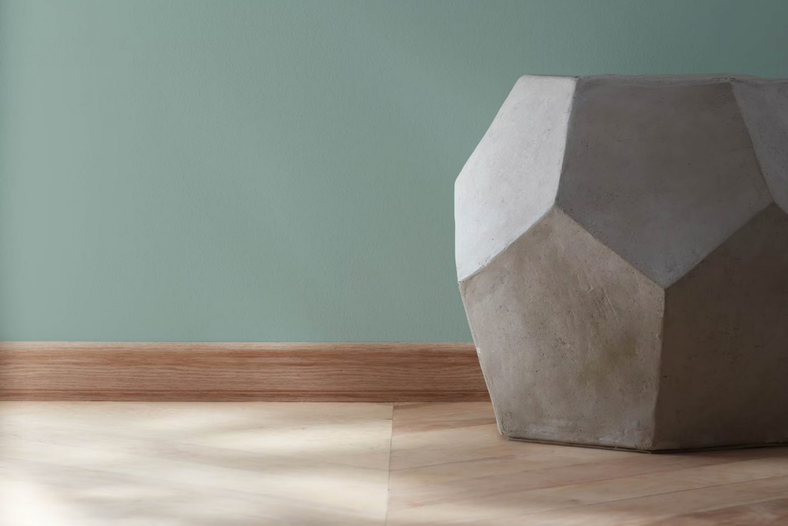
When you first see 705 Sioux Falls by Benjamin Moore, it’s like a breath of fresh air. This color is gentle, yet doesn’t fade into the background of any room. It’s a subtle hue that holds its own charisma, warm enough to make any area feel inviting yet distinctive to add a touch of refinement.
I’ve noticed that depending on the lighting, Sioux Falls can change from a pure, soft gray to having hints of blue and green, bringing a natural, soothing element to my home. It’s not just a paint color; it’s a backdrop for living.
Whether you are looking to freshen up your living room or give your bedroom a quiet, comforting vibe, 705 Sioux Falls adjusts to your desires, blending seamlessly with various decor styles and furnishings.
This adaptability is why I find myself recommending it to friends who want to refresh their homes without overpowering it with color.
What Color Is Sioux Falls 705 by Benjamin Moore?
Sioux Falls 705 by Benjamin Moore is a beautiful, soft green hue with understated blue undertones, making it a flexible choice for many interior design styles. The color offers a fresh, calm vibe, suitable for areas meant for relaxation and peace. It’s neither too bright nor too subdued, striking a nice balance that works well in both brightly lit rooms and those with limited natural light.
This shade excels in interior styles such as coastal, modern farmhouse, and Scandinavian due to its natural, earthy qualities. It complements white accents and natural materials such as wood, linen, and cotton, enhancing the overall sense of airiness and comfort in a room.
When paired with wood finishes, Sioux Falls 705 brings out their warm undertones, creating a cozy, inviting environment. Metal accents in shades like brushed nickel or soft brass can also pair nicely, adding a slight contrast without overshadowing the gentle nature of the color.
Textures such as jute, sisal, and wool blend seamlessly with this shade, reinforcing a connection to the natural world. For those who prefer a bit of contrast, incorporating darker greens or grays can add depth and interest to the design, making Sioux Falls 705 an adaptable and appealing choice for many homes.
Is Sioux Falls 705 by Benjamin Moore Warm or Cool color?
Sioux Falls 705 by Benjamin Moore is a flexible shade of green that can add a fresh and calming touch to any area in your home. This shade is soft enough to be used on all walls in a room without overpowering the area, yet it has enough depth to make a statement whether in a small bathroom or a large living room.
The color can effectively highlight white trim or woodwork, enhancing the architectural features of a home. It pairs beautifully with a range of other colors, from soft neutrals like beige and gray to stronger accents like navy or burnt orange, offering a wide scope for decoration.
In a kitchen, it can create a cozy, welcoming vibe, while in a bedroom, it works to establish a relaxed atmosphere that’s good for winding down. Additionally, this color reflects light well, making it a great choice for darker areas needing a touch of brightness. Overall, Sioux Falls 705 can refresh any home environment with its natural green hue.
Undertones of Sioux Falls 705 by Benjamin Moore
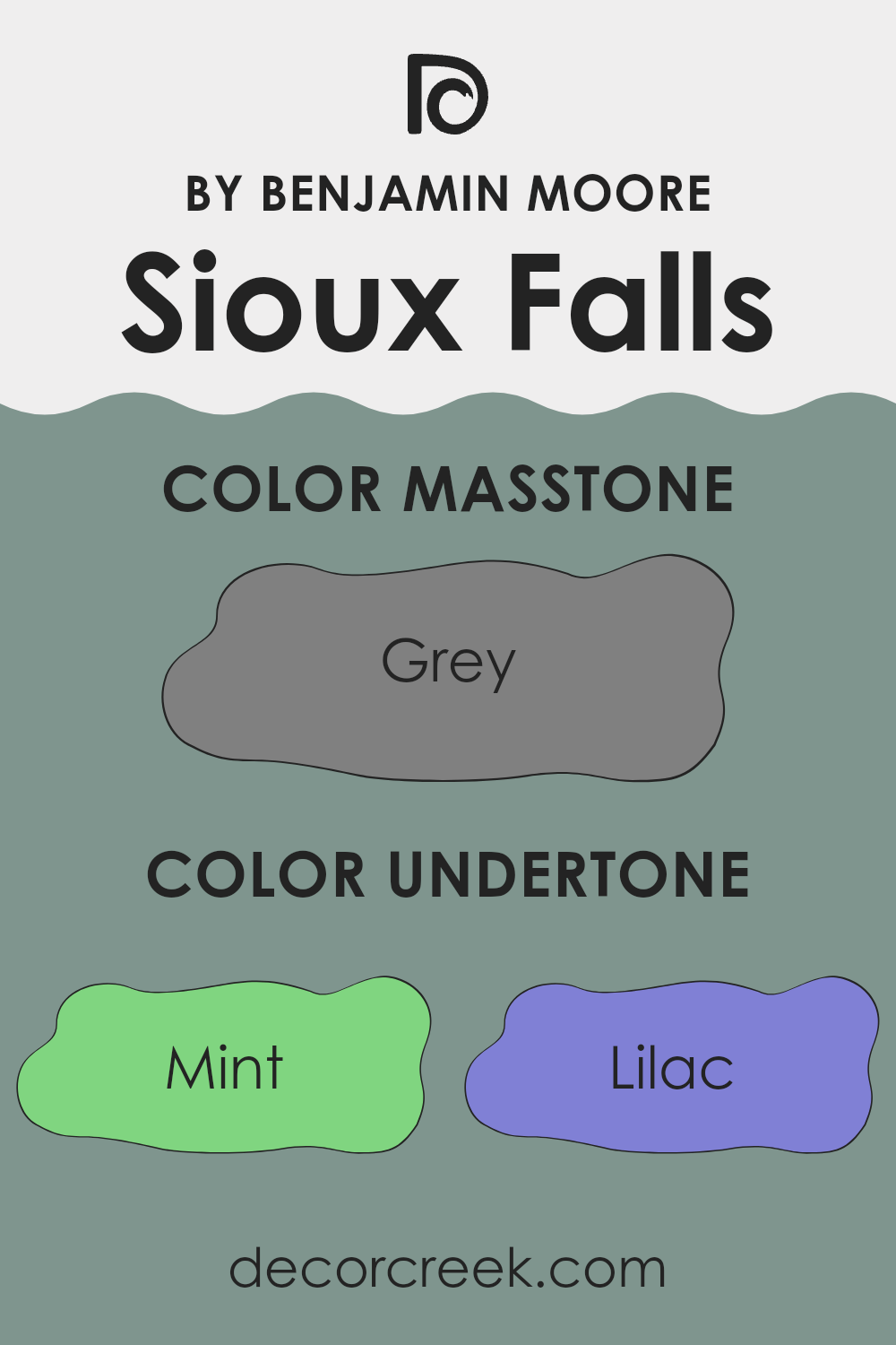
Sioux Falls 705 by Benjamin Moore is a complex paint color that features a rich blending of subtler hues, which influence how it is perceived in different environments. Undertones play a crucial role in paint colors because they can subtly influence the overall ambiance of a room. The presence of undertones like mint, lilac, and light blue give Sioux Falls 705 a cool feel, making it a good choice for rooms seeking a calm and refreshing atmosphere, such as bathrooms or bedrooms.
When applied on interior walls, the undertones in Sioux Falls 705 affect the room’s mood and how other colors in the area are interpreted. For instance, undertones like pale pink and light purple add a gentle warmth that can soften an area and make it more welcoming. On the other hand, darker undertones like navy and dark green lend a touch of depth that can help ground larger areas or make smaller rooms feel more intimate.
In varied lighting, this paint can appear differently; natural light might enhance its cooler undertones like light turquoise and light blue, while artificial lighting could bring out warmer tones such as pale pink or olive. This flexibility makes Sioux Falls 705 an interesting choice for those who want a color that adjusts subtly with the changing light throughout the day, providing a dynamic backdrop for daily activities.
Overall, the multiple undertones in Sioux Falls 705 offer adaptability in terms of matching with furniture and decor, allowing it to fit seamlessly into diverse design styles and preferences, from modern to traditional.
What is the Masstone of the Sioux Falls 705 by Benjamin Moore?
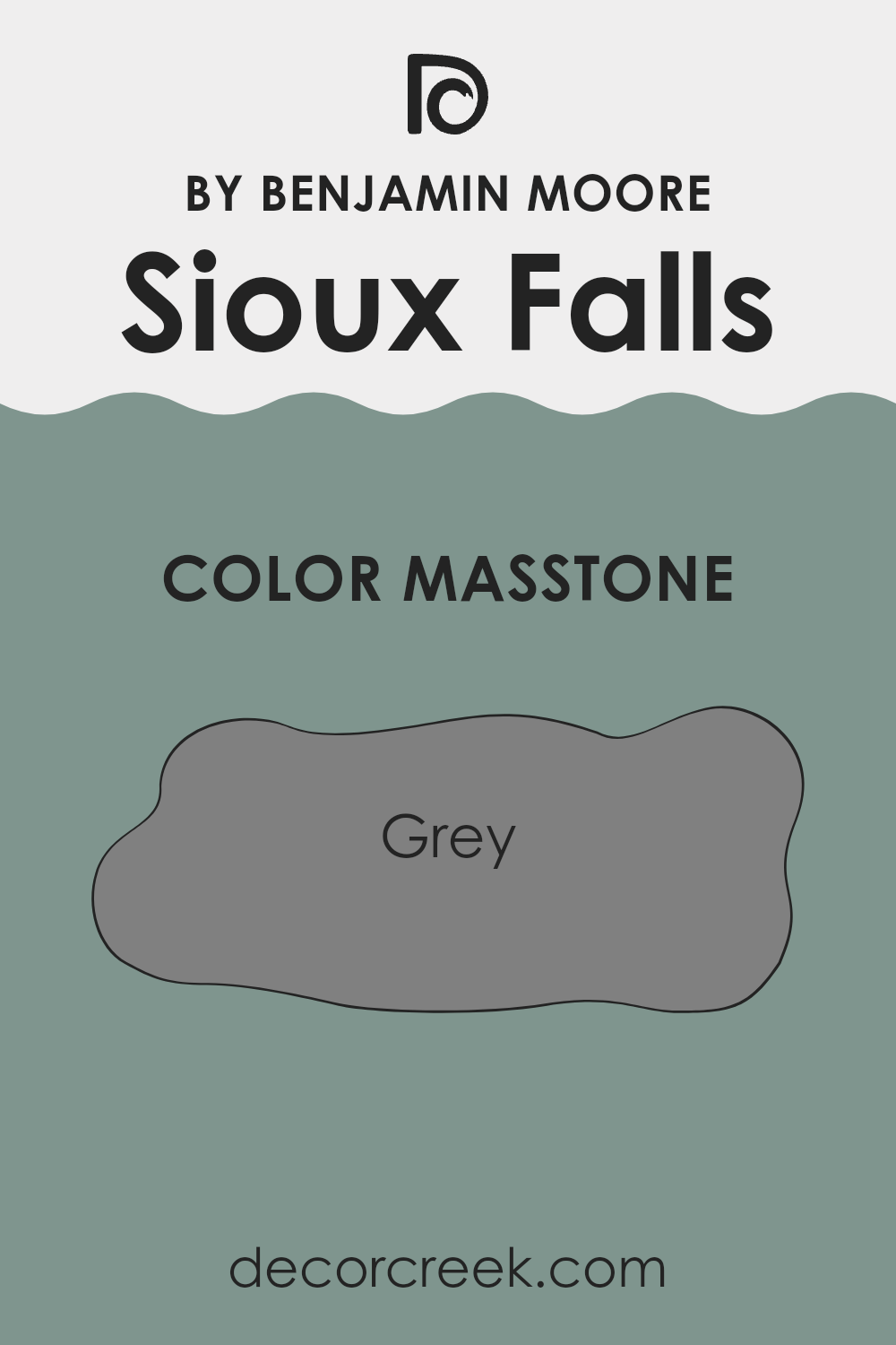
Sioux Falls 705 by Benjamin Moore is a shade of grey that can bring a calm and cozy feel to any room in your home. Its masstone, which is a solid grey (#808080), acts as a neutral base, making it easy to match with other colors.
This means you can pair it with bright colors like teal for a lively look, or softer shades like dusty rose for a more relaxed atmosphere. Since grey is classic and practical, it works well in busy areas such as living rooms or hallways, where it can hide small marks or scuffs better than lighter colors.
It’s also great for creating a simple and uncluttered look in smaller areas like bathrooms or home offices. Using this adaptable grey can help create a pleasant backdrop that allows your furniture and décor to stand out without overpowering the area.
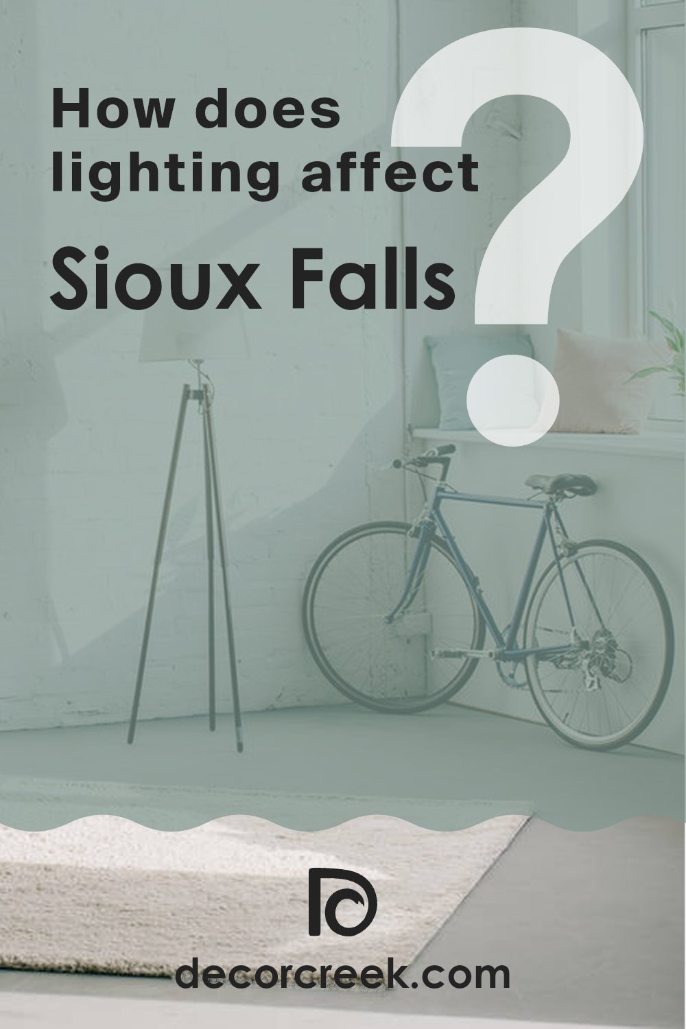
How Does Lighting Affect Sioux Falls 705 by Benjamin Moore?
Lighting plays a crucial role in how we perceive colors in our environments. Different light sources can change the way a color looks, making it appear more vibrant, dull, or a different shade entirely.
Taking the color Sioux Falls 705 by Benjamin Moore as an example, we can see how this shade reacts under various lighting conditions. Sioux Falls 705 is a unique color that can look quite different depending on the lighting.
In artificial light, such as that from LED bulbs or fluorescent lamps, Sioux Falls 705 might look slightly cooler, leaning towards a more subdued tone. Artificial lighting tends to sharpen colors, so this color could appear less warm and more neutral under such conditions.
Under natural light, which is sunlight, Sioux Falls 705 can appear warmer and more dynamic. Natural sunlight brings out the depth and richness of colors, making this shade appear more lively and true-to-the-swatch in daylight.
Room orientation also impacts how colors are displayed:
- North-Faced Rooms: These rooms get less direct sunlight, which can make light colors look a bit shadowy and cooler. Sioux Falls 705 may appear more muted and slightly darker in north-facing rooms, losing some of its warmth.
- South-Faced Rooms: With ample direct sunlight throughout the day, south-facing rooms are ideal for this color. The natural light brightens Sioux Falls 705, enhancing its warm undertones and making the room feel inviting.
- East-Faced Rooms: These rooms enjoy bright light in the morning, which then dims as the day progresses. Sioux Falls 705 will look particularly warm and welcoming in the morning, becoming more subdued by the evening.
- West-Faced Rooms: Light in these rooms builds throughout the day with a peak in the late afternoon. In the morning, Sioux Falls 705 may appear cooler, gradually warming up and reaching its peak warmth in the golden afternoon light.
The varying effects of light on Sioux Falls 705 show that choosing a paint color for your area involves considering both the paint itself and the lighting conditions it will be under. This ensures that the color behaves as you want it throughout the day.
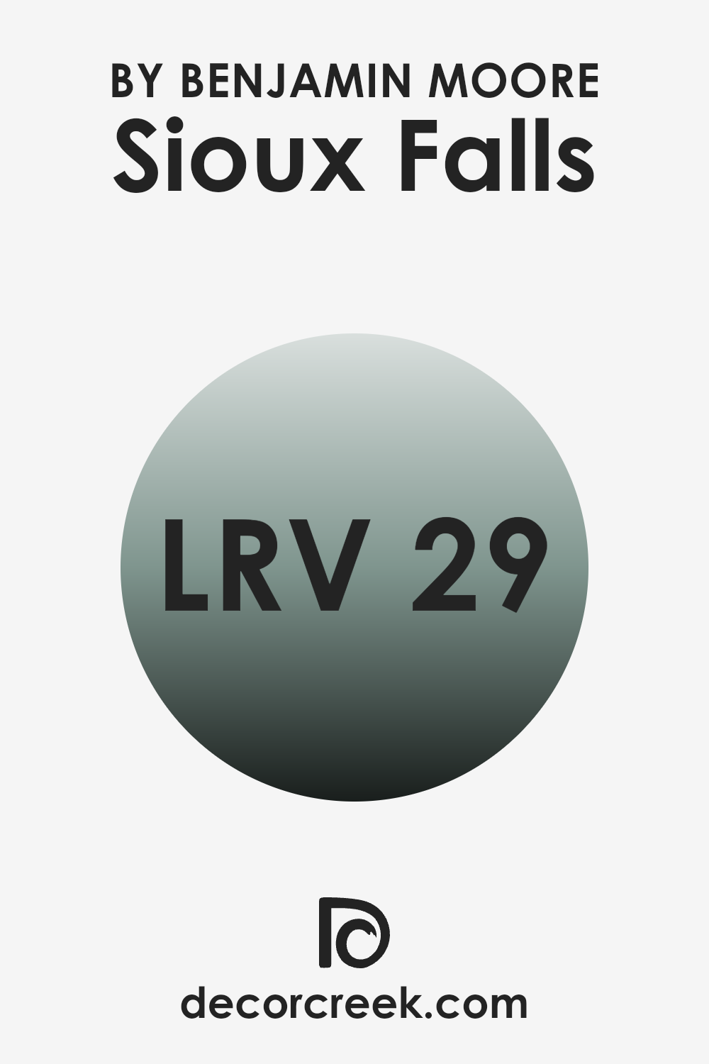
What is the LRV of Sioux Falls 705 by Benjamin Moore?
Light Reflectance Value (LRV) measures how much light a paint color reflects or absorbs when it’s on your walls. The scale for LRV runs from a low of one, where very little light is reflected, to a high of ninety-nine, where almost all light is bounced back. This value is important because it helps determine how light or dark a color will appear in your room.
A higher LRV means the paint will look lighter and can make a room feel more open and airy. On the other hand, colors with a lower LRV absorb more light, making them appear darker and can make a room feel smaller or more cozy. The LRV for the Sioux Falls 705 color from Benjamin Moore is 29.28.
This is on the lower side of the scale, meaning it doesn’t reflect a lot of light. In a room, this color will appear fairly dark, absorbing more light than it reflects. This can make the room feel more enclosed and intimate. It’s an important factor to consider if you’re looking to paint a smaller room or one that doesn’t get much natural light, as using a color with a low LRV can make the room feel even more closed in.
However, in a well-lit room or a larger area, this rich shade can add warmth and character.
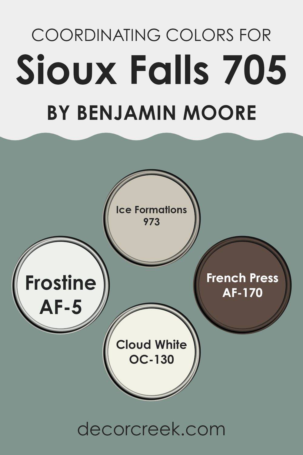
Coordinating Colors of Sioux Falls 705 by Benjamin Moore
Coordinating colors are shades that complement each other and are often used together in design to create a harmonious look. These colors can be contrasted or similar in tone, and when selected carefully, they help in achieving a balanced and appealing aesthetic in any room. For instance, a main wall color can be beautifully enhanced by choosing coordinating trim, accent, and ceiling colors.
A good example of coordinating colors includes a palette like the one involving shades such as 973 – Ice Formations, AF-5 – Frostine, AF-170 – French Press, and OC-130 – Cloud White. Ice Formations is a light gray with subtle blue undertones, giving a calm and clean appearance, ideal for creating a soft backdrop.
Frostine is another light shade in the palette offering a slightly warmer tone which makes it perfect for rooms that aim for a gentle and inviting feel. On the darker side, French Press adds a bold touch with its deep, rich brown hue, ideal for an accent wall or for bringing warmth into the room. Lastly, Cloud White is a true white, offering a fresh and bright finish that works wonders on trims and ceilings to provide a crisp edge to the color scheme.
Together, these colors work in cohesion to provide visual interest and continuity throughout the interior.
You can see recommended paint colors below:
- 973 Ice Formations
- AF-5 Frostine
- AF-170 French Press
- OC-130 Cloud White
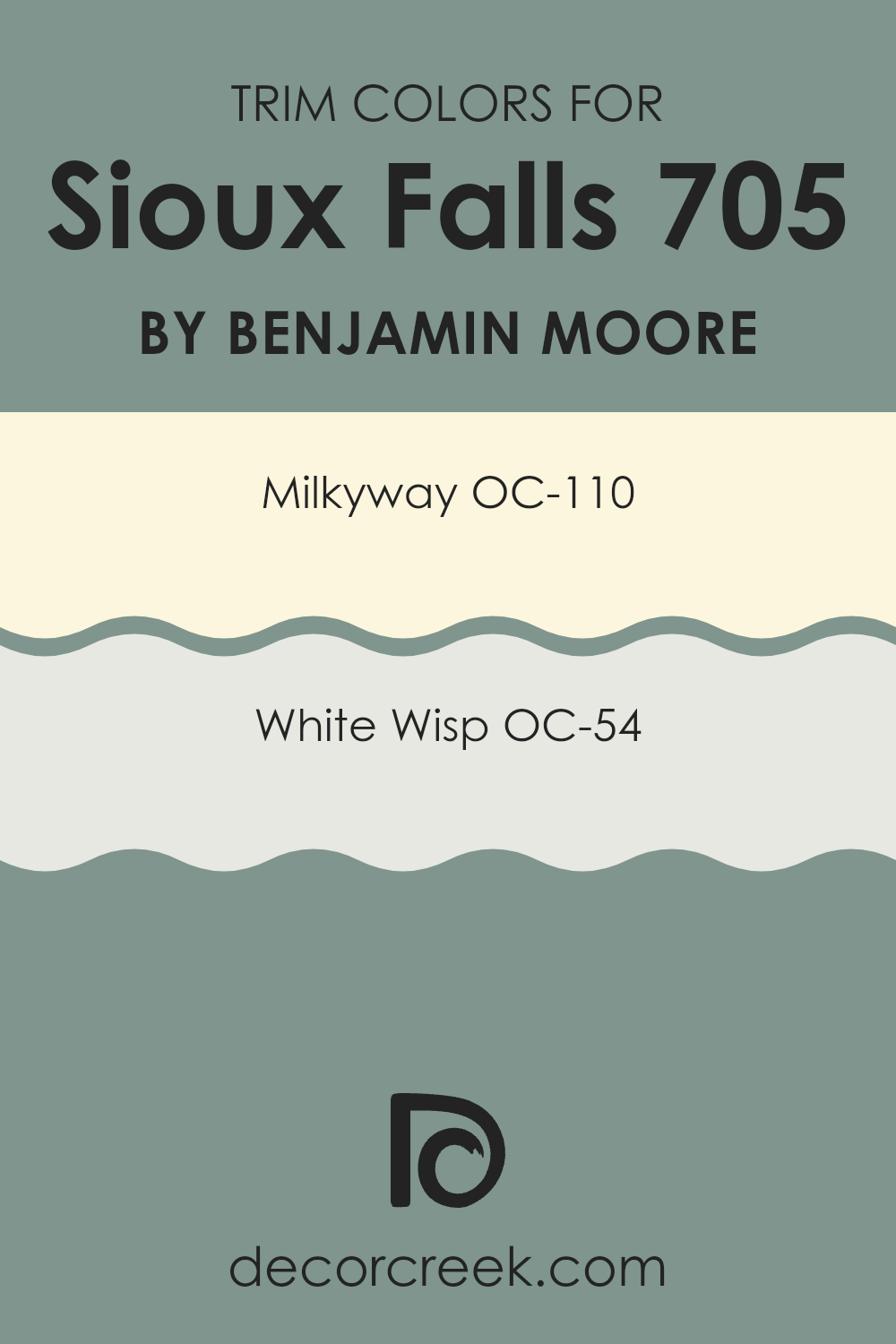
What are the Trim colors of Sioux Falls 705 by Benjamin Moore?
Trim colors are specific shades used to highlight or define the edges and accents of walls, doors, windows, and other architectural features in a room or on the exterior of a building. They play a crucial role in interior and exterior design by framing areas, creating contrasts, or complementing the primary wall colors, and thus can be utilized to enhance the overall aesthetic appeal and coherence of a room.
Benjamin Moore’s OC-110 – Milkyway and OC-54 – White Wisp are excellent choices for trim colors because they have a calming and clean look that can gracefully set off more dominant hues present in a room or an exterior. Milkyway OC-110 by Benjamin Moore is a soft and creamy white that can give a fresh and clean border to any room, making it particularly valuable in areas that need a gentle brightness.
White Wisp OC-54, on the other hand, is a very light gray with a hint of blue, providing a cool and airy feel which works well in creating a subtle, yet striking, contrast that does not overwhelm the main color scheme. Both colors offer a lovely balance and a finished look to any area, enhancing the surrounding shades and adding to the visual charm of the room.
You can see recommended paint colors below:
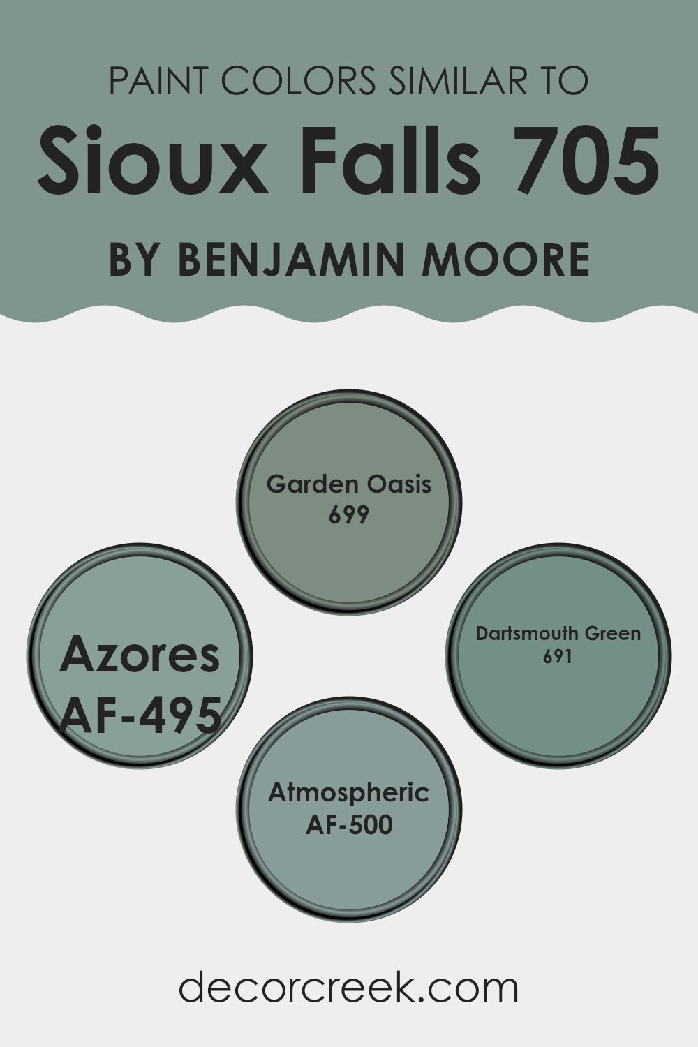
Colors Similar to Sioux Falls 705 by Benjamin Moore
Choosing similar colors can be crucial in design because they create a harmonious and cohesive atmosphere, effortlessly flowing from one shade to another without any jarring transitions. This is particularly evident with colors like Sioux Falls and its close relatives from Benjamin Moore—each offering subtly different vibes while maintaining overall balance within a room. Similar colors ensure that the decor feels connected and smooth, providing a gentle backdrop that’s easy on the eyes and perfect for rooms aiming for a subtle yet impactful appeal.
For example, Garden Oasis (699) adds a touch of lush vibrancy to rooms, reminiscent of a refreshing green landscape. It provides a lively yet soft quality that’s instantly refreshing. Azores (AF-495) brings in a slightly richer, deeper hue that suggests the deep and mysterious aspects of oceanic waters, adding a hint of depth to any room.
Dartsmouth Green (691) leans towards a more traditional, deeper green that resembles rich evergreen foliage that’s both grounding and nature-inspired. Lastly, Atmospheric (AF-500) offers a blend of blue and green that mimics a dusky sky, perfect for creating a calm and inviting mood. These shades work together to enhance each other, making any design project look thoughtfully put together and harmoniously aligned.
You can see recommended paint colors below:
- 699 Garden Oasis
- AF-495 Azores
- 691 Dartsmouth Green
- AF-500 Atmospheric
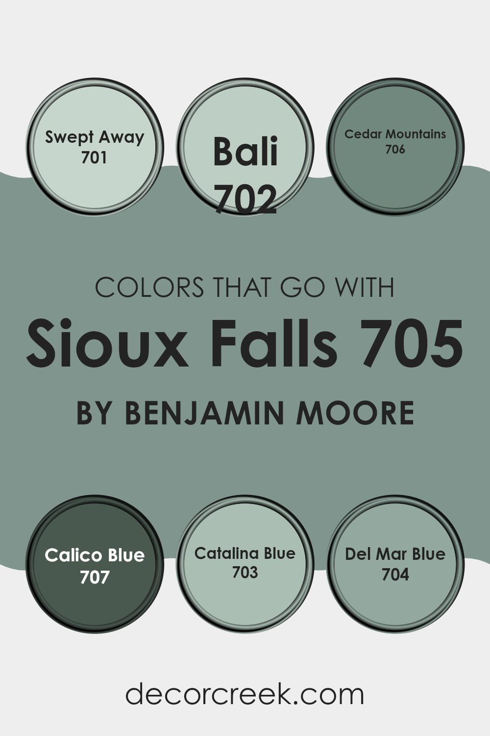
Colors that Go With Sioux Falls 705 by Benjamin Moore
Selecting the right colors to complement Sioux Falls 705 by Benjamin Moore can greatly enhance the aesthetic and feel of a room. These complementary colors include Swept Away, Bali, Cedar Mountains, Calico Blue, Catalina Blue, and Del Mar Blue. Each of these colors harmonizes with Sioux Falls 705, which serves as a flexible base, allowing these additional tones to bring warmth, depth, or brightness to your room depending on your decorating goals.
Swept Away is a gentle, airy gray that adds a subtle touch of elegance and can make any room feel more open and light. Bali, on the other hand, introduces a richer hue reminiscent of deep sea waters, perfect for creating a striking contrast against the calmness of Sioux Falls 705. Cedar Mountains offers a dusky earth tone that grounds the room with its nature-inspired, soothing presence.
Calico Blue brings a playful, soft blue that is like a breath of fresh air for any room, suggesting the sky on a clear day. Catalina Blue is deeper and more intense, ideal for adding a focal point or as an accent wall to draw the eye. Lastly, Del Mar Blue offers a vibrant, oceanic vibe that can make a room feel lively and energetic, perfect for areas needing a splash of cheer. Together, these colors work in harmony to create inviting and beautifully coordinated environments.
You can see recommended paint colors below:
- 701 Swept Away
- 702 Bali
- 706 Cedar Mountains
- 707 Calico Blue
- 703 Catalina Blue
- 704 Del Mar Blue
How to Use Sioux Falls 705 by Benjamin Moore In Your Home?
Sioux Falls 705 by Benjamin Moore is a unique shade of gray-green that brings a fresh and soothing feel to any room. This color is adaptable and works beautifully in various parts of a home. If you’re thinking about giving your living room a new look, Sioux Falls 705 can create a calm and inviting atmosphere. It pairs well with natural materials like wood and stone, enhancing the room’s overall aesthetic.
In a bedroom, this color can help establish a restful environment, perfect for relaxing after a long day. For those looking to update their kitchen, Sioux Falls 705 on the cabinets or walls can provide a clean, modern background that still feels warm and welcoming.
Additionally, this color is a great choice for bathrooms. It fits well with white fixtures, adding a touch of nature-inspired beauty without flexible the area. Sioux Falls 705 is a practical and stylish choice for anyone looking to refresh their home with a new paint color.
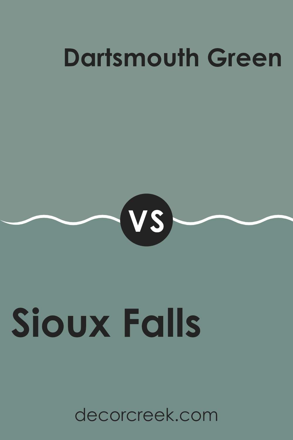
Sioux Falls 705 by Benjamin Moore vs Dartsmouth Green 691 by Benjamin Moore
The two colors, Sioux Falls and Dartsmouth Green by Benjamin Moore, both offer unique yet harmonious qualities. Sioux Falls is a light, subdued gray-green shade that feels fresh and calming, making it suitable for areas where a light and airy ambiance is desired.
Dartsmouth Green, on the other hand, is a much darker green with a deep, rich tone. This color is more striking and brings a bold, invigorating presence to any room.
While Sioux Falls is adaptable and blends easily with various decors, enhancing rooms without dominating them, Dartsmouth Green makes a strong statement and works well as an accent or on feature walls. The contrasting lightness of Sioux Falls and the depth of Dartsmouth Green can complement each other beautifully in an interior, providing balance and visual interest.
You can see recommended paint color below:
- 691 Dartsmouth Green
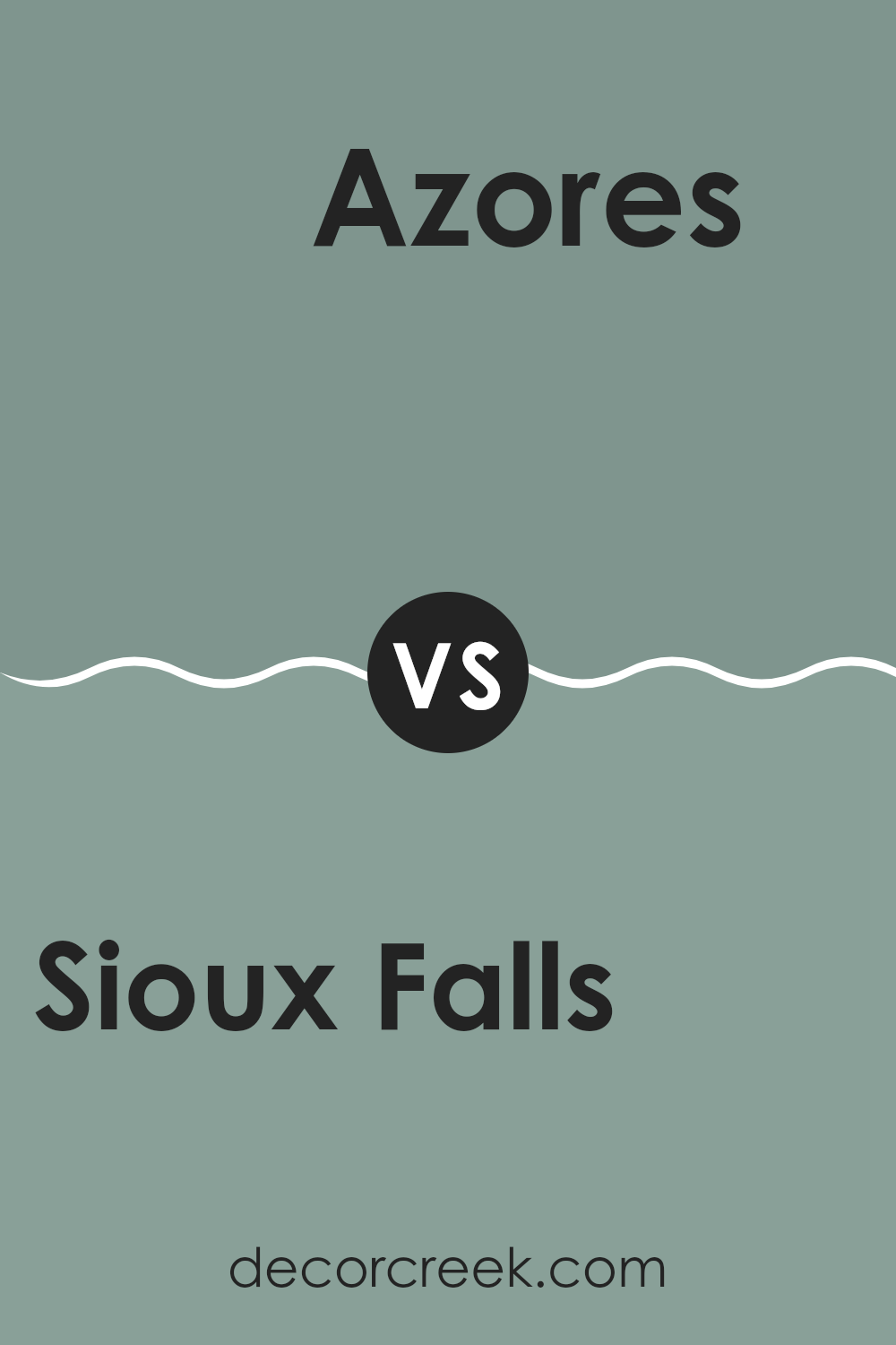
Sioux Falls 705 by Benjamin Moore vs Azores AF-495 by Benjamin Moore
Sioux Falls 705 is a soothing green-gray shade that brings a muted, natural feel to any area. It’s an adaptable color that works well in many rooms, providing a soft backdrop that complements both bold and understated decor styles.
Meanwhile, Azores AF-495 is a brighter green that has a fresher and slightly more vibrant appearance. This shade can add a lively touch to a room, making it feel more energetic and inviting. It’s particularly good for adding a splash of color without overpowering the senses.
When comparing the two, Sioux Falls is more subdued and can make a room feel cozy and grounded, whereas Azores offers a bit of a punch, ideal for interiors that benefit from a brighter, cheerier atmosphere. Depending on the mood you want to create, Sioux Falls is great for a relaxed, subtle look, while Azores is better for creating a cheerful and engaging environment. Both colors can work well together if you’re looking to combine calm with a touch of bright freshness.
You can see recommended paint color below:
- AF-495 Azores
Sioux Falls 705 by Benjamin Moore vs Garden Oasis 699 by Benjamin Moore
Sioux Falls is a soft, muted green with subtle gray undertones, making it a gentle and calming shade that adds a touch of nature-inspired neutrality to any room. It’s adaptable enough to work in various settings, such as living rooms or bedrooms, where a soothing atmosphere is desired.
In contrast, Garden Oasis is a livelier green that leans towards freshness and vibrancy. This shade is brighter and has a more pronounced green hue, which can infuse more energy and liveliness compared to Sioux Falls. Garden Oasis works well in areas where you want to bring in elements of the outdoors, creating a lively and refreshing environment.
Both colors offer a natural vibe, but Sioux Falls is quieter and more understated, while Garden Oasis stands out more and can make a room feel more dynamic and fresh. Depending on what kind of mood or effect you’re aiming for, either could be a great choice for bringing a touch of nature into your home.
You can see recommended paint color below:
- 699 Garden Oasis
Sioux Falls 705 by Benjamin Moore vs Atmospheric AF-500 by Benjamin Moore
Sioux Falls and Atmospheric are two distinctive paint colors by Benjamin Moore. Sioux Falls is a deeper, grayish green that feels cozy and grounding. It’s a color that would work well in rooms where you want to bring in the calmness of nature, like a bedroom or a reading nook. This shade can add a subtle hint of color without being too bold.
On the other hand, Atmospheric is a lighter, airy gray that provides a clean and fresh look. It’s an excellent choice for rooms that you want to keep light and open, such as kitchens and bathrooms. Unlike Sioux Falls, it reflects more light and can make a room feel more spacious.
When comparing these two, the main difference lies in their ability to shape the room’s mood. Sioux Falls, by being darker, offers a more cocooning feel, whereas Atmospheric creates a breezier atmosphere that makes rooms feel larger. Both colors have their unique uses depending on the ambience you aim to achieve.
You can see recommended paint color below:
- AF-500 Atmospheric
In conclusion, reading about 705 Sioux Falls by Benjamin Moore has been really interesting. This color is like a soft shade of green that looks a bit like the color you see on trees during early spring. It’s cool and calming, almost like how you feel when you look at a peaceful field full of grass.
This paint color is like a magic trick for rooms because it makes them look bright and welcoming. Whether you want to paint a bedroom or a living room, this color is a good choice because it’s not too bold and not too quiet. It matches many other colors, which means you can use different color curtains or furniture, and they will still look nice.
I learned that 705 Sioux Falls can make small rooms seem bigger and more open, just like when you are outside in a big open field. It’s cool because it can make you feel relaxed and happy just by being around it. Using this color in your home can be a fun way to make it feel fresh and new.
Just like how a simple color can change how a room looks, learning about this color made me think about how small changes can have big results. So, painting a room with 705 Sioux Falls might just be the simple change someone needs to make their home feel even better.
Ever wished paint sampling was as easy as sticking a sticker? Guess what? Now it is! Discover Samplize's unique Peel & Stick samples.
Get paint samples

