I recently chose 2094-40 Soft Cranberry by Benjamin Moore for a small bedroom makeover, and I must say, the result pleasantly surprised me. Initially, I was looking for a color that would bring warmth and a touch of uniqueness to the room without feeling too strong. Soft Cranberry stood out as a rich, yet understated hue that promised to add just the right amount of vibrancy.
The color has a soothing quality that is hard not to like. It strikes a beautiful balance by being bold enough to make a statement yet subdued enough to keep the room feeling cozy and inviting.
Painting the room this shade shifted the entire feel of the room, making it more welcoming and lively.
What I love most about Soft Cranberry is how it interacts with different lights during the day, shifting subtly from a deep, lush tone in the morning to a softer, warmer glow by evening.
If you’re considering a new paint color and want something that will add character without dominating your decor, Soft Cranberry is definitely worth considering. It’s flexible enough to work with a variety of decorating styles, from modern to rustic.
Plus, it pairs beautifully with light woods, whites, and greys, making it really easy to blend into existing themes.
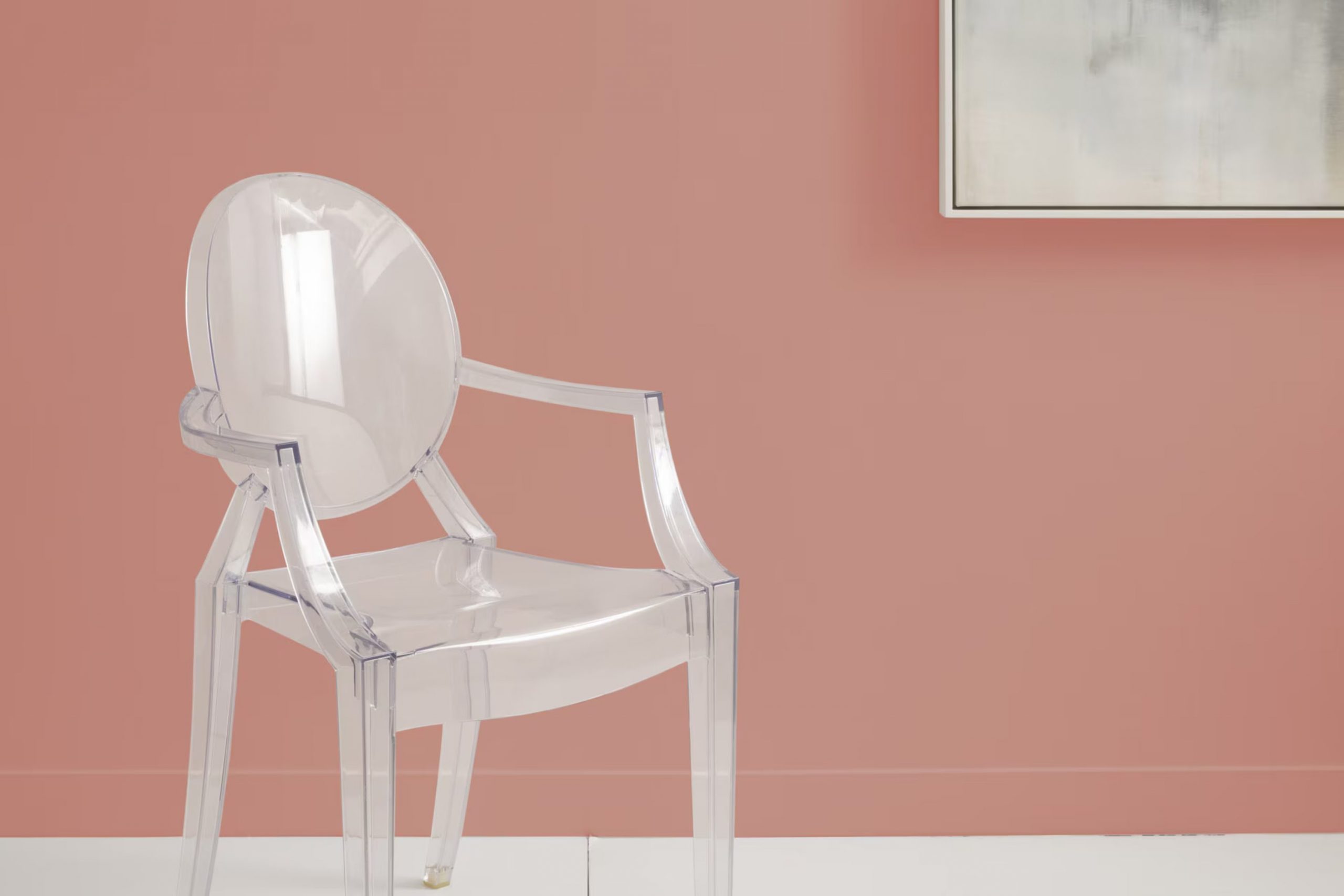
What Color Is Soft Cranberry 2094-40 by Benjamin Moore?
Soft Cranberry by Benjamin Moore is a vibrant and warm hue that instantly makes any room feel welcoming and cozy. This color has a deep, pinkish-red tone that can add a rich layer of depth to your walls. Perfect for creating a statement wall or an intimate ambiance, Soft Cranberry brings a lively burst of color without feeling too heavy.
This particular shade is well suited for interior styles that lean toward the traditional, rustic, or even shabby chic. It works beautifully in dining rooms and living areas where its inviting essence can be fully appreciated. Used in a bedroom, it provides a cozy, nest-like feel that’s ideal for relaxation.
Soft Cranberry pairs wonderfully with various materials and textures. Natural wood, whether light oak or darker walnut, complements its warmth and enhances its earthy undertones. Incorporating elements like linen, wool, or rustic burlap can balance its richness with their natural, subtle textures. For a modern twist, metallic finishes like bronze or gold can create a striking contrast, adding a refined touch and visual interest.
In sum, Soft Cranberry is a flexible color that brings life and character to interiors, making it a lasting favorite for home decorators.
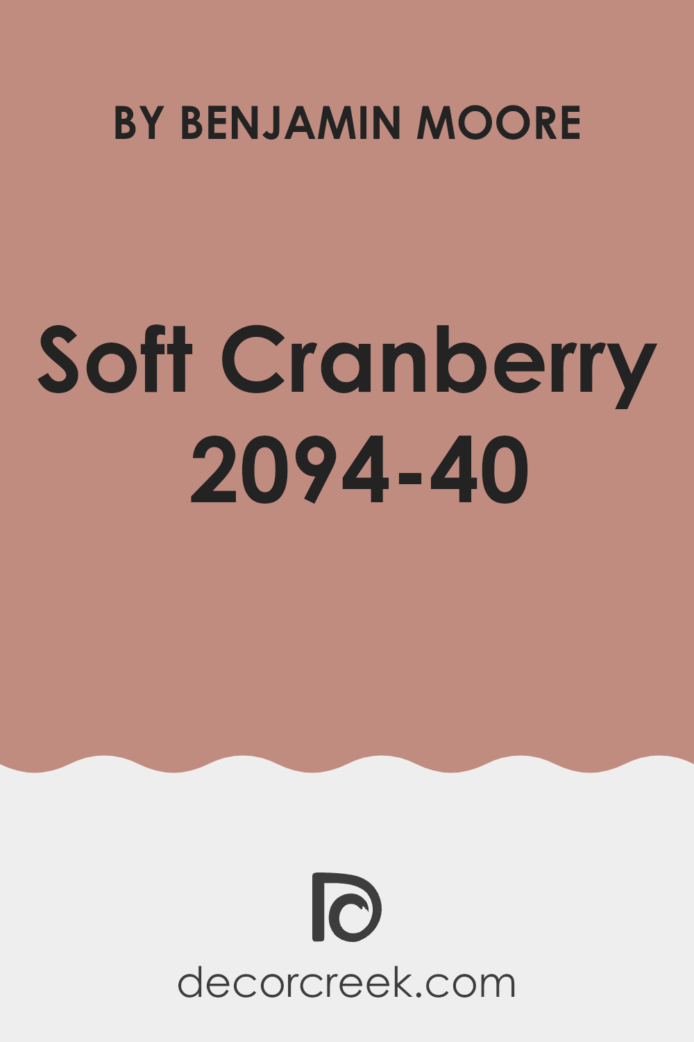
Is Soft Cranberry 2094-40 by Benjamin Moore Warm or Cool color?
Soft Cranberry 2094-40 by Benjamin Moore is a warm and inviting paint color that adds a cozy touch to any room. This shade of cranberry has a muted quality, making it less intense and more adaptable than brighter reds. It works well in living rooms and dining areas, creating a welcoming atmosphere that encourages relaxation and conversation.
In homes, Soft Cranberry can be paired with neutral colors like whites and beiges to keep rooms looking light and airy. It also looks beautiful with darker tones like navy or gray, which can help create a balanced and harmonious look. This color has the unique ability to add warmth to a room without feeling too heavy or intense.
Applying Soft Cranberry on an accent wall or in decorative touches, such as throw pillows or curtains, can enhance the room without requiring a complete color overhaul. It’s a flexible hue that can easily fit into many design styles, from rustic to modern. This makes it a practical choice for adding a splash of color that feels inviting and homey.
Undertones of Soft Cranberry 2094-40 by Benjamin Moore
Soft Cranberry is a unique shade from Benjamin Moore that appears primarily as a vibrant but soothing reddish color. The undertones playing within it are subtle shades that strongly influence how this color is perceived in different rooms and lighting conditions.
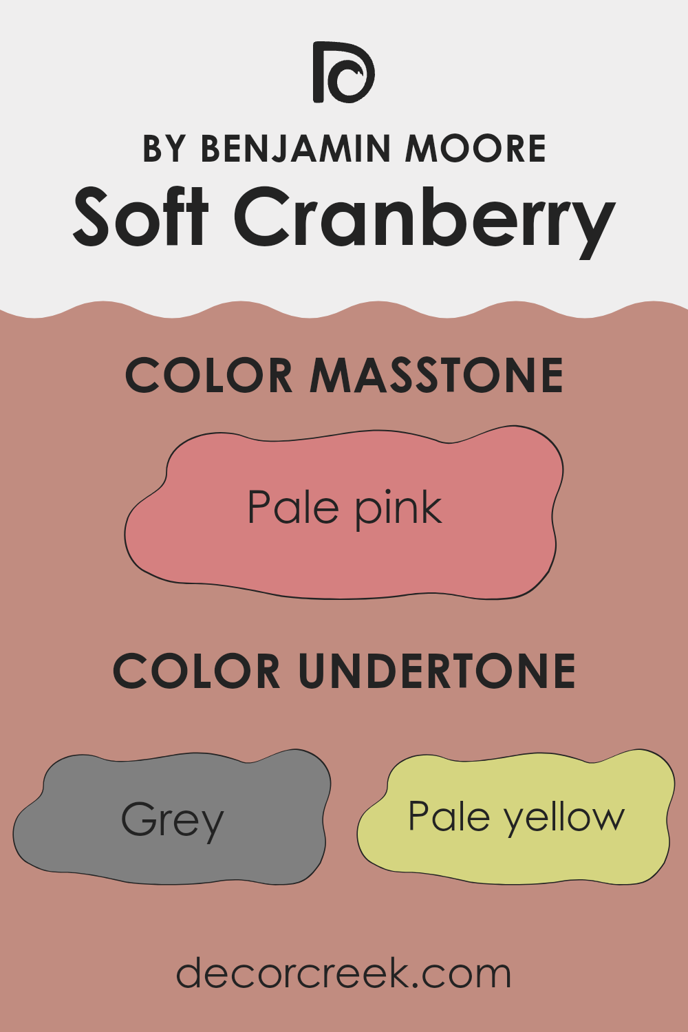
Undertones are like hidden colors that blend softly with the main color but aren’t always immediately visible. They can shift the appearance of the paint depending on the light, affecting the mood of the room. Soft Cranberry has multiple undertones, including grey, pale yellow, light purple, and more. Each of these adds a layer of depth and complexity, allowing the color to adapt gently to different interior design themes and lighting conditions.
For instance, in a room with ample natural light, the pale yellow and light purple undertones might make the walls seem slightly warmer and more inviting. In artificial lighting, the gray or light gray undertones could become more noticeable, giving the walls a cooler feel. Such flexibility makes Soft Cranberry a great choice for many living areas, from living rooms to bedrooms.
On interior walls, this color can influence the mood and atmosphere. The blend of undertones like orange and pink brings warmth, ideal for creating a cozy environment, while cooler undertones like mint and light blue add a fresh touch. This range makes Soft Cranberry flexible and appealing for many décor styles and preferences.
What is the Masstone of the Soft Cranberry 2094-40 by Benjamin Moore?
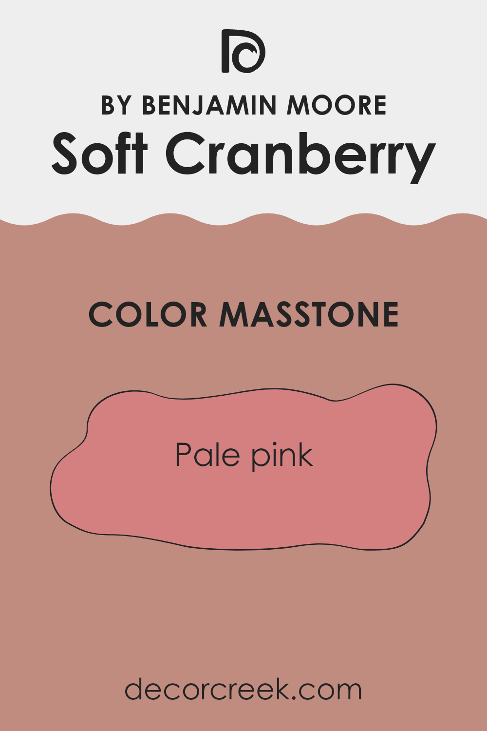
Soft Cranberry 2094-40 by Benjamin Moore is a gentle shade of pale pink (#D58080), which creates a soothing and welcoming atmosphere in any home. When applied to walls, it introduces a subtle warmth that makes rooms feel more inviting without feeling too strong.
This shade works well in areas where calmness and comfort are desired, such as bedrooms and living rooms. Because of its softness, it pairs beautifully with neutrals like whites, grays, and beiges, which helps maintain a balanced look.
It can also be accented with darker colors like deep blues or greens for a more vibrant contrast. This flexibility makes it a great choice for those wanting to add a touch of color to their home without committing to something too bold or striking. Overall, Soft Cranberry 2094-40 offers a fresh and light feel that can easily refresh any room.
How Does Lighting Affect Soft Cranberry 2094-40 by Benjamin Moore?
Lighting has a significant influence on how colors appear in a room. The impact of light on color is important because different types of light can change how a color looks, whether the light is natural (coming from the sun) or artificial (provided by light bulbs).
For instance, Soft Cranberry, a paint color, looks different under various lighting conditions. Under artificial light, such as LED or incandescent bulbs, Soft Cranberry tends to appear richer and deeper. The warmth from typical household bulbs can enhance the red tones, making the walls seem cozier and more inviting.
In natural light, the appearance of Soft Cranberry shifts depending on the time of day and the direction the room faces. In north-facing rooms, natural light is cooler and bluer, which can make Soft Cranberry look a bit more muted and less vibrant. These rooms don’t get a lot of direct sunlight, so the color might look different throughout the day but generally stays on the cooler side.
In south-facing rooms, there’s an abundance of bright, warm light throughout the day. This type of light can make Soft Cranberry look vibrant and lively, enhancing its warm tones. The color appears brighter and can really stand out in a south-facing room.
East-facing rooms get most of their light in the morning when the sun is rising. Here, Soft Cranberry will look bright and warm in the morning but might lose some of its vibrancy as the day progresses and less direct sunlight enters the room. It can have a calming effect in the morning, perfect for bedrooms or breakfast nooks.
West-facing rooms receive intense light in the late afternoon and evening. As the sun sets, Soft Cranberry will reflect the reddish, golden tones of the sunset, which enhances its warmth, making the room feel cozy and welcoming during these hours.
Understanding how light affects this color can help in making decisions about paint colors based on the orientation of your rooms and the kind of light they receive.
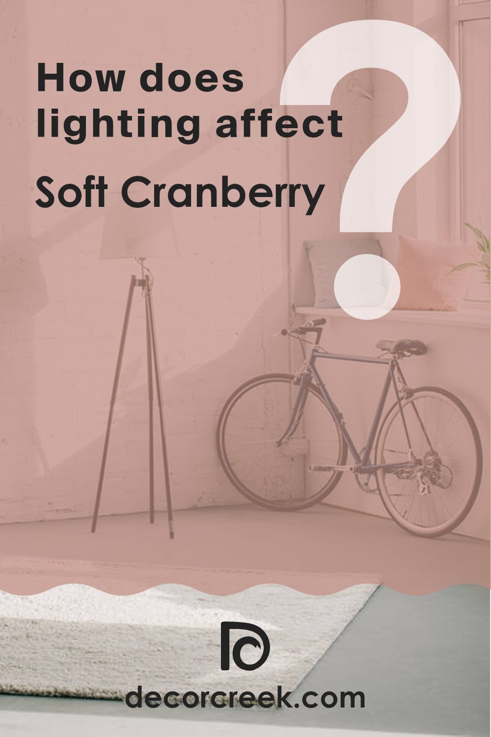
What is the LRV of Soft Cranberry 2094-40 by Benjamin Moore?
LRV, or Light Reflectance Value, is a measurement that indicates how much light a paint color reflects back into a room. This numeric value ranges from 1 to 99 (with 1 being very dark and 99 being very light), representing the percentage of light reflected.
A higher LRV means the color is lighter and will make a room appear brighter as it reflects more light. Conversely, a lower LRV means the color is darker and will absorb more light, making a room feel more enclosed. Understanding LRV can help you choose the right paint color for a room based on how much natural or artificial light it gets.
In the case of the color with an LRV of 31.53, it falls into the darker half of the scale. This means it doesn’t reflect much light, absorbing more instead. In practical terms, painting walls this color can make a room feel cozier and more enclosed. This can be ideal for creating a warm and inviting atmosphere in areas like bedrooms or dining rooms, where a sense of comfort and intimacy is often desirable. However, it’s important to ensure there is enough lighting in the room, either natural or artificial, to prevent the room from feeling too dark or small.
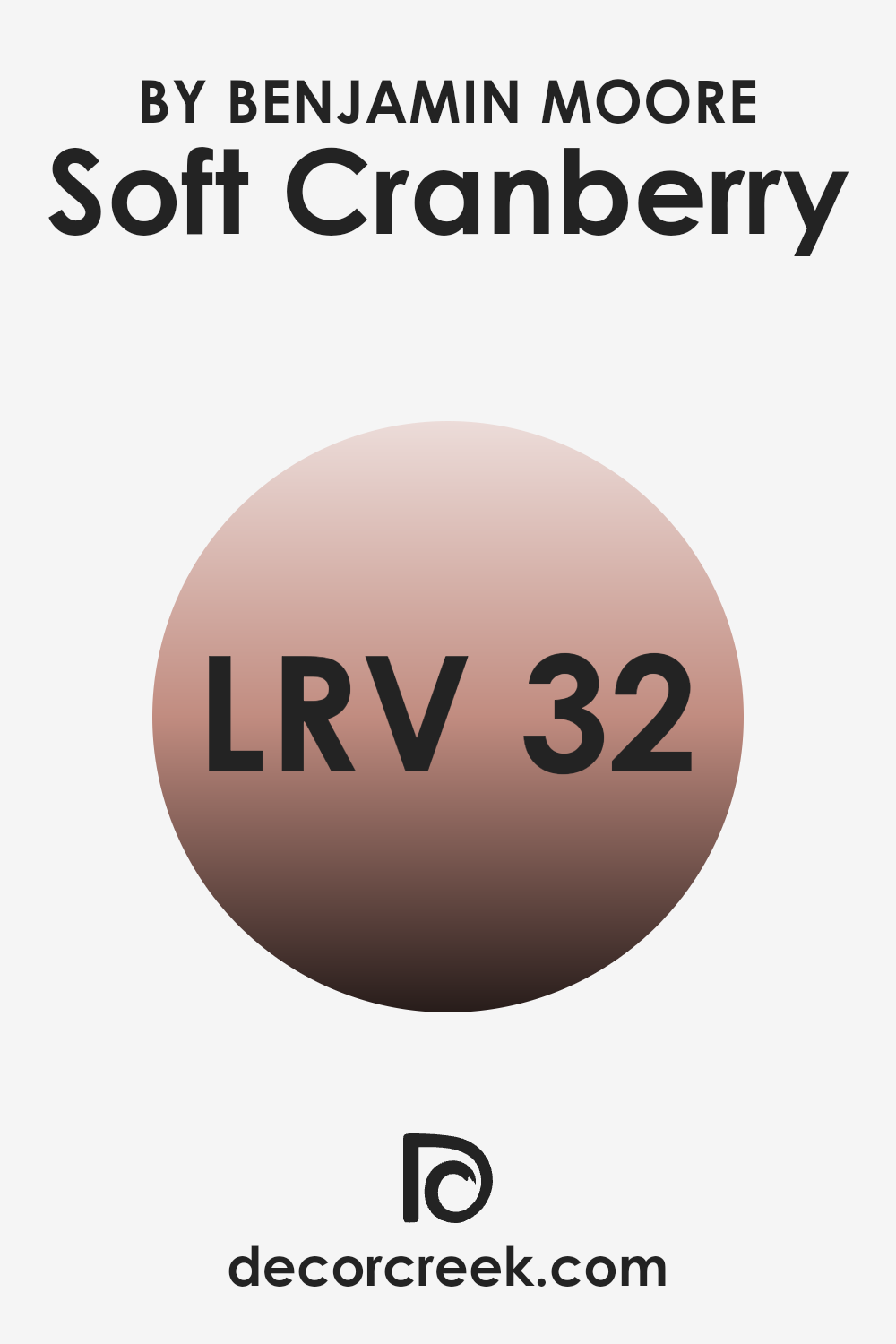
Coordinating Colors of Soft Cranberry 2094-40 by Benjamin Moore
Coordinating colors are specifically chosen to complement a primary color, enhancing the overall aesthetic of a room. When used correctly, they create a visually appealing and balanced palette. These colors vary in shades and tones but work harmoniously with the main color. For example, when paired with a rich shade like Soft Cranberry by Benjamin Moore, a set of coordinating colors can heighten the warmth and inviting nature of a room without feeling too intense.
Halo is a soft, muted hue that gently balances the boldness of a deeper color like Soft Cranberry. It provides a calm backdrop that allows the richer tones to stand out without competing for attention. Nocturnal Gray, on the other hand, is a deep, moody gray that adds depth and contrast to the vibrant warmth of Soft Cranberry, making it ideal for adding a modern touch to any room.
Snowfall White is a crisp, clean white that brings a fresh and clean brightness to the mix, refreshing the palette. Lastly, Cloud White has a slightly warmer tone, ensuring a smooth transition between striking and subtle colors, perfectly rounding out the palette to create a cohesive look.
You can see recommended paint colors below:
- OC-46 Halo (CHECK A SAMPLE)
- 2135-30 Nocturnal Gray (CHECK A SAMPLE)
- OC-118 Snowfall White
- OC-130 Cloud White
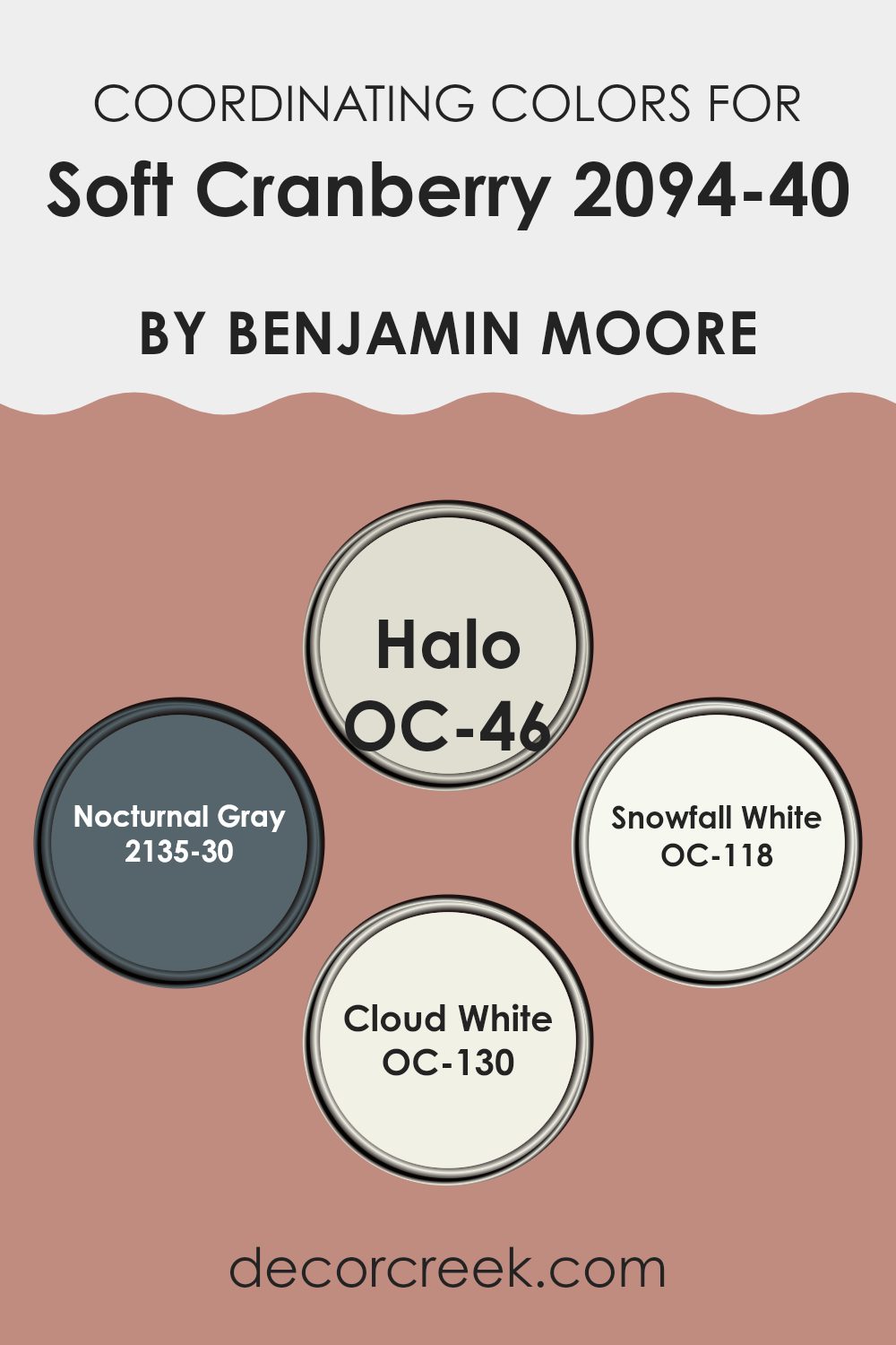
What are the Trim colors of Soft Cranberry 2094-40 by Benjamin Moore?
Trim colors are essential hues that highlight and frame the areas around windows, doorways, baseboards, and moldings, creating clear boundaries that enhance the overall appeal of the wall color. When paired with an assertive shade like Soft Cranberry by Benjamin Moore, a well-chosen trim color can accentuate the richness of the main hue without feeling too strong.
Choosing lighter trim colors, such as Simply White or Mayonnaise, helps break the monotony of stronger wall colors and adds a refreshing contrast that gently draws attention to the architectural details of the room.
Simply White (OC-117) is a clean and fresh white shade that brings out crisp clarity, making it a perfect option for trims to both brighten and visually enlarge a room bordered by stronger colors like Soft Cranberry. Mayonnaise (OC-85), on the other hand, is a soft, warm white with a hint of creaminess, offering an understated and gentle complement to richer, more intense hues, adding a cozy, softening effect around the edges of a boldly painted room. Both colors support a harmonious yet dynamic look when paired with a strong wall color, helping create a balanced and welcoming atmosphere in any room.
You can see recommended paint colors below:
- OC-117 Simply White
- OC-85 Mayonnaise
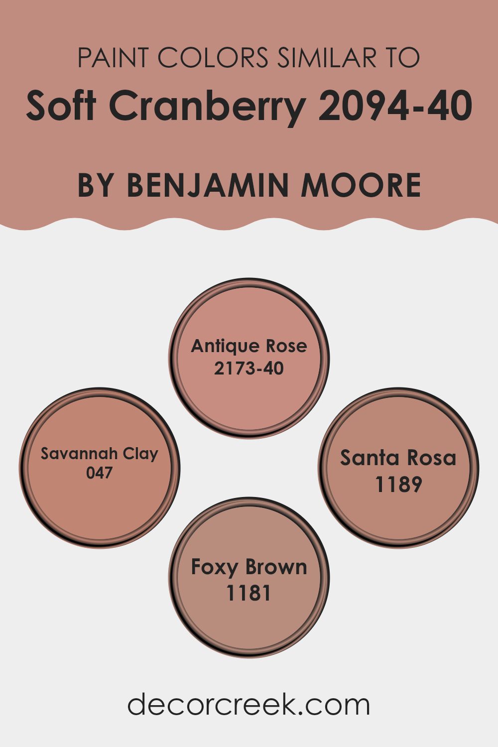
Colors Similar to Soft Cranberry 2094-40 by Benjamin Moore
Similar colors can greatly influence the aesthetic and mood of a room, offering a cohesive and harmonious look. When hues like Soft Cranberry are paired with analogous shades such as Antique Rose, Savannah Clay, Santa Rosa, and Foxy Brown, they create a subtle yet impactful sense of continuity.
These colors, all sharing a warm base, work together by adding depth and complementing one another, making the environment feel balanced and inviting. This approach of using similar colors can effectively improve interiors without feeling too strong or high-contrast, maintaining a gentle flow through the color spectrum.
Antique Rose has a charming, understated presence with its rich yet gentle pink tone that softly suggests elegance, making it perfect for creating a cozy nook. Savannah Clay wraps a room in its warm, earthy feel, making it ideal for areas that seek a subtle hint of grounded comfort. Santa Rosa, with its dusty rose shade, brings a touch of vintage flair, offering a nostalgic and refined warmth that enriches interiors with a time-honored feel. Lastly, Foxy Brown adds an unexpected depth with its rich, chocolate-like character, allowing for a bold design moment while still staying within the harmonious palette. When these colors are used together, they naturally create a visually pleasing and unified environment.
You can see recommended paint colors below:
- 2173-40 Antique Rose (CHECK A SAMPLE)
- 047 Savannah Clay (CHECK A SAMPLE)
- 1189 Santa Rosa (CHECK A SAMPLE)
- 1181 Foxy Brown
Colors that Go With Soft Cranberry 2094-40 by Benjamin Moore
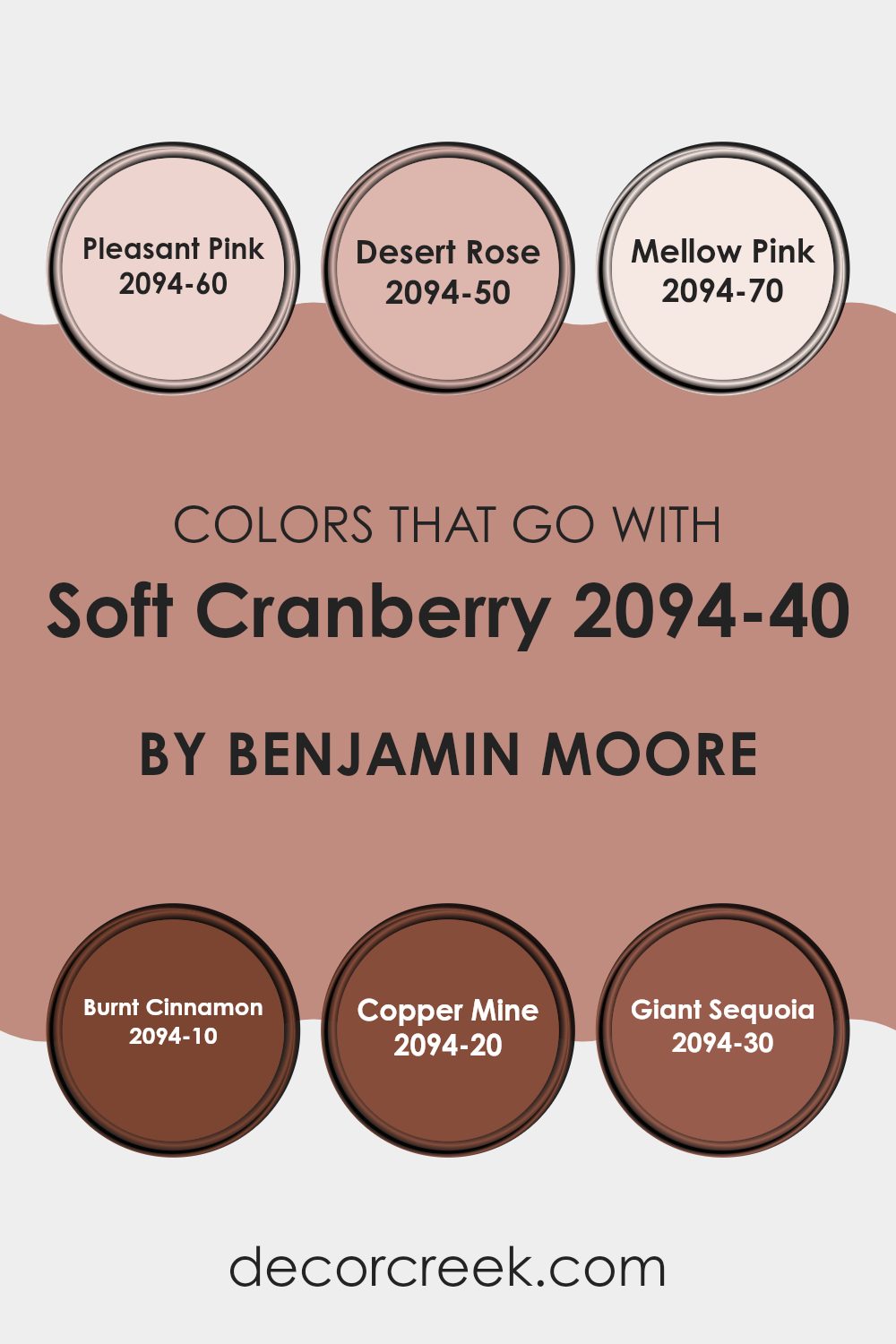
Choosing the right colors to complement Soft Cranberry 2094-40 by Benjamin Moore is important for creating a harmonious and appealing look in any room. Soft Cranberry itself is a rich, warm hue that brings a cozy feel to interiors. When paired with compatible colors such as Pleasant Pink or Desert Rose, the result is a soft and inviting atmosphere. Pleasant Pink is a gentle tone that adds a touch of freshness without feeling too strong next to Soft Cranberry, while Desert Rose offers a slightly deeper pink that enriches the overall palette, adding depth and warmth.
To contrast or highlight the intensity of Soft Cranberry, selecting shades like Mellow Pink, Burnt Cinnamon, Copper Mine, or Giant Sequoia can strongly influence the room’s mood. Mellow Pink provides a subtle contrast, brightening the setting with its soft, almost pastel quality.
Burnt Cinnamon introduces a spice-like shade that complements the cranberry color with its earthy, deep red tones. Copper Mine adds a metallic accent that reflects light and brings a unique layer of interest. Lastly, Giant Sequoia, with its deep, woodsy hue, anchors the color scheme and adds a touch of nature-inspired strength. These complementary colors work together to enhance the beauty and warmth of Soft Cranberry, making it adaptable to many design themes.
You can see recommended paint colors below:
- 2094-60 Pleasant Pink (CHECK A SAMPLE)
- 2094-50 Desert Rose (CHECK A SAMPLE)
- 2094-70 Mellow Pink (CHECK A SAMPLE)
- 2094-10 Burnt Cinnamon (CHECK A SAMPLE)
- 2094-20 Copper Mine (CHECK A SAMPLE)
- 2094-30 Giant Sequoia (CHECK A SAMPLE)
How to Use Soft Cranberry 2094-40 by Benjamin Moore In Your Home?
Soft Cranberry 2094-40 by Benjamin Moore is a warm and inviting paint color that adds a cozy touch to any room. Ideal for those looking to create a welcoming atmosphere, this shade blends pink and red tones to produce a rich, yet subtle hue.
It works perfectly in living areas like the living room or dining area where you spend a lot of time with family or entertaining guests. Soft Cranberry also lends itself well to bedrooms, providing a calm and cozy backdrop that makes the area feel comfortable and relaxing for sleeping.
Additionally, this color can be a great choice for adding a touch of warmth to kitchens or bathrooms where it pairs nicely with cream or white cabinets for a fresh yet warm look. Accessories and decorations in neutral tones or natural materials like wood can also complement a wall painted with Soft Cranberry, enhancing the overall aesthetic of your home.
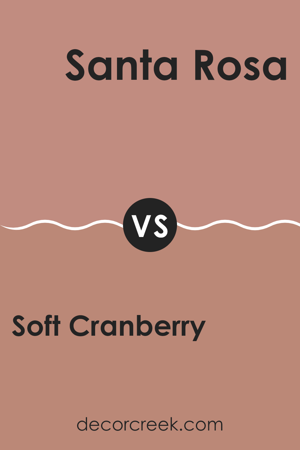
Soft Cranberry 2094-40 by Benjamin Moore vs Santa Rosa 1189 by Benjamin Moore
Soft Cranberry and Santa Rosa by Benjamin Moore are two distinct colors that bring unique vibes to any room. Soft Cranberry has a vibrant, rich tone that resembles the deep, reddish-pink hue of cranberry fruit. This color is lively and warm, making it great for rooms where you want to add a cozy, inviting atmosphere.
On the other hand, Santa Rosa is a more subdued shade. It is a muted blend of beige and pink, offering a softer, more neutral appearance. This color is perfect for creating a calm, understated look in a room, and it pairs well with a variety of decor styles and other colors.
While Soft Cranberry injects energy and warmth into a room, Santa Rosa provides a gentle, soothing backdrop. Both colors offer their own unique appeal, depending on what mood or style you’re aiming to achieve in your decorating project.
You can see recommended paint color below:
- 1189 Santa Rosa (CHECK A SAMPLE)
Soft Cranberry 2094-40 by Benjamin Moore vs Foxy Brown 1181 by Benjamin Moore
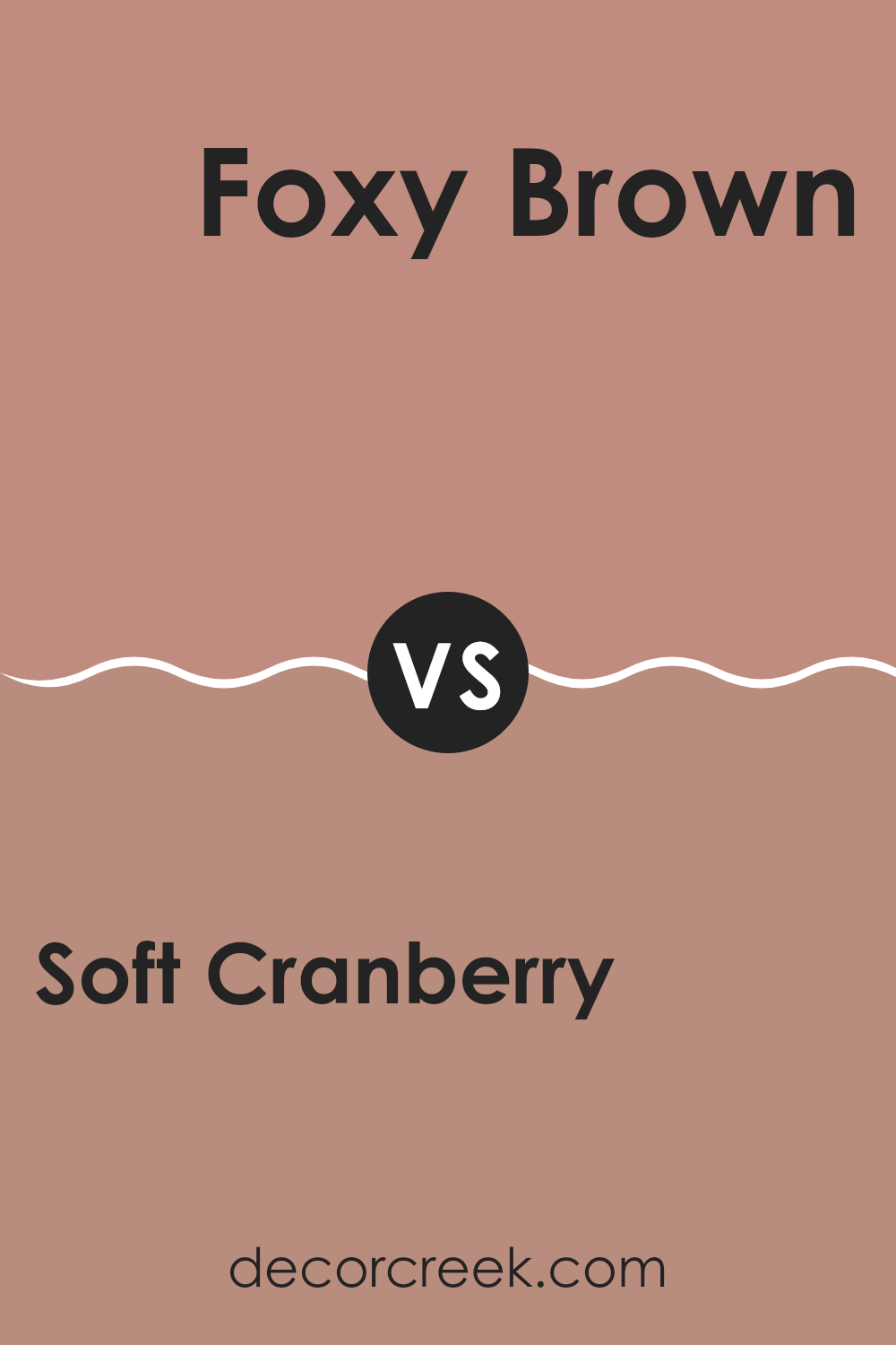
Soft Cranberry is a warm red with a cozy, rich hue that makes any room feel comfortable and inviting. It’s ideal for areas where you want a touch of vibrancy without feeling too intense on the senses. On the other hand, Foxy Brown is a deep, rich brown that offers a strong sense of earthiness and grounding. It’s a color that pairs well with many other shades, providing a solid base in a color scheme.
When comparing the two, Soft Cranberry tends to add more energy to a room because of its red tones, while Foxy Brown brings a more subdued, stabilizing effect due to its darker, richer brown tones.
Both colors offer their own unique charm and can strongly influence the mood and style of a room. Depending on what atmosphere you want to create, either could be the perfect choice. Soft Cranberry might be better suited for a lively, dynamic area, whereas Foxy Brown would work well in a room meant for relaxation and grounding.
You can see recommended paint color below:
- 1181 Foxy Brown
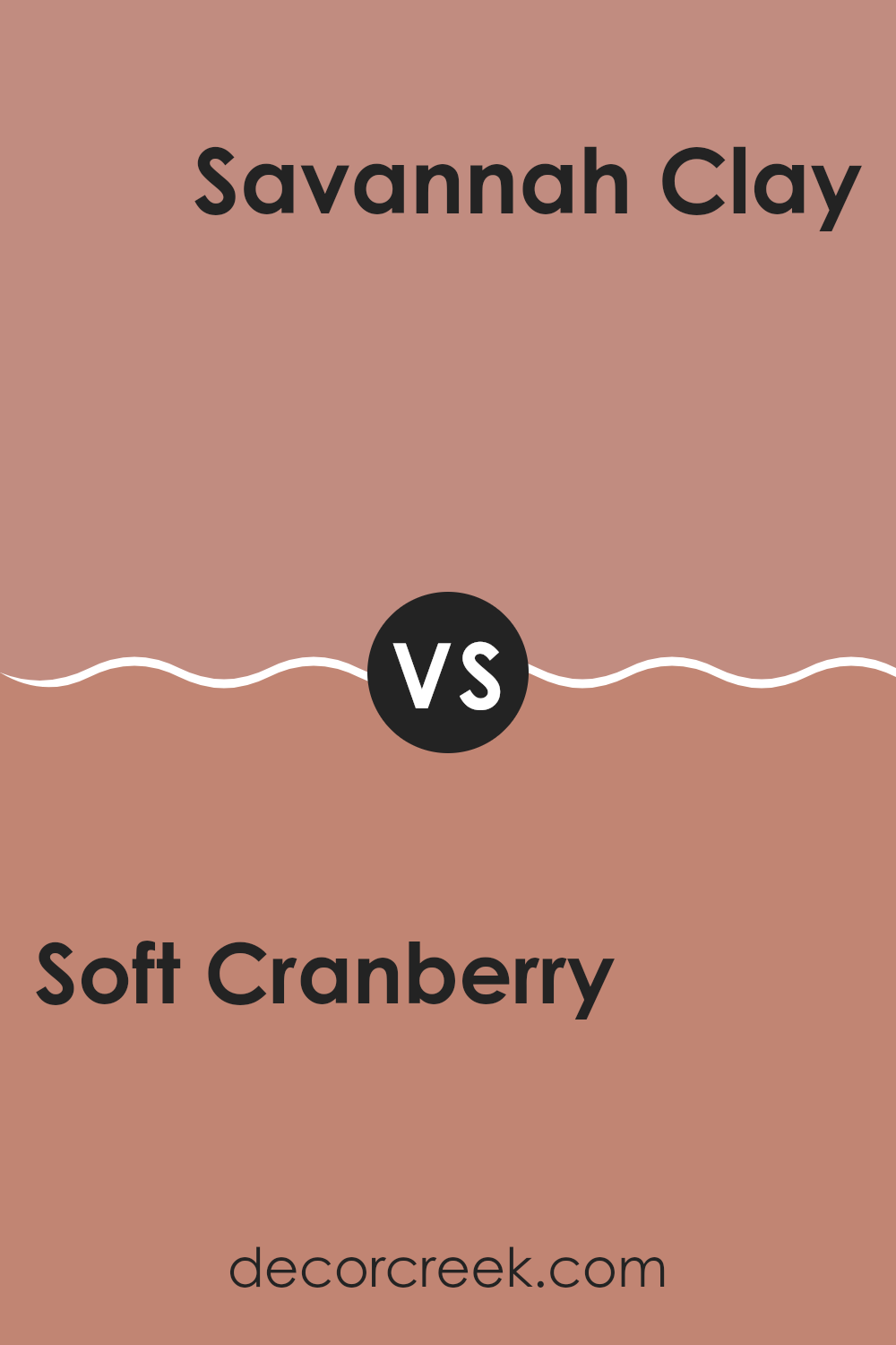
Soft Cranberry 2094-40 by Benjamin Moore vs Savannah Clay 047 by Benjamin Moore
Soft Cranberry and Savannah Clay are two unique shades from Benjamin Moore. Soft Cranberry has a rich, deep pink tone with a touch of red, giving it a warm and cozy feel. It’s perfect for adding a vibrant pop to small rooms or creating a welcoming atmosphere in larger areas.
On the other hand, Savannah Clay features a muted orange with earthy undertones, conveying a rustic and homey vibe. It’s great for those looking to add a subtle yet inviting color to their room, complementing natural elements like wood or stone.
When comparing these two, Soft Cranberry stands out with its brighter and more lively appearance, while Savannah Clay leans toward a softer, more laid-back look. Together, they offer options for those who want to bring warmth to their rooms, with Soft Cranberry feeling more dramatic and Savannah Clay providing a gentler touch.
You can see recommended paint color below:
- 047 Savannah Clay (CHECK A SAMPLE)
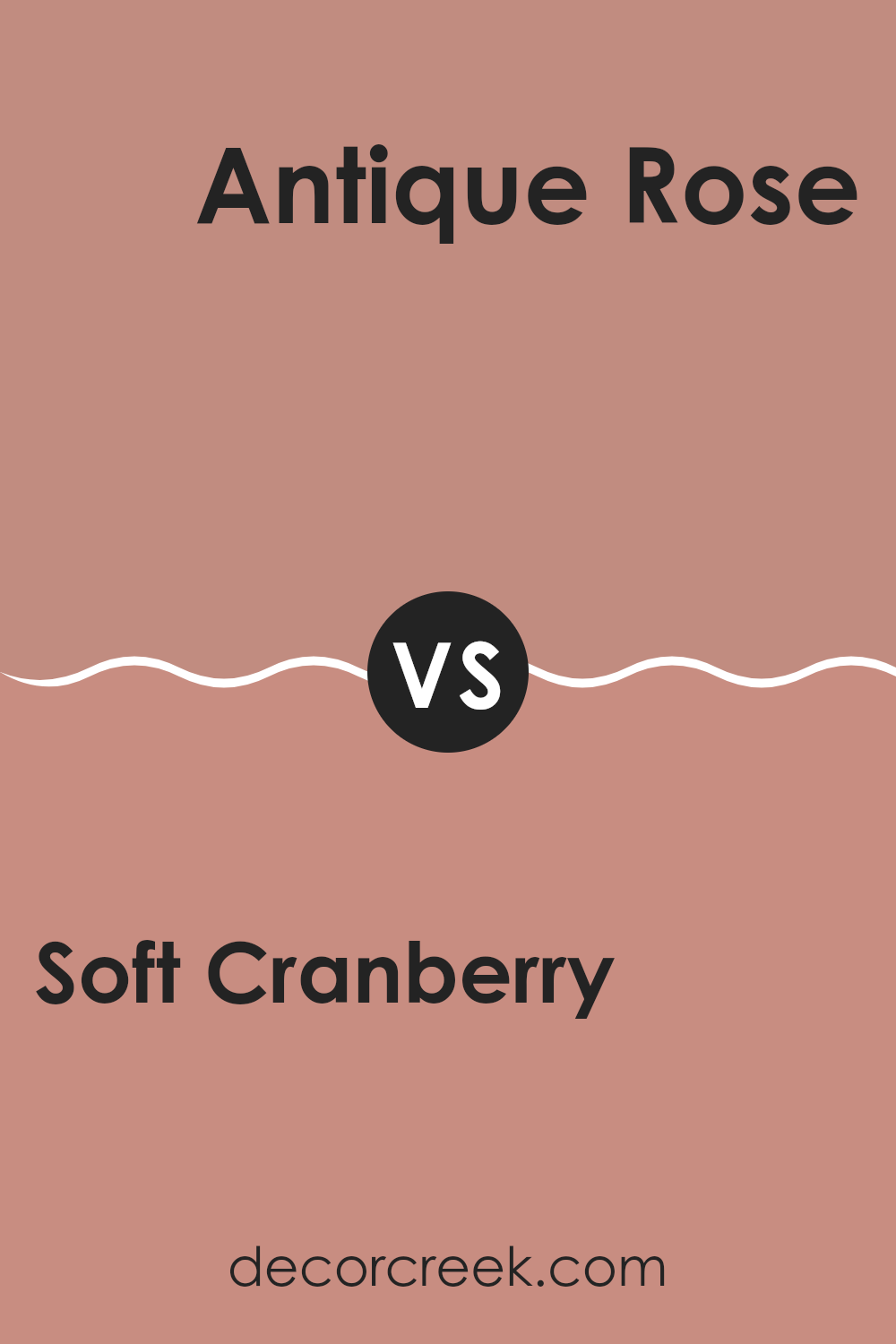
Soft Cranberry 2094-40 by Benjamin Moore vs Antique Rose 2173-40 by Benjamin Moore
The Soft Cranberry color is a warm, muted shade that closely resembles the soft tones of a ripe cranberry fruit. It gives off coziness and can make a room feel welcoming and comfortable. On the other hand, Antique Rose is a more subdued, dusky pink with a touch of warmth that gives it a charming, old-fashioned feel. This color is also quiet and comforting, but leans more toward a classic, nostalgic vibe.
When placed side by side, Soft Cranberry presents a slightly bolder hue, while Antique Rose appears more understated. Soft Cranberry might be a better choice for those looking to add a bit of warmth and subtle energy to a room without feeling too intense. In contrast, Antique Rose is ideal for someone seeking a gentle, soothing presence in their decor that pairs well with vintage elements and natural materials.
Overall, both colors offer their own appeal, with Soft Cranberry providing a stronger presence and Antique Rose offering a softer touch. Each can create a cozy atmosphere, just in slightly different ways.
You can see recommended paint color below:
- 2173-40 Antique Rose (CHECK A SAMPLE)
After reading about the 2094-40 Soft Cranberry paint by Benjamin Moore, I’m really impressed! This paint color is like a gentle hug for your room. It’s a warm, cozy red that feels like sitting by a fire or enjoying a slice of pie. It’s not too bright, but has just enough cheer to make a room feel welcoming.
People use this paint because they want something that feels both comfy and happy. Whether you’re painting your living room or just a little corner where you like to read, Soft Cranberry can make it feel special. It works well in many places and with different decorations, which makes it really useful.
Also, Benjamin Moore is known for making paint that sticks well and looks good for a long time. This means you won’t have to repaint often; the color stays beautiful and does not get boring.
So, if someone is thinking about giving their home a new look, Soft Cranberry is a great choice. It adds warmth, cheer, and a touch of nature’s beauty to any wall it covers. Thumbs up from me!
Ever wished paint sampling was as easy as sticking a sticker? Guess what? Now it is! Discover Samplize's unique Peel & Stick samples.
Get paint samples


