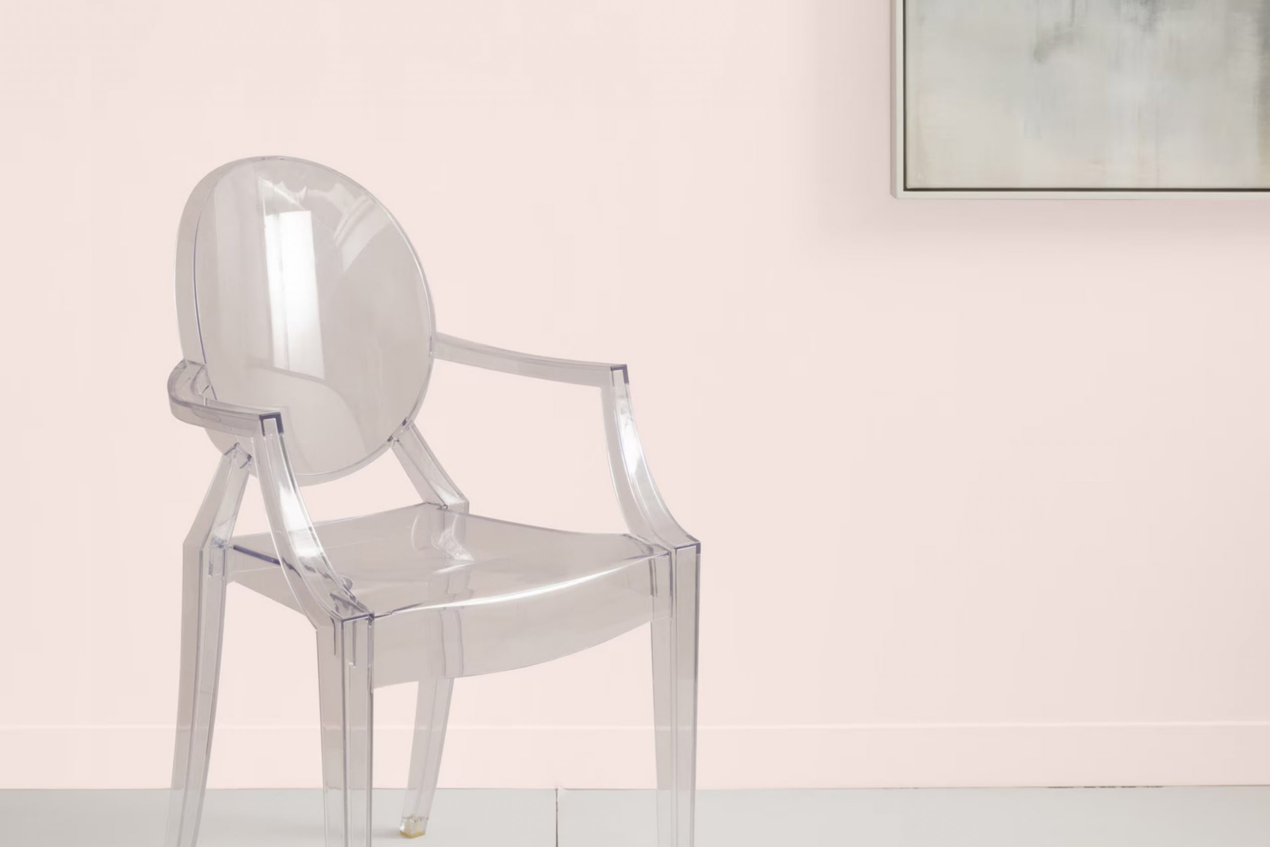
There’s something special about 2094-70 Mellow Pink by Benjamin Moore. When you start considering this color for your room, you’ll notice how it instantly brings a sense of calm and warmth. Mellow Pink isn’t just another shade; it has an inviting quality that makes a room feel both cozy and elegant at the same time.
Whether you’re thinking of giving your bedroom a soft touch or adding a gentle hue to your office, this color seems to strike the perfect balance. It’s subtle enough not to be too much but has enough character to make a room feel thoughtfully designed.
Its soft tones create an environment where you can relax after a long day or find inspiration for new ideas. You might imagine Mellow Pink blending seamlessly with natural textures and soft lighting, crafting an atmosphere that feels both peaceful and inspiring.
Whether you’re planning a large renovation or a small update, Mellow Pink could be that touch of color that ties everything together.
What Color Is Mellow Pink 2094-70 by Benjamin Moore?
Mellow Pink by Benjamin Moore is a warm, inviting shade that brings a gentle touch to any room. This soft pink doesn’t overpower, but instead offers a delicate hint of color that can brighten a room without being too intense. It carries an understated elegance that makes it easy to use and approachable.
This color works beautifully in interior styles such as shabby chic, romantic, and vintage. Mellow Pink provides a lovely backdrop in a French country setting, adding warmth and comfort. In a bohemian style room, it can complement vibrant textiles and eclectic accessories, while offering a subtle grounding element.
When pairing Mellow Pink with materials and textures, consider using light, natural woods like birch or pine to bring out its warmth. White or cream accents can enhance its softness. Textures such as linen and cotton can emphasize the color’s cozy and welcoming nature. Additionally, metals like brass or gold can create a charming contrast, bringing a touch of sophistication.
Incorporate Mellow Pink in bedrooms, nurseries, or living rooms where a gentle, calming atmosphere is desired. Accessorize with soft throws and cushions in matching or complementary tones to make the room feel more inviting and harmonious.
Is Mellow Pink 2094-70 by Benjamin Moore Warm or Cool color?
Mellow Pink 2094-70 by Benjamin Moore is a soft, inviting shade of pink. This color brings a gentle warmth to any room. It can be used in various rooms throughout the home. In bedrooms, it creates a cozy and calming atmosphere, making it a perfect choice for a restful environment.
When used in living rooms, it adds a touch of warmth and can make the room feel more inviting for guests. In terms of pairing, Mellow Pink works well with neutral colors like white, beige, or gray. It can also complement deeper tones like navy or green for a bolder look.
This color is ideal for adding a subtle pop of color without being too much. Furthermore, using Mellow Pink on an accent wall or in accessories such as pillows and throws can bring a sense of unity to your home decor. Overall, it is a gentle and warm color choice.
Undertones of Mellow Pink 2094-70 by Benjamin Moore
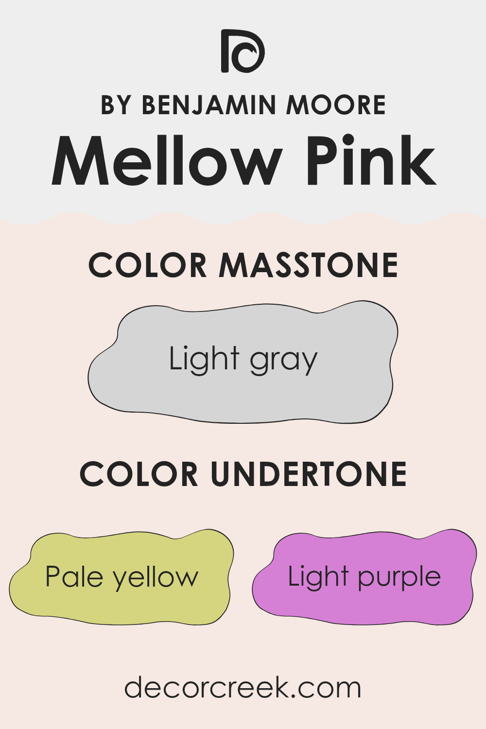
Mellow Pink by Benjamin Moore, numbered 2094-70, is a delicate and soft hue with an interesting mix of undertones. These undertones include pale yellow, light purple, light blue, pale pink, mint, lilac, and gray. Each undertone subtly influences how we perceive this color, adding depth and warmth or coolness.
Undertones are the colors that lie beneath the main color, affecting whether a paint appears warm or cool. For example, a pink with yellow undertones may feel warmer, while one with blue undertones can seem cooler. In the case of Mellow Pink, the pale pink gives a soft, gentle feel, while the gray undertone adds a touch of sophistication and neutrality, balancing the warmth from the yellow and mint tones.
When used on walls, these undertones can change depending on lighting and adjacent colors. The lilac and light purple can add a subtle elegant vibe, while the mint provides freshness. Light plays a crucial role; in natural daylight, the color may appear brighter and warmer, while under artificial light, the blue and gray undertones might become more prominent, providing a cooler, more muted appearance.
This makes Mellow Pink an adaptable color that can create a cozy or slightly fresh atmosphere depending on the setting.
What is the Masstone of the Mellow Pink 2094-70 by Benjamin Moore?
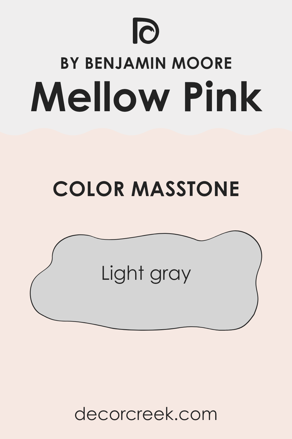
Mellow Pink 2094-70 by Benjamin Moore is a soft, gentle color that brings a subtle warmth to rooms. Though its name suggests a stronger pink, its masstone, which is light gray (#D5D5D5), tempers the hue, resulting in a muted, calming shade of pink.
The light gray undertone helps the color to adapt to different lighting situations. In well-lit rooms, Mellow Pink can appear bright and uplifting, adding a gentle touch of color without overpowering the room. In dimmer rooms, the gray undertone becomes more prominent, giving the room a cozier and more soothing feel.
This makes Mellow Pink suitable for a variety of settings, from living rooms to bedrooms, offering an easy option for those seeking to create a relaxed environment. The balance between pink and gray allows it to blend well with neutrals and natural materials, enhancing the overall harmony of the home.
How Does Lighting Affect Mellow Pink 2094-70 by Benjamin Moore?
Lighting plays a crucial role in how we perceive colors in any room. The color Mellow Pink by Benjamin Moore, like all colors, will look different under various lighting conditions. Let’s see how this shade reacts in artificial and natural lighting, and how it appears in rooms facing different directions.
Under artificial light, the appearance of Mellow Pink can vary widely depending on the type of bulbs used. Incandescent bulbs typically emit a warm, yellowish light, which can enhance the warm tones in Mellow Pink, making it appear cozier and slightly more saturated. In contrast, fluorescent or LED lights with a cooler or neutral tone might make the pink look a little flatter or subdued, as they can wash out some of the color’s warmth.
In natural light, Mellow Pink takes on different characteristics depending on where the light is coming from. In north-facing rooms, the light tends to be cooler and softer, which might make Mellow Pink appear a bit more muted and cooler due to the lack of direct sunlight. This can be great if you want to tone down the pink’s intensity.
In south-facing rooms, the abundant sunlight adds warmth and brightness throughout the day. This can make Mellow Pink glow with its full color depth, looking vibrant and lively. The direct sunlight can bring out the richness, making the pink seem more cheerful and energetic.
East-facing rooms have soft, warm light during the morning and cooler light later. In the morning, Mellow Pink may appear warmer and softer, creating a gentle, inviting atmosphere. As the day progresses, the color can seem less intense.
Meanwhile, west-facing rooms receive warm evening light, which enhances the warm tones of Mellow Pink, making it richer and more inviting in the afternoon and evening hours, especially as the sun sets. Each lighting condition can dramatically change the room’s mood with this shade.
What is the LRV of Mellow Pink 2094-70 by Benjamin Moore?
Light Reflectance Value, or LRV, is a measure used to indicate how much light a color reflects. The scale goes from 0, which means no light is reflected (pure black), to 100, which means all light is reflected (pure white). Paint colors with higher LRV are brighter and reflect more light, making rooms feel more open and airy.
On the other hand, colors with lower LRV absorb more light, giving a room a cozier and more intimate feel. LRV is important when choosing paint colors because it influences how a color will look in different lighting conditions and how it will affect the perception of room size and brightness.
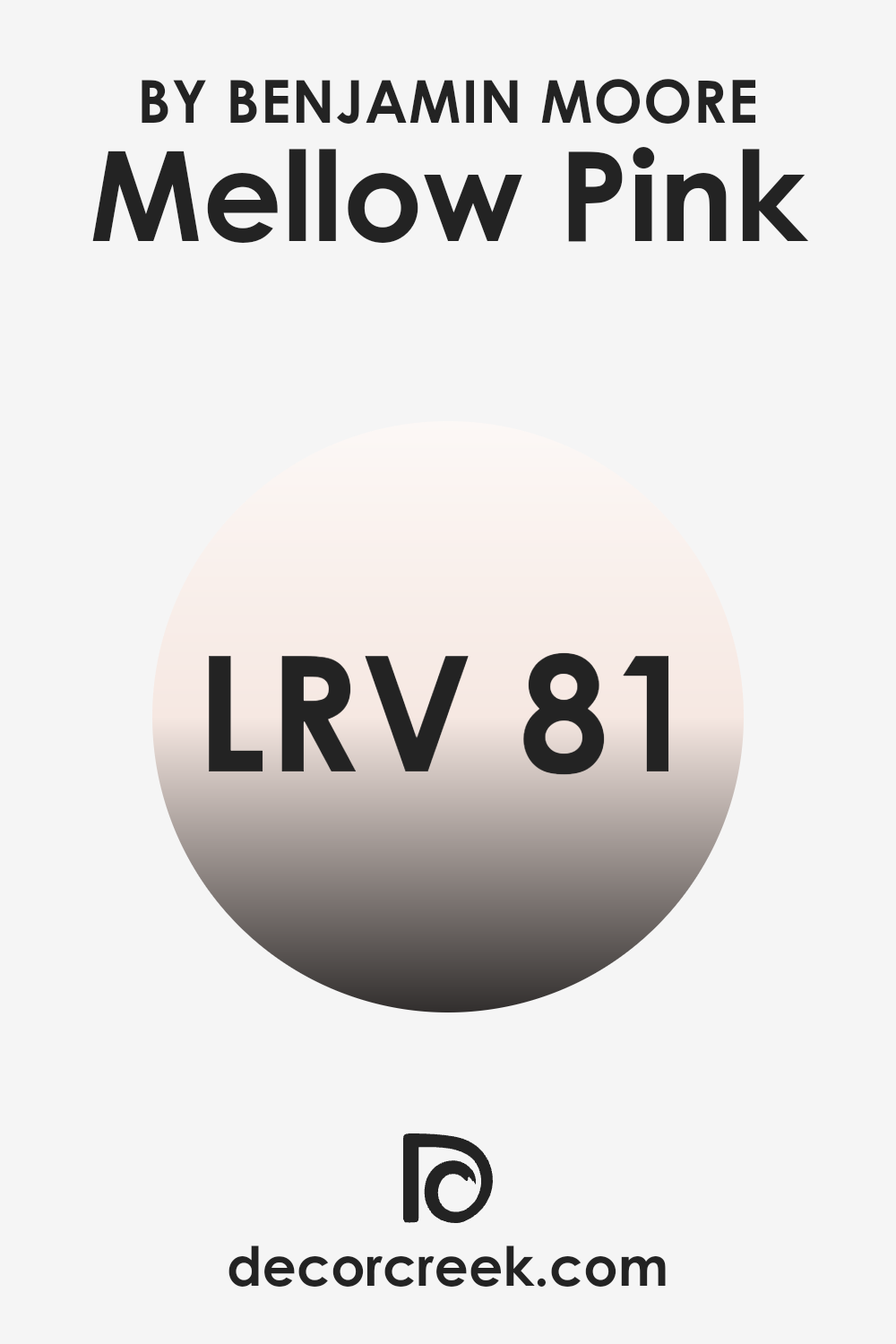
For Mellow Pink with an LRV of 80.76, this means it is a very light color that reflects a lot of light. When applied to walls, it will help make the room feel brighter and more spacious. High LRV colors like this one can be particularly beneficial in rooms that do not receive much natural light, as they can help counteract dullness and bring a sense of lightness to the environment.
In a room with plenty of natural light, it will amplify that brightness, creating a vivid and lively atmosphere. Overall, its high LRV makes it a suitable choice if you want your room to feel fresh and illuminated.
Coordinating Colors of Mellow Pink 2094-70 by Benjamin Moore
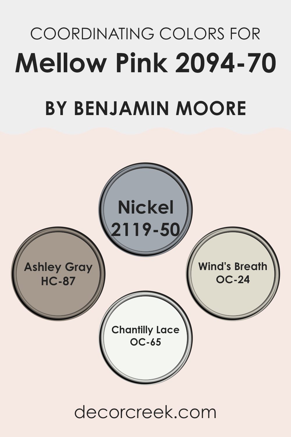
Coordinating colors are colors that work harmoniously together to create a balanced and pleasing look in a room. When selecting coordinating colors for a shade like Mellow Pink, the aim is to find hues that complement its gentle, rosy tones. The colors Nickel, Ashley Gray, Wind’s Breath, and Chantilly Lace from Benjamin Moore work wonderfully with Mellow Pink to bring both depth and softness to any room.
Nickel, a medium gray with subtle blue undertones, provides a cool contrast that can add a modern touch to the warmth of Mellow Pink. Ashley Gray is a warm, neutral taupe that pairs perfectly with pink, giving a cozy and inviting feel.
On the lighter side, Wind’s Breath introduces a soft, creamy beige that enhances the lightness of Mellow Pink, creating an airy and relaxed atmosphere. Chantilly Lace, a bright and crisp white, offers a clean backdrop, reflecting light beautifully and giving the additional colors room to stand out. Together, these coordinating colors can create a cohesive and visually appealing palette. Whether used in a living room, bedroom, or any other room, these hues ensure a harmonious blend that enhances the overall aesthetic without overpowering the pink’s gentle charm.
You can see recommended paint colors below:
- 2119-50 Nickel
- HC-87 Ashley Gray
- OC-24 Wind’s Breath
- OC-65 Chantilly Lace
What are the Trim colors of Mellow Pink 2094-70 by Benjamin Moore?
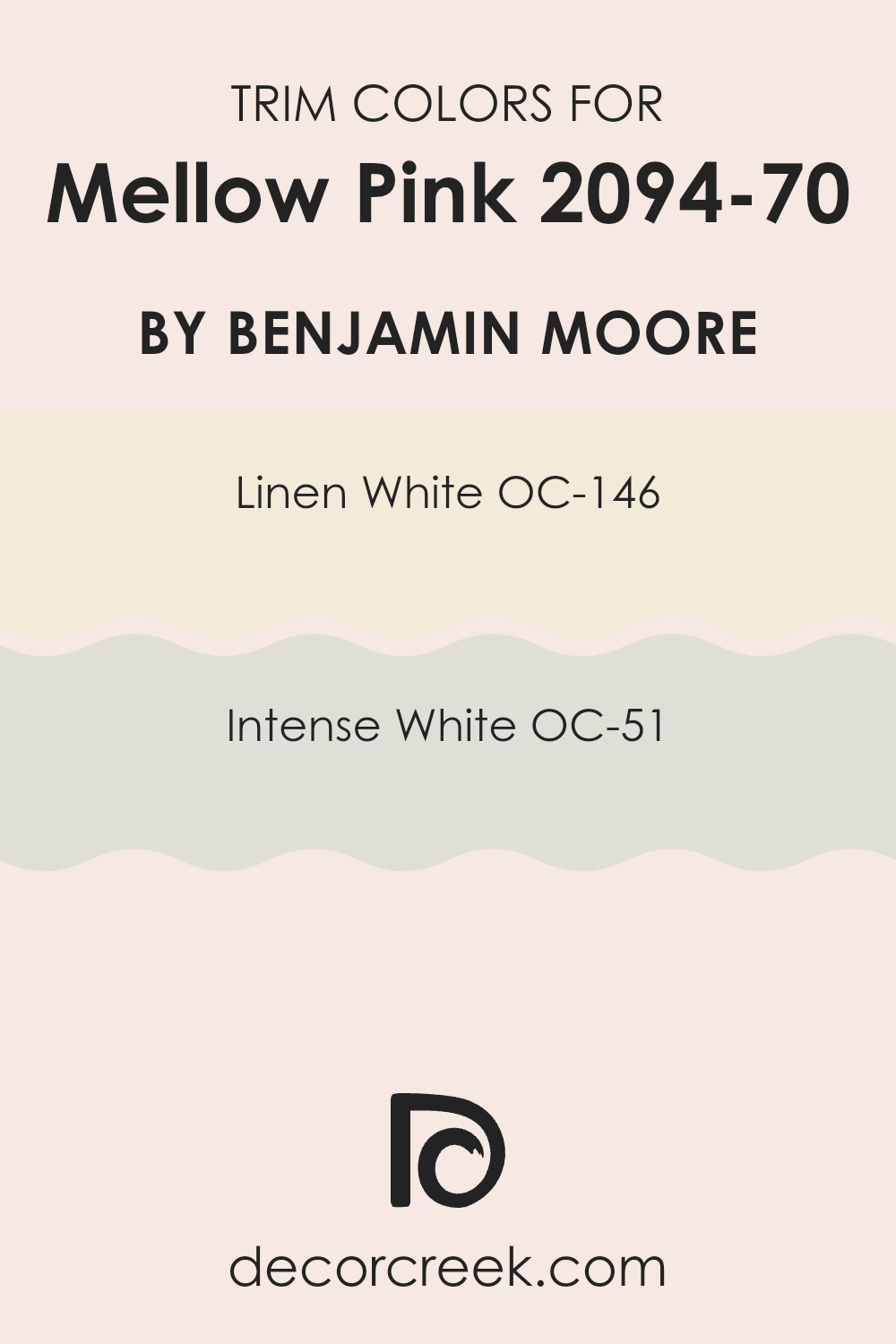
Trim colors are the subtle, yet significant hues used to highlight edges like window frames, baseboards, and moldings, providing a polished look to any room. When it comes to the soft and gentle nature of Mellow Pink 2094-70 by Benjamin Moore, choosing the right trim color can make a huge difference. Using trim colors like OC-146 Linen White or OC-51 Intense White can enhance the warmth and charm of Mellow Pink.
Linen White, known for its creamy undertones, complements the rosy tones, creating a warm and inviting atmosphere. Meanwhile, Intense White offers a touch of soft gray undertones, which tend to add a cooler contrast that can balance the softness of Mellow Pink while maintaining a harmonious feel.
Trim colors are important as they define and frame the room, drawing attention to architectural details and giving a finished look that enhances the entire room. Pairing Mellow Pink with these white shades helps ensure the room feels balanced without overpowering the gentle pink color. Linen White often exudes a cozy, classic vibe that melds well with pink, making rooms feel cozy but light.
Intense White provides a modern touch, delivering a crisp and clean appearance while still being understated enough not to overshadow Mellow Pink. Both options serve to highlight Mellow Pink’s innate soothing qualities in unique ways, offering flexibility depending on the desired environment feel.
You can see recommended paint colors below:
- OC-146 Linen White
- OC-51 Intense White
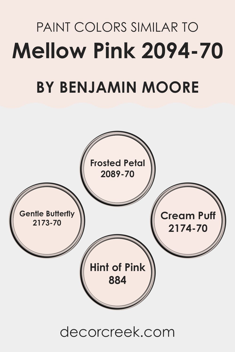
Colors Similar to Mellow Pink 2094-70 by Benjamin Moore
Similar colors are important because they create a harmonious and cohesive look, which can be pleasing to the eye. When you use colors that are close in tone and hue, like those akin to Mellow Pink, they can complement one another, providing a smooth flow between elements in a room.
This subtle blending can produce a calming effect, as there aren’t any stark contrasts that might otherwise grab attention or feel jarring. Such color schemes can induce feelings of warmth and comfort, helping a room feel more unified and intentionally designed.
Frosted Petal offers a soft and gentle pink that lightly whispers feelings of grace and subtle beauty. Gentle Butterfly comes with a delicate approach, bringing in a touch of pale warmth that enhances lightness and airiness in a setting. Cream Puff extends a cozy, creamy undertone that provides a gentle balance and adds to the softness of the palette. Lastly, Hint of Pink nudges a whisper of color into a room, subtly enhancing the overall ambiance without overpowering the room. These shades work together as a team, each adding their own slight twist, yet coming together seamlessly to create an inviting and cohesive environment.
You can see recommended paint colors below:
- 2089-70 Frosted Petal
- 2173-70 Gentle Butterfly
- 2174-70 Cream Puff
- 884 Hint of Pink
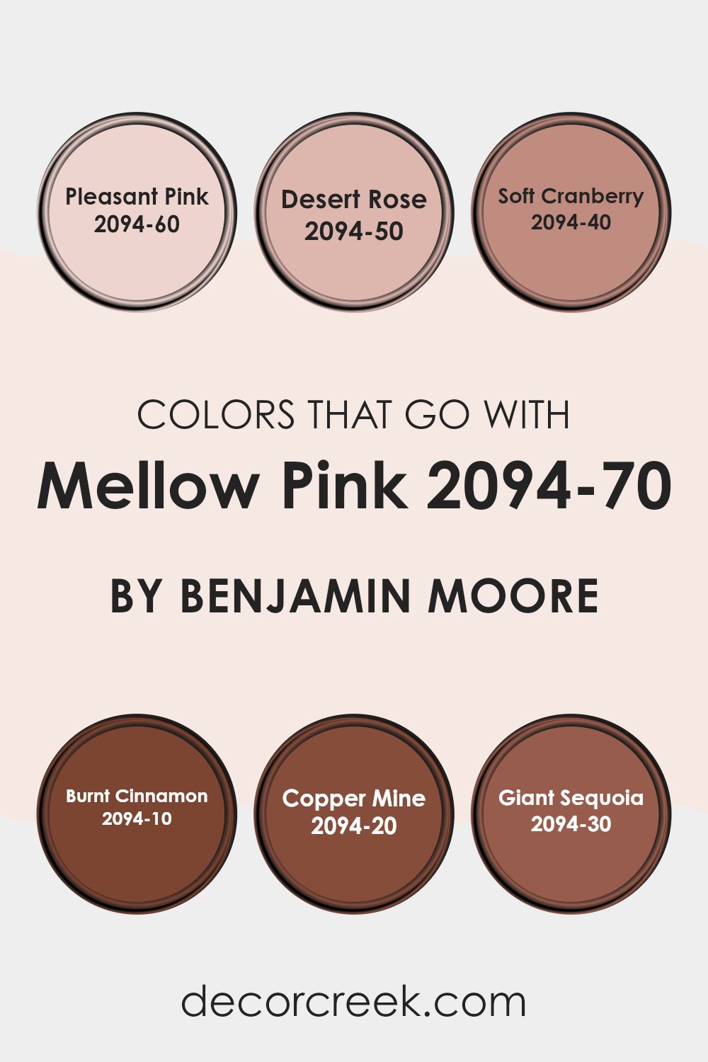
Colors that Go With Mellow Pink 2094-70 by Benjamin Moore
Choosing the right colors to pair with Mellow Pink 2094-70 by Benjamin Moore can make a room feel well-balanced and harmonious. Each complementary color has its unique charm and contributes to creating the overall atmosphere. Pleasant Pink 2094-60 is a soft, warm pink that pairs seamlessly with Mellow Pink, adding a touch of gentle elegance.
Desert Rose 2094-50 brings in a slightly richer tone, providing depth and interest without overpowering the room. Together, these pink shades create a cohesive and comforting environment that feels welcoming.
Soft Cranberry 2094-40 is a deeper, more pronounced color that adds dimension and contrast. It can enhance the subtler hues by providing a strong focal point. Burnt Cinnamon 2094-10 introduces a warm, earthy tone, grounding the softer shades and adding a cozy touch. Copper Mine 2094-20 and Giant Sequoia 2094-30 bring in rich, natural shades inspired by nature.
Copper Mine has a metallic warmth that pairs beautifully with pinks, while Giant Sequoia offers a solid, deep hue reminiscent of tree bark. Together, these colors create a room that feels balanced, with each hue complementing and enhancing the others, resulting in a comforting, aesthetically pleasing environment.
You can see recommended paint colors below:
- 2094-60 Pleasant Pink
- 2094-50 Desert Rose
- 2094-40 Soft Cranberry
- 2094-10 Burnt Cinnamon
- 2094-20 Copper Mine
- 2094-30 Giant Sequoia
Mellow Pink 2094-70 by Benjamin Moore Color Palette
Mellow Pink brings a light, gentle sweetness that feels bright, comforting, and uplifting. This palette enhances that tender charm with warm whites, grounding accents, and cool supportive tones. Cloud White, White Dove, and Simply White brighten the palette with soft clarity, helping Mellow Pink feel airy and delicate.
Cool Mint adds a refreshing counterpoint that gives the palette a playful, cheerful balance. Light Pewter offers a subtle gray warmth that softens the palette and adds calmness.
Hale Navy provides rich contrast, strengthening the palette with depth that keeps the pink from feeling too light or sugary.
Kendall Charcoal deepens that contrast further, grounding the palette with a steady, confident edge.
Together, the colors create a palette that feels spirited yet balanced, making it ideal for bedrooms, nurseries, creative spaces, and cozy corners where warmth and joy feel natural. The mix of gentle pink, soft whites, and deep accents gives the palette movement, charm, and easy warmth.

How to Use Mellow Pink 2094-70 by Benjamin Moore In Your Home?
Mellow Pink 2094-70 by Benjamin Moore is a soft and soothing shade that adds a gentle touch to any room. This light pink color is perfect for creating a warm and inviting atmosphere in your home. It works well in bedrooms, nurseries, or living areas where you want a calm and cozy feel.
You can pair it with neutral tones like whites and grays to keep the look fresh and clean. In a bedroom, Mellow Pink can be used on all the walls for a cohesive look, or as an accent wall behind the bed for a subtle pop of color.
Add matching textiles, like cushions or throws, to tie the room together. In a nursery, this hue creates a sweet and comforting environment for a baby. In the living room, you can use Mellow Pink for painting trim or furniture pieces to add a hint of color without making the room feel too strong.
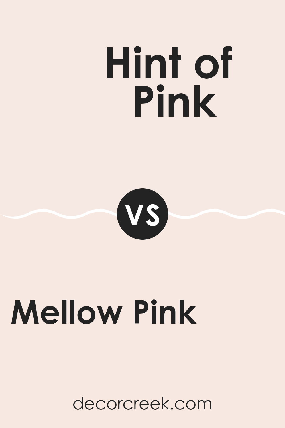
Mellow Pink 2094-70 by Benjamin Moore vs Hint of Pink 884 by Benjamin Moore
Mellow Pink 2094-70 by Benjamin Moore is a gentle, soft pink with a subtle warmth. It has a slightly dusty undertone, which gives it a more mature and refined look without being too bold. This makes it a good choice for creating a cozy and welcoming room.
On the other hand, Hint of Pink 884 by Benjamin Moore is an even lighter shade. It’s almost an off-white with just a whisper of pink. This color gives a room an airy and clean feel, providing just a touch of warmth without being too much. It’s perfect for those who want a very subtle hint of color in their room.
Both colors offer a peaceful and inviting atmosphere, but Mellow Pink leans more towards a noticeable pink, while Hint of Pink is extremely understated. Choosing between them depends on whether you want your room to clearly showcase pink or have merely the slightest hint of it for a fresh look.
You can see recommended paint color below:
- 884 Hint of Pink
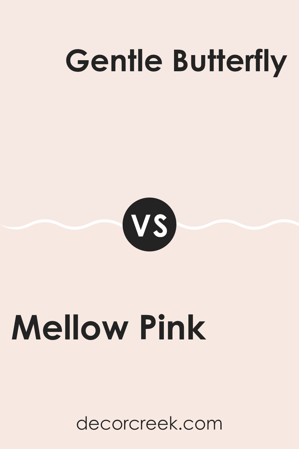
Mellow Pink 2094-70 by Benjamin Moore vs Gentle Butterfly 2173-70 by Benjamin Moore
Mellow Pink 2094-70 by Benjamin Moore is a soft, gentle shade with a warm, pinkish hue. It has a comforting and cozy feel, making it ideal for bedrooms or rooms where you want a calm atmosphere. It provides a gentle touch of color that isn’t overpowering, creating a soothing environment.
On the other hand, Gentle Butterfly 2173-70 by Benjamin Moore is a light, creamy yellow. This color brings a sense of warmth and cheerfulness to a room. It’s reminiscent of sunshine filtering through curtains, adding a bright and airy feel to any room.
When comparing the two, Mellow Pink offers a more subdued, calming effect, while Gentle Butterfly introduces a touch of light and energy. Both colors are soothing, but Gentle Butterfly has a hint of playfulness compared to the more relaxed nature of Mellow Pink. Together, they can complement each other, adding balance and harmony to interiors.
You can see recommended paint color below:
- 2173-70 Gentle Butterfly
Mellow Pink 2094-70 by Benjamin Moore vs Frosted Petal 2089-70 by Benjamin Moore
Mellow Pink 2094-70 and Frosted Petal 2089-70, both by Benjamin Moore, are soft and gentle colors that bring a calm atmosphere to any room. Mellow Pink is a subtle, warm pink that adds a touch of warmth and comfort.
It works well in living rooms or bedrooms, creating a cozy and inviting feel. On the other hand, Frosted Petal is a cooler, paler pink with a hint of lavender. This color adds a light and airy feel, making rooms appear brighter and more open.
While Mellow Pink leans toward a peachy undertone, Frosted Petal presents a cooler, more subdued vibe. Choosing between them depends on whether you prefer the gentle warmth of Mellow Pink or the fresh coolness of Frosted Petal. Both colors are soft and pretty, offering different moods for your home.
You can see recommended paint color below:
- 2089-70 Frosted Petal
Mellow Pink 2094-70 by Benjamin Moore vs Cream Puff 2174-70 by Benjamin Moore
Mellow Pink 2094-70 by Benjamin Moore is a soft and calming shade of pink. It’s gentle on the eyes and creates a warm and welcoming atmosphere in a room. This color is ideal for rooms where you want a touch of subtle color without being too much. It works well in bedrooms or living rooms where relaxation is key.
On the other hand, Cream Puff 2174-70 by Benjamin Moore is a light and airy cream color. It exudes a sense of freshness and cleanliness, making it perfect for kitchens, bathrooms, or any room where brightness is desired. The cream tone is neutral, allowing it to blend easily with a variety of other colors.
While Mellow Pink adds a hint of warmth and personality, Cream Puff leans towards a more light and neutral effect. Both colors can be used to impart a unique atmosphere to your home.
You can see recommended paint color below:
- 2174-70 Cream Puff
After diving into the world of 2094-70 Mellow Pink by Benjamin Moore, I’ve come to appreciate its gentle charm. Imagine a soft, delicate shade that feels like a warm hug from a favorite blanket. Mellow Pink isn’t too bright or too dull; it’s just right. It’s like mixing a tiny bit of red with lots of white, creating a color that feels both cozy and welcoming.
This color makes rooms feel happy and comfortable, almost like having a warm light shining in. Whether it’s painting a bedroom or adding a touch to a living room, Mellow Pink helps a place feel friendly and calm. I think this color can be like a friend at home, making every room smile a little more just by being there.
Mixing Mellow Pink with other colors can be really fun. Pair it with whites or soft grays to keep things gentle or add a splash of brighter colors for more cheer. It’s a color that loves to play and blend, always making sure the room feels just right.
In the end, using Mellow Pink feels like adding a touch of kindness and softness to our surroundings. It’s a simple way to make any place feel more like home, with a gentle whisper of pink cheering everyone up.
Ever wished paint sampling was as easy as sticking a sticker? Guess what? Now it is! Discover Samplize's unique Peel & Stick samples.
Get paint samples

