If you’re considering repainting a room or just refreshing your home’s look, Sherwin Williams’ SW 9138 Stardew is a color you might come across. This subtle, adaptable shade of gray-blue has a calming effect, making it perfect for rooms where you want to relax and unwind. Before you decide to go ahead with Stardew, there are a few things you should know.
First, consider the lighting in your room. Stardew can look quite different depending on natural light and the types of bulbs you use. It tends to pull more blue or gray based on these factors. It’s also important to think about the existing colors in your furnishings and decor. Stardew pairs well with a range of hues, but you’ll get the best results if you consider the overall palette.
Lastly, remember that paint can look different once it’s on your walls compared to a color swatch. Trying out a sample first might be a good idea to ensure it’s exactly what you’re looking for.
Choosing the right paint color can be both fun and a bit challenging, but getting it right can really enhance your room.
Is Stardew SW 9138 Right for My Home?
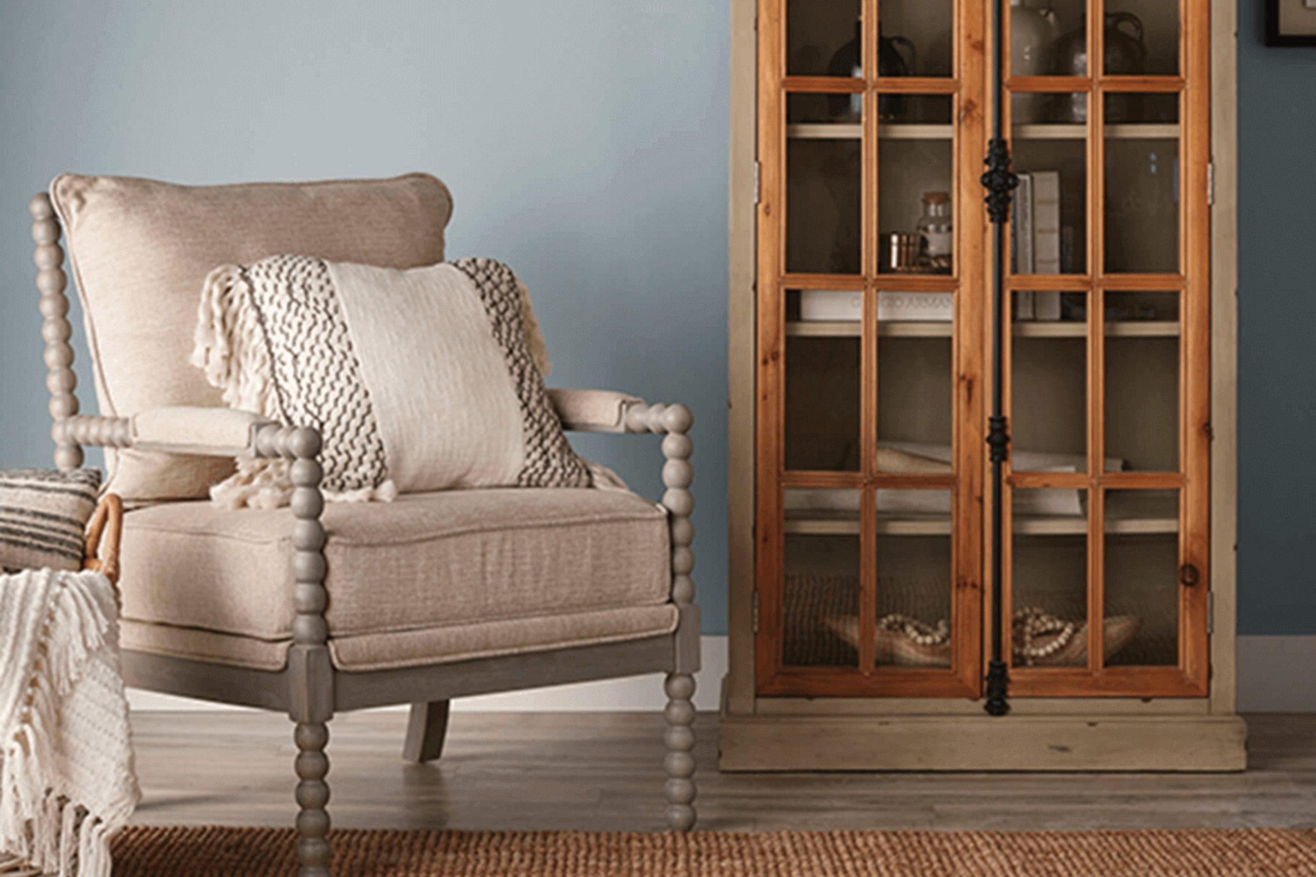
Stardew is a beautiful color that reminds me of a soft, foggy morning sky. It’s a gentle blue with hints of gray, making it a flexible hue that can fit into many different rooms in my home. What really strikes me about this shade is how it can create a peaceful and calming environment, perfect for rooms where I like to relax or focus.
In my experience, Stardew pairs wonderfully with natural materials and textures. I love combining it with light woods like oak and birch to keep the room feeling airy and fresh. It also looks stunning with white accents, which can help brighten the room and create a crisp, clean look. For a more cozy feel, I might add textiles like soft wool throws or linen curtains in neutral colors that complement its subtle undertones.
This color works particularly well in modern and minimalist interior styles due to its clean and understated vibe. However, it’s also beautiful in coastal and Scandinavian designs, where its cool tones harmonize with natural elements and light-colored woods.
Using Stardew in my home has allowed me to create rooms that are not only visually appealing but also incredibly soothing. It’s an easy color to live with and helps craft a welcoming and comfortable atmosphere.
decorcreek.com
What are the right undertones of Stardew SW 9138 ?
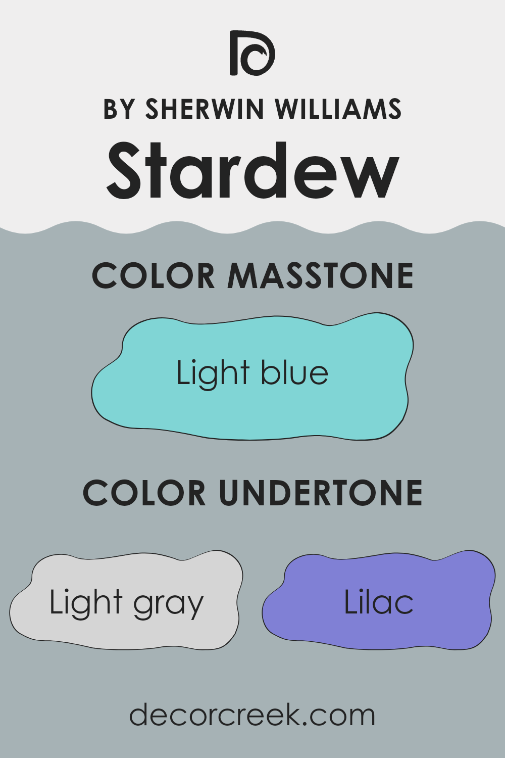
Stardew is an adaptable color known for its calming vibe, making it a popular choice for home interiors. The undertones of a color are subtle hints of other colors that can be seen when the light changes or when the color is placed next to other shades. Undertones significantly influence how we perceive a color because they can enhance different feelings or atmospheres depending on their mixture.
The variety of undertones in Stardew include light gray, lilac, mint, light purple, pale yellow, grey, pale pink, turquoise, blue, light turquoise, and dark turquoise. These undertones can make the color appear warmer or cooler under different lighting conditions, affecting the mood and visual temperature of the room.
For instance, the lilac and light purple undertones add a soft, gentle feel, making a room appear more inviting. On the other hand, mint and turquoise give a fresh and lively hint, ideal for creating a refreshing atmosphere. The presence of grey and light gray helps ground these brighter undertones, ensuring the color maintains a neutral, balanced appearance.
When applied to interior walls, these nuanced undertones play with the light, subtly shifting throughout the day, making Stardew a dynamic yet balanced choice. The inclusion of both warm undertones like pale yellow and cooler ones like blue means the color can effectively pair with various decor styles and color schemes while still maintaining its unique charm.
Overall, the rich spectrum of undertones in Stardew makes it a flexible option that adapts well to different settings and preferences.
decorcreek.com
Best Coordinating Colors to use with Stardew SW 9138 by Sherwin Williams this year.
Coordinating colors are selected shades that complement and enhance each other when used together in a design. They work by creating a harmonious color scheme that can make a room feel more cohesive and planned. Take, for instance, the color Stardew by Sherwin Williams, a soft, muted blue with subtle gray undertones.
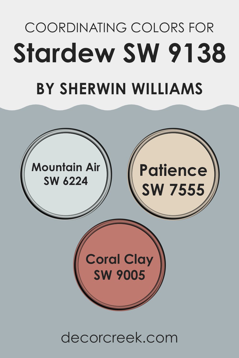
Coordinating colors for Stardew include Mountain Air, Patience, and Coral Clay, each contributing to a balanced and appealing palette. These coordinating colors have been carefully chosen to either contrast with or complement the base color, allowing for adaptable design choices that can accommodate various tastes and styles.
Mountain Air is a gentle, airy blue that nearly mirrors the sky on a clear, sunny day. Its lightness can offer a refreshing counterpoint that emphasizes the depth and subtlety of Stardew. On the other hand, Patience is a warm, sandy beige, almost like a soft whisper of earth tones, adding warmth to the coolness of the primary color, creating a nurturing and inviting atmosphere.
Lastly, Coral Clay introduces a muted coral hue, reminiscent of a sunset, which injects a subtle vibrancy and lift to the scheme, ensuring the overall look is lively yet not intense. Together, these shades harmonize well with Stardew, providing multiple options for creating rooms that feel both cohesive and distinctly designed.
You can see recommended paint colors below:
- SW 6224 Mountain Air
- SW 7555 Patience
- SW 9005 Coral Clay
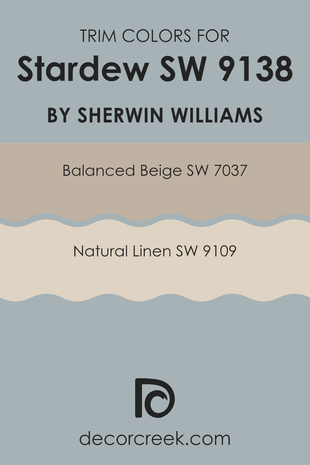
Trendy Trim Colors of Stardew SW 9138 by Sherwin Williams to use this year.
Trim colors are used to accentuate and define the edges or borders of a room, highlighting architectural details like doors, window frames, and baseboards. The selection of a contrasting or complementary trim color can greatly enhance the aesthetic of a room, making architectural features stand out and adding depth to the overall design.
For example, Stardew SW 9138 by Sherwin Williams is a gentle hue that can be beautifully framed by well-chosen trim colors. Trim colors such as Balanced Beige SW 7037 and Natural Linen SW 9109 are especially effective in bringing a polished yet subtle contrast to Stardew SW 9138, enhancing both its presence and appeal in any room.
Balanced Beige SW 7037 is a warm and welcoming color, providing a soothing backdrop that works well in many settings. This beige tone is flexible and unassuming, making it an excellent choice for trim, giving depth to lighter wall colors without overpowering the room’s general ambiance.
On the other hand, Natural Linen SW 9109 offers a slightly lighter and crisper feel, which helps to brighten rooms and create a soft, clean look when used as trim. It pairs nicely with a variety of wall colors, including the gentle tones of Stardew, providing a discreet yet effective enhancer to the room’s overall color scheme.
You can see recommended paint colors below:
- SW 7037 Balanced Beige
- SW 9109 Natural Linen
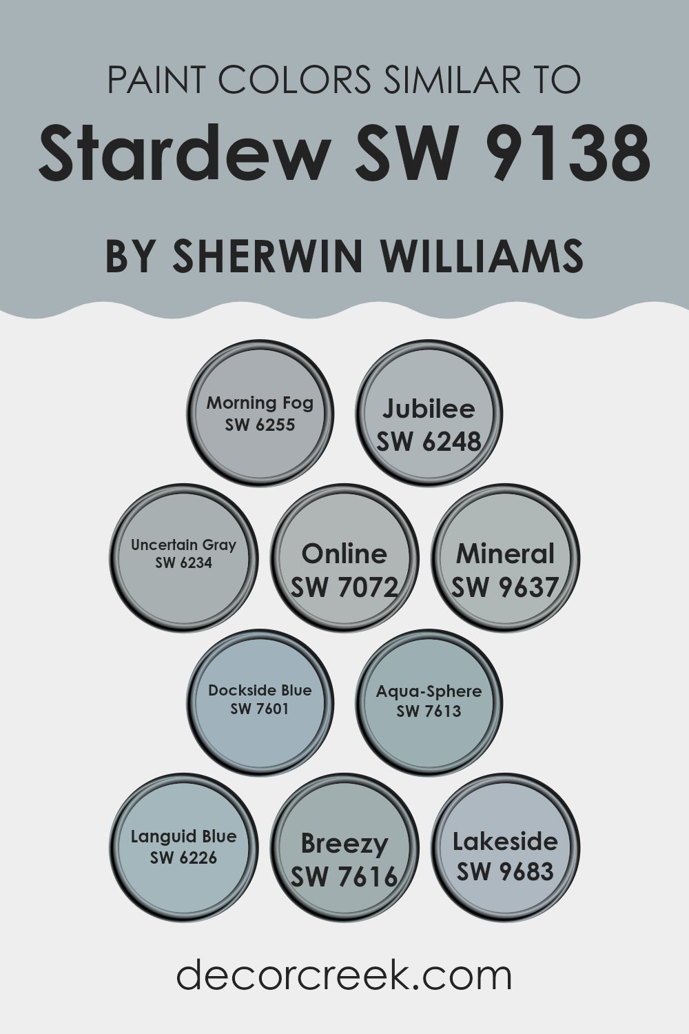
Evergreen Colors Similar to Stardew SW 9138 by Sherwin Williams
Similar colors play a crucial role in creating a harmonious and cohesive look in any design by effortlessly blending with each other while maintaining a subtle difference that adds depth and interest.
For instance, colors like Morning Fog and Jubilee, which are similar hues of gray, work well together by providing a soothing and neutral backdrop that can easily be accented with bolder colors. On the other hand, shades like Uncertain Gray and Online help create a layered effect when used alongside each other, enhancing the aesthetic of a room without overpowering it with contrast.
Furthermore, colors like Mineral and Dockside Blue add a touch of calm and understated charm, making them perfect for rooms meant to relax and soothe. Aqua-Sphere and Languid Blue tie in beautifully with natural elements and are ideal for bathrooms or bedrooms looking to achieve a fresh and airy feel.
Breezy and Lakeside lead the way in creating an inviting and comfortable setting, with their soft, almost pastel-like tones that mimic the gentle appearance of the sky and the water. Each of these colors, while similar, holds its own unique character, allowing for flexibility and creativity in decorating without the risk of clashing hues or jarring transitions.
You can see recommended paint colors below:
- SW 6255 Morning Fog
- SW 6248 Jubilee
- SW 6234 Uncertain Gray
- SW 7072 Online
- SW 9637 Mineral
- SW 7601 Dockside Blue
- SW 7613 Aqua-Sphere
- SW 6226 Languid Blue
- SW 7616 Breezy
- SW 9683 Lakeside
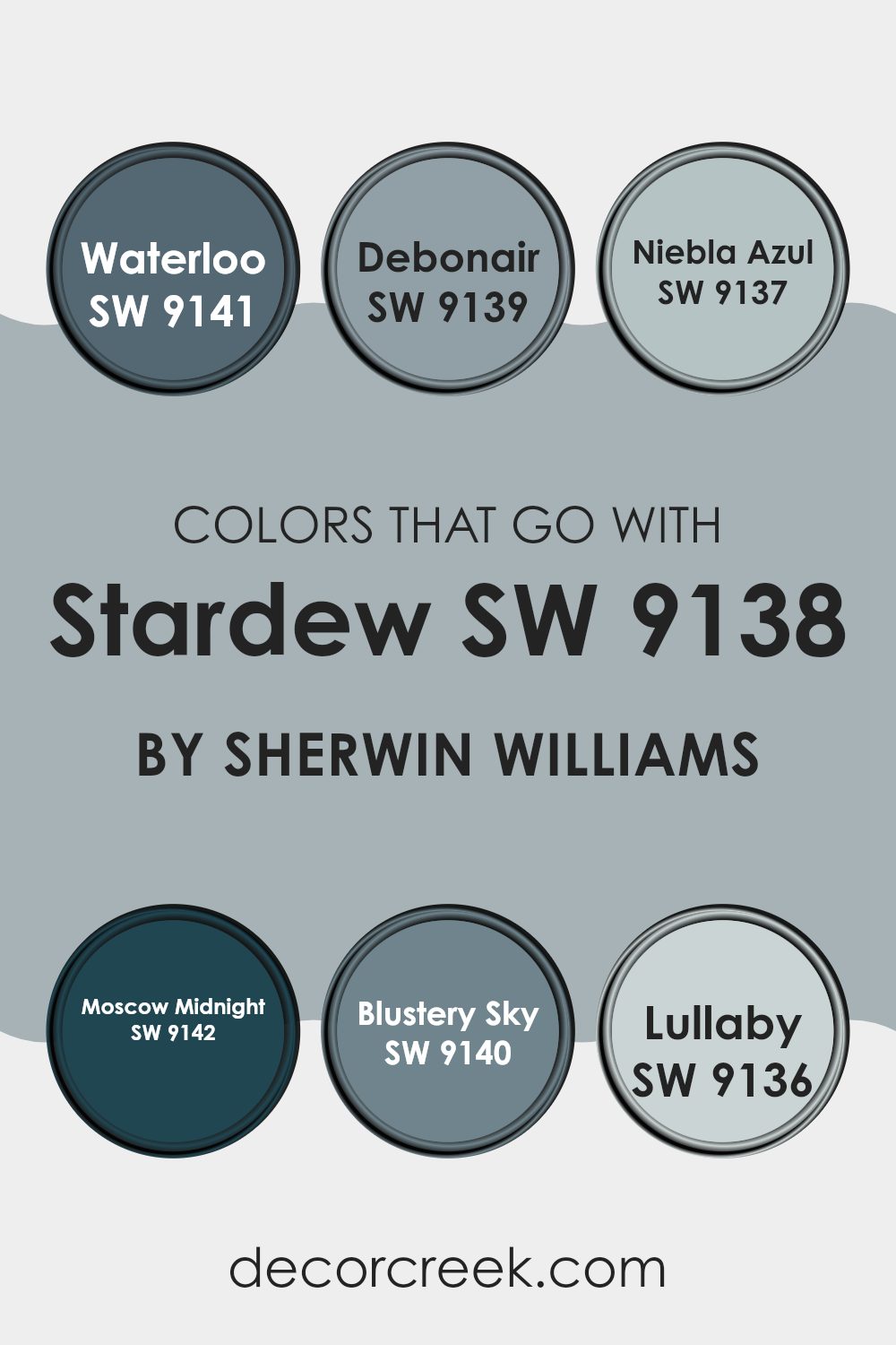
Colors that Go With Stardew SW 9138 by Sherwin Williams
Choosing colors that pair well with Stardew SW 9138 by Sherwin Williams is essential because the right combinations can enhance the overall aesthetic of any room. Whether you’re painting a room or adding accents, these coordinating shades can help create a cohesive and pleasing environment. They add depth and interest, while ensuring that everything in the room feels connected and balanced.
Painting with Stardew, a soothing and gentle gray, sets a calm backdrop. Complement it with Waterloo SW 9141, a deeper gray-blue that adds a subtle pop of color while keeping the mood relaxed. Debonair SW 9139, a stylish grayish-green hue, is perfect for those wanting to incorporate a touch of natural elements into their rooms without creating an intense feeling or reducing the sense of calm established by Stardew.
Niebla Azul SW 9137 brings in a light blue that’s like a soft whisper of color, ideal for creating a light and airy feel. Moscow Midnight SW 9142 is the boldest, a dark navy that offers a striking contrast and depth, perfect for an accent wall or decorative touches.
Blustery Sky SW 9140, similar to a stormy sky, blends blue and gray tones for dramatic yet balanced visuals. Lastly, Lullaby SW 9136 provides a whisper-soft pastel blue, perfect for achieving a gentle, soothing vibe in rooms meant for relaxation. Together, these colors support each other in creating environments that are harmonious and inviting.
You can see recommended paint colors below:
- SW 9141 Waterloo
- SW 9139 Debonair
- SW 9137 Niebla Azul
- SW 9142 Moscow Midnight
- SW 9140 Blustery Sky
- SW 9136 Lullaby
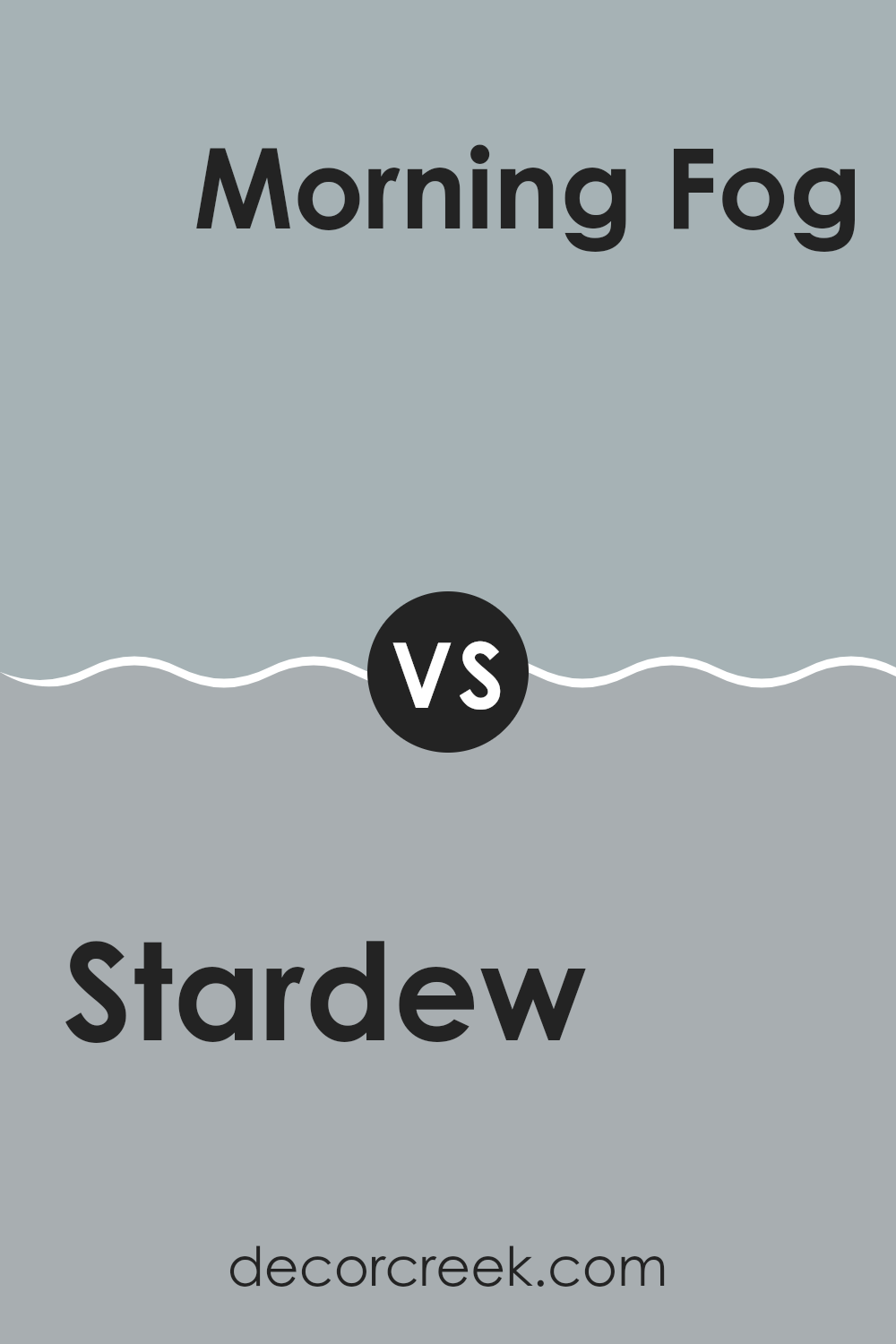
Stardew SW 9138 by Sherwin Williams vs Morning Fog SW 6255 by Sherwin Williams
Stardew is a muted grayish-blue hue that gives a calm vibe to any room. This color has a soft appeal, which makes it excellent for creating a relaxed environment. It pairs well with white trim and natural wood tones, balancing coolness with warmth.
Morning Fog, on the other hand, is a cooler, light grey color. It reflects more light, making it ideal for smaller rooms or areas that receive less natural sunlight. Its neutral tone serves as a great backdrop for bolder colors and can easily fit into most color schemes without clashing.
Both Stardew and Morning Fog offer unique qualities for interior rooms. While Stardew leans towards a subtle hint of blue, providing a gentle, inviting atmosphere, Morning Fog stands out in its pure, clean grey simplicity, acting as an adaptable base for decorating. The choice between them depends on the desired mood and room functionality.
You can see recommended paint color below:
- SW 6255 Morning Fog
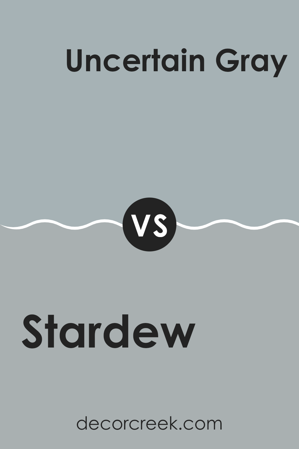
Stardew SW 9138 by Sherwin Williams vs Uncertain Gray SW 6234 by Sherwin Williams
Stardew and Uncertain Gray are two paint colors from Sherwin Williams that offer distinct hues for different decorating styles. Stardew is a soft, muted green with a touch of gray, creating a calm and welcoming vibe. It’s perfect for rooms where you want a touch of nature’s peacefulness without creating an intense feeling with bright colors.
On the other hand, Uncertain Gray is a cooler shade that leans towards a blue-gray. Despite its name suggesting ambiguity, it provides a clear sense of elegance and can make a room feel more composed and mature. This color works well in modern and minimalistic rooms as it pairs beautifully with both stark whites and bold colors.
Both colors are adaptable but serve different moods and themes in interior design. Stardew’s slight green is warmer and can make a room feel cozy and lived-in, while Uncertain Gray’s cooler tone offers a sharper, more polished look.
You can see recommended paint color below:
- SW 6234 Uncertain Gray
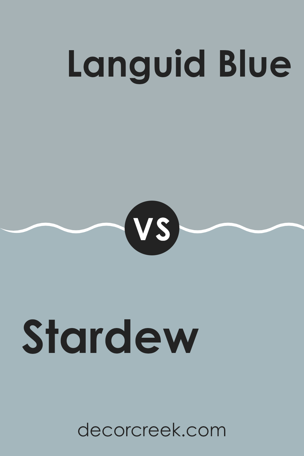
Stardew SW 9138 by Sherwin Williams vs Languid Blue SW 6226 by Sherwin Williams
Stardew and Languid Blue by Sherwin Williams are two colors that offer their unique charm to any room, yet differ in their tones and moods. Stardew has a soft, muted gray with a hint of blue that feels calm and gentle. It’s ideal in rooms where you want a neutral backdrop that still provides a touch of color, giving rooms a cozy and subtle feel.
On the other hand, Languid Blue is a clearer, more pronounced blue that brings a brighter and fresher look. This color can make a room feel more lively and airy compared to Stardew. Languid Blue works well in areas that benefit from a splash of color, like bathrooms or bedrooms, adding a cheerful and refreshing vibe.
Both colors can help enhance a room, but the choice between them depends on whether you prefer a more understated tone or something that feels a little fresher and brighter.
You can see recommended paint color below:
- SW 6226 Languid Blue
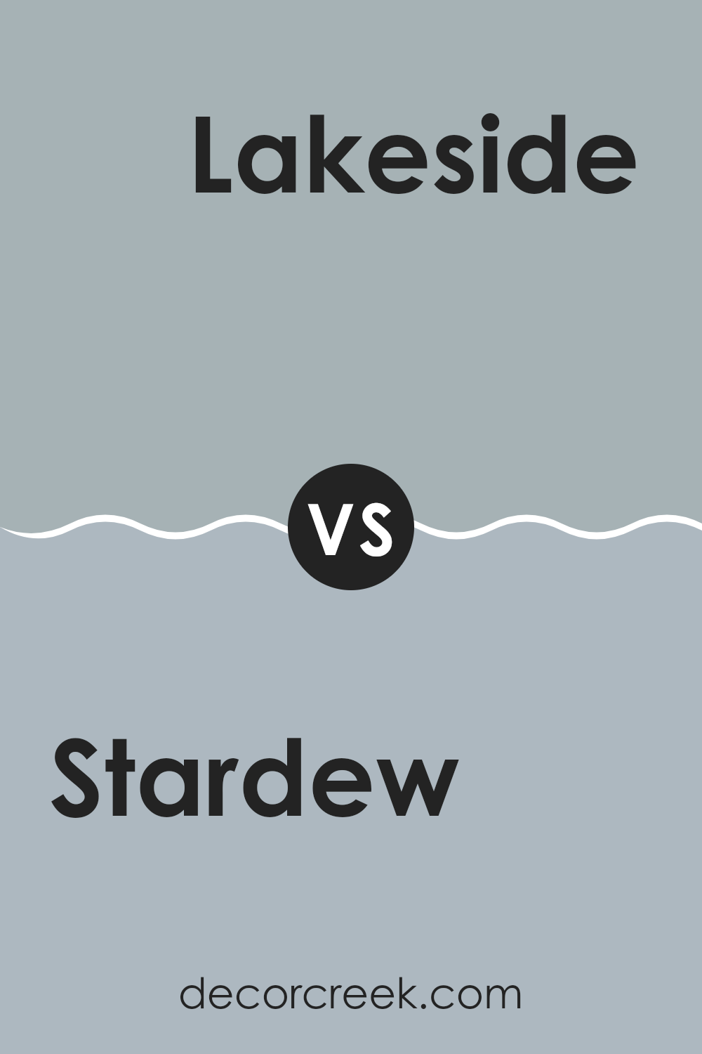
Stardew SW 9138 by Sherwin Williams vs Lakeside SW 9683 by Sherwin Williams
Stardew and Lakeside, both by Sherwin Williams, offer distinct shades that could beautifully complement a room depending on the mood you’re aiming for. Stardew is a subtle, muted gray with a touch of blue-green, giving it a cool and calm feel that’s adaptable for various rooms. It’s excellent for achieving a peaceful, soothing atmosphere in a place meant for relaxation, like a bedroom or bathroom.
On the other hand, Lakeside is a darker, richer blue that carries a bit more energy and depth. This makes it a strong choice for areas where you might want a more dynamic, vibrant feel, such as a lively living room or an office. It can add a splash of color without creating an intense feeling, maintaining a nice balance with neutral furnishings or serving as an attractive contrast against lighter colors.
Both colors lend themselves well to decorating with style and ease, making your choice depend on the specific vibe you want in your room.
You can see recommended paint color below:
- SW 9683 Lakeside
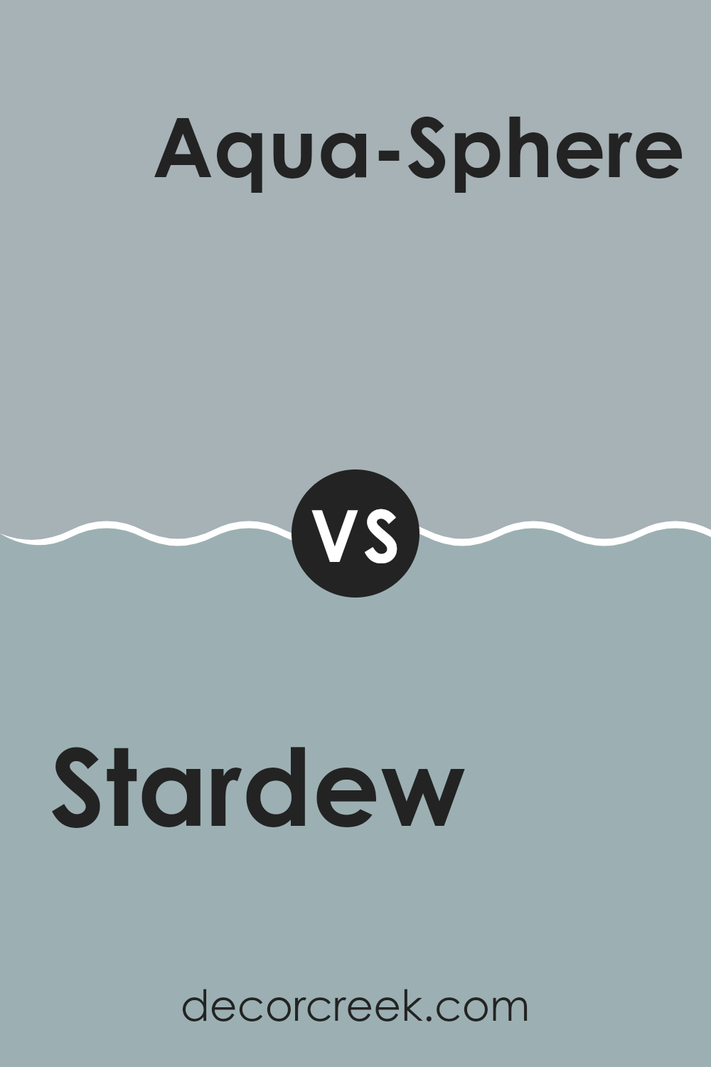
Stardew SW 9138 by Sherwin Williams vs Aqua-Sphere SW 7613 by Sherwin Williams
The two colors, Stardew and Aqua-Sphere, both by Sherwin Williams, offer distinct vibes for any room. Stardew is a soft, muted gray with a touch of blue. It provides a calm and subtle background, making a room feel open yet cozy.
On the other hand, Aqua-Sphere is a light aqua color with more vibrancy. It brings more energy to a room and has a fresh, lively feel compared to the more understated Stardew. While Stardew works well in rooms where you want a neutral scheme that’s easy on the eyes, Aqua-Sphere can add a splash of brightness, perfect for a bathroom or a cheerful kitchen.
Depending on the atmosphere you’re trying to create, each color has its strengths. Stardew suits quieter, relaxed environments, while Aqua-Sphere is ideal for more spirited, active areas.
You can see recommended paint color below:
- SW 7613 Aqua-Sphere
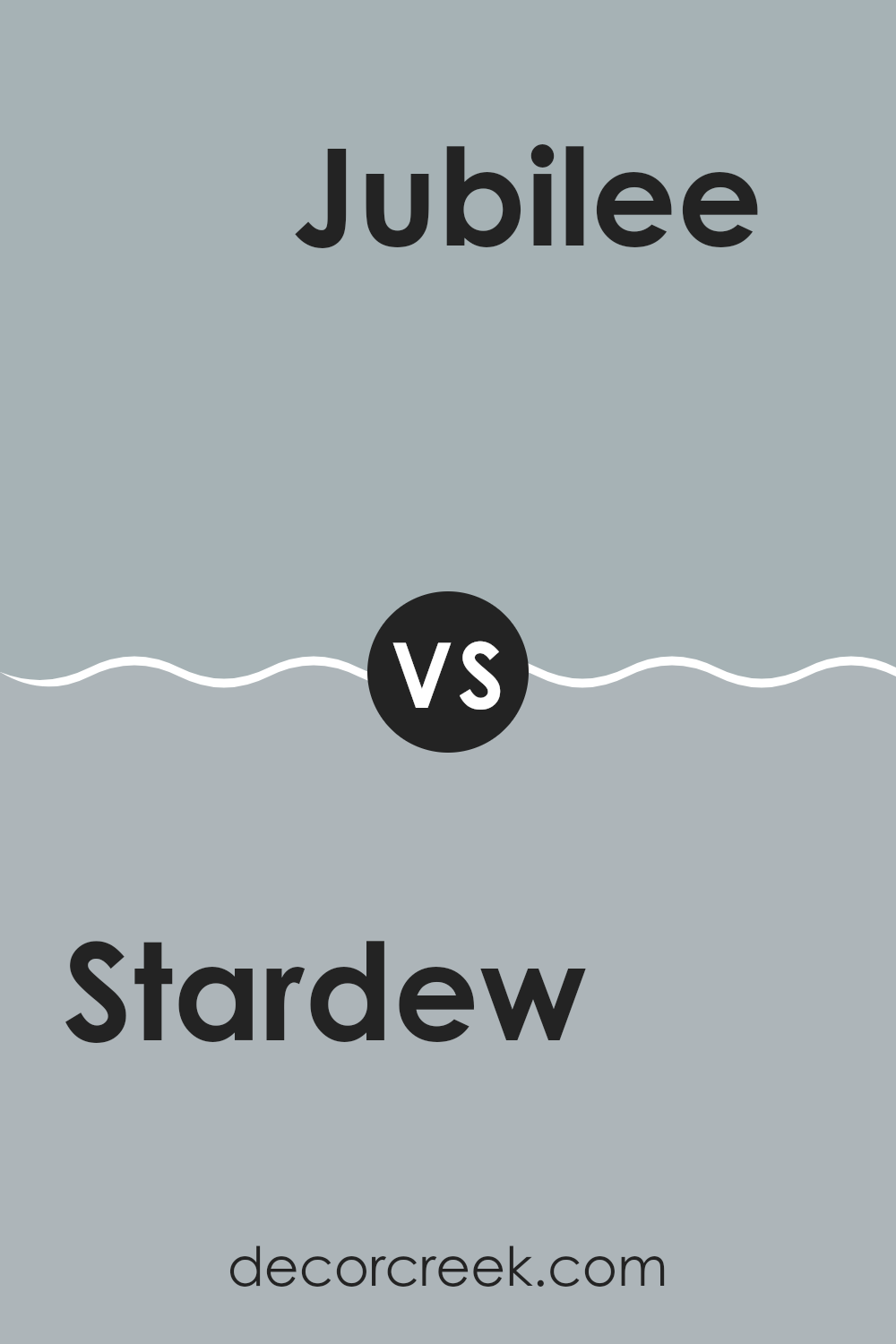
Stardew SW 9138 by Sherwin Williams vs Jubilee SW 6248 by Sherwin Williams
Stardew and Jubilee by Sherwin Williams are two subtly distinct shades that each bring their own unique flair to a room. Stardew is a soft, muted gray with a touch of blue undertones, making it a soothing choice for any room aiming to achieve a calm and quiet atmosphere. It pairs nicely with a variety of decor styles, especially those with white trim or natural wood elements.
On the other hand, Jubilee leans a bit darker and also incorporates gray tones, but with a stronger influence of lavender, giving it a slightly more pronounced presence in a room. This color works particularly well in areas where you want to add a bit of depth without creating an intense feeling.
Both are adaptable enough for use in many settings, whether it’s a bedroom, living room, or office. While Stardew offers a gentle backdrop, Jubilee brings a hint more richness and color intensity, which can be ideal for those looking to add a bit more personality to their interiors.
You can see recommended paint color below:
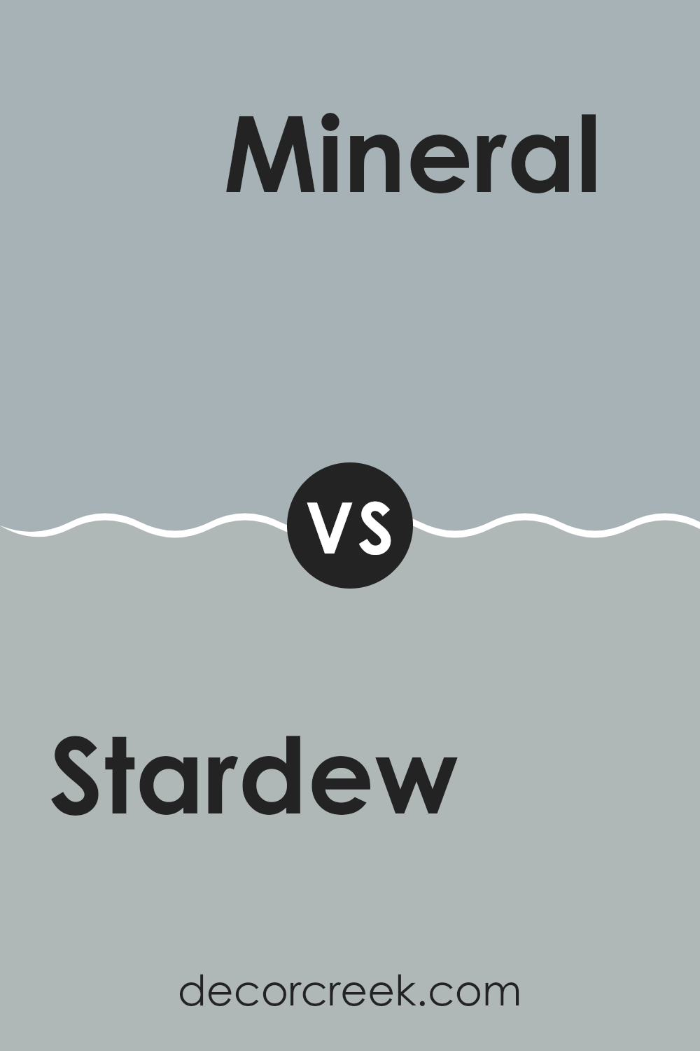
Stardew SW 9138 by Sherwin Williams vs Mineral SW 9637 by Sherwin Williams
Stardew and Mineral by Sherwin Williams are both neutral colors, but they have different vibes and uses in interior design. Stardew is a soft, muted blue-gray that has a gentle, soothing quality to it. This color is ideal for rooms where you want to create a calm and relaxing atmosphere, such as bedrooms or bathrooms.
On the other hand, Mineral is a darker shade, leaning more towards a gray with a hint of greenish undertone. This color is great for providing a stronger presence in a room and is excellent for areas that need a bit more grounding or drama, like an accent wall in a living room or dining area.
While both colors provide a neutral backdrop, Stardew offers a lighter, airier feel, making rooms look larger. Mineral gives a room more depth and can be paired well with both light and dark furnishings, offering flexibility in decor choices. Depending on the mood you’re trying to set, each color can bring its unique atmosphere to a room.
You can see recommended paint color below:
- SW 9637 Mineral
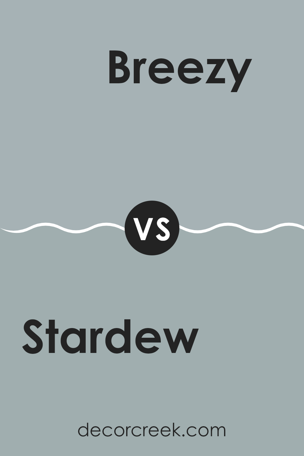
Stardew SW 9138 by Sherwin Williams vs Breezy SW 7616 by Sherwin Williams
Both Stardew and Breezy by Sherwin Williams are popular shades of blue, each offering a distinct mood to any room. Stardew is a muted, soft blue-gray that’s quite subtle, making it ideal for a calming atmosphere in rooms where you want to relax, like bedrooms or living rooms. It pairs well with light woods and white trims, giving a gentle and clean aesthetic.
On the other hand, Breezy is a lighter, more airy blue. It has a refreshing vibe that can instantly lighten up a room. This color works beautifully in bathrooms or kitchens where a bright, uplifting feel is desirable. Breezy stands out more than Stardew and can give a sense of openness when applied.
Both colors reflect light differently; Stardew absorbs more light, providing a cozy feel, whereas Breezy reflects light, enhancing room brightness. Choosing between them depends on the kind of mood and room you’re aiming to achieve.
You can see recommended paint color below:
- SW 7616 Breezy
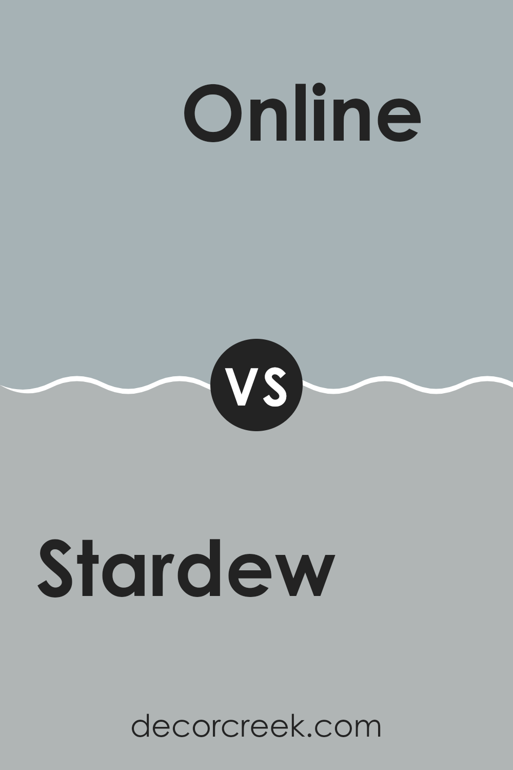
Stardew SW 9138 by Sherwin Williams vs Online SW 7072 by Sherwin Williams
Comparing the two Sherwin Williams colors, Stardew SW 9138 and Online SW 7072, we see noticeable differences in their tones and atmospheres. Stardew presents a soft, muted blue with gray undertones, giving it a calm and gentle feel that works well in rooms meant for relaxation like bedrooms or living areas. It’s a subtle color that doesn’t dominate a room but instead blends smoothly with various decor styles.
On the other hand, Online is a deeper gray with a hint of blue. This color is more dramatic and bolder than Stardew, making it a great choice for modern and sleek designs, particularly in home offices or more formal rooms. It can provide a strong backdrop for artwork or vibrant furniture.
Both colors offer a fresh and current look but serve different aesthetic purposes. Stardew is better for a softer, more laid-back vibe, while Online suits a sharper, more commanding style. Choosing between them depends on the specific mood you want to set in your room.
You can see recommended paint color below:
- SW 7072 Online
Stardew SW 9138 by Sherwin Williams vs Dockside Blue SW 7601 by Sherwin Williams
Stardew SW 9138 is a soft, muted gray with subtle blue undertones, making it an adaptable choice for creating a calm and soothing atmosphere in any room. This color pairs well with both modern and traditional decor, offering a neutral backdrop that is both understated and welcoming.
On the other hand, Dockside Blue SW 7601 is a deeper, more pronounced blue that captures the essence of a peaceful lakeside retreat. It has a coastal vibe, great for those looking to add a touch of calm but with a bit more color than Stardew. Dockside Blue stands out more on walls and can make a room feel more enclosed and cozy compared to the lighter Stardew.
Overall, while both colors promote a peaceful setting, Stardew is subtler and more neutral, whereas Dockside Blue offers a stronger presence with its richer tone. This makes Dockside Blue a better choice for highlighting a room or creating a focal point, whereas Stardew is ideal for overall room application.
You can see recommended paint color below:
- SW 7601 Dockside Blue
As I wrap up my thoughts on SW 9138 Stardew by Sherwin Williams, I really like how this paint color can change a room. Stardew is not just a simple gray; it’s got a hint of blue that makes it feel calm and cozy. I tried this color in a small bedroom and it turned out very pretty and soothing, which was exactly what I was aiming for.
This color works well in many parts of a house. Whether you want to make your living room feel more relaxed or your bedroom a bit cozier, Stardew might be a good pick. Also, this color matches well with white trim or dark wood furniture, giving you a lot of different ways to style your room.
Overall, picking SW 9138 Stardew can make decorating fun because it’s easy to match with other colors and decorations. If you’re thinking about a new color for any room in your house, I would definitely recommend giving Stardew by Sherwin Williams a try. It’s a soft and cool color that adds a lovely touch to any room without making it too dark or cold.
decorcreek.com
Ever wished paint sampling was as easy as sticking a sticker? Guess what? Now it is! Discover Samplize's unique Peel & Stick samples.
Get paint samples

