Black
Black Blue
Blue Brown
Brown Gray
Gray Green
Green Neutral
 Orange
 White
White Yellow
If you are looking for a paint color that adds a subtle touch of drama to any room without feeling too intense, consider SW 9140 Blustery Sky by Sherwin Williams. As someone who appreciates layered shades, I find Blustery Sky especially interesting.
At first glance, it may appear to be a standard cool blue, but a closer look reveals elegant gray undertones that add unexpected depth and adaptability. This color works beautifully with different decor styles, whether you want to create a calming bedroom atmosphere or a lively living room feeling.
Blustery Sky has the unique ability to shift its mood depending on the lighting. In natural light, it feels airy and calming, while under artificial lighting, it can appear richer and more noticeable, making it an excellent choice for rooms used both day and night.
If you’re thinking about giving your home a fresh look, Blustery Sky offers a balance between calming and bold, making it easy to use while ensuring your room looks distinctive.

What Color Is Blustery Sky SW 9140 by Sherwin Williams?
Blustery Sky by Sherwin Williams is a rich and deep blue-gray shade that resembles the moody tones of a stormy sky. This color creates a cozy and slightly dramatic atmosphere, making it perfect for adding character to your home. Its toned-down saturation allows it to blend naturally into different decor styles, especially modern, contemporary, and rustic interiors.
This adaptable shade works beautifully with natural materials and textures. Pairing it with warm wood tones, like oak or walnut, brings balance to its cool undertones, making rooms feel welcoming. Incorporating elements like linen or cotton in lighter colors such as whites and creams can help brighten the atmosphere while maintaining an earthy and organic feeling. For a more modern touch, metallic finishes like brushed nickel or chrome can offer a striking contrast against the Blustery Sky backdrop.
Use this color in living rooms, bedrooms, or offices where you want depth and personality without making the room feel too intense. It’s especially effective on accent walls or for cabinetry and kitchen islands. Combine it with plenty of lighting to keep rooms lively and welcoming. With Blustery Sky, you can easily create a stylish yet comforting atmosphere in your home.

decorcreek.com
Is Blustery Sky SW 9140 by Sherwin Williams Warm or Cool color?
Blustery Sky SW 9140 by Sherwin Williams is a striking paint color that offers a dynamic and energetic feeling to any room. This shade is a deep, moody blue with hints of gray, making it adaptable for different decorating styles and rooms within a home.
In a living room or dining area, this color can create a bold backdrop for art and furniture, drawing attention and making statement pieces stand out. In bedrooms, the depth of Blustery Sky can help make the room feel cozy and secure, ideal for a restful sleeping atmosphere.
The gray undertones in this color make it highly adaptable; it pairs beautifully with both warm tones like creams and golds, as well as cooler tones like silvers and whites. This flexibility allows homeowners to use it in many decor themes, from modern to traditional. Moreover, in rooms with plenty of natural light, Blustery Sky can appear more lively and bright, while in rooms with less light, it creates a deeper and more enveloping feeling. Overall, this color is perfect for those looking to add a touch of drama and personality to their home.
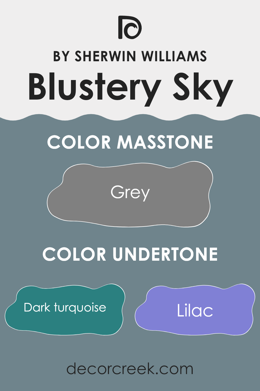
Undertones of Blustery Sky SW 9140 by Sherwin Williams
Blustery Sky is a unique paint shade that appears predominantly blue with subtle complexities that influence its appearance under different lighting conditions or when placed next to other colors. This layered behavior is caused by its different undertones, which affect how the color is perceived in a room.
Undertones are secondary colors that exist beneath the main surface color, influencing the overall shade and feeling of the paint. For Blustery Sky, these undertones include shades like dark turquoise, lilac, and mint, which can give the color a cooler feeling, making it suitable for creating a calm and relaxed atmosphere in a room. Meanwhile, undertones of olive, brown, and dark green add depth and can help the color blend beautifully in naturally lit rooms or complement wood furnishings effectively.
When Blustery Sky is used on interior walls, the effect of these undertones becomes more noticeable. For instance, in a well-lit room with plenty of natural light, the lighter undertones like light turquoise and pale pink may stand out, giving the walls a lively yet subtle appearance that adds personality without making the room feel too intense. In contrast, in rooms with less light, darker undertones like navy and dark grey may become more dominant, creating a more grounded and cozy atmosphere.
Overall, the blend of undertones in this color allows it to adjust and appear differently depending on its surroundings and lighting, making it an adaptable choice for different types of rooms and design styles. Understanding how undertones work is important when choosing the right paint color for your room, ensuring it complements your home’s interior and creates the desired effect.
decorcreek.com
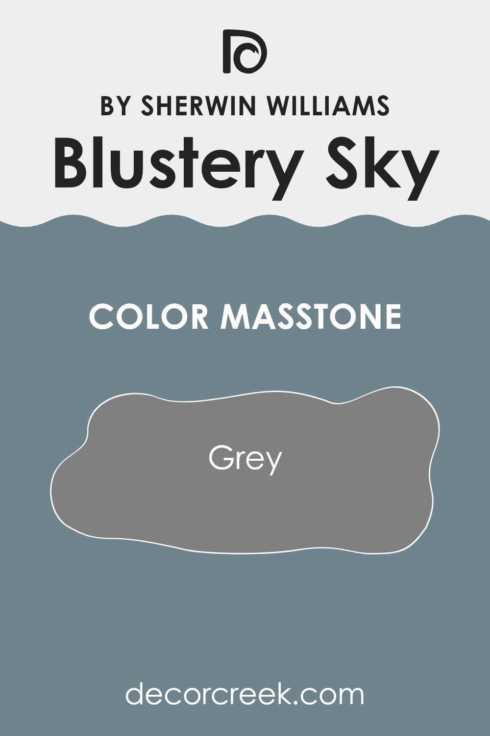
What is the Masstone of the Blustery Sky SW 9140 by Sherwin Williams?
Blustery Sky SW 9140 by Sherwin Williams has a masstone of Grey (#808080), making it an adaptable choice for home interiors. This shade of grey is balanced: not too dark and not too light, which means it can work beautifully in different rooms, whether large or small. In larger rooms, it can help create a cozy feeling without making the room feel cramped. In smaller rooms, it gives a sense of openness without appearing too stark or cold.
Because of its neutral grey tone, Blustery Sky pairs easily with many other colors. This flexibility allows homeowners to use it as a background color that supports bolder furnishings or artwork without competing for attention.
It’s perfect for living areas where you may want a calm and understated appearance, or in bedrooms where a neutral wall color can support different decor styles from modern to traditional. Grey also tends to hide imperfections well, making it a practical choice too.
decorcreek.com
How Does Lighting Affect Blustery Sky SW 9140 by Sherwin Williams?
Lighting has a strong impact on the way colors appear, changing our perception depending on whether the light is natural or artificial. The color in discussion, Blustery Sky, is a wonderful example of how different lighting conditions can influence a paint color’s appearance.
In natural light, Blustery Sky reveals its truest tone. Under clear daylight, this color tends to appear lively and energetic because of the strong presence of blue light in sunlight. However, in the softer, golden light of sunset, it may look slightly softer, reflecting a gentler and more muted blue.
When it comes to artificial lighting, the color can appear quite different. Under fluorescent lights, which usually emit a cooler tone, Blustery Sky may lean toward a cooler and crisper version of its natural appearance, often highlighting the blue tones. On the other hand, under incandescent lighting, known for its warm glow, Blustery Sky might appear slightly greener because of the yellow tint created by these light sources.
Considering the orientation of rooms, the appearance of this color will also change:
- North-facing rooms can be challenging for Blustery Sky because they receive less direct sunlight and may make colors appear slightly shadowed and muted. In these rooms, this color might look more like a true, deep blue.
- South-facing rooms, with abundant sunlight through most of the day, will show Blustery Sky in its brightest and truest form, making the room feel lively.
- East-facing rooms receive plenty of morning light, making Blustery Sky look bright and fresh early in the day but potentially cooler and darker in the afternoon and evening.
- West-facing rooms receive strong evening light. This type of lighting can make Blustery Sky appear very dynamic—lighter and softer in the morning and deeper and richer later in the day.
It’s fascinating to see how lighting can change the appearance of color, and understanding this can help when choosing paint colors based on room orientation and the type of lighting available.

decorcreek.com
What is the LRV of Blustery Sky SW 9140 by Sherwin Williams?
LRV stands for Light Reflectance Value, which is a measure of how much light a paint color reflects back into a room, essentially showing how light or dark a color will appear once applied to the walls.
LRV numbers range from low to high, with lower numbers indicating darker colors that absorb more light and higher numbers pointing to lighter shades that reflect more light. This measurement helps when deciding how a paint color will interact with the natural and artificial lighting in a room, influencing the overall atmosphere.
With an LRV of 21.714, the color Blustery Sky is on the darker end of the scale, meaning it absorbs more light than it reflects. This can make rooms painted in this color feel cozier and more intimate, which may be ideal for creating a comfortable setting. However, in rooms with limited natural light, using a color with such a low LRV could make the room feel even darker and potentially too intense. In well-lit or larger rooms, this color can add depth and drama to the room, improving the overall appearance without making the room feel cramped.

decorcreek.com
Coordinating Colors of Blustery Sky SW 9140 by Sherwin Williams
Coordinating colors work together to improve one another and create a balanced color scheme in any room. For example, when coordinating with a color like Blustery Sky from Sherwin Williams, which can be described as a deep and moody grey-blue, it’s important to select shades that complement it without making the room feel too intense. Colors such as Mountain Air, Nuance, and Gray Area are excellent choices for this purpose.
Mountain Air is a subtle, soft blue that brings a feeling of freshness to the palette. Its lighter appearance pairs beautifully with the deeper tones of Blustery Sky, providing a gentle contrast and creating an airy atmosphere in the room. Nuance, on the other hand, is a neutral shade that leans toward a grey-beige tone, offering an elegant yet understated backdrop that allows bolder colors to stand out without dominating.
Finally, Gray Area serves as a perfect connection between these colors, with its medium grey tone that adds depth and balance to the overall palette, ensuring that each shade supports the others for a connected look. These coordinating colors are carefully selected to work beautifully together, improving the atmosphere of the room while maintaining a pleasing visual balance.
You can see recommended paint colors below:

What are the Trim colors of Blustery Sky SW 9140 by Sherwin Williams?
Trim colors, such as SW 7757 – High Reflective White and SW 7012 – Creamy by Sherwin Williams, play an important role in improving the appearance of a room painted in Blustery Sky SW 9140. They help create a clean and finished look by defining the edges around doors, windows, and baseboards.
The use of trim colors also helps highlight the main color, in this case, Blustery Sky, by creating a striking contrast that can make the walls stand out more clearly. Choosing the right trim color ensures that the wall color is complemented properly, helping the room feel balanced and visually pleasing.
High Reflective White SW 7757 is a very bright and clean white that offers a sharp contrast to the deeper tones of Blustery Sky, making it an excellent choice for trim, as it makes the border areas stand out while adding a sense of crisp definition. Creamy SW 7012, on the other hand, provides a softer contrast with a warm and welcoming tone that can soften the overall appearance while still offering a noticeable border against the deeper wall color. Using either of these trim colors can help create a well-defined and attractive color palette that improves the overall atmosphere of the room.
You can see recommended paint colors below:

Colors Similar to Blustery Sky SW 9140 by Sherwin Williams
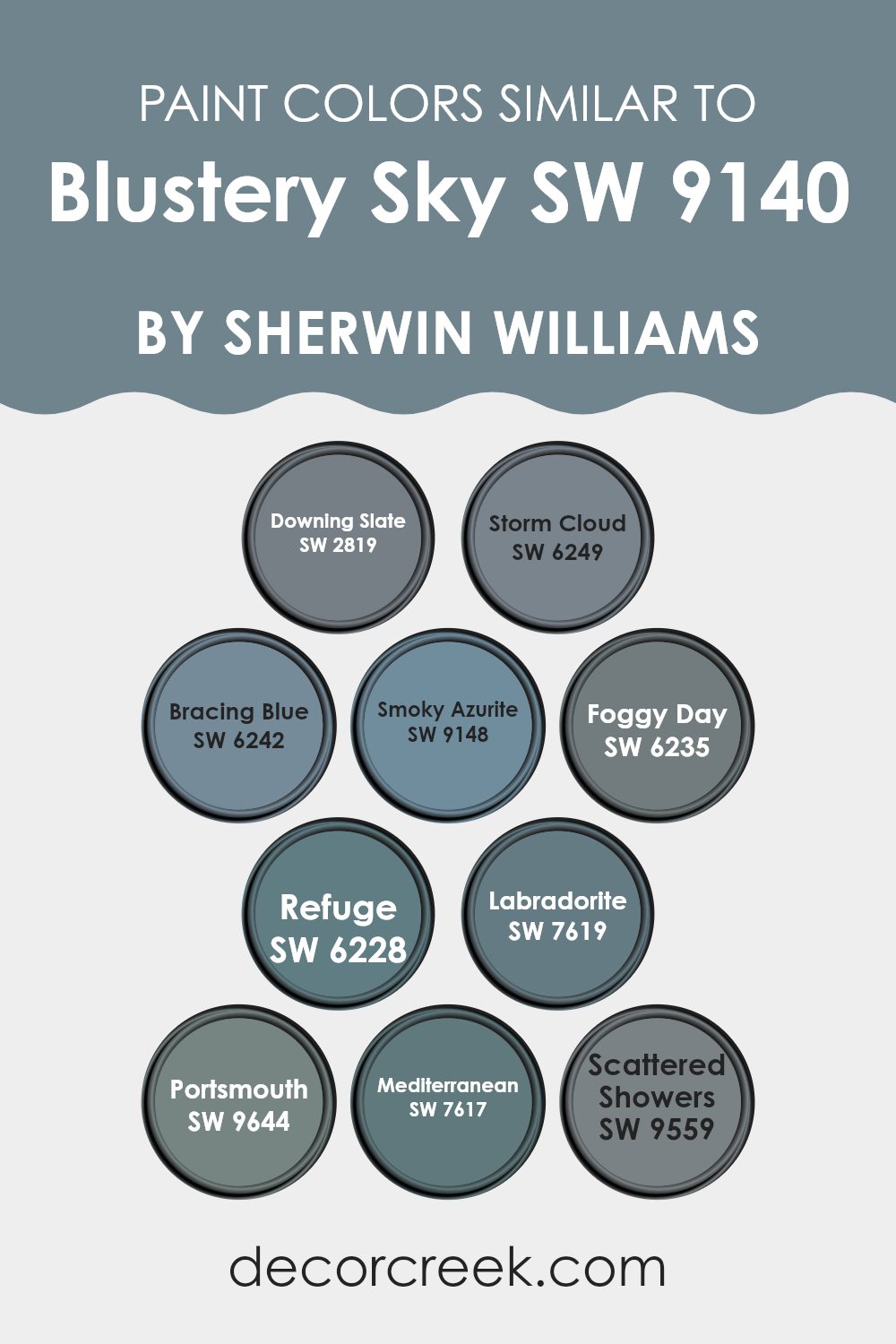
Choosing similar colors is important in design because it helps create visual harmony and a pleasing overall appearance. Colors that are closely related in hue and intensity, like variations of blue-gray or dark slate, work beautifully together, supporting a balanced and connected look.
For example, Downing Slate is a muted blue-gray that creates a calm atmosphere, while Storm Cloud is a deeper and moodier blue that adds a touch of drama. Bracing Blue offers a lively yet balanced pop of color, suitable for a more energetic setting.
Further along the palette, Smoky Azurite introduces a darker blue tone that pairs beautifully with softer furnishings, adding depth to a room’s decor. Foggy Day, true to its name, resembles a light and misty gray that works as a fresh backdrop for more colorful decor pieces.
Refuge provides a slightly stronger shade, perfect for creating focal points without making the room feel too intense. Labradorite, a unique blend of green and blue, creates a natural feeling, suitable for rooms designed for relaxation and calm.
Colors like Portsmouth showcase a dark and stormy blue, which can be ideal for creating an elegant contrast in rooms, while Mediterranean offers a vivid and lively blue that reflects the energy of its namesake sea. Scattered Showers features a softer intensity that allows for flexibility in different design elements, blending naturally with both bold and muted accents.
Lastly, the thoughtful use of these colors, from dark blues to light grays, means each one can either stand out as a statement or work together to support the overall appearance of a room. This approach ensures that no single element overpowers the others, creating a balanced and welcoming atmosphere.
You can see recommended paint colors below:
- SW 2819 Downing Slate
- SW 6249 Storm Cloud
- SW 6242 Bracing Blue
- SW 9148 Smoky Azurite
- SW 6235 Foggy Day
- SW 6228 Refuge
- SW 7619 Labradorite
- SW 9644 Portsmouth
- SW 7617 Mediterranean
- SW 9559 Scattered Showers
Colors that Go With Blustery Sky SW 9140 by Sherwin Williams
Colors that complement Blustery Sky SW 9140 by Sherwin Williams play an important role in creating a balanced and visually appealing atmosphere in any room. Choosing the right combinations allows each color to support and improve the others, resulting in a connected overall appearance.
For instance, Waterloo, which is a deep and rich navy, offers a strong contrast that makes lighter shades stand out while also adding depth to the decor. On the other hand, Debonair is a soft gray with a hint of blue that reflects the lighter tones in Blustery Sky, creating a gentle and calming flow throughout the color palette.
Stardew, a muted blue with gray undertones, works naturally with Blustery Sky because it provides a soft, low-contrast companion that strengthens the calming atmosphere. Niebla Azul, with its airy and light blue tone, introduces a fresh and lively touch that keeps the room feeling open and bright.
Further along the palette, Moscow Midnight serves as a bold and dramatic contrast that can ground lighter shades and attract attention, creating a strong focal point. Lastly, Lullaby adds a playful touch with its pale and soft blue, perfect for creating a calming retreat that still feels connected to the surrounding colors. Together, these colors form an adaptable palette that suits many design styles, from relaxed to energetic, ensuring every room feels balanced and visually pleasing.
You can see recommended paint colors below:
- SW 9141 Waterloo
- SW 9139 Debonair
- SW 9138 Stardew
- SW 9137 Niebla Azul
- SW 9142 Moscow Midnight
- SW 9136 Lullaby

How to Use Blustery Sky SW 9140 by Sherwin Williams In Your Home?
Blustery Sky SW 9140 by Sherwin Williams is a vibrant blue-gray paint color that brings a fresh and modern feeling to any room. This particular shade can make a small room feel larger and brighter thanks to its ability to reflect light.
It’s a perfect choice for bathrooms or bedrooms since it creates a calm and soothing atmosphere. If you’re looking to add a touch of color without going too bold, this color can also be used on an accent wall in a living room or dining area.
Pairing it with neutral furniture and decor highlights its unique tone and creates a stylish yet cozy room. Additionally, Blustery Sky works beautifully on kitchen cabinets for an updated appearance. Its beautiful blend of blue and gray offers an adaptable backdrop that is easy to pair with different accents, styles, and textures.
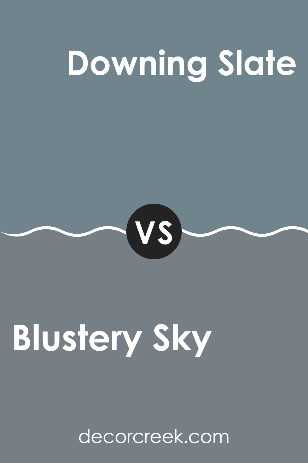
Blustery Sky SW 9140 by Sherwin Williams vs Downing Slate SW 2819 by Sherwin Williams
Blustery Sky is a dynamic grayish-blue color that has a stormy and deep appearance. It gives a room a bold and strong presence, suitable for those looking to add character without making the room feel too intense.
Downing Slate, on the other hand, leans more toward a muted and deep gray with a hint of blue undertone. This color is ideal for creating a subtle and calming atmosphere, giving a room a steady and understated feeling.
When comparing the two, Blustery Sky stands out more and can create a statement in any room, while Downing Slate works better as a quiet backdrop that complements other design elements. Both offer unique visual appeal, with Downing Slate being the better choice for a more neutral and understated charm, and Blustery Sky perfect for those wanting to add a touch of drama and depth.
You can see recommended paint color below:
Blustery Sky SW 9140 by Sherwin Williams vs Labradorite SW 7619 by Sherwin Williams
Blustery Sky and Labradorite, both Sherwin Williams paints, are distinctly different shades that suit different tastes and design needs. Blustery Sky is a deep blue with a stormy intensity, reminiscent of a cloudy sky before a storm. This color tends to create a moody and dramatic atmosphere in rooms, making it ideal for creating a strong and focused feeling.
In contrast, Labradorite has a muted greenish-gray tone, inspired by the mineral it’s named after. It’s more understated and adaptable, fitting naturally into many decorative styles without making the room feel too intense. This color works beautifully in rooms where a calm and understated beauty is desired.
Both colors can be used effectively in different settings, depending on the atmosphere you want to create. Blustery Sky is generally better for creating bold statements, while Labradorite works especially well in interiors where a softer and more neutral palette is preferred.
You can see recommended paint color below:

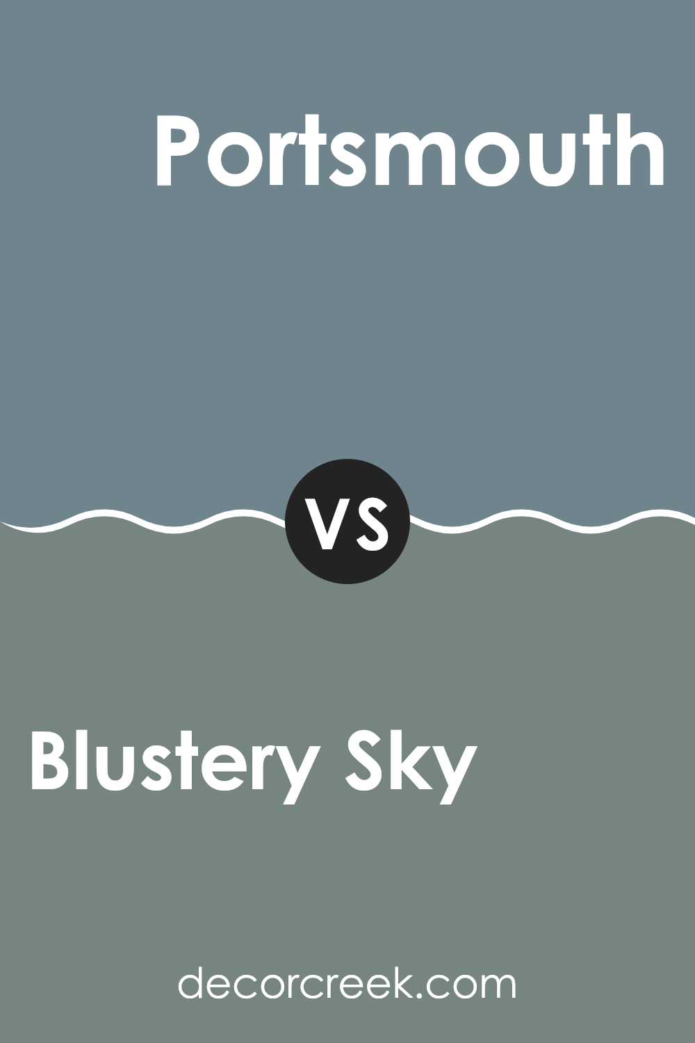
Blustery Sky SW 9140 by Sherwin Williams vs Portsmouth SW 9644 by Sherwin Williams
Blustery Sky and Portsmouth are two shades offered by Sherwin Williams that both bring unique feelings to any room. Blustery Sky is a deep, moody blue with a hint of gray.
It creates a strong and noticeable atmosphere, making it a wonderful choice for rooms like a study or dining room where you want a touch of drama and depth. On the other hand, Portsmouth is a softer and muted green.
It’s less intense and has a calming effect, making it ideal for bedrooms or living areas where a more relaxed atmosphere is desired. While Blustery Sky adds a bold touch, Portsmouth offers a gentle backdrop, perfect for lighter and airier rooms. These colors can work beautifully together, creating a balanced contrast when used in the same color palette or in connected rooms.
You can see recommended paint color below:
Blustery Sky SW 9140 by Sherwin Williams vs Scattered Showers SW 9559 by Sherwin Williams
Blustery Sky and Scattered Showers, both by Sherwin Williams, are distinct yet subtly connected through their cool undertones. Blustery Sky appears as a deep and rich blue with a hint of moody gray, making it a strong choice for rooms where a bold and calming blue can add depth and interest. This color works beautifully in both bright, naturally lit rooms and spaces with less light, maintaining its deep appearance without looking too dark.
In contrast, Scattered Showers is a lighter gray that also carries blue undertones, but it is much softer and more subtle compared to Blustery Sky. It’s an excellent choice for creating a light and airy atmosphere in a room. The color is adaptable and can easily complement a wider range of decor styles and surrounding colors.
Using these two colors in the same room can create a dynamic layering of blue tones, with Blustery Sky offering a striking backdrop and Scattered Showers providing a gentle contrast that can help make a room appear larger visually.
You can see recommended paint color below:

Blustery Sky SW 9140 by Sherwin Williams vs Refuge SW 6228 by Sherwin Williams
Blustery Sky and Refuge, both by Sherwin Williams, are two unique shades of blue, each bringing its own character. Blustery Sky has a mid-tone grayish blue that feels fresh and modern. It’s an adaptable color that pairs well with both brighter and more muted shades, making it suitable for common areas like living rooms or kitchens. The color is especially effective in rooms with plenty of natural light, as it tends to shift subtly throughout the day.
On the other hand, Refuge is a deeper and more intense blue with a hint of green. This color is bolder and can create a striking effect when used in interior rooms. It’s perfect for an accent wall or in any room where you want to add a touch of drama. Despite its intensity, Refuge can also create a cozy atmosphere, especially in well-lit rooms or when paired with soft lighting.
Both colors offer a fresh interpretation of traditional blues, with Blustery Sky leaning toward a softer and more relaxed feeling, while Refuge offers a stronger and more confident presence.
You can see recommended paint color below:

Blustery Sky SW 9140 by Sherwin Williams vs Storm Cloud SW 6249 by Sherwin Williams
Blustery Sky and Storm Cloud by Sherwin Williams are both beautiful shades of blue, but they have noticeable differences. Blustery Sky is a lighter and more muted blue that feels airy and calming. It’s wonderful for creating a relaxed and soothing atmosphere in a room. Think of it like a gentle, cloudy day where the sky is a soft blend of blue and gray.
On the other hand, Storm Cloud is a deeper and more intense blue. It resembles the dark and dramatic tones of a stormy sky. This color is bolder and more dramatic, making it ideal for adding a strong and eye-catching presence in a room.
While Blustery Sky tends to open up a room with its lighter tone, Storm Cloud creates a more enclosed and cozy feeling, making it a wonderful choice for accent walls or furniture pieces that you want to stand out. Both colors are adaptable, but your choice between them depends on the mood and style you want to create in your room.
You can see recommended paint color below:

Blustery Sky SW 9140 by Sherwin Williams vs Bracing Blue SW 6242 by Sherwin Williams
Blustery Sky and Bracing Blue, both by Sherwin Williams, are distinct yet similar shades of blue. Blustery Sky appears as a deeper and stormier blue with a hint of gray, making it a strong choice for creating a calming atmosphere without feeling too dark. It works beautifully in rooms that aim for a somewhat muted yet noticeable color presence.
On the other hand, Bracing Blue leans toward a cleaner and more direct shade of blue. It’s lighter compared to Blustery Sky and carries a fresher and more lively feeling. This makes it excellent for areas where you want a more energetic atmosphere while still maintaining a sense of calm.
Both colors pair well with neutral tones, but their different undertones can influence the type of decor and accessories that work best with each shade. Blustery Sky suits rooms that call for a more grounded and mature feeling, while Bracing Blue fits beautifully in brighter and more energetic rooms. Choosing between them depends on the mood and style you want to create in your room.
You can see recommended paint color below:

Blustery Sky SW 9140 by Sherwin Williams vs Foggy Day SW 6235 by Sherwin Williams
Blustery Sky and Foggy Day by Sherwin Williams are two distinct shades of gray-blue, each offering its own unique atmosphere. Blustery Sky is a deeper and more dynamic color that resembles a stormy late afternoon sky. It’s bold and creates a strong visual effect when used in interior rooms. This color can add depth and drama to a room.
In contrast, Foggy Day is a softer and lighter gray with subtle blue undertones. It reflects the calm and muted appearance of a foggy morning. This color is more understated and is excellent for creating a relaxed and soothing atmosphere. It works beautifully in areas where you want a gentle and peaceful feeling.
When choosing between these two, consider the mood you want to create. Blustery Sky is perfect when you want something striking and full of personality, while Foggy Day is ideal for a soft and quiet appearance. Both colors reflect light differently, with Blustery Sky absorbing more light and Foggy Day reflecting it, adding to their individual effects.
You can see recommended paint color below:

Blustery Sky SW 9140 by Sherwin Williams vs Mediterranean SW 7617 by Sherwin Williams
Blustery Sky is a deep blue with a touch of gray, giving it a stormy and moody feeling. It’s a color that stands out because of its ability to add drama to any room without feeling too intense. It works beautifully in areas where you want to create a strong visual impression, like living rooms or bedrooms.
On the other hand, Mediterranean is a vivid blue-green that reflects the lively colors of the sea. This color is lighter and brighter than Blustery Sky, bringing a cheerful and refreshing energy into rooms. It is ideal for kitchens, bathrooms, or any area where you want to add a lively splash of color.
While both colors come from a blue base, Blustery Sky leans toward a darker and more muted tone, perfect for creating a more intimate atmosphere. Mediterranean, with its blend of blue and green, offers a fresh and energetic appearance, wonderful for brightening a room. These differences make each color suitable for different moods and settings.
You can see recommended paint color below:

Blustery Sky SW 9140 by Sherwin Williams vs Smoky Azurite SW 9148 by Sherwin Williams
Blustery Sky is a unique shade of blue with a hint of grey. It brings a cool and calming feeling to any room, making it ideal for creating a soothing atmosphere in places like bedrooms or living areas. On the other hand, Smoky Azurite is a darker and more muted blue with grey undertones that give it a very subtle and moody appearance. This color works beautifully in rooms where you want to add depth or create a more serious atmosphere.
Despite both being blues, Blustery Sky’s lighter and airier feeling contrasts with Smoky Azurite’s deeper and more grounded character. While Blustery Sky brightens a room with a fresh feeling, Smoky Azurite offers a more reserved and understated appearance.
This makes Blustery Sky a wonderful choice for someone looking to brighten a room, while Smoky Azurite is suitable for those who prefer a more classic and toned-down style. Both colors support design flexibility but suit different moods and themes within a room.
You can see recommended paint color below:

SW 9140 Blustery Sky by Sherwin Williams is a really beautiful color. The deep blue-gray shade reminds me of a stormy sky, and it brings a lot of personality to any room. Whether you use it in your living room, kitchen, or bedroom, this color makes the room look stylish and unique.
It’s not too dark and not too light, just right for making a room feel cozy and interesting. Plus, it works beautifully with other colors and furniture you may already have, making it easy to use when you want to refresh your room without purchasing all new decor.
It’s a color that’s not only for adults; I think kids would find it really fun too, especially in a game room or study area. So, if anyone is thinking about giving their home a fresh appearance, SW 9140 Blustery Sky is definitely a color worth considering. It can truly make your home look beautiful in a fresh and lively way!

decorcreek.com
Ever wished paint sampling was as easy as sticking a sticker? Guess what? Now it is! Discover Samplize's unique Peel & Stick samples.
Get paint samples