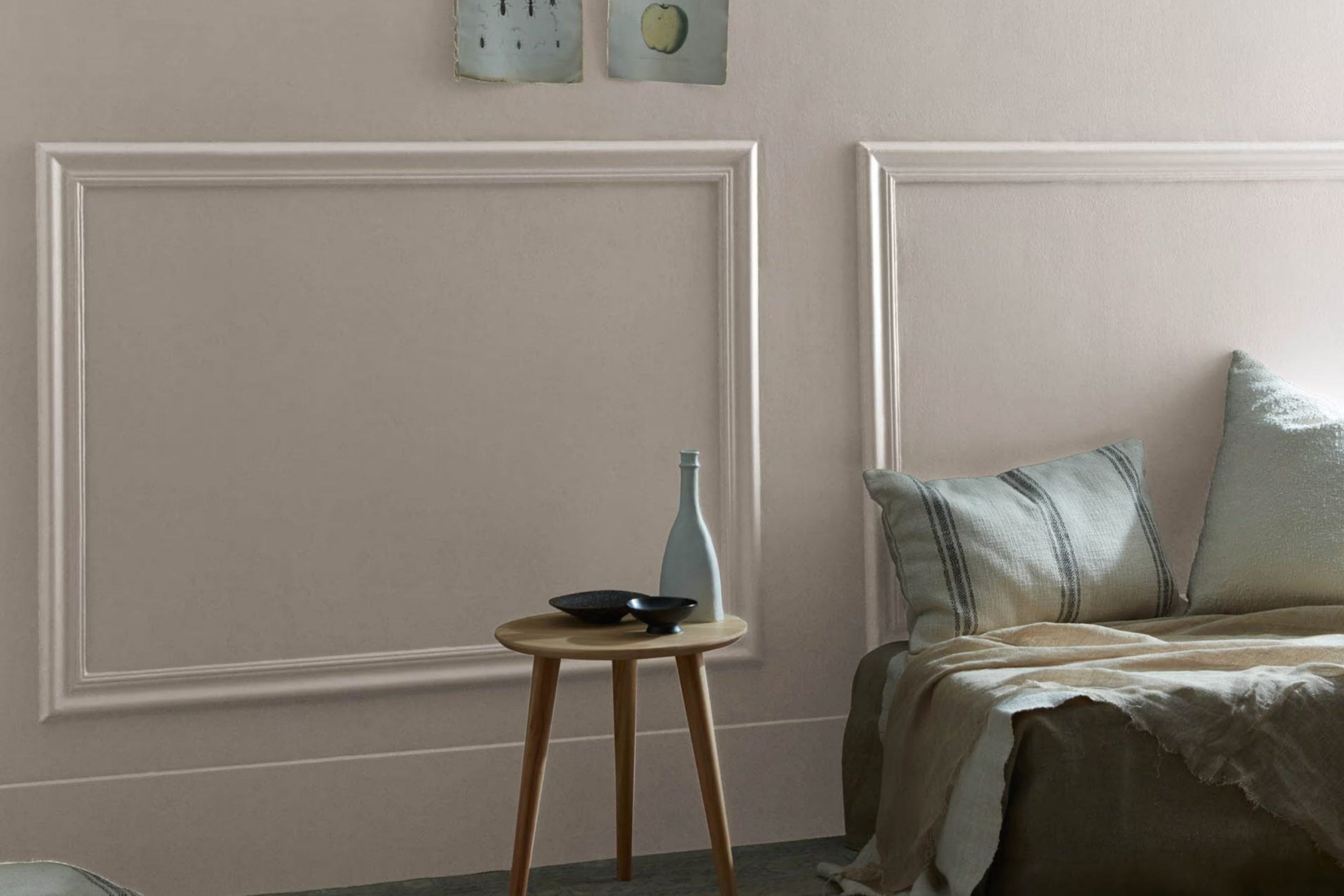
When you first see 2111-50 Stone Harbour by Benjamin Moore, you might be struck by its unique charm. This isn’t just any grey; it’s a refined blend that mimics the peaceful feeling of a misty morning by the sea. Its subtle strength lies in its ability to stand out while seamlessly merging with various decor styles, making it a great choice for anyone looking to refresh their room without overpowering it with color.
The adaptability of Stone Harbour is perhaps its greatest asset. Whether you’re aiming to revitalize your living room, bedroom, or even your kitchen, this color provides a neutral backdrop that complements both contemporary and traditional furnishings.
Think of it as a canvas awaiting your personal touch, allowing you and your room’s personality to shine.
In my journey to find the perfect paint color, Stone Harbour has emerged as a contender that balances warmth with modernity, offering a cozy, understated elegance that’s hard to ignore.
What Color Is Stone Harbour 2111-50 by Benjamin Moore?
Stone Harbour by Benjamin Moore is a flexible gray shade that carries a hint of both blue and green, giving it a unique and subtle depth. This color offers a fresh perspective to any room while maintaining a sense of calm and understated elegance. Due to its muted yet rich tone, Stone Harbour works exceptionally well in minimalist and modern interior designs. It also blends seamlessly into coastal and Scandinavian styles, bringing a light, airy feel to such rooms.
When it comes to pairing materials, Stone Harbour complements natural wood, which helps to warm up its cooler undertones. Whether it’s a dark walnut or a light, sandy oak, the wood’s natural patterns and textures stand out against this calming gray backdrop. Metals like brushed nickel and chrome also work well with Stone Harbour, adding a touch of sleek modernism to the decor.
Additionally, soft, plush fabrics in white or light pastel shades can soften up the room, creating a cozy and inviting environment. For those looking to beautify their living area, Stone Harbour is a reliable choice. It provides a neutral base that supports a wide range of design expressions and can freshen up any area of your home with its stylish, gentle presence.
Is Stone Harbour 2111-50 by Benjamin Moore Warm or Cool color?
Stone Harbour 2111-50 by Benjamin Moore is a unique shade that blends gray with subtle hints of blue and green. This flexible color is perfect for anyone wanting to add a touch of muted elegance to their home without overpowering the room.
It works exceptionally well in living rooms and bedrooms, providing a soothing backdrop that complements a wide range of decor styles, from modern to traditional. In rooms with ample natural light, Stone Harbour reflects beautifully, enhancing the room’s overall ambiance and making it feel cozy yet open.
In areas with less light, it adds depth and interest, giving the room a more intimate feel. This color pairs well with crisp whites or rich wood tones, which help to create a balanced and visually appealing environment. Whether used as an accent wall or throughout an entire room, Stone Harbour has a way of pulling different elements of a room together, making decorating simple and enjoyable.
Undertones of Stone Harbour 2111-50 by Benjamin Moore
Stone Harbour is a flexible paint color that can subtly change its appearance depending on its environment. The undertones in a color are like hidden hues that can reveal themselves under different lighting conditions or when paired with certain decor elements. Think of them as the color’s background chorus, influencing how the main color presents itself.
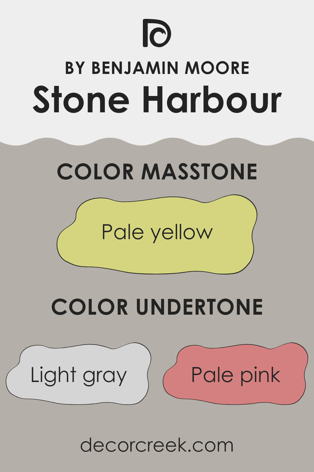
In the case of Stone Harbour, it has a variety of undertones that range from light gray to olive. These undertones play a significant role in the way we perceive the color. For instance, with light gray undertones, the wall may appear more neutral and balanced in rooms with ample natural light.
However, under artificial lighting, pale pink or light purple undertones might become more visible, giving the walls a subtle warmth. Lighting isn’t the only thing that affects how these undertones show; furnishings and décor can also bring out different shades. Light blue and mint undertones might make the room feel cooler, ideal for a calming bedroom or bathroom.
In contrast, yellow and orange undertones could add warmth to a welcoming living room, especially when complemented with natural wood or earthy textures. On interior walls, the complexity of these undertones means Stone Harbour can adapt well to different styles and rooms, reflecting varying moods and atmospheres.
The olive and light green undertones could ensure that the color works well in a room with lots of plants, enhancing a natural, earthy feel. Overall, this color, with its range of undertones, offers a flexible palette that can suit various interior themes, from modern and minimalistic to cozy and traditional.
What is the Masstone of the Stone Harbour 2111-50 by Benjamin Moore?
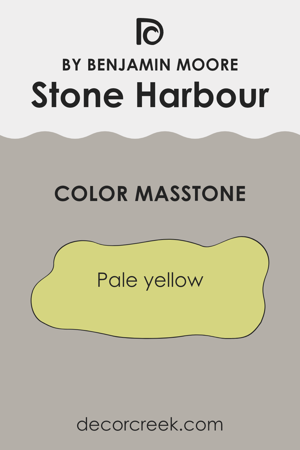
Stone Harbour 2111-50 by Benjamin Moore has a masstone of pale yellow, specifically shaded as #D5D580. This shade emits a subtle, soft glow that gives any room a cheerful and airy feel. Since it’s not strongly bright, it seamlessly fits into various home styles, from classic to modern.
This color works particularly well in living areas and kitchens where its gentle warmth fosters a welcoming environment. In bedrooms, its light tone can help create a calm, restful atmosphere, ideal for relaxing. Additionally, the light yellow can make small rooms appear larger and more open.
This masstone coordinates easily with other colors, allowing for flexible color schemes that can include both light and dark hues for contrast. Overall, this pale yellow offers an adaptable palette option that enhances rooms without dominating them, making it a practical choice for those looking to refresh their home’s aesthetic.
How Does Lighting Affect Stone Harbour 2111-50 by Benjamin Moore?
Lighting plays a crucial role in how we perceive colors. Different types of light can change how a color looks, sometimes making it appear brighter or duller. The color Stone Harbour by Benjamin Moore can vary significantly depending on whether it’s under artificial light or in natural light.
In artificial light, Stone Harbour tends to look warmer and more inviting. This is because most indoor lighting has a yellowish tint, which can make the color appear softer and more muted. In contrast, under natural light, especially bright sunlight, it looks crisper and more true to the gray shade that it is. You might notice subtle blue or green undertones that aren’t as evident under indoor lighting.
The direction a room faces also affects how Stone Harbour looks due to the quality of natural light it receives:
- North-Faced Rooms: These rooms get less direct sunlight, which can make Stone Harbour look cooler and more shadowy. Here, the color might lean slightly more towards its blue-green undertones, giving it a calm and more gentle look.
- South-Faced Rooms: These rooms are flooded with lots of natural light throughout the day. As a result, Stone Harbour can appear lighter and more vibrant here. Its warmer undertones might be more visible, making the room feel lively.
- East-Faced Rooms: Morning light is warm, and it shines best in these rooms during the morning hours. Stone Harbour will appear brightest and warmest in the morning, shifting to cooler tones as natural light fades throughout the day.
- West-Faced Rooms: Rooms facing this direction receive evening light, which is warmer and softer. Here, Stone Harbour will glow warmly towards the evening, maintaining a steady and pleasing look as the sun sets.
Understanding how Stone Harbour reacts under different lighting conditions can really help when deciding which rooms to paint and create the mood you want in your home. Bright and cheerful or calm and gentle, lighting will determine its impact.
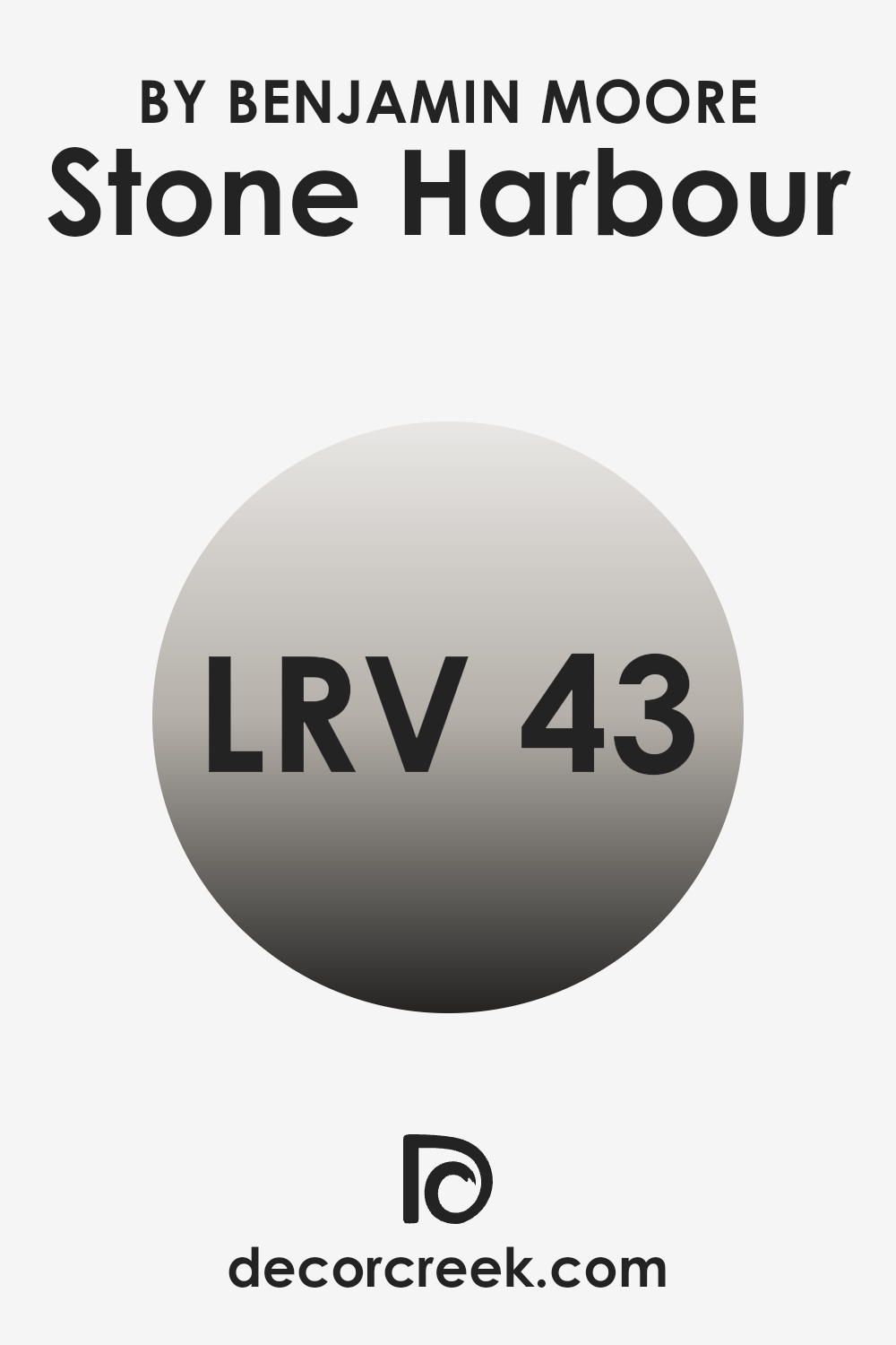
What is the LRV of Stone Harbour 2111-50 by Benjamin Moore?
LRV stands for Light Reflectance Value, which measures the percentage of light a paint color reflects back into a room. A higher LRV means the color reflects more light, making the room feel brighter and open, whereas a lower LRV means the color absorbs more light, creating a cozier and somewhat darker feel.
The scale on which this is measured goes from a low number, which reflects less light, to a high number, signaling more light reflection. With an LRV of 43.2, the color in question reflects a moderate amount of light, making it neither too dark nor too light.
This means it has the flexibility to work in various lighting conditions, as it won’t dramatically alter the perception of a room either by making it seem cramped or excessively expansive. Instead, it strikes a balance, providing a steady, neutral backdrop that would work well in a range of settings and complement different decor styles.
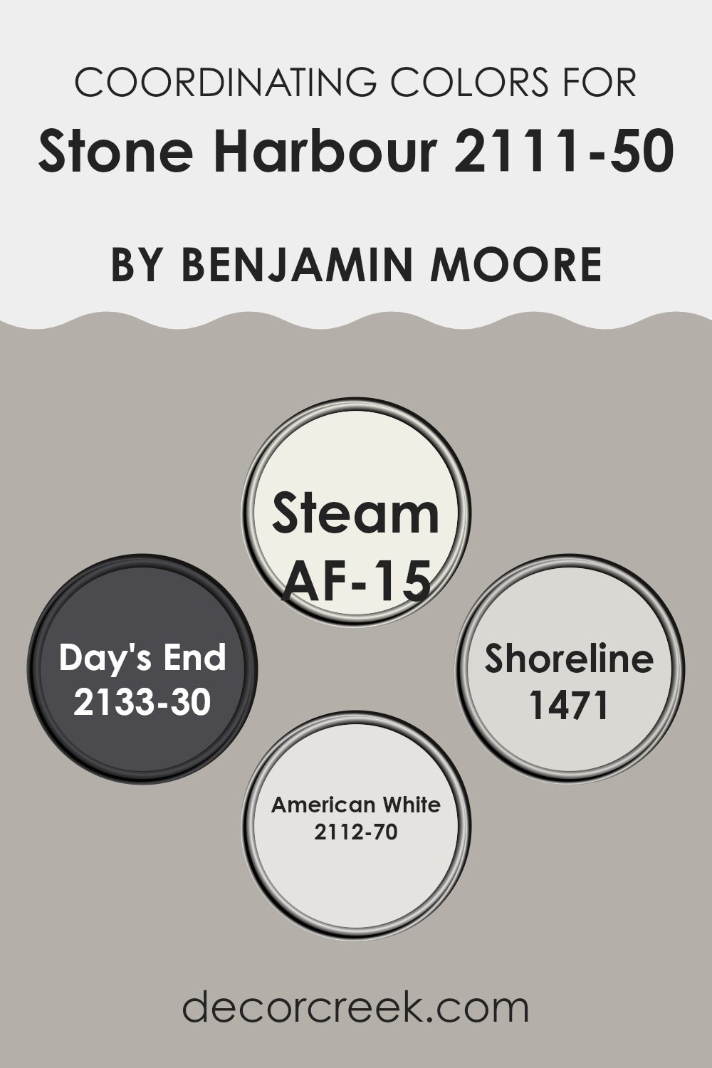
Coordinating Colors of Stone Harbour 2111-50 by Benjamin Moore
Coordinating colors are hues selected to complement a primary color, enhancing the overall aesthetic of a room while maintaining visual harmony. These colors can either be contrasting to bring some vibrancy into an interior or closely related shades that provide a subtle and cohesive look. When working with Stone Harbour by Benjamin Moore, a neutral and adaptable gray, choosing the right coordinating colors ensures that the gray stands out without overpowering the environment.
AF-15 – Steam by Benjamin Moore is a clean and crisp white that helps to brighten rooms and provide a fresh contrast to the deeper tones of Stone Harbour. This combination creates a balanced and inviting atmosphere, ideal for living rooms or kitchens.
Another coordinating color, 2133-30 – Day’s End, is a deep twilight blue that offers a bold counterpoint to Stone Harbour’s understated gray, perfect for creating a striking focal wall or accent features.
For a smoother transition, 1471 – Shoreline is a soft beige that blends seamlessly with Stone Harbour, enhancing the room with a warm and cozy feel without distraction, suitable for bedrooms or relaxing areas. Lastly, 2112-70 – American White offers a slightly warmer tint than Steam, imparting a subtle warmth to the cooler gray tones of Stone Harbour, making it ideal for areas needing a gentle touch of brightness.
You can see recommended paint colors below:
- AF-15 Steam
- 2133-30 Day’s End
- 1471 Shoreline
- 2112-70 American White
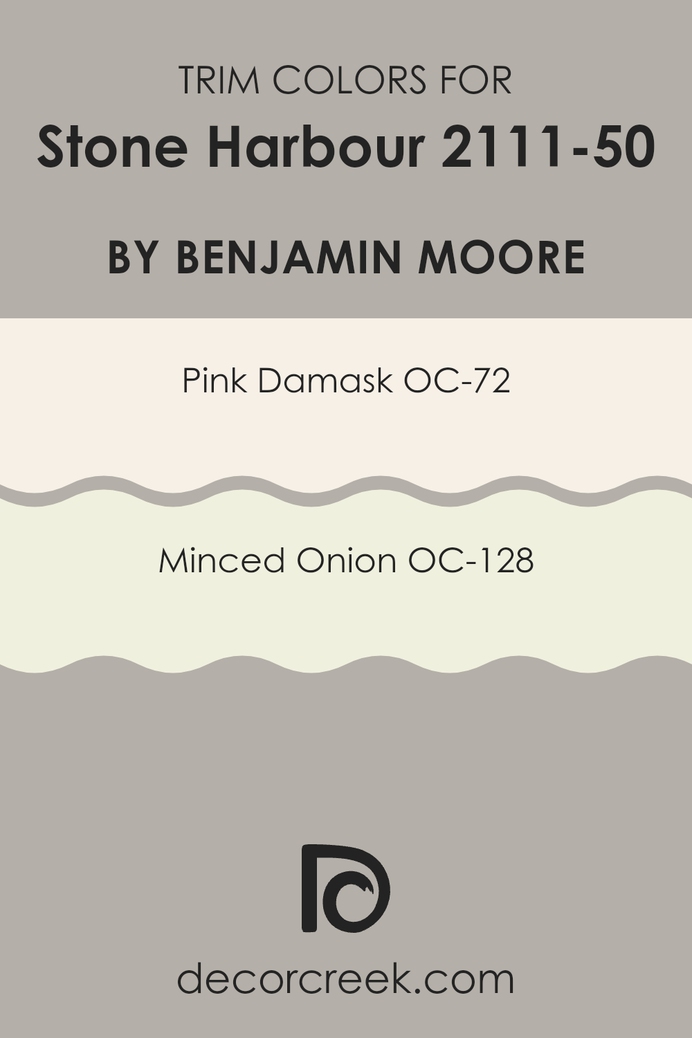
What are the Trim colors of Stone Harbour 2111-50 by Benjamin Moore?
Trim colors are specific shades used to accentuate and define the details of a room, like door frames, baseboards, window trims, and moldings. When used effectively, such as with the adaptable hue of Stone Harbour by Benjamin Moore, trim colors can complement the main wall color, enhancing the overall aesthetic of a room. Selecting the right trim colors helps in ensuring that these extensions pop out, providing a neat and polished look which outlines the architectural features of a room.
For a color such as Stone Harbour, choosing a warm and gentle shade like Pink Damask (OC-72) can add a subtle contrast that draws the eye without creating an overpowering effect. Pink Damask is a soft, muted pink that beams with a welcoming warmth, perfect for creating a friendly and relaxed atmosphere.
On the other hand, Minced Onion (OC-128) offers a lighter, nearly neutral option resembling a soft gray with undertones of white. This color is ideal for those looking to maintain a smooth and clean appearance that complements the deeper tone of Stone Harbour without drawing too much attention to itself. Integrating these colors as trims can effectively frame the central color themes, giving the room a professional finish.
You can see recommended paint colors below:
- OC-72 Pink Damask
- OC-128 Minced Onion
Colors Similar to Stone Harbour 2111-50 by Benjamin Moore
Implementing similar colors in a decor scheme, such as variations of Stone Harbour 2111-50 by Benjamin Moore, plays a critical role in creating a cohesive and harmonious aesthetic. Colors that resemble each other but have slight variations provide a subtle contrast that adds depth and texture without creating an overpowering effect.
This is crucial in rooms where a calm and unified appearance is desired. Such colors work together seamlessly, allowing for a smooth visual flow, making the room appear larger and more pulled together. This gentle blending can also enhance the overall mood of the interior, promoting a relaxed and comfortable environment.
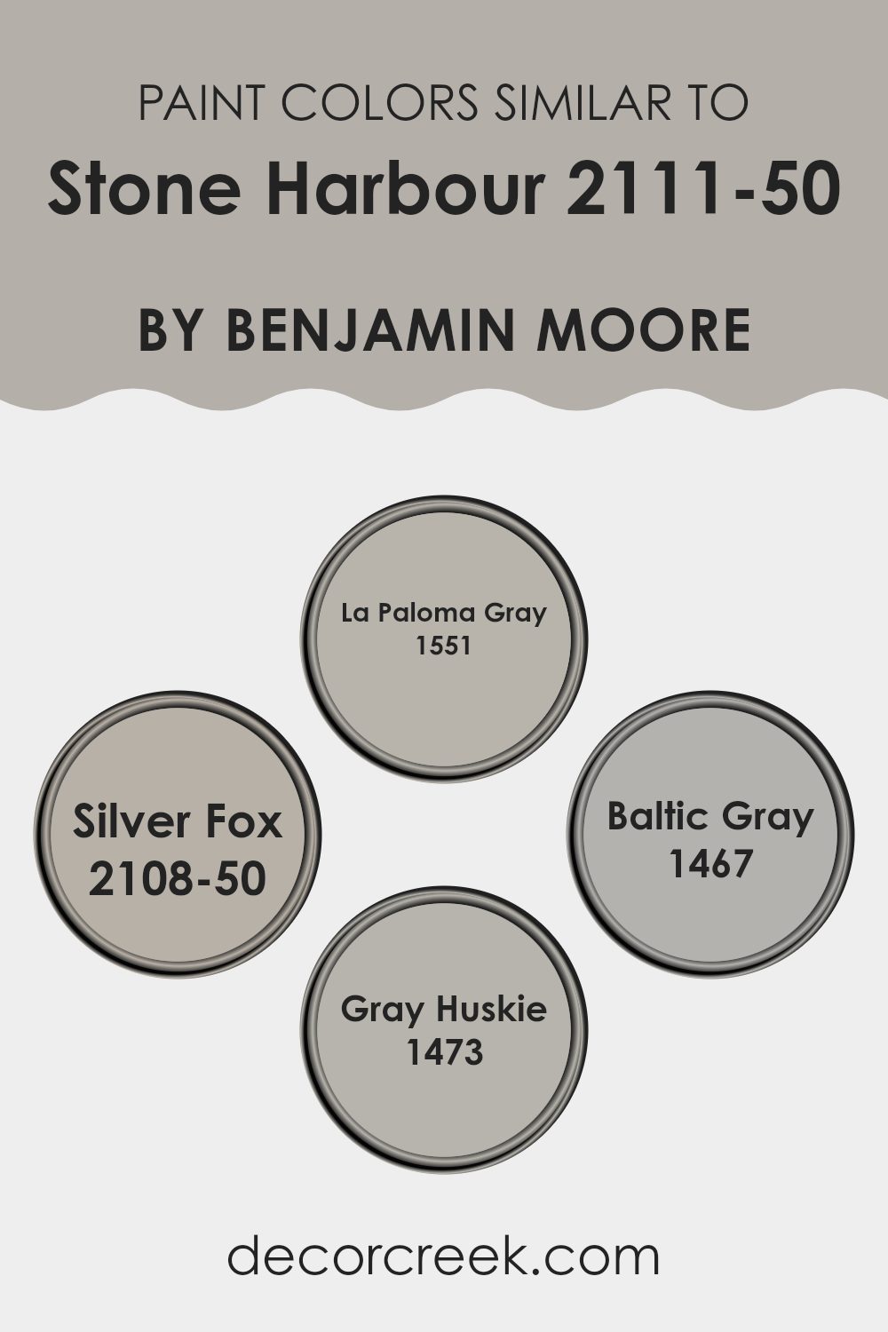
For instance, La Paloma Gray 1551 is a muted gray with a touch of blue, perfect for adding a slightly cooler tone while maintaining a low-key vibe. On the other hand, Silver Fox 2108-50 offers a warmer gray alternative that introduces a hint of cozy, inviting warmth to the room. Moving towards a deeper tone, Baltic Gray 1467 provides a stronger statement while still aligning with the other hues, ideal for accent walls or furniture.
Finally, Gray Huskie 1473 stands out as a medium gray that balances between warm and cool, making it extremely adaptable for integrating into various design elements. All these colors, while individual in their characteristics, collectively contribute to a cohesive look when paired with the baseline tone of Stone Harbour.
You can see recommended paint colors below:
- 1551 La Paloma Gray
- 2108-50 Silver Fox
- 1467 Baltic Gray
- 1473 Gray Huskie
Colors that Go With Stone Harbour 2111-50 by Benjamin Moore
Choosing the right colors that complement Stone Harbour 2111-50 by Benjamin Moore is crucial in achieving a well-balanced and harmonious look in any room. The reason why these specific colors are important is because they help create a cohesive atmosphere when used together.
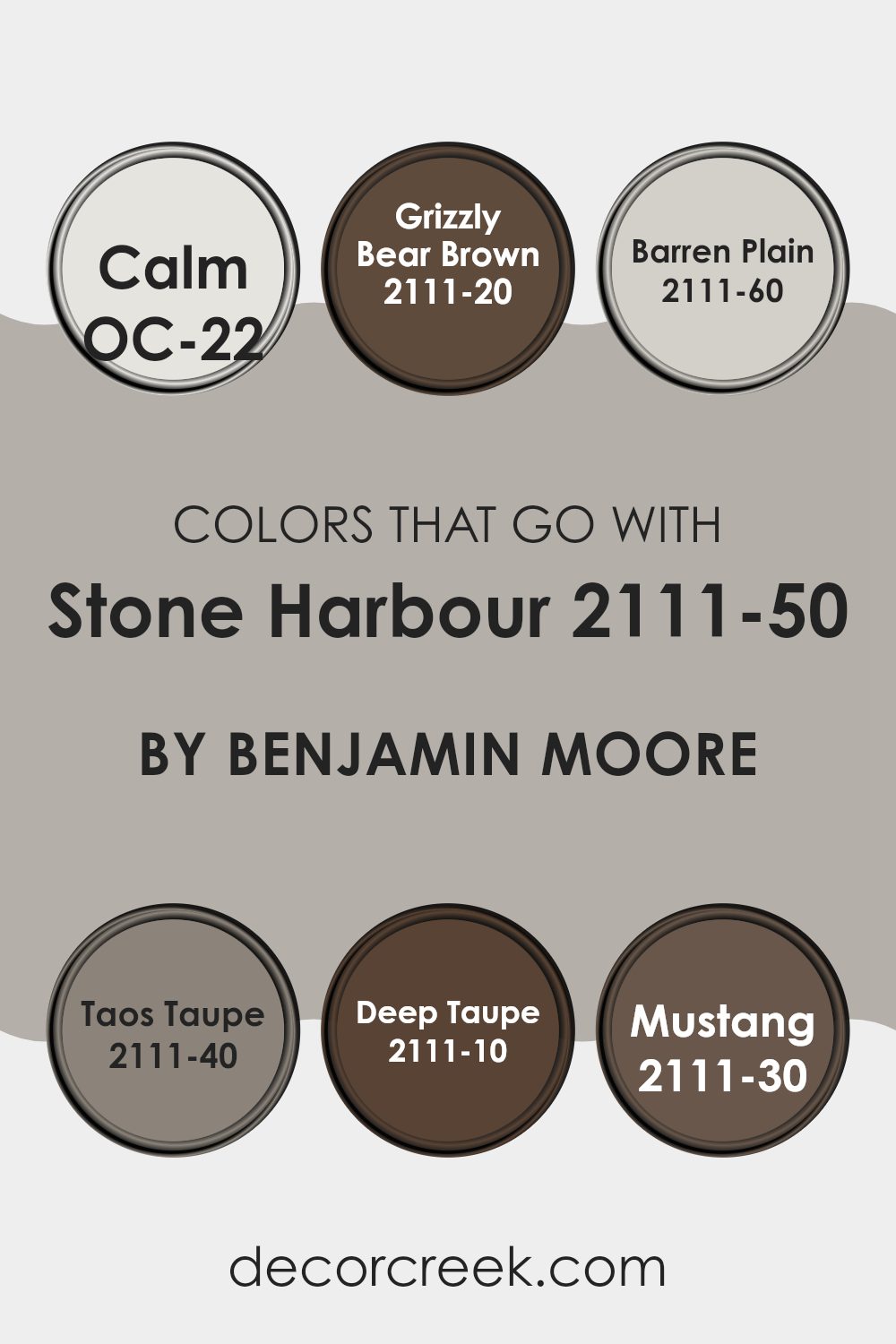
Colors like OC-22 – Calm and 2111-60 – Barren Plain provide subtle contrasts that can make the features of Stone Harbour stand out without creating an overpowering effect. Alternately, darker shades such as 2111-20 – Grizzly Bear Brown and 2111-10 – Deep Taupe provide depth and warmth, making a room feel more inviting.
OC-22 – Calm is a gentle off-white that offers a fresh and clean canvas, allowing more pronounced colors like Stone Harbour to really show off their depth. Grizzly Bear Brown is a deep, rich brown that brings a touch of coziness and grounding energy to interiors, playing off lighter shades beautifully.
Barren Plain is a soft light gray that works seamlessly with Stone Harbour, giving a subtle lift to the room without causing a stark contrast. Taos Taupe and Deep Taupe are warmer, muted brown shades that work well in creating a refined yet cozy atmosphere, complementing the cooler undertones of Stone Harbour.
Lastly, Mustang is a dark, almost black hue that adds dramatic flair and can make other colors pop when used as an accent. Combining these shades with Stone Harbour balances both light and dark tones, allowing for design flexibility in decorating any room, whether seeking a calm retreat or an elegantly defined area.
You can see recommended paint colors below:
- OC-22 Calm
- 2111-20 Grizzly Bear Brown
- 2111-60 Barren Plain
- 2111-40 Taos Taupe
- 2111-10 Deep Taupe
- 2111-30 Mustang
How to Use Stone Harbour 2111-50 by Benjamin Moore In Your Home?
Stone Harbour 2111-50 by Benjamin Moore is a adaptable gray shade with a hint of warmth, making it an excellent choice for adding a subtle, cozy touch to any room in your home. This color works beautifully in living rooms or bedrooms, providing a soothing backdrop that complements various decor styles, from modern to rustic. It is especially effective in rooms that get plenty of natural light, as the color shifts subtly throughout the day, adding depth and interest to the walls.
Using Stone Harbour in the kitchen can also enhance the room by pairing well with cabinets and countertops, creating a welcoming atmosphere. In smaller areas like bathrooms or hallways, this color can help to visually expand the interior, giving the illusion of more openness.
For those looking to add a bit of contrast, Stone Harbour pairs well with brighter colors or rich textures, allowing for personal touches through artwork, furniture, or accent pieces. This makes it not only a practical choice for wall color but also a fantastic base for showcasing your unique style.
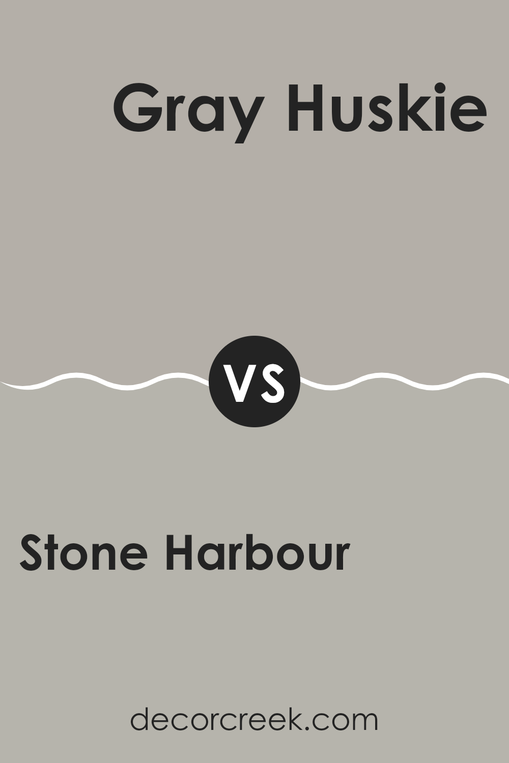
Stone Harbour 2111-50 by Benjamin Moore vs Gray Huskie 1473 by Benjamin Moore
Stone Harbour and Gray Huskie, both by Benjamin Moore, are unique gray shades that decorate rooms beautifully. Stone Harbour presents as a soft, muted gray with a slightly warm undertone, making it a adaptable choice for interiors aiming for a gentle and welcoming atmosphere. It can lighten an area while maintaining a cozy feel, ideal for living rooms or bedrooms.
On the other hand, Gray Huskie appears as a deeper, stronger gray, with cooler undertones. This color is perfect for those who prefer a more pronounced gray that still keeps the calmness grays are known for. It works well in areas that require a bit more drama or definition, like kitchens or bathrooms.
Both colors offer distinct vibes: Stone Harbour is softer and warmer, thus more subdued, while Gray Huskie provides a bolder, cooler statement. Depending on the room and its lighting, either could enhance the environment with their unique shades of gray.
You can see recommended paint color below:
- 1473 Gray Huskie
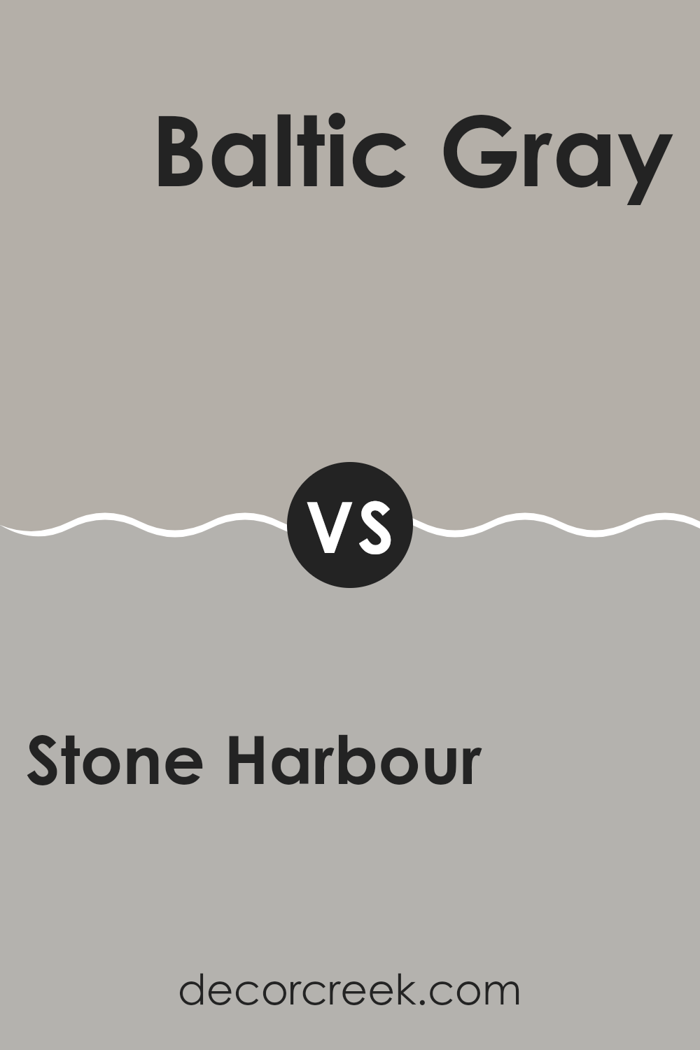
Stone Harbour 2111-50 by Benjamin Moore vs Baltic Gray 1467 by Benjamin Moore
Stone Harbour and Baltic Gray, both from Benjamin Moore, present a calming and neutral palette, but with distinct undertones and vibes. Stone Harbour is a lighter gray with a warm, soft feel to it, making it particularly adaptable for various rooms needing a gentle backdrop.
On the other hand, Baltic Gray, while still maintaining a neutrality, leans towards a deeper, cooler gray that offers a bit more boldness. This makes it suitable for areas where a stronger, yet still understated, color statement is desired.
Although both colors can coordinate well within a home for a harmonious look, the choice between them depends on how much warmth or coolness you’d like to introduce to your interior. Their subtlety allows them to be used in many settings without overpowering design schemes.
You can see recommended paint color below:
- 1467 Baltic Gray
Stone Harbour 2111-50 by Benjamin Moore vs Silver Fox 2108-50 by Benjamin Moore
Stone Harbour and Silver Fox, both by Benjamin Moore, offer subtle yet distinct tones for interior settings. Stone Harbour has a cooler undertone, presenting a light gray with hints of blue, making it perfect for creating a calming atmosphere without being too dark. It works especially well in rooms that receive plenty of natural light, as the illumination highlights its nuanced shifts.
In contrast, Silver Fox carries a warmer, taupe-like shade. It’s an adaptable gray that leans toward a soft beige under certain lighting, offering a cozy, welcoming feel. Unlike the cooler character of Stone Harbour, Silver Fox introduces gentle warmth, making it ideal for areas where a softer ambiance is preferred.
Both shades are neutral enough to pair seamlessly with a wide variety of design styles and furnishings. Silver Fox may be the better option for those wanting warmth and coziness, while Stone Harbour is the choice for a muted, cool aesthetic that feels fresh and understated.
You can see recommended paint color below:
- 2108-50 Silver Fox
Stone Harbour 2111-50 by Benjamin Moore vs La Paloma Gray 1551 by Benjamin Moore
Stone Harbour and La Paloma Gray, both from Benjamin Moore, offer distinct takes on neutral gray shades. Stone Harbour is a lighter gray with a subtle hint of beige, making it a perfect choice for areas that you want to feel airy and bright. Its lightness gives a room an open, welcoming feel without being too stark.
In contrast, La Paloma Gray is a deeper, mid-tone gray that brings a stronger presence of color. This shade is great for adding a bit more body to a room without engulfing it with darkness. It helps create a cozy atmosphere, especially in well-lit environments where its richness can really shine through.
While Stone Harbour works best in areas where you want to keep things light and subtle, La Paloma Gray is ideal for zones where a slightly bolder, yet still neutral, tone is desired. Combining both colors in different parts of a home could also work well, using Stone Harbour in smaller, brighter areas and La Paloma Gray in larger or more intimate settings.
You can see recommended paint color below:
- 1551 La Paloma Gray
After reading about the paint color 2111-50 Stone Harbour by Benjamin Moore, I can say it’s a really good choice if you want a room that feels calm and cool. The color mixes gray with a hint of blue, creating a look that’s peaceful and not too bright or too dark. It seems perfect for places in the house where you want to relax like bedrooms or living rooms.
I learned that the color goes well with many different styles. Whether you have a modern home with lots of metal and glass or a cozy spot with wood and soft cushions, Stone Harbour can fit right in. It can be a background color that lets your furniture or decorations stand out.
Also, it’s great for both small rooms and bigger areas. In small rooms, it can make the walls feel like they are pulling back, making the room seem larger. In big rooms, it helps tie everything together.
In conclusion, Stone Harbour by Benjamin Moore seems like a really useful paint color. It’s not just pretty but also practical, working well in different rooms and with many kinds of furniture. If someone is thinking about picking a new color for their walls, Stone Harbour is definitely worth considering.
Ever wished paint sampling was as easy as sticking a sticker? Guess what? Now it is! Discover Samplize's unique Peel & Stick samples.
Get paint samples

