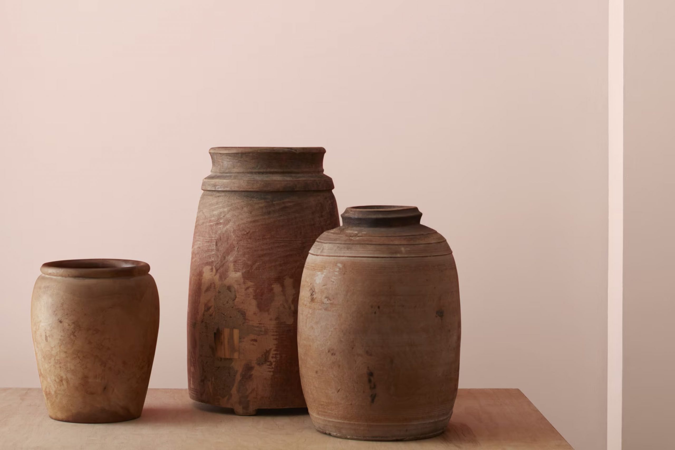
I recently came across 1185 Sugarcane by Benjamin Moore, and I must say, it’s one of those shades that makes you feel instantly at home. Often, choosing the right paint color can feel like too much with so many options out there, but 1185 Sugarcane stands out for its soothing and gentle presence. This shade is a soft off-white that leans toward a warm beige, making it adaptable for any room you’re thinking of refreshing.
Perfect for those looking to create a cozy and inviting room, Sugarcane pairs wonderfully with natural textures and materials. Whether you’re aiming to revamp your living room or just give your bedroom a subtle touch of warmth, this color offers a calm backdrop. It’s not just a backdrop, though; its depth adds a layer of elegance to your décor.
What makes 1185 Sugarcane special is its ability to adjust. In different lighting, it reveals various undertones that can complement a wide range of décor styles, from modern minimalist to rustic farmhouse.
So, if you’re in search of a color that provides both flexibility and a sense of calm, 1185 Sugarcane might just be the perfect starting point.
What Color Is Sugarcane 1185 by Benjamin Moore?
Sugarcane by Benjamin Moore is a soft and subtle shade of off-white that brings a cozy, gentle feeling to any room. This color has a warm tone that makes rooms feel inviting and peaceful, ideal for creating a relaxed atmosphere. Despite its simplicity, Sugarcane provides a fresh and clean look, perfect for those who prefer understated elegance in their decor.
Sugarcane works exceptionally well in interior styles that prioritize comfort and simplicity, such as Scandinavian, modern, and minimalist designs. Its neutral character allows it to serve as a background for various decor elements without overpowering them. This shade particularly shines in well-lit rooms, where the natural light enhances its warm undertones.
When it comes to pairing Sugarcane with materials and textures, it matches beautifully with natural wood, which complements its warmth. It also looks great with soft textiles like cotton and linen in lighter colors to maintain a light and airy feel. For a bit of contrast, incorporating elements in black or dark gray can add a modern touch to the overall aesthetic.
Metal accents, particularly in brass or gold, can also add a hint of luxury to an interior painted in Sugarcane, creating a subtle yet cozy feel.
Is Sugarcane 1185 by Benjamin Moore Warm or Cool color?
Sugarcane (1185) by Benjamin Moore is a warm and soft off-white paint color that can make any room feel cozy and welcoming. Its subtle pink undertones add a hint of warmth and can help make rooms seem friendlier and more inviting.
This color is great for areas where you want to relax, like bedrooms or living rooms. It works well in homes because it pairs easily with many other colors, from bold shades to more neutral tones, allowing for a lot of flexibility in home decor.
Since Sugarcane is a lighter color, it also helps to make small rooms appear bigger and brighter. This is perfect for hallways or small bathrooms that might otherwise feel cramped. The color’s gentle nature doesn’t feel too strong on the senses, making it a good choice for most rooms. It’s especially valuable for anyone wanting to freshen up their home without making drastic changes.
Undertones of Sugarcane 1185 by Benjamin Moore
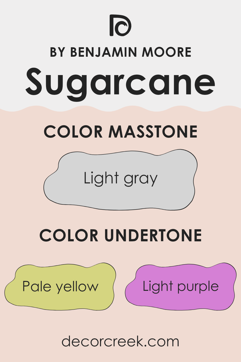
The color Sugarcane by Benjamin Moore is unique because it contains a complex mix of undertones that can subtly influence the appearance of the paint in different lighting conditions.
Undertones are the colors that lurk beneath the surface of the primary color, and they can significantly affect how we perceive a color. For instance, undertones can make a color look cooler or warmer depending on the setting and lighting.
Sugarcane has undertones of pale yellow, light purple, light blue, pale pink, mint, lilac, and grey. Each of these undertones contributes to the overall look in various ways:
- Pale Yellow: Adds a soft warmth, making the room feel cozy and inviting.
- Light Purple and Lilac: Provide a subtle hint of elegance, balancing the warmth with a touch of cool.
- Light Blue and Mint: These cooler tones can make a room feel fresh and airy.
- Pale Pink: Gives a gentle, welcoming glow to the walls.
- Grey: Offers a neutral base that helps balance the brighter colors, ensuring the color doesn’t feel too strong in the room.
When applied to interior walls, these undertones of Sugarcane ensure the color adapts subtly to changes in light throughout the day. In natural sunlight, the warmer yellow and pink tones might become more apparent, creating a bright and warm feel. In artificial lighting, the cooler tones like blue and lilac might stand out more, providing a balanced, calm atmosphere. This adaptability makes Sugarcane a flexible choice for many rooms, complementing various décor styles and color schemes.
decorcreek.com
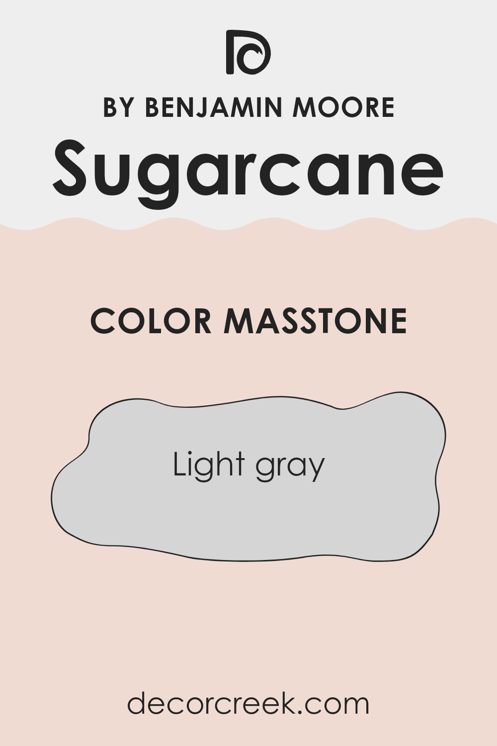
What is the Masstone of the Sugarcane 1185 by Benjamin Moore?
Sugarcane by Benjamin Moore, marked by its light gray tone (#D5D5D5), is a subtle and adaptable color perfect for home interiors. This soft shade effectively brightens rooms, making areas feel more open and airy without being stark, as pure white sometimes can. Its neutral quality allows it to pair well with many décor styles and colors, providing a restful backdrop that doesn’t clash with other elements.
Since light gray is gentle on the eyes, Sugarcane is ideal for areas where you spend a lot of time, such as living rooms or bedrooms. It’s particularly useful in smaller rooms or areas with less natural light, as it can make them appear larger and more welcoming.
This color is also low maintenance; light marks or smudges are less visible, reducing the need for frequent touch-ups. Overall, Sugarcane is a practical choice for creating a pleasant, modern look in any home.
How Does Lighting Affect Sugarcane 1185 by Benjamin Moore?
Lighting plays a crucial role in how we perceive colors in our surroundings. The color we see is not just about the paint or fabric itself; it’s also about the light that shines on it. Different light sources can change how a color looks. For example, natural sunlight gives the truest representation of color, while artificial light can alter this perception.
The color Sugarcane by Benjamin Moore is a soft, subtle shade that reacts uniquely under different lighting conditions and room orientations. In natural light, Sugarcane displays its true color, which is a gentle off-white with a hint of warmth. This warm undertone makes it look fresh and inviting when the sunlight hits it.
In rooms with artificial lighting, Sugarcane’s appearance can change based on the type of bulbs used. Warm bulbs enhance its creamy qualities, making the room feel cozy. Cooler bulbs might make it look brighter and slightly more neutral, which could affect the warmth it brings to the area.
Room orientation affects how Sugarcane appears throughout the day:
- North-faced rooms: These rooms get less direct sunlight, which can make colors appear cooler and more muted. Sugarcane in a north-facing room might look more neutral and less warm, making the area feel calmer but slightly less cozy.
- South-faced rooms: These rooms enjoy ample sunlight, brightening and warming up the color. Here, Sugarcane will appear at its richest during the day, enhancing the room’s natural light with a soft, warm glow.
- East-faced rooms: Morning light is warm and bright, so Sugarcane will start the day glowing warmly in these rooms. However, as the day progresses and the natural light diminishes, the color might lose some of its warmth and look more subdued.
- West-faced rooms: Evening light in these rooms means Sugarcane will end the day with a warm glow. During most of the day, the color might appear slightly cooler until the warm, afternoon light fills the room.
Thus, the direction your room faces, along with the type of light it receives, can significantly impact how Sugarcane will look and feel in your interior.
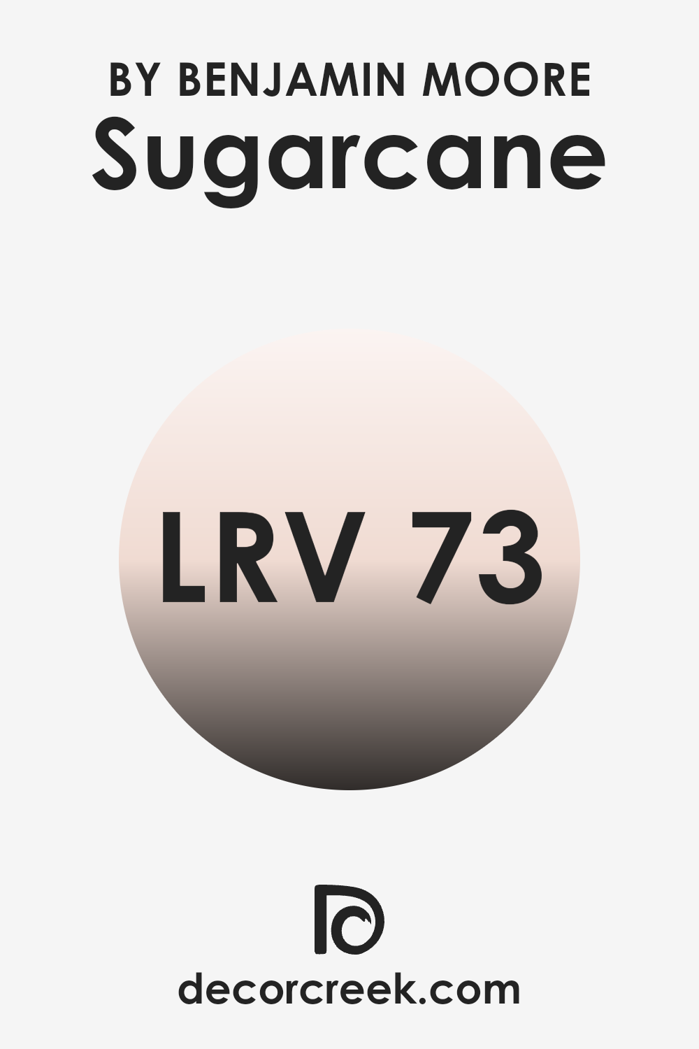
What is the LRV of Sugarcane 1185 by Benjamin Moore?
LRV stands for Light Reflectance Value, a measurement that indicates how much light a paint color reflects back into a room. This value is presented on a scale where higher numbers mean the color reflects more light.
Understanding this can help you choose paint colors that will make your rooms look bigger or smaller, brighter or cozier, depending on your needs.
The LRV of 72.55 for the color we are discussing means it is quite reflective. This makes it a good choice for rooms that might not get a lot of natural sunlight, as it can help brighten the room. This lighter shade will not absorb much light, so it will help maintain a bright and open feel in the room. Using such a reflective color can especially be a strategic choice in smaller rooms or areas to give an illusion of more room.
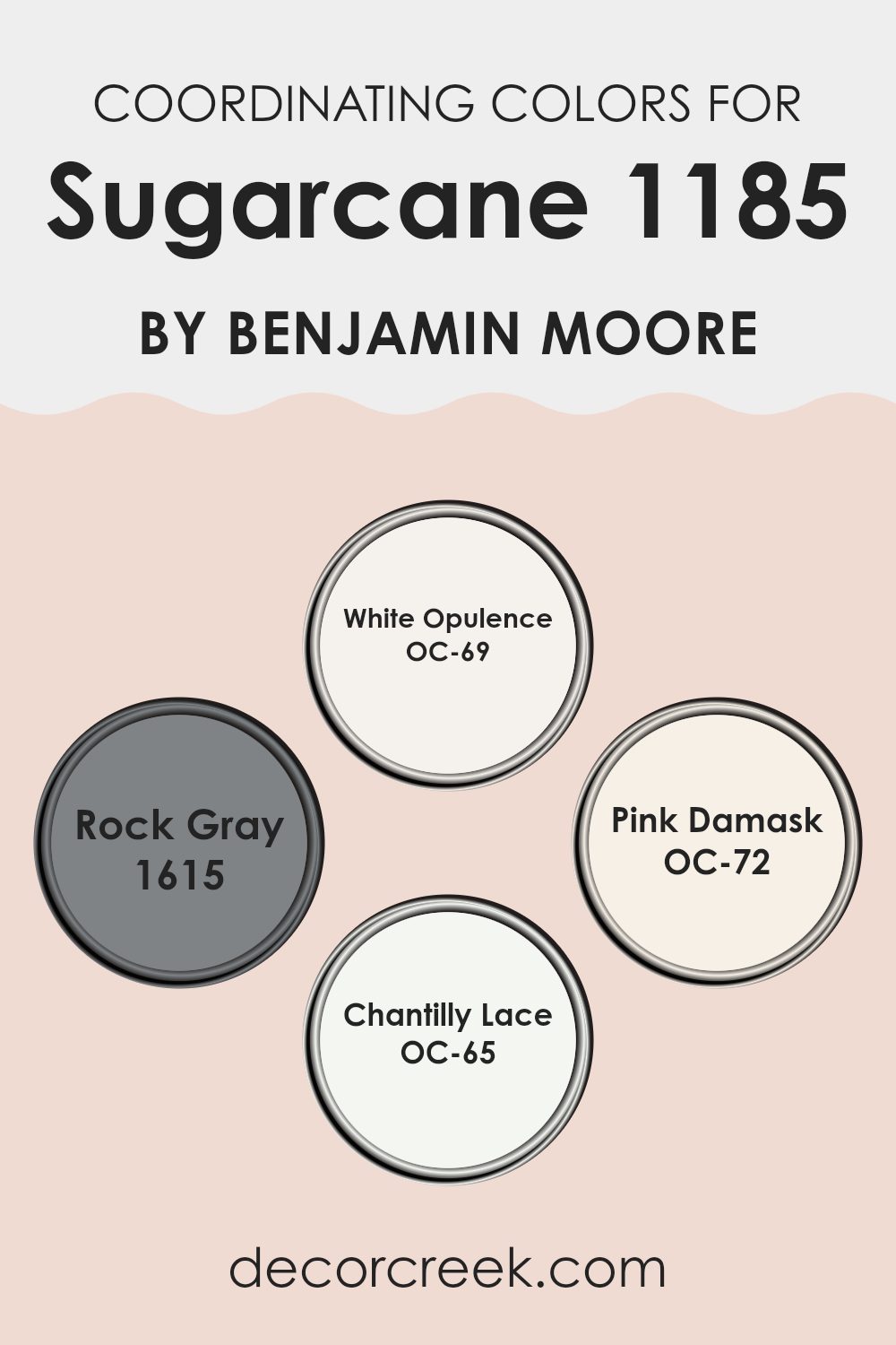
Coordinating Colors of Sugarcane 1185 by Benjamin Moore
Coordinating colors are selected shades that complement a main color, enhancing the overall aesthetic of a room without feeling too strong. This concept is often used in interior design to create a harmonious palette that can both accent and unify a room. For example, when paired with the subtle warmth of a neutral like Sugarcane by Benjamin Moore, other coordinating colors add depth and contrast while maintaining a cohesive look.
White Opulence is a crisp, clean white that provides a fresh and airy feel, making it ideal for trim or ceilings to give a lifted effect to the room. Rock Gray offers a solid, earthy base that can anchor lighter tones and serve well in larger areas or as an accent wall to add some visual weight.
Pink Damask is a gentle blush pink that brings a soft, welcoming touch, perfect for creating a calming atmosphere in rooms meant for relaxation. Chantilly Lace is another pure white, but with a slightly softer edge than White Opulence, offering flexibility for use in any room that needs a touch of brightness without starkness. Together, these colors work smoothly with Sugarcane, ensuring that each room shows a polished and cohesive appearance.
You can see recommended paint colors below:
- OC-69 White Opulence
- 1615 Rock Gray
- OC-72 Pink Damask
- OC-65 Chantilly Lace
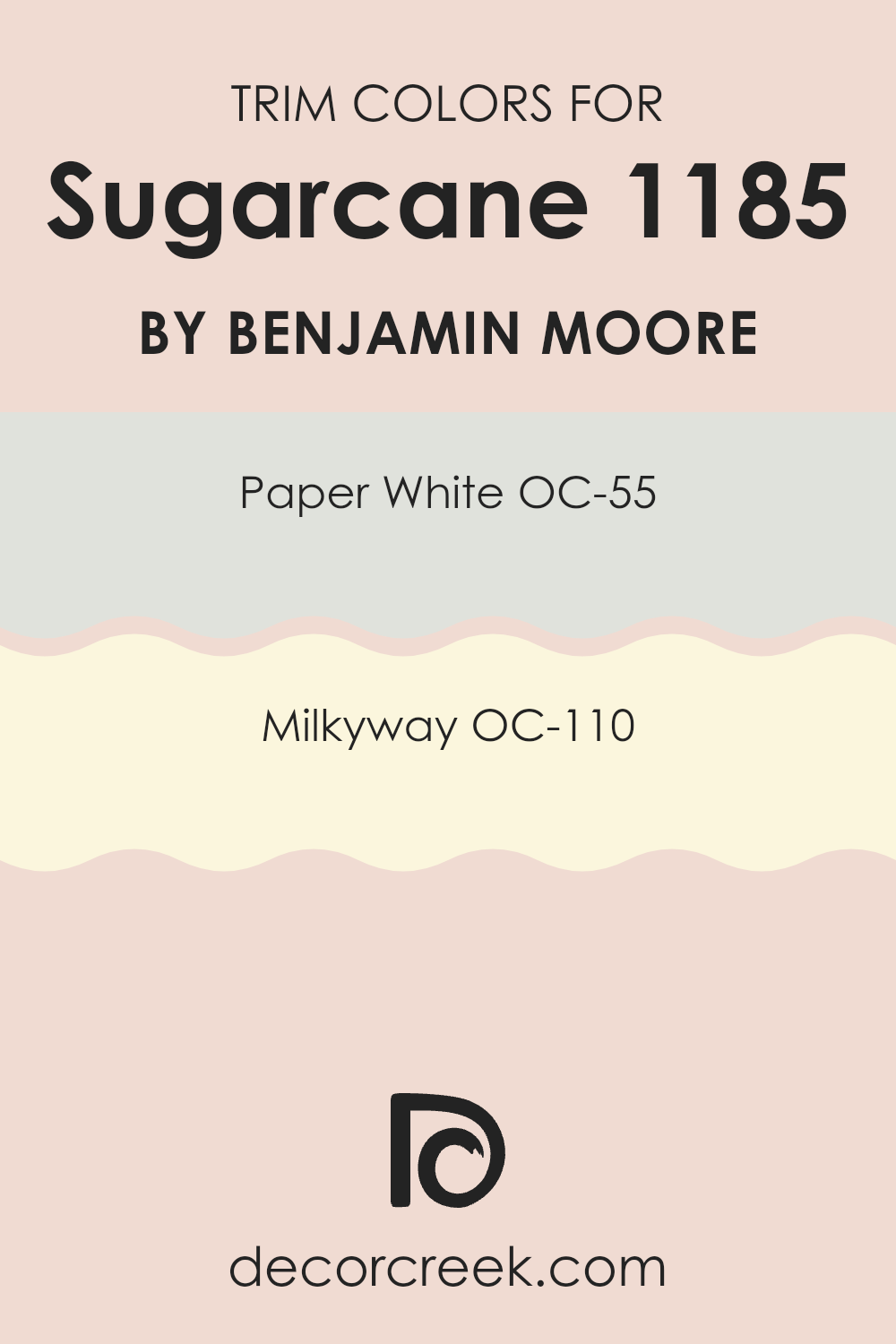
What are the Trim colors of Sugarcane 1185 by Benjamin Moore?
Trim colors are the hues selected for the edges and accents in a room, such as door frames, skirting, and moldings. Choosing the right trim color can significantly affect the overall look and feel of a room, creating a distinct visual frame around different areas or features within a room.
When paired with a wall color like Benjamin Moore’s Sugarcane (1185), trim colors can either blend smoothly or create a striking contrast, depending on the desired effect. The choice of trim colors can bring balance and crispness to the overall aesthetic of a room, enhancing the main color scheme effectively.
“Paper White” (OC-55) is a fresh and clean white shade that provides a subtle contrast against deeper and mid-tone colors, making it an adaptable choice for trim. It helps in highlighting the architectural features of a room without becoming too dominant. “Milkyway” (OC-110), on the other hand, offers a slightly warmer and creamier hue for trim, perfect for adding a gentle, soft touch to rooms. This color works exceptionally well with understated or pastel wall colors, helping to knit the room’s colors together harmoniously without sharp contrasts.
You can see recommended paint colors below:
- OC-55 Paper White
- OC-110 Milkyway
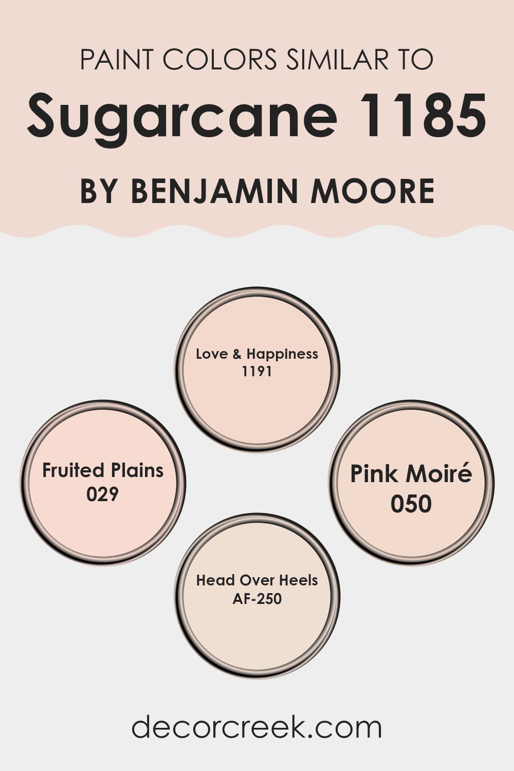
Colors Similar to Sugarcane 1185 by Benjamin Moore
Choosing similar colors such as Love & Happiness, Fruited Plains, Pink Moiré, and Head Over Heels to complement 1185 Sugarcane by Benjamin Moore can create a harmonious and cohesive look in your interior. Using shades that blend well together ensures that each room flows into the next smoothly, providing visual continuity that is pleasing to the eye. For homeowners, this approach maximizes the aesthetic value of the home without causing abrupt transitions between rooms, making for a more comfortable and relaxing environment.
Love & Happiness has a gentle pink that evokes a sense of calm happiness, perfect for creating a welcoming vibe in living areas. Fruited Plains offers a subtler, earthy pink that grounds the room while still adding a touch of warmth, ideal for a cozy setting. Pink Moiré is a softer, lighter pink, enhancing rooms with a hint of airy openness, great for smaller or darker rooms to give them a more open feel.
Lastly, Head Over Heels is a bolder pink that still manages to hold a soft presence, making it a striking choice for accent walls or decorative elements to add a lively splash without feeling too strong. These choices collectively enhance the ambiance set by Sugarcane 1185, creating an environment that feels inviting and stylish.
You can see recommended paint colors below:
- 1191 Love & Happiness
- 029 Fruited Plains
- 050 Pink Moiré
- AF-250 Head Over Heels
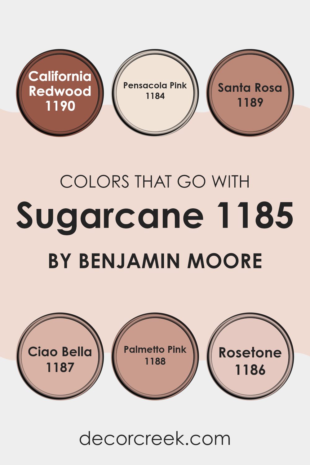
Colors that Go With Sugarcane 1185 by Benjamin Moore
Colors that complement Sugarcane 1185 by Benjamin Moore are crucial because they help in creating a cohesive and appealing look in a room. The selected colors should harmonize well to offer a calming effect and enhance the aesthetics of the room.
For instance, California Redwood 1190 brings warmth and a hint of traditional elegance into the room, making it ideal for areas that aim for a cozy and welcoming atmosphere. Pensacola Pink 1184 is softer and brings a gentle touch, ideal for creating a light, airy feel in bedrooms and bathrooms.
Santa Rosa 1189 is earthy with a muted tone, providing a natural, grounding contrast to Sugarcane 1185, which works wonders in living areas that benefit from a subtle yet impactful presence. Ciao Bella 1187, on the other hand, adds an artistic flair with its vibrant yet not too intense hue, perfect for accent walls or decorative elements.
Palmetto Pink 1188 is slightly more saturated and lively, providing a cheerful splash of color that pairs well with the neutral backdrop of Sugarcane. Lastly, Rosetone 1186 offers a romantic, soft visual appeal, blending well with Sugarcane to set a relaxing and inviting mood in any room. Using these colors in combination with Sugarcane 1185 will effectively set the tone and mood desired in different rooms.
You can see recommended paint colors below:
- 1190 California Redwood
- 1184 Pensacola Pink
- 1189 Santa Rosa
- 1187 Ciao Bella
- 1188 Palmetto Pink
- 1186 Rosetone
How to Use Sugarcane 1185 by Benjamin Moore In Your Home?
Sugarcane 1185 by Benjamin Moore is a gentle and light beige color that works beautifully in any home. It’s quite adaptable, and can easily fit in with a range of decorating styles, whether you prefer a modern look or something more classic.
If you’re thinking about refreshing a room, this color is a great choice for walls since it adds a warm and inviting tone without feeling too strong. This subtle shade pairs well with bolder colors if you want to add some contrast, or with similar soft tones for a calm and cohesive look.
You can use Sugarcane 1185 in different rooms like the living room, bedroom, or even the kitchen. It’s especially good for smaller rooms because the light color can make rooms appear bigger and brighter. Additionally, this hue works well with natural light, enhancing a sunny and airy feel in your room. With Sugarcane 1185, you can create a friendly and welcoming atmosphere in your home.
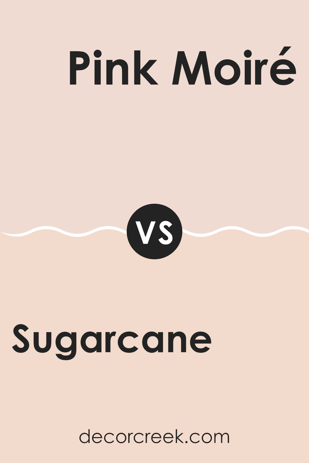
Sugarcane 1185 by Benjamin Moore vs Pink Moiré 050 by Benjamin Moore
The two colors Sugarcane and Pink Moiré, both from Benjamin Moore, present interesting contrasts in their tones. Sugarcane is a light, soft beige that gives off a warm and cozy feel, making it excellent for creating a comfortable and inviting atmosphere in any room. Its subtlety allows it to blend well with many decor styles without feeling too strong alongside other elements.
On the other hand, Pink Moiré is a gentle pink with a slightly more noticeable hue compared to Sugarcane. This color brings a delicate, cheerful vibe that can brighten rooms and add a touch of light-heartedness. While it is still soft enough not to dominate a room’s overall look, Pink Moiré offers a hint of playful color that can make small rooms feel more open and lively.
Both colors are flexible and can be used in many settings, though Sugarcane tends to suit a wider range of decor themes due to its neutral nature, while Pink Moiré is a great choice for adding a subtle splash of color.
You can see recommended paint color below:
- 050 Pink Moiré
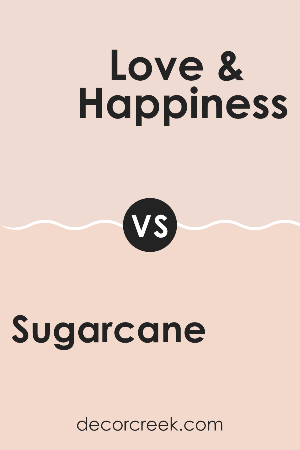
Sugarcane 1185 by Benjamin Moore vs Love & Happiness 1191 by Benjamin Moore
Sugarcane and Love & Happiness are both soothing colors from Benjamin Moore’s palette but have distinct vibes. Sugarcane is a soft, muted beige with warm undertones. It creates a cozy and inviting atmosphere, perfect for rooms where you want calm and simplicity. It pairs well with a variety of decor, making it adaptable for any room.
Love & Happiness, on the other hand, adds a touch of pink, giving it a gentle, cheerful quality compared to the more neutral Sugarcane. This color tends to brighten up a room and bring in a subtle, joyful energy. It’s ideal for places where a light, uplifting feel is desired, like a nursery or a relaxing reading corner.
Both colors reflect light well and can make small rooms appear larger. While Sugarcane leans toward a traditional look, Love & Happiness offers a hint of playfulness and soft charm to a room.
You can see recommended paint color below:
- 1191 Love & Happiness
Sugarcane 1185 by Benjamin Moore vs Fruited Plains 029 by Benjamin Moore
Sugarcane 1185 by Benjamin Moore is a soft, muted beige with a warm undertone, offering a cozy, inviting feel to any room. It’s an adaptable color that works well in many areas of a home, such as living rooms or bedrooms, providing a calm, neutral backdrop that pairs easily with a variety of furniture styles and other colors.
In contrast, Fruited Plains 029 by Benjamin Moore is a lighter, slightly yellow-toned beige. This color is brighter and offers a fresh, airy feel, which can make small rooms appear larger and more open. It’s especially suitable for kitchens and bathrooms or any area that could benefit from a light, clean look.
Both Sugarcane and Fruited Plains share a neutral palette, but Fruited Plains leans toward a sunnier vibe, potentially adding a subtle cheerfulness to rooms. Sugarcane, with its warmer tone, suggests a more snug and sheltered atmosphere. Choosing between them would depend on the mood and functionality you want for the room.
You can see recommended paint color below:
- 029 Fruited Plains
Sugarcane 1185 by Benjamin Moore vs Head Over Heels AF-250 by Benjamin Moore
The main color, Sugarcane, is a soft, light taupe that offers a warm, subtle backdrop for any room. Its understated charm comes from its ability to blend well with other colors, making it ideal for creating a cozy and welcoming environment. This shade is perfect for minimalist or traditional decor styles, particularly in rooms where you want to keep things calm and neutral.
On the other hand, Head Over Heels is a deeper, blush pink that adds a dash of romantic flair. This color is bolder and can make more of a statement. It works brilliantly in areas like bedrooms or sitting areas where a touch of warmth and personality is desired. While it’s still gentle enough not to feel too strong, it provides a lovely contrast against lighter tones, including Sugarcane.
Together, these two colors can complement each other beautifully, with Sugarcane providing a quiet base and Head Over Heels adding charming pops of color. They can create an inviting and modern room that feels fresh yet cozy.
You can see recommended paint color below:
After reading about 1185 Sugarcane by Benjamin Moore, I really got a good sense of how special this paint color is. It’s soft and light, almost like the inside of a marshmallow, which makes any room feel bright and airy. Sugarcane isn’t just any white; it has a touch of warmth that makes your room feel cozy, like a gentle hug. It works really well in small rooms to make them look bigger and in rooms that don’t get a lot of sunlight, helping to brighten them up.
From making a bedroom look peaceful to making a living room feel welcoming, Sugarcane is more than just a paint; it’s like a quick trick to make your home look nicer. I think it’s a great choice if you want to freshen up your room without making it too flashy. It’s simple and clean, making everything look neat and tidy.
If you’re thinking about giving your room a new look, 1185 Sugarcane could be a perfect pick to make it look fresh and new again. It’s clear that choosing the right color can really change how a room feels, and Sugarcane is definitely one of those colors that can do just that.
decorcreek.com
Ever wished paint sampling was as easy as sticking a sticker? Guess what? Now it is! Discover Samplize's unique Peel & Stick samples.
Get paint samples

