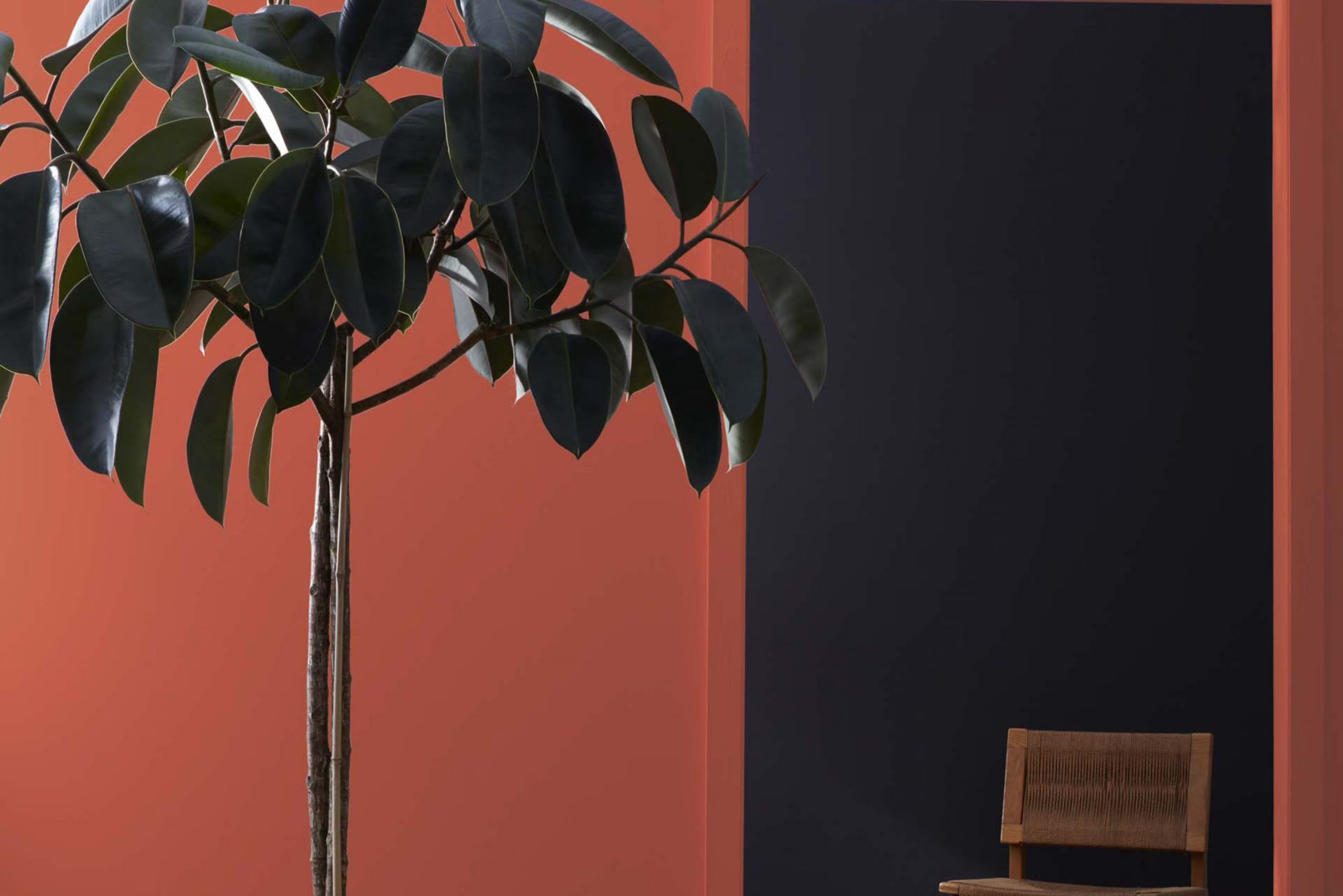
I recently came across Benjamin Moore’s 2090-30 Terra Cotta Tile, a paint color that brings a warm, inviting tone to any room. When you see it, you might think of the rich, earthy hues found in traditional clay tiles. It’s a color that feels both cozy and energetic, adding a rustic charm to interiors without feeling too intense.
Using it in my own home, I noticed how it pairs beautifully with natural elements like wooden furniture or green plants, enhancing the overall warmth of the environment. If you’re considering a refresh for your living room, kitchen, or even the exterior of your house, this terra cotta shade could be the perfect choice.
It works well in various lighting conditions, shifting subtly from dawn to dusk, which keeps the room feeling vibrant yet soothing at any time of the day.
Whether you’re looking to create a welcoming entryway or a snug reading corner, Terra Cotta Tile offers a flexible backdrop that enlivens your decor while maintaining a feel of earthy groundedness.
What Color Is Terra Cotta Tile 2090-30 by Benjamin Moore?
Terra Cotta Tile by Benjamin Moore is a warm, earthy color that brings a cozy and inviting atmosphere to any room. It is reminiscent of the reddish-clay pottery found in Mediterranean landscapes and resembles a baked terra cotta pot’s rich, rustic hue. This flexible shade can lend a comforting ambiance to living rooms, giving walls a bold yet welcoming appearance.
One of the best fits for Terra Cotta Tile is in interiors that favor rustic or Southwestern themes. The color’s natural earthiness pairs wonderfully with materials like exposed wood, wrought iron, and woven textiles. It also complements stone elements very well, creating a look that feels grounded and connected to the outdoors.
In terms of texture, Terra Cotta Tile works beautifully alongside rough, tactile surfaces such as burlap, linen, and chunky knits, which enhance the cozy feel of the color. For a more striking contrast, pairing this warm tone with smooth, glossy finishes like ceramic tiles or polished metals can create an appealing balance.
Ideal for accent walls, kitchens, or cozy reading nooks, Terra Cotta Tile can also be used in exteriors, especially for doors and shutters, amplifying the curb appeal with its inviting, warm presence. This color not only makes a strong statement but also creates a backdrop that is both lively and homey.
Is Terra Cotta Tile 2090-30 by Benjamin Moore Warm or Cool color?
Terra Cotta Tile 2090-30 by Benjamin Moore is a warm, inviting shade that resembles the classic, rustic clay pots found in gardens and Mediterranean landscapes. Its rich, reddish-orange hue adds a cozy touch to any room, making it perfect for creating a welcoming atmosphere. When used on walls, this color provides a vibrant backdrop that complements both modern and traditional decor.
In living rooms, Terra Cotta Tile can make the room feel more connected and homey, especially when paired with neutral furniture and natural elements like wood or stone. In kitchens, applying this color can introduce a cheerful vibe, ideal for rooms where families gather and share meals. Bedrooms painted with Terra Cotta Tile offer a unique warmth, setting a comforting tone that helps in relaxing at the end of the day.
Because of its earthy nature, it pairs beautifully with greens, browns, and deep blues, enhancing the beauty of any home by bringing in a touch of nature-inspired aesthetics. Whether you’re aiming for a rustic look or a bold statement wall, this color can do the trick gracefully.
Undertones of Terra Cotta Tile 2090-30 by Benjamin Moore
Terra Cotta Tile by Benjamin Moore is a rich, warm color with a vibrant base that can significantly influence the ambiance of a room. The color features a mix of several undertones that play a critical role in how it appears under different lighting conditions and when paired with various decor elements.
The primary undertone of red gives it a bold and inviting feel, which brings warmth to any room. This warmth is subtly balanced by hints of olive and dark green, adding an earthy depth that prevents the color from feeling too strong. Orange undertones enhance the warmth, making the color appear cozy and welcoming.
Additionally, this paint color includes touches of purple and navy which introduce a sense of depth and complexity. These cooler undertones ensure that the color maintains a balanced and grounded look, avoiding the risk of feeling too fiery. Grey and dark grey undertones help mute the intensity slightly, making it more flexible for interior walls.
When used on interior walls, these undertones collectively affect how Terra Cotta Tile interacts with both natural and artificial light. During the day, the color can appear vibrant and lively, while at night, it might take on a more subdued and cozy feel. The variety of undertones also means that the color can adjust subtly to different furniture and decor styles, from modern to rustic, making it a practical choice for many homes. The impact of these undertones ensures that, despite its boldness, Terra Cotta Tile remains a grounded and adaptable color choice for interior design.
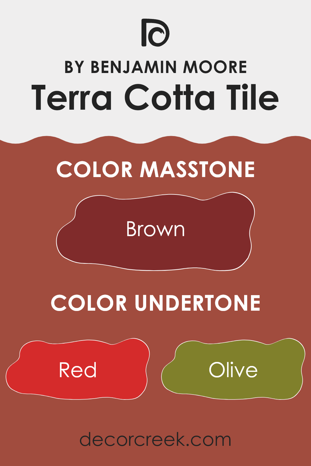
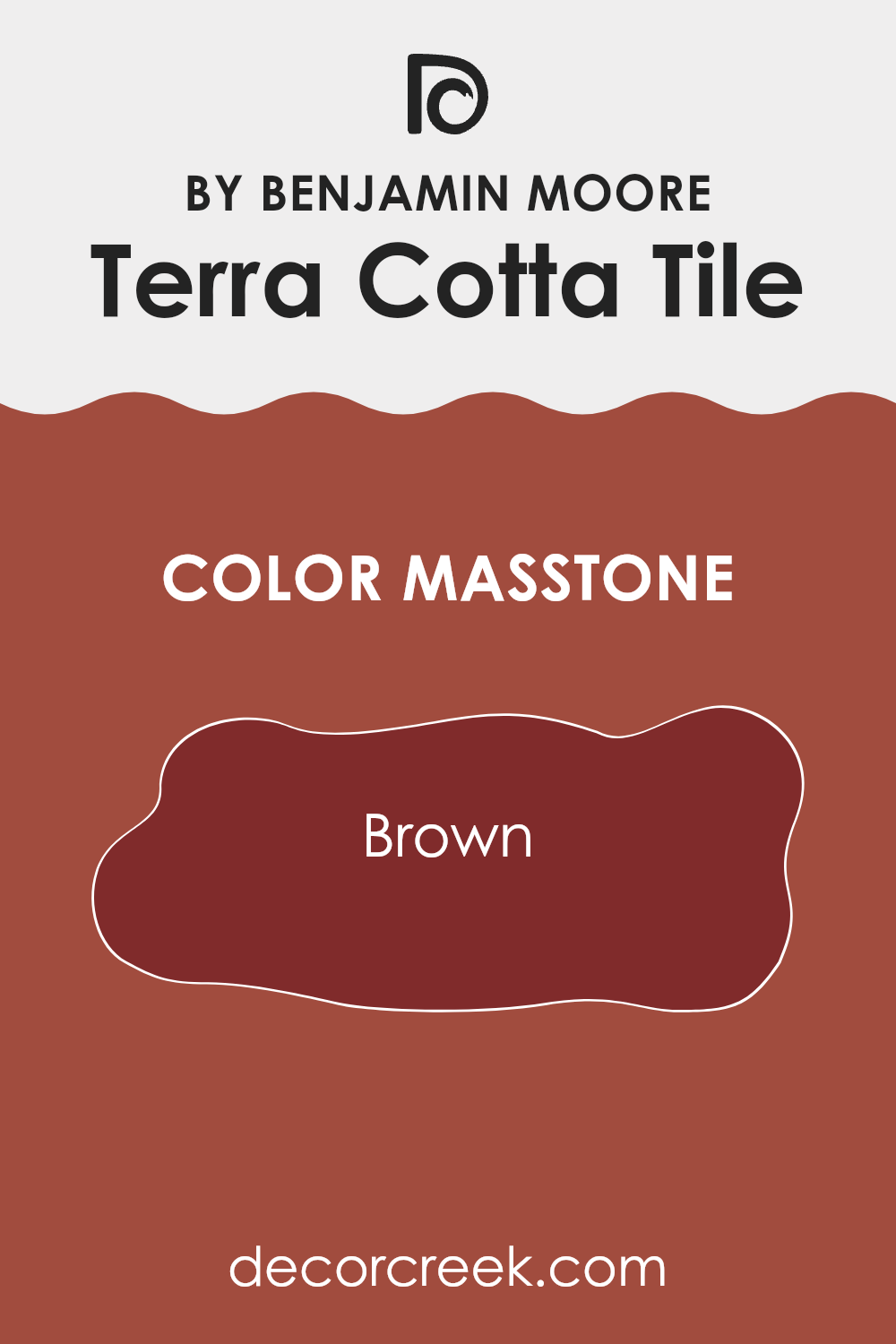
What is the Masstone of the Terra Cotta Tile 2090-30 by Benjamin Moore?
Terra Cotta Tile 2090-30 by Benjamin Moore is a warm, inviting brown color with a masstone of Brown (#802B2B). This deep, rich shade brings a cozy and welcoming feel to any room, making it ideal for living areas and kitchens where you want a comforting atmosphere.
Its earthy tones help create a comfortable environment, blending well with natural materials like wood and stone. This color is flexible enough to pair with both light and dark furniture, offering a beautiful contrast that enhances the room.
Since it’s a deeper shade, it works wonderfully as an accent wall or for smaller elements throughout the home to add depth and warmth without overpowering the room. Terra Cotta Tile is perfect for those looking to add a touch of warmth to their home in a stylish, yet understated way.
How Does Lighting Affect Terra Cotta Tile 2090-30 by Benjamin Moore?
Lighting plays a crucial role in how colors are perceived in any room. The color of a room can look different depending on whether it’s under natural or artificial light. This idea holds true for a specific shade like Terra Cotta Tile by Benjamin Moore, a rich, warm orange-red hue.
Artificial light:Under artificial lighting, such as LED or incandescent bulbs, Terra Cotta Tile tends to appear warmer and deeper. This enhancement brings out the cozy, inviting qualities of the color. In environments with soft, warm white bulbs, this color’s red and orange tones can seem more pronounced, making the room feel more welcoming.
Natural light:
In natural light, the appearance of Terra Cotta Tile can vary significantly throughout the day. During the morning and early afternoon when the light is brightest, the color may look lighter and more vibrant. As the day progresses toward evening, the changing sunlight can add golden hues, enriching the depth of the color.
Room orientation:North-facing rooms: These rooms get less direct sunlight, which tends to be cooler, causing Terra Cotta Tile to appear slightly more muted and subdued. The lack of intense light makes the room feel cozy but without the warmth the color can provide under brighter light.
South-facing rooms: With more exposure to direct sunlight, Terra Cotta Tile shines vividly in south-facing rooms. The ample sunlight brings out the brightness and warmth of the color, making it feel lively and energetic.
East-facing rooms: In rooms facing east, the morning sunlight can make Terra Cotta Tile look bright and cheerful. However, as the daylight fades, the color can take on a softer, quieter appearance, aligning with the calming end of the day.
West-facing rooms: The late afternoon and evening light in west-facing rooms can intensify the warm tones of Terra Cotta Tile, giving the room a glowing, cozy ambiance as the sun sets. Understanding the effects of lighting and room orientation helps in planning interior rooms, ensuring that the colors chosen achieve the desired impact in the environment.
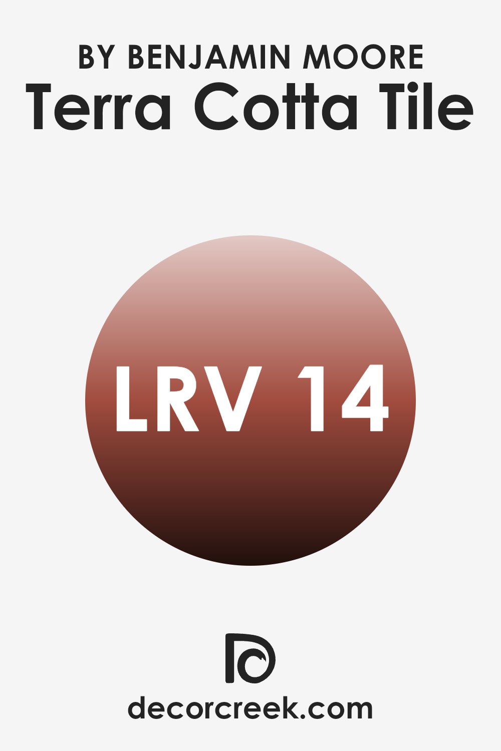
What is the LRV of Terra Cotta Tile 2090-30 by Benjamin Moore?
LRV stands for Light Reflectance Value, which is a measurement that tells you how much light a paint color reflects or absorbs. It is given as a percentage where lower numbers mean that the color absorbs more light, making it appear darker, and higher numbers indicate that it reflects more light, making it seem lighter.
This value is crucial when choosing paint colors for a room because it can greatly influence the mood and visual perception of a room. Colors with a low LRV can make a room feel cozier but smaller, while lighter colors can make a room feel larger and more open.
With an LRV of 14.14, Terra Cotta Tile by Benjamin Moore is a color that absorbs quite a bit of light, which means it will look rich and deep when applied to walls. This can create a warm and inviting atmosphere, but it might also make a small room feel more enclosed if used on all walls. In large, well-lit rooms, this color can add depth and warmth without overpowering the room, making it suitable for rooms where a cozy feeling is desired. Choosing this color for walls should be balanced with good lighting and lighter accents to ensure the room doesn’t feel too dark.
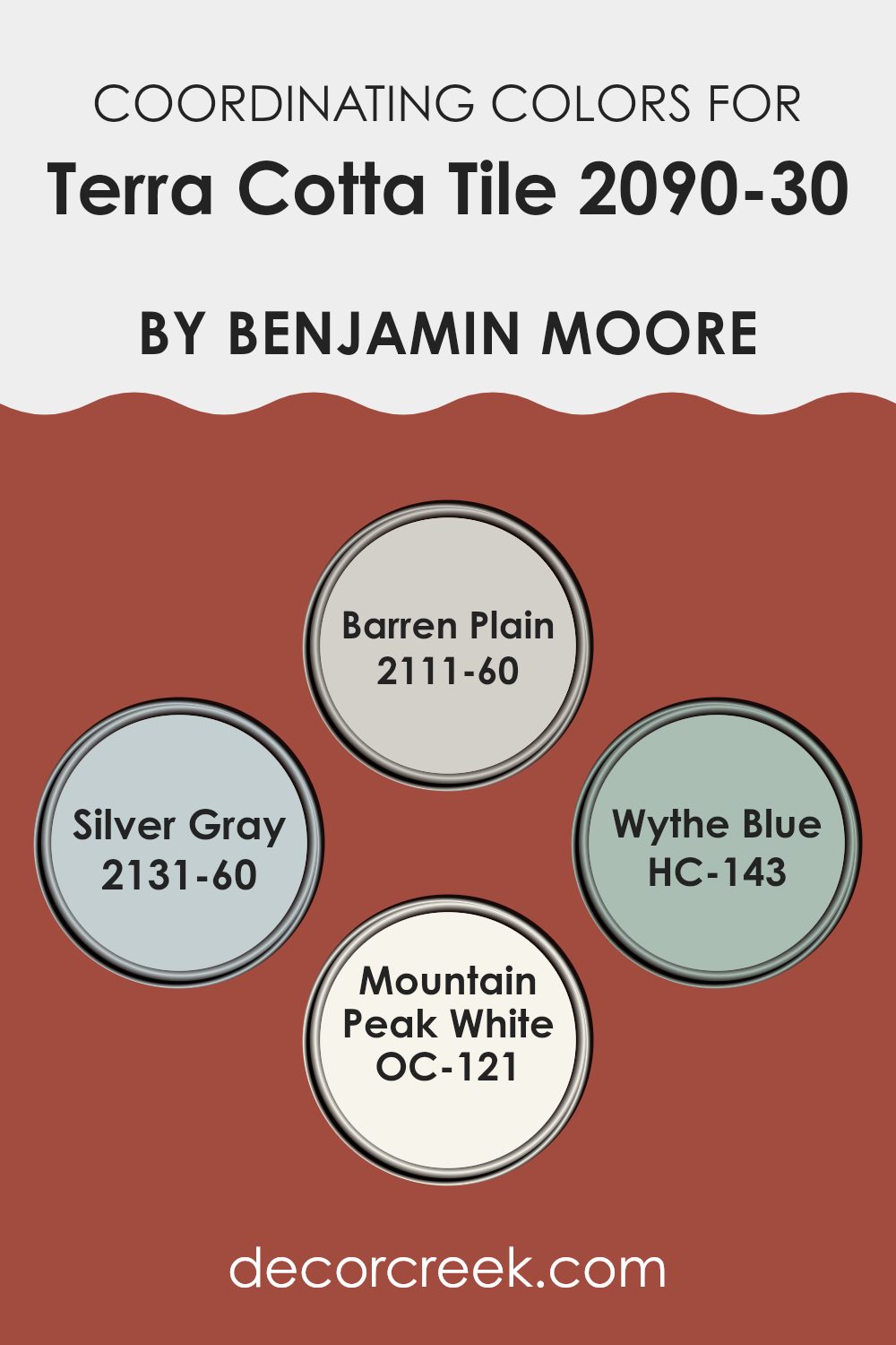
Coordinating Colors of Terra Cotta Tile 2090-30 by Benjamin Moore
Coordinating colors are shades that complement or enhance each other when used together in decorating rooms. These colors, chosen to coordinate with Benjamin Moore’s Terra Cotta Tile, work harmoniously to create aesthetically pleasing environments. By selecting colors that go well with a main hue, like Terra Cotta Tile, you can achieve a balanced and appealing look in any room, with each color bringing out the best features of the others.
Barren Plain is a muted, soft beige that adds a warm and subtle backdrop, making Terra Cotta Tile’s vibrant hue stand out more prominently. Silver Gray is a gentle, light gray with just a hint of blue, offering a cool contrast that can lighten a room’s mood and complement darker or brighter colors like Terra Cotta Tile beautifully.
Wythe Blue, with its blend of blue and green, provides a refreshing pop of color that works delightfully alongside warmer tones. Mountain Peak White is a clean, crisp white that acts as a flexible partner, brightening and providing relief to richer, deeper colors, making it ideal as a counterbalance to Terra Cotta Tile. Together, these colors create inviting rooms, where each shade contributes to a coherent, visually appealing palette.
You can see recommended paint colors below:
- 2111-60 Barren Plain
- 2131-60 Silver Gray
- HC-143 Wythe Blue
- OC-121 Mountain Peak White
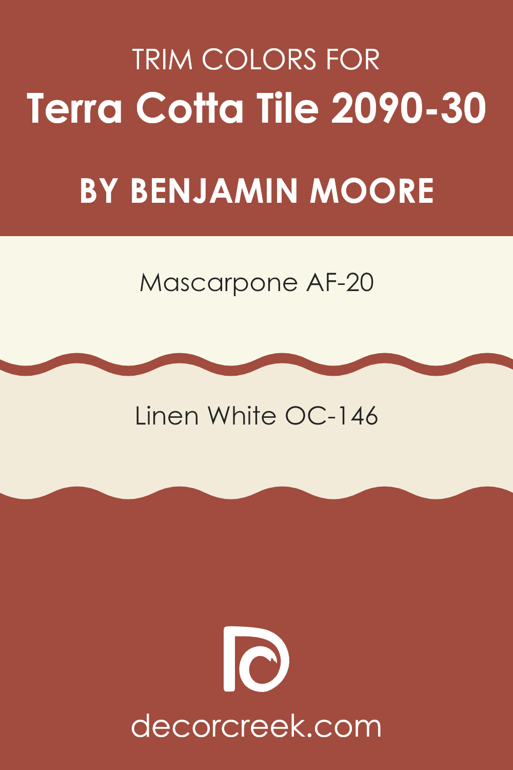
What are the Trim colors of Terra Cotta Tile 2090-30 by Benjamin Moore?
Trim colors are the hues used for the accents and finishing details in a room, such as baseboards, moldings, and door frames, that highlight and complement the main wall color. In this case, AF-20 – Mascarpone and OC-146 – Linen White act as trim colors against a rich hue like Terra Cotta Tile by Benjamin Moore.
These trim colors are crucial because they provide a visual framework that enhances the overall look of the paint on the walls, helping to define and balance the vibrancy of Terra Cotta Tile. By carefully choosing trim colors that harmonize with the primary wall color, the room’s overall look is neatly tied together, creating a pleasing and cohesive ambiance.
AF-20 – Mascarpone is a warm, creamy white that offers a gentle contrast, softening the boldness of darker colors without feeling too intense. It has a calming quality that makes it an excellent choice for creating a light, airy feel in rooms that need a touch of brightness.
On the other hand, OC-146 – Linen White is a slightly muted white with a hint of warmth, perfect for crafting a cozy and inviting atmosphere that complements the earthy undertones of Terra Cotta Tile. Both colors work together to frame and accentuate the primary color, enriching the room’s color palette and adding a polished touch to the overall decor.
You can see recommended paint colors below:
- AF-20 Mascarpone
- OC-146 Linen White
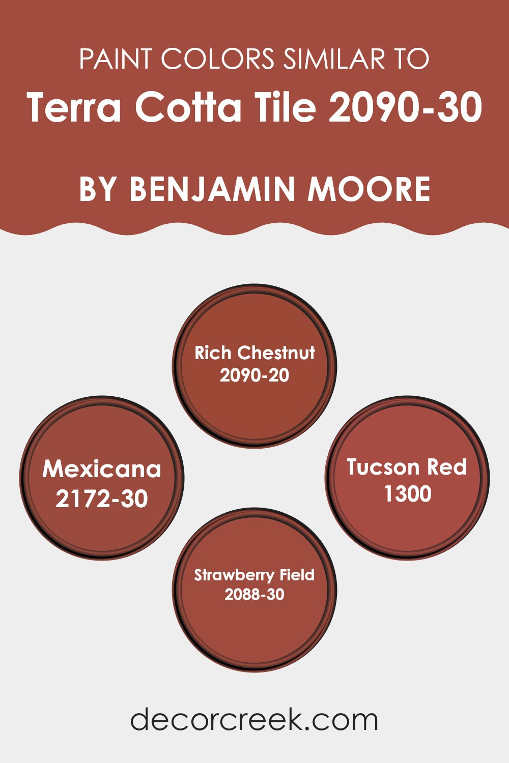
Colors Similar to Terra Cotta Tile 2090-30 by Benjamin Moore
Choosing similar colors is an excellent way to create a harmonious and cohesive look in any room. Colors like Rich Chestnut, Mexicana, Tucson Red, and Strawberry Field complement Terra Cotta Tile by Benjamin Moore because they share warm, earthy undertones.
When colors have similar undertones, they naturally blend with each other, enhancing the overall aesthetic without feeling too strong. This approach is particularly useful in areas where you want to maintain a fluid design without sharp contrasts, making the environment more inviting.
Rich Chestnut is a deep, warm brown that brings a cozy feel, perfect for creating a snug and relaxing atmosphere. Next, Mexicana stands out as a vibrant, more saturated hue that adds a bit of spice and personality to a room, reminiscent of southwestern clay.
Tucson Red, slightly brighter, offers a dusty red that echoes the natural shades found in desert landscapes, providing a comforting, familiar touch to interiors. Lastly, Strawberry Field is a lively and cheerful red with a hint of pink, bringing a playful yet soft energy to any room. These colors create aesthetically pleasing environments when used together, making any room feel more cohesive and thoughtfully designed.
You can see recommended paint colors below:
- 2090-20 Rich Chestnut
- 2172-30 Mexicana
- 1300 Tucson Red
- 2088-30 Strawberry Field
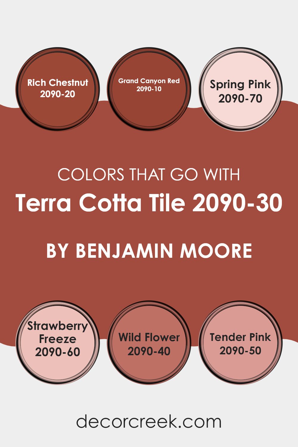
Colors that Go With Terra Cotta Tile 2090-30 by Benjamin Moore
Choosing the right colors to pair with Terra Cotta Tile 2090-30 by Benjamin Moore is key to creating a harmonious room. Each coordinating color must complement the warm, earthy tones of Terra Cotta Tile to bring out the best in your decor. The carefully selected hues range from muted pinks to vibrant reds, all designed to create a welcoming and cohesive look. Understanding how these colors interact not only enhances the aesthetic but also sets the mood and character of the room.
For instance, Rich Chestnut 2090-20 is a deep, warm brown that provides a strong foundation, balancing the brightness of Terra Cotta Tile with its depth and warmth. Grand Canyon Red 2090-10, by contrast, offers a bold and lively pop that energizes a room, echoing the red undertones of the terra cotta. On the softer side, Spring Pink 2090-70 is a gentle and light pastel, which introduces a fresh, airy feeling, making it perfect for rooms seeking a subtle lift.
Similarly, Strawberry Freeze 2090-60, a delicate and cheerful pink, adds a youthful touch and pairs smoothly with the earthier terra cotta. For a touch of nature, Wild Flower 2090-40, with its hints of purple and gray, brings an organic feel, while Tender Pink 2090-50, a slightly more saturated pink, provides a smooth and gentle contrast, which softens large rooms and complements the main color beautifully. Each shade works together to create settings that feel cohesive and are visually appealing.
You can see recommended paint colors below:
- 2090-20 Rich Chestnut
- 2090-10 Grand Canyon Red
- 2090-70 Spring Pink
- 2090-60 Strawberry Freeze
- 2090-40 Wild Flower
- 2090-50 Tender Pink
How to Use Terra Cotta Tile 2090-30 by Benjamin Moore In Your Home?
Terra Cotta Tile 2090-30 by Benjamin Moore is a warm, inviting paint color reminiscent of baked clay. Its rich, earthy red tone can add a cozy feel to any room in your house. This color works particularly well in living areas like the living room or dining area, where you want a welcoming atmosphere that makes guests feel at home. It’s also great in a kitchen, bringing a cheerful splash of color that complements wooden cabinets and natural stone countertops very well.
When using Terra Cotta Tile, you can balance it with neutral tones like soft whites or light grays to keep the room from feeling too heavy. Adding accents in teal or deep green can introduce a lovely contrast, making the room more interesting.
For those who like a rustic or Southwestern style, this paint pairs beautifully with decor featuring natural elements like exposed wood or woven textiles. Overall, Terra Cotta Tile is perfect for adding warmth and character to your home.
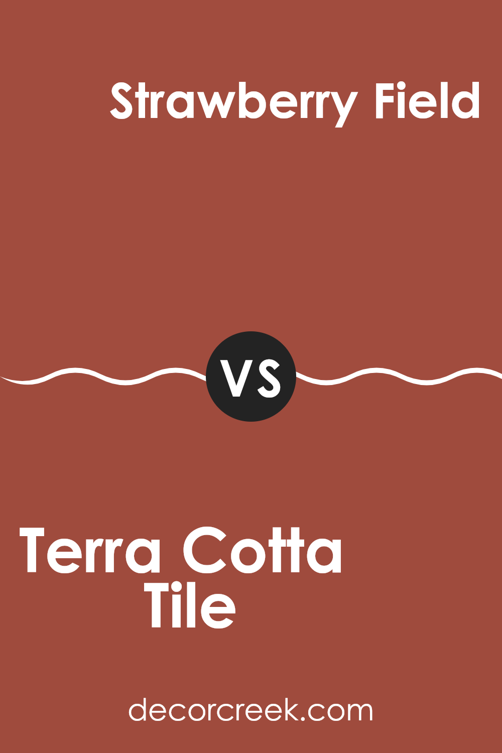
Terra Cotta Tile 2090-30 by Benjamin Moore vs Strawberry Field 2088-30 by Benjamin Moore
Terra Cotta Tile by Benjamin Moore is a rich, earthy orange with a warm, welcoming vibe. It reminds you of clay pottery and has a traditional feel that makes any room cozy and inviting. It’s perfect for living rooms or dining areas where you want a sense of warmth.
Strawberry Field by Benjamin Moore, on the other hand, is a vibrant, cheerful pink. It’s like the color of ripe strawberries or a beautiful sunset. This color brings a lively and playful atmosphere to any room, making it great for rooms where you want to add a pop of bright color and fun.
Both colors are bold and can create unique moods in a room. Terra Cotta Tile leans more toward a classic, comfort-oriented style, while Strawberry Field offers a punchier, more energetic feel. When deciding between the two, consider the mood you want to set in your room.
You can see recommended paint color below:
- 2088-30 Strawberry Field
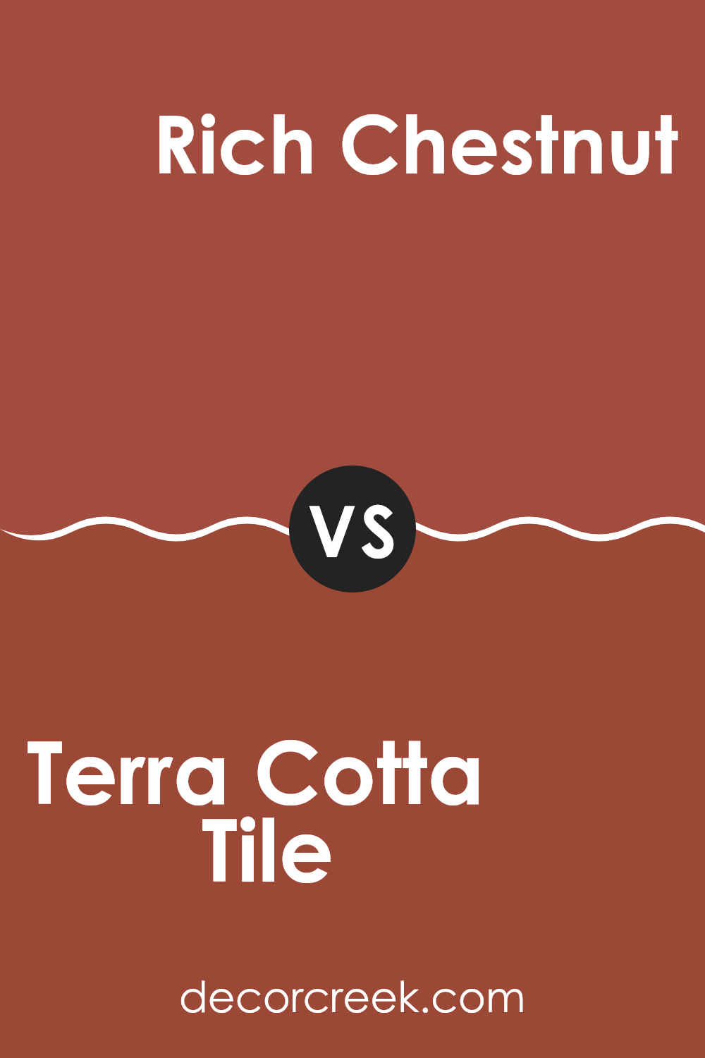
Terra Cotta Tile 2090-30 by Benjamin Moore vs Rich Chestnut 2090-20 by Benjamin Moore
Terra Cotta Tile and Rich Chestnut are both warm, welcoming colors by Benjamin Moore, though they bring different vibes because of their tones. Terra Cotta Tile has a vibrant, earthy quality, much like the natural clay material it’s named after. Its reddish-orange hue is lively and can create a cozy, inviting atmosphere in any room.
On the other hand, Rich Chestnut is a deeper, more intense color. It tends to draw in more brown and less of the red that appears in Terra Cotta Tile. This makes it a great choice for those who prefer something strong but still want to keep the warmth. Rich Chestnut can add a lot of depth to a room, making it feel snug and secure.
In summary, while both colors add warmth and character, Terra Cotta Tile leans toward a brighter, more energetic feel, whereas Rich Chestnut offers a darker, richer presence.
You can see recommended paint color below:
- 2090-20 Rich Chestnut
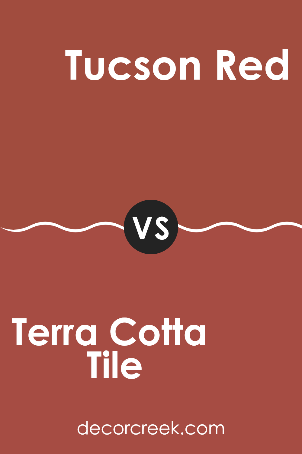
Terra Cotta Tile 2090-30 by Benjamin Moore vs Tucson Red 1300 by Benjamin Moore
The main color, Terra Cotta Tile, is a warm, earthy shade with a vibrant, rustic charm reminiscent of clay pottery. It gives off a cozy, welcoming vibe, often used to add a lively pop to rooms. On the other side, Tucson Red tends to be bolder and deeper, channeling a traditional red that feels more classic and grounded.
It’s a strong color that can make a statement in any room, providing a sense of sturdiness and lasting appeal. Both colors carry red and brown tones, but Terra Cotta Tile leans toward an orange undertone, offering a sunnier, lighter feel, while Tucson Red serves as a stronger presence with its rich, deep base that can anchor a room more firmly.
These hues can work beautifully together, with Terra Cotta Tile brightening areas and Tucson Red adding depth and drama.
You can see recommended paint color below:
- 1300 Tucson Red
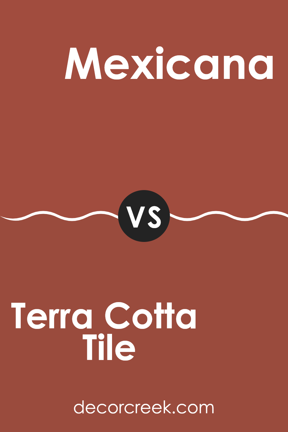
Terra Cotta Tile 2090-30 by Benjamin Moore vs Mexicana 2172-30 by Benjamin Moore
Terra Cotta Tile by Benjamin Moore is a rich, warm red with earthy, orange undertones. This color can bring a cozy and inviting feel to any room, making it ideal for living areas or dining rooms where you spend a lot of time. It pairs well with natural materials like wooden furniture or stonework, enhancing a rustic aesthetic.
On the other hand, Mexicana by Benjamin Moore is bolder and deeper, leaning more toward a robust maroon. While it also carries red and orange tones, it has a stronger presence due to its relative darkness and intensity. Perfect for an accent wall or for rooms that aim to make a more striking impression, Mexicana might be the better choice for someone looking to make a bold statement.
Both colors, while similar, serve different purposes based on how striking or subtle you want the room’s impact to be. They also share an ability to create a warm atmosphere, but Mexicana does it with a bit more punch.
You can see recommended paint color below:
- 2172-30 Mexicana
In conclusion, the paint “2090-30 Terra Cotta Tile” by Benjamin Moore is truly wonderful. It’s a warm, reddish-brown color that feels cozy and inviting. This shade reminds me of autumn leaves and snug, clay pots, creating a homey vibe wherever it’s used. Whether it’s painted on a wall in a living room, a kitchen, or even outside on a porch, it adds a lovely splash of warmth.
This color is great for making big rooms feel a bit cozier and more welcoming. It works really well with other colors, too. Neutrals like white or gray look extra nice with it, but even some blues and greens can pair nicely. It’s especially good for a room where you want to relax and feel comfortable.
Using this paint could be a simple way to make your house feel more like a home, which is pretty awesome. You don’t need to change a lot of things, maybe just adding this color to one wall or a few spots around the house can make a big difference. I think it’s a perfect choice if you want to warm up your home with a color that feels just right.

Ever wished paint sampling was as easy as sticking a sticker? Guess what? Now it is! Discover Samplize's unique Peel & Stick samples.
Get paint samples

