Lighter colors may seem a bit boring due to their subtle and calm appearance. And indeed, bolder and more saturated colors look more eye-catchy and appealing! However, even with a subtle and delicate hue on the interior walls, you can make your living space feel cozy and welcoming.
Today, we want to tell you more about one of such gentle and tranquil colors called Wythe Blue by Benjamin Moore.
This article will help you better understand the nuances of this charming hue, as well as see how its delicate and fair appearance can make a room look unique and give it personality!
What Kind of Color Is Wythe Blue HC-143 by Benjamin Moore?
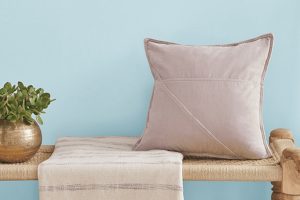
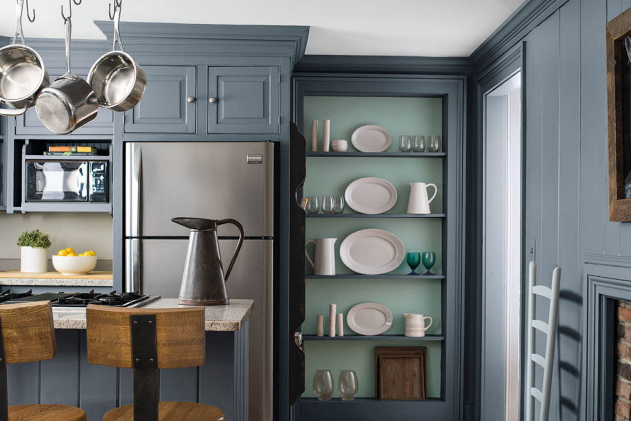
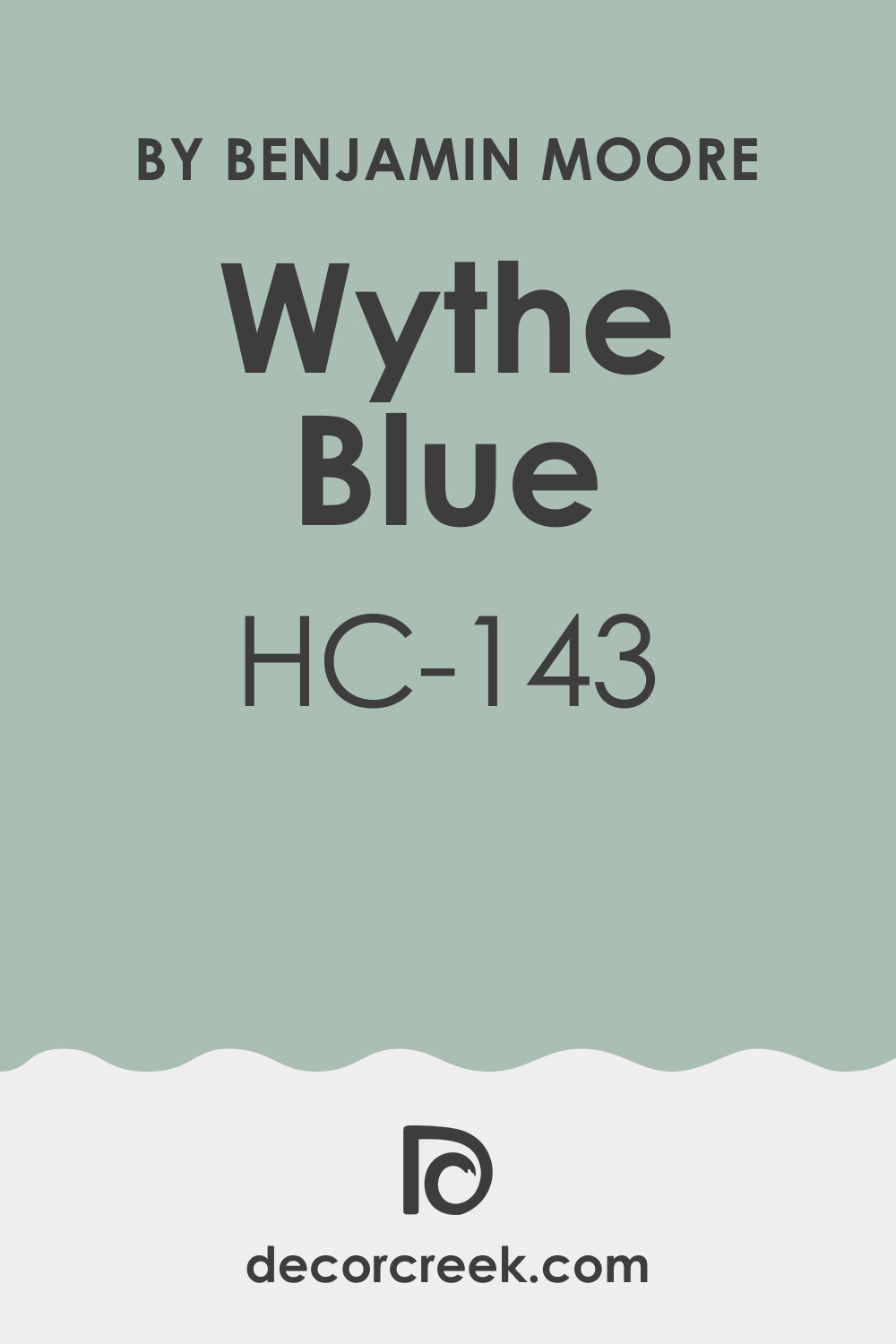
Benjamin Moore Wythe Blue is a blue-green color with a subtle cast of gray, as Encycolorpedia says. The hue reads very gentle and delicate on the walls, creating a soothing and relaxed vibe in any room where it is used.
However, since this color has a mixed nature due to the blue and green hues blended in it, you must use it very carefully in your home to achieve the desired effect! It may read differently in different lighting conditions, displaying more of a gray or green tint.
Also, it will look somewhat distinct in lighter and darker spaces. but generally, BM Wythe Blue is a great color choice if you are looking for a refreshing and calming vibe in your home!
Ever wished paint sampling was as easy as sticking a sticker? Guess what? Now it is! Discover Samplize's unique Peel & Stick samples.
Get paint samples
Is Wythe Blue HC-143 Warm or Cool?
Some people like cool-toned colors because they add a crisp and fresh vibe to any space. Others prefer warmer hues due to their cozy appearance. But Benjamin Moore Wythe Blue is none of those. It is a paint that neither feels too cool nor too warm.
Thus, this blue-green blend is a perfect example of balance. This is why you can use it in your home without being afraid it may suddenly show you a cooler (or a warmer) side!
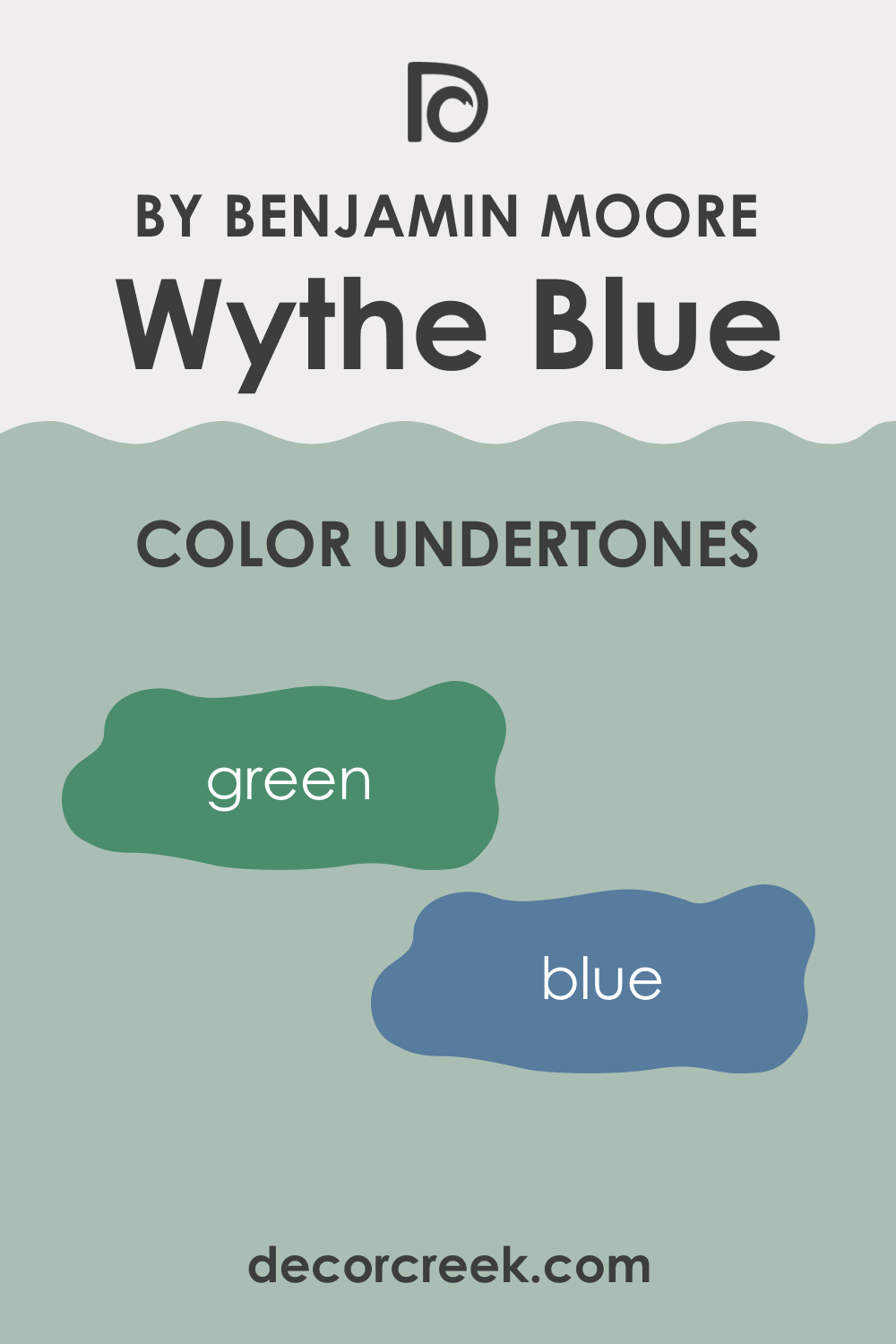
What Undertones Does Wythe Blue HC-143 Paint Color Have?
Undertones can turn almost any color into a nightmare if you don’t know how to make them work for you! The more complex the undertones of color, the harder it can be to figure out how it will work in space.
BM Wythe Blue has mixed undertones of blue and green, which makes it challenging to use this color correctly, although it looks pretty balanced. This hue may read unexpectedly differently depending on the lighting conditions and other colors used in a room.
This is why sampling is the only way to avoid grave mistakes you will later regret.
Wythe Blue HC-143 Coordinating Colors
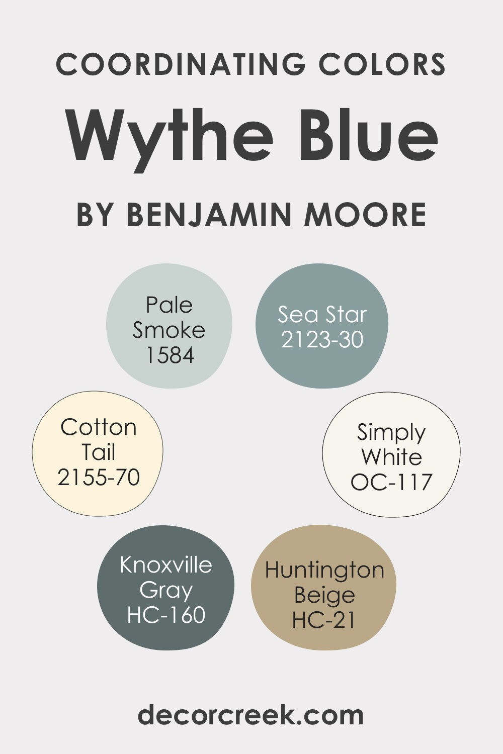
If you want to try BM Wythe Blue in your space, you have to be cautious with choosing coordinating colors with this blue-green paint. Otherwise, it is very likely that you mess up your space! To avoid making mistakes, use the coordinating color palettes we have prepared for you below. They will recommend you the best paint colors that will make your space look fabulous!
For a monochromatic palette, you can try one of the following coordinating colors:
- 1584 Pale Smoke
- 2123-30 Sea Star
- HC-160 Knoxville Gray
On the other hand, for a contrasting color palette, we recommend you opt for these paint colors to achieve the best effect along with BM Wythe Blue:
- OC-117 Simply White
- HC-21 Huntington Beige
- 2155-70 Cotton Tail
What LRV Wythe Blue HC-143 Paint Color Has And How It Reacts to Light?
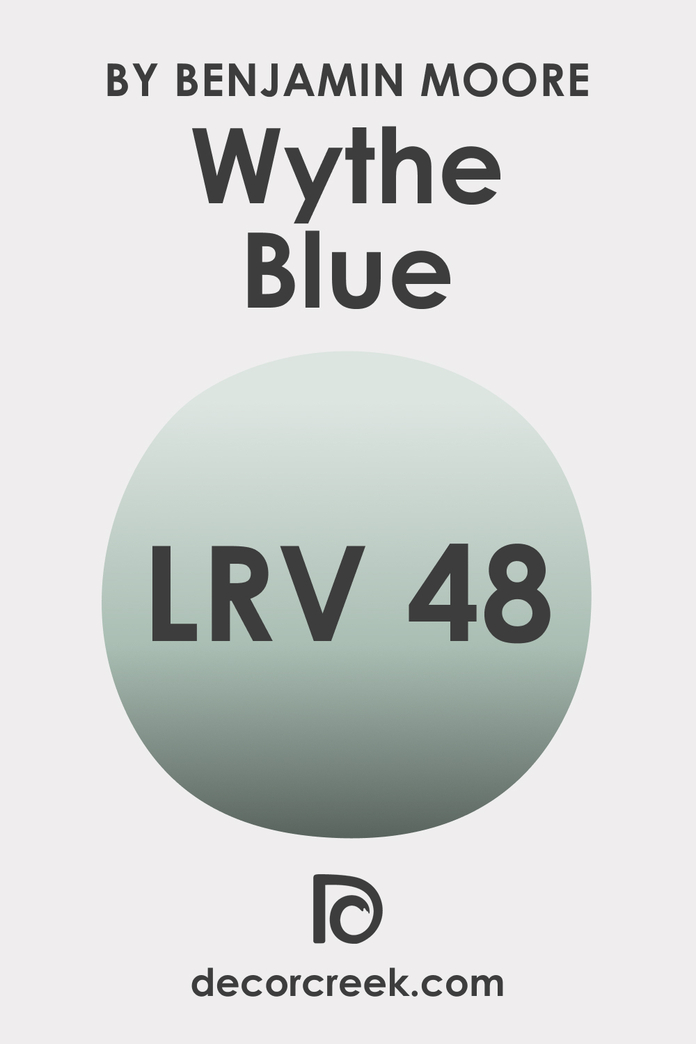
LRV stands for the light reflectance value. It shows how much light a color can reflect when it is applied to the wall. The higher the LRV value, the lighter the color, and vice versa. The closer the LRV is to zero, the darker the color. If the LRV climbs up to reach 100, the color gets lighter.
The LRV value of BM Wythe Blue is 48, which places this blue-green hue almost in the middle of the light reflectance scale. This is why this color reads balanced and neither dark nor light.
With Benjamin Moore Wythe Blue on the walls, your space will feel fresh, relaxed, calm, and tranquil. Since the color is well-balanced in terms of saturation, it will work anywhere and in any compass direction. Of course, it may sometimes feel warmer or cooler.
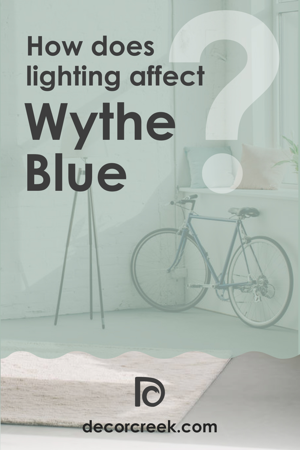
Also, note that this color depends on light quite a lot! In ample natural light, it will feel extra light and refreshing. On the other hand, with little or no natural light, this color will feel calm and not too bold.
LRV – what does it mean? Read This Before Finding Your Perfect Paint Color
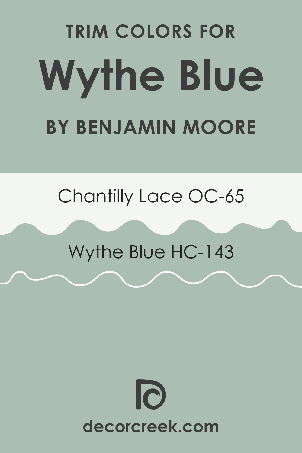
BM Wythe Blue Trim Colors
White is an ideal trim color that works almost all the time, no matter what color is used on the walls. White pairs nicely with most colors, so you just need to pick the white that will work harmoniously with the wall color.
If you have BM Wythe Blue on your walls, consider BM Chantilly Lace for your ceilings, trims, and moldings. It is a true white color that will help you highlight the original hue.
Colors Similar to BM Wythe Blue
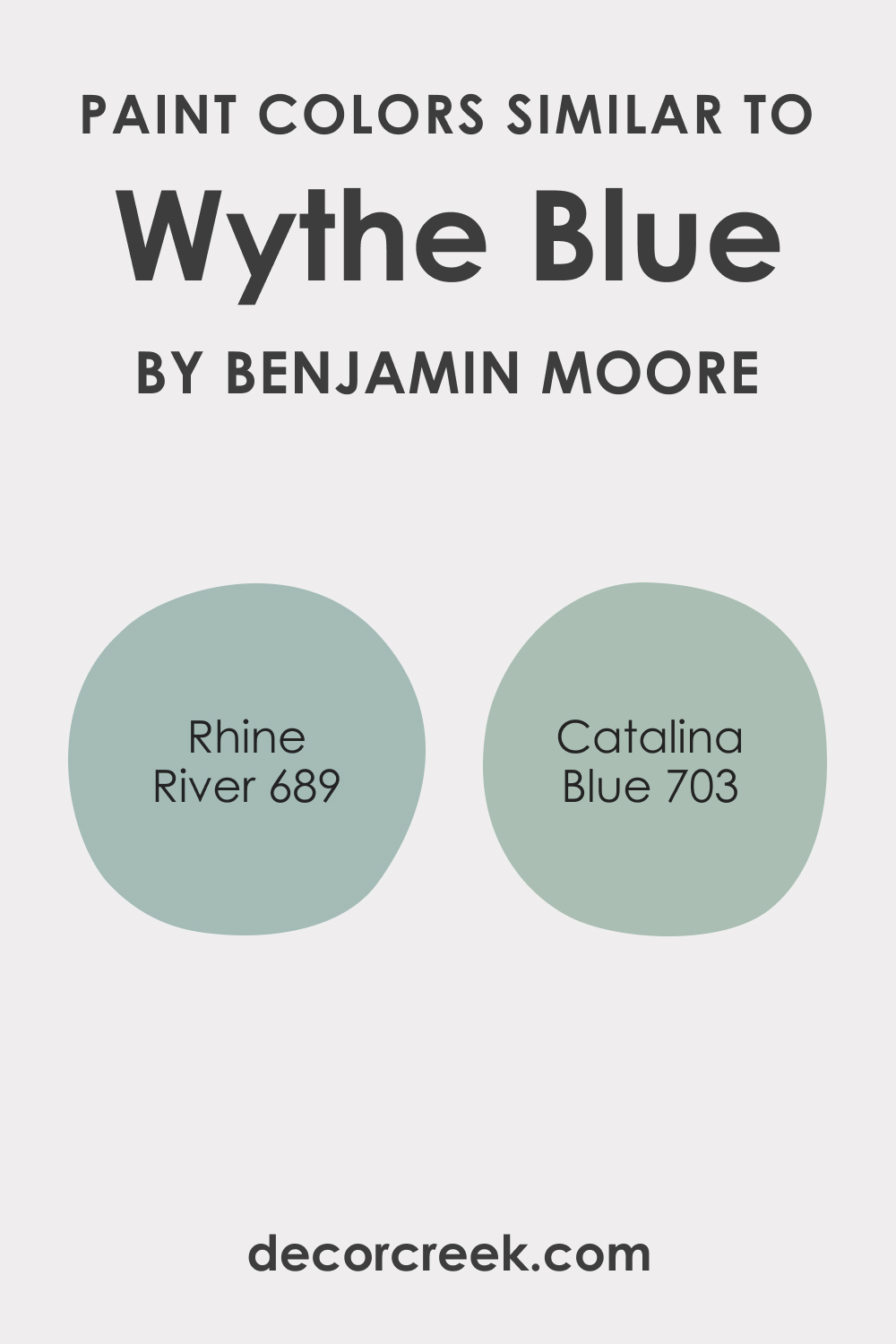
In case you need to find the color that reads almost the same on your walls as BM Wythe Blue, knowing similar colors is essential. When you have a bunch of colors that can be used as substitutes, you can easier find the best-matching alternatives.
In particular, we recommend you use the following colors instead of BM Wythe Blue if you strive for the closest match in tone and light reflectivity:
- BM 689 Rhine River
- BM 703 Catalina Blue
BM Catalina Blue and BM Wythe Blue read nearly identical. The only difference is their undertones. BM Wythe Blue reads bluer, whilst its counterpart reads greener.
As for BM Rhine River, it somewhat differs from BM Wythe Blue, displaying a bluer hue. Compared to it, BM Wythe Blue looks greener. As you can see, none of these colors will be an ideal 100% match!
Each color varies slightly in tone or LRV, but generally, they read almost identically to BM Wythe Blue.
Colors That Go Well With BM Wythe Blue
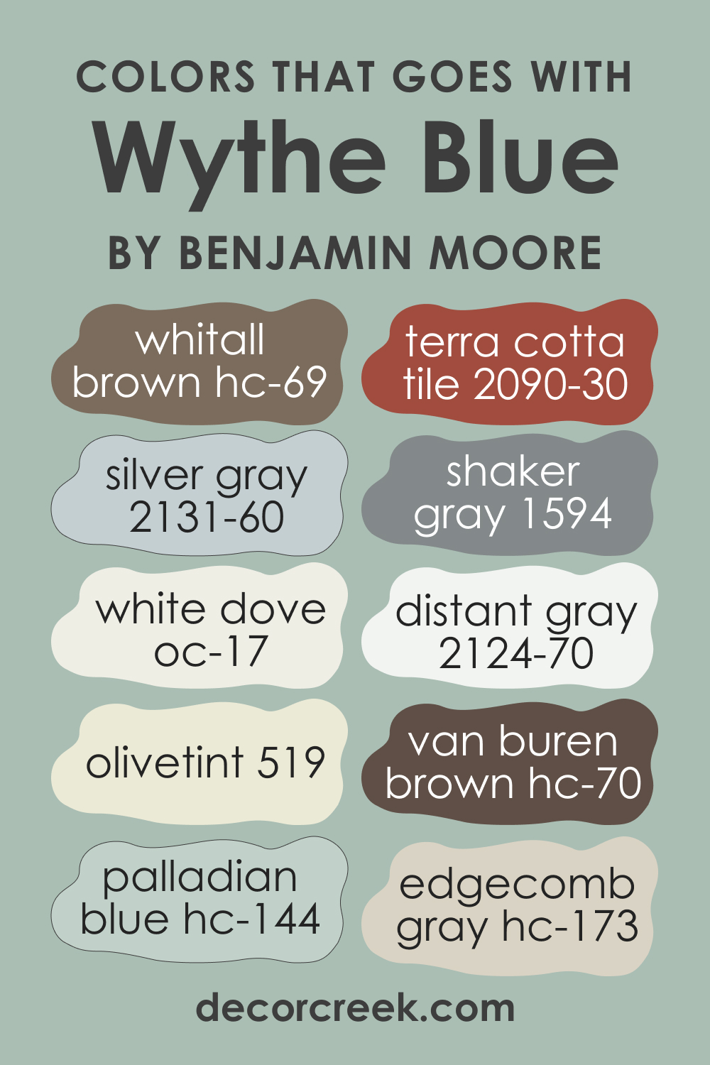
BM Wythe Blue can work well with quite few colors, which makes this delicate blue-green not very versatile hue. You can best pair this paint color with true whites, wooden textures, yellows, black, grays, and even browns and greiges! But also, it may pair well with other hues as well. In particular, check out the following color suggestions:
- HC-69 Whitall Brown
- OC-17 White Dove
- 2131-60 Silver Gray
- 2090-30 Terra Cotta Tile
- BM 519 Olivetint
- BM 1594 Shaker Gray
- BM 2124-70 Distant Gray
- Van Buren Brown HC-70
- Palladian Blue HC-144
- Edgecomb Gray HC-173
Comparing BM Wythe Blue With Other Colors
It cannot be very easy to understand the difference between colors that look nearly the same. However, being able to see the difference in undertones and LRVs allows you to estimate the color from a more wide perspective.
Below, we compare BM Wythe Blue with a few colors that work in a similar way. This will help you understand this delicate hue better.
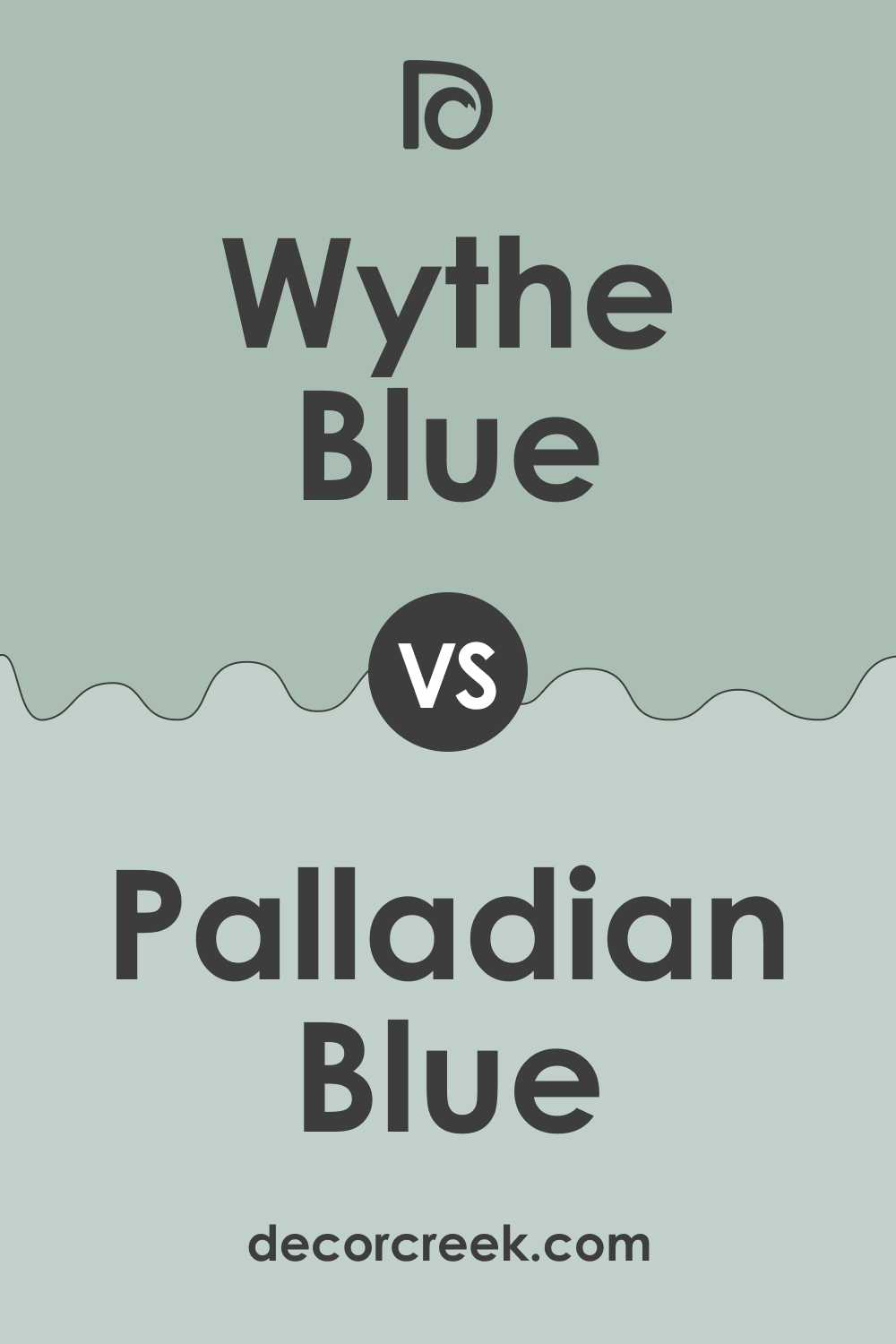
Wythe Blue vs. Palladian Blue
The Palladian Blue color looks like a lighter version of BM Wythe Blue. It is less saturated and reads airier and more subtle. However, the hue itself is very similar to the one BM Wythe Blue has.
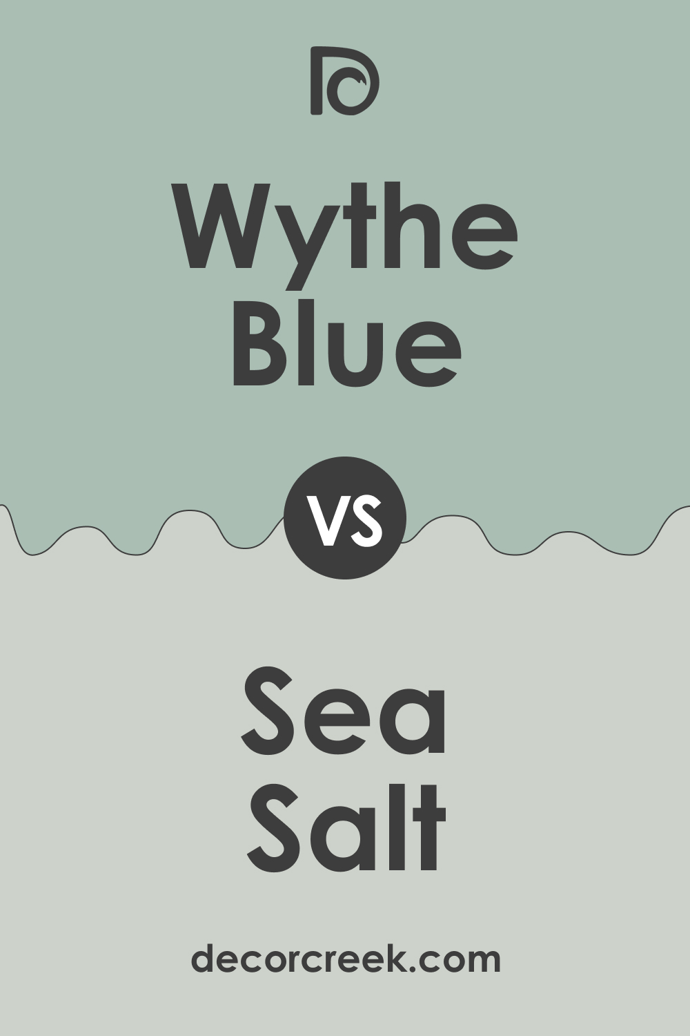
Wythe Blue vs. Sea Salt
Compared to BM Wythe Blue, SW Sea Salt reads gray with a very slight greenish hue. Its counterpart, on the contrary, displays a pronounced green undertone! Due to the higher saturation, BM Wythe Blue also seems darker than SW Sea Salt.
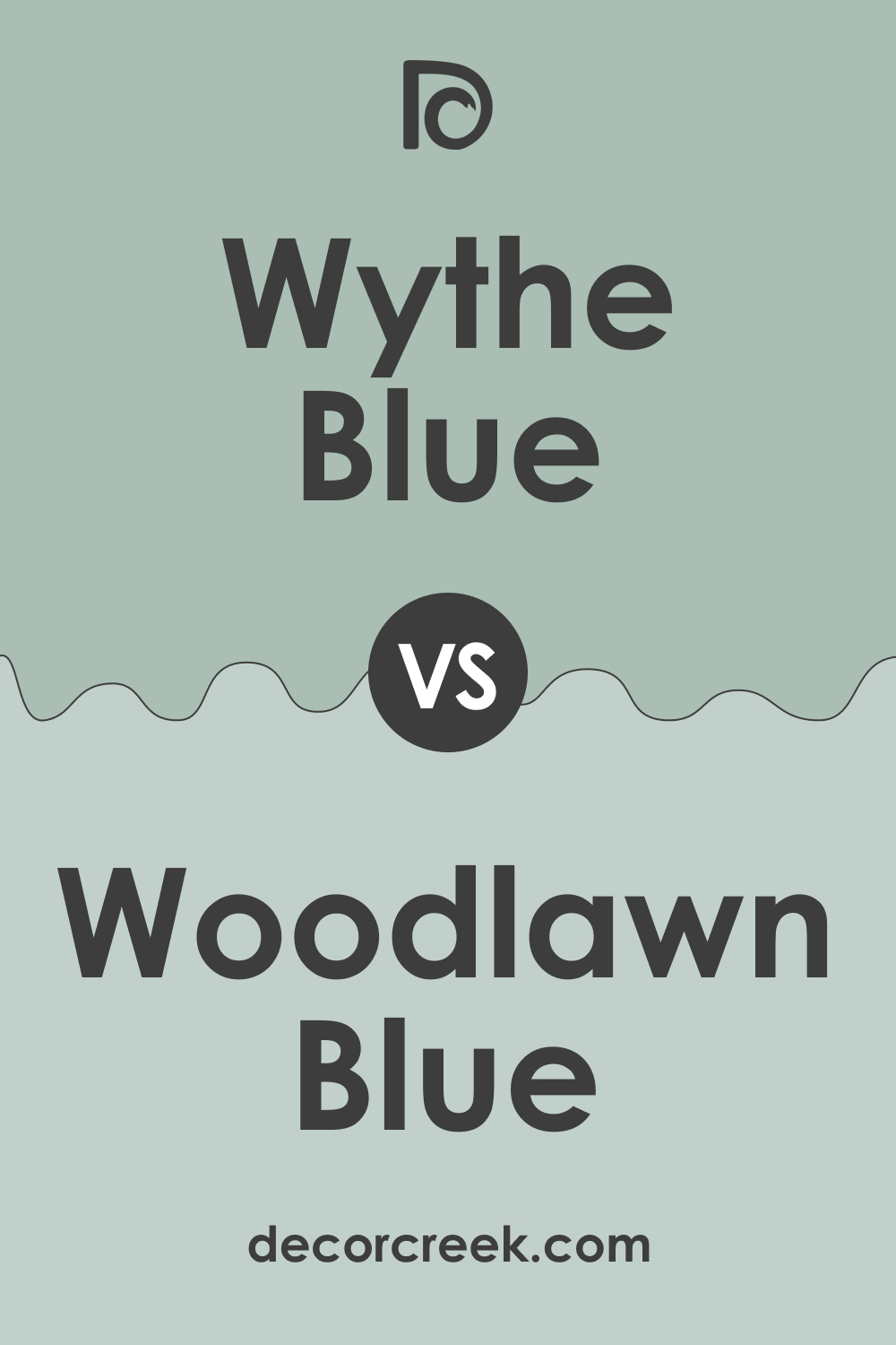
Wythe Blue vs. Woodlawn Blue
Both colors have greenish undertones, but compared to Woodlawn Blue, BM Wythe Blue reads light emerald green. Its counterpart, on the other hand, shows a more pronounced grayish undertone. However, BM Woodlawn Blue and BM Wythe Blue both read tranquil and delicate, with a soft and balanced appearance.
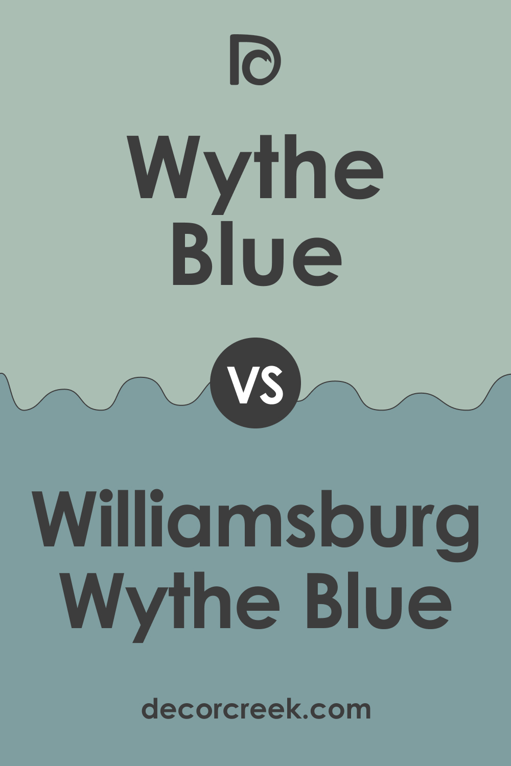
Wythe Blue vs. Williamsburg Wythe
BM Williamsburg Wythe has an LRV 36 and pairs a hint of Prussian blue with a gray base paint. Compared to BM Wythe Blue, it looks more saturated and also darker due to the lower LRV value.
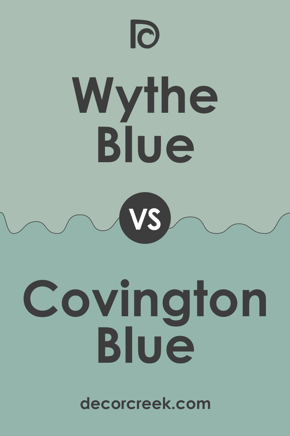
Wythe Blue vs. Covington Blue
BM Covington Blue is also blue-green, but it has a lower LRV of 42, unlike BM Wythe Blue, whose LRV is 48.69. Because of this specific nuance, BM Covington Blue looks darker and more saturated, revealing a more pronounced green tone.
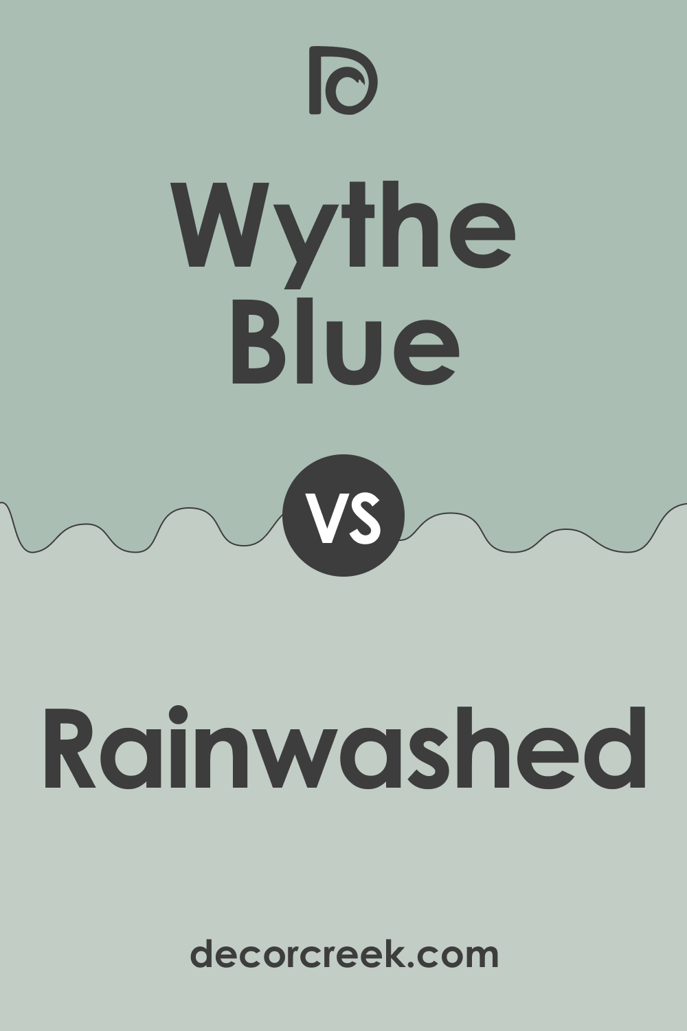
Wythe Blue vs. Rainwashed
SW Rainwashed is lighter than BM Wythe Blue. Also, it reads somewhat grayer with a barely there greenish hue. Compared to it, BM Wythe Blue displays its green undertones in a rather dominating way.
Where to Use BM Wythe Blue Paint Color In Your Home?
This delicate blue-green can work in different rooms, and below, we describe how exactly it may express itself in your home. Hopefully, it will help you define where in your home this color will work best.
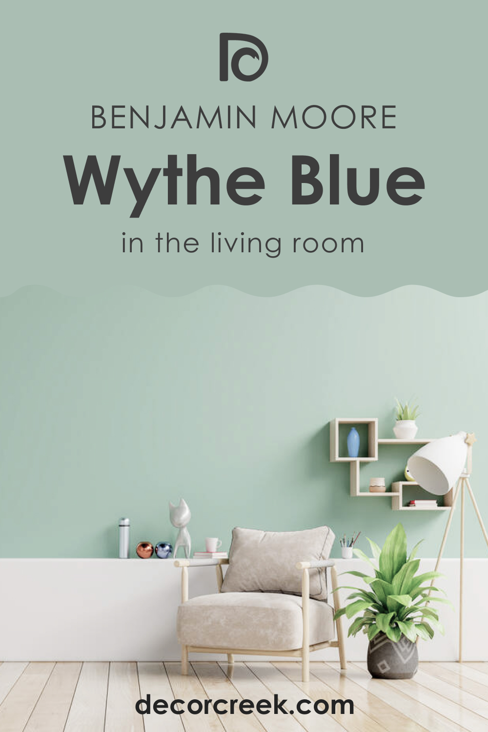
Wythe Blue HC-143 in the Living Room
You can absolutely use this tranquil and balanced blue-green on the accent wall of your living room or even paint all the walls in this color! It will work even better if you pair it with wooden textures through the flooring, cabinetry, furniture, and door and window frames.
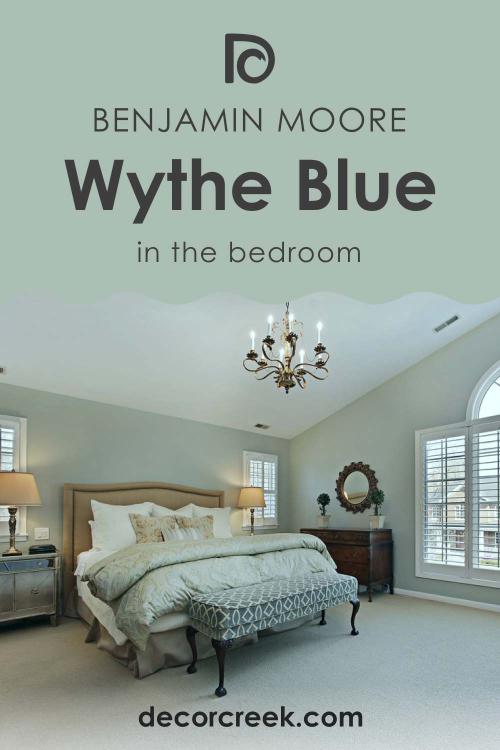
Wythe Blue HC-143 in a Bedroom
This is one of the best colors for your bedroom if you crave for a soothing and tranquilizing vibe! You can pair it with burnt oranges and linen upholstery to create a contrasting look. Also, if you love using metals in your interior, try out golden tints, matte blacks, or even chromes along with this color.
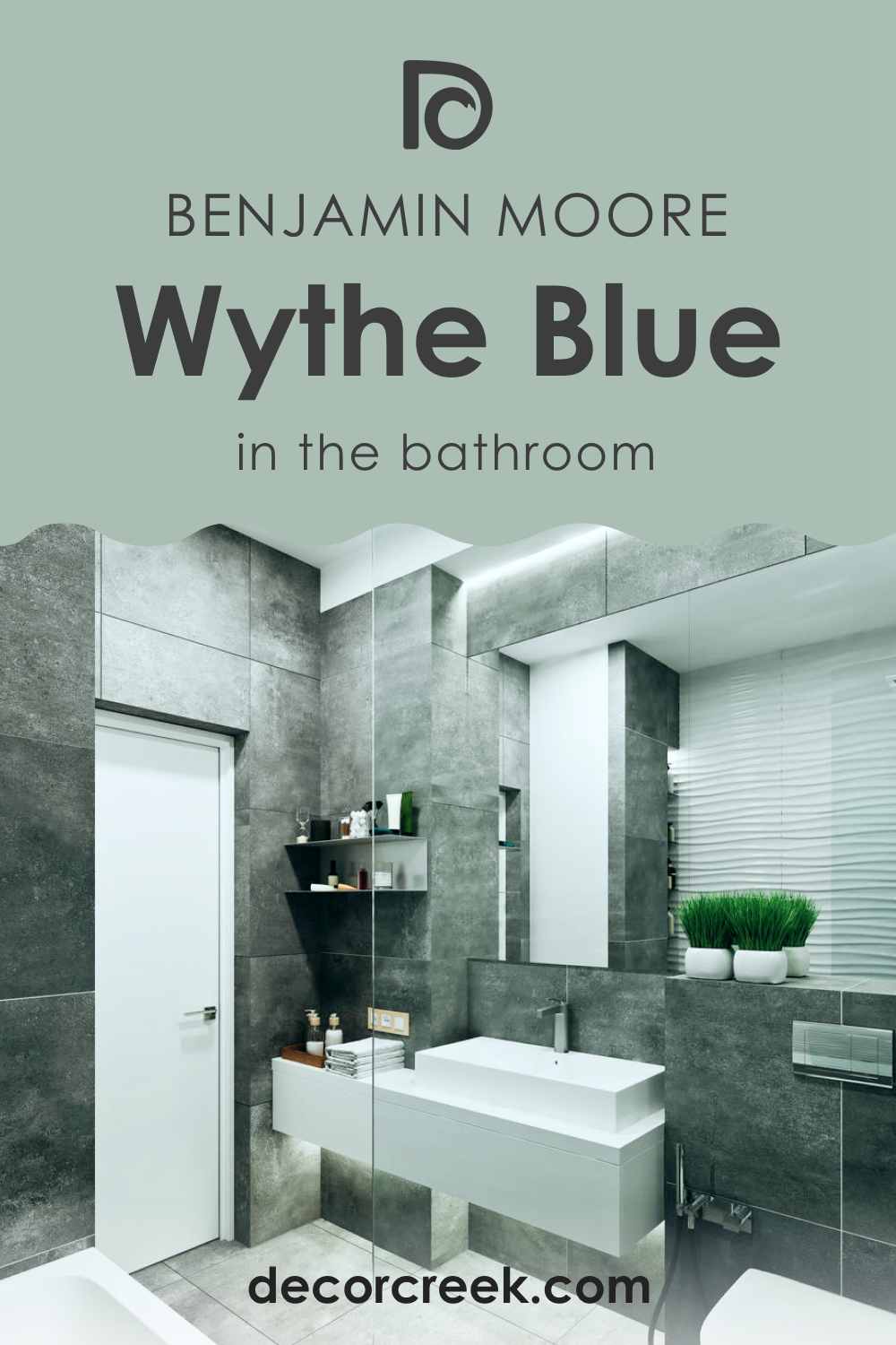
Wythe Blue HC-143 and Bathroom
In bathrooms, this color reveals its true beauty on the walls if the room is well-lit and spacious enough. But if it’s small-sized and lacks natural light, you’d better use BM Wythe Blue on the vanity or paint an accent wall with it.
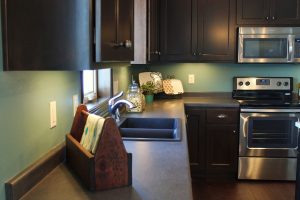
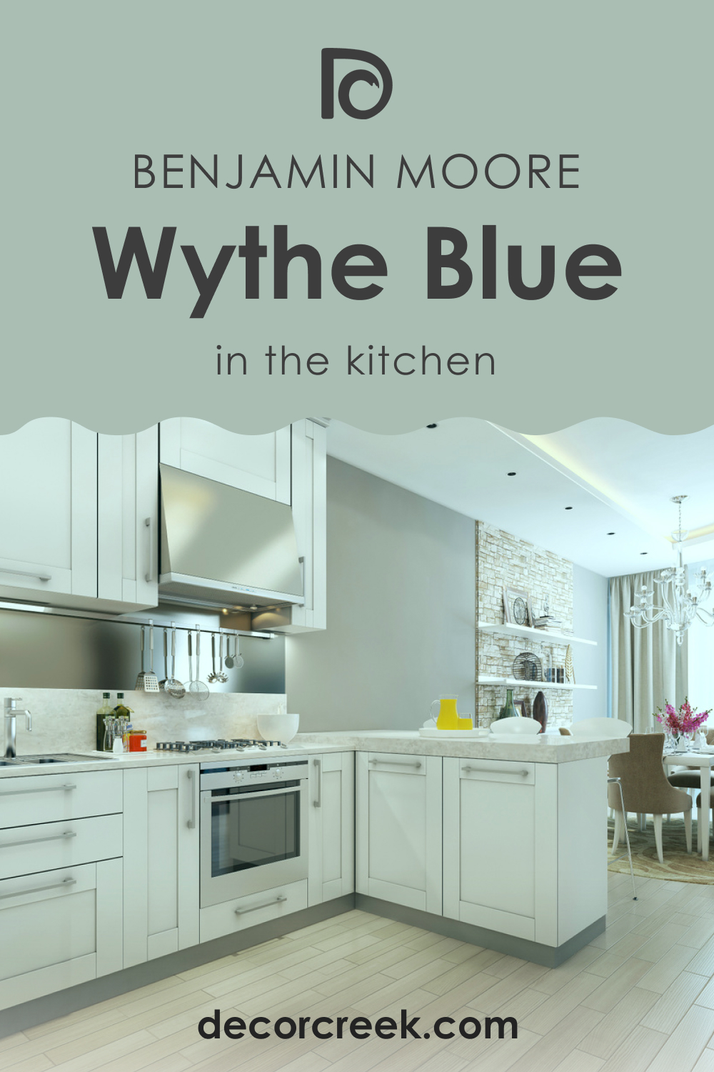
Wythe Blue HC-143 in the Kitchen
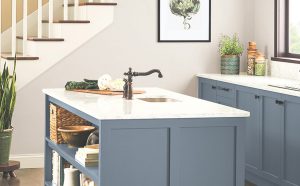
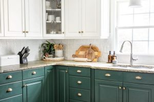
You should definitely give this color a try in your kitchen despite its light appearance and the delicate vibe it gives! Pair it with creamy whites, a white veined marble countertop, and white backsplash tiles to create a beautiful backdrop in the space. Furthermore, this color can also be paired with an off-white on the upper cabinets.
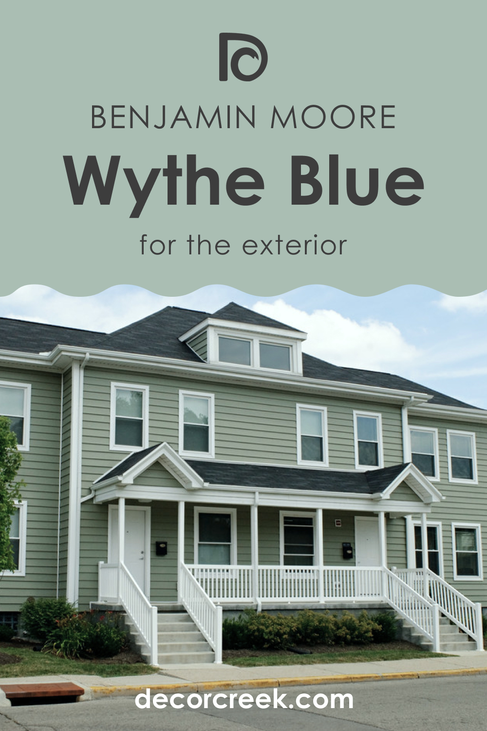
Wythe Blue HC-143 for the Exterior Use
If you are an owner of a Ranch-style, Coastal, Cape Cod, or Modern home, this paint on the exterior walls will add a stunning touch to your facade! As an accent for the trims, moldings, and door and window frames, feel free to add blacks and whites or even a tinge of contrasting black, or use them vice versa.
Now you know more about this gorgeous and, at the same time, tricky blue-green color! You know what kind of paint BM Wythe Blue is and how it works in different rooms. You know how it reacts to light and how it will read depending on the lighting conditions.
Also, you learned how to coordinate it correctly and what colors will work best with this beautiful and delicate shade of blue. With all these tips, you will find the best place for it in your home.
Ever wished paint sampling was as easy as sticking a sticker? Guess what? Now it is! Discover Samplize's unique Peel & Stick samples.
Get paint samples
Frequently Asked Questions
⭐What color collection does BM Wythe Blue belong to?
BM Wythe Blue belongs to the Historical Colors collection by Benjamin Moore.
⭐Does this color have other names?
Yes, it does. BM Wythe Blue is also known as BM 703.
⭐Does this color work with black?
Yes, it does. But you must use black very carefully, mostly on smaller accent surfaces.


