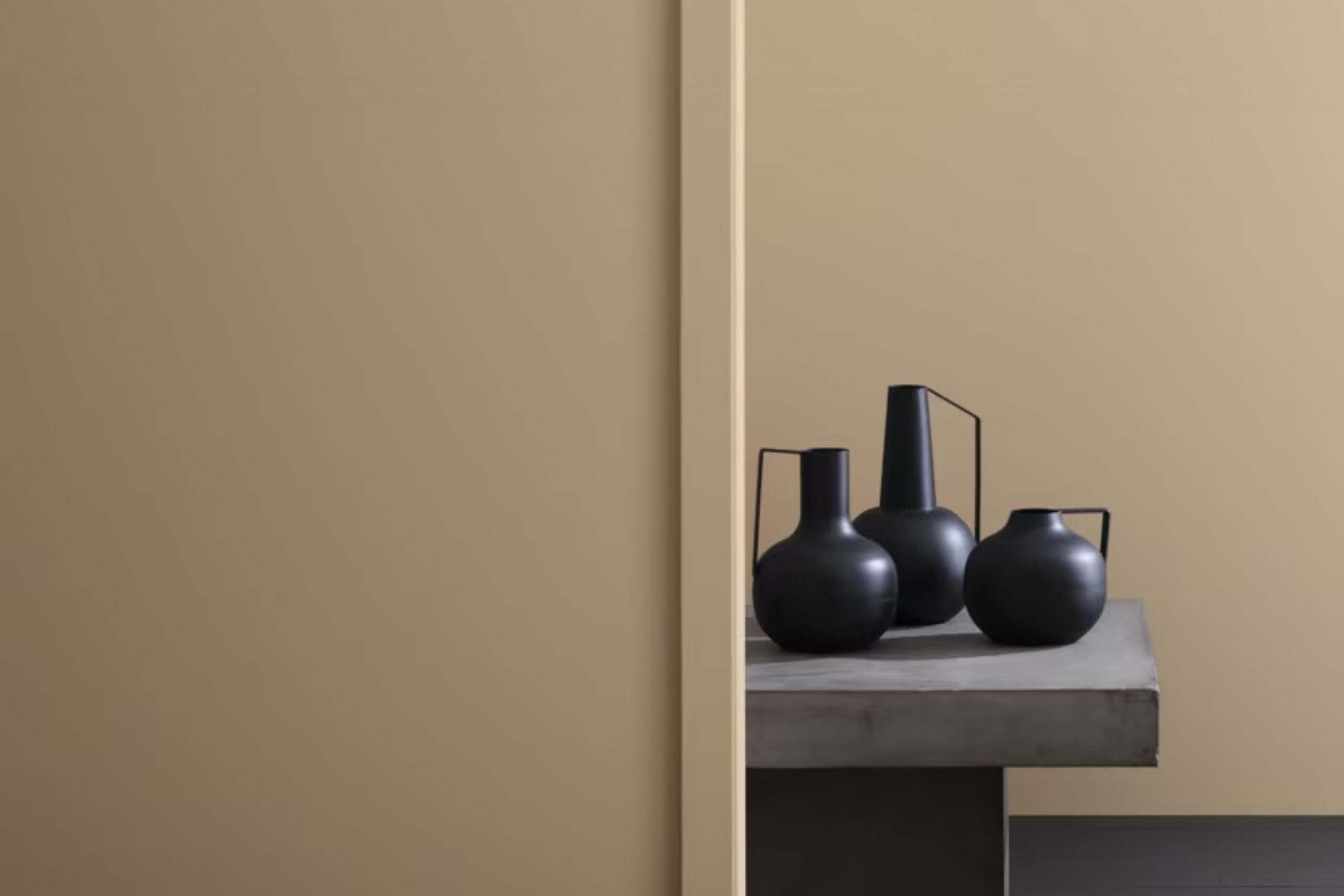
If you’re thinking about repainting a room in your house and are considering a shade that’s neutral yet warm, let me tell you about Benjamin Moore’s CSP-280 Warm Sand. As someone who loves to update my space without going too bold, I found Warm Sand to be a perfect fit. This color has a soothing presence, ideal for creating a cozy and inviting atmosphere in any room.
Warm Sand is quite versatile, blending beautifully with other colors. You can pair it with soft whites for a gentle contrast or with dark browns to enhance its warmth. It’s especially good for living areas and bedrooms where you want a calm and relaxed vibe.
The beauty of using a color like Warm Sand is that it acts almost like a canvas, allowing other elements of your decor to stand out. Whether you’re hanging art, displaying cushions with vibrant patterns, or even showcasing wood furniture, everything seems to complement this shade.
So, if you’re looking for a paint color that provides both beauty and flexibility, Warm Sand might just be the way to go.
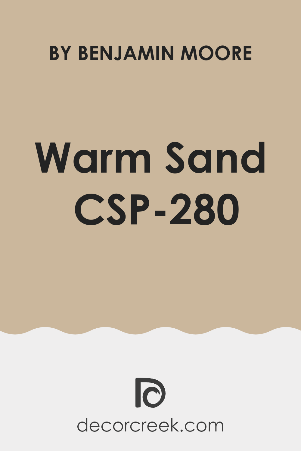
What Color Is Warm Sand CSP-280 by Benjamin Moore?
Warm Sand by Benjamin Moore is a neutral color that boasts a soft beige hue, reminiscent of a sandy beach on a sunny day. Its soothing yet rich tone makes it versatile, pairing well with a variety of decorating themes. Particularly, it harmonizes beautifully in interiors following the modern farmhouse, coastal, and traditional styles. The color’s understated elegance provides a perfect backdrop for these relaxed, welcoming aesthetics.
The warmth of Warm Sand allows it to blend seamlessly with natural materials and textures, enhancing spaces with a cozy, lived-in feel. When paired with wood, from light oak to dark walnut, it highlights the natural grain, adding depth and character to the room.
Fabrics like linen or soft, plush cotton in whites, creams, or muted blues complement its earthy base, reinforcing a calm and inviting atmosphere.
Moreover, Warm Sand works well with stone elements, such as a limestone fireplace or slate tabletops, bringing out their subtle textures.
In spaces with ample sunlight, its underlying yellow tones become more pronounced, creating a gentle glow that makes the room feel even more welcoming.
Lighting choices, like warm-toned LEDs or classic lampshades, can further enhance the cozy ambiance that Warm Sand initiates. Such versatility makes it a go-to choice for those seeking a neutral yet warm palette.
Is Warm Sand CSP-280 by Benjamin Moore Warm or Cool color?
Warm Sand by Benjamin Moore is a gentle and appealing color that brings a cozy and inviting aura to any room. Its subtle beige tone works well with various styles of decor, making it a versatile choice for many homes. Since the color is both soft and neutral, it helps create a backdrop that allows furniture and artwork to stand out. This color particularly shines in living rooms and bedrooms where you want a calm and welcoming atmosphere.
In spaces with limited natural light, Warm Sand can help brighten the environment without overpowering the room with a stark, bright shade. It pairs well with white trims, adding a subtle contrast that’s pleasant to the eye.
Additionally, this color is a great choice for those who like to frequently change their home accents; it matches well with many different colors and textures. Overall, using Warm Sand in a home sets the stage for a space that’s both warm and stylish.
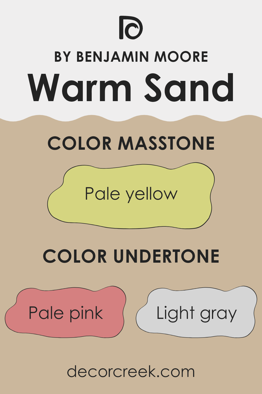
Undertones of Warm Sand CSP-280 by Benjamin Moore
Warm Sand boasts a subtle complexity, shaped by a unique palette of undertones including pale pink, light gray, light purple, mint, grey, light blue, lilac, yellow, orange, light green, and olive. Each of these colors plays a role in the overall perception of the primary hue, influencing how it interacts with light and the colors around it.
In the case of Warm Sand, the blend of undertones can make the color appear differently depending on the lighting and surrounding elements. For instance, in a room with natural light, the pink or orange undertones might make the wall color look warmer, creating a cozy and welcoming vibe. In artificial light, the grey or light blue might become more pronounced, giving the space a cooler feel.
On interior walls, these undertones can affect the mood and atmosphere of a room. A wall painted with Warm Sand can add a subtle hint of warmth and earthiness, with its array of undertones gently influencing the room’s character. The inclusion of green and yellow undertones can make it complement natural elements like wood or plants beautifully, enhancing a connection to nature.
Overall, the complexity of Warm Sand due to its undertones makes it a versatile choice for walls, capable of subtly shifting its impact depending on its environment. This feature allows for flexibility in decorating, as the paint can adapt to various styles and preferences, ensuring that the walls contribute harmoniously to the room’s overall ambiance.
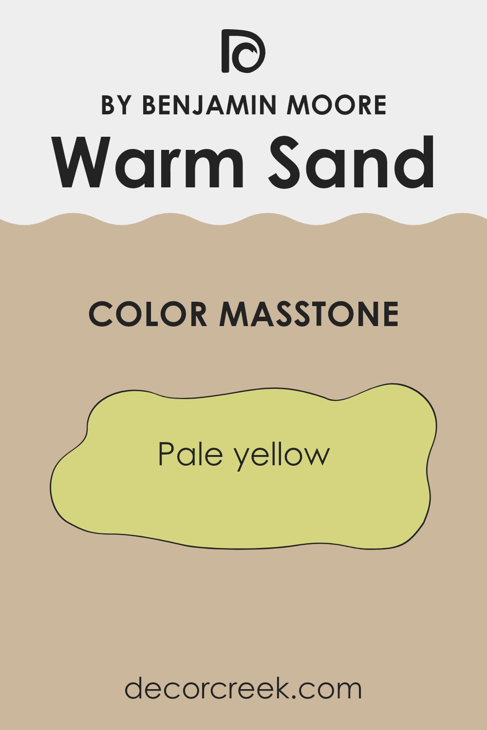
What is the Masstone of the Warm Sand CSP-280 by Benjamin Moore?
Warm Sand CSP-280 by Benjamin Moore has a masstone of pale yellow, represented by the color code #D5D580. This shade is like a soft, subtle yellow that brings a hint of cheer to any room without being too bright or overpowering. The pale yellow tone creates a cozy and welcoming atmosphere in homes, making spaces feel more open and airy.
This color works particularly well in living areas and bedrooms where a calming effect is desired, but without the coolness often associated with blue or green tones. It reflects natural light beautifully, enhancing the sense of space, especially in smaller rooms or areas with limited natural light.
Furthermore, pale yellow can complement a wide range of décor styles and pairs well with a variety of other colors, from neutral earth tones to more vibrant colors, allowing for versatility in interior decorating. This makes Warm Sand CSP-280 not just a paint color but a practical choice for creating pleasant and adaptable living environments.
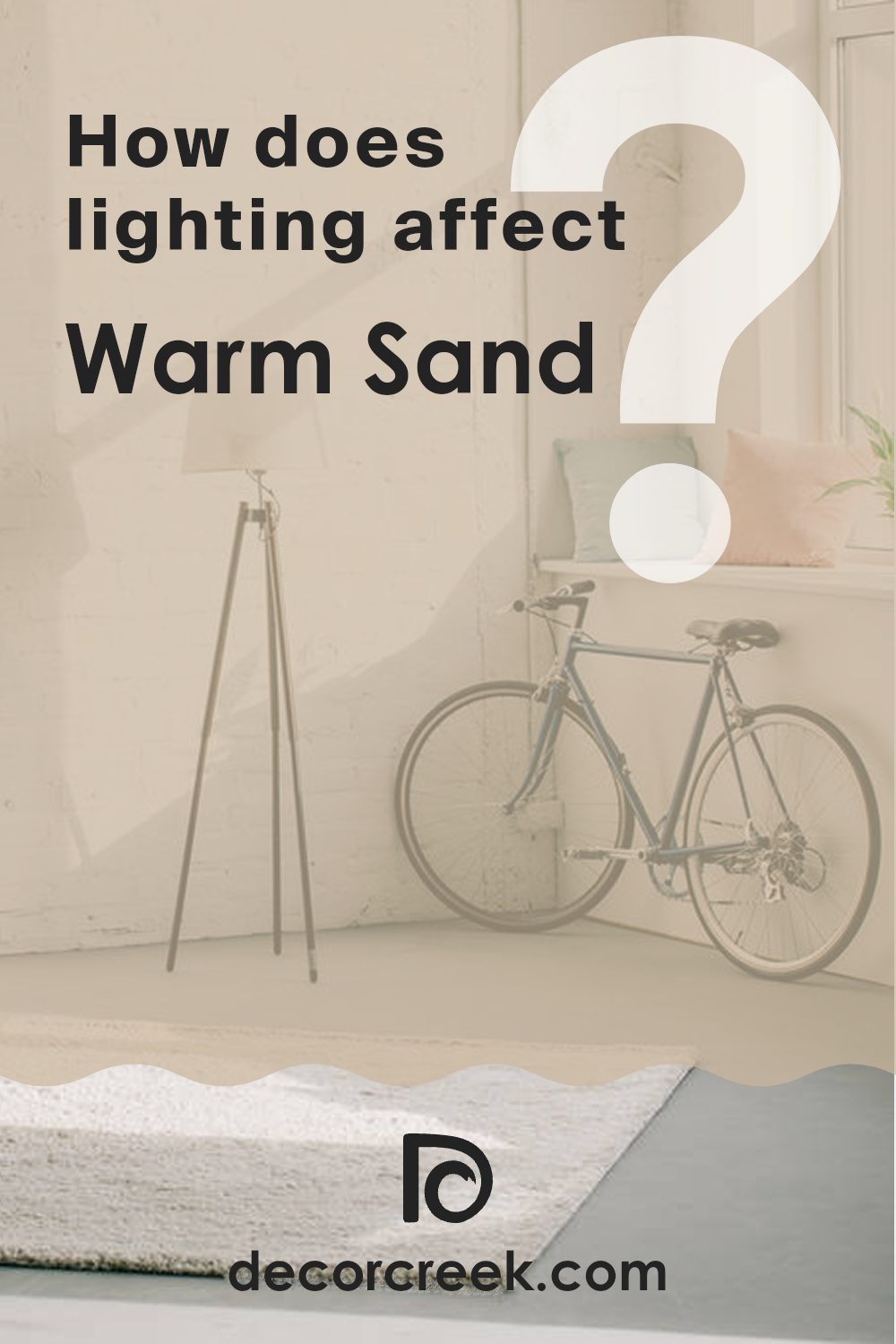
How Does Lighting Affect Warm Sand CSP-280 by Benjamin Moore?
Lighting plays a critical role in how we perceive colors in different environments. The color we see can be considerably influenced by the type of light under which it is viewed, whether artificial or natural. For instance, imagine a paint color like Warm Sand by Benjamin Moore, which has a soft, neutral tone.
In artificial light, such as the yellow glow from incandescent bulbs, the color Warm Sand might appear slightly more golden or richer. This is because the yellowish hue of the bulb can add warmth to the color on the walls. In contrast, under fluorescent lights, which tend to emit a bluer tone, this paint color might look slightly cooler and more subdued.
Natural light brings another dimension to how Warm Sand looks. Depending on the direction your room faces, the color can appear differently at various times of the day:
- North-facing rooms: These rooms get less direct sunlight, which can make light appear somewhat gray and cool. In such rooms, Warm Sand might look more muted and less vibrant, with a softer, almost shadowy quality.
- South-facing rooms: These rooms benefit from plentiful bright light for most of the day. Here, Warm Sand will look warmer and brighter, enhancing its sandy tones and making the room feel inviting and cozy.
- East-facing rooms: Morning light is warm and bright in east-facing rooms, making Warm Sand look lively and cheerful in the morning. However, as the day progresses, the color might lose some of its warmth and appear more neutral or cool.
- West-facing rooms: Evening light in west-facing rooms can be intensely warm and glowing. Warm Sand in such a setting can appear very cozy and comforting, particularly in the late afternoon and evening when the sunlight is golden.
Overall, the perception of colors like Warm Sand can shift noticeably depending on the light exposure, which is crucial to consider when choosing a paint color for different rooms in a home.
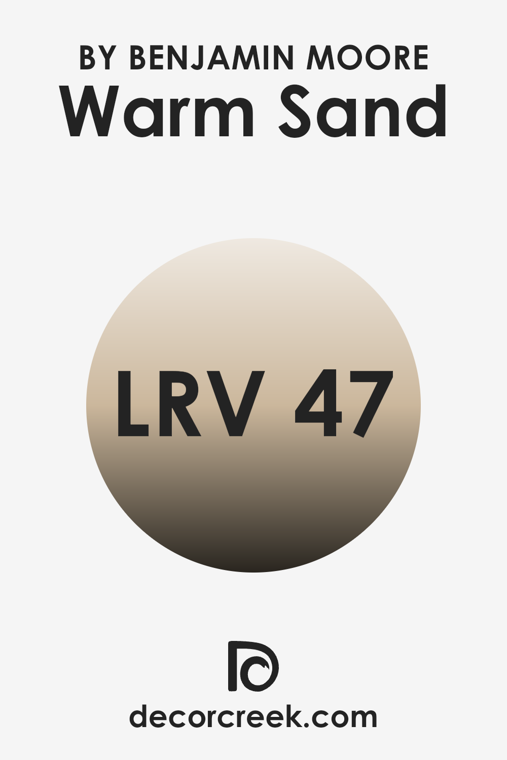
What is the LRV of Warm Sand CSP-280 by Benjamin Moore?
LRV stands for Light Reflectance Value, a measurement that tells you how much light a paint color reflects back into a room as opposed to absorbing it. This value is represented on a scale from zero, which means no light is being reflected and the surface is essentially absorbing all light, like what you’d get from pure black, to a higher number indicating a lighter color that reflects more light.
For home decorators, understanding LRV is crucial because it helps predict how light or dark a color will appear once it’s on your walls. Colors with a higher LRV make a room feel brighter and more open, as they reflect more light back into the space.
The LRV for the color in question, with an LRV of 47.49, strikes a balance where it’s not too dark nor too light. It means this shade will provide a significant amount of light reflection but still hold enough depth to give warmth and character to a room. Such a mid-range LRV makes this color versatile, ideal for areas that need a cozy yet moderately light-enhancing effect.
In spaces with less natural light, this kind of LRV can prevent the room from feeling too dim, while in well-lit areas, it won’t feel overwhelmingly bright but will maintain a calm and inviting atmosphere.
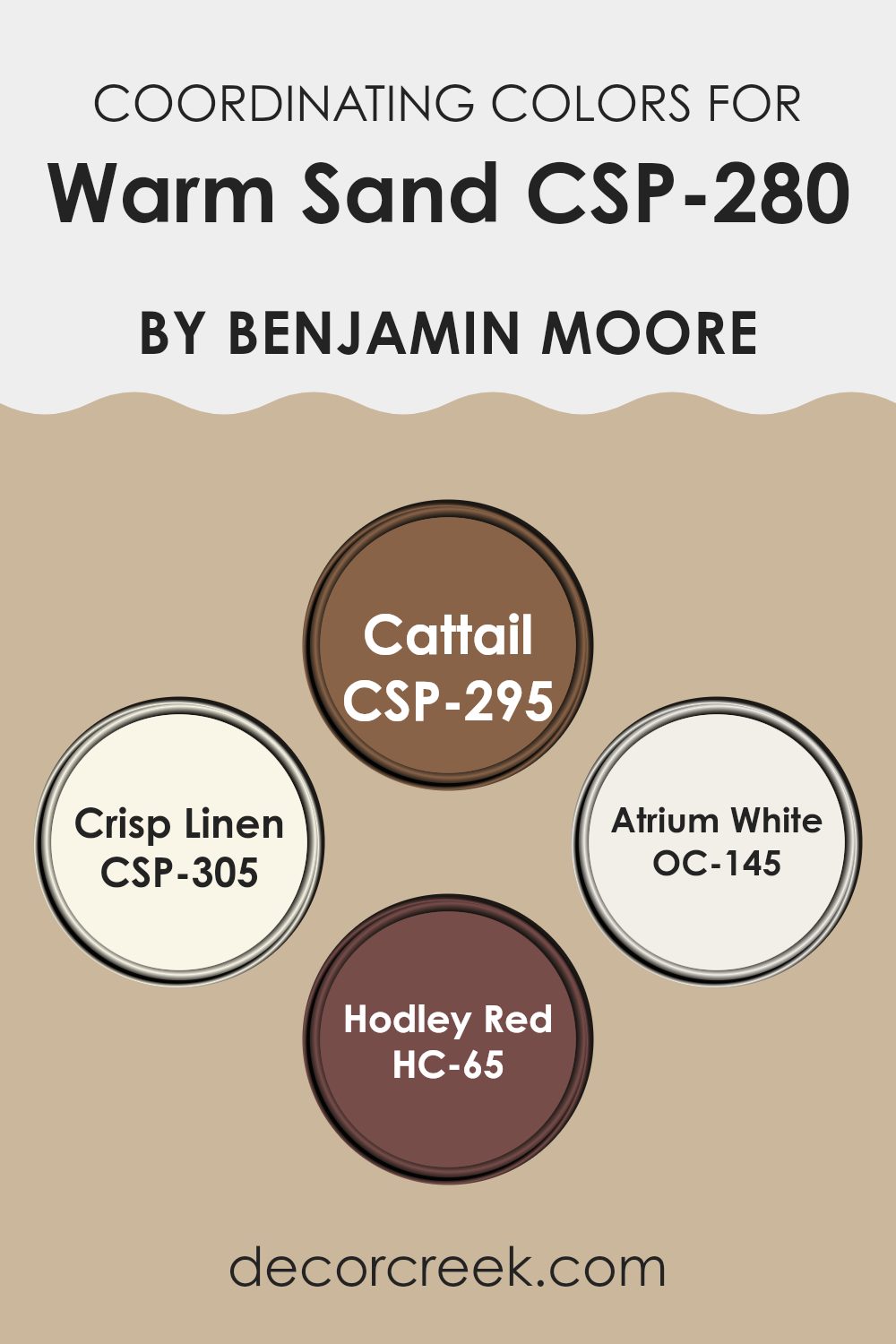
Coordinating Colors of Warm Sand CSP-280 by Benjamin Moore
Coordinating colors are chosen to create a harmonious color scheme for rooms or spaces, where every hue complements the others, enhancing the overall aesthetic in a subtle but impactful way. By selecting colors like Warm Sand as a base and pairing it with others such as Cattail, Crisp Linen, Atrium White, and Hodley Red, you achieve a balanced and pleasing palette. Each coordinating shade serves a distinct purpose, working together to produce a visually appealing environment.
Cattail is a rich, earthy brown that adds a sense of warmth and depth to spaces, making it an excellent complement to the lighter tones of Warm Sand. Crisp Linen, on the other hand, is a soft, clean white with a hint of warmth, great for making any space feel fresh and open.
Atrium White is another white shade, but with a slightly brighter and more neutral tone that helps in reflecting natural light and making the room look larger. Finally, Hodley Red offers a bold, vibrant burst of color that stands out against more muted tones, perfect for adding a dynamic flair to a room’s decor. Together, these colors create a cohesive and attractive color scheme that enhances the ambiance of any space.
You can see recommended paint colors below:
- CSP-295 Cattail
- CSP-305 Crisp Linen
- OC-145 Atrium White
- HC-65 Hodley Red
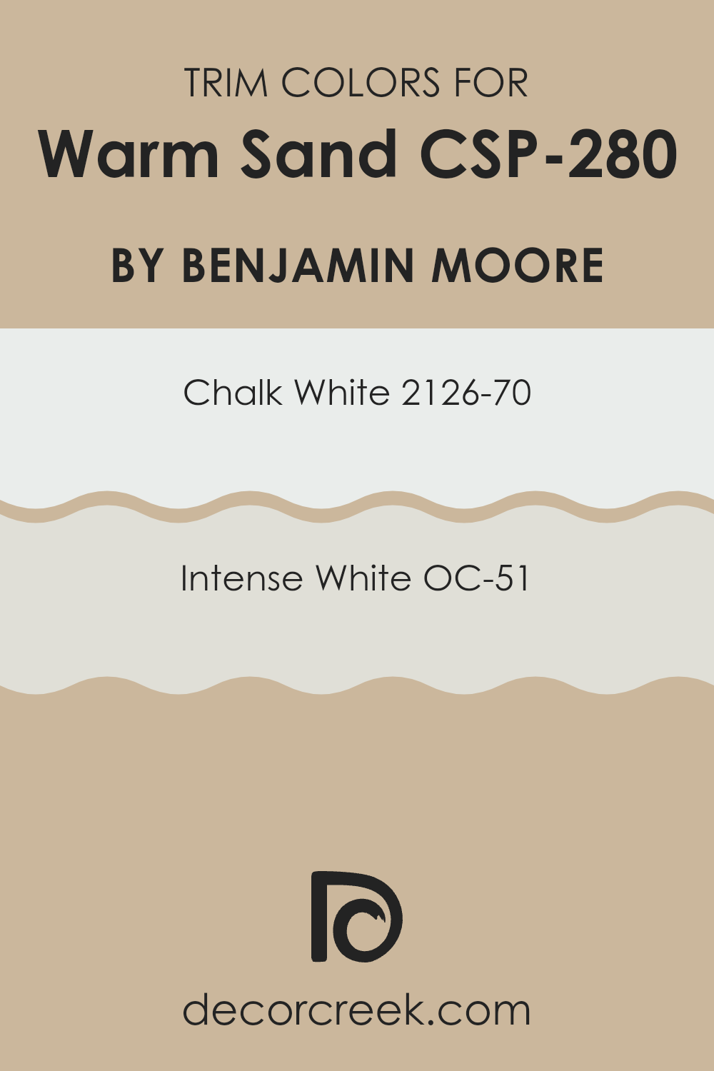
What are the Trim colors of Warm Sand CSP-280 by Benjamin Moore?
Trim colors are the hues applied to the molding, door frames, window casings, and other architectural elements to accentuate and define the architectural details in a room. Selecting the right trim color is crucial as it frames the main color scheme of the walls, enhancing both the aesthetics and overall feel of a space.
For a warm, neutral wall color like Warm Sand by Benjamin Moore, trim colors such as Chalk White (2126-70) and Intense White (OC-51) are excellent choices because they provide a crisp, clean contrast that highlights the warm tones of the walls without overwhelming them.
Chalk White is a pure, bright white with a touch of softness that makes it ideal for creating a striking but subtle border around Warm Sand-colored walls. This shade reflects a lot of light, which can make spaces appear larger and more open.
Intense White, on the other hand, is a bit deeper and includes a hint of gray, offering a slightly more muted approach that still maintains sharp, clear lines against warmer hues.
This color is perfect for bringing a gentle yet clear distinction to the edges and corners of a room, enhancing the overall visual structure of the space.
You can see recommended paint colors below:
- 2126-70 Chalk White
- OC-51 Intense White
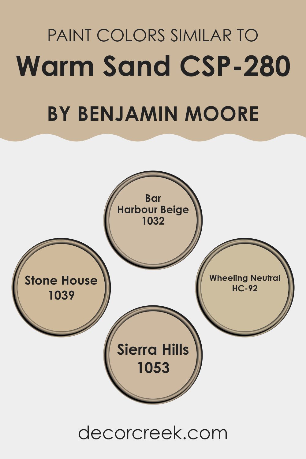
Colors Similar to Warm Sand CSP-280 by Benjamin Moore
Choosing similar colors, such as shades and tones that complement a primary color like Warm Sand by Benjamin Moore, is crucial for creating a cohesive and harmonious look in your home. When these colors are used together, they create a subtle variation that adds depth and interest without the stark contrasts that more dramatically different colors might produce.
For instance, using shades like Bar Harbour Beige, Stone House, Wheeling Neutral, and Sierra Hills alongside Warm Sand can enhance the warmth and welcoming feel of any space, making the environment more comfortable and visually appealing.
Bar Harbour Beige is a light, sandy beige that mimics the softness of a quiet beach, blending seamlessly with similar neutrals. Next, Stone House offers a deeper, slightly richer hue reminiscent of earthy clay, providing a grounding effect. Wheeling Neutral is a balanced beige with a touch of gray, perfect for adding a neutral backdrop that allows furnishings to stand out.
Finally, Sierra Hills offers a hint of green, recalling the subtle tones of nature and adding a unique twist to the neutral palette. Together, these colors support one another, building a space that is both welcoming and stylish.
You can see recommended paint colors below:
- 1032 Bar Harbour Beige
- 1039 Stone House
- HC-92 Wheeling Neutral
- 1053 Sierra Hills
Colors that Go With Warm Sand CSP-280 by Benjamin Moore
Choosing the right colors to complement Warm Sand CSP-280 by Benjamin Moore is crucial because it helps create a harmonious and inviting environment. For example, pairing it with colors like 230 – Pirate’s Chest offers a beautiful contrast as Pirate’s Chest is a rich, deep brown that mimics the look of aged wooden chests used by seafarers. Similarly, HC-43 – Tyler Taupe is a versatile taupe that works well with Warm Sand by providing a subtle backdrop that enhances the lighter tone without overpowering it.
Other colors like 252 – Olivetone add a natural element when paired with Warm Sand, as Olivetone is a deep, earthy green that resembles lush foliage. This pairing can make a room feel grounded and connected to nature. HC-21 – Huntington Beige is another great companion for Warm Sand, offering a slightly darker beige tone that adds depth and warmth to the space.
OC-4 – Brandy Cream, a soft, creamy shade, gives a gentle contrast that brightens the environment, while OC-71 – Sand Dollar, a light, almost ethereal color, ensures that the space remains airy and light. Using these colors together with Warm Sand creates a cohesive palette that enhances the beauty of each shade, making any room feel cozy and well-coordinated.
You can see recommended paint colors below:
- 230 Pirate’s Chest
- HC-43 Tyler Taupe
- 252 Olivetone
- HC-21 Huntington Beige
- OC-4 Brandy Cream
- OC-71 Sand Dollar

How to Use Warm Sand CSP-280 by Benjamin Moore In Your Home?
Warm Sand CSP-280 by Benjamin Moore is a cozy and inviting paint color that brings a natural, earthy feel to any room. Its soft, neutral tone pairs well with a wide range of colors, making it a versatile choice for decorating.
You can use Warm Sand in your living room to create a welcoming atmosphere. It’s particularly effective for making small spaces feel bigger and brighter. In the bedroom, this color adds a gentle touch, helping to make the space relaxing and cozy.
If you’re looking to refresh your kitchen or bathroom, Warm Sand works well here too, providing a clean and fresh look without being too stark. This color can also be an excellent background for art or to highlight furniture pieces. Overall, Warm Sand CSP-280 can help you achieve a warm and inviting home environment, where every room feels comfortable.
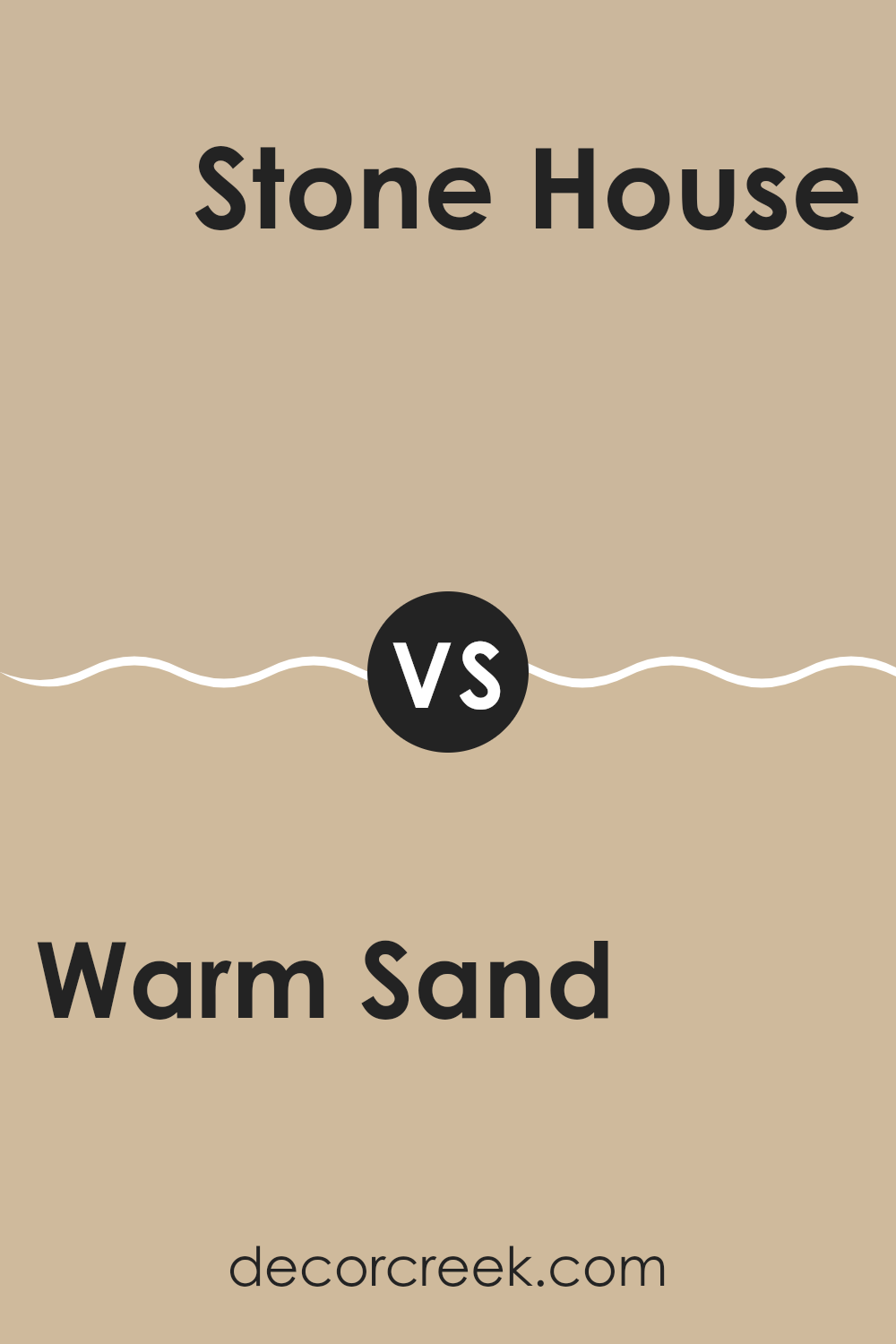
Warm Sand CSP-280 by Benjamin Moore vs Stone House 1039 by Benjamin Moore
Warm Sand and Stone House are two colors by Benjamin Moore that bring a cozy and approachable feel to any space. Warm Sand has a soft, beige tone that easily complements various decor elements, making it a versatile choice for living rooms, bedrooms, or offices. It radiates a gentle, welcoming vibe that pairs well with both bold and muted colors.
On the other hand, Stone House is a slightly darker shade, leaning towards a richer, earthier beige that brings a sense of warmth and comfort. This color is excellent for creating a cozy nook or adding depth to a larger room. It works well with natural materials like wood and leather, enhancing the overall aesthetics of a space.
Both colors offer a neutral base, but Warm Sand is lighter, giving a room a more open and airy feel, whereas Stone House adds a touch of grounding and depth, ideal for spaces that you want to feel more enclosed and intimate.
You can see recommended paint color below:
- 1039 Stone House
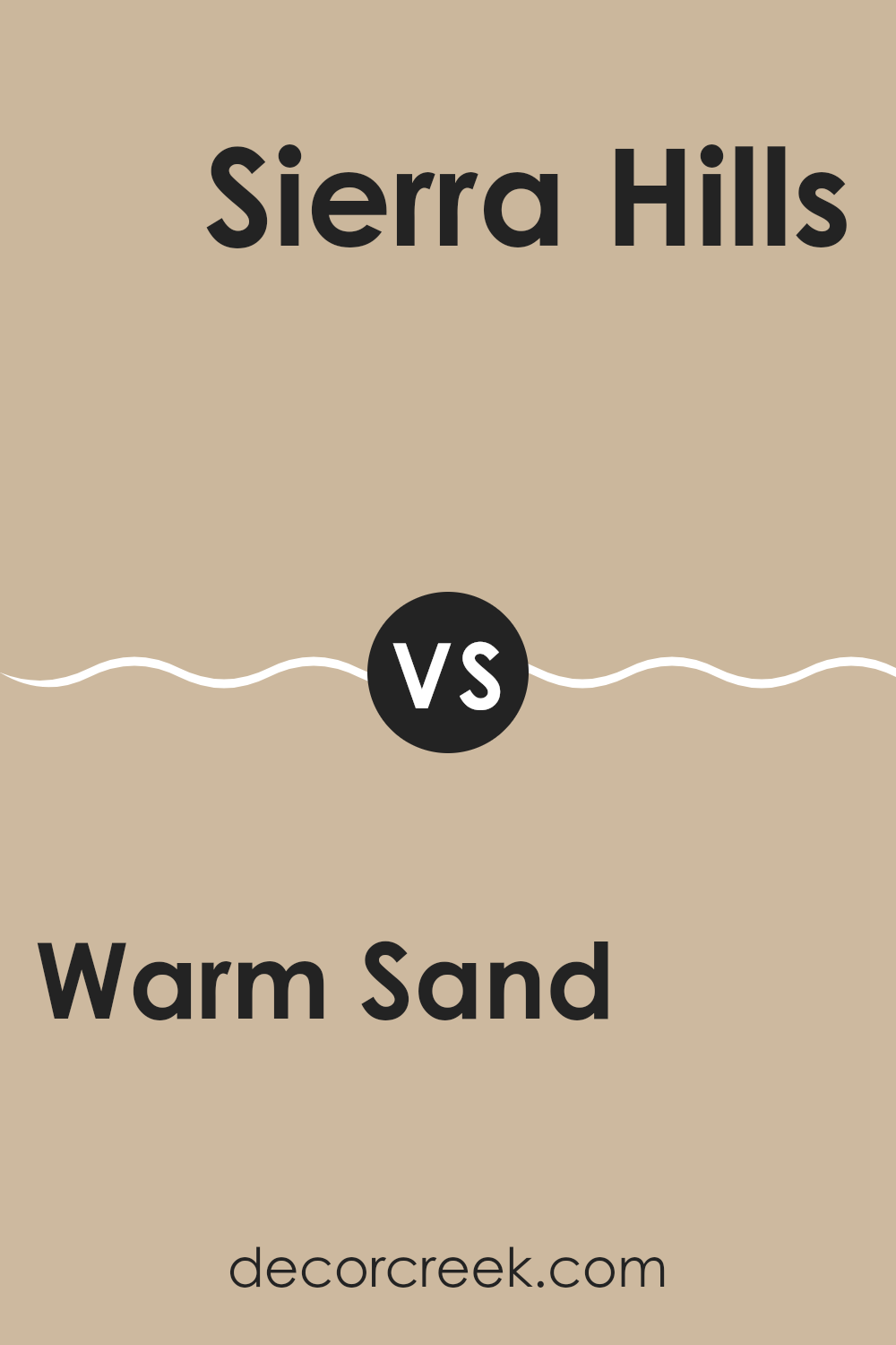
Warm Sand CSP-280 by Benjamin Moore vs Sierra Hills 1053 by Benjamin Moore
Warm Sand and Sierra Hills, both from Benjamin Moore, showcase different yet complementary tones. Warm Sand is a soft beige that gives off a cozy and welcoming effect. It’s subtle enough to work well in a variety of spaces, adding a gentle backdrop to rooms that promotes a relaxed atmosphere. This color is versatile, pairing easily with both bright and muted furnishings.
On the other hand, Sierra Hills leans more towards a sandy taupe, containing hints of gray which add a cooler touch compared to Warm Sand. Sierra Hills can act as a neutral base in your home but gives a slightly more modern and fresh look due to its gray undertones.
Overall, while both colors can create a natural and calming environment, Warm Sand offers a warmer, traditional beige whereas Sierra Hills provides a contemporary twist with its taupe-gray composition. Choosing between them depends on the warmth and modernity you want to introduce to your space.
You can see recommended paint color below:
- 1053 Sierra Hills
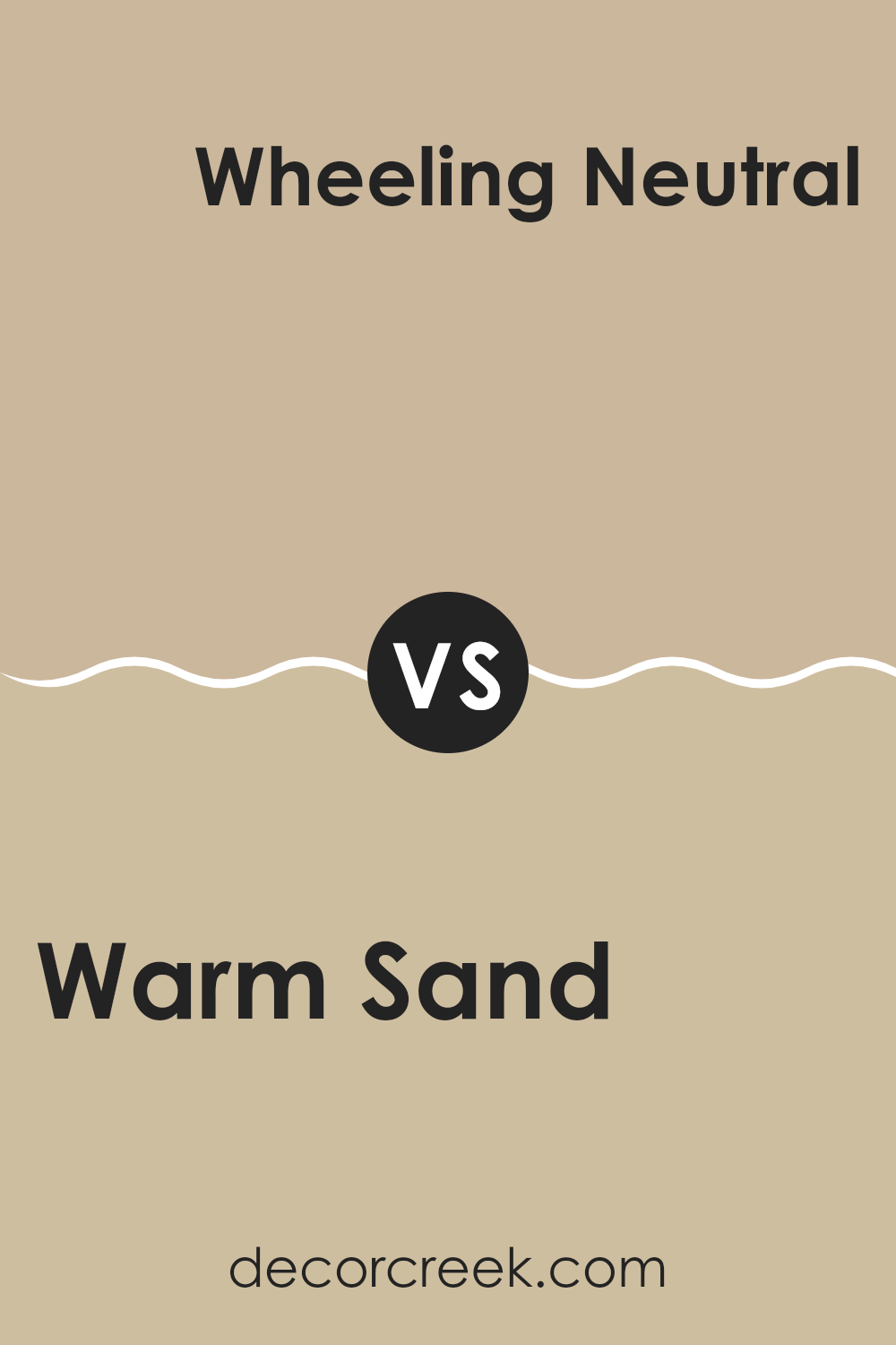
Warm Sand CSP-280 by Benjamin Moore vs Wheeling Neutral HC-92 by Benjamin Moore
Warm Sand and Wheeling Neutral are two paint colors by Benjamin Moore that share some similarities but also have unique differences. Warm Sand is more on the beige side, giving off a cozy and inviting vibe. It’s a great choice for someone looking to create a warm and welcoming atmosphere in their home. This color works well in living rooms or bedrooms where you want a soft, cozy feel.
On the other hand, Wheeling Neutral has a slightly grayer tone compared to Warm Sand. It is more subdued and less warm, making it ideal for those who prefer a neutral backdrop that still adds some character.
Wheeling Neutral is versatile and can be used in various spaces, including modern kitchens or home offices, where a more balanced, neutral shade is desired to complement other decor elements.
Both colors are neutral and work well in a variety of lighting conditions, providing a flexible palette for decorating with other colors and materials.
You can see recommended paint color below:
- HC-92 Wheeling Neutral
Warm Sand CSP-280 by Benjamin Moore vs Bar Harbour Beige 1032 by Benjamin Moore
The main color, Warm Sand, is a neutral tone with a comforting, soft quality that gives rooms a cozy and inviting atmosphere. It tends to have a creamy base which makes it very adaptable and easy to match with a variety of decor styles and colors.
On the other hand, Bar Harbour Beige is another neutral but with a slightly grayer undertone compared to Warm Sand. This makes Bar Harbour Beige lean towards a more muted look, providing a subtle contrast to the warmer, more yellow-infused tones of Warm Sand.
While both colors are versatile and work well in various settings, Warm Sand adds warmth to a space, making it feel homely and relaxed, whereas Bar Harbour Beige offers a more understated and calm aesthetic. These colors could work well together in a space, creating a harmonious blend of warmth with a touch of sophistication, without overwhelming the senses.
You can see recommended paint color below:
- 1032 Bar Harbour Beige

After trying out CSP-280 Warm Sand paint by Benjamin Moore in my room, I have to say, it has a really nice soft and warm color. This shade of beige is not too bright but still adds a lot of warmth to the room, making it feel cozy and welcoming. When sunlight hits the walls, the room looks extra comforting, like a sunny beach.
It’s a simple color that goes well with lots of other colors so I could keep my favorite green curtains and still add some blue pillows for a fresh look. It also does a great job at hiding little marks and smudges which is great because it means less cleaning for me!
For anyone looking to refresh their room without making things too bold or loud, CSP-280 Warm Sand is a great choice. It makes the room feel like a warm hug and is easy to match with different decors and styles. Whether it’s your bedroom or living room, this color makes the place feel just right.
I’d definitely recommend it to my friends and family who want to make their home feel warmer and cozier without too much effort. All in all, it’s a great color that makes any room nicer.
Ever wished paint sampling was as easy as sticking a sticker? Guess what? Now it is! Discover Samplize's unique Peel & Stick samples.
Get paint samples

