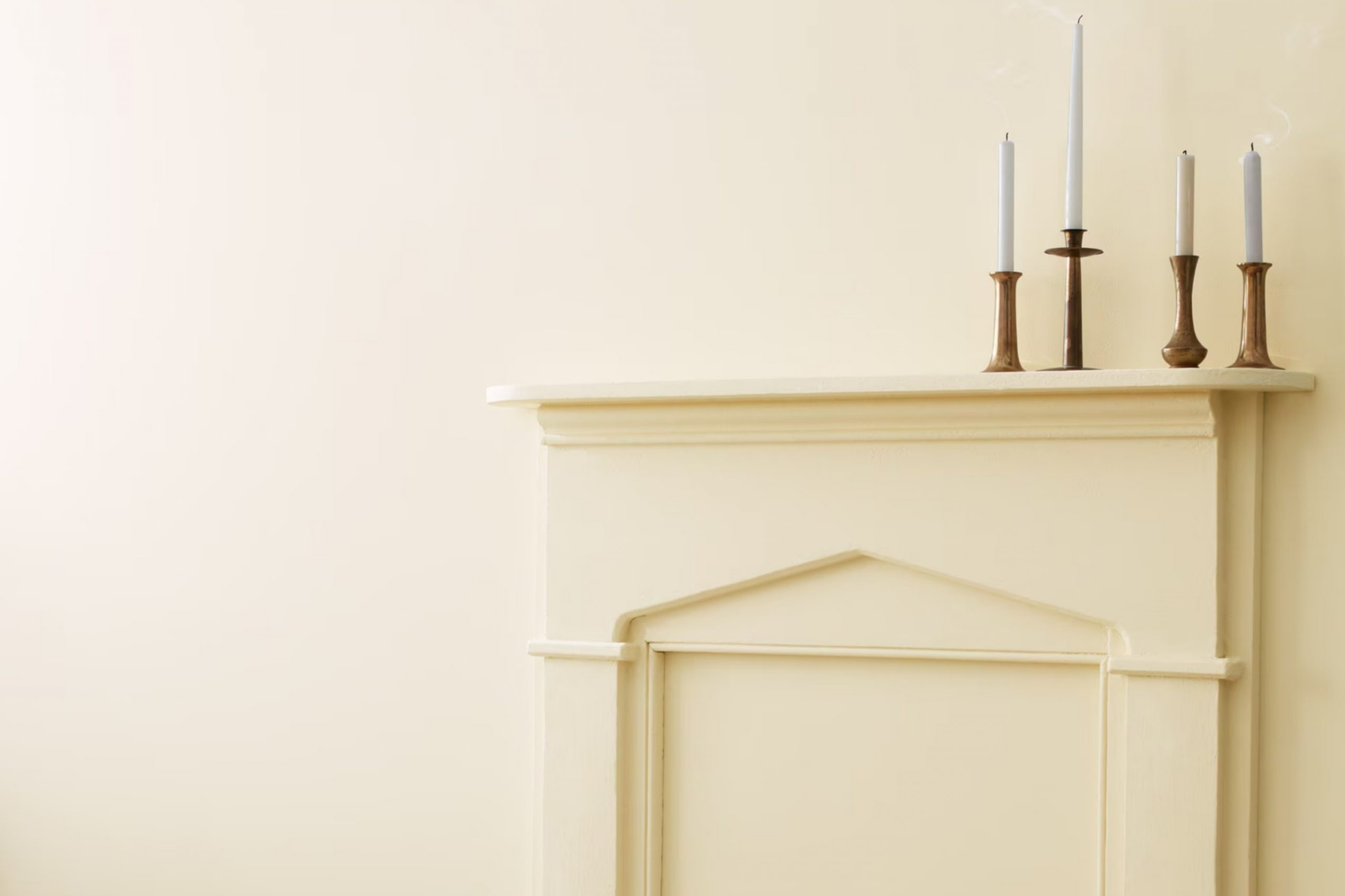
At first glance, you might think white is just plain and simple, but White Down has a certain warmth and depth that really caught my interest. It’s not just a blank canvas; it’s a cozy, inviting shade that adds a touch of elegance to any space.
Imagine standing in a room painted in White Down. The walls exude a subtle, creamy hue that makes the whole space feel more open and airy.
It’s like wrapping yourself in a soft, warm blanket on a cool day. There’s something about this color that just feels right, whether you’re looking to refresh a living room or brighten up a hallway.
I found that OC-131 White Down works beautifully with natural light, reflecting it without being harsh or glaring. It pairs well with both modern and traditional decor, making it a versatile choice for many.
You don’t have to be an interior designer to appreciate the gentle charm and comfort it brings to any setting.
So if you’re thinking about giving your home a fresh look, consider the inviting and timeless appeal of White Down.
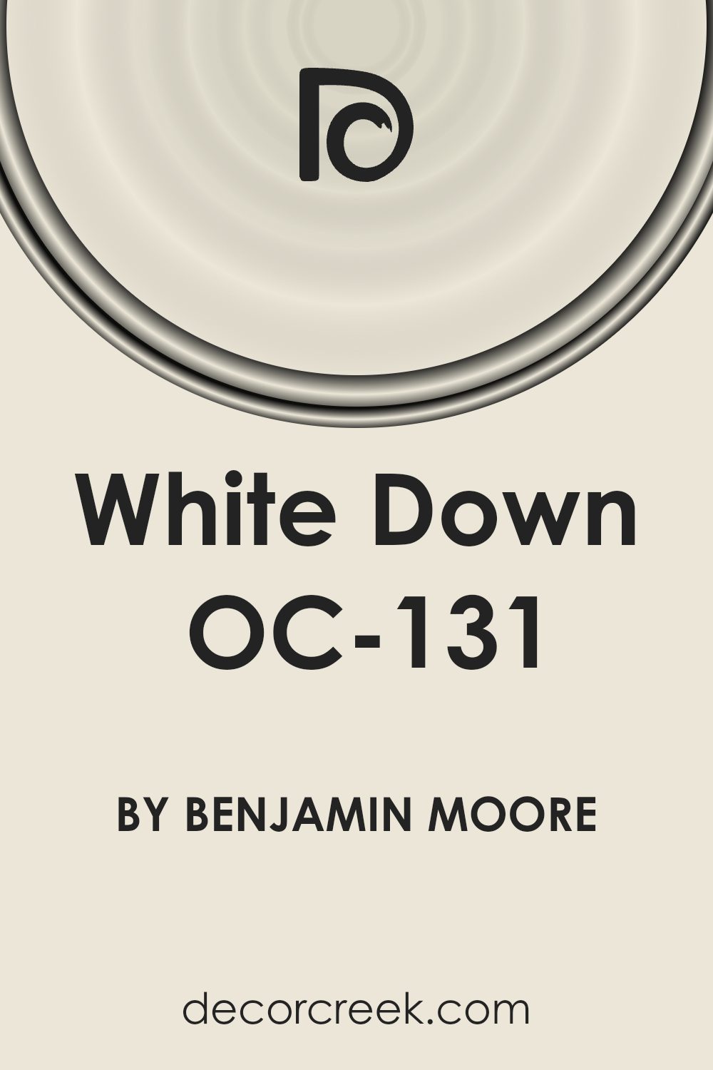
What Color Is White Down OC-131 by Benjamin Moore?
White Down OC-131 by Benjamin Moore is a soft, subtle off-white with warm undertones. This color carries a gentle warmth that makes it distinct from stark whites, giving spaces an inviting and cozy atmosphere. It’s an excellent choice for those who want to keep their interiors feeling light without resorting to cooler shades.
This color works well in traditional, coastal, and modern farmhouse interior styles. Its warmth complements the classic elements of a traditional home, the breezy and relaxed feel of coastal interiors, and the rustic charm of modern farmhouse designs.
White Down OC-131 pairs beautifully with natural materials like wood and stone. The warm undertones highlight the rich grains and textures found in wood, making it a great choice for spaces with hardwood floors or wooden beams.
In terms of textures, this shade coordinates nicely with soft linens and thick woolens, enhancing the cozy vibe of a room.
It also matches well with leather accents, adding a touch of sophistication and warmth. Whether it’s used on walls, trim, or cabinets, White Down OC-131 provides a versatile backdrop that allows other colors or decorative elements to shine without losing its own presence.
Is White Down OC-131 by Benjamin Moore Warm or Cool color?
White Down OC-131 by Benjamin Moore is a versatile off-white paint color. It brings a warm and cozy feel to any space. This color is slightly creamy, which makes it stand out from stark whites. Its subtle warmth can make a room feel inviting and comfortable.
White Down works well with both traditional and modern decor, providing a neutral backdrop that complements various styles.
In living rooms or dining areas, it creates a welcoming atmosphere, making the space feel brighter and slightly larger. It also pairs nicely with natural materials like wood or stone, enhancing their natural beauty. In bedrooms, this color can help create a calm and restful environment, perfect for relaxation.
White Down is also a great choice for hallways and entryways, as it reflects light well without feeling too cold. Overall, its soft and inviting qualities make it a popular choice for many homeowners looking for a subtle yet warm white paint option.
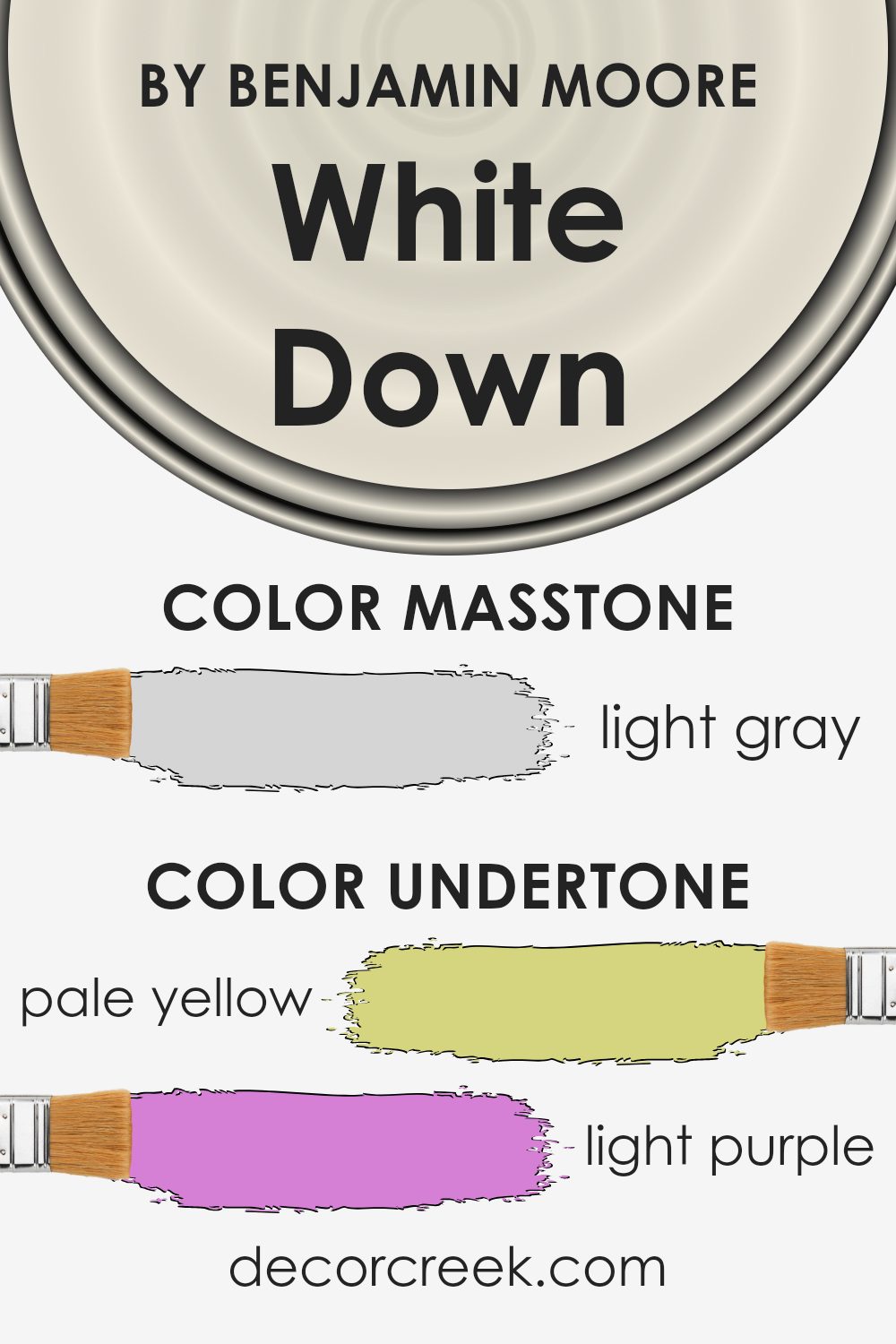
Undertones of White Down OC-131 by Benjamin Moore
White Down OC-131 by Benjamin Moore is a warm and versatile off-white shade. Its subtle undertones give it a unique look.
The color has a range of undertones, including pale yellow, light purple, light blue, pale pink, mint, lilac, and grey. These undertones can change how the color appears depending on lighting and surrounding colors.
Undertones play a crucial role in color perception. For example, a pale yellow undertone makes a color look warmer and sunnier. Light blue can give it a cooler, more calming feel. The grey undertone adds a neutral quality, helping balance the color. The presence of light purple and lilac can add a touch of sophistication, while pale pink and mint add freshness.
In a room, White Down OC-131’s undertones can make the walls feel inviting and cozy. In natural daylight, the yellow undertone might stand out, warming the space.
In artificial light, the subtle grey might be more noticeable, offering a quieter backdrop.
The light purple and lilac can enhance the elegance of a space, while the mint adds a gentle freshness. Overall, these undertones make White Down a great choice for various room styles and settings, adapting well to different lighting conditions.
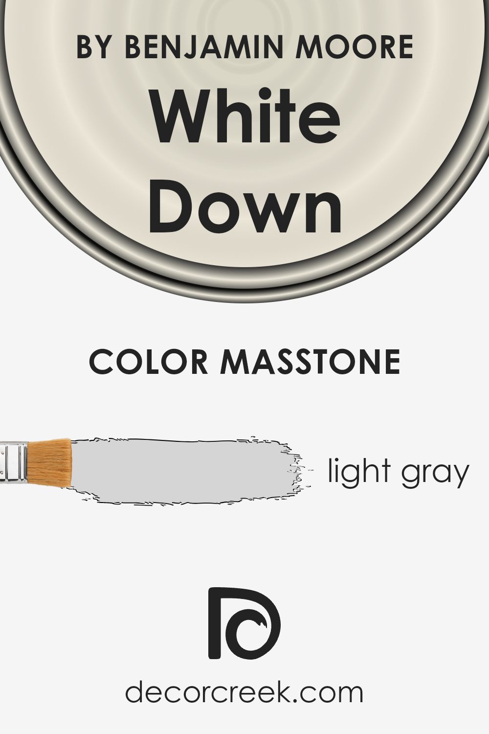
What is the Masstone of the White Down OC-131 by Benjamin Moore?
White Down OC-131 by Benjamin Moore is a light gray color with a calm and quiet appearance. The masstone, at #D5D5D5, means it has a soft and gentle tone that makes it versatile for home use. This light gray shade provides a bright and airy feel without being too harsh, like pure white, which helps make spaces feel larger and more welcoming.
The neutral quality of White Down makes it a great backdrop for different styles and color schemes in homes. It easily pairs with both cool and warm colors, allowing homeowners to try various looks.
In rooms with plenty of natural light, White Down creates a refreshing, open atmosphere, enhancing a sense of openness.
It also works well in dimmer areas, adding a touch of light without overpowering the room. With its subtle elegance, White Down is a popular choice for those wanting a simple yet effective wall color.
How Does Lighting Affect White Down OC-131 by Benjamin Moore?
Lighting plays a significant role in how we perceive colors in our environment. Depending on the type of light, colors can appear warmer, cooler, brighter, or duller than they actually are. The color White Down OC-131 by Benjamin Moore can look different under various lighting conditions, showcasing these effects.
In natural light, the color can change throughout the day. In north-facing rooms, which usually receive cooler and more consistent light, White Down might appear more muted or slightly gray because the light lacks warmth.
This can emphasize any cool undertones in the paint. Therefore, it might look a bit more subdued in these spaces.
In south-facing rooms, the color generally benefits from warm, bright light throughout the day. Here, White Down tends to show its true color more accurately, appearing warm and inviting.
The abundance of natural light will enhance the warmth of the paint, making it feel cozier.
East-facing rooms catch the morning light, which is warm but becomes cooler as the day progresses. In the early hours, White Down might appear bright and lively, but later in the day, it can turn more neutral or even slightly cool as the direct sunlight wanes.
In west-facing rooms, the opposite happens. The morning light can be cooler and less intense, making the color appear softer and more subdued at first. As the day progresses, the afternoon and evening light becomes warmer and more intense, enriching the color and giving it a warmer appearance during those times.
Under artificial lighting, the type of bulb used can also affect the appearance of White Down.
Incandescent bulbs tend to cast a warm glow, which can enhance the warmth of the paint. LED or fluorescent bulbs, which can be cooler, might give the paint a more neutral tone. When choosing lighting, consider how you want White Down to appear in the room and select bulbs that complement your desired effect.
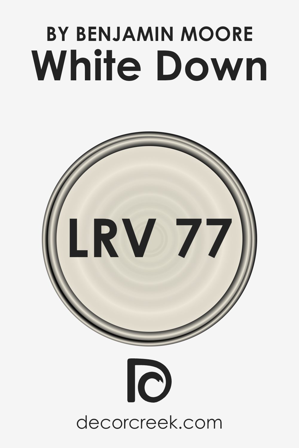
What is the LRV of White Down OC-131 by Benjamin Moore?
LRV stands for Light Reflectance Value, which is a measure of how much light a color reflects. It’s a scale from 0 to 100, where 0 means the color doesn’t reflect any light, like deep black, and 100 means it reflects all light, like pure white.
When you paint a room, the LRV of the color can affect how bright or dark the room appears. Colors with a higher LRV, like White Down which has an LRV of 76.69, will reflect more light. This means they can make a room feel brighter and more open.
In contrast, colors with lower LRV values absorb more light, which tends to make spaces feel cozier and sometimes smaller.
For the color White Down with an LRV of 76.69, this means it reflects quite a lot of light, making it a good choice for spaces where you want to create a light and airy feel. Because it reflects substantial light, it can help brighten up rooms with less natural light. This can make the walls seem to almost glow during the day, giving the room a spacious feel.
In contrast, in a room with too much direct sunlight, a color with such a high LRV might reflect so much light that it could feel a bit stark.
Therefore, it’s important to consider how much natural light the room receives when deciding on using White Down.
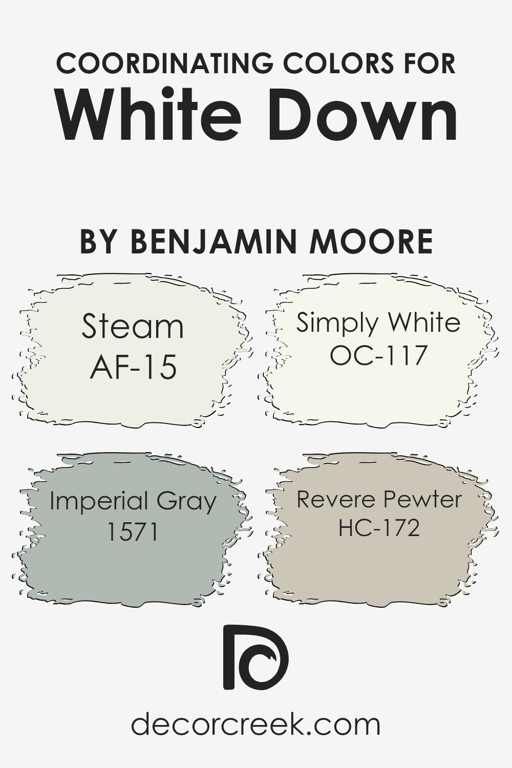
Coordinating Colors of White Down OC-131 by Benjamin Moore
Coordinating colors are shades that blend well together to create a pleasing look in any space. When designing a room or a home, it’s essential to pick colors that complement each other to ensure a harmonious feel. White Down by Benjamin Moore is a fantastic neutral starting point.
Pairs of this paint work beautifully with specific shades. AF-15 Steam is a soft and subtle off-white that adds warmth, making it perfect for walls and ceilings when paired with White Down. It provides a gentle transition without overpowering other elements in the space.
1571 Imperial Gray is a medium gray with a slightly cool undertone that adds depth and contrast. It complements White Down by striking a balance between light and dark. OC-117 Simply White is a clean, clear white, great for trim and accents, as it highlights architectural features against the backdrop of White Down.
Lastly, HC-172 Revere Pewter is a warm gray that can give spaces a touch of coziness while maintaining a modern edge.
Together, these colors create a cohesive and inviting aesthetic, ideal for various styles and preferences. By using these coordinating colors, you can achieve an effortlessly stylish and welcoming environment throughout your home.
You can see recommended paint colors below:
- AF-15 Steam
- 1571 Imperial Gray
- OC-117 Simply White
- HC-172 Revere Pewter
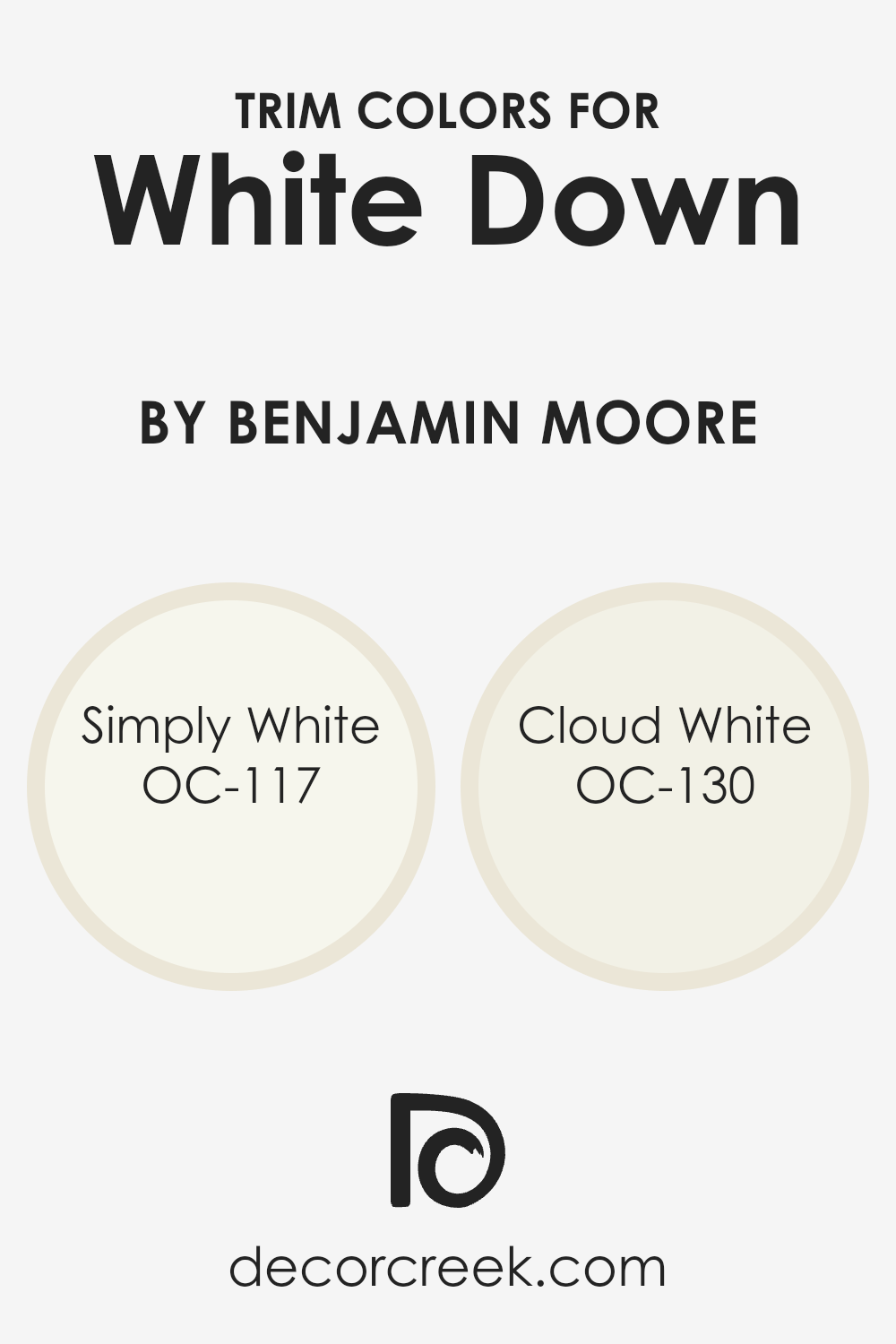
What are the Trim colors of White Down OC-131 by Benjamin Moore?
Trim colors are the colors used on the details like baseboards, moldings, and window frames in a room. They help set the mood and highlight certain areas by providing contrast or blending in smoothly with the main color.
With White Down by Benjamin Moore as the wall color, choosing the right trim color is crucial because it can either make the room feel more vibrant or maintain a soft ambiance.
The trim helps define the room’s boundaries and adds a finishing touch that makes the overall color scheme come together nicely. A well-selected trim color can enhance how the wall color looks and feels, ensuring that the room’s aesthetics are harmonious.
Simply White OC-117 is a clean, refreshing shade that’s not too stark. Its gentle warmth makes it a versatile trim color that pairs well with most shades, providing a crisp framework without overpowering the main wall color.
On the other hand, Cloud White OC-130 offers a slightly creamier tone, bringing a subtle warmth that adds coziness to the room. As a trim color, it complements White Down beautifully by providing a subtle contrast, which enhances the softness of the main color.
Both of these trim colors work well to highlight White Down, ensuring the room feels complete and unified without clashing or overwhelming the senses.
You can see recommended paint colors below:
Colors Similar to White Down OC-131 by Benjamin Moore
Choosing colors that match each other makes designing rooms and spaces feel right. For instance, picking colors that go well with White Down OC-131 by Benjamin Moore can really bring out the best in any area. Colors that are close to it can make a room feel more connected and cozy.
One such similar color is Muskoka Trail 974. This shade is a soft, earthy tone reminiscent of the natural world, offering a warm and inviting atmosphere. Its subtle undertones make it a perfect partner to White Down, adding just the right amount of depth and character.
These colors can make a space feel balanced and complete. When colors like Muskoka Trail are paired with White Down, they create a backdrop that’s both pleasing to the eye and comforting. This harmony allows for other design elements, like furniture and decor, to stand out without clashing.
The slight differences between the shades provide variety, but their similarities ensure everything feels just right.
Using colors that are close to each other on the spectrum helps create a cohesive and pleasant environment. Their soft and muted tones work together to add warmth and charm to any setting.
You can see recommended paint color below:
- 974 Muskoka Trail
How to Use White Down OC-131 by Benjamin Moore In Your Home?
White Down OC-131 by Benjamin Moore is a versatile paint color that offers a warm, inviting touch to any home. It’s a soft, creamy white that provides a cozy feel. People can use this color on walls to make spaces feel more open and airy.
It’s a great choice for living rooms, bedrooms, or hallways, creating a peaceful and welcoming atmosphere.
White Down pairs well with both dark and light furniture, making it flexible for different styles. In a kitchen, it can work beautifully for cabinets or walls, giving the space a light and clean look. Bathrooms painted in White Down can feel bright and fresh, especially when complemented with soft-colored towels and accessories.
This color can also serve as a neutral backdrop in a home office, allowing for different decor styles without overwhelming the senses. Overall, White Down is a reliable choice for anyone looking to make their home feel cozy and inviting.
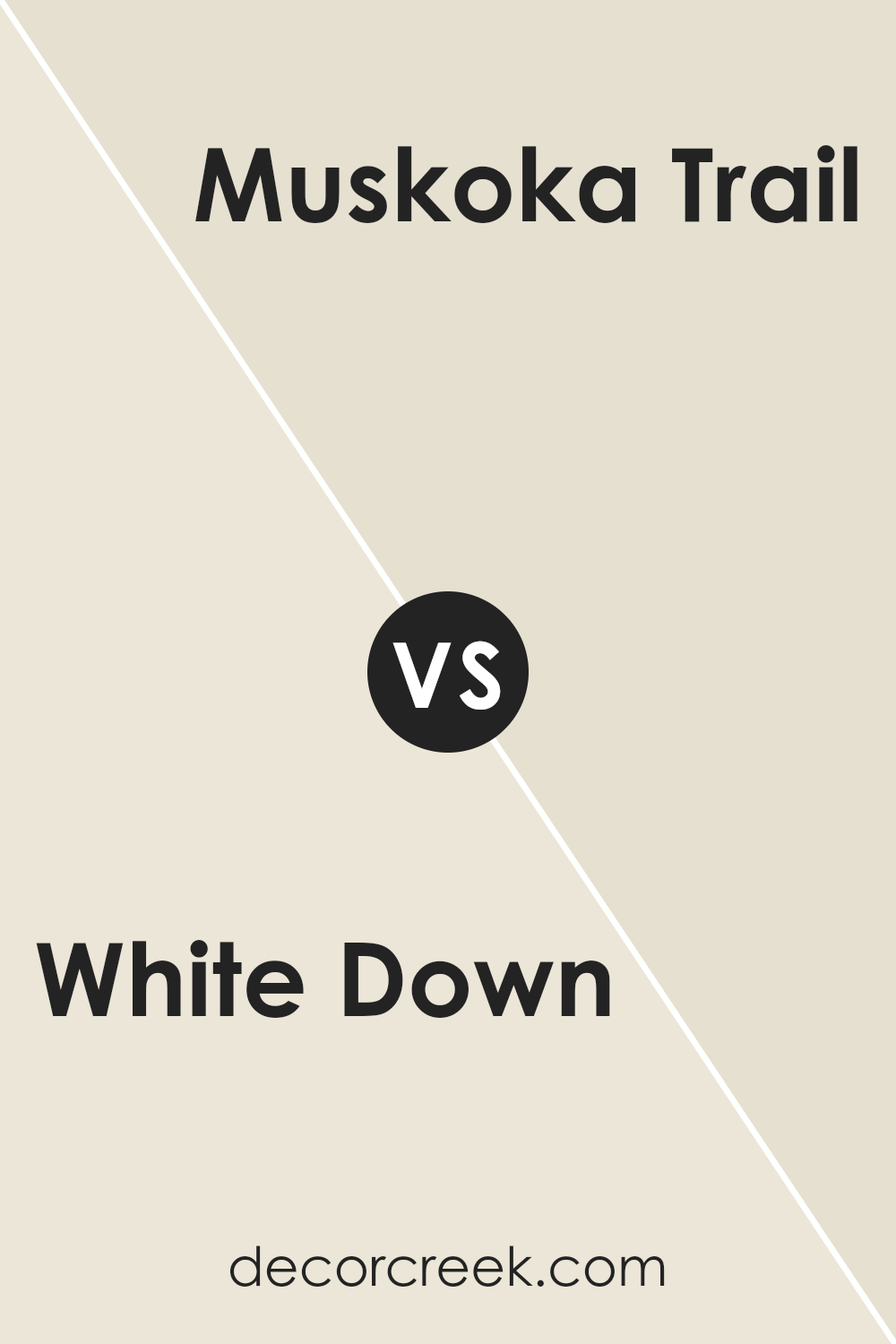
White Down OC-131 by Benjamin Moore vs Muskoka Trail 974 by Benjamin Moore
White Down OC-131 by Benjamin Moore is a soft off-white that offers a warm, inviting feel. It has a subtle hint of beige, making it more versatile for different settings. This color works well in spaces seeking a calm and spacious atmosphere, reflecting light to keep rooms bright and airy.
On the other hand, Muskoka Trail 974 by Benjamin Moore is an earthy, muted green. It evokes a sense of nature and brings a cozy, grounded vibe to any room.
This color is perfect for creating an intimate and relaxed environment, making it suitable for bedrooms or living rooms where comfort is key.
Pairing these two colors can result in a balanced contrast. White Down can be used for walls or larger spaces, while Muskoka Trail can serve as an accent, such as on trims or feature walls, adding depth and character without being overwhelming.
You can see recommended paint color below:
- 974 Muskoka Trail
It’s a soft shade that makes every room feel cozy and inviting. If you imagine a soft, fluffy cloud, that’s kind of what this color looks like on your walls.
It’s a great choice if you want a clean and simple backdrop for your home. Your favorite furniture and decorations will really stand out against this shade. Even though it’s not a bright white, it has enough warmth to make your space feel comfortable and welcoming.
One of the best things about OC-131 White Down is that it fits in almost anywhere. Whether you have lots of colorful things in your room or prefer things more plain, this color makes it all look nice together. It’s like the helper you never knew you needed.
So, if you’re thinking about painting and want a color that feels friendly and goes with everything, OC-131 White Down is a smart pick. It’s like the good friend who helps everything feel just right.
Ever wished paint sampling was as easy as sticking a sticker? Guess what? Now it is! Discover Samplize's unique Peel & Stick samples.
Get paint samples

