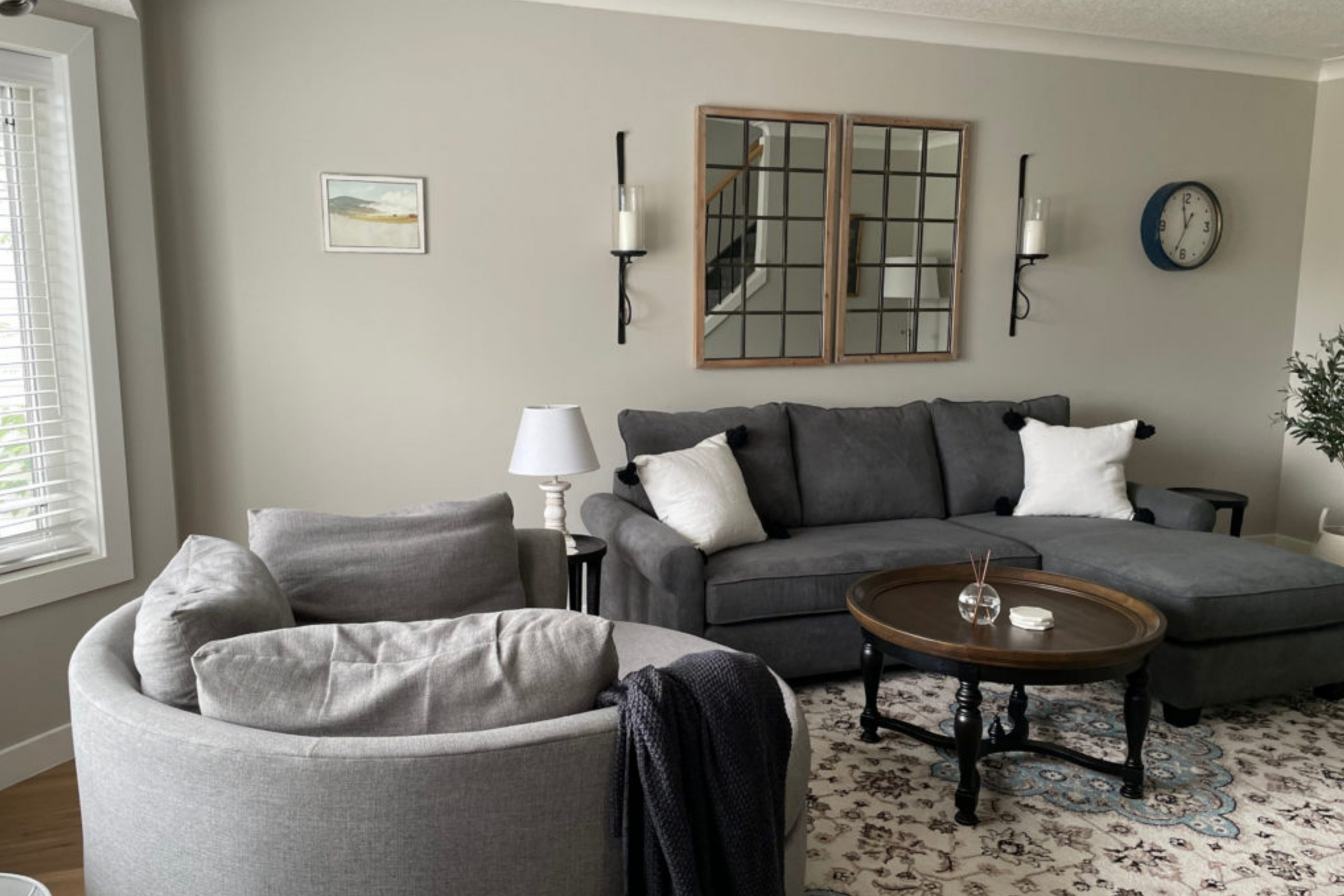
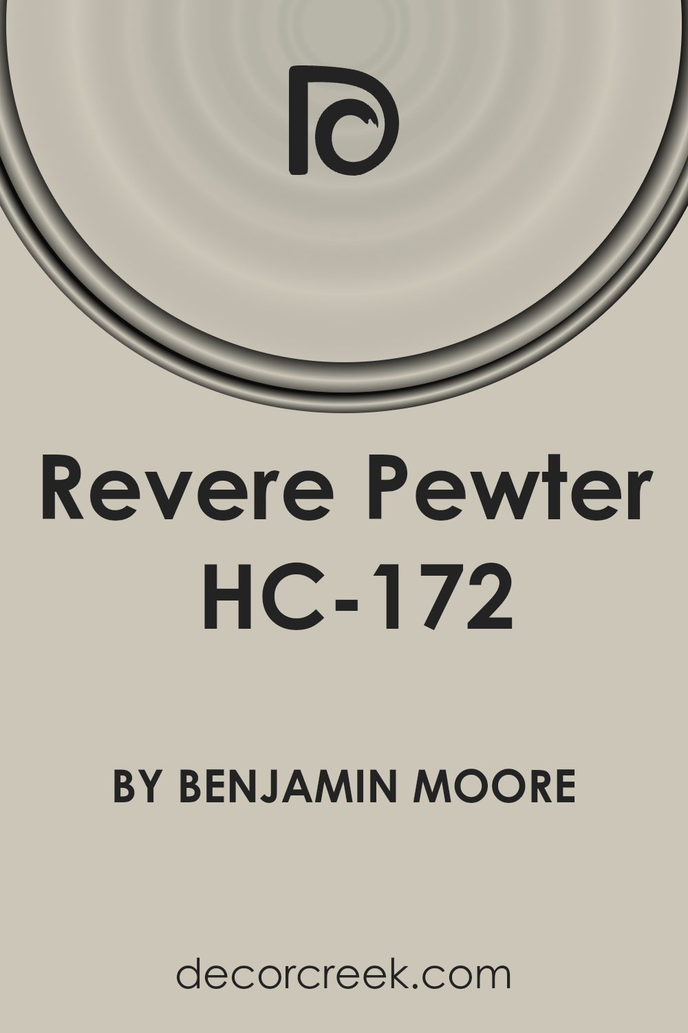
HC-172 Revere Pewter by Benjamin Moore is a highly regarded paint color that has found its way into many homes and design projects across the world. This versatile shade of gray brings a warm, inviting atmosphere to any space, making it a top choice for those looking to refresh their interiors. Its popularity stems from its remarkable ability to blend well with a wide array of decor styles, furniture, and other colors, whether you’re aiming for a modern, minimalist look or something more traditional.
Revere Pewter stands out for its unique balance of warm and cool tones, offering a middle ground that works wonders in various lighting conditions. Whether in a room flooded with natural light or in a space that relies on artificial lighting, this color maintains its beauty and elegance, providing a cozy yet sophisticated backdrop. This adaptability makes it an ideal option for living rooms, bedrooms, kitchens, and even home offices, showcasing its true versatility.
For homeowners and interior designers alike, selecting Revere Pewter means choosing a paint color that will not only elevate the aesthetic of a space but also stand the test of time.
Its ability to match with other colors and elements in a room is unmatched, making it a steadfast choice for anyone looking to update their interior without the worry of clashing designs.
What Color Is Revere Pewter HC-172 by Benjamin Moore?
Revere Pewter by Benjamin Moore is a versatile and warm gray shade that offers a perfect balance between gray and beige. Because of this balance, it’s often referred to as a “greige” color. This medium-light gray has warm undertones that make it incredibly welcoming and cozy in any space. It’s the type of color that looks different depending on the lighting, appearing more as a classic gray in well-lit rooms and more beige in spaces with less natural light.
This color’s adaptability makes it an excellent choice for a variety of interior styles. It shines in modern and contemporary settings due to its clean and understated hue. Yet, its warmth allows it to fit seamlessly into traditional and rustic decors as well, where its ability to bring a sense of calm and elegance is greatly appreciated.
Revere Pewter pairs wonderfully with a wide range of materials and textures. In spaces with hardwood floors or wooden furniture, it enhances the natural beauty of the wood, creating a harmonious and grounded look. With metals, whether it’s the coolness of stainless steel or the warmth of brass and gold accents, this color helps to highlight their textures and finishes. For fabrics, from smooth leather to soft cotton and linen, its versatility acts as a backdrop that either complements or contrasts beautifully, depending on the desired effect.
Overall, this greige offers a blend of sophistication and comfort, making it an ideal choice for creating inviting spaces that feel modern yet timeless.
Is Revere Pewter HC-172 by Benjamin Moore Warm or Cool color?
Revere Pewter by Benjamin Moore is a versatile color that brings a warm, welcoming tone to any home. This gray has a subtle warmth to it that makes it stand out from other shades. It’s not just any gray; it’s a perfect balance between gray and beige, often referred to as “greige.” This unique blend allows it to work beautifully in a variety of lighting conditions, making it a great choice for rooms that face north or south, receiving different amounts of sunlight throughout the day.
The magic of Revere Pewter lies in its ability to adapt. In spaces with lots of natural light, it appears lighter and more airy, creating a serene and open environment. In rooms with less light, it brings a cozy and inviting feel without making the space feel closed off. This adaptability makes it a favorite for homeowners looking to achieve a modern yet timeless look.
Its neutral base also means it pairs well with a wide range of colors, from soft pastels to bold hues, allowing for endless decorating possibilities. Whether you’re aiming for a calming retreat or a stylish entertaining space, Revere Pewter offers a solid foundation that enhances the room’s features and furnishings without overwhelming them. This balance and versatility explain why it’s a top choice for those wanting to refresh their homes with a color that provides both style and flexibility.
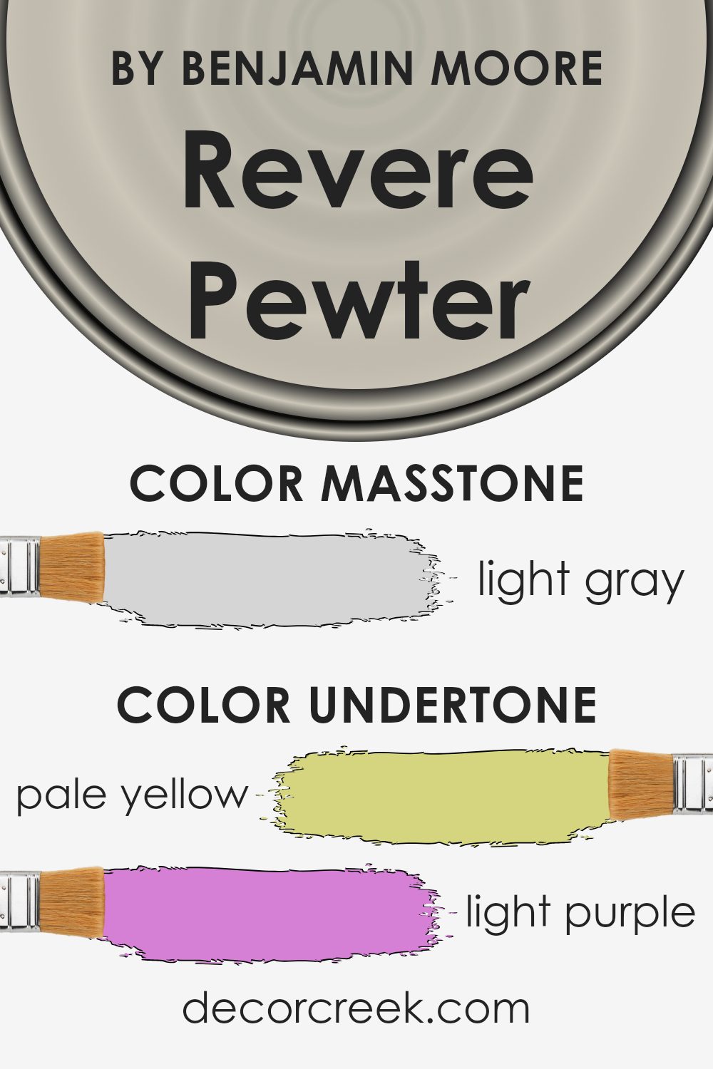
Undertones of Revere Pewter HC-172 by Benjamin Moore
Revere Pewter is a popular paint color known for its versatility and warmth. It’s a sophisticated shade that can look different depending on the light and surrounding colors. This is because of its various undertones, which are subtle colors underneath the main hue. These undertones can include pale yellow, light purple, light blue, pale pink, mint, lilac, and grey.
Understanding undertones is important because they significantly influence how we perceive a color. For instance, in a room with a lot of natural light, Revere Pewter might bring out its pale yellow undertone, making the space feel warmer. In another setting, its grey undertone could become more pronounced, giving the room a cooler, more neutral vibe.
When applied to interior walls, Revere Pewter’s undertones blend with the room’s lighting and decor, allowing the paint to adapt and change. This adaptability means it can complement a wide range of styles and colors. For example, furniture or decor with purple tones might highlight Revere Pewter’s light purple undertone, creating a subtle, cohesive look. Alternatively, pairing it with blue decorations might draw out its light blue undertone, bringing a calm and serene atmosphere to the space.
In summary, the unique blend of undertones in Revere Pewter makes it a highly adaptable and appealing choice for interior walls. Its ability to morph in appearance with different lighting and decor makes it a go-to paint color for many homeowners looking to achieve a warm, inviting, and cohesive look in their space.
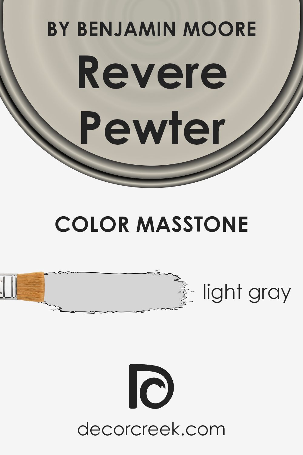
What is the Masstone of the Revere Pewter HC-172 by Benjamin Moore?
Revere Pewter is a popular light gray paint color with warm undertones. Its masstone, light gray (#D5D5D5), gives it a unique advantage in home décor. This color can blend well with almost any interior, making rooms feel larger and more open. Its soft gray shade works perfectly in spaces that get a lot of sunlight, as it doesn’t overpower the room but instead adds a soothing backdrop.
In less lit areas, it brings warmth, preventing the space from feeling cold or unwelcoming. This versatility means it pairs well with a wide range of other colors, from bold and bright to soft and neutral, allowing for endless decorating possibilities. Whether used in a living room, bedroom, or kitchen, its subtle warmth creates a cozy, inviting atmosphere. It’s particularly effective for achieving a modern, chic look without feeling too stark or industrial.
How Does Lighting Affect Revere Pewter HC-172 by Benjamin Moore?
Lighting plays a crucial role in how we perceive colors, significantly impacting their appearance. The effect of lighting on colors can alter our perception of a space, affecting mood and design choices. A color can appear different under various light sources: artificial light can change a color’s hue, saturation, and brightness, while natural light brings out a color’s true vibrance.
Revere Pewter, a popular paint color, offers a perfect example of how lighting can influence color perception. This color, known for its versatility, looks slightly different depending on the light it’s under. Under artificial light, such as LED or incandescent bulbs, it tends to show a warmer, richer hue. This makes spaces feel cozy and inviting, which is ideal for living rooms or bedrooms where a comfortable ambiance is desired.
In contrast, natural light unveils Revere Pewter’s true color and complexity. In a room bathed in sunlight, this color looks lighter and more airy, providing a soft, neutral backdrop that complements various decor styles. Its ability to adapt to different lighting conditions makes it a favorite for many homeowners.
The direction a room faces also affects how Revere Pewter looks. North-facing rooms tend to get less direct sunlight, so here, Revere Pewter might appear more as a cool, muted gray, enhancing a calm and serene atmosphere. In south-facing rooms, where sunlight is abundant, the paint takes on a warmer tone, creating a bright and welcoming space.
East-facing rooms receive gentle morning light, making Revere Pewter look soft and warm early in the day, transitioning to cooler tones as the day progresses. West-facing rooms experience the opposite, with the color starting cooler in the morning and warming up as the sun sets, filling the room with a golden glow.
In essence, the interaction between Revere Pewter and light emphasizes the importance of considering lighting when choosing paint colors. By understanding how light affects color, you can select a shade that enhances your space under different conditions, ensuring your room always looks its best.
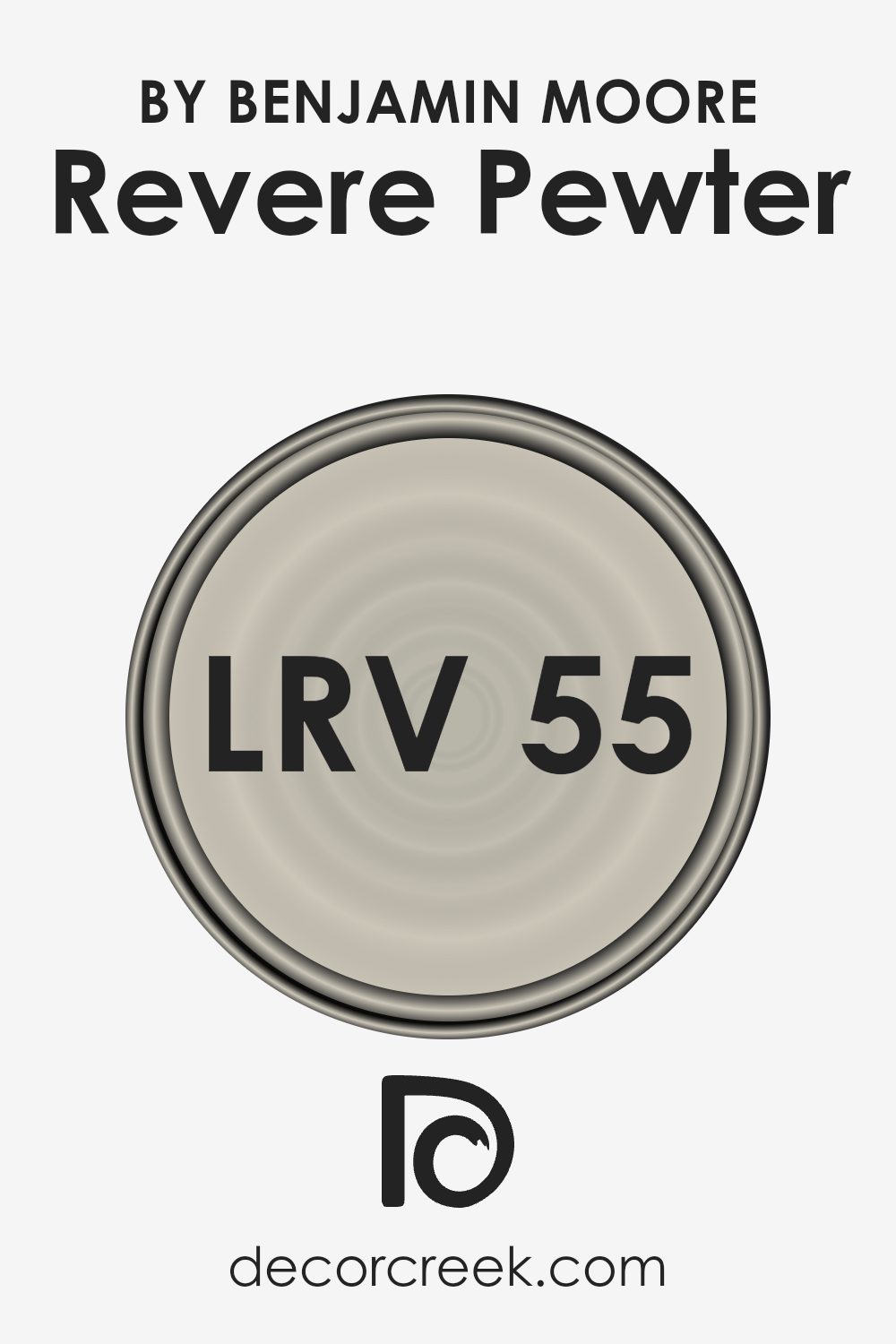
What is the LRV of Revere Pewter HC-172 by Benjamin Moore?
LRV stands for Light Reflectance Value, which is a measure on a scale from 0 to 100 that tells you how much light a paint color reflects back into the room. A color with a low LRV (closer to 0) will absorb more light, making it appear darker and can make a room feel smaller or cozier. On the other hand, a color with a high LRV (closer to 100) reflects more light, making a space feel larger and more open. This measurement helps in deciding which paint color to choose based on how bright or dark you want the room to feel without having to rely solely on the color itself.
Having an LRV of 55.05, the mentioned color is right in the middle of the scale, which means it’s a medium shade that neither reflects too much light nor absorbs too much. It strikes a balance, making it a versatile choice for various spaces. In a room with plenty of natural light, it will appear lighter and more open, enhancing the space without overwhelming it.
In contrast, in a less lit room, it will offer a cozy warmth, adding depth and character without making the space feel cramped. Its LRV value makes it a flexible color that can adapt to different lighting conditions, working well in many areas of a home.
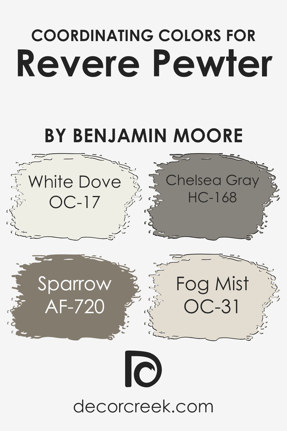
Coordinating Colors of Revere Pewter HC-172 by Benjamin Moore
Coordinating colors are hues that harmonize well with each other, creating a pleasing and balanced look in any space. When it comes to using a neutral base like Revere Pewter by Benjamin Moore, selecting the right coordinating colors can enhance its warmth and versatility without overwhelming the senses. The aim is to choose shades that complement the base color, accentuating its beauty and bringing a cohesive feel to the room.
White Dove is a soft, warm white that brings a sense of calm and cleanliness to spaces, acting as a perfect backdrop for Revere Pewter. It’s like a gentle whisper in a room, unassuming yet profound in its ability to tie different elements together.
Sparrow, on the other hand, introduces a deeper, earthy tone that grounds the palette, adding depth and sophistication. It’s like a shadow at dusk—subtle but impactful. Chelsea Gray offers a stronger, more defined color choice that can make features stand out, giving a room character and a modern edge. It’s the confident stroke in a painting that draws the eye and defines the landscape.
Lastly, Fog Mist brings a breath of fresh air, a light, airy quality that elevates the space, making it feel open and serene. It’s the soft light of dawn that gently awakens the room with a promise of a new day. Together, these colors work in harmony to create a visually appealing and emotionally resonant space that feels both unified and vibrant.
You can see recommended paint colors below:
- OC-17 White Dove
- AF-720 Sparrow
- HC-168 Chelsea Gray
- OC-31 Fog Mist
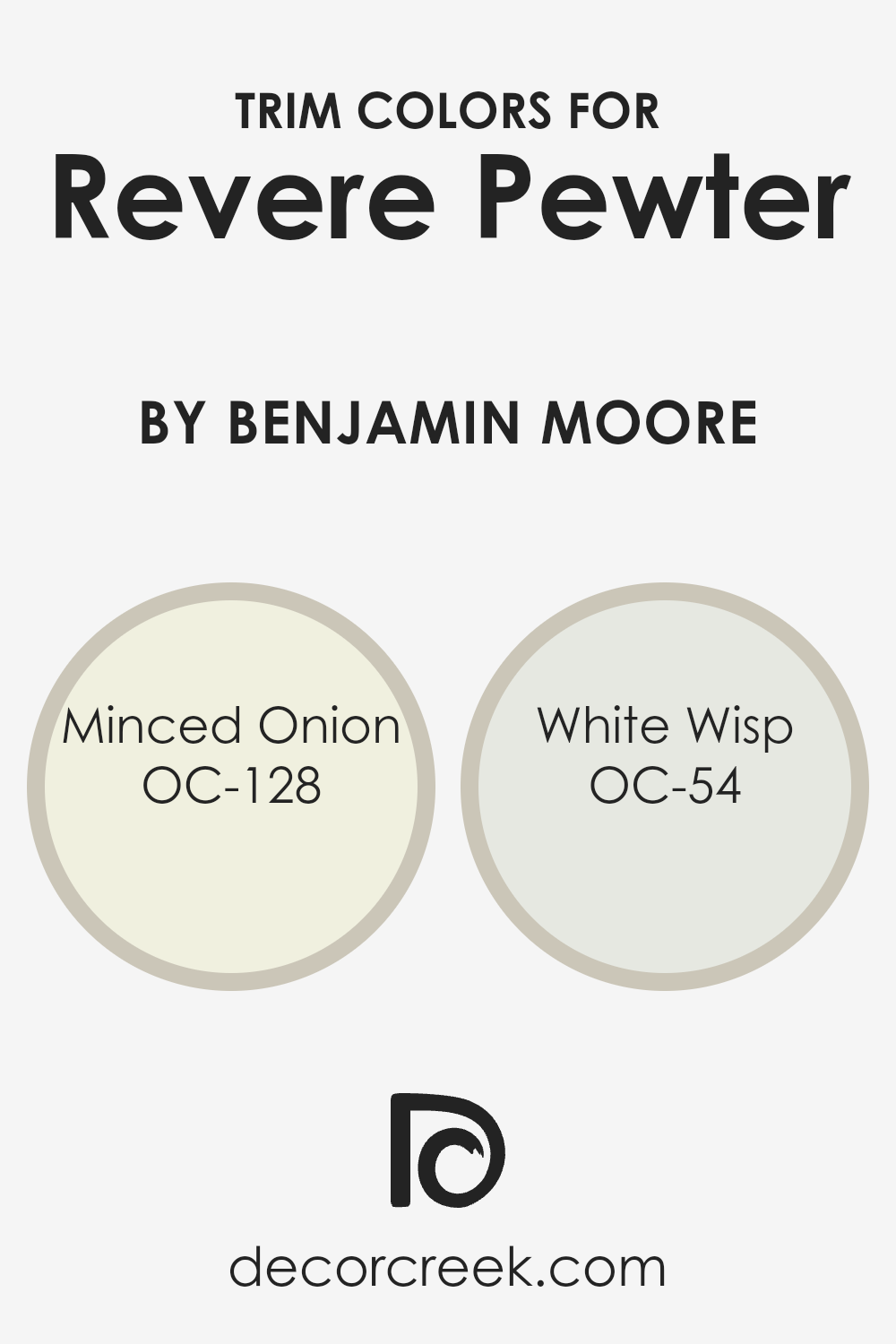
What are the Trim colors of Revere Pewter HC-172 by Benjamin Moore?
Trim colors refer to the hues selected for the architectural elements that frame or accent a wall, such as door frames, window sills, skirtings, and moldings. These colors play a crucial role in interior design because they can either complement or contrast with the main wall color to enhance a room’s aesthetic appeal and character.
For example, when paired with Revere Pewter, a warm, light gray shade by Benjamin Moore, selecting the right trim color can highlight the wall’s subtle undertones, adding depth and dimension to the space. Trim colors like OC-128 Minced Onion and OC-54 White Wisp are excellent choices for working with Revere Pewter as they can contribute to a cohesive and refined look.
OC-128 Minced Onion by Benjamin Moore is a soft, creamy white with a hint of warmth, making it an ideal trim color that balances the neutral yet rich tone of Revere Pewter. It offers a subtle contrast, creating a serene and inviting atmosphere without overpowering the main color.
On the other hand, OC-54 White Wisp is a cooler, almost ethereal white, with a fresh, airy quality that brings lightness to the pairing with Revere Pewter. This color can help to create a more spacious feel, making it perfect for smaller rooms or spaces with limited natural light, providing a crisp, clean edge that refreshes the overall palette.
You can see recommended paint colors below:
- OC-128 Minced Onion
- OC-54 White Wisp
Colors Similar to Revere Pewter HC-172 by Benjamin Moore
Choosing similar colors is vital in creating a harmonious and aesthetically pleasing environment. When colors closely resemble one another, they naturally create a sense of balance and cohesion in a space. For instance, taking a color like Revere Pewter, a popular selection for its warm and inviting gray tone, and pairing it with colors that share its underlying tones, can enhance the overall mood of a room.
Similar colors work together by seamlessly blending with each other, avoiding harsh contrasts and promoting a tranquil and cohesive look. This subtle blending helps in unifying diverse design elements, making the space feel well-coordinated and thoughtfully put together.
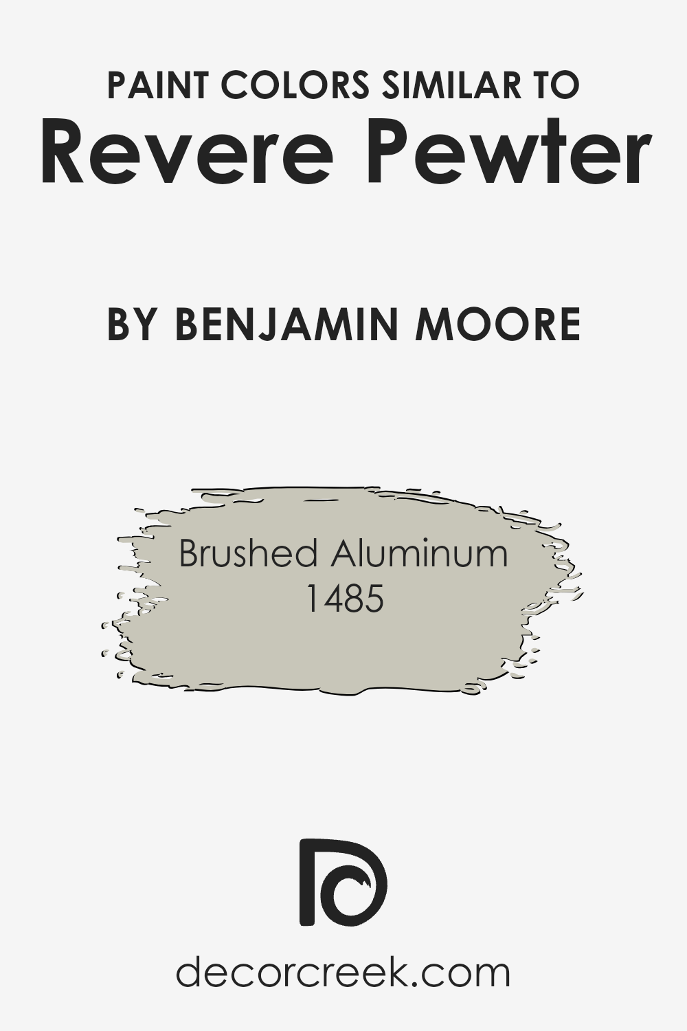
One example of a color that pairs wonderfully with Revere Pewter is Brushed Aluminum (1485). Brushed Aluminum is a lighter gray that complements Revere Pewter’s warm undertones, providing a soft contrast that enriches the visual appeal of a room without overwhelming it. This lighter shade can lift the atmosphere of a space, making it appear more open and airy, while still maintaining a connection with the earthier tones of Revere Pewter.
Together, these colors create a refined palette that can enhance the feeling of light and space in a room, making them ideal for achieving a serene and inviting environment.
You can see recommended paint color below:
- 1485 Brushed Aluminum
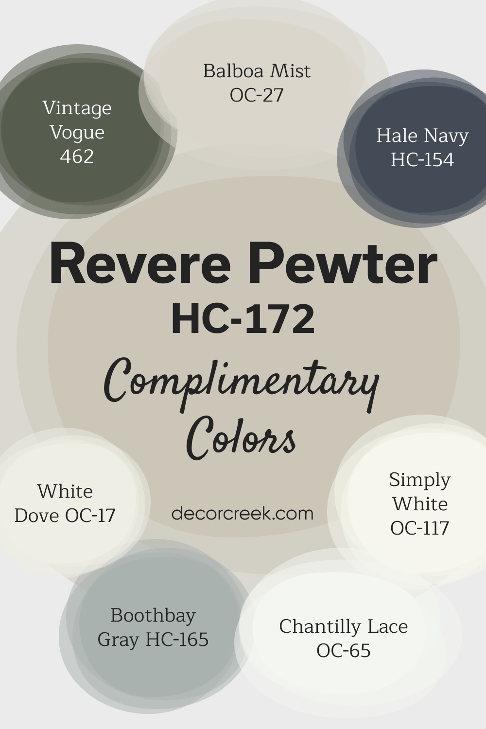
Complimentary Colors for Revere Pewter HC-172 Paint Color by Benjamin Moore
Revere Pewter by Benjamin Moore is a timeless, warm gray that works well in many spaces, offering a neutral base that blends effortlessly with various styles. Pairing it with creates a striking contrast for a bold and modern look.
For a lighter and airier feel, Chantilly Lace and Simply White add brightness and clarity to any room, making them perfect for trim or accent walls.
For a more subtle palette, Boothbay Gray and Balboa Mist offer soft, understated tones that enhance the calming nature of Revere Pewter. White Dove adds a touch of warmth, complementing the gray’s cozy feel, while Vintage Vogue introduces a rich, sophisticated accent. Together, these colors create a harmonious and stylish design, suitable for any space in your home.
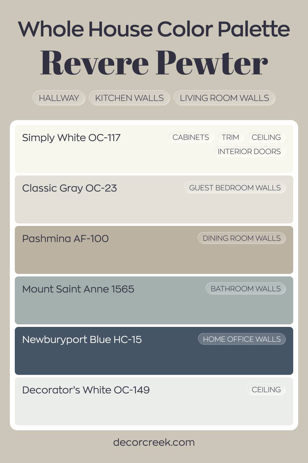
Whole House Paint Color Palette Defined By Revere Pewter HC-172
Revere Pewter HC-172 anchors the hallway, kitchen, and living room with its balanced greige depth. Simply White on cabinets, trim, ceilings, and interior doors keeps the overall look bright and tailored. Decorator’s White on the ceiling enhances that crisp finish.
Classic Gray in the guest bedroom offers a lighter variation, while Pashmina in the dining room adds rich warmth.
Mount Saint Anne in the bathroom introduces a soft blue-gray tone that freshens the palette. Each shade builds naturally from the main greige base.
Newburyport Blue in the house office adds strong character and contrast. The deeper blue grounds the lighter rooms and completes the layered design.
How to Use Revere Pewter HC-172 by Benjamin Moore In Your Home?
Revere Pewter by Benjamin Moore is a versatile paint color that has become a top choice for homeowners. Its unique gray shade has warm undertones, making it perfect for creating a cozy and inviting atmosphere in any room. This color is so adaptable that it can work in various spaces, whether you’re sprucing up your living room, bedroom, or even the kitchen.
One of the best things about Revere Pewter is how it complements both modern and traditional decor. It pairs beautifully with bright whites for a clean and crisp look, or it can stand alongside bold colors to create a more dynamic space. This flexibility makes it an excellent choice for walls, but it doesn’t stop there. You can use it on cabinets, trim, or even furniture to add a touch of sophistication.
For those looking to update their home without committing to a drastic change, Revere Pewter provides a neutral backdrop that can grow with your style. Whether you’re going for a minimalist vibe or a cozy, rustic feel, this color can help you achieve the look you want with ease.
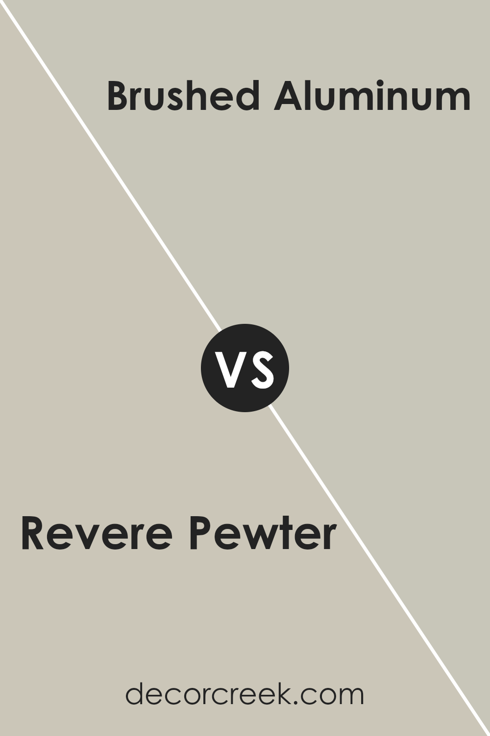
Revere Pewter HC-172 by Benjamin Moore vs Brushed Aluminum 1485 by Benjamin Moore
Revere Pewter and Brushed Aluminum, both by Benjamin Moore, are two unique shades that stand out for different reasons. Revere Pewter is a warm, light gray that has a soft, inviting feel to it. It’s a versatile color that can make spaces feel cozy yet sophisticated. On the other hand, Brushed Aluminum is a cooler, light gray with a more metallic and modern vibe. This color tends to bring a sleek and contemporary look to spaces, making it great for modern designs.
These two colors, while both could be categorized as light grays, cater to different tastes and styles. Revere Pewter leans towards a neutral warmth, making rooms feel more homey and relaxed. It works well in almost any space, from living rooms to bedrooms. Brushed Aluminum, however, with its cooler undertones, is better suited for a minimalist or modern setting, offering a more crisp and clean aesthetic.
In summary, Revere Pewter offers warm, welcoming tones for a cozy atmosphere, while Brushed Aluminum provides a cool, chic look for modern spaces.
You can see recommended paint color below:
- 1485 Brushed Aluminum
Conclusion
Revere Pewter by Benjamin Moore is a versatile color that has gained popularity for its unique ability to blend with various decors and settings. Its warm undertone makes it a perfect choice for those looking to create a cozy and inviting atmosphere in their homes. This color can seamlessly integrate with different styles, whether you’re aiming for a modern, classic, or rustic look. Its adaptability is a key reason why many homeowners and interior designers favor it for both walls and accents, providing a subtle backdrop that enhances other colors and elements in a room.
The popularity of Revere Pewter also stems from its ability to change its appearance under different lighting conditions, offering a range of shades from light gray to warm taupe. This quality allows for flexibility in decorating and styling rooms, ensuring that the color complements natural light during the day and artificial light at night.
Its timeless appeal ensures that it remains a go-to choice for those looking to update their space without committing to a bold color that may quickly go out of fashion. In conclusion, Revere Pewter stands out as a highly adaptable and enduringly stylish option that can help achieve a variety of aesthetic goals in interior decor.

Ever wished paint sampling was as easy as sticking a sticker? Guess what? Now it is! Discover Samplize's unique Peel & Stick samples.
Get paint samples

