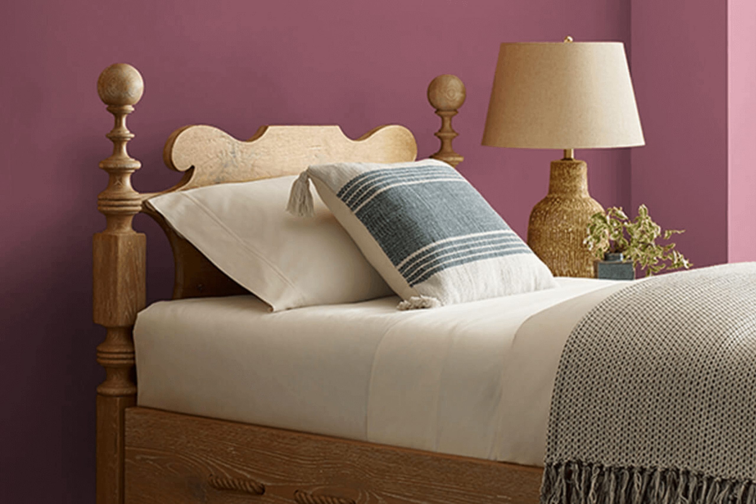
I find SW 6299 Aged Wine by Sherwin Williams to be a rich, deep color that brings a warm and elegant touch to any space. Its deep red tone, reminiscent of a fine aged wine, makes it perfect for creating a cozy and inviting atmosphere in any room. Whether you’re looking to add a touch of drama to your dining area or create a sophisticated feel in your living room, this color can be just the right choice.
When I painted my walls with Aged Wine, I noticed an immediate change in the mood of the space. The color feels both luxurious and comforting, making it ideal for moments when you want to relax and unwind.
It pairs beautifully with both neutral and bold accents, so you can easily match it with your existing decor or use it as a foundation to test out new design ideas.
In my experience, Aged Wine also works well as an accent wall, adding depth and interest without overwhelming a room.
It’s a versatile color that suits various styles, from classic to modern. I’ve found it especially effective when combined with textures like wood and metal, enhancing the overall look. If you appreciate a harmonious balance of richness and warmth in your home, this hue might be worth considering.
What Color Is Aged Wine SW 6299 by Sherwin Williams?
Aged Wine by Sherwin Williams is a deep, rich shade of burgundy with undertones of earthy brown and plum, creating a warm and inviting atmosphere. This distinguished color can add depth and warmth to a room and is ideal for creating cozy spaces. It works exceptionally well in traditional and rustic interior styles, where rich colors and natural materials are celebrated.
Pair Aged Wine with materials like dark woods, such as mahogany or walnut, which complement its deep tones. It also looks stunning against beige or cream accessories, offering a beautiful contrast that brightens the look.
Textures like velvet or leather will further enhance its luxurious vibe, adding a comfortable and inviting feel to the room. In modern interiors, Aged Wine can serve as a striking accent when used sparingly, perhaps on one feature wall or through accessories, providing a pop of color against a neutral backdrop.
Furthermore, using metallics such as gold or brass can add a touch of elegance and sophistication to spaces featuring Aged Wine. Overall, this color creates a harmonious and warm environment, perfect for living rooms, dining areas, or intimate spaces looking for a touch of rich color and history.
Is Aged Wine SW 6299 by Sherwin Williams Warm or Cool color?
Aged Wine SW 6299 by Sherwin Williams is a rich, deep shade of red-brown that brings warmth and depth to any room. This color creates a cozy and inviting atmosphere, making it ideal for living rooms, dining rooms, or bedrooms where comfort is key.
Its earthy tone gives a nod to rustic elegance, fitting well in classic or traditional home designs. Pairing it with neutral tones such as beige or cream can balance and soften its boldness, while accenting it with gold or brass can add a touch of richness.
It also works well as an accent wall, drawing attention without overwhelming the space. The color’s warm undertones can enhance wooden furniture and floors, highlighting their natural grain and texture.
Overall, Aged Wine is versatile and can complement various design styles, providing a warm backdrop that enhances the comfort and charm of a home.
Undertones of Aged Wine SW 6299 by Sherwin Williams
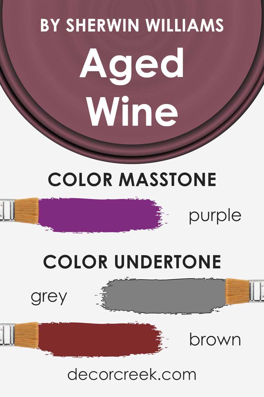
Aged Wine by Sherwin Williams is a rich and complex color, and its appearance can change based on its undertones. These undertones include shades of grey, brown, olive, pink, red, and more, which influence how the color is perceived in different lighting and surroundings.
The grey and dark grey undertones can make Aged Wine appear more muted and neutral, adding a subtle sophistication to a room.
In contrast, the warmer undertones like brown, red, and orange give the color a sense of warmth and coziness, which can make a space feel inviting and comfortable. The pink and pale pink undertones can introduce a soft, soothing element, while also adding a hint of charm.
The presence of navy, dark blue, blue, and dark turquoise undertones can bring a touch of depth and richness, adding to the color’s complexity and making it suitable for both modern and traditional settings.
The violet, lilac, fuchsia, and light purple undertones introduce a bit of whimsy and playfulness, which can be an unexpected yet refreshing addition to a room.
On interior walls, these diverse undertones of Aged Wine can create a dynamic backdrop that changes throughout the day, influenced by natural and artificial lighting. This versatility makes it a popular choice for various design themes, adding a unique personality to any space.
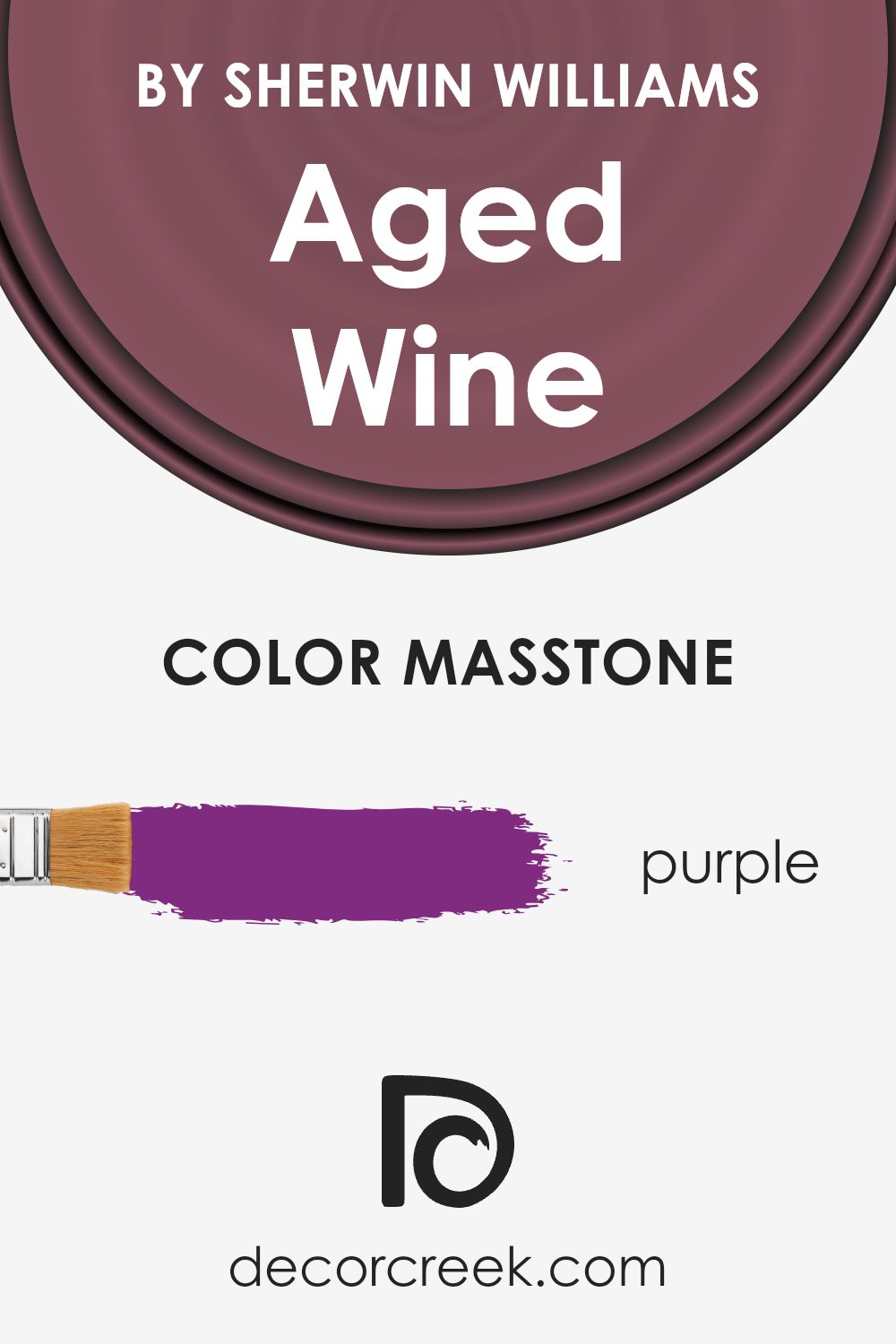
What is the Masstone of the Aged Wine SW 6299 by Sherwin Williams?
Aged Wine (SW 6299) by Sherwin Williams has a rich, deep purple hue with the masstone being a striking shade of purple (#802B80). This color brings a sense of warmth and depth to a room, making it feel cozy and inviting.
In homes, this shade can create an intimate atmosphere, perfect for spaces like living rooms or dining areas where people gather and connect. It adds a touch of luxury without being overpowering, offering both vibrancy and richness.
When paired with neutral tones or lighter colors, Aged Wine can be the focal point, drawing attention and adding character to a room. This makes it especially effective in areas where you want to make a statement or create a distinct mood. However, it can also pair well with other rich hues for a more dramatic effect.
Overall, Aged Wine is a versatile color that can help define a space, bringing with it a sense of elegance and comfort.
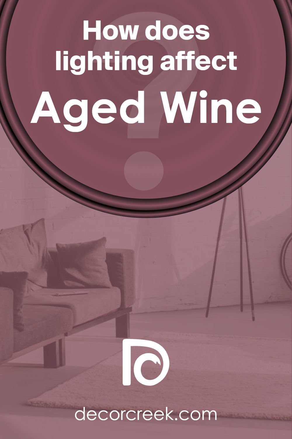
How Does Lighting Affect Aged Wine SW 6299 by Sherwin Williams?
Lighting can have a significant impact on how colors appear. This is particularly true for paint colors like Aged Wine by Sherwin Williams. The light in a room can change how a color looks, affecting mood and atmosphere.
In natural light, Aged Wine will show its true character. Natural light tends to make colors look brighter and more vivid. However, the amount and direction of light can cause variations.
In north-facing rooms, which receive cooler and more consistent light, Aged Wine may look slightly subdued and more muted. The lack of direct sunlight in these rooms means that cooler tones in the color can become more pronounced, giving it a more reserved and soft appearance.
South-facing rooms, on the other hand, get plenty of warm and bright light throughout the day. In these rooms, Aged Wine can look richer and warmer due to the ample sunlight. The color might appear more vibrant and lively, with its red and purple tones standing out.
East-facing rooms have warm, golden light in the morning and cooler light later in the day. This means that Aged Wine will look warmer and more inviting in the morning, while it might take on a cooler tone as the day progresses.
West-facing rooms receive warm light in the afternoon and evening. Aged Wine in such rooms will look warm and radiant later in the day, with deeper undertones highlighted as the sunlight intensifies.
Under artificial light, factors like bulb type play a role. Incandescent lighting, which is warm, can enhance the color’s warmth, making it cozier. Fluorescent lighting, which can be cooler, might subdue the richness of Aged Wine, giving it a slightly flatter look. LED lighting varies, but choosing a warmer LED bulb can help maintain the warmth and character of the color.
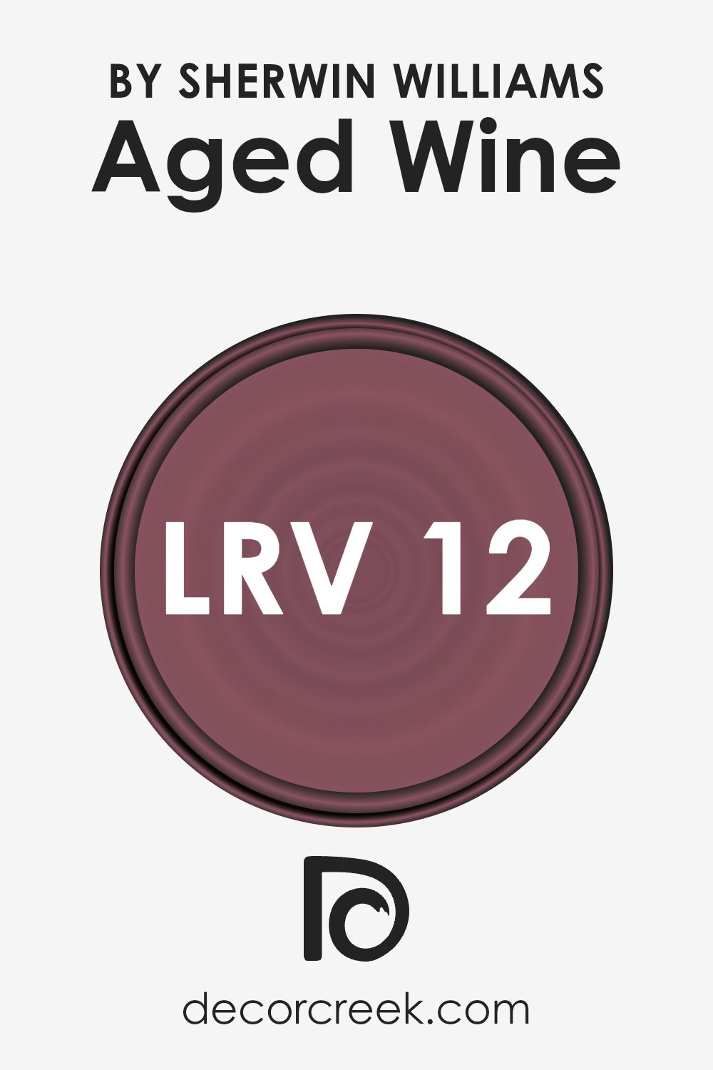
What is the LRV of Aged Wine SW 6299 by Sherwin Williams?
Light Reflectance Value, or LRV, measures how much light a color reflects or absorbs. It is a scale that runs from 0, representing complete black that absorbs all light, to 100, indicating pure white that reflects all light. Understanding LRV helps in picking the right color for your space, as it gives you an idea of how light or dark the color will appear and how it can affect the feel of a room.
For instance, colors with low LRV will absorb more light, making spaces feel warmer and cozier, whereas colors with high LRV will reflect more light, helping spaces seem larger and more open.
The LRV of the color Aged Wine is 12.485, which means it is a rather dark, deep color. This low LRV indicates that Aged Wine will absorb a significant amount of light, contributing to a more intimate and cozy atmosphere within a room. It might be well-suited for spaces where you want to create a warm, inviting environment.
However, if used in a room that lacks natural light, it may make the area feel smaller or more enclosed. Balancing Aged Wine with lighter accents or furnishings can help offset its depth and keep a harmonious feeling in the space.
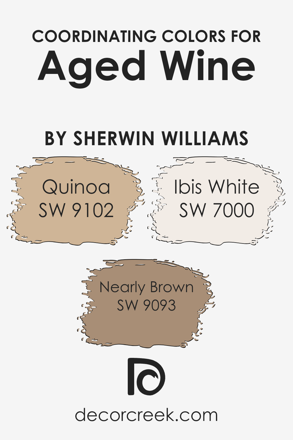
Coordinating Colors of Aged Wine SW 6299 by Sherwin Williams
Coordinating colors are colors that go well together, enhancing the overall aesthetic of a space. They typically complement a main color by either providing contrast or by harmonizing subtly with it. For Aged Wine, a deep and rich shade, coordinating colors can help to either draw attention to its richness or soothe its intensity.
SW 9102 Quinoa is a warm, earthy tone with a hint of mustard that adds a soft and inviting feel. It can provide a pleasant balance, making spaces feel welcoming and cozy.
Meanwhile, SW 9093 Nearly Brown, offers a robust and grounded option with its darker, more muted tone that seamlessly complements the richness of Aged Wine, creating comfort and familiarity. On the lighter side, SW 7000 Ibis White is a crisp, neutral white with the slightest hint of warmth.
It brightens and freshens up any space while allowing Aged Wine to stand out as the focal point.
Together, these colors provide a balanced palette that brings different yet harmonious elements to a room, making it inviting and aesthetically pleasing. Whether enhancing depth or bringing in light, these colors coordinate beautifully to build an appealing and cohesive design.
You can see recommended paint colors below:
- SW 9102 Quinoa
- SW 9093 Nearly Brown
- SW 7000 Ibis White
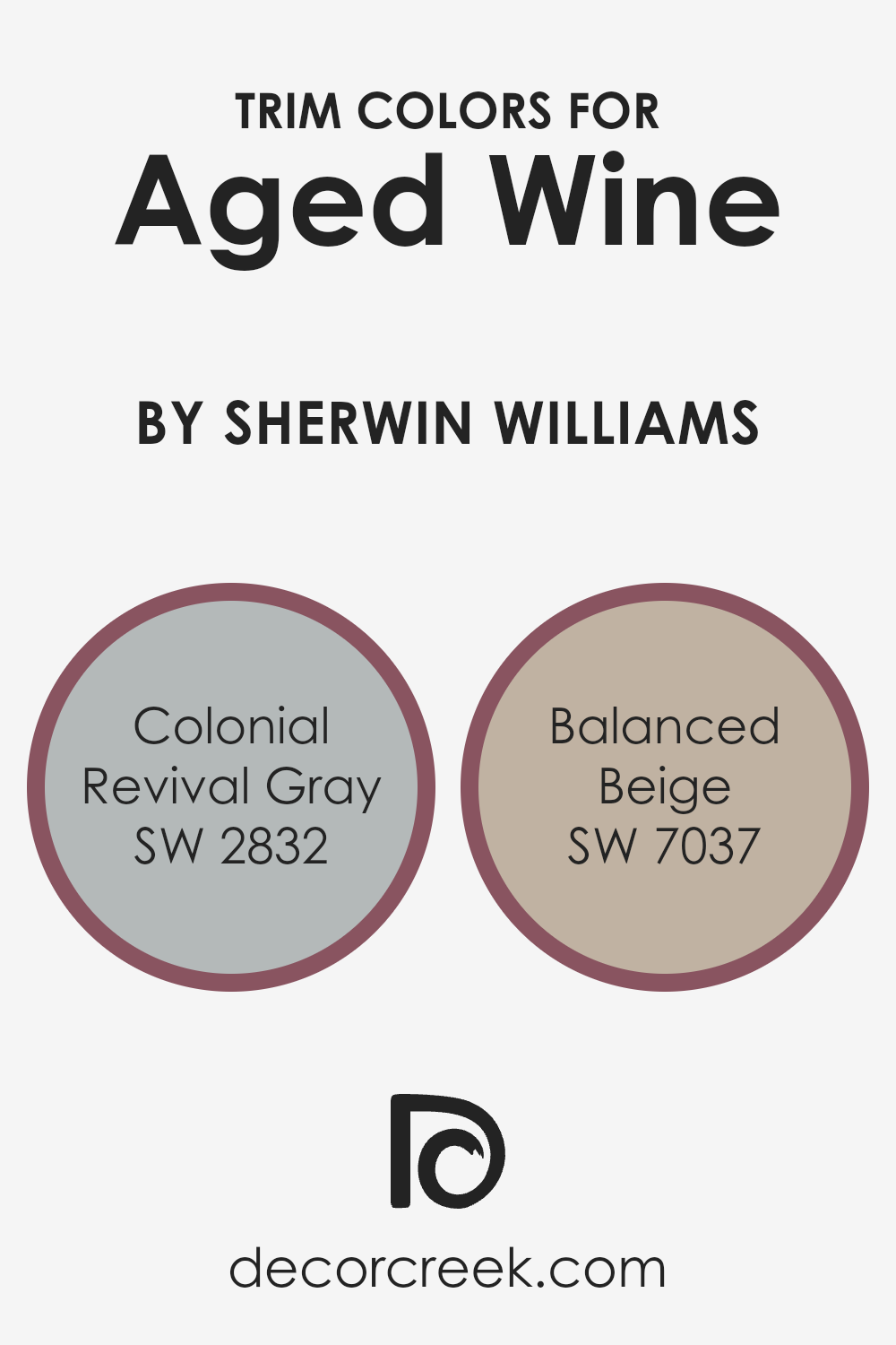
What are the Trim colors of Aged Wine SW 6299 by Sherwin Williams?
Trim colors are the shades used to accentuate and define the architectural details in a space, such as window frames, moldings, doors, and baseboards. In the context of Aged Wine by Sherwin Williams, trim colors are crucial as they add contrast and depth to the walls painted in this rich hue.
The right trim color can highlight Aged Wine’s warm, deep tones, and together, they create a complementary scheme that enhances the overall aesthetic of the room.
When used with the balanced and subtle tones of Colonial Revival Gray and Balanced Beige, the trim colors not only set boundaries but also provide a beautiful contrast that enhances the main color’s warmth and elegance.
Colonial Revival Gray is a subtle, soft gray with a hint of traditional charm that perfectly complements the rich wine color by adding a cool contrast.
It instills a sense of classic elegance to the trim, providing a touch of sophistication without overpowering the main wall color. On the other hand, Balanced Beige offers a warm, neutral tone that seamlessly blends with the Aged Wine, providing a cohesive look.
This beige shade adds warmth and comfort, creating a cozy atmosphere that softens the transition between walls and trim.
Together, these trim colors enhance the richness and depth of Aged Wine, creating a harmonious and inviting space.
You can see recommended paint colors below:
- SW 2832 Colonial Revival Gray
- SW 7037 Balanced Beige
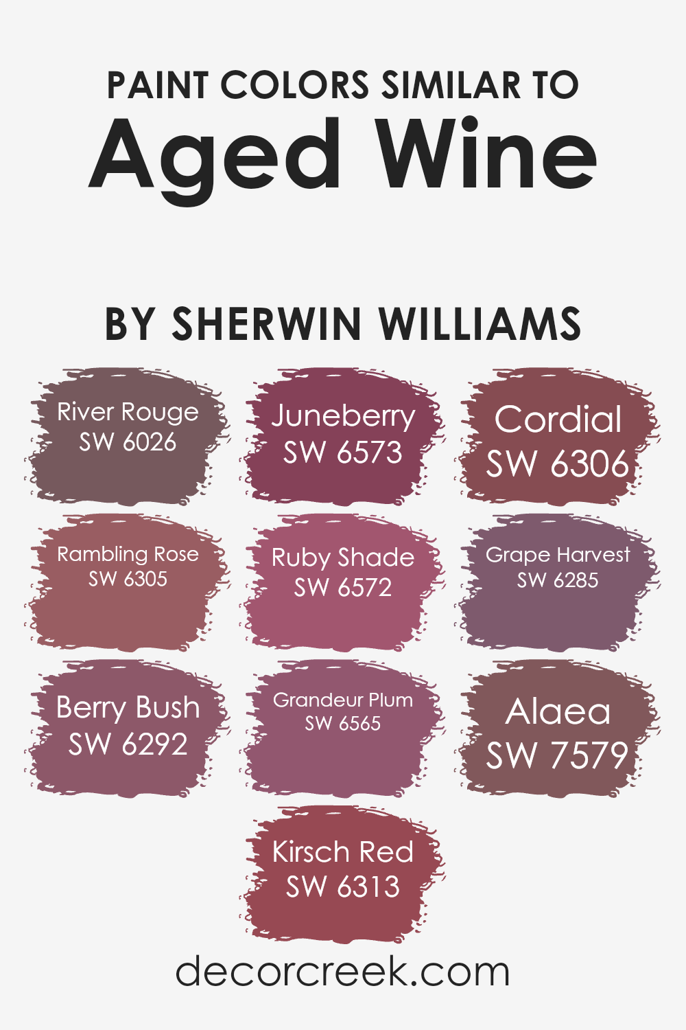
Colors Similar to Aged Wine SW 6299 by Sherwin Williams
Similar colors are important in design as they create a unified and harmonious look. Colors like SW 6026 River Rouge and SW 6305 Rambling Rose evoke a warm, inviting feeling with their soft, reddish hues. These shades complement each other beautifully, making any room feel cozy and welcoming.
SW 6292 Berry Bush brings a touch of earthiness, as it mixes darker pink tones with hints of brown, adding depth to the palette. SW 6313 Kirsch Red and SW 6573 Juneberry add vibrant energy with their rich red tones, perfect for drawing attention to specific areas without being overpowering.
On the other hand, SW 6572 Ruby Shade offers a slightly deeper red with a touch of drama, while SW 6565 Grandeur Plum leans into more purple undertones, adding a regal touch to the mix. SW 6306 Cordial shines with its rich, berry-inspired hue, balancing the palette with its sweet yet bold character.
SW 6285 Grape Harvest is distinguished by its deep grape tones, lending a grounded and rich feel.
Finally, SW 7579 Alaea, with its muted clay color, ties these colors together, ensuring a natural yet distinct flow. Together, these colors achieve a cohesive and beautiful look that can enhance any space.
You can see recommended paint colors below:
- SW 6026 River Rouge
- SW 6305 Rambling Rose
- SW 6292 Berry Bush
- SW 6313 Kirsch Red
- SW 6573 Juneberry
- SW 6572 Ruby Shade
- SW 6565 Grandeur Plum
- SW 6306 Cordial
- SW 6285 Grape Harvest
- SW 7579 Alaea
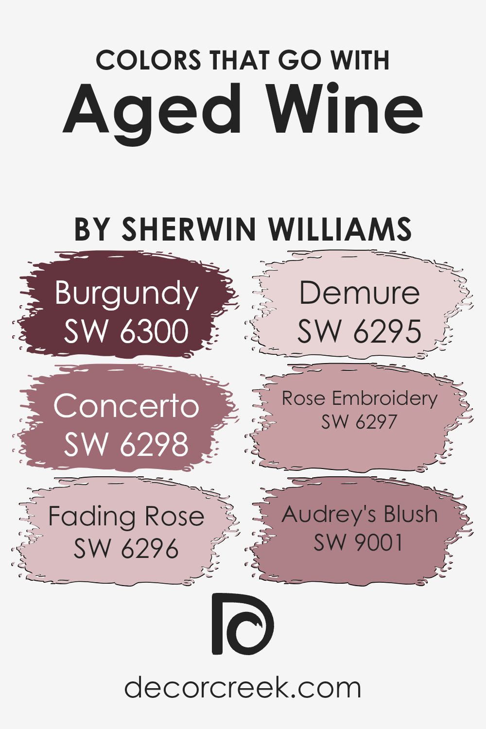
Colors that Go With Aged Wine SW 6299 by Sherwin Williams
When decorating a room with Aged Wine SW 6299 by Sherwin Williams, it’s essential to pair it with colors that complement its rich, deep hue. SW 6300 – Burgundy, for instance, brings an intensity that adds depth, working beautifully as an accent or a more profound color backdrop.
Meanwhile, SW 6298 – Concerto offers a slightly lighter tone with a hint of warmth, creating a balanced relationship with Aged Wine that feels inviting and comforting.
SW 6296 – Fading Rose offers a softer, pastel touch, perfect for adding a gentle contrast without overpowering the room’s scheme. This is complemented well by SW 6295 – Demure, a muted shade that whispers elegance and subtlety, allowing Aged Wine’s boldness to stand out.
Similarly, SW 6297 – Rose Embroidery enriches the palette with its understated pinkish tones, while SW 9001 – Audrey’s Blush brings a light and airy feel, lifting the overall mood.
Together, these colors work harmoniously, creating a balanced and visually pleasing environment where each hue supports the others, enhancing the space’s overall appeal.
You can see recommended paint colors below:
- SW 6300 Burgundy
- SW 6298 Concerto
- SW 6296 Fading Rose
- SW 6295 Demure
- SW 6297 Rose Embroidery
- SW 9001 Audrey’s Blush
How to Use Aged Wine SW 6299 by Sherwin Williams In Your Home?
Aged Wine by Sherwin Williams is a rich, deep burgundy color that can add warmth and coziness to any room. This color works beautifully in dining rooms or living spaces where you want to create an inviting and intimate atmosphere. Pairing Aged Wine with neutral tones like creamy whites or soft grays can help balance its depth, keeping the room from feeling too dark.
It’s also great as an accent wall, where it can add a pop of color without overwhelming the space. For a bolder look, consider using it in a study or library, where it can create a feeling of comfort and focus.
In a bedroom, Aged Wine can add a touch of luxury and comfort, especially when combined with plush textiles like velvet or wool. Accessories in metallic tones, such as gold or bronze, can enhance its warmth and make the room feel complete.
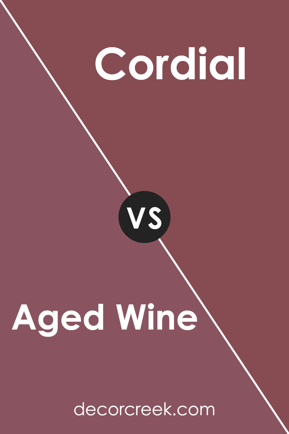
Aged Wine SW 6299 by Sherwin Williams vs Cordial SW 6306 by Sherwin Williams
Aged Wine SW 6299 and Cordial SW 6306, both by Sherwin Williams, are rich shades of red. Aged Wine is a deep, muted burgundy with warm undertones, creating a cozy and inviting atmosphere. It has a vintage feel, making it suitable for spaces where you want to add a touch of elegance and warmth.
On the other hand, Cordial is a brighter and slightly more vibrant shade of red. It has a livelier, almost cheerful essence compared to the more subdued nature of Aged Wine.
While both colors can be used to add warmth to a room, Aged Wine leans more towards a classic, sophisticated look, whereas Cordial can invoke a more lively and welcoming environment. Pairing either with neutrals can lead to beautifully balanced spaces, but the choice between the two depends on whether you prefer a subdued or a more energetic vibe.
You can see recommended paint color below:
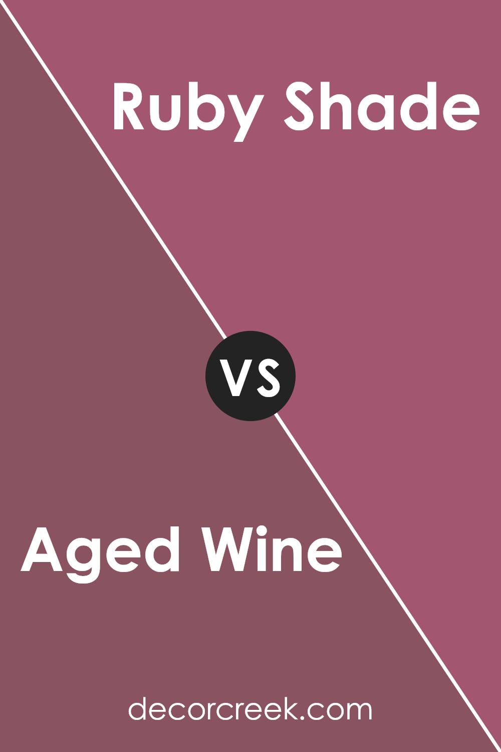
Aged Wine SW 6299 by Sherwin Williams vs Ruby Shade SW 6572 by Sherwin Williams
Aged Wine is a deep, muted red with undertones of brown and purple, giving it a rich, earthy feel. It’s a color that feels warm and comforting, ideal for creating a cozy atmosphere in living rooms or bedrooms. It pairs well with neutral tones and can add a touch of elegance to any space.
In contrast, Ruby Shade is a brighter, more vibrant red with a hint of pink. This color is energetic and bold, making it perfect for accent walls or adding a pop of color to a room. It can be a lively choice for spaces like kitchens or dining rooms, where a burst of color can add excitement.
Both colors have their own charm: Aged Wine is subtle and grounded, while Ruby Shade is spirited and lively. Depending on the mood you want to create, either color can effectively enhance your space with its unique personality.
You can see recommended paint color below:
- SW 6572 Ruby Shade
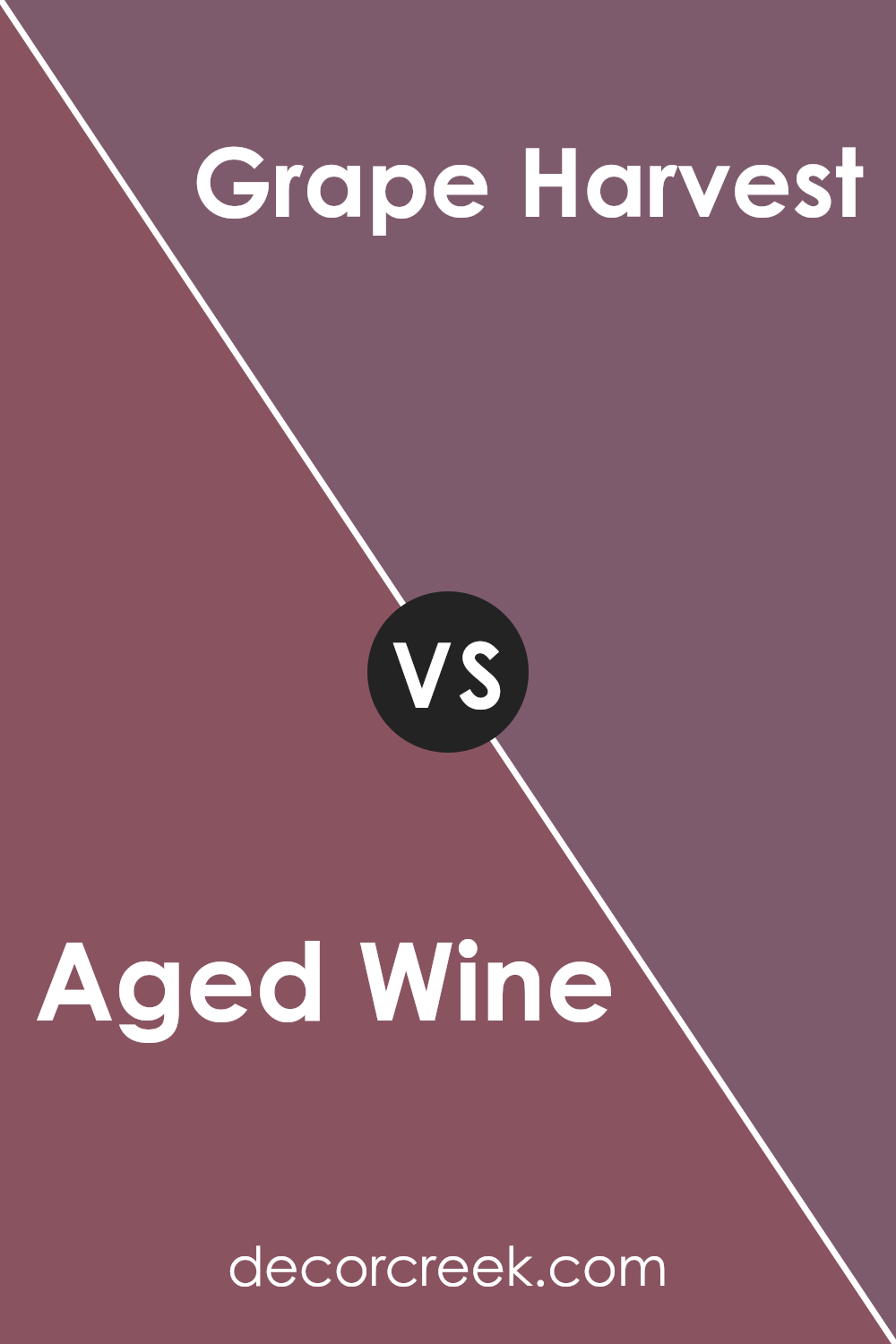
Aged Wine SW 6299 by Sherwin Williams vs Grape Harvest SW 6285 by Sherwin Williams
Aged Wine and Grape Harvest are both rich, elegant colors by Sherwin Williams, but they have distinct characteristics. Aged Wine is a deep, muted burgundy with hints of brown, resembling the earthy tones of mature red wine. It’s a color that adds warmth and a sense of coziness to a space, making it ideal for living rooms or dining areas where a comfortable and inviting atmosphere is desired.
On the other hand, Grape Harvest is a slightly brighter, more vibrant shade of purple. It leans towards a warmer, grape-like hue, infusing spaces with a bit more energy and brightness than Aged Wine.
This makes Grape Harvest suitable for accent walls or areas where a touch of lively color is wanted without overwhelming the room.
Both colors work well with neutral shades, but Aged Wine tends to blend more seamlessly in more traditional settings, while Grape Harvest can offer a pop of color in modern designs.
You can see recommended paint color below:
- SW 6285 Grape Harvest
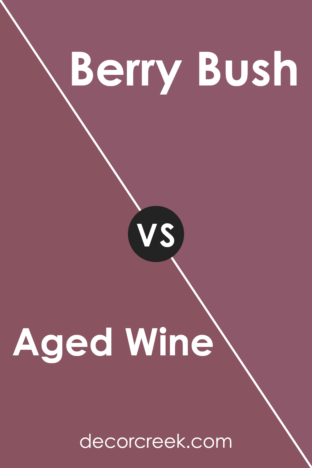
Aged Wine SW 6299 by Sherwin Williams vs Berry Bush SW 6292 by Sherwin Williams
Aged Wine and Berry Bush are two distinct colors by Sherwin Williams that offer different vibes for a room. Aged Wine is a deep, rich shade of purple with hints of red, like the deep color of a vintage red wine. It creates a warm and cozy atmosphere, perfect for living rooms or bedrooms where you want to feel snug and comfortable.
On the other hand, Berry Bush is lighter and has more pink undertones. It’s a vibrant and cheerful color, reminiscent of ripe summer berries. This makes Berry Bush a good choice for spaces where you want to introduce energy and playfulness, such as a kitchen or a child’s room.
While Aged Wine adds a sense of warmth and depth to a space, Berry Bush brings brightness and a cheerful touch. The choice between the two would depend on whether you are looking to create a calming and intimate environment or a lively and spirited one.
You can see recommended paint color below:
- SW 6292 Berry Bush
Aged Wine SW 6299 by Sherwin Williams vs Rambling Rose SW 6305 by Sherwin Williams
Aged Wine and Rambling Rose are two distinct colors by Sherwin Williams, each with its own unique character. Aged Wine is a deep, rich burgundy with a hint of purple, evoking a sense of warmth and coziness. It’s perfect for creating a dramatic atmosphere, making it ideal for spaces where you want to add depth and richness. Its darker tone can bring a sense of intimacy to a room, making it feel cozy and welcoming.
On the other hand, Rambling Rose is a lighter, more vibrant pinkish-red. It’s bright and lively, with a cheerful energy that can uplift a space. This color is well-suited for areas where you want to bring a sense of playfulness and light.
It can make a room feel fresh and invigorating, adding a pop of color without being overwhelming.
Together, these colors can complement each other beautifully, with Aged Wine providing a grounded, deep backdrop and Rambling Rose offering a striking contrast.
You can see recommended paint color below:
- SW 6305 Rambling Rose

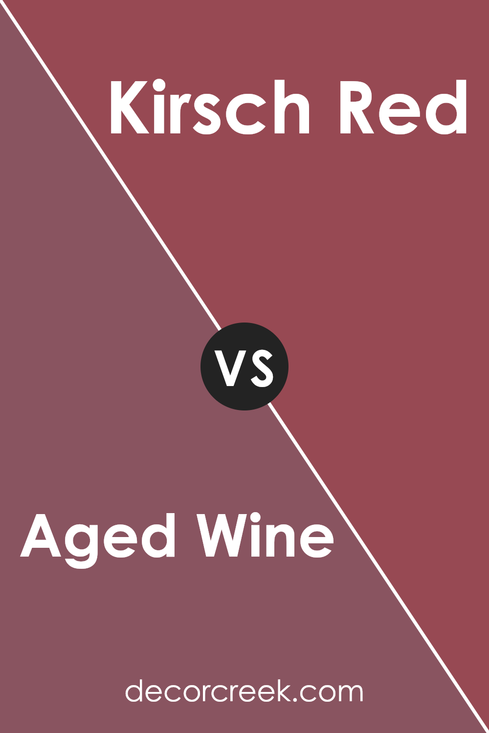
Aged Wine SW 6299 by Sherwin Williams vs Kirsch Red SW 6313 by Sherwin Williams
Aged Wine (SW 6299) and Kirsch Red (SW 6313) by Sherwin Williams are both rich, warm colors, but they offer different vibes. Aged Wine is a deep, muted burgundy. It feels cozy and inviting, like a glass of fine wine enjoyed by a fireplace. It’s a great choice for adding warmth to a room without being too overpowering.
On the other hand, Kirsch Red is a bold, vibrant red. It’s much brighter and more energetic. This color draws attention and can make a strong statement in any space. Kirsch Red could be perfect for an accent wall or a piece of furniture that you want to stand out.
In summary, Aged Wine is more subdued and calming, providing a soft, elegant touch, while Kirsch Red is lively and bold, perfect for those who want to add a splash of energy and passion to their space.
You can see recommended paint color below:
- SW 6313 Kirsch Red
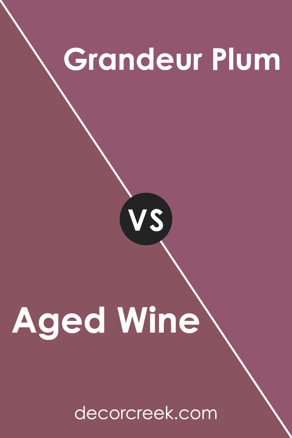
Aged Wine SW 6299 by Sherwin Williams vs Grandeur Plum SW 6565 by Sherwin Williams
Aged Wine (SW 6299) by Sherwin Williams is a rich, deep red color with subtle brown undertones, reminiscent of a fine vintage wine. It exudes warmth and creates a cozy, inviting atmosphere, making it ideal for living rooms or dining areas where comfort and togetherness are key.
In contrast, Grandeur Plum (SW 6565) is a darker purple with blue undertones, offering a more dramatic and bold look. It adds a touch of luxury and boldness, making it a great choice for accent walls or spaces where you want to make a statement.
While both colors are deep and rich, Aged Wine leans more towards the earthy side with its reddish-brown hue, while Grandeur Plum feels more mysterious and opulent with its blue-tinged purple. Choosing between them depends on whether you prefer the warmth of red wine tones or the bold elegance of a mature plum shade.
You can see recommended paint color below:
- SW 6565 Grandeur Plum
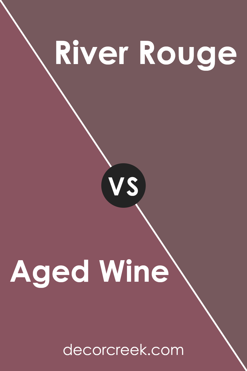
Aged Wine SW 6299 by Sherwin Williams vs River Rouge SW 6026 by Sherwin Williams
Aged Wine and River Rouge are both rich, warm colors by Sherwin Williams, but they offer different vibes. Aged Wine is a deep, sophisticated shade of purple with reddish undertones, like a dark burgundy. It feels warm and cozy, making it a great choice for creating an inviting atmosphere. It’s perfect for spaces where you want to feel comforted and relaxed.
River Rouge, on the other hand, is more of a muted, earthy red. It has a more rustic and natural feel compared to Aged Wine. While also warm, River Rouge brings a sense of earthiness and is a bit more laid-back. It can be used to bring a touch of nature indoors or to give a room a grounded, natural look.
Both colors are rich and strong, but Aged Wine leans towards a luxurious feel, while River Rouge offers a more grounded and natural ambiance.
You can see recommended paint color below:
- SW 6026 River Rouge
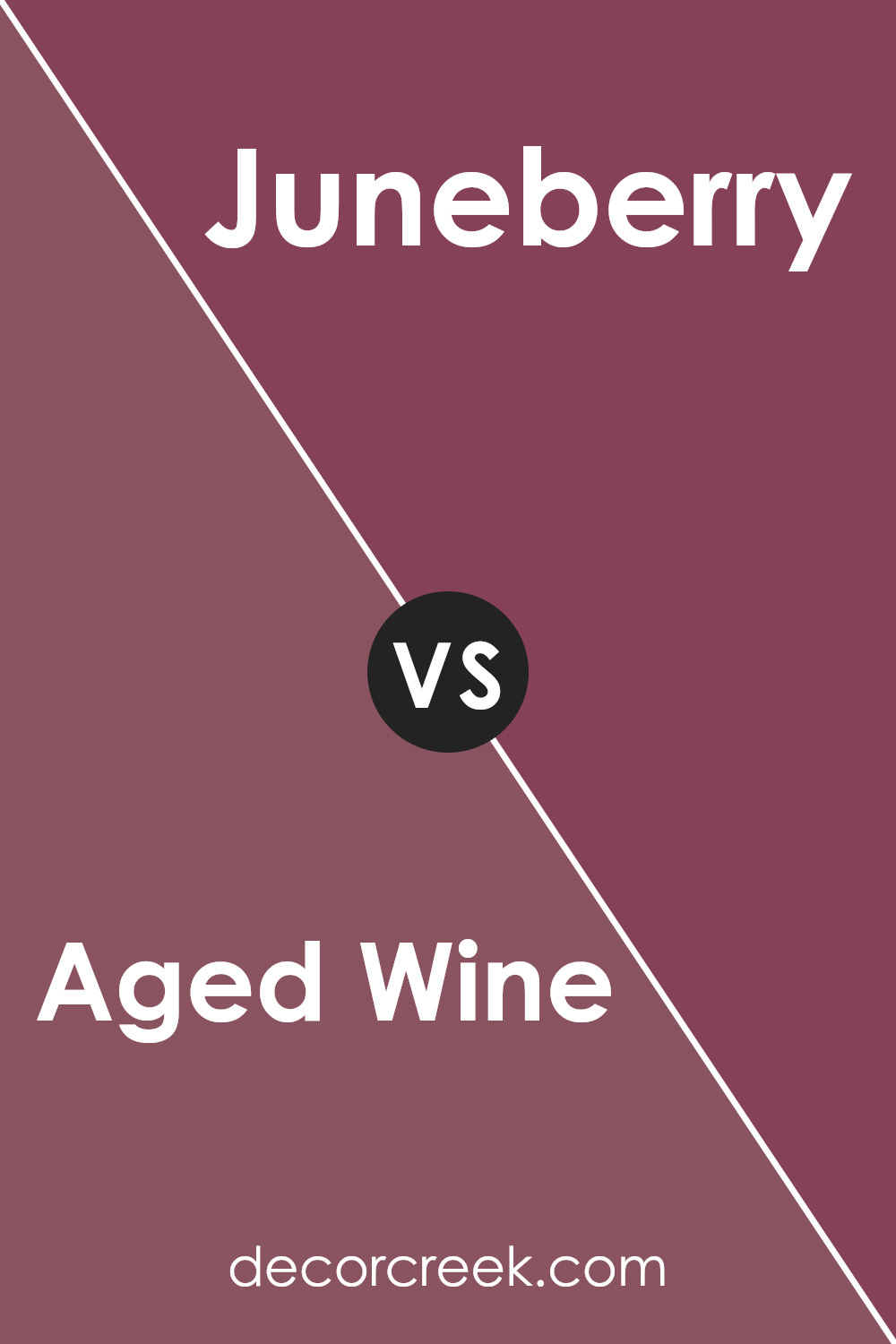
Aged Wine SW 6299 by Sherwin Williams vs Juneberry SW 6573 by Sherwin Williams
Aged Wine and Juneberry are two rich, bold colors by Sherwin Williams. Aged Wine is a deep, muted red with hints of brown, resembling a vintage red wine that has an earthy, calming presence. Its darker tone makes it perfect for creating a cozy, warm atmosphere, ideal for relaxing spaces like a living room or den.
In contrast, Juneberry is a more vibrant and brighter berry shade with a lively touch. It has a stronger presence of purple undertones, giving it energy and making it stand out. Juneberry is bolder and more colorful, which works well in spaces where you want to make a statement, like an accent wall or an office.
Both colors add warmth and richness, but Aged Wine is more subdued and traditional, while Juneberry is more playful and energizing. Choosing between them depends on whether you want a more relaxed ambiance or a vibrant, eye-catching look.
You can see recommended paint color below:
- SW 6573 Juneberry
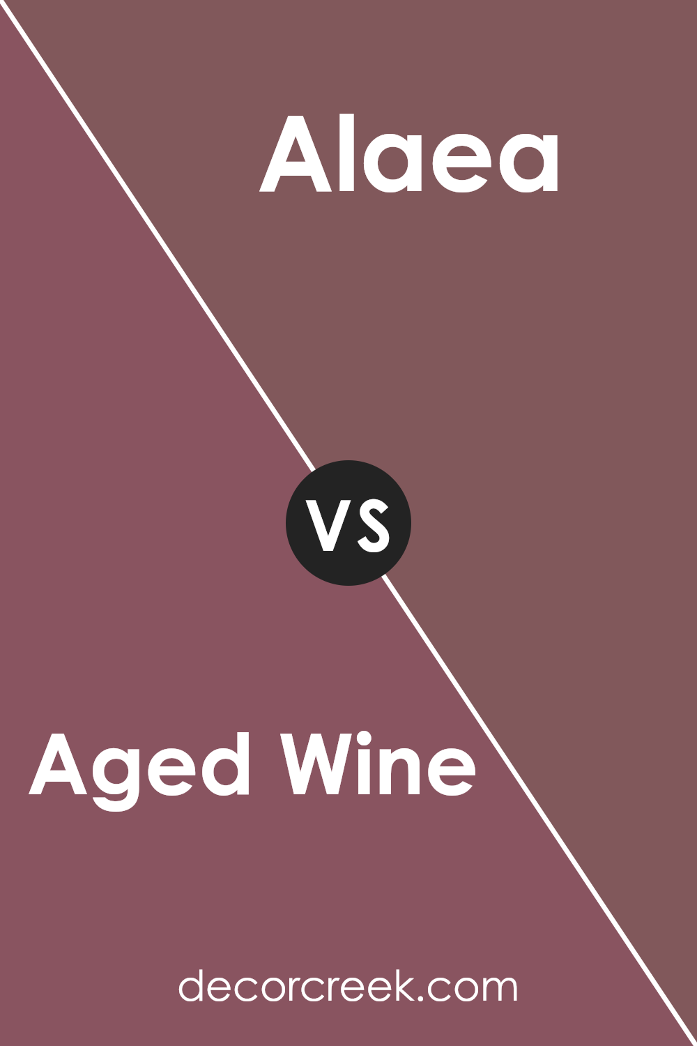
Aged Wine SW 6299 by Sherwin Williams vs Alaea SW 7579 by Sherwin Williams
Aged Wine and Alaea by Sherwin Williams are two distinct colors that offer unique aesthetics. Aged Wine is a deep, rich burgundy shade reminiscent of dark-red grapes. It’s warm and offers a cozy and inviting atmosphere, making it a great choice for spaces where you want warmth and intimacy. This color can add a touch of elegance and works well in living rooms or dining areas.
In contrast, Alaea is a soft, earthy red-orange that feels more grounded and organic. It’s lighter and warmer than Aged Wine, bringing a touch of brightness and liveliness to a room. Alaea can create a cheerful and welcoming environment and may be ideal for kitchens or entryways.
When comparing the two, Aged Wine is more about depth and intimacy, while Alaea offers a brighter and more invigorating feel. Depending on the mood you want to set, each color can play a different role in designing a room.
You can see recommended paint color below:
- SW 7579 Alaea
This color, a mix of deep red and brown, feels warm and cozy, like being wrapped in a soft blanket. It reminds me of berries and evenings by the fireplace. It’s a color that makes me think of comfort and joy.
Using Aged Wine in any room can make it feel more welcoming and friendly. Imagine painting a wall this color and how it might feel like a gentle hug every time you walk in.
Whether it’s for a living room, a dining room where families gather, or a bedroom for restful nights, this shade can fit in well.
Aged Wine is more than just a color; it tells a story of warmth and familiarity. It can reflect feelings of happiness and calmness. When you look at it, you may picture fun times with friends and family, sharing stories and laughter.
In the end, choosing SW 6299 Aged Wine is like picking a trusty friend who brings warmth and reassurance to your rooms.
It’s a color that can add feelings to any place. I find it truly special, and I hope everyone who uses it will enjoy the comfort and contentment it brings, just like I do.
Ever wished paint sampling was as easy as sticking a sticker? Guess what? Now it is! Discover Samplize's unique Peel & Stick samples.
Get paint samples

