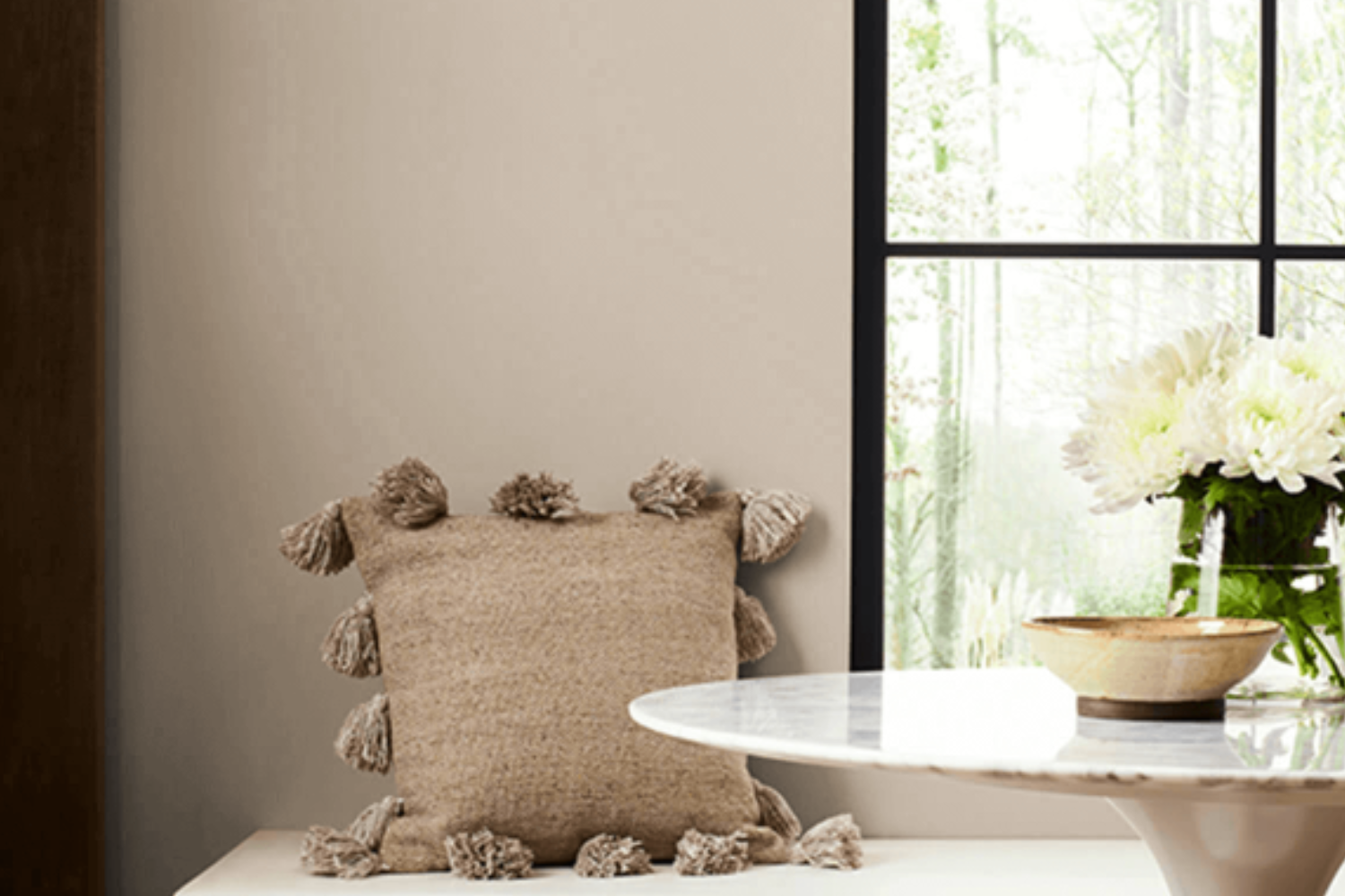
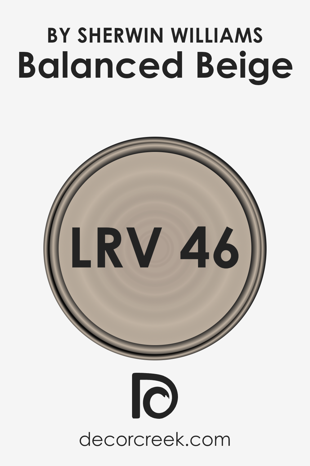
Introducing SW 7037 Balanced Beige by Sherwin Williams, a color that redefines the notion of neutral paints, offering a perfect blend of warmth and versatility. This shade stands out as a go-to choice for anyone looking to add a touch of sophistication and calmness to their spaces.
Balanced Beige is not just any ordinary beige; it’s a carefully crafted hue that brings a cozy, inviting atmosphere to any room, making it ideal for both modern and traditional decor.
This color’s unique versatility allows it to adapt seamlessly to various lighting conditions, showcasing different facets of its personality, from a soft, creamy warmth in abundant daylight to a deeper, more grounding presence under artificial lighting. Whether you’re aiming to refresh your living room, bedroom, or even the exterior of your home, Balanced Beige offers a solid foundation that complements a wide range of color palettes and design styles.
What sets Balanced Beige apart is its unparalleled ability to balance color warmth with neutrality, making it a fantastic choice for creating a relaxing and stylish environment.
Its adaptability makes it a favorite among homeowners and professionals alike, proving that neutral does not mean mundane. Let’s explore how this sophisticated beige can transform your space into a haven of style and comfort.
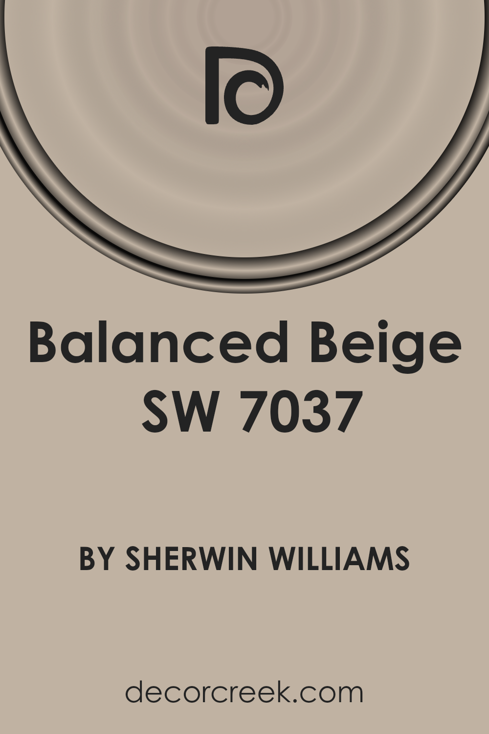
What Color Is Balanced Beige SW 7037 by Sherwin Williams?
Balanced Beige by Sherwin Williams is a cozy and welcoming color that brings warmth to any room without overpowering the space. This nuanced shade stands right at the crossroads of tan and gray, providing a versatile backdrop that can complement various decorating styles and color schemes. Its gentle warmth makes it ideal for creating a serene and inviting atmosphere, perfect for spaces where relaxation is key, such as living rooms, bedrooms, and home offices.
Balanced Beige works exceptionally well in interior styles that lean towards the natural, rustic, and minimalist. Its earthy tones pair beautifully with natural materials like wood, stone, and leather, enhancing their texture and adding depth to the overall design. It also harmonizes wonderfully with soft textiles, such as wool or cotton, contributing to a cozy and comfortable environment.
When it comes to colors, Balanced Beige is incredibly flexible. It can serve as a stunning canvas for both bold accent colors and softer, more muted palettes. This makes it easy to integrate into existing designs or to use as a foundation for new ones. Whether you’re aiming for a bright and airy feel or a more grounded and earthy vibe, Balanced Beige can help achieve the desired effect with its subtle and soothing qualities.
Ever wished paint sampling was as easy as sticking a sticker? Guess what? Now it is! Discover Samplize's unique Peel & Stick samples.
Get paint samples

Is Balanced Beige SW 7037 by Sherwin Williams Warm or Cool color?
Balanced Beige by Sherwin Williams is a versatile neutral color that brings warmth and sophistication to any space. Its unique blend of beige with subtle gray undertones makes it a perfect choice for those looking to create a cozy, yet modern look in their homes.
Unlike stark whites or deeper grays, this shade offers a soft backdrop that pairs well with a wide range of decor styles, from traditional to contemporary. It works exceptionally well in rooms that get a lot of natural light, as the changing light throughout the day can bring out different dimensions of the color, adding depth and interest to the space.
Additionally, Balanced Beige is great for open-plan areas, as it helps to seamlessly connect different living spaces without feeling monotonous. Its neutrality allows for easy transitions between rooms, making it a popular choice among homeowners looking for a color that supports a fluid living environment.
Whether used as a main wall color or as an accent, Balanced Beige provides a solid foundation for layering textures and colors, creating a warm and inviting home atmosphere.
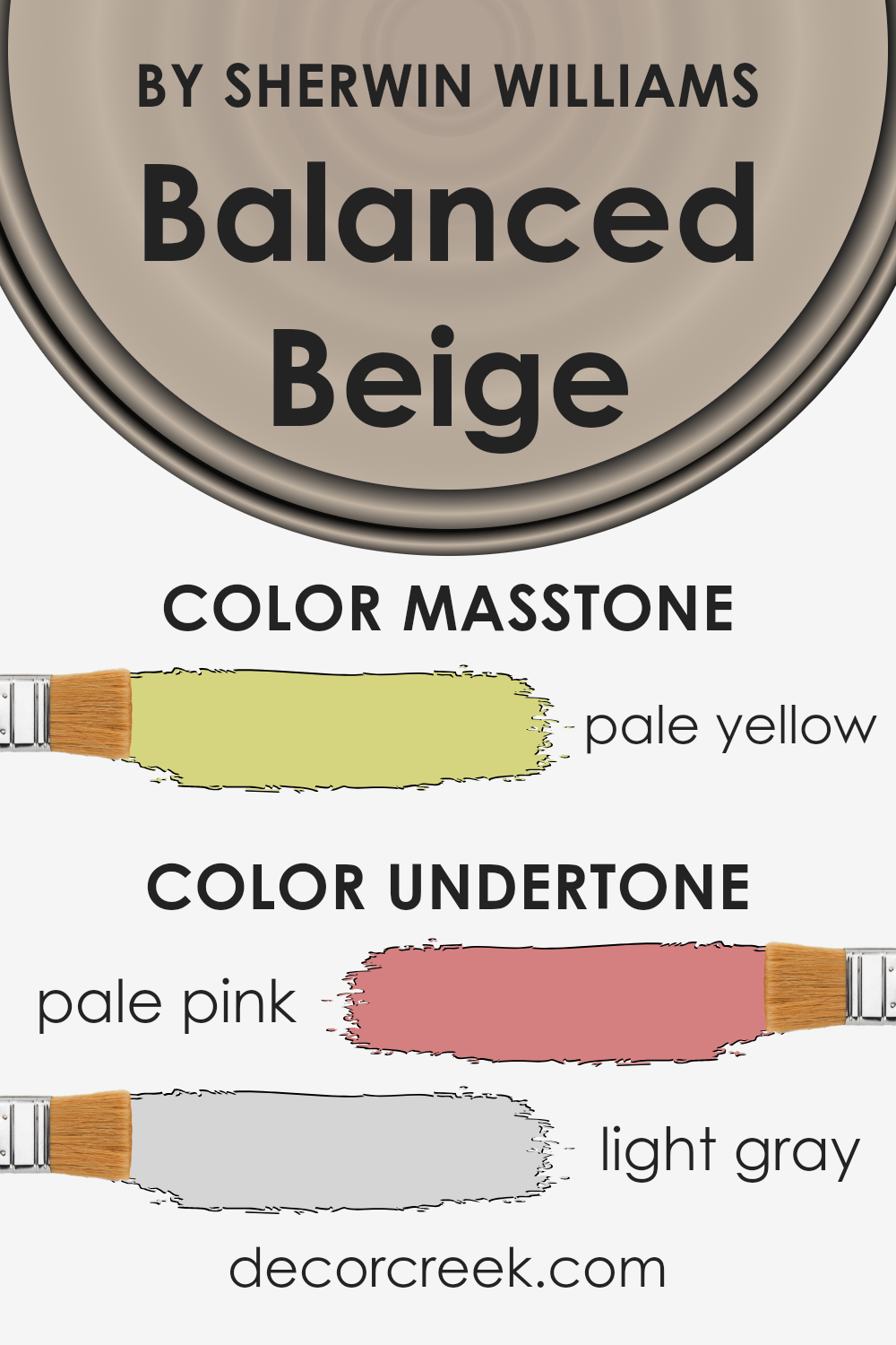
Undertones of Balanced Beige SW 7037 by Sherwin Williams
Balanced Beige by Sherwin Williams is a unique color that might seem simple at first glance, but when you look closer, it’s full of depth thanks to its undertones. Imagine a cozy blanket; at first, it just seems warm, but the more you snuggle, the more you notice how the fabric’s colors play together. That’s kind of what undertones do in paint.
This particular beige isn’t just a plain beige; it has subtle hints of pale pink and light gray mixed into it. Think of undertones like secret ingredients in a recipe that can subtly change the flavor of a dish. They can make a huge difference in how we perceive the color. Depending on the light in a room, sometimes you might notice the wall color shifting.
In bright sunlight, those pale pink undertones might make the walls seem warmer, almost like there’s a soft blush to them. On cloudy days, the light gray undertones might stand out, giving the space a cooler, more serene vibe.
When Balanced Beige is used on interior walls, it can really influence the mood of a room. That mix of pale pink and light gray makes the walls more dynamic and adaptable to different styles and decorations. It’s like having a color that can slightly change its appearance to match the time of day or the room’s accessories, making it a very versatile choice for any space.
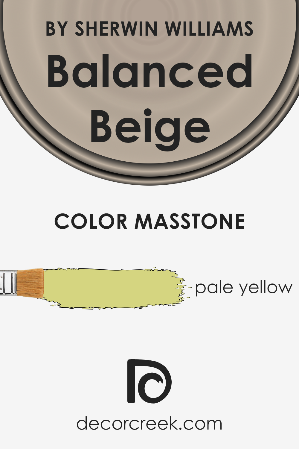
What is the Masstone of the Balanced Beige SW 7037 by Sherwin Williams?
Balanced Beige by Sherwin Williams, with its masstone of pale yellow, adds a unique and gentle warmth to any space. This specific shade, resembling a soft, sunlit hue, creates an inviting ambiance in homes. Its pale yellow undertone offers a hint of coziness without overwhelming a room with too much color. This makes it perfect for those looking to add a subtle touch of warmth to their walls while maintaining a neutral backdrop.
The color works well in various settings, whether you’re aiming for a light and airy feel or a more grounded, earthy vibe. Because of its versatility, it pairs beautifully with a wide range of decor styles—from modern to rustic.
It helps in softening spaces with natural light, enhancing the room’s overall comfort and appeal. Furthermore, its gentle presence makes it an excellent choice for nearly every room in the house, including living areas, bedrooms, and kitchens, contributing to a cohesive and harmonious home environment.
How Does Lighting Affect Balanced Beige SW 7037 by Sherwin Williams?
Lighting plays a crucial role in how we perceive the color of objects, including the paint on our walls. The same color can look different under various lighting conditions due to the light’s intensity, direction, and color. Understanding this can help us choose paint colors that will look good in any light.
Balanced Beige by Sherwin Williams is a versatile color that behaves differently depending on the lighting. In artificial light, such as from LED or incandescent bulbs, this beige takes on a warmer hue, creating a cozy and inviting atmosphere. The type of bulb can affect its appearance: warmer bulbs enhance its creamy qualities, while cooler bulbs bring out its subtler gray tones.
- In natural light, the story changes through the day. Morning light in east-facing rooms brings out the color’s soft warmth, making spaces feel bright and cheerful. As the sun moves, the intensity of the natural light decreases, which can make the color appear more neutral or slightly cooler in the afternoon.
- North-facing rooms receive less direct sunlight, which can make colors appear cooler. Here, Balanced Beige might look more like a true neutral, losing some of its warmth but still providing a soft, inviting backdrop. It’s ideal for creating a light, airy feel without becoming too cold.
- South-facing rooms, on the other hand, are bathed in warm light throughout the day. This enhances the warmth of Balanced Beige, making it appear more vibrant and cozy. It’s a perfect match for spaces where you want to create a sunny, welcoming feel.
- West-facing rooms get the full impact of the setting sun, which can dramatically change how this color looks. During the morning, it might appear neutral or cool. As the sun sets, the room can glow with warmth, highlighting the beige’s richer, cozier side.
Understanding how lighting affects colors like Balanced Beige can help you predict how it will look in your space at any time of day, ensuring you’re happy with your choice in varied lighting conditions.

What is the LRV of Balanced Beige SW 7037 by Sherwin Williams?
LRV stands for Light Reflectance Value, which is a measure used to describe the amount of light a paint color reflects or absorbs when it’s applied to a wall. Think of LRV as a scale from 0 to 100, where 0 is completely black, absorbing all light, and 100 is pure white, reflecting all light back. This number is super important when choosing paint because it can help you understand how light or dark a color will look in your space.
A higher LRV means the color will appear lighter and can make a room feel more open and airy. In contrast, a lower LRV means the color will look darker, which can make a room feel cozier but also smaller.
For Balanced Beige by Sherwin Williams, which has an LRV of 45.6, this falls nearly in the middle of the scale. This means it neither reflects light as much as lighter colors do, nor absorbs it like darker shades. In a well-lit room, this color can look warm and welcoming, adding a cozy ambiance without making the space feel too closed in.
However, in a room with less natural light, it might appear a bit darker, emphasizing its beige undertones more. This mid-range LRV makes Balanced Beige a versatile color, capable of bringing a sophisticated and neutral look to walls in many types of rooms, balancing between light and cozy.
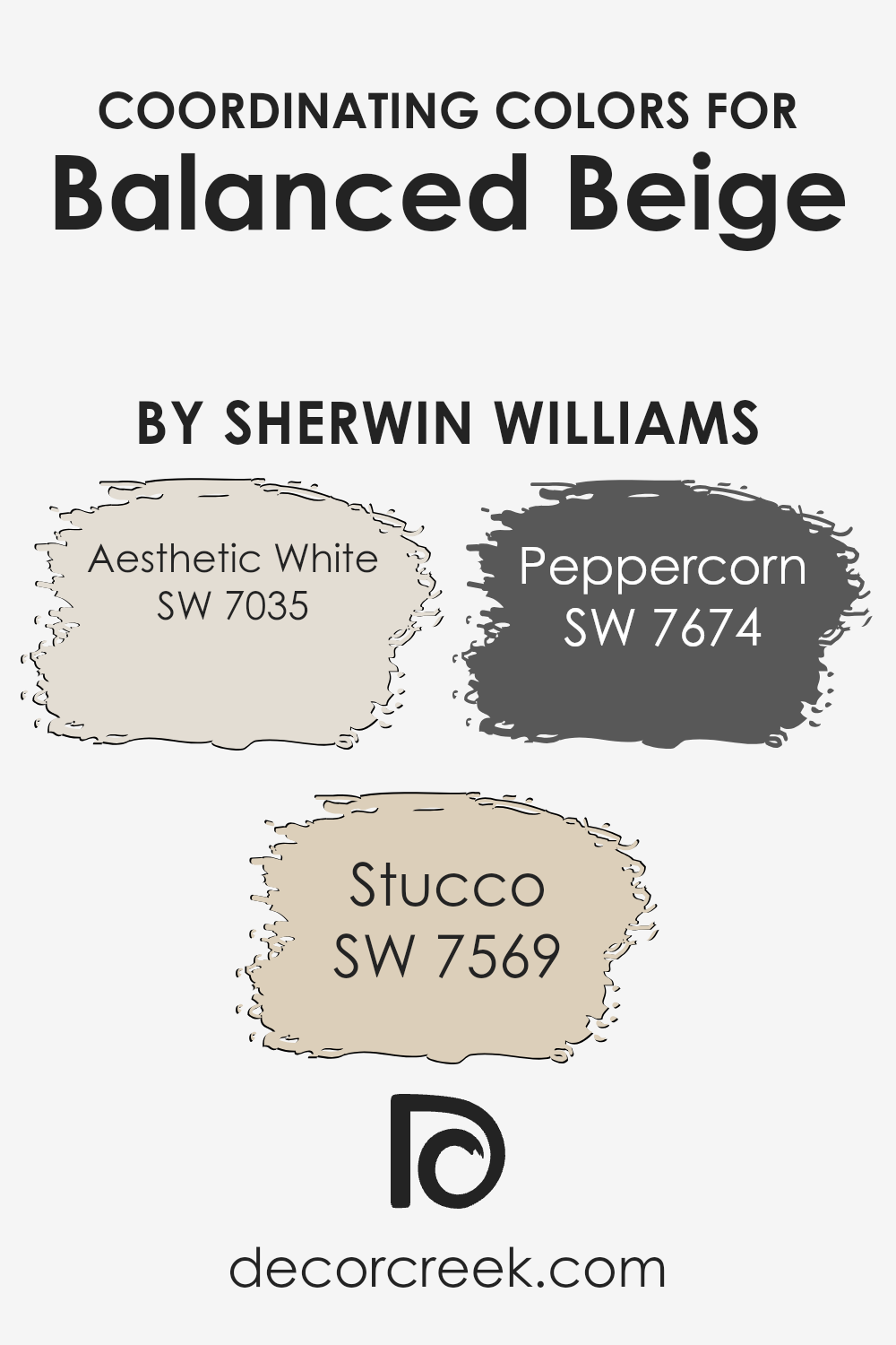
Coordinating Colors of Balanced Beige SW 7037 by Sherwin Williams
Coordinating colors are those that work well together in harmony to enhance the overall aesthetic of a space, offering a visually pleasing palette when combined. When it comes to Balanced Beige by Sherwin Williams, certain colors have been identified to coordinate beautifully with it, adding depth, contrast, or continuity to your décor depending on what you’re aiming for. Aesthetic White, Stucco, and Peppercorn are three of these coordinating hues, each bringing its own unique vibe while still maintaining a cohesive look with Balanced Beige.
Aesthetic White is a soft, warm white with a subtle hint of beige, making it the perfect companion for Balanced Beige if you’re aiming for a light and airy feel without it becoming too stark or cold. It’s great for trim, ceilings, or even as a wall color in a room adjacent to one painted in Balanced Beige, providing a gentle transition between spaces. Stucco, on the other hand, is a warm, mid-toned neutral that leans more towards an earthy, natural look. It offers a slightly deeper contrast to Balanced Beige while maintaining a soft and inviting atmosphere.
Lastly, Peppercorn presents a significant contrast as a dark charcoal gray with cool undertones. It’s ideal for creating dramatic accents, like on doors or as an accent wall, offering a bold pop against the softer backdrop of Balanced Beige, without overwhelming the space. Together, these colors form a versatile palette that can be adjusted to suit various styles and preferences, from cozy and welcoming to sleek and modern.
You can see recommended paint colors below:
- SW 7035 Aesthetic White
- SW 7569 Stucco
- SW 7674 Peppercorn
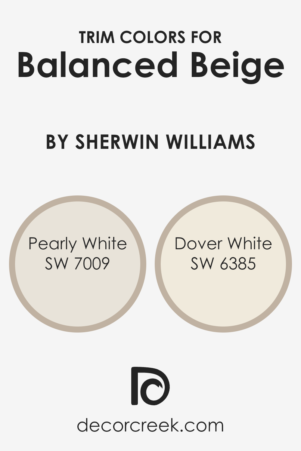
What are the Trim colors of Balanced Beige SW 7037 by Sherwin Williams?
Trim colors are essentially the shades used for the detailing in rooms, like door frames, window sills, and skirting boards, that offset the main wall color. They’re vital because they frame the space, accentuating the architectural details and enhancing the overall ambiance of a room.
When paired with a neutral and warm wall color like Balanced Beige by Sherwin Williams, trim colors contribute to a refined and coherent look. Specifically, selecting the right trim color can elevate the warmth and subtlety of Balanced Beige, making the space more inviting and aesthetically pleasing.
For example, Pearly White (SW 7009) by Sherwin Williams is a soft, muted off-white with a gentle warmth to it, making it an excellent choice for trims when you want a subtle contrast without overwhelming the calmness of Balanced Beige. It’s like a quiet whisper along the edges of a room, softly highlighting the space’s features without demanding attention
On the other hand, Dover White (SW 6385) is a bit warmer and creamier, offering a slightly more pronounced contrast against Balanced Beige that adds a touch of brightness. Using Dover White for trim brings out Balanced Beige’s cozy tones, creating a welcoming and harmonious environment that feels both cohesive and distinctly layered.
You can see recommended paint colors below:
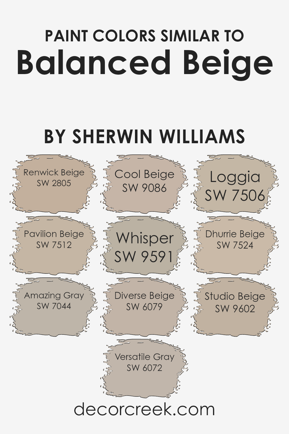
Colors Similar to Balanced Beige SW 7037 by Sherwin Williams
Similar colors play a key role in creating harmonious design schemes. They have a subtle variation that adds depth and complexity to a space without overwhelming it with contrast. When dealing with a base color like Balanced Beige by Sherwin Williams, finding shades that complement it can make a significant difference in the overall aesthetic. Similar colors, such as Renwick Beige, bring a warm, earthy vibe, slightly deeper than the base, offering a solid, grounded feel.
Pavilion Beige, on the other hand, leans towards a lighter, airy feel, perfect for creating a serene and inviting atmosphere. Amazing Gray adds a contemporary twist with its grayish tone, making spaces look modern and sophisticated. Versatile Gray, true to its name, is highly adaptive, seamlessly blending with various decor styles.
Cool Beige introduces a fresher, cooler tone, making it ideal for spaces that aim for a crisp, clean look. Whisper subtly shifts towards a lighter palette, providing a soft, ethereal quality to the environment.
Diverse Beige adds a hint of richness and depth, making it suitable for areas that require a bit more weight. Loggia offers a rustic charm, reminiscent of clay and earth, enriching spaces with its robustness.
Dhurrie Beige brings a unique, slightly muted elegance, perfect for those looking for a sophisticated yet understated background. Lastly, Studio Beige has a warm, inviting presence, creating cozy, comforting spaces.
By understanding these similar shades, designers can craft rooms that feel cohesive, layered, and visually interesting.
You can see recommended paint colors below:
- SW 2805 Renwick Beige
- SW 7512 Pavilion Beige
- SW 7044 Amazing Gray
- SW 6072 Versatile Gray
- SW 9086 Cool Beige
- SW 9591 Whisper
- SW 6079 Diverse Beige
- SW 7506 Loggia
- SW 7524 Dhurrie Beige
- SW 9602 Studio Beige
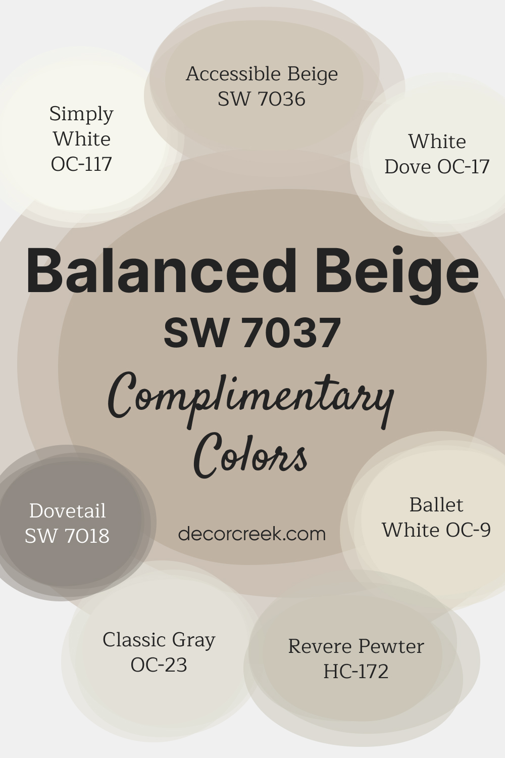
Complimentary Colors for Balanced Beige SW 7037 Paint Color by Sherwin Williams
Balanced Beige SW 7037 by Sherwin-Williams is a warm and inviting neutral that brings a cozy elegance to any space. Its balanced undertones make it versatile enough for living rooms, bedrooms, and entryways, creating a welcoming atmosphere that suits both modern and traditional decor styles.
This shade pairs beautifully with a range of complementary colors to create a harmonious palette. For a fresh, bright contrast, consider pairing Balanced Beige with Ballet White OC-9 and White Dove OC-17.
Revere Pewter HC-172 and Accessible Beige SW 7036 add warmth, while Dovetail SW 7018 provides a deeper, grounding element.
Simply White OC-117 and Classic Gray OC-23 introduce light, airy tones, perfect for trim or cabinetry, creating a refined and balanced look.
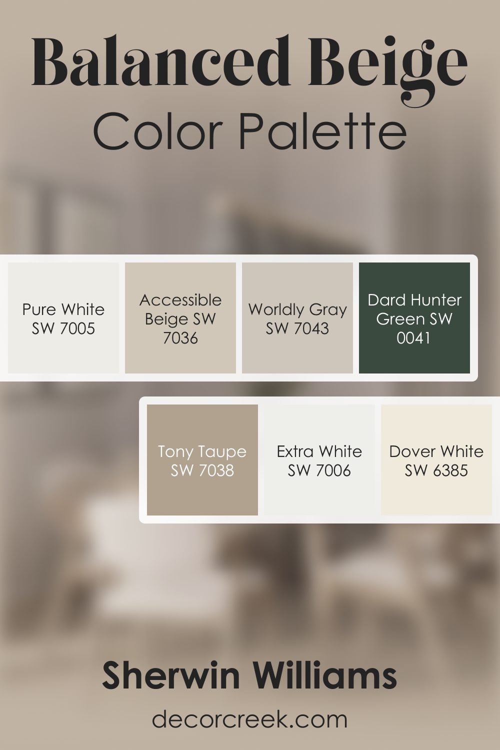
Balanced Beige SW 7037 by Sherwin Williams Color Palette
Balanced Beige offers warm comfort with a natural feel that suits many styles. Accessible Beige blends gently with it, creating a smooth background for open rooms.
Dover White and Pure White brighten the palette and keep it feeling light. Worldly Gray adds a subtle cool shift that gives visual interest without heaviness.
Extra White adds crisp contrast, while Tony Taupe brings grounded warmth that fits perfectly with natural wood and simple textures.
Dard Hunter Green adds a dramatic accent for rich depth. The palette feels welcoming, earthy, and relaxing.
How to Use Balanced Beige SW 7037 by Sherwin Williams In Your Home?
Balanced Beige by Sherwin Williams is a versatile paint color that can bring warmth and simplicity to any room in your home. With its cozy undertone, it acts as a perfect backdrop, whether you’re looking to create a serene bedroom or a welcoming living room. Its balanced nature means it can pair well with both dark and light furniture, offering flexibility in decorating styles.
You can use Balanced Beige in large areas like the walls to create a soothing and neutral canvas, which then allows you to play with colors through accessories like pillows, curtains, or artworks.
In smaller doses, it works beautifully on a feature wall or as an accent, adding depth without overwhelming the space. For those wanting to achieve a modern yet timeless look, applying this color to kitchen cabinets or bathroom walls can instantly elevate the space. Balanced Beige is essentially a smart choice for anyone looking to add a touch of warmth and elegance to their home without going too bold.
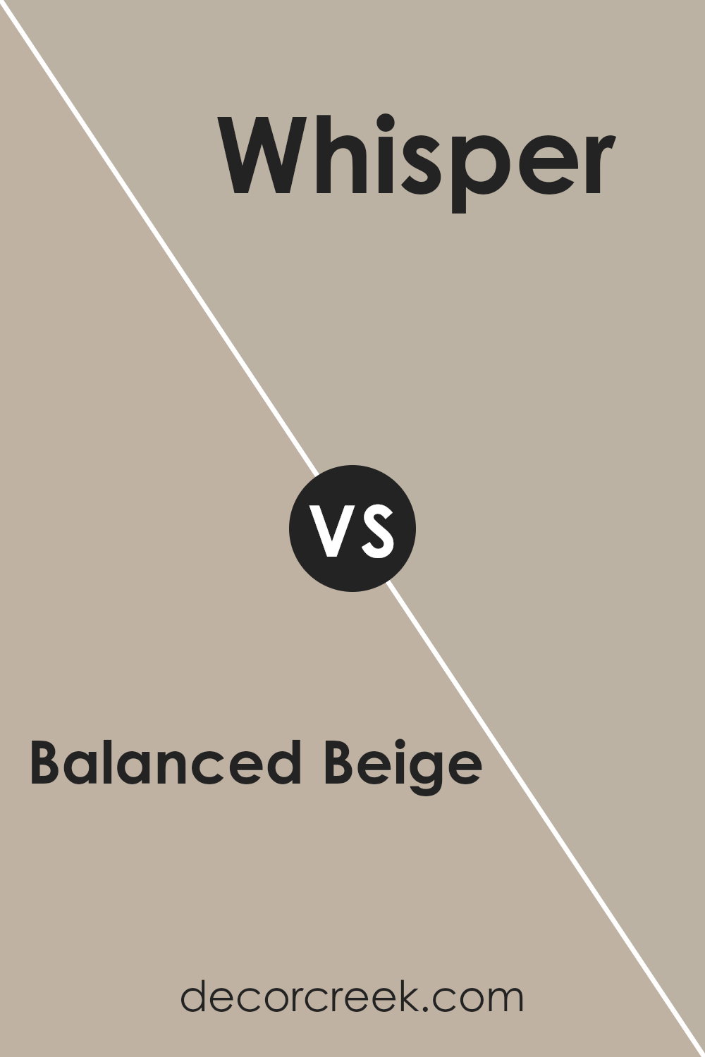
Balanced Beige SW 7037 by Sherwin Williams vs Whisper SW 9591 by Sherwin Williams
Balanced Beige and Whisper, both from Sherwin Williams, offer unique tones for spaces. Balanced Beige, true to its name, provides a stable and soothing beige color that’s perfect for creating warm, inviting rooms.
It has a versatile appeal, working well in various settings from living rooms to bedrooms, adding depth without overwhelming the space. On the other hand, Whisper presents a much lighter hue.
It’s a subtle shade leaning towards whites with a hint of warmth, making it ideal for those seeking a clean, airy feel. Whisper can open up smaller spaces or bring a serene vibe to any room. While Balanced Beige adds a cozy layer of color, Whisper keeps things light and minimalistic. Both are excellent choices but serve different aesthetic goals; Balanced Beige for a comforting richness and Whisper for a gentle, pristine look.
You can see recommended paint color below:
- SW 9591 Whisper
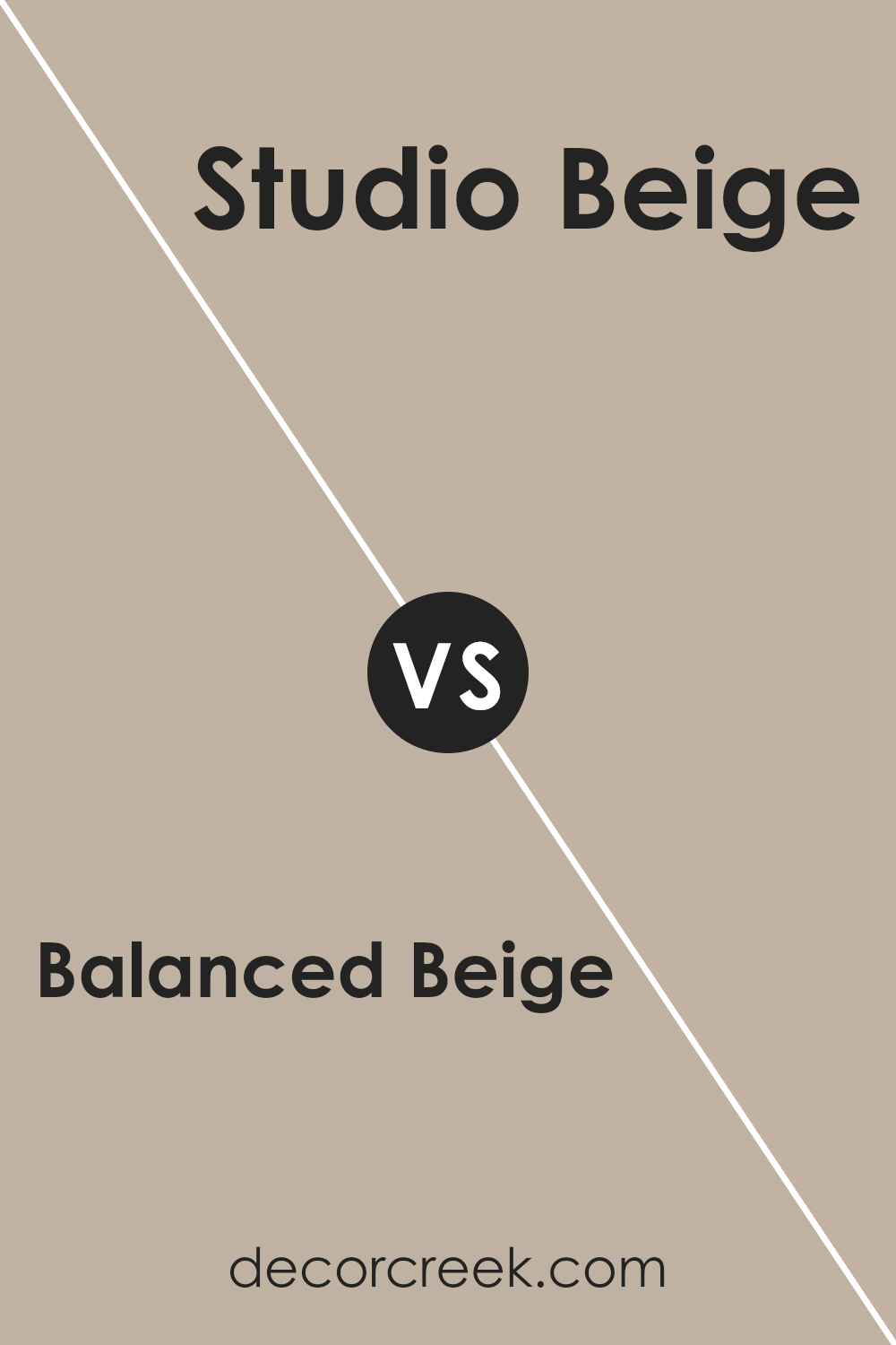
Balanced Beige SW 7037 by Sherwin Williams vs Studio Beige SW 9602 by Sherwin Williams
Balanced Beige is a warm, inviting neutral shade that offers a soft and cozy vibe to any room. It’s like a hug for your walls, creating a serene and comforting atmosphere. It pairs well with various colors, from bold and vibrant to soft and subtle, making it incredibly versatile for decorating schemes. On the other hand, Studio Beige takes a slightly different approach.
This color is deeper and richer, bringing a sense of sophistication and elegance. While it still maintains the warmth and neutrality of beige, it has a more pronounced presence, making it ideal for spaces where you want to add a bit of drama without overwhelming the senses.
Both shades are fantastic for creating inviting spaces, but the choice between Balanced Beige and Studio Beige depends on the mood you’re aiming for. Want a gentle, airy feel? Go for Balanced Beige. Looking for something with a bit more depth? Studio Beige is your pick.
You can see recommended paint color below:
- SW 9602 Studio Beige
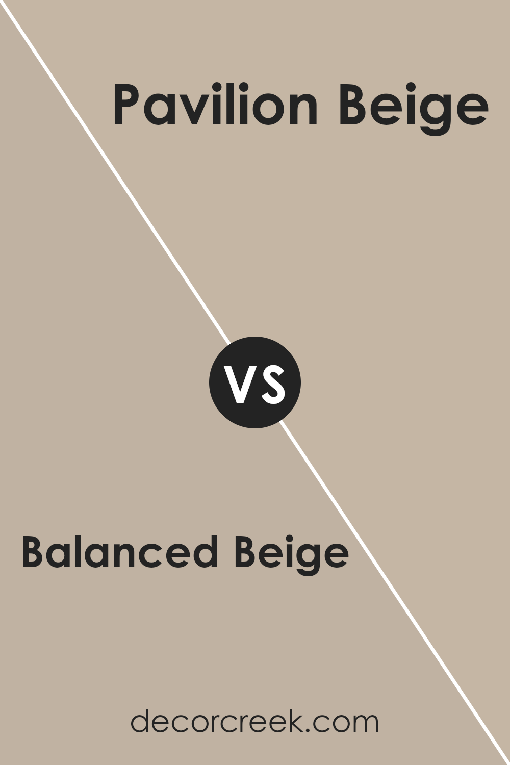
Balanced Beige SW 7037 by Sherwin Williams vs Pavilion Beige SW 7512 by Sherwin Williams
Balanced Beige and Pavilion Beige are two popular shades offered by Sherwin Williams. Balanced Beige is a warm and inviting color that can make any space feel cozy and welcoming. Its versatility allows it to adapt to various decorative styles and settings, making it a favorite for homeowners and interior designers alike.
On the other hand, Pavilion Beige leans slightly towards a lighter, more neutral tone, offering a subtle elegance that brightens rooms while maintaining warmth and comfort. This color is perfect for creating a serene and tranquil environment, helping to enhance natural light in spaces. Both colors share a beige base, but Balanced Beige carries a bit more depth, adding a sense of richness and sophistication to walls.
Whereas, Pavilion Beige offers a cleaner, crisper look that can make smaller spaces appear larger. In essence, while both colors are incredibly versatile and appealing, the choice between them depends on the desired mood and spatial effect: richer and cozier with Balanced Beige or airier and more luminous with Pavilion Beige.
You can see recommended paint color below:
- SW 7512 Pavilion Beige
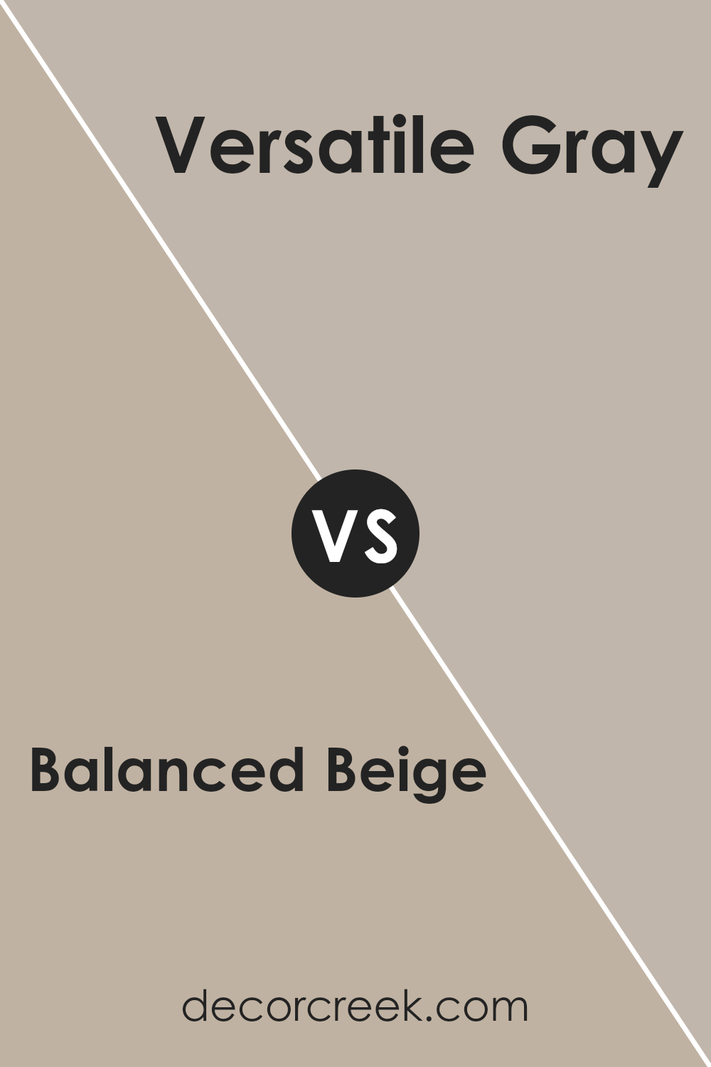
Balanced Beige SW 7037 by Sherwin Williams vs Versatile Gray SW 6072 by Sherwin Williams
Balanced Beige and Versatile Gray, both by Sherwin-Williams, are popular for adding a neutral, soothing touch to spaces. Balanced Beige is a warm, welcoming color with a hint of gray, creating a cozy vibe. It’s like the gentle embrace of a well-loved, sunlit room, perfect for areas where you want to unwind and relax.
On the other hand, Versatile Gray is a true neutral gray that offers a modern and subtle elegance. It lacks the warmth of Balanced Beige, leaning more towards a classic, understated look that works beautifully in spaces meant to be both calming and contemporary.
While Balanced Beige brings warmth and a sense of comfort to a room, Versatile Gray offers a sleek, more refined feel. Both colors work well in various lighting conditions, adapting subtly to different times of the day.
Whether you prefer the warm, inviting nature of Balanced Beige or the cool, sophisticated tone of Versatile Gray, each color offers its unique charm, making spaces feel just right.
You can see recommended paint color below:
- SW 6072 Versatile Gray
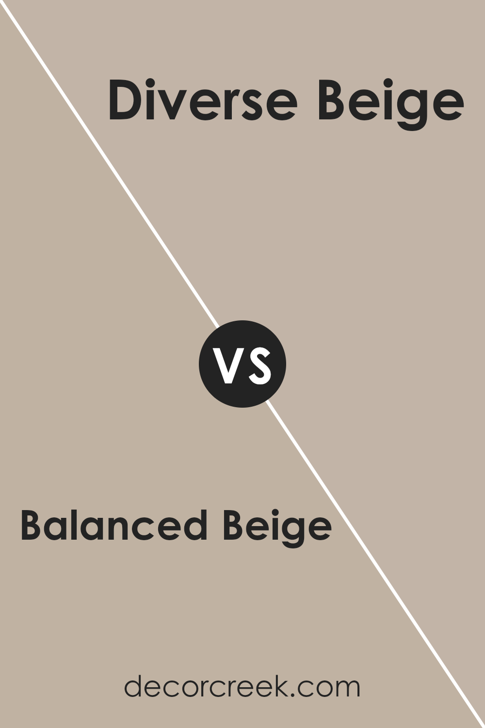
Balanced Beige SW 7037 by Sherwin Williams vs Diverse Beige SW 6079 by Sherwin Williams
Balanced Beige and Diverse Beige are both popular colors from Sherwin Williams, offering subtle yet distinct vibes for any room. Balanced Beige leans more towards a light to mid-tone beige with a soothing, neutral appeal. It’s the kind of color that feels effortlessly calm and can easily blend with various decor styles, making spaces feel warm and inviting without being overpowering.
On the other hand, Diverse Beige steps in with a slightly darker, richer tone. This color brings a bit more warmth and depth to the table, offering a cozy atmosphere that still maintains a neutral base. It’s excellent for adding a touch of elegance and sophistication to a room, providing a backdrop that complements both bold and soft furnishings.
Both colors serve as fantastic choices for those looking to create a serene and inviting environment. Whether you’re aiming for a subtle elegance or a cozy, welcoming vibe, Balanced Beige and Diverse Beige offer versatility while maintaining their unique characteristics.
You can see recommended paint color below:
- SW 6079 Diverse Beige
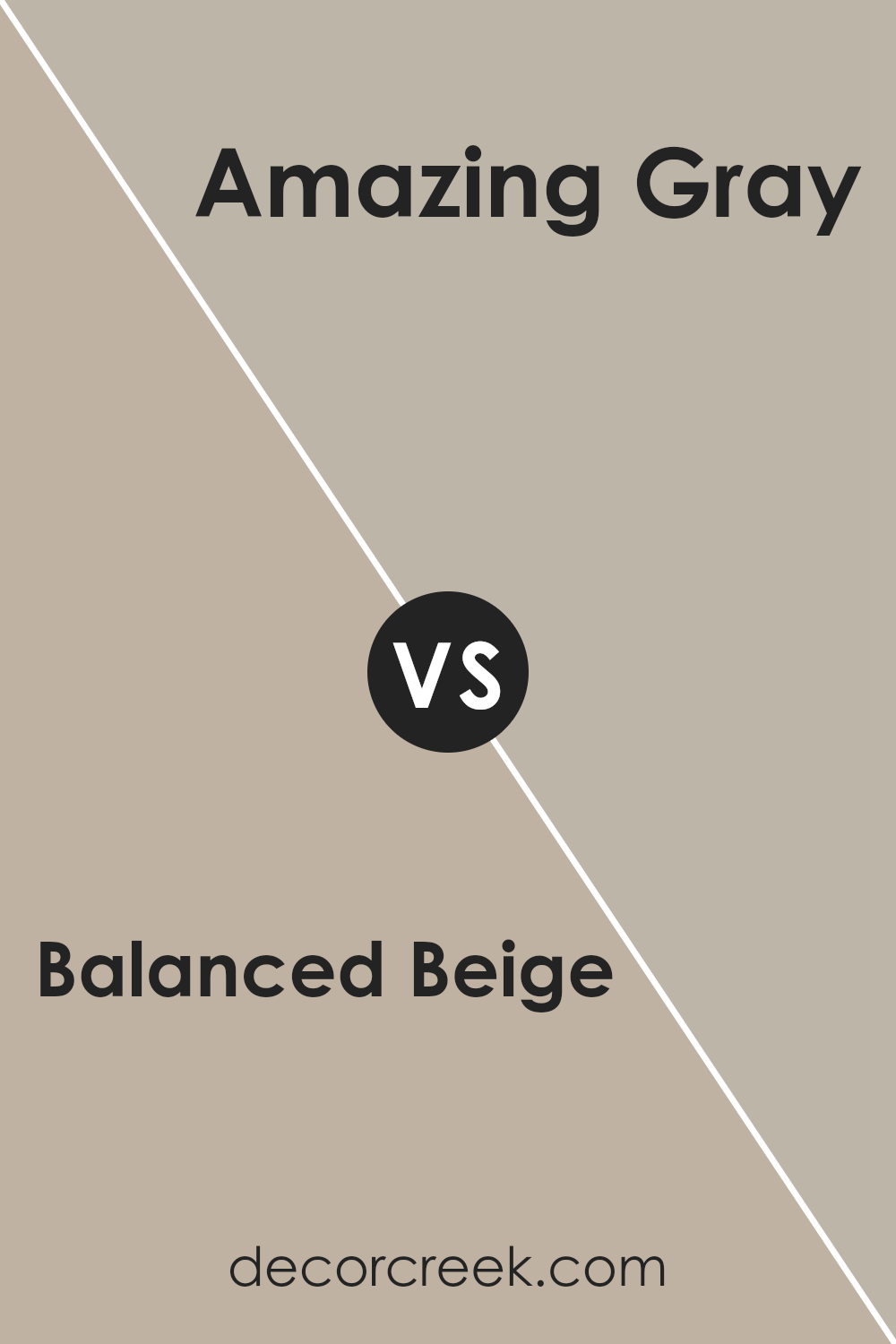
Balanced Beige SW 7037 by Sherwin Williams vs Amazing Gray SW 7044 by Sherwin Williams
Balanced Beige and Amazing Gray are two popular colors often chosen for their versatility in home design. Balanced Beige is a warm, inviting color that brings a cozy and comfortable feel to any room.
It’s a neutral shade that pairs well with a wide range of decor, making it a favorite for living areas and bedrooms. On the other hand, Amazing Gray leans towards a cooler tone, offering a sophisticated and modern look. Although it’s also neutral, it has the power to give spaces a more contemporary edge. This color works great in spaces where you want to add a touch of elegance without overwhelming the room.
When comparing these two, the main difference lies in their undertones and the atmosphere they create. Balanced Beige adds warmth to a room, making it feel more homely and welcoming, whereas Amazing Gray provides a chic and sleek ambiance, perfect for a more modern aesthetic.
Both colors are incredibly versatile and can enhance the overall appeal of a space when used thoughtfully.
You can see recommended paint color below:
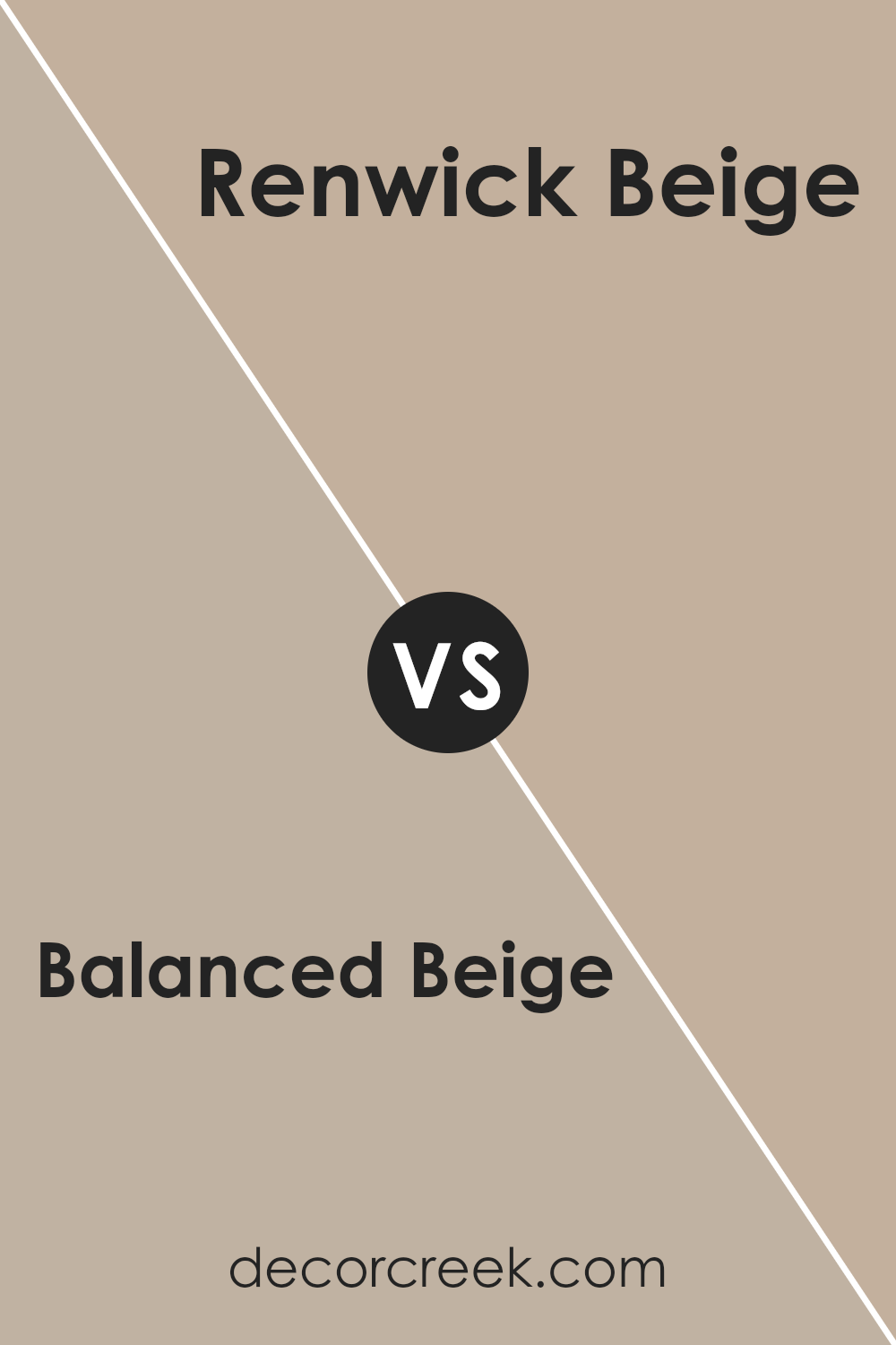
Balanced Beige SW 7037 by Sherwin Williams vs Renwick Beige SW 2805 by Sherwin Williams
Balanced Beige and Renwick Beige, both by Sherwin Williams, share a similar beige family, but each brings its unique vibe to a space. Balanced Beige is a lighter, softer hue, offering a more neutral backdrop that can effortlessly complement a wide range of decor styles and color schemes.
Its versatility makes it a great choice for creating a cozy, welcoming space without overwhelming it with color. On the other hand, Renwick Beige steps in with a slightly richer, deeper tone.
This color has more warmth, making rooms feel more enclosed and intimate. It’s excellent for adding a touch of elegance and depth, especially in spaces where you want to make a statement without going too bold. While both colors maintain the calmness and neutrality of beige, Balanced Beache’s lighter touch and Renwick Beige’s depth offer varied opportunities for setting the mood and style of a room.
You can see recommended paint color below:
- SW 2805 Renwick Beige
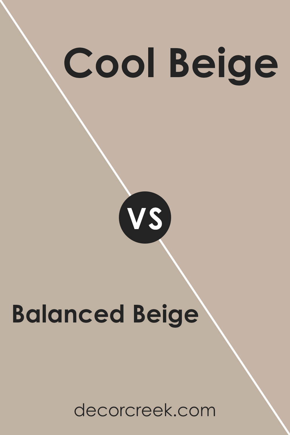
Balanced Beige SW 7037 by Sherwin Williams vs Cool Beige SW 9086 by Sherwin Williams
Balanced Beige and Cool Beige are two noteworthy paints, both offering unique tones to suit varied tastes and decor. Balanced Beige leans towards a warm, inviting hue, somewhat like a cozy blanket, offering comfort and a solid, neutral foundation for any room. It works well in spaces where you want to add warmth without overpowering the room with color.
On the flip side, Cool Beige presents a fresher, crisper shade. As its name suggests, it carries a cooler tone, reminiscent of sandy shores just before dawn. This makes it perfect for spaces that aim for a serene, calm atmosphere.
Cool Beige is the go-to for modern aesthetics, where its subtle chilliness can complement minimalist designs and brighter accents.
When compared, the warmth of Balanced contrasts beautifully with the chilled tone of Cool Beige, offering two distinct choices based on the ambiance you’re aiming to achieve. Balanced Beige infuses warmth and coziness, ideal for living and family rooms, while Cool Beige brings a serene, sophisticated vibe, excellent for bathrooms and kitchens. Each color serves its purpose, depending on the room’s character and the feeling you wish to convey.
You can see recommended paint color below:
- SW 9086 Cool Beige
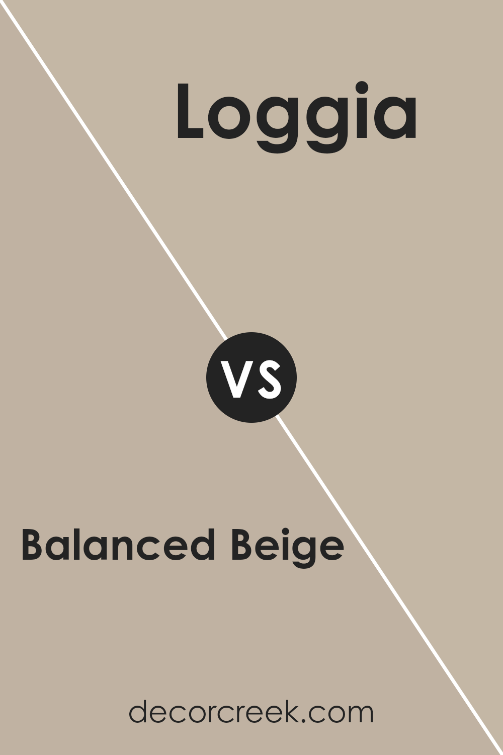
Balanced Beige SW 7037 by Sherwin Williams vs Loggia SW 7506 by Sherwin Williams
Balanced Beige and Loggia, both by Sherwin Williams, offer unique choices for those looking to add warmth and sophistication to their spaces. Balanced Beige sits on the lighter side, providing a soft, cozy backdrop that can make rooms feel more spacious and inviting. Its neutral tone makes it incredibly versatile, matching well with a variety of decor and furniture colors, making it a go-to for a classic, understated elegance.
On the other hand, Loggia steps in with a slightly deeper tone, offering a richer, earthier quality. This color brings a hint more drama and warmth, creating an intimate atmosphere that’s perfect for gathering spaces or bedrooms. It pairs beautifully with natural materials like wood and leather, adding depth and character to the space.
When deciding between the two, consider the mood you’re aiming to achieve and the lighting in your room. Balanced Beige brightens up spaces and gives an airy feel, while Loggia provides a snug, comforting embrace without feeling too heavy. Both colors stand out for their ability to blend seamlessly into various styles, from modern to classic, making them excellent choices for creating a harmonious home environment.
You can see recommended paint color below:
- SW 7506 Loggia
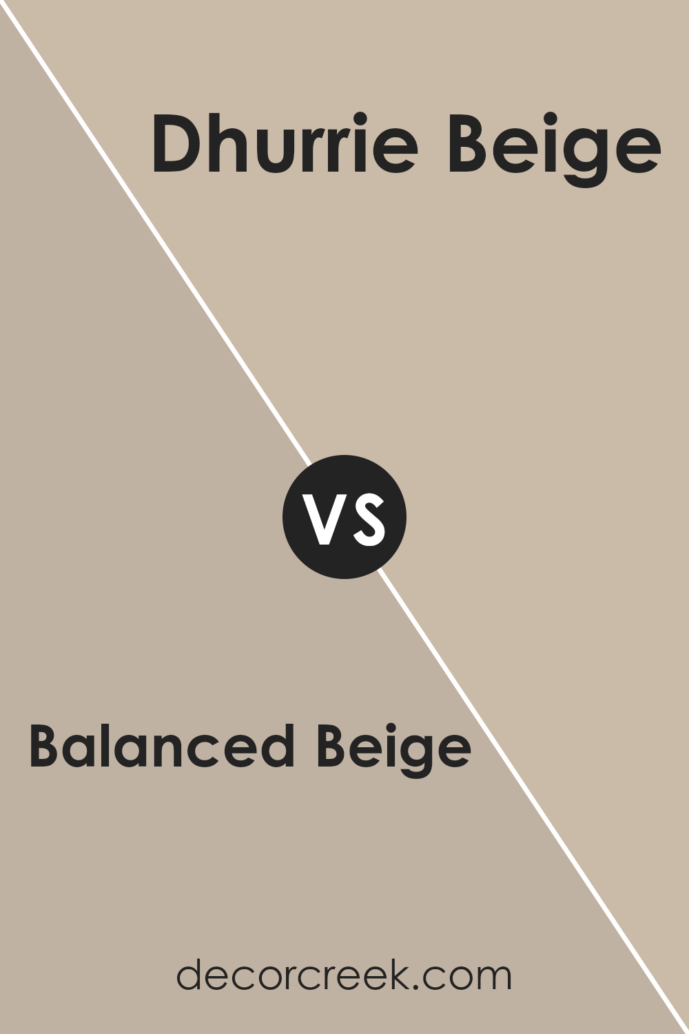
Balanced Beige SW 7037 by Sherwin Williams vs Dhurrie Beige SW 7524 by Sherwin Williams
Balanced Beige and Dhurrie Beige both come from Sherwin Williams, offering unique vibes for spaces. Balanced Beige stands out as a warmer tone, giving rooms a cozy and inviting feel. It’s like a soft hug for your walls, making spaces feel more like home. This color works well in places where you want to chill and relax, such as living rooms or bedrooms.
On the other hand, Dhurrie Beige leans toward a cooler palette. It’s lighter, bringing a fresh and airy feel to any room. Think of Dhurrie Beige as a breath of fresh air, perfect for spaces that need a touch of brightness without overwhelming the senses.
It’s great for smaller spaces or rooms that get less natural light, as it can help make them appear bigger and more welcoming.
Both colors are versatile and can blend well with different decors and themes, but their unique undertones set them apart, offering distinct atmospheres depending on what you’re going for.
You can see recommended paint color below:
- SW 7524 Dhurrie Beige
Conclusion
Balanced Beige by Sherwin Williams stands as a versatile and welcoming shade of beige that brings warmth and subtlety to any room. Its unique quality lies in its ability to create a cozy atmosphere while also maintaining a sense of elegance and simplicity.
This particular color works well in a variety of settings, adapting to both modern and traditional decors, and it can easily be paired with a wide range of color schemes. It’s a perfect choice for those looking to add a touch of sophistication without overwhelming a space with color.
Furthermore, Balanced Beige’s adaptability makes it a favorite among homeowners and interior designers alike. Whether it’s applied in a living room, bedroom, or bathroom, it provides a solid foundation that complements furnishings and accents of all types.
This color not only enhances the aesthetic appeal of a home but also contributes to creating a serene and inviting environment. It’s an excellent option for anyone seeking to update their space with a timeless and neutral color that has the potential to transform any area into a more beautiful and harmonious space.

Ever wished paint sampling was as easy as sticking a sticker? Guess what? Now it is! Discover Samplize's unique Peel & Stick samples.
Get paint samples
