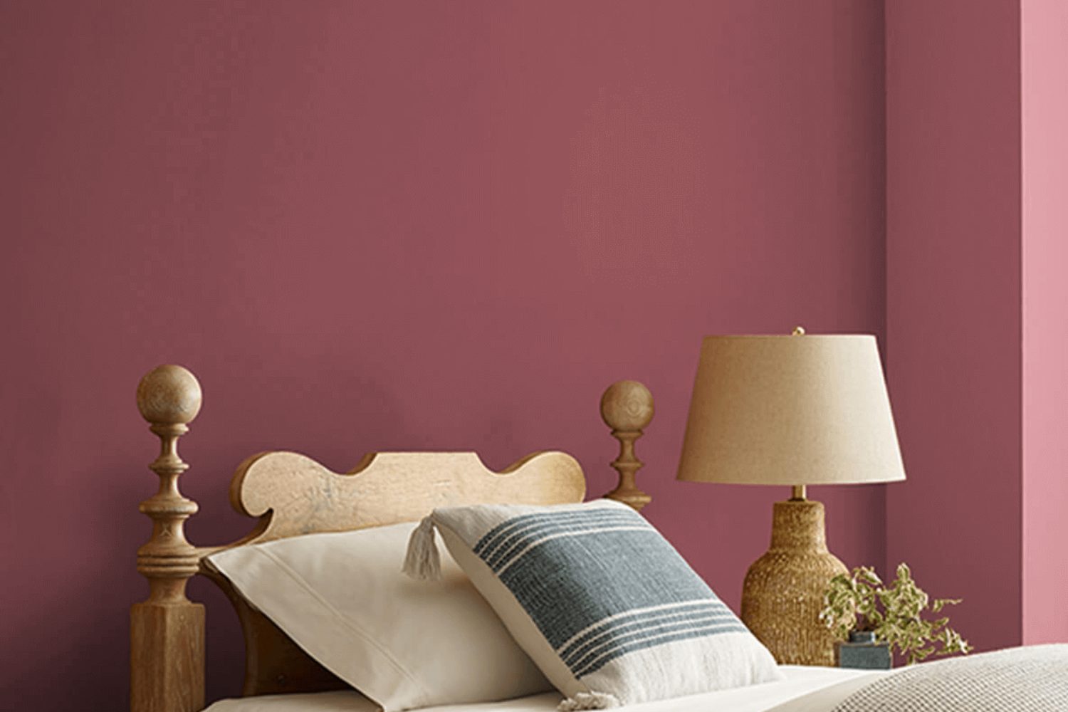
Embarking on a journey to freshen up your living space? Look no further than SW 6306 Cordial by Sherwin Williams, a paint shade that brings a warm and inviting tone to any room. This color, a soft yet rich hue, serves as a versatile backdrop for both modern and traditional interiors. It seamlessly blends with a variety of decor styles and adds a touch of elegance without overpowering the space.
SW 6306 Cordial is not just another shade of pink. Its unique blend offers a hint of sophistication that can enhance the coziness of bedrooms, living rooms, or even dining areas. Whether you’re aiming for a subtle change or planning to transform your entire home, this color provides a solid foundation that works well with different color schemes and furniture styles.
Furthermore, Sherwin Williams paints are known for their quality and durability, ensuring that your chosen color stays vibrant and true for years to come. Opting for SW 6306 Cordial not only means choosing a beautiful color but also investing in the long-lasting appeal of your home’s interior.
Considering its versatility and timeless charm, SW 6306 Cordial by Sherwin Williams is a perfect choice for anyone looking to add a warm and welcoming atmosphere to their home.
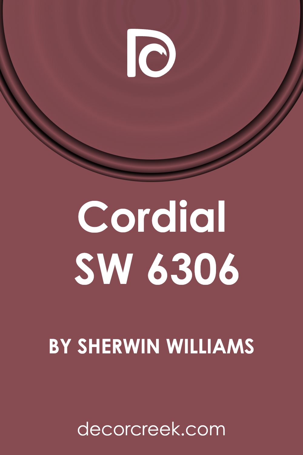
What Color Is Cordial SW 6306 by Sherwin Williams?
Cordial by Sherwin Williams is a color that adds warmth and depth to any space. It’s a rich hue, like a cozy blanket on a chilly evening. Imagine the vibrant warmth of a setting sun or the comforting embrace of a terracotta pot, this color beautifully captures those moments. Its earthy tones make it versatile for various interior styles, truly shining in spaces aiming for a welcoming, homely vibe.
When considering interior designs, Cordial works wonders in rustic, bohemian, or even modern settings that celebrate boldness and warmth. This color has the unique ability to make large rooms feel cozier and small spaces appear more inviting. It lends itself beautifully to rooms that seek to encourage comfort and conversation, like living rooms or dining areas.
Pairing materials and textures with Cordial can elevate a room’s aesthetic significantly. Natural wood, whether dark or light, complements its earthy nature, bringing out the richness of the color. Textiles in linen or cotton, especially in neutral tones like cream or soft beige, create a subtle contrast that enhances the warmth of Cordial. For a bit of luxury, a splash of metallic accents, such as brass or gold, can add a sophisticated touch. With Cordial as a backdrop, these combinations create a layered and textured interior that’s both inviting and stylish.
Is Cordial SW 6306 by Sherwin Williams Warm or Cool color?
CordialSW 6306 by Sherwin Williams is a color that can truly transform a home. At its core, it’s a rich, welcoming hue that blends warmth and elegance. Think of a cozy evening at home or the gentle touch of a sunny afternoon; that’s the feeling this color brings into a space. It’s versatile, working well in various rooms, from the living room to the bedroom, adding depth and comfort wherever it’s applied.
What’s really interesting about CordialSW 6306 is how it adapts to different lighting and complements other colors. In bright sunlight, it has a lively, vibrant quality, while under softer light, it can create a more intimate and snug atmosphere. This makes it a fantastic choice for anyone looking to add a touch of sophistication without overwhelming a room with too much intensity.
Moreover, CordialSW 6306 has the unique ability to match with a wide range of decor styles. Whether your home is modern, traditional, or somewhere in between, this color adds a beautiful backdrop that enhances furnishings and accessories. It’s this adaptability that makes it not just a color, but a smart choice for creating a space that feels both stylish and inviting.
Undertones of Cordial SW 6306 by Sherwin Williams
CordialSW 6306 by Sherwin Williams is a rich, vibrant color with a complex mix of undertones. These undertones include purple, olive, grey, red, pink, orange, pale pink, dark grey, navy, dark green, and dark turquoise. Each of these undertones contributes to the way the color appears under different lighting conditions and in various settings. Understanding these undertones can help in choosing the right color scheme for your space.
Undertones affect our perception of color because they subtly influence the main hue. For instance, in natural light, the purple and pink undertones of CordialSW 6306 might give it a softer, warmer appearance, making it feel inviting. The grey and dark grey undertones could provide a more grounded, neutral base, allowing the color to blend with a variety of decor styles. In contrast, olive and dark green undertones emphasize a connection to nature, which could bring a sense of calmness to a room.
When applied to interior walls, CordialSW 6306’s rich spectrum of undertones allows it to adapt beautifully to different spaces and lighting conditions. The red and orange undertones can add a cozy warmth to a living room, while the navy and dark turquoise could give a depth that enriches the space. This adaptability makes CordialSW 6306 a versatile choice for your home, as it can enhance the mood and style of a room while also pulling together diverse elements of your decor.
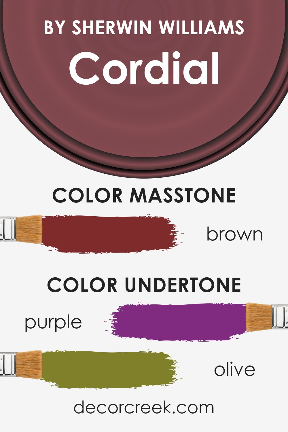
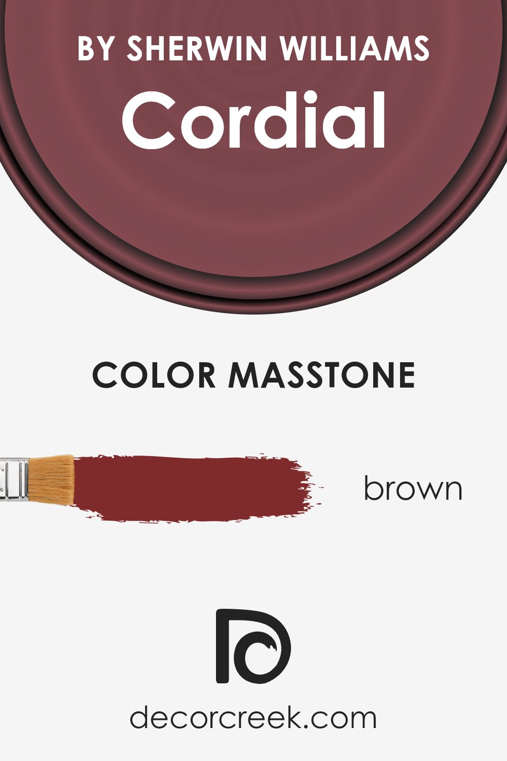
What is the Masstone of the Cordial SW 6306 by Sherwin Williams?
CordialSW 6306 by Sherwin Williams has a masstone that can be described as a rich Brown, specifically noted as #802B2B. This distinctive shade of brown offers a warm and inviting feel to any room it’s applied in. Its unique hue can create a cozy atmosphere, making spaces feel more intimate and welcoming. The masstone’s depth allows it to work beautifully in homes, especially in areas where a sense of comfort is desired, such as living rooms or bedrooms. This color can also serve as an excellent backdrop for various decor styles, from rustic to modern, enhancing textures and furnishings with its earthy underpinning. Its versatility means it can seamlessly blend with other colors, from soft neutrals to more vibrant tones, providing flexibility in design choices. The warmth of this brown can also help to visually shrink large, open spaces, making them feel more connected and personal.
How Does Lighting Affect Cordial SW 6306 by Sherwin Williams?
Lighting plays a crucial role in how we perceive colors. The same paint can look different depending on whether a room is lit by natural sunlight or artificial light. This is important to bear in mind when picking out paint colors, like the Sherwin Williams Cordial, for your home.
In artificial light, the color’s true tone can change depending on the type of bulb used. LED or fluorescent lighting can either bring out the warmth in the color or make it appear cooler than it actually is. For a color like Cordial, which has its own unique depth, artificial light can enhance its richness, making it appear more vibrant and inviting, especially in spaces where natural light isn’t as abundant.
In contrast, natural light showcases this color in its purest form. How it looks can vary significantly throughout the day and depends greatly on the direction the room faces.
- North-facing rooms tend to have cooler, more consistent light, which can make a color like Cordial appear more muted and subdued. It won’t lose its appeal but will have a softer look.
- South-facing rooms bathe in warm, bright sunlight for most of the day, which can make the color come alive and appear warmer and more dynamic. This direction benefits the warm undertones, making spaces feel cozy and welcoming.
- East-facing rooms get bright morning light, making colors look brighter and fresher in the morning, with the light becoming cooler as the day goes on. Cordial can have a bright, cheery look in the morning, transitioning to a more balanced tone in the afternoon.
- West-facing rooms receive intense evening light, which can enhance the warmth of the color, making it appear richer and more intense during sunset. Throughout the day, the color may appear more neutral, gaining warmth and depth in the late afternoon and early evening.
Understanding how lighting affects colors like Cordial is key to utilizing them effectively in your space, ensuring the hues look perfect under any lighting condition.
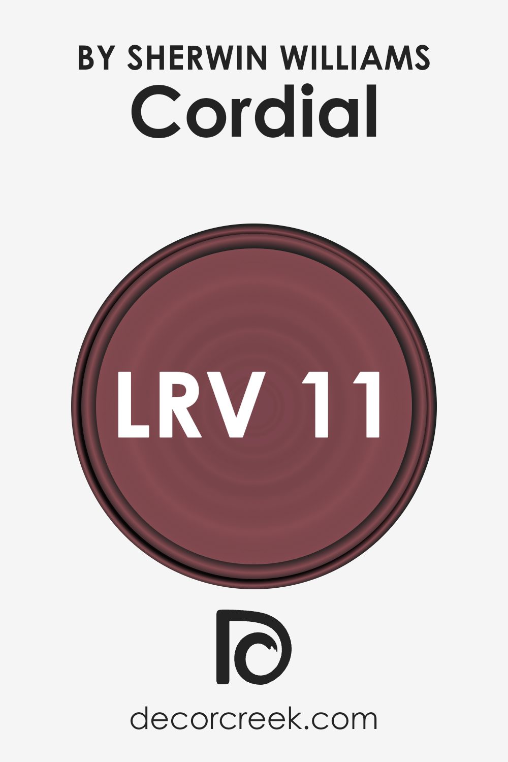
What is the LRV of Cordial SW 6306 by Sherwin Williams?
LRV stands for Light Reflectance Value, which is a measure of the amount of visible and usable light that a color reflects or absorbs. When paint is applied to walls, the LRV scale, which goes from 0 to 100, becomes quite useful. A color with an LRV of 0 would be pure black, absorbing all light, while a color with an LRV of 100 would reflect all light, appearing pure white. This value affects not only how bright or dark a color looks on the wall but also how it can make a room feel. Lighter colors, with higher LRVs, can make spaces feel more open and airy, while darker colors, with lower LRVs, can create a sense of warmth and coziness but may also make a room appear smaller.
With an LRV of 10.821, the color in question is on the darker side, meaning it reflects a small portion of light and absorbs much of it. In practical terms, when applied to walls, it will significantly darken a space, making it important to consider the room’s lighting. This darkness can add depth and richness to a room, providing a strong backdrop for decor. However, because it reflects a minimal amount of light, using it in a smaller or poorly lit space could potentially make the area feel more enclosed. Balancing it with lighter colors, either in decor or in adjacent rooms, can help mitigate this effect and allow the deep, rich qualities of the color to stand out without overwhelming the space.
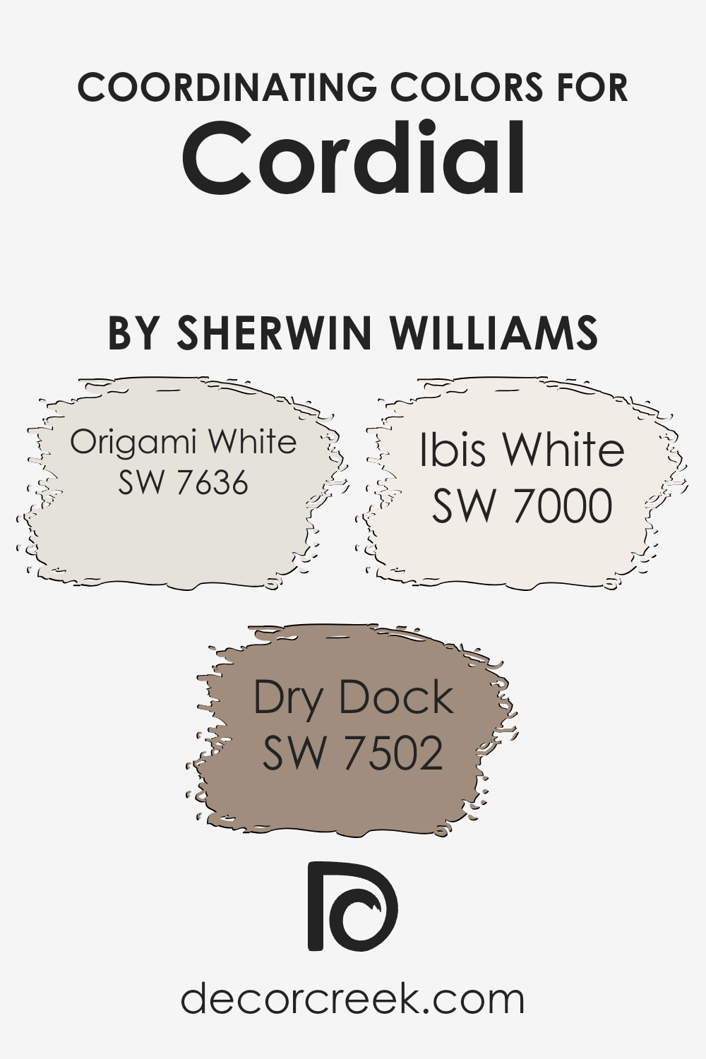
Coordinating Colors of Cordial SW 6306 by Sherwin Williams
Coordinating colors are hues that harmonize well together, enhancing the overall aesthetic of a space. They work by balancing each other out, whether through contrasting shades or complementing tones, creating a cohesive look. For the warm and inviting tone of a base color like Cordial by Sherwin Williams, selecting the right coordinating colors is key to achieving a unified design.
Origami White SW 7636 is a soft, warm white that brings a serene and clean backdrop to the richness of Cordial. Its subtle warmth ensures the space feels welcoming without overpowering the senses, perfect for creating a light and airy ambiance. Dry Dock SW 7502, on the other hand, introduces a deeper, taupe-like earthiness that grounds the color scheme. This mid-tone provides a solid foundation that contrasts beautifully with the lighter Origami White and enriches the space with a sense of sophistication and warmth.
Completing the palette, Ibis White SW 7000 offers a slightly cooler, crisp white. It acts as a refreshing counterbalance to the warmth of Cordial, adding brightness and a sense of spaciousness. Together, these colors create a harmonious blend, each playing a crucial role in enhancing the beauty and cohesiveness of your decor.
You can see recommended paint colors below:
- SW 7636 Origami White
- SW 7502 Dry Dock
- SW 7000 Ibis White
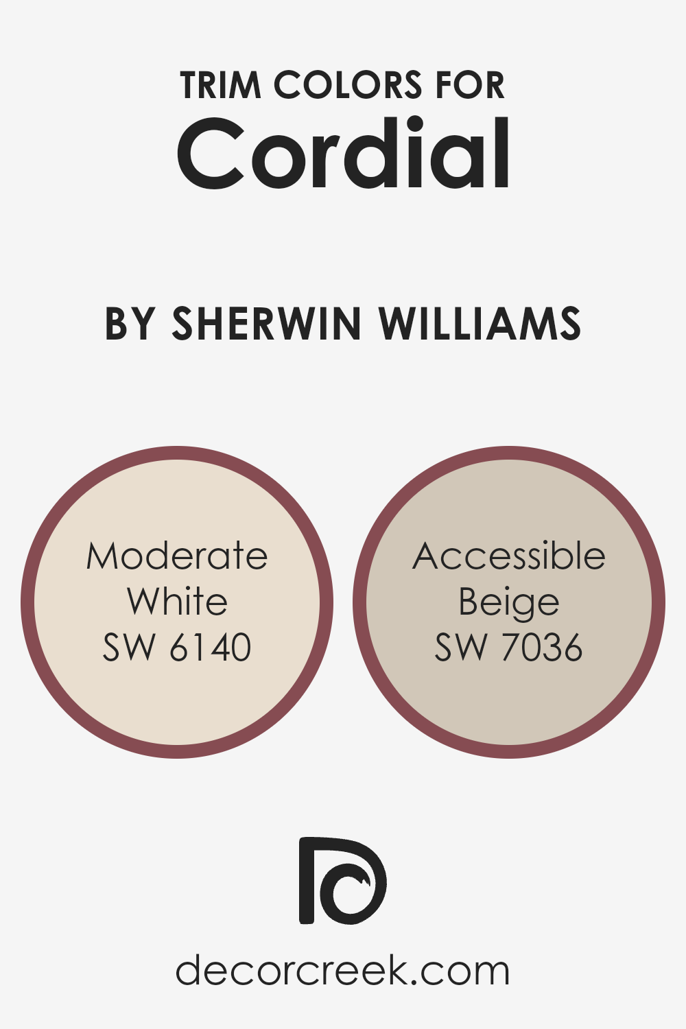
What are the Trim colors of Cordial SW 6306 by Sherwin Williams?
Trim colors refer to the hues selected for the architectural details and trims of a room or exterior, such as door frames, window casings, skirting boards, and crown moldings. They play a crucial role in defining and enhancing the overall aesthetic of a space. When paired with Cordial by Sherwin Williams, a warm and welcoming hue, trim colors can either complement or contrast this base color to create a desired effect. For example, using a trim color that’s lighter or of a muted tone can highlight the richness of Cordial, providing a sophisticated and cohesive look. Similarly, the right trim color can also serve to frame the space attractively, making architectural details pop and giving the room a polished finish.
Moderate White SW 6140 and Accessible Beige SW 7036 are two colors that work exceptionally well as trim colors with Cordial. Moderate White is a soft, warm white with just a hint of underlying beige, making it a versatile choice that brings a subtle, airy brightness to the room without overpowering the warmth of Cordial. It’s like a gentle whisper along the edges of a room, offering a soft transition between the walls and the trim.
On the other hand, Accessible Beige is a light beige that leans towards the neutral spectrum, offering a serene and grounding effect. It blends beautifully as a trim color, creating a seamless look that enhances the depth and character of Cordial, lending an understated elegance and a sense of calm to the space. Both colors support and enrich the ambiance set by Cordial, ensuring the room feels thoughtfully designed and visually cohesive.
You can see recommended paint colors below:
- SW 6140 Moderate White
- SW 7036 Accessible Beige
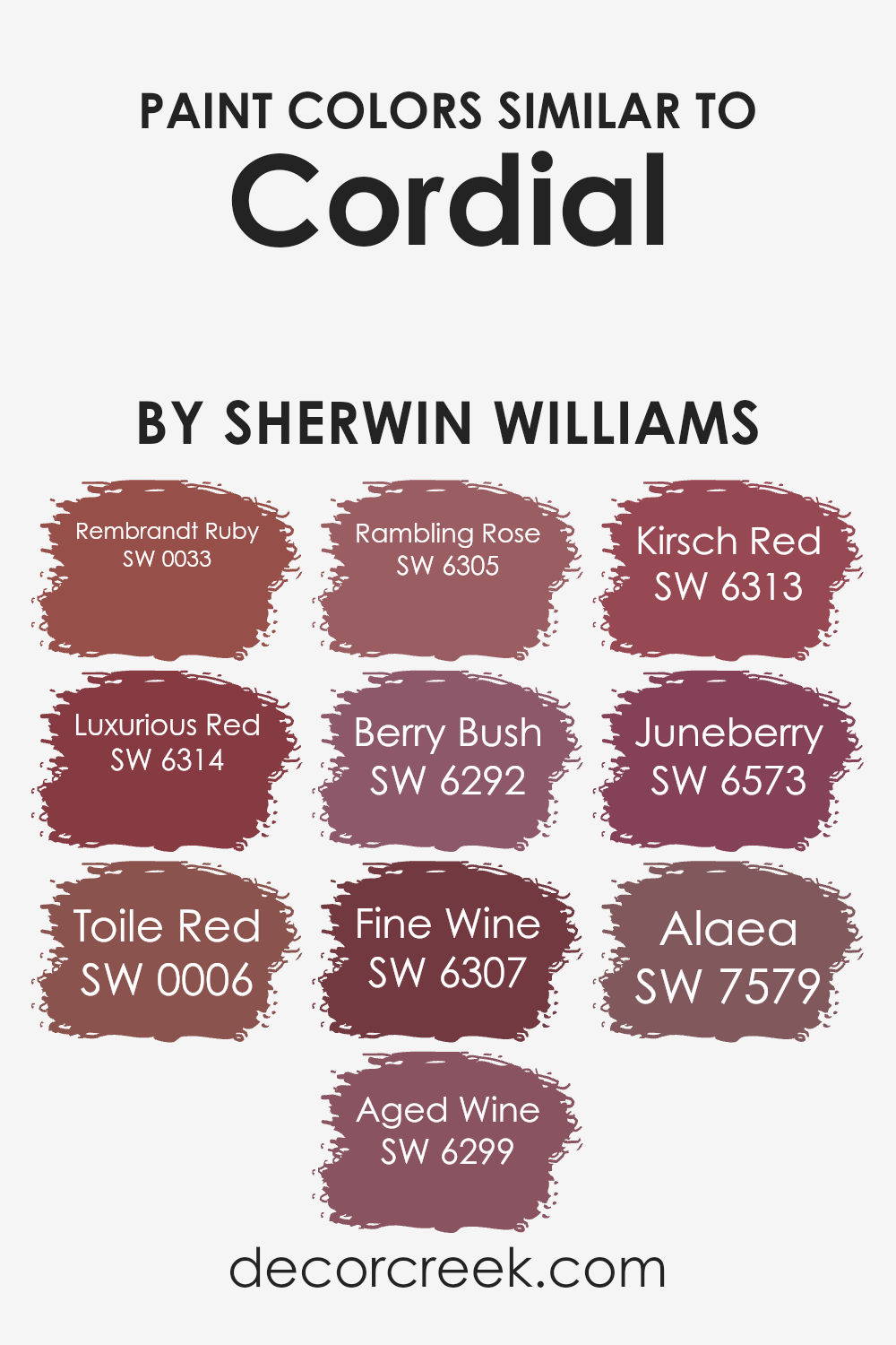
Colors Similar to Cordial SW 6306 by Sherwin Williams
Identifying similar colors to a base hue, such as Cordial by Sherwin Williams, is vital because it allows for creating a harmonious and visually appealing palette within a space. These similar colors, ranging from dusky reds to rich, deep wine shades, are instrumental in establishing a cohesive look that can either soothe or invigorate a room, depending on the chosen intensity and combination. They work by subtly varying in saturation and brightness, providing depth and complexity to interiors without overwhelming the senses. This nuanced approach to color selection ensures that each hue, while distinct, shares a common thread that ties the visual experience together seamlessly.
For instance, Rembrandt Ruby has a deep, classic elegance, reminiscent of ancient masterpieces, while Luxurious Red boasts a boldness that can bring warmth and energy into a space. Toile Red offers a slightly muted, vintage appeal, creating a sophisticated backdrop. Aged Wine, as its name suggests, has an aged depth that adds character and richness. Rambling Rose exudes a soft, floral elegance perfect for creating a serene atmosphere.
Berry Bush has a subtle hint of purple, giving it a unique twist on traditional reds. Fine Wine, sophisticated and complex, can transform a space into a refined setting. Kirsch Red has a vibrant, cherry-like hue that injects liveliness. Juneberry is playful and spirited, adding a pop of fun color, and Alaea, with its earthy, natural tones, grounds a palette with its understated beauty. Together, these colors form a versatile palette that can cater to various design needs, from creating an intimate and cozy nook to designing a lively and energetic gathering space.
You can see recommended paint colors below:
- SW 0033 Rembrandt Ruby
- SW 6314 Luxurious Red
- SW 0006 Toile Red
- SW 6299 Aged Wine
- SW 6305 Rambling Rose
- SW 6292 Berry Bush
- SW 6307 Fine Wine
- SW 6313 Kirsch Red
- SW 6573 Juneberry
- SW 7579 Alaea
Colors that Go With Cordial SW 6306 by Sherwin Williams
Pairing colors with Cordial SW 6306 by Sherwin Williams is crucial because it sets the tone and atmosphere of a space, ensuring that the colors harmonize to create a welcoming and cohesive look. The right combination can enhance the aesthetic appeal and boost the mood of any room. Colors like SW 6305 – Rambling Rose, SW 6303 – Rose Colored, SW 6302 – Innocence, SW 6307 – Fine Wine, SW 9002 – Carley’s Rose, and SW 6304 – Pressed Flower work exceptionally well with Cordial SW 6306, providing a range of options from soft and subtle to bold and dramatic.
Rambling Rose offers a richer, deeper tone that brings warmth and sophistication. It contrasts beautifully against the lighter Cordial, adding depth and interest. Rose Colored is a softer, more understated hue that complements Cordial, creating a sense of harmony and balance within a space. Innocence has a gentle, whisper-soft quality that brightens and enlarges a room when paired with Cordial, making it feel more open and airy.
For a bold statement, Fine Wine adds a luxurious, intense pop of color that stands out against the more muted Cordial, giving a room a focal point. Carley’s Rose, slightly more vibrant and energetic, injects life and personality into spaces, working well with Cordial for a lively yet elegant look. Pressed Flower, with its earthy, muted qualities, grounds the pairing, bringing a natural, calming element to the overall palette. Together, these colors create a versatile and inviting space that feels both coordinated and effortlessly stylish.
You can see recommended paint colors below:
- SW 6305 Rambling Rose
- SW 6303 Rose Colored
- SW 6302 Innocence
- SW 6307 Fine Wine
- SW 9002 Carley’s Rose
- SW 6304 Pressed Flower

How to Use Cordial SW 6306 by Sherwin Williams In Your Home?
Cordial SW 6306 by Sherwin Williams is a lovely paint color that brings warmth and coziness to any room in a house. This color has a gentle, inviting vibe, making it perfect for spaces where you spend a lot of time with family or friends. Think about using it in your living room or dining area to create a welcoming atmosphere. Because it’s a versatile shade, it pairs well with both light and dark furnishings, offering flexibility in your decor choices.
For bedrooms, Cordial adds a touch of calm and sophistication, helping to create a peaceful retreat for rest and relaxation. In smaller spaces like bathrooms or hallways, this color can add depth without making the space feel cramped or too dark.
If you’re someone who loves a bit of creativity, you can also use it as an accent wall to highlight a particular area of a room, like behind your bed or a seating area. This approach draws the eye and adds interest to your space. Overall, Cordial is a fantastic choice for anyone looking to add warmth and personality to their home.
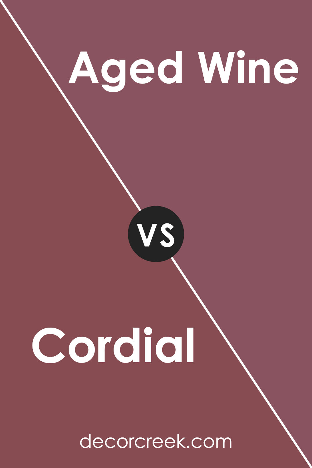
Cordial SW 6306 by Sherwin Williams vs Aged Wine SW 6299 by Sherwin Williams
Cordial and Aged Wine, both by Sherwin Williams, offer distinct vibes when it comes to choosing paint colors. Cordial swings towards a lighter, more playful pinkish hue. It’s the kind of color you might pick to create a welcoming and soft atmosphere in a room, perfect for spaces aiming for a gentle and calming feel. On the flip side, Aged Wine dives into a much deeper, richer realm. This color boasts a dark, berry-inspired tone that brings a sense of sophistication and depth to any space.
While Cordial feels airy and cheerful, Aged Wine introduces a layer of elegance and seriousness, making it a go-to for areas where you want to make a statement or add some dramatic flair. Despite their differences, both colors share a warmth that can make a room feel cozy and inviting in their own unique ways.
You can see recommended paint color below:
- SW 6299 Aged Wine
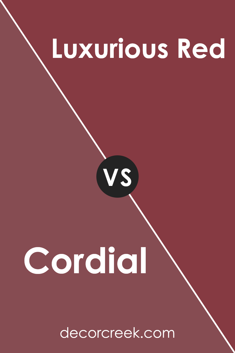
Cordial SW 6306 by Sherwin Williams vs Luxurious Red SW 6314 by Sherwin Williams
Alright, comparing “Cordial” and “Luxurious Red” from Sherwin Williams, both colors bring a warm and cozy touch to any space, but they have their unique shades that set them apart. Cordial is a soft, muted pink with a touch of warmth that makes it inviting and soothing. It’s perfect for creating a gentle, relaxed atmosphere. On the other hand, Luxurious Red is a deeper, richer red with an elegance that makes it stand out. This color can add a bold statement to a room, making it feel more luxurious and lively.
While Cordial leans towards a lighter, more subtle ambiance, Luxurious Red brings intensity and drama, offering a strong visual impact. Both colors work great for adding personality to your interiors, but your choice depends on the mood you wish to create—Cordial for a softer, comforting feel and Luxurious Red for a more sumptuous and vibrant vibe.
You can see recommended paint color below:
- SW 6314 Luxurious Red
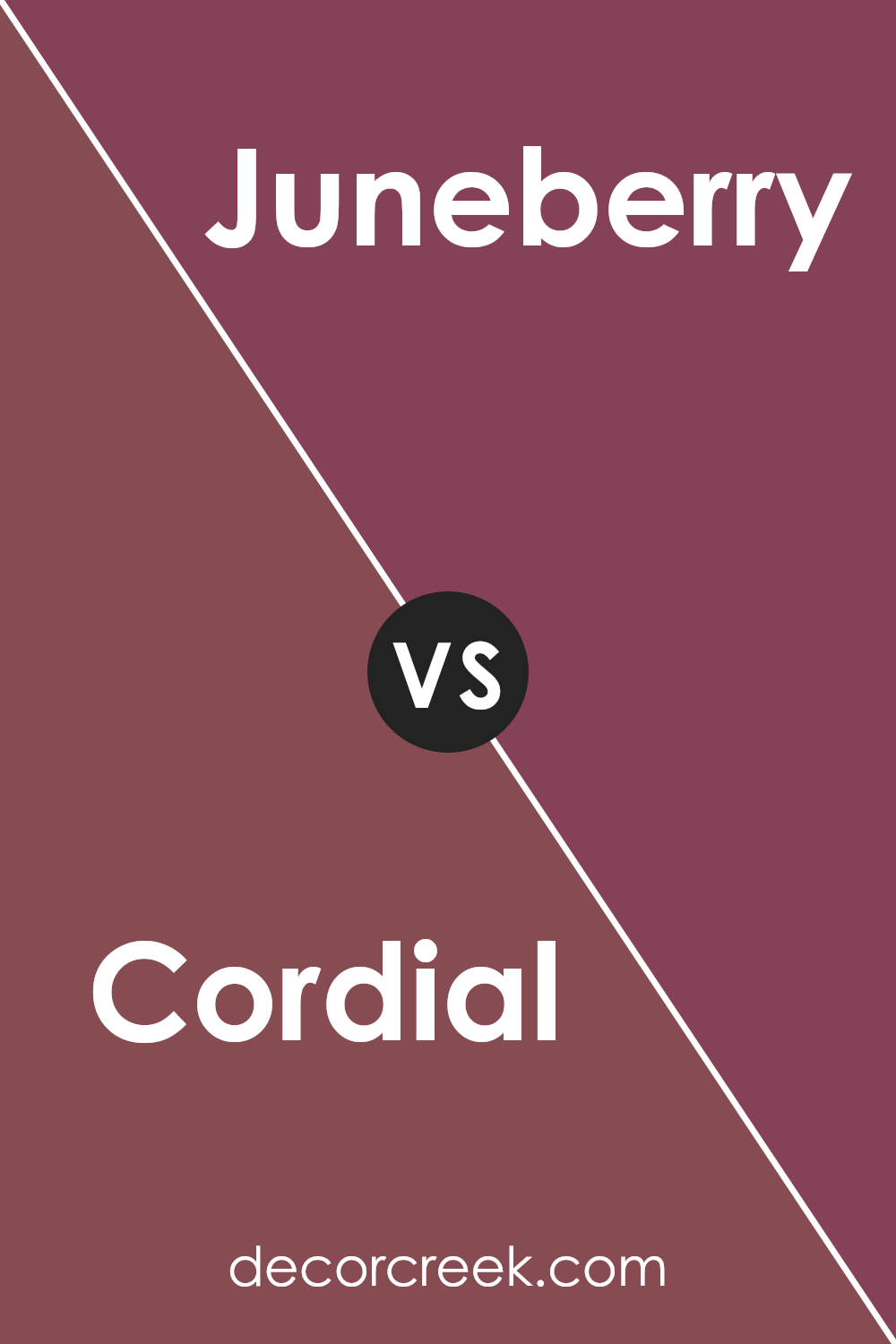
Cordial SW 6306 by Sherwin Williams vs Juneberry SW 6573 by Sherwin Williams
Cordial is a color that’s like a cozy, warm hug. Think of a light brown with a touch of purple, making it a unique and soft shade. It’s the kind of color you might see in a comfy, inviting living room. Now, if you switch gears and look at Juneberry, you’re entering a vibrant world. Juneberry is not shy at all; it’s a bold reddish-purple that grabs your attention. You can imagine this color making a statement on a bedroom wall or in decorative pillows.
When you put Cordial and Juneberry side by side, they tell two different stories. Cordial whispers comfort and calmness, making spaces feel secure and snug. On the other hand, Juneberry speaks loudly, injecting energy and drama into any spot it touches. Despite their differences, both colors have their charm, one soothing and the other exciting, offering a wide range of possibilities for decorating and styling spaces.
You can see recommended paint color below:
- SW 6573 Juneberry
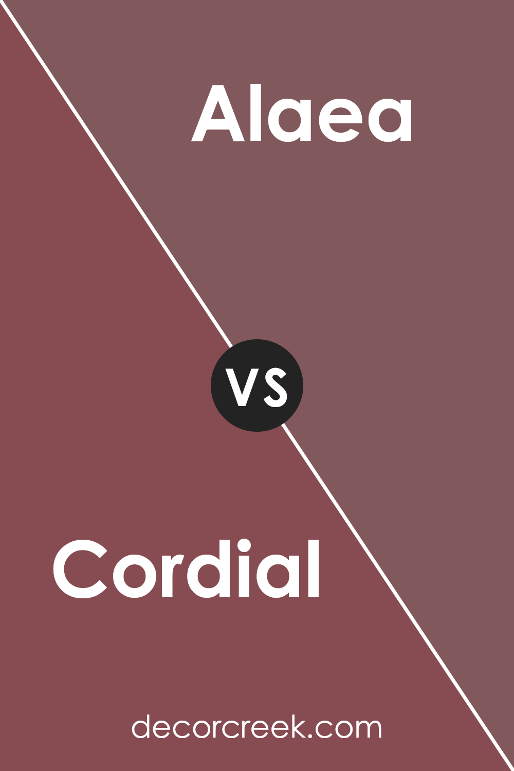
Cordial SW 6306 by Sherwin Williams vs Alaea SW 7579 by Sherwin Williams
Cordial and Alaea are two distinct colors by Sherwin Williams that offer unique vibes for any space. Cordial is a deep, rich purple that brings a sense of sophistication and luxury. It has a velvety quality to it, making it perfect for creating a cozy and inviting atmosphere. On the other hand, Alaea is a warm, earthy red with hints of terracotta. It exudes a natural and comforting feel, ideal for spaces where you want to add warmth and a welcoming touch.
While Cordial leans towards a more elegant and refined look, Alaea offers a grounded and soothing effect. Both colors have their charm and can significantly affect the mood and style of a room. Depending on the ambiance you’re aiming for, Cordial might be the choice for a more dramatic and luxurious space, whereas Alaea could be the go-to for a cozy, earthy, and calming environment.
You can see recommended paint color below:
- SW 7579 Alaea
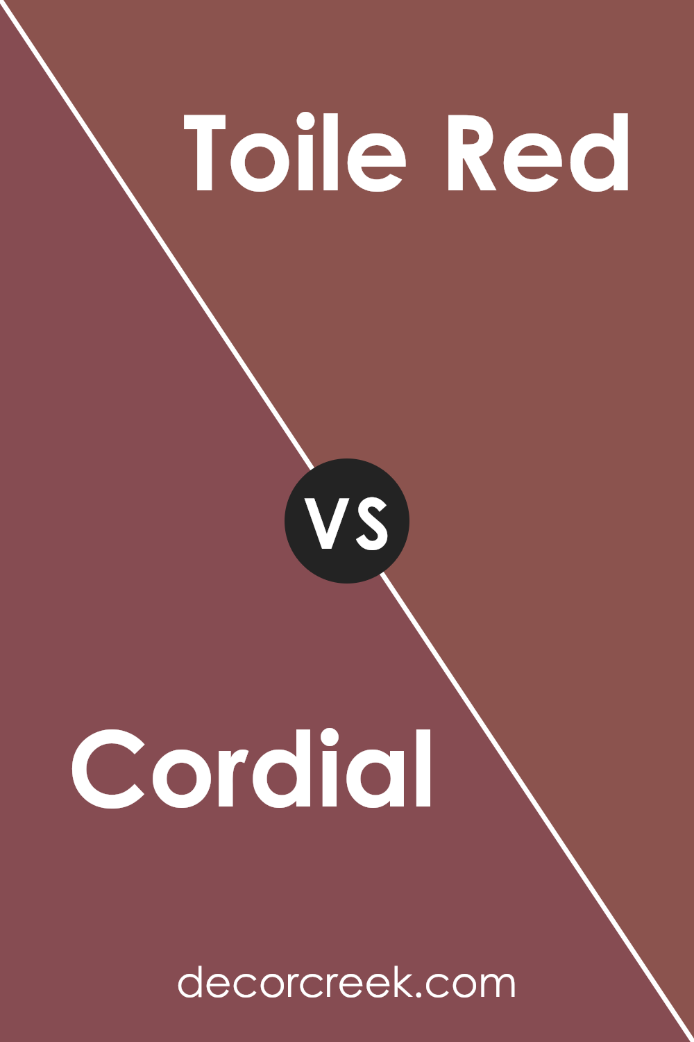
Cordial SW 6306 by Sherwin Williams vs Toile Red SW 0006 by Sherwin Williams
Cordial by Sherwin Williams is a rich, deep purple with a tone that feels warm and welcoming. It’s a color that can make a space feel cozy and sophisticated at the same time. On the other hand, Toile Red by Sherwin Williams is a classic, vibrant red that brings energy and excitement to any room. It’s a bold color that can create a strong focal point or add a pop of brightness to a space.
Both colors are great choices, but they serve very different purposes. Cordial’s purple shade is perfect for creating a calming, luxurious environment, ideal for bedrooms or living areas where you want to relax. Toile Red, however, is all about making a statement and can instantly brighten up a kitchen, dining area, or any place you want to inject some vitality and cheer.
In summary, if you’re looking for something soothing and sophisticated, Cordial is the way to go. If you prefer something that stands out and energizes, Toile Red should be your pick.
You can see recommended paint color below:
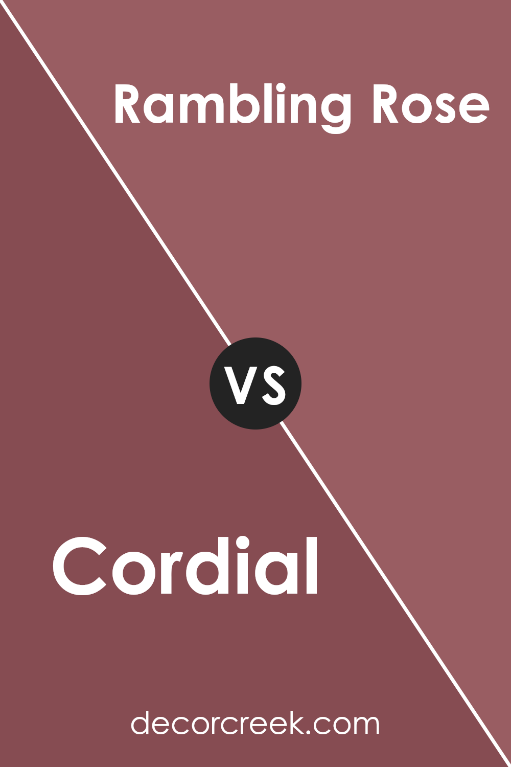
Cordial SW 6306 by Sherwin Williams vs Rambling Rose SW 6305 by Sherwin Williams
The two colors, Cordial and Rambling Rose by Sherwin Williams, offer a beautiful palette with subtle differences. Cordial is a deeper shade, closer to a rich pink with hints of berry. Think of it as a warm, inviting color that has a bit of sophistication because of its depth. It’s perfect for spaces where you want to add a cozy yet stylish vibe.
On the other hand, Rambling Rose is lighter, leaning more towards a soft, gentle pink. It’s like the first blush of sunrise, with a delicate and airy feel. This color is ideal for rooms that you want to feel open, bright, and soothing.
While both colors share a pink base, Cordial brings warmth and depth, making it great for accent walls or cozy spaces. Rambling Rose, with its lighter tone, provides a sense of calm and openness, perfect for creating a relaxing environment. Together, they can create a lovely gradient of pinks, from the gentle embrace of Rambling Rose to the richer warmth of Cordial.
You can see recommended paint color below:
- SW 6305 Rambling Rose
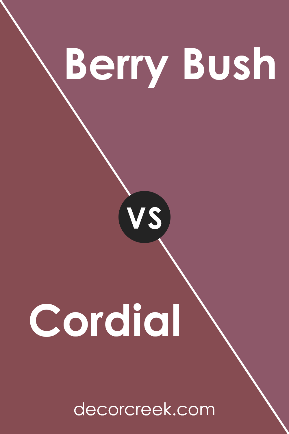
Cordial SW 6306 by Sherwin Williams vs Berry Bush SW 6292 by Sherwin Williams
Cordial SW 6306 and Berry Bush SW 6292, both Sherwin Williams colors, offer unique shades. Cordial leans more towards a rich, comforting pink with a touch of warmth, creating a cozy atmosphere in any space. Imagine a gentle hug in the form of a color; that’s what Cordial brings to the table. It’s perfect for rooms where relaxation is key, providing a soft backdrop that’s soothing to the eyes.
On the other hand, Berry Bush moves towards a deeper, more intense hue. It resembles ripe berries, offering a vibrant burst of color. This shade is bolder and stands out more, making it ideal for spaces that need a pop of color or a dramatic focal point. It brings energy and life, transforming the room into a lively area.
In summary, while Cordial offers a gentle and warm pink tone for a comforting feel, Berry Bush presents a vibrant and bold berry shade for more energy and vivacity. Both colors have their own unique appeal, depending on the atmosphere you’re looking to create.
You can see recommended paint color below:
- SW 6292 Berry Bush
Cordial SW 6306 by Sherwin Williams vs Rembrandt Ruby SW 0033 by Sherwin Williams
Cordial SW 6306 and Rembrandt Ruby SW 0033, both from Sherwin Williams, are like two beautiful flowers in a lush garden. Cordial is like a soft hug; it’s warm, comforting, and has a gentle vibe. Its tone can make a space feel inviting without being too bold. Imagine a cozy reading nook or a welcoming living room; that’s where Cordial shines.
On the other side, Rembrandt Ruby is like the heart of a roaring fire. It’s deeper, richer, and has a bit of boldness to it. This color isn’t shy. It stands out and makes a statement. If you’re aiming to add some drama or a focal point to a room, Rembrandt Ruby is your go-to. It’s the kind of color that can turn a simple space into something memorable and striking.
So, while both colors bring warmth, Cordial does it in a whisper, and Rembrandt Ruby in a shout. Whether you want a whisper or a shout in your space can help you decide between the two.
You can see recommended paint color below:
- SW 0033 Rembrandt Ruby
Cordial SW 6306 by Sherwin Williams vs Fine Wine SW 6307 by Sherwin Williams
Cordial and Fine Wine are two paint colors by Sherwin Williams that are close cousins in the color world. Cordial sits on the lighter end, giving off a soft, welcoming vibe. It’s like the warm glow of a setting sun, adding a gentle touch of pink to the walls without overwhelming the room. This makes it perfect for creating a cozy, inviting space.
On the other hand, Fine Wine takes the richness up a notch. As the name suggests, it mirrors the deep, luxurious color of red wine. It’s bolder and darker than Cordial, making a statement wherever it’s used. This color can add a sense of drama and sophistication to a space, making it ideal for accent walls or rooms where you want a bit of extra elegance.
While both colors share a red-pink base, Cordial is lighter and more subdued, offering a soft backdrop ideal for relaxation. Fine Wine, with its deeper tone, brings intensity and a touch of luxury, perfect for creating focal points in a design. Choosing between them depends on the mood you want to set in your space.
You can see recommended paint color below:
- SW 6307 Fine Wine
Cordial SW 6306 by Sherwin Williams vs Kirsch Red SW 6313 by Sherwin Williams
Cordial and Kirsch Red are both colors offered by Sherwin Williams, but they bring their own unique vibes to any space. Cordial has a softer, more soothing tone. It’s like a gentle hug for your walls, giving a room a cozy and inviting feel without being too overpowering. This color can make small rooms feel a bit larger and more open, thanks to its lighter touch.
On the other hand, Kirsch Red is bolder and more assertive. Think of the lushness of ripe cherries; that’s the kind of rich, vibrant energy it brings. It’s a color that makes a statement and can turn a wall or room into a striking focal point. Because of its depth, Kirsch Red works well in spaces that can handle a bit of drama or where you want to draw attention.
In short, if you’re looking for a color that’s warm and gentle, Cordial is a great pick. But if you want something that stands out more and brings a burst of energy, Kirsch Red is the way to go. Both colors have their charm, depending on the mood you want to create.
You can see recommended paint color below:
- SW 6313 Kirsch Red
Conclusion
The article on the color Cordial by Sherwin Williams provides an insightful overview of how this particular shade can enhance various spaces. With its warm and inviting tone, Cordial proves to be an excellent choice for those looking to add a touch of coziness and comfort to their rooms. The detailed analysis highlights the versatility of this color, showing that it can adapt well to different lighting conditions and complement a wide range of decor styles, from traditional to modern.
Furthermore, the article offers practical tips on pairing Cordial with other colors and accents to achieve a balanced and aesthetically pleasing look. Through real-life examples and expert advice, readers gain a clear understanding of how to effectively utilize this shade in their own spaces. Whether it’s creating a feature wall or introducing Cordial through fabric and accessories, the article assures that incorporating this color into home design projects is both simple and rewarding.

Ever wished paint sampling was as easy as sticking a sticker? Guess what? Now it is! Discover Samplize's unique Peel & Stick samples.
Get paint samples

