When it comes to giving your space a fresh, beautiful update, choosing the right paint color can make all the difference. I recently had the pleasure of using Sherwin Williams SW 6589 Alyssum on a project, and I was impressed with the subtle yet transformative impact it had on the room.
Alyssum by Sherwin Williams is a delicate shade that strikes a fine balance between white and lavender, bringing a light, airy feel to any space.
This color works wonderfully in areas where you want to introduce a sense of calm without sacrificing brightness. Its mild lavender hue injects a gentle touch of color, making it an excellent choice for bedrooms, bathrooms, or anywhere you wish to create a soothing atmosphere.
Painting with Alyssum was a smooth process, and the color paired easily with various fabrics and furniture styles, enhancing the overall aesthetic without overpowering the space.
If you’re thinking about refreshing your home’s look, consider Alyssum for a subtle infusion of color that feels both modern and timeless. It’s amazing how a simple coat of paint can refresh your environment. I found that Alyssum adapts beautifully to different lighting conditions, displaying a range of hues from soft white in bright light to a more distinct lavender tone during the evening.
This versatility makes it a reliable choice for dynamic living spaces.
What Color Is Alyssum SW 6589 by Sherwin Williams?
The color Alyssum by Sherwin Williams is a subtle and soft shade of lavender with a hint of gray. This calming hue has just enough muted tones to be versatile, making it a fantastic choice for various interior styles. Particularly, it shines in modern farmhouse and Scandinavian-inspired themes where simplicity and lightness are key elements of the decor.
Alyssum pairs beautifully with natural materials like light woods, which help to enhance its understated elegance. When matched with textures like linen or cotton, the color creates a cozy and welcoming environment.
The use of wool or chunky knits would also complement the softness of the color, adding warmth to the overall atmosphere of the room.
This color works well in spaces that need a gentle touch of brightness without overwhelming the senses. Its muted lavender tone offers a fresh look while maintaining a laid-back vibe, perfect for living rooms, bedrooms, or even nurseries.
Whether it’s combined with neutral colors or set against crisp whites, Alyssum creates a soothing palette that’s easy on the eyes and offers a fresh, airy feel to any space.

Is Alyssum SW 6589 by Sherwin Williams Warm or Cool color?
Alyssum SW 6589 by Sherwin Williams is a warm and gentle white that can make any room in a house feel welcoming and bright. This color works really well in small spaces because it helps make them look bigger and more open. It’s not just plain white; it has a touch of softness that adds a cozy vibe without being too stark or cold.
Homeowners often choose Alyssum SW 6589 for bedrooms and living rooms because it creates a clean and calm background. It pairs nicely with all kinds of colors, making it very versatile for decorating. Whether someone wants to add bright colors or stick with neutrals, this shade of white acts as a great base.
In spaces like kitchens and bathrooms, Alyssum SW 6589 keeps things looking fresh and clean. It reflects light beautifully, which helps in rooms that might not get a lot of natural sunlight. Overall, it’s a practical color choice that can work well throughout a home, making spaces feel more inviting and larger.
Undertones of Alyssum SW 6589 by Sherwin Williams
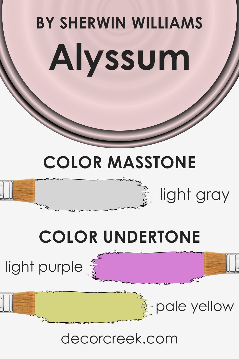
Alyssum SW 6589 by Sherwin Williams is a unique color that features a rich variety of undertones which includes light purple, pale yellow, light blue, pale pink, lilac, mint, and grey. Each of these undertones contributes to how the color interacts with light and impacts the mood of a room.
Undertones are subtle hues mixed into the main color and they play a crucial role in the overall appearance of the color once it’s applied to walls. They can affect how warm or cool a color looks and how well it harmonizes with other colors and elements in a room.
When used on interior walls, Alyssum SW 6589 brings a complex and delicate blend of its undertones that can change appearance under different lighting conditions. For instance, in a room with abundant natural light, the light purple and pale pink undertones might make the walls appear softly cheerful and welcoming.
In artificial lighting, the grey and lilac undertones might become more pronounced, giving the room a calm and grounded feel.
This ability to subtly shift in tone makes Alyssum SW 6589 versatile and appealing for various spaces, allowing it to complement different decor styles and color schemes. Whether in a living room, bedroom, or hallway, this color with its rich undertones can help create an atmosphere that feels harmonious and well-coordinated.
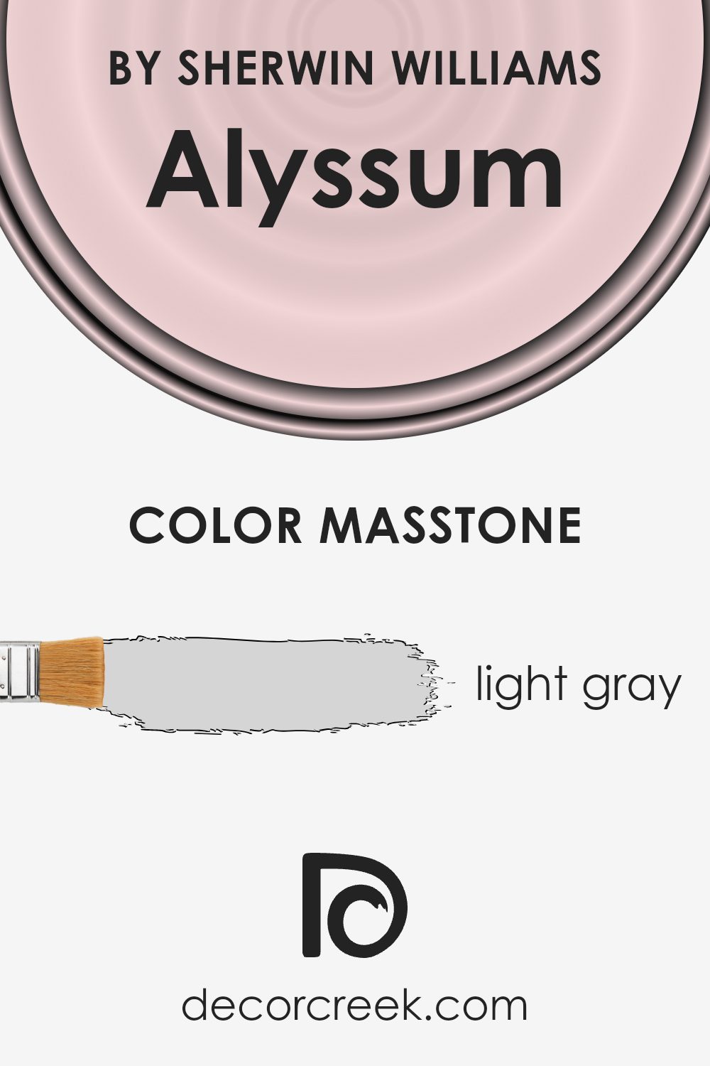
What is the Masstone of the Alyssum SW 6589 by Sherwin Williams?
The masstone of Light Gray (#D5D5D5) found in AlyssumSW 6589 from Sherwin Williams offers a clean and bright look ideal for home interiors. This shade of gray acts as a neutral backdrop, allowing for versatile use across any room, whether it be a living area, bedroom, or kitchen. Its light tone brings an airy feel to spaces, making them appear larger and more open.
This color is particularly effective in rooms that receive less natural light, as it can help brighten the surroundings without overwhelming with strong colors. Furniture and decor pieces in bold or dark colors stand out beautifully against this light gray, offering an opportunity to add some visual interest and personality to a room.
It’s also perfect for those looking for a minimal and clean aesthetic, as it pairs well with almost any color palette, making decorating effortless and achievable. This hue of gray thus provides a practical solution for creating stylish and inviting spaces in the home.
How Does Lighting Affect Alyssum SW 6589 by Sherwin Williams?
Lighting plays a crucial role in how we perceive colors in our environment. The type of light and the direction it comes from can significantly change the appearance of a color. It’s important to consider these factors when choosing paint for your walls.
Alyssum by Sherwin Williams is a versatile shade that can look different depending on the light it’s exposed to. In artificial light, such as that from light bulbs, this color tends to appear slightly more saturated and warm. This makes it an excellent choice for spaces that want a cozy and inviting atmosphere during evenings or in rooms without much natural light.
In natural light, Alyssum tends to show its true color better. The quality of natural light, however, varies depending on the time of day and the room’s orientation:
1. North-Facing Rooms: These rooms get less direct sunlight, which means light can be cooler and bluer. Here, Alyssum can appear slightly more muted and cooler, highlighting its subtle bluish undertones.
2. South-Facing Rooms:These rooms benefit from abundant direct sunlight, bringing out the brightness and vibrancy of the color. Alyssum looks warmer and more vivid in south-facing rooms, especially during the middle of the day.
3. East-Facing Rooms: Morning light is warm and soft in these rooms. Alyssum will look brighter and more cheerful in the morning but will become cooler as the day progresses and the sunlight diminishes.
4. West-Facing Rooms: Evening light in these rooms is warm and golden. This light can make Alyssum glow warmly in the afternoon and evenings, contrasting with the cooler morning light.
Understanding the effect of lighting on Alyssum can help you decide which room and wall orientation will showcase this paint color optimally, creating your desired ambiance effectively.
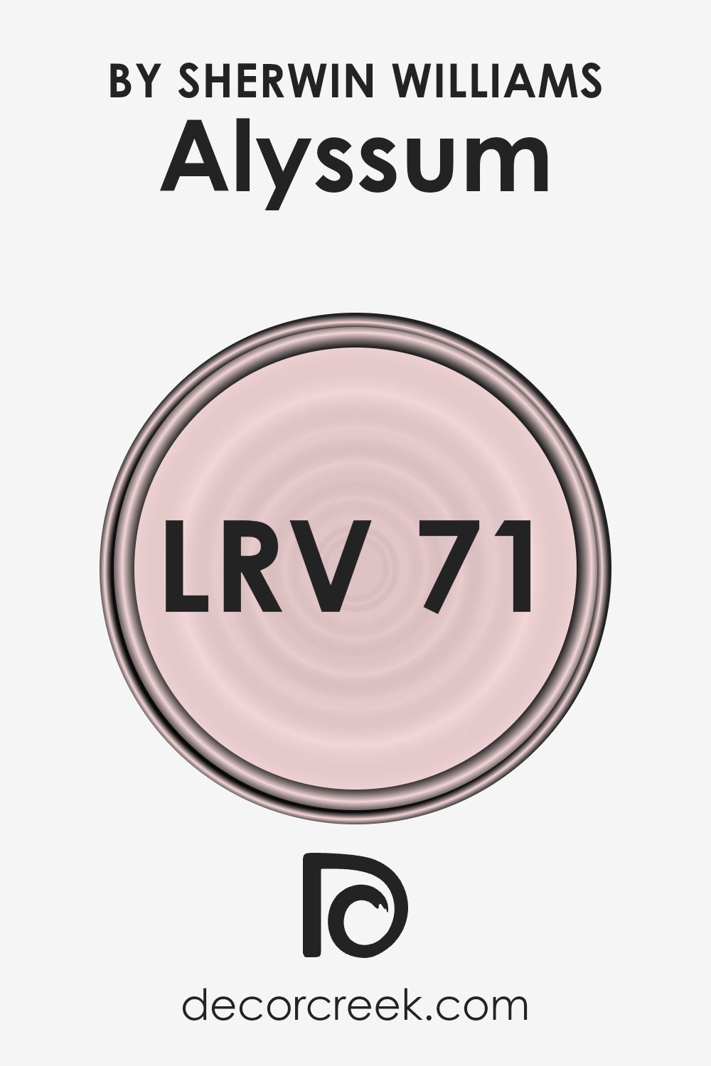
What is the LRV of Alyssum SW 6589 by Sherwin Williams?
LRV stands for Light Reflectance Value. It is a measurement that tells you how much light a paint color reflects back into a room as opposed to absorbing it. This value is given on a scale where a higher number means the color reflects more light, making it appear lighter in the room.
Conversely, a lower number means the color absorbs more light, making it darker. Knowing the LRV of a color can help you determine how bright or dark a room will feel once it’s painted.
With an LRV of 71.119, the Alyssum paint color is quite reflective, suggesting it will make a room look bright and airy when used on walls. Colors like this are useful in spaces that either don’t get much natural light or are naturally smaller, as the light reflectivity can make the room appear larger and more open.
However, it’s also worth noting that despite its brightness, walls painted in Alyssum will still show depth and variation under different lighting conditions, enhancing its dynamic character throughout the day.
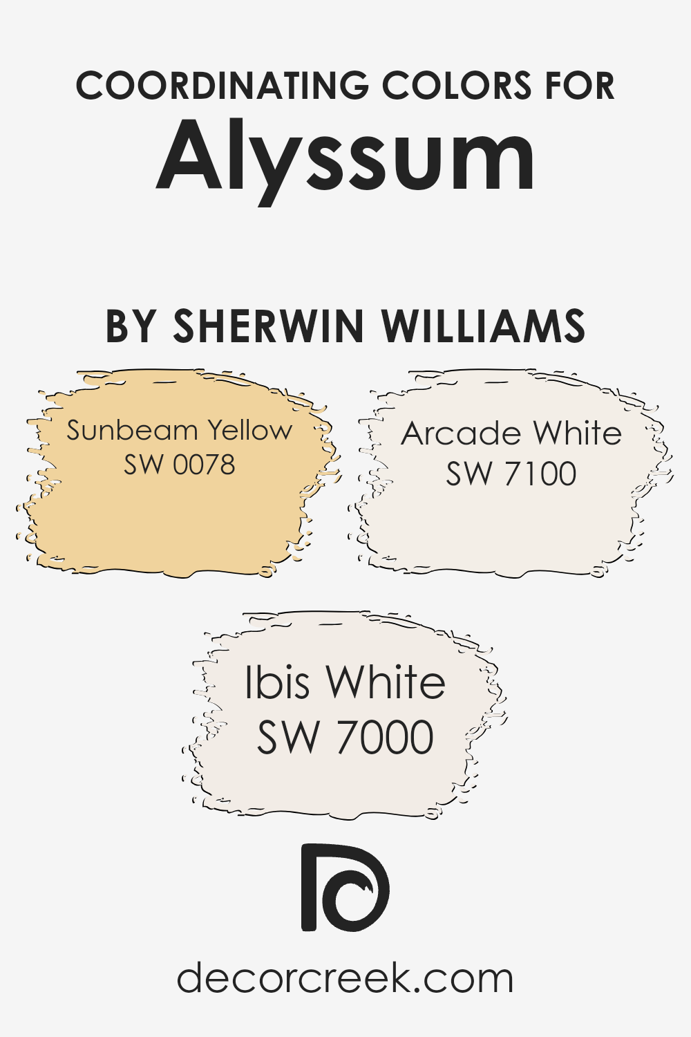
Coordinating Colors of Alyssum SW 6589 by Sherwin Williams
Coordinating colors are hues that complement each other when used together in interior design and decoration. They enhance the aesthetic appeal and create a harmonious atmosphere in any space. Specifically, when considering a primary color like Alyssum by Sherwin Williams, you can enhance its charm by pairing it with coordinating colors that bring out its best qualities.
Coordinating colors such as Sunbeam Yellow, Ibis White, and Arcade White work well because they share certain intensities and undertones that balance the primary color’s strength without overpowering it.
Sunbeam Yellow is a vibrant and cheerful color that adds a burst of energy to any room. It works beautifully to brighten spaces when used as an accent color alongside softer, subtler shades like Alyssum.
Ibis White, on the other hand, is a clean and crisp white that provides a fresh, airy feel to interiors.
It helps in creating a refined look when combined with other colors. Lastly, Arcade White offers a slightly warmer tone compared to Ibis White, bringing a cozy and inviting feel, which makes it perfect for living spaces where comfort is key. These coordinating colors work together to create a visually appealing and balanced color scheme.
You can see recommended paint colors below:
- SW 0078 Sunbeam Yellow
- SW 7000 Ibis White
- SW 7100 Arcade White
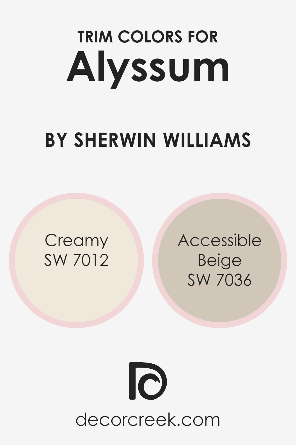
What are the Trim colors of Alyssum SW 6589 by Sherwin Williams?
Trim colors are essential for adding definition and contrast to the walls of a room, enhancing both the overall aesthetic and highlighting the architectural features of a space. When paired with a primary wall color like Alyssum SW 6589 by Sherwin Williams, which is a soft and subtle shade, choosing the right trim colors can really make the wall color stand out.
SW 7012 – Creamy and SW 7036 – Accessible Beige are two trim colors that complement Alyssum SW 6589 beautifully, adding just the right amount of contrast without overwhelming the gentle nature of the primary color.
SW 7012 – Creamy is a soft, warm white that brings a gentle brightness to the trim, offering a smooth transition that can enhance the light in a room while framing the walls neatly. On the other hand, SW 7036 – Accessible Beige is a light beige that provides a slightly stronger contrast than Creamy, yet remains subtle enough to maintain a harmonious feel with Alyssum SW 6589.
Both colors are versatile and can help in creating a cohesive look that ties the different elements of the room together attractively.
You can see recommended paint colors below:
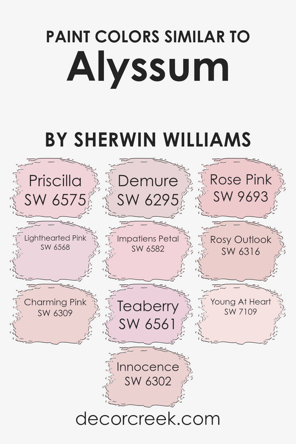
Colors Similar to Alyssum SW 6589 by Sherwin Williams
Similar colors play a crucial role in creating a harmonious and visually appealing environment. When colors closely relate to one another, such as variations of pink and light pink, they help produce a cohesive look that is pleasant to the eye.
These subtle variations can also add depth and dimension to spaces without the stark contrasts that more diverse color palettes present.
For example, using shades like soft pink and calm pink together allows for design fluidity, guiding the eye smoothly from one area to another without abrupt changes, thus maintaining a gentle aesthetic flow in the decor.
Starting with SW 6575 – Priscilla, this shade is a playful light pink that brings a fresh and youthful glow to spaces. Next, SW 6568 – Lighthearted Pink offers a slightly more subdued pink, perfect for creating a warm, inviting atmosphere. SW 6309 – Charming Pink has a deeper hue that lends a cozy feel to any room, while SW 6302 – Innocence is a very soft pink that provides a subtle, delicate touch.
SW 6295 – Demure offers an understated elegance with its muted pink tone, and SW 6582 – Impatiens Petal introduces a brighter pink that adds a cheerful pop of color.
SW 6561 – Teaberry is a vibrant pink that injects a bit of fun into the environment. SW 9693 – Rose Pink is rich and lovely, ensuring a striking impact. SW 6316 – Rosy Outlook is an optimistic pink that brightens spaces effortlessly. Lastly, SW 7109 – Young At Heart is a dynamic pink that infuses a playful and lively spirit into any setting.
All these shades, revolving around pink and light pink, work together to create a soft, welcoming ambiance in any space.
You can see recommended paint colors below:
- SW 6575 Priscilla
- SW 6568 Lighthearted Pink
- SW 6309 Charming Pink
- SW 6302 Innocence
- SW 6295 Demure
- SW 6582 Impatiens Petal
- SW 6561 Teaberry
- SW 9693 Rose Pink
- SW 6316 Rosy Outlook
- SW 7109 Young At Heart
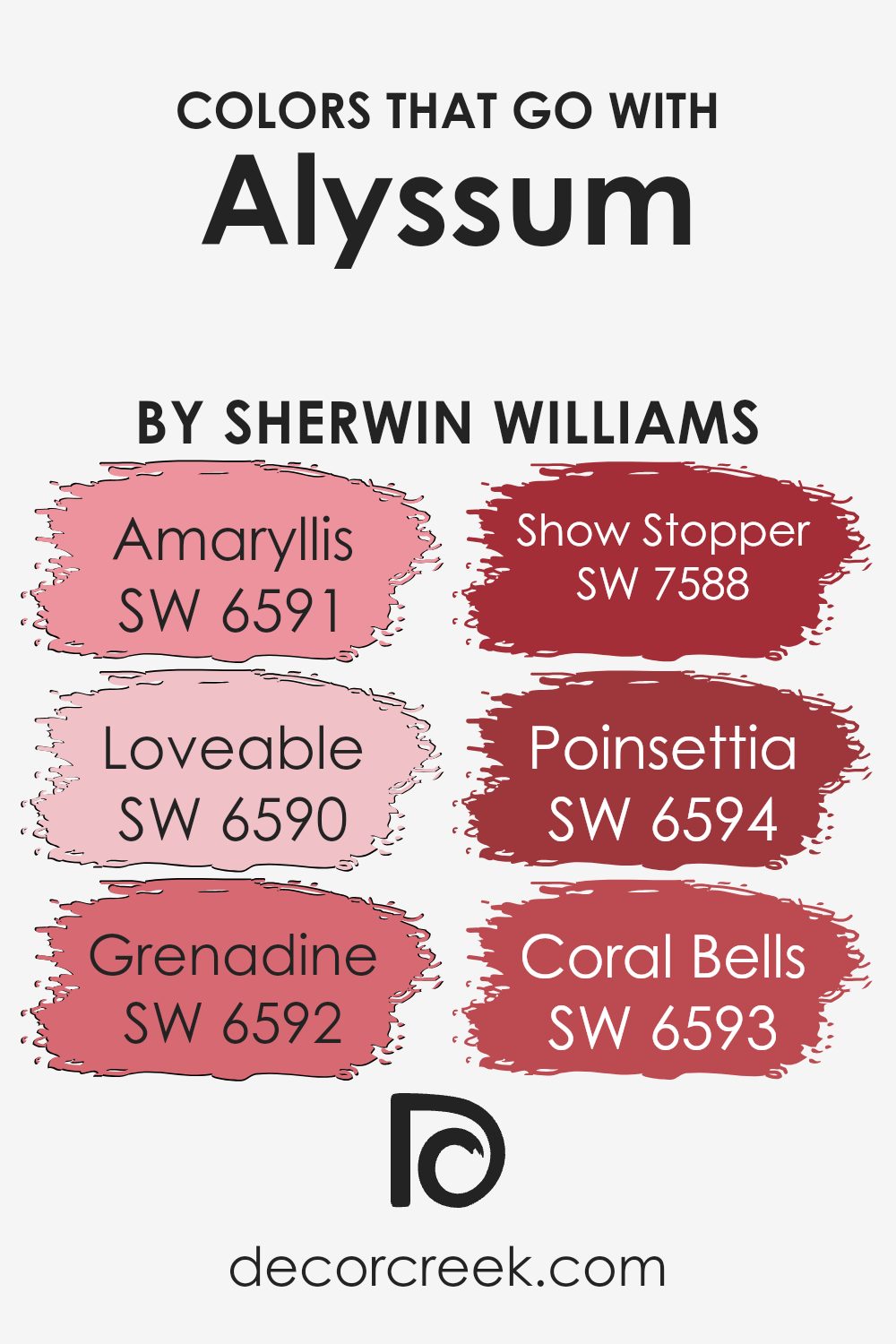
Colors that Go With Alyssum SW 6589 by Sherwin Williams
Choosing colors that harmonize with Alyssum SW 6589 by Sherwin Williams is essential for creating a visually appealing color scheme in any space. These colors are not only visually compatible, but they also enhance the overall aesthetics by providing contrast, depth, or soft companionship to Alyssum SW 6589, depending on the atmosphere you wish to create.
For instance, SW 6591 – Amaryllis, a vibrant red, adds a lively pop of color that draws the eye, making it perfect for accent walls or decorative elements. Similarly, SW 6590 – Loveable is a soft pink that gently complements the light tones of Alyssum SW 6589, ideal for nurturing a warm and inviting environment.
On the other hand, SW 6592 – Grenadine offers a rich, deep red that can create a bold statement, perfect for those looking to make an impact. SW 7588 – Show Stopper, an intense, deep red, creates a dynamic look when paired with lighter shades like Alyssum SW 6589, providing a striking contrast.
If looking for something vibrant yet not too overpowering, SW 6594 – Poinsettia is an excellent choice with its cheerful red hue that brightens up spaces.
Lastly, SW 6593 – Coral Bells strikes a balance with its coral tone, offering a subtle yet warm addition to rooms needing a touch of soft color that still maintains interest and harmony.
These colors, when used thoughtfully, can vastly improve the feel and aesthetic appeal of a space, making color choice an important consideration in any decorating or design effort.
You can see recommended paint colors below:
- SW 6591 Amaryllis
- SW 6590 Loveable
- SW 6592 Grenadine
- SW 7588 Show Stopper
- SW 6594 Poinsettia
- SW 6593 Coral Bells
How to Use Alyssum SW 6589 by Sherwin Williams In Your Home?
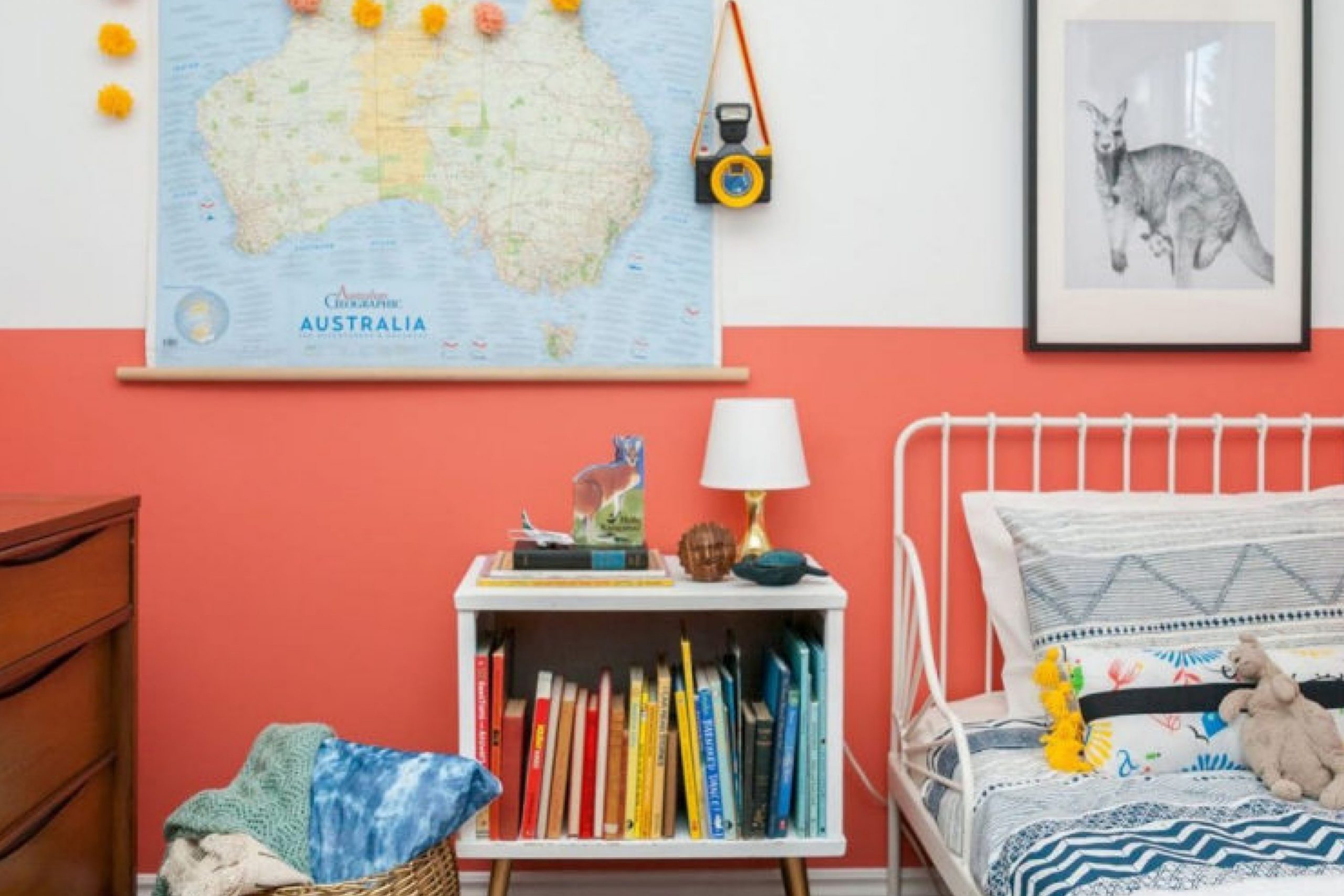
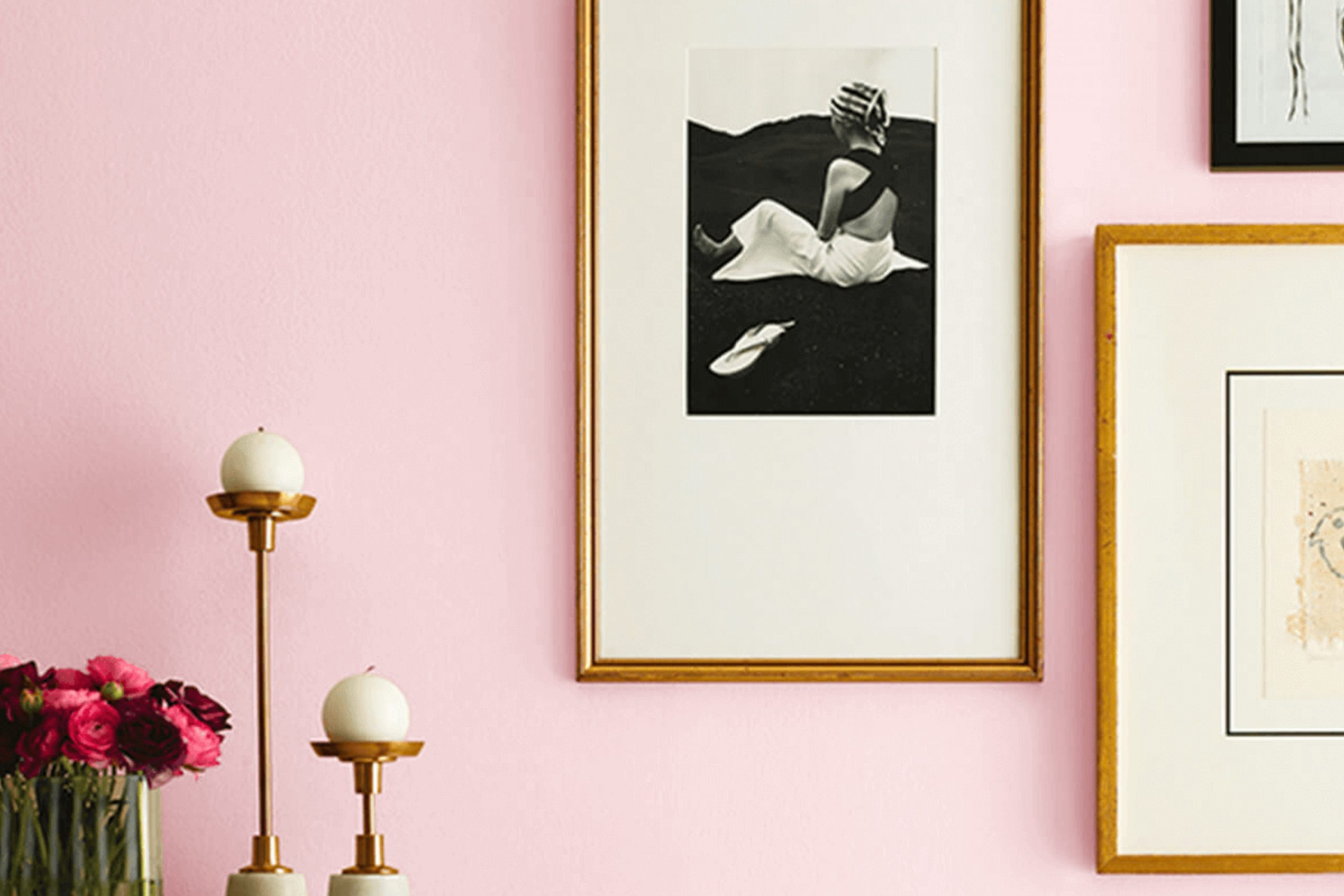
Alyssum SW 6589 by Sherwin Williams is a gentle, soft pink paint color that brings a warm and welcoming vibe to any room in your home. It’s perfect if you want to refresh your space with a subtle touch of color that’s not too overpowering. Alyssum is ideal for creating a cozy atmosphere in spaces where you relax, such as bedrooms and living rooms.
You can paint all walls in a small room with Alyssum to make it feel bright and airy, or use it on an accent wall in a larger room to add a soft pop of color. It also pairs perfectly with white trims, enhancing the overall clean and fresh look.
In addition, this color works well in a nursery or child’s room, offering a soothing backdrop that can grow with them over the years. Alyssum can help make your home feel more inviting and comfortable without too much effort.
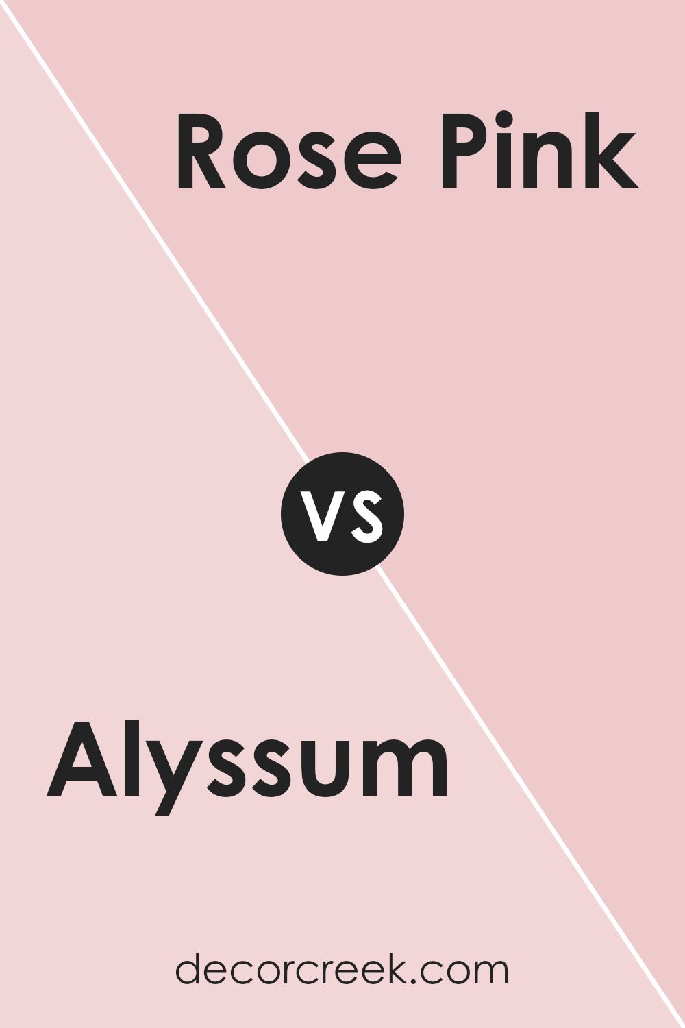
Alyssum SW 6589 by Sherwin Williams vs Rose Pink SW 9693 by Sherwin Williams
Alyssum by Sherwin Williams is a light purple with a subtle gray undertone, giving it a soft and gentle feel. This color is versatile and can brighten up a small room or add a touch of calm to a busy area. On the other hand, Rose Pink is a vibrant, cheerful shade of pink that has a playful and welcoming vibe.
It’s bolder and can add a fresh pop of color to any space, perfect for creating a focal point or adding energy to a room.
When comparing the two, Alyssum is more understated and pairs well with neutral tones, while Rose Pink stands out and works great with other bold colors or can be toned down with soft whites or grays. Both colors offer unique atmospheres: Alyssum is more about creating a peaceful space, and Rose Pink is about adding joy and vibrancy.
You can see recommended paint color below:
- SW 9693 Rose Pink
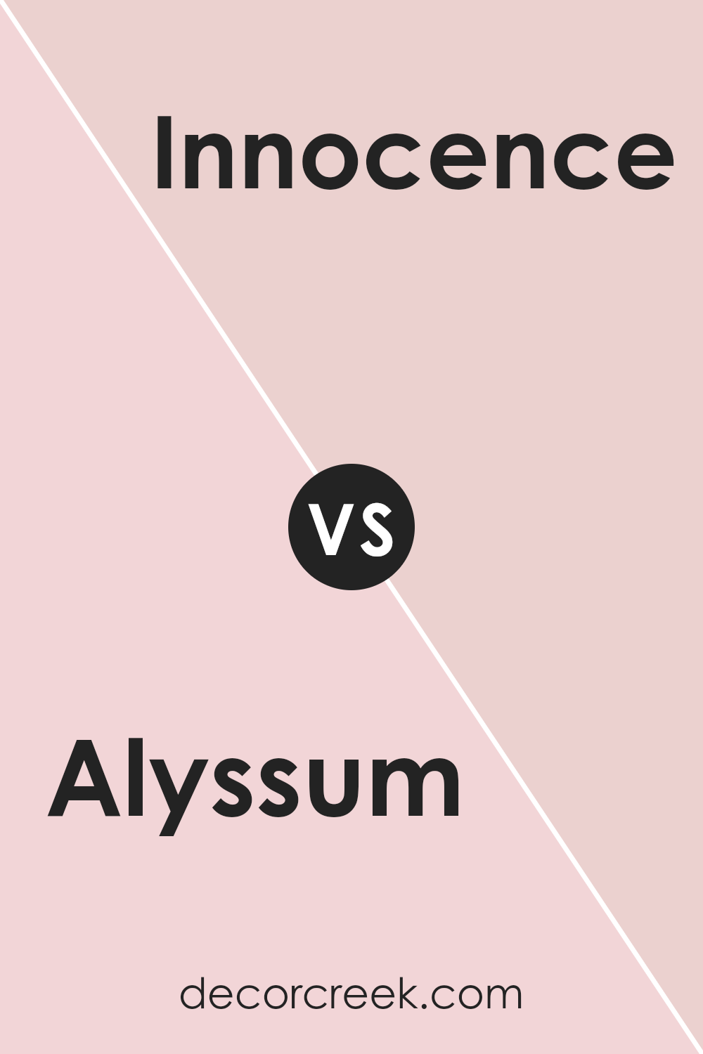
Alyssum SW 6589 by Sherwin Williams vs Innocence SW 6302 by Sherwin Williams
Alyssum SW 6589 and Innocence SW 6302 by Sherwin Williams are both soft, light hues, but they cater to slightly different tastes and design needs. Alyssum is a gentle purple with a hint of grey, giving it a muted, subtle feel that’s versatile for spaces that aim for a soft backdrop with a touch of warmth. This color is great for anyone wanting to add a slight nuance of color without overwhelming a space.
On the other hand, Innocence is a pale pink that leans towards a creamy, almost peachy tone. This color is brighter and warmer compared to Alyssum, providing a fresh and inviting atmosphere. It’s suitable for creating a cheerful and cozy environment, perfect for lively living areas or a child’s bedroom.
Both colors are light enough to make small rooms appear larger and are flexible for pairing with bolder colors or various decor styles. Whether choosing the cool subtlety of Alyssum or the warm softness of Innocence, both offer a beautiful base for creating a welcoming space.
You can see recommended paint color below:
- SW 6302 Innocence
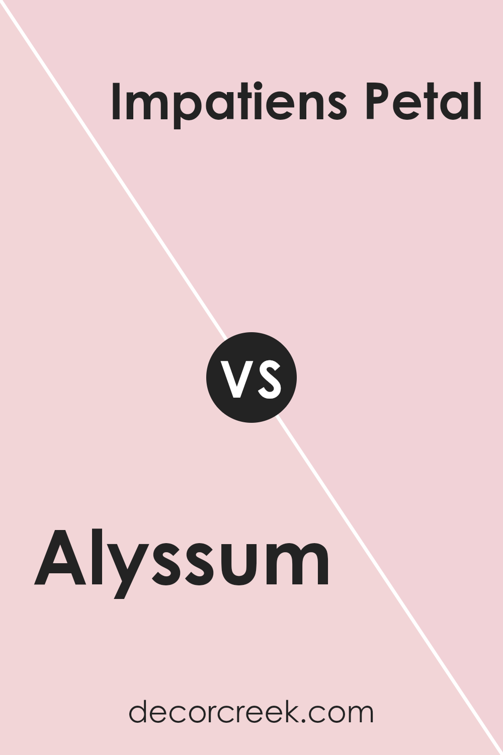
Alyssum SW 6589 by Sherwin Williams vs Impatiens Petal SW 6582 by Sherwin Williams
The color Alyssum SW 6589 and Impatiens Petal SW 6582 from Sherwin Williams offer distinctive moods and aesthetics. Alyssum leans towards a soft pastel lavender, providing a subtle and gentle feel to spaces, which works perfectly for a calming bedroom or a peaceful living area. It has a cooler, slightly understated vibe that suits minimalistic or modern decors.
On the other hand, Impatiens Petal is a more vibrant pink. It carries warmth and liveliness, making it ideal for areas where a splash of cheerfulness is desired. This shade could wonderfully brighten up a nursery, kitchen, or any space needing a touch of playfulness without being overwhelming.
When comparing the two, Alyssum is cooler and more muted, while Impatiens Petal is warmer and more lively. Your choice between them would depend on the kind of atmosphere you aim to create in your space. Whether looking for soothing neutrality or a joyful pop, each color offers its unique charm.
You can see recommended paint color below:
- SW 6582 Impatiens Petal
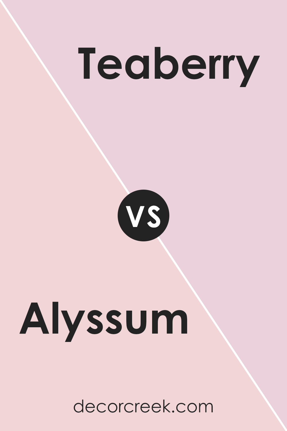
Alyssum SW 6589 by Sherwin Williams vs Teaberry SW 6561 by Sherwin Williams
Alyssum SW 6589 by Sherwin Williams is a soft, gentle pink that provides a light and airy feel to any space. It’s almost like a whisper of pink on the walls, making it ideal for creating a soothing atmosphere in places such as bedrooms or bathrooms. This color is quite neutral and blends well with many different decor styles, from modern to traditional.
On the other hand, Teaberry SW 6561 by Sherwin Williams is a more vibrant and rich pink. This color packs more punch and can bring a lively and playful energy to a room. Perfect for spaces where you want to make a statement, like a dining area or a child’s room, Teaberry offers a bolder choice that can energize the surroundings.
Both colors reflect different moods and uses, with Alyssum being more reserved and calm, and Teaberry standing out as more dynamic and fun. Depending on what feeling you want to achieve in your space, either could be a great choice.
You can see recommended paint color below:
- SW 6561 Teaberry
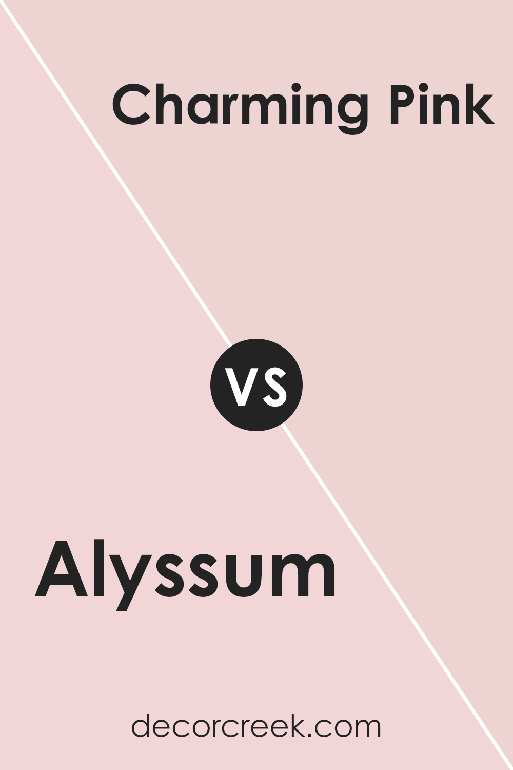
Alyssum SW 6589 by Sherwin Williams vs Charming Pink SW 6309 by Sherwin Williams
Alyssum by Sherwin Williams is a soft, subtle shade of lavender, offering a hint of relaxation and peacefulness to any space. It’s light enough to make small rooms appear larger and can easily complement various decor styles. This color works well in bedrooms or living areas where a calming influence is desired.
On the other hand, Charming Pink is a gentle and warm pink tone that brings a cozy and welcoming vibe. It’s not overly vibrant but has just enough depth to add character to a room. Charming Pink is perfect for creating a nurturing and friendly atmosphere, making it ideal for spaces like nurseries or casual living rooms.
Both colors share a softness and lightness in hue but differ in their emotional impact. Alyssum invites a sense of calm and understated elegance, while Charming Pink exudes warmth and a more openly cheerful feel. Each offers unique possibilities for creating a comforting space in your home.
You can see recommended paint color below:
- SW 6309 Charming Pink
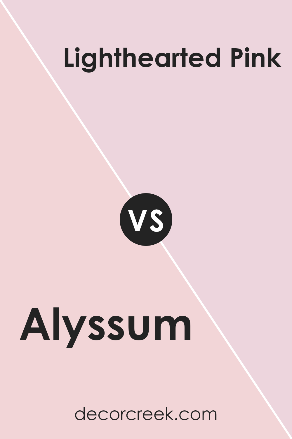
Alyssum SW 6589 by Sherwin Williams vs Lighthearted Pink SW 6568 by Sherwin Williams
Alyssum and Lighthearted Pink are two distinct shades by Sherwin Williams that each bring their own unique vibe to a space. Alyssum is a soft, subdued lavender with a gentle and airy feel, perfect for creating a peaceful atmosphere in places like bedrooms or reading nooks. It has just enough gray to make it versatile for pairing with various decors without overwhelming the senses.
In contrast, Lighthearted Pink is a vibrant, cheerful pink. It’s bolder and more playful, making it great for spaces where energy and freshness are desired, such as a child’s bedroom or a creative workspace. This color stands out more and can add a pop of fun to an area.
Both colors are light and can reflect natural light well, making rooms appear brighter and more open. However, while Alyssum leans towards a more neutral and calming approach, Lighthearted Pink leans towards a lively and fun aesthetic. These qualities make each color suitable for different purposes and tastes.
You can see recommended paint color below:
- SW 6568 Lighthearted Pink
Alyssum SW 6589 by Sherwin Williams vs Rosy Outlook SW 6316 by Sherwin Williams
The two colors, Alyssum and Rosy Outlook by Sherwin Williams, both offer a soft and welcoming feel, but they have different tones and moods. Alyssum is a subtle lavender shade, giving a gentle and calming effect that works well in spaces meant for relaxation, like bedrooms or bathrooms.
On the other hand, Rosy Outlook is a warmer pink hue that emits a cheerful and cozy vibe, perfect for living rooms or areas where positivity is desired. While Alyssum’s cooler undertones suggest a quiet, peaceful space, Rosy Outlook’s pinker tones create a sense of warmth and friendliness.
Both colors are versatile, but the choice between them depends on the atmosphere you’re aiming to achieve in your room.
You can see recommended paint color below:
- SW 6316 Rosy Outlook
Alyssum SW 6589 by Sherwin Williams vs Demure SW 6295 by Sherwin Williams
Alyssum and Demure by Sherwin Williams are two distinct shades, each setting a different mood for a space. Alyssum is a vibrant and cheerful lavender, bringing a sense of freshness and liveliness. It’s perfect for brightening up a room and pairs well with soft whites or even other vibrant shades for a playful palette.
On the other hand, Demure displays a softer, more subdued tone. This color is a smoky mauve, leaning towards a more muted and subtle appearance. It offers a calm, cozy feeling, making it ideal for relaxing environments like bedrooms or living rooms. Demure works well with earth tones and deeper shades, providing a grounding effect.
Both colors have their unique appeal, with Alyssum adding energy and brightness, while Demure offers a calm, understated elegance. Choosing between them depends on the atmosphere you want to create in your space.
You can see recommended paint color below:
- SW 6295 Demure
Alyssum SW 6589 by Sherwin Williams vs Priscilla SW 6575 by Sherwin Williams
Alyssum SW 6589 and Priscilla SW 6575 by Sherwin Williams are both unique shades that can give a room distinct character. Alyssum is a lively lavender color that’s quite light and has a fresh, airy feel. This makes it perfect for spaces where you want a touch of brightness without overwhelming the room with color. It could work well in a bathroom or as an accent wall in a living room.
On the other hand, Priscilla is a deeper, more muted mauve shade. It offers a subtle richness and can give a room a cozy and calm atmosphere. This color might be ideal for bedrooms or areas where a relaxing vibe is desired.
Both colors are versatile but serve different moods and settings. Alyssum, with its lighter and breezier tone, feels more vibrant, while Priscilla, with its richer and subdued hue, offers a sense of warmth and comfort.
You can see recommended paint color below:
- SW 6575 Priscilla
Alyssum SW 6589 by Sherwin Williams vs Young At Heart SW 7109 by Sherwin Williams
Alyssum SW 6589 by Sherwin Williams is a soft, gentle lilac that leans slightly towards pink. This color is both light and airy, providing a subtle touch of warmth to any room. It’s a great choice for creating a soothing vibe in spaces meant for relaxation, like bedrooms or bathrooms.
On the other hand, Young At Heart SW 7109 is a brighter, more vibrant pink. This shade has a playful and lively feel, making it perfect for spaces where energy and cheerfulness are desired. It works well in children’s rooms or creative spaces, infusing a dose of fun and positivity.
These two colors, while both in the realm of pastels, serve different moods and settings. Alyssum is more understated and calm, whereas Young At Heart stands out as the more lively and cheerful option. Choosing between them depends on the atmosphere you’re aiming to create in your space.
You can see recommended paint color below:
- SW 7109 Young At Heart
Conclusion
Alyssum is a gentle white that has a hint of soft purple. It’s not just plain white; that little touch of color makes it unique and very pretty.
Using this color in a room makes the place feel calm and inviting, perfect for a bedroom where you just want to relax or a living room that feels warm and welcoming.
Sherwin Williams did a great job with Alyssum because it works well in a lot of different places in a home. It goes nicely with many other colors, whether they are bright or dark. That means it’s easy to use when you want to decorate your room with different kinds of furniture and decorations.
Overall, choosing SW 6589 Alyssum is a great idea if you’re looking for a paint color that is soft, makes rooms look lovely, and is easy to match with other colors. It’s simple, pretty, and makes any room feel more like home.
I think it’s a wonderful choice for anyone looking to freshen up their home with a new coat of paint!
Ever wished paint sampling was as easy as sticking a sticker? Guess what? Now it is! Discover Samplize's unique Peel & Stick samples.
Get paint samples

