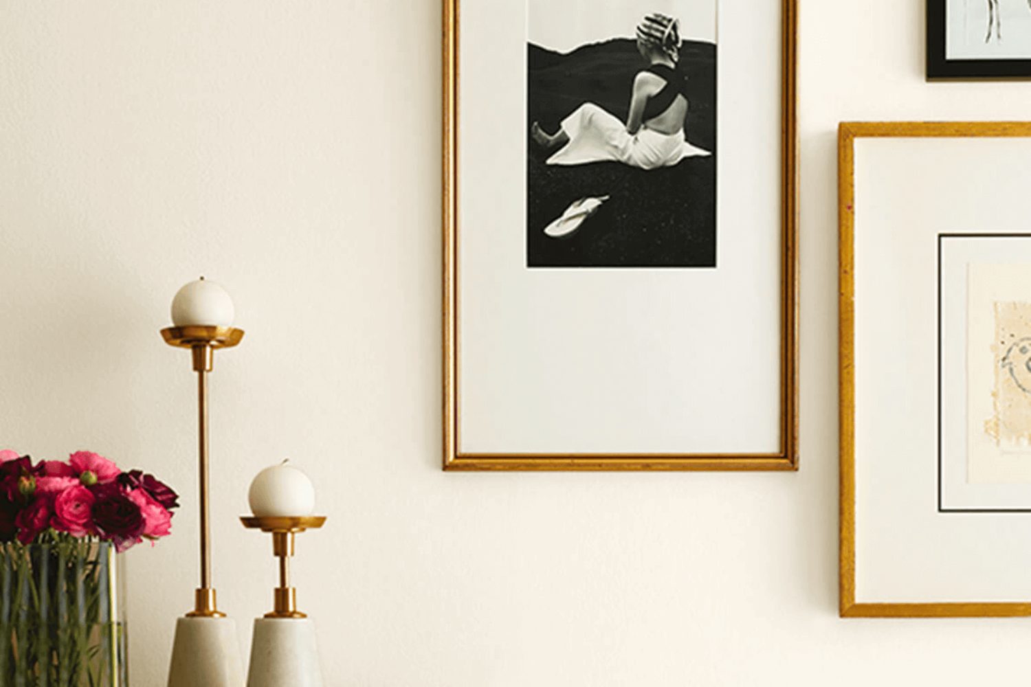
When it comes to choosing the perfect paint color for your home, it’s not just about the hue but the feeling it evokes. Enter SW 7012 Creamy by Sherwin Williams, a soft, warm white that has the power to transform any space into a cozy haven. This versatile shade is more than just a basic white. Its subtle undertones bring a gentle warmth to rooms, creating an inviting atmosphere that’s hard to beat.
Whether you’re planning to freshen up your living room, bedroom, or even kitchen, SW 7012 Creamy offers a timeless appeal that complements a wide range of décor styles—from modern to traditional and everything in between.
What Color Is Creamy SW 7012 by Sherwin Williams?
Creamy by Sherwin Williams is a soft, warm neutral paint color that brings a cozy and inviting atmosphere to any room. Its subtle, creamy undertone makes it more than just a plain beige or white, offering a hint of warmth without overwhelming the senses. This versatile shade works well in a variety of lighting conditions, adapting to create a serene and comfortable space.
Ideal for various interior styles, Creamy shines in settings such as modern farmhouse, traditional, and even Scandinavian decor due to its understated elegance and flexibility. It serves as a perfect backdrop for bold accents or can stand on its own for a minimalist look.
When it comes to pairing with materials and textures, Creamy is exceptionally adaptable. It complements natural wood tones, from light pine to dark walnut, bringing out their warmth and character. Metals like brushed nickel or aged brass add a touch of sophistication and contrast nicely against its soft hue. For textures, Creamy pairs beautifully with soft, plush fabrics like wool or linen, enhancing coziness, as well as with smooth, matte finishes that underline its subtle elegance.
This color is a go-to choice for anyone looking to create a soothing, welcoming space that feels both refined and accessible. Its ability to harmonize with a wide range of materials and textures makes it a practical and stylish option for any home.

Is Creamy SW 7012 by Sherwin Williams Warm or Cool color?
Creamy by Sherwin Williams is a soft and warm off-white paint color that brings a cozy and welcoming vibe to any room. This color has a gentle richness that adds just enough warmth to make spaces feel inviting without overwhelming them with color.
It’s perfect for those looking to create a serene and comfortable environment in their home. Because of its subtle warmth, Creamy works exceptionally well in rooms with natural light, where it can enhance the brightness and give off a soft glow. In spaces with less light, it helps to keep the room feeling open and airy, rather than closed off. This versatility makes it an excellent choice for common areas like living rooms, kitchens, and dining rooms, as well as private spaces like bedrooms.
Its neutral tone also means it pairs well with a wide range of decor styles and colors, from bold and vibrant to more muted and earthy tones. This adaptability and the welcoming atmosphere it creates are what makes Creamy a popular choice among homeowners.
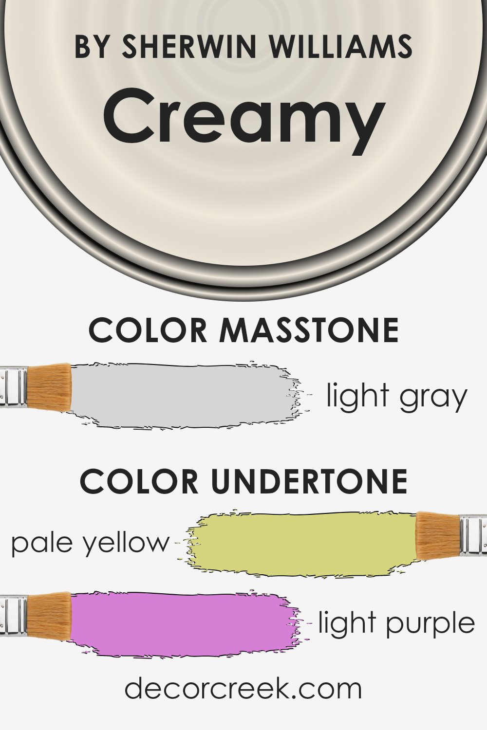
Undertones of Creamy SW 7012 by Sherwin Williams
Creamy by Sherwin Williams is a rich, soothing shade that has a mix of subtle undertones, giving it a versatile appeal. These undertones include pale yellow, light purple, light blue, pale pink, mint, lilac, and grey. Each of these undertones contributes to how we perceive the color, often influencing the mood and atmosphere of a space.
Undertones play a crucial role in the overall appearance of a color. They can either warm up or cool down a color, affecting how it interacts with light and other colors in a room. For example, pale yellow and mint bring warmth and a sense of freshness to Creamy, making it inviting and cozy. On the other hand, light purple and lilac add a hint of coolness, which can help balance the warmth, ensuring the color doesn’t feel overwhelming.
When applied to interior walls, Creamy becomes a dynamic backdrop that can shift in appearance based on the time of day and lighting conditions. During the day, natural light might highlight its warmer undertones, making a room feel bright and airy. In contrast, artificial lighting in the evening can bring out its cooler undertones, creating a serene and calming atmosphere.
The grey undertone in Creamy ensures it remains a sophisticated and versatile choice, preventing it from feeling too saturated or vivid, and making it an excellent choice for those seeking a color that marries warmth with subtlety. These characteristics make Creamy a popular choice for various settings, adapting seamlessly to different styles and preferences.
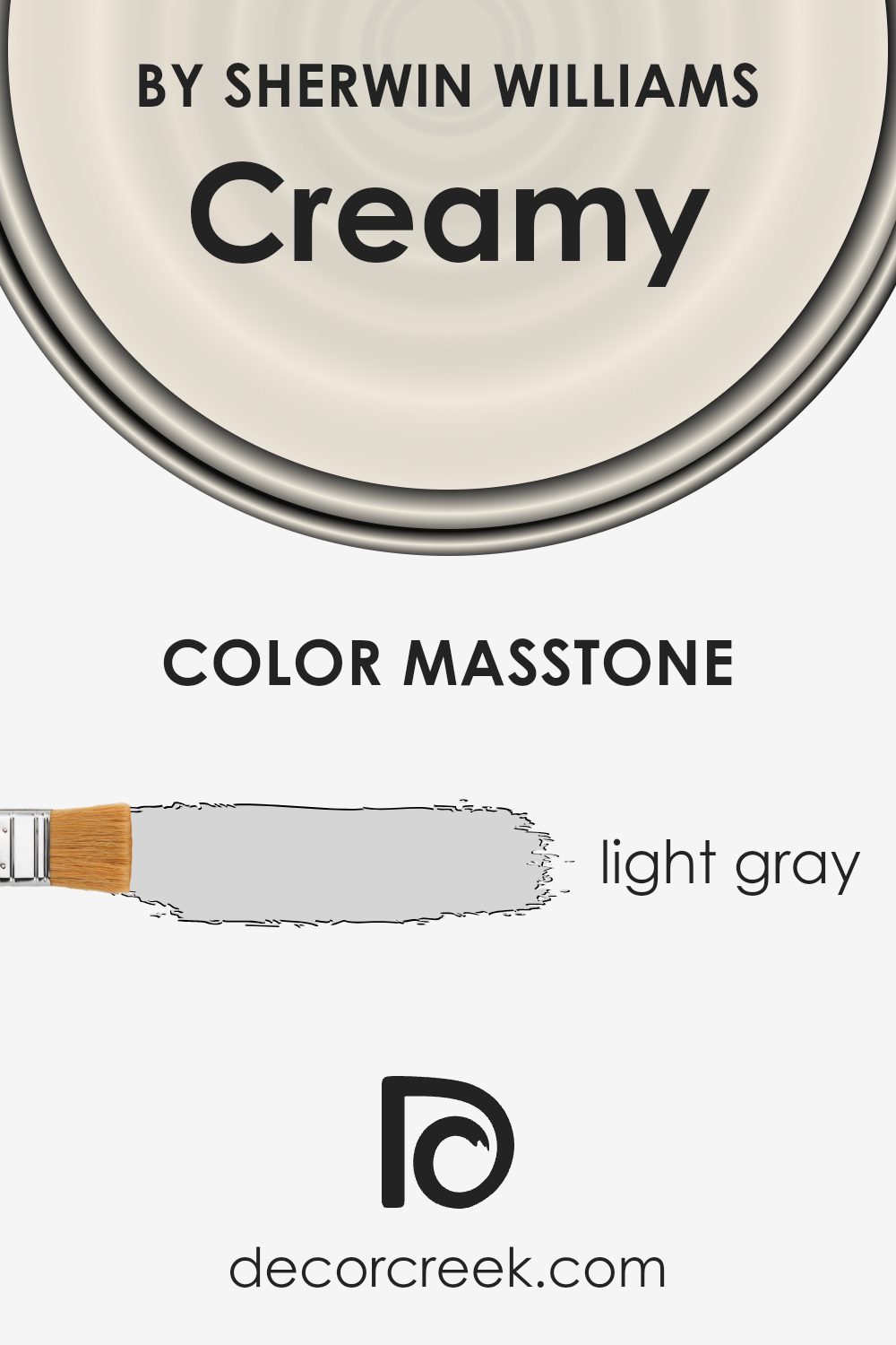
What is the Masstone of the Creamy SW 7012 by Sherwin Williams?
Creamy SW 7012 by Sherwin Williams has a masstone of light gray, identified by the color code #D5D5D5. This subtle and soft shade of gray brings a serene and calm feel to any room in the home. Its light gray tone makes it highly versatile, blending seamlessly with a wide array of decor styles and color palettes.
Whether you’re aiming for a modern minimalist look, a cozy cottage vibe, or a sleek contemporary style, this color provides a neutral backdrop that complements furniture, artwork, and textiles of any color.
In spaces where natural light is abundant, Creamy SW 7012’s light gray masstone reflects and amplifies the light, making rooms appear more spacious and airy. In rooms with less natural light, it adds brightness without the starkness often associated with pure white.
Its unobtrusive nature allows other elements in the room to stand out, making it an excellent choice for walls, trim, or ceilings. Furthermore, this hue can enhance relaxation and comfort, making it ideal for bedrooms and living spaces.
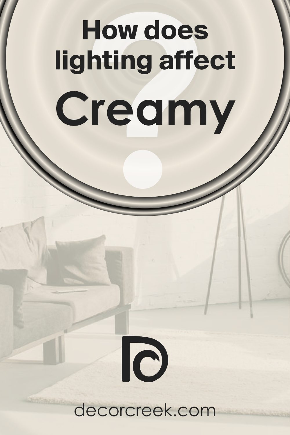
How Does Lighting Affect Creamy SW 7012 by Sherwin Williams?
Lighting plays a critical role in how we perceive colors. A color can look different depending on the light source illuminating it, whether it’s natural sunlight or artificial light. This effect is due to how light influences our color perception and the way colors reflect or absorb light.
Take a soft, warm neutral like the color Creamy. In natural light, this color tends to appear brighter and more true to its original hue. It exudes a cozy and welcoming atmosphere, making spaces feel open and airy. Under the clear, broad spectrum of sunlight, its yellow undertones can become more pronounced, giving off a soothing, sunny vibe.
- In artificial light, the appearance of this color can vary significantly based on the type of bulbs used. Warm light bulbs enhance its creamy, warm qualities, making it more inviting. In contrast, cooler bulbs might make it appear slightly muted, but still maintaining its inviting essence.
- Room orientation affects how this color is perceived throughout the day. In north-facing rooms, which receive less direct sunlight, it may take on a more muted, subtle look, yet it retains a certain warmth that enlivens the space. South-facing rooms, drenched in abundant sunlight, bring out the richness of the color, making it appear more vibrant and lively.
- East-facing rooms enjoy the warmth of the morning sun, making Creamy bloom with a gentle, welcoming glow in the mornings, then turning softer and more subdued as the day progresses. West-facing rooms, however, experience the opposite; the color stays cooler during the morning and warms up in the late afternoon and evening as the sun sets, creating a cozy atmosphere that’s perfect for relaxing.
In summary, the perception of this color changes in different lights and directions, demonstrating the dynamic nature of colors under varying lighting conditions. It shows how versatile and adaptive Creamy can be, accommodating various moods and settings by merely shifting in light.
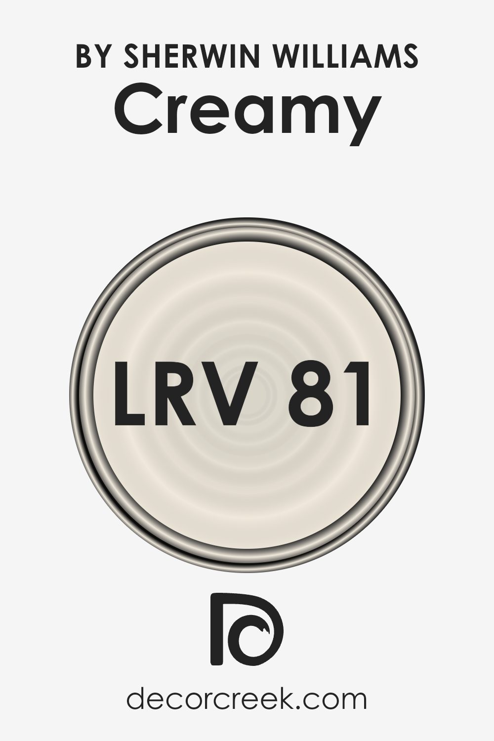
What is the LRV of Creamy SW 7012 by Sherwin Williams?
When it comes to the specific color with an LRV of 81.191, it means the paint is fairly light, reflecting a good amount of light back into the room. For this particular shade, you can expect it to brighten up the space considerably, making it appear open and airy. This high LRV is beneficial if you’re looking to enhance the natural light in a room or if your goal is to make a smaller space seem larger.
Since lighter colors can also be more forgiving when it comes to imperfections in your walls, this color could be a good choice for walls that aren’t perfectly smooth or for spaces that get a lot of natural light variation throughout the day.
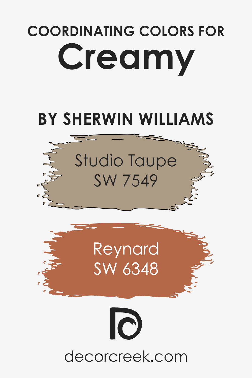
Coordinating Colors of Creamy SW 7012 by Sherwin Williams
Coordinating colors are those that complement each other well in design and decor, creating a balanced and visually appealing look. When you have a base color like a soft, warm hue, selecting coordinating colors involves finding shades that harmonize with this base while adding contrast and interest. In the case of a gentle and inviting hue, you can enhance its coziness and appeal by pairing it with carefully selected coordinating colors. These colors should ideally enhance the base color’s attributes without overpowering it, offering a palette that’s both diverse and cohesive.
For instance, SW 7549 – Studio Taupe is a wonderful coordinating color. This particular shade offers a rich, grounded feel, blending beautifully with warmer tones to create a serene and sophisticated atmosphere. Its earthiness complements the creamy base by providing depth and stability to the space.
On the other hand, SW 6348 – Reynard is a vibrant, warmer shade that adds a touch of energy and warmth to the room. It stands out against a softer backdrop, bringing life and character to the ensemble. Together, these coordinating colors work seamlessly to enhance the beauty of the space, offering a balanced and inviting look that draws the eye and comforts the soul.
You can see recommended paint colors below:
- SW 7549 Studio Taupe
- SW 6348 Reynard
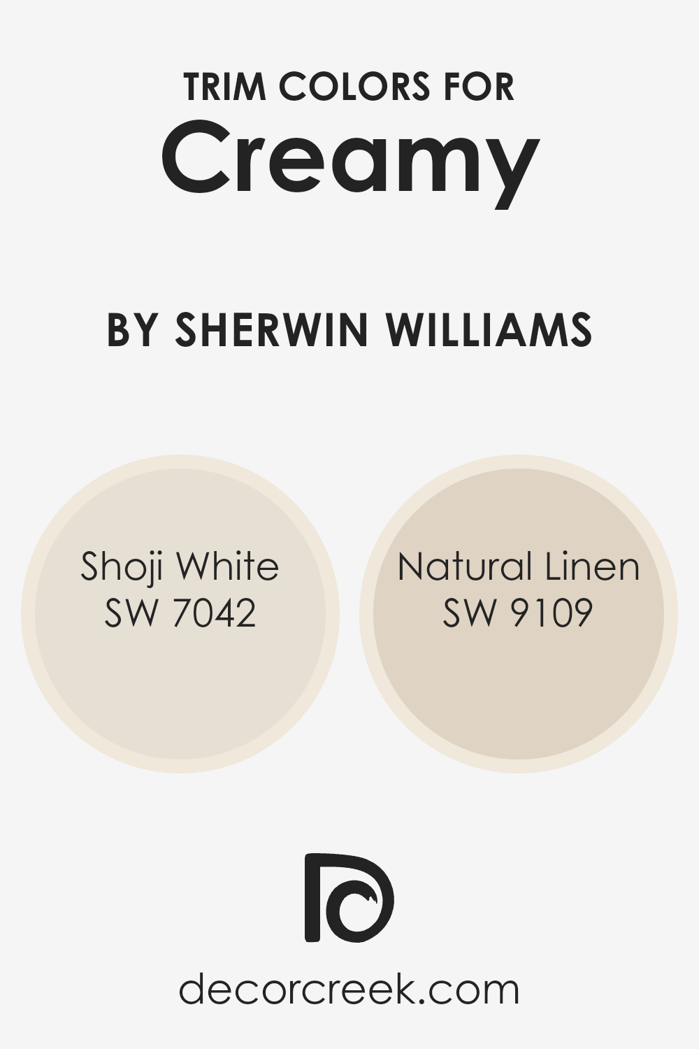
What are the Trim colors of Creamy SW 7012 by Sherwin Williams?
Trim colors play a crucial role in interior and exterior design by accentuating the architectural features of a room or a building. They help in framing and highlighting spaces, creating clear visual lines that enhance the overall aesthetic. When paired with a warm and inviting hue like Creamy (SW 7012) by Sherwin Williams, trim colors can significantly amplify the coziness and charm of the space.
Choosing the right trim color is essential in achieving the desired contrast or continuity with the wall color. For a color like Creamy, which exudes a soft, welcoming glow, the choice of trim color can either subtly define the space or add a striking visual boundary.
Shoji White (SW 7042) is a soft, warm white with a touch of beige, making it an excellent choice for trim, offering a gentle contrast against the warmer, richer tones of Creamy. This combination can create a seamless transition between the wall and trim, promoting a sense of harmony and spaciousness in the room.
Natural Linen (SW 9109), on the other hand, is a light, neutral beige that brings a hint of earthiness to the trim, providing a slightly stronger contrast against Creamy while still maintaining a cohesive and inviting atmosphere. Both colors, by subtly contrasting with or complementing the wall color, play a critical role in enhancing the visual appeal and overall mood of a space designed with Creamy (SW 7012) in mind.
You can see recommended paint colors below:
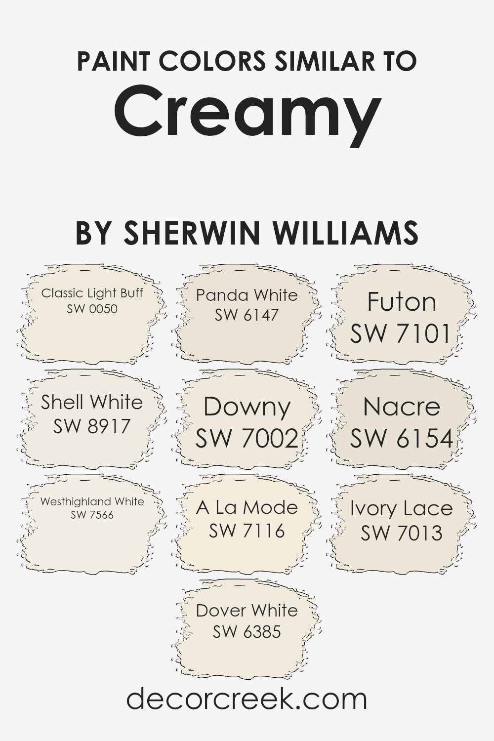
Colors Similar to Creamy SW 7012 by Sherwin Williams
Choosing similar colors, like shades that complement Creamy by Sherwin Williams, plays a crucial role in interior design because they create a harmonious and balanced look. These colors, while distinct, share a subtle connection that can enhance the aesthetic appeal of a room, making it feel more cohesive and visually pleasing. Whether you’re looking to create a soothing ambiance or simply want a neutral backdrop that allows your decor to stand out, similar shades offer a versatile solution.
They work together by providing a seamless transition between spaces, ensuring that no single color overwhelms the environment. This technique allows for a sophisticated blend that can make your space look larger and more inviting.
- Classic Light Buff introduces a soft, warm touch that mimics the early morning sun’s gentle rays, perfect for creating a welcoming atmosphere.
- Shell White brings in a slightly lighter hue, reminiscent of seashells by the shore, offering a crisp, clean look.
- Westhighland White takes a step towards a purer white, providing a fresh canvas that pairs well with any color palette.
- Dover White adds a hint of warmth, making spaces feel cozy yet bright.
- Panda White strikes a balance between beige and white, offering a perfect neutral backdrop.
- Downy is like the first snowfall’s softness, adding a serene, peaceful touch.
- A La Mode, with its understated elegance, blends seamlessly into modern and traditional decors alike.
- Futon suggests a minimalist approach with its understated, creamy texture.
- Nacre resembles the precious inner layer of pearls, giving rooms a refined, sophisticated edge.
- Lastly, Ivory Lace offers a vintage charm, reminiscent of delicate, antique lace, perfect for spaces that aim for a soft, nostalgic feel.
Together, these shades enrich the ambiance by offering a collective palette that’s both nuanced and expansive, suitable for any design vision.
You can see recommended paint colors below:
- SW 0050 Classic Light Buff
- SW 8917 Shell White
- SW 7566 Westhighland White
- SW 6385 Dover White
- SW 6147 Panda White
- SW 7002 Downy
- SW 7116 A La Mode
- SW 7101 Futon
- SW 6154 Nacre
- SW 7013 Ivory Lace
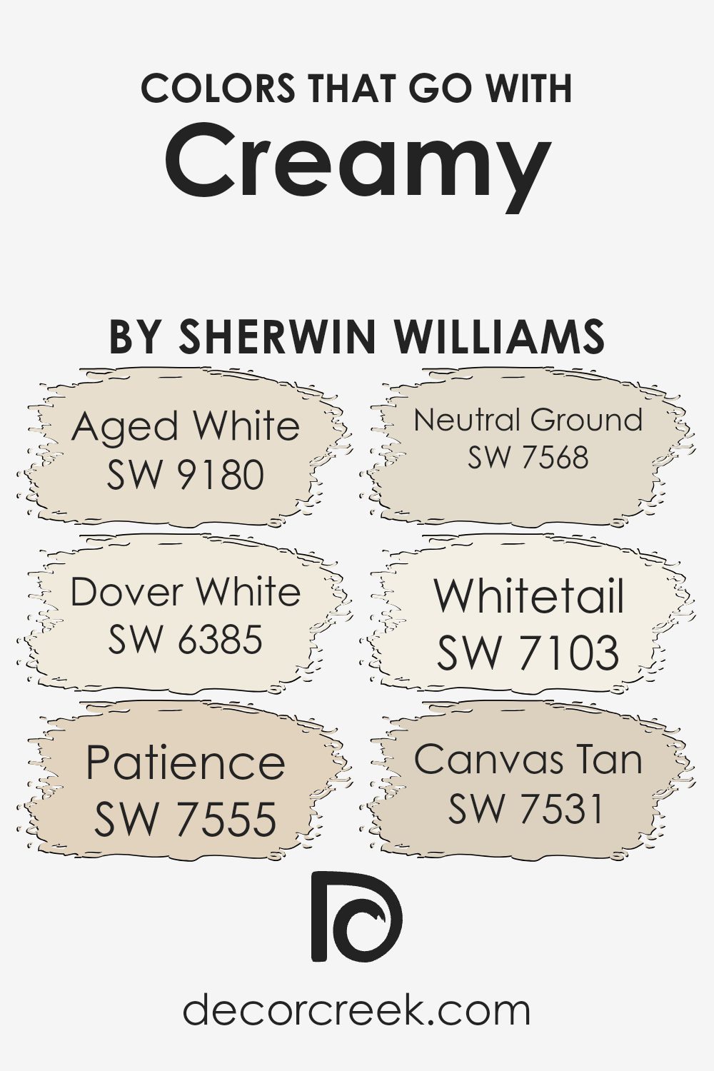
Colors that Go With Creamy SW 7012 by Sherwin Williams
Colors that complement Sherwin-Williams’ Creamy (SW 7012) play a crucial role in interior design because they help create a harmonious and appealing aesthetic. Creamy SW 7012 itself is a soft, warm white that brings a cozy and inviting atmosphere to any space.
When paired with the right colors, like Aged White (SW 9180), Dover White (SW 6385), Patience (SW 7555), Neutral Ground (SW 7568), Whitetail (SW 7103), and Canvas Tan (SW 7531), it can enhance the room’s overall look, making it seem more cohesive and well-thought-out.
These colors work well with Creamy because they share similar undertones, ensuring that no single color overpowers another, allowing for a seamless transition from one hue to another.
- Aged White (SW 9180) is a gentle off-white with a hint of beige, perfect for creating a soft, muted look alongside Creamy.
- Dover White (SW 6385) offers a slightly brighter approach but still maintains a warm, welcoming vibe that complements the understated elegance of Creamy.
- Patience (SW 7555) is a deeper, more pronounced color that adds contrast while still fitting within the warm palette, and Neutral Ground (SW 7568) brings a balanced, earthy beige into the mix, grounding the lighter tones.
- Whitetail (SW 7103) is a very light, almost pure white, providing a crisp, clean look that can help highlight Creamy’s depth.
- Lastly, Canvas Tan (SW 7531) introduces a hint of tan that works well with Creamy, adding a touch of richness and warmth to the palette.
Together, these colors form a cohesive and inviting palette that enhances the beauty and versatility of Creamy SW 7012.
You can see recommended paint colors below:
- SW 9180 Aged White
- SW 6385 Dover White
- SW 7555 Patience
- SW 7568 Neutral Ground
- SW 7103 Whitetail
- SW 7531 Canvas Tan
Creamy SW 7012 by Sherwin Williams Color Palette
Creamy always brings a warm, gentle glow that instantly softens the entire room. There’s something truly comforting about the way this shade settles into a space—never harsh, never too bright, but full of quiet warmth. I love pairing it with Extra White or Alabaster when I want brightness that still feels tender and inviting. These two shades help Creamy open up a room without stealing its warmth.
For deeper contrast, Urbane Bronze and Tricorn Black add a strong grounding moment that keeps the palette looking polished and steady. They offer the right amount of depth while allowing Creamy to remain the soft heart of the palette. Accessible Beige, Tony Taupe, and Amazing Gray create gentle transitions that help everything feel cohesive and naturally blended.
Together, these colors form a palette that feels cozy, balanced, and full of quiet comfort, perfect for anyone who loves warm, welcoming interiors.

How to Use Creamy SW 7012 by Sherwin Williams In Your Home?
Creamy SW 7012 by Sherwin Williams is a soft, inviting paint color that works wonders in making any room feel warm and cozy. Its light buttery tone can help brighten up spaces, from kitchens to living rooms, making them feel more welcoming without being too bold. The subtle nature of Creamy SW 7012 makes it super versatile, fitting into a variety of decorating styles, whether you’re into modern minimalism or cozy country.
For those looking to refresh their home, this color can be a great choice for walls. It pairs nicely with whites, giving a clean look, or with dark colors for a striking contrast. Besides walls, you can use it on cabinets or furniture to add a touch of softness without overwhelming the space.
It’s particularly useful in smaller rooms or those with less natural light, as it can help make the area appear larger and brighter. Easy to apply and match with decor, Creamy SW 7012 offers a simple yet effective way to update your home.
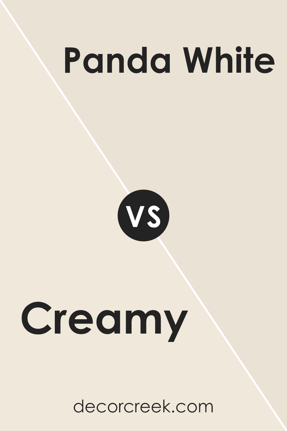
Creamy SW 7012 by Sherwin Williams vs Panda White SW 6147 by Sherwin Williams
Creamy SW 7012 and Panda White SW 6147 are two popular colors from Sherwin Williams, each offering a unique vibe. Creamy is a soft, warm hue with yellow undertones, giving spaces a cozy and inviting feel. It’s perfect for those who want to add a touch of warmth to their rooms without overwhelming them with too much color. On the other hand, Panda White is a cool, neutral white with a hint of gray.
This color is great for creating a clean, airy look, making small spaces appear larger and more open. It’s an excellent choice for minimalistic or modern designs, where the goal is to achieve a calm and serene atmosphere.
While Creamy adds warmth, Panda White offers a crisp background, making them suitable for different design needs. Whether you’re aiming for a cozy ambiance or a sleek modern look, these colors can beautifully transform your space.
You can see recommended paint color below:
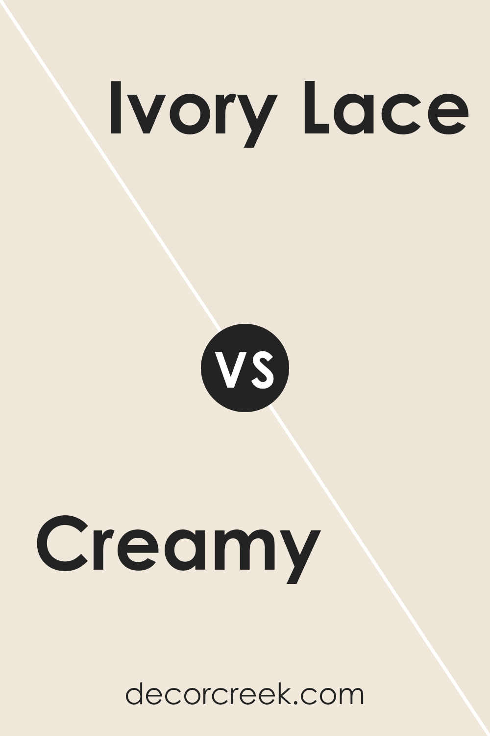
Creamy SW 7012 by Sherwin Williams vs Ivory Lace SW 7013 by Sherwin Williams
Creamy SW 7012 and Ivory Lace SW 7013, both from Sherwin Williams, share a subtle elegance but exhibit distinct tones that set them apart. Creamy, as its name suggests, has a rich, warm undertone that brings a cozy feel to spaces.
It’s like the comforting shade of a well-loved ivory sweater, offering a soft yet inviting backdrop to any room. On the other hand, Ivory Lace has a slightly lighter presence, providing a delicate and refined touch. This color evokes the feel of sunlight softly filtering through sheer curtains, creating a bright and airy atmosphere.
While Creamy adds warmth and depth, making spaces feel snug and welcoming, Ivory Lace introduces a sense of freshness and lightness, ideal for creating a serene and calm environment.
Both colors are versatile and can blend well with various decor styles, yet each brings its unique vibe to the table – Creamy, a hint of warmth and coziness, and Ivory Lace, a breath of fresh air and elegance.
You can see recommended paint color below:
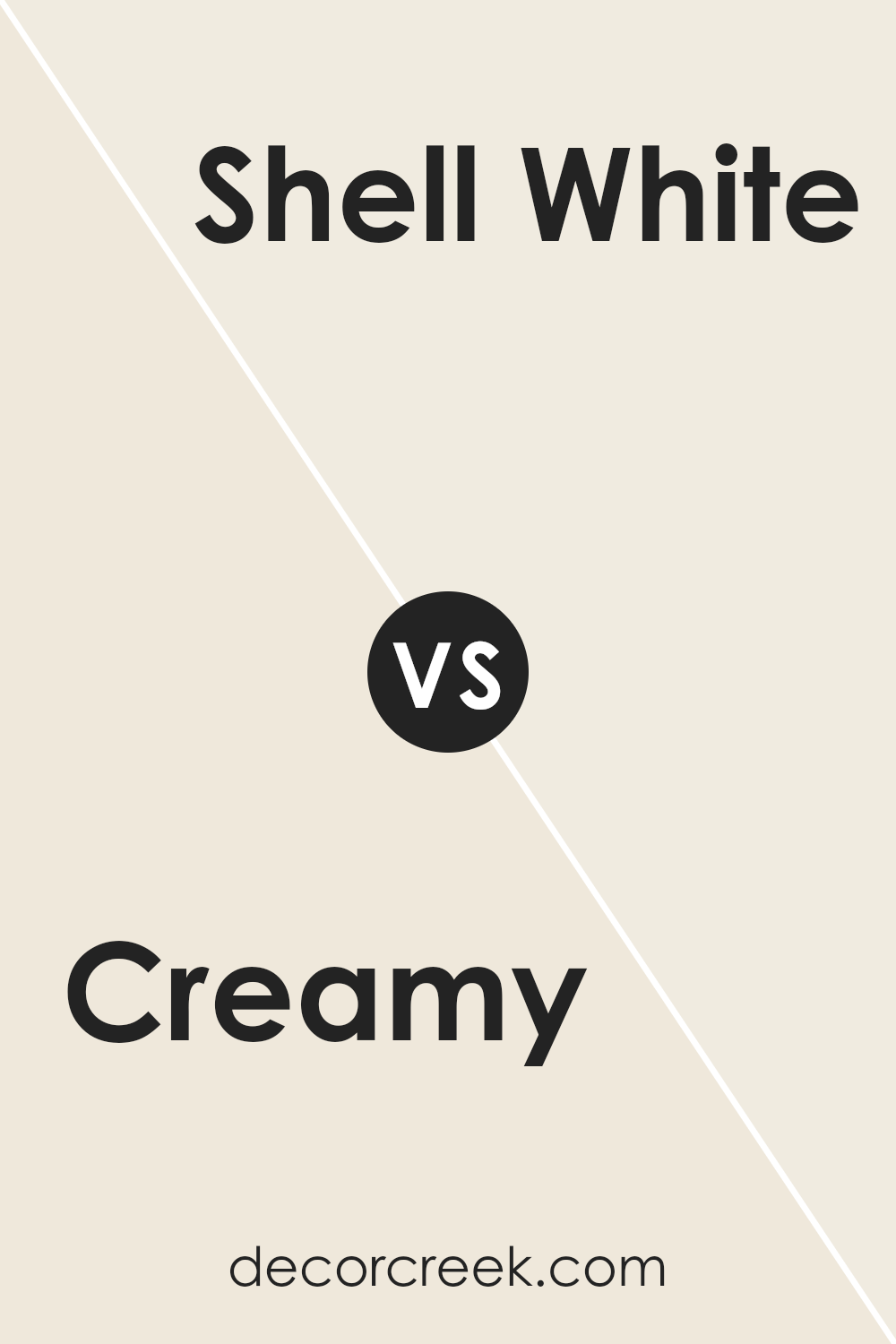
Creamy SW 7012 by Sherwin Williams vs Shell White SW 8917 by Sherwin Williams
Comparing the two colors, Creamy and Shell White, both by Sherwin Williams, reveals a subtle yet distinct difference in their tones. Creamy, as its name suggests, carries a warm, buttery feel, making it an ideal choice for creating a cozy and inviting ambiance.
It projects a hint of yellow undertone, which adds to its richness and depth. On the other hand, Shell White leans towards a cleaner, more neutral shade. It is much lighter, offering a feeling of freshness and simplicity. Shell White is perfect for those seeking a minimalist or a more modern look, as it serves as a gentle backdrop that can complement any color scheme.
While Creamy adds warmth and character to a space, Shell White provides a crisp, straightforward canvas. Both colors share an inherent versatility, yet cater to different aesthetic preferences and design needs. Whether you’re aiming for warmth and coziness or a bright, open space, choosing between Creamy and Shell White can significantly influence the atmosphere of your room.
You can see recommended paint color below:
Creamy SW 7012 by Sherwin Williams vs Nacre SW 6154 by Sherwin Williams
Comparing Creamy and Nacre, both from Sherwin Williams, paints a picture of two softly nuanced hues. Creamy, as its name suggests, offers a subtle, rich undertone of yellow, giving off a warm and inviting vibe. It’s like the glow of morning light in a cozy, peaceful room. This color wraps spaces in a gentle brightness, bringing a sense of calm and comfort to any room.
On the other hand, Nacre leans more into the realm of neutrals with a hint of warmth lurking beneath its surface. It’s a bit like comparing the softness of early morning light to the delicate luster of a pearl; Nacre brings an understated elegance to spaces.
It’s less about making a statement and more about creating a timeless backdrop that complements various decors and styles.
When placed side by side, Creamy stands out for its warm, welcoming appeal, while Nacre offers a sophisticated, serene atmosphere. Both colors exhibit versatility and can enhance a room’s aesthetic in their unique ways, making them excellent choices for anyone looking to refresh their space.
You can see recommended paint color below:
- SW 6154 Nacre
Creamy SW 7012 by Sherwin Williams vs Westhighland White SW 7566 by Sherwin Williams
Sure! Both Creamy and Westhighland White are popular paint colors by Sherwin Williams, but they have some distinct differences. Creamy, as the name suggests, has a soft, warm, off-white hue that can add a cozy feel to any room. It’s a bit like vanilla ice cream, offering a comforting, gentle touch to walls and spaces. This color works well in rooms that could use a bit of warmth without overwhelming brightness.
On the other hand, Westhighland White is another off-white color, but it leans more towards a pure, clean white with just a hint of warmth. It’s kind of like a white canvas, providing a fresh and open feel that makes it a great choice for creating a bright and airy space. Westhighland White pairs exceptionally well with almost any color scheme, making it quite versatile for different design styles.
In summary, while both colors are in the off-white spectrum, Creamy brings a warmer, cozier feel, whereas Westhighland White offers a cleaner, brighter look. Your choice between them would depend on the type of atmosphere you want to create in your space.
You can see recommended paint color below:
Creamy SW 7012 by Sherwin Williams vs A La Mode SW 7116 by Sherwin Williams
Creamy and A La Mode by Sherwin Williams are two inviting colors, each offering a distinct mood to any space. Creamy, as its name suggests, has a rich, warm undertone that feels cozy and comforting. It’s like a soft blanket wrapping around the room, providing a calming and welcoming atmosphere. This color shines best in spaces where relaxation and warmth are key, making living rooms and bedrooms feel snug and inviting.
On the other hand, A La Mode is lighter and has a more understated elegance. It leans towards a neutral palette but retains enough warmth to prevent it from feeling cold or stark.
This color is versatile and fresh, perfect for brightening up a space without overpowering it. It works well in areas that receive a lot of natural light, enhancing the room’s openness and airiness.
In comparison, while both share a warm base, Creamy offers depth and coziness, making spaces feel more intimate. A La Mode, conversely, introduces a lighter, cleaner look that can make a room appear more spacious and serene. Each brings its unique vibe, catering to different tastes and design needs.
You can see recommended paint color below:
- SW 7116 A La Mode
Creamy SW 7012 by Sherwin Williams vs Downy SW 7002 by Sherwin Williams
The main color, Creamy, and the second color, Downy, both by Sherwin Williams, offer a soft and welcoming palette. Creamy has a warmer tone, bringing a cozy and comforting vibe to any space. It’s like the color of a soft wool blanket, adding a gentle touch of warmth and relaxation.
On the other hand, Downy leans towards a cooler spectrum, resembling the light, airy quality of a clear sky just after dawn. It’s more subdued, offering a sense of calmness and serenity that can make a room feel more open and breathable.
When comparing these two, think of Creamy as giving off a subtle warmth that makes a space feel lived-in and inviting, while Downy offers a crisp cleanliness with a touch of neutrality, making it versatile for different decor styles. Both colors work well to create a peaceful environment, but the choice between them depends on the ambiance you’re aiming to achieve: warmth and coziness with Creamy, or cool and calm with Downy.
You can see recommended paint color below:
Creamy SW 7012 by Sherwin Williams vs Dover White SW 6385 by Sherwin Williams
Creamy and Dover White are both popular paint colors from Sherwin Williams, but they have distinct differences that make each unique. Creamy, as the name suggests, offers a rich, smooth, and warm hue that resembles the luxuriousness of fresh cream. It has a softness to it that brings a cozy and comforting feel to spaces. Its warm undertones can make a room feel welcoming and bright without overwhelming the senses.
On the other hand, Dover White has a cleaner, crisper look. It stands out for its brightness and ability to make spaces feel more open and airy. Dover White leans more towards a pure white compared to Creamy, which has deeper, warmer tones.
This color is perfect for someone looking to create a fresh, vibrant look in their home, offering a neutral backdrop that is versatile and easy to match with various decor styles.
In summary, while both Creamy and Dover White are excellent choices for those seeking a neutral palette, Creamy offers warmth and richness, and Dover White brings clarity and brightness to a space.
You can see recommended paint color below:
Creamy SW 7012 by Sherwin Williams vs Classic Light Buff SW 0050 by Sherwin Williams
Creamy and Classic Light Buff, both by Sherwin Williams, are popular choices for those wanting to add a warm and inviting atmosphere to their spaces. Creamy, as its name suggests, offers a rich, soft tone reminiscent of a light, fluffy cream. This shade exudes a sense of coziness and comfort, making it ideal for living rooms and bedrooms where a relaxing ambiance is desired.
On the other hand, Classic Light Buff has a more subdued appearance. It’s a lighter, almost neutral beige that brings a clean and airy feel to any room. This color works well in spaces that aim for a minimalistic look or where the goal is to create a bright and open environment.
Both colors are versatile and can complement a wide range of decors and furniture choices. However, Creamy adds warmth and depth, making a room feel more intimate, while Classic Light Buff offers a lighter, refreshing touch that can make small spaces appear larger. Depending on the atmosphere you want to create, either color can be the perfect choice for giving your home a beautiful, timeless look.
You can see recommended paint color below:
- SW 0050 Classic Light Buff
Creamy SW 7012 by Sherwin Williams vs Futon SW 7101 by Sherwin Williams
Creamy (SW 7012) and Futon (SW 7101) are two shades by Sherwin Williams, each offering a unique vibe. Creamy, as its name suggests, has a soft, warm tone that adds a cozy and welcoming feeling to any space. It’s like a gentle hug for your walls, making the room feel naturally light and airy without being too stark or cold.
On the other hand, Futon (SW 7101) brings a slightly different mood. It’s a touch deeper than Creamy, offering a bit of neutrality that works well in spaces where you want a calm, understated elegance. It’s the kind of color that supports other hues, allowing them to shine while holding its ground, providing a sophisticated backdrop.
Both colors share a versatility, giving rooms a timeless appeal. However, the main difference lies in their undertones and depth. Creamy leans towards a warm, inviting vibe, perfect for creating a snug environment. Futon, while also warm, edges towards a more reserved look, ideal for spaces aiming for a chic, minimalist aesthetic.
You can see recommended paint color below:
- SW 7101 Futon
Conclusion
Concluding, the color Creamy SW 7012 by Sherwin Williams is a versatile and warm shade that brings a sense of coziness and brightness to any space. Its ability to blend well with various decor styles and colors makes it a popular choice among homeowners and designers alike. This soft hue can create a comforting atmosphere in rooms, making it ideal for living areas, kitchens, and bedrooms where a welcoming vibe is desired.
Moreover, the practicality of Creamy in enhancing natural light and adding a subtle elegance without overwhelming a room highlights its appeal.
It is a go-to color for those looking to achieve a serene and inviting space. This paint color proves to be an excellent choice for anyone looking to refresh their home with a timeless and beautiful shade that exudes warmth and sophistication.

Ever wished paint sampling was as easy as sticking a sticker? Guess what? Now it is! Discover Samplize's unique Peel & Stick samples.
Get paint samples

