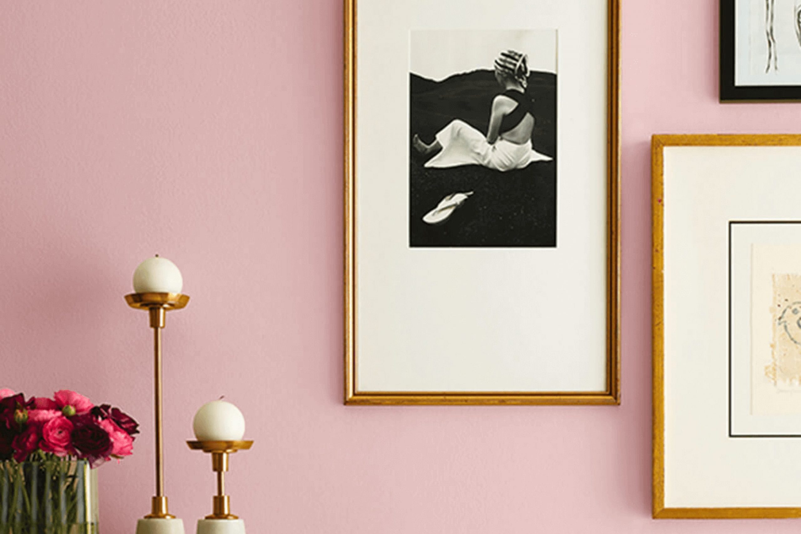
If you’re planning to give any room in your house a fresh coat of paint, you might want to consider the unique charm of SW 0076 Appleblossom by Sherwin Williams. This paint color is a subtle, yet warm shade that brings a gentle elegance to any area without weighing it down with too much intensity. Whether you’re looking to spruce up your living room or give your bedroom a cozy vibe, Appleblossom can provide that touch of simplicity and warmth that you’re looking for.
I’ve found it to be particularly useful in areas that need a little brightness because of its soft and airy feel. For anyone trying to achieve a homey, welcoming atmosphere, this color works wonders paired with natural light, enhancing the room’s overall mood.
It’s easy to complement with a variety of decor styles, from rustic wood finishes to modern minimalism.
If the goal is to create a peaceful and friendly area, Appleblossom is a reliable choice that seems to adapt beautifully to various settings and furnishings.
What Color Is Appleblossom SW 0076 by Sherwin Williams?
The color Appleblossom by Sherwin Williams is a gentle, warm pink hue with soft, peachy undertones that give it a cozy, welcoming feel. This color can brighten up an area while maintaining a subtle, soothing presence. It’s not overly bold but has just enough depth to add character to a room.
Appleblossom works beautifully in a variety of interior styles, particularly those that favor a soft, romantic aesthetic like shabby chic, contemporary, or even Scandinavian if used as an accent. It pairs wonderfully with neutral colors such as whites, creams, and light grays which help to maintain a light and airy feel in the decor.
Materials like soft linens, smooth satin, and plush velvets complement the softness of Appleblossom, enhancing the overall gentle feel of the room. Natural wood, wicker, and woven fabrics also match well, adding a touch of rustic charm that contrasts nicely with the color’s softness.
In terms of functionality, Appleblossom is a great choice for living rooms, bedrooms, or nurseries, creating an inviting and warm atmosphere. Its gentle hue makes it easy on the eyes, which is ideal for areas where you spend a lot of time relaxing.
decorcreek.com
Is Appleblossom SW 0076 by Sherwin Williams Warm or Cool color?
Appleblossom SW 0076 by Sherwin Williams is a paint color that brings a cozy warmth to any room. This shade has a subtle, soothing quality without being too intense, making it perfect for creating a relaxed atmosphere in your home. It works especially well in living rooms and bedrooms where a soft, welcoming vibe is desired.
Because it’s a fairly neutral color, Appleblossom blends seamlessly with various decor styles and complements many furniture colors and materials. Whether your home features modern minimalist furniture or more classic and rustic pieces, this color can tie the room together nicely.
For those looking to freshen up their areas without making drastic changes, Appleblossom can be an excellent choice. It’s soft enough to act as a background, allowing other design elements to stand out, yet has enough presence to make a statement on its own when used in larger areas or as a feature wall. Plus, it’s adaptable enough to be paired with bolder colors for a dynamic look or with pastels for a more gentle ambiance.
Undertones of Appleblossom SW 0076 by Sherwin Williams
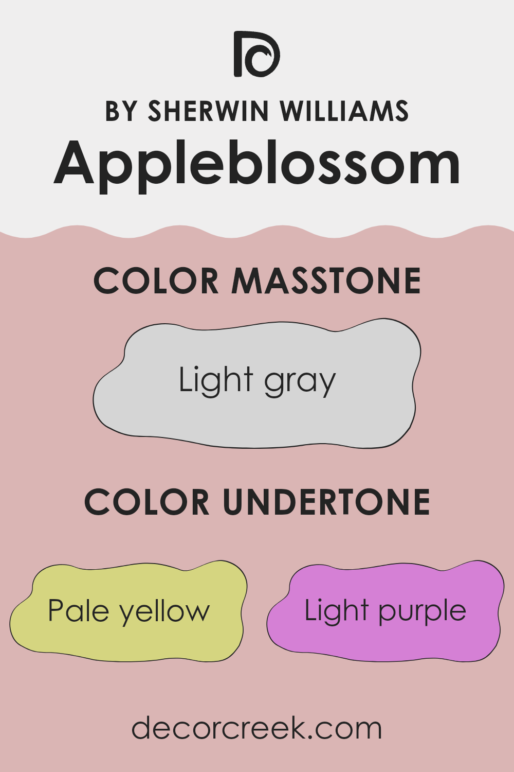
Appleblossom is a unique paint color that comes alive with various undertones, subtly influencing how it looks in different settings. These undertones include pale yellow, light purple, pale pink, light blue, mint, lilac, and grey. Each undertone contributes to the overall perception of the color, making it flexible and adaptive to various decors and lighting conditions.
Undertones are essentially subtle colors that lie beneath the primary color. They can significantly affect how a paint color looks on the walls of a room, depending on the natural and artificial light. For instance, in a room with ample natural light, the pale yellow and light blue undertones might make Appleblossom appear brighter and more vibrant. In contrast, in an area with less natural light, the grey and lilac undertones could make the color appear softer and more muted.
When used on interior walls, Appleblossom brings a dynamic yet gentle ambiance to the room. The blend of its undertones allows it to pair well with various furnishings and decors, offering flexibility in design choices. For example, the light purple and pale pink undertones could enhance a romantic or cozy feel, while the mint and light blue undertones could help create a more refreshing and airy atmosphere.
Overall, Appleblossom’s array of undertones makes it an excellent choice for anyone looking to add a touch of color that can adapt and change subtly with different lighting and decor, making each room unique and personalized.
What is the Masstone of the Appleblossom SW 0076 by Sherwin Williams?
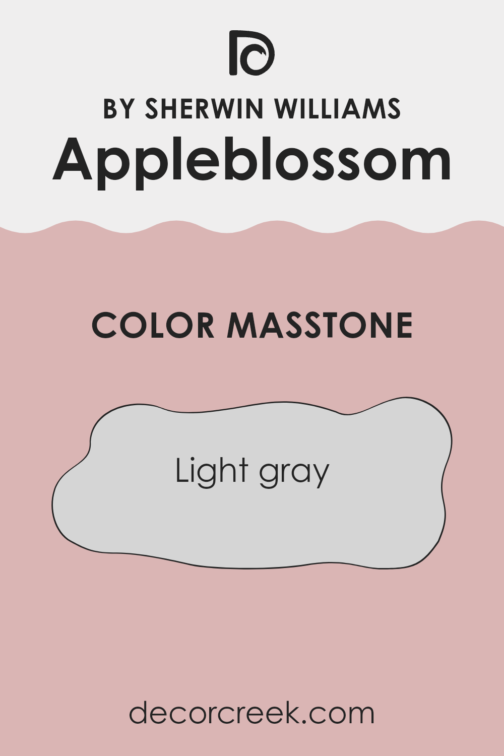
AppleblossomSW 0076 by Sherwin Williams has a masstone of light gray, coded as #D5D5D5. Typically, light gray offers a neutral background, making it flexible for different home settings. It’s easy to match with a wide variety of decor elements, from bold and bright to soft and subtle.
In brightly lit areas of the home like living rooms or kitchens, this light gray can help reflect natural light, making areas appear larger and more open. In smaller or less lit areas, such as hallways or small bathrooms, it avoids the sense of crowding that darker colors might create. Additionally, it’s a practical choice for hiding minor wall imperfections and maintaining a clean look over time.
Overall, its light and neutral tone provides a flexible backdrop, allowing personal taste and style preferences to stand out through furniture and accessories. This makes AppleblossomSW 0076 a reliable option for those seeking a straightforward yet effective color solution for their home.
How Does Lighting Affect Appleblossom SW 0076 by Sherwin Williams?
Lighting plays a crucial role in how we perceive colors. Different light sources can dramatically change the way a color looks in an area. For instance, natural sunlight tends to bring out the truest hue of a color, while artificial lighting can alter how we see it, depending on the type of light bulb used.
Taking the color Appleblossom as an example, its appearance can vary in different lighting conditions. In natural light, Appleblossom tends to show its true color—a soft, warm pink with a hint of peach. This hue is generally consistent throughout the day in natural light, although it can appear slightly brighter and more vivid when the sun is at its peak.
Under artificial lighting, Appleblossom’s appearance can differ. Fluorescent lights, which have a cooler tone, might make the color look slightly washed out, reducing its warmth. In contrast, incandescent or warm LED lights enhance its peachy pink tones, making the color appear richer and more welcoming.
The orientation of a room also influences how Appleblossom appears:
- North-faced rooms: These rooms get less direct sunlight, which can make colors appear cooler and more muted. Appleblossom in a north-facing room might look more subdued and less vibrant.
- South-faced rooms: These rooms receive ample sunlight, which can make colors look brighter and truer to their natural shade. Here, Appleblossom would likely appear warm and lively throughout most of the day.
- East-faced rooms: Morning light in these rooms is warm and bright, making Appleblossom look inviting and cheerful in the morning, potentially fading to a more gentle hue as the light diminishes throughout the day.
- West-faced rooms: Evening light, which is warm and golden, will illuminate Appleblossom beautifully, especially in the late afternoon and early evening, enhancing its warm tones.
Overall, the effect of lighting on a color like Appleblossom is significant, impacting both the mood and the visual dynamics of any area.
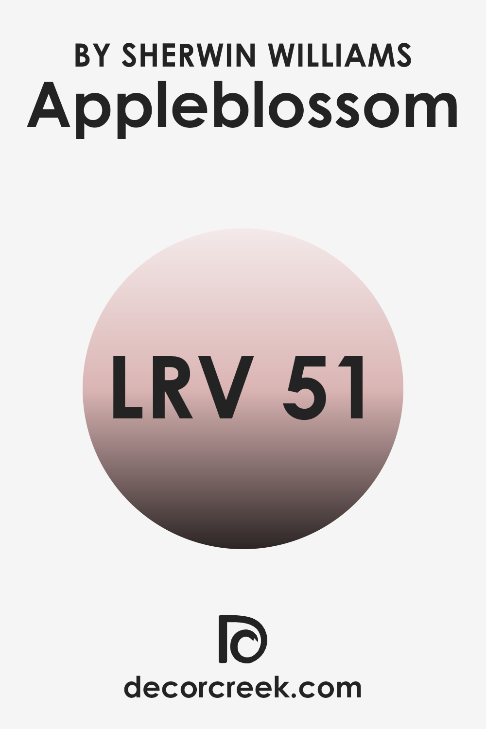
What is the LRV of Appleblossom SW 0076 by Sherwin Williams?
Light Reflectance Value (LRV) measures the percentage of light a paint color reflects back into a room compared to the total light falling on it. This value ranges from 0, which means no light is reflected and it absorbs all the light, to a high number indicating a surface that reflects more light back.
Generally, the higher the LRV, the lighter the paint appears when applied to walls. It plays a crucial role in deciding how bright or dark a room will feel once it’s painted. For instance, lighter colors with higher LRVs make a room feel more open and airy because they reflect more light around the area.
The LRV of 51.334 for a color like Appleblossom suggests it’s in the middle spectrum, neither too light nor too dark. This LRV means the color can help a room feel neither overly bright nor too enclosed. In areas with moderate natural light, Appleblossom will comfortably reflect a decent amount of light, contributing to a balanced ambiance that neither dominates the area with brightness nor feels too muted. This makes it flexible for various decorating styles and areas, providing just enough reflection to support a welcoming and harmonious environment without becoming too intense.
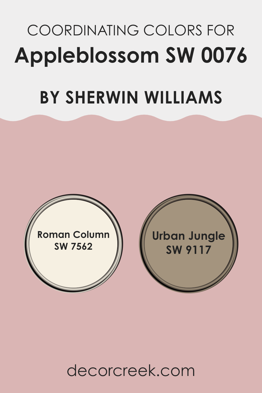
Coordinating Colors of Appleblossom SW 0076 by Sherwin Williams
Coordinating colors are shades that complement each other when used together in decorating or design, creating a harmonious and visually appealing area. The idea is to select colors that either contrast in a pleasing way or are similar in tone, enhancing the overall aesthetic without becoming too intense for the senses. For example, when decorating with a base color like the subtle pink hue of Appleblossom by Sherwin Williams, choosing coordinating colors carefully can help achieve a balanced look.
One such coordinating color is Roman Column SW 7562, a soft and warm off-white shade that creates a gentle contrast with warmer hues like Appleblossom. This color works well as it subtly enhances the warmth of the pink without clashing or taking away from its gentle charm. It’s perfect for trims, ceilings, or larger wall sections where a soft, reflective quality is desired.
Another coordinating option is Urban Jungle SW 9117, which is a deeper, muted green shade. This color adds a natural, grounding effect when paired with the lightness of Appleblossom, offering a calming, yet enriching vibe that can make greenery in the room pop or give a rich backdrop to lighter furnishings. Together, these coordinating colors can provide a balanced, appealing ambiance to any area.
You can see recommended paint colors below:
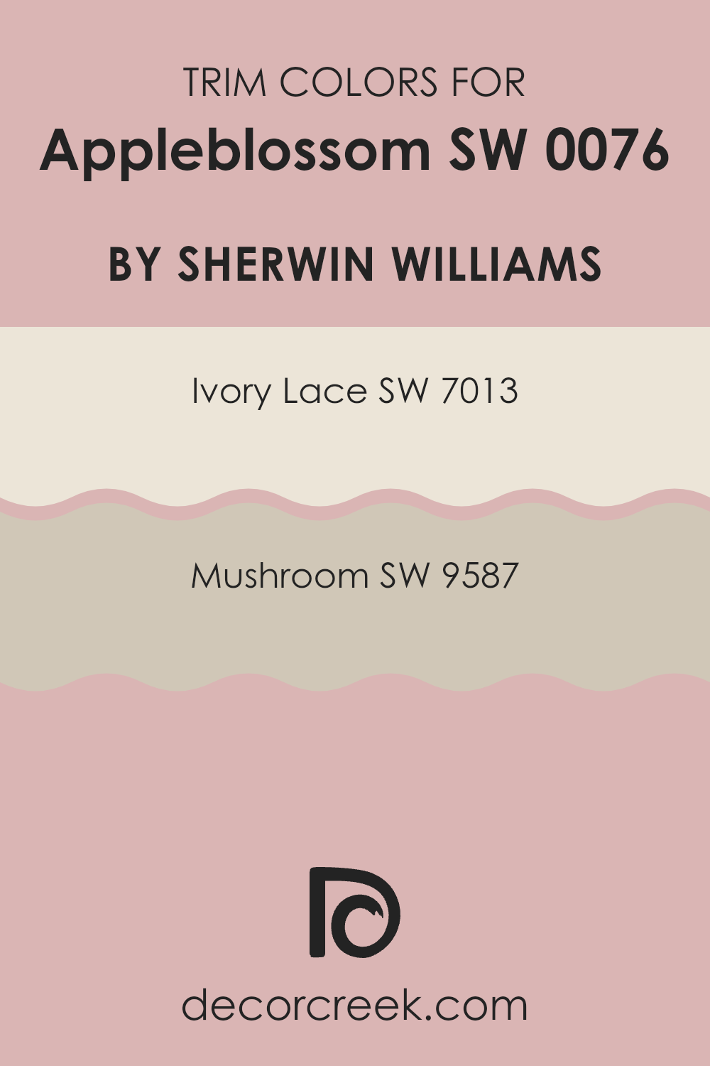
What are the Trim colors of Appleblossom SW 0076 by Sherwin Williams?
Trim colors are specific shades used to highlight or outline key features in rooms, such as window frames, doors, baseboards, and moldings, and they help to define and accentuate the architecture of an area. Using trim colors effectively can make these details pop, providing a visual contrast that enhances the overall aesthetic of a room. For example, when using a gentle hue like Appleblossom by Sherwin Williams, selecting the right trim color is crucial to creating a pleasing balance that draws the eye without causing too much intensity.
Ivory Lace SW 7013 is a soft, creamy white that offers a subtle contrast, glowing warmly against more understated wall colors. It works exceptionally well in areas where a light, airy feel is desired, reflecting natural light and giving a clean, finished look to the edges of a room.
Mushroom SW 9587, on the other hand, is a deeper, earthy beige that provides a grounding effect. This color is ideal for adding depth and warmth to an area, perfect for enhancing features and framing areas with a touch of natural elegance. Both trim colors complement Appleblossom nicely, either by softly highlighting architectural details or by adding a cozy, welcoming vibe.
You can see recommended paint colors below:
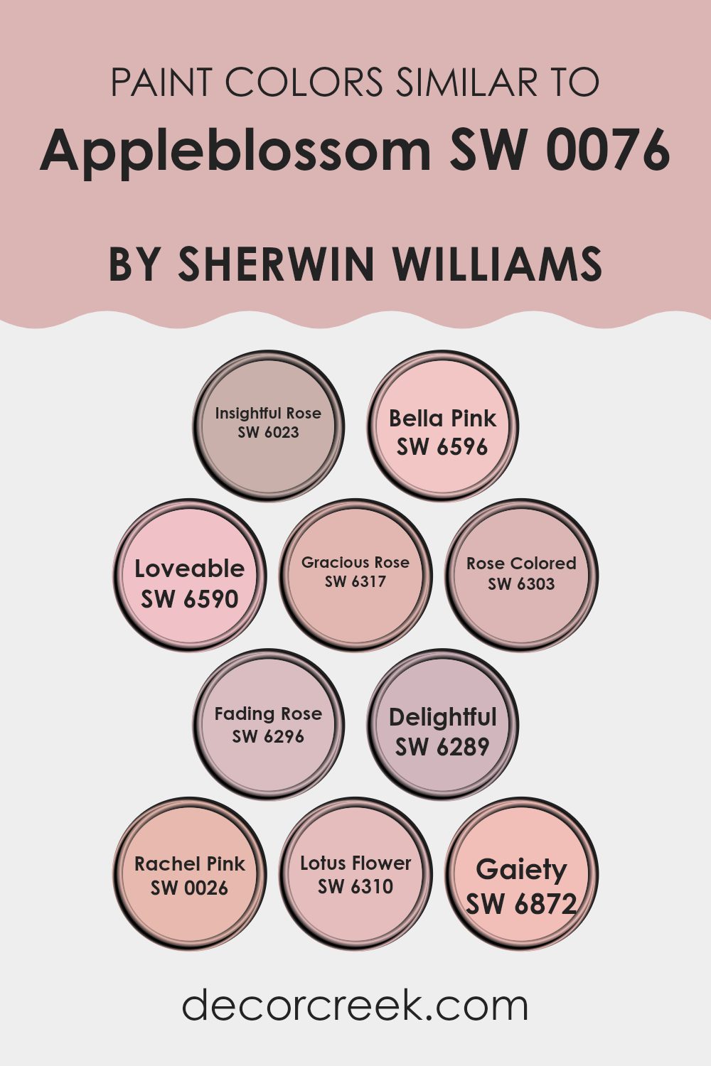
Colors Similar to Appleblossom SW 0076 by Sherwin Williams
Choosing similar colors for your interior or exterior design project is crucial because it ensures a harmonious and visually appealing look. It helps in creating a cohesive atmosphere by using shades that naturally complement each other. For example, Insightful Rose has a subtle depth that pairs beautifully with other pinks and neutrals, giving a sense of unity.
Bella Pink offers a more playful, slightly brighter hue that can enliven areas while still blending smoothly with milder tones. Loveable is aptly named for its warm and inviting presence, perfect for welcoming rooms. Gracious Rose carries a refined yet gentle tone, excellent for creating a polished, subtle contrast.
The softer Rose Colored brings an almost nostalgic feel to an area, ideal for achieving a soft, comforting environment. Fading Rose is muted and understated, great for those seeking a hint of color without creating too much intensity. Delightful, as the name suggests, provides a cheerful boost to any area, enhancing the mood with its light and airy presence.
Rachel Pink is a soft, delicate color that works well where you need a gentle touch of warmth. Lotus Flower, with its slightly exotic appeal, offers a fresh and uplifting vibe. Lastly, Gaiety stands out with its spirited and lively character, making it perfect for areas intended to inspire joy and activity. These colors, when used together, can create areas that are cohesive yet diverse, bringing all elements of a room together wonderfully.
You can see recommended paint colors below:
- SW 6023 Insightful Rose
- SW 6596 Bella Pink
- SW 6590 Loveable
- SW 6317 Gracious Rose
- SW 6303 Rose Colored
- SW 6296 Fading Rose
- SW 6289 Delightful
- SW 0026 Rachel Pink
- SW 6310 Lotus Flower
- SW 6872 Gaiety
How to Use Appleblossom SW 0076 by Sherwin Williams In Your Home?
Appleblossom SW 0076 by Sherwin Williams is a soft, subtle shade of pink that can bring a warm and inviting feel to any room in your home. This color is great for creating a cozy atmosphere in areas like living rooms and bedrooms. It’s light enough to make a small room appear larger and works well when paired with white trim or furnishings for a clean and classic look.
For those looking to add a bit of color without overpowering an area, Appleblossom is an excellent choice. It’s also flexible, blending well with various decor styles, whether you have modern tastes or prefer something more traditional. In a child’s room, it can offer a gentle and cheerful environment that’s perfect for play and rest.
Additionally, this color can be used in bathrooms or as an accent wall in dining areas to add a touch of warmth. Pairing it with complementary colors like soft greens or light browns can create a harmonious and welcoming palette.
Appleblossom SW 0076 by Sherwin Williams vs Fading Rose SW 6296 by Sherwin Williams
Appleblossom and Fading Rose, both by Sherwin Williams, offer subtle deviations in the realm of soft, warm tones. Appleblossom presents as a gentle, muted pink with an inviting quality that makes areas feel cozy yet light.
It’s a color that pairs well with soft whites and muted greens for a fresh and airy feel. On the other hand, Fading Rose leans toward a deeper, more subdued shade. This color offers a richer, almost antique-like rose tint, which can add a touch of warmth and traditional charm to rooms.
It works exceptionally well with darker furniture or in an area that seeks a more grounded, somewhat nostalgic aesthetic. Both colors are flexible in their own ways; Appleblossom could be perfect for lifting the mood of an area, while Fading Rose is ideal for creating a cozy, enveloping atmosphere.
You can see recommended paint color below:
- SW 6296 Fading Rose
Appleblossom SW 0076 by Sherwin Williams vs Rose Colored SW 6303 by Sherwin Williams
Appleblossom and Rose Colored, both by Sherwin Williams, offer distinct shades perfect for different areas. Appleblossom is a soft, muted pink with a warm peach undertone, making it a cozy and inviting color that works well in living rooms or bedrooms.
In contrast, Rose Colored is a bolder, deeper pink with hints of red, adding a richer and more robust vibe suitable for areas that benefit from a strong color presence like dining rooms or accent walls.
Appleblossom’s subtlety suits those looking for a gentle splash of color that still maintains a relaxed atmosphere. Meanwhile, Rose Colored makes a statement and is perfect for those wanting to add some warmth and energy to their area. Both colors complement various decor styles, but the choice between them depends on the desired impact and room function. In summary, Appleblossom is gentle and cozy, whereas Rose Colored is bold and energetic.
You can see recommended paint color below:
- SW 6303 Rose Colored
Appleblossom SW 0076 by Sherwin Williams vs Gracious Rose SW 6317 by Sherwin Williams
Appleblossom and Gracious Rose, both by Sherwin Williams, offer two distinct takes on pink. Appleblossom is a softer, muted shade that leans toward a light, dusty pink. It has a subtle, understated quality, making it a great choice for creating a gentle, welcoming area. This color works well in areas where you want to keep the mood light and airy.
On the other hand, Gracious Rose is a deeper, more vibrant pink. It brings more energy and warmth to a room compared to Appleblossom. Gracious Rose stands out more prominently, making it suitable for areas where you wish to make a stronger visual impact or add a touch of warmth.
Both colors can enhance the aesthetics of a home, but your choice depends on the desired effect and mood. Appleblossom is ideal for those preferring a more delicate, soothing atmosphere, while Gracious Rose is perfect for adding a lively and cozy touch.
You can see recommended paint color below:
- SW 6317 Gracious Rose
Appleblossom SW 0076 by Sherwin Williams vs Lotus Flower SW 6310 by Sherwin Williams
Appleblossom and Lotus Flower, both by Sherwin Williams, present a soothing palette but in distinct ways. Appleblossom is a soft, muted pink with a warm undertone, giving it a cozy and welcoming feel. It’s perfect for rooms where you want a gentle touch of color that isn’t overpowering, like living rooms or bedrooms.
On the other hand, Lotus Flower is lighter and has a delicate, almost ethereal quality. This color is closer to a pastel pink and has a freshness that can brighten up an area. It works great in bathrooms or areas that need a light, airy feel.
When used together, these colors complement each other beautifully, with Appleblossom’s warmth balancing the lighter, cooler tones of Lotus Flower. They can create a harmonious and inviting area, especially in areas meant for relaxation.
You can see recommended paint color below:
- SW 6310 Lotus Flower

Appleblossom SW 0076 by Sherwin Williams vs Delightful SW 6289 by Sherwin Williams
Appleblossom and Delightful, both by Sherwin Williams, offer unique tones suited for different tastes and settings. Appleblossom is a subtle, warmer pink with a soft, welcoming vibe.
It pairs well with neutral colors, making it perfect for living rooms or bedrooms where a cozy atmosphere is desired. On the other hand, Delightful is a cooler, light sky blue that feels airy and light.
This shade is ideal for bathrooms or kitchens, providing a clean and refreshing look. Both colors, while distinct, lend a gentle, pleasing mood to areas without creating too much intensity. Whether one chooses the calmness of Appleblossom or the breezy touch of Delightful, each brings its charm and lightens up the room in its way.
You can see recommended paint color below:
Appleblossom SW 0076 by Sherwin Williams vs Loveable SW 6590 by Sherwin Williams
Appleblossom and Loveable by Sherwin Williams are two distinct shades. Appleblossom is a soft, gentle pink with a muted, almost peachy undertone. This color is perfect for creating a cozy and welcoming area.
It pairs well with delicate decor and light wood furniture, giving any room a calm, inviting feel. On the other hand, Loveable is a vibrant, bright pink. It’s a much bolder choice, standing out and adding a punch of color wherever it’s used.
Loveable works well in areas where you want to make a statement, such as an accent wall or in a playful child’s room. In contrast to the soothing nature of Appleblossom, Loveable brings energy and fun to areas. Both colors offer unique aesthetics but cater to different moods and settings within a home.
You can see recommended paint color below:
- SW 6590 Loveable
Appleblossom SW 0076 by Sherwin Williams vs Bella Pink SW 6596 by Sherwin Williams
Appleblossom and Bella Pink by Sherwin Williams are two distinct shades of pink, each having its own unique appeal. Appleblossom is a soft, muted pink with a subtle warmth to it. It’s a gentle color that can make any area feel inviting and cozy without being too intense. This color works well in areas where you want a touch of softness without dominating the room.
On the other hand, Bella Pink is a brighter and more vibrant shade. It has a playful and cheerful vibe that can add a pop of color and energy to an area. This shade is perfect for areas where you want to make a statement or add a burst of joy.
Both colors have their uses depending on the mood and atmosphere you want to create. Appleblossom is ideal for a soothing effect, while Bella Pink is great for bringing life and excitement to a room.
You can see recommended paint color below:
- SW 6596 Bella Pink
Appleblossom SW 0076 by Sherwin Williams vs Rachel Pink SW 0026 by Sherwin Williams
Appleblossom and Rachel Pink, both by Sherwin Williams, offer subtle yet distinct hues for home decor. Appleblossom has a gentle, muted tone that resembles a very soft, creamy pink with understated beige undertones. This color is comforting and warm, making it ideal for creating a cozy feel in areas like living rooms or bedrooms. It’s flexible and pairs well with both bold and neutral palettes.
On the other hand, Rachel Pink is livelier, presenting a clear, brighter pink with a hint of peach. This makes it more striking and cheerful compared to Appleblossom. Rachel Pink is great for adding a pop of color in an area without becoming too intense. It works well in areas that benefit from a playful and light atmosphere, such as a child’s bedroom or a creative area.
When choosing between the two, consider the mood you want to set in your room. Appleblossom offers a subtle warmth, while Rachel Pink brings a cheerful vibrancy.
You can see recommended paint color below:
Appleblossom SW 0076 by Sherwin Williams vs Gaiety SW 6872 by Sherwin Williams
Appleblossom by Sherwin Williams is a subtle and warm hue, resembling the tender colors of apple blossoms themselves. It has a soft, welcoming peachy-pink tone that gives a cozy, calm feel to any area. This color is great for rooms needing a gentle touch of warmth and comfort, like living areas or bedrooms.
On the other hand, Gaiety by Sherwin Williams is a vibrant, lively green. It’s a bold color that stands out and brings energy and cheerfulness into a room. Gaiety works well in areas where you want to add a pop of brightness or create a fun, dynamic atmosphere, such as in children’s play areas or creative areas.
While Appleblossom offers a soothing touch, Gaiety goes all out with brightness and energy. Both colors have their unique appeal, depending on your mood and the vibe you want to set in your area.
You can see recommended paint color below:
- SW 6872 Gaiety
Appleblossom SW 0076 by Sherwin Williams vs Insightful Rose SW 6023 by Sherwin Williams
Appleblossom by Sherwin Williams is a light, muted shade of pink with a warm undertone, creating a subtle and cozy feel in a room. It’s gentle, providing a soft backdrop that’s not too intense, making it ideal for areas where you want a touch of color without it taking over the room.
On the other hand, Insightful Rose is a bit deeper and richer than Appleblossom. With a rosier tone, this color is more vibrant and noticeable. It has the power to add a more pronounced pop of color to an area, which can make a room feel more lively and filled with energy.
In essence, while both colors share a basic pink hue, Appleblossom is softer and more understated, making it perfect for creating a soothing environment. Insightful Rose, with its deeper and brighter tones, is great for those looking to make a more dynamic statement in their decorating choices.
You can see recommended paint color below:
In wrapping up my thoughts about SW 0076 Appleblossom by Sherwin Williams, I must say I’m really impressed with how this color can change the look of a room. Appleblossom isn’t just any pink; it’s soft and gentle, kind of like the inside of a rose or the first light of sunrise. It makes areas feel warm and welcoming, perfect for a bedroom or a quiet corner where you love to read or play.
One of the best things about Appleblossom is how nicely it pairs with other colors. Whether you put it together with shades of green, blue, or even gray, it stands out beautifully without taking over the room. It’s a color that says “calm and happy” right when you walk in.
If you’re thinking about giving your room a new look, Appleblossom might be just what you need. It’s pretty, but not too loud, making it a great choice for anyone who wants to keep their walls looking fresh and light. Plus, painting with this color is like adding a little smile to your walls—it just makes everything feel a bit brighter.
So, if you’re up for a change, why not give Appleblossom a try? After all, who doesn’t love a room that feels just as nice as a sunny day in spring?

Ever wished paint sampling was as easy as sticking a sticker? Guess what? Now it is! Discover Samplize's unique Peel & Stick samples.
Get paint samples

