When you’re looking for a fresh paint color, SW 6289 Delightful by Sherwin Williams might just catch your eye. Picture this: a soothing, gentle hue that fills your room with a sense of calm, yet still holds onto a cheerful vibe. As you consider updating your room, you might want to consider how this appealing shade can introduce a new energy into your home.
Delightful is not just a mere gray or a straightforward pastel. It carries hints of joy and uplift without overpowering your senses or dominating your decor. Whether you’re planning to revamp your living room, bedroom, or even a nursery, Delightful provides a flexible backdrop. You can pair it with bold accents or keep things understated with soft neutrals, allowing you great freedom in your decorating schemes.
As you make your color choices, think about how each room makes you feel and the atmosphere you aim to create. A color like SW 6289 Delightful could be exactly what you need to refresh your surroundings and add a touch of pleasantness to your everyday environment
. So why not give your walls a new lease on life with this charming shade?
What Color Is Delightful SW 6289 by Sherwin Williams?
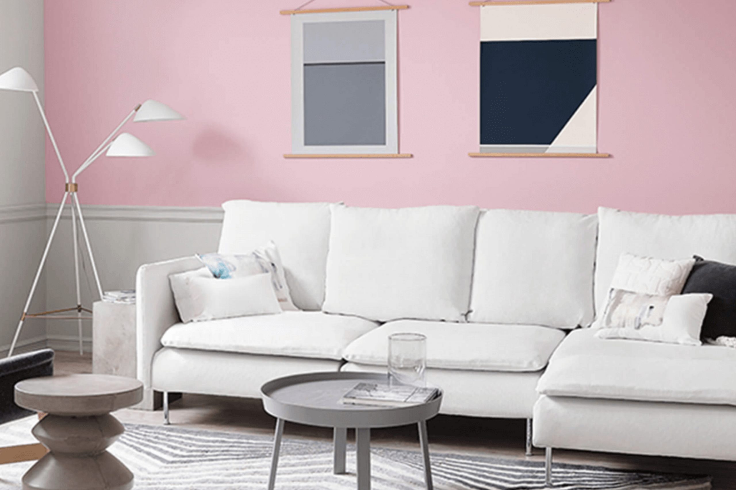
The color Delightful is a bright and cheerful shade of pink with a touch of softness, making it a perfect choice for adding a playful yet gentle ambiance to a room. This hue has a warm undertone, ensuring it brings a cozy, inviting feel to any area.
Delightful pairs exceptionally well with a variety of interior styles, especially modern contemporary, shabby chic, and even Scandinavian décor when used as an accent. It’s particularly effective in adding a pop of color in neutral-dominated designs, providing a pleasant contrast to shades of white, beige, and gray.
When it comes to materials, Delightful works splendidly with natural textures. For instance, the warmth of wooden elements like oak or walnut complements its inviting tone, while white painted furniture helps keep the look fresh and lively. Incorporating fabrics like linen or cotton with this color creates a soft, layered effect, enhancing the room’s overall cozy, airy feel.
Delightful is also best used in rooms that benefit from a touch of brightness and warmth like bedrooms, living rooms, or nurseries. Pairing it with matte finishes or incorporating it through accessories such as cushions, rugs, or curtains can really make an area feel personalized and well-coordinated. Plus, adding metallic accents like brass or copper can introduce an extra layer of texture and luxury to the overall design palette.
Is Delightful SW 6289 by Sherwin Williams Warm or Cool color?
Delightful is a charming pink shade from Sherwin Williams that can really brighten up a home. This light, cheerful pink offers a fresh and playful ambiance, making it perfect for adding a splash of color to any room without overpowering it. It’s especially great for a child’s room or a cozy reading nook, as it has a soft and soothing vibe that makes the area feel warm and inviting.
In living rooms or kitchens, Delightful can be paired with neutral tones like whites or grays to keep the area looking clean and open. Its ability to reflect light beautifully also helps in making small rooms appear larger and more airy.
Adding this color to just one wall as an accent can also effectively enhance the room’s decor and overall aesthetic. Overall, Delightful is an adaptable color that works well in many different rooms, offering a gentle touch of personality and warmth.
Undertones of Delightful SW 6289 by Sherwin Williams
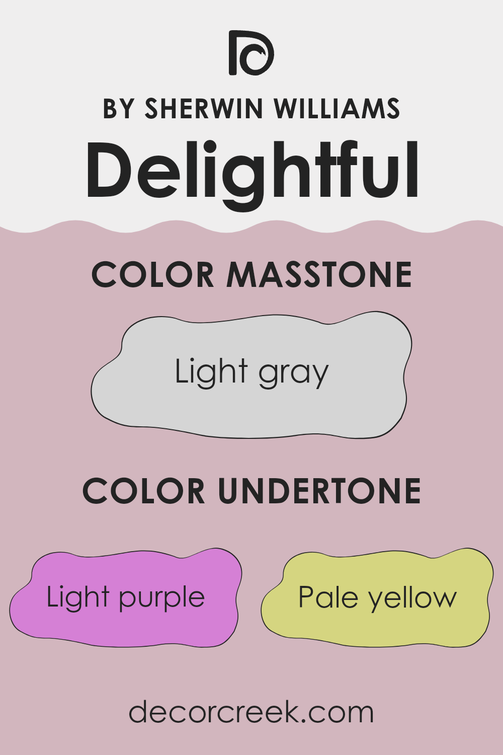
Delightful SW 6289 is a unique paint color that contains a mixture of subtle undertones, including light purple, pale yellow, pale pink, light blue, lilac, mint, and grey. These undertones play a significant role in how the color is perceived and can impact the overall feel of a room.
Undertones are the colors that linger beneath the surface of the main color. They can enhance or alter the primary color under different lighting conditions. For instance, during daylight, Delightful SW 6289 might reveal its light blue or lilac undertones, giving the walls a cool, calm feel. In artificial light, the pale yellow or light purple might become more noticeable, adding warmth to the area.
The mix of undertones in Delightful SW 6289 makes it adaptable, allowing it to adjust subtly to varying décor and lighting. This flexibility can make the color a good choice for rooms that are used throughout the day, such as living rooms or kitchens. The grey undertone helps to balance the vibrancy of the other colors, ensuring that the paint doesn’t overpower but rather complements the room.
When used on interior walls, this color offers a dynamic yet harmonious backdrop, reacting uniquely with both natural and artificial light. This can make the area feel different at different times of the day. The complexity of its undertones can create a welcoming, warm environment that represents the mood and purpose of the room.
What is the Masstone of the Delightful SW 6289 by Sherwin Williams?
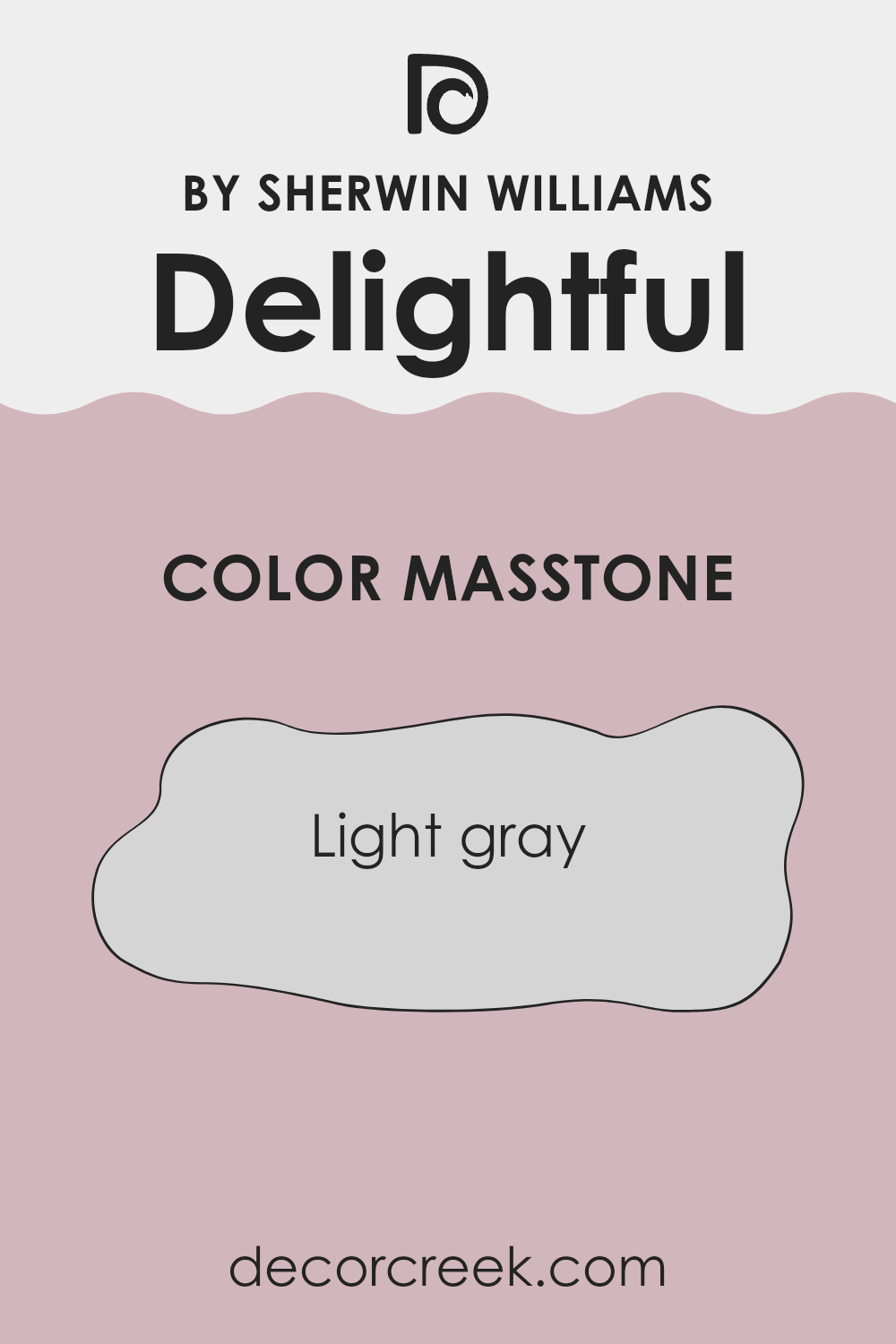
The masstone of Delightful SW 6289 is Light Gray, a color that offers a neutral backdrop perfect for any home setting. This shade is adaptable and makes other colors pop, making it ideal for pairing with both bright and muted tones.
Light Gray doesn’t overpower the room, keeping interiors looking open and airy. For smaller areas, it can help give an illusion of more openness, which is a useful trick for making cramped rooms feel bigger. This color is also very calming, without being too bold or dull, creating a peaceful vibe that’s especially nice in bedrooms and living rooms.
Light Gray is low-maintenance, hiding small smudges or stains better than lighter colors, which makes it practical for busy households. Because of its flexibility, Light Gray works well with different decor styles, from modern to rustic, providing a simple yet effective way to spruce up a home.
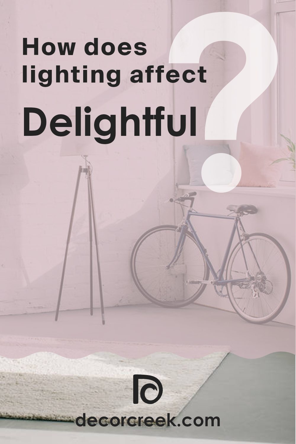
How Does Lighting Affect Delightful SW 6289 by Sherwin Williams?
Lighting plays a crucial role in how colors are perceived in an environment, making it important to consider the type of light when choosing paint like the pale lavender color from Sherwin Williams. The way this color appears can vary significantly under different lighting conditions, ranging from artificial light to natural sunlight.
In artificial light, such as that from incandescent bulbs, this lavender shade tends to appear warmer and softer. The yellowish tint of most indoor lighting can make the color seem more subdued and less vibrant. In contrast, under fluorescent lights, which are cooler, the color might look slightly bluish and more lively.
When it comes to natural light, the appearance of the color can change throughout the day and depending on the direction the room faces. In north-faced rooms, which receive less direct sunlight and mostly indirect, cooler light, the color can appear a bit more muted and shadowy. This might make the area feel slightly colder, as the blue light accentuates cooler tones.
South-faced rooms, on the other hand, get a lot of direct sunlight, which can make the color warm up and look more vibrant and cheerful. The abundant light can really make the lavender stand out, giving it a lively and bright appearance throughout most of the day.
East-faced rooms receive sunlight in the morning when the light is warm and golden. This morning light can make the lavender color look soft and glowing, gradually shifting to a cooler tone as the day progresses.
West-faced rooms experience the opposite, as they get the strongest sunlight in the late afternoon. This can cause the color to appear bright and vivid in the afternoon and early evening, then shift to a softer hue as the sunlight fades.
Knowing how different types of light affect this particular shade of lavender can help you decide which room and wall orientation will best suit your aesthetic goals.
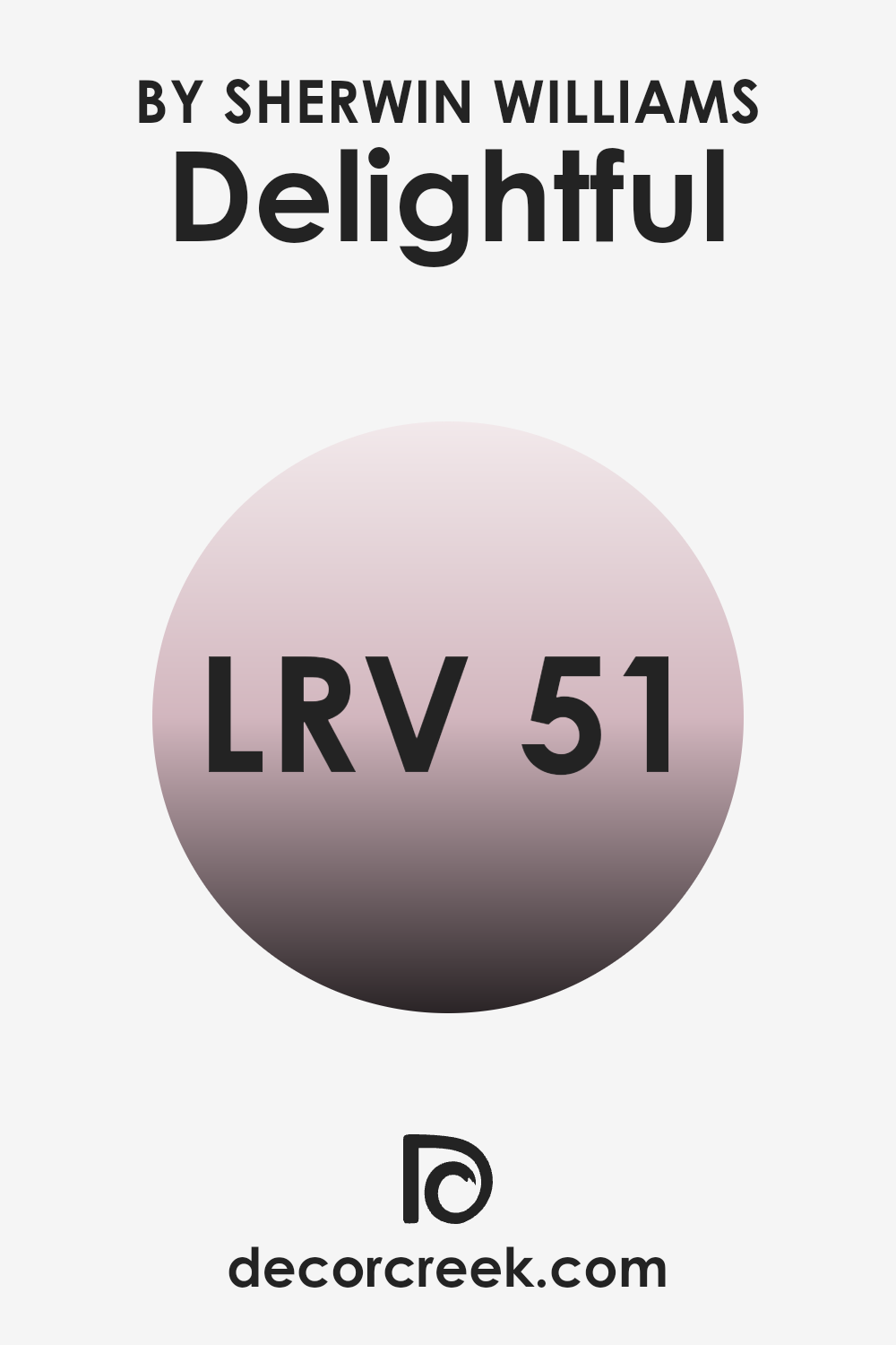
What is the LRV of Delightful SW 6289 by Sherwin Williams?
Light Reflectance Value, or LRV, measures the amount of light that a color reflects or absorbs. This scale goes from very dark, reflecting almost no light, to very light, reflecting nearly all the light that hits it. Colors with higher LRVs make rooms feel more open and brighter as they reflect more light.
On the contrary, darker colors, which have lower LRVs, can make a room feel cozier but smaller since they absorb more light. The LRV of Delightful by Sherwin Williams is approximately 50.8, which puts it in the middle range. This means it neither reflects light too strongly nor absorbs it heavily.
In practical terms, if you use this shade on walls, it can provide a balance, neither making the room too bright nor too dim. This neutrality can be an advantage when aiming for a balanced look, avoiding the extremes of feeling too stark or too closed in. This makes it an adaptable choice that can work well in various lighting conditions and design aesthetics.
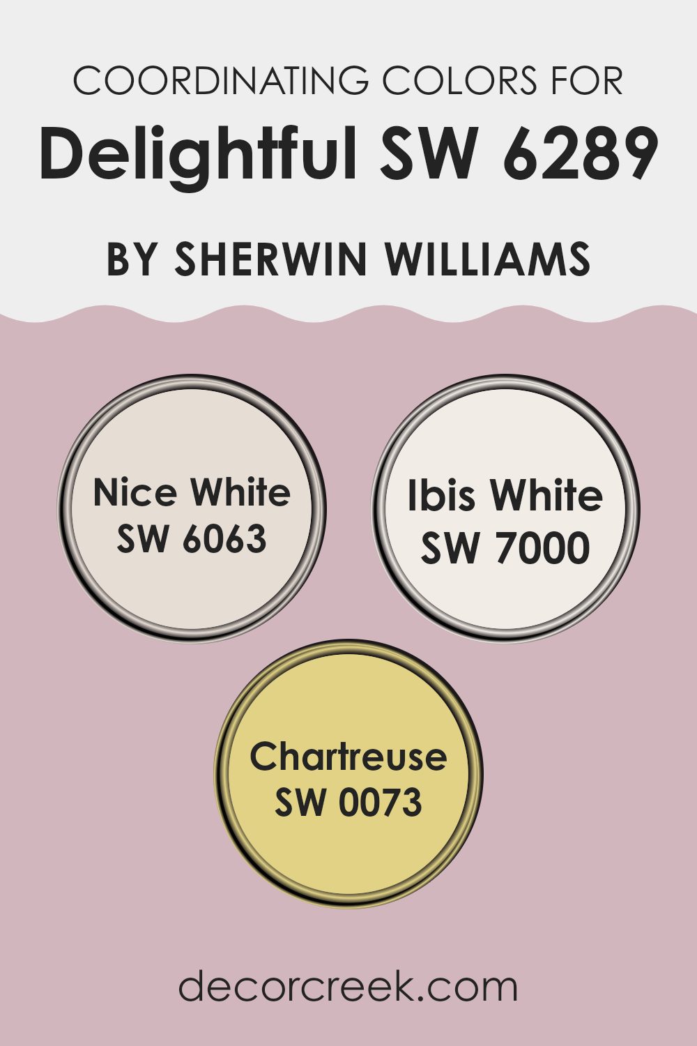
Coordinating Colors of Delightful SW 6289 by Sherwin Williams
Coordinating colors are essentially hues that pair well with a primary color to enhance the overall aesthetic of a room. In the context of home décor or design, these complementary colors work together to create a balanced and harmonious look. For instance, when using a specific shade like Delightful by Sherwin Williams, choosing the right coordinating colors can significantly impact the mood and style of a room.
Among the coordinating colors for Delightful, Nice White offers a clean and crisp backdrop that allows more vibrant colors to stand out, making it ideal for trim or ceilings. It’s a pure, bright shade that can help other colors in a room pop without overpowering them. Ibis White, on the other hand, has a slightly warmer tone, providing a soft, neutral canvas that is adaptable enough to support any design style.
It works wonderfully for larger surface areas, contributing to a cozy and inviting atmosphere. Lastly, Chartreuse is a lively, bold green that can add a splash of energy and freshness to a room. It’s perfect for accent pieces or a feature wall, bringing a touch of nature and brightness to the environment. These colors complement Delightful by creating a delightful and appealing visual flow in any area, keeping the aesthetics light and enjoyable.
You can see recommended paint colors below:
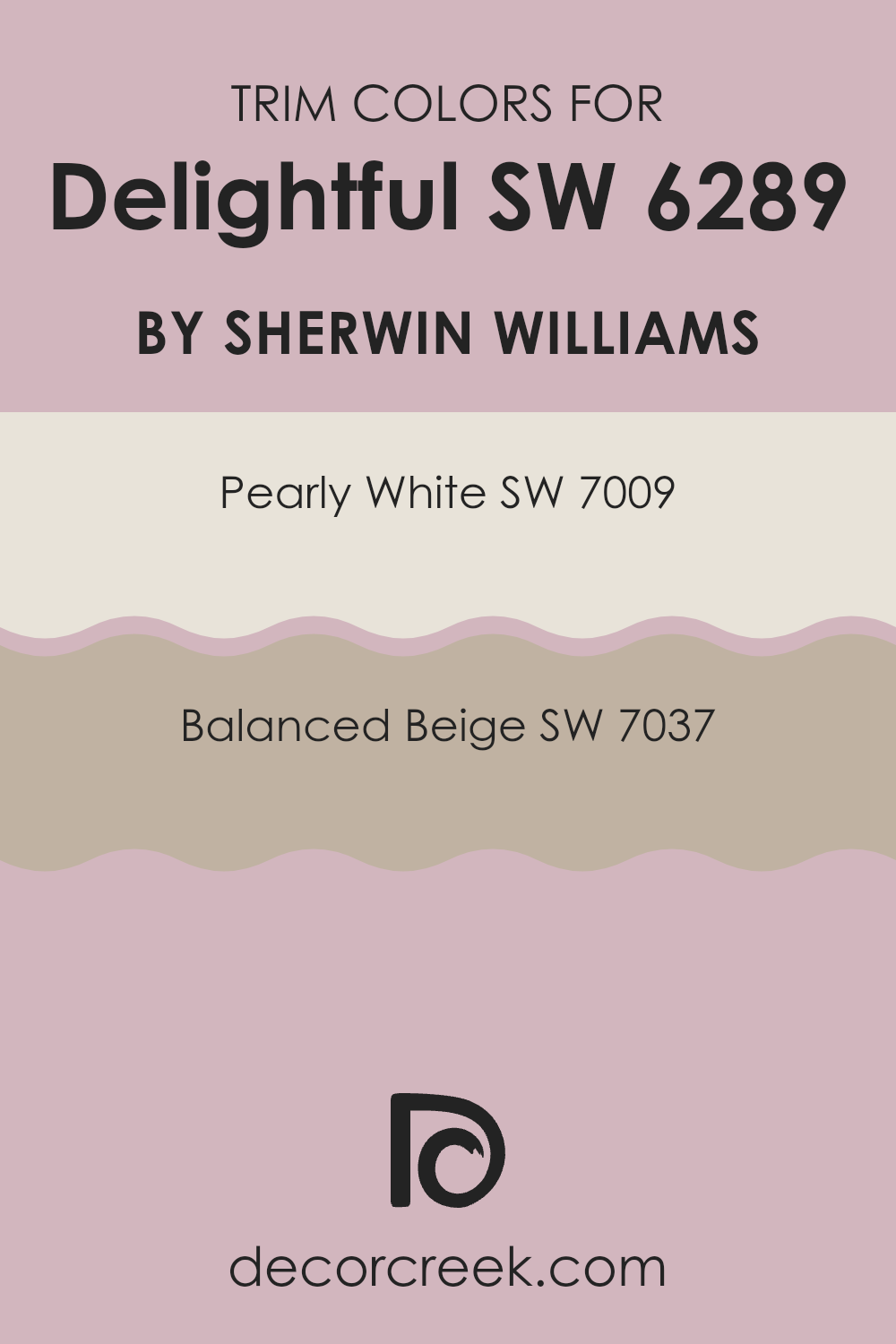
What are the Trim colors of Delightful SW 6289 by Sherwin Williams?
Trim colors play a crucial role in interior design by creating visual boundaries that can highlight or complement the predominant colors of a room. For a vibrant shade like Delightful from Sherwin Williams, selecting the right trim color is essential to ensure that the walls stand out appropriately without overpowering the room.
Pearly White and Balanced Beige are excellent choices as trim colors because they offer a subtle contrast that can enhance the cheerful vibe of Delightful while maintaining a harmonious atmosphere. Pearly White is a gentle and subdued shade that provides a fresh, clean look to the trim, making it an ideal pairing for the lively Delightful color.
It helps to frame the room in a light and airy manner, giving the area a calm and inviting feel. On the other hand, Balanced Beige offers a warm and neutral option for trims, adding a touch of earthiness that complements the more dynamic main color. This combination not only grounds the vibrant Delightful but also adds a cozy dimension to the overall aesthetic, making the room feel well-coordinated and pleasant.
You can see recommended paint colors below:
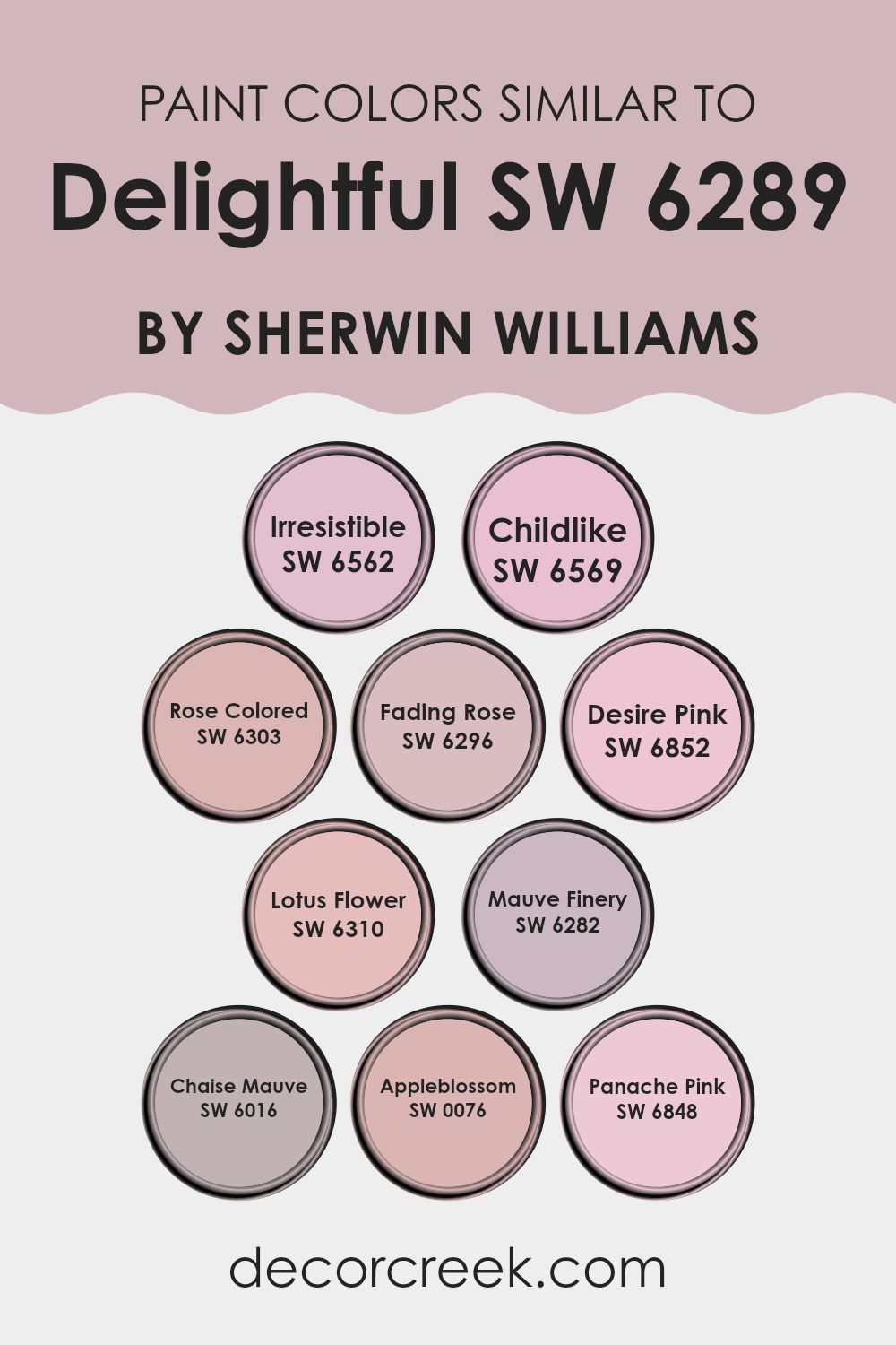
Colors Similar to Delightful SW 6289 by Sherwin Williams
Choosing colors that harmonize well with a main color like Delightful SW 6289 can significantly impact both aesthetics and mood in any room. Similar colors like Irresistible SW 6562, a gentle yet joyful pink, bring a light and playful touch. This harmonizes subtly with the calmness of Childlike SW 6569, which offers a lighter, almost whimsical vibe.
Rose Colored SW 6303 provides a more vivid, yet soft visual effect, creating an inviting atmosphere. Fading Rose SW 6296, with its delicate hint of pink, introduces a vintage feel that gently mellows interiors. Desire Pink SW 6852 lends a cheerful energy with its bright and uplifting hue, offering a bold contrast while maintaining harmony with the softer principal color.
Lotus Flower SW 6310, with its subtle pink, exudes a welcoming and comforting feel, ideal for creating a soothing backdrop. Mauve Finery SW 6282 offsets with a muted mauve that gives depth without overpowering. Chaise Mauve SW 6016 offers a deeper, more reserved shade of mauve that adds refinement without heaviness, nicely balancing the lighter shades.
Lastly, Appleblossom SW 0076 and Panache Pink SW 6848 both bring their own unique traits; Appleblossom, with its rosy freshness, revitalizes, while Panache Pink, a bolder, more pronounced pink, injects a dose of cheerfulness. These similar shades collectively add dimension and continuity when used alongside the primary color.
You can see recommended paint colors below:
- SW 6562 Irresistible
- SW 6569 Childlike
- SW 6303 Rose Colored
- SW 6296 Fading Rose
- SW 6852 Desire Pink
- SW 6310 Lotus Flower
- SW 6282 Mauve Finery
- SW 6016 Chaise Mauve
- SW 0076 Appleblossom
- SW 6848 Panache Pink
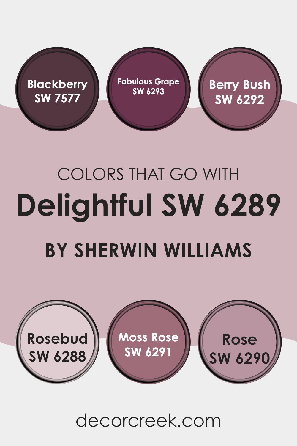
Colors that Go With Delightful SW 6289 by Sherwin Williams
Choosing the right colors to pair with DelightfulSW 6289 by Sherwin Williams is crucial because they can dramatically affect the mood and style of a room. When coordinating colors, such as SW 7577 – Blackberry or SW 6293 – Fabulous Grape, it’s about creating a harmonious environment that complements the main hue. These colors work by either providing a stark contrast or subtly blending with DelightfulSW 6289, ensuring that the area feels well thought out and visually appealing.
For instance, SW 7577 – Blackberry is a deep, rich berry color that adds a feeling of warmth and depth to rooms that feature DelightfulSW 6289. It works well in areas that need a touch of elegance without being overly bold. SW 6293 – Fabulous Grape, on the other hand, is a vibrant purple that brings energy and a playful spirit to interiors, making it perfect for rooms intended to be lively and inviting.
Then you have shades like SW 6292 – Berry Bush, a softer and more subdued purple that provides a gentle contrast, enhancing areas without overpowering the senses. SW 6288 – Rosebud is a dusky pink that offers a soft, floral feel, ideal for creating a comforting and inviting atmosphere.
SW 6291 – Moss Rose presents a slightly deeper pink tone, lending a more grounded feel to the room. Lastly, SW 6290 – Rose introduces a classic rosy hue, perfect for rooms looking to achieve a traditional look with a modern twist. Together, these colors work with DelightfulSW 6289 to style any interior beautifully and effectively.
You can see recommended paint colors below:
- SW 7577 Blackberry
- SW 6293 Fabulous Grape
- SW 6292 Berry Bush
- SW 6288 Rosebud
- SW 6291 Moss Rose
- SW 6290 Rose
How to Use Delightful SW 6289 by Sherwin Williams In Your Home?
Delightful SW 6289 by Sherwin Williams is a vibrant and cheerful shade of pink that can add a fresh, lively touch to any room in your house. It’s perfect for areas where you want to create a friendly and inviting atmosphere, such as a child’s bedroom or a playroom. The brightness of the color makes it great for lifting the mood and adding a burst of energy to a room.
You can also use this pink in more unexpected places like a kitchen or a bathroom for a unique twist. Pairing it with neutral colors like white or grey helps keep the look balanced and prevents the pink from overpowering the room.
For a modern and stylish effect, consider using it on an accent wall or for smaller decorative elements like trim. This approach keeps the pink manageable while still letting its cheerful nature shine through. Accessories and furnishings in complementary colors can tie the whole look together, making your home both stylish and welcoming.
Delightful SW 6289 by Sherwin Williams vs Appleblossom SW 0076 by Sherwin Williams
“Delightful” is a soft, gentle pink with a slightly muted tone that brings a warm and cozy feel to rooms. It’s subtle enough to work as a neutral but still adds a hint of color that’s very inviting. “Appleblossom,” on the other hand, is a more vivid and lively shade of pink.
It has an energetic quality that can make a room feel more cheerful and vibrant. While “Delightful” is excellent for creating a calming and peaceful atmosphere, “Appleblossom” is better suited for areas where a more dynamic and cheerful mood is desired.
Both colors are pink, but “Delightful” leans towards a softer, less intrusive pink, whereas “Appleblossom” stands out more with its brighter and more pronounced pink hue.
You can see recommended paint color below:
- SW 0076 Appleblossom
Delightful SW 6289 by Sherwin Williams vs Rose Colored SW 6303 by Sherwin Williams
Delightful SW 6289 is a fresh and cheerful blue shade with subtle green undertones that give it a vibrant, yet soft appearance. It’s a light color that can brighten up any room, making it seem more open and airy. This color works well in areas like living rooms or kitchens where you want a pleasant, inviting atmosphere.
On the other hand, Rose Colored SW 6303 is a gentle pink with a warm, cozy vibe. It’s a soft color that adds a touch of warmth to any room, ideal for creating a welcoming and comfortable ambiance. This hue is perfect for areas where relaxation is key, such as bedrooms or sitting areas.
Both colors offer their unique charm and can significantly affect the mood of a room. Delightful’s cool tones contrast with the warm, soothing tones of Rose Colored, providing two distinct options for different decorating needs.
You can see recommended paint color below:
- SW 6303 Rose Colored
Delightful SW 6289 by Sherwin Williams vs Fading Rose SW 6296 by Sherwin Williams
Delightful SW 6289 and Fading Rose SW 6296 are two paint colors from Sherwin Williams that offer distinct vibes for any room. Delightful is a vibrant shade that leans towards a rich periwinkle blue. It’s a playful color, full of life and perfect for areas meant to energize and uplift.
On the other hand, Fading Rose is a muted pink hue with a touch of warmth, creating a more subtle and calming atmosphere. This color is ideal for rooms where you want to relax and unwind, like a bedroom or a cozy reading nook.
While Delightful can make a bold statement and draw attention, Fading Rose tends to blend softly into the background, offering a gentle splash of color without overpowering the senses. Both colors have their unique appeal, depending on what mood or style you’re aiming to achieve in your room.
You can see recommended paint color below:
- SW 6296 Fading Rose
Delightful SW 6289 by Sherwin Williams vs Irresistible SW 6562 by Sherwin Williams
Delightful SW 6289 and Irresistible SW 6562 are two distinct colors offered by Sherwin Williams. Delightful is a soft, light purple that gives a gentle and soothing feel to any room. This color works great in areas meant for relaxation or creativity due to its muted and pleasant hue.
On the other hand, Irresistible is a vibrant blue with a noticeable brightness that can energize a room. It’s perfect for adding a pop of color to an interior without overpowering it. This shade is ideal for lively areas or accent walls.
Both colors can bring new character to a room, but they serve different moods and settings. While Delightful offers a calm and peaceful vibe, Irresistible brings a lively and cheerful atmosphere. Choosing between them depends on what feeling you want to generate in your interior.
You can see recommended paint color below:
- SW 6562 Irresistible
Delightful SW 6289 by Sherwin Williams vs Panache Pink SW 6848 by Sherwin Williams
Delightful SW 6289 by Sherwin Williams is a soft, subtle hue that leans towards a soothing sky blue. It has a gentle vibe, making it a superb choice for creating a light and airy feel in any room. This color pairs beautifully with creams and light grays, offering a refreshing palette that’s easy on the eyes.
In contrast, Panache Pink SW 6848 is a vibrant, bold pink that adds a pop of energy and fun to any interior. It’s much brighter and more playful than Delightful, and it stands out dramatically. Panache Pink works well in areas intended to encourage creativity and happiness, such as kids’ rooms or creative studios.
Both colors bring their unique character to interiors: Delightful is calming and creates a relaxed atmosphere, while Panache Pink is lively and stimulating. They cater to different tastes and purposes, making each ideal for specific settings depending on the desired mood and impact.
You can see recommended paint color below:
- SW 6848 Panache Pink
Delightful SW 6289 by Sherwin Williams vs Desire Pink SW 6852 by Sherwin Williams
Delightful and Desire Pink are both vibrant hues that offer distinctly unique ambiances. Delightful is a gentle blue with a fresh, airy feel to it, perfect for creating a light and breezy atmosphere in any room. Its subtle tones can make small areas appear larger and are calming, making it a good choice for bedrooms and bathrooms.
On the other hand, Desire Pink is a bold, playful pink that adds a pop of color and liveliness. It’s a bright and energetic shade that is more suited for rooms used for engagement and creativity, like a child’s playroom or a cozy nook.
While Delightful offers a cooling presence, Desire Pink warms up a room. If you’re looking to inject cheerfulness and warmth into an interior, Desire Pink is the way to go. Meanwhile, for a more relaxed and open feel, Delightful is the ideal match. Both colors reflect different moods and can significantly affect how an interior feels.
You can see recommended paint color below:
- SW 6852 Desire Pink
Delightful SW 6289 by Sherwin Williams vs Mauve Finery SW 6282 by Sherwin Williams
Delightful and Mauve Finery, both from Sherwin Williams, present pleasing yet distinctly different tones. Delightful is a soft, muted lavender tone that adds a gentle and light ambience to any room. This color is very calming and works well in areas designed for relaxation or reflection.
Its understated hue blends nicely with other pastels and neutral shades, making it adaptable for various decor styles. On the other hand, Mauve Finery leans more towards a pink-mauve shade which creates a slightly warmer feel. This color is richer and has a bit more presence, offering a cozy and inviting atmosphere.
It’s perfect for rooms where a touch of warmth is desired without overpowering the interior with too bold a color. Mauve Finery pairs well with deeper shades like dark greys or rich browns, providing a lovely contrast that enhances both colors. Both colors have their unique appeal, depending on what mood or style you wish to achieve in your interior.
You can see recommended paint color below:
- SW 6282 Mauve Finery
Delightful SW 6289 by Sherwin Williams vs Lotus Flower SW 6310 by Sherwin Williams
Delightful and Lotus Flower are both colors by Sherwin Williams that offer a soothing feel, but they have distinct tones. Delightful is a soft, muted pink with a cozy warmth that makes it perfect for creating a welcoming room. It lends a gentle, soft touch to an interior and pairs well with neutral and darker shades.
On the other hand, Lotus Flower is also a pink but with a lighter, almost pastel quality. This color is brighter and brings a refreshing energy to any area, making it ideal for places like bathrooms or kitchens where a clean, fresh look is desirable. Lotus Flower can also help in making a small interior appear larger because of its light-reflecting qualities.
Together, these colors could work beautifully in a home, with Lotus Flower in a vibrant, light-filled area and Delightful in a more subdued, cozy room. They both offer warmth, but Lotus Flower provides a lighter, airier feel compared to the deeper, comforting hue of Delightful.
You can see recommended paint color below:
- SW 6310 Lotus Flower
Delightful SW 6289 by Sherwin Williams vs Chaise Mauve SW 6016 by Sherwin Williams
Delightful SW 6289 is a soft, vibrant shade of pink that has a cheerful and uplifting vibe. It’s a lively color that works well in rooms intended to feel energetic and friendly, such as kids’ rooms or casual living areas. In contrast, Chaise Mauve SW 6016 is deeper and quieter.
This color is a muted mauve that leans more towards a subtle, refined purple with hints of gray. It’s more subdued and works beautifully in areas where a calm and understated aesthetic is preferred, such as bedrooms and bathrooms.
While Delightful is brighter and can energize a room, Chaise Mauve brings a more relaxed and toned-down look. Each color offers a different mood and can be chosen based on the atmosphere one wishes to create in a particular interior.
You can see recommended paint color below:
Delightful SW 6289 by Sherwin Williams vs Childlike SW 6569 by Sherwin Williams
The color Delightful SW 6289 by Sherwin Williams is a rich, deep pink with a hint of purple, giving it a bold and vibrant feel. This makes it an excellent choice for rooms where you want to inject energy and positivity. It contrasts well with lighter shades and can create an inviting atmosphere when used on an accent wall or in decorative accessories.
On the other hand, Childlike SW 6569 by Sherwin Williams is a fresh, playful green. It has a light and airy quality, making it perfect for creating a calm and relaxing environment. This color works well in areas that receive a lot of natural light and pairs beautifully with natural materials like wood and stone.
When comparing these two colors, Delightful is much bolder and stands out more, while Childlike offers a more subtle and soothing visual experience. Depending on your room and personal preference, each color has distinct qualities that can help achieve different aesthetics and moods.
You can see recommended paint color below:
After reading about SW 6289 Delightful by Sherwin Williams, I’ve learned a lot about this unique paint color. SW 6289 Delightful is not just any color; it’s like a light lavender that almost looks like the soft color of the sky at sunrise. It’s gentle and light, making any room feel calm and happy.
This color is good for bedrooms, where we rest and dream, or even in places like the living room, where families gather to talk and play games. It has a cheerful and inviting feel that makes you want to relax and enjoy your time there. If you’re looking for a color that makes your home feel open and cozy at the same time, this might be the perfect choice.
I now see why people call this color Delightful. It can really make a plain room turn into a beautiful interior without making it too bright or too loud. It’s soft like a whisper, and it plays nicely with other colors too, whether it’s furniture or decorations. So, if you or someone you know is thinking about giving their room a new look, SW 6289 Delightful could be just what they need to create a warm and lovely place to spend their time.
decorcreek.com
Ever wished paint sampling was as easy as sticking a sticker? Guess what? Now it is! Discover Samplize's unique Peel & Stick samples.
Get paint samples

