As someone always on the lookout for the perfect paint shade, I stumbled upon SW 6023 Insightful Rose by Sherwin Williams and felt an instant connection. It’s a sublime choice for anyone aiming to bring a soft, warm presence into their room. This wonderful rose hue fits beautifully in bedrooms or any area meant for relaxation and gentle reflection. Not too bold but definitely not meek, Insightful Rose strikes a balance that can enhance your surroundings without overpowering them.
What stands out about this color is how it pairs so effortlessly with various decor styles and preferences. Whether you’re looking to spruce up a vintage setting or add a touch of warmth to a modern design, this color adjusts and complements the environment.
If you’re considering a refresh for your interiors, SW 6023 Insightful Rose is a shade worth considering. It brings a cozy yet refined atmosphere to your home, making any room feel more welcoming and designed with intention.
Beyond aesthetics, the emotional impact of this color is calming, making it ideal for areas where you need a retreat from the daily bustle.

What Color Is Insightful Rose SW 6023 by Sherwin Williams?
Insightful Rose by Sherwin Williams is a gentle, warm pink that brings a cozy and inviting vibe to any room. The hue is soft and muted, making it incredibly flexible for use in various interior design styles. This shade works particularly well in modern farmhouse, shabby chic, and Scandinavian decor, offering a pop of color that is both refreshing and subtle.
Insightful Rose pairs beautifully with natural materials like light woods, adding a touch of rustic charm. It also complements textures such as linen and cotton, which help create a relaxed and comfortable atmosphere. Additionally, this color looks stunning with metallic accents like brass or copper, providing a slight contrast and a hint of glam without overpowering the room.
Ideal for bedrooms or living rooms, Insightful Rose can help make a room feel warm and welcoming. Its ability to act as a neutral base or as an accent color allows for flexibility in design choices. Whether you’re looking to paint an entire room or just add a splash of color through decor items, Insightful Rose offers a lovely, subtle option that enhances the aesthetic of your home effortlessly.
Is Insightful Rose SW 6023 by Sherwin Williams Warm or Cool color?
Insightful Rose by Sherwin Williams is a unique and soft shade of pale pink that brings a gentle warmth to any room. Its subtle tone makes it perfect for creating a cozy, inviting atmosphere in living room, bedrooms or even bathrooms. This color pairs well with light neutrals like whites and beiges, which helps to enhance its calming effect without overpowering the room.
Despite being a lighter shade, Insightful Rose holds its own as a prominent color choice, offering a touch of cheerfulness. It works particularly well in rooms with natural light, where the color can show its true softness and depth.
Moreover, its versatility means it can be used for full walls or just as an accent to add a little color to a room without making a major commitment. For families or those looking to sell their home, Insightful Rose is practical as it appeals to a wide range of tastes, adding warmth and a subtle character to interiors.
Undertones of Insightful Rose SW 6023 by Sherwin Williams
Insightful Rose by Sherwin Williams is a unique paint color that changes subtly depending on the lighting and surrounding colors. It has various undertones like pale yellow, light purple, pale pink, light blue, mint, lilac, and grey. These undertones are like hints of other colors that you can see mixed in with the main color under different lighting conditions.
Undertones are important because they can make a color look different in every room. For example, in bright sunlight, a color might look lighter or show more of its yellow or blue undertones. Under artificial light, the same color might look darker or more grey.
In the case of Insightful Rose, the mix of undertones like pale pink and lilac can give a room a warm and welcoming feel, while the cooler undertones like light blue and mint might make it feel more refreshing. The grey undertone can help balance the brightness, making the color more subtle and flexible.
This means that Insightful Rose can work well in many different rooms and styles, adjusting its look depending on what kind of light it’s in and what furniture and decorations are around it. Using this color on interior walls can really enhance the mood and style of a room, making it feel just right.
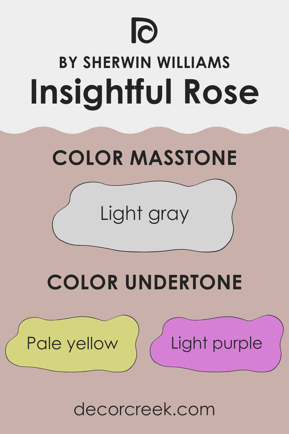
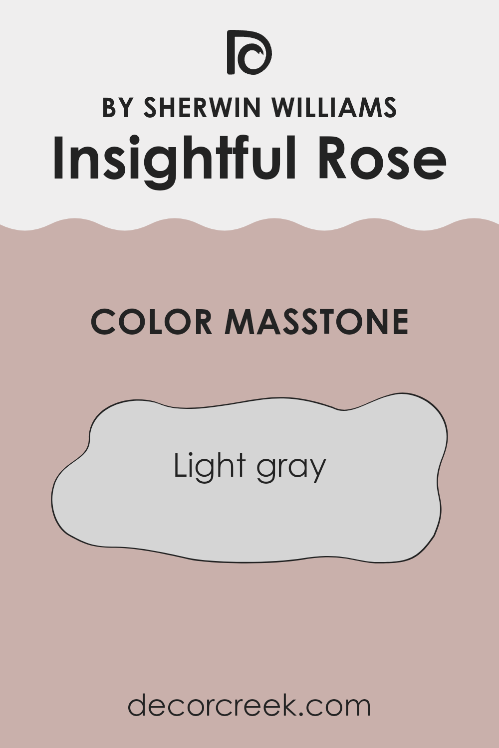
What is the Masstone of the Insightful Rose SW 6023 by Sherwin Williams?
Insightful Rose 6023 by Sherwin Williams has a masstone of light gray with the specific shade of #D5D5D5. This neutral and subtle hue makes it an excellent choice for home interiors as it easily blends with different styles and decorations.
The light gray tone provides a calm and soft background that can make rooms appear larger and more open. It is particularly effective in areas that get less natural light, as its brightness can help lighten up the area. This shade also has the advantage of versatility; it pairs well with a wide range of other colors, whether bright or dark, allowing for flexibility in decorating choices.
Furniture and artwork can stand out against this gentle backdrop, making it a practical choice for anyone wanting to highlight other aspects of their room’s decor. Its understated nature means it doesn’t overpower any room, fitting well into bedrooms, living rooms, or bathrooms for a fresh and clean look.
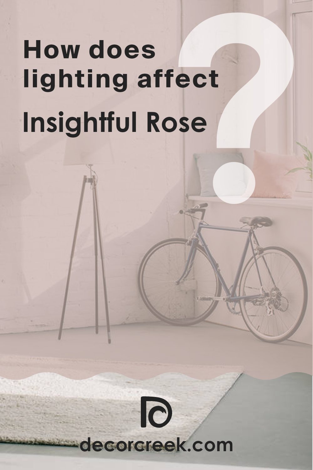
How Does Lighting Affect Insightful Rose SW 6023 by Sherwin Williams?
Lighting plays a crucial role in how we perceive colors. The same color can appear different depending on whether it is viewed under natural or artificial light. This is because different light sources have varying color temperatures and intensities.
Take, for instance, a color like Insightful Rose, which is a subtle shade of pink. Under natural light, this color tends to reveal all its depth and vibrancy because natural light provides a balanced spectrum of colors. It makes this shade of pink look lively and true to its hue.
In artificial light, the perception of Insightful Rose can change depending on the type of bulb used. Incandescent bulbs, which emit a warm light, might make the color appear softer and warmer, enhancing its coziness. Fluorescent lighting, on the other hand, could cast a cooler tone, making the color appear slightly muted.
The orientation of a room also affects how Insightful Rose looks due to the varying qualities of light during the day. In a north-facing room, which generally receives less direct sunlight, this color might look a bit darker and less vibrant. These rooms tend to have a cooler light, which could make the pink shade a tad subdued.
South-facing rooms are bathed in abundant light for most of the day, which means Insightful Rose would look brighter and more vivid. This room orientation is ideal for showing the truest version of the color. In east-facing rooms, the morning light can make Insightful Rose look soft and gentle. It’s an inviting color in the morning, which gradually shifts as the light changes throughout the day.
West-facing rooms get evening light, which might make this shade of pink feel warmer as the sun sets, possibly enhancing a cozy and warm atmosphere. So, the appearance of Insightful Rose can be quite dynamic, influenced heavily by the lighting and the room orientation. It highlights the importance of considering these factors when choosing paint colors.
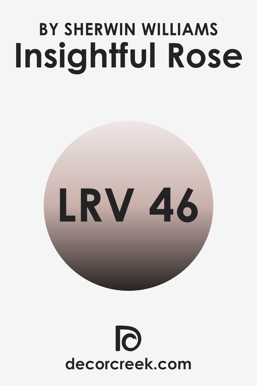
What is the LRV of Insightful Rose SW 6023 by Sherwin Williams?
LRV, or Light Reflectance Value, measures the percentage of light a paint color reflects from or absorbs into a surface. It’s a useful metric when choosing paint colors because it helps predict how light or dark a color will look on your walls. A higher LRV means the paint color will appear lighter and reflect more light, making rooms feel more open and airy.
On the other hand, a lower LRV means the paint is darker and absorbs more light, which can make a room feel cozier or smaller. Insightful Rose, with an LRV of around 46, sits near the middle of the scale. This means it neither reflects nor absorbs light excessively.
In a well-lit room, this color might appear slightly lighter and more vibrant, while in a poorly lit area, it could seem a bit deeper and richer. This versatility makes it a great choice for various rooms, adapting somewhat to the natural light available while providing a consistent, mild warmth to the room.
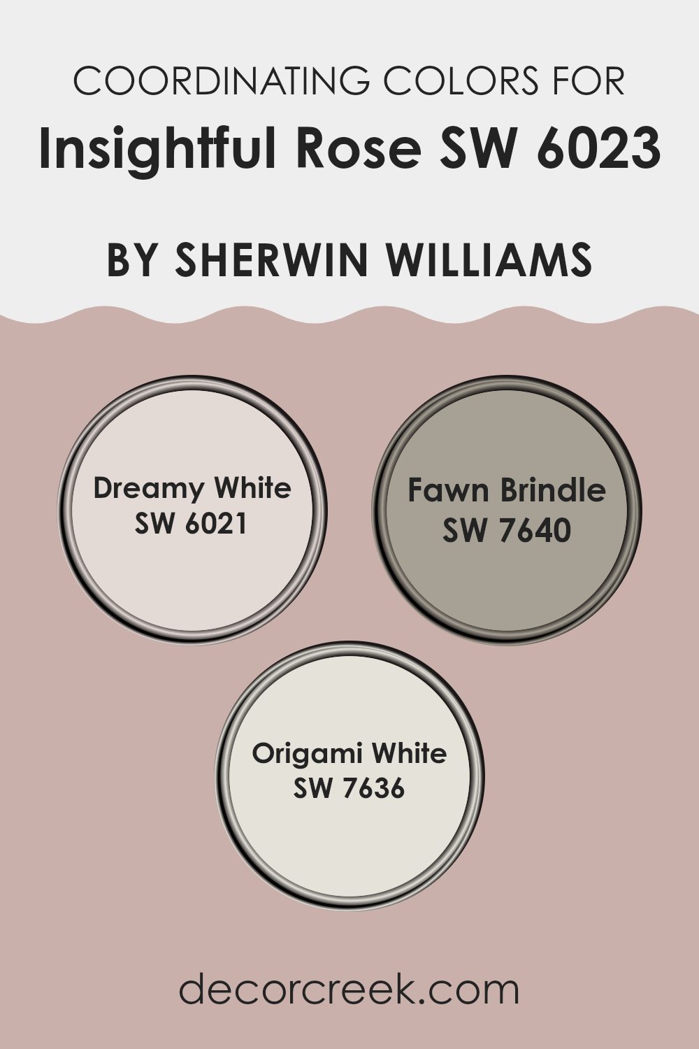
Coordinating Colors of Insightful Rose SW 6023 by Sherwin Williams
Coordinating colors are shades that complement each other well and create a harmonious atmosphere when used together in a room. For instance, the soft and subtle hues of Insightful Rose by Sherwin Williams can be beautifully paired with specific coordinating colors to enhance its aesthetic without overpowering it. When you choose coordinating colors, you aim to find tones that balance or enhance the main color, depending on the mood or theme you wish to achieve in your decoration.
Dreamy White SW 6021 is a gentle white with a whisper of warmth that offers a calm and clean backdrop, making it a perfect match to the nurturing presence of Insightful Rose. This color can help brighten up a room while maintaining a cozy feel.
Fawn Brindle SW 7640, on the other hand, is a deeper, grayish hue that grounds the lighter shades and adds a touch of elegance without being too stark or bold. Lastly, Origami White SW 7636 strikes a balance between warm and cool tones, providing versatility. It’s a neutral white that doesn’t lean too heavily towards any color, making it an excellent middle ground when blending various elements within a room. Together, these coordinating colors offer a range of options that can suit different design needs while maintaining visual harmony.
You can see recommended paint colors below:
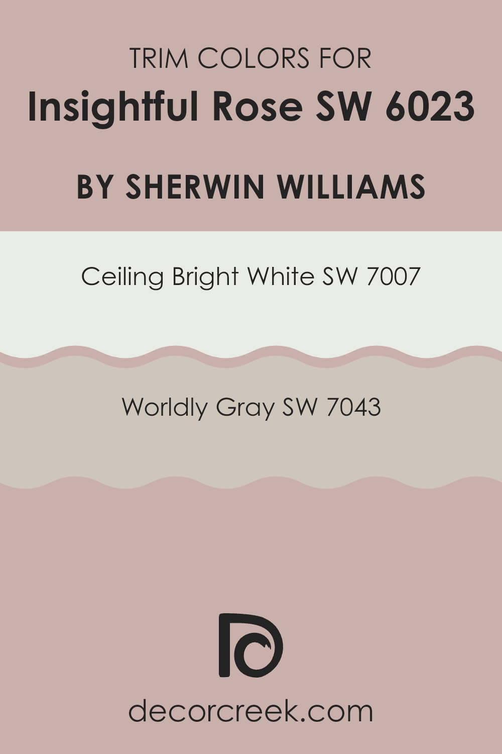
What are the Trim colors of Insightful Rose SW 6023 by Sherwin Williams?
Trim colors are specifically chosen to complement the main hues used on walls and other larger surfaces in a room, such as Insightful Rose by Sherwin Williams. They are implemented on elements like door frames, window sills, and baseboards to create a coherent and aesthetically pleasing look.
Trim colors, such as SW 7007 – Ceiling Bright White and SW 7043 – Worldly Gray, play a critical role by highlighting and defining the architectural features of a room. They draw attention to the details, enhancing the overall harmony of the design while providing a crisp, clean finish that contrasts or complements the wall color effectively.
Ceiling Bright White, SW 7007, is a pure, radiant white that offers a fresh and clear appearance, ideal for making trims stand out against deeper or more vibrant wall colors. This color has the advantage of making areas appear larger and ceilings higher, adding a sense of airiness to any room. On the other hand, Worldly Gray, SW 7043, is a soft, warm gray that provides a subtle, contrasting hue, which works beautifully to soften the transition between colors in a room. It is flexible enough to blend smoothly with both cool and warm palettes, ensuring a polished and cohesive look throughout the room.
You can see recommended paint colors below:
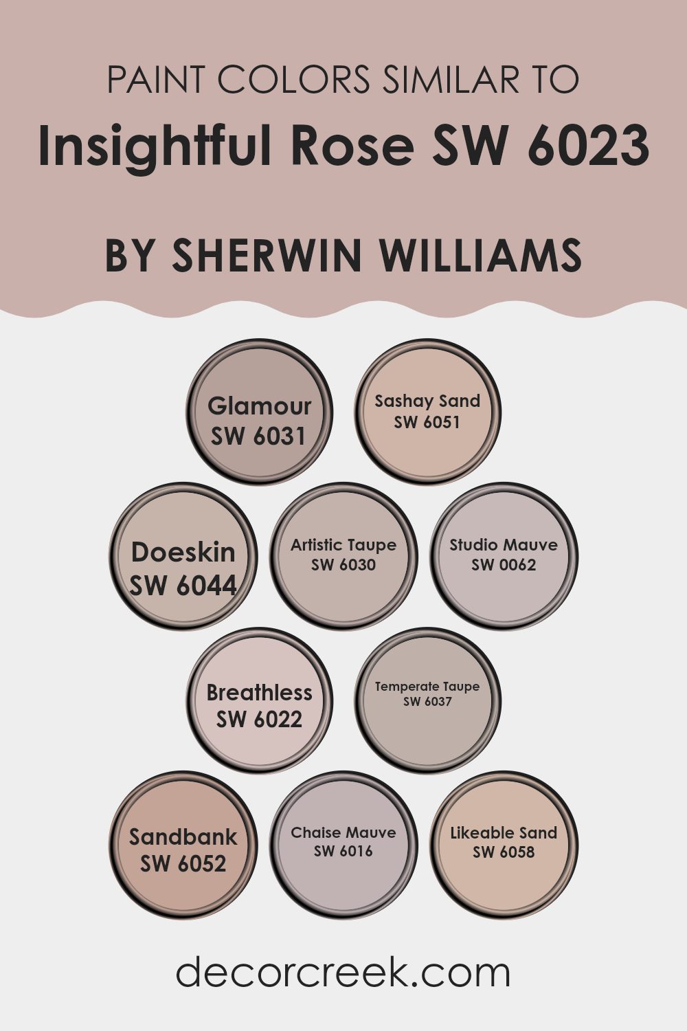
Colors Similar to Insightful Rose SW 6023 by Sherwin Williams
Similar colors are essential in design because they create a sense of harmony and balance. When colors closely relate to each other, like shades around Insightful Rose by Sherwin Williams, they help produce a smooth visual flow, reducing stark contrasts that might jar the eye.
For instance, Glamour is a deep, muted peach that adds warmth without overpowering, making it flexible for areas that aim for a subtle richness. Right alongside, Sashay Sand offers a lighter, beige tone that complements its surroundings by providing a calm and gentle backdrop, ideal for a peaceful environment.
Doeskin, a soft, dusky taupe, serves as a strong neutral base, perfect for those who prefer understated elegance. Similarly, Artistic Taupe has that balanced mix of gray and brown, providing a solid foundation that pairs well with a variety of decor.
Studio Mauve brings in a gentle hint of lavender, ideal for adding a touch of warmth while keeping the overall feel light and airy. Breathless, too, leans towards a soft lavender, but with a slightly cooler tone, offering a fresh and light aesthetic to any room. Temperate Taupe, darker and richer, gives a cozy impression, ideal for creating inviting rooms.
Sandbank, with its hint of earthy brown, ensures stability in design, grounding more vibrant accents. Chaise Mauve has a unique dusty rose tint, perfect for adding a subtle touch of color without overpowering. Finally, Likeable Sand, with its soft beige hue, pairs effortlessly with other shades, helping to create a cohesive and inviting room. Each of these colors supports a design that aims for unity and aesthetic flow, crucial for crafting visually appealing and comfortable interiors.
You can see recommended paint colors below:
- SW 6031 Glamour
- SW 6051 Sashay Sand
- SW 6044 Doeskin
- SW 6030 Artistic Taupe
- SW 0062 Studio Mauve
- SW 6022 Breathless
- SW 6037 Temperate Taupe
- SW 6052 Sandbank
- SW 6016 Chaise Mauve
- SW 6058 Likeable Sand
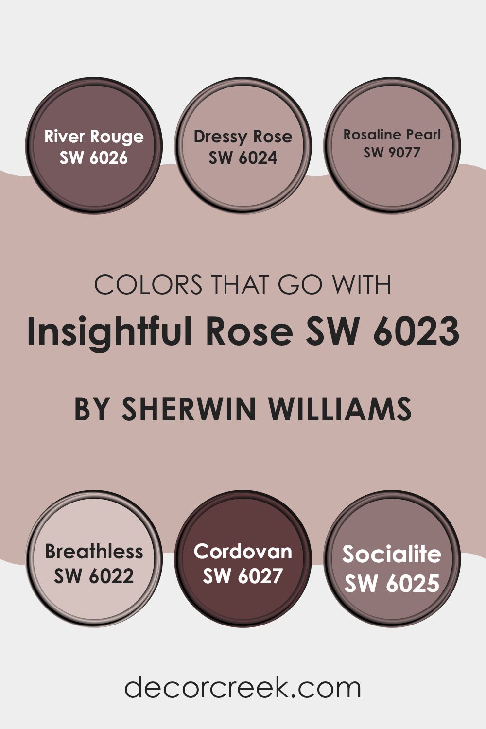
Colors that Go With Insightful Rose SW 6023 by Sherwin Williams
Choosing colors that pair well with Insightful Rose SW 6023 by Sherwin-Williams is key in achieving a harmonious interior design. Insightful Rose itself is a gentle blush tone that offers a soft, welcoming feel to any room. When it comes to matching this shade with others, selecting the right hues can enhance the room’s aesthetic and create a balanced, visually appealing environment.
River Rouge SW 6026 has a deep, rich burgundy color that provides a striking contrast to the lightness of Insightful Rose, adding a bold touch to decor. Dressy Rose SW 6024, slightly deeper than Insightful Rose, complements it by adding depth to your design without overpowering the room.
Rosaline Pearl SW 9077 is a lighter, almost ethereal pink that delivers a subtle glow, enhancing the airy feel when paired with Insightful Rose. Breathless SW 6022, a nearly white pastel with a hint of pink, brings a refreshing brightness that keeps the palette tender and lively. Cordovan SW 6027 offers a hint of earthy brown mixed with red, lending a robust yet warm element that pairs well with softer pinks.
Finally, Socialite SW 6025, with its unique mauve tone, bridges the gap between pink and violet, offering an intriguing middle ground that complements Insightful Rose in a unique way. Together, these colors provide a flexible palette that can be used creatively in different rooms, ensuring a polished look throughout your home or project.
You can see recommended paint colors below:
- SW 6026 River Rouge
- SW 6024 Dressy Rose
- SW 9077 Rosaline Pearl
- SW 6022 Breathless
- SW 6027 Cordovan
- SW 6025 Socialite
How to Use Insightful Rose SW 6023 by Sherwin Williams In Your Home?
Insightful Rose by Sherwin Williams is a beautiful and gentle pink color that can add a soft and inviting touch to any room in your home. This shade is perfect if you want to create a cozy and comforting rom. You can use it in your bedroom to make it feel more relaxing and restful, where the subtle warmth of the pink can help you unwind after a long day.
In a living room, Insightful Rose can be paired with neutral colors like whites or grays to keep the room looking light and airy while adding a hint of color. This makes the room feel more welcoming without overpowering it with bright colors.
If you have a home office, painting one wall with Insightful Rose can liven up the room. This color is not distracting and can add a touch of personality to an area without being too bold. Overall, this color is flexible and works well in various interior designs, adding a gentle charm wherever it’s used.
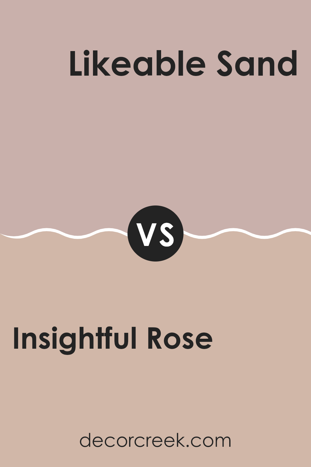
Insightful Rose SW 6023 by Sherwin Williams vs Likeable Sand SW 6058 by Sherwin Williams
Insightful Rose and Likeable Sand, both by Sherwin Williams, offer distinct yet harmonious color choices for home decor. Insightful Rose is a subtle pink with a soft, inviting feel. It provides a gentle warmth to any room, making it ideal for areas where comfort and relaxation are key, such as living rooms or bedrooms.
On the other hand, Likeable Sand is a neutral beige that brings a balanced, calming effect. This color works well in numerous settings, effortlessly complementing various decor styles and color palettes. Likeable Sand is especially effective in creating a welcoming atmosphere in areas like kitchens or hallways.
Together, these colors can be paired to achieve a cozy, aesthetically pleasing environment with a mix of warmth and neutrality. This combination can effectively set a peaceful mood without overpowering the senses.
You can see recommended paint color below:
- SW 6058 Likeable Sand
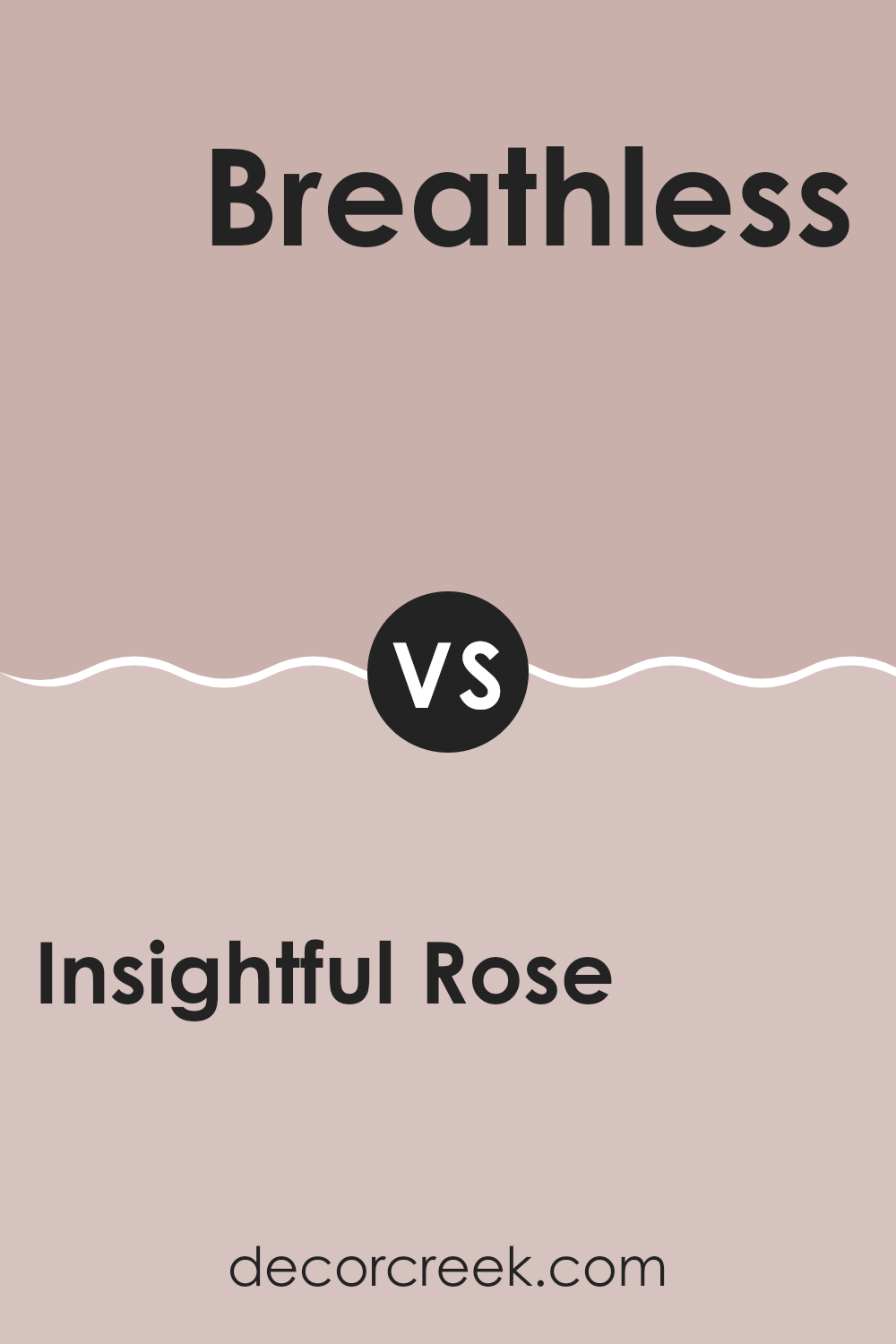
Insightful Rose SW 6023 by Sherwin Williams vs Breathless SW 6022 by Sherwin Williams
Insightful Rose and Breathless, both by Sherwin Williams, are quite close to each other in their color tones. Insightful Rose has a rich, rosy hue that brings warmth into any room. It’s a soft pink that hints at a dusty rose, perfect for creating a cozy, welcoming atmosphere.
On the other hand, Breathless leans more towards a neutral, almost beige-like pink. It’s lighter and less saturated than Insightful Rose, providing a subtle and calming effect in rooms where it is used. This makes Breathless ideal for those looking for a more understated look.
When used together, these two colors can complement each other effectively, with Insightful Rose offering depth and warmth, while Breathless acts as a soothing backdrop. Both paints have their unique appeal, depending on your decor preferences.
You can see recommended paint color below:
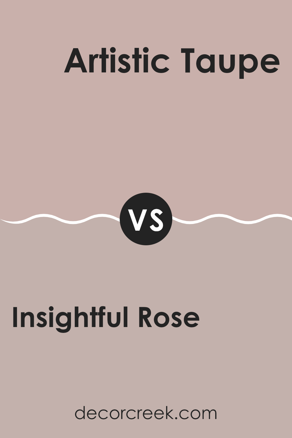
Insightful Rose SW 6023 by Sherwin Williams vs Artistic Taupe SW 6030 by Sherwin Williams
Insightful Rose by Sherwin Williams is a warm, soft pink shade that gives a room a cozy and inviting feel. It’s a gentle color that can make areas feel more intimate and comforting. This color works well in bedrooms or living areas where a touch of softness can create a relaxing atmosphere.
On the other hand, Artistic Taupe is a muted beige with gray undertones, also by Sherwin Williams. It’s a neutral color that provides a calm and stable background for any room. Artistic Taupe is flexible and can be paired easily with different colors and decors. It is particularly effective in creating a subtle backdrop that lets furnishings and artwork stand out.
While Insightful Rose adds a warm, charming touch, Artistic Taupe offers a more understated and flexible canvas. Each has its unique appeal depending on the mood and style you want for your room.
You can see recommended paint color below:
- SW 6030 Artistic Taupe
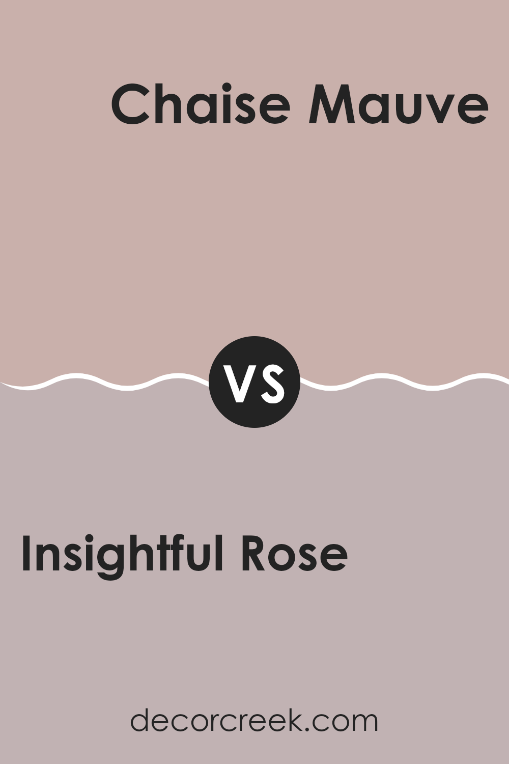
Insightful Rose SW 6023 by Sherwin Williams vs Chaise Mauve SW 6016 by Sherwin Williams
Insightful Rose and Chaise Mauve are two distinct paint colors from Sherwin Williams that each create a unique mood and visual appeal in a room. Insightful Rose is lighter and airier, bringing a soft warmth to rooms with its gentle pink hue. This color is excellent for areas meant to feel welcoming and cozy.
On the other hand, Chaise Mauve has a deeper, more muted tone, blending purple and gray to produce an understated elegance. It is perfect for adding a touch of subtle depth to a room without overpowering it. This color works well in areas where you’d like a more grounded, calm atmosphere.
Both shades are flexible but serve different purposes based on the ambience you want to achieve. Insightful Rose tends to brighten rooms and add a hint of gentle color, while Chaise Mauve is great for creating a refined backdrop that doesn’t call too much attention to itself.
You can see recommended paint color below:
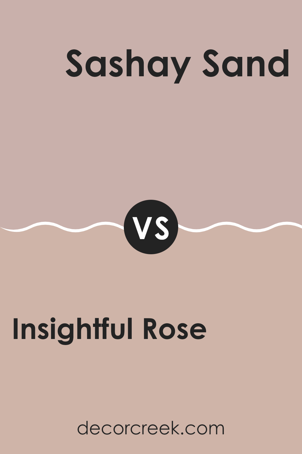
Insightful Rose SW 6023 by Sherwin Williams vs Sashay Sand SW 6051 by Sherwin Williams
Insightful Rose and Sashay Sand are two paint colors from Sherwin Williams that provide distinct vibes to any room. Insightful Rose is a deeper, muted pink with a touch of warmth, making it perfect for creating a cozy and welcoming atmosphere. It’s ideal for bedrooms or living areas where a calming yet inviting feel is desired.
On the other hand, Sashay Sand is a light beige with creamy undertones, offering a subtle elegance without overpowering a room. It’s exceptionally flexible, working well in various settings, from kitchens to hallways, enhancing natural light’s effect.
When comparing the two, Insightful Rose adds a bit more personality and warmth, making a statement in a gentle way. Sashay Sand is more about laying a soft, neutral foundation, allowing other décor elements to stand out. Both offer unique opportunities to beautify rooms, depending on your style and the mood you want to create.
You can see recommended paint color below:
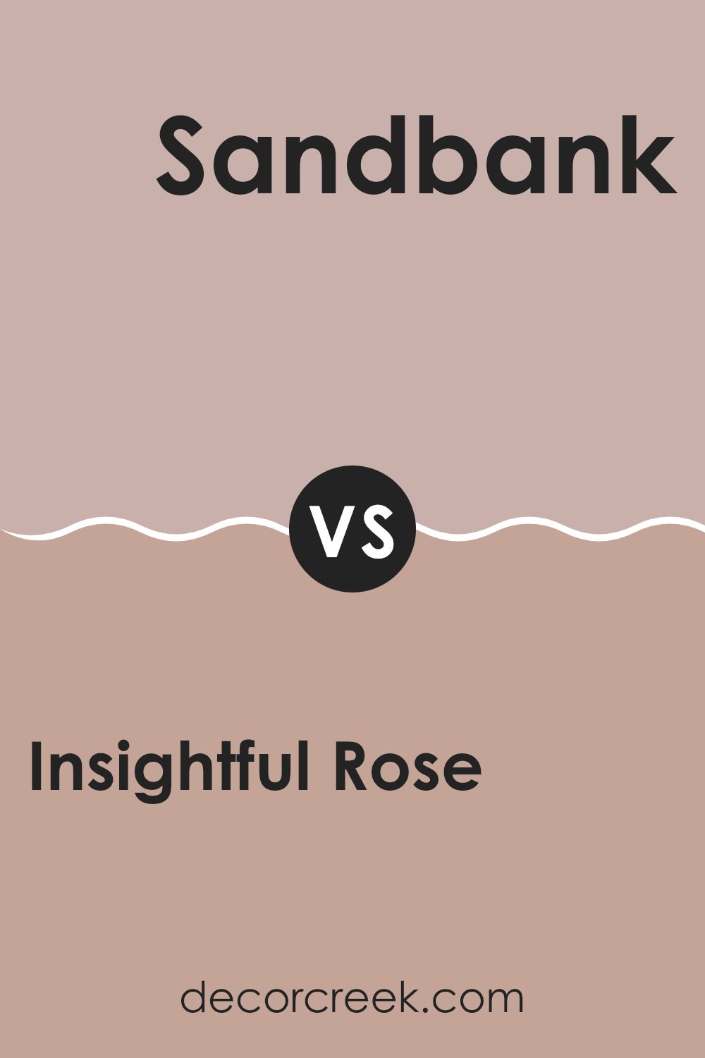
Insightful Rose SW 6023 by Sherwin Williams vs Sandbank SW 6052 by Sherwin Williams
Insightful Rose is a gentle and soft pink shade that gives a fresh, open feel to a room. It pairs beautifully with a variety of decor and can be used to create a cozy yet cheerful atmosphere in a room. Its subtle rose tone works well for bedrooms, bathrooms, or anywhere you want to add a hint of warmth.
In contrast, Sandbank is a muted brown with a clay-like undertone. This color is more grounded and natural, giving a room a calm and stable look. It is ideal for areas where you want to foster a sense of relaxation and earthiness, like living rooms or entryways. It contrasts well with brighter colors, providing a soothing backdrop.
Both colors offer unique vibes – Insightful Rose adds a gentle pop of color, while Sandbank keeps things down-to-earth. Depending on your style and the mood you want to create, either color can enhance your home beautifully.
You can see recommended paint color below:
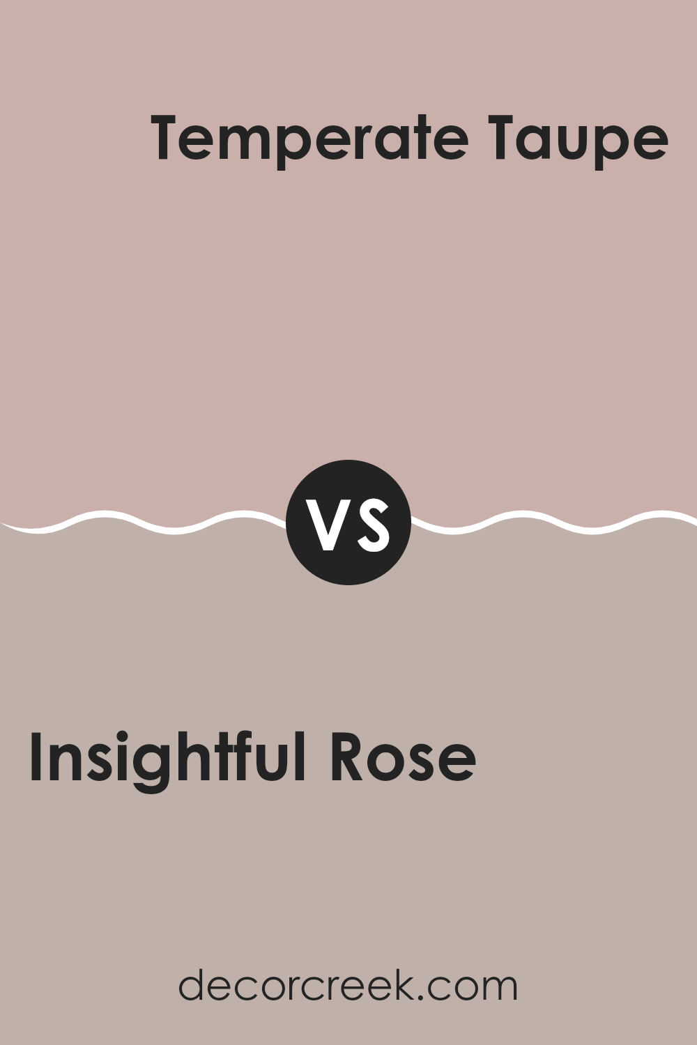
Insightful Rose SW 6023 by Sherwin Williams vs Temperate Taupe SW 6037 by Sherwin Williams
Insightful Rose is a soft, gentle pink color that offers a sense of calm and warmth to any room. It’s a flexible shade that pairs well with both bright and neutral hues, making it suitable for various decorating styles. Whether you’re looking to add a touch of femininity to a room or just brighten up a dull area, this color works beautifully.
On the other hand, Temperate Taupe is a cozy, warm gray-brown color that provides a solid foundation for any room. It’s perfect for those seeking a neutral backdrop that still adds character to a room. This color works great in areas where you want a touch of elegance without overpowering the room, making rooms feel welcoming and grounded.
Both colors offer their own unique charm. While Insightful Rose injects more vibrancy and warmth, making rooms feel friendly and inviting, Temperate Taupe offers a calmer, more subtle approach that works seamlessly in a variety of interiors.
You can see recommended paint color below:
Insightful Rose SW 6023 by Sherwin Williams vs Doeskin SW 6044 by Sherwin Williams
Insightful Rose and Doeskin, both by Sherwin Williams, offer distinctive shades suitable for creating warm, inviting rooms. Insightful Rose is a deeper, muted pink that brings a cozy yet vibrant touch to rooms. It’s quite flexible, matching well with both darker and lighter tones, and can add a subtle pop of color without overpowering a room.
On the other hand, Doeskin is a soft, neutral taupe. It leans towards a classic and gentle beige that pairs easily with a wide range of colors. This makes it a great choice for those looking to create a calm and understated look.
While Insightful Rose may lend a bit more personality due to its rosy hue, Doeskin stands out for its ability to serve as a quiet backdrop in any room. Whether it’s a bedroom or a living area, Doeskin supports other colors to shine, maintaining a soft presence. In summary, while both colors provide warmth, Insightful Rose adds a touch of cheerfulness, whereas Doeskin offers a soothing foundation.
You can see recommended paint color below:
Insightful Rose SW 6023 by Sherwin Williams vs Glamour SW 6031 by Sherwin Williams
“Insightful Rose” and “Glamour” by Sherwin Williams are two distinct shades that each offer their own unique ambiance to a room. “Insightful Rose” is a soft, gentle pink with a subtle warmth that makes it perfect for creating a cozy, inviting atmosphere. It pairs beautifully with soft whites and light neutrals, making it ideal for bedrooms or quiet sitting areas where a calm feel is desired.
On the other hand, “Glamour” is a deeper, more assertive pink. This color has a rich tone that can give a room a more lively and energetic feel. It works well in rooms that benefit from a pop of color, such as a dining area or an accent wall in a living room.
Both colors offer flexibility and can refresh a room’s mood, but “Insightful Rose” leans toward a soft, calming effect, while “Glamour” provides a bold and dynamic punch. The choice between the two would entirely depend on the kind of energy and atmosphere you want to achieve in your room.
You can see recommended paint color below:
- SW 6031 Glamour
Insightful Rose SW 6023 by Sherwin Williams vs Studio Mauve SW 0062 by Sherwin Williams
Insightful Rose and Studio Mauve, both by Sherwin Williams, offer distinct hues that could beautifully accent a room. Insightful Rose presents as a soft pink with a slightly muted tone, giving it a gentle and inviting appearance. This color is ideal for creating a cozy, warm atmosphere in areas like living rooms or bedrooms. It thrives in areas where a touch of subtle vibrancy is desired without overpowering the senses.
On the other hand, Studio Mauve is a darker, more subdued shade that leans towards a dusky lavender. It is perfect for adding a hint of depth and maturity to a room. Its richer tone pairs well with a variety of decors, contributing to an elegant aesthetic. Studio Mauve works exceptionally well in areas meant for reflection or calm, such as home offices or reading nooks.
When comparing the two, Insightful Rose appears lighter and more playful, while Studio Mauve offers a more reserved and grounded look. Both colors provide unique opportunities to enhance the aesthetics of a room according to the ambiance you want to set.
You can see recommended paint color below:
Wrapping up my thoughts on SW 6023 Insightful Rose by Sherwin Williams, I have to say, I love this paint color! Insightful Rose is not just any pink; it’s a special shade that feels warm and welcoming. It’s like the pink color of a flower, but not too bright, just really cozy and nice to look at.
When I painted my bedroom with this color, it really changed the whole feeling of the room. It made my room feel happy and calm. Easy to relax after a busy day. Also, it was fun to see how it matched with different things in my room like my curtains and bedsheet.
So, if you’re thinking about adding a new color to your home, Insightful Rose is a fantastic choice. Whether you put it in a bedroom, living room, or even a little corner for reading, this color brings in a lot of warmth. It’s easy to like and makes any room feel more cheerful. It’s not too strong, so it mixes really well with other colors around it. I’m really glad I chose this color because it makes my home feel just right!
Ever wished paint sampling was as easy as sticking a sticker? Guess what? Now it is! Discover Samplize's unique Peel & Stick samples.
Get paint samples

