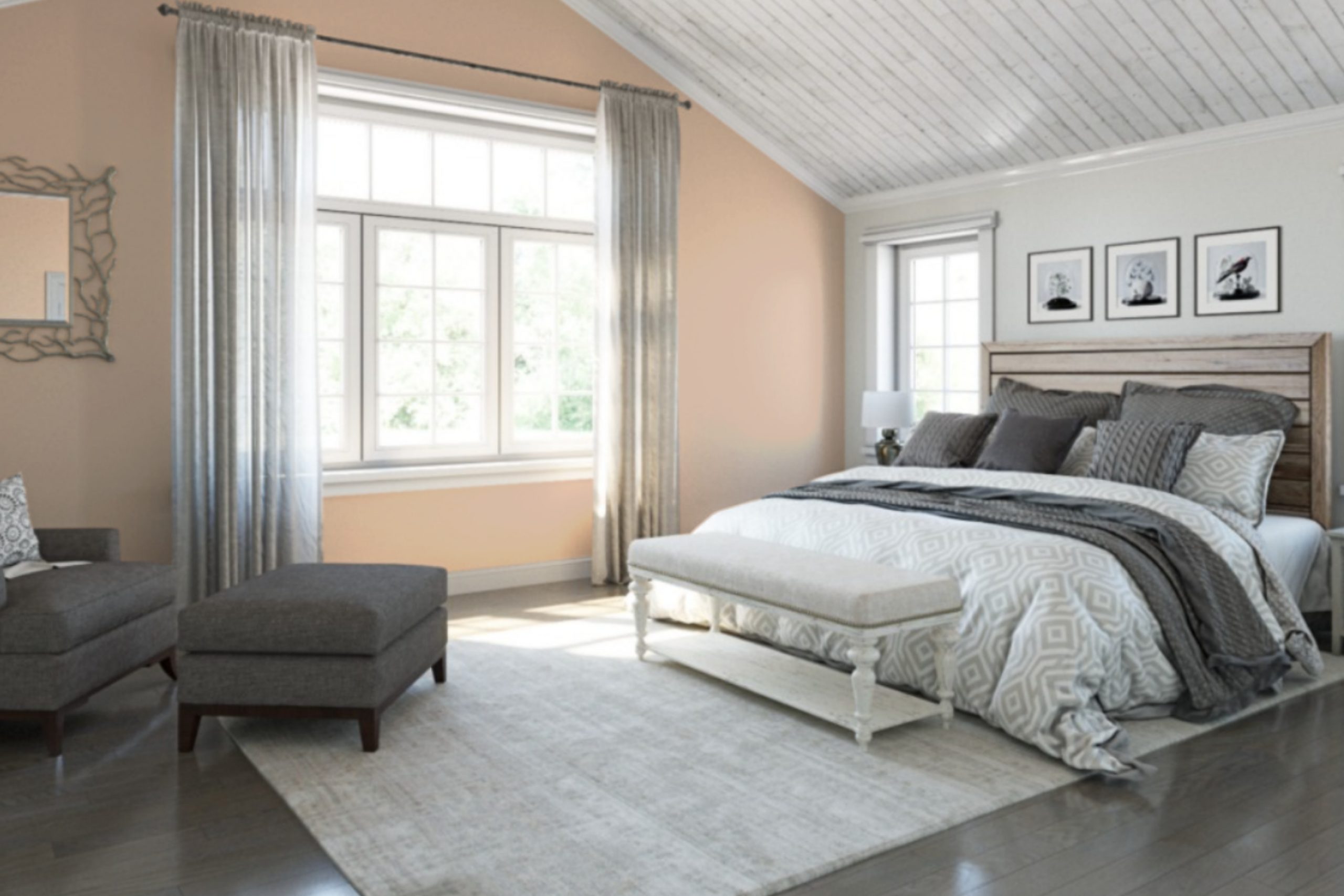
Let me tell you about a paint color named SW 0027 Aristocrat Peach by Sherwin Williams. If you’re looking for a color that softly brightens up any room without being too bold or overpowering, this might be the perfect choice. I’ve used it myself in a few projects, and it never fails to add just the right amount of warmth.
Aristocrat Peach has a gentle, inviting tone that works well whether you’re painting a cozy bedroom or giving a fresh look to your living room. It creates a calm backdrop that pairs beautifully with many decor styles and colors. From my experience, this shade has a way of making areas seem more welcoming, providing a light, cheerful ambiance that enhances natural light.
It’s also adaptable. Whether you decide to cover all walls for a soft, uniform look or use it as an accent alongside darker colors, Aristocrat Peach adapts seamlessly. Plus, for anyone interested in DIY projects, this color offers a forgiving palette to work with, making your task a little easier.
So, if you’re planning to redecorate or just want to freshen up a dull room, I’d recommend considering Aristocrat Peach. It has definitely worked wonders for me.
What Color Is Aristocrat Peach SW 0027 by Sherwin Williams?
Aristocrat Peach by Sherwin Williams is a soft, inviting shade of peach that brings warmth and a gentle vibrancy to any area. This color has a nurturing quality, making it a perfect choice for creating a cozy, welcoming atmosphere in a home. Its subtle undercurrents of pink give it a cheerful vibe without being too intense.
Aristocrat Peach is incredibly adaptable, fitting seamlessly into various interior styles such as rustic, shabby chic, contemporary, and even traditional settings. It works exceptionally well in living areas, kitchens, and bedrooms where you want to add a touch of softness and warmth.
When it comes to pairing with materials, Aristocrat Peach goes beautifully with natural wood tones, from lighter beech to richer walnut, enhancing the organic feel of an area. It also works well with textures like linen, wool, and cotton, which help to create a cozy, tactile environment.
Adding elements in white or creamy hues can bring a fresh, airy feel to the room, while touches of green in indoor plants or botanical prints complement the peach tones nicely, adding a burst of natural energy to the decor.

Is Aristocrat Peach SW 0027 by Sherwin Williams Warm or Cool color?
Aristocrat Peach by Sherwin Williams is a warm, inviting shade of peach that brings a cozy and cheerful touch to any area. This color has a soft, nurturing quality that makes areas feel comfortable and welcoming.
Its gentle hue is perfect for living areas or bedrooms where a calming atmosphere is desired, but with a hint of warmth to keep the area lively and engaging. Using Aristocrat Peach on walls can make an area feel brighter and more open, as its light-reflective qualities cast a subtle glow.
It pairs well with creamy whites or soft grays for a harmonious look, or can be matched with bold colors like deep blues or greens for a dynamic contrast. This adaptability makes it a great choice for those looking to refresh their home décor without elevating the area with too strong a color. Overall, Aristocrat Peach offers a balance of warmth and light, creating a friendly and inviting environment in any home.
Undertones of Aristocrat Peach SW 0027 by Sherwin Williams
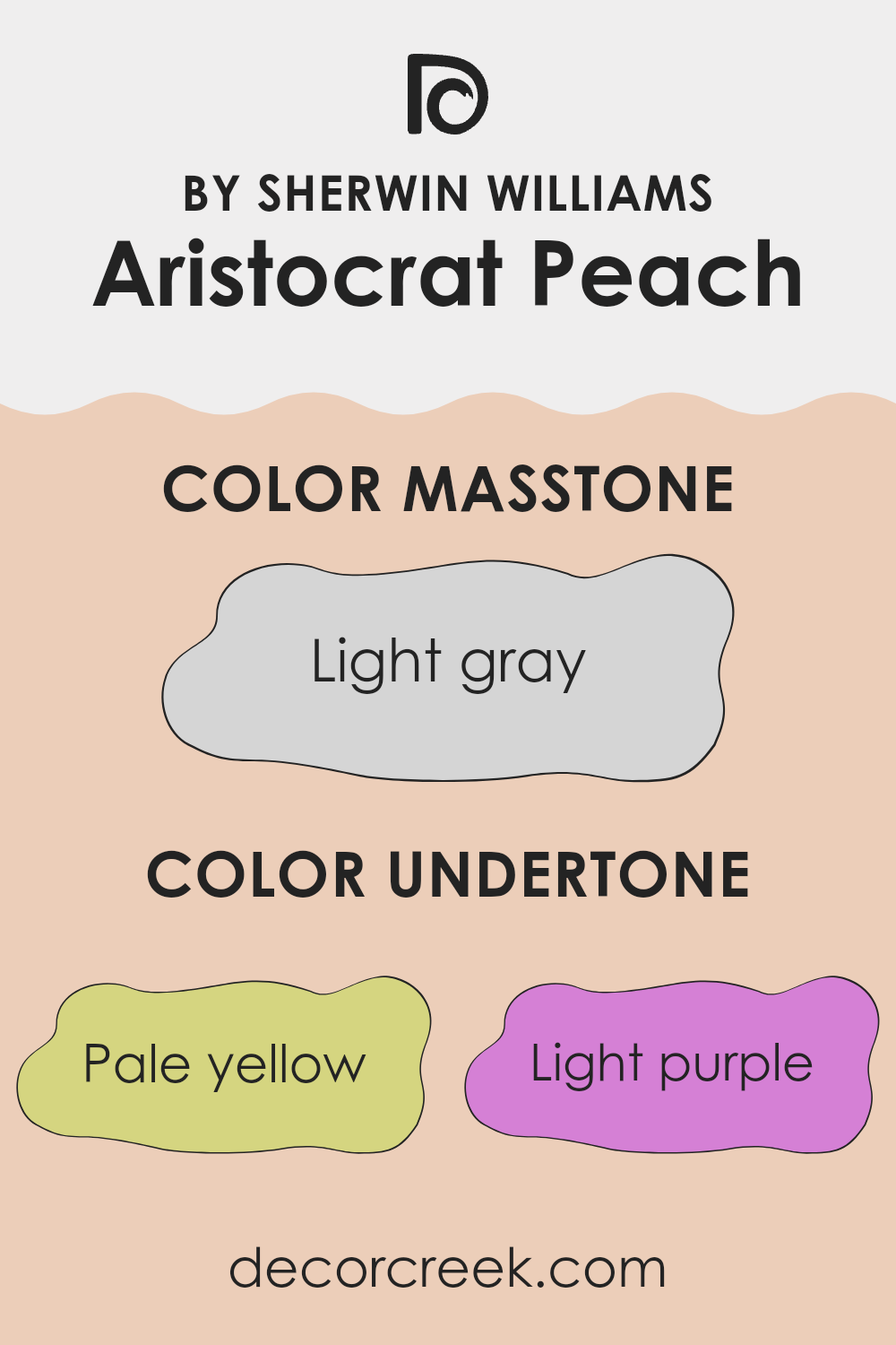
Aristocrat Peach is a unique paint color that subtly shifts its appearance depending on its environment due to its varied undertones. Colors like pale yellow, light purple, pale pink, light blue, mint, lilac, and grey subtly influence this shade, making it adaptable and complex.
Understanding undertones helps us grasp why a color may look different in various settings or lighting conditions. An undertone is a hue that subtly emerges from the main color and can enhance or alter the color’s overall appearance. For example, a color with a grey undertone might look cooler, while a pink undertone can give a warm glow.
When used on interior walls, Aristocrat Peach brings a dynamic element into play. The pale yellow undertone adds a gentle, sunny warmth making areas feel welcoming. The light purple and pale pink undertones introduce a softness, ideal for creating a cozy atmosphere. Light blue and mint undertones offer a fresh, airy feel, perfect for making a small area appear bigger. Similarly, the lilac undertone can give a slightly playful touch to the area, while the grey undertone ensures the color maintains a balanced, neutral base, making it easy to match with different decor styles and colors.
These undertones collectively make Aristocrat Peach a flexible choice for various areas, complementing natural light in an area and harmonizing with a wide range of furnishings and accessories. Whether it brightens up a living area, softens a bedroom, or adds character to a kitchen, its complex undertones play a key role in its effectiveness as a wall color.
What is the Masstone of the Aristocrat Peach SW 0027 by Sherwin Williams?
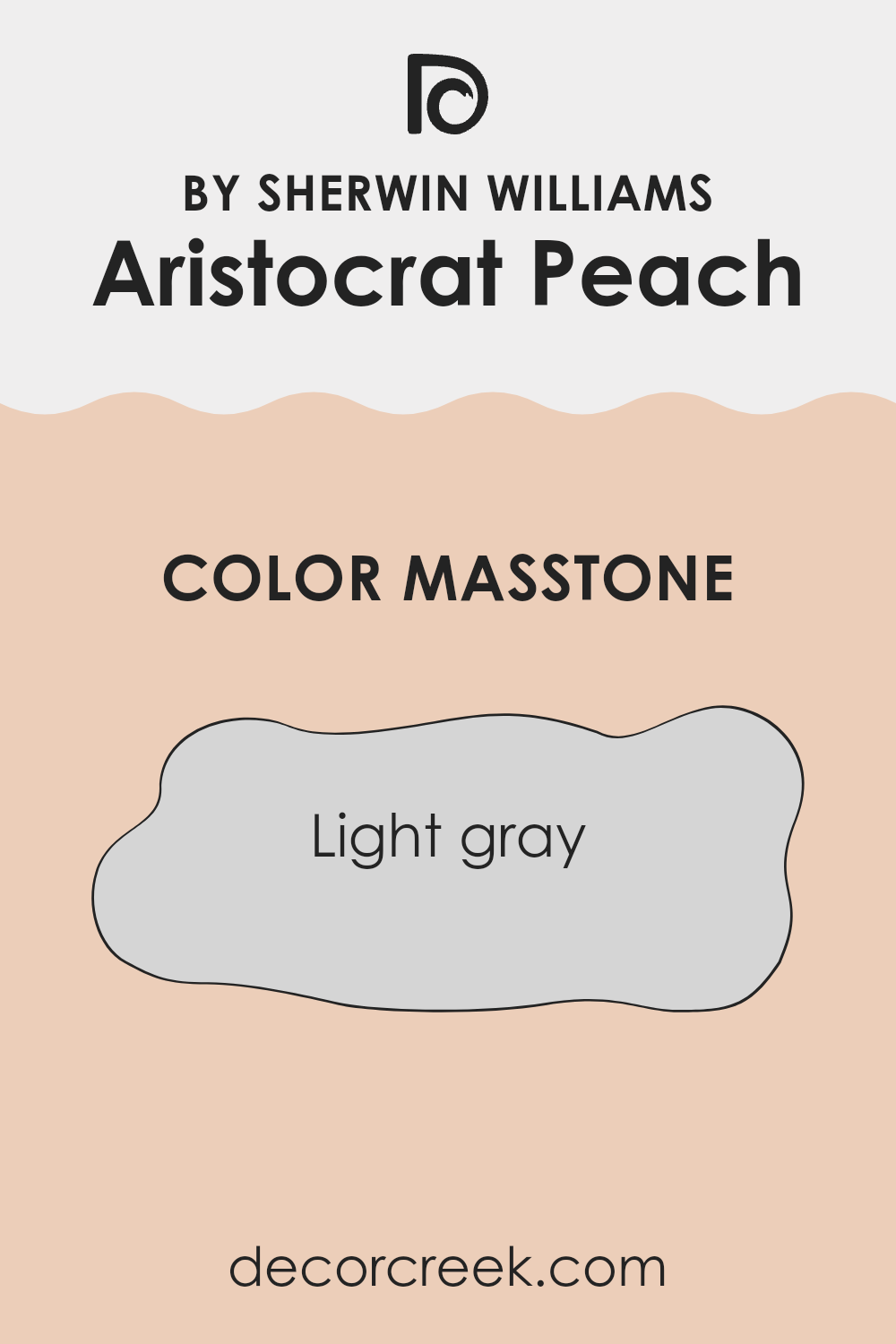
Aristocrat Peach SW 0027 by Sherwin Williams shows up as a light gray color, coded as #D5D5D5. This tone has a clean and soft appearance, making it very adaptable for use in home decor. It blends seamlessly with various design styles, whether traditional or modern.
The light gray masstone can serve as a neutral backdrop in areas, allowing furniture and artwork to stand out. Its subtle hue doesn’t overpower an area, which makes it great for smaller areas, giving an illusion of a bigger environment.
Additionally, its lightness brings a bright and airy feel to any area, enhancing natural light during the day. This color is also great for balancing out darker colors or busy patterns, providing a calming rest for the eyes in a colorful or vibrant setting. Overall, its adaptability and gentle presence make it a dependable choice for creating a comfortable and inviting home environment.
How Does Lighting Affect Aristocrat Peach SW 0027 by Sherwin Williams?
Lighting plays a critical role in how we perceive colors. Different light sources can significantly affect the appearance of a paint color in an area. Each type of light – whether artificial or natural – can change how a color looks.
Aristocrat Peach by Sherwin Williams is a warm, cozy hue that behaves differently under various lighting conditions. In artificial light, such as that from LED or incandescent bulbs, this peach shade tends to look richer and more vibrant. Artificial light often enhances warmer tones, making this color feel inviting and comfortable, especially in the evenings.
In natural light, Aristocrat Peach’s appearance can vary depending on the direction the area faces and the quality of light throughout the day. In north-facing areas, natural light is cooler and more subdued, which can make the color appear slightly muted and less intense. These areas don’t get a lot of direct sunlight, so the color can look more subdued.
South-facing areas receive a generous amount of sunlight throughout the day, which can make Aristocrat Peach look brighter and more vivid. The warm light intensifies the peach tones, creating a cheerful and lively ambiance.
East-facing areas get a lot of sunlight in the morning but less in the afternoon. In the morning, when the light is warmer, Aristocrat Peach will appear lively and bright. As the day progresses and natural light dims, the color may take on a softer, more subtle quality.
West-facing areas experience the opposite lighting pattern of east-facing ones. These areas have less intense light in the morning, giving Aristocrat Peach a softer appearance. In the evening, as the sun sets, the color can look warmer and more vivid due to the reddish-orange sunlight casting directly into the area.
Overall, the interplay of light and color in an area can dramatically affect the mood and aesthetic. Knowing how Aristocrat Peach will react under different lighting conditions can help in deciding if it’s the right color for a particular area.

decorcreek.com
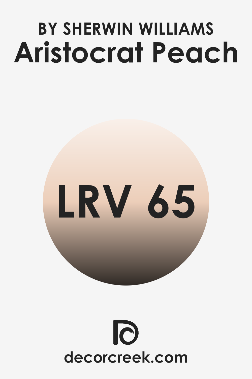
What is the LRV of Aristocrat Peach SW 0027 by Sherwin Williams?
LRV stands for Light Reflectance Value, which is a measure indicating the amount of visible light that a paint color reflects when it is applied on a wall. Basically, it tells us how light or dark a color will appear under normal lighting conditions. Colors with a high LRV reflect more light, making them appear brighter and lighter, while colors with a low LRV absorb more light, appearing darker.
This value is crucial when choosing paint shades as it helps predict how the color will look once it’s on your walls. For instance, a higher LRV can make a small area feel more open and airy, whereas a lower LRV can make an area feel cozier.
Looking at the LRV of 65.345 for the peach color, this means it’s more on the light-reflecting end of the spectrum. In practical terms, this peach shade will reflect a significant amount of light, making it a good choice for areas that you want to feel brighter and more open. This can be particularly beneficial in areas that receive less natural daylight, as the high LRV will help maximize the available light.
Thus, this peach hue with its light-reflective properties can help make an area look inviting and comfortably open.
decorcreek.com
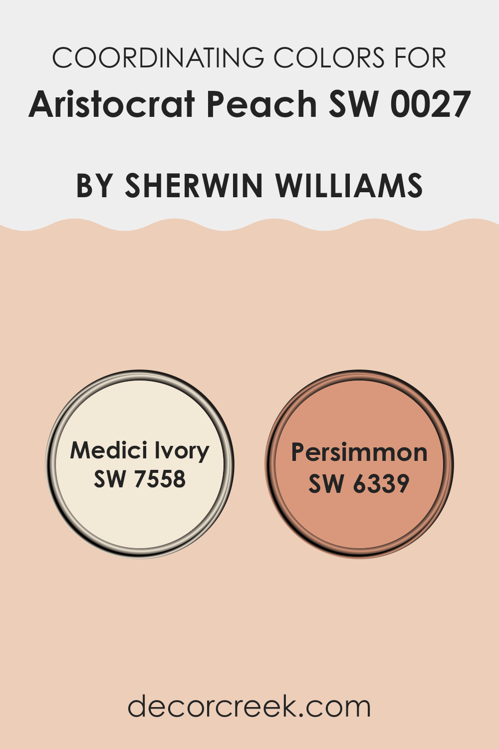
Coordinating Colors of Aristocrat Peach SW 0027 by Sherwin Williams
Coordinating colors are selected to complement and enhance the main color by creating a cohesive color scheme in an area. When choosing coordinating colors, the goal is to pick shades that harmonize and balance each other out, making the environment visually appealing. Coordinating colors are often used for accent walls, furniture, and accessories, integrating them to support the dominant color.
Aristocrat Peach is a warm, inviting hue, and colors like Medici Ivory and Persimmon are excellent choices to coordinate with it. Medici Ivory is a gentle, buttery cream shade that provides a subtle contrast to the brighter and more vivid Aristocrat Peach.
This lighter tone can help soften an area and add a touch of calmness to areas where activity is frequent, like living areas or kitchens. On the other hand, Persimmon is a bold, deep orange that carries an energetic vibe. This vibrant shade can inject life into a design, making it ideal for accenting features or furniture pieces that you want to stand out. Together, these coordinating colors create a warm and engaging atmosphere complementing the peachy tones of Aristocrat Peach.
You can see recommended paint colors below:
- SW 7558 Medici Ivory
- SW 6339 Persimmon
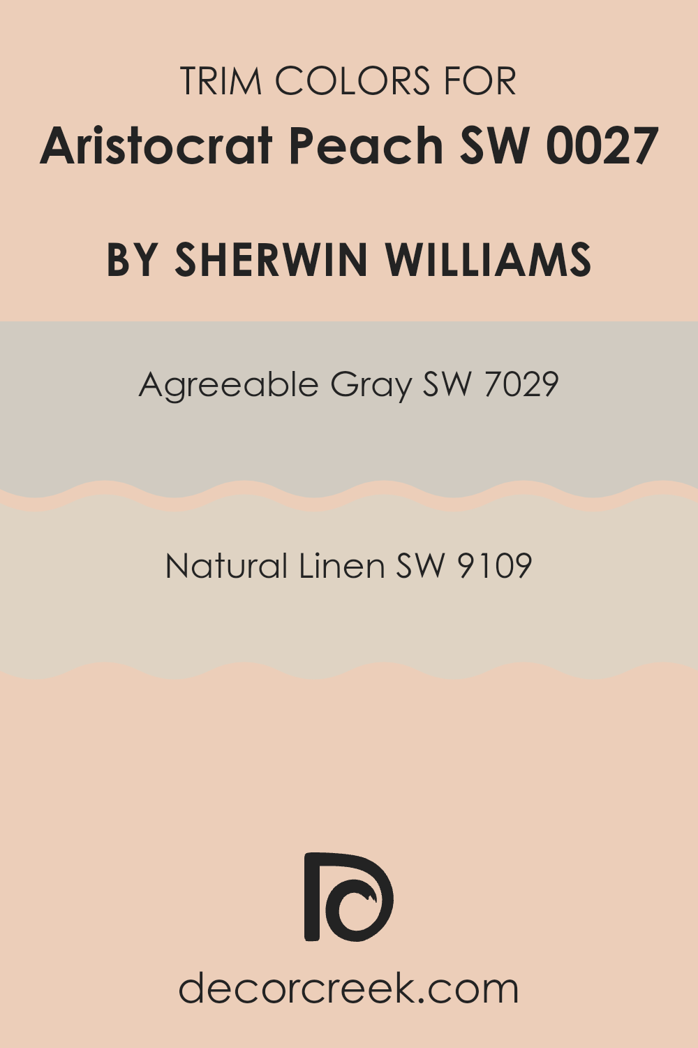
What are the Trim colors of Aristocrat Peach SW 0027 by Sherwin Williams?
Trim colors, like SW 7029 – Agreeable Gray and SW 9109 – Natural Linen, play a crucial role in defining the areas where they are applied, especially when paired with a distinct wall color such as Aristocrat Peach by Sherwin Williams. By using a trim color that complements or contrasts with the wall color, you can enhance architectural details, frame specific areas to create a more organized and finished look, and bring harmony to the overall color scheme of an area.
This practice helps in clearly defining transitions between different materials on walls and ceilings, around doors and windows, or along baseboards, thus accentuating the aesthetic appeal of the area.
Agreeable Gray is an adaptable shade that strikes a perfect balance between light and dark, making it an excellent choice as a trim color to offset the warmer tones of Aristocrat Peach. Its neutral yet warm presence works to subtly highlight the peach tones without overpowering them.
On the other hand, Natural Linen offers a slightly richer and warmer option, enveloping areas with a cozy, inviting vibe that pairs beautifully with the soft warmth of Aristocrat Peach. This color is great at providing a seamless blend that bridges traditional and contemporary elements in decor.
You can see recommended paint colors below:
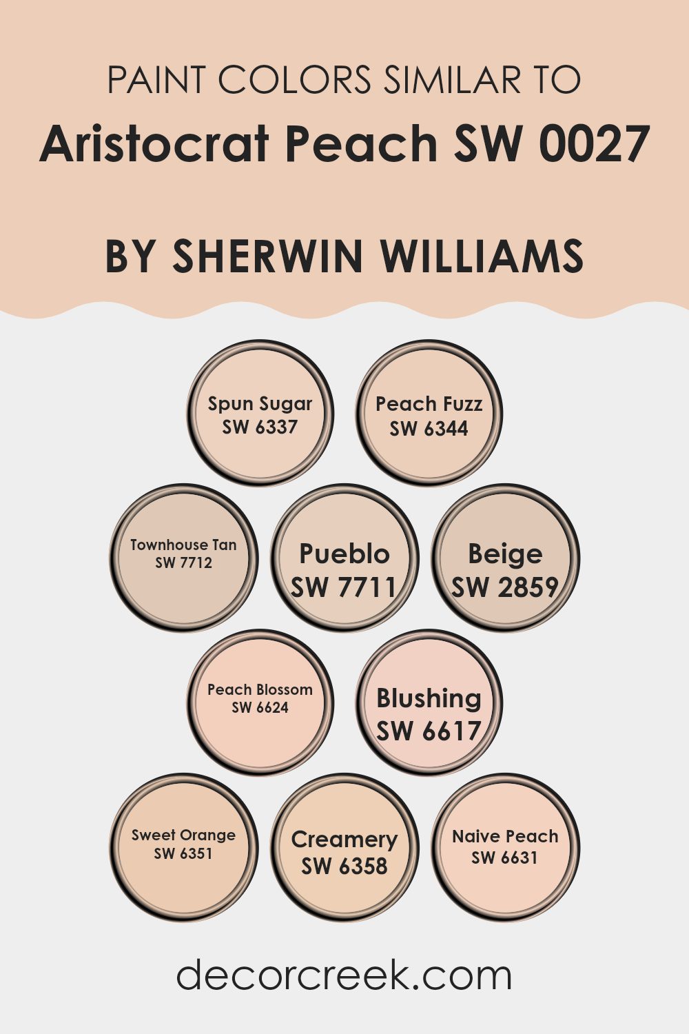
Colors Similar to Aristocrat Peach SW 0027 by Sherwin Williams
When using similar colors like those related to Aristocrat Peach by Sherwin-Williams, the primary benefit is achieving a cohesive and harmonious look. These colors, all variations of peach and beige, work together seamlessly, either as complementary elements in a single area or across multiple areas of a home.
This approach simplifies decision-making as these colors naturally pair well, reducing the risk of clashing hues. Moreover, similar colors can enhance the psychological effects desired in an area, such as warmth and welcome, which are particularly strong with peach and beige tones.
Colors like SW 6337 – Spun Sugar and SW 6344 – Peach Fuzz have a delightful lightness, perfect for creating a soft backdrop that makes areas feel airy and open. SW 7712 – Townhouse Tan and SW 7711 – Pueblo introduce a richer, earthier vibe that grounds a design scheme.
For those looking to add a subtle layer of complexity, SW 2859 – Beige is an excellent choice as it provides a neutral base that complements bolder accents. SW 6624 – Peach Blossom and SW 6617 – Blushing add a gentle pop of color, ideal for areas needing a touch of vibrancy without elevating the senses.
Meanwhile, SW 6351 – Sweet Orange and SW 6358 – Creamery infuse a sense of energy and freshness, great for invigorating an area. Lastly, SW 6631 – Naive Peach offers a muted elegance that works well in more understated or refined settings. Each of these colors, while similar, holds its unique charm, allowing them to stand alone or blend beautifully together for design continuity.
You can see recommended paint colors below:
- SW 6337 Spun Sugar
- SW 6344 Peach Fuzz
- SW 7712 Townhouse Tan
- SW 7711 Pueblo
- SW 2859 Beige
- SW 6624 Peach Blossom
- SW 6617 Blushing
- SW 6351 Sweet Orange
- SW 6358 Creamery
- SW 6631 Naive Peach
How to Use Aristocrat Peach SW 0027 by Sherwin Williams In Your Home?
Aristocrat Peach SW 0027 by Sherwin Williams is a warm, inviting shade of peach that can add a cheerful vibe to any area. This color works beautifully in areas where you want to create a cozy, welcoming atmosphere, like living areas or bedrooms. It’s soft enough to be soothing, yet vibrant enough to add personality and life.
To use it in your home, consider painting an accent wall in Aristocrat Peach to liven up a neutral area. It pairs well with creams, tans, and even soft blues or greens, allowing for a variety of decorating styles. You could also use this color in a hallway or entryway for a sunny welcome every time you enter.
Painting furniture, like a bookshelf or a nightstand, is another fun way to incorporate Aristocrat Peach into your decor. It provides a playful pop of color that can liven up older pieces or tie an area’s color scheme together. Whether you choose to go bold with a full area or subtle with accents, Aristocrat Peach can make your home feel warm and inviting.
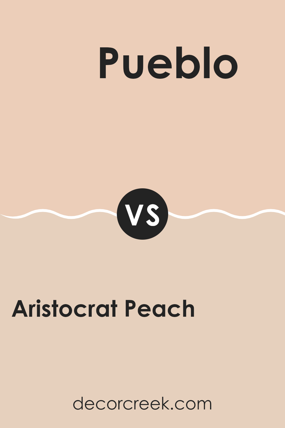
Aristocrat Peach SW 0027 by Sherwin Williams vs Pueblo SW 7711 by Sherwin Williams
Aristocrat Peach and Pueblo by Sherwin Williams are quite different in tone and feel, offering varied options for home interiors. Aristocrat Peach has a soft, subtle peach hue that brings a light and airy feel to any area, making it perfect for creating a gentle and welcoming atmosphere. It works particularly well in living areas and bedrooms where a calming influence is desired.
On the other hand, Pueblo is a deeper, more saturated color resembling the warm tones of terracotta. This color adds a cozy, earthy quality to an area, reminiscent of southwestern or rustic styles. It is ideal for areas where a stronger, more grounded ambiance is desired, such as dining areas or home offices.
Both colors offer warmth, but while Aristocrat Peach leans towards a delicate charm, Pueblo offers a bolder and earthier presence. Choosing between them depends on the mood and style you want to achieve in your area.
You can see recommended paint color below:
Aristocrat Peach SW 0027 by Sherwin Williams vs Blushing SW 6617 by Sherwin Williams
Aristocrat Peach and Blushing are two distinct shades from Sherwin Williams. Aristocrat Peach is a soft, muted peach that leans towards a warm beige with a cozy feel.
It’s quite neutral and adaptable, good for creating a gentle, inviting atmosphere in areas like living areas or bedrooms. On the other hand, Blushing has a more pronounced pink tone, giving it a slightly more youthful and cheerful vibe.
This color is bolder and can add a touch of fun and energy to an area, making it great for areas where you want a little more personality, such as a kid’s area or an accent wall. Both colors, while friendly and warm, cater to different aesthetic preferences and can influence the mood of an area distinctly due to their varying intensities and undertones.
You can see recommended paint color below:
- SW 6617 Blushing
Aristocrat Peach SW 0027 by Sherwin Williams vs Peach Blossom SW 6624 by Sherwin Williams
The main color, Aristocrat Peach, and the second color, Peach Blossom, both by Sherwin Williams, offer subtle yet distinct tones of peach. Aristocrat Peach presents a richer, deeper peach hue. It has a warm, welcoming feel that works well in areas where you want a cozy yet slightly muted ambiance. This color can pair nicely with darker woods and traditional décor to create a comfortable, inviting area.
On the other hand, Peach Blossom is lighter and airier. It leans towards a softer, more delicate peach that brightens an area effortlessly. This shade is particularly suitable for areas that aim to feel fresh and lively. It can enhance areas with natural light and matches well with light woods, whites, and soft greys, making it ideal for a modern, youthful environment.
In summary, both colors offer peach tones but carry diverse vibes; Aristocrat Peach provides depth and warmth, while Peach Blossom brings lightness and freshness.
You can see recommended paint color below:
Aristocrat Peach SW 0027 by Sherwin Williams vs Creamery SW 6358 by Sherwin Williams
Aristocrat Peach and Creamery are both warm and inviting colors from Sherwin Williams, but they have distinct tones that set them apart. Aristocrat Peach is a soft, muted peach color that brings a gentle warmth to any area. It’s subtle and has an understated elegance, making it a great choice for creating a cozy and welcoming atmosphere in areas like living areas and bedrooms.
On the other hand, Creamery is a cream color that leans towards yellow, giving it a slightly brighter and more energetic feel compared to Aristocrat Peach. It’s perfect for areas where you want to add a touch of brightness without elevating the area with bold color.
Both colors work well in areas that get a lot of natural light, enhancing their warmth. While Aristocrat Peach adds a whisper of color, Creamery can serve as a neutral backdrop that’s easy to match with other colors and decor styles. These colors can work beautifully together to create a harmonious and cheerful area.
You can see recommended paint color below:
- SW 6358 Creamery
Aristocrat Peach SW 0027 by Sherwin Williams vs Spun Sugar SW 6337 by Sherwin Williams
Aristocrat Peach and Spun Sugar by Sherwin Williams are two distinct shades that can liven up any area differently. Aristocrat Peach offers a soft, cozy vibe due to its muted peach tone, making it great for creating a warm, welcoming atmosphere in areas like living areas or bedrooms.
Meanwhile, Spun Sugar is much lighter, almost off-white with a subtle pink undertone, bringing a gentle, airy feel that can make small areas appear larger and brighter. The peachy shade of Aristocrat Peach lends itself well to pairing with rich, dark colors like navy or deep greens, providing a balanced contrast.
On the other hand, Spun Sugar works best with soft pastels, making for a subtle and light palette that’s perfect for areas aiming for a relaxed, minimalist aesthetic. Choose Aristocrat Peach for a more pronounced color statement, or Spun Sugar for an understated elegance.
You can see recommended paint color below:
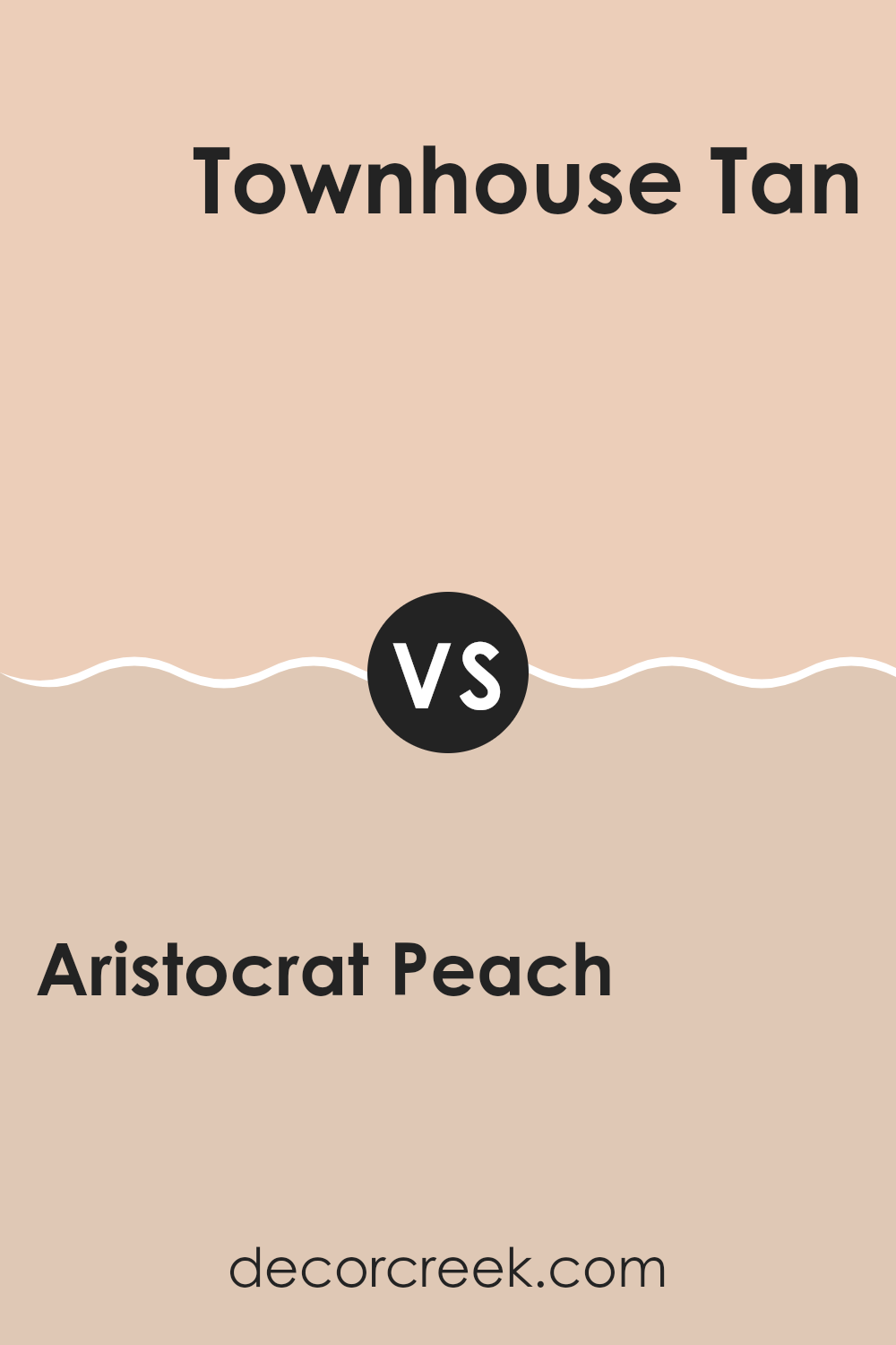
Aristocrat Peach SW 0027 by Sherwin Williams vs Townhouse Tan SW 7712 by Sherwin Williams
Aristocrat Peach is a soft, warm peach hue that gives a gentle and inviting feel to areas. It suggests a sunny and cheerful ambiance, making it great for living areas or kitchens where you want a cozy, welcoming atmosphere. On the other hand, Townhouse Tan is a deeper beige color with a neutrality that makes it highly adaptable.
It can create a calming effect, suitable for areas like bedrooms or offices where a more subdued color is preferable. While Aristocrat Peach brings a brighter, more vibrant touch, Townhouse Tan offers a more grounded, understated look.
Both colors can soften an area’s feel, each in its unique way, making them excellent choices for adding personality to a home without elevating it with bold colors. Townhouse Tan can also work well in pairing with other colors due to its neutral base, whereas Aristocrat Peach might guide a specific palette to harmonize with its warmer tone.
You can see recommended paint color below:
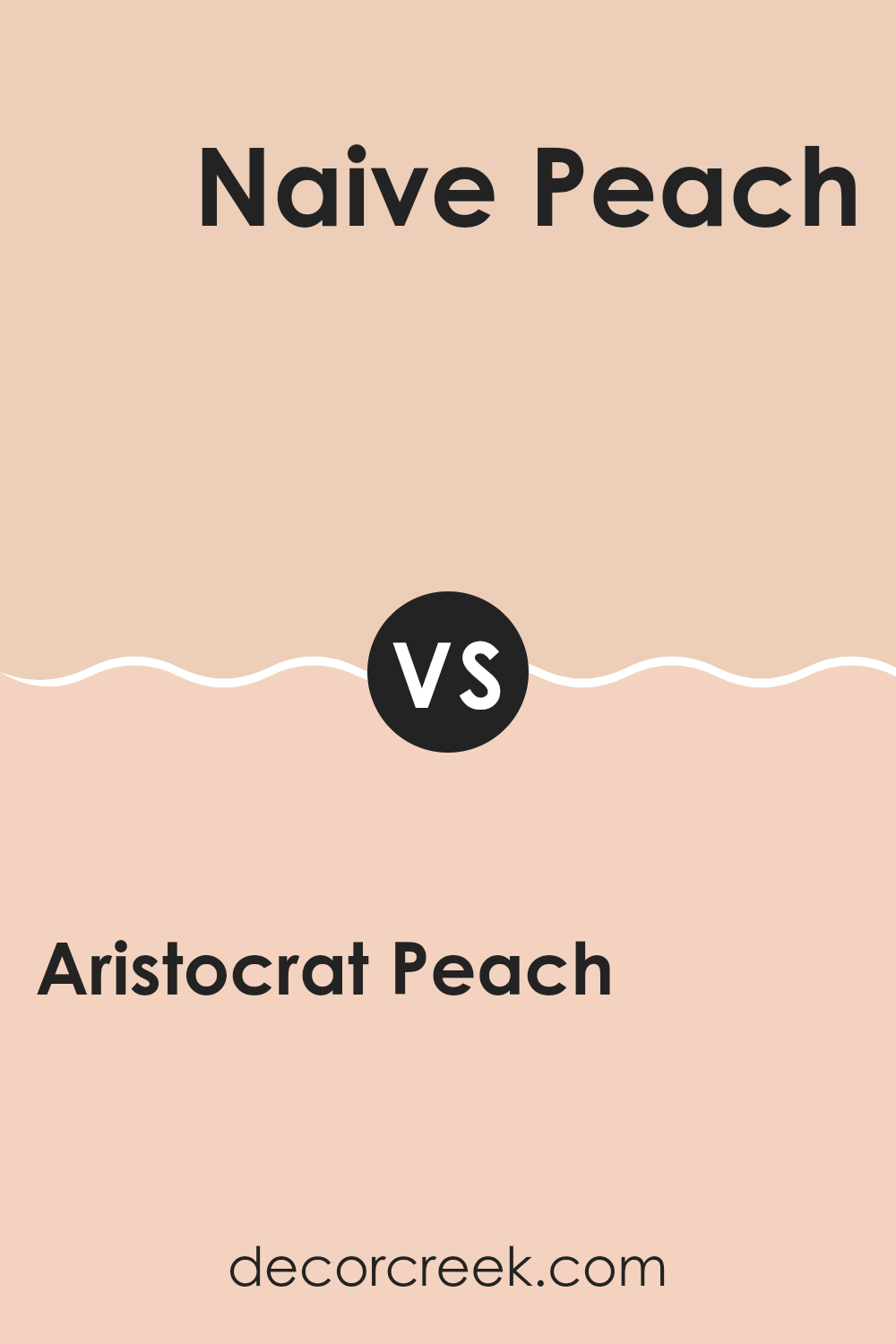
Aristocrat Peach SW 0027 by Sherwin Williams vs Naive Peach SW 6631 by Sherwin Williams
Aristocrat Peach and Naive Peach by Sherwin Williams are two peachy shades that bring their unique vibes to areas. Aristocrat Peach has a deeper, richer hue, giving a cozy and warm feel to any area.
It’s perfect for creating a welcoming atmosphere in living areas and bedrooms. On the other hand, Naive Peach is lighter and softer, making it ideal for areas where you want a gentle and airy feel, such as kitchens and bathrooms.
Both colors reflect light differently depending on the time of day, adding a dynamic character to interiors. Aristocrat Peach, with its richer tone, can make larger areas feel more intimate, whereas Naive Peach can help smaller areas appear brighter and more open. When choosing between these two, consider the mood you want to set and the size of your area.
You can see recommended paint color below:
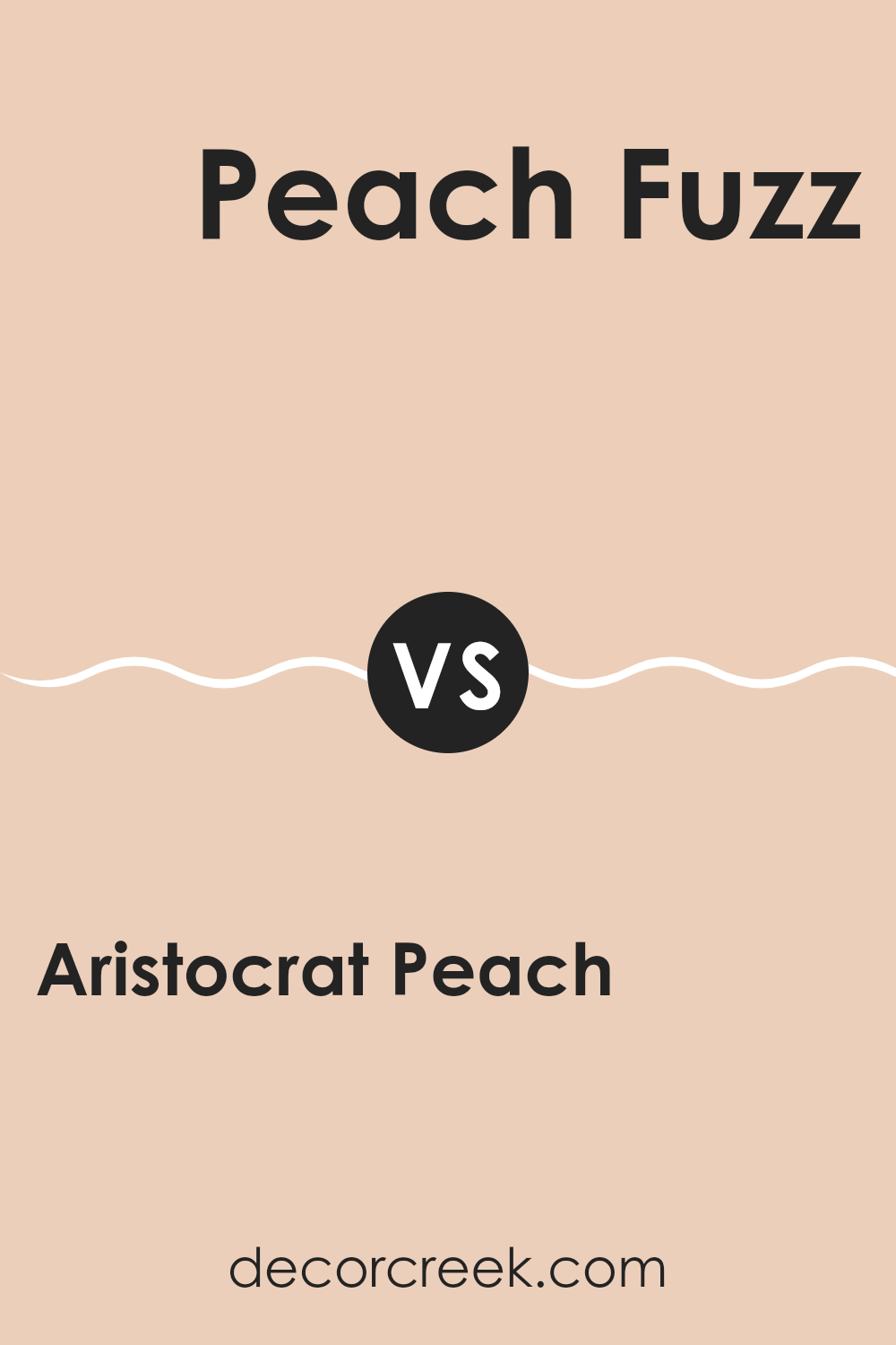
Aristocrat Peach SW 0027 by Sherwin Williams vs Peach Fuzz SW 6344 by Sherwin Williams
Aristocrat Peach and Peach Fuzz by Sherwin Williams are both warm, inviting hues, but they have some distinct differences. Aristocrat Peach is a more muted, subtle shade that leans towards a neutral peach tone. It has an understated quality that makes it adaptable for any area aiming for a soft, welcoming feel without elevating brightness.
On the other hand, Peach Fuzz is a cheerier, more vibrant color. It is a brighter peach that can add a playful, lively vibe to an area. This shade is great for areas that want a pop of color while maintaining a warm ambiance.
In summary, if you’re looking for a peach tone that’s low-key and easy to match with other colors, Aristocrat Peach is the way to go. If you prefer something more energetic and fun, Peach Fuzz might be the better choice. Both colors represent variations of peach that can warm up an area effectively, depending on your style preference and decorating goals.
You can see recommended paint color below:
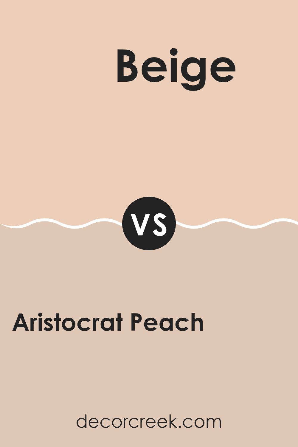
Aristocrat Peach SW 0027 by Sherwin Williams vs Beige SW 2859 by Sherwin Williams
Aristocrat Peach and Beige by Sherwin Williams are two distinct shades that offer their unique appeal for home décor. Aristocrat Peach is a warm, soft peach tone that gives a gentle, welcoming atmosphere to any area. Its subtle pink undertones make an area feel cozy and inviting, perfect for living areas and bedrooms where a calm, affectionate ambiance is desired.
On the other hand, Beige is a classic neutral color. It’s a true beige that provides a stable and grounding effect. This color works extremely well in various settings as it pairs effortlessly with brighter colors or serves as a standalone hue for a clean, minimalistic look.
It’s particularly useful in areas where you want to highlight other design elements without the wall color taking center stage. Both colors offer flexibility in decorating but cater to different aesthetic preferences. Aristocrat Peach adds a touch of warmth and softness, while Beige offers a straightforward and clean backdrop for any area.
You can see recommended paint color below:
- SW 2859 Beige
Aristocrat Peach SW 0027 by Sherwin Williams vs Sweet Orange SW 6351 by Sherwin Williams
Aristocrat Peach and Sweet Orange are both warm and welcoming colors, but they bring different vibes and intensities to an area. Aristocrat Peach is a subtle, soft peach that offers a gentle and airy feel, making it perfect for creating a cozy and inviting atmosphere in any area. It’s an adaptable shade that pairs well with various decor styles, from modern to traditional.
On the other hand, Sweet Orange is a brighter, more vibrant orange. This color packs a punch and is great for areas where you want to add a sense of energy and enthusiasm. It’s bolder than Aristocrat Peach and stands out more, which makes it suitable for accent walls or areas that you want to highlight.
While both colors share a warm base, Aristocrat Peach leans towards a muted tone that soothes and calms, whereas Sweet Orange is lively and can energize an area. Depending on the mood you want to set, each color has its unique appeal and potential impacts on the area’s aesthetics.
You can see recommended paint color below:
- SW 6351 Sweet Orange
In wrapping up my thoughts on SW 0027 Aristocrat Peach by Sherwin Williams, I want to share how much I enjoy this color. It’s like a warm, sunny day that makes you smile just by looking at it. When I used this paint in my living area, it made the whole area light up like it was filled with sunshine, even on rainy days. This peachy color isn’t just pretty, it’s also really comforting and friendly.
I found that this shade of peach goes well with lots of other colors. You can pair it with soft whites for a gentle look or with bright greens and blues for something fun and energetic. It’s perfect for any area that needs a touch of joy, from kitchens to bedrooms.
Overall, Aristocrat Peach by Sherwin Williams is more than just a paint; it’s a way to bring a little bit of happiness into your home. It’s simple to use and looks great all the time. For anyone looking to brighten up their home with a fresh, cheerful color, I’d definitely suggest giving Aristocrat Peach a try.
It has truly made a difference in how my home feels, making it a happier and more inviting place to be.

Ever wished paint sampling was as easy as sticking a sticker? Guess what? Now it is! Discover Samplize's unique Peel & Stick samples.
Get paint samples

