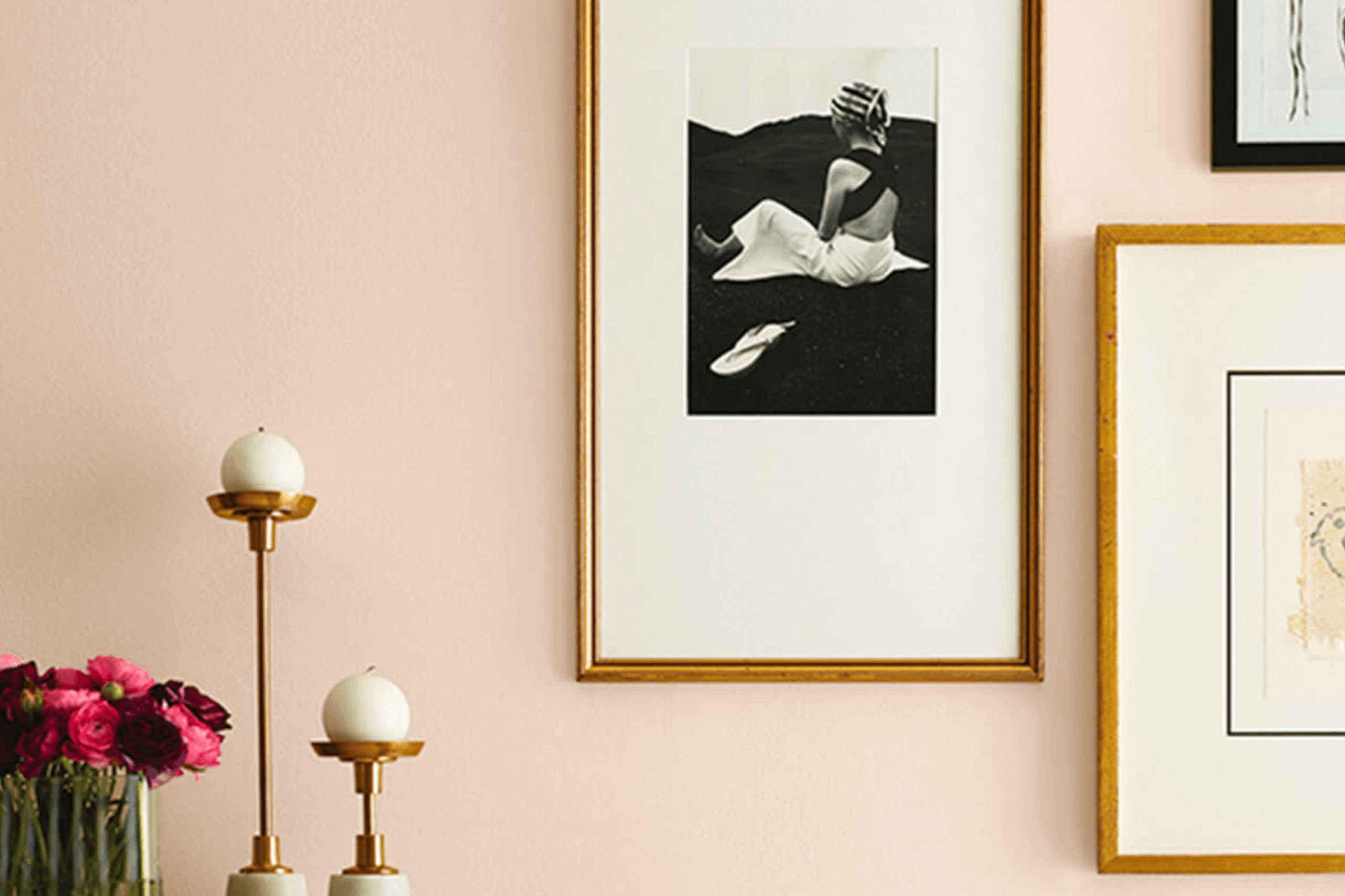
When I think about creating a warm and grounded atmosphere in a room, SW 7711 Pueblo by Sherwin Williams immediately comes to mind. It’s a rich, earthy hue that blends the subtle warmth of terracotta with the quiet strength of clay, offering a unique balance that feels both inviting and steadfast. The color carries a natural warmth that can turn any room into a comforting retreat, echoing the warm harmony of a desert sunset.
I appreciate how this shade can effortlessly complement a variety of styles, from rustic to contemporary. Its versatility isn’t lost on me; while it can stand alone as a focal point, it also plays well with other colors, adding depth to neutral palettes or calming influence to bolder themes.
When choosing a color for a living room, I often lean towards shades that evoke a sense of belonging and comfort, and Pueblo does just that. It creates an environment that not only feels connected to nature but also adds a touch of sophistication to my room.
Whether on an accent wall or throughout an entire room, SW 7711 has a way of making a house feel like a home, a place where one is both grounded and inspired.
What Color Is Pueblo SW 7711 by Sherwin Williams?
Pueblo SW 7711 by Sherwin Williams is a rich, warm color that brings a cozy and inviting feel to any room. It is a deep reddish-brown shade reminiscent of earthy tones found in the Southwestern United States. This color works well in interiors that aim for a rustic, earthy, or traditional style.
Pueblo’s warmth complements materials such as reclaimed wood, leather, and natural stone. It pairs excellently with textured fabrics like burlap or linen. The color can also be accented with metal details, such as wrought iron, to enhance its rustic appeal. In addition, Pueblo goes well with softer, neutral colors like cream or beige, which help balance its boldness.
This color is especially suited for living rooms, dining areas, or any room where a sense of comfort and warmth is desired. It adds depth and character to walls and can also be used as an accent color to highlight architectural features or specific pieces of furniture.
Pueblo is ideal for areas that incorporate a lot of natural elements, as it echoes the tones found in nature. Whether it’s used on walls, trim, or accessories, this color adds a grounded, inviting touch to interiors, making any room feel welcoming and warm.
Is Pueblo SW 7711 by Sherwin Williams Warm or Cool color?
Pueblo SW 7711 by Sherwin Williams is a warm, earthy color that combines tones of brown with a hint of orange. This shade can bring a cozy and inviting atmosphere to any room. Its warm undertones make it particularly effective in living areas and kitchens, where it can create a sense of comfort and welcome.
By using Pueblo on walls, homeowners can enhance the natural light in a room, as it reflects light in a soft, soothing way. This color works well with other neutral shades, such as creams and beiges, adding depth and richness to a room without overpowering it.
It pairs nicely with natural materials like wood and stone, making it an excellent choice for rustic or southwestern-themed interiors. Additionally, Pueblo can be accented with bolder colors, such as deep blues or greens, for added contrast. Overall, Pueblo SW 7711 is a flexible and warm color that can enhance various home settings.
Undertones of Pueblo SW 7711 by Sherwin Williams
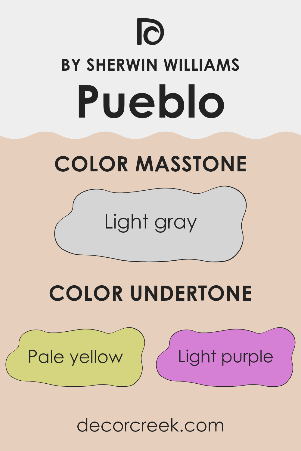
Pueblo by Sherwin Williams, with its collection of undertones, can change the way a room feels. These undertones include pale yellow, light purple, pale pink, light blue, mint, lilac, and grey. Each undertone plays a role in the overall appearance of the color, creating different effects.
When a color is applied to a room, its undertones can influence how the color appears in different lighting conditions. For example, sunlight or artificial light can highlight certain undertones, making them more noticeable.
Pale yellow and pale pink can add warmth to a room, making it feel cozy and inviting. Light blue and mint undertones can give a room a fresh and airy feel, while the presence of lilac adds a subtle hint of sophistication. Grey undertones provide a neutral base, grounding the color and preventing it from feeling too vibrant.
In a room painted with Pueblo, these undertones mean that the walls will reflect a range of moods depending on the time of day and the type of lighting. Morning sunlight might emphasize a warmer palette, while cooler artificial lights in the evening might bring out more of the lilac and grey tones. The result is a flexible color that can feel cozy or refreshing depending on the setting.
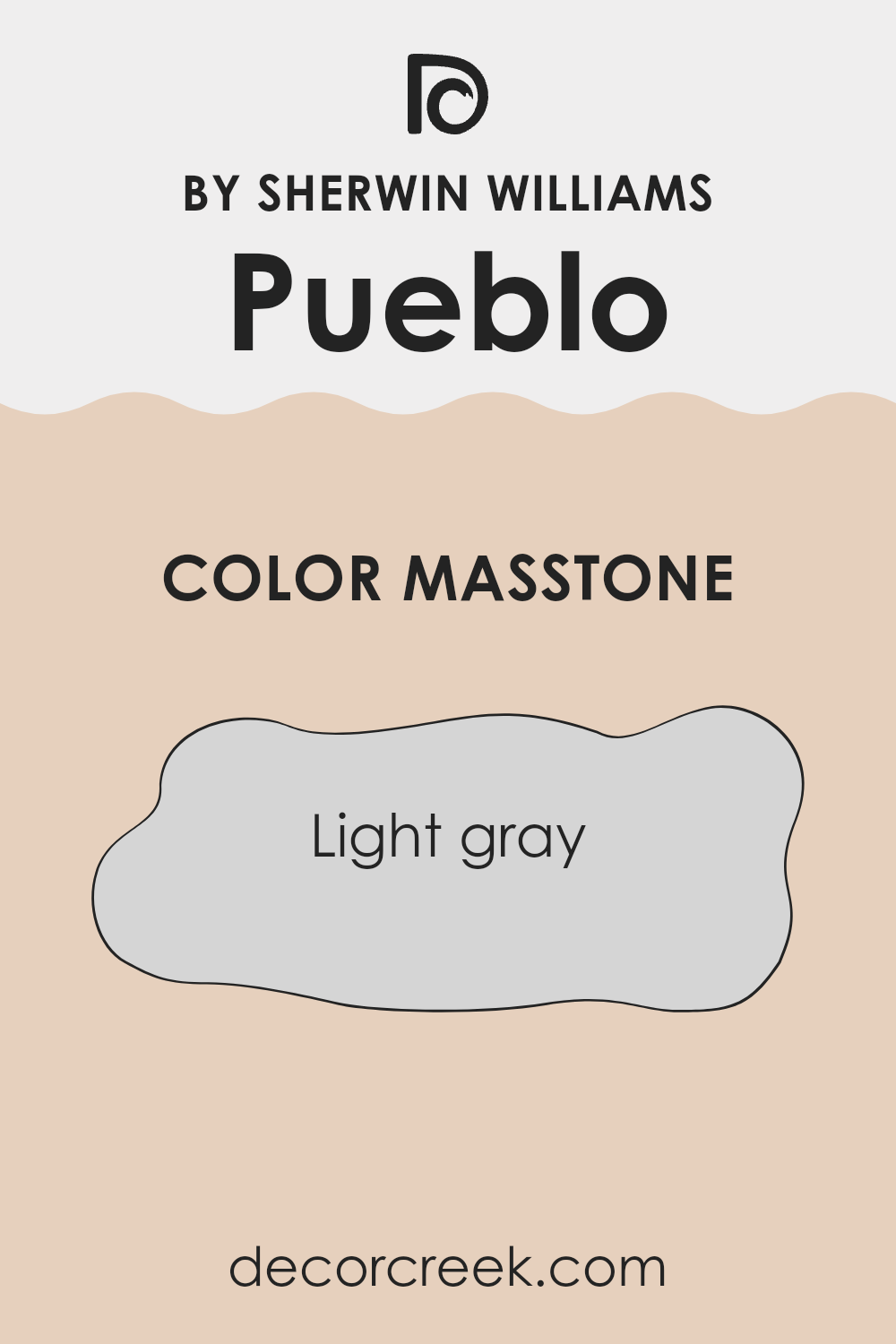
What is the Masstone of the Pueblo SW 7711 by Sherwin Williams?
Sherwin Williams’ Pueblo SW 7711 is a light gray color, around #D5D5D5, that offers a flexible choice for home interiors. Its neutral hue makes it a great backdrop, allowing adaptability in design. This soft gray doesn’t overpower a room, making it ideal for both large and small rooms.
It reflects light cleanly, which can help a room feel brighter and more open without being stark or cold. In living rooms, Pueblo SW 7711 provides a calming feeling, making it suitable for walls where a relaxed environment is desired.
It works well with a range of other colors, allowing homeowners to match it with bright accents for a pop of color or with other neutrals for a more subtle look. This adaptability helps when coordinating with different furniture styles and decors, making it a popular choice for many different settings, from modern to traditional homes.
How Does Lighting Affect Pueblo SW 7711 by Sherwin Williams?
Lighting plays a significant role in how we perceive colors. Natural light changes throughout the day and can alter the appearance of paint colors, while artificial light can introduce its own hues, depending on the type of bulbs used. Sherwin Williams’ color Pueblo (SW 7711) is a warm, earthy tone that can appear different under various lighting conditions.
In natural light, Pueblo may appear brighter and more vibrant. In a north-facing room, which gets softer and cooler light, this color can take on a more muted, slightly cooler tone. The reduced illumination in north-facing rooms might make Pueblo look a bit darker or somber, highlighting its richer undertones.
In south-facing rooms, ample sunlight tends to enhance colors and bring out their warmth. Here, Pueblo will likely appear brighter and more vivid, showing its warm, brownish hue. The natural light in these rooms is typically warm and consistent throughout the day, making Pueblo seem cheerful and cozy.
East-facing rooms get warm, yellow light in the morning and cooler, bluish light in the afternoon. As a result, Pueblo might look warm and inviting during morning hours, while appearing more subdued and slightly cooler later in the day.
West-facing rooms experience the opposite: cooler light in the morning and a warmer glow in the late afternoon and evening. Pueblo will likely pick up warmth and depth as the day progresses, becoming more vibrant as the sun sets.
Artificial lighting can influence Pueblo’s appearance too. Incandescent bulbs, which give off a warm, yellowish light, complement Pueblo’s warmth, making it seem cozier. On the other hand, fluorescent lights, which tend to be cooler, might bring out cooler, more neutral tones in the color, potentially making it look less lively.
LED lights, available in both warm and cool tones, can also impact the appearance depending on their specific color temperature. Thus, to achieve the desired effect, it’s important to consider the type of light that will dominate the room where you’re using Pueblo.
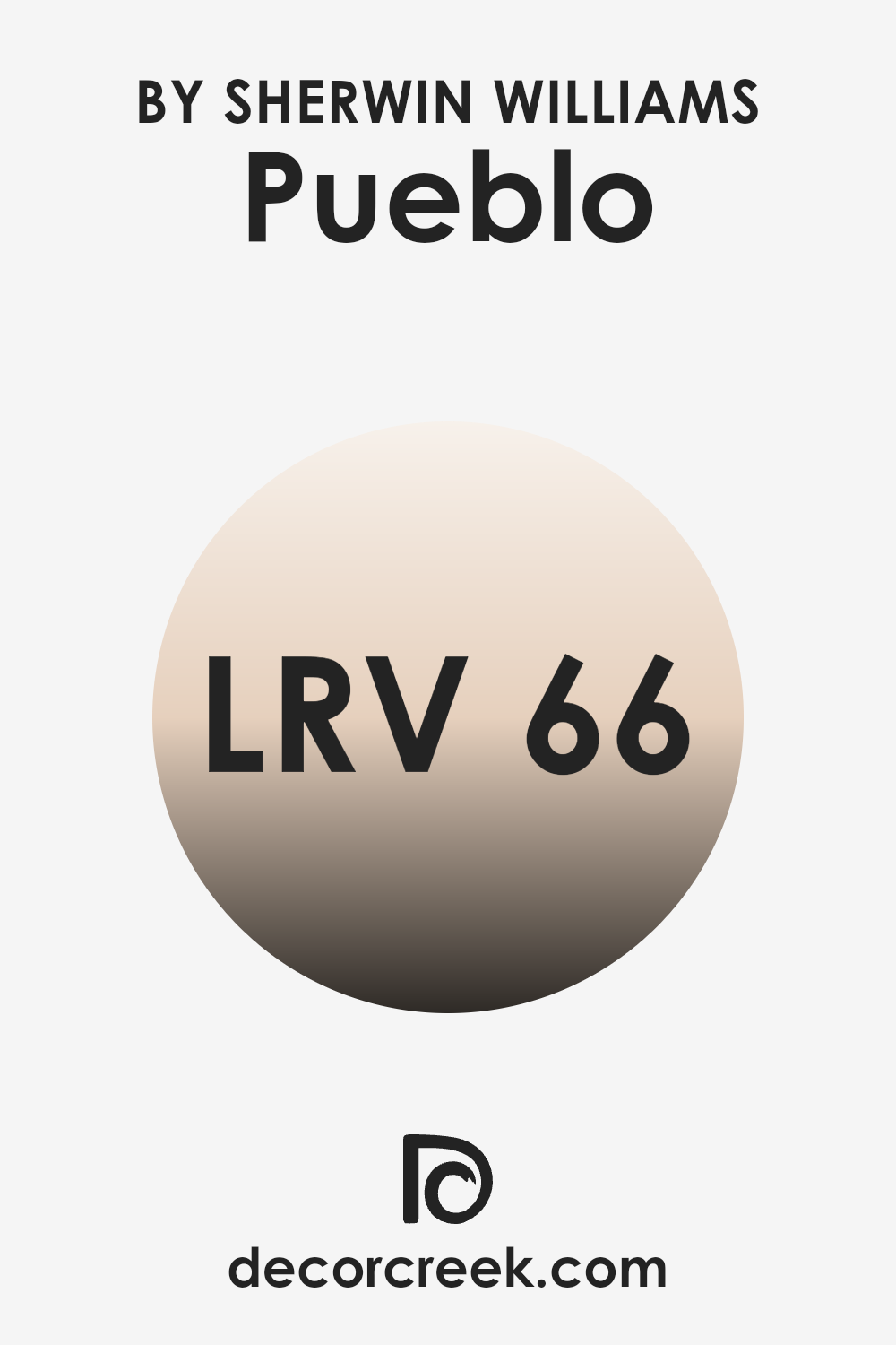
What is the LRV of Pueblo SW 7711 by Sherwin Williams?
LRV, or Light Reflectance Value, is a measurement used in the paint and design industry to indicate how much light a color reflects or absorbs. The scale ranges from 0, which means no light is reflected, making it completely black, to 100, which means all light is reflected, making it completely white. An LRV of 65.561 for the Pueblo paint color from Sherwin Williams means it reflects a fair amount of light without being overly bright.
This makes it a great choice for areas where you want a balance of lightness and warmth. Colors with higher LRVs help make rooms look more spacious and airy since they reflect more light. On the other hand, colors with lower LRVs absorb more light, making areas feel cozier and more enclosed.
For Pueblo, with its LRV of 65.561, this means it will reflect a moderate amount of light, making rooms feel open but still providing some warmth and depth. This color is likely to appear lighter during the day when more natural light is available, while still maintaining its color integrity under artificial lighting.
It’s flexible, making it suitable for both larger, sun-filled rooms and smaller, dimly-lit areas. Its ability to reflect light without being overly glaring helps create a welcoming and comfortable environment, which can be perfect for living rooms, bedrooms, or kitchens where comfort and adaptability are key.
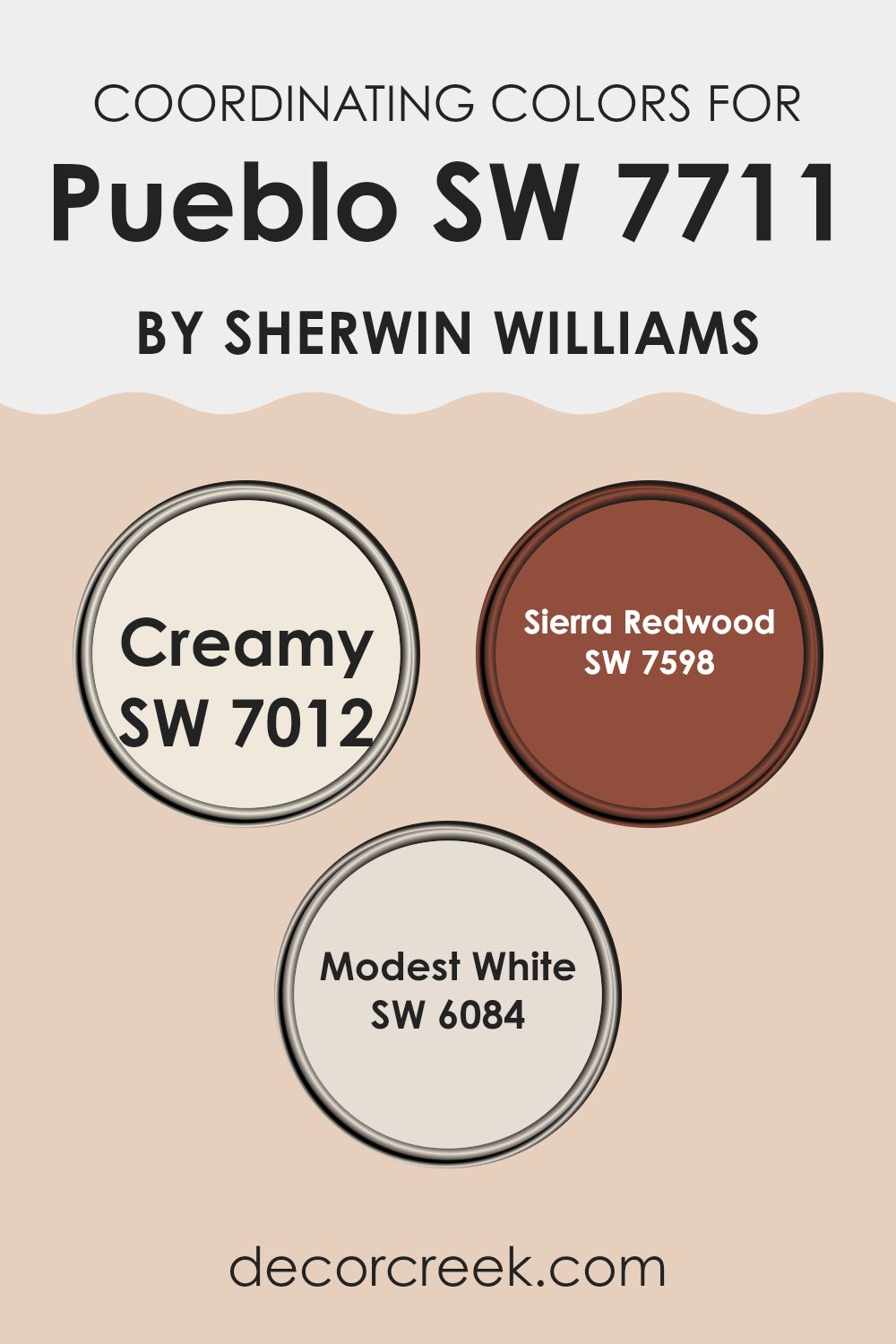
Coordinating Colors of Pueblo SW 7711 by Sherwin Williams
Coordinating colors are hues that complement each other well, creating a harmonious color scheme within a room. They don’t have to match exactly but should work together to enhance the overall aesthetic of a room.
When you use these colors in combination, they can highlight certain features of a room or provide a balanced backdrop against which furniture and decor can stand out. For example, if you’re working with Pueblo SW 7711 from Sherwin Williams as your main color, you can choose coordinating colors that bring out its best qualities.
One such coordinating color is Creamy SW 7012, which is a soft, warm white that adds brightness and a subtle glow. It is perfect for adding lightness and a foundational warmth to the room. Sierra Redwood SW 7598 is another great choice, introducing a rich, earthy red that can add depth and a touch of boldness.
This color pairs well with Pueblo, as it echoes its warm tones while adding contrast. Modest White SW 6084 is a clean, gentle white with a hint of warmth, ideal for creating a neutral backdrop that highlights the more vibrant earth tones in the palette. Together, these colors work to enhance the warmth and interest of a room anchored by Pueblo.
You can see recommended paint colors below:
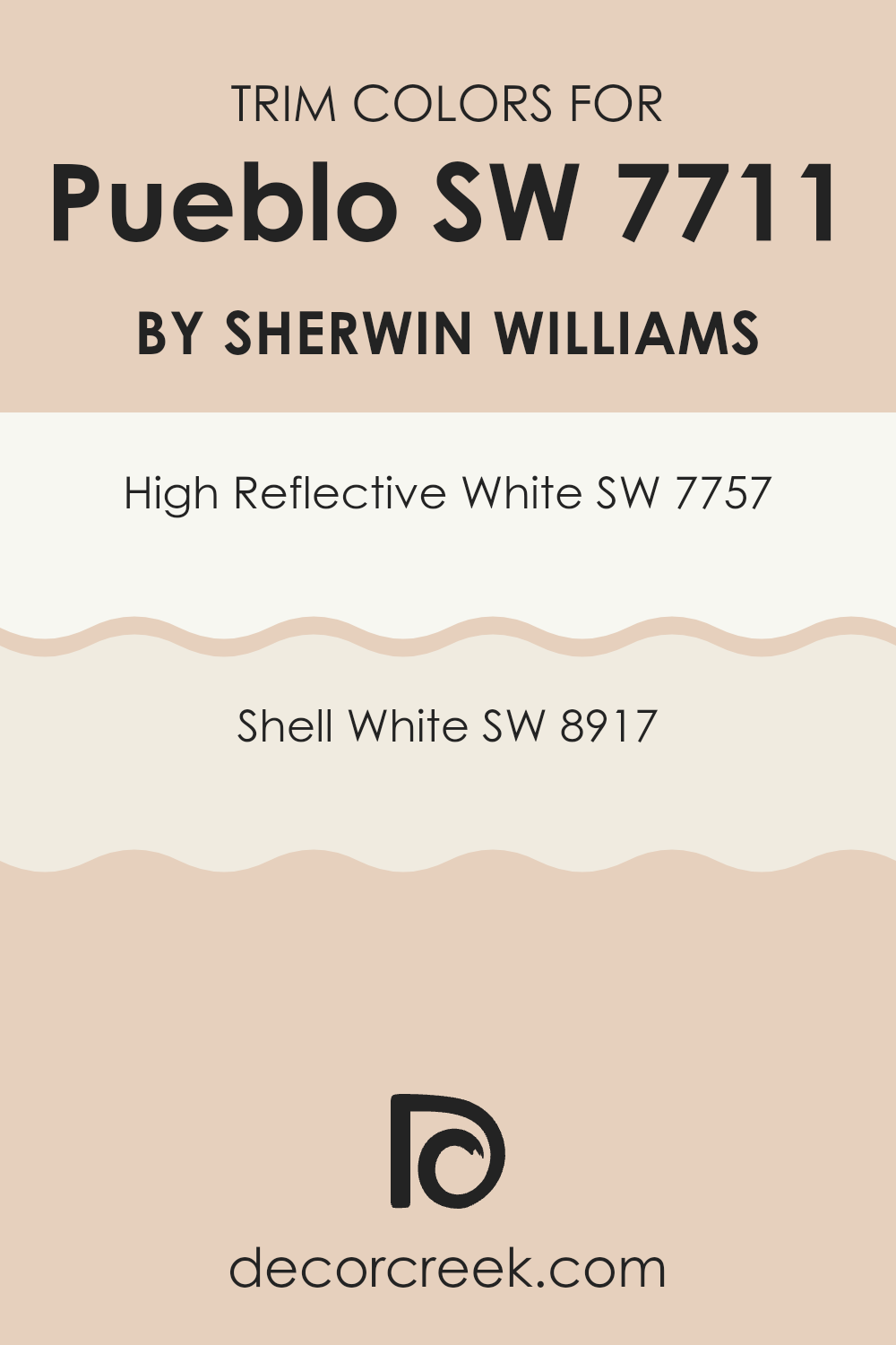
What are the Trim colors of Pueblo SW 7711 by Sherwin Williams?
Trim colors are the finishing touches that can enhance the appearance of a room or building by outlining or highlighting certain architectural features. They can provide contrast or complement the main color to create a cohesive look. When choosing trim colors for Sherwin Williams’ Pueblo (SW 7711), it’s important to select shades that enhance and balance the warm tones of this inviting color.
Using brighter or more subdued whites as trim can help achieve a clean and crisp outline, adding definition and depth to the overall design. High Reflective White (SW 7757) is a true, bright white that can provide a stark contrast against the earthy warmth of Pueblo. This starkness helps to accentuate architectural features and brings a crisp finish to the look.
On the other hand, Shell White (SW 8917) offers a softer, more muted warmth. It gently complements the Pueblo color, providing a seamless, understated finish. Both choices can significantly affect the overall perception of a room by either highlighting or gently framing the room with complementary tones.
You can see recommended paint colors below:
Colors Similar to Pueblo SW 7711 by Sherwin Williams
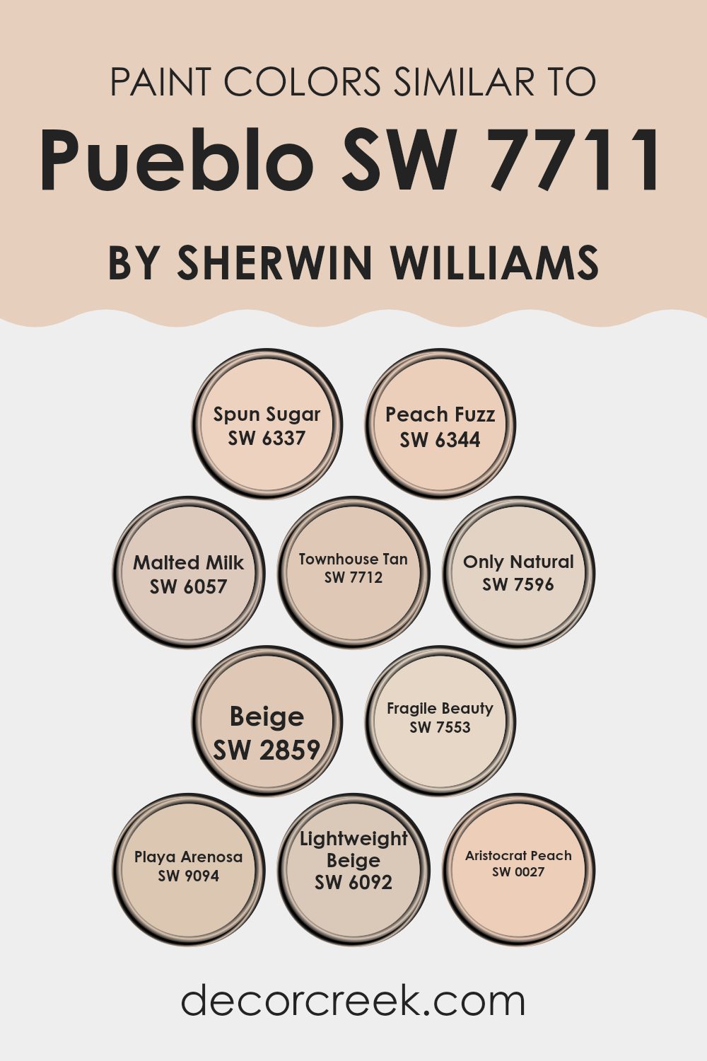
Using similar colors is crucial for creating a harmonious and cohesive design, as they ensure a soothing and attractive visual experience. These hues often share undertones and can work together to highlight the main color without clashing. For instance, Pueblo SW 7711 by Sherwin Williams is complemented beautifully by colors like SW 6337 Spun Sugar and SW 6344 Peach Fuzz, which offer gentle warmth and soft, peachy tones.
SW 6057 Malted Milk adds a subtle creamy beige to this mix, strengthening the warm vibe while maintaining an earthy balance. SW 7712 Townhouse Tan introduces a slightly deeper tan, enhancing the grounded essence shared with Pueblo.
Colors like SW 7596 Only Natural and SW 2859 Beige add a classic, neutral touch that seamlessly blends with the warmth of Pueblo. SW 7553 Fragile Beauty offers a delicate, light pink hue that softens the palette, bringing an element of lightness. SW 9094 Playa Arenosa delights with its sandy undertones, reminiscent of a peaceful beach landscape.
The almost airy texture of SW 6092 Lightweight Beige further lightens the overall composition, subtly balancing brighter shades. Finally, SW 0027 Aristocrat Peach enriches the grouping with a refined peach hue, adding a layer of gentle vibrancy that ties everything together effortlessly. These colors work in unison with Pueblo, creating a warm and inviting atmosphere.
You can see recommended paint colors below:
- SW 6337 Spun Sugar
- SW 6344 Peach Fuzz
- SW 6057 Malted Milk
- SW 7712 Townhouse Tan
- SW 7596 Only Natural
- SW 2859 Beige
- SW 7553 Fragile Beauty
- SW 9094 Playa Arenosa
- SW 6092 Lightweight Beige
- SW 0027 Aristocrat Peach
Colors that Go With Pueblo SW 7711 by Sherwin Williams
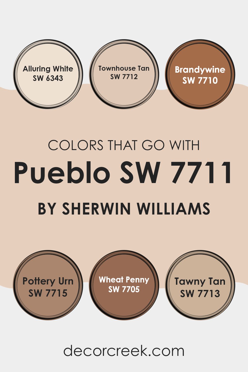
Colors that go with Pueblo SW 7711 by Sherwin Williams are important because they create a harmonious and balanced look when designing a room. Pueblo, with its warm and earthy tone, pairs beautifully with a range of complementary colors, enhancing the overall aesthetic. SW 6343 – Alluring White brings a sense of freshness and brightness to a room, serving as a perfect backdrop that highlights the warmth of Pueblo.
Meanwhile, SW 7712 – Townhouse Tan shares a similar warmth but offers a slightly darker, richer tone, adding depth and creating a cozy atmosphere. These combinations can highlight architectural features or create zones in an open-concept room without feeling disjointed.
On the other hand, SW 7710 – Brandywine introduces a bit of drama with its deep, reddish-brown hue that grounds the softness of Pueblo, adding a touch of elegance. SW 7715 – Pottery Urn brings in a deeper, earthy orange that complements Pueblo’s tone, offering a lively contrast.
SW 7705 – Wheat Penny introduces a metallic, copper-like tone that can add an interesting texture or focal point. Lastly, SW 7713 – Tawny Tan provides a subtle and understated color choice that gently warms the room without overpowering it. Each color works together to enhance the visual appeal while maintaining a warm and inviting ambiance.
You can see recommended paint colors below:
- SW 6343 Alluring White
- SW 7712 Townhouse Tan
- SW 7710 Brandywine
- SW 7715 Pottery Urn
- SW 7705 Wheat Penny
- SW 7713 Tawny Tan
How to Use Pueblo SW 7711 by Sherwin Williams In Your Home?
Pueblo SW 7711 by Sherwin Williams is a warm, earthy paint color that brings a cozy feel to any home. It’s a soft, muted brown with hints of gray, creating a welcoming and comfortable atmosphere. This flexible color works well in various rooms such as living rooms, bedrooms, or even kitchens.
One way to use Pueblo in your home is to paint an accent wall, adding depth and interest without overpowering the room. Pair it with lighter neutrals like ivory or cream for a balanced look. In the living room, Pueblo can serve as a backdrop for natural wood furniture and green plants, enhancing its earthy vibe.
In the bedroom, it creates a restful environment, especially when used alongside soft textiles like cotton or linen. Additionally, Pueblo complements rustic and bohemian styles beautifully, making it easy to coordinate with other decor. This color is perfect for anyone looking to add warmth and character to their home.
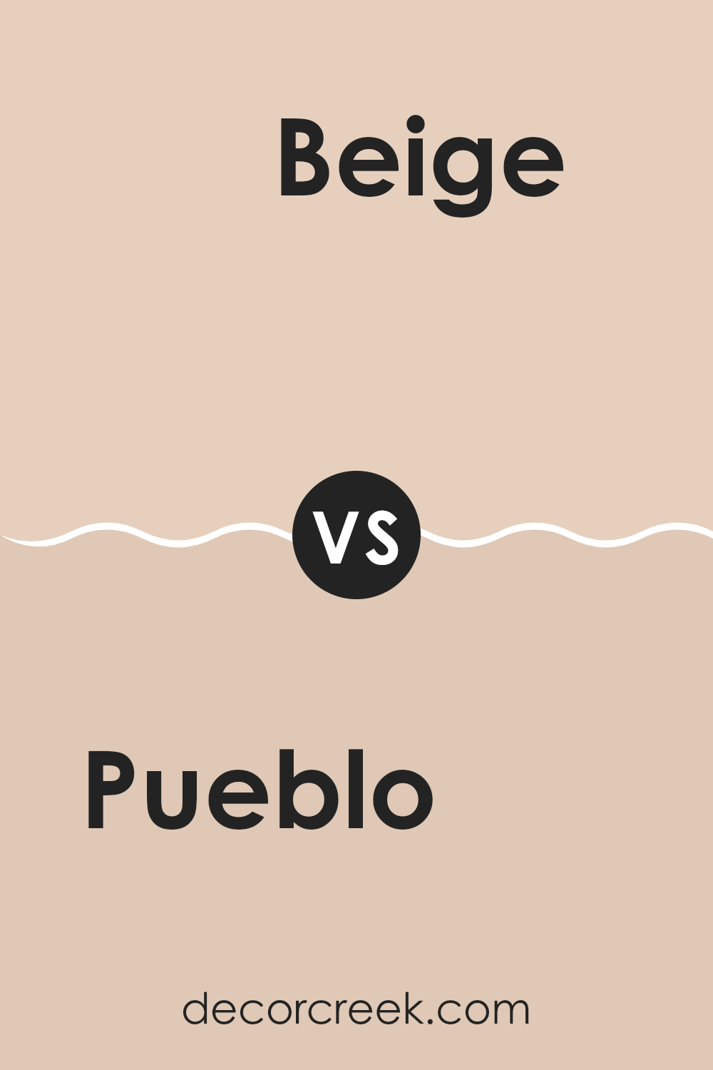
Pueblo SW 7711 by Sherwin Williams vs Beige SW 2859 by Sherwin Williams
Pueblo is a warm and earthy color with a rich, reddish-brown tone. It feels cozy and natural, resembling clay or adobe. This color can make a room feel inviting and grounded. It works well in areas where you want warmth and a touch of nature.
On the other hand, Beige SW 2859 is a classic, light neutral. It’s brighter and softer than Pueblo, providing a more airy and open feel. Beige is flexible and easy to pair with other colors, making it great for any room. It creates a clean and simple backdrop that suits many styles.
When you compare Pueblo with Beige, the former has a bold presence while the latter offers subtlety. Pueblo adds depth and character, whereas Beige brings a sense of openness and ease. Both have their unique charm, but the choice depends on whether you prefer a cozy atmosphere or a light, flexible setting.
You can see recommended paint color below:
- SW 2859 Beige
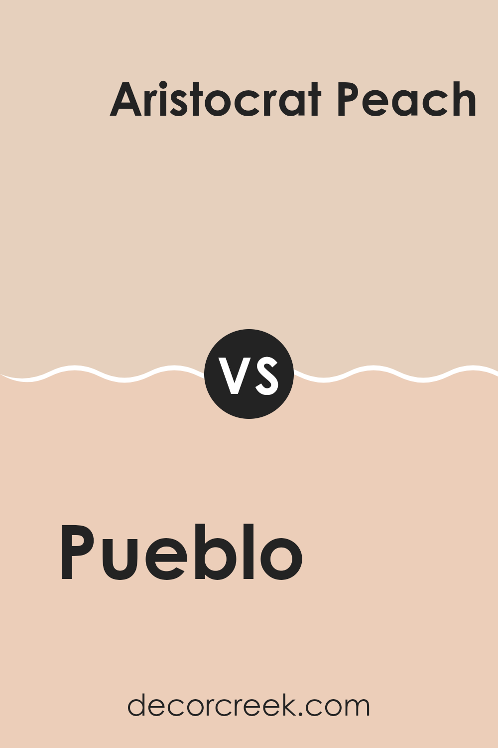
Pueblo SW 7711 by Sherwin Williams vs Aristocrat Peach SW 0027 by Sherwin Williams
Pueblo is a warm, earthy brown with red and orange undertones, offering a grounded and cozy feel. It’s reminiscent of natural clay or adobe, making it an ideal choice for creating an inviting and rustic atmosphere. This color works well in living areas or areas where you want to evoke warmth, comfort, and a connection to nature.
Aristocrat Peach, on the other hand, is a soft, gentle peach tone. It brings a light and airy vibe to a room, adding a touch of elegance and playfulness. This color is perfect for areas where you want a lively yet relaxing ambiance, such as bedrooms or nurseries.
When comparing the two, Pueblo is deeper and more robust, suitable for an earthy, cozy design. Aristocrat Peach, however, is lighter and softer, bringing a subtle brightness and a cheerful feel to any room. Together, they can create a balanced contrast, combining warmth with a hint of brightness.
You can see recommended paint color below:
- SW 0027 Aristocrat Peach
Pueblo SW 7711 by Sherwin Williams vs Playa Arenosa SW 9094 by Sherwin Williams
Pueblo (SW 7711) by Sherwin Williams is a warm, earthy shade of brown that feels grounded and natural. It has subtle red undertones, giving it a rich, cozy feel that’s perfect for creating an inviting atmosphere in any room. This color works well in living rooms or dining areas, providing a welcoming and comfortable environment.
On the other hand, Playa Arenosa (SW 9094) is a lighter, more neutral color. It’s a sandy beige shade that leans towards a soft, muted palette, making it flexible for various settings. Playa Arenosa can brighten up a room without being overpowering, offering a subtle backdrop that’s easy to pair with different decor styles.
When compared, Pueblo brings warmth and depth, while Playa Arenosa provides an airy, light feel. These two colors can complement each other well, with Pueblo adding coziness and Playa Arenosa offering balance and subtlety.
You can see recommended paint color below:
- SW 9094 Playa Arenosa
Pueblo SW 7711 by Sherwin Williams vs Malted Milk SW 6057 by Sherwin Williams
Pueblo (SW 7711) and Malted Milk (SW 6057) by Sherwin Williams are both warm, earthy tones, but they offer different vibes. Pueblo is a rich, terracotta shade with a strong presence. It has deep red and brown undertones, giving it a grounded and warm feel. This color can add warmth and depth to a room, making it feel cozy and inviting.
On the other hand, Malted Milk is a soft, creamy beige. It is lighter and more neutral, providing a gentle and calming backdrop. Malted Milk has subtle undertones that make it an adaptable choice, easily blending with other colors and styles.
Where Pueblo can be bold and expressive, Malted Milk lends a subtle and relaxed atmosphere. Together, they can create a balanced design, with Pueblo adding character and Malted Milk offering softness. Both colors enhance areas with their warmth, but each has its own unique charm.
You can see recommended paint color below:
Pueblo SW 7711 by Sherwin Williams vs Peach Fuzz SW 6344 by Sherwin Williams
Pueblo by Sherwin Williams is a warm, earthy color with brown and terracotta tones. It brings to mind the rich soil of the Southwest, offering a cozy and grounded feel. This color can make a room feel inviting and comfortable, ideal for rustic or natural settings.
On the other hand, Peach Fuzz by Sherwin Williams is a soft, pastel shade with hints of pink and orange. It gives off a gentle, light-hearted vibe. This color can brighten up a room and create a cheerful, welcoming atmosphere.
When comparing the two, Pueblo is darker and more robust, suggesting warmth and stability, while Peach Fuzz is lighter and more playful, suggesting softness and happiness. Pairing them could create a balanced look, where Peach Fuzz adds a touch of brightness to Pueblo’s depth, blending warmth with a touch of gentle color. Each color brings its own mood and can set the tone of a room.
You can see recommended paint color below:
Pueblo SW 7711 by Sherwin Williams vs Spun Sugar SW 6337 by Sherwin Williams
Pueblo SW 7711 and Spun Sugar SW 6337 are two distinct colors by Sherwin Williams that offer different vibes for any room. Pueblo is a warm, earthy shade that falls into the brown family. It exudes a natural, grounded feeling, reminiscent of terracotta or clay. This hue can create a cozy, inviting atmosphere and works well in living areas or areas needing a touch of warmth.
On the other hand, Spun Sugar is a soft, light pink. It’s an airy and gentle color that brings a fresh and lighthearted feel to a room. Spun Sugar is perfect for areas you want to feel light and bright, like bedrooms or nurseries.
While Pueblo provides depth and earthiness, Spun Sugar offers lightness and sweetness. Depending on the look you aim for, Pueblo can add a sense of warmth and stability, while Spun Sugar brings in a playful and gentle touch.
You can see recommended paint color below:
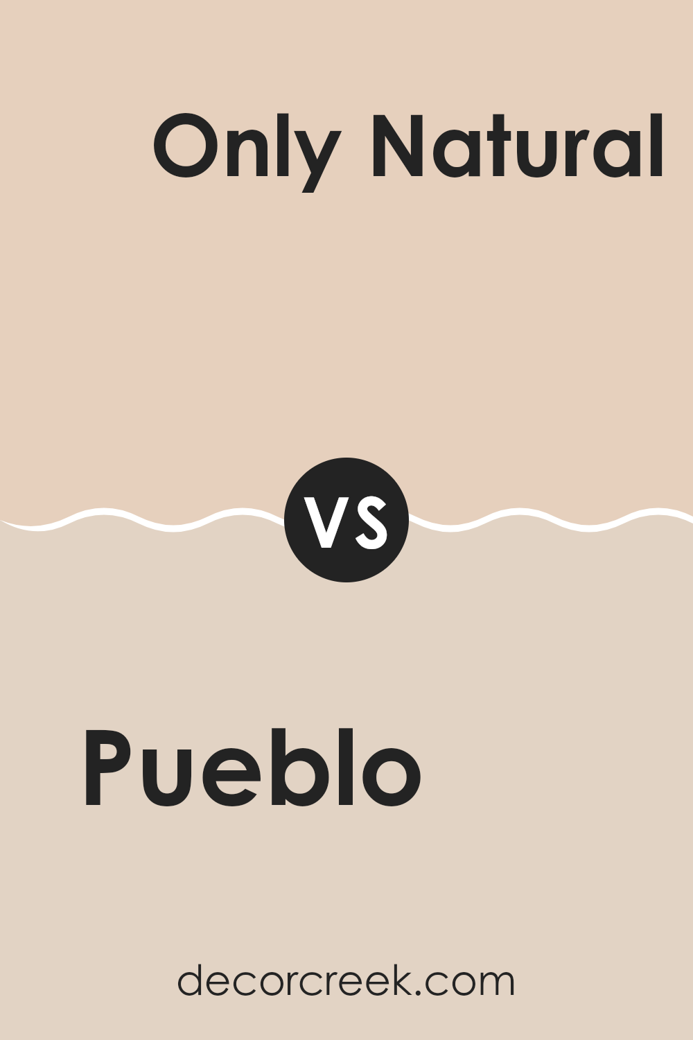
Pueblo SW 7711 by Sherwin Williams vs Only Natural SW 7596 by Sherwin Williams
Pueblo and Only Natural are both warm colors from Sherwin Williams, but they have distinct characteristics. Pueblo is a rich, earthy terracotta shade with strong red and brown undertones, giving it a bold and grounded feel. It’s a color that can bring warmth and coziness to a room, making it ideal for areas like living rooms or dining areas where you want to create an inviting atmosphere.
On the other hand, Only Natural is a softer, muted beige with subtle peachy undertones. It has a more understated appearance compared to Pueblo, which makes it flexible and easy to pair with other colors and decor styles. Only Natural is perfect for areas where you want a gentle backdrop, allowing for greater flexibility with furnishings and accents.
While Pueblo makes a statement with its robust presence, Only Natural offers a more neutral and calming effect, making them suitable for different design needs.
You can see recommended paint color below:
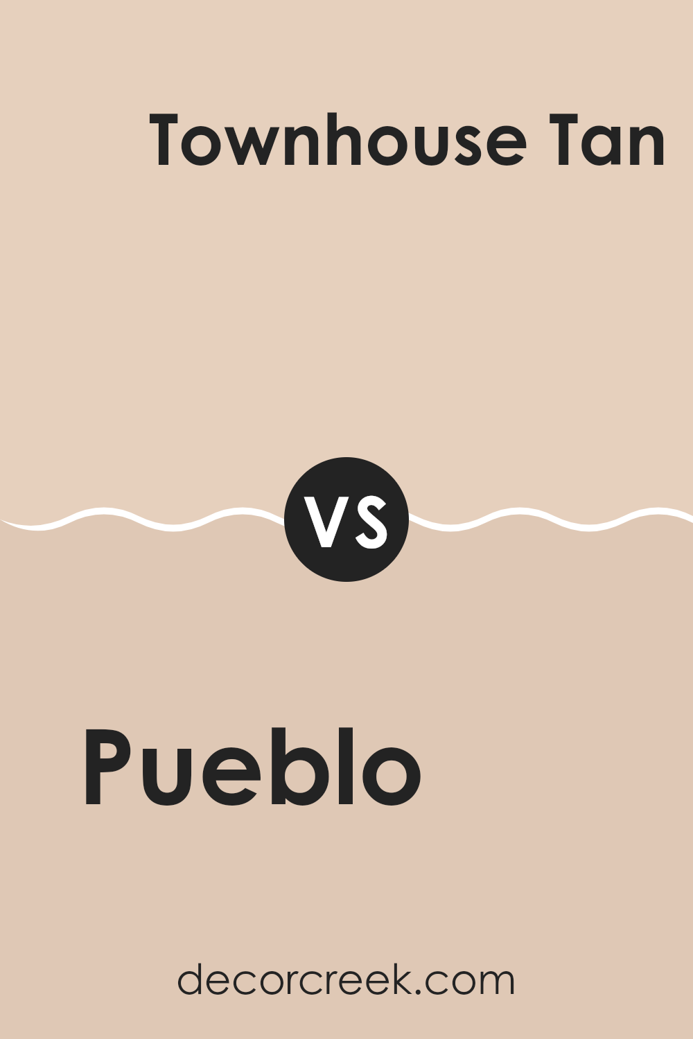
Pueblo SW 7711 by Sherwin Williams vs Townhouse Tan SW 7712 by Sherwin Williams
Pueblo SW 7711 and Townhouse Tan SW 7712 from Sherwin Williams are earthy and warm colors, but each has its unique feel. Pueblo is a rich, warm reddish-brown color that brings a cozy and inviting atmosphere. It has a strong presence and adds depth and warmth to any room, making it ideal for creating a comforting environment.
On the other hand, Townhouse Tan is a lighter, more muted shade with a subtle yellow-brown base. It offers a calm and neutral backdrop that can make a room feel open and airy. This color is flexible, blending well with various styles and decors, adding a touch of simplicity and warmth without overpowering the room.
Both colors work beautifully in homes, but Pueblo is better for cozy nooks or accents, while Townhouse Tan suits larger areas where a soft, welcoming feel is desired. They complement each other well when used together.
You can see recommended paint color below:
- SW 7712 Townhouse Tan
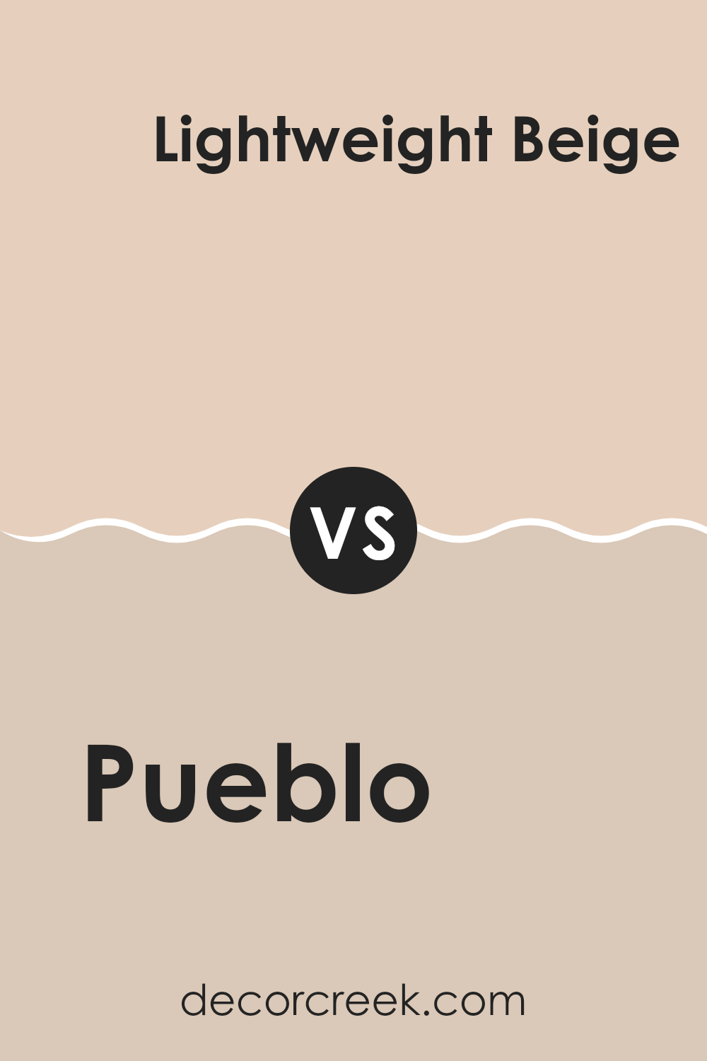
Pueblo SW 7711 by Sherwin Williams vs Lightweight Beige SW 6092 by Sherwin Williams
Pueblo SW 7711 and Lightweight Beige SW 6092 by Sherwin Williams are two distinct colors that can create different moods in a room. Pueblo is a warm, earthy shade with reddish-brown undertones, evoking a rustic and cozy atmosphere. It brings a sense of depth and richness to a room, making it feel inviting and grounded.
On the other hand, Lightweight Beige is a soft, neutral shade with a lighter tone. It offers a clean and simple backdrop that can help a room feel open and airy. Its versatility allows it to blend well with various other colors and styles, providing a calm and balanced look.
Together, these colors can complement each other nicely. Pueblo can add warmth and character as an accent or feature wall, while Lightweight Beige can maintain a harmonious environment throughout the rest of the room, ensuring it feels both lively and calm.
You can see recommended paint color below:
- SW 6092 Lightweight Beige
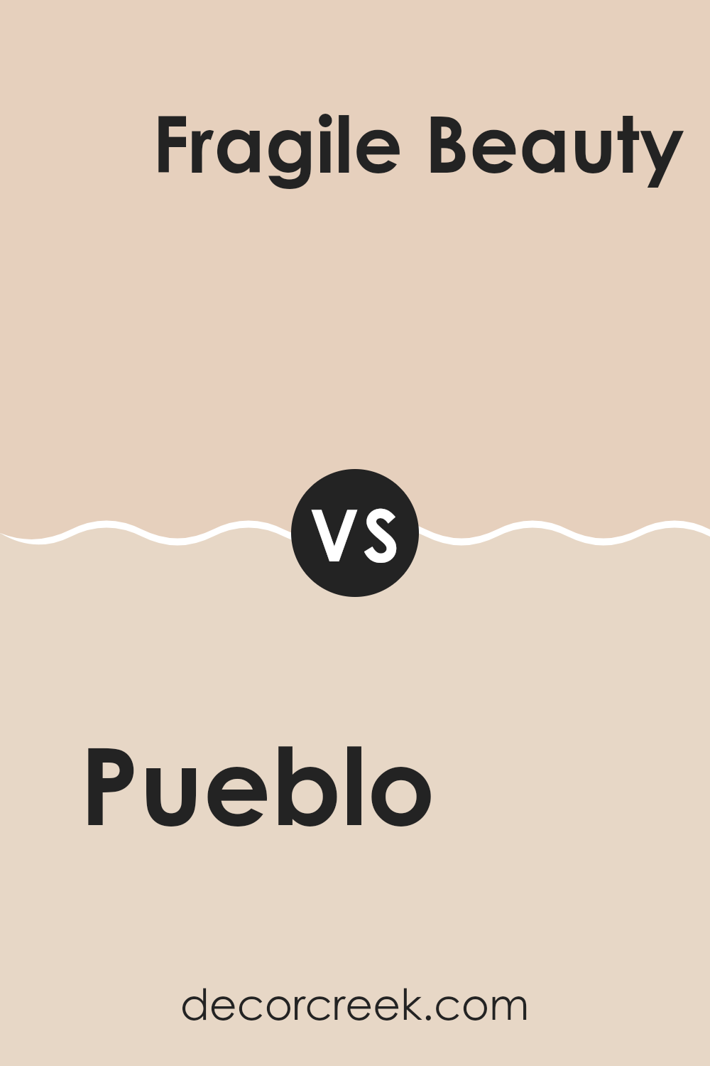
Pueblo SW 7711 by Sherwin Williams vs Fragile Beauty SW 7553 by Sherwin Williams
Pueblo SW 7711 by Sherwin Williams is a warm and earthy color with reddish-brown tones that reflect the rich, natural landscape of the desert. It provides a sense of coziness and comfort, making it an ideal choice for creating inviting areas. This color can create a rustic or southwestern look, bringing warmth and depth to interiors or exteriors.
In contrast, Fragile Beauty SW 7553 is a softer, more muted hue with a gentle, delicate appearance. It leans towards a pale, gentle pink or blush, infusing areas with a light and airy feel. This color can brighten rooms and gives a sense of elegance and subtlety.
While Pueblo adds warmth and strength, Fragile Beauty offers a gentle and understated charm. Together, they can create an interesting balance, with Pueblo providing depth and grounding, while Fragile Beauty adds a touch of lightness and softness to any design.
You can see recommended paint color below:
After exploring the details about SW 7711 Pueblo by Sherwin Williams, I feel like I’ve learned a lot about this paint color. It’s a warm and cozy shade, reminding me of a soft, sandy desert or a warm terracotta pot. Imagine a color that makes a room feel welcoming and comfortable, like a big, warm hug.
When thinking about using Pueblo in our rooms, I can see it making a living room feel inviting, a kitchen feel lively, or even adding a cozy touch to a bedroom. It’s like being wrapped in a gentle, sunny day. This color could make people feel at home and relaxed, helping them feel happy and at ease.
What really stands out to me about Pueblo is how it can match different styles and decorations. Whether a room has a modern look or a more classic feel, this color fits right in. It’s like having a puzzle piece that connects well with everything else, making the whole room look just right.
Overall, SW 7711 Pueblo seems like a great choice to make rooms feel warm and friendly, and I love the idea of using it to bring a soft glow to any place. If you want a helpful paint color that makes people smile, Pueblo might be the perfect pick.
Ever wished paint sampling was as easy as sticking a sticker? Guess what? Now it is! Discover Samplize's unique Peel & Stick samples.
Get paint samples

