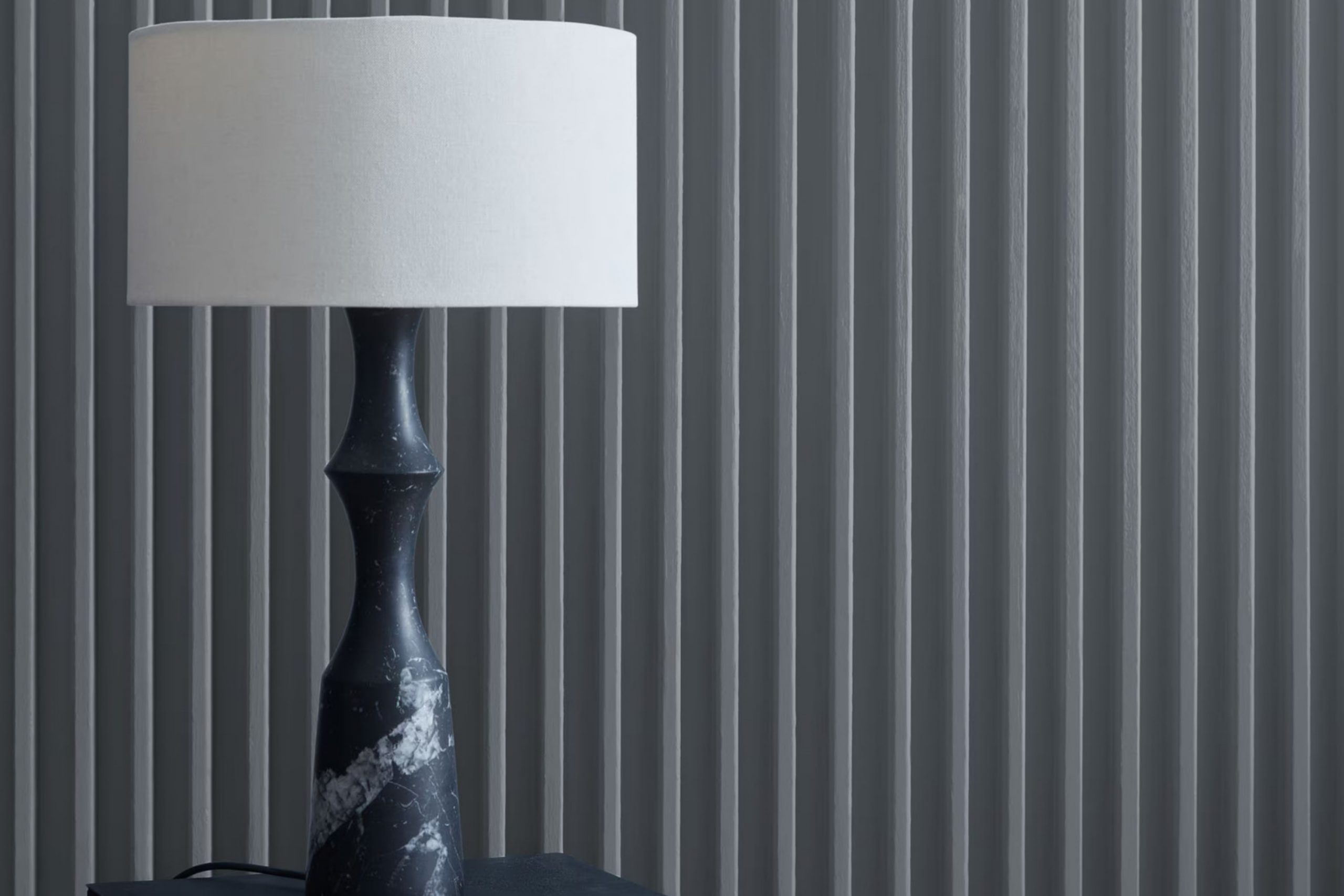
If you’re in the mood to refresh the walls of your home, you’ll want to consider Benjamin Moore’s 1608 Ashland Slate. This color is a robust yet subdued gray that draws inspiration from the natural strength of stone. As I experimented with different shades for my living room, I stumbled upon Ashland Slate; it intrigued me with its unique ability to blend seamlessly with both modern and traditional decors.
The color has a chameleon-like quality, reflecting subtle changes under different lighting conditions. During the day, it’s a cool, soothing gray, and by evening, it adopts a warmer, more enveloping tone. Many people overlook the importance of choosing the right gray — it needs to be neither too stark nor too somber.
I found Ashland Slate to hit that perfect middle ground, making it not just a paint choice, but a strategic backdrop for my life. It has a definite but unassuming presence that complements various textures and finishes, from sleek metals to soft linens.
Whether you’re looking to create a peaceful office area or a cozy nook in your home, 1608 Ashland Slate might just be the shade you’re looking for.
What Color Is Ashland Slate 1608 by Benjamin Moore?
Ashland Slate (1608) by Benjamin Moore is an adaptable gray shade that brings a sense of calm and sturdy refinement to any area. This color has a balanced mix of deep blue and soft gray tones, making it ideal for those who want to add a gentle hint of color to their interiors without overpowering the room. Ashland Slate fits beautifully in a range of interior styles, from modern and contemporary to traditional designs.
This distinctive hue pairs wonderfully with natural materials like wood and stone, enhancing their organic textures. Its depth complements the rich grains of wooden furniture and flooring, highlighting their natural warmth. When combined with metals such as brushed nickel or stainless steel, Ashland Slate helps create a clean and cohesive aesthetic that feels both grounded and current.
In terms of textures, Ashland Slate works well with soft fabrics like wool or linen. These materials add comfort to the overall look, creating a cozy and inviting atmosphere. Use it in areas like living rooms or bedrooms to cultivate a peaceful and relaxing feel. Its adaptability also makes it suitable for bathrooms and kitchens, where it contributes to a clean and welcoming environment.
Is Ashland Slate 1608 by Benjamin Moore Warm or Cool color?
Ashland Slate (1608) from Benjamin Moore is an adaptable gray color with a touch of blue. This distinctive shade is perfect for creating a calm and welcoming atmosphere in any area. Because it’s not too dark or too light, Ashland Slate works beautifully in smaller spots like bathrooms or study rooms, as well as in larger areas such as living rooms.
The color pairs nicely with white trim or furniture, which helps brighten the area while keeping a cozy feel. When applied to walls, it provides a neutral backdrop that allows freedom in decorating with other tones in furniture and accents.
Additionally, this shade performs well under different lighting conditions, maintaining a consistent look in both natural and artificial light. It’s also an excellent choice for exteriors, giving homes a stylish and cohesive appearance that complements their surroundings. Overall, Ashland Slate is a practical option that brings a modern yet comfortable touch to both interiors and exteriors.
Undertones of Ashland Slate 1608 by Benjamin Moore
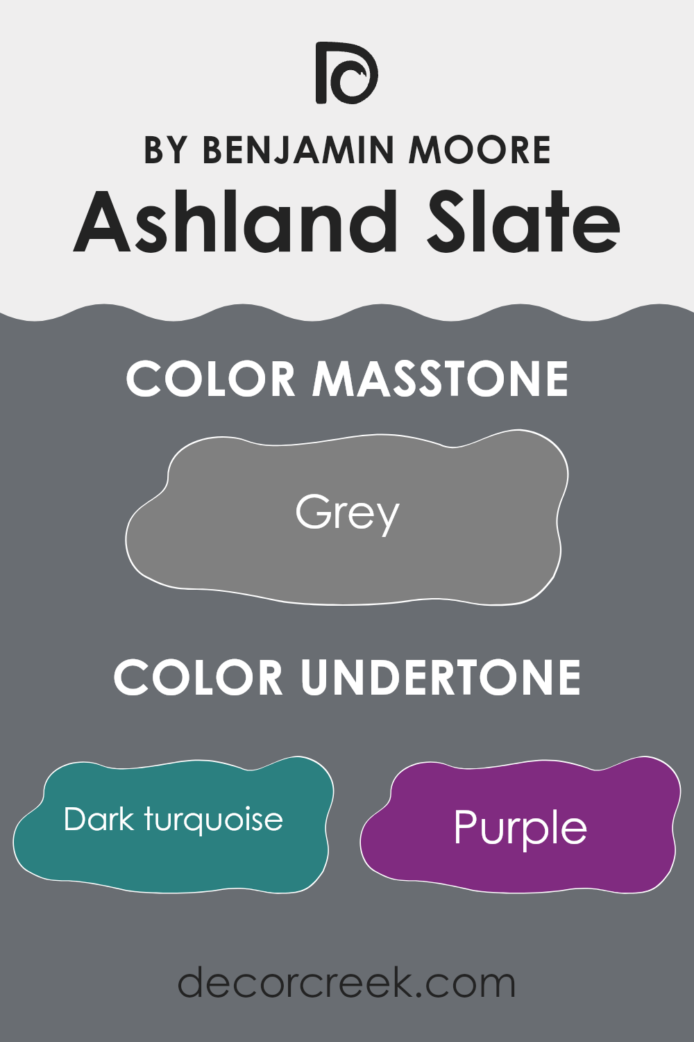
Ashland Slate by Benjamin Moore is a distinctive shade that carries a range of subtle undertones, influencing how it appears on your walls depending on lighting and surroundings. This color can reveal undertones that shift from turquoise to light gray, affecting its overall impression in a room.
Undertones in paint shades are like hidden hues within the main color. They can make a tone appear cooler or warmer and influence how it pairs with furniture or other decor. For instance, when Ashland Slate leans toward dark turquoise or navy undertones, it offers a cooler, more muted look—ideal for creating a calm and grounded atmosphere.
Conversely, undertones like orange or yellow bring out a warmer quality, helping an area feel more welcoming and cozy. Recognizing these undertones allows for better coordination with complementary shades in furniture, curtains, and accessories, ensuring a cohesive design.
When applied to interior walls, the shifting undertones of Ashland Slate play a major role. In natural light, brighter undertones such as light turquoise or mint may stand out, giving the room a livelier character. Under artificial lighting, darker undertones like deep gray or navy tend to emerge, adding a refined and subtle appeal.
Overall, the complexity of Ashland Slate’s undertones introduces depth and dimension to an area, making it an adaptable choice for a wide range of styles and settings. It adjusts beautifully to each environment, reflecting personal taste and enhancing the overall mood of your home.
What is the Masstone of the Ashland Slate 1608 by Benjamin Moore?
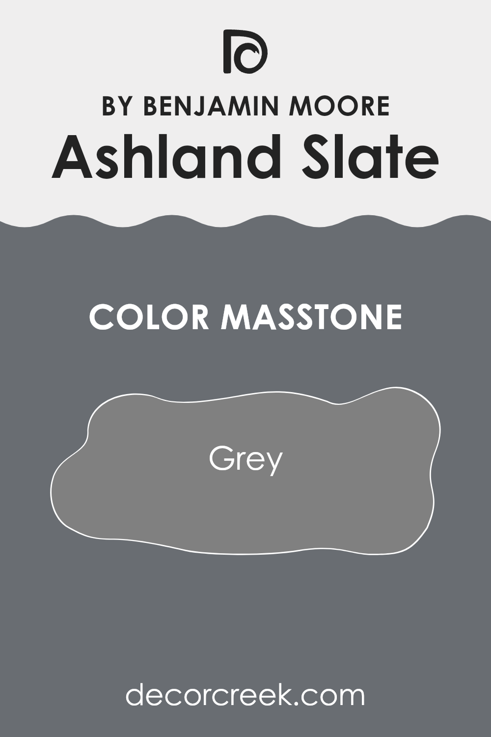
Ashland Slate by Benjamin Moore is a true gray, represented by its masstone, a medium shade identified by the color code #808080. This neutral gray is highly adaptable, making it an excellent choice for various areas in a home. Because of its balanced tone, it pairs beautifully with both bright colors and softer hues, allowing homeowners to mix and match their decor effortlessly.
In a living room or bedroom, this shade provides a calm, inviting backdrop that complements vibrant artworks or colorful textiles without dominating the area. Its neutrality also makes it ideal for rooms that benefit from subtlety, such as home offices or studies, where focus should remain undisturbed by bold colors.
Additionally, this gray is practical for high-traffic zones like hallways and kitchens. It conceals minor imperfections effectively and maintains a polished look even in busier settings. Overall, Ashland Slate presents a practical, stylish option that enhances the natural flow and character of a home.
How Does Lighting Affect Ashland Slate 1608 by Benjamin Moore?
Lighting plays a crucial role in how we perceive colors. The type of light and its intensity can significantly affect the appearance of a color in a room. For instance, Ashland Slate by Benjamin Moore might look different under various lighting conditions.
In artificial light, this gray shade can appear warmer, especially under incandescent lighting, which tends to add a yellowish tint. This makes Ashland Slate look more inviting and cozier in the evening under lamps or overhead lights. On the other hand, in natural light, the color might appear truer to its original gray tone, depending on the amount and angle of the sunlight.
The direction a room faces also affects how Ashland Slate looks. In north-facing areas, which get less direct sunlight, this color can look slightly darker and more muted, giving a calm and steady feel. This might be great for creating a focused environment or a restful area.
In south-facing rooms, which enjoy ample sunlight, Ashland Slate brightens up beautifully. The natural light enhances the gray, making the walls lively and more dynamic throughout the day. This is ideal for areas like living rooms or kitchens where a fresh, airy feel is desired.
East-facing rooms receive the most light in the morning. Here, Ashland Slate can look particularly vibrant in the morning but gradually become more subtle as the day progresses. This natural change in appearance can add dynamic character to the area, suitable for bedrooms or breakfast nooks.
Lastly, in west-facing rooms, sunlight in the late afternoon can make Ashland Slate reveal warm undertones, creating a cozy and welcoming atmosphere toward the evening. This setting is perfect for dining rooms or areas used mostly in the afternoon and evenings.
Overall, the lighting and room orientation dictate how Ashland Slate is perceived, making it an adaptable color choice for various environments.
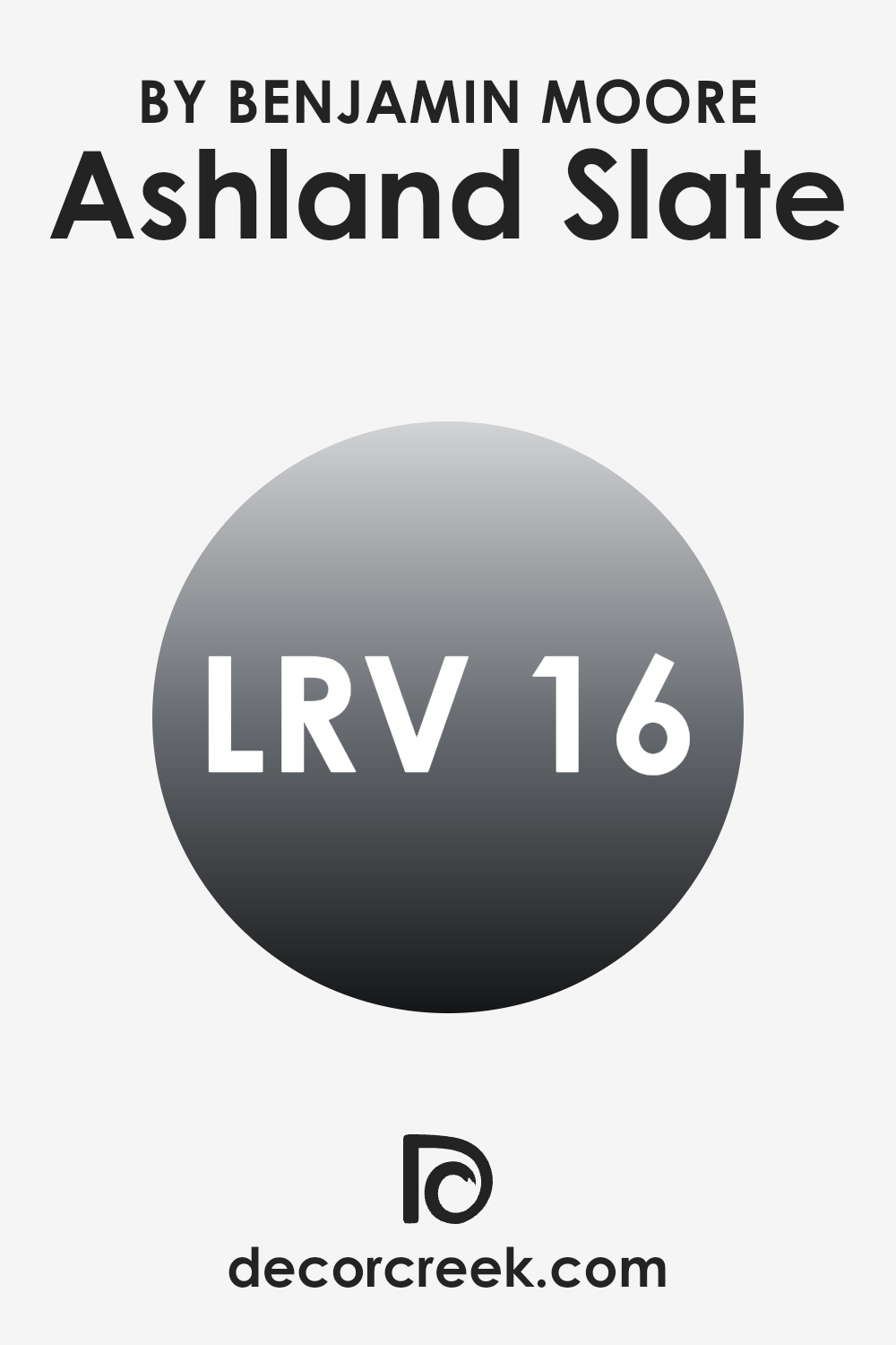
What is the LRV of Ashland Slate 1608 by Benjamin Moore?
LRV, or Light Reflectance Value, measures how much light a paint color reflects or absorbs. It’s a helpful scale to determine how light or dark a color will appear once applied to your walls. When selecting paint, understanding LRV can guide you in predicting how the color will shape the mood of a room.
Higher LRV values indicate that the color reflects more light, making the area feel brighter and more open. Conversely, lower LRV values mean the color absorbs more light, often creating a cozier or more subdued atmosphere.
For the color Ashland Slate from Benjamin Moore, which has an LRV of sixteen point twelve, it sits on the darker side of the spectrum. Shades like this tend to absorb more light, allowing them to make larger areas feel more intimate and grounded.
In rooms with limited natural light, using a shade with a low LRV can make the area feel more enclosed or darker. It’s ideal for spots where a more focused and cozy mood is desired, such as a study or home theater. When used in well-lit areas or paired with lighter tones and reflective accents, Ashland Slate can bring a rich, balanced presence without overpowering the surroundings.
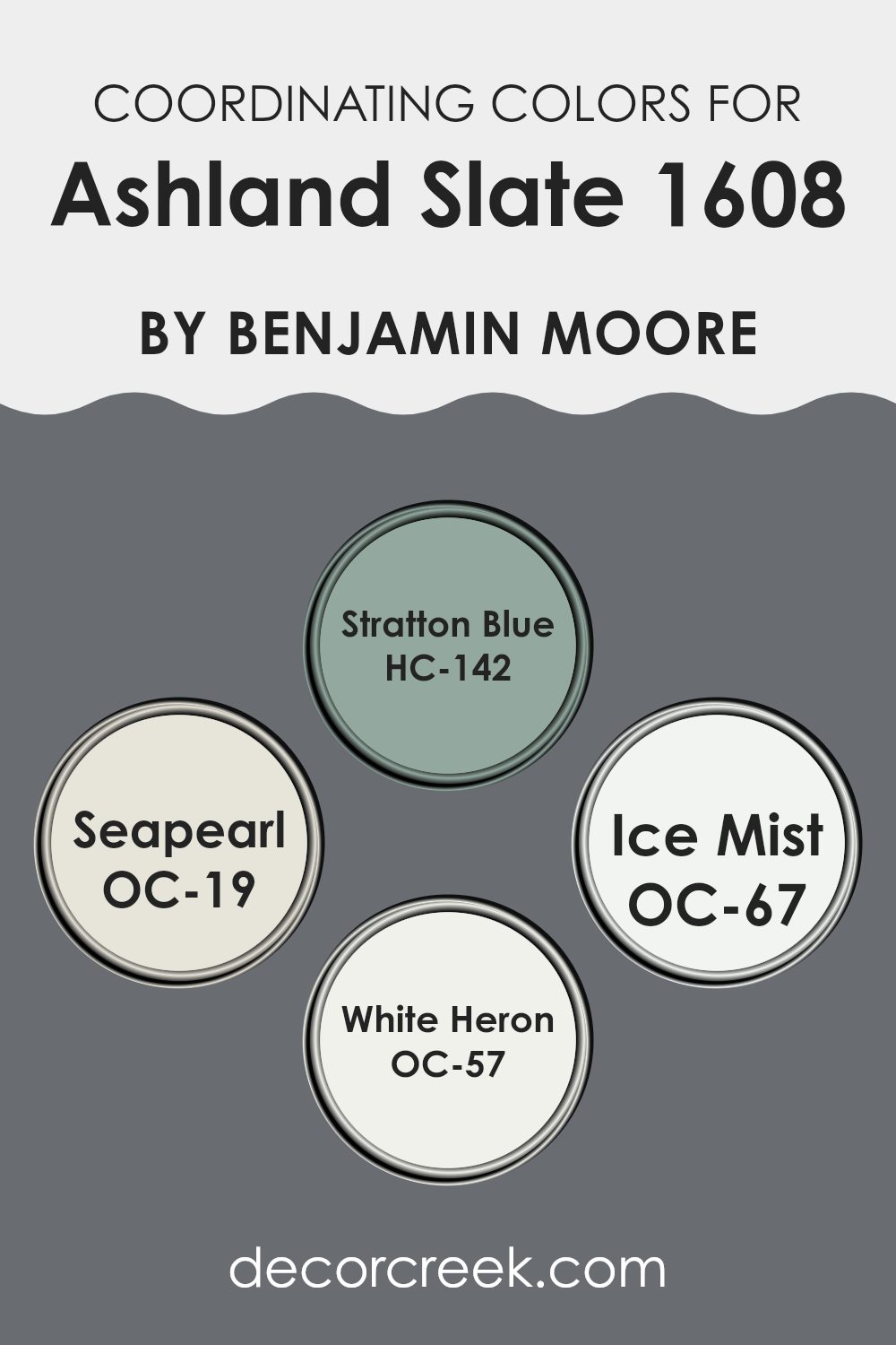
Coordinating Colors of Ashland Slate 1608 by Benjamin Moore
Coordinating colors are shades that harmonize beautifully with a main color, enhancing the overall aesthetic of an area without overpowering it. In the case of Ashland Slate by Benjamin Moore, the coordinating shades include Stratton Blue, Seapearl, Ice Mist, and White Heron. These tones work together to create a cohesive look, balancing and complementing the deep, refined character of Ashland Slate.
Stratton Blue offers a calm, muted blue hue that pairs effortlessly with the dark gray of Ashland Slate, introducing a gentle touch of color to the palette. It brings a refreshing quality without appearing too bold, helping to maintain a balanced atmosphere. Seapearl, by contrast, is a soft off-white with warm undertones that provides a light, open feel, perfectly offsetting the richness of darker tones.
Ice Mist is delicate and airy—a pale blue with cool undertones that adds a sense of freshness and clarity to any room. White Heron, a crisp and pure white, works as a flawless background shade, making the other colors stand out while preserving a polished look. Together, these coordinating hues highlight and enhance the beauty of Ashland Slate, offering flexibility for achieving balance and depth across different interiors.
You can see recommended paint colors below:
- HC-142 Stratton Blue
- OC-19 Seapearl
- OC-67 Ice Mist
- OC-57 White Heron
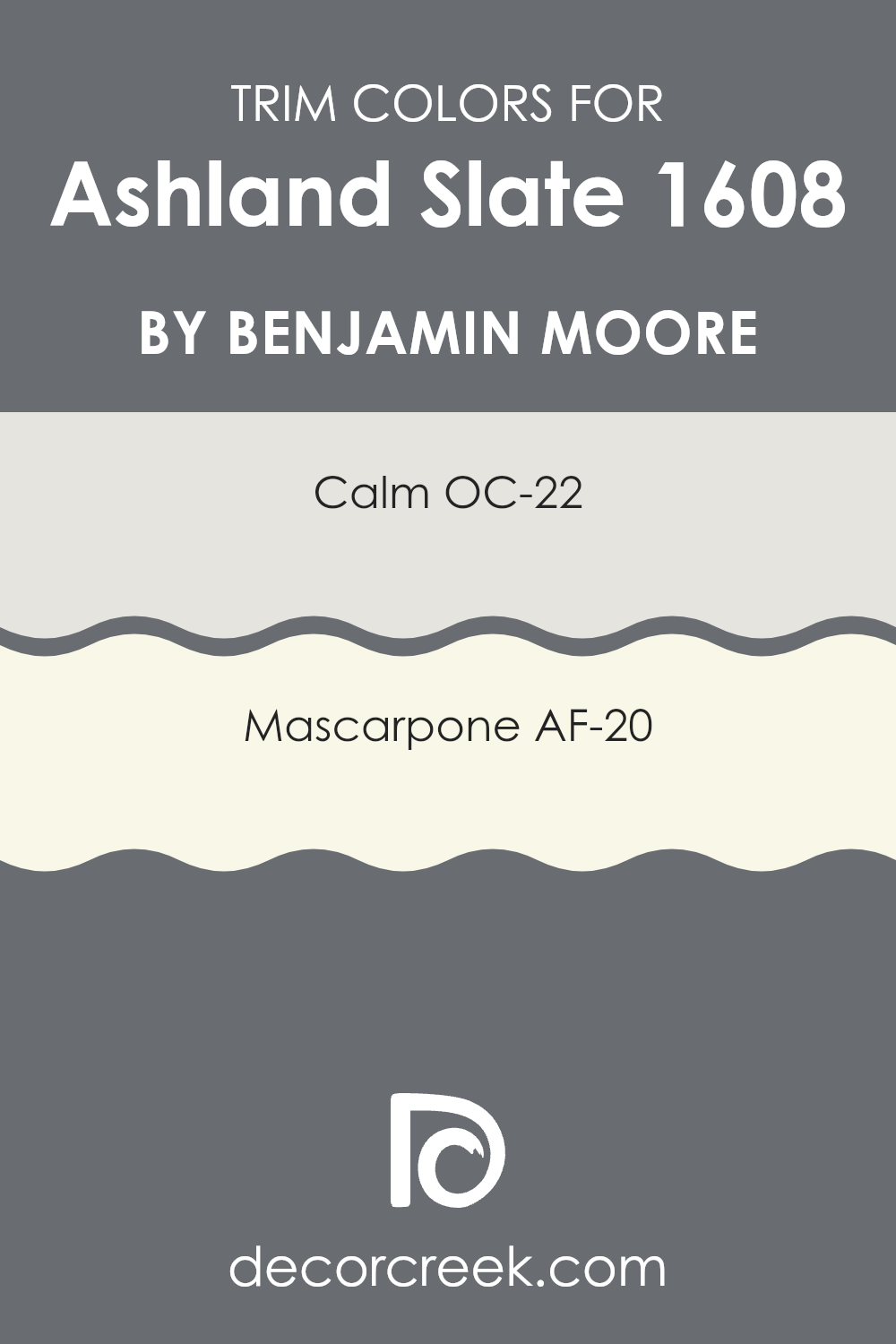
What are the Trim colors of Ashland Slate 1608 by Benjamin Moore?
Trim colors are essentially hues used to accentuate or highlight architectural features and elements like door frames, moldings, and baseboards. By pairing specific trim colors with the main color of a wall, in this case, Ashland Slate from Benjamin Moore, one can create a cohesive and visually appealing look.
Trim colors like OC-22 – Calm and AF-20 – Mascarpone by Benjamin Moore are ideal complements to Ashland Slate because they offer a subtle contrast that defines and enhances the architectural details without overpowering the primary color. OC-22 – Calm is a gentle and neutral white that provides a clean and fresh look. It is light enough to add a refreshing contrast against the deeper tones of Ashland Slate.
AF-20 – Mascarpone, on the other hand, is a creamy white that adds a warm and inviting touch. This color is slightly richer than Calm, providing a soft yet noticeable contrast that highlights trim work effectively when paired with darker wall colors like Ashland Slate. Both colors contribute to creating a beautiful and harmonious area, accenting the primary hues nicely and enhancing the overall appeal of the room.
You can see recommended paint colors below:
- OC-22 Calm
- AF-20 Mascarpone
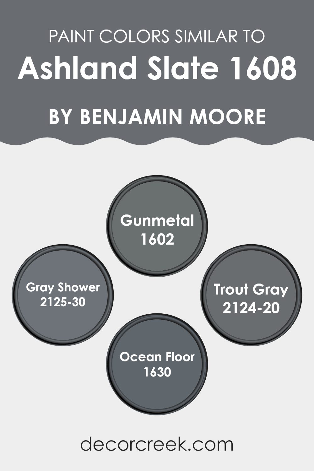
Colors Similar to Ashland Slate 1608 by Benjamin Moore
When decorating a room, choosing similar colors can create a harmonious and cohesive aesthetic that fosters a unified look. Shades similar to Ashland Slate, such as Gunmetal, Gray Shower, Trout Gray, and Ocean Floor, work beautifully together because they share a common base tone while offering subtle variations that add depth and interest to the area.
These related hues are soothing to the eye, allowing for a smooth visual transition from one section of the room to another. This can make smaller areas appear larger and give the overall design a more refined appearance.
Gunmetal is a bold, dark gray that provides a solid foundation for any palette, making it an excellent choice for accent walls or statement furniture. Gray Shower offers a lighter, softer gray that brightens interiors and works well on walls or large surfaces to create an airy, open feeling.
Trout Gray is a deep charcoal shade, perfect for introducing a touch of drama or emphasizing architectural details. Lastly, Ocean Floor completes the palette with its rich, oceanic blue-gray tone, ideal for establishing a focal point or adding subtle intrigue to a design. Together, these colors form a cohesive yet dynamic collection, offering plenty of design possibilities within a unified color range.
You can see recommended paint colors below:
- 1602 Gunmetal
- 2125-30 Gray Shower
- 2124-20 Trout Gray
- 1630 Ocean Floor
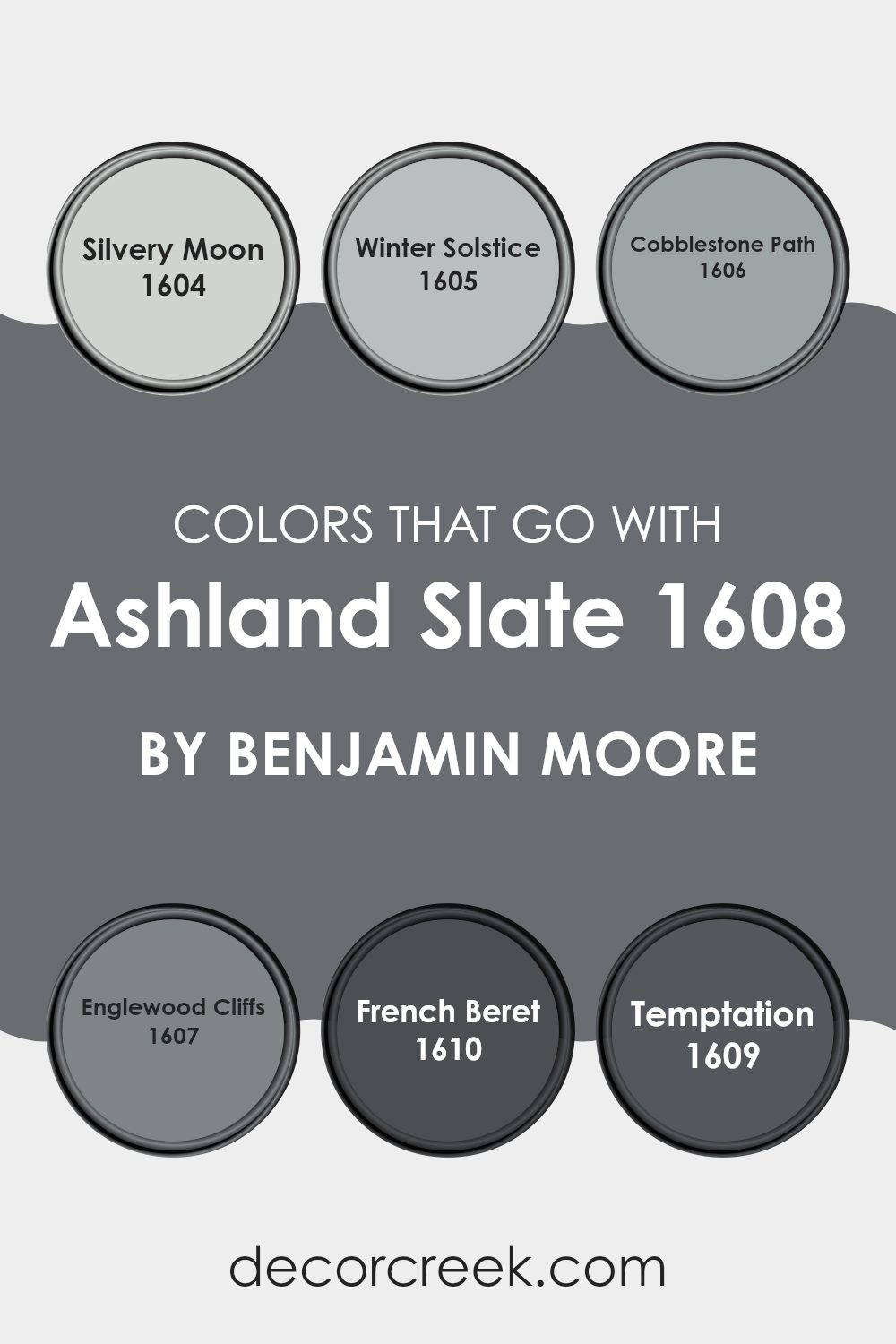
Colors that Go With Ashland Slate 1608 by Benjamin Moore
Choosing complementary paint colors is essential when working with a base color like Ashland Slate 1608 by Benjamin Moore. Such coordination ensures that the hues in your area harmonize to create a cohesive and appealing look. Colors like Silvery Moon, Winter Solstice, Cobblestone Path, Englewood Cliffs, French Beret, and Temptation are particularly well-suited to pair with Ashland Slate. Whether you are decorating a living room, bedroom, or any part of your home, using these paired shades helps establish a balanced and inviting environment.
For instance, Silvery Moon is a light, airy gray that adds gentle contrast to the deeper tones of Ashland Slate, offering a subtle lift to darker interiors. Winter Solstice has a slightly bluer tint, giving a cool, refreshing touch that complements the stone-like undertones of Ashland Slate. Cobblestone Path, a mid-tone gray, mirrors the earthiness of Ashland Slate, enriching the depth of the color scheme.
Englewood Cliffs, slightly warmer in tone, introduces a hint of warmth that prevents the palette from feeling too stark. French Beret, the darkest of these options, adds depth and definition when used alongside Ashland Slate. Lastly, Temptation stands out with its refined blend of gray and blue, bringing a lively yet balanced energy that enhances the palette without overpowering it. Together, these shades create a dynamic yet harmonious composition, perfect for designing welcoming and visually captivating interiors.
You can see recommended paint colors below:
- 1604 Silvery Moon
- 1605 Winter Solstice
- 1606 Cobblestone Path
- 1607 Englewood Cliffs
- 1610 French Beret
- 1609 Temptation
How to Use Ashland Slate 1608 by Benjamin Moore In Your Home?
Ashland Slate 1608 by Benjamin Moore is an adaptable gray color with subtle hints of blue. It’s an excellent choice for anyone looking to refresh their home. This shade works beautifully in many areas, including living rooms, bedrooms, and even kitchens. If you’re tired of bright colors and want something that feels calm and cozy, Ashland Slate could be the perfect fit.
In the living room, pairing Ashland Slate with soft whites on trim or furniture creates a clean, modern look. It’s also ideal for accent walls, offering a gentle contrast. In bedrooms, this color encourages a peaceful atmosphere, helping you unwind and relax. You can use it on all walls for a cohesive effect or on one wall to create a focal point.
Additionally, Ashland Slate is practical. It conceals scuffs and marks well, making it a smart choice for high-traffic areas like hallways. Whether you’re updating a single room or the entire home, this color is easy to coordinate with different decor styles and brings a fresh touch to your interior.
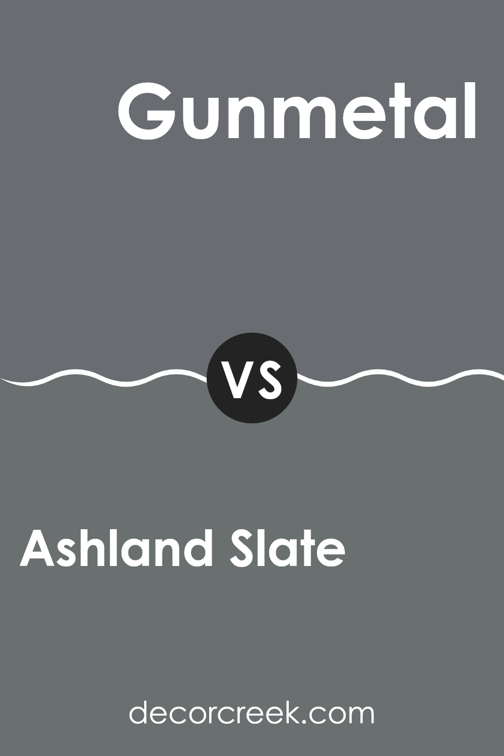
Ashland Slate 1608 by Benjamin Moore vs Gunmetal 1602 by Benjamin Moore
Ashland Slate and Gunmetal by Benjamin Moore are two distinct shades, each with its own character. Ashland Slate is a deep, almost charcoal gray that adds a strong, grounded feel to any area. It’s ideal for creating a statement wall or achieving an overall cozy, enveloping effect. This shade absorbs light softly, resulting in a lush, refined finish on walls.
In contrast, Gunmetal is a lighter gray with a noticeable blue undertone, giving it a cooler and airier appearance compared to Ashland Slate. Gunmetal performs beautifully in areas with abundant natural light, reflecting brightness and making interiors feel larger and more open. It’s an excellent choice for modern living areas or offices where a fresh, polished look is desired.
Together, these colors provide adaptable options for interiors—Ashland Slate brings depth and drama, while Gunmetal delivers a lighter, fresher atmosphere.
You can see recommended paint color below:
- 1602 Gunmetal
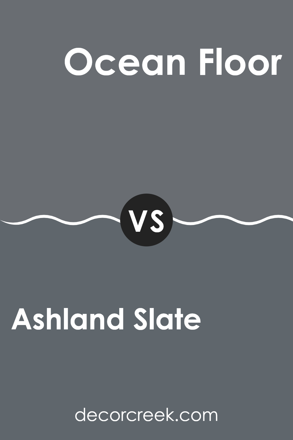
Ashland Slate 1608 by Benjamin Moore vs Ocean Floor 1630 by Benjamin Moore
Ashland Slate by Benjamin Moore is a rich, deep gray with a hint of blue, giving it a strong and sturdy presence in any room. It’s the kind of color that works well in areas where you want a solid, grounding effect without darkening the area too much.
Contrastingly, Ocean Floor is also a gray, but it leans more toward a softer, muted navy tone. This color can add a subtle hint of depth to a room while maintaining a calm and gentle atmosphere. When comparing the two, Ashland Slate appears darker and bolder, making it a great choice for accent walls or furniture pieces.
On the other hand, Ocean Floor, with its bluish-gray hues, is ideal for creating a soft background that complements brighter or more vibrant colors. Both colors offer unique opportunities to decorate and style various areas, depending on whether you want a more pronounced or understated effect.
You can see recommended paint color below:
- 1630 Ocean Floor
Ashland Slate 1608 by Benjamin Moore vs Gray Shower 2125-30 by Benjamin Moore
Ashland Slate and Gray Shower are two distinct shades of gray by Benjamin Moore. Ashland Slate is a deep, rich gray that provides a strong and grounding effect, making it a great choice for creating a cozy and secure feeling in a room.
It’s darker and has a slight warmth, making it welcoming. On the other hand, Gray Shower is a lighter and cooler gray that feels fresh and modern. It’s ideal for areas where you want a clean, breezy look that doesn’t feel too heavy.
Gray Shower might also make small areas feel a bit larger due to its lighter tone. In summary, Ashland Slate works well for a bold, comforting area while Gray Shower is perfect for a lighter, airier atmosphere.
You can see recommended paint color below:
- 2125-30 Gray Shower
Ashland Slate 1608 by Benjamin Moore vs Trout Gray 2124-20 by Benjamin Moore
Ashland Slate and Trout Gray, both by Benjamin Moore, are distinct yet harmonious color options for home interiors. Ashland Slate is a deeper, charcoal gray that brings a strong, grounded feel to a room.
It’s perfect for creating a cozy, inviting area, especially in places meant for relaxation and gathering. In contrast, Trout Gray tends to be a bit bolder, with a more noticeable blue undertone. This shade can add a subtle touch of vibrancy to an area, making it ideal for an accent wall or spots where you want to introduce a bit of drama without overpowering the senses.
While both shades are on the darker side, Trout Gray’s slight blue hint makes it a bit livelier compared to the more neutral tone of Ashland Slate. These colors pair beautifully together, with Ashland Slate providing a solid foundation and Trout Gray adding a deeper, refined accent.
You can see recommended paint color below:
- 2124-20 Trout Gray
After reading about 1608 Ashland Slate by Benjamin Moore, I’ve learned quite a bit about this distinctive paint color! This shade stands out because it’s not just plain gray – it carries subtle hints of blue and green that make it truly captivating. It’s reminiscent of a stormy sea or a cloudy sky, bringing a lively yet cozy feeling to any area.
What’s really appealing about Ashland Slate is how well it works in a variety of rooms. Whether it’s a bedroom, a living area, or even a bathroom, this color instantly adds a sense of style. It’s like wearing an outfit that fits perfectly no matter where you go—always appropriate and effortlessly chic.
I’ve also noticed that this shade pairs beautifully with many other colors. It complements whites, creams, and even bolder tones if you’re in the mood to experiment. This makes decorating easy and enjoyable, allowing for plenty of creative combinations.
Overall, 1608 Ashland Slate by Benjamin Moore feels like a great choice for anyone wanting to refresh a room. It’s like adding an elegant piece of art to your wall—it simply enhances everything around it. If you’re thinking about painting, this color could be the perfect pick to bring depth and charm to your home.
Ever wished paint sampling was as easy as sticking a sticker? Guess what? Now it is! Discover Samplize's unique Peel & Stick samples.
Get paint samples

