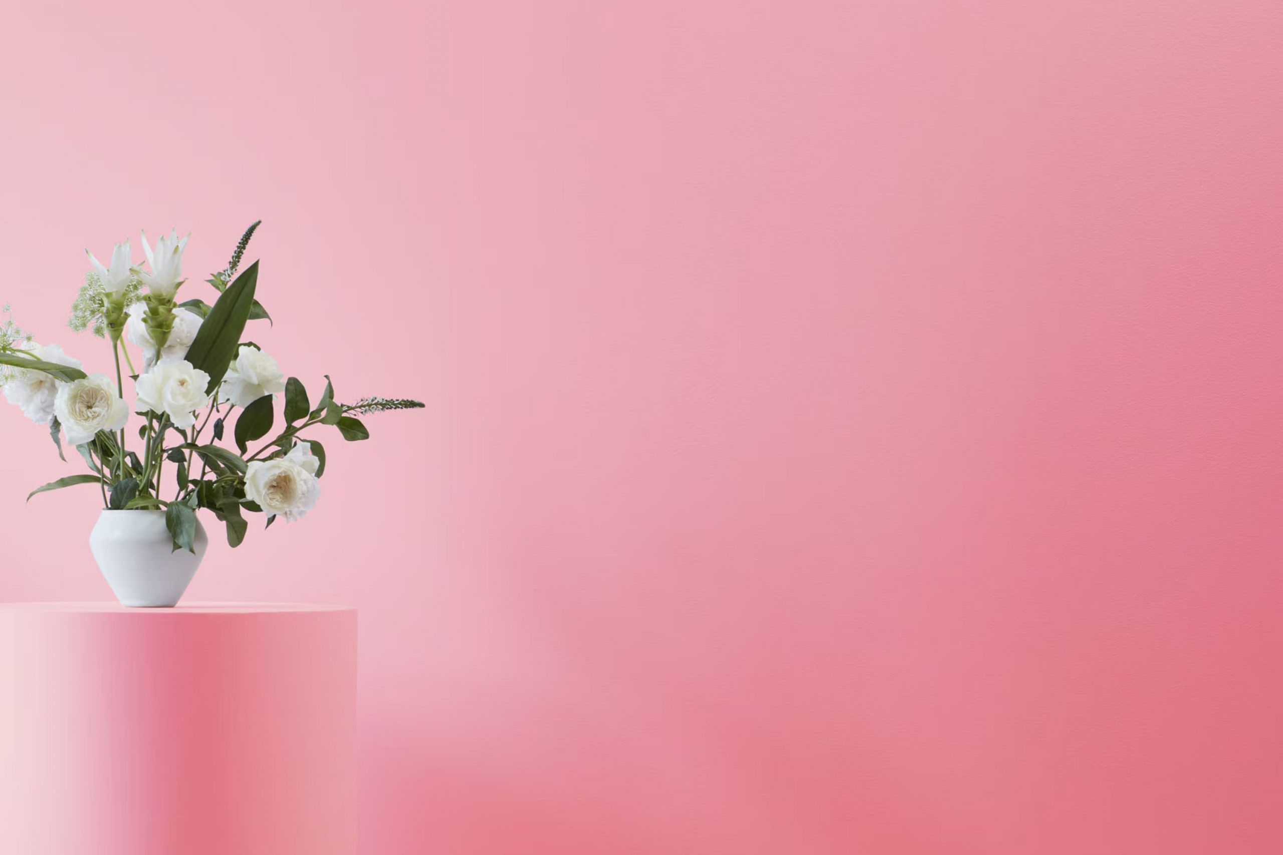
I recently had the chance to use Benjamin Moore’s 2087-40 Autumn Red, and I must say, it’s a game changer if you’re looking to liven up a room. This shade of red is warm and inviting, mimicking the rich hues of fall leaves.
It’s perfect for anyone wanting to add a cozy, rustic feel to their room without it feeling too bold or too strong.
Adding this paint to a living room or dining area creates a welcoming atmosphere. It pairs beautifully with neutral tones, allowing for many decorating styles, from modern to traditional.
If you’re thinking about refreshing your walls or looking for that perfect autumn vibe all year round, Autumn Red could be the right pick.
What Color Is Autumn Red 2087-40 by Benjamin Moore?
Autumn Red by Benjamin Moore is a warm, vibrant shade of red that brings to mind the rich, cozy tones of fall foliage. This color has a depth that provides a lively ambiance to any room. Ideal for creating a welcoming and cheerful atmosphere, Autumn Red works exceptionally well in living areas where lively conversations and gatherings take place, like living rooms or dining areas.
For interior styles, Autumn Red shines in rustic and traditional settings, adding a touch of warmth that complements natural woods and classic furniture designs. This color also fits beautifully within bohemian-inspired decor, adding a bold touch that pairs well with global textiles and eclectic accessories.
In terms of materials, Autumn Red teams up nicely with dark woods to create a grounding effect, enhancing the room’s overall warmth. It also goes well with leather, adding a luxurious yet homey touch to any room. Textures like woven fabrics and soft woolen throws will round out the look, providing a comfy and inviting feel.
Overall, Autumn Red is perfect for those looking to add a bit of warmth and energy to their home, making any room more lively and snug. Its flexibility allows it to be used in various ways, whether as a statement wall or in decorative elements, creating rooms that are both stylish and comfortable.
Is Autumn Red 2087-40 by Benjamin Moore Warm or Cool color?
Autumn Red 2087-40 by Benjamin Moore is a vibrant and warm shade, perfect for adding a cozy and inviting feel to any home. This rich, deep red hue can make a bold statement when used on walls or can add subtle warmth as an accent color.
It works well in living rooms or dining areas, creating a welcoming atmosphere for guests and family gatherings. In smaller areas like bathrooms or entryways, Autumn Red can also add depth and interest, making the area feel more intimate and comfortable.
This color pairs nicely with neutral tones like beige, gray, or soft white, which helps balance out its intensity. For those looking to add a bit of natural contrast, incorporating green or blue accents can be quite effective. Furniture and decor in wood tones also complement Autumn Red beautifully, enhancing its earthy quality. Overall, using Autumn Red in your home can make rooms feel more grounded and cozy, perfect for creating a relaxing environment.
Undertones of Autumn Red 2087-40 by Benjamin Moore
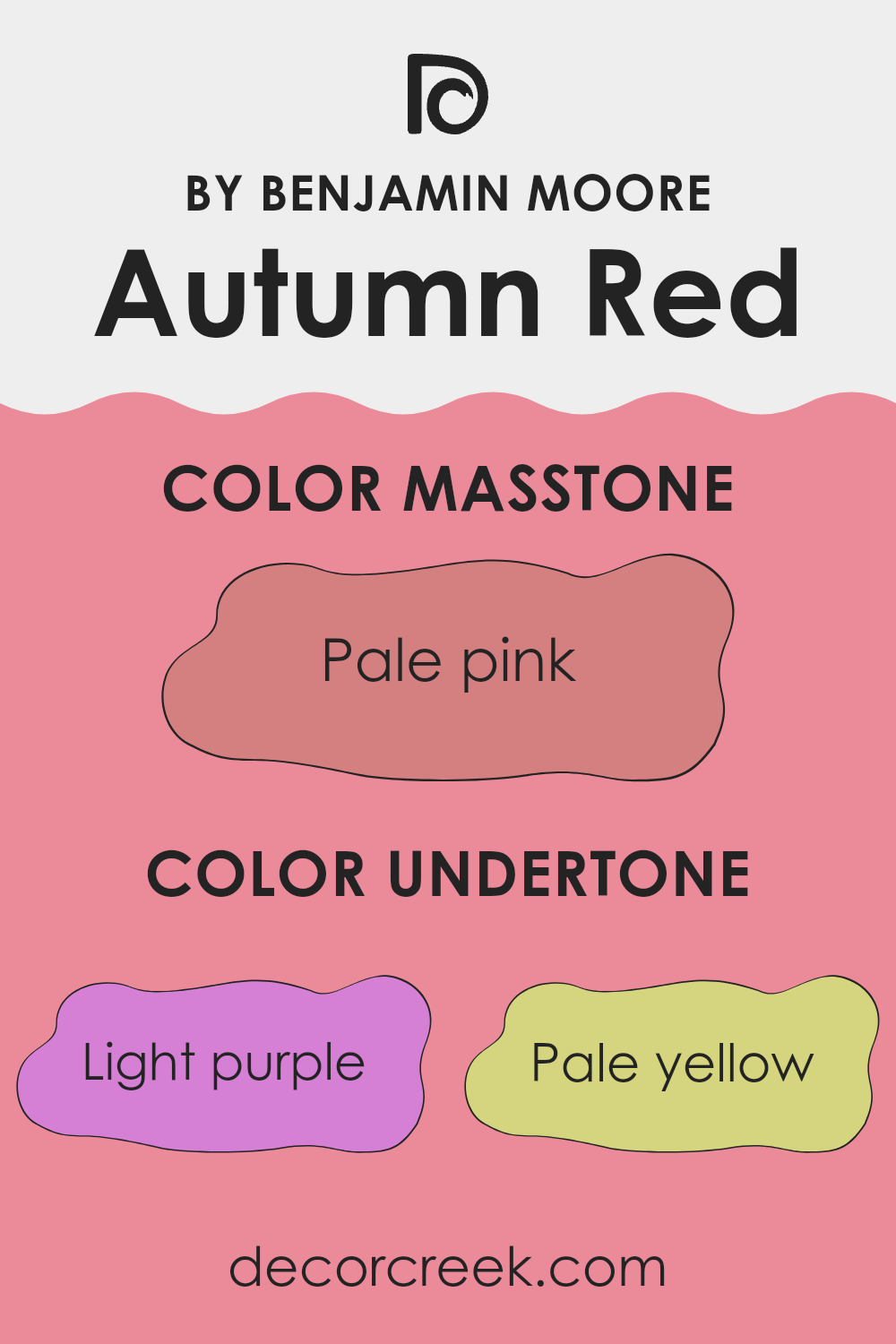
Autumn Red by Benjamin Moore is a unique color that holds a complex mix of subtle shades. Understanding the undertones of a paint color can greatly influence how it appears in different lighting and settings. Undertones are the colors that lie beneath the main color. In the case of Autumn Red, these undertones range across a broad spectrum including light purple to pale yellow, light gray, and even vivid shades like pink and orange.
When painting interior walls, the undertones of Autumn Red can create various effects depending on the room’s lighting and surrounding colors. For example, in a room with ample natural light, the pale yellow or light blue undertones might make the room feel more airy and open. In contrast, under artificial lighting, the darker undertones like purple or brown might become more noticeable, giving the room a cozier and more grounded feel.
The presence of both warm (orange, yellow, red) and cool (light blue, lilac, mint) undertones provides a flexible palette that allows for ease in decorating. This flexibility means Autumn Red can work well with different styles and furnishings, whether modern or traditional, bright or subdued.
Furthermore, the use of this color on walls can have varying psychological impacts. For instance, the orange and red undertones can add warmth and energy to a room, whereas the light gray or light green undertones bring a sense of calm. Understanding these effects can help in choosing complementary colors for decor items like curtains, rugs, and furniture, ensuring a harmonious room atmosphere that reflects the desired mood and style.
What is the Masstone of the Autumn Red 2087-40 by Benjamin Moore?
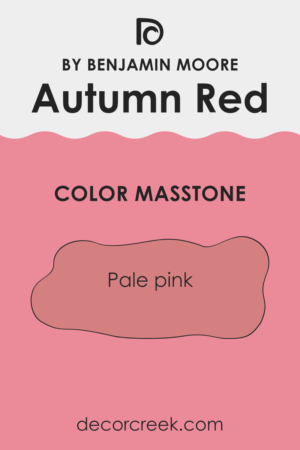
Autumn Red 2087-40 by Benjamin Moore has a masstone that appears as a pale pink, coded as #D58080. This soft and gentle hue brings a warm and welcoming vibe to any room. When used in homes, this color provides a subtle touch of coziness without feeling too heavy. It’s particularly effective in bedrooms or living areas where a calm atmosphere is desired. Additionally, this shade can help soften rooms that receive a lot of natural light, preventing the room from feeling too stark or bright.
This pale pink masstone has the ability to blend with various decor styles, whether paired with bold colors for a dynamic contrast or used alongside neutral tones for a more balanced look. It’s especially useful in rooms that aim for a soft, yet cheerful aesthetic.
Overall, Autumn Red 2087-40’s pale pink masstone makes it a practical choice for adding a touch of warmth and personality to your home, without dominating the design elements.
How Does Lighting Affect Autumn Red 2087-40 by Benjamin Moore?
Lighting greatly influences the way colors appear in both indoor and outdoor settings. Colors can change a lot under different types of light. This concept is essential when choosing paint, such as Autumn Red from Benjamin Moore. In artificial lighting, colors often look deeper and can either be enhanced or softened depending on the tone of the light. Warm lights make red hues like Autumn Red more vibrant and rich, whereas cooler lights may make them appear slightly muted.
In natural light, the appearance of colors shifts throughout the day with changes in the sun’s position and intensity. Autumn Red will naturally look brightest and most true to color in midday sunlight when natural light is at its peak. During dawn and dusk, the color may appear softer and more shadowed.
The orientation of a room also plays a significant role in how Autumn Red will look:
- North-Faced Rooms: These rooms get less direct sunlight, which means colors like Autumn Red might look slightly darker and more subdued. The cooler, indirect light can reduce the vibrancy of the red.
- South-Faced Rooms: These rooms enjoy abundant sunlight for most of the day. Here, Autumn Red will appear lively and dynamic, really shining in the strength of the natural light. The warmth and brightness of the sun will highlight the rich, warm undertones of the red.
- East-Faced Rooms: Morning light in east-facing rooms is warm and yellowish. Autumn Red will look very welcoming and bright in the morning, gradually becoming less intense as the day progresses and the natural light shifts away.
- West-Faced Rooms: In these rooms, the color will start off cooler in the morning but become warmly illuminated by the strong afternoon sunlight. Autumn Red will shift throughout the day, from a more muted shade in the morning to a vibrant and warm hue by evening.
Understanding these effects can help you decide which room best suits Autumn Red to achieve the desired ambiance and style at various times of the day.
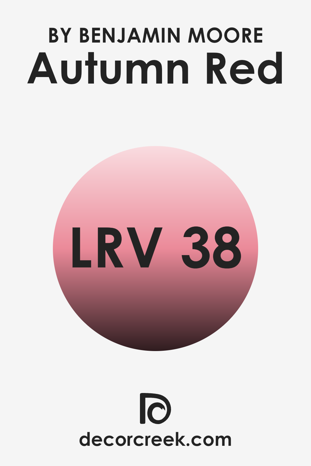
What is the LRV of Autumn Red 2087-40 by Benjamin Moore?
LRV stands for Light Reflectance Value, and it measures the amount of light a paint color reflects back into a room. Think of it this way—the higher the number, the more light it reflects. This number helps explain how light or dark a color will look once it’s on your walls.
It’s particularly useful when choosing paint colors because it gives you an idea of how they’ll appear under different lighting conditions. For example, a room with lots of windows might make a dark color look lighter, while a room with few windows might make the same color look darker.
For Autumn Red, with an LRV of 38.41, it’s in the mid-range of the scale, meaning it doesn’t reflect a lot of light but isn’t overly dark either. This can make the color rich and relatively vibrant, brightening up a room comfortably without feeling too intense. It’s ideal for creating a warm, inviting atmosphere in a room.
Whether the area gets lots of sunlight or just a little, this particular shade will hold its depth of color fairly steadily, creating consistency across changing light conditions throughout the day.
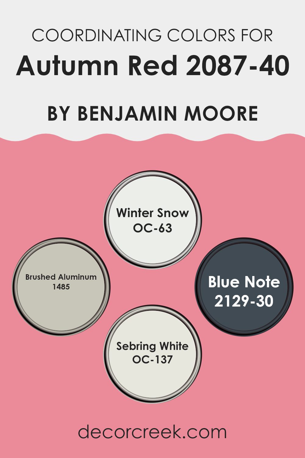
Coordinating Colors of Autumn Red 2087-40 by Benjamin Moore
Coordinating colors are hues that complement or enhance each other when used together in design or decor. Typically, these colors are selected based on their ability to balance a primary color or to create a harmonious color scheme throughout a room. For instance, Benjamin Moore’s Autumn Red can be beautifully paired with a set of coordinating colors, which work to either contrast or blend smoothly with the central shade, depending on their undertone and intensity.
One coordinating color option is Winter Snow OC-63, a crisp and clean white that provides a fresh contrast to the deep richness of Autumn Red. It acts as a neutral backdrop that helps the red stand out without feeling too strong. Another choice, Brushed Aluminum 1485, offers a subtle silvery gray that complements the red by providing a muted yet reflective quality, enhancing the overall warmth.
For a dramatic flair, Blue Note 2129-30 brings a deep, almost navy blue into the palette, adding a touch of boldness and depth that enriches the visual interest in a room. Finally, Sebring White OC-137 works similarly to Winter Snow but with a hint of creaminess, softening the contrast slightly and lending a cozy feel alongside the rich Autumn Red. Together, these coordinating colors offer multiple ways to design a room that feels both inviting and stylish.
You can see recommended paint colors below:
- OC-63 Winter Snow
- 1485 Brushed Aluminum
- 2129-30 Blue Note
- OC-137 Sebring White
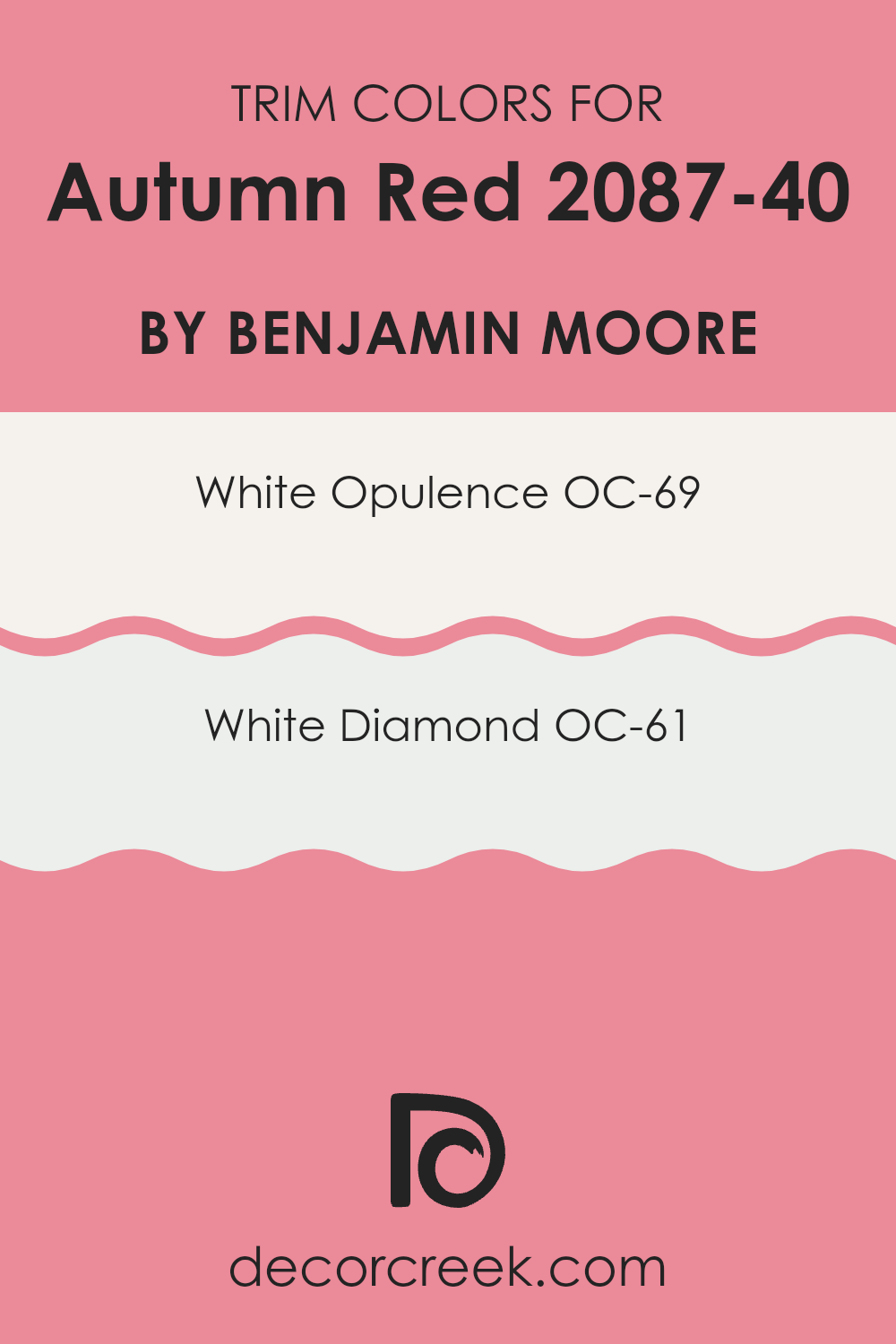
What are the Trim colors of Autumn Red 2087-40 by Benjamin Moore?
Trim colors refer to the paint used for moldings, casings, window and door frames, and other architectural features on walls. Choosing the right trim color can significantly improve the overall appearance of a room by defining and accenting the architectural details.
For a vibrant shade like Autumn Red by Benjamin Moore, selecting a suitable trim color is crucial as it helps create a balanced and harmonious look. White trim colors, for instance, offer a clean and crisp boundary that effectively contrasts with a bold wall color, making the room feel more cohesive and neatly arranged.
One excellent choice for a trim color when using Autumn Red is OC-69 – White Opulence by Benjamin Moore. This color is a very subtle and soft white that doesn’t compete with the richness of Autumn Red but instead complements it by providing a gentle separation between the wall and the trim. Another good option is OC-61 – White Diamond, which has a slightly brighter tone compared to White Opulence. It offers a fresh and clear distinction against darker tones, adding a lively edge to the room’s overall look. Both of these white shades help improve the visual appeal by providing a crisp, clean finish that works beautifully with the deep and inviting autumnal red.
You can see recommended paint colors below:
- OC-69 White Opulence
- OC-61 White Diamond
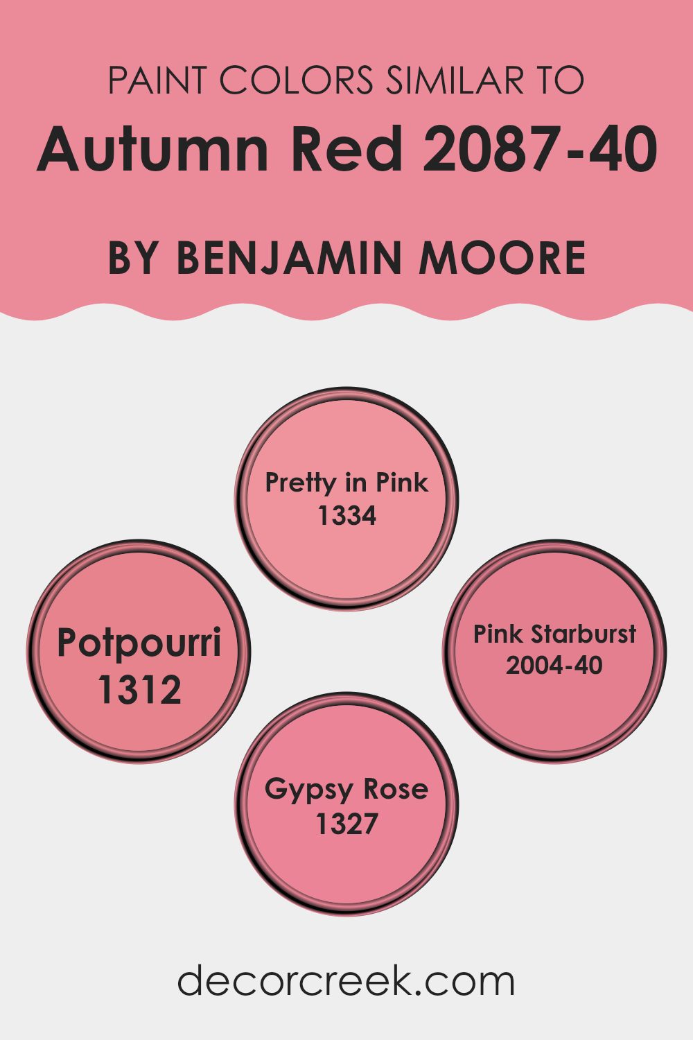
Colors Similar to Autumn Red 2087-40 by Benjamin Moore
Choosing similar colors for a design scheme comes with several advantages, particularly in creating a harmonious and visually appealing room. Colors that belong to the same family, such as variations of a base color, help achieve a cohesive look without losing visual interest.
For instance, when working with a base color like Autumn Red by Benjamin Moore, selecting shades that are closely related to it can gently enhance the overall look of the interior. This method allows for slight variations in intensity and brightness, which adds depth and dimension to the room. By keeping the colors similar, the transitions between different surfaces and materials feel fluid and natural, promoting a comfortable and welcoming atmosphere.
When considering similar colors to Autumn Red, Pretty in Pink offers a softer, more muted alternative. It provides a gentle contrast while still maintaining warmth, making it ideal for rooms that aim for a softer ambiance. Another option, Potpourri, has a slightly muted quality that works well for creating a cozy yet understated look.
Pink Starburst is a lively choice, introducing a vibrant but balanced burst of pink that can energize a room without feeling too intense. Lastly, Gypsy Rose is richer and deeper, perfect for adding a touch of drama and refined elegance while staying within the same color spectrum. Each of these colors supports the primary shade in their own unique way, ensuring that the design remains connected and fluid.
You can see recommended paint colors below:
- 1334 Pretty in Pink
- 1312 Potpourri
- 2004-40 Pink Starburst
- 1327 Gypsy Rose
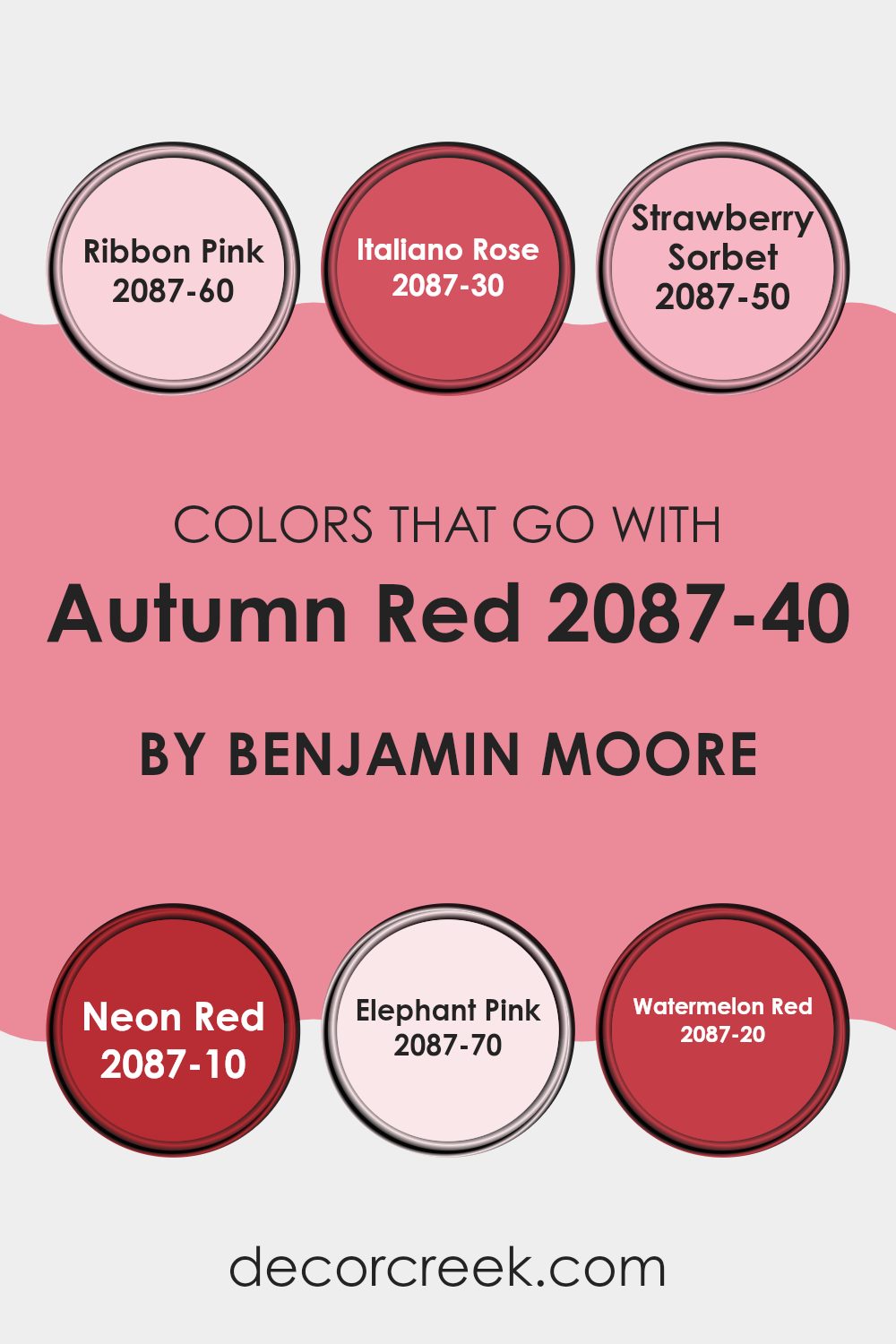
Colors that Go With Autumn Red 2087-40 by Benjamin Moore
Choosing the right colors to pair with Autumn Red 2087-40 by Benjamin Moore can significantly improve the overall look of any room, making the ambiance more warm and inviting. Selecting complementary colors like Ribbon Pink, Italiano Rose, Strawberry Sorbet, Neon Red, Elephant Pink, and Watermelon Red helps create a cohesive and visually appealing palette, which in turn improves the look and feel of the room. These shades harmonize well with Autumn Red as they share similar undertones, ensuring that the overall decor feels balanced and well put together.
Ribbon Pink is a soft and subtle pink that adds a touch of gentleness to the boldness of Autumn Red, making it perfect for creating a soft and inviting atmosphere. Italiano Rose has a deeper, richer hue that mirrors the depth of Autumn Red, providing a striking contrast that remains harmonious. Strawberry Sorbet offers a lighter, refreshing pink that adds a burst of freshness to the room, working well in more vibrant settings.
Neon Red is vivid and bright, boosting the energy of the room when paired with Autumn Red. Elephant Pink is very muted and almost neutral, which makes it an excellent background shade that doesn’t compete with the stronger Autumn Red. Lastly, Watermelon Red has a juicy, vibrant feel that enhances the warmth of Autumn Red, perfect for areas where a lively, energetic feel is desired. Using these colors together makes it easy to achieve a beautiful, coordinated look that is both warm and welcoming.
You can see recommended paint colors below:
- 2087-60 Ribbon Pink
- 2087-30 Italiano Rose
- 2087-50 Strawberry Sorbet
- 2087-10 Neon Red
- 2087-70 Elephant Pink
- 2087-20 Watermelon Red
How to Use Autumn Red 2087-40 by Benjamin Moore In Your Home?
Autumn Red 2087-40 by Benjamin Moore is a warm, vibrant paint color that adds a cozy feel to any room. This rich, red hue works great in areas where you spend a lot of time relaxing, like the living room or bedroom. It pairs well with neutral shades such as creams and browns, which help balance its intensity.
Using it on one wall as an accent can create a beautiful focal point, while painting all walls can make the room feel more enclosed and snug. This color also looks lovely in dining areas, giving them a welcoming and cozy atmosphere.
For those wanting to add a touch of warmth to their kitchen, consider using it on cabinets or as a backsplash color. Accessories and décor in contrasting colors, like teal or mustard yellow, can make the red stand out and give your home a cheerful, stylish look.
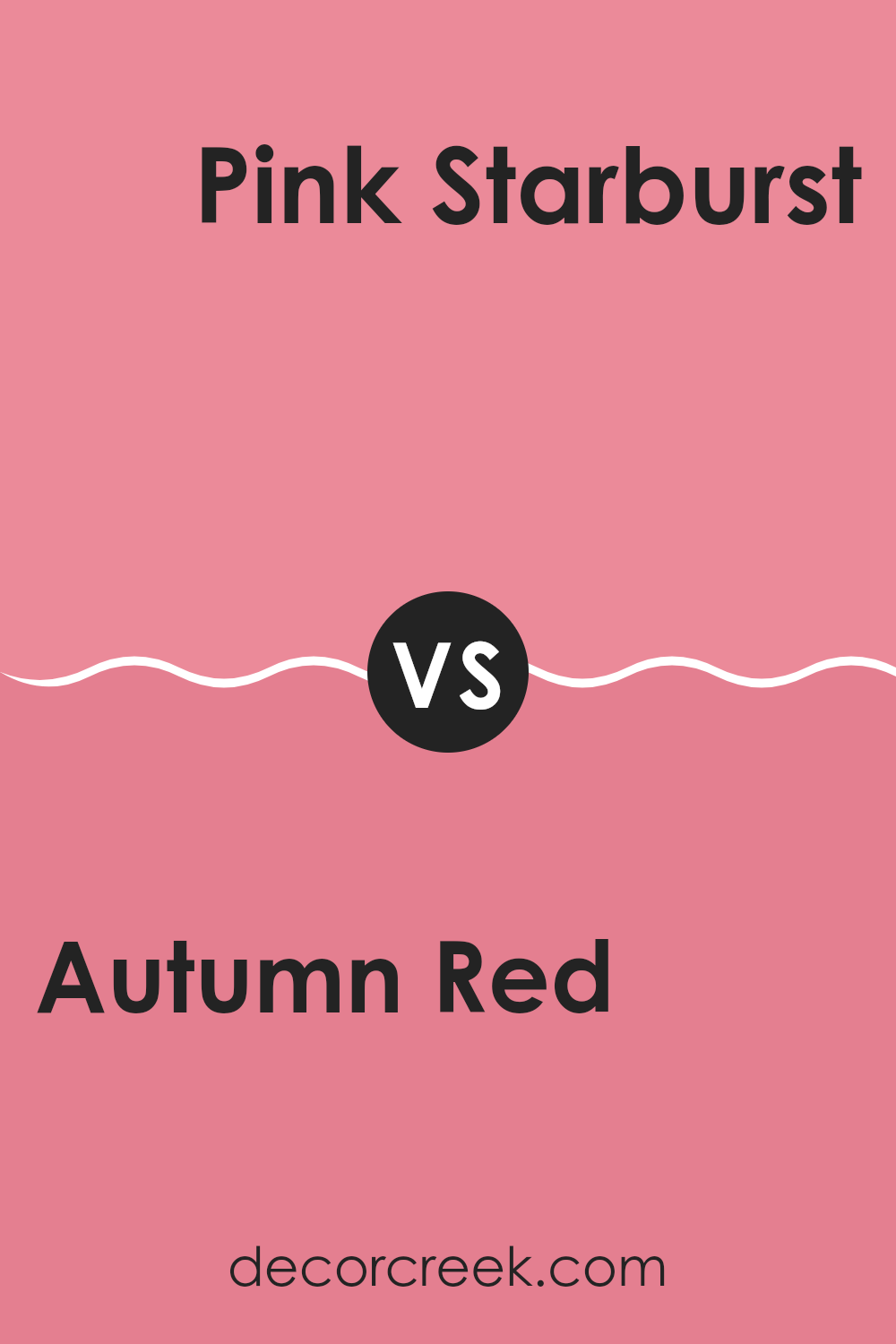
Autumn Red 2087-40 by Benjamin Moore vs Pink Starburst 2004-40 by Benjamin Moore
Autumn Red and Pink Starburst by Benjamin Moore are two distinct paint colors. Autumn Red is a deep, rich shade that resembles the warm tones of fall leaves. It brings a cozy and inviting feeling to a room, making it ideal for living areas or accent walls where a touch of warmth is desired.
On the other hand, Pink Starburst is a vibrant, light pink that has a youthful and playful vibe. It’s much lighter compared to Autumn Red and tends to add brightness and a sense of cheerfulness to a room. This color works well in areas meant to be lively and uplifting, like a child’s room or a creative workspace.
While both colors add personality to a room, Autumn Red leans toward a traditional, warm aesthetic, whereas Pink Starburst offers a fresh, energizing atmosphere.
You can see recommended paint color below:
- 2004-40 Pink Starburst
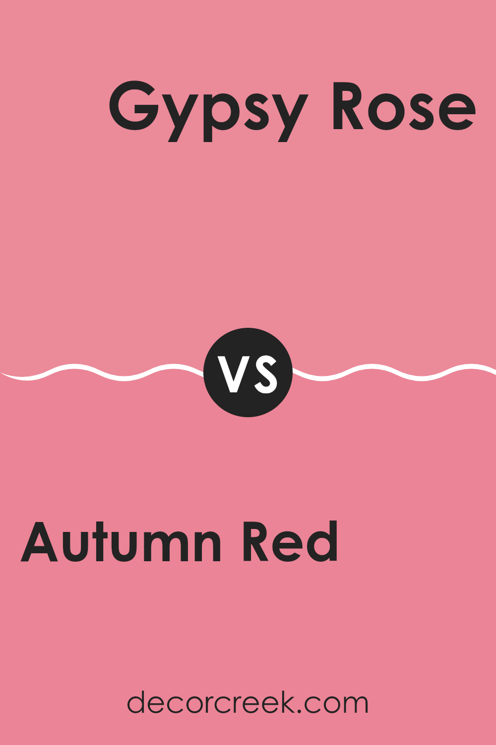
Autumn Red 2087-40 by Benjamin Moore vs Gypsy Rose 1327 by Benjamin Moore
Autumn Red and Gypsy Rose, both by Benjamin Moore, offer distinct vibes for different rooms. Autumn Red is a deep, rich red with a warm, inviting feel. It’s perfect for creating a cozy atmosphere in a room, resembling the warm shades of fall leaves. This color would work well in a living room or dining area where you want a welcoming, comfortable setting.
On the other hand, Gypsy Rose is a lighter red, leaning toward a pinkish hue. It has a soft, playful essence, making it ideal for adding a touch of cheerfulness to rooms. Its subdued tone provides a less intense option compared to Autumn Red, suited for bedrooms or areas where a lighter, airier feel is desired.
Overall, while both colors share a red base, Autumn Red offers warmth and depth, while Gypsy Rose brings a lighter, softer touch. This makes them suitable for different purposes depending on the mood you want to create in your room.
You can see recommended paint color below:
- 1327 Gypsy Rose
Autumn Red 2087-40 by Benjamin Moore vs Pretty in Pink 1334 by Benjamin Moore
Autumn Red by Benjamin Moore is a bold and warm hue reminiscent of fall leaves. It creates a cozy and inviting atmosphere, making it ideal for rooms where you wish to foster comfort and conversation. Its deep red tone pairs well with neutral colors and natural materials, adding a touch of rustic charm.
Pretty in Pink by Benjamin Moore, on the other hand, is a gentle and soft pink that makes any room feel light and playful. It’s a color that adds a fresh, youthful vibe, perfect for bedrooms or areas aimed at relaxation and cheer. Since it’s a more subdued shade, it works incredibly well as a background for bolder colors or on its own for a minimalistic, airy look.
These two colors offer distinct feelings and visual impact, with Autumn Red bringing warmth and depth, and Pretty in Pink offering a sense of lightness and freshness. Both colors can significantly improve the mood and style of a room depending on what you want to achieve.
You can see recommended paint color below:
- 1334 Pretty in Pink
Autumn Red 2087-40 by Benjamin Moore vs Potpourri 1312 by Benjamin Moore
Autumn Red by Benjamin Moore is a vibrant and deep hue that evokes the feeling of fall leaves and cozy firesides. This color has a strong presence and can add a dynamic punch to any room. It pairs well with neutral tones, allowing its rich quality to really stand out.
Potpourri by Benjamin Moore, on the other hand, is much lighter and softer. It offers a gentle touch of color, resembling the subtle pink found in a mix of dried flowers and spices. Potpourri is adaptable enough to work in many settings, providing a quiet backdrop that complements and soothes rather than dominates.
When comparing the two, Autumn Red is the more bold and energetic choice, likely to draw attention and set a mood of warmth and energy. Potpourri is quieter and more understated, perfect for creating a relaxed and inviting atmosphere. Each color serves different moods and settings, but both share the quality and richness typical of Benjamin Moore paints.
You can see recommended paint color below:
In wrapping up my thoughts about 2087-40 Autumn Red by Benjamin Moore, I have to say that it’s a real standout color. Imagine the leaves changing in fall — that’s the beautiful shade you get with Autumn Red. Whether you want to liven up a room that doesn’t get much light or add a splash of warmth to an area that feels too plain, this color can do the trick.
It works well in many areas, like living rooms, dining areas, and even bedrooms, creating a cozy, inviting atmosphere. Plus, it pairs nicely with many other colors. You could match it with soft creams for a gentle look, or bold blacks for a more dramatic feel. This makes it a great choice for anyone wanting to add a bit more personality to their home without making things too bright or jarring.
So, if you’re thinking about giving your room a new look, 2087-40 Autumn Red is definitely worth considering. It’s not just another red; it’s a unique shade that brings warmth and comfort, making everyone feel right at home.
Ever wished paint sampling was as easy as sticking a sticker? Guess what? Now it is! Discover Samplize's unique Peel & Stick samples.
Get paint samples

