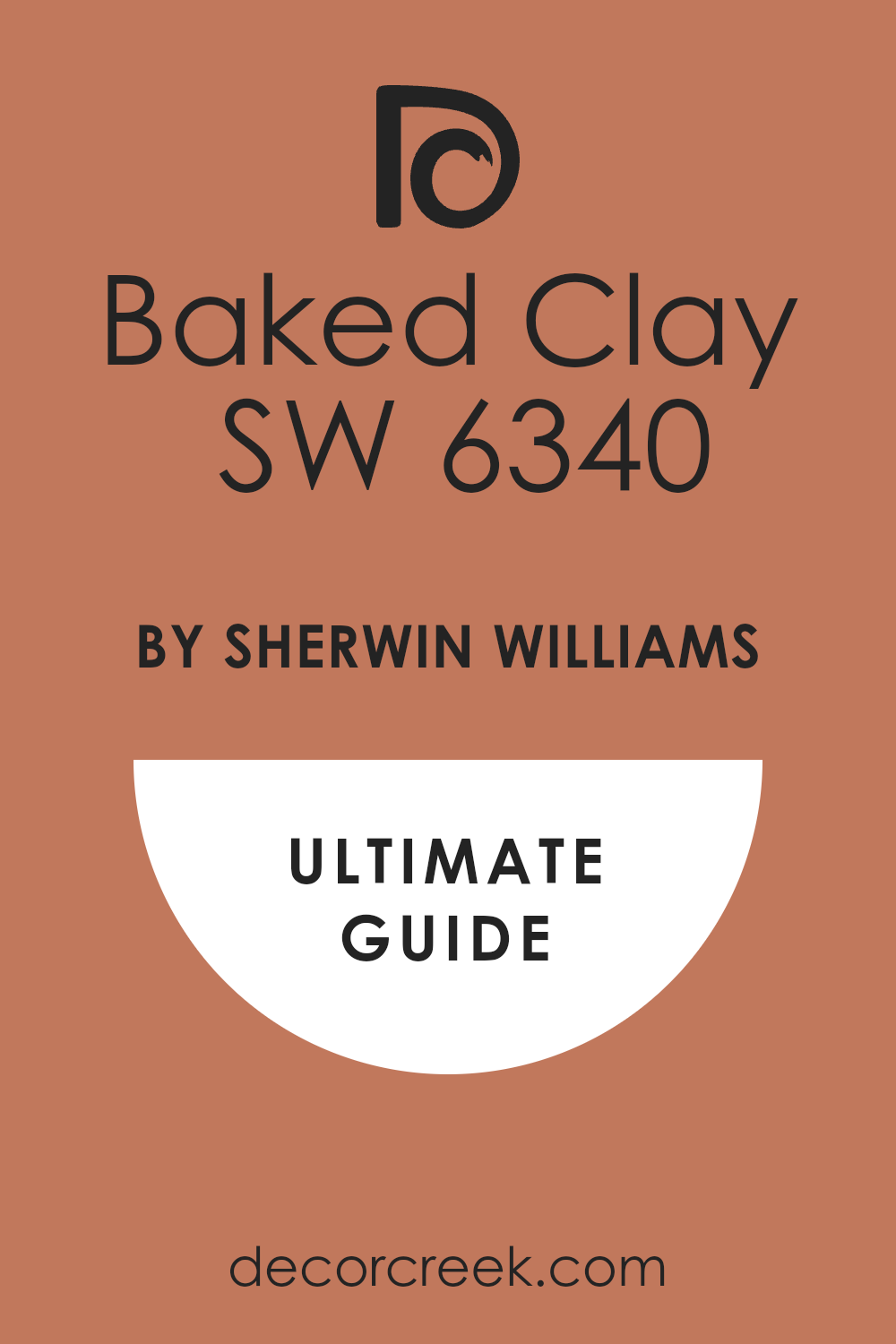
When you’re looking to refresh a room or add a cozy vibe, choosing the right paint color is key. That’s why I find SW 6340 Baked Clay by Sherwin Williams so interesting. Picture a warm, earthy tone that reminds you of terracotta pots drying under a sunny sky. This color has a rustic charm that can make any space feel more welcoming.
Using Baked Clay on your walls can really warm up your home, especially in spaces like the living room or dining area where you gather with friends and family.
It pairs beautifully with natural elements like wooden furniture or woven baskets, enhancing the overall homely feel. Plus, if you like a southwestern style or a rustic look, this color is perfect.
When you think about changing up a room, it’s natural to worry about the outcome. But I can tell you, Baked Clay brings such a comforting and grounded atmosphere; it might just be the change you’re looking for. It’s like adding a warm blanket to the room, both soothing and rich.
Whether you decide to paint all the walls or just an accent wall, Baked Clay is versatile and can harmonize with many decors and tastes. So, if you’re in the mood to freshen up your space, consider this beautiful color. It might just transform your home in the most delightful way.
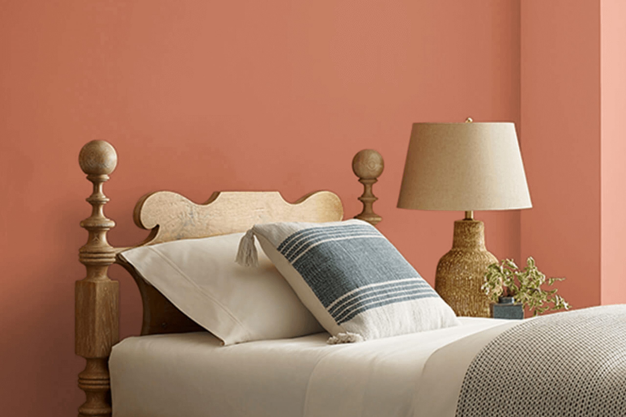
What Color Is Baked Clay SW 6340 by Sherwin Williams?
The color Baked Clay, a rich, warm terra-cotta hue, brings a cozy and welcoming vibe to any space. Its earthy tones are reminiscent of natural clay that has been sun-dried, giving it a rustic charm. This color works exceptionally well in interior styles that lean towards the rustic, such as farmhouse, bohemian, and even traditional decor, adding a touch of warmth to the atmosphere.
In terms of materials, Baked Clay pairs wonderfully with natural elements like wood, particularly in darker tones, which contrast nicely with its brighter warmth. Textures like wool, linen, and burlap also complement this color well, enhancing the rustic feel it naturally embodies.
Using it on accent walls or for decorative accessories can help to bring depth and a sense of coziness to living rooms, dining areas, or bedrooms.
Additionally, it can serve as a striking backdrop for greenery. Plants with lush green leaves will stand out beautifully against this terracotta backdrop, creating a lively and inviting environment. Opting for accessories and furnishings in neutral tones or muted earthy colors will keep the overall look cohesive and grounded.
This versatile color is also a great choice for kitchens and entryways, where it introduces warmth right from the first glance.
Is Baked Clay SW 6340 by Sherwin Williams Warm or Cool color?
Baked Clay by Sherwin Williams is a warm and earthy color that brings a cozy feel to any room. Its rich, red-orange hue resembles natural clay that’s been sun-dried, adding a touch of rustic charm to spaces. This color works well in rooms where you want to create a welcoming and comfortable atmosphere, like living rooms or dining areas.
Since it’s such a bold color, it pairs nicely with neutral tones like beiges, grays, and whites. This helps to balance out its intensity, making sure the space doesn’t become overwhelming. Baked Clay can also be used as an accent wall to add a pop of color without dominating the space.
In homes that have a lot of natural light, this color can look especially vibrant, enhancing the warm, sunny feeling inside. Overall, Baked Clay is ideal for anyone looking to add warmth and a natural feel to their home.
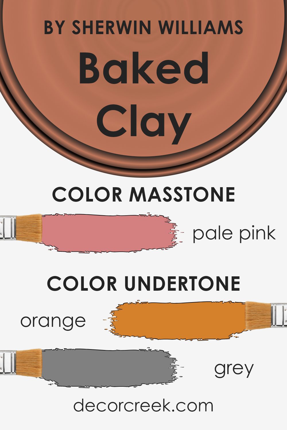
Undertones of Baked Clay SW 6340 by Sherwin Williams
Baked Clay is a vibrant color that can greatly influence the mood and style of any room. Many people overlook how the subtle hints or undertones within a paint color can alter its main appearance. For Baked Clay, these undertones are varied and can include shades of orange, grey, olive, pink, red, pale yellow, yellow, purple, brown, mint, light purple, light green, lilac, fuchsia, light gray, violet, and light blue.
The presence of these undertones means the color can appear slightly different depending on the lighting and surrounding colors. For example, in a room with a lot of natural light, the orange or yellow undertones might make the color appear warmer and more welcoming.
However, in artificial light, the grey or olive undertones could become more dominant, giving the color a more muted and subdued look.
When used on interior walls, Baked Clay can create a warm and cozy atmosphere. The orange and red undertones can make a space feel more inviting, which is perfect for living rooms or dining areas. The more subdued undertones like grey and olive can help soften the boldness of the color, making it more adaptable and easier to pair with different decor styles and colors.
Understanding these undertones is crucial when choosing Baked Clay for your walls, as it helps you anticipate how the color will behave in your specific interior conditions and how it will complement other elements in the room. This knowledge ensures that you achieve the desired effect for your living spaces without unexpected surprises.
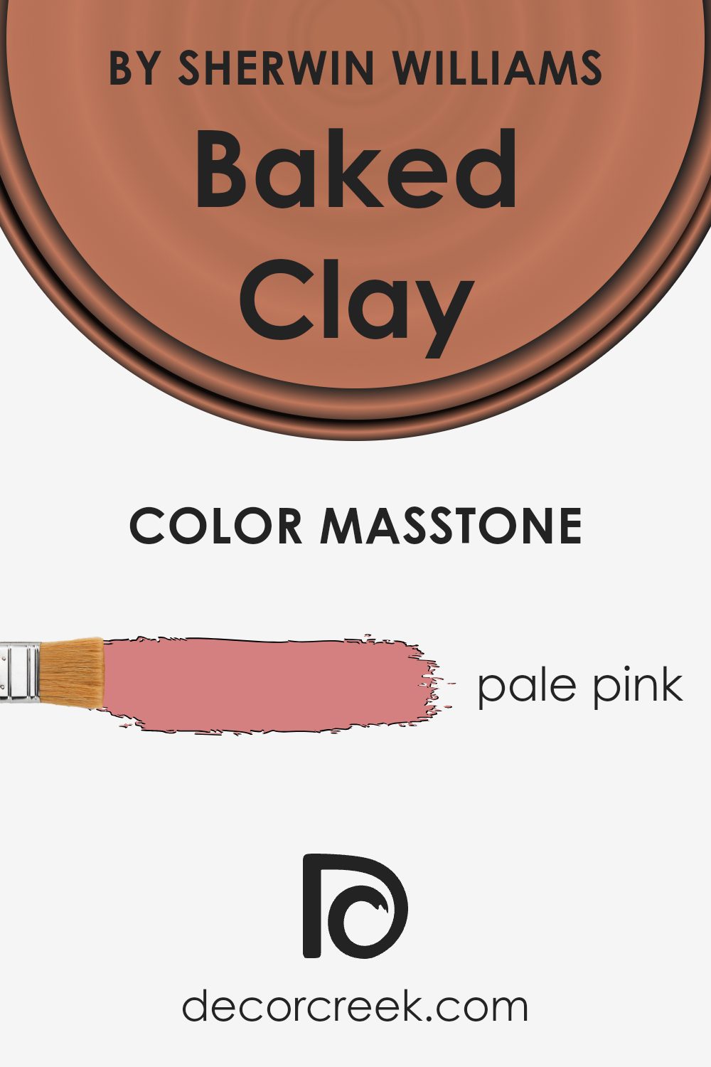
What is the Masstone of the Baked Clay SW 6340 by Sherwin Williams?
The masstone for the paint color labeled as Baked Clay by Sherwin Williams is pale pink, noted by its unique shade code of #D58080. This specific hue has a pleasant, soft pink tone that imbues spaces with a warm and inviting atmosphere. In home interiors, the use of this color can make rooms feel cozy and comfortable.
Its gentle pink is not overpowering, which makes it an excellent choice for living areas, bedrooms, and even kitchens where one seeks a touch of subtle warmth without overwhelming the senses.
Additionally, this pale pink works well with a variety of decor styles and pairs beautifully with neutral colors such as whites, grays, and beiges, adding a slight, yet noticeable lift to the aesthetic. This color’s versatility and appealing warmth make it suitable for many homes, promoting a friendly and cheerful environment.
It can also match well with more vivid colors or darker tones to create a more dynamic and visually interesting space.
How Does Lighting Affect Baked Clay SW 6340 by Sherwin Williams?
Lighting plays a crucial role in how colors are perceived in any environment. Different types of light can make the same color look different. For example, consider the color Baked Clay from Sherwin Williams. It’s a rich, warm hue that can shift in appearance depending on the lighting conditions.
Artificial Light: In rooms lit by incandescent bulbs, which usually emit a warmer, yellowish light, Baked Clay might appear even warmer, emphasizing its red and orange undertones. However, under fluorescent lights, which tend to emit a cooler, bluish light, Baked Clay could look less vibrant and slightly muted since cooler light can suppress warm colors.
Natural Light: The color’s appearance drastically changes depending on the time of day and the direction of the windows.
- North-facing rooms don’t get direct sunlight, meaning the light is usually cooler and more consistent throughout the day. This can make Baked Clay look more subdued and slightly darker, as the cooler light doesn’t enhance its warm undertones.
- South-facing rooms receive a lot of sunlight, with intense light during midday. Here, Baked Clay will appear much brighter and more vivid, as the ample natural light enhances its warm, rich tones.
- East-facing rooms get most of their sunlight in the morning. Morning light is generally gentle and warm, which can make Baked Clay look very inviting and cozy in the mornings, while turning more neutral as the day progresses.
- West-facing rooms are bright in the afternoons with a softer and warmer sunset light. The late, warm light can intensify the warmth of Baked Clay, making it look very dynamic and robust during the evening.
Understanding how lighting affects the color can help in deciding how and where to use this particular shade effectively. It’s clear that both the type of light and the direction of the light in a room can significantly influence how this color is perceived.
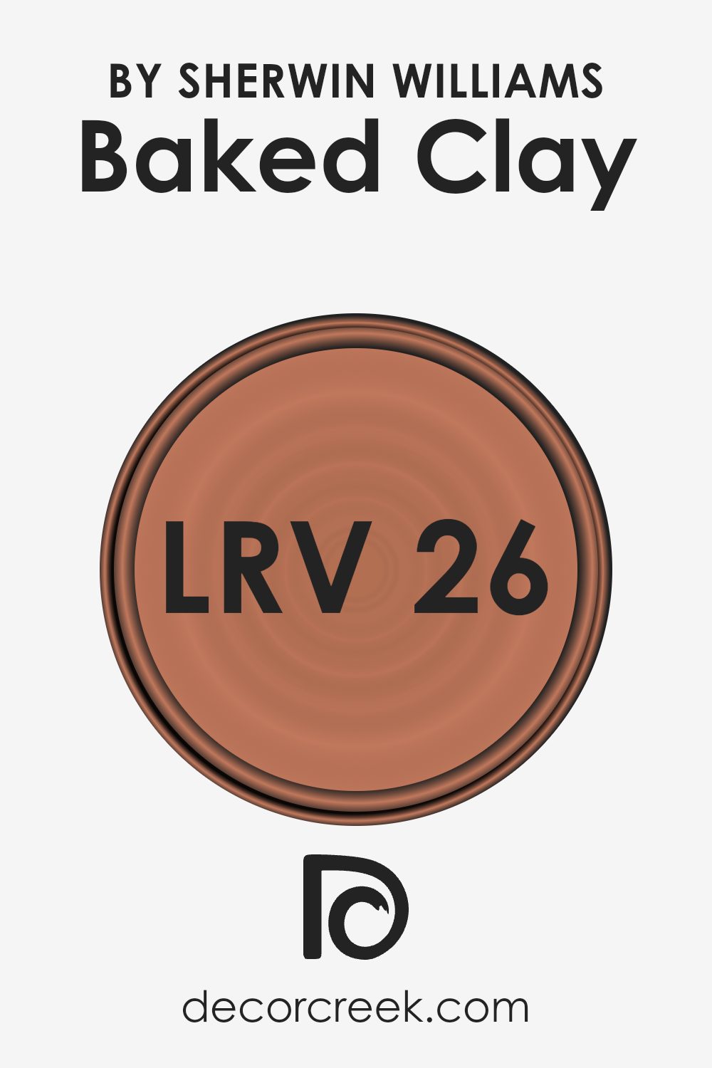
What is the LRV of Baked Clay SW 6340 by Sherwin Williams?
LRV stands for Light Reflectance Value, a measure used to describe the percentage of visible light a paint color reflects when it’s applied to a wall. It’s an important factor in choosing paint because it can influence how light or dark a room feels.
A higher LRV means the paint will reflect more light, making the space appear brighter and often larger. Conversely, a lower LRV means less light is reflected, which can make a room feel cozier but also smaller and darker.
The LRV for the color in question is 25.581, which is on the lower end of the scale. This means it doesn’t reflect much light and is a deeper shade. In practical terms, using this color on your walls can make a room feel more enclosed and intimate. It’s ideal for creating a warm, cozy atmosphere in spaces where you might want to relax, such as a bedroom or a living room.
Just remember that if the room is already lacking in natural light, this color might make it feel even darker.
Coordinating Colors of Baked Clay SW 6340 by Sherwin Williams
Coordinating colors work harmoniously with a particular base shade to enhance the overall aesthetic of a space. Baked Clay by Sherwin-Williams, for example, pairs well with a palette of coordinating colors that subtly complement its warm, earthy tone.
These coordinating hues are selected to create a balanced and visually appealing look, ensuring that the colors in a room feel cohesive.
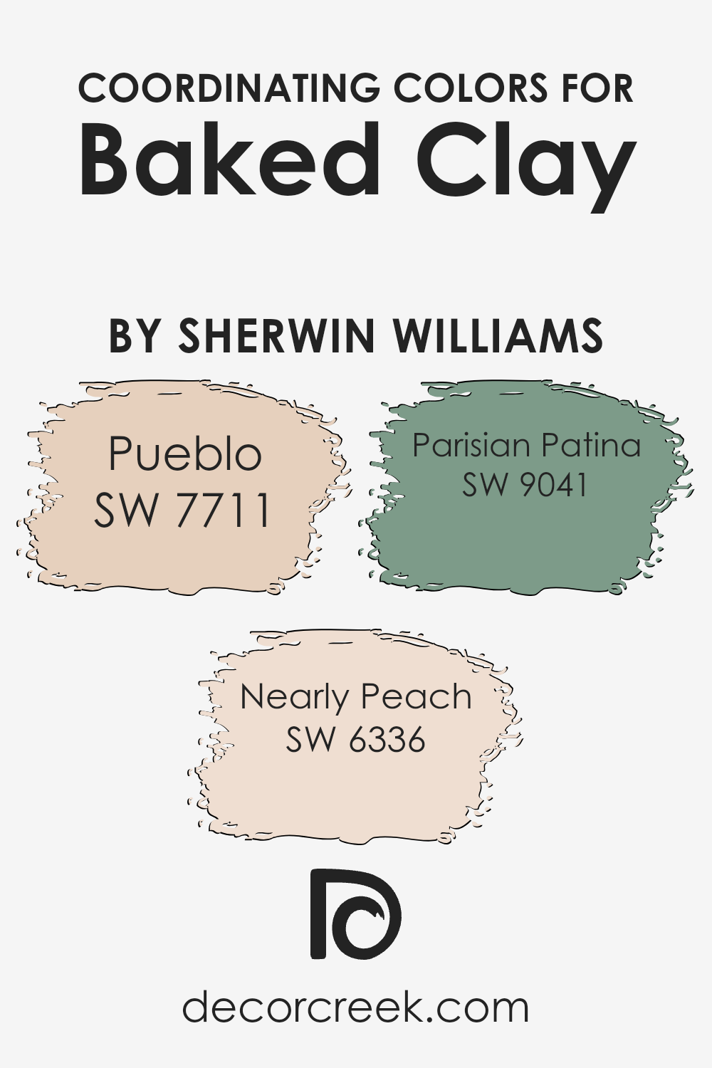
SW 7711 – Pueblo is a soft, muted beige that offers a gentle contrast to the more robust tone of Baked Clay. This color is perfect for those who want to maintain a calm and light atmosphere in their space while adding a touch of warmth. SW 6336 – Nearly Peach has a delicate, soft peach undertone that provides a subtle freshness and brightness, making it ideal for creating a soothing yet cheerful environment.
Lastly, SW 9041 – Parisian Patina is a deeper, greenish-blue hue that adds a hint of sophistication and depth, appealing to anyone looking to incorporate a more dramatic yet harmonious element into their décor. Together, these colors create a cohesive palette that enhances the beauty and warmth of Baked Clay.You can see recommended paint colors below:
- SW 7711 Pueblo (CHECK A SAMPLE)
- SW 6336 Nearly Peach (CHECK A SAMPLE)
- SW 9041 Parisian Patina (CHECK A SAMPLE)
What are the Trim colors of Baked Clay SW 6340 by Sherwin Williams?
Trim colors are used to accentuate and define the key features of a room, such as door frames, baseboards, and crown moldings. They can significantly impact the mood and style of a space by highlighting architectural details or adding contrast to the primary wall colors.
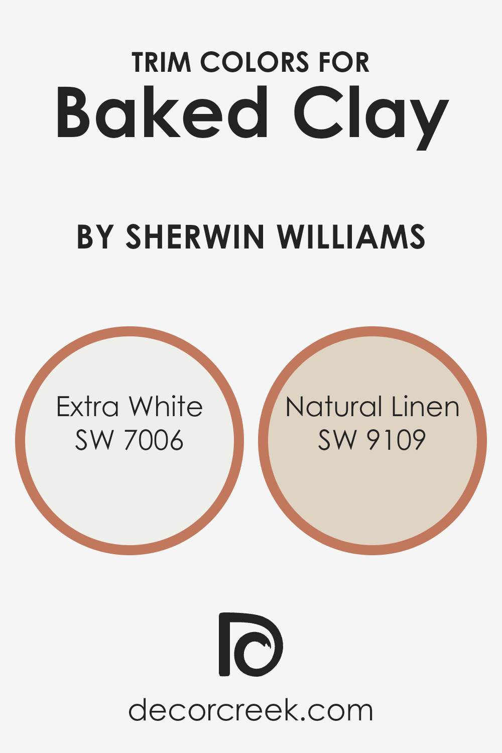
Choosing the right trim color can help frame Baked Clay, a warm and inviting hue, in such a way that it enhances the overall aesthetic. For Baked Clay by Sherwin Williams, trim colors like SW 7006 – Extra White and SW 9109 – Natural Linen work well because they complement the earthy tones without overwhelming them, providing a neat, polished look.
Extra White, as the name suggests, is a very clean and crisp white color. It’s perfect as a trim color for creating a sharp contrast that can make the warm tones of Baked Clay pop, adding a fresh and clean edge to the walls. Natural Linen, on the other hand, offers a softer approach with its warm, beige tone that harmonizes smoothly with Baked Clay.
It’s ideal for those who prefer a more subtle transition between the wall and the trim, enhancing the room’s cozy feel without creating too stark of a contrast.
You can see recommended paint colors below:
Colors Similar to Baked Clay SW 6340 by Sherwin Williams
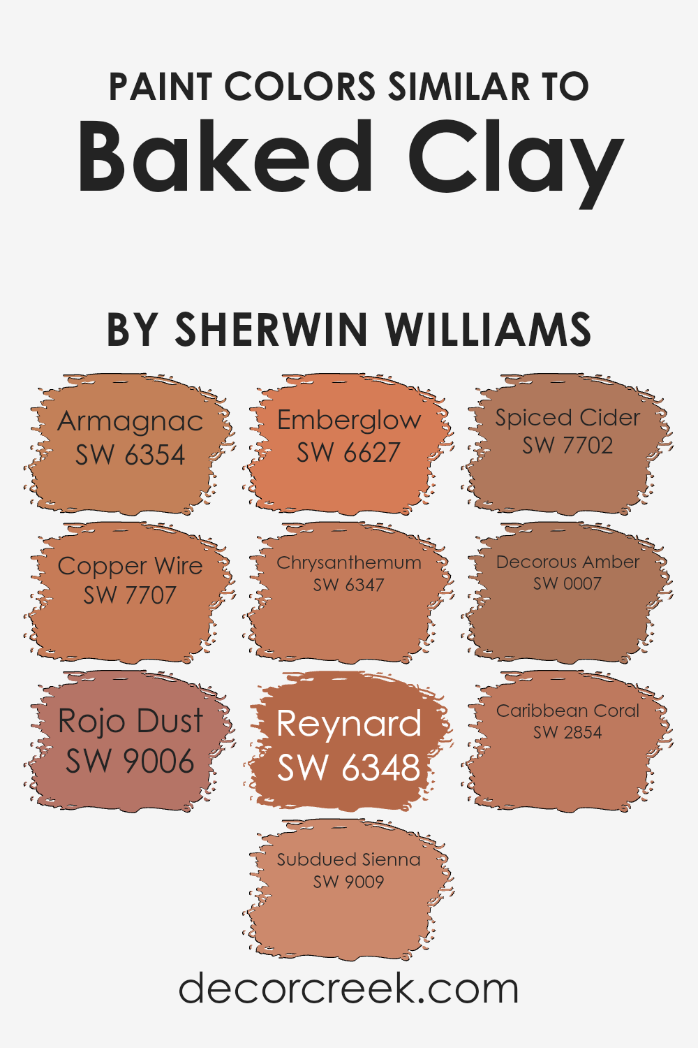
Understanding the importance of similar colors in design and architecture is crucial since they provide a seamless visual experience that is pleasing to the eye. Similar colors, like those around the hue of Baked Clay by Sherwin Williams, are very effective in creating a cohesive appearance in any space, enhancing the aesthetic appeal without overwhelming the senses. This color palette usually adds warmth and an inviting atmosphere, perfect for areas where comfort and welcome are key.
For example, Armagnac is a rich, deep terracotta that offers warmth and earthiness, while Copper Wire presents a slightly more intense, reddish-copper hue, adding a touch of traditional charm. Rojo Dust leans towards a softer, more muted terracotta, providing a subtle elegance.
Subdued Sienna, true to its name, is a toned-down sienna shade that brings a gentle warmth to settings. Emberglow is reminiscent of glowing embers, a vibrant color that can inject energy into a room. Chrysanthemum has a more floral and slightly brighter feel, adding a dash of cheerfulness.
Reynard is a bold, fox-like color that is strong but not overtly loud, capturing attention in a sophisticated way. Spiced Cider is a comforting apple-cinnamon type shade, rich and inviting for cozy spaces. Decorous Amber offers a dignified golden hue that enriches a room with its subdued brightness.
Lastly, Caribbean Coral is a playful, slightly tropical shade that brightens spaces while retaining an earthy base, making it versatile and engaging.
All these colors share a warmth and naturalness that can enhance any space they occupy, creating harmonious and welcoming environments.
You can see recommended paint colors below:
- SW 6354 Armagnac (CHECK A SAMPLE)
- SW 7707 Copper Wire (CHECK A SAMPLE)
- SW 9006 Rojo Dust (CHECK A SAMPLE)
- SW 9009 Subdued Sienna (CHECK A SAMPLE)
- SW 6627 Emberglow (CHECK A SAMPLE)
- SW 6347 Chrysanthemum (CHECK A SAMPLE)
- SW 6348 Reynard (CHECK A SAMPLE)
- SW 7702 Spiced Cider (CHECK A SAMPLE)
- SW 0007 Decorous Amber (CHECK A SAMPLE)
- SW 2854 Caribbean Coral
Colors that Go With Baked Clay SW 6340 by Sherwin Williams
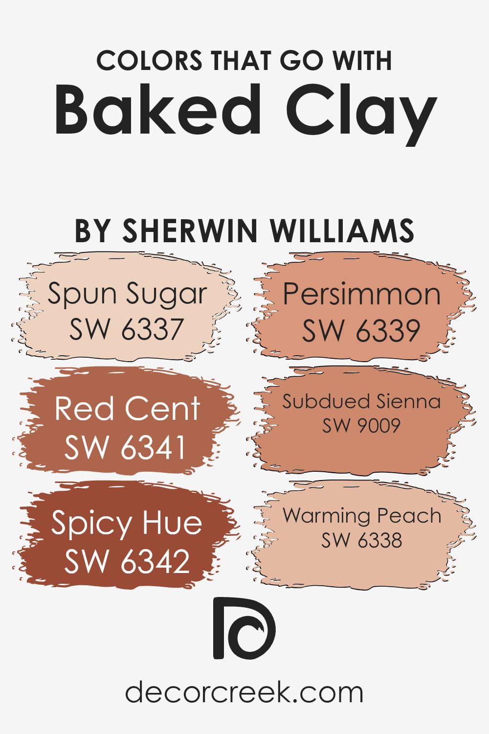
Choosing the right colors to complement Baked Clay SW 6340 by Sherwin Williams is crucial because it ensures that the space feels cohesive and well-designed. These coordinating colors can enhance the warmth of Baked Clay by creating a visually appealing palette that harmonizes within a room.
For instance, Spun Sugar SW 6337 is a subtle, soft beige that offers a gentle contrast to the deeper, earthy tones of Baked Clay, making the space feel airy and light. Red Cent SW 6341, on the other hand, is a rich, rusty red that mirrors some of the undertones in Baked Clay, reinforcing the warmth and adding depth to the overall look.
Further adding to the flexibility of Baked Clay are colors like Spicy Hue SW 6342, a vibrant orange with energy and warmth that can inject life into any space when paired with Baked Clay. Persimmon SW 6339, which is a bold, bright orange, offers a cheerful pop that can liven up neutral surroundings and works beautifully next to the soothing earthiness of Baked Clay.
Subdued Sienna SW 9009, a muted, dusty rose, provides a touch of softness and sophistication, making it perfect for creating a subtle, welcoming atmosphere. Lastly, Warming Peach SW 6338 is a gentle peach that lends a fresh, sunny vibe to the room, ensuring the space feels vibrant yet relaxed.
Together, these colors support one another, creating environments that are both appealing and comfortable.
You can see recommended paint colors below:
- SW 6337 Spun Sugar (CHECK A SAMPLE)
- SW 6341 Red Cent (CHECK A SAMPLE)
- SW 6342 Spicy Hue (CHECK A SAMPLE)
- SW 6339 Persimmon (CHECK A SAMPLE)
- SW 9009 Subdued Sienna (CHECK A SAMPLE)
- SW 6338 Warming Peach (CHECK A SAMPLE)
How to Use Baked Clay SW 6340 by Sherwin Williams In Your Home?
Baked Clay is a warm terra cotta color that adds a cozy touch to any room. If you’re looking to bring a sense of warmth and welcoming into your home, this shade is perfect. It pairs beautifully with natural elements like wood or stone, making it ideal for living rooms or kitchens where you spend a lot of time gathering with family and friends.
For a bold impact, consider painting an accent wall in Baked Clay to add depth and focus to your space. In a bedroom, mixing this color with soft creams and greens can create a harmonious and relaxing environment, perfect for winding down. Additionally, Baked Clay works well in exterior settings, enhancing curb appeal when used for front doors or shutters.
This versatile color can also blend with various decor styles, from rustic to modern, depending on the furnishings and accessories you choose.
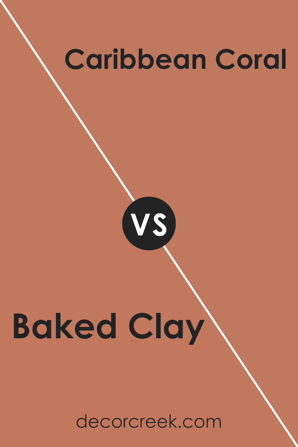
Baked Clay SW 6340 by Sherwin Williams vs Caribbean Coral SW 2854 by Sherwin Williams
Baked Clay by Sherwin Williams is a warm, earthy color with a deep reddish-brown hue that evokes a sense of coziness and comfort. It’s perfect for creating a welcoming atmosphere in living spaces or any area where you want to add a touch of warmth.
On the other hand, Caribbean Coral, also by Sherwin Williams, is a vibrant, lively coral shade that has a fresh and energetic quality. This color is ideal for spaces where you want to introduce brightness and a playful mood. While Baked Clay offers a more muted and cozy ambiance, Caribbean Coral brings an energetic burst of color, making each suitable for different decorating intents.
Baked Clay works well in traditional or rustic settings, whereas Caribbean Coral fits beautifully in more casual, youthful, or beach-themed environments.
You can see recommended paint color below:
- SW 2854 Caribbean Coral
Baked Clay SW 6340 by Sherwin Williams vs Chrysanthemum SW 6347 by Sherwin Williams
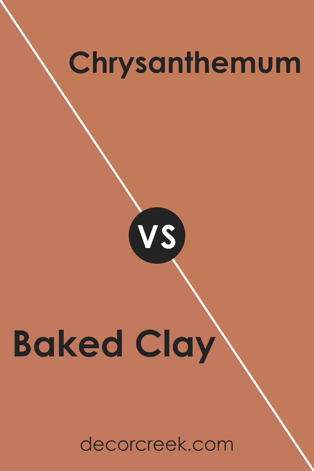
Baked Clay and Chrysanthemum are two distinct colors offered by Sherwin Williams. Baked Clay embodies a rich, warm terra cotta hue that reminds one of a sun-drenched earthen pot. It’s a cozy color, perfect for creating a welcoming and homey atmosphere in spaces like living rooms or dining areas.
On the other hand, Chrysanthemum takes a lighter approach. This color features a soft golden yellow with a subtle, creamy finish, giving it a gentle and cheerful vibe. It works wonderfully in spaces intended to feel light and airy, such as kitchens or sunrooms.
When comparing the two, Baked Clay provides depth and warmth, making a bold statement, whereas Chrysanthemum offers a lighter, uplifting touch, enhancing spaces with its brightness. Both colors can dramatically affect the mood and style of a room, depending on what feeling you want to achieve.
You can see recommended paint color below:
- SW 6347 Chrysanthemum (CHECK A SAMPLE)
Baked Clay SW 6340 by Sherwin Williams vs Rojo Dust SW 9006 by Sherwin Williams
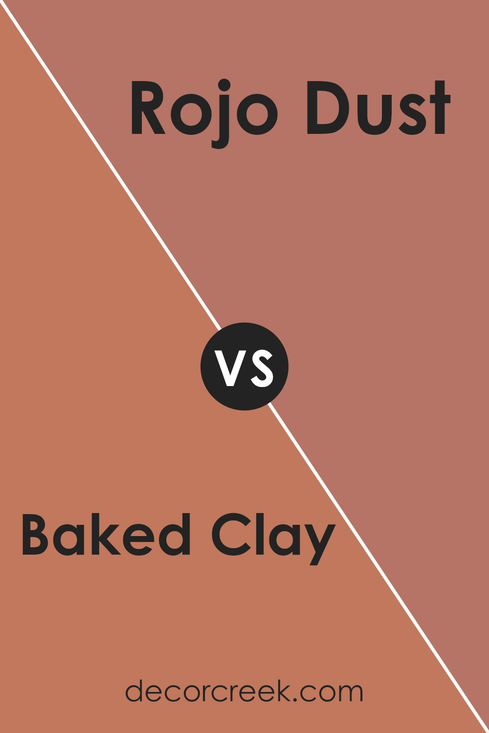
**Baked Clay** is a warm, earthy color that brings to mind the rich hues of autumn. It’s a strong shade with a comforting presence, perfect for creating cozy spaces in homes. This color works well in living rooms or dining areas where you want to add warmth and a welcoming feel.
**Rojo Dust**, on the other hand, is a softer, more subdued shade. It leans more towards a dusty rose color, offering a gentle touch of warmth without overpowering a space. It’s an excellent choice for bedrooms or bathrooms where you want a hint of color that’s easy on the eyes.
Both colors carry warm undertones, but Baked Clay is bolder and deeper, while Rojo Dust is lighter with a more muted approach. Depending on the mood you want to create in a room, Baked Clay adds vibrancy, whereas Rojo Dust is more subtle and calming. Each offers a unique vibe that can significantly affect the feel and aesthetic of a space.
You can see recommended paint color below:
- SW 9006 Rojo Dust (CHECK A SAMPLE)
Baked Clay SW 6340 by Sherwin Williams vs Copper Wire SW 7707 by Sherwin Williams
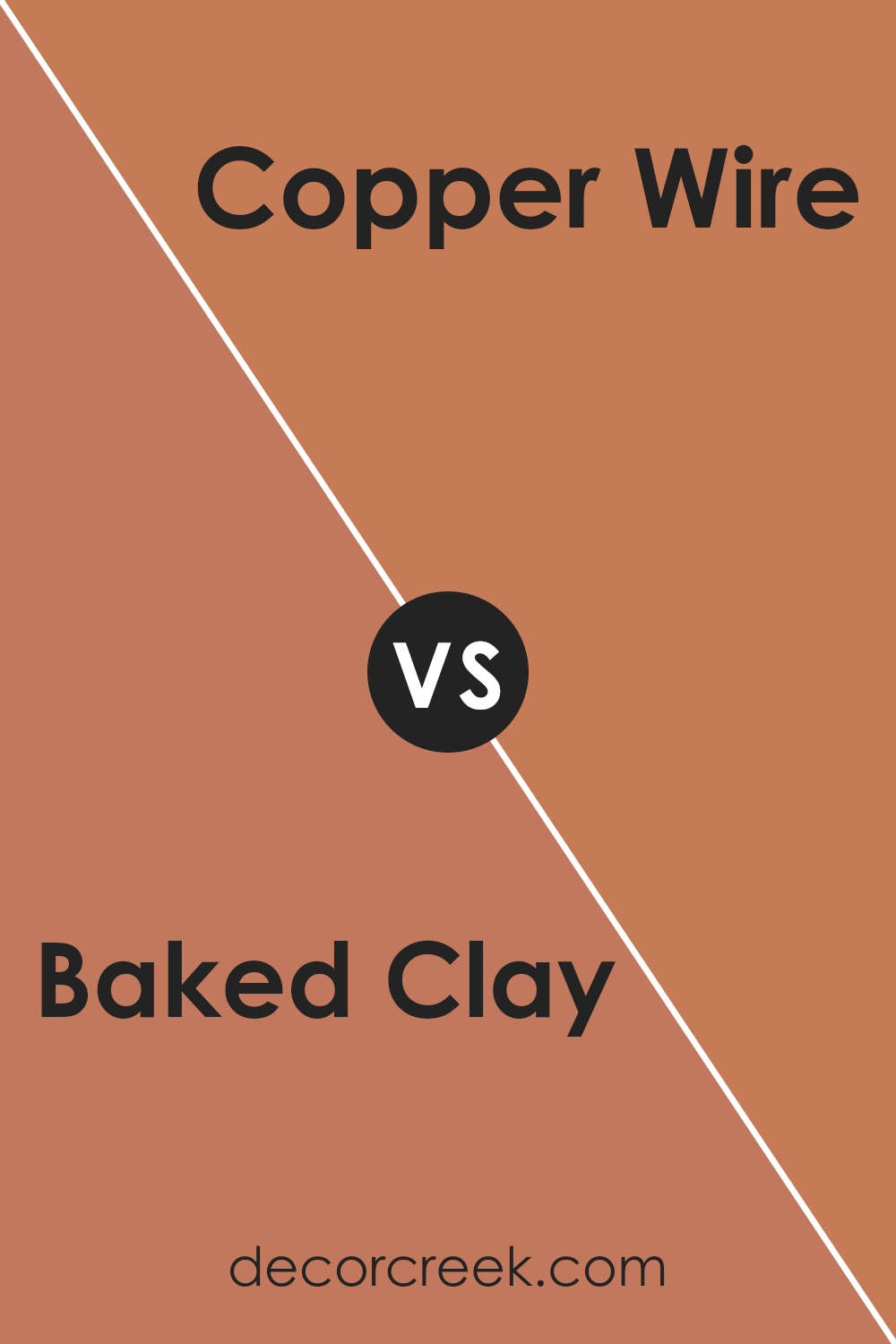
Baked Clay and Copper Wire are two distinct colors from Sherwin Williams. Baked Clay has a deep, warm terracotta tone that resembles the color of natural clay that has been fired in a kiln. This color is cozy and welcoming, making it a great choice for spaces where you want to add a bit of warmth and comfort, like living rooms or dining areas.
On the other hand, Copper Wire is a richer, more vibrant shade. It mimics the reddish-brown color of polished copper and brings a lively and energetic feel to any space. This makes it perfect for accent walls or decorative elements where you want to draw attention and add a pop of color.
Both colors share a warm base, but Baked Clay leans towards a muted, earthy feel, while Copper Wire offers a more striking and bold look. Choosing between them depends on the mood you want to set in your room and how bold you want to go with your color choices.
You can see recommended paint color below:
Baked Clay SW 6340 by Sherwin Williams vs Spiced Cider SW 7702 by Sherwin Williams
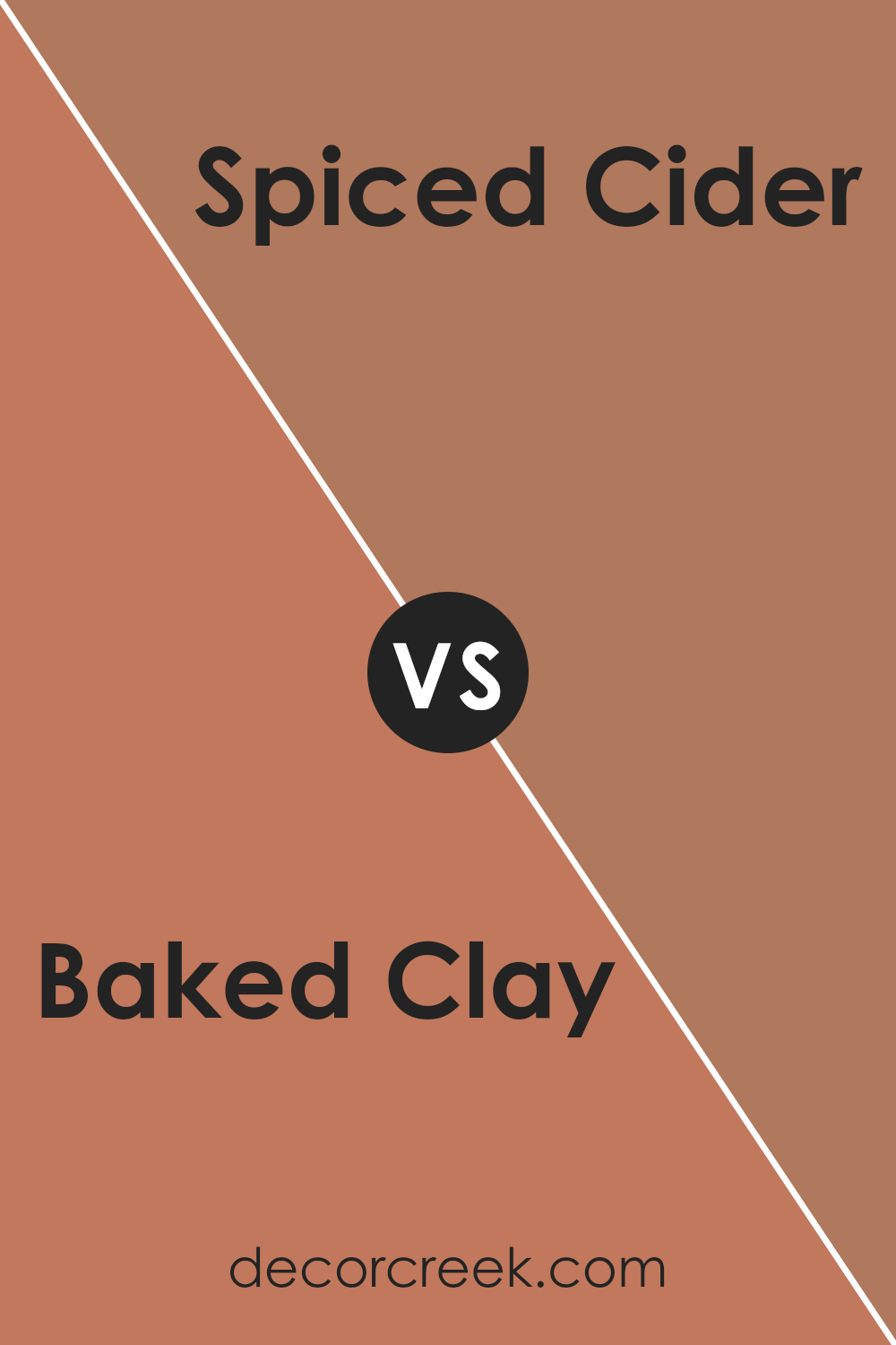
Baked Clay and Spiced Cider are two warm, inviting colors by Sherwin Williams that bring cozy vibes to any room. Baked Clay is a deep, earthy tone that resembles the color of terracotta. It has a rich red-brown hue that makes spaces feel grounded and welcoming.
It’s perfect for creating a rustic look. On the other hand, Spiced Cider is a bit lighter, leaning towards a caramel brown. This color has hints of cinnamon and is great for adding a touch of warmth without overwhelming a space.
It pairs well with other warm tones and works beautifully in areas where you want a softer, cozy feel. While both colors share a warmth, Baked Clay offers a more intense and earthy feel, whereas Spiced Cider provides a gentler, soothing warmth.
You can see recommended paint color below:
- SW 7702 Spiced Cider (CHECK A SAMPLE)
Baked Clay SW 6340 by Sherwin Williams vs Reynard SW 6348 by Sherwin Williams
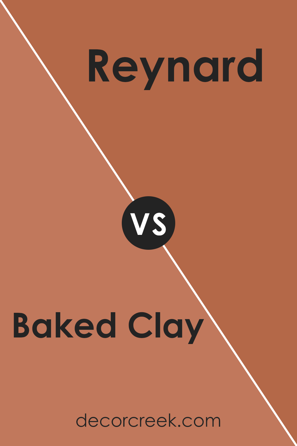
The main color, Baked Clay, is a warm, earthy tone with a strong red base that gives it a cozy and welcoming feel. It’s like the color of terracotta pots, which makes it ideal for spaces where you want a touch of natural warmth.
In contrast, Reynard is also a warm hue, but it leans more towards a deep, reddish-brown, similar to the fur of a fox. This color is rich and can create a sense of depth in a room, perfect for an accent wall or to add some drama.
Both colors, being in the red family, convey warmth but Reynard is darker and more intense, making it more striking, whereas Baked Clay is lighter and softer, which can be more versatile in different settings. Together, they can complement each other well in a space that aims for a rustic or warm atmosphere.
You can see recommended paint color below:
- SW 6348 Reynard (CHECK A SAMPLE)
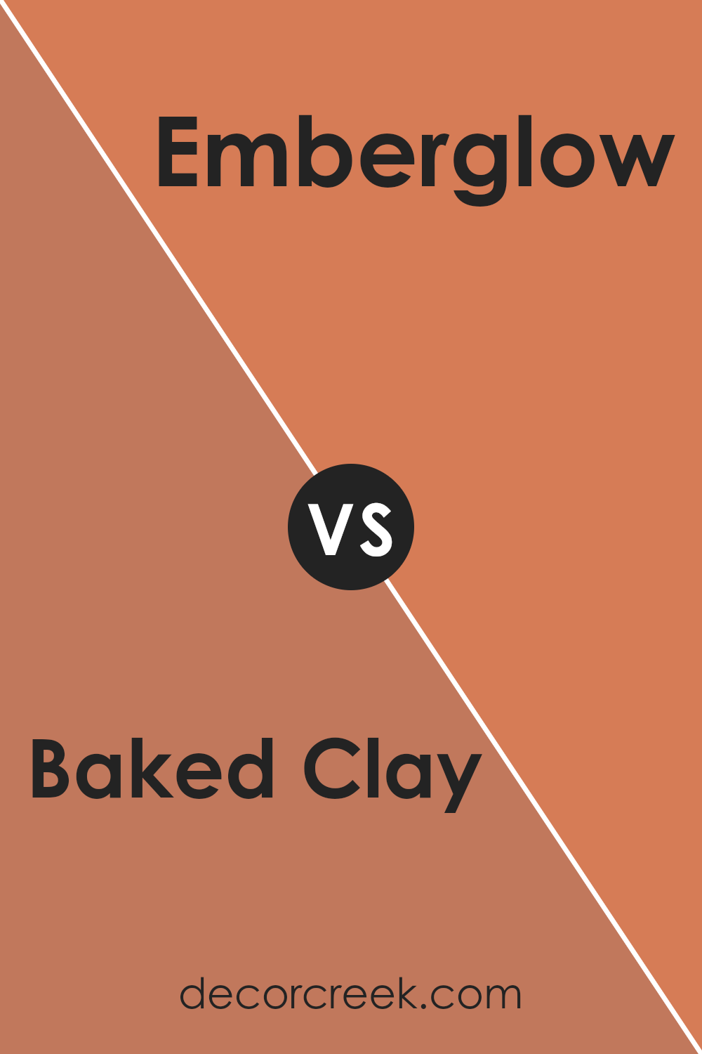
Baked Clay SW 6340 by Sherwin Williams vs Emberglow SW 6627 by Sherwin Williams
The main color, Baked Clay, offers a warm and earthy tone with a muted, almost dusty quality. It’s a versatile color that brings a cozy, welcoming feel to any space and pairs well with natural materials like wood or stone.
On the other hand, Emberglow is a more vibrant option, with a bolder, orangish-red hue that packs a punch. This color is great for making a statement in a room or adding a pop of color to lift the spirits of the space.
Both colors share a warmth that can make a house feel more like a home, but Baked Clay is subtler and more subdued, while Emberglow stands out more and can generate energy in a room.
Depending on your decor goals, Baked Clay could be used for a soft, grounded look, whereas Emberglow could be the go-to for a dynamic and lively atmosphere.
You can see recommended paint color below:
- SW 6627 Emberglow (CHECK A SAMPLE)
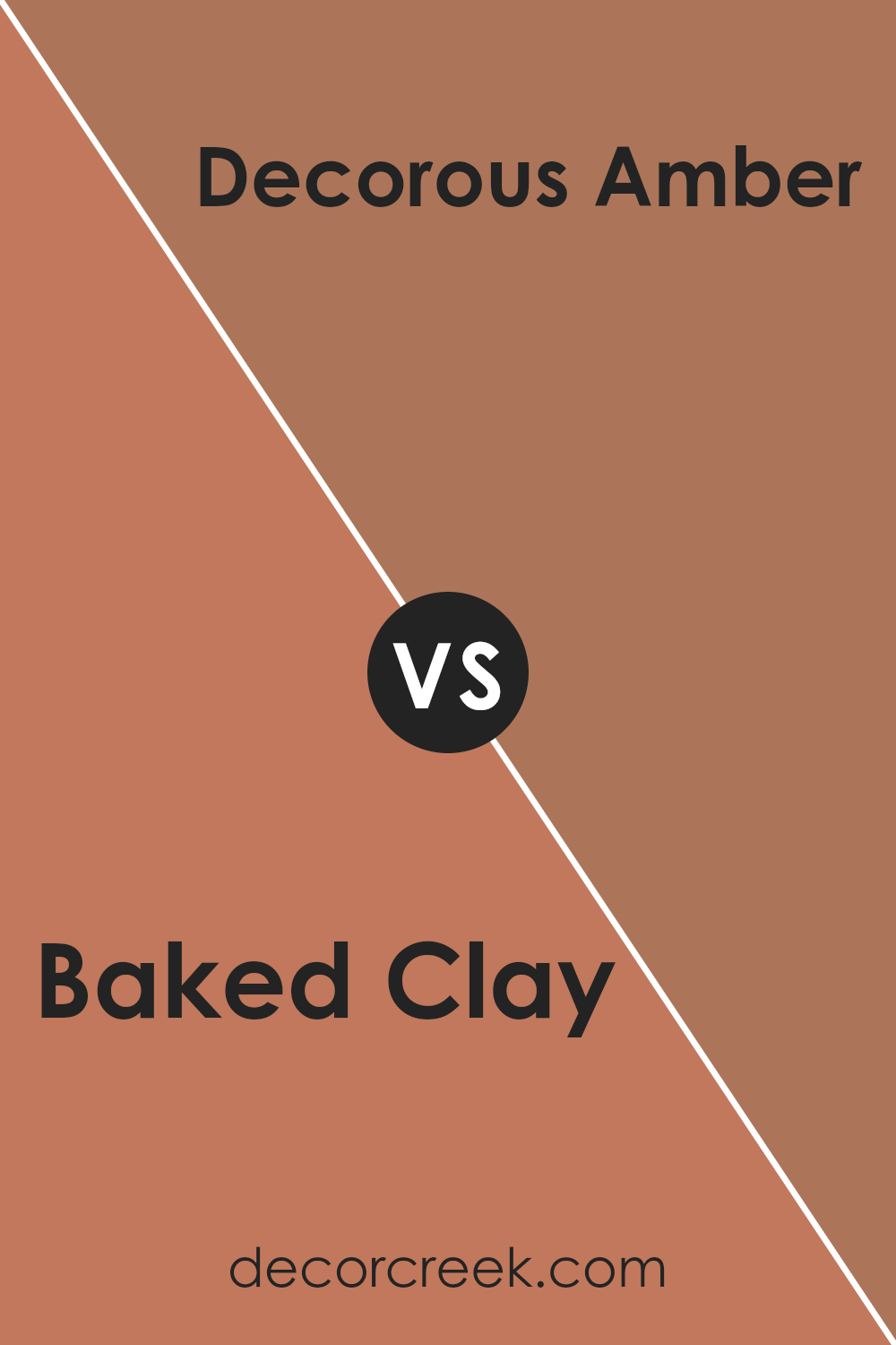
Baked Clay SW 6340 by Sherwin Williams vs Decorous Amber SW 0007 by Sherwin Williams
Baked Clay and Decorous Amber are two warm paint colors from Sherwin Williams that can add a cozy touch to any room. Baked Clay is a rich, earthy red with hints of terracotta, creating a warm and inviting atmosphere. It’s a strong color that makes a statement and works well in spaces where you want to add character and warmth.
On the other hand, Decorous Amber is a lighter, softer orange with golden undertones. It offers a warm glow that is less intense than Baked Clay, making it perfect for creating a gentle and welcoming environment. This shade pairs nicely with other soft tones and can brighten up a space while still keeping things relaxed.
Both colors are great options for those who like warm hues, but the choice between them depends on the mood you want to set. Baked Clay is bolder and more vibrant, while Decorous Amber is subtler and more subdued.
You can see recommended paint color below:
- SW 0007 Decorous Amber (CHECK A SAMPLE)
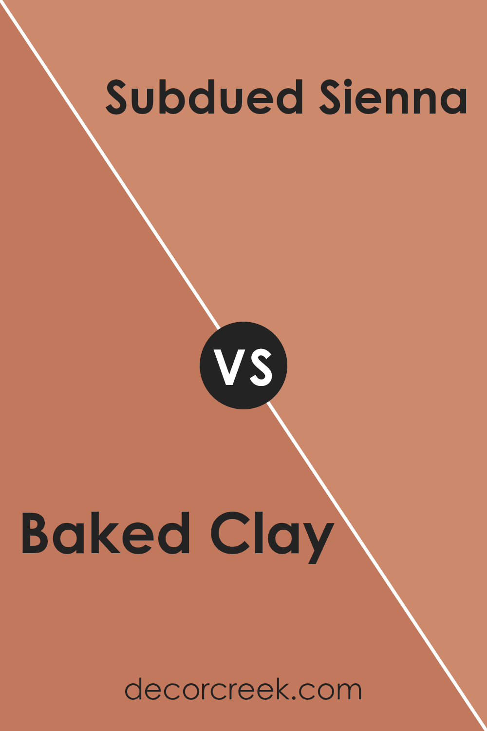
Baked Clay SW 6340 by Sherwin Williams vs Subdued Sienna SW 9009 by Sherwin Williams
The main color, Baked Clay, and the second color, Subdued Sienna, both offer warm, earthy tones, but there are notable differences between them. Baked Clay has a rich, reddish-brown hue that resembles the color of terracotta. It has a vibrant feel that can add a welcoming touch to any space. It’s great for rooms where you want a cozy, inviting atmosphere.
On the other hand, Subdued Sienna is a softer, more muted color. It leans more towards a brownish-pink, offering a subtle hint of warmth without being too bold. This color is excellent for creating a gentle and calming environment.
Both colors pair well with natural materials and can work beautifully in spaces that get a lot of natural light. While Baked Clay stands out more and can dominate a room, Subdued Sienna is better for those looking for a softer background color. Choosing between them depends on whether you prefer a stronger presence or a more understated look.
You can see recommended paint color below:
- SW 9009 Subdued Sienna (CHECK A SAMPLE)
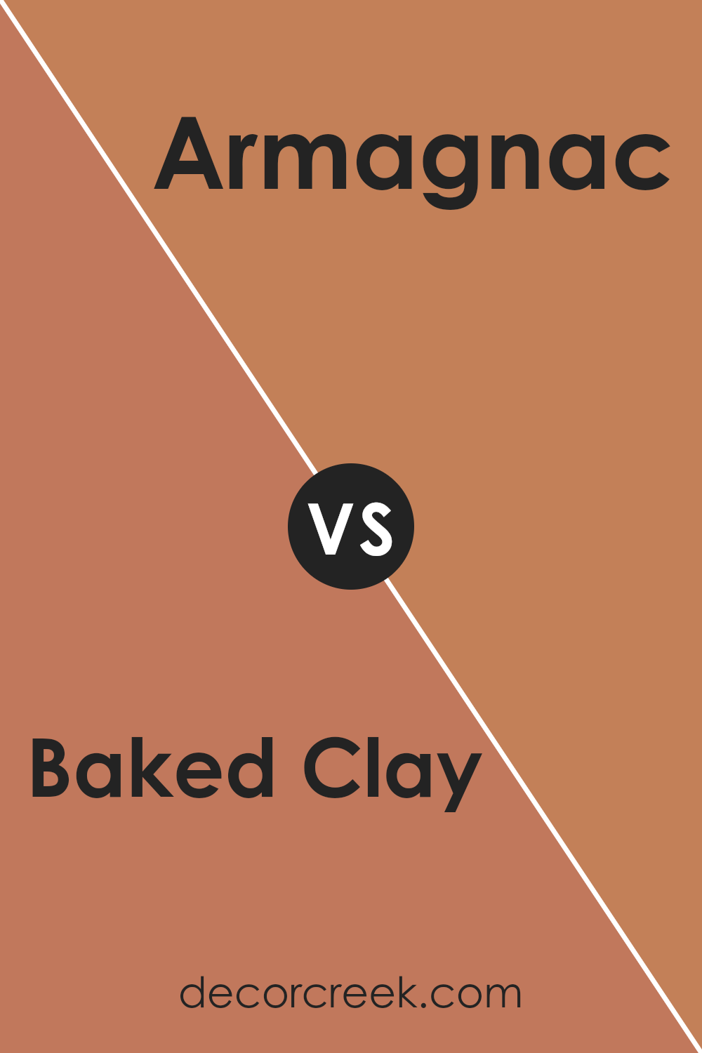
Baked Clay SW 6340 by Sherwin Williams vs Armagnac SW 6354 by Sherwin Williams
Baked Clay and Armagnac are both warm, inviting colors but each brings its own unique appeal to a space. Baked Clay has a terracotta hue that feels earthy and rich. It’s perfect for creating a cozy, welcoming atmosphere in a room. This color works well in living areas and kitchens where you want a sense of warmth and comfort.
On the other hand, Armagnac is a deeper, more intense color, reminiscent of a rich, dark amber or the deep hues found in aged brandy. This color adds a touch of drama and depth, making it a great choice for accent walls or in dining areas where a more formal yet warm environment is desired.
Both colors pair well with natural materials like wood or stone, and can be complemented by creams and deep greens for a balanced look. Whether you choose the earthiness of Baked Clay or the boldness of Armagnac, each color offers a unique way to warm up your space.
You can see recommended paint color below:
- SW 6354 Armagnac (CHECK A SAMPLE)
Conclusion
SW 6340 Baked Clay by Sherwin Williams is a warm, inviting color that really makes any room feel cozy and welcoming. It reminds me of autumn leaves and has a rustic charm that can work well in both modern and traditional spaces. Whether I’m painting a bedroom or adding a splash of color to the living room, Baked Clay brings a sense of calm and comfort.
I’ve found that this color pairs beautifully with natural materials like wood or stone, enhancing their natural beauty. It’s also versatile enough to use in different parts of the house, from the kitchen to the hallway. Plus, it goes really well with both light and dark furniture, which makes it easy to use no matter what my home looks like.
After trying out Baked Clay in my own home, I am really pleased with how it has turned out. It creates a warm, inviting atmosphere that makes me and my guests feel right at home. From a practical standpoint, it covers well and lasts a long time, which means I won’t have to repaint anytime soon. I’m glad I chose Baked Clay for my walls, and I think anyone looking for a warm, neutral color would love it too!
Ever wished paint sampling was as easy as sticking a sticker? Guess what? Now it is! Discover Samplize's unique Peel & Stick samples.
Get paint samples


