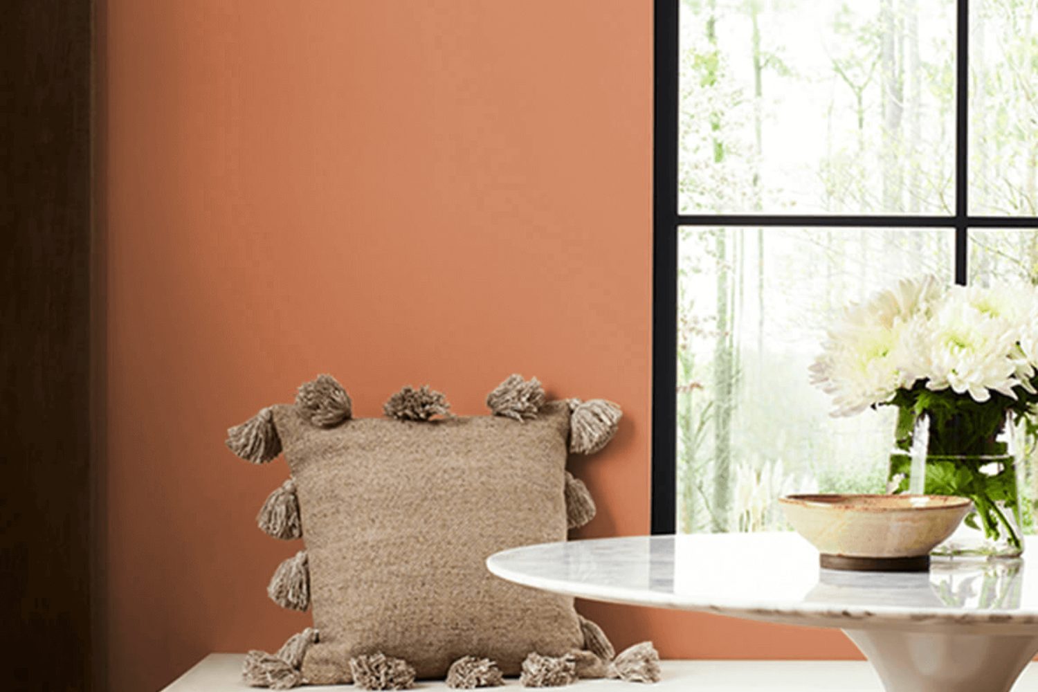
Introducing the color SW 7707 Copper Wire by Sherwin Williams, a unique and versatile shade that holds the power to transform any space. This color, which draws its essence from the rich and warm tones of a freshly minted copper penny, boasts an inviting quality that can make rooms feel more cozy and welcoming. Perfect for anyone looking to add a touch of warmth to their interior or exterior design, Copper Wire effortlessly combines modern sophistication with traditional comfort.
This intriguing hue works well in a variety of settings, from the kitchen to the living room, and even on the exterior of homes for those looking to make a statement. Whether you’re aiming for a rustic vibe or a sleek, contemporary look, Copper Wire adapts to your vision, providing a beautiful backdrop for furniture, art, and decor of all styles. Its versatility also extends to lighting, where it can create a glowing effect in well-lit spaces or add a soothing warmth in dimmer, cozier corners.
For decorators and homeowners exploring color options, SW 7707 Copper Wire offers a blend of familiarity and innovation, making it a standout choice that’s both timeless and trendy. If you’re considering this color for your next project, you’ll find it opens up a world of design possibilities, all while maintaining a sense of comfort and style that’s unmatched.
What Color Is Copper Wire SW 7707 by Sherwin Williams?
Copper Wire by Sherwin Williams is a warm, inviting shade that reminds one of the cozy glow of a softly lit room. Its rich, earthy tones blend the rustic charm of natural copper with a dash of modern sophistication. This versatile color has a welcoming vibe, making it perfect for spaces where you want to create a comfortable, yet stylish atmosphere.
This shade works wonders in various interior styles, particularly those that lean towards rustic, industrial, or bohemian themes. Its warmth makes it a natural match for spaces aiming for a cozy, homey feel. In modern and contemporary settings, Copper Wire adds a touch of warmth without overpowering the clean lines and minimalistic aesthetics.
When it comes to materials, Copper Wire pairs beautifully with natural wood, adding to that sense of warmth and comfort. It also goes well with metallic finishes, particularly brass and matte black, offering a stunning contrast that can bring a room to life. Textures like leather and wool complement its earthy vibe, making spaces feel more inviting.
In terms of use, it’s great for accent walls, cabinets, or as a bold choice for kitchen islands. Combined with soft lighting, textiles in neutral hues, and perhaps some greenery, it can transform any room into a cozy retreat. This shade is not just a color – it’s a statement of warmth and style.
Is Copper Wire SW 7707 by Sherwin Williams Warm or Cool color?
Copper Wire by Sherwin Williams is a unique and warm paint color that brings a cozy, inviting atmosphere to any home. Its rich tones resemble the rustic charm of weathered copper, making it perfect for creating a statement wall or adding depth to a room. This color works wonderfully in spaces where natural light can enhance its vibrancy, such as living rooms or kitchens. It pairs beautifully with neutral shades, like soft whites or light greys, allowing it to stand out without overwhelming the space.
Additionally, its versatility means it can be matched with various textures and materials, from wooden furniture to metal accents, lending a modern yet timeless feel to your home. Copper Wire can also help in setting a relaxed mood, making it ideal for bedrooms or reading nooks. Overall, this color adds a touch of warmth and sophistication, effortlessly transforming the appearance and feel of any room.
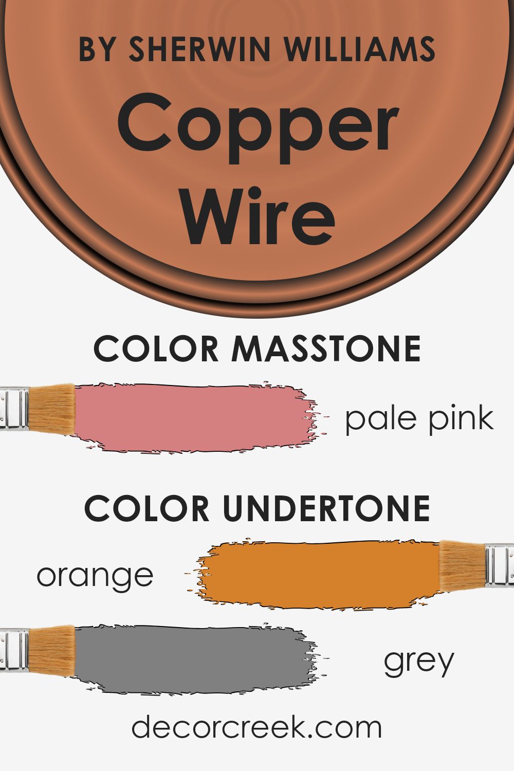
Undertones of Copper Wire SW 7707 by Sherwin Williams
Copper Wire SW 7707 by Sherwin Williams is a sophisticated color that offers more than just its initial appearance. While its masstone—a pale pink hue—is what first catches the eye, the true character of this color lies in its undertones.
Orange Undertone
The presence of an orange undertone adds a warm, inviting quality to Copper Wire. This undertone can bring a sense of coziness to a room, making it an excellent choice for spaces where you want to evoke warmth and comfort, like living rooms or bedrooms. The orange undertone can also enhance the color’s vibrancy under natural light, making it a dynamic choice depending on the room’s exposure.
Grey Undertone
Balancing out the warmth of the orange, the grey undertone introduces a subtle coolness to Copper Wire. This undertone helps neutralize the color, preventing it from becoming overly warm or intense. The grey undertone also contributes to the versatility of Copper Wire, allowing it to work well in both modern and traditional settings. It provides a grounding effect, making the color suitable for spaces where you want a calm and subdued atmosphere, such as home offices or bathrooms.
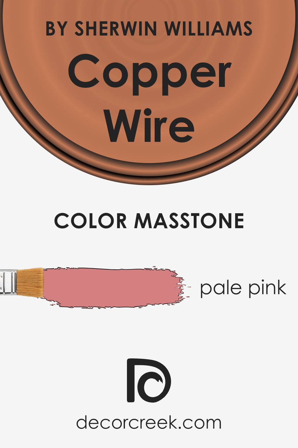
What is the Masstone of the Copper Wire SW 7707 by Sherwin Williams?
Copper Wire SW 7707 by Sherwin Williams has a masstone that presents as Pale Pink (#D58080). This unique shade brings a warm and welcoming vibe into homes, making rooms feel cozy and inviting. The pale pink hue is soft and subtle, allowing it to blend seamlessly with a variety of decor styles, from modern to traditional. It works exceptionally well in spaces aiming for a gentle, nurturing atmosphere, such as bedrooms or living areas.
Furthermore, this color has a versatility that supports creativity in home decoration. It pairs beautifully with neutral tones, adding a pop of warmth without overwhelming the space. Meanwhile, against darker colors, it stands out, bringing a light and airy feel that can help brighten darker rooms or accentuate spaces with limited natural light. Overall, the pale pink masstone of Copper Wire SW 7707 offers a fresh and modern approach to adding color to homes, creating spaces that are both beautiful and comforting.
How Does Lighting Affect Copper Wire SW 7707 by Sherwin Williams?
Lighting plays a crucial role in how we perceive colors in our spaces. Different light sources can enhance or dull the appearance of paint colors, affecting the mood and atmosphere of a room. Let’s explore how the color Copper Wire by Sherwin Williams reacts under various lighting conditions and in rooms with different orientations.
In artificial light, the warmth of Copper Wire can become more prominent or subdued, depending on the type of bulb used. LED or incandescent lighting, which typically casts a warmer glow, tends to amplify the cozy, warm undertones of Copper Wire, making it appear richer and more vibrant. In contrast, fluorescent lighting often emits a cooler tone that can slightly mute the warm qualities of this color, giving it a more neutral appearance.
Natural light, with its changing intensity throughout the day, can also dramatically affect how Copper Wire looks. In a north-facing room, which receives cooler, more diffused light, this color may appear slightly muted, yet it retains its warmth, adding a subtle cozy glow to the space. South-facing rooms, blessed with abundant natural light throughout the day, can make Copper Wire glow warmly, enhancing its vibrant, inviting nature.
East-facing rooms enjoy bright morning light, which can make Copper Wire look particularly lively and bright in the mornings, gradually transitioning to a more subdued, warm tone as the day progresses and the light dims. Conversely, in west-facing rooms, this color may start off more muted in the morning but become exceptionally vibrant and warm in the evening light.
Regardless of the room orientation, Copper Wire’s unique character adapts to the lighting, offering versatility and warmth to any space. Understanding these nuances can help in choosing the right room to paint this inviting, warm hue, ensuring that it’s displayed to its best advantage under various lighting conditions.

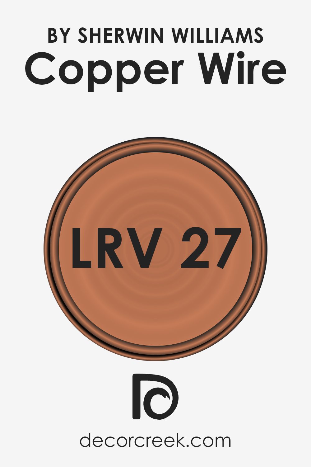
What is the LRV of Copper Wire SW 7707 by Sherwin Williams?
LRV stands for Light Reflectance Value, which is a measure indicating how much light a paint color reflects or absorbs when it’s applied to a wall. This scale ranges from 0 to 100, with 0 being pure black (absorbs all light) and 100 being pure white (reflects all light). The LRV of a color can greatly influence how light or dark a room feels. A high LRV means that the color reflects more light, making the room feel brighter and larger. On the other hand, a low LRV indicates that the color absorbs more light, which can make a space feel cozier or smaller, depending on the room’s natural light.
Given that the LRV of Copper Wire is 26.915, it falls into the darker end of the spectrum. This means it absorbs more light than it reflects, which can significantly impact how it looks on your walls. In spaces with limited natural light, this color might make the room feel more intimate and enclosed. However, if used in a well-lit area or combined with adequate artificial lighting, it can add a warm and inviting atmosphere without making the space feel too cramped. Making wise use of lighting and decor can balance the absorption effect, maximizing the rich and warm qualities of the color without overshadowing the room’s features.
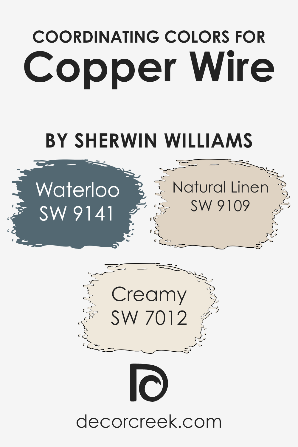
Coordinating Colors of Copper Wire SW 7707 by Sherwin Williams
Coordinating colors are shades that complement the main color, in this case, Copper Wire by Sherwin Williams, creating a harmonious color scheme in a room or design. They work by balancing the primary hue, enhancing its appeal, and adding depth or contrast to the overall look. Three colors that coordinate well with Copper Wire are Waterloo, Creamy, and Natural Linen by Sherwin Williams. These colors are chosen to either accentuate the warmth and richness of Copper Wire or to offer a soft backdrop that allows Copper Wire to stand out as a focal point.
Waterloo is a subdued, deep hue that brings a sense of sophistication and depth when paired with the rustic charm of Copper Wire. Its cool undertone makes it a perfect complement, adding a touch of elegance without overpowering the space.
On the other hand, Creamy is a soft, warm white that offers a smooth transition from the boldness of Copper Wire, ensuring the space feels airy and light. This shade is ideal for creating a serene and inviting atmosphere. Lastly, Natural Linen is a warm, neutral beige that echoes the earthy tones of Copper Wire, providing a subtle contrast and enriching the palette with its natural, understated elegance. Together, these coordinating colors work seamlessly to enhance the beauty and warmth of Copper Wire, offering various options for creating a cohesive and visually appealing space.
You can see recommended paint colors below:
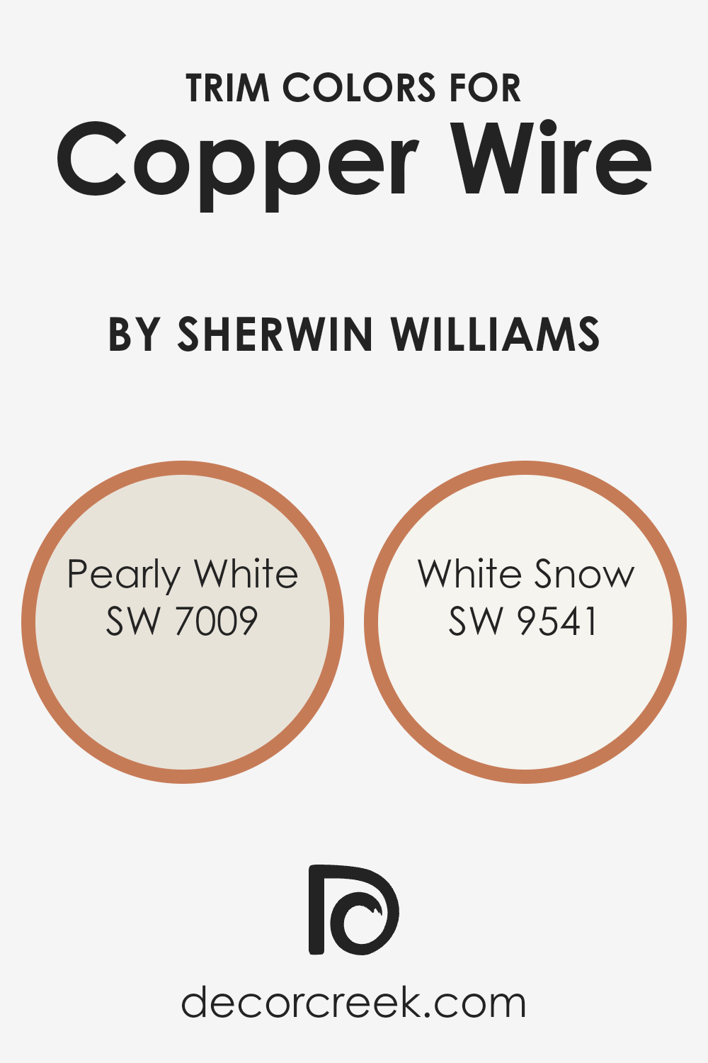
What are the Trim colors of Copper Wire SW 7707 by Sherwin Williams?
Trim colors, like the ones chosen to complement Copper Wire by Sherwin Williams, play a crucial role in defining the essence and character of a room. By selecting shades such as Pearly White (SW 7009) and White Snow (SW 9541) as trim colors, one can subtly highlight the warm, inviting orange tones of Copper Wire, providing a crisp, clean boundary that enhances the overall aesthetic. These trim colors not only frame the space but also introduce a level of sophistication and brightness, making them an important aspect of the design.
Pearly White is a soft, muted white with a gentle hint of warmth, making it a seamless match for the cozy hue of Copper Wire, creating a soothing transition between the wall color and the trim. White Snow, on the other hand, offers a stark, fresh contrast to Copper Wire, with its pure, bright tone it brings a vibrant lift to the space, energizing the surroundings without overwhelming the rich depth of Copper Wire. Together, these trim colors enrich the environment, highlighting architectural details and enhancing the room’s overall balance and harmony.
You can see recommended paint colors below:
- SW 7009 Pearly White
- SW 9541 White Snow
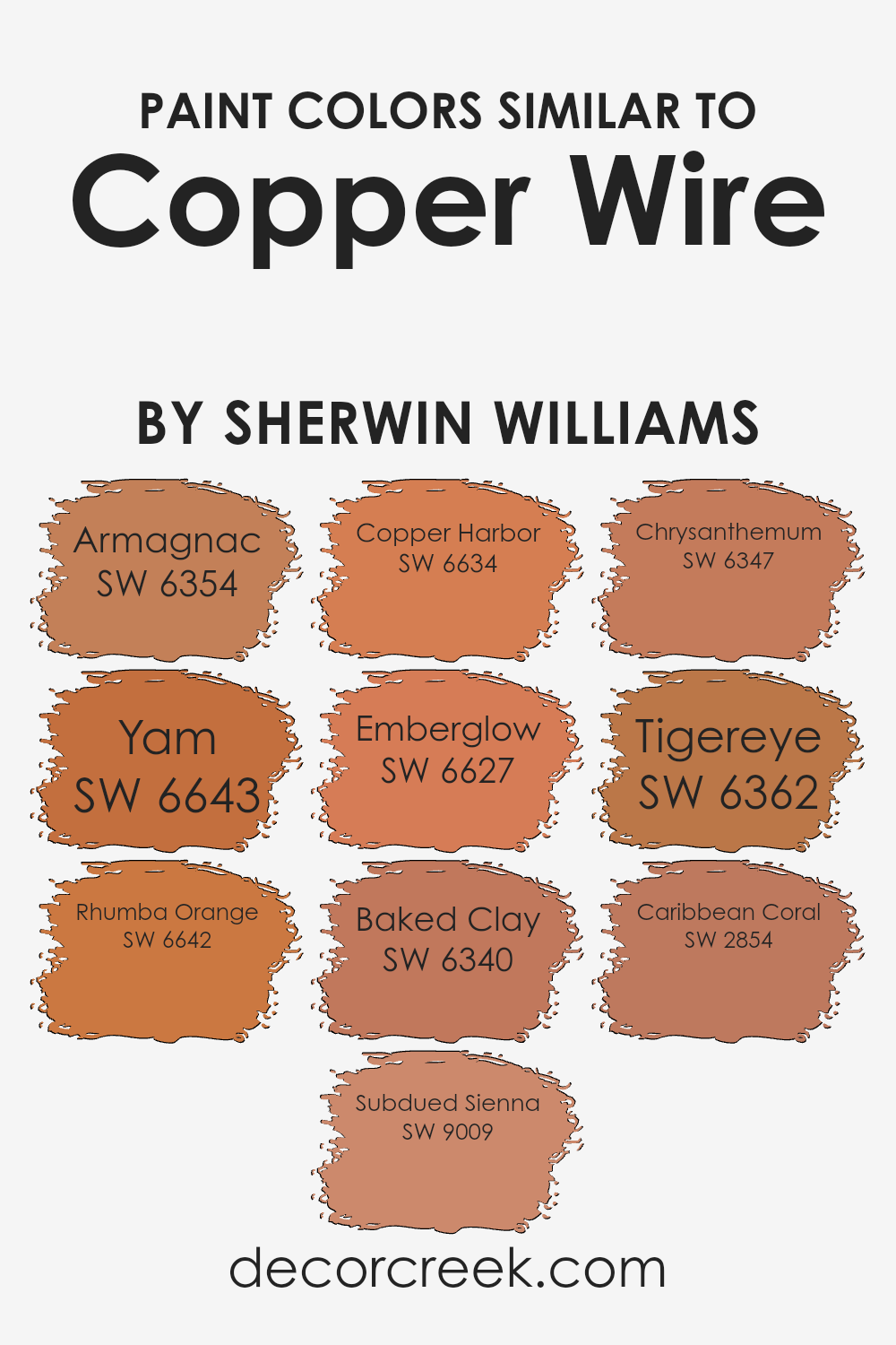
Colors Similar to Copper Wire SW 7707 by Sherwin Williams
Similar colors play an essential role in design, especially when creating a cohesive and pleasing aesthetic. When colors closely resemble each other, like variations found within the Sherwin Williams palette that echo the tones of Copper Wire, they can be used to establish harmony and balance within a space. These analogous shades, ranging from warm oranges to deep reds, work together by providing subtle contrasts that enrich the visual experience without overwhelming the senses. Utilizing similar colors can also create depth and accentuate details, making a room feel more cohesive and thoughtfully put together.
For example, Armagnac has a rich, deep warmth that offers an inviting ambiance, while Yam adds a slightly brighter, yet earthy feel that complements wooden textures beautifully. Rhumba Orange injects a spicy zest, bringing energy to spaces without dominating them. Subdued Sienna offers a muted, earthy option that blends seamlessly with natural elements for a grounded effect. Copper Harbor introduces a vivid, dynamic burst, reminiscent of autumnal glow, whereas Emberglow produces a softer, more muted warmth, perfect for creating a cozy atmosphere. Baked Clay has a rustic charm that recalls sun-drenched terracotta, while Chrysanthemum is a deeper, more introspective hue that draws in warmth and sophistication. Tigereye presents a golden, luminous quality that captures the essence of a sunset, and Caribbean Coral exudes a softer, gentler radiance, ideal for introducing a touch of subtlety and romance. Each color, with its unique but complementary attributes, works together to weave a rich tapestry of hues that enhance and unify the visual space.
You can see recommended paint colors below:
- SW 6354 Armagnac
- SW 6643 Yam
- SW 6642 Rhumba Orange
- SW 9009 Subdued Sienna
- SW 6634 Copper Harbor
- SW 6627 Emberglow
- SW 6340 Baked Clay
- SW 6347 Chrysanthemum
- SW 6362 Tigereye
- SW 2854 Caribbean Coral
Colors that Go With Copper Wire SW 7707 by Sherwin Williams
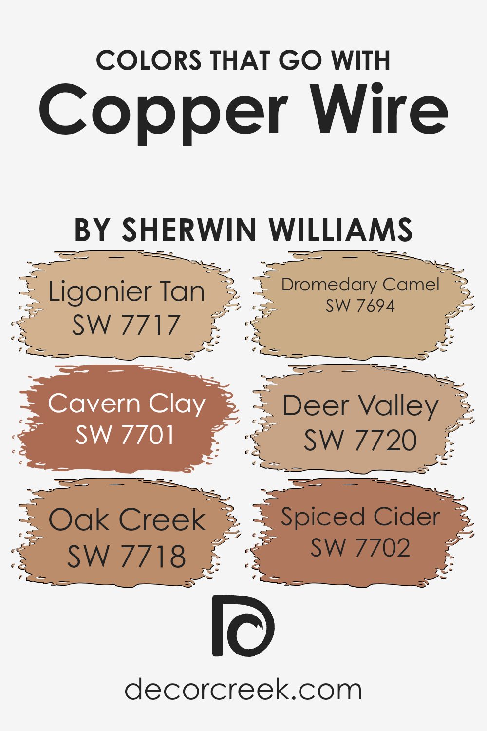
Colors that pair well with Copper Wire SW 7707 by Sherwin Williams are essential for creating a harmonious and inviting space. They play a crucial role in enhancing the room’s overall aesthetic, ensuring that Copper Wire— a rich and warm hue—serves as a stunning backdrop or accent that ties the room together. By selecting complementary colors, such as Ligonier Tan, Cavern Clay, Oak Creek, Dromedary Camel, Deer Valley, and Spiced Cider, one can craft a color palette that adds depth and character to interiors. These pairings allow for a balance between warmth and sophistication, making any space feel cozy and well-designed.
Ligonier Tan is a soft, muted beige that brings a lightness and warmth to spaces, working well to soften the intensity of Copper Wire. Cavern Clay, with its earthy, terracotta tone, echoes the warmth of Copper Wire, creating a rich, inviting ambiance. Oak Creek offers a slightly deeper, brownish-red hue, adding a touch of elegance and depth when paired with Copper Wire. Dromedary Camel, a medium to light brown, provides a neutral foundation that highlights the warmth in Copper Wire. Deer Valley presents a unique blend of gray and green, introducing a refreshing contrast that enhances the room’s dimensionality. Lastly, Spiced Cider is a warm, deep amber that complements Copper Wire’s vibrant personality, ensuring a cozy yet dynamic aesthetic. Together, these colors support Copper Wire in achieving a well-rounded, visually pleasing, and cohesive look for any interior.
You can see recommended paint colors below:
- SW 7717 Ligonier Tan
- SW 7701 Cavern Clay
- SW 7718 Oak Creek
- SW 7694 Dromedary Camel
- SW 7720 Deer Valley
- SW 7702 Spiced Cider
How to Use Copper Wire SW 7707 by Sherwin Williams In Your Home?
Copper Wire SW 7707 by Sherwin Williams is a rich, warm paint color that can add a cozy and inviting feel to any room in your home. This color has a vibrant yet earthy tone, which makes it perfect for creating an atmosphere of warmth and comfort. You can use it in various ways to enhance your living space. For instance, painting living room walls with Copper Wire can make the area feel more welcoming and snug, perfect for family gatherings. In the bedroom, applying this color can help create a relaxing and restful environment, ideal for a good night’s sleep.
Additionally, Copper Wire works well as an accent color. If you’re not ready to commit to painting entire walls, consider using it on trim, doors, or even a single accent wall to add a pop of color. It pairs beautifully with neutral tones, wood finishes, and even metallic accents, offering you the flexibility to experiment with different design styles. Whether you aim for a modern, rustic, or eclectic look, Copper Wire can help you achieve your desired ambiance, making your home even more enjoyable and personalized.
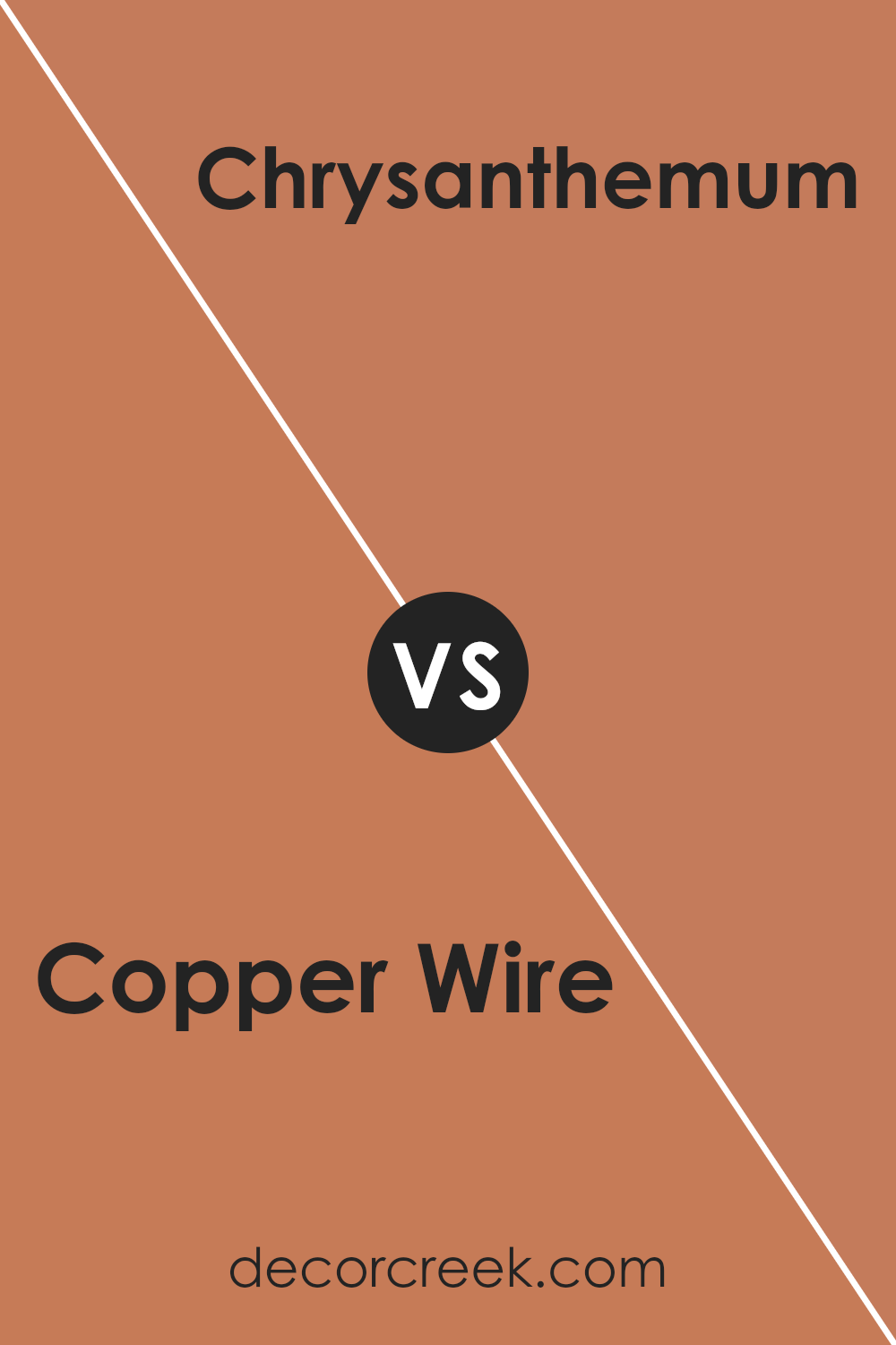
Copper Wire SW 7707 by Sherwin Williams vs Chrysanthemum SW 6347 by Sherwin Williams
Copper Wire is a rich, warm hue with a touch of rustic elegance. It leans more towards the earthy tones, evoking feelings of warmth and coziness. Its deep, reddish-brown color is reminiscent of the metal it’s named after. This color can make any space feel inviting and comfortable, perfect for creating a cozy living room or a welcoming kitchen.
On the other hand, Chrysanthemum is a vibrant, cheerful yellow with a sunny disposition. It’s lighter and brighter, bringing an optimistic energy to any room. This color shines like the flower it’s named after, adding a splash of brightness and a feeling of happiness. It’s ideal for spaces where you want to inject vitality and warmth, such as kitchens, bathrooms, or any room needing a boost of cheerfulness.
While Copper Wire adds depth and richness with its earthy charm, Chrysanthemum offers a lively and brightening effect with its sunny hue. Both colors have their unique appeal, whether you’re looking to create a cozy retreat or brighten up your space.
You can see recommended paint color below:
- SW 6347 Chrysanthemum
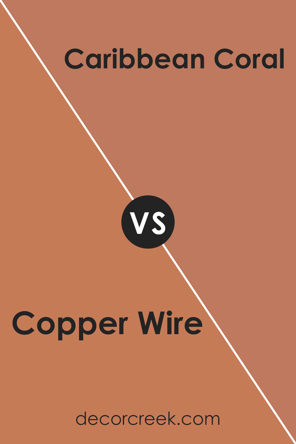
Copper Wire SW 7707 by Sherwin Williams vs Caribbean Coral SW 2854 by Sherwin Williams
Copper Wire is a cozy, rich tone that leans towards the earthier side of the color spectrum. It reminds one of autumn leaves or the warm glow of a sunset; it’s a color that feels like a warm hug. It can bring a sense of comfort and warmth to any space, creating an inviting atmosphere.
On the other hand, Caribbean Coral is a vibrant, lively color. It’s much brighter and leans towards a playful, cheerful vibe. This color is reminiscent of tropical flowers and sunsets by the beach. It’s a shade that can instantly brighten up a room and give it a fresh, energetic feel.
Putting the two side by side, Copper Wire brings warmth and comfort, giving spaces a grounded feel, while Caribbean Coral injects vivacity and brightness, offering a refreshing energy. Both colors have their unique charm, one creating a cozy retreat and the other, a bright and lively space.
You can see recommended paint color below:
- SW 2854 Caribbean Coral
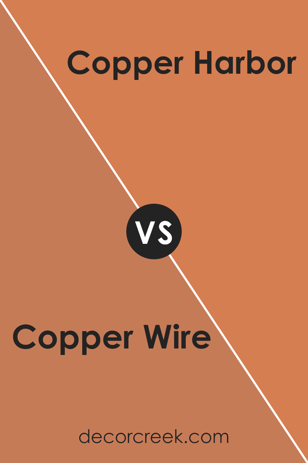
Copper Wire SW 7707 by Sherwin Williams vs Copper Harbor SW 6634 by Sherwin Williams
Copper Wire and Copper Harbor, both by Sherwin Williams, offer distinct vibes for any space. Copper Wire brings a muted, earthy warmth that feels cozy and inviting. It’s like the soft glow of a sunset that wraps the room in a gentle embrace. This color works well in spaces where you want a calm and subdued atmosphere.
On the other hand, Copper Harbor packs a brighter punch. It’s a vivid, lively shade that seems to bring energy and excitement wherever it’s applied. Think of the vibrant hues of autumn leaves—it has that kind of dynamic presence. This color is perfect for areas where you want to inject vitality and a sense of joy.
While both colors share the copper name, they serve different moods and settings. Copper Wire is your go-to for a reserved and sophisticated look, whereas Copper Harbor is the choice when aiming for a bold and spirited ambiance. Choosing between them depends on the vibe you’re looking to achieve in your space.
You can see recommended paint color below:
- SW 6634 Copper Harbor
Copper Wire SW 7707 by Sherwin Williams vs Subdued Sienna SW 9009 by Sherwin Williams
Copper Wire and Subdued Sienna, both by Sherwin Williams, offer distinct vibes for any space. Copper Wire brings a lively, warm feel to a room, somewhat like the glow of a sunset or the sheen of a well-polished penny. It’s bold without being overbearing, making it perfect for adding a splash of energy to any area. On the other hand, Subdued Sienna takes a more reserved approach. It’s a muted, earthy color that leans towards a soft, natural look.
This color is all about bringing a sense of calm and groundedness to a space. While both colors share a warm base, Copper Wire is definitely the more vibrant of the two, standing out in a room. Subdued Sienna, however, works beautifully as a subtle background, supporting other colors or serving as a gentle main hue. In essence, while both offer warmth, Copper Wire adds drama, whereas Subdued Sienna offers tranquility.
You can see recommended paint color below:
- SW 9009 Subdued Sienna
Copper Wire SW 7707 by Sherwin Williams vs Baked Clay SW 6340 by Sherwin Williams
Copper Wire and Baked Clay, both from Sherwin Williams, offer unique takes on warm, inviting tones. Copper Wire leans towards a subtle, earthy orange that brings to mind the natural patina of aged copper. Its understated elegance makes it versatile for spaces seeking a touch of warmth without overwhelming brightness. On the other hand, Baked Clay is a richer, deeper hue reminiscent of terracotta pots basking in the sun.
This color has a more pronounced presence that can add depth and coziness to a room. While both share a warm base, Copper Wire feels lighter and more muted, making it a great option for a soft accent or background color. Baked Clay, with its bolder, earthier tone, is ideal for creating a strong statement or focal point. In essence, Copper Wire offers a gentle whisper of warmth, whereas Baked Clay speaks in a more assertive tone of earthy comfort.
You can see recommended paint color below:
- SW 6340 Baked Clay
Copper Wire SW 7707 by Sherwin Williams vs Emberglow SW 6627 by Sherwin Williams
Copper Wire and Emberglow, both from Sherwin Williams, are unique colors that stand out for different reasons. Copper Wire is a rich, warm hue with a touch of metallic flair that resembles the color of a polished copper penny. It gives off a cozy yet sophisticated vibe, making it perfect for spaces where you want a blend of elegance and comfort. On the other hand, Emberglow is a vibrant, fiery orange with a lot of energy.
It’s bolder and brighter, evoking feelings of warmth and excitement. This color works well in areas where you want to add a pop of color or create a lively atmosphere. While both colors share a warmth that can cozy up a room, Copper Wire leans more towards a refined, classic look, whereas Emberglow is all about making a statement with its intensity and vibrancy. Together, they offer options for those looking to add warmth to their space, with Copper Wire favoring subtlety and Emberglow going for impact.
You can see recommended paint color below:
- SW 6627 Emberglow
Copper Wire SW 7707 by Sherwin Williams vs Armagnac SW 6354 by Sherwin Williams
Copper Wire and Armagnac, both by Sherwin Williams, offer distinct hues that could transform a space depending on the mood or style you’re aiming for. Copper Wire is a warm, welcoming shade that reminds you of a cozy autumn day with its blend of red and orange tones. It has enough brightness to make a room feel inviting without becoming too intense, perfect for living spaces or dining areas.
On the other hand, Armagnac brings a richer, deeper color that leans towards a luxurious red-brown. It’s like looking at a fine aged wine or the rich, earthy tones of a dense forest. This color might be better suited for creating a dramatic accent wall or for adding depth to a study or bedroom.
Although both colors share a warm base, Copper Wire offers a lighter, more vibrant feel, while Armagnac provides sophistication with its deeper, more intense tone. This makes Copper Wire a choice for a lively, energetic ambiance, while Armagnac caters to a more refined, intimate setting.
You can see recommended paint color below:
- SW 6354 Armagnac
Copper Wire SW 7707 by Sherwin Williams vs Yam SW 6643 by Sherwin Williams
Copper Wire is a rich, warm hue reminiscent of the metallic gleam of its namesake. It has a cozy, inviting feel that brings a touch of elegance and warmth to any space. This color leans towards an earthy, reddish-brown aura, highlighting spaces with a sophisticated yet welcoming vibe.
On the other hand, Yam is a vibrant, cheerful orange color. It’s like capturing the essence of autumn and infusing it into your space. This shade is brighter and bolder compared to Copper Wire, offering a lively contrast that pops. While Copper Wire whispers warmth, Yam shouts it, bringing an energetic and dynamic feel to any room.
Both colors are distinct yet complementary. Copper Wire offers a subtle, refined charm, perfect for creating a cozy retreat or an elegant backdrop. Yam, with its vivacious spirit, injects life and joy into spaces, making it ideal for areas where you want to spark creativity or evoke excitement. Whether used together or alone, each color has its unique appeal, with Copper Wire providing a soothing warmth and Yam a burst of energy.
You can see recommended paint color below:
- SW 6643 Yam
Copper Wire SW 7707 by Sherwin Williams vs Rhumba Orange SW 6642 by Sherwin Williams
Copper Wire and Rhumba Orange are two distinctive colors by Sherwin Williams that bring their own unique vibes to the table. Starting with Copper Wire, it’s a rich, deep shade that hints at the natural color of aged copper. It’s the kind of color that brings a warm, cozy feeling to a space, making it perfect for creating an inviting atmosphere. Think of it as a hug from your favorite blanket on a chilly evening.
On the other hand, Rhumba Orange is all about vibrancy and energy. It’s a lively, bold orange that seems to shout joy and enthusiasm. This color has a way of brightening up a room and injecting a burst of positivity. It’s the sort of color that can wake up a space, making it feel fresh and full of life.
While both colors come from the same vast palette, they serve different moods and settings. Copper Wire leans towards a sophisticated and refined look, whereas Rhumba Orange is about fun and zestfulness. Whether it’s the subtle elegance of Copper Wire or the cheerful audacity of Rhumba Orange, each has its charm and purpose in design.
You can see recommended paint color below:
- SW 6642 Rhumba Orange
Copper Wire SW 7707 by Sherwin Williams vs Tigereye SW 6362 by Sherwin Williams
Copper Wire is a rich, warm shade that kind of mirrors the polished glow of its namesake metal. It’s cozy and inviting, with a touch of sophistication that can make a space feel both elegant and homely. This color has an earthy hue, blending brown with soft red undertones, making it versatile for various settings, from a chic living room to a welcoming kitchen.
On the other side, Tigereye takes its cues from the natural warmth and depth of a tiger’s eye stone. This color is bolder and more pronounced, with a golden amber tone that stands out vividly. It’s the type of color that brings a lively and energetic vibe to a room, perfect for creating a focal point or adding a splash of vibrancy.
While both colors share a warmth that can enrich a space, Copper Wire leans more towards subtlety and versatility, offering a muted elegance. Tigereye, however, is all about making a statement, with its rich, golden hues demanding attention and bringing a room to life. Whether you’re looking for a soft, refined atmosphere or aiming to inject some dynamic energy, these colors offer distinct choices for decorating.
You can see recommended paint color below:
- SW 6362 Tigereye
Conclusion
In summary, the article discussed Copper Wire by Sherwin Williams, highlighting its versatility and appeal as a paint color. It’s a rich, warm hue that can add a cozy and inviting atmosphere to any space. The color is flexible enough to be used in a variety of settings, from kitchens to living rooms, bringing a touch of elegance and warmth wherever it’s applied. It pairs well with a range of decor styles, making it a popular choice among homeowners looking for a reliable and stylish color option.
Furthermore, the article touched on how the color can influence the mood of a room, making spaces feel more welcoming and comfortable. The unique charm of Copper Wire makes it a standout choice for those wishing to inject a vibrant yet sophisticated element into their decorating scheme. Its ability to complement different materials and finishes also adds to its appeal, offering endless design possibilities. Overall, Copper Wire is presented as a top pick for anyone wanting to refresh their home with a new paint color that combines beauty with versatility.
Ever wished paint sampling was as easy as sticking a sticker? Guess what? Now it is! Discover Samplize's unique Peel & Stick samples.
Get paint samples

