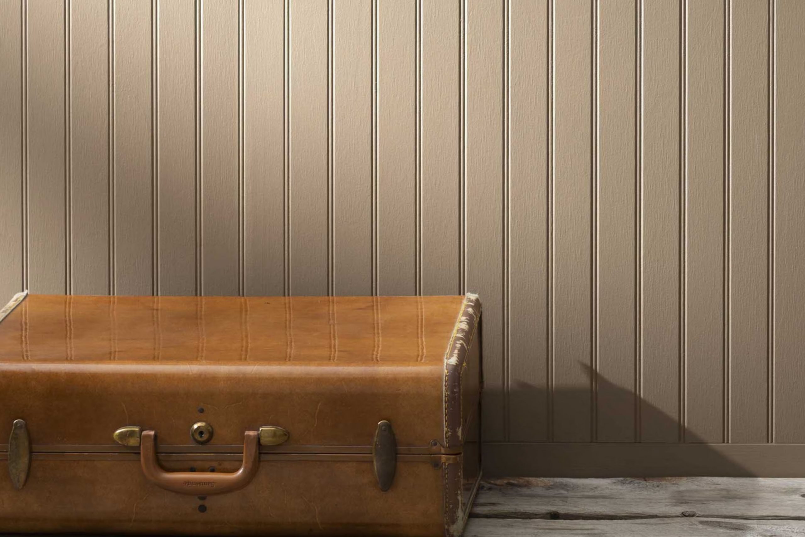
If you’re in the mood for a change at home, picking a new paint color is a great place to start, and I might just have the perfect suggestion: 1032 Bar Harbour Beige by Benjamin Moore. Let’s talk about why this hue could be a game-changer for your walls.
It’s not just any beige—it’s got a warmth that really softens a room, giving it a cozy yet elegant vibe. I noticed that it manages to brighten areas while still bringing an earthy, grounding effect, which is ideal if you’re looking for something that pairs well with different decor styles and colors.
Whether you’re looking to refresh your living room, bedroom, or even your kitchen, Bar Harbour Beige could be the seamless fit you’re searching for.
Let’s get into what makes this color unique and how it might just be the new favorite shade you’ve been looking to find.
What Color Is Bar Harbour Beige 1032 by Benjamin Moore?
Bar Harbour Beige by Benjamin Moore is a subtle, warm beige tone that offers a comfortable backdrop for a variety of decorating styles. This color is reminiscent of soft sand on a cozy beach, providing a relaxed and inviting atmosphere to any room. Its softness makes it a flexible shade suitable for living rooms, bedrooms, and even kitchens, adding a touch of warmth without overpowering the room.
This beige works particularly well in styles such as traditional, country, and casual coastal interiors. Its warm undertones help to create a homey feel, making areas seem more inviting and cozy. Bar Harbour Beige pairs beautifully with natural materials such as wood, adding a rustic charm when used with oak or pine. It also enhances textures like linen and cotton, which contribute to a soft, airy environment.
For those who want to keep their room light and bright, this beige is a great base color. It forms an excellent background for adding accessories or making bolder color statements with furnishings. Whether used on walls or as an accent, Bar Harbour Beige helps to ground your decor while providing a gentle warmth that’s easy to live with.
It’s ideal for anyone wanting to create a peaceful, yet stylish, home environment.
Is Bar Harbour Beige 1032 by Benjamin Moore Warm or Cool color?
Bar Harbour Beige, a paint color by Benjamin Moore, offers a warm and inviting tone that is perfect for creating a cozy atmosphere in any home. This subtle beige shade is flexible, making it an excellent choice for both living rooms and bedrooms, as it complements various decor styles and color schemes. Its lightness helps to make small areas appear larger and more open, while still adding enough warmth to make the room feel welcoming.
Since it is a neutral color, Bar Harbour Beige allows for a lot of flexibility in decorating. You can easily match it with bolder colors in furniture or accessories. It also serves as a great backdrop for hanging art or displaying collectibles, as it doesn’t overpower other elements in the room.
People often choose this shade because it keeps rooms bright and works well with natural light, enhancing a fresh, airy feel. Overall, it’s a reliable choice for anyone looking to refresh their home’s look with a pleasant, easy-to-use color.
Undertones of Bar Harbour Beige 1032 by Benjamin Moore
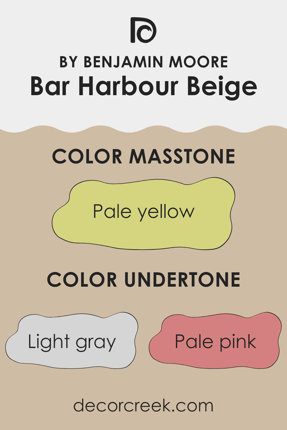
Bar Harbour Beige by Benjamin Moore is a complex, flexible paint color that subtly incorporates various undertones, making it a popular choice for interior walls. The primary undertones in this color are light gray, pale pink, light purple, mint, light blue, grey, lilac, yellow, orange, light green, and olive. These undertones significantly influence how the beige appears under different lighting conditions and when paired with various decor elements.
Undertones are subtle colors that reside beneath the surface of the main color. They can enhance the depth and complexity of a paint color, affecting its overall appearance in a room. For example, light gray and grey can cool down the warmth of beige, giving a more neutral, balanced look. In contrast, pale pink and lilac bring a soft, almost romantic quality to the walls, adding a touch of warmth.
Yellow and orange undertones add a sunny, cheerful feel to the beige, making it feel more inviting. Light blue and mint provide a fresh, crisp edge, which can make the room feel more spacious and airy. Light green and olive add a natural, earthy vibe, which can be calming and grounding.
When applied to interior walls, Bar Harbour Beige can shift in appearance throughout the day, from a bright, warm hue in natural sunlight to a deeper, cooler tone under artificial lighting. This chameleon-like ability allows it to adapt seamlessly to different styles and decors, making it an excellent choice for those looking to create a cozy, welcoming room without committing to a bold color statement.
What is the Masstone of the Bar Harbour Beige 1032 by Benjamin Moore?
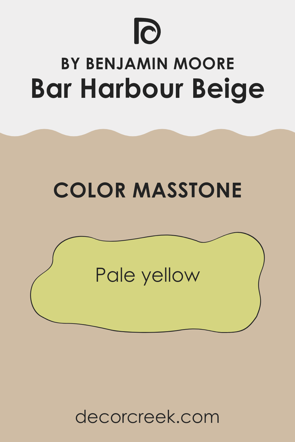
Bar Harbour Beige 1032 by Benjamin Moore has a masstone that is a pale yellow, close to color code #D5D580. This subtle shade brings a warm and light feeling to any room. It’s great for rooms that don’t get a lot of sunlight, as it helps make them appear brighter and more welcoming.
The softness of this beige-yellow is flexible and can be paired easily with different colors and patterns without making the area feel cluttered or too busy. It’s an ideal choice for living rooms or bedrooms where you want a cozy atmosphere but still wish to keep things light and airy.
Additionally, the calmness of this pale yellow can make small areas seem larger, which is perfect for homes where maximizing the feel of room is essential. This paint color creates a gentle backdrop for both modern and traditional decor, providing just enough warmth to make a home feel lived-in and inviting.
How Does Lighting Affect Bar Harbour Beige 1032 by Benjamin Moore?
Lighting plays a crucial role in how colors appear in different environments. The color Bar Harbour Beige by Benjamin Moore, a popular shade, can look different depending on the lighting conditions of the room it is in.
In artificial light, Bar Harbour Beige tends to appear warmer and more inviting. This is because most artificial lighting, like incandescent bulbs, casts a warm glow, emphasizing the beige and yellow tones in the paint. Therefore, rooms with lots of lamps or overhead lights might make this color look richer and slightly deeper.
In natural light, the appearance of Bar Harbour Beige can vary dramatically throughout the day and depending on the direction the room faces. Natural light tends to show the truest color, but the intensity and angle of the light can change how the paint looks.
In north-facing rooms, light is cooler and bluer, which can make Bar Harbour Beige appear more muted and slightly grayish. These rooms get less direct sunlight, so the color won’t change much throughout the day but will generally stay on the cooler side of its shade.
South-facing rooms enjoy ample sunlight, which can make Bar Harbour Beige look brighter and bring out its warmer undertones. The color can feel quite cozy and warm, particularly during the middle of the day when sunlight is at its peak.
East-facing rooms receive sunlight in the morning when the light is golden and soft. This morning light can make Bar Harbour Beige look very soft and warm early in the day, but it might become less vibrant as the day progresses and natural light fades.
West-facing rooms get the evening light, which can be quite warm and golden. In these rooms, Bar Harbour Beige might look particularly warm and welcoming in the late afternoon and evening as the sun sets. Overall, Bar Harbour Beige is a flexible color that can work well in many settings, but it’s important to consider lighting when deciding where to apply this shade for the best effect.
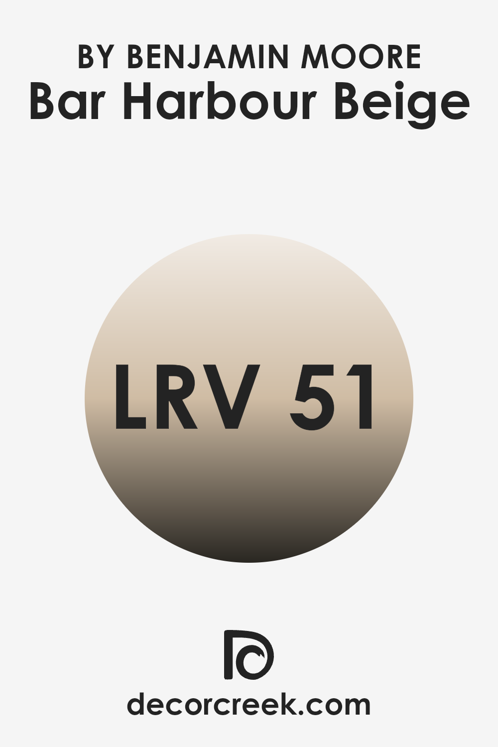
What is the LRV of Bar Harbour Beige 1032 by Benjamin Moore?
LRV stands for Light Reflectance Value, which indicates the amount of visible and usable light that a paint color reflects when dry. This value is generally expressed using a scale where higher values mean the color reflects more light and appears lighter, and lower values mean it reflects less light, appearing darker.
LRV is particularly important when choosing paint colors because it helps in understanding how different shades will affect the mood and brightness of a room. For instance, a room with a high LRV paint will look brighter and more open, while a lower LRV can make a room look cozier but also smaller.
In the case of the color Bar Harbour Beige, which has an LRV of 51.11, it is classified as a mid-range color. This LRV value means it doesn’t reflect more than half of the light but isn’t among the darkest, making it quite balanced. This beige color will not make a room feel overly bright, nor will it make it feel too enclosed or dark.
It creates a moderate ambiance that is welcoming and warm, making it a flexible choice for many living room. It can brighten up a room moderately while keeping the cozy feeling that comes from a slightly lower light reflection. This makes it ideal for areas where both comfort and a sense of openness are desirable.
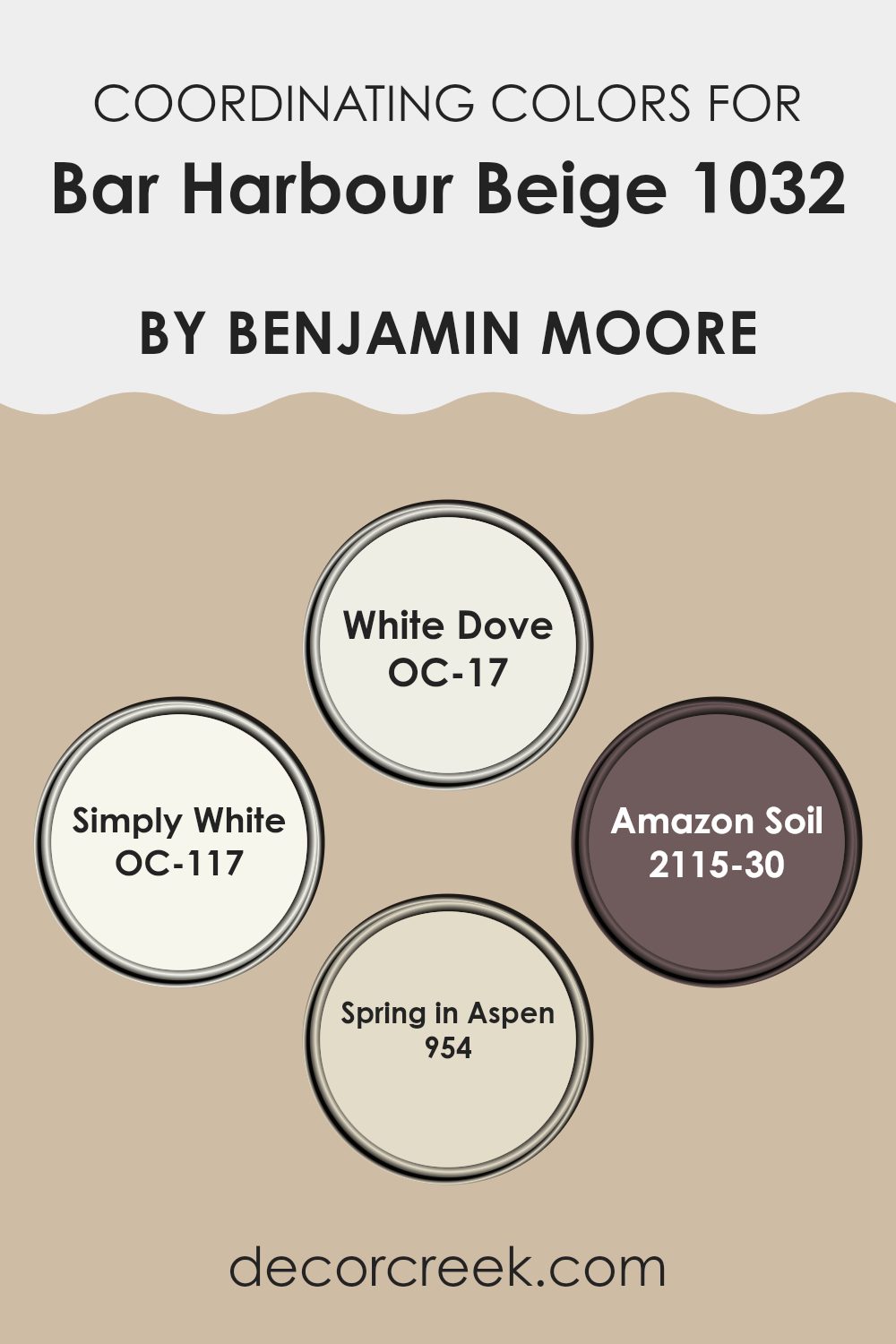
Coordinating Colors of Bar Harbour Beige 1032 by Benjamin Moore
Coordinating colors are shades that complement or enhance the main color in a design palette, creating a balanced and harmonious look. They can be used in various aspects of decor such as wall colors, furniture, and accents. For instance, Bar Harbour Beige by Benjamin Moore is a flexible and warm neutral that pairs beautifully with select coordinating colors to adapt to various design styles and preferences.
One such coordinating color is White Dove (OC-17), a soft and clean white that offers a calm contrast to the warmth of Bar Harbour Beige, making it ideal for trims, ceilings, and woodwork. Similarly, Simply White (OC-117) is a crisp, brighter white that injects a fresh and airy feel into the room, working well in areas that benefit from a light, reflective quality.
On the other end of the spectrum, Amazon Soil (2115-30) is a deep, rich brown that provides a striking and bold complement, adding depth and character to any room when used as an accent wall or in furniture pieces. Spring in Aspen (954) is a subtle green with a hint of gray, offering a natural, understated complement to the earthy tones of Bar Harbour Beige, perfect for adding a touch of softness to any interior.
You can see recommended paint colors below:
- OC-17 White Dove
- OC-117 Simply White
- 2115-30 Amazon Soil
- 954 Spring in Aspen
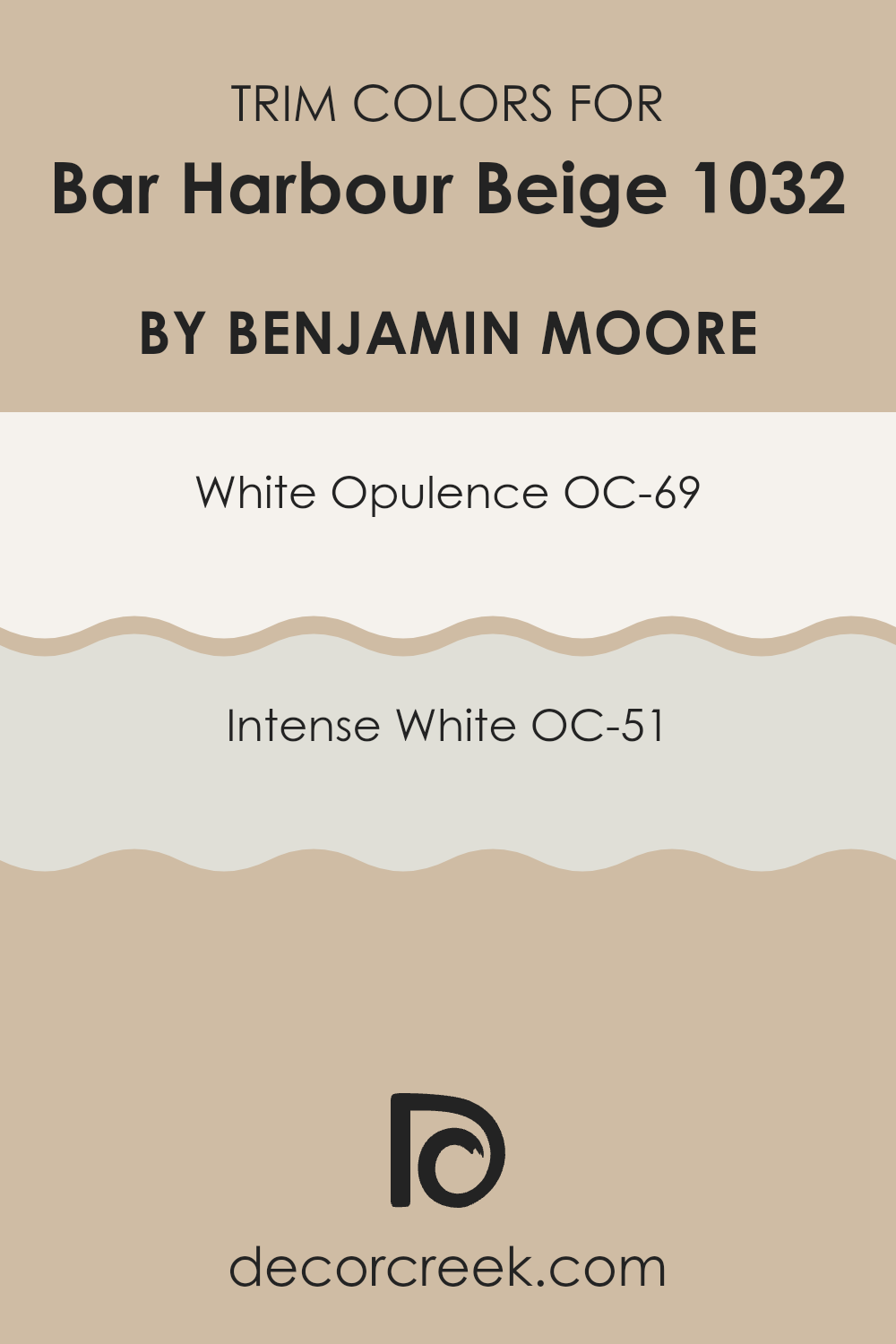
What are the Trim colors of Bar Harbour Beige 1032 by Benjamin Moore?
Trim colors are specific shades used to highlight or accentuate the architectural details of a room such as door frames, moldings, and baseboards. The right trim color can create a striking contrast that defines and enhances the overall aesthetic of a room.
For Bar Harbour Beige by Benjamin Moore, using trim colors like OC-69 White Opulence and OC-51 Intense White can complement and subtly bring out the warm undertones of this beige paint, creating a cohesive and inviting look in any room.
White Opulence OC-69 is a clean and bright white that brings a fresh and airy feel to any room, making it an ideal choice for trim work, especially when paired with the gentle warmth of Bar Harbour Beige. On the other hand, Intense White OC-51 is a soft white with a slight gray undertone, which can add a gentle contrast and depth when used as a trim color, making it perfect for enhancing the visual appeal of the room without overpowering the primary color theme.
You can see recommended paint colors below:
- OC-69 White Opulence
- OC-51 Intense White
Colors Similar to Bar Harbour Beige 1032 by Benjamin Moore
Similar colors play a crucial role in creating a cohesive and harmonious atmosphere in any room. When colors like Adobe Beige, Stone House, Sierra Hills, and Bradstreet Beige are used in conjunction with Bar Harbour Beige 1032 by Benjamin Moore, they create a seamless aesthetic that enhances the overall feel of a room without dramatic transitions.
These colors belong to a warm, neutral palette that works wonderfully to provide a calm and inviting environment. Their resemblance ensures that each room flows naturally into the next, maintaining a consistent theme that is pleasing to the eye.
Taking a closer look at these colors, Adobe Beige 1128 is a gentle hue with a touch of warmth that suggests an earthy clay context. It’s like a soft hold that makes any room feel grounded and secure. Stone House 1039, on the other hand, offers a slightly deeper tone that reflects stability and reliability, making it a perfect backdrop for areas where you spend a lot of time like living rooms or studies. Moving on, Sierra Hills 1053 has a subtle green undertone that can bring a hint of nature indoors, refreshing areas without overpowering them.
Lastly, Bradstreet Beige HC-48 provides a more muted option, stable and understated yet flexible, making it an excellent choice for areas needing quiet and focus. These shades collectively ensure that the color scheme remains consistent and smooth, providing a charming palette that enhances any interior design project.
You can see recommended paint colors below:
- 1128 Adobe Beige
- 1039 Stone House
- 1053 Sierra Hills
- HC-48 Bradstreet Beige

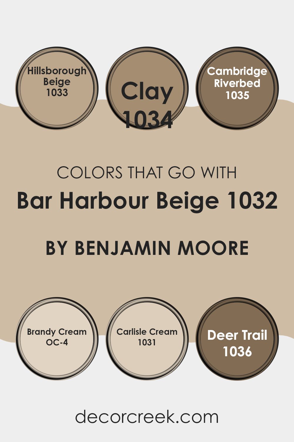
Colors that Go With Bar Harbour Beige 1032 by Benjamin Moore
Choosing the right colors to complement Bar Harbour Beige 1032 by Benjamin Moore can significantly enhance the aesthetic appeal of a room. Colors such as Hillsborough Beige, Clay, Cambridge Riverbed, Brandy Cream, Carlisle Cream, and Deer Trail each bring their own unique vibe when paired with Bar Harbour Beige, creating a harmonious palette. These colors help in achieving a cohesive look that is both appealing and soothing.
Hillsborough Beige is a slightly deeper shade that echoes the warmth of Bar Harbour Beige, making it ideal for creating a cozy atmosphere in areas like living rooms. Clay, on the other hand, provides a richer, earthier tone that pairs well with the lightness of Bar Harbour Beige, perfect for adding a touch of understated contrast.
Cambridge Riverbed introduces a subtle gray undertone, offering a cool complement to the warmer beige, which is great for modern and minimalist decors. Brandy Cream is lighter and offers a soft, creamy contrast that brightens rooms when used with Bar Harbour Beige.
Carlisle Cream is very close to Bar Harbour Beige but lighter, which helps in creating a gently layered look without stark contrasts. Lastly, Deer Trail brings a dusty brown hue into the mix, grounding the lighter shades and adding depth and warmth to the overall color scheme. Together, these hues work seamlessly to create inviting and harmonious rooms.
You can see recommended paint colors below:
- 1033 Hillsborough Beige
- 1034 Clay
- 1035 Cambridge Riverbed
- OC-4 Brandy Cream
- 1031 Carlisle Cream
- 1036 Deer Trail
How to Use Bar Harbour Beige 1032 by Benjamin Moore In Your Home?
Bar Harbour Beige 1032 by Benjamin Moore is a cozy and flexible paint color that can add a warm, welcoming feel to any room in your house. Its neutral tone makes it easy to pair with a wide range of other colors and home decor styles, from traditional to modern.
You can use it in your living room to create a cozy room that feels inviting. It’s also great for bedrooms, offering a calm background that can help you relax. In the kitchen and dining areas, Bar Harbour Beige works well as it provides a clean, subtle backdrop that won’t clash with your dishes or furniture.
It’s also ideal for hallways and entryways where you want a color that flows nicely into other rooms. This color balances well with bolder accents like blues or greens, allowing you to add pops of color through accessories like cushions, rugs, or artwork.
Bar Harbour Beige 1032 by Benjamin Moore vs Bradstreet Beige HC-48 by Benjamin Moore
Bar Harbour Beige and Bradstreet Beige are both neutral beige colors from Benjamin Moore, yet they have subtle differences. Bar Harbour Beige is a slightly lighter shade, providing a soft and warm backdrop that is very flexible for any room.
It has a gentle feel, working well in areas that you want to keep light and airy. On the other hand, Bradstreet Beige is a bit deeper and richer, giving it a stronger presence. This color is excellent for areas where you want a cozy atmosphere, as it brings a comforting and welcoming vibe.
Although both colors are beiges, Bradstreet Beige leans a bit more towards a yellow undertone, which adds warmth, whereas Bar Harbour Beige has a neutral-to-cool undertone that makes it very adaptable and easy to match with a wide range of decor styles. Both colors work well in various settings, from living rooms to bedrooms, depending on the mood you’re aiming to create.
You can see recommended paint color below:
- HC-48 Bradstreet Beige
Bar Harbour Beige 1032 by Benjamin Moore vs Sierra Hills 1053 by Benjamin Moore
The main color, Bar Harbour Beige, presents as a warm, soft beige that conveys a subtle and cozy feel, making it perfect for creating a calm and inviting atmosphere. It has an earthy tone that pairs beautifully with natural materials and textures like wood and linen.
On the other hand, Sierra Hills, while still in the beige spectrum, leans slightly towards a warmer, richer hue with hints of yellow undertones. This color brings a welcoming glow to any room, offering a hint of sunshine even on cloudy days. Its warm character makes it ideal for living rooms or dining areas where you want to create a friendly and inviting environment.
Both colors work well in areas that seek comfort and warmth but with different impacts depending on their specific tones and the ambiance you want to achieve. Bar Harbour Beige is quieter and more reserved, while Sierra Hills offers a touch more cheerfulness and warmth.
You can see recommended paint color below:
- 1053 Sierra Hills
Bar Harbour Beige 1032 by Benjamin Moore vs Adobe Beige 1128 by Benjamin Moore
Bar Harbour Beige and Adobe Beige are both warm, neutral colors from Benjamin Moore. Bar Harbour Beige is a lighter, sandy color that resembles the soft hues of a beach. It’s great for making rooms feel open and airy.
On the other hand, Adobe Beige is slightly darker with more depth, drawing inspiration from clay-like tones. This makes it a good choice for adding a cozy and welcoming feel to a room. Both colors work well in areas where you want a calm and inviting atmosphere without making the area feel too small or closed in.
They pair nicely with a variety of decor styles, particularly ones that favor a natural or earthy look. Overall, while both are beiges, Bar Harbour Beige leans more towards a gentle, light beige whereas Adobe Beige offers a bit more richness and warmth.
You can see recommended paint color below:
Bar Harbour Beige 1032 by Benjamin Moore vs Stone House 1039 by Benjamin Moore
Bar Harbour Beige and Stone House are two colors by Benjamin Moore that highlight subtle yet distinct differences in tone. Bar Harbour Beige is a soft and light beige that has a warm, welcoming feel. It’s an ideal choice for creating a cozy atmosphere in living rooms or bedrooms. Its lightness makes it great for smaller rooms, as it can help the area appear larger and more open.
On the other hand, Stone House carries a richer, deeper beige tone. This color is more grounded with a slightly brown undertone that gives it a sturdy, reliable feel. It is excellent for areas in a home that demand a stronger, but still neutral, color presence such as dining rooms or entryways.
Both colors work well in various styles of decor, providing a neutral backdrop that can complement many different furnishings and accents. However, the choice between them depends on the desired impact: lighter and airier with Bar Harbour Beige or more solid and anchoring with Stone House. This distinction can help decide which to use based on the room’s purpose and the ambiance you aim to create.
You can see recommended paint color below:
- 1039 Stone House
As I wrap up my thoughts on the Benjamin Moore paint called 1032 Bar Harbour Beige, I realize how special this color truly is. It’s more than just a simple beige; it’s like a cozy blanket for your walls. It brings warmth and a welcoming feeling to any room, whether it’s your bedroom, living room, or even your kitchen. The color is not too bright or too dark, it’s just right for making a place feel like home.
Using 1032 Bar Harbour Beige can make your room look neat and clean. It’s a color that doesn’t take attention away from your favorite furniture or art pieces. Instead, it goes well with almost everything, like a perfect pair of jeans that fit just right with any top. Whether your home has a lot of wood furniture or modern pieces, this shade of beige will compliment it all beautifully.
Overall, Benjamin Moore’s 1032 Bar Harbour Beige is a fantastic choice if you want to freshen up your home without making things too complicated. It’s a color that stays quietly in the background but in the best way possible, making everything else look just a little bit nicer.
So, if you’re thinking about giving your home a mini-makeover, this color might just be the perfect starting point.
Ever wished paint sampling was as easy as sticking a sticker? Guess what? Now it is! Discover Samplize's unique Peel & Stick samples.
Get paint samples

