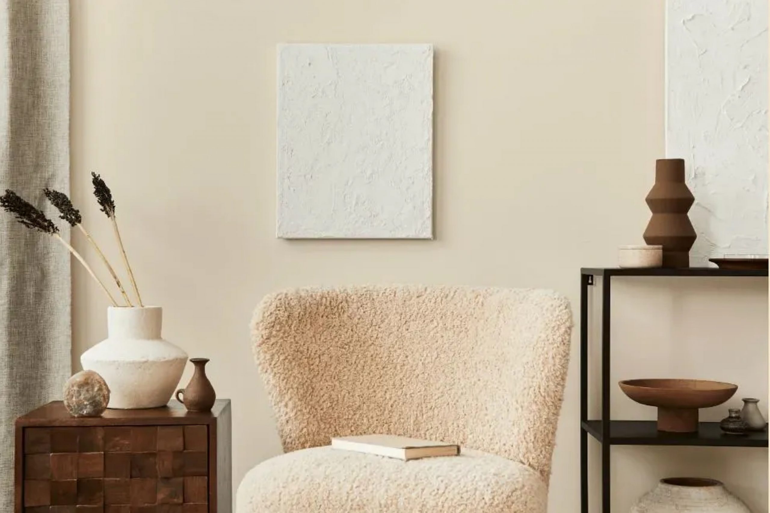
Adobe Beige AC-7 is a warm, inviting color that exudes a sense of earthy sophistication. This hue, reminiscent of natural clay and sunbaked adobe, brings a comforting and grounding presence to any space. Adobe Beige AC-7 works exceptionally well in interior styles that emphasize natural elements and understated elegance, such as rustic, modern farmhouse, transitional, and contemporary designs.
It pairs beautifully with a variety of materials and textures, including rough-hewn wood, smooth leather, natural fibers like jute and linen, and matte metal finishes. This versatile color can transform spaces into cozy, inviting areas while maintaining a sense of refined simplicity.
Is It a Warm Or Cool Color?
Adobe Beige AC-7 is decidedly a warm color. Its inherent warmth brings a cozy, welcoming feel to homes, making it a popular choice for living areas, bedrooms, and dining rooms. This warmth adds to the ambiance of a room, creating a space that feels both comfortable and inviting.
In homes, Adobe Beige AC-7 works particularly well in spaces that seek to create a relaxed, nurturing environment, as its warm undertones promote a sense of calm and comfort.
The color is also versatile enough to blend seamlessly with both bold and subdued color palettes, making it an excellent choice for various design aesthetics.
Ever wished paint sampling was as easy as sticking a sticker? Guess what? Now it is! Discover Samplize's unique Peel & Stick samples.
Get paint samples

Undertones of Adobe Beige AC-7
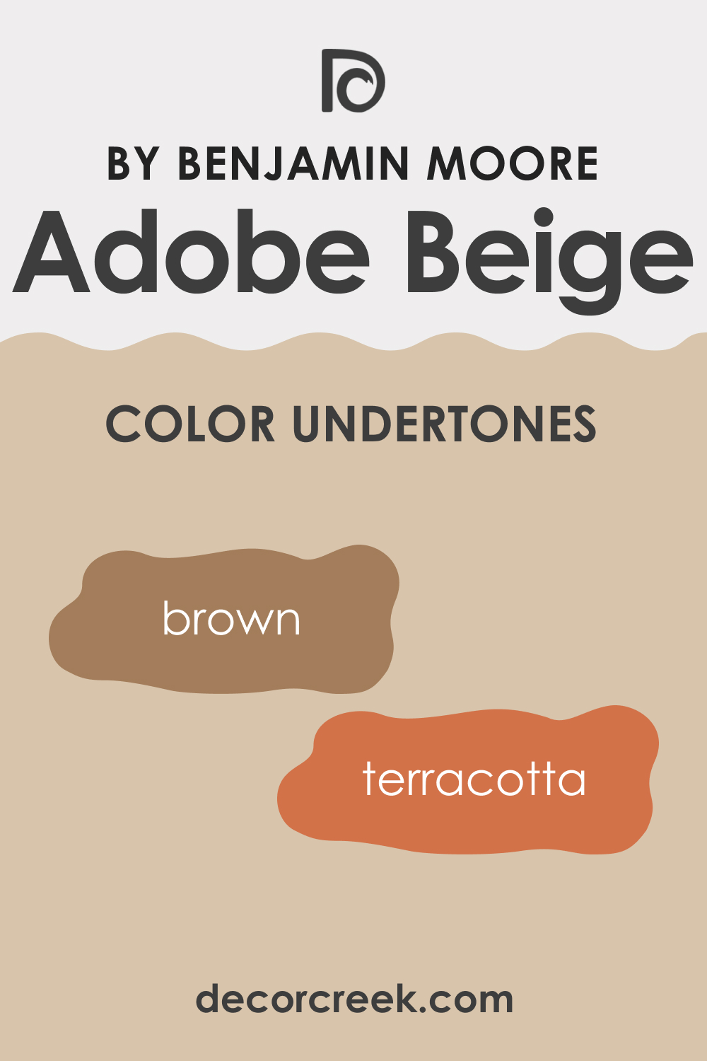
Adobe Beige AC-7 has subtle undertones that lean towards warm earthy hues, including soft browns and muted terracottas. These undertones play a significant role in the way we perceive color, often dictating the mood and atmosphere of a space. In the case of Adobe Beige AC-7, these warm undertones contribute to the color’s inviting and comforting feel, making it ideal for creating cozy living spaces.
On interior walls, the undertones of Adobe Beige AC-7 add depth and complexity, allowing the color to complement a wide range of decor styles and color schemes.
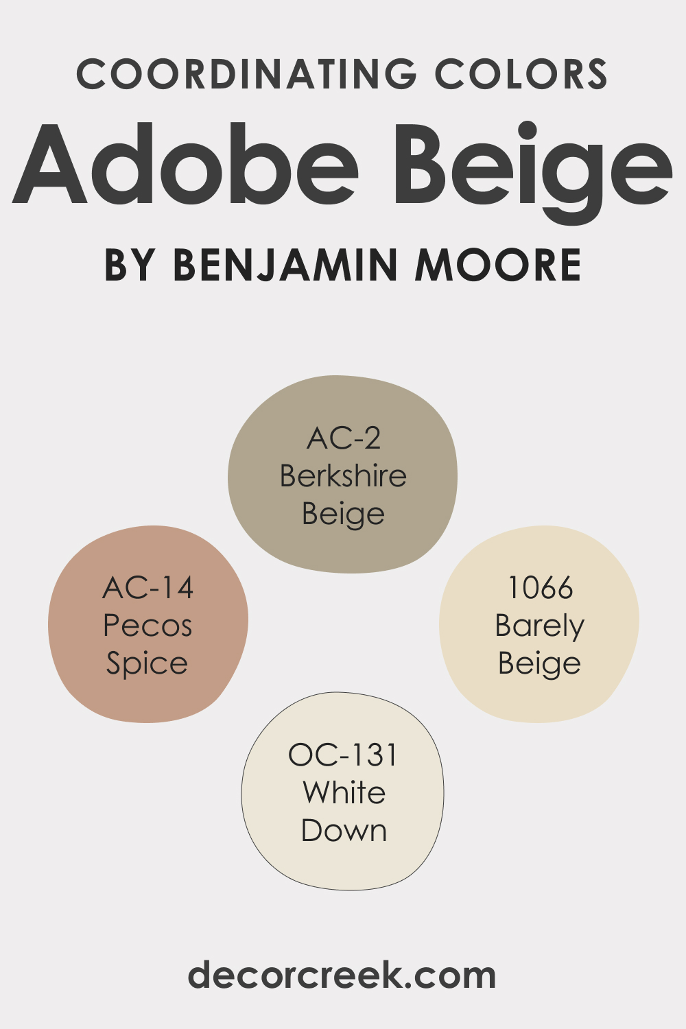
Coordinating Colors of Adobe Beige AC-7
Coordinating colors are those that harmonize and enhance the primary color, creating a balanced and aesthetically pleasing palette. Adobe Beige AC-7 pairs well with:
- AC-2 Berkshire Beige : A soft, muted beige that complements Adobe Beige AC-7’s warmth.
- AC-14 Pecos Spice : A rich, spicy hue that adds depth and contrast.
- BM 1066 Barely Beige : A lighter, more neutral beige that provides a subtle contrast.
- OC-131 White Down : A soft, warm white that brightens and complements Adobe Beige AC-7.
Additional colors that coordinate well include a soft sage green, a muted blue, and a gentle lavender, all of which can complement Adobe Beige AC-7’s earthy warmth.
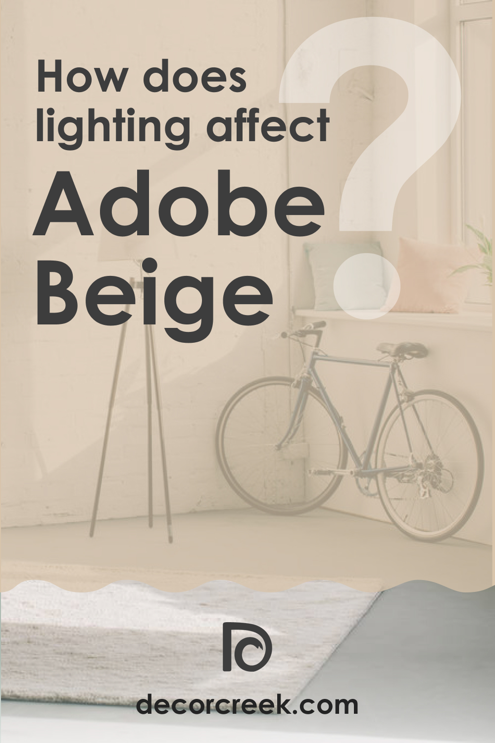
How Does Lighting Affect Adobe Beige AC-7?
Lighting dramatically affects how colors are perceived, and Adobe Beige AC-7 is no exception. Under artificial light, particularly warm-toned bulbs, Adobe Beige AC-7 can appear more pronounced in its warmth, enhancing the cozy ambiance of a room. In natural light, this color can change in intensity and hue throughout the day, from a softer tone in the morning to a richer, deeper hue in the evening.
In north-facing rooms, Adobe Beige AC-7 may appear more muted due to the cooler light, whereas in south-facing rooms, it can look warmer and more vibrant. In east and west-facing rooms, this color will experience a dynamic shift between the warm morning light and the cooler evening light, showcasing its versatility in different lighting conditions.
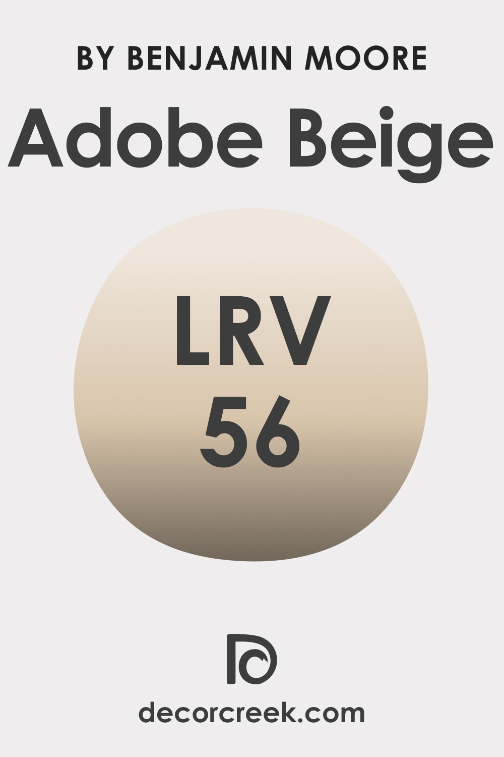
LRV of Adobe Beige AC-7
Light Reflectance Value (LRV) measures the percentage of light a paint color reflects. Adobe Beige AC-7, with an LRV of 56, falls into the mid-range category, reflecting a moderate amount of light. This LRV means that Adobe Beige AC-7 is versatile enough to be used in various lighting conditions without overpowering a space.
In brightly lit rooms, this color will appear lighter and more open, while in rooms with less natural light, it will offer a warmer and more intimate feel. The mid-range LRV of Adobe Beige AC-7 makes it an excellent choice for creating a balanced, welcoming atmosphere in both small and large spaces.
LRV – what does it mean? Read This Before Finding Your Perfect Paint Color
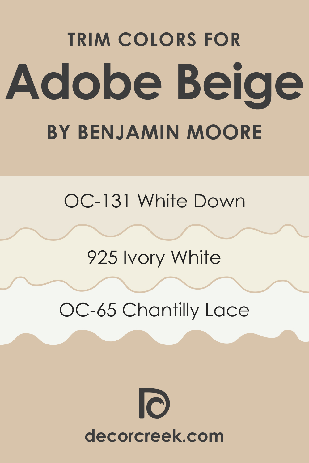
Trim Colors of Adobe Beige AC-7
Trim colors are essential in interior design as they frame and accentuate the walls, contributing to the overall look and feel of a room. For Adobe Beige AC-7, choosing the right trim color is crucial.
Shades of white, such as a crisp bright white, a soft ivory, or a creamy off-white, work beautifully with Adobe Beige AC-7. E.g., you might want to try the following colors:
- OC-65 Chantilly Lace
- BM 925 Ivory White
- OC-131 White Down
These shades of white can provide a subtle contrast, highlighting the warmth of Adobe Beige AC-7 and bringing a sense of balance and brightness to the space. The right trim color not only complements the wall color but also enhances architectural details, creating a cohesive and polished look.
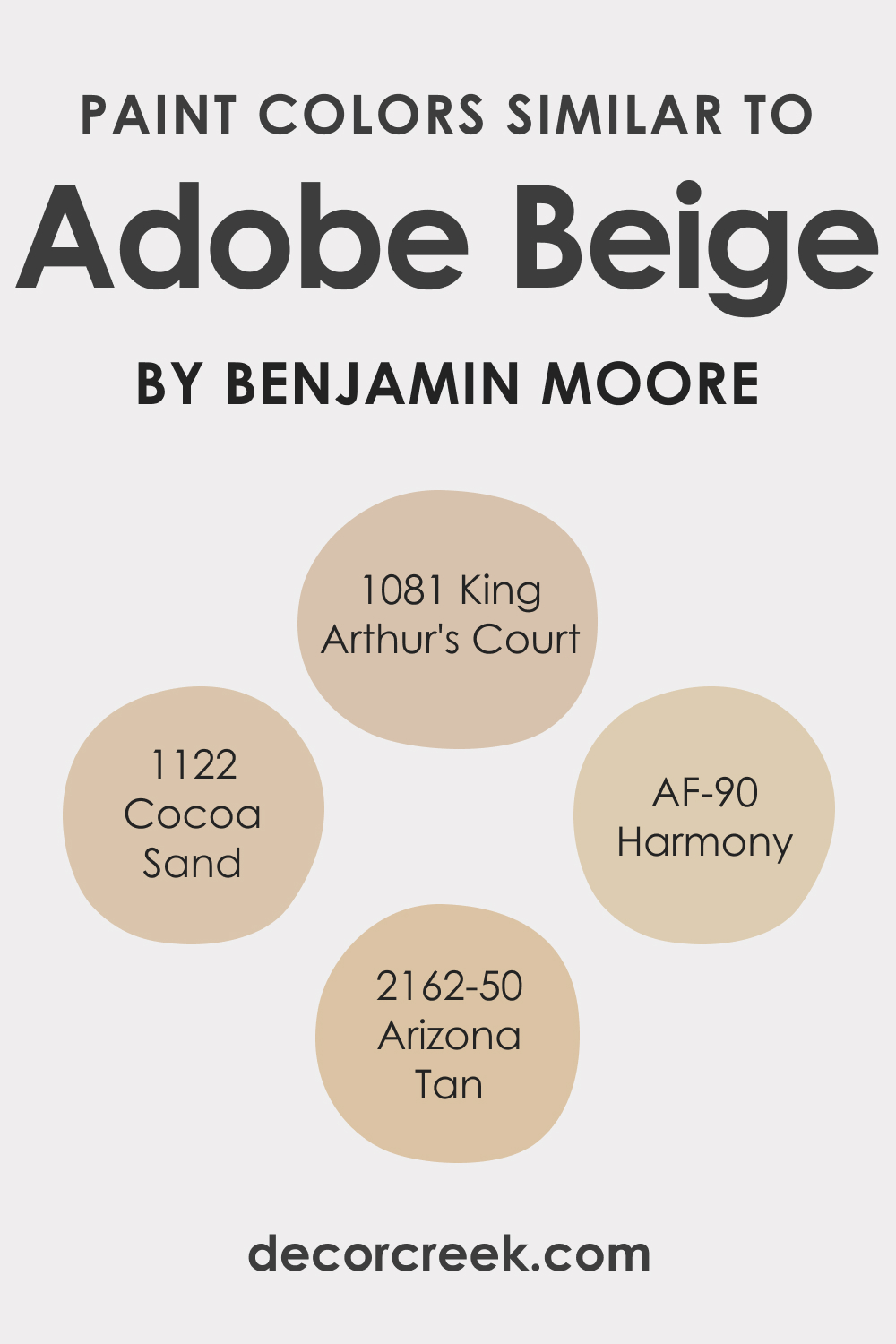
Colors Similar to Adobe Beige AC-7
Knowing colors similar to Adobe Beige AC-7 is valuable for creating color schemes, matching existing decor, and ensuring continuity in a design project. Similar colors include:
- BM 1122 Cocoa Sand : A rich, earthy brown that echoes the warmth of Adobe Beige AC-7.
- AF-90 Harmony : A deep, warm brown that shares Adobe Beige AC-7’s cozy ambiance.
- BM 1081 King Arthur’s Court
- BM 2162-50 Arizona Tan : A muted, natural brown with a similar earthiness.
Each of these colors complements Adobe Beige AC-7, providing options for creating a harmonious color scheme in your home.
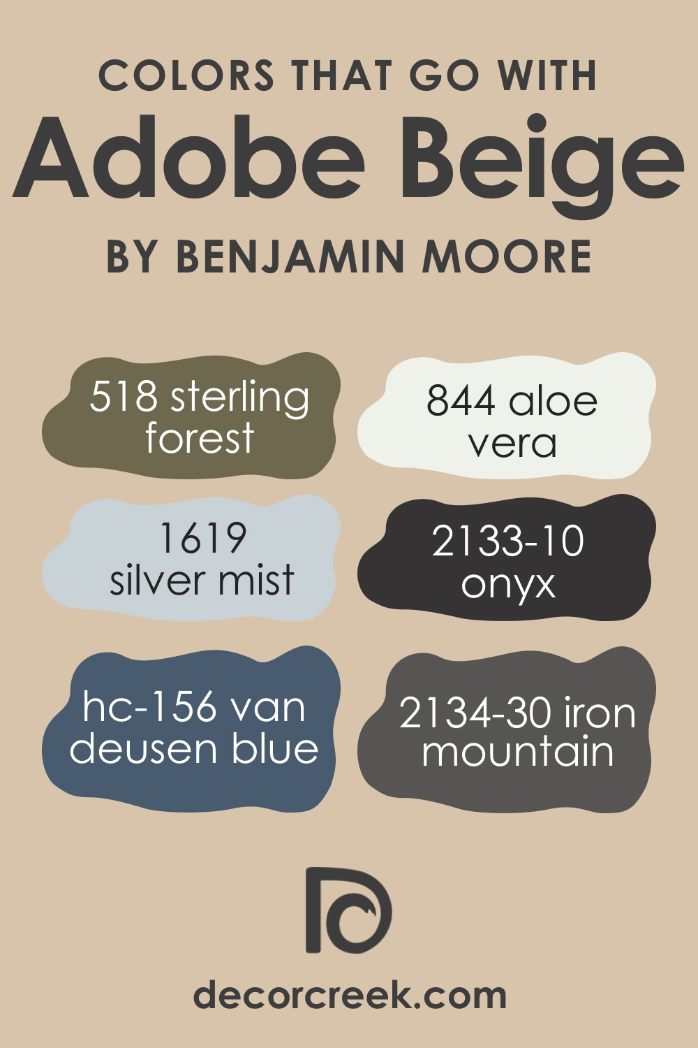
Colors That Go With Adobe Beige AC-7
It’s important to choose colors that harmonize well together in the same room to create a cohesive and aesthetically pleasing design. For Adobe Beige AC-7, consider these Benjamin Moore colors:
- HC-156 Van Deusen Blue : A deep, sophisticated blue that contrasts beautifully with Adobe Beige AC-7.
- BM 2133-10 Onyx : A bold, dramatic black that adds depth and elegance.
- BM 1619 Silver Mist : A light, airy gray that offers a subtle contrast.
- BM 518 Sterling Forest : A muted green that complements the earthy tones of Adobe Beige AC-7.
- BM 844 Aloe Vera : A soft, calming green that enhances the natural feel.
- BM 2134-30 Iron Mountain : A dark gray with brown undertones that pairs well with the warmth of Adobe Beige AC-7.
Each of these colors offers a unique contribution to a palette featuring Adobe Beige AC-7, allowing for a range of design possibilities.
How to Use Adobe Beige AC-7 in Your Home?
Adobe Beige AC-7, with its warm and versatile nature, is suitable for various rooms in your home. It can be used in living rooms to create a cozy and inviting atmosphere or in bedrooms for a soothing and restful ambiance. This color is particularly effective in spaces that embrace natural elements, fitting seamlessly into interior design styles like rustic, contemporary, transitional, and modern farmhouse.
Adobe Beige AC-7 also works well in dining areas, imparting a sense of warmth and elegance, and can be used in hallways and entryways for a welcoming feel. Its adaptability makes it an excellent choice for both large and small spaces.
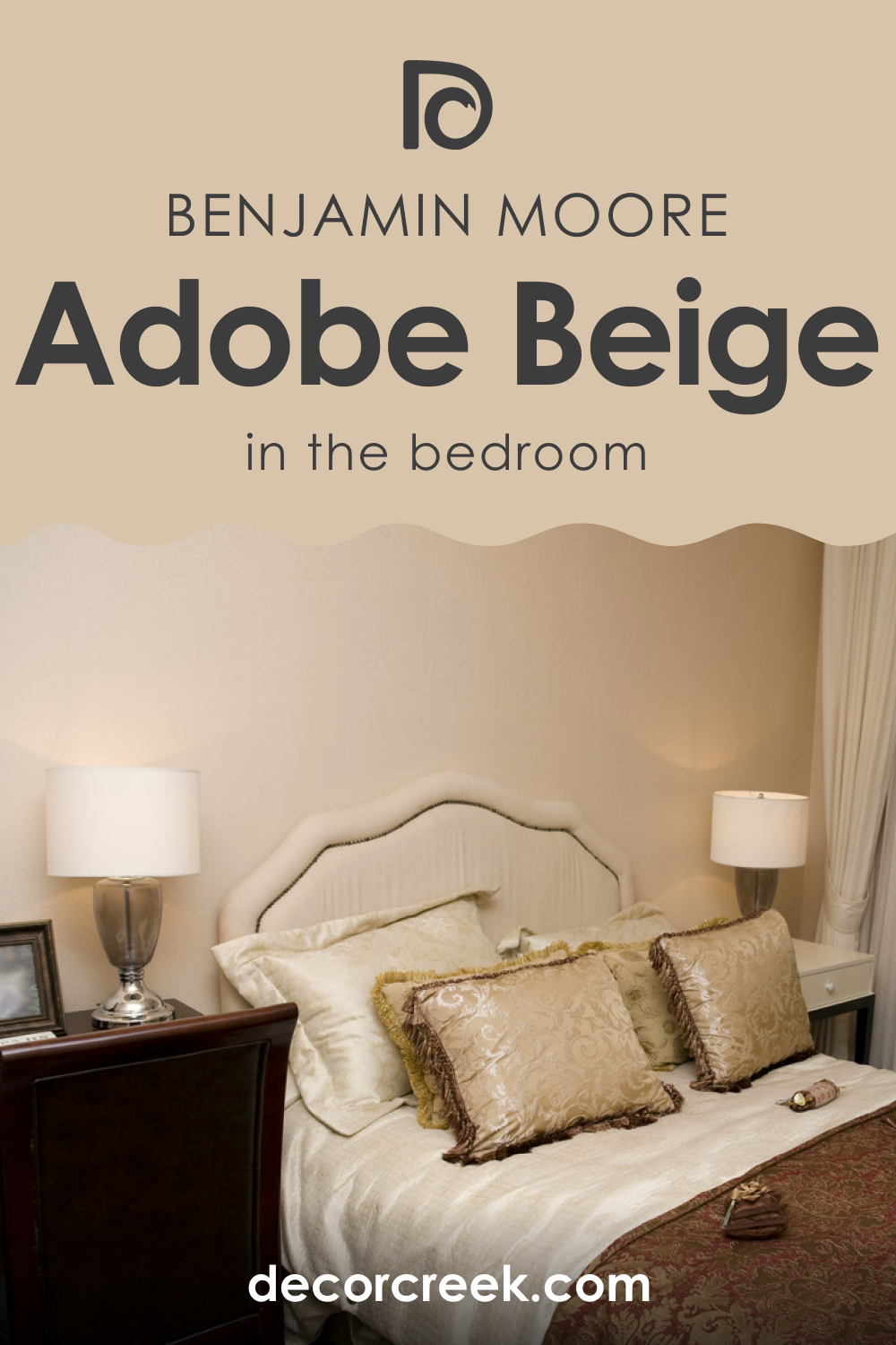
Adobe Beige AC-7 In the Bedroom
In the bedroom, Adobe Beige AC-7 creates a tranquil and restful environment. Its warm undertones promote relaxation and comfort, making it an ideal choice for a soothing bedroom palette. This color pairs beautifully with rich textiles, plush bedding, and natural wood furniture, enhancing the room’s coziness.
To add depth, combine Adobe Beige AC-7 with contrasting accent colors in pillows, curtains, or artwork.
Adobe Beige AC-7 In the Bathroom
Using Adobe Beige AC-7 in the bathroom can transform the space into a serene, spa-like retreat. This color complements natural materials like stone and wood, enhancing the room’s sense of tranquility. Pair it with crisp white fixtures and towels for a clean, refreshing look. Adobe Beige AC-7 is particularly effective in larger bathrooms, where it can add warmth without overwhelming the space.

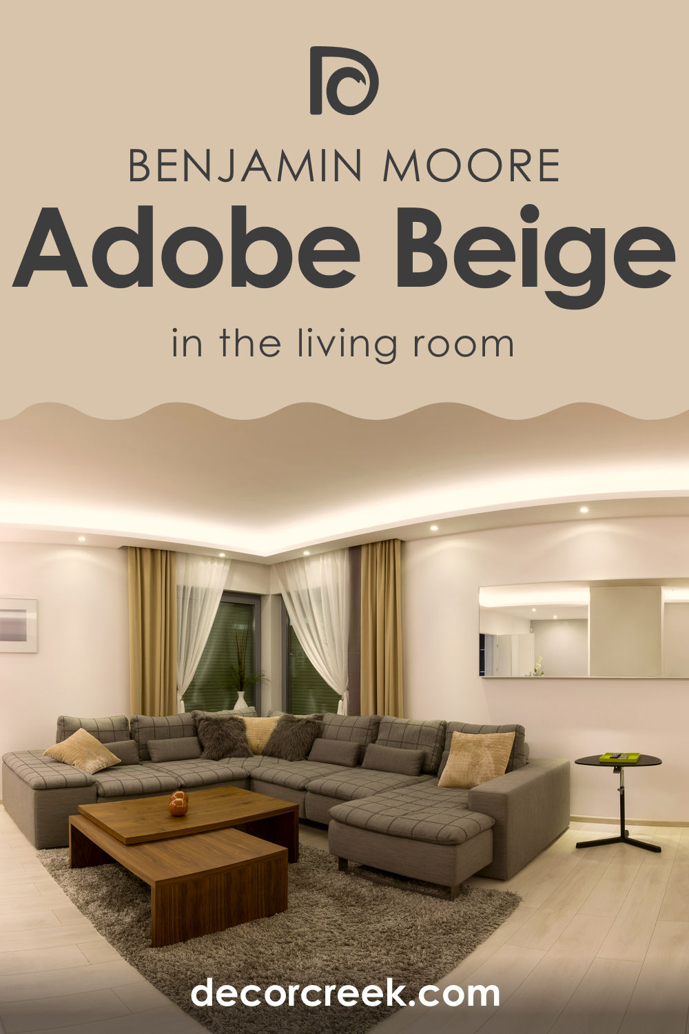
Adobe Beige AC-7 In the Living Room
Adobe Beige AC-7 in the living room offers a warm and welcoming ambiance. It pairs well with a variety of textures and materials, such as leather, wool, and velvet, adding to the room’s cozy feel. Use it as a main wall color or as an accent to add depth and interest.
Complement it with lighter furniture and decor to balance the warmth of the color.
Adobe Beige AC-7 For Exteriors
As an exterior color, Adobe Beige AC-7 imparts a warm and inviting look to your home. It works well with natural landscapes and complements a variety of architectural styles, from traditional to contemporary. Pair it with contrasting trim colors like white or soft gray for a classic, timeless appearance. Adobe Beige AC-7 is also an excellent choice for exterior accents like shutters or doors.

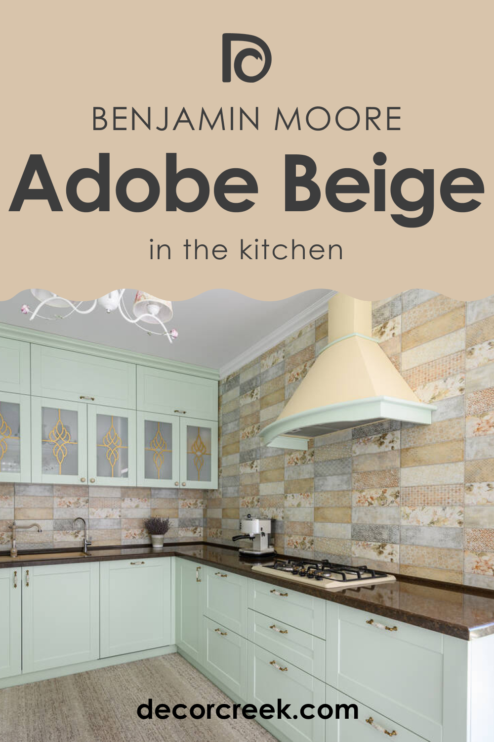
Adobe Beige AC-7 In the Kitchen
Adobe Beige AC-7 can create a warm and inviting kitchen atmosphere. It pairs well with natural wood tones for cabinetry, offering a rustic charm. Use it on walls to create a cozy ambiance or as an accent color on a kitchen island. Complement it with natural stone countertops and warm metal accents like copper or brass for a cohesive and stylish kitchen design.
Adobe Beige AC-7 On Kitchen Cabinets
Using Adobe Beige AC-7 on kitchen cabinets can give your kitchen a warm and inviting feel. This color works well with both modern and traditional kitchen styles, adding depth and character. Pair it with light-colored walls and countertops to create a balanced look.
For a cohesive design, use brushed nickel or aged brass hardware. Adobe Beige AC-7 on cabinets is especially effective in kitchens with good natural lighting, where it can create a rich and inviting atmosphere.

Comparing Adobe Beige AC-7 With Other Colors
Comparing different colors is essential in interior design because it helps to understand how colors interact with each other, the mood they create, and how they can transform a space. Color comparison is crucial for creating a harmonious color palette that suits the desired aesthetic and atmosphere.
It also aids in understanding the nuances of color undertones, which can significantly affect a room’s overall look in various lighting conditions. Comparing colors assists in choosing complementary shades for accents, trims, and furnishings, ensuring a cohesive and well-designed space.
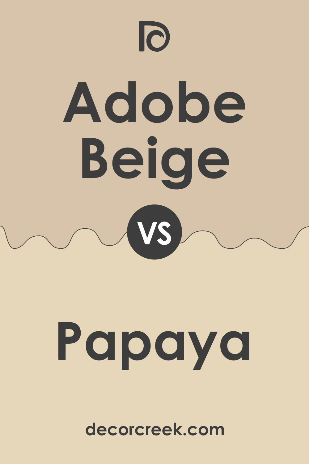
Adobe Beige AC-7 vs. BM 957 Papaya
Adobe Beige AC-7 and BM 957 Papaya offer a study in subtle contrasts. Adobe Beige is a warm, earthy beige with a comforting and grounding presence, ideal for creating a serene and inviting atmosphere. In contrast, Papaya is a brighter, more vibrant shade with a touch of playful energy.
Papaya would bring a lively and cheerful ambiance to a room, while Adobe Beige would provide a more calming and sophisticated feel. Together, they could create a balanced environment with a blend of warmth and brightness.
Adobe Beige AC-7 vs. HC-172 Revere Pewter
Comparing Adobe Beige AC-7 with HC-172 Revere Pewter highlights the difference between warm beige and a cooler gray. Revere Pewter, a light gray with warm undertones, offers a more contemporary, neutral backdrop than the earthier Adobe Beige. Adobe Beige brings a natural, warm feel to spaces, while Revere Pewter provides a sleek, modern look. In a combined setting, Adobe Beige can add warmth to the understated elegance of Revere Pewter.
Adobe Beige AC-7 vs. AF-685 Thunder
AF-685 Thunder is a deeper, more dramatic color compared to the softer Adobe Beige AC-7. Thunder, being a darker gray, brings a sense of sophistication and depth to spaces. In contrast, Adobe Beige offers a lighter, warmer, and more inviting atmosphere. When used together, Thunder could provide a striking contrast to the gentle warmth of Adobe Beige, ideal for creating an engaging and dynamic space.
Adobe Beige AC-7 vs. BM 2137-60 Gray Owl
BM 2137-60 Gray Owl is a cool, light gray that contrasts with the warm, earthy tones of Adobe Beige AC-7. Gray Owl brings a serene and airy feel to spaces, making it ideal for creating a tranquil and modern environment. In contrast, Adobe Beige adds warmth and coziness. Used together, they can offer a balanced palette, combining the freshness of Gray Owl with the inviting warmth of Adobe Beige.
Adobe Beige AC-7 vs. OC-64 Pure White
OC-64 Pure White offers a stark contrast to Adobe Beige AC-7. Pure White is a clean, crisp color that provides a neutral backdrop, making other colors stand out. Adobe Beige, with its warm undertones, creates a more inviting and cozy ambiance. In combination, Pure White can add brightness and freshness to the warmth of Adobe Beige, particularly effective in trims and ceilings.
Adobe Beige AC-7 vs. BM 1542 Himalayan Treck
BM 1542 Himalayan Treck is a deeper, more saturated color compared to Adobe Beige AC-7. Himalayan Treck, with its rich, earthy tones, offers a sense of adventure and boldness. Adobe Beige, in contrast, is more subdued and calming. When paired, Himalayan Treck can bring depth and drama to the subtle and soothing nature of Adobe Beige.
Conclusion
In conclusion, comparing Adobe Beige AC-7 with various other colors from Benjamin Moore’s range illustrates the importance of understanding color dynamics in interior design. Each comparison showcases how Adobe Beige AC-7 interacts with different hues, creating diverse aesthetics and moods.
From the lively contrast with Papaya to the elegant complement with Revere Pewter, and the dramatic juxtaposition with Thunder, these comparisons highlight Adobe Beige AC-7’s versatility and adaptability.
Understanding these interactions is key to creating beautifully curated spaces that reflect personal style and achieve desired atmospheres.

Ever wished paint sampling was as easy as sticking a sticker? Guess what? Now it is! Discover Samplize's unique Peel & Stick samples.
Get paint samples


