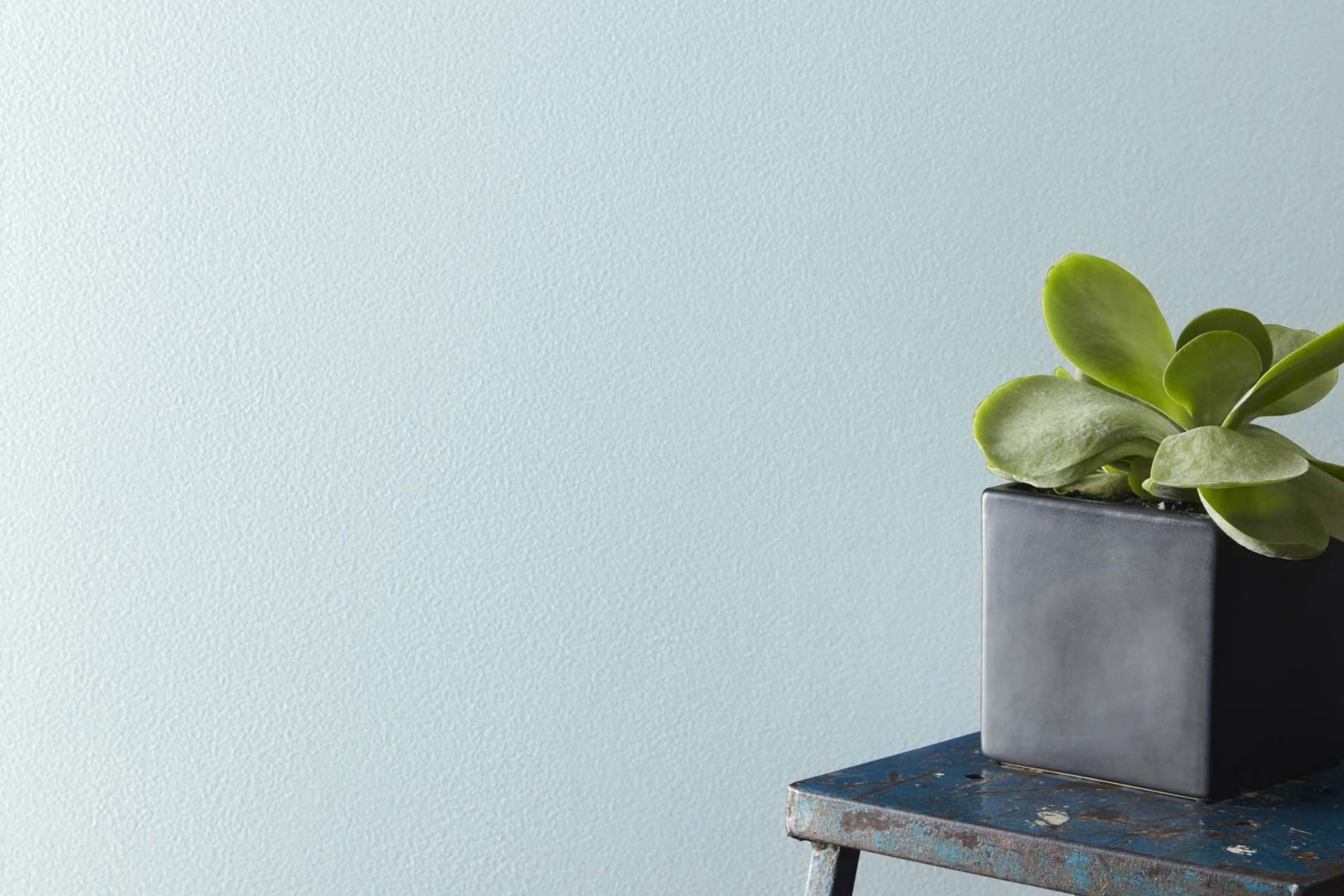
When you first lay eyes on 1667 Blue Haze by Benjamin Moore, it’s like a breath of fresh air. This shade is a gentle blend of blue with hints of gray, reminiscent of the soft morning sky. It has a soothing quality that makes any room feel calm and relaxed. As someone who enjoys a touch of subtlety in decor, you’ll appreciate how this color maintains a quiet presence without overpowering a room.
Choosing the right paint color can be a bit tricky, but Blue Haze offers a flexible option that works beautifully in various settings, whether you’re updating your living room or adding a peaceful touch to your bedroom. Its soft hue pairs well with both modern and traditional decorations, making it a go-to choice for anyone looking to refresh their home.
Plus, it complements a wide range of other colors and materials, from bright whites to warm woods, ensuring that it integrates seamlessly into your existing decor. So if you’re looking for a color that brings a peaceful and airy feel to your home, 1667 Blue Haze could be the perfect pick for you.
Its subtle charm and adaptability make it a fantastic candidate for creating a welcoming atmosphere in any room.
What Color Is Blue Haze 1667 by Benjamin Moore?
Blue Haze by Benjamin Moore is a gentle and soft blue hue with a touch of gray. This subtle color has an ability to infuse a room with a calm and welcoming atmosphere, making it a perfect choice for rooms where relaxation is key. It has a light reflectance value which means it can brighten up a room while maintaining a cozy feel.
Ideal for a variety of interior styles, Blue Haze works exceptionally well in coastal, Scandinavian, and modern farmhouse decors. Its muted quality complements minimalist areas, allowing furniture and artwork to stand out. In a coastal setting, it echoes the colors of the sky and sea, enhancing the airy and fresh aesthetic that is central to this style.
When pairing with materials and textures, Blue Haze is flexible. It looks stunning with natural wood, whether it’s a pale Scandi-style birch or a richer, darker walnut. Textiles like linen or soft cotton in white or neutral tones create a clean, relaxed look. For a bit of contrast, adding elements in black or navy can ground the room.
Combining it with metallic finishes like brushed silver or soft gold adds a hint of luxury, making the color pop subtly. Overall, Blue Haze is an adaptable color choice that shifts mood depending on its pairing, offering endless possibilities for creating a personalized and cozy home environment.
Is Blue Haze 1667 by Benjamin Moore Warm or Cool color?
Blue Haze is a paint color from Benjamin Moore that offers a subtle, soothing feel to any room. This gentle blue with a hint of gray helps create a relaxed and restful environment. It’s perfect for living rooms where you want to wind down or bedrooms that are meant for a calm atmosphere.
The muted tone makes it easy to pair with various decor styles, whether you’re going for a modern look or something more classic. It reflects light beautifully, which can make smaller rooms appear bigger and more open.
This color also works well as a background for artworks or bolder colored furniture, providing a clean yet warm backdrop. Homeowners often choose Blue Haze because it’s flexible and enduring, providing just the right amount of color without overpowering the room. It’s excellent for those looking to refresh their home with a gentle touch of color.
Undertones of Blue Haze 1667 by Benjamin Moore
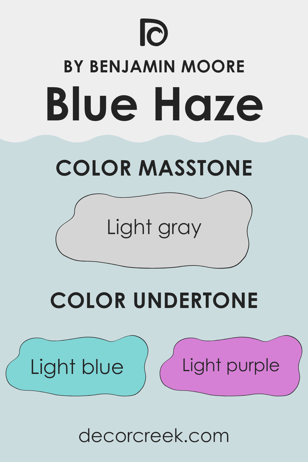
Blue Haze by Benjamin Moore is a flexible paint color with a range of subtle undertones that can influence the atmosphere of any room. The undertones are light blue, light purple, pale yellow, lilac, mint, pale pink, and grey. These undertones play a critical role in how we perceive the color, as they can subtly shift Blue Haze’s appearance under different lighting conditions or when paired with various decor elements.
Undertones affect the way we see colors because they can bring out certain hues more prominently in specific lighting. For example, in a room with a lot of natural light, the pale yellow and light blue undertones of Blue Haze might make the walls look brighter and more vibrant. In contrast, in a room with dimmer lighting, the grey and lilac undertones might become more dominant, giving the room a softer, more muted look.
When using Blue Haze on interior walls, the presence of these undertones allows the color to adapt to different styles and furnishings. The mint and light purple undertones can complement natural elements like houseplants or wood finishes, enhancing an earthy feel. Meanwhile, the pale pink undertone provides a subtle warmth that makes the room welcoming. The adaptability of Blue Haze, enriched by its undertones, makes it suitable for various rooms, ensuring it works harmoniously with different themes and color palettes.
This flexibility is crucial for homeowners looking to create a cohesive yet unique home environment.
What is the Masstone of the Blue Haze 1667 by Benjamin Moore?
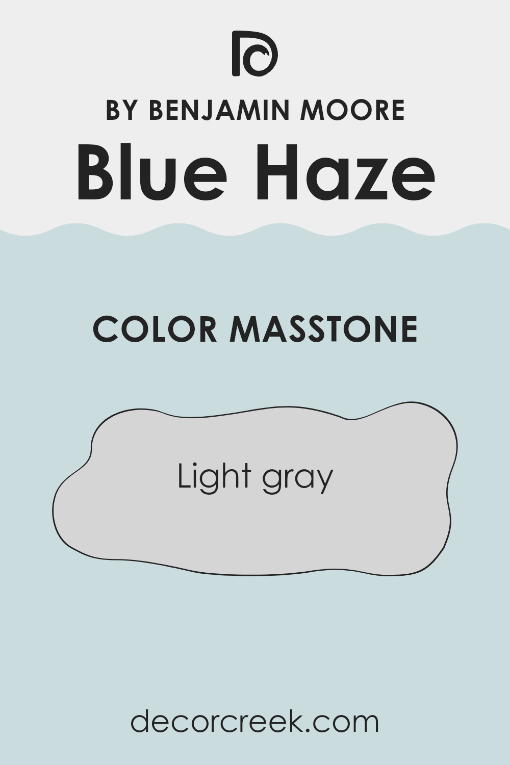
Blue Haze 1667 by Benjamin Moore, with its masstone of light gray (#D5D5D5), brings a soft and neutral tone into any home. This particular shade of light gray is very flexible and works well in many different settings.
It can help make a small room appear larger and brighter because it reflects light well. When used in a busy area like a living room, it offers a calm background that doesn’t overpower the room but instead complements various furniture styles and colors.
This color is also easy to maintain, as it doesn’t show dirt or smudges easily — a practical choice for high-traffic areas or homes with kids and pets. It’s a popular choice for those looking to update their room without making too bold a statement. Additionally, pairing this light gray with brighter colors or wood finishes can add a pleasing contrast, making it an adaptable option that can adjust to changing decor styles over time.
How Does Lighting Affect Blue Haze 1667 by Benjamin Moore?
Lighting plays a crucial role in how we perceive colors in an environment. The same color can appear different under various light sources due to differences in light temperature and intensity. Take the color Blue Haze by Benjamin Moore as an example; how it shows in a room can change significantly depending on the type of light it’s under—whether it’s natural sunlight or artificial lighting.
In natural light, Blue Haze generally looks bright and vivid because natural sunlight provides a full spectrum of light, making colors appear truer. In artificial light, the appearance can shift based on the type of bulbs used. Fluorescent lighting can give Blue Haze a cooler tone, making it seem slightly lighter. In contrast, incandescent lighting typically warms up the color, giving it a softer, cozier feel.
The direction a room faces also affects how Blue Haze looks throughout the day. North-facing rooms tend to receive less direct sunlight, which can make this light blue shade appear a bit more muted and shadowy. South-facing rooms, however, get a lot of sunlight; here, Blue Haze will look very vibrant and almost seem to glow due to the abundant bright light.
East-facing rooms catch the morning sun, which is generally warm and bright. In these rooms, early in the day, Blue Haze will appear cheerful and fresh. As the day progresses and the sun moves, the color might lose some of its vibrancy but still holds a pleasant lightness. Conversely, in west-facing rooms, the situation reverses.
The color won’t get much attention in the morning but will progressively brighten up and look lively by the afternoon as it catches the warm, golden tones of the setting sun. Understanding these nuances can help in deciding where to apply this color and what kind of lighting fixtures to use to enhance its beauty without losing its subtleties.
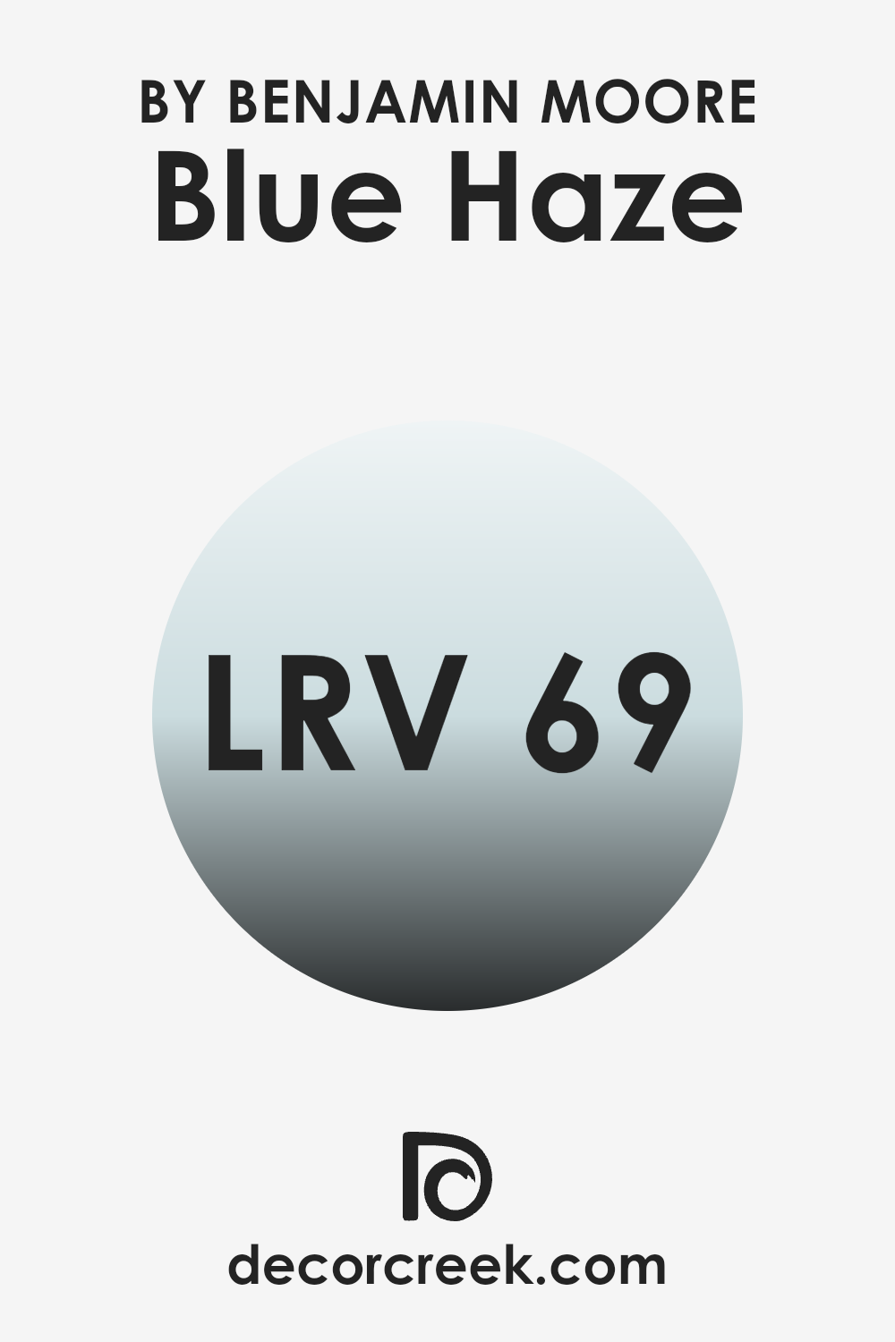
What is the LRV of Blue Haze 1667 by Benjamin Moore?
LRV stands for Light Reflectance Value, a measure that tells how much light a paint color reflects back into a room as opposed to absorbing it. This measurement scale runs from 1 to 99, where 1 would represent a very dark color that absorbs most light and 99 is nearly reflective like a mirror.
Understanding LRV is important because it helps in deciding which colors to use based on how bright or dim you want your room to appear. A color with a high LRV can make rooms look larger and more illuminated because it reflects more light around the room.
For the shade “Blue Haze,” which has an LRV of 68.59, it means the color is fairly light and will reflect a considerable amount of light. This makes it a great choice for making a small room feel more open and airy, or brightening a room that doesn’t get much natural sunlight. It won’t make a room feel closed in or overpowering, due to its higher light-reflective quality.
This can affect mood as well as aesthetics, as lighter rooms tend to feel more welcoming and comfortable.
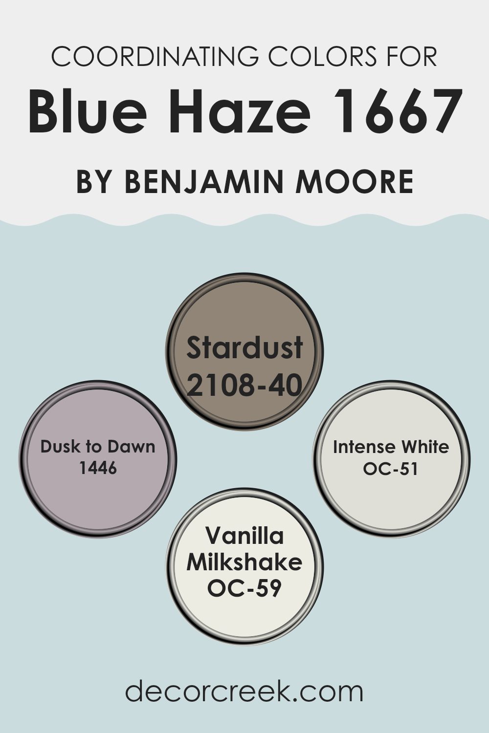
Coordinating Colors of Blue Haze 1667 by Benjamin Moore
Coordinating colors are those that complement each other while sharing some common undertones to create a harmonious look in any room. When you pair colors like Blue Haze with its coordinating shades, you make the room feel well put together. Each coordinating color complements Blue Haze by enhancing its character and mood without overpowering it.
This ensures that the overall area feels balanced and aesthetically pleasing. Using coordinating colors effectively can help define different areas of a room or tie together diverse elements within a single room.
For instance, Stardust, a soft grey, offers a subtle contrast to Blue Haze, lending a gentle distinction without a stark difference. This makes it ideal for creating a peaceful and inviting atmosphere. Dusk to Dawn, which is a deeper shade, provides a more pronounced contrast, adding a bit of depth and interest to areas predominantly colored in Blue Haze. On the lighter side, Intense White isn’t just plain white; it has a hint of grey which makes it a perfect match for maintaining the cool tone of Blue Haze while brightening the room.
Finally, Vanilla Milkshake, a creamy off-white, brings a warm contrast that softens the overall look, creating a cozy and welcoming vibe. All of these colors work together to enhance the primary color without clashing, allowing for a fluid and pleasing decor.
You can see recommended paint colors below:
- 2108-40 Stardust
- 1446 Dusk to Dawn
- OC-51 Intense White
- OC-59 Vanilla Milkshake
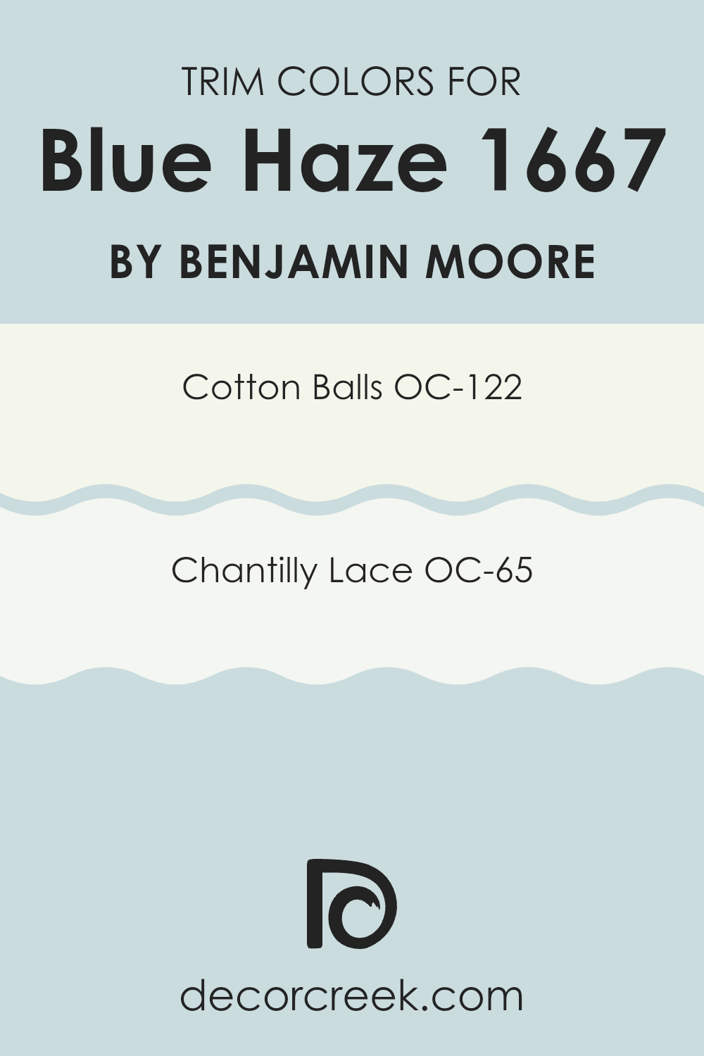
What are the Trim colors of Blue Haze 1667 by Benjamin Moore?
Trim colors are used to highlight or accentuate the architectural details and frame the main color of a room, helping to define and complete the look of a room. When used effectively, trim colors can enhance the overall aesthetic, provide a neat finish, and create subtle yet impactful contrasts that draw attention to features like door frames, moldings, and window sills. For Blue Haze by Benjamin Moore, choosing the right trim colors is crucial to set off its cool, gentle blue tone in a way that feels cohesive and well-coordinated.
Two excellent trim color choices for Blue Haze are Cotton Balls OC-122 and Chantilly Lace OC-65, both by Benjamin Moore. Cotton Balls is a warm, soft white with a slightly creamy feel that provides a gentle contrast, softening the cooler tones of Blue Haze without overpowering its light and airy feel.
On the other hand, Chantilly Lace is a crisp, clean white with just the slightest hint of cool undertone, which makes it perfect for sharpening and refining the edges around Blue Haze, ensuring that the rooms feel fresh and neatly defined. Together, these trim colors offer options that can either soften or crisply define the visual transitions in rooms painted with Blue Haze.
You can see recommended paint colors below:
- OC-122 Cotton Balls
- OC-65 Chantilly Lace
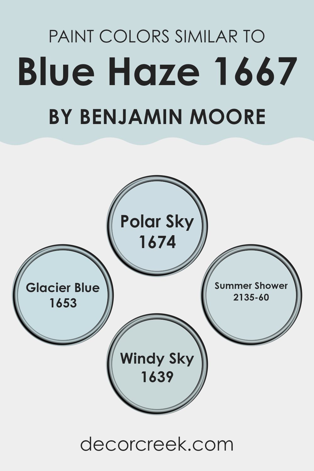
Colors Similar to Blue Haze 1667 by Benjamin Moore
Selecting similar colors, like variants of the Blue Haze tone by Benjamin Moore, is crucial for creating a harmonious color scheme within a room. These shades complement each other because they share a common base color, which in this case is a soft, soothing blue.
When used together, these hues can make a room feel more cohesive, inviting, and aesthetically pleasing, as the slight variations create depth and interest. For example, using different shades of similar colors in fabrics, wall paint, and decorations can unify a room while allowing for gradation and richness of design.
Among the variations, Polar Sky is a bit deeper than Blue Haze, lending a stronger yet still gentle touch of blue to areas needing a bit more color without overpowering boldness. Glacier Blue is a lighter, airier shade, excellent for creating a sense of freshness and light in smaller or darker rooms. Summer Shower, on the other hand, offers a slight hint of green, which enhances its refreshing feel, making it perfect for bathrooms or airy kitchens.
Meanwhile, Windy Sky, which adds a touch of gray to the blue, offers a cooler and more neutral alternative, ideal for modern areas that require a subtle yet distinct color background. These different yet similar colors work together smoothly to create environments that are pleasing to the eye and very comfortable to live in.
You can see recommended paint colors below:
- 1674 Polar Sky
- 1653 Glacier Blue
- 2135-60 Summer Shower
- 1639 Windy Sky
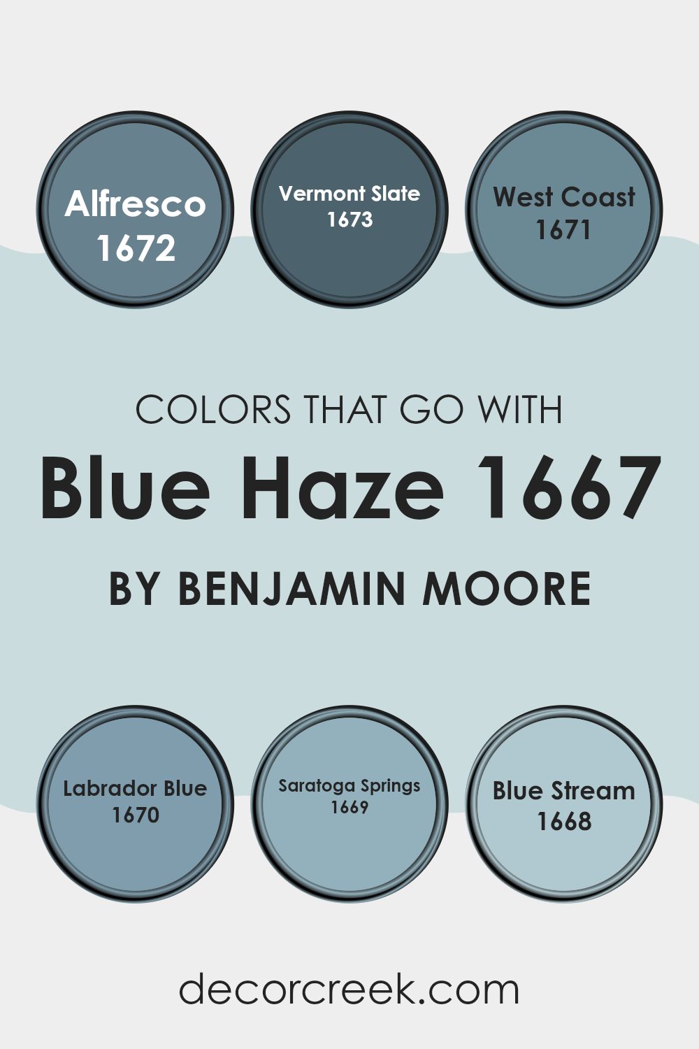
Colors that Go With Blue Haze 1667 by Benjamin Moore
Choosing the perfect colors to pair with Blue Haze 1667 by Benjamin Moore can significantly enhance the aesthetic appeal and overall ambiance of a room. Complementary colors like Alfresco, Vermont Slate, West Coast, Labrador Blue, Saratoga Springs, and Blue Stream each bring their own unique flair while maintaining harmony with the soothing Blue Haze. These pairings are crucial because they help create a balanced and cohesive look that can make any room feel more inviting.
Alfresco is a gentle color that offers a hint of freshness, mimicking a light sky on a clear day, which pairs beautifully with the softness of Blue Haze. Vermont Slate offers a deeper, more grounded feel, reminiscent of the sturdy, weathered rocks of a mountain trail, providing a striking contrast that adds depth to the walls.
West Coast has a warm undertone that suggests the calmness of a sunset beach, enhancing Blue Haze with its subtle yet warm presence. Labrador Blue is vibrant, echoing the lively spirit of ocean waves, which can infuse a room with energy when used alongside the peaceful Blue Haze. Saratoga Springs is a rich, deep tone with a hint of mystery, akin to shadows cast in a dense forest, perfect for adding elegance without overpowering.
Lastly, Blue Stream is crisp and fluid, similar to a brisk flowing river, complementing Blue Haze by reinforcing a theme of fluidity and continuity in the decor. Together, these colors form a flexible palette that can be adapted to various decor styles, adding beauty and a harmonious sense to any living room.
You can see recommended paint colors below:
- 1672 Alfresco
- 1673 Vermont Slate
- 1671 West Coast
- 1670 Labrador Blue
- 1669 Saratoga Springs
- 1668 Blue Stream
How to Use Blue Haze 1667 by Benjamin Moore In Your Home?
Blue Haze 1667 by Benjamin Moore is a soft and gentle blue paint that brings a refreshing vibe to any room. This color is perfect for those looking to add a calm and relaxing feel to their living room. It works beautifully in bedrooms, creating a cozy atmosphere that’s ideal for resting. You can also use it in bathrooms for a clean, airy look.
For a subtle touch, consider painting accent walls with Blue Haze in your living room or kitchen. This will add a nice pop of color without overpowering the room. Pair it with white or light gray furnishings for a harmonious look.
Moreover, if you’re aiming for a slight change instead of a full repaint, using Blue Haze on furniture like bookshelves or cabinets can instantly refresh the piece and bring new life to your room. Overall, Blue Haze 1667 is a flexible color that works well in various settings, helping to create a pleasant and welcoming environment.
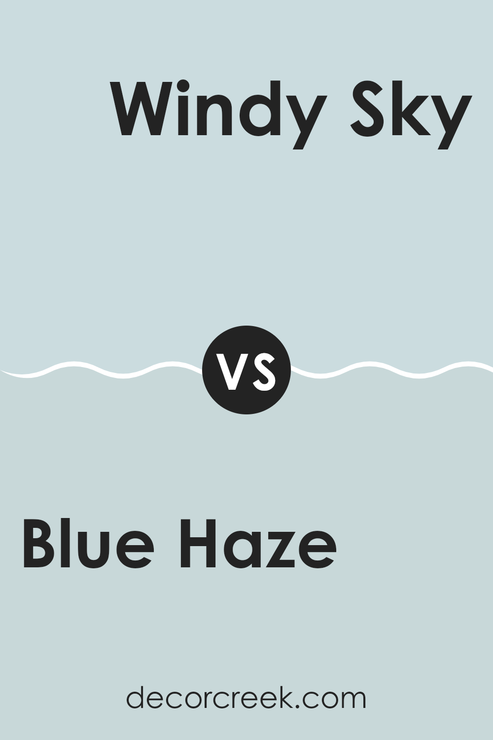
Blue Haze 1667 by Benjamin Moore vs Windy Sky 1639 by Benjamin Moore
Blue Haze and Windy Sky by Benjamin Moore are two beautiful colors that are perfect for creating a calm and soothing atmosphere. Blue Haze is a soft, pale blue that adds a touch of lightness to any room. It pairs well with muted tones and can make small areas appear larger and more open.
On the other hand, Windy Sky is a slightly deeper shade of blue with hints of gray. This color gives a room a cozy feel, making it ideal for places where you want to relax and unwind.
While both shades can enhance a room, Blue Haze is better for achieving a brighter ambiance, and Windy Sky works well in settings where a more subdued, comforting mood is desired. Both colors are flexible and can be used in various styles, from contemporary to traditional.
You can see recommended paint color below:
- 1639 Windy Sky
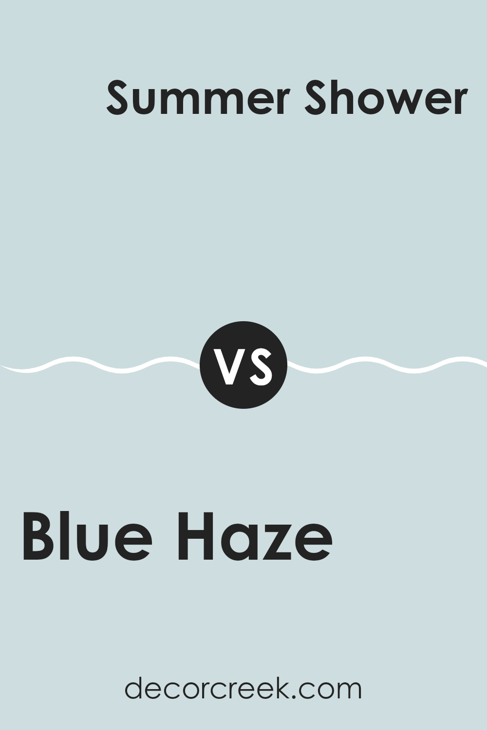
Blue Haze 1667 by Benjamin Moore vs Summer Shower 2135-60 by Benjamin Moore
Comparing Blue Haze and Summer Shower, both from Benjamin Moore, reveals subtle yet distinct differences. Blue Haze offers a soft, muted blue with a hint of gray, creating a gentle and calming feel in any room.
It’s a flexible color that blends well with more neutral shades, providing a soothing backdrop. Summer Shower, on the other hand, possesses a lighter, crisper blue tone that resembles a clear sky on a sunny day. This color has a refreshing quality that can brighten up a room, making it feel more open and airy.
It pairs well with whites and other light neutrals, perfect for those looking to add a clean and fresh vibe to their interiors. Both colors hold their own charm and can significantly affect the mood and ambiance of a room, depending on the effect you want to achieve.
You can see recommended paint color below:
- 2135-60 Summer Shower
Blue Haze 1667 by Benjamin Moore vs Polar Sky 1674 by Benjamin Moore
Blue Haze and Polar Sky by Benjamin Moore are two distinct shades of blue, each with its unique character. Blue Haze is a soft, muted blue that gives a gentle and calming feel to any room. It’s a flexible color that pairs well with many decors, making it ideal for living areas and bedrooms where a relaxed atmosphere is desired.
On the other hand, Polar Sky is a slightly brighter and cooler shade, imparting a fresher and more vibrant feel. It can add a sense of airiness and light to an area, making it particularly suitable for smaller or darker rooms that could benefit from a sense of expanded openness.
While both colors share a blue base, Blue Haze leans towards a warmer, almost pastel-like softness, whereas Polar Sky offers a crisper and more energetic vibe. Choosing between them depends on the kind of mood or aesthetic you want to achieve in your area.
You can see recommended paint color below:
- 1674 Polar Sky
Blue Haze 1667 by Benjamin Moore vs Glacier Blue 1653 by Benjamin Moore
Blue Haze and Glacier Blue are two colors by Benjamin Moore that while similar, have distinct characteristics. Blue Haze is a soft, muted color that has a slightly gray undertone, making it very gentle and subtle when applied on walls. It provides a calming feel to any room, without being too vibrant or overpowering. It’s perfect for creating a relaxed environment, especially in bedrooms or living areas where you want a soothing atmosphere.
On the other hand, Glacier Blue is a bit brighter and leans more towards a true light blue. It has a fresh, airy quality that can make an area feel more open and light-filled. This color works wonderfully in bathrooms or kitchens where a cleaner, crisper blue can liven up the room.
Both colors are quite flexible, but the choice between them depends on the mood you want to set and the natural light in your rooms. Glacier Blue tends to breathe more energy into an area, whereas Blue Haze offers a more subdued, cozy feel.
You can see recommended paint color below:
- 1653 Glacier Blue
Discussing 1667 Blue Haze by Benjamin Moore made me realize just how unique and special this paint color is. In wrapping up my thoughts, this isn’t just any ordinary blue. It’s a peaceful color that reminds me of a soft morning sky, which can make any room feel calm and happy.
What’s really great about Blue Haze is how softly it blends with other colors, like greens, whites, and even yellows, making it a wonderful choice for cozy places like living rooms and bedrooms. It has a way of making these rooms feel like a warm, gentle hug, which I think everyone would enjoy.
I tried using Blue Haze in a small project at home and it turned out beautifully—light and airy but also with enough color to make the area interesting and lively. My experience confirmed that it’s easy to apply and looks really good in natural light, which makes the room look bright and welcoming.
In summary, if you’re thinking of giving a fresh look to your house with a paint that’s easy to match, gentle on the eyes, and has a cheerful but calm feel, 1667 Blue Haze by Benjamin Moore would be a brilliant choice. It’s perfect for anyone who wants to make their home feel warmer and more inviting without being too bold or dramatic.
Ever wished paint sampling was as easy as sticking a sticker? Guess what? Now it is! Discover Samplize's unique Peel & Stick samples.
Get paint samples

