If you’re on the lookout for the perfect blue to enhance your space, you might find Sherwin Williams’ SW 6497 Blue Horizon to be a refreshing choice. The joy of painting your room with a new color as lively and serene as Blue Horizon is unmatched. Imagine walking into your space, feeling instantly uplifted by the vibrant yet soothing tones that decorate your walls.
As a versatile shade, Blue Horizon works beautifully in various settings, whether you’re aiming to add a splash of color to your bedroom, living room, or even a bathroom. This color has a charm that lightens up any room and brings a fresh, airy feel to the environment.
With its subtle vibrancy, you can feel like I am breathing new life into your home in no time. By choosing SW 6497 Blue Horizon, you’re not just painting your walls; you’re reinventing your surroundings into a delightful, peaceful haven.
So, don’t hesitate to bring this color into your life and see how it can revamp your home with its lovely blue hues.

What Color Is Blue Horizon SW 6497 by Sherwin Williams?
Blue Horizon by Sherwin Williams is a vibrant shade of blue that brings a fresh and energetic feel to any space. This color has a lively vibe that can instantly perk up a room. It is particularly striking because it has a deep, yet bright quality that attracts the eye without overwhelming the senses.
Blue Horizon works especially well in contemporary and coastal interior styles. In contemporary settings, its boldness adds a lively splash of color against neutral backgrounds, while in coastal designs, it echoes the vibrant hues of the sea and the sky, enhancing the airy and light atmosphere that these styles often evoke.
When it comes to pairing materials and textures with Blue Horizon, natural wood works beautifully as it complements the warmth of the blue. Think light oak or weathered wood for a beachy look, or darker walnut for a more striking contrast in a modern space. Linen and cotton fabrics in white or soft gray also pair nicely, adding a relaxed and comfortable feel to the environment.
For a touch of luxury, metallic accents in silver or brushed nickel can provide just the right amount of shimmer and sophistication, making the blue stand out even more.
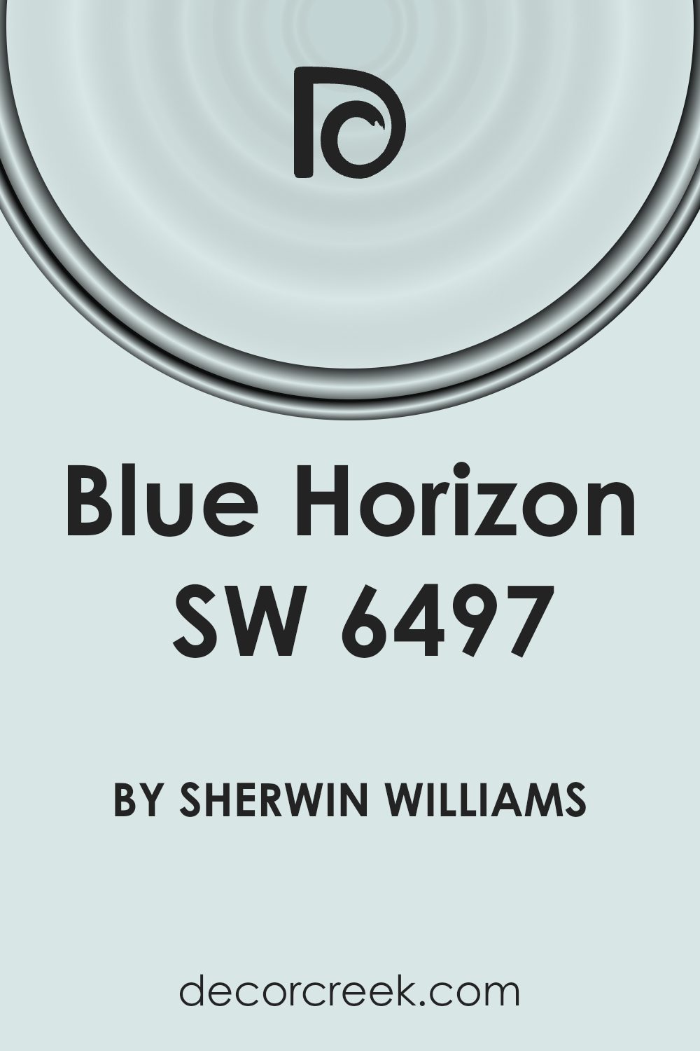
Is Blue Horizon SW 6497 by Sherwin Williams Warm or Cool color?
Blue Horizon by Sherwin Williams is a vibrant shade of blue that brings a lively and refreshing vibe to any room. It’s a color that works well in spaces where you want to add a pop of brightness without overwhelming the area. Perfect for a small accent wall, it can also be used in larger areas if you want to make a bold statement.
When used in homes, Blue Horizon creates an energetic atmosphere. It’s great for places like a home office or a study area, where it can help boost focus and energy levels. In a living room or bedroom, pairing it with softer tones, like creamy whites or light grays, helps balance the boldness and makes the space more inviting.
This color also works very well with natural light, which can enhance its vibrancy throughout the day. Whether you go for a matte or glossy finish, Blue Horizon is versatile and can easily adapt to different styles and preferences, making it a popular choice for those looking to refresh their living spaces.
Undertones of Blue Horizon SW 6497 by Sherwin Williams
Blue Horizon is a unique paint color that has a complex mix of undertones, including light blue, pale yellow, light purple, mint, lilac, pale pink, and grey. These undertones play a crucial role in how the color appears under different lighting conditions and against various decor styles.
Undertones are subtle colors that influence the main hue. For instance, a blue paint with a grey undertone might look cooler and more neutral than a blue with a yellow undertone, which could appear warmer. Understanding these nuances helps in choosing paint colors that complement the space and furnishings.
When used on interior walls, Blue Horizon creates a dynamic effect due to its blend of undertones. In rooms with lots of natural light, the light blue and mint undertones might make the walls feel fresh and lively. Lower light might draw out the lilac and pale pink, giving the room a softer, more gentle feel.
Moreover, the grey undertone in Blue Horizon can help in balancing brighter colors in the room, making it a versatile choice that can adapt to various decorating styles. This adaptability makes it ideal for spaces that serve multiple purposes or need to transition between different uses or moods throughout the day.
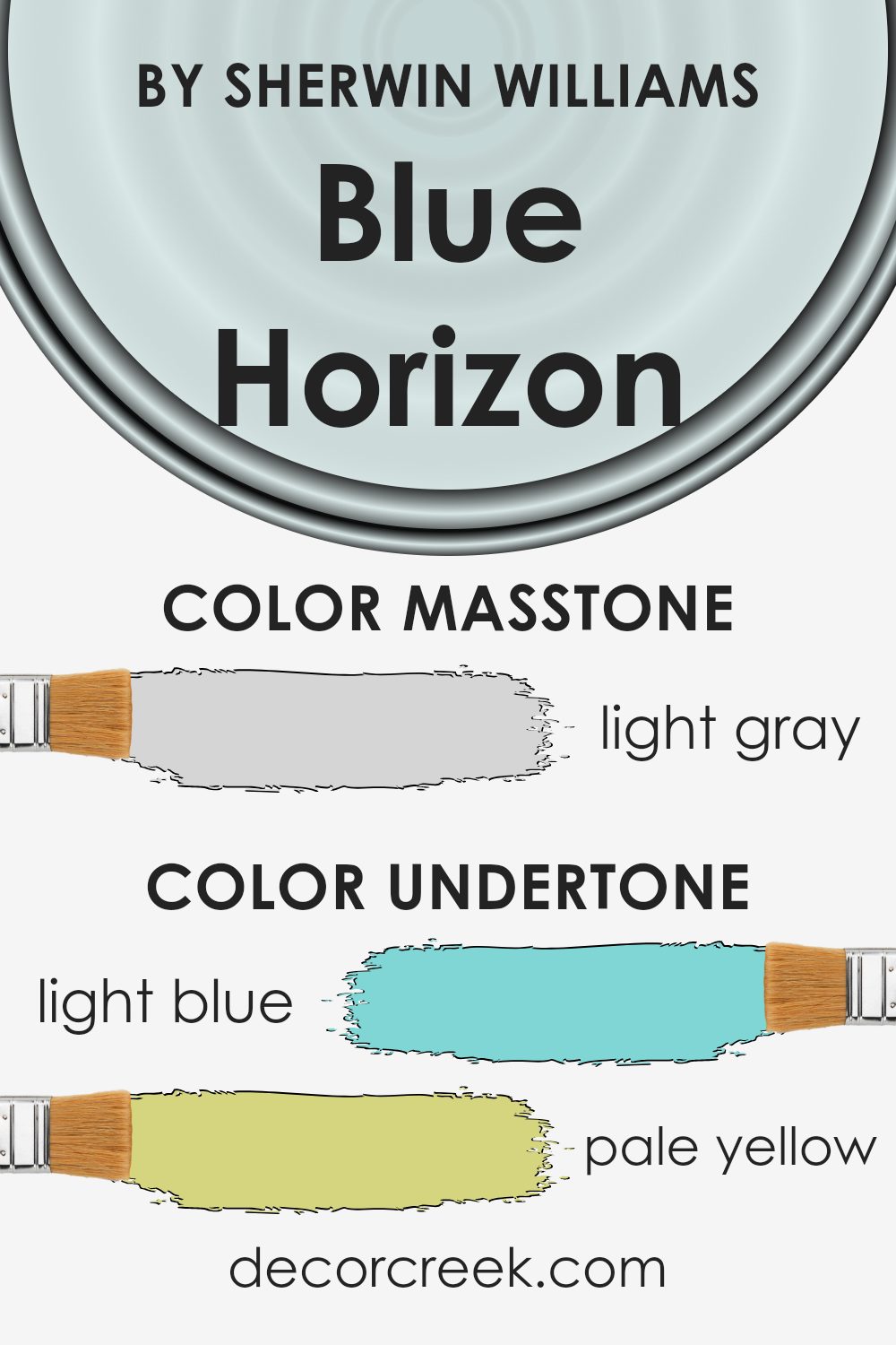
What is the Masstone of the Blue Horizon SW 6497 by Sherwin Williams?
Blue HorizonSW 6497 has a masstone of light gray, with a hex code of #D5D5D5. This subtle shade works wonderfully in homes because it serves as a neutral backdrop. It’s light enough to make small rooms appear larger and more open, yet has enough presence to add a hint of color without overwhelming a space.
With its light gray tone, it pairs well with a wide range of other colors, from bright accents to other neutral tones, allowing for flexibility in decorating.
This makes it ideal for living areas, bedrooms, and even bathrooms, where you might want a calm, soothing atmosphere. It’s especially useful in spaces that get lots of natural light, as it can help balance the brightness without darkening the room. This color is great for anyone who wants a fresh, clean look that’s easy on the eyes.
How Does Lighting Affect Blue Horizon SW 6497 by Sherwin Williams?
Lighting has a significant impact on how colors are perceived, and this is especially true for paint colors on walls. Different lighting conditions can make a color look very different. Blue Horizon is a vibrant shade of blue that can change appearance depending on the light in the room.
In artificial light, such as light bulbs commonly used in homes, colors can look warmer or cooler depending on the bulb. Blue Horizon might appear brighter and slightly more vivid under cool white bulbs, which mimic daylight. Under warm yellow light, it might look more muted, pulling out subtle green or gray undertones in the color.
In natural light, Blue Horizon behaves differently throughout the day as the quality of the sunlight changes. Sunlight in the morning is typically softer and cooler, making Blue Horizon look crisp and lively. As the day progresses, the color may look more subdued but still retains its rich, vibrant tone.
The orientation of the room also plays a role in how Blue Horizon looks:
- North-faced rooms receive less direct sunlight, and the light is usually cooler and softer. In these rooms, Blue Horizon can look a bit more shadowed and subtle. It doesn’t reach its full vibrancy due to the lack of intense light.
- South-faced rooms get a lot of sunlight throughout the day, which is generally warmer. Here, Blue Horizon can appear very bright and energizing because it gets ample light, enhancing its vividness.
- East-faced rooms enjoy the morning sun, which is cool and bright. This kind of light can make Blue Horizon look very lively and refreshing in the morning, decreasing in intensity as the day goes on.
- West-faced rooms see the strongest sunlight during the afternoon and evening when the light is warmest. In these rooms, Blue Horizon can appear warmer in the later parts of the day, bringing out different undertones in the paint.
Understanding these differences can help you decide where to apply this particular shade of blue to achieve the mood and effect you desire in each space.

What is the LRV of Blue Horizon SW 6497 by Sherwin Williams?
LRV stands for Light Reflectance Value, a measure used to describe the percentage of visible and usable light that a paint color reflects when it’s dry. Essentially, it helps determine how light or dark a color will appear once it’s on your walls. A higher LRV means the color reflects more light, making it appear lighter, and it can make a small or dark space feel more open and bright.
Conversely, a paint color with a low LRV absorbs more light, which can make a room feel cozier but also smaller and darker.
In the case of the LRV of 77.646 for the discussed color, it means this color is quite light, reflecting a substantial amount of light. This makes it an excellent choice for use in rooms that are smaller or don’t get much natural light, as it can help make the space appear larger and more airy. For larger spaces, using this paint can enhance the bright, open feeling of the room.
It’s a practical option for anyone looking to freshen up their space without going for a stark white.

Coordinating Colors of Blue Horizon SW 6497 by Sherwin Williams
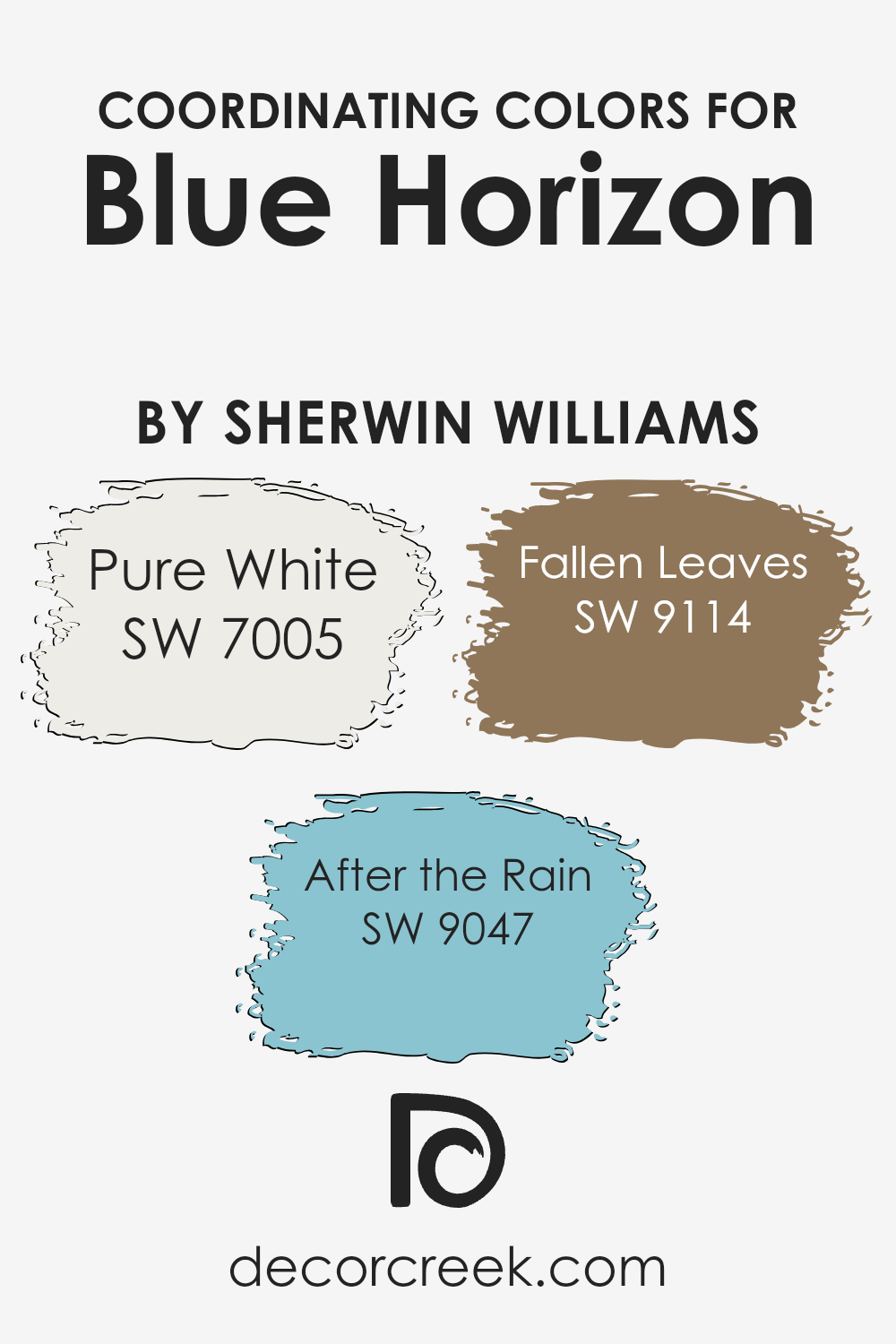
Coordinating colors are those that complement and enhance the appearance of a primary color, in this case Blue Horizon. These colors work together to create a harmonious and appealing color scheme that can be used throughout interior spaces to achieve a balanced and cohesive look. Paint companies often suggest a palette of coordinating colors to make it simpler for consumers to design a space that feels well put together.
For example, Pure White is a crisp and clean shade that provides a neutral background, allowing Blue Horizon to truly stand out while keeping the space light and open. After the Rain is a gentle and refreshing color that pairs beautifully with Blue Horizon, adding a subtle contrast that is both refreshing and calming.
Fallen Leaves offers a warm, autumnal tone that complements the cooler shades of Blue Horizon and After the Rain. This combination brings warmth and depth to the palette, creating a welcoming and cozy atmosphere in any room.
You can see recommended paint colors below:
- SW 7005 Pure White (CHECK A SAMPLE)
- SW 9047 After the Rain (CHECK A SAMPLE)
- SW 9114 Fallen Leaves (CHECK A SAMPLE)
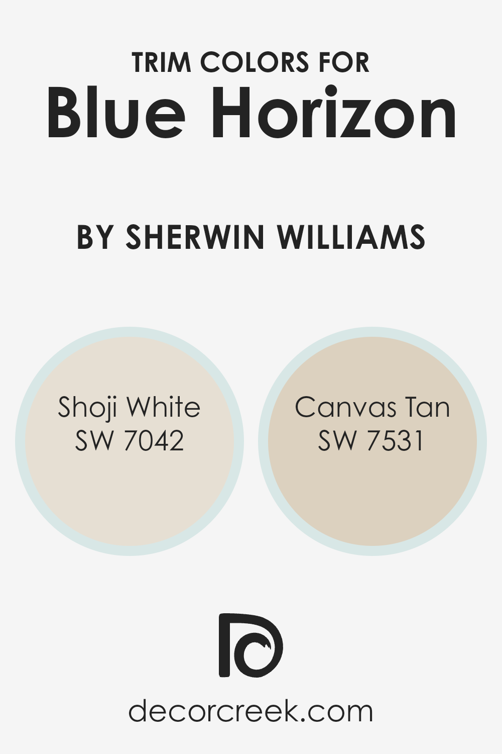
What are the Trim colors of Blue Horizon SW 6497 by Sherwin Williams?
Trim colors like SW 7042 – Shoji White and SW 7531 – Canvas Tan play a crucial role in complementing the base color of a wall, in this case, Blue Horizon by Sherwin Williams. The choice of trim color can subtly highlight the architecture and design elements of a room, framing the main color and giving a finished look to the space. This detailing through trim colors can make the areas such as crown moldings, door frames, and baseboards stand out, adding depth and contrast to the overall design theme.
Shoji White is a soft, muted off-white shade that brings a hint of warmth to a room, making it a perfect trim option for creating a gentle contrast with bold colors like Blue Horizon. On the other hand, Canvas Tan is a warmer, beige-like color that offers a natural, understated boundary that works well with richer, vivid wall colors.
Both these shades are versatile and help ensure that the visual transition between the wall color and woodwork or different room sections is visually pleasant and coherent.
You can see recommended paint colors below:
Colors Similar to Blue Horizon SW 6497 by Sherwin Williams
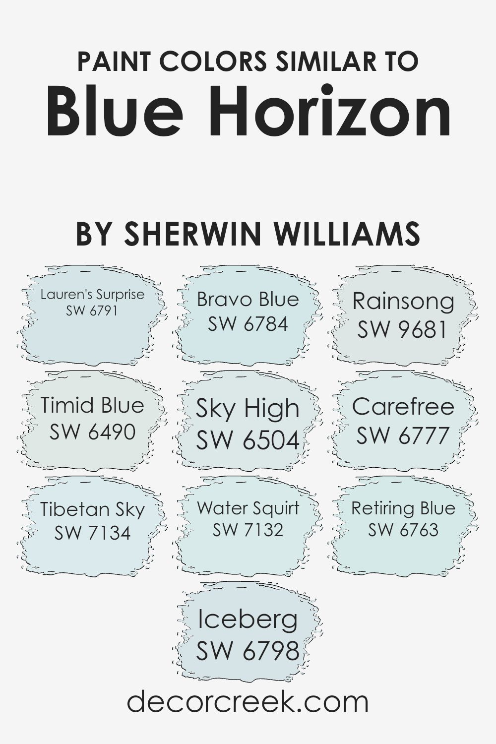
When decorating a space, using similar colors can create a harmonious and visually appealing environment. A palette of similar colors, like variations of blue, can bring a sense of coherence and fluidity to a room, making it appear more organized and intentional.
Colors like Lauren’s Surprise and Timid Blue are soft and subtle, contributing to a gentle and calming atmosphere, perfect for places of relaxation such as bedrooms or bathrooms. Tibetan Sky and Iceberg offer slightly bolder hues that still maintain a soothing tone, ideal for creating focal points without overwhelming the space.
Continuing with shades like Bravo Blue and Sky High, these deeper blues can add a touch of drama while keeping the overall feel cohesive and grounded. Water Squirt and Rainsong bring in a lively, refreshing vibe, which can be great for rejuvenating a study area or a kitchen.
Lastly, Carefree and Retiring Blue lean towards the softer, muted side, perfect for crafting a peaceful corner in busy homes. By selecting variations of a single hue, the flow between different areas and rooms is smooth, making the entire space feel connected and thoughtfully curated.
These similar colors work by tying together diverse elements and textures, illustrating that a well-considered color scheme can effectively set the atmosphere of your home.
You can see recommended paint colors below:
- SW 6791 Lauren’s Surprise
- SW 6490 Timid Blue
- SW 7134 Tibetan Sky
- SW 6798 Iceberg (CHECK A SAMPLE)
- SW 6784 Bravo Blue (CHECK A SAMPLE)
- SW 6504 Sky High (CHECK A SAMPLE)
- SW 7132 Water Squirt
- SW 9681 Rainsong (CHECK A SAMPLE)
- SW 6777 Carefree
- SW 6763 Retiring Blue
Colors that Go With Blue Horizon SW 6497 by Sherwin Williams
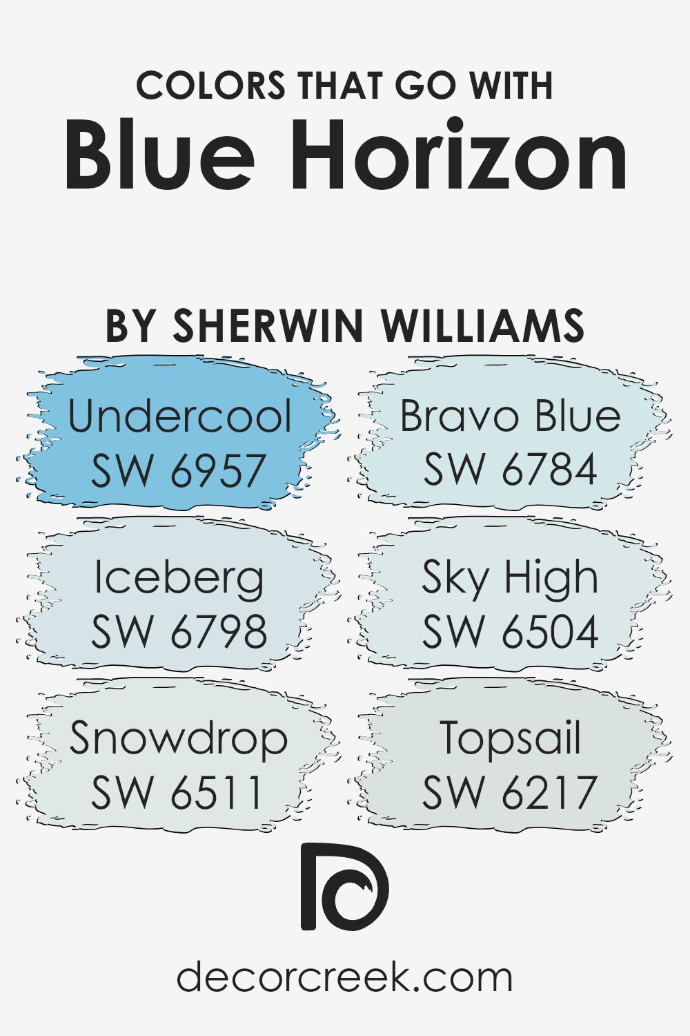
Choosing complementary colors to pair with Blue Horizon SW 6497 by Sherwin Williams is essential for creating a harmonious and visually appealing space. The right combinations can enhance the overall aesthetic, set a mood, or accentuate particular features of a room.
Colors like SW 6957 – Undercool and SW 6798 – Iceberg provide a crisp contrast to Blue Horizon, making them ideal for spaces that aim for a fresh and lively vibe. On the other hand, SW 6511 – Snowdrop acts as a soft and gentle pairing, perfect for creating a light and airy feel when combined with the deeper Blue Horizon.
SW 6784 – Bravo Blue is a bolder choice that complements Blue Horizon by intensifying the overall blue tone of the environment, injecting vibrancy and energy into the space. SW 6504 – Sky High offers a quieter match, ensuring a smooth visual transition with its subtle and calming hue.
Lastly, SW 6217 – Topsail is a muted shade that pairs nicely with Blue Horizon, providing a calm backdrop that allows for more versatile decorating options. Each of these colors works in its way to support Blue Horizon in creating a cohesive and inviting space, whether by contrasting sharply or blending softly.
You can see recommended paint colors below:
- SW 6957 Undercool (CHECK A SAMPLE)
- SW 6798 Iceberg (CHECK A SAMPLE)
- SW 6511 Snowdrop (CHECK A SAMPLE)
- SW 6784 Bravo Blue (CHECK A SAMPLE)
- SW 6504 Sky High (CHECK A SAMPLE)
- SW 6217 Topsail (CHECK A SAMPLE)
How to Use Blue Horizon SW 6497 by Sherwin Williams In Your Home?
Blue Horizon SW 6497 by Sherwin Williams is a vibrant shade of blue that can add a playful touch to any room in your home. Suitable for both large spaces and small accents, this color is especially great for adding a pop of brightness. You might consider using it in a kid’s bedroom to create a cheerful atmosphere or in a bathroom for a fresh and clean look.
For a modern twist, you could paint one statement wall in this shade to liven up a living room. It pairs well with more neutral colors like white or gray, which helps balance out its brightness. For those who enjoy DIY projects, Blue Horizon can also be used on furniture pieces like a bookshelf or a desk to give them a new lease on life.
Overall, Blue Horizon SW 6497 is a versatile color that can help make your home more lively and inviting. Whether you use it for walls or just as an accent, it’s a great choice for anyone looking to add some character to their space.
Blue Horizon SW 6497 by Sherwin Williams vs Bravo Blue SW 6784 by Sherwin Williams
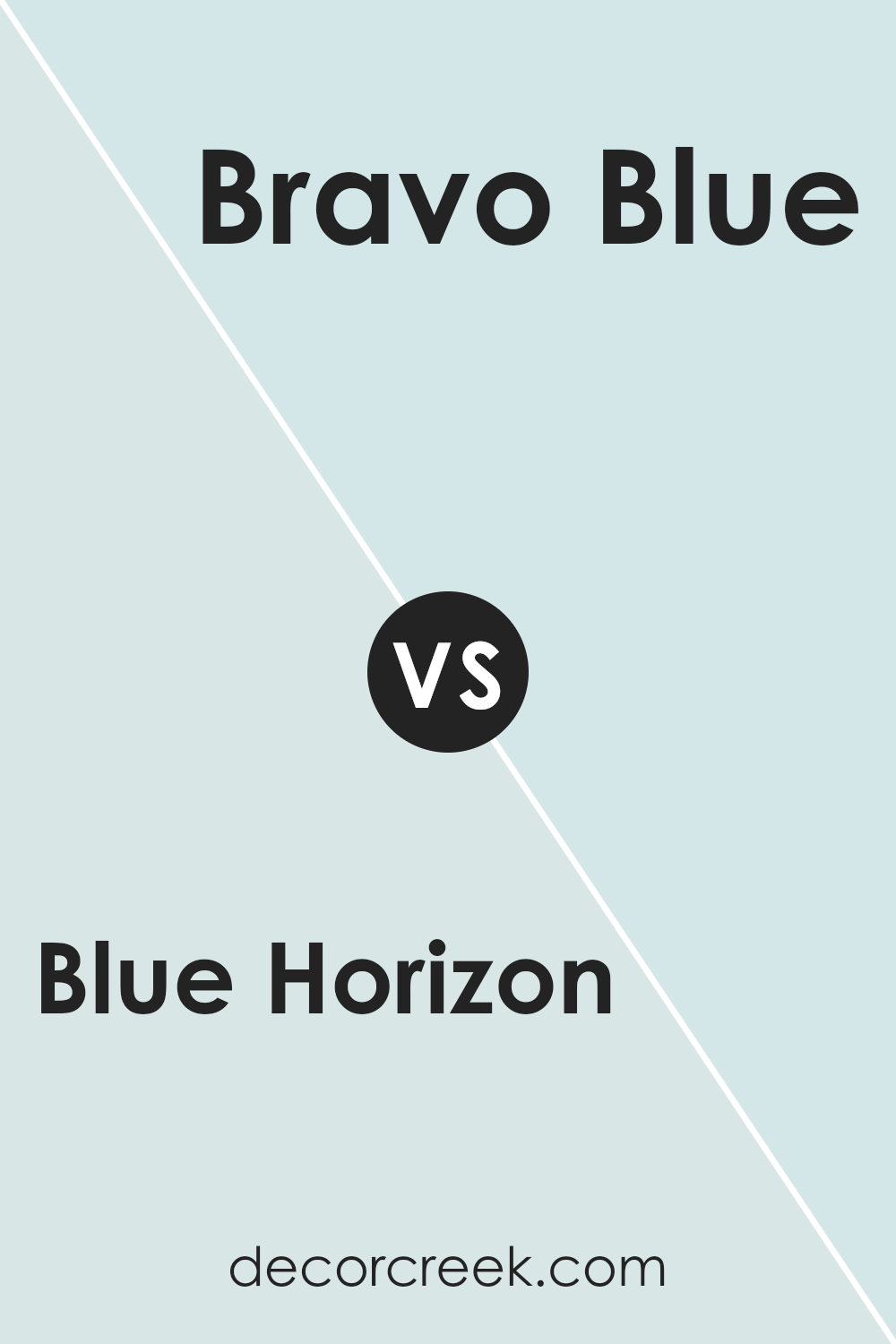
Blue Horizon and Bravo Blue by Sherwin Williams are two distinct shades that bring their unique character to spaces. Blue Horizon is a softer, more muted blue that carries a calm and gentle feel, perfect for creating a relaxed atmosphere in a room. It gives a sense of peacefulness and is light enough to be soothing, making it an excellent choice for bedrooms or bathrooms where a gentle ambiance is desired.
On the other hand, Bravo Blue is a much deeper and vivid blue. This shade is bolder and makes more of a statement. It stands out due to its brightness and can bring a lively and energetic feel to any area. This makes it ideal for spaces that benefit from a splash of color, like playrooms or creative spaces.
Both colors are versatile in their way, either enhancing a space with a soft backdrop or adding a punch of lively color.
You can see recommended paint color below:
- SW 6784 Bravo Blue (CHECK A SAMPLE)
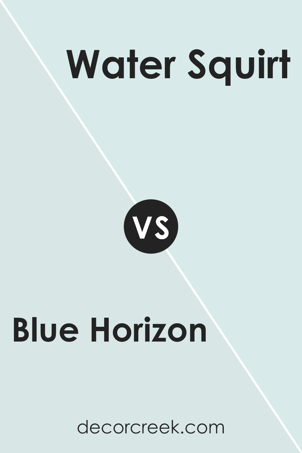
Blue Horizon SW 6497 by Sherwin Williams vs Water Squirt SW 7132 by Sherwin Williams
Blue Horizon and Water Squirt are two distinct shades by Sherwin Williams. Blue Horizon is a deep, vibrant color that resembles the evening sky. It’s perfect for adding a bold touch to any room and can make spaces feel cozy and welcoming. On the other hand, Water Squirt is a lighter, more subdued blue.
It has a freshness to it that can brighten up spaces and make them appear larger. This color is ideal for bathrooms or bedrooms where you want a calm, light atmosphere. In summary, if you’re looking for a color that stands out and creates a warm, inviting environment, Blue Horizon is the go-to.
But if you prefer something lighter and air-refreshing, Water Squirt is the better choice. Both colors offer unique vibes and can enhance the aesthetic of your home depending on your style and needs.
You can see recommended paint color below:
- SW 7132 Water Squirt
Blue Horizon SW 6497 by Sherwin Williams vs Lauren’s Surprise SW 6791 by Sherwin Williams
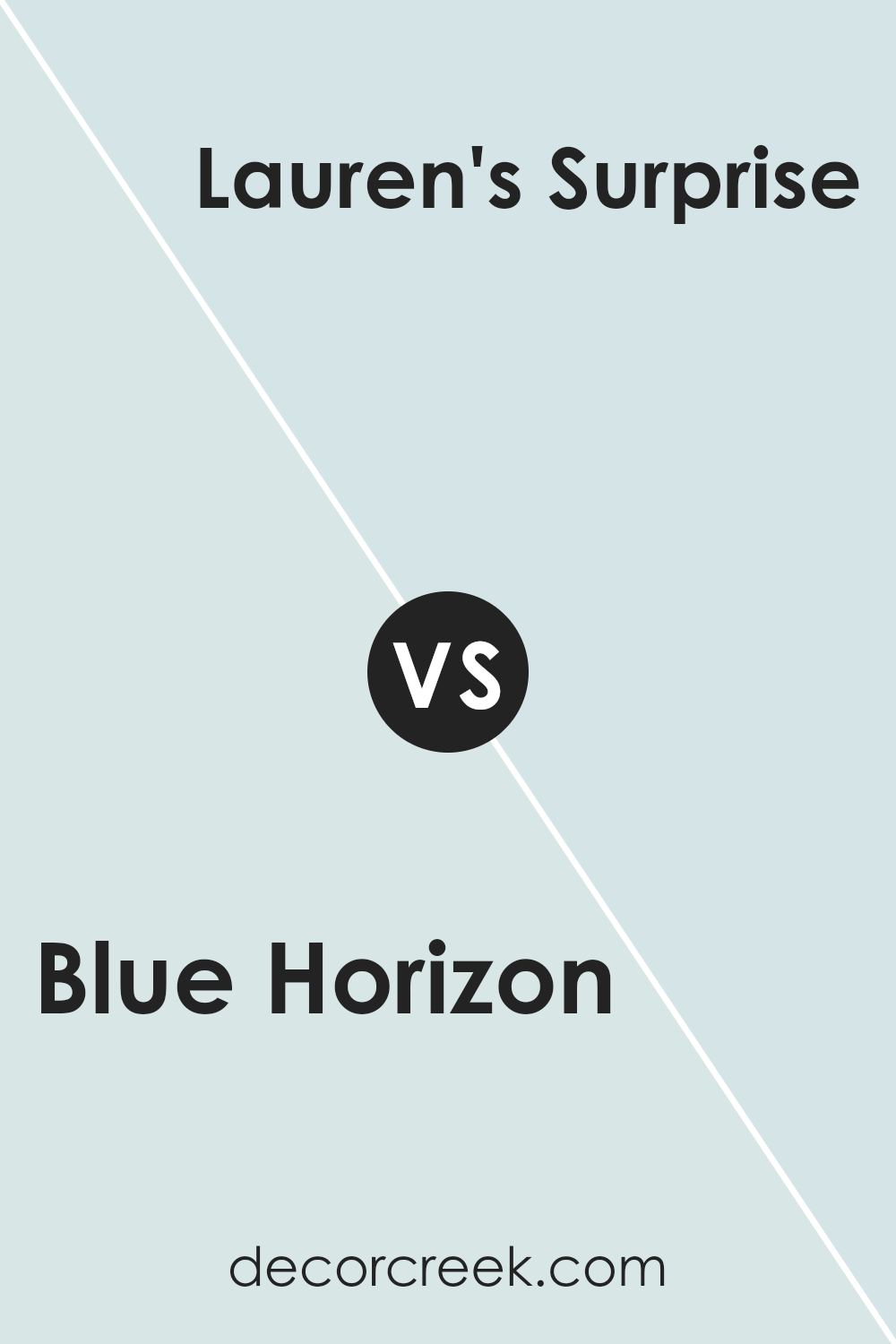
Blue Horizon and Lauren’s Surprise are two unique shades by Sherwin Williams. Blue Horizon is a deep, rich blue that brings a strong presence to a room. It has a calm quality but is bold enough to make a statement. On the other hand, Lauren’s Surprise is a vibrant and fresh turquoise.
This color is lighter, injecting a playful and cheerful vibe into a space. While Blue Horizon can be seen as more reserved and traditional, Lauren’s Surprise offers a brighter, more energetic feel. Both colors can greatly enhance a room, but your choice depends on the mood you want to create.
Blue Horizon works well in a sophisticated setting or an area meant for relaxation, whereas Lauren’s Surprise is perfect for spaces that aim to be stimulating and joyful.
You can see recommended paint color below:
- SW 6791 Lauren’s Surprise
Blue Horizon SW 6497 by Sherwin Williams vs Carefree SW 6777 by Sherwin Williams
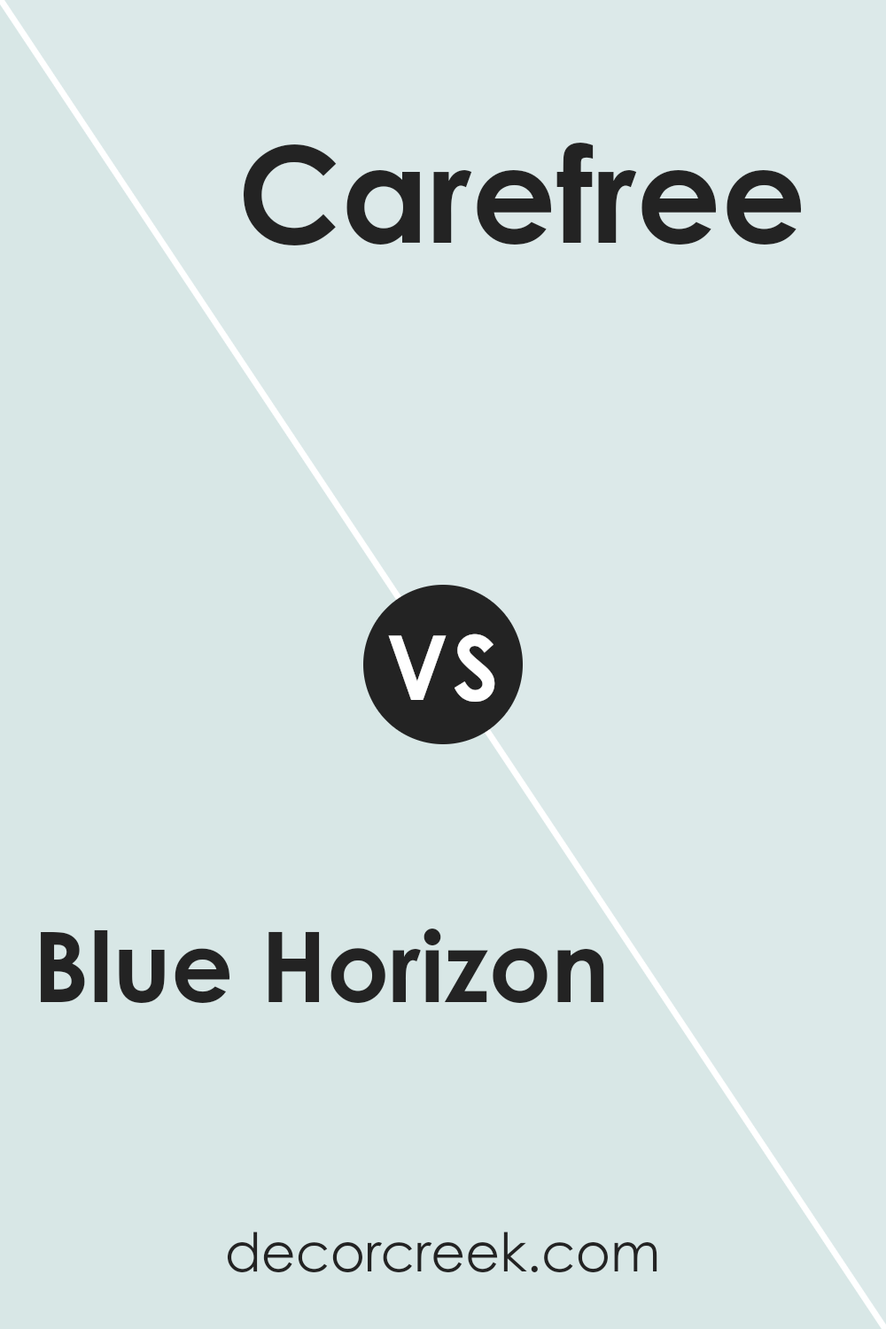
Blue Horizon and Carefree by Sherwin Williams are two distinct shades of blue, each with its own unique feel. Blue Horizon is a deep, rich blue that has a calming effect and brings a strong presence to any space. It’s a color that might remind you of a deep ocean or a dusk sky, making it great for creating a focused and cozy atmosphere in rooms.
On the other hand, Carefree is a much lighter and brighter blue. This shade is airy and vibrant, giving a room a more open and cheerful look. It’s the kind of color that can instantly brighten up a space and make it feel more lively and welcoming.
In summary, while Blue Horizon offers depth and intensity, Carefree brings lightness and cheer. Depending on what vibe you’re going for in a room, each color has its advantages. Blue Horizon works well in a study or bedroom for a grounded, calming feel, whereas Carefree is perfect for bathrooms or kitchens, adding a splash of freshness.
You can see recommended paint color below:
- SW 6777 Carefree
Blue Horizon SW 6497 by Sherwin Williams vs Timid Blue SW 6490 by Sherwin Williams
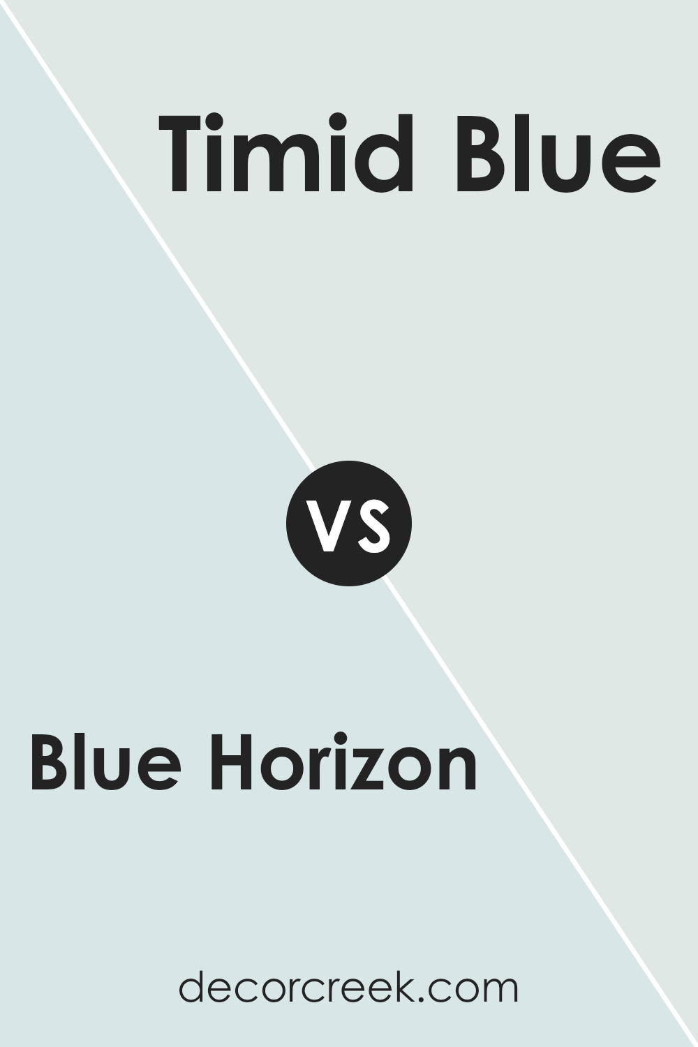
Blue Horizon and Timid Blue are two paint colors, both from Sherwin Williams. Blue Horizon has a deeper, more vibrant tone that stands out. It’s like the color of a deep ocean or a rich sky just before night falls. On the other hand, Timid Blue is much softer and lighter. Its subtle hue is similar to a clear sky on a calm day.
While Blue Horizon adds a bold touch and might bring more focus to a space, Timid Blue gives a gentle, airy feel, making a room feel more open and relaxed. Both colors offer a fresh, clean look but in different intensities and moods.
Whether you choose the striking presence of Blue Horizon or the gentle calm of Timid Blue depends on the atmosphere you want to create.
You can see recommended paint color below:
- SW 6490 Timid Blue
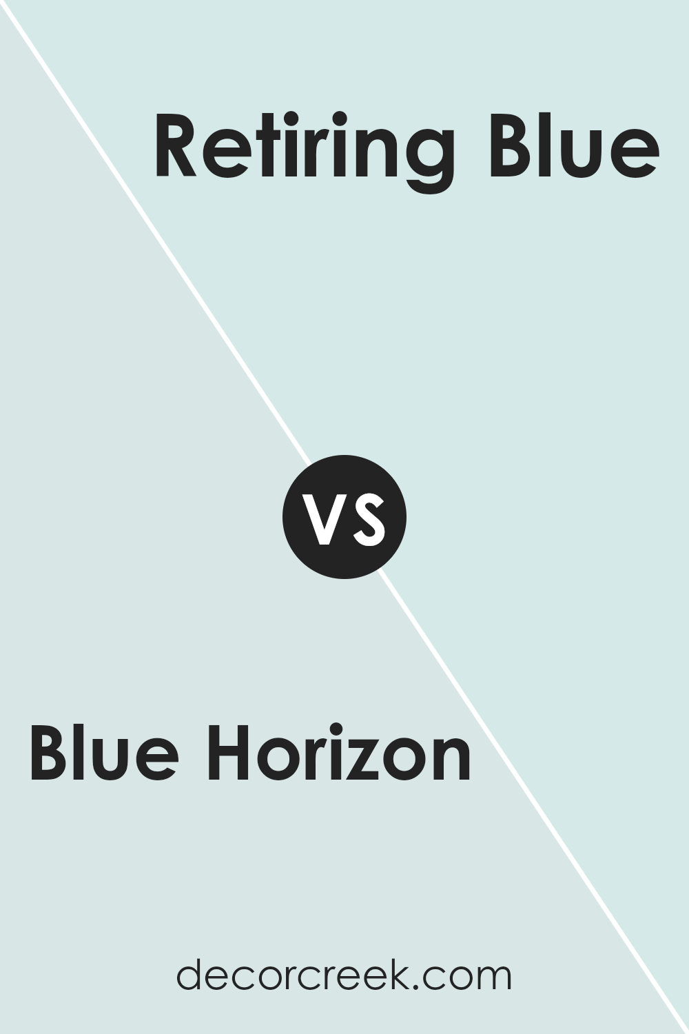
Blue Horizon SW 6497 by Sherwin Williams vs Retiring Blue SW 6763 by Sherwin Williams
Blue Horizon and Retiring Blue, both by Sherwin Williams, are unique shades of blue, each offering its own charm. Blue Horizon is a vibrant and deep blue that brings a strong presence to any room. It’s bold and eye-catching, making it perfect for accent walls or areas where you want to make a statement.
On the other hand, Retiring Blue has a softer, lighter touch. This color is closer to a sky blue and has a calming effect, making it ideal for bedrooms or spaces where you want to create a relaxing atmosphere.
While Blue Horizon stands out more dramatically, Retiring Blue offers a gentle and inviting appeal. Each color has its place depending on the mood and style you wish to achieve in your space.
You can see recommended paint color below:
- SW 6763 Retiring Blue
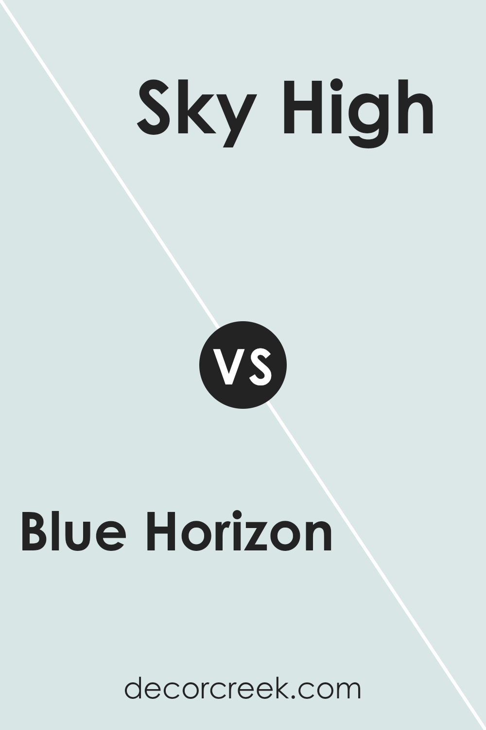
Blue Horizon SW 6497 by Sherwin Williams vs Sky High SW 6504 by Sherwin Williams
Blue Horizon and Sky High are two distinct shades offered by Sherwin Williams. Blue Horizon is a deeper blue with a hint of gray, giving it a somewhat muted yet distinct presence. This makes it a great choice for creating a grounding atmosphere in a space.
On the other hand, Sky High is visibly lighter and carries a more airy feel, reminiscent of a clear sky on a bright day. It has a fresh and open vibe, making it perfect for spaces where you want to introduce brightness without overwhelming with color.
Both colors provide a calm feeling but in different intensities and tones. Blue Horizon suits areas where a more subtle, deep color is desired, while Sky High is ideal for spaces needing a touch of lightness and freshness.
You can see recommended paint color below:
- SW 6504 Sky High (CHECK A SAMPLE)
Blue Horizon SW 6497 by Sherwin Williams vs Tibetan Sky SW 7134 by Sherwin Williams
The main color, Blue Horizon, is a vibrant and deep shade of blue that has a bold and refreshing feel. It can add a strong and lively touch to any space, making it ideal for creating a focal point in a room. On the other hand, Tibetan Sky is a lighter and more subtle blue.
It provides a calm and gentle ambiance, perfect for a relaxing environment like a bedroom or bathroom. Both colors are blues but they offer different atmospheres: Blue Horizon is more striking and dynamic, while Tibetan Sky is softer and more laid-back.
Depending on what feel you want for a room, you could choose the deep and lively Blue Horizon for energy or the soft and gentle Tibetan Sky for a soothing effect.
You can see recommended paint color below:
- SW 7134 Tibetan Sky

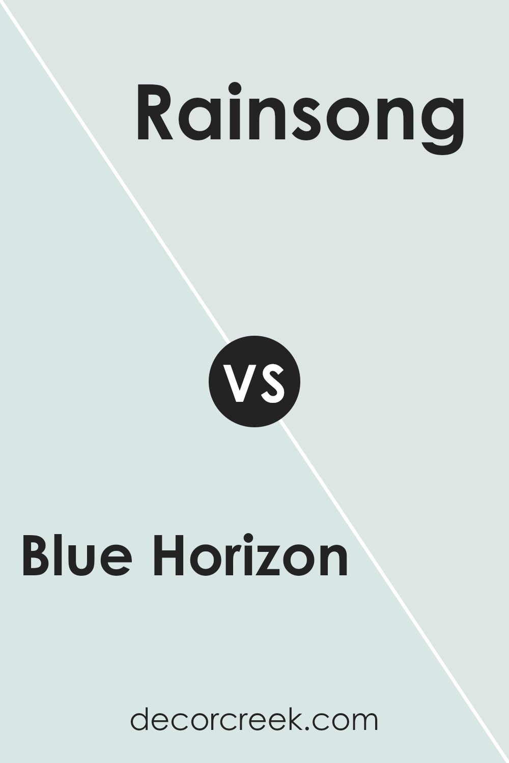
Blue Horizon SW 6497 by Sherwin Williams vs Rainsong SW 9681 by Sherwin Williams
Blue Horizon and Rainsong are two distinctive shades offered by Sherwin Williams. Blue Horizon is a deeper, vibrant shade that appears rich and strong, giving a feeling of depth and steadiness to any space. It resembles the color you might see deep in the ocean or in a dimly lit sky after sunset. This makes it a great choice for spaces where a bold, prominent look is desired.
On the other hand, Rainsong is a lighter, subtle color. It’s a soft, muted gray with hints of blue, reminiscent of a cloudy sky during a gentle rain. This color is ideal for creating a calm, soothing atmosphere in a room. It’s especially good for spaces meant to relax in, like bedrooms or quiet reading corners.
Both colors have their unique appeal, depending on what vibe you want for your space. Blue Horizon tends to make a statement, while Rainsong is more about creating a peaceful backdrop.
You can see recommended paint color below:
- SW 9681 Rainsong (CHECK A SAMPLE)
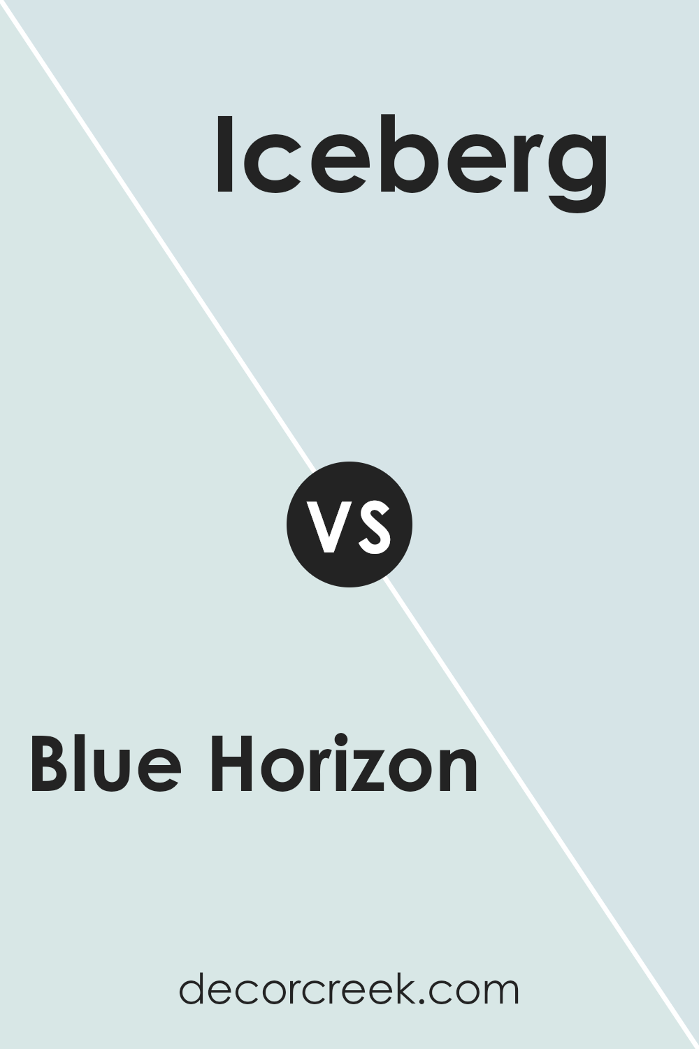
Blue Horizon SW 6497 by Sherwin Williams vs Iceberg SW 6798 by Sherwin Williams
Blue Horizon SW 6497 and Iceberg SW 6798, both by Sherwin Williams, offer distinct tones that can significantly affect the mood and style of a room. Blue Horizon is a deeper, more pronounced shade that stands out on walls and creates a bold statement. It carries a sense of strength and confidence, making it suitable for spaces where you want to add some character, like living rooms or dining areas.
On the other hand, Iceberg SW 6798 is lighter and has a breezier feel. This color is closer to a sky blue, which can make small spaces appear larger and more open. It’s great for bathrooms or small bedrooms, where a touch of lightness can enhance the perception of space.
Choosing between them depends on the vibe you’re aiming for: Blue Horizon for a bold and lively setting, and Iceberg for a light, airy atmosphere. Both colors coordinate well with neutral furnishings and decor, offering versatile options for updating your space.
You can see recommended paint color below:
- SW 6798 Iceberg (CHECK A SAMPLE)
Conclusion
In conclusion, the paint color SW 6497 Blue Horizon by Sherwin Williams is a fantastic choice if you want to bring a fresh and calm feel to any room in your home. Its beautiful blue shade reminds you of a clear sky on a sunny day or the gentle waves of the ocean, making any space feel more peaceful and relaxing.
Whether you’re painting a bedroom, a living room, or even a bathroom, this color goes well with lots of other colors and decorations.
It’s great for creating a cozy and welcoming atmosphere where you can feel happy and calm, whether you’re reading, playing, or just spending time with family. Overall, SW 6497 Blue Horizon is more than just paint; it’s a way to make your home feel just right for you.

Ever wished paint sampling was as easy as sticking a sticker? Guess what? Now it is! Discover Samplize's unique Peel & Stick samples.
Get paint samples


