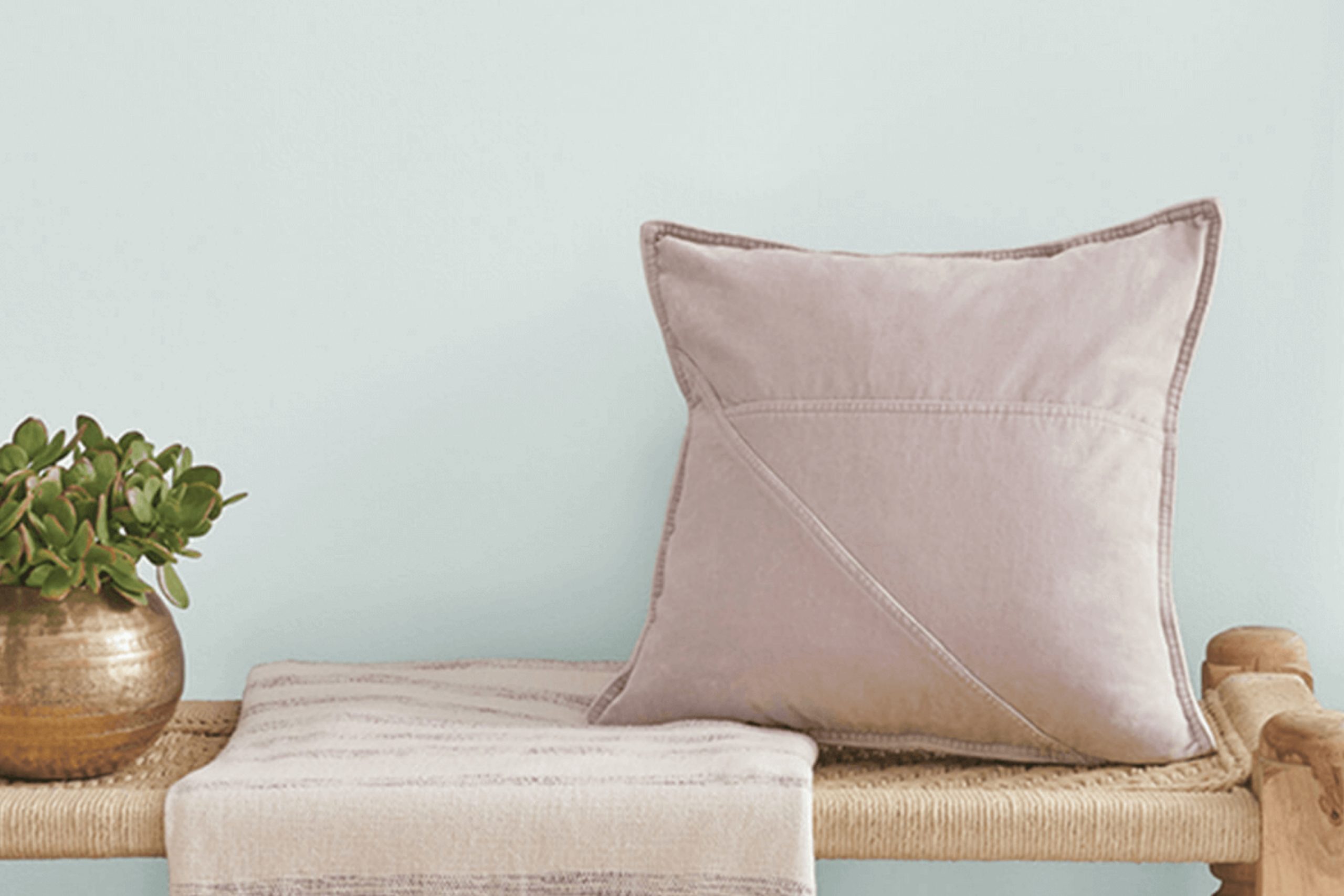
Are you planning to give your space a fresh look with new paint? You might want to consider SW 6217 Topsail by Sherwin Williams. As someone who loves experimenting with different shades, SW 6217 Topsail has really impressed me.
This color is a gentle, soft gray with a hint of blue, making it incredibly adaptable for various spaces within your home.
Whether in your living room, bedroom, or even bathroom, Topsail adds a smooth, calming presence. It’s light enough to make your rooms feel airy and spacious but also has enough depth to add some character without overpowering the rest of your decor.
I’ve found that it pairs wonderfully with both modern and traditional interiors, making it a versatile choice if you’re unsure about future decor changes. Easy to apply and blend with any style, Topsail could be the perfect new addition to your walls. So if you’re looking for a paint color that transforms your home into a serene and welcoming space, think about giving SW 6217 Topsail a go.
What Color Is Topsail SW 6217 by Sherwin Williams?
Topsail by Sherwin Williams is a gentle and airy shade of blue that brings a fresh, calming presence to any room. Its light, almost pastel tone captures the essence of a clear sky on a bright day, making it ideal for spaces where you want to create a relaxed and inviting atmosphere. This color works beautifully in coastal or beach-themed interiors, complementing natural light and creating a breezy, open feel.
Topsail can also be seamlessly incorporated into modern and contemporary spaces. Its subtle influence doesn’t overpower and can help soften the hard lines and stark contrasts often found in modern design. It pairs well with crisp whites and soft grays, providing a smooth color transition and adding visual interest.
When it comes to materials, Topsail complements natural wood tones from light oak to rich walnut, enhancing their warmth. It also works well with textures like soft cotton, smooth ceramics, and woven fabrics, adding depth and interest to the decor.
Whether it’s on a painted wall or as an accent in textiles, this color supports a range of aesthetic expressions, making it a versatile choice for many homes.
Is Topsail SW 6217 by Sherwin Williams Warm or Cool color?
Topsail by Sherwin Williams is a light and airy color that brings a fresh and clean look to any room. This soft shade falls somewhere between blue and green, giving it a calming effect that is perfect for places where relaxation is key, like bedrooms and bathrooms. One of the best things about Topsail is how versatile it is.
It pairs beautifully with both dark and light furniture, making it easy to fit into various design styles without overwhelming the space.
The subtlety of Topsail also makes it great for smaller rooms or areas with limited natural light, as it helps to brighten spaces without being too bold. When used in a living room or kitchen, it creates a welcoming environment, making everyone feel at home.
Moreover, its gentle hue behaves like a neutral, so it matches well with many other colors, allowing for endless decorating possibilities. Using Topsail can be a simple yet effective way to freshen up your home with a touch of calm and freshness.
Undertones of Topsail SW 6217 by Sherwin Williams
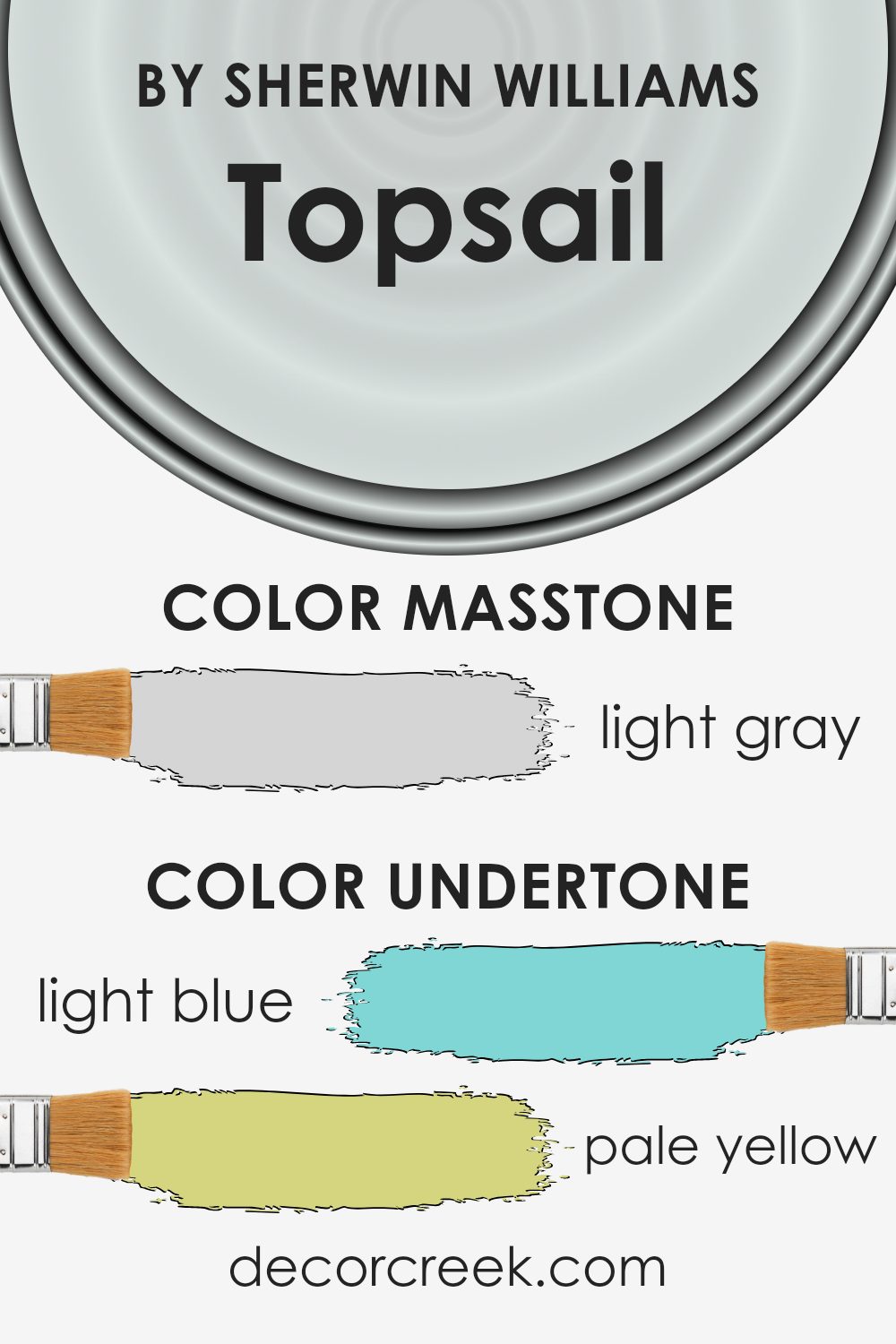
Topsail is a soothing paint color with a complex blend of undertones that can subtly influence the feel and appearance of a room. The light blue undertone adds a fresh and airy feel, making it perfect for creating a calming atmosphere. The pale yellow undertone brings in a touch of warmth, which can make a space feel more inviting and cozy.
The light purple undertone introduces a hint of playful creativity, ideal for sparking inspiration in a home office or craft room. Mint undertones lend a refreshing vibe, enhancing the overall clean look of the color. Meanwhile, undertones of lilac contribute a gentle, almost whimsical quality to the ambiance.
Pale pink undertones add a soft, nurturing element which is great for bedrooms where comfort is key. The grey undertone provides a neutral base, making Topsail versatile and easy to pair with a wide range of decor styles and colors.
In general, undertones in paint colors affect the way colors look on walls under different lighting conditions and can influence the mood of the room. For instance, in a room with plenty of natural light, the light blue and mint undertones of Topsail might be more pronounced, making the room feel more vibrant and lively.
In artificial light, the grey and pale yellow undertones might become more noticeable, giving the room a cozier and warmer feel. Thus, considering the lighting and the desired ambiance of a room is crucial when choosing a color like Topsail for interior walls.
What is the Masstone of the Topsail SW 6217 by Sherwin Williams?
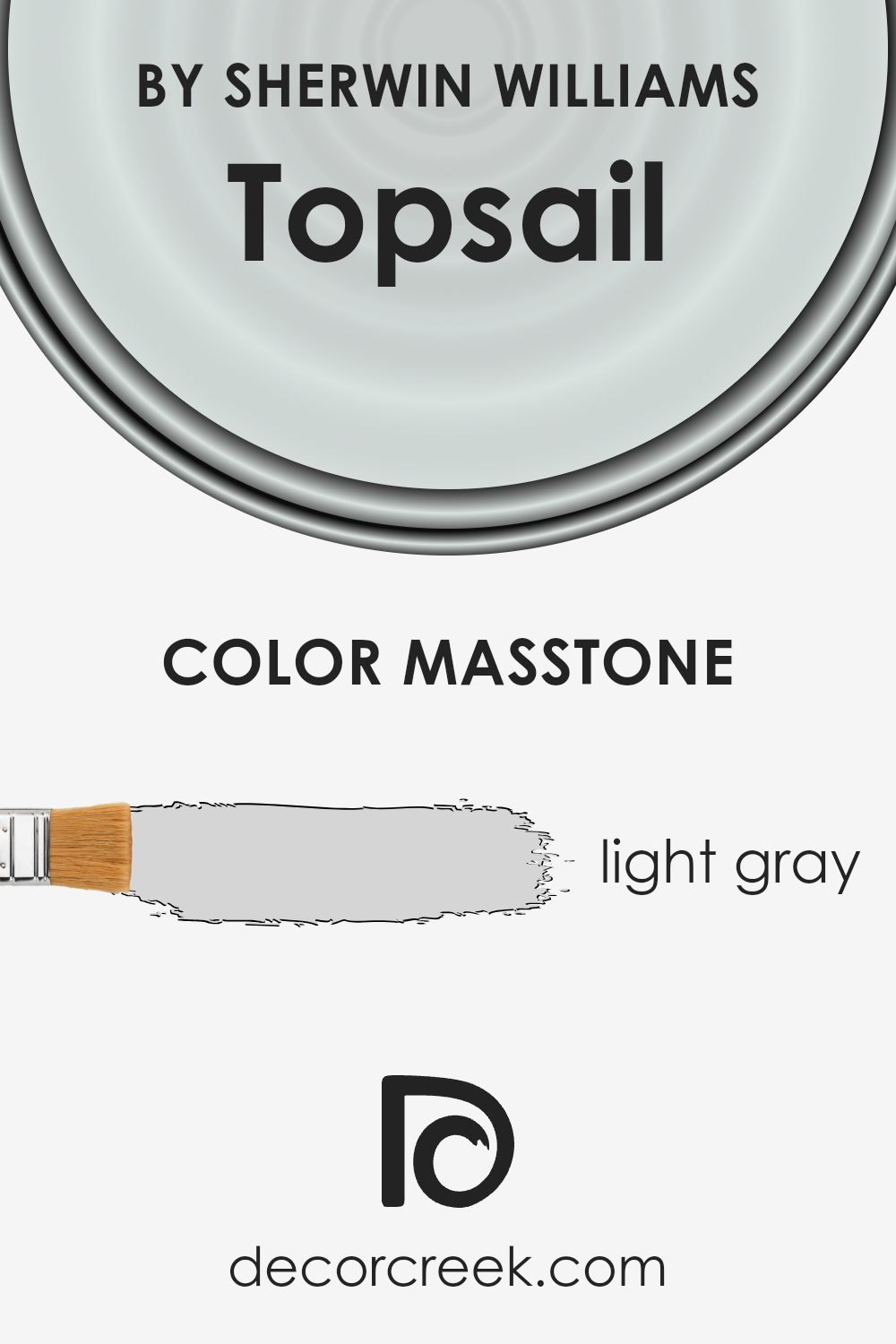
Topsail by Sherwin Williams is a light gray color with a masstone value of #D5D5D5. This gentle shade is versatile and can make rooms feel more spacious and open. Its softness allows it to work well as a neutral backdrop, meaning it complements a wide range of other colors without overpowering them. This makes it ideal for use in various parts of the home, from bedrooms and living rooms to kitchens and bathrooms.
The light gray tone of Topsail has a calming effect, which is perfect for creating a relaxing atmosphere in personal spaces like bedrooms. It’s also light enough to enhance natural light in darker rooms. This color can play a helpful role in home staging as well, giving spaces a clean and well-kept look that appeals to buyers.
Overall, Topsail is a practical choice for those wanting a fresh and airy feel in their home without the starkness of pure white.
How Does Lighting Affect Topsail SW 6217 by Sherwin Williams?
Lighting plays a crucial role in how colors appear in different environments. The way light reflects off surfaces can significantly alter the perceived color, making it appear lighter, darker, or even changing the hue. There are two main types of lighting: natural light, which comes from the sun, and artificial light, such as bulbs and LEDs.
The color Topsail from Sherwin Williams is a subtle shade that can look quite different depending on the lighting conditions. In artificial light, Topsail tends to appear slightly cooler with a gentle grayish tone because most artificial lighting leans towards cooler temperatures, unless warm lights are used. In natural light, the color shows its true soft, light blue shade, reflecting the daylight and often looking airy and bright.
In rooms that face different directions, Topsail also varies in appearance:
- North-facing rooms: These rooms receive less direct sunlight throughout the day, which can make colors appear more muted and cooler. Topsail in a north-facing room will look more like a subtle, soft gray with hints of blue, providing a calm atmosphere.
- South-facing rooms: With more direct sunlight, south-facing rooms get bright light most of the day, which can amplify the vibrancy of colors. Topsail here will look brighter and more distinctly blue, creating a cheerful and lively space.
- East-facing rooms: East-facing rooms get plenty of morning light, which is cooler and bluish. Topsail in these rooms will have a crisp and refreshing look in the morning, gradually becoming softer and more shadowed as the day progresses.
- West-facing rooms: These rooms receive evening light, which is warmer and more golden. Topsail in west-facing rooms will look warmer during the evening, taking on soft, soothing qualities that can make the room feel cozy.
Understanding how lighting affects colors like Topsail can help in choosing the right paint for a room based on its orientation and the type of lighting available. This ensures that the color behaves as desired throughout the day, matching the intended ambiance and decor.
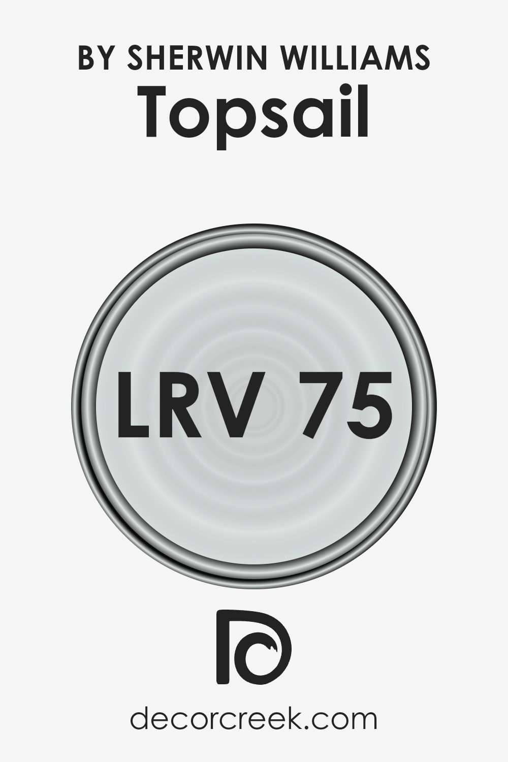
What is the LRV of Topsail SW 6217 by Sherwin Williams?
LRV stands for Light Reflectance Value, which measures the percentage of light a paint color reflects compared to how much it absorbs. When a paint has a high LRV, it means that it reflects more light than a color with a lower LRV. This is a crucial factor to consider when choosing a paint color for your spaces, as it can significantly affect the visual warmth and brightness of a room.
A higher LRV makes a room look brighter and larger, while a lower LRV can make a space appear cozier and more enclosed.
For Topsail by Sherwin Williams, with an LRV of roughly 75, the color is in the higher spectrum of light reflectance. This means it is a light color that will brighten up a space effectively, making it appear airy and more spacious. The light reflection properties of this particular shade make it an excellent choice for smaller rooms or spaces with limited natural light, as it helps in making the area feel less cramped by reflecting more light around the room.
It’s also a good option for creating a fresh and open atmosphere in any living area.
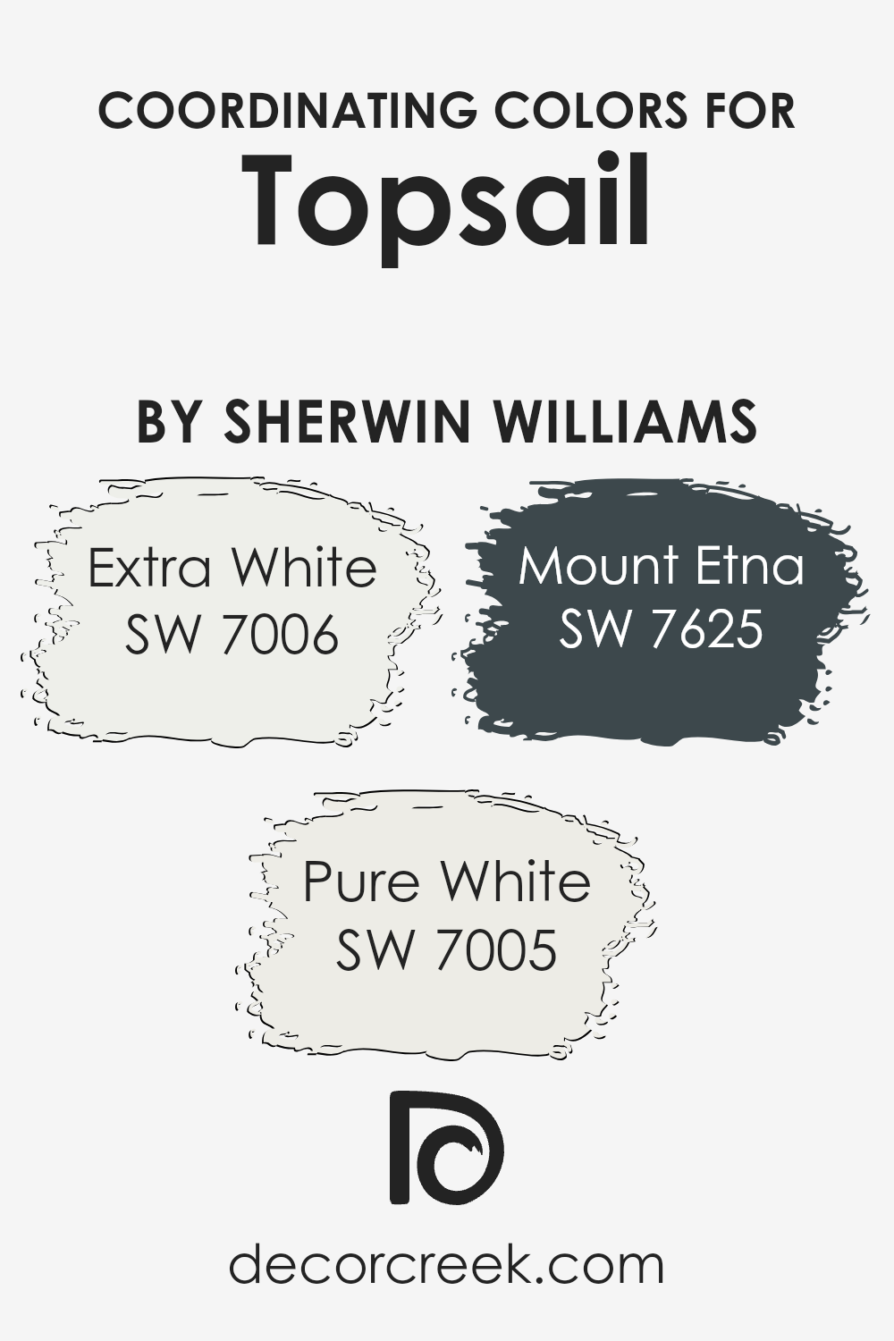
Coordinating Colors of Topsail SW 6217 by Sherwin Williams
Coordinating colors are those hues that complement and enhance the overall aesthetic when paired with a primary shade. In interior design, these colors work together to create a harmonious ambiance, balancing and unifying various design elements within a space. For example, Topsail by Sherwin Williams, a soft, muted color, can be beautifully complemented by a selection of coordinating colors that either contrast or blend smoothly with it.
SW 7006 – Extra White is a bright and clean shade, perfect for creating a crisp contrast that makes any room feel fresh and inviting. It works well to highlight architectural details or as an accent trim, providing a sharp outline against softer tones. Meanwhile, SW 7005 – Pure White is a touch warmer than Extra White, offering a subtle differentiation that helps in softening transitions between more dominant colors.
This shade is excellent for creating a gentle, unobtrusive backdrop that allows other colors, like Topsail, to stand out.
For a moodier contrast, SW 7625 – Mount Etna serves as a deep, rich complement to Topsail. This shadowy charcoal hue brings depth and drama to interiors, perfect for accent walls or cabinetry to anchor lighter tones within the room. By using such coordinated colors, one can easily design a cohesive and pleasant space.
You can see recommended paint colors below:
- SW 7006 Extra White
- SW 7005 Pure White
- SW 7625 Mount Etna
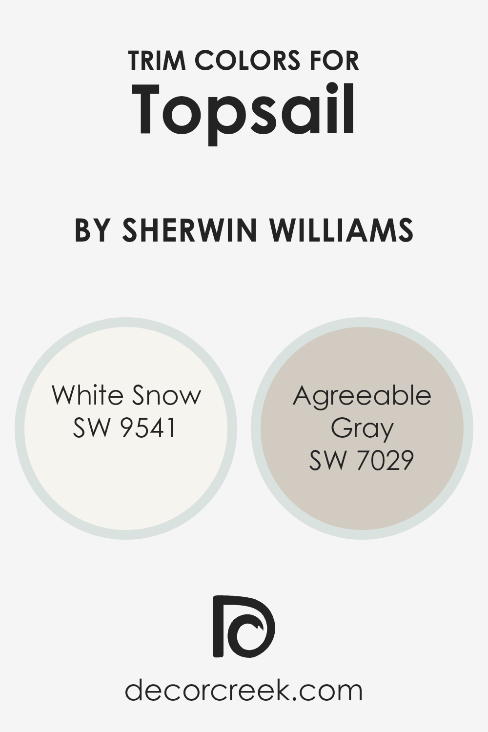
What are the Trim colors of Topsail SW 6217 by Sherwin Williams?
Trim colors play a significant role in enhancing the visual appeal and harmony of a room’s overall color scheme. When pairing with Topsail by Sherwin Williams, choosing the right trim color can accentuate the subtle tones of the wall paint, creating a clean and cohesive look. Opting for White Snow or Agreeable Gray as trim colors can help set off the soft, refreshing vibe of Topsail, ensuring that the space feels well-put-together without overwhelming the senses.
White Snow is a crisp, pure white that brings a fresh and airy feel to any room. It’s perfect for making Topsail pop, while keeping the atmosphere light and open. On the other hand, Agreeable Gray is a warm and neutral gray that offers a subtle contrast, softening the overall appearance while still maintaining a smooth transition from wall to trim.
This harmonious blend enhances the visual depth and can make smaller spaces seem larger, providing a nurturing backdrop for any style of decor.
You can see recommended paint colors below:
- SW 9541 White Snow
- SW 7029 Agreeable Gray
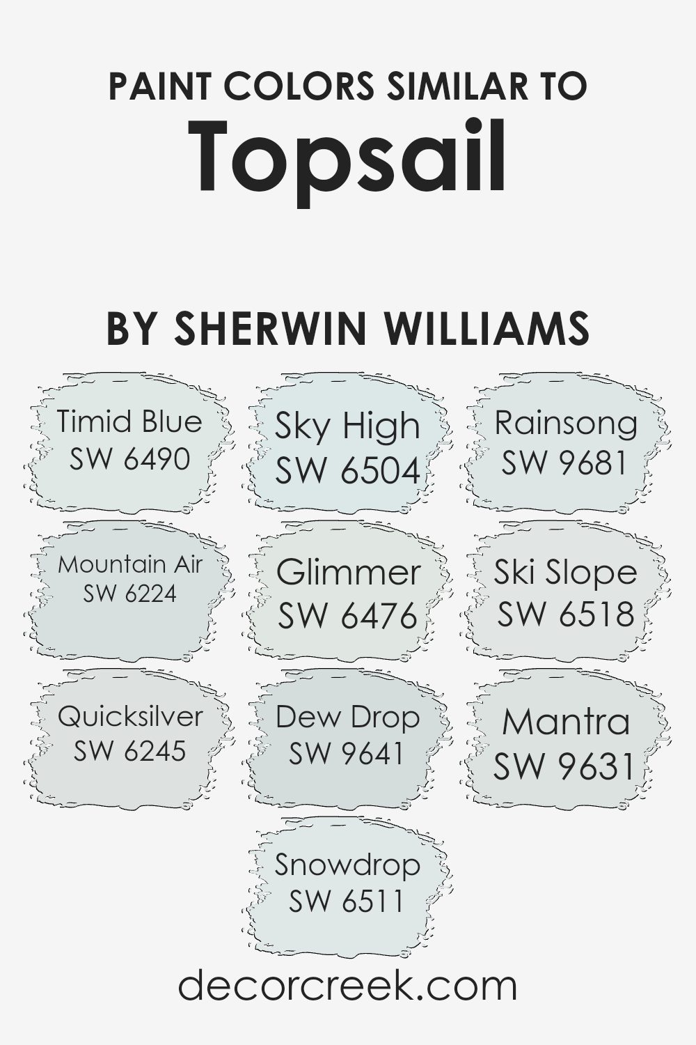
Colors Similar to Topsail SW 6217 by Sherwin Williams
Similar colors have a distinct role in design by creating a seamless and harmonious look, lending a cohesive atmosphere to any environment. When colors like SW 6490 Timid Blue and SW 6224 Mountain Air are used, they bring a gentle, airy feel, giving the impression of an expansive sky or a subtle breeze. These hues are soft and understated, providing a clean and open aesthetic that’s refreshing and easy on the eyes.
On the other hand, colors like SW 6245 Quicksilver and SW 6511 Snowdrop offer a sleek, modern touch, with Quicksilver having a muted, metallic vibe and Snowdrop reflecting a bright, crisp whiteness, reminiscent of winter snow. Using these colors adds a sharp, contemporary edge.
Colors like SW 6504 Sky High and SW 6476 Glimmer play into the lighter spectrum further by infusing spaces with a sense of calm lightness; Sky High has a delightful, airy quality, while Glimmer offers a faint sparkle akin to early morning dew. Additionally, colors like SW 9641 Dew Drop and SW 9681 Rainsong provide a gentle wash of color—Dew Drop with a whisper of pale blue and Rainsong with a hint of stormy grey.
Lastly, SW 6518 Ski Slope and SW 9631 Mantra suggest the softness of alpine snow and the muted subtlety of an echo, respectively, beautifully layering in with the rest. These shades ensure visual consistency and subtle depth, making them perfect for creating a peaceful and cohesive space.
You can see recommended paint colors below:
- SW 6490 Timid Blue
- SW 6224 Mountain Air
- SW 6245 Quicksilver
- SW 6511 Snowdrop
- SW 6504 Sky High
- SW 6476 Glimmer
- SW 9641 Dew Drop
- SW 9681 Rainsong
- SW 6518 Ski Slope
- SW 9631 Mantra
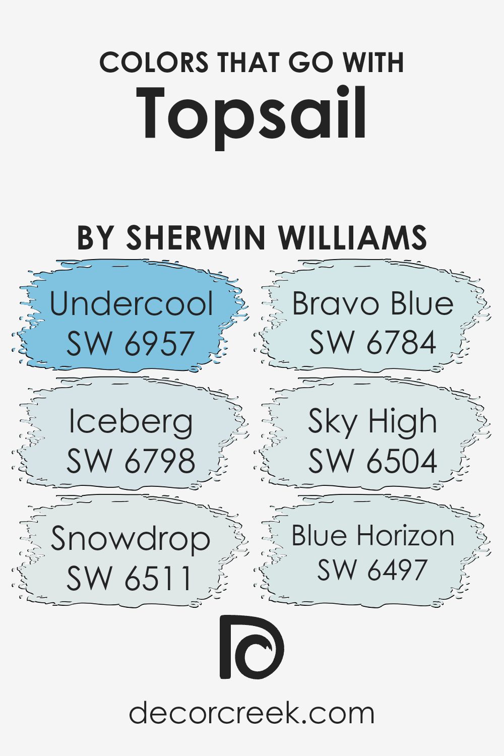
Colors that Go With Topsail SW 6217 by Sherwin Williams
Choosing complementary colors to pair with Topsail SW 6217 by Sherwin Williams is crucial because it helps create a harmonious and aesthetically pleasing space. When colors are well-coordinated, they enhance the overall look and feel of an area, allowing for a more appealing and cohesive design.
For instance, using compatible shades such as SW 6957 – Undercool, a deep teal that harmonizes with Topsail for a bold, yet calming maritime theme, or SW 6798 – Iceberg, a crisp and cool blue, which gives a refreshing contrast against the softness of Topsail, provides delightful visual layers.
Furthermore, pairing Topsail with SW 6511 – Snowdrop, a bright, clean white, brings out the subtle nuances in Topsail, enhancing the room’s light and airy feel. SW 6784 – Bravo Blue offers a more vivid, energizing pop of color that stands out against the gentleness of Topsail, making spaces lively and dynamic.
For a softer pairing, SW 6504 – Sky High, a light and gentle blue, reflects the sky on a clear day and pairs sweetly with Topsail to maintain a light, laid-back vibe. Lastly, SW 6497 – Blue Horizon, which resembles the color of a distant mountain range, supports a theme of open spaces and continuity when alongside Topsail, perfect for achieving a seamless look throughout your home.
You can see recommended paint colors below:
- SW 6957 Undercool
- SW 6798 Iceberg
- SW 6511 Snowdrop
- SW 6784 Bravo Blue
- SW 6504 Sky High
- SW 6497 Blue Horizon
How to Use Topsail SW 6217 by Sherwin Williams In Your Home?
Topsail by Sherwin Williams is a soft and subtle shade of blue-green that adds a fresh, airy feel to any room. It’s like bringing a light breeze inside! This color works wonderfully in spaces where you want a calm and gentle atmosphere, such as bedrooms or bathrooms.
For those who like a minimalistic style, combining Topsail with white trim can create a clean and bright look. Alternatively, pairing it with dark woods or warm tones can add a cozy yet modern touch, making spaces like living rooms feel welcoming.
Besides walls, Topsail can be used on cabinets or furniture for a subtle hint of color. If you’re not ready to commit to painting a whole room, consider using it for an accent wall or inside shelving units for a pleasant pop of color. It’s also a great choice for the ceiling to give a unique, sky-like effect. Whether used in large areas or small touches, Topsail brings a gentle, refreshing vibe to your home.
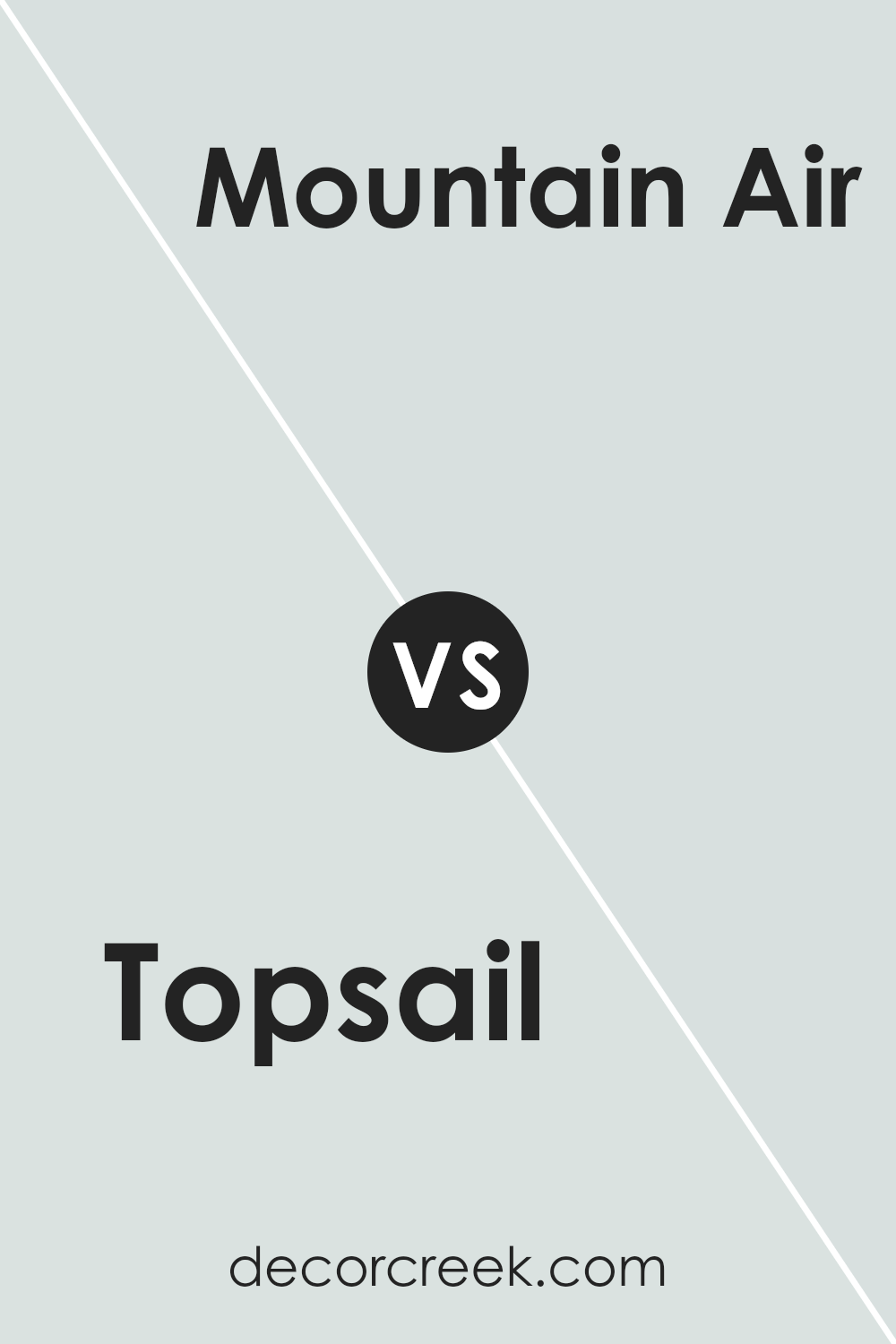
Topsail SW 6217 by Sherwin Williams vs Mountain Air SW 6224 by Sherwin Williams
The main color, Topsail, and the second color, Mountain Air, both by Sherwin Williams, have subtle differences. Topsail is a lighter, softer shade that leans towards a very pale, muted blue with a hint of green. It gives a fresh and airy feel to spaces, making it an excellent choice for creating a calm and open atmosphere in rooms like bedrooms and bathrooms.
On the other hand, Mountain Air has a slightly deeper tone than Topsail. It’s also a gentle blue but with a more noticeable gray influence, which makes it appear a bit cooler and more shadowed compared to Topsail. Mountain Air works well in areas that benefit from a cool, soothing vibe but with a bit more depth to the color. Both colors reflect a clean and peaceful energy, yet Mountain Air provides a slightly stronger presence due to its deeper and cooler tone.
You can see recommended paint color below:
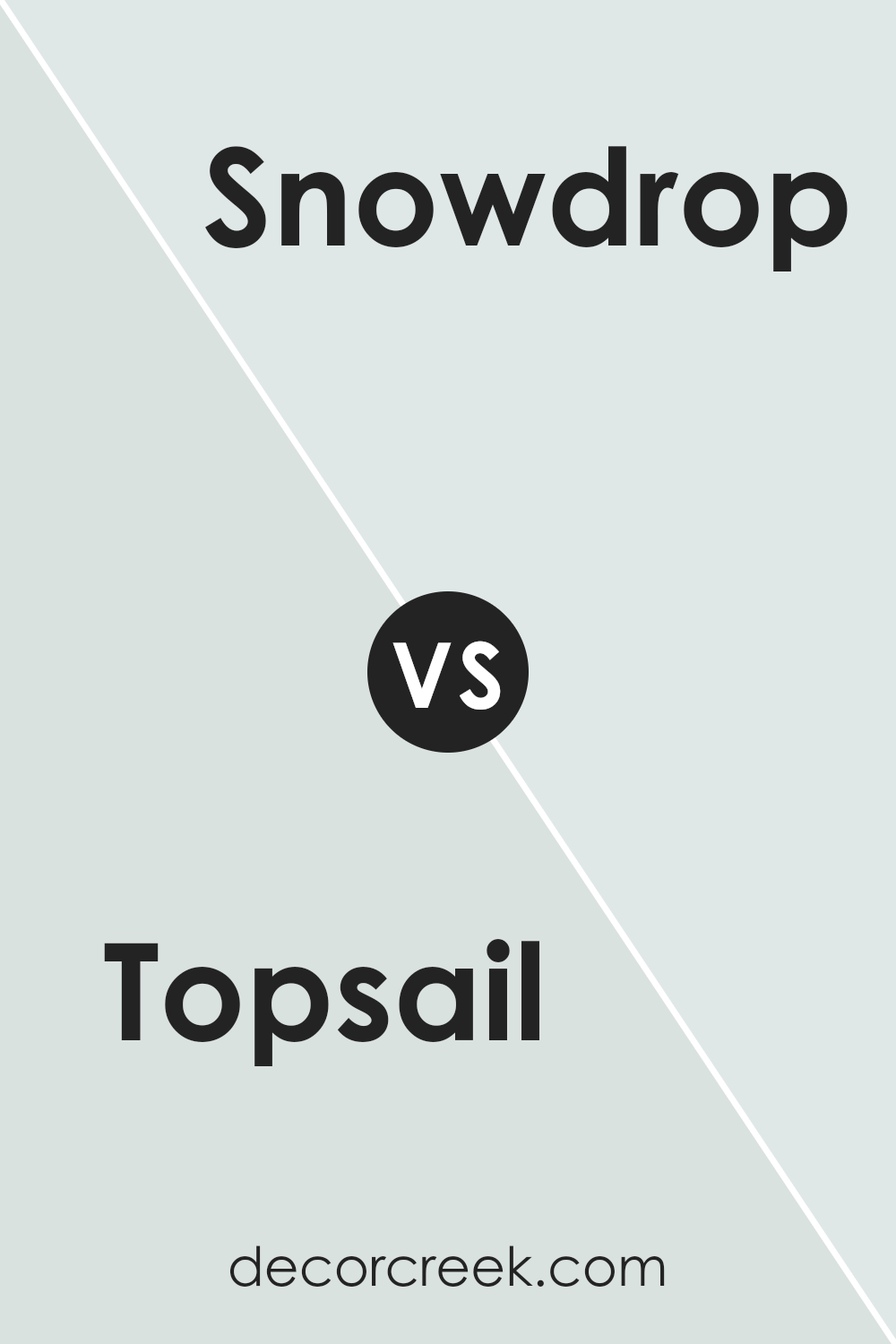
Topsail SW 6217 by Sherwin Williams vs Snowdrop SW 6511 by Sherwin Williams
Topsail and Snowdrop, both by Sherwin Williams, are distinct hues perfect for creating a light, airy ambiance in a room. Topsail is a soft, muted gray with a hint of blue, giving it a calm and gentle appearance that’s easy on the eyes. This color works well in spaces looking for a neutral backdrop with a subtle hint of color.
In contrast, Snowdrop is a bright, clean white that brings a crisp freshness to any space. It’s perfect for making smaller rooms appear larger and brighter. Although both colors share a lightness and purity, Topsail introduces a cool, gentle depth, while Snowdrop offers a sharp, clear simplicity that helps other colors in a room stand out. Together, they can work beautifully to create a refined, refreshing look.
You can see recommended paint color below:
- SW 6511 Snowdrop
Topsail SW 6217 by Sherwin Williams vs Timid Blue SW 6490 by Sherwin Williams
Topsail and Timid Blue, both by Sherwin Williams, offer subtle and calming hues but they differ in tone and atmosphere. Topsail is a light gray with a hint of blue that can make a room feel airy and open. It’s soft enough to serve as a neutral backdrop, allowing for versatility in decor.
On the other hand, Timid Blue is a true light blue that brings a fresher, more distinct blue presence into a space. This color is brighter and more noticeable compared to Topsail, creating a slightly more cheerful and vibrant ambiance. While Topsail can blend seamlessly with other colors, Timid Blue stands out a bit more, making it a great choice for adding a gentle splash of color.
Both shades are excellent for creating a calm and welcoming environment, but your choice depends on whether you prefer a more understated or slightly bolder blue influence in your space.
You can see recommended paint color below:
- SW 6490 Timid Blue
Topsail SW 6217 by Sherwin Williams vs Sky High SW 6504 by Sherwin Williams
Topsail and Sky High are two paint colors offered by Sherwin Williams that bring their unique shades to interiors. Topsail is a soft, light gray shade with subtle blue undertones, providing a calm and gentle feel to any space. It’s an excellent choice for achieving a breezy and airy ambiance in rooms, making them feel more open and relaxed.
On the other hand, Sky High is a more vibrant and lighter blue that resembles the clear daytime sky. This color is brighter and more cheerful, bringing a lively energy to any room. It’s especially great for adding a pop of color in spaces that you want to feel more dynamic and fun.
Both colors work beautifully in spaces that aim for a refreshing feel, but while Topsail leans towards a muted, soothing experience, Sky High steps forward with a more playful and vivid vibe.
You can see recommended paint color below:
- SW 6504 Sky High
Topsail SW 6217 by Sherwin Williams vs Dew Drop SW 9641 by Sherwin Williams
Topsail by Sherwin Williams is a gentle and soft hue, resembling a light gray with hints of blue. It evokes the calmness of an overcast sky, making it ideal for creating a peaceful atmosphere in any room. This color pairs well with more vibrant colors or works beautifully on its own for a minimalist look.
On the other hand, Dew Drop is a fresh and subtle green shade with a touch of gray. This color is reminiscent of early morning dew on spring grass, lending a crisp, clean feel to spaces. It’s particularly effective in areas where a refreshing, natural vibe is desired.
Both Topsail and Dew Drop are subdued and not overpowering, promoting a light, airy feel in interiors. While Topsail leans towards a neutral blue, Dew Drop brings a hint of green, offering a touch of nature’s freshness. These colors can beautifully complement each other, with Topsail providing a cool balance to the slightly warmer undertones of Dew Drop.
You can see recommended paint color below:
- SW 9641 Dew Drop
Topsail SW 6217 by Sherwin Williams vs Mantra SW 9631 by Sherwin Williams
Topsail and Mantra by Sherwin Williams are both soothing, muted colors, but they bring their unique vibes to a space. Topsail is a light, airy gray with a hint of blue, giving it a fresh and clean feel. It’s perfect for creating a calming atmosphere in rooms like bedrooms or bathrooms.
On the other hand, Mantra leans towards a slightly darker, gray-green shade that offers a sense of calm and collectedness. This color works well in spaces where you want to relax but also maintain a feel of subtle elegance—perfect for living rooms or home offices. Both colors reflect light beautifully, yet Mantra provides a bit more depth, making it slightly warmer than the breezier feel Topsail offers.
In essence, Topsail is ideal for those who prefer lighter, more luminous spaces, while Mantra suits those looking for a touch of warmth without overwhelming darkness.
You can see recommended paint color below:
- SW 9631 Mantra
Topsail SW 6217 by Sherwin Williams vs Quicksilver SW 6245 by Sherwin Williams
The main color, Topsail, and the second color, Quicksilver, both by Sherwin Williams, offer subtle yet distinct vibes for any room. Topsail is a light, airy gray that has a hint of blue, creating a calm, refreshing feel. It’s ideal for spaces where you want to promote a sense of relaxation and lightness.
On the other hand, Quicksilver is a bit darker and leans more towards a true gray. This color is excellent for modern spaces as it provides a clean, neutral background that’s very versatile. Both colors are great for those who prefer minimalist designs, but while Topsail will make a room feel more open and bright, Quicksilver offers a slightly more grounded, cool atmosphere.
Whether you choose Topsail for its breezy feel or Quicksilver for its neat, straightforward character, both colors are fantastic choices for a contemporary home.
You can see recommended paint color below:
- SW 6245 Quicksilver
Topsail SW 6217 by Sherwin Williams vs Ski Slope SW 6518 by Sherwin Williams
Topsail and Ski Slope by Sherwin Williams are both subtle, light colors, but they offer different vibes due to their tones. Topsail is a soft, pale blue with a hint of gray, making it calm and gentle. It’s a versatile color that can make small spaces appear bigger and brighter without overwhelming the room.
On the other hand, Ski Slope is a pale green with a soft white undertone, giving it a crisp and clean look. This color works great in spaces that need a touch of freshness, like bathrooms or kitchens, adding a light, airy feel. While Topsail reflects the sky on a clear day, Ski Slope evokes the freshness of early spring.
Both colors are great for creating a relaxed, light atmosphere but offer distinct color temperatures; Topsail being cooler and Ski Slope warmer, depending on the surrounding decor and lighting.
You can see recommended paint color below:
- SW 6518 Ski Slope
Topsail SW 6217 by Sherwin Williams vs Glimmer SW 6476 by Sherwin Williams
Topsail and Glimmer are two paint colors from Sherwin Williams that offer distinctly different vibes for your space. Topsail is a soft, muted gray with a slight blue undertone, giving it a calm and gentle look. This color is perfect for creating a peaceful and relaxing atmosphere in any room.
On the other hand, Glimmer is a pale, silvery green with hints of blue, making it appear brighter and more refreshing. This color is great for adding a touch of light and airiness to spaces that need a bit of uplifting.
While both colors are light and can help make a small room look larger, Topsail leans more towards a neutral, subdued palette, making it easier to match with a wide range of decor. Glimmer, with its subtle hint of green, offers a cool, breezy feel, ideal for modern spaces that aim for a fresh, clean look. Whether you choose Topsail for its understated elegance or Glimmer for its lively sparkle, both colors are versatile choices for contemporary homes.
You can see recommended paint color below:
Topsail SW 6217 by Sherwin Williams vs Rainsong SW 9681 by Sherwin Williams
Topsail and Rainsong are two calming shades from Sherwin Williams that both bring a gentle ambiance to any space. Topsail is a softer, lighter color that can be described as a pale gray with a hint of blue. It has a breezy and fresh feel, making it perfect for creating a relaxed, airy atmosphere in rooms like the living area or bedroom.
Rainsong, on the other hand, carries a bit more depth. It’s a muted green with gray undertones, giving it a more grounded and natural look. This color is excellent for spaces where you want to add a touch of nature-inspired calm without going too dark.
Both colors work well in spaces that get a lot of natural light, enhancing their subtleties and providing a soothing backdrop. While Topsail offers a light, open vibe, Rainsong brings in a touch of earthiness, making it suitable for areas where you want a more cozy or inviting feel.
Together, they can complement each other beautifully in a home that aims for a calm and airy decor style.
You can see recommended paint color below:
- SW 9681 Rainsong
Conclusion
SW 6217 Topsail by Sherwin Williams is definitely a paint color worth considering if you’re thinking about giving your room a fresh new look. It’s like a gentle whisper of blue that can make any space feel calm and serene, sort of like a quiet day by the sea. Because of its softness, Topsail is really versatile, which means it works well in almost any room, whether it’s your bedroom, living room, or even your bathroom!
Not only does it make rooms look airy and open, but it also has this cool quality that makes it super relaxing to be around. If your room doesn’t get a lot of natural sunlight, Topsail can lighten it up and make it feel more welcoming. Pairing it with other colors is easy too; it goes nicely with soft whites, grays, and even some fun colors like yellow or teal if you’re feeling adventurous.
So, if you want a color that helps create a peaceful and cozy vibe, SW 6217 Topsail is a great choice to think about. It’s perfect if you want a touch of color without anything too bold or bright. Go ahead and give it a try, and see how it transforms your space into a calming retreat!
Ever wished paint sampling was as easy as sticking a sticker? Guess what? Now it is! Discover Samplize's unique Peel & Stick samples.
Get paint samples

