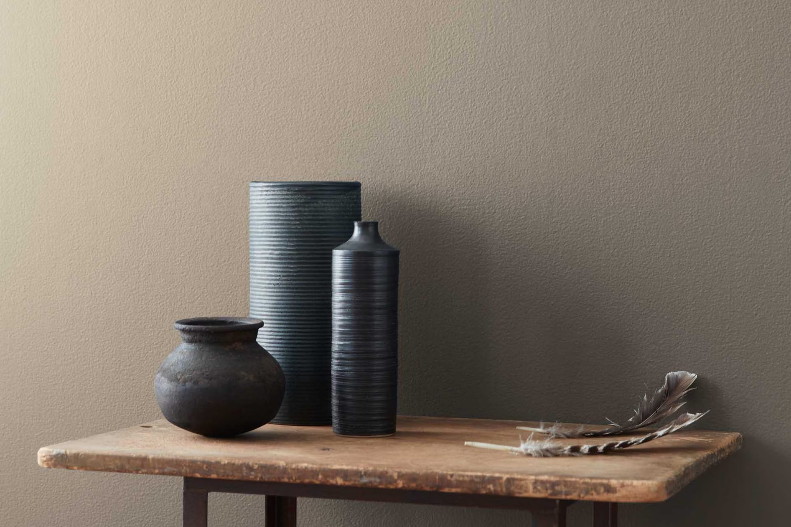
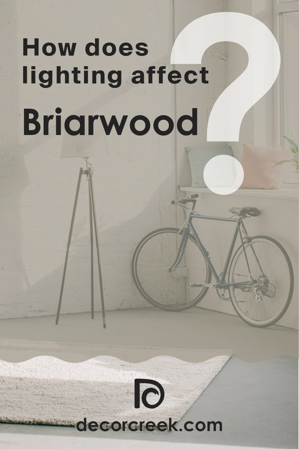
If you’re on the hunt for a paint color that truly feels like home, let me guide you through my thoughts on HC-175 Briarwood by Benjamin Moore. This particular shade is one that holds a charm that’s both subtle and profoundly impactful when applied to the walls of any room. When you walk into an area adorned with Briarwood, the atmosphere shifts noticeably. It’s akin to the warm, comforting welcome of a well-worn leather chair set beside a crackling fireplace.
Briarwood isn’t just another brown or beige; it has a depth that plays wonderfully with natural light, shifting subtly throughout the day from a softer, understated hue to a more pronounced, striking tone by evening. This adaptability makes it an excellent choice for rooms that serve multiple purposes at different times of the day.
Imagine your living room or bedroom imbued with such a rich, earthy palette—it can ground the area and serve as a perfect backdrop for both bright and muted furnishings. Choosing Briarwood means giving your interior a refined yet inviting atmosphere.
It’s perfect for those looking to create a cozy, warm environment without overpowering the senses.
Whether you want to refresh your favorite nook or give your entire home a makeover, consider how this shade could enrich your living experience.
What Color Is Briarwood HC-175 by Benjamin Moore?
Briarwood by Benjamin Moore is a warm, deep taupe that exudes a cozy and inviting vibe. This color has an earthy hue, blending brown and gray tones, which makes it incredibly adaptable for different decorating styles. It’s particularly effective in achieving an enduring look in any interior area.
One of the main advantages of Briarwood is how well it works with a range of materials and textures. It pairs beautifully with natural wood, which enhances its warmth, making it a superb choice for rooms with wooden floors or furniture. It also complements well with stone and metallic accents, adding a nice grounding element to areas that feature these materials.
When it comes to interior styles, Briarwood shines in rustic and traditional settings due to its natural tones. It also fits well in modern farmhouse aesthetics, where its warmth can soften more contemporary lines and finishes. Additionally, its subtlety makes it a good match for minimalist decor, providing a touch of warmth without overpowering the room.
Therefore, Briarwood is not just a paint color but a backdrop that supports a range of materials and styles, enhancing the overall feel of a home while maintaining a cozy, grounded atmosphere. Whether incorporated into a living room, bedroom, or kitchen, it offers a solid foundation for layering various decor elements.
Is Briarwood HC-175 by Benjamin Moore Warm or Cool color?
Briarwood by Benjamin Moore is a warm, deep taupe that brings a cozy and inviting feel to any room in a house. This color is adaptable, meaning it works well in different areas like living rooms, bedrooms, and even on exterior sidings. Its rich depth adds a subtle character to walls without overpowering the area with darkness.
This makes it a good choice for people who want to add a touch of warmth to their homes without choosing a color that’s too bold or intense. Briarwood goes well with a variety of decor styles and colors. It pairs nicely with lighter shades such as creams and beiges, which can help to create a balanced look.
It can also bring out the richness of wooden furniture and floors, enhancing the natural beauty of wood grains. Because it’s a neutral color, it can also act as a backdrop for both traditional and contemporary furnishings, allowing for flexibility in changing the look and feel of the room without needing to repaint.
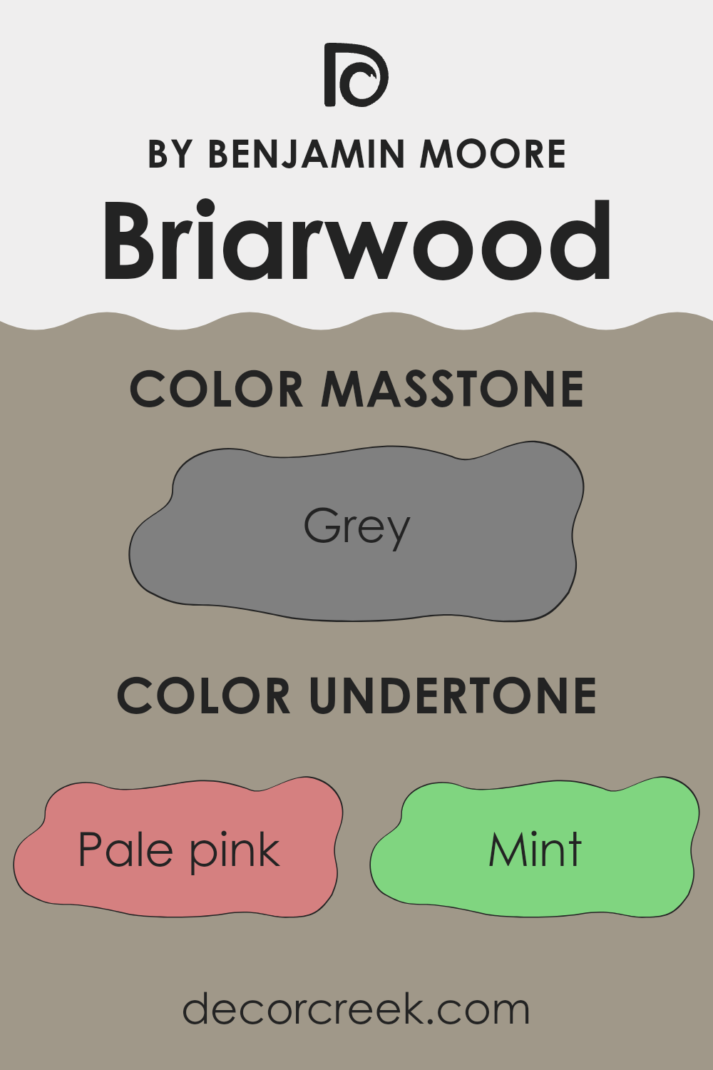
Undertones of Briarwood HC-175 by Benjamin Moore
Briarwood is an adaptable paint color known for its rich depth and warm appeal. The subtleties in its undertones play a significant role in how it is perceived in different settings. When we discuss undertones, we’re referring to the colors that subtly emerge from the main hue under different lighting conditions or when paired with other colors. These undertones can significantly influence the atmosphere of a room.
The particular undertones of Briarwood include shades like pale pink, mint, and pale yellow, which bring a delicate and light feeling to the color. Then there are undertones like lilac and light purple that add a touch of softness and subtlety. Even darker or richer shades like dark green and navy peek through, providing a grounding effect that balances the lighter tones.
When applied to interior walls, these undertones allow Briarwood to adjust to various décor styles and themes effortlessly. In natural light, you might notice the color appearing more open and airy due to its lighter undertones; meanwhile, in a room with less light, the darker undertones might become more prominent, giving the area a cozy and welcoming feel.
These subtle shades also mean that Briarwood pairs beautifully with a wide range of colors. Furnishings and decor in both light and dark shades can complement its adaptable nature. Whether you’re looking for a backdrop for vibrant, bold colors or a harmonious base for a more muted palette, Briarwood’s undertones provide a beautiful canvas.
Understanding these nuances is crucial when choosing a paint color, as they help in achieving the desired ambience and ensure that the color on the walls matches your vision.
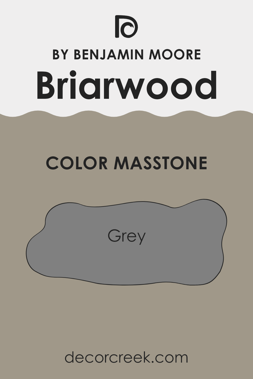
What is the Masstone of the Briarwood HC-175 by Benjamin Moore?
Briarwood HC-175 by Benjamin Moore has a masstone of Grey (#808080), a pure, balanced gray that brings a stable and calming feel to any area. In homes, this shade of gray acts as an adaptable backdrop.
It can blend seamlessly with various decor styles, from modern to traditional. Being a neutral color, it allows homeowners to pair it with bold colors like blues and reds for a dynamic look or with soft whites and creams for a more cohesive, calm atmosphere.
This gray is great for areas that receive a lot of foot traffic or have frequent changes in decor, because it doesn’t clash with other colors and always looks clean and fresh. It’s particularly effective in living rooms, kitchens, and bedrooms where you want a color that doesn’t overpower but still adds a touch of class and continuity throughout the home.
How Does Lighting Affect Briarwood HC-175 by Benjamin Moore?
Lighting plays a crucial role in how we perceive colors. Different types of light can make a color look very different in one setting compared to another. For example, natural light brings out the truest version of a color, while artificial light can add its own hue to the color.
Taking the color Briarwood by Benjamin Moore, let’s examine how it interacts with various types of light. Briarwood is a deep, warm gray with earthy undertones, adaptable in many areas.
Under artificial light, such as LED or incandescent bulbs, the warmth of Briarwood can become more pronounced, giving the walls a cozier feel that’s especially welcoming during the evening or in rooms without much natural light. Different bulbs can affect how Briarwood looks too; warmer bulbs enhance its brown undertones, while cooler bulbs might make it look more gray.
In natural light, Briarwood changes with the angle and intensity of the sun. In north-facing rooms, where light is cooler and more constant but softer throughout the year, Briarwood tends to show more of its gray nuances, making the area look distinctly refined without being too dark.
South-facing rooms, with plentiful, warm light throughout the day, light up with Briarwood, letting its warm undertones shine, making the room feel warm and inviting. This is ideal for living areas or any part of the home where you want a cozy, welcoming ambience.
East-facing rooms receive the most light in the morning when the sun rises, making Briarwood look brighter and warmer in the mornings while turning more neutral as the day progresses. This quality makes it perfect for bedrooms or breakfast nooks where you start the day.
West-facing rooms, bathed in intense afternoon light, can make Briarwood appear richer and darker, particularly later in the day. This effect is perfect for creating a striking impression in dining rooms or studies.
Overall, Briarwood’s adaptability in different lighting conditions makes it a flexible color choice, significantly altering the mood of any room depending on the light it receives.
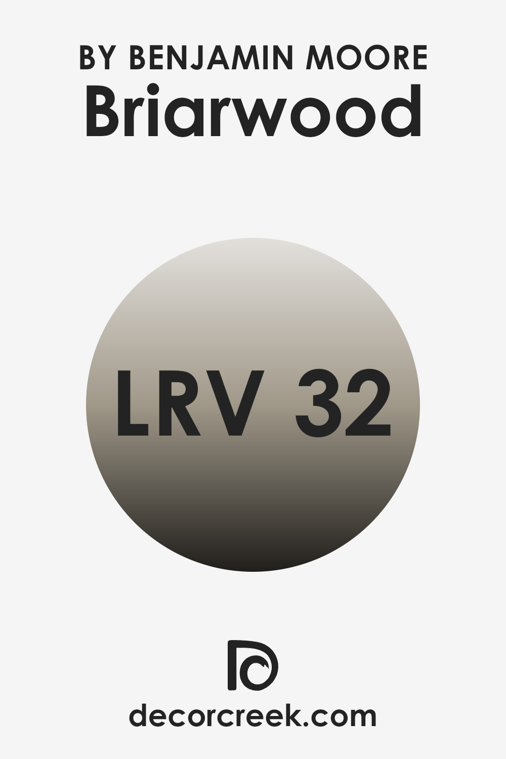
What is the LRV of Briarwood HC-175 by Benjamin Moore?
LRV stands for Light Reflectance Value, which is a measure used to describe the amount of visible and usable light that a color reflects from or absorbs into a surface. Essentially, it indicates how light or dark a color will appear when painted on a wall.
The higher the LRV, the lighter the color will appear, which means it reflects more light. On the other hand, a lower LRV means the color is darker and absorbs more light. This value is particularly useful when choosing paint colors, as it helps you understand how different colors will affect the lighting and mood of a room.
The LRV of Briarwood, which is 31.8, suggests that it is a relatively deeper shade. This means it tends to absorb more light than it reflects. In a practical sense, using a color with such an LRV can make a room feel cozier and more enclosed. However, it can also make a small area seem smaller or a dimly lit area appear even darker.
If you’re painting a large room or one with plenty of natural light, this color could add a nice depth and warmth without overpowering the area. It’s important to consider both the natural and artificial lighting in your environment when deciding if this LRV value will work well for your needs.
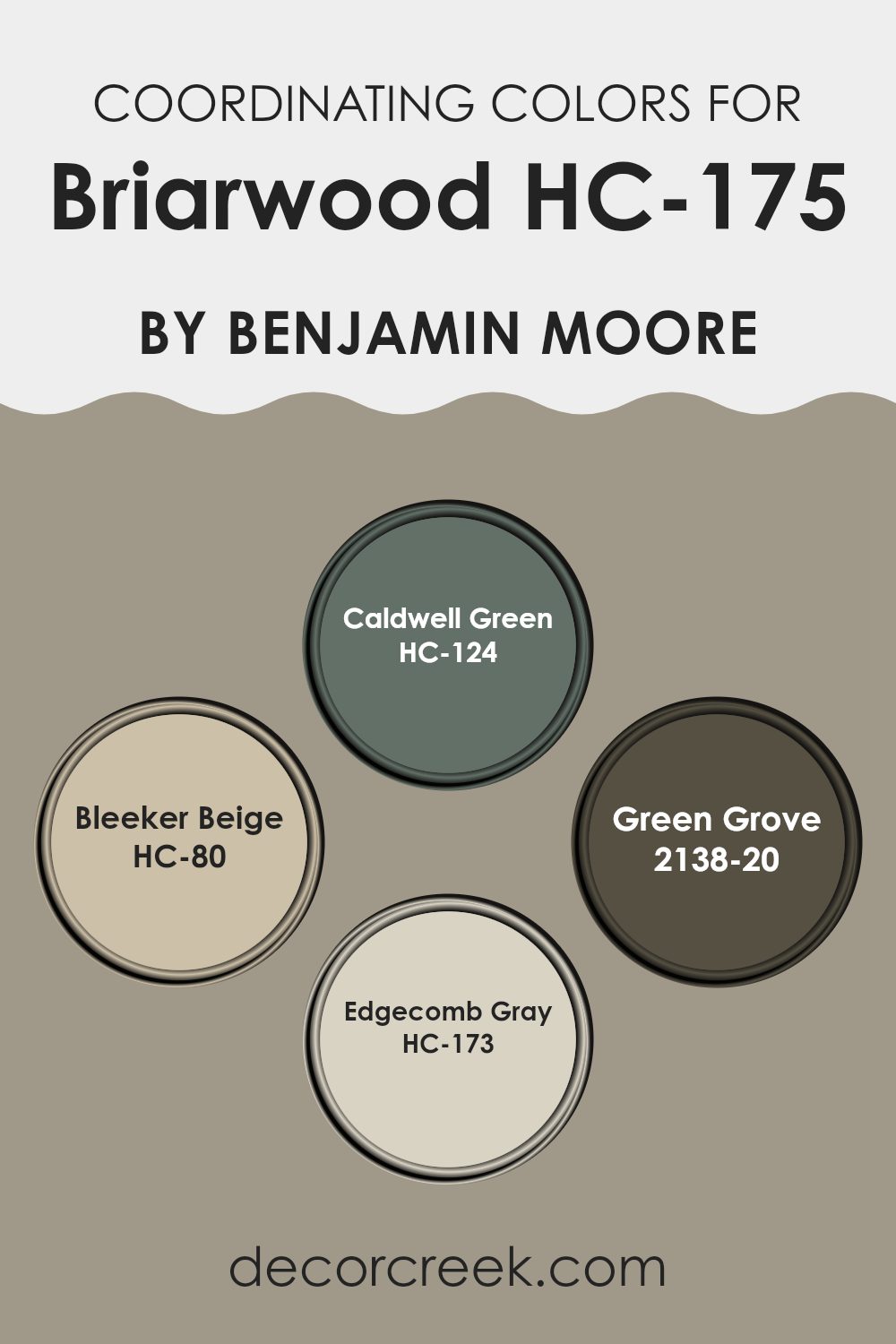
Coordinating Colors of Briarwood HC-175 by Benjamin Moore
Coordinating colors are shades that harmonize well when used together in design, creating a visually appealing and balanced look, often enhancing the main color they accompany. In homes, it’s common to pick a central color and then select coordinating colors for accents like trim, doors, and adjoining rooms, providing a cohesive flow throughout the area. For instance, Briarwood HC-175 by Benjamin Moore is a rich color that can be paired with a variety of hues to either contrast or complement its depth.
Caldwell Green HC-124 is a deep, muted green that brings a natural, grounded feeling to a room. When paired with a color like Briarwood, it can highlight an earthy or organic vibe in the setting.
Bleeker Beige HC-80 offers a warm and inviting feel, and its neutral tone makes it an excellent choice for creating a subtle backdrop that allows other colors, such as Briarwood, to stand out more prominently. Green Grove 2138-20 is a darker shade of green, and it brings a rich, intense contrast, perfect for adding depth and interest when used with lighter, neutral tones like Briarwood.
Lastly, Edgecomb Gray HC-173 offers a light and airy gray that softens and blends seamlessly with deeper hues, working particularly well to support a calm and consistent scheme when used alongside Briarwood. These coordinating colors work together to enhance the overall aesthetic while maintaining a balanced palette.
You can see recommended paint colors below:
- HC-124 Caldwell Green
- HC-80 Bleeker Beige
- 2138-20 Green Grove
- HC-173 Edgecomb Gray
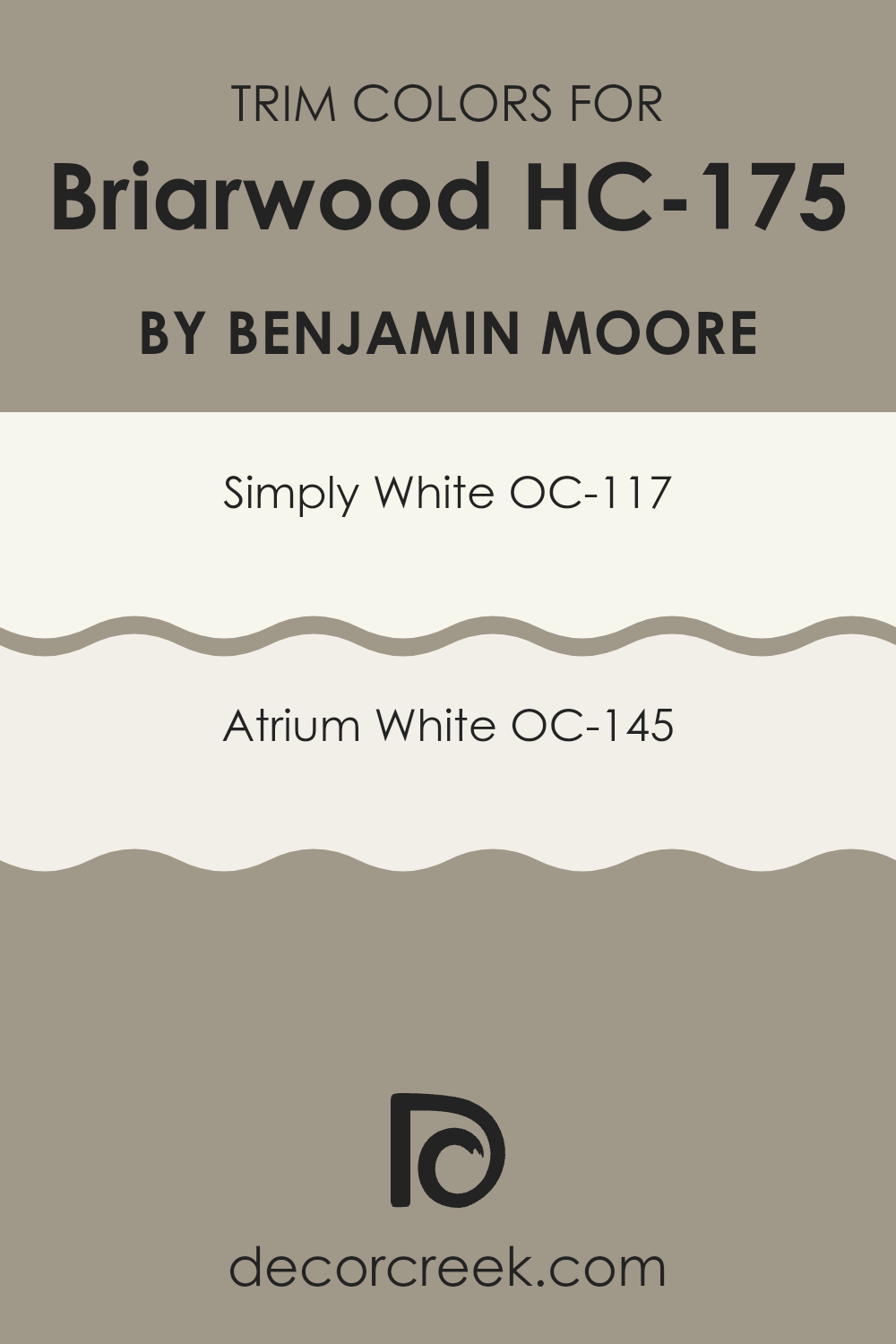
What are the Trim colors of Briarwood HC-175 by Benjamin Moore?
Trim colors, which are the hues selected for the architectural details like door frames, window sills, and baseboards, play a crucial role in defining and accentuating the overall aesthetics of a room.
When paired with a distinctive shade like Benjamin Moore’s Briarwood, trim colors such as OC-117 – Simply White and OC-145 – Atrium White can greatly enhance the appearance by providing a crisp, clean contrast that highlights the depth and richness of the primary color. This contrast not only brings out the architectural features but also helps in creating a more defined and cohesive look.
OC-117 – Simply White is a very clean and bright white that offers a fresh and clear appearance, perfect for making Briarwood stand out. This shade acts as a light and open counterpart to deeper hues, ensuring that the room feels spacious and welcoming. On the other hand, OC-145 – Atrium White has a slightly creamy quality, lending a gentle warmth to araes without dominating the main color.
It’s ideal for those looking to create a subtle, yet inviting atmosphere, complementing Briarwood with a soft and warm background that enhances the overall ambience. Both colors are adaptable and effectively highlight deeper tones, ensuring they play a supportive yet essential role in interior color schemes.
You can see recommended paint colors below:
How to Use Briarwood HC-175 by Benjamin Moore In Your Home?
Briarwood HC-175 by Benjamin Moore is a warm, mid-tone gray with brown undertones that offers a cozy and inviting ambiance to any area in your home. This adaptable paint color is perfect for creating a comfortable and relaxing atmosphere in living rooms or bedrooms. Its earthy hue pairs well with natural materials like wood or stone, enhancing the welcoming feel of a family kitchen or a rustic dining area.
If you’re looking to refresh your home’s exterior, Briarwood is also an excellent choice for outdoor trim, shutters, or siding, complementing natural outdoor elements and boosting curb appeal. Whether used as a main color or an accent, this shade works harmoniously with other tones, supporting a variety of design styles from traditional to more modern looks.
For those seeking a change without overpowering their surroundings, painting an accent wall in Briarwood can add a subtle yet impactful touch, giving the room a renewed feel without a complete overhaul.
Writing this piece about HC-175 Briarwood by Benjamin Moore has really shown me how a single paint color can influence the atmosphere of an entire room. Briarwood is not just any brown; it’s a warm, inviting shade that seems to wrap you in comfort as you walk in. It brings to mind a cozy, soft blanket.
Throughout my exploration of Briarwood, I discovered how seamlessly it fits into different areas of a home. Whether it’s enhancing the exterior with a welcoming charm or offering a comforting backdrop indoors, Briarwood integrates naturally.
It pairs beautifully with a range of shades—from crisp whites to gentle beiges, and even vibrant hues—making it an ideal choice when you want a color that harmonizes effortlessly with your existing decor.
I also found it fascinating how lighting changes the appearance of Briarwood. In bright light, it looks softer and warmer, while in dimmer conditions, it develops a deeper, more enriched tone. It’s like having a color that subtly shifts its personality as the day progresses.
In essence, Benjamin Moore’s HC-175 Briarwood is more than just paint for your walls. It’s a choice that infuses your home with warmth and comfort, allowing every space to feel perfectly balanced. Whether you want your room to evoke a gentle sense of coziness or a touch of refined elegance, this color is a truly exceptional choice.
Ever wished paint sampling was as easy as sticking a sticker? Guess what? Now it is! Discover Samplize's unique Peel & Stick samples.
Get paint samples

