There’s something about its rich, timeless hue that effortlessly brings a space to life. It’s a color that seems to tell a story of its own, blending elegance with a touch of nature. When you surround yourself with Caldwell Green, it feels as though you’re inviting the calmness of the outdoors right into your home.
I noticed how this versatile shade adds depth and character to any room. Its classic yet modern appeal works wonders whether I paint an entire room or use it as an accent.
Whether it’s bright sunlight pouring into the room or the gentle dimming of the evening, Caldwell Green adapts, shifting in tone and warmth to suit the mood.
I also love how it plays well with other colors. Pairing it with neutrals brings out its sophistication, while combining it with deeper shades can create a cozier atmosphere.
It’s more than just a paint color—it’s a way to express my style in a subtle yet impactful way.
If you’re looking for a color that offers both elegance and a sense of comfort, HC-124 Caldwell Green is an excellent choice.
What Color Is Caldwell Green HC-124 by Benjamin Moore?
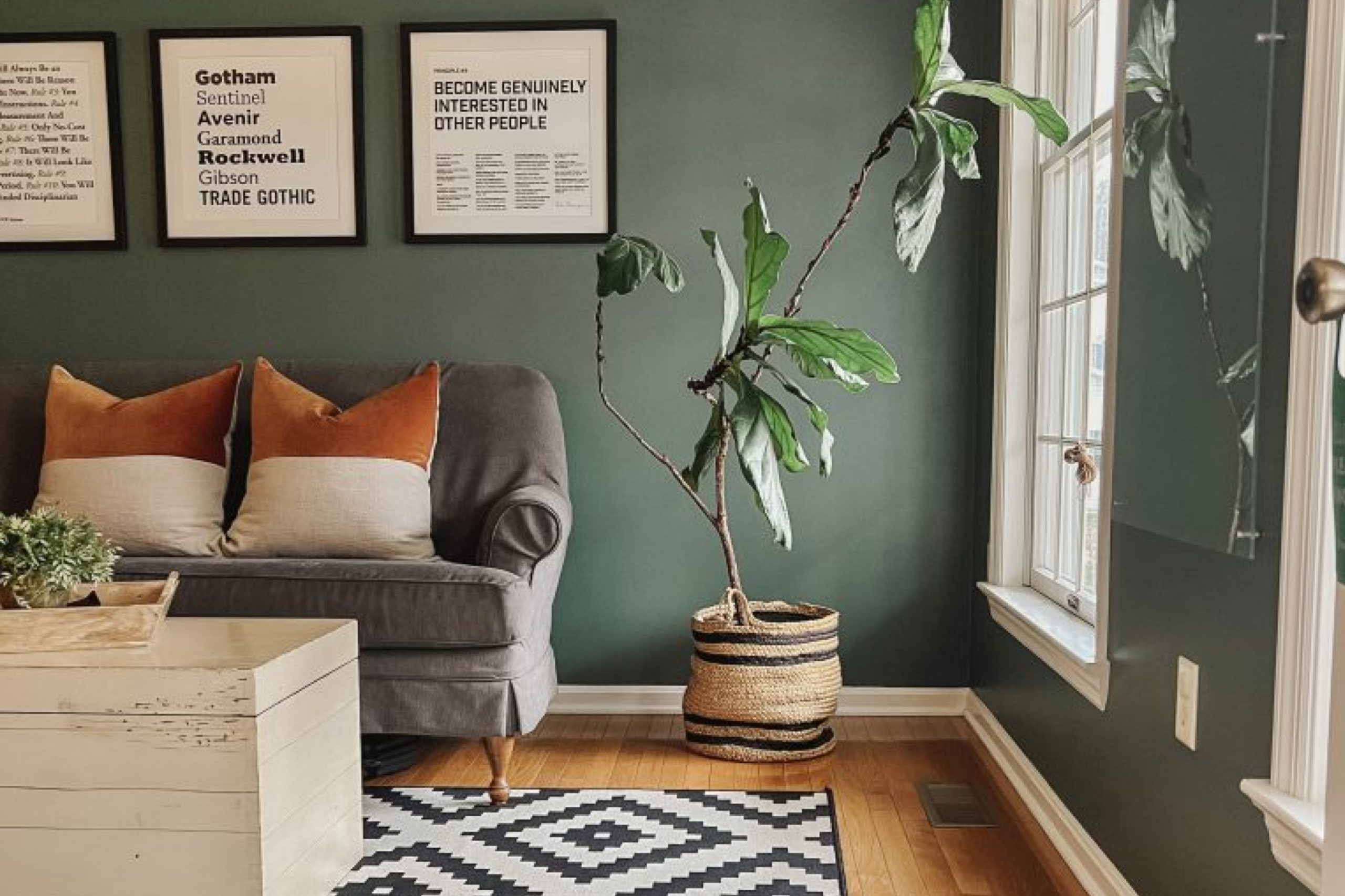
Caldwell Green (HC-124) by Benjamin Moore is a beautiful, rich shade of green that offers a timeless and earthy feel to any space. It’s a deep forest green with hints of blue, making it perfect for creating a cozy and inviting environment. This color works wonderfully in traditional interior styles, bringing a touch of nature indoors and providing a sense of warmth and comfort.
It can also suit modern and eclectic interiors, where bold color choices can make striking statements.
For farmhouse or rustic settings, Caldwell Green works well against natural wood tones, complementing raw materials like oak, walnut, or reclaimed wood. It pairs beautifully with other natural elements, such as stone fireplaces or brick accents, which emphasize its earthy nature.
When combined with metals like brass or copper, Caldwell Green adds a layer of sophistication and elegance to a room.
In terms of textures, this color goes well with soft textiles such as linen, wool, and velvet, enhancing an inviting and plush atmosphere. It also complements textured wallpapers, particularly those with botanical or geometric patterns, adding depth to the walls.
Paired with white or cream trim, it creates a classic contrast, highlighting architectural details and making the green pop.
Is Caldwell Green HC-124 by Benjamin Moore Warm or Cool color?
Caldwell Green HC-124 by Benjamin Moore is a popular paint color choice for many homes. Its muted green tone can bring a calm and refreshing feel to any space. The color works well in various rooms like living rooms, bedrooms, and kitchens because it has a versatile quality that pairs nicely with both modern and traditional styles.
The gentle green hue can create a soothing environment, which is especially nice for areas where relaxation is key, such as bedrooms or family rooms.
When used in a living room, Caldwell Green HC-124 provides a nice backdrop that can make furniture and decor pop without overwhelming the space. In a kitchen, it adds a hint of color that can refresh the look without clashing with other elements.
This color also works well alongside natural materials like wood and stone, enhancing their natural beauty and creating a cohesive look throughout the home.
Undertones of Caldwell Green HC-124 by Benjamin Moore
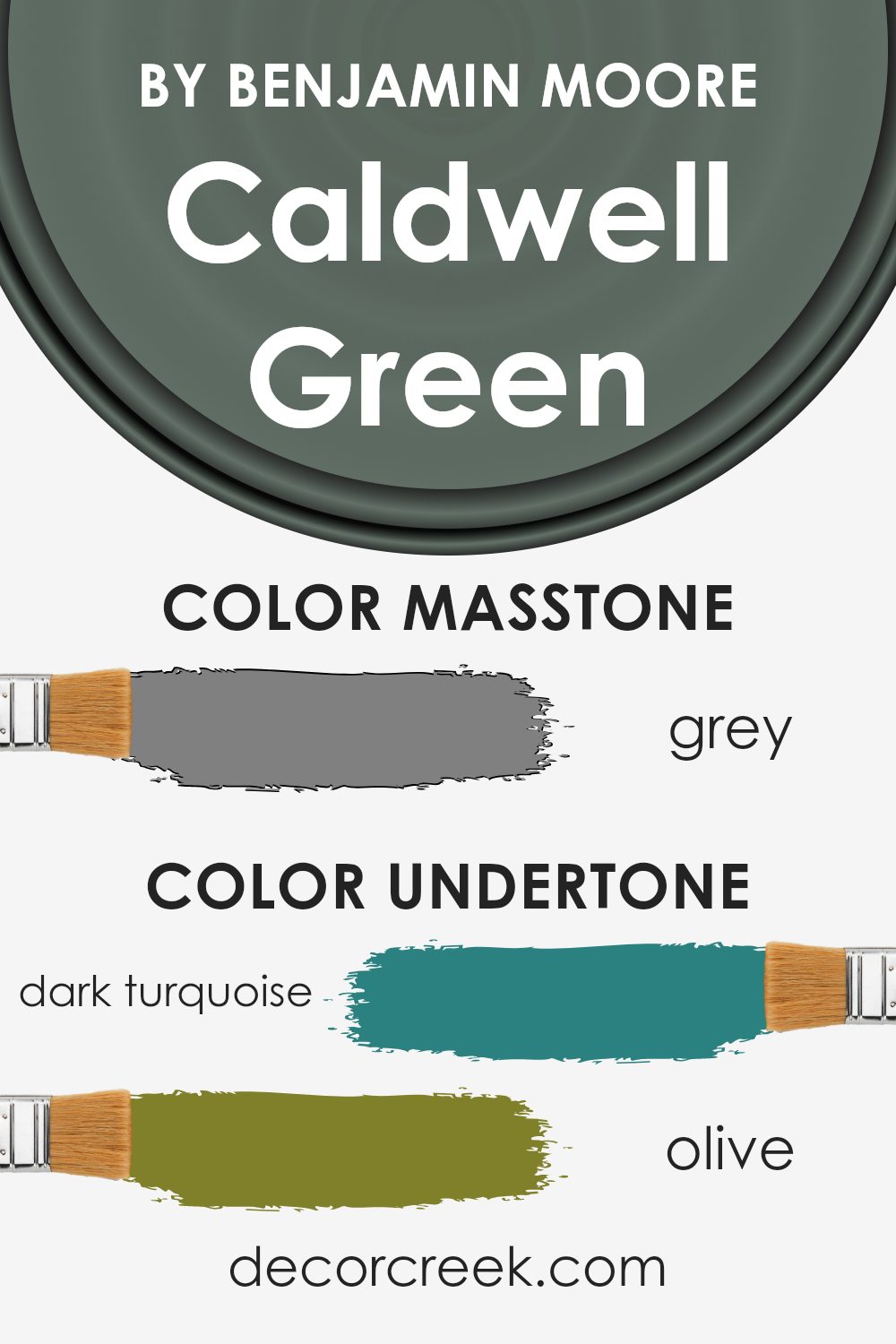
Caldwell Green (HC-124) by Benjamin Moore is a color that can change a lot depending on the lighting and surrounding colors. This paint is a shade of green, but its many undertones make it interesting. The undertones of this color include dark turquoise, olive, purple, dark green, navy, and several more. These undertones can influence how the color looks in different settings.
For example, if a room has a lot of natural light, the lighter undertones like mint or pale yellow might stand out more, giving the room a fresh and bright appearance.
On the other hand, in dim light, darker undertones like navy or dark grey might show more, making the room feel more cozy and intimate.
When Caldwell Green is used on interior walls, the effect can vary greatly. The green might sometimes look deeper and richer due to the dark green and navy undertones.
In contrast, when paired with warm lighting or furnishings, the color might have a subtle warmth because of its brown or orange undertones.
Understanding these undertones helps in choosing complementary colors for furniture and decorations, creating a balanced and visually pleasing space.
Thus, the undertones play a key role in how the paint interacts with its environment.
What is the Masstone of the Caldwell Green HC-124 by Benjamin Moore?
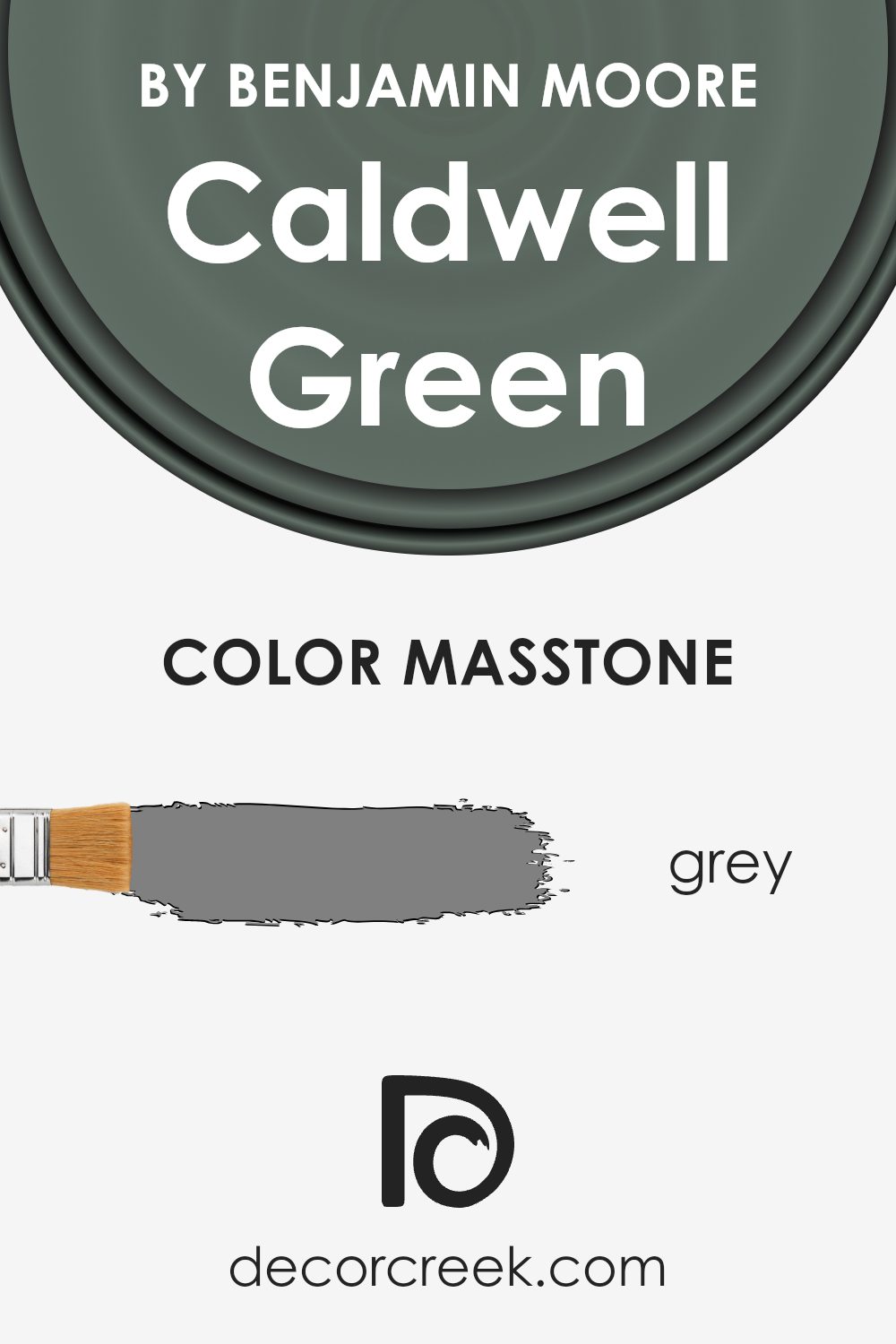
Caldwell Green HC-124 by Benjamin Moore is a medium shade with a hint of gray undertone. This grayish-green color provides a calm and balanced atmosphere in homes. The masstone’s gray aspect makes Caldwell Green particularly versatile, as it complements various styles and decors.
In spaces with ample natural light, it can appear more green, bringing a touch of the outdoors in. However, in dimly lit rooms, the gray tones become more prominent, creating a cozy and subdued feel.
This color works well in living rooms, bedrooms, and even kitchens. It pairs nicely with neutral shades like whites and beiges and provides a great background for wooden furniture and natural materials.
Caldwell Green can make a room feel fresh and updated without being too bold or overwhelming. Its ability to subtly shift between gray and green allows homeowners to enjoy a nuanced color that adapts to different lighting and settings.
How Does Lighting Affect Caldwell Green HC-124 by Benjamin Moore?
Lighting plays a crucial role in how we perceive colors. Different types of light, whether natural or artificial, can dramatically change the way a color looks. Caldwell Green HC-124 by Benjamin Moore is a color that can vary significantly under different lighting conditions.
In natural light, Caldwell Green appears as a rich, deep green. However, its appearance can change based on the direction and intensity of the light a room receives.
In north-facing rooms, natural light tends to be cooler and muted, making Caldwell Green look slightly darker and more subdued. This can bring out the gray undertones in the color, giving it a more muted look.
In south-facing rooms, the light is warmer and more direct, which can enhance the richness of Caldwell Green. The color often appears brighter and more vibrant in these spaces, as the sunlight is more intense for most of the day.
East-facing rooms get morning light that is soft and warm. Caldwell Green may look brighter and more cheerful in the morning, but the color can become more muted as the day goes on and the light decreases.
West-facing rooms get light in the afternoon and evening. Here, Caldwell Green can look warm and inviting as the sunlight adds a golden hue to the color later in the day.
In artificial light, the type of bulb used can greatly affect how Caldwell Green looks. Incandescent bulbs tend to cast a warm, yellow light, which can make the color look warmer and more inviting, possibly enhancing its green qualities.
In contrast, LED or fluorescent lights can have a cooler or stark white cast, which might make the color appear slightly cooler or more subdued.
It’s essential to consider the type and placement of lighting in a room to ensure the desired appearance of this color.

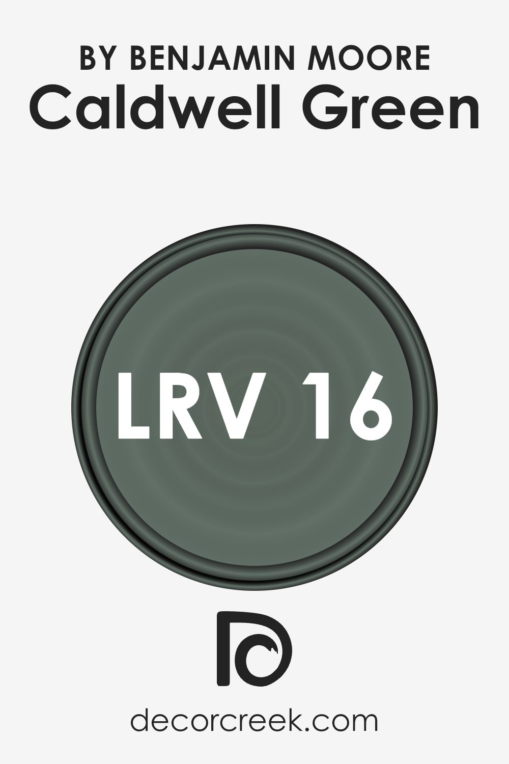
What is the LRV of Caldwell Green HC-124 by Benjamin Moore?
Light Reflectance Value, or LRV, measures how much light a color reflects or absorbs. It’s an important guideline to consider when choosing paint for your walls. LRV is on a scale from 0 to 100, with 0 being completely black, reflecting no light, and 100 being completely white, reflecting all the light.
Essentially, the higher the LRV, the lighter and more reflective the color will be. This affects how bright or dark a room looks and feels.
In spaces with limited natural light, a higher LRV can brighten things up. Conversely, lower LRV values can deepen room color and warmth by absorbing more light.
Caldwell Green, with an LRV of 16.27, falls on the lower end of the scale. This means it will absorb more light rather than reflect it, making it a darker color.
In a room, it can create a cozy, intimate atmosphere, as it doesn’t bounce much light around.
This is a great option if you’re looking to make a large room feel more inviting or add a touch of warmth to an otherwise bright space.
However, without enough natural or artificial light, it may make small spaces feel even smaller, so lighting should be considered when using this color.
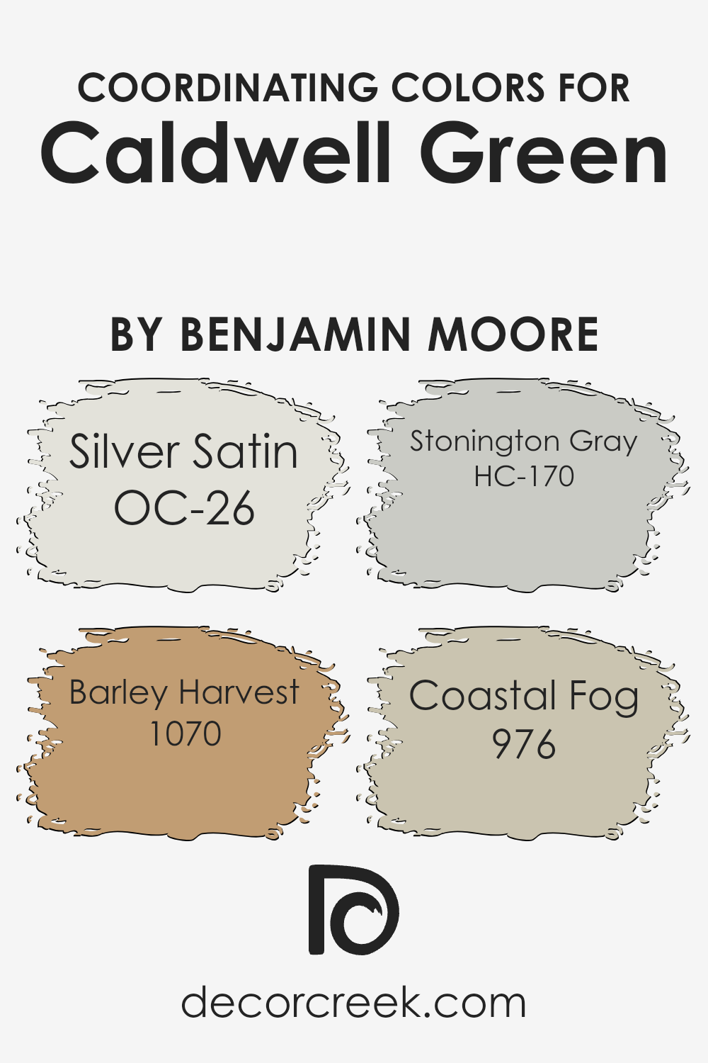
Coordinating Colors of Caldwell Green HC-124 by Benjamin Moore
Coordinating colors are hues that work well together to create a harmonious look in a space. They can set the mood of a room and ensure that various elements come together seamlessly. Caldwell Green is a tranquil and elegant shade by Benjamin Moore, and it pairs beautifully with a range of other colors.
For instance, Silver Satin, a soft off-white, adds a sense of lightness and airiness, making spaces feel open and inviting. It serves as a great backdrop when paired with deeper colors like Caldwell Green, allowing the green to stand out without overwhelming the room.
Barley Harvest, on the other hand, introduces warmth with its golden undertones, adding a cozy and inviting feel to the overall palette. Stonington Gray provides an understated and neutral balance, bridging the stronger colors with its classic and subtle presence.
Lastly, Coastal Fog brings a muted, earthy tone into play, adding depth and grounding the color scheme. When used together, these colors create a pleasing and cohesive environment, each complementing Caldwell Green beautifully yet distinctly.
In a home, these colors can be used across walls, furniture, or accents, offering a versatile and appealing aesthetic.
You can see recommended paint colors below:
- OC-26 Silver Satin
- 1070 Barley Harvest
- HC-170 Stonington Gray
- 976 Coastal Fog
What are the Trim colors of Caldwell Green HC-124 by Benjamin Moore?
Trim colors refer to the paint colors used on the trim of a room, such as baseboards, moldings, window frames, and doors. These colors are crucial because they frame the main wall color and enhance the overall look of a space.
For Caldwell Green HC-124 by Benjamin Moore, using the right trim color can either highlight its refreshing, earthy tones or create a gentle contrast that complements the room’s aesthetic.
Choosing the right trim color helps in defining architectural details and providing clear outlines for your walls, making the room look more polished and complete.
OC-85 Mayonnaise and OC-152 Super White are excellent choices for trim when paired with Caldwell Green. Mayonnaise is a warm, creamy white with a hint of yellow, which adds a soft and cozy touch, making the room feel inviting and pleasant.
Super White, on the other hand, is a bright, crisp white that offers a clean, modern look, creating a striking contrast with the green walls.
This combination helps to brighten the space and provides a sophisticated finish that balances the boldness of Caldwell Green while ensuring the room feels fresh and airy.
You can see recommended paint colors below:
- OC-85 Mayonnaise
- OC-152 Super White

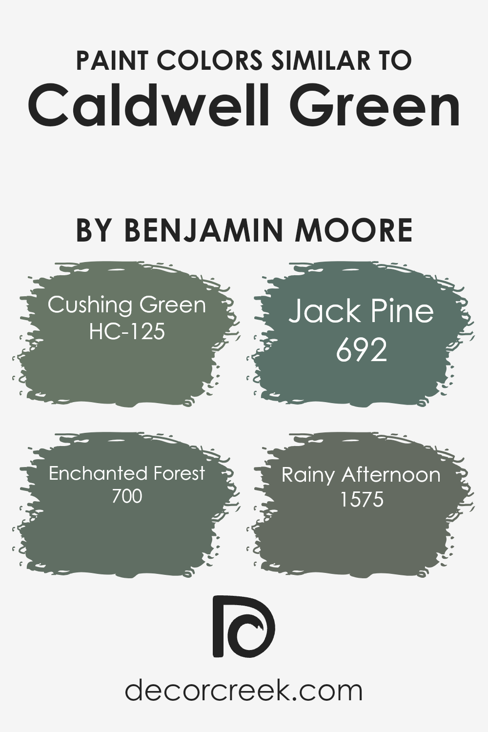
Colors Similar to Caldwell Green HC-124 by Benjamin Moore
Similar colors play a crucial role in design by creating harmony and cohesion in a space. Caldwell Green by Benjamin Moore is a rich, timeless hue, and when paired with colors that share its underlying tones, it can create a balanced and inviting environment.
Colors like Cushing Green, Enchanted Forest, Jack Pine, and Rainy Afternoon complement Caldwell Green beautifully. These colors are similar because they share earthy undertones that can make a room feel grounded and cohesive.
Cushing Green, for example, is a deep shade with a hint of grey, adding a sense of stability and warmth. Enchanted Forest is slightly darker, conveying a sense of depth and richness that resonates with natural earthiness.
Jack Pine has a softer touch with its muted green tone, invoking a sense of nature and relaxation.
On the other hand, Rainy Afternoon offers a subdued hue with blue undertones, bringing a calming and comforting ambience. When these colors are used together, they enhance each other’s qualities, creating a unified look that feels both timeless and fresh.
This harmony is key in design, as it allows different elements to coexist without clashing, making the space more pleasing to the eye.
You can see recommended paint colors below:
- HC-125 Cushing Green
- 700 Enchanted Forest
- 692 Jack Pine
- 1575 Rainy Afternoon
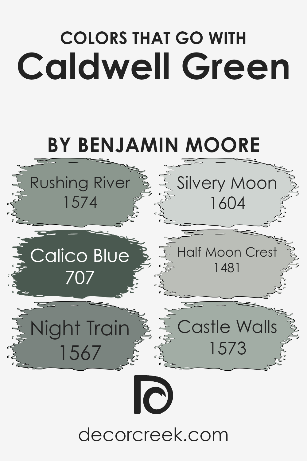
Colors that Go With Caldwell Green HC-124 by Benjamin Moore
Caldwell Green HC-124 by Benjamin Moore is a lovely green that feels natural and soothing. The beauty of this color is enhanced when paired with others like 1574 – Rushing River, a soft and gentle blue-gray that complements the calming green tones perfectly.
Its subtle hue feels fresh and open, almost like a gentle breeze. Adding 707 – Calico Blue introduces a cooler blue, balancing Caldwell Green’s warmth with a touch of cool elegance, creating a sense of harmony.
For a bit of depth, 1567 – Night Train provides a dark, moody hue that contrasts beautifully. Its depth brings out the softer tones in Caldwell Green for a cozy ambiance. Meanwhile, 1604 – Silvery Moon brings in a light, airy touch, giving your space a gentle glow.
The combination with 1481 – Half Moon Crest introduces a creamy undertone that enriches the green without overpowering it. For a bit of strength, 1573 – Castle Walls offers a strong, earthy presence that grounds the lighter colors beautifully.
Together, these colors create a cohesive palette that highlights the grace of Caldwell Green, making any room feel welcoming and balanced.
You can see recommended paint colors below:
- 1574 Rushing River
- 707 Calico Blue
- 1567 Night Train
- 1604 Silvery Moon
- 1481 Half Moon Crest
- 1573 Castle Walls
How to Use Caldwell Green HC-124 by Benjamin Moore In Your Home?
Caldwell Green HC-124 by Benjamin Moore is a lovely green paint that brings a fresh and clean feel to your home. This color is perfect for various spaces, adding a touch of nature inside. In living rooms, Caldwell Green can create a warm and inviting atmosphere.
Pair it with neutral furniture or use it on an accent wall to make the room pop. In the kitchen, this shade can be refreshing, giving the space a lively and updated vibe. Consider painting cabinets or just a small wall area for a modern look.
In bedrooms, Caldwell Green offers a restful feel, ideal for relaxation. It pairs well with soft whites or wood tones, creating a balanced and cozy environment. For bathrooms, this color works well with natural light, adding a touch of elegance. Accessorize with matching towels or decor items for a cohesive look. Caldwell Green is flexible and easy to use throughout the home.
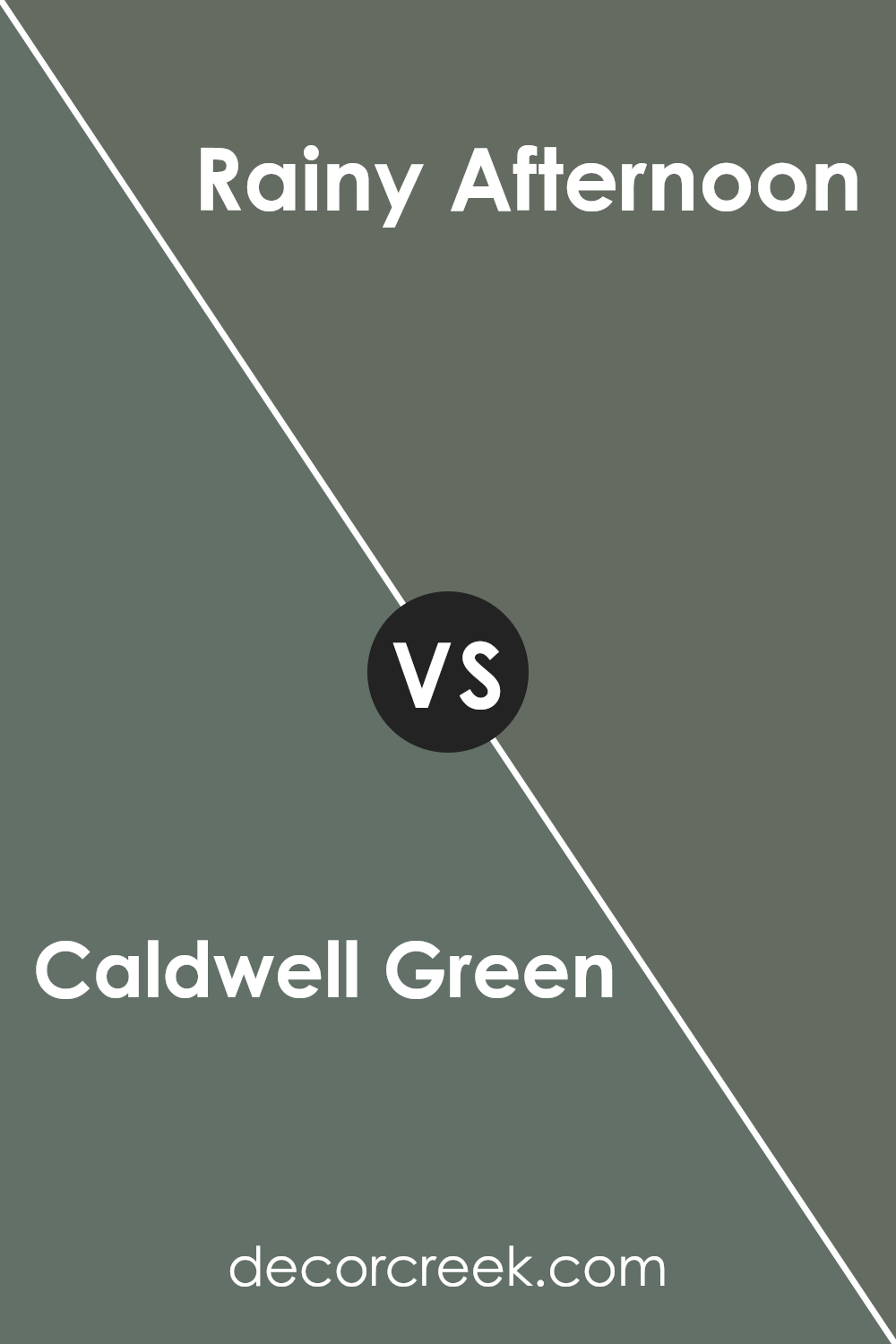
Caldwell Green HC-124 by Benjamin Moore vs Rainy Afternoon 1575 by Benjamin Moore
Caldwell Green HC-124 and Rainy Afternoon 1575 by Benjamin Moore are both tranquil, calming hues, but they each have their own unique vibe. Caldwell Green HC-124 is a soft, muted green with a subtle hint of gray. This gives it a fresh and breezy appearance, making it suitable for spaces where you want a natural and relaxed feel.
On the other hand, Rainy Afternoon 1575 is a deeper green with more intense gray undertones, lending it a moodier and more introspective quality.
While both colors bring natural beauty indoors, Caldwell Green is lighter and airier, perfect for energizing a room.
In contrast, Rainy Afternoon offers a cozy and comforting atmosphere, ideal for creating a more intimate space.
Both colors work well in various settings, from living rooms to bedrooms, though their intended effect can vary based on lighting and furnishings.
You can see recommended paint color below:
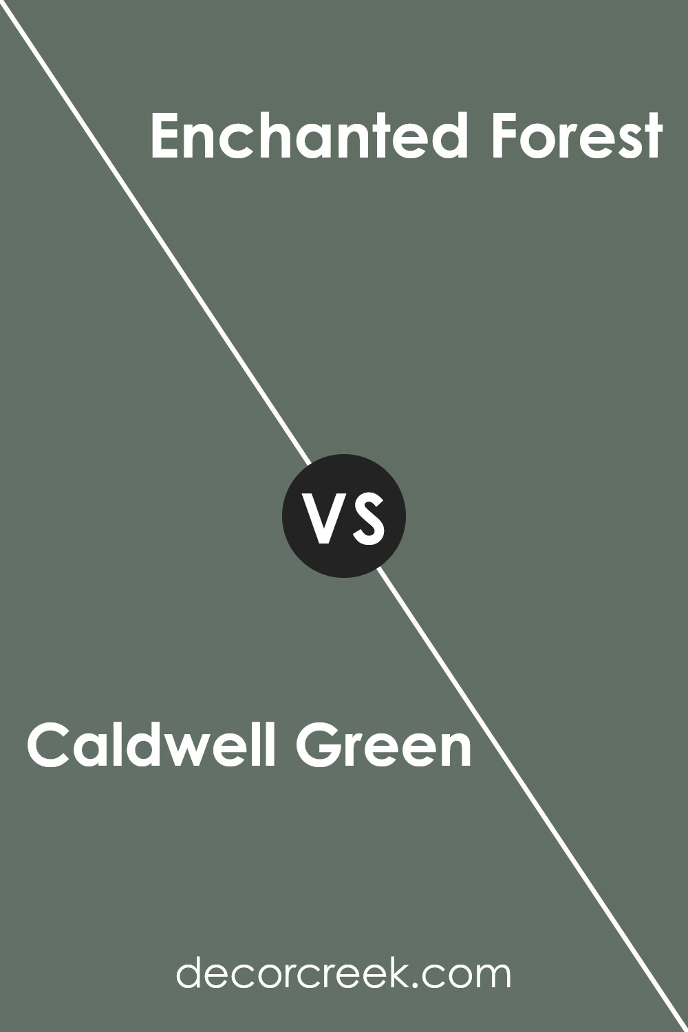
Caldwell Green HC-124 by Benjamin Moore vs Enchanted Forest 700 by Benjamin Moore
Caldwell Green (HC-124) and Enchanted Forest (700), both by Benjamin Moore, are rich green shades but have distinct vibes. Caldwell Green is a more muted, classic green with a slight hint of gray, making it versatile for different spaces.
It’s balanced and not too dark, ideal for creating a calm and inviting atmosphere.
On the other hand, Enchanted Forest is a deeper, more intense green. Its rich tone adds drama and sophistication to any room, making it perfect for accent walls or spaces where you want a bold look.
While Caldwell Green fits seamlessly into traditional and modern settings with its understated elegance, Enchanted Forest demands attention and works well in spaces that can handle a bit of visual weight.
Both colors bring the freshness of nature indoors but cater to different design needs. Caldwell Green offers subtlety, while Enchanted Forest provides intensity.
You can see recommended paint color below:
- 700 Enchanted Forest
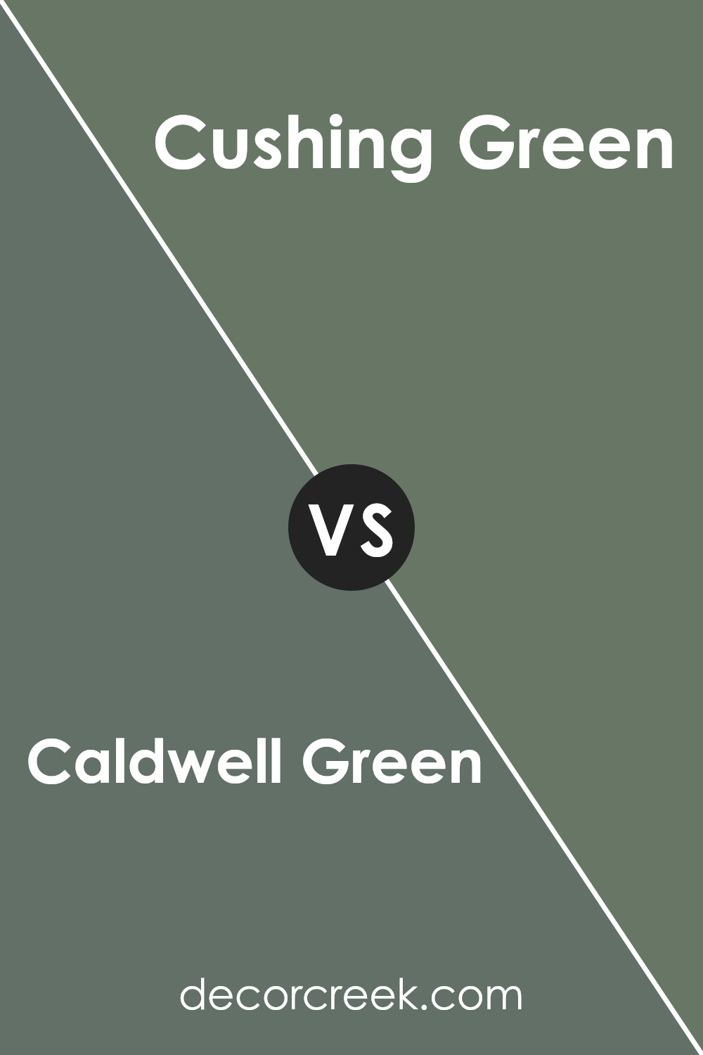
Caldwell Green HC-124 by Benjamin Moore vs Cushing Green HC-125 by Benjamin Moore
Caldwell Green and Cushing Green, both from Benjamin Moore, are two closely related colors, yet each has a distinct character. Caldwell Green is a soft, subdued green that leans towards a sage hue with a hint of gray. It brings a gentle, calming touch to any room, making it versatile for different spaces.
On the other hand, Cushing Green is slightly darker and richer. It retains the calming essence of a green color but offers more depth and intensity compared to Caldwell Green. This color works well to create a cozy and inviting atmosphere, adding warmth to a room.
Both colors are great for bringing the feeling of nature indoors, but Caldwell Green is lighter and more airy, while Cushing Green provides a stronger, more grounded feel. Depending on your preference for lightness or richness, each color can serve as a beautiful choice for home decor.
You can see recommended paint color below:
- HC-125 Cushing Green
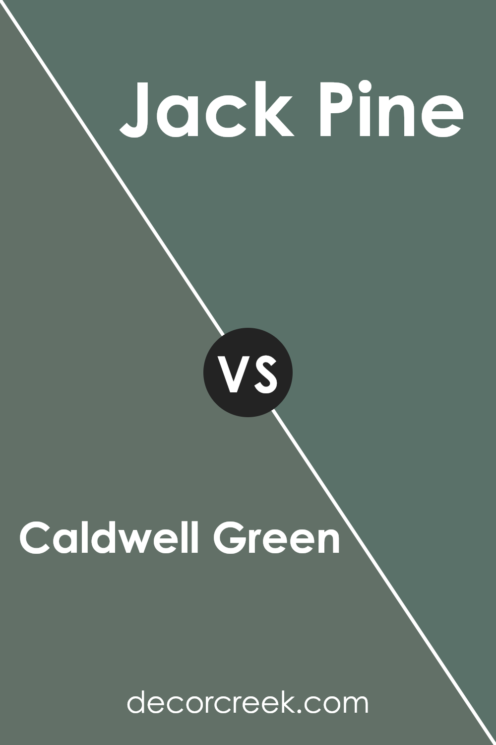
Caldwell Green HC-124 by Benjamin Moore vs Jack Pine 692 by Benjamin Moore
Caldwell Green HC-124 by Benjamin Moore is a deep, rich green that exudes warmth and a sense of earthiness. It’s a versatile color that works well in both traditional and contemporary spaces, providing a strong backdrop that still feels inviting. Jack Pine 692, on the other hand, is a lighter, more muted green, reminiscent of pine needles. It has a softer tone, making it perfect for creating a calm and natural ambiance in a room.
Both colors bring nature indoors, but they do so in different ways. Caldwell Green has a more dramatic presence, while Jack Pine is subtle and understated.
Depending on your preference, Caldwell Green can make a statement, while Jack Pine offers a gentle, soothing touch.
They can both create cozy atmospheres, but Caldwell Green is bolder, whereas Jack Pine’s lighter shade tends to feel airy and relaxed.
You can see recommended paint color below:
- 692 Jack Pine
Conclusion
It’s a special shade of green that can make any room feel fresh and inviting. When I think of this color, I picture a calm forest or a lush garden. It reminds me of nature and peaceful moments.
Caldwell Green is really good at making a room look welcoming without being too bright or too dark. It works well in many different places like living rooms, kitchens, and even bedrooms. I think it’s because the color has a nice balance—it’s not too bold but not too boring either.
It’s a nice choice for people who want to add color to their homes without making it too loud.
I also learned that this green can be matched with lots of other colors, like creams, whites, and maybe even some blues or browns.
This makes it an easy choice for people trying to find a wall color that won’t clash with their furniture.
In the end, Caldwell Green seems to be a favorite for many because it brings a bit of calmness and beauty, no matter where it’s used.
I can see why someone would pick this color to make their home more cozy and inviting.
Ever wished paint sampling was as easy as sticking a sticker? Guess what? Now it is! Discover Samplize's unique Peel & Stick samples.
Get paint samples

