If you’re on the lookout for a color that brings warmth and richness to your space, let me introduce you to SW 6012 Browse Brown by Sherwin Williams. Imagine a paint that adds a subtle depth to your home without overpowering your existing decor.
Browse Brown does just that. It’s a versatile shade, perfect whether you’re refreshing a cozy corner or giving a new life to an old room. What I personally appreciate about Browse Brown is its understated elegance. It doesn’t shout for attention, yet it has a presence that enhances everything around it.
This color works seamlessly with both modern and traditional styles, making it a go-to choice for many. Its earthy tones help create a welcoming atmosphere, often igniting feelings of comfort and security, which is crucial for a place like home. Choosing the right color can sometimes feel overwhelming, but with Browse Brown, you find a dependable option that pairs well with many schemes and textures.
This makes decorating a simpler task, giving you the freedom to play around with different accents or furniture pieces to see what truly resonates with your vision. This color could be the one you’ve been looking for to complete your home’s story.

What Color Is Browse Brown SW 6012 by Sherwin Williams?
Browse Brown by Sherwin Williams is a warm, deep brown that brings a cozy, welcoming vibe to any space. It’s a versatile shade that works brilliantly in homes looking to create a comforting and grounded atmosphere. This particular brown has a richness to it that pairs excellently with natural materials like wood, leather, and wool, enhancing their textures and providing a solid base that allows these materials to stand out.
In terms of interior design styles, Browse Brown fits beautifully in rustic environments where the emphasis is on natural beauty and simplicity. It’s also ideal for traditional settings, offering a timeless appeal that complements classic furniture and rich fabrics such as velvet or silk.
For a modern twist, you can use it in industrial-themed decors, where it contrasts effectively with metal elements and exposed brick, adding warmth to the typically cool tones. The color works well not just on walls but also for cabinetry or furniture, providing a strong foundation that supports a range of color palettes.
Lighter colors like creams and beiges offer a gentle contrast, while bolder hues like mustard or teal can bring energy and brightness to the room. When used effectively, Browse Brown creates a space that feels both grounded and inviting.

Is Browse Brown SW 6012 by Sherwin Williams Warm or Cool color?
Browse Brown SW 6012 by Sherwin Williams is a versatile and warm shade of brown that brings a cozy and inviting atmosphere to any room in a home. This particular color is excellent for spaces where you want to promote comfort and relaxation, such as living rooms and bedrooms.
The warm undertones of Browse Brown make it a great match with natural materials like wood, enhancing the rustic charm of wooden furniture and flooring. It also pairs well with a variety of other colors, allowing flexibility in decor choices.
For example, when combined with creamy whites or soft blues, it creates a balanced and harmonious look. Because of its neutral yet warm character, Browse Brown can help make a space feel grounded and secure without darkening the ambiance too much. It’s especially suitable for those looking to create a welcoming home environment without using overly bold hues.
Undertones of Browse Brown SW 6012 by Sherwin Williams
Browse Brown is a unique paint color with multifaceted undertones that greatly influence its appearance under different lighting conditions and settings. Undertones are subtle hues mixed into the main color which can subtly alter how the paint looks once applied. Despite its name, Browse Brown is not just a simple brown; it includes subtle shades like olive, purple, dark turquoise, and more, each adding depth and complexity.
In an interior setting, these undertones can make Browse Brown look extremely versatile. For instance, the olive and dark green undertones might make it feel more grounded and connected to nature, especially in rooms with plenty of natural light or leafy houseplants.
The purple and pink undertones could add a soft, almost cozy feel to spaces like living rooms or bedrooms, giving the walls a warmer appearance in artificial light. Moreover, the variety of dark tones like navy and dark grey add a richness to the color, making it an excellent choice for creating a solid, grounding backdrop that complements various decor styles and colors. Lighter undertones such as pale pink and mint bring a splash of brightness, preventing the color from feeling too heavy or overpowering.
When using Browse Brown on the walls, the interaction of its complex undertones with other elements in the room—such as furniture, flooring, and artwork—can change the perception of the space. These undertones allow the color to adapt subtly but noticeably, making it a dynamic choice for any interior.
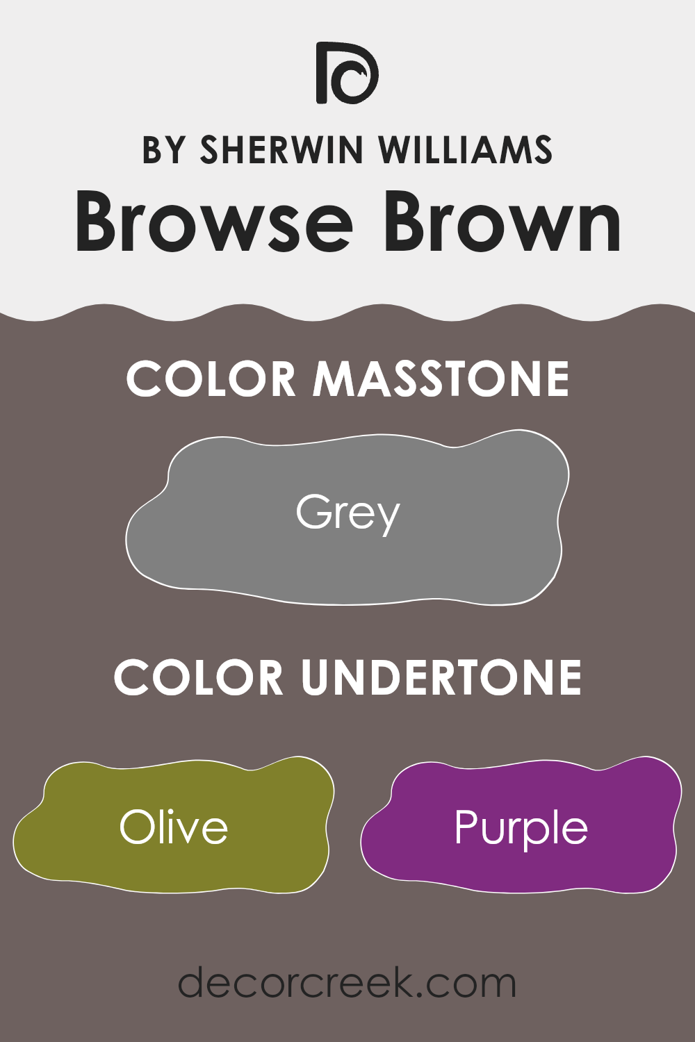
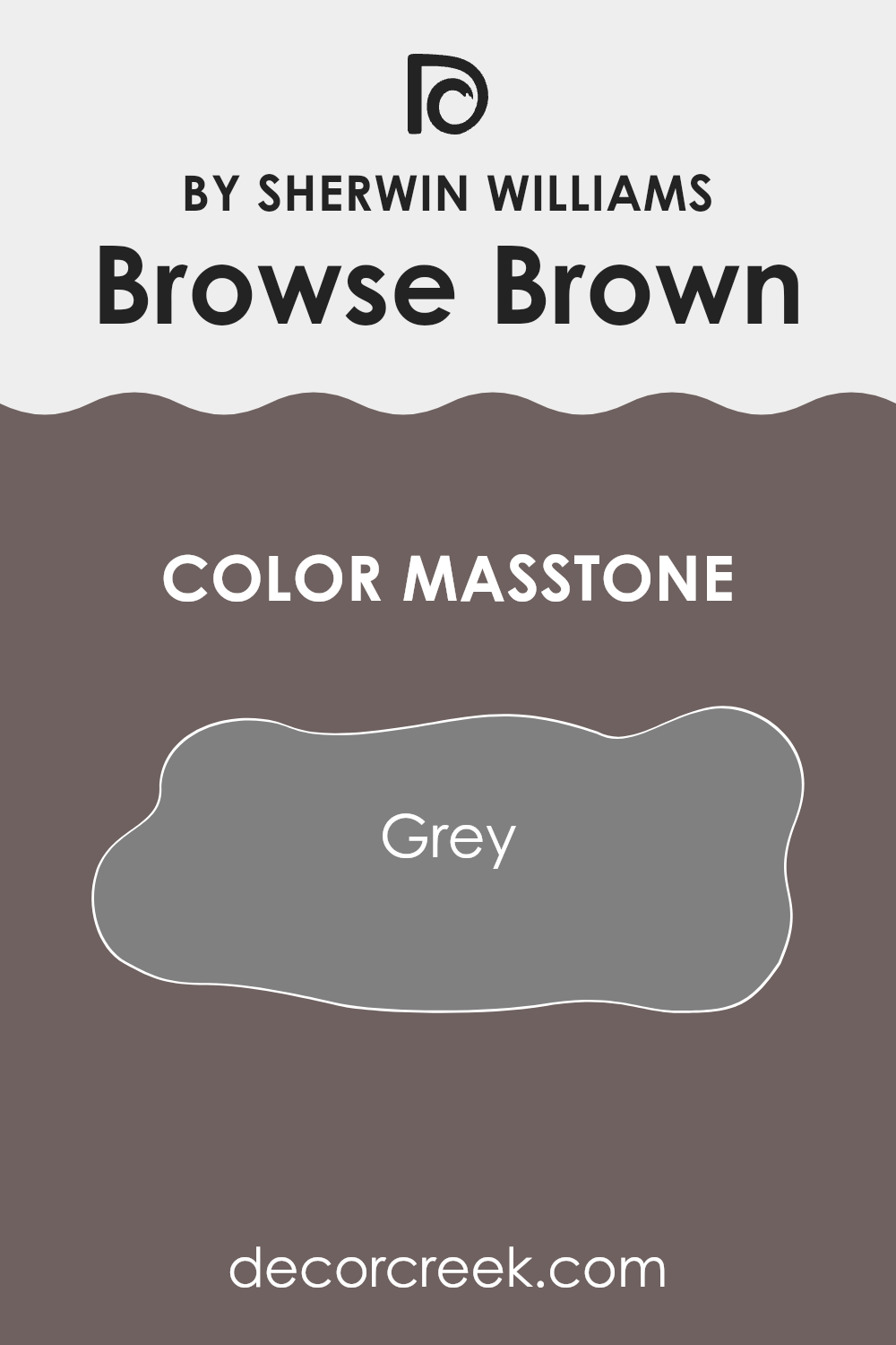
What is the Masstone of the Browse Brown SW 6012 by Sherwin Williams?
The primary tone of Browse Brown SW 6012 by Sherwin Williams is grey, specifically noted as #808080. This neutral grey shade serves as a versatile backdrop in home interiors. Because of its balanced color, it’s easy to pair with a wide range of other hues, from soft pastels to bold, vibrant colors.
This makes it a practical choice for any room in the house, whether you’re looking to give a living room a fresh, modern look or create a calm atmosphere in a bedroom. Grey tones like this one have a subtle charm; they don’t overpower a space but blend naturally with other elements, whether it’s furniture, art, or textiles.
This property ensures that decorations and individual style choices stand out without feeling disjointed. It’s especially good in spaces that receive a lot of natural light, as it can help in balancing the brightness while maintaining a cool and cozy ambiance. This adaptability makes grey a popular choice for those wanting a color that supports varied design overhauls and styles through the years.
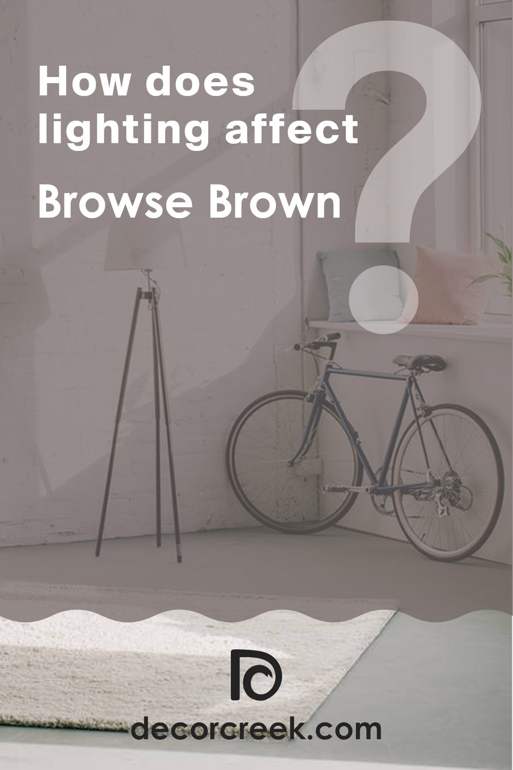
How Does Lighting Affect Browse Brown SW 6012 by Sherwin Williams?
Lighting plays a crucial role in how we perceive colors in any environment. The influence of light on colors can drastically alter their appearance, depending on whether the illumination is natural or artificial.
Take, for example, the color Browse Brown by Sherwin Williams. This shade is a warm, deep, comforting brown that can appear differently based on the light it’s exposed to. In artificial light, such as from light bulbs, this brown tends to look richer and more vibrant. The yellow and orange tones in artificial lighting can intensify the warmth of the brown, making it appear cozier and more inviting.
In contrast, in natural light, the color can shift throughout the day. Morning light, which is often softer and has a bluish tone, might make Browse Brown appear slightly muted and cooler. As the day progresses and the light becomes brighter and more golden, the color can look warmer and more intense.
The orientation of the room also affects how Browse Brown will look. In north-facing rooms, which receive less direct sunlight and have a cooler light, this brown can look more subdued and neutral. It might lose some of its warmth but still retains a soothing presence in the space.
South-facing rooms, blessed with abundant direct sunlight, will highlight the warmth and depth of Browse Brown, enhancing its inviting quality. This makes it ideal for living spaces or any area where a welcoming atmosphere is desired.
East-facing rooms see bright light in the morning when the sun rises, making the color appear warm and lively in the morning, then gradually shifting back to a less intense tone in the afternoon as the natural light fades.
Conversely, in west-facing rooms, the morning light is more indirect, meaning Browse Brown will feel softer and more muted earlier in the day. As the sun sets, the room is filled with intense warm light, which can make the color look extraordinarily vibrant and rich.
Thus, the perception of Browse Brown by Sherwin Williams is greatly influenced by the lighting and the direction the room faces, demonstrating the dynamic nature of how light impacts color.
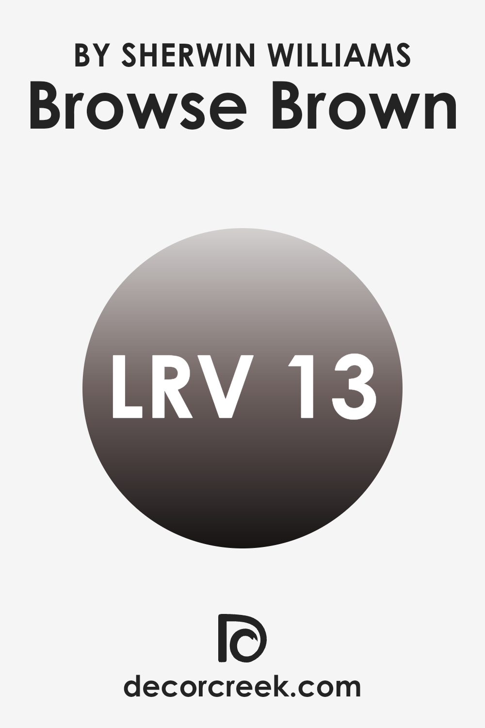
What is the LRV of Browse Brown SW 6012 by Sherwin Williams?
LRV stands for Light Reflectance Value, a measure indicating how much light a paint color reflects back into the room when it’s applied to the walls. Measured on a scale where a lower number means the color absorbs more light and a higher number indicates more light reflection, LRV helps in determining how a color might look under different lighting conditions. A high LRV color will make a room feel brighter and larger, while a low LRV color can give a room a cozier and more muted appearance.
The LRV of Browse Brown is 12.631, indicating that it is a darker shade that absorbs a significant amount of light rather than reflecting it. This means that Browse Brown will look more intense and could make smaller rooms feel smaller or more enclosed.
In spaces without much natural light, this color could appear even darker, so artificial lighting would be important to prevent it from making the space feel too dim or closed off. However, in a large and well-lit area, Browse Brown can add depth and warmth, creating a cozy atmosphere.
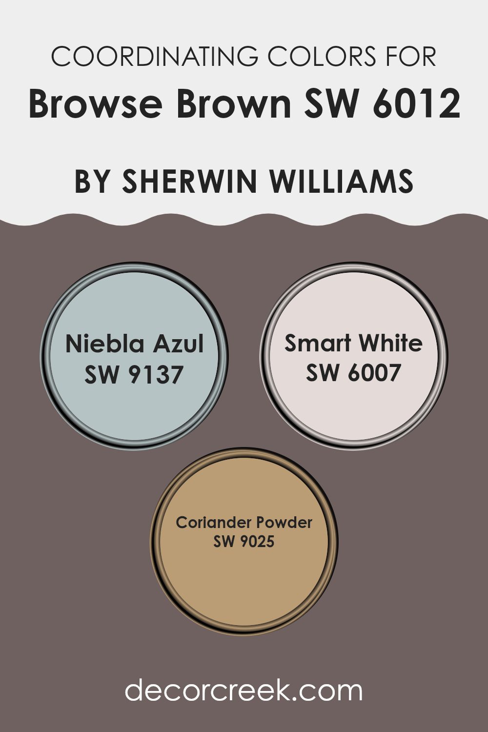
Coordinating Colors of Browse Brown SW 6012 by Sherwin Williams
Coordinating colors are essentially a palette of hues selected to complement and enhance the primary color used in a space, in this case, Browse Brown by Sherwin Williams. The idea behind coordinating colors is to create a harmonious and aesthetically pleasing environment, where each color supports and accents the others. The chosen coordinating colors can draw out subtle undertones from the main color or introduce contrasting or complementary shades to balance the overall look of a room.
Niebla Azul has a gentle and airy quality, much like a soft mist hanging over a cool morning. It works well with Browse Brown to create a calm and soothing atmosphere, lightening the heavier tones of brown with its subtle, refreshing presence.
Smart White, on the other hand, offers a crisp and clean contrast that can make the room feel more spacious and open. Its bright presence can highlight the richness of Browse Brown, providing a refreshing balance to darker shades. Lastly, Coriander Powder brings a warm, earthy spice tone that resonates well with Browse Brown. It enhances the cozy feel of a space by adding a hint of organic richness, making the environment feel warm and inviting without overpowering the foundational color.
You can see recommended paint colors below:
- SW 9137 Niebla Azul
- SW 6007 Smart White
- SW 9025 Coriander Powder
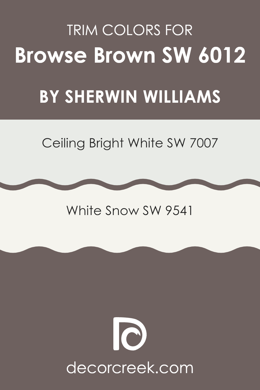
What are the Trim colors of Browse Brown SW 6012 by Sherwin Williams?
Trim colors are specifically chosen hues that are used on the architectural features such as door frames, moldings, baseboards, and window trims of a room or exterior of a building. These colors, which often contrast with the main wall color, play an essential role in defining the space and highlighting the architectural details.
For a wall painted in a rich shade like Browse Brown, trim colors like Ceiling Bright White and White Snow can be used to create a crisp, clean look that adds a refreshing complexity to the overall aesthetics.
Ceiling Bright White is a pure, bright shade of white that reflects light beautifully, making it an excellent choice for trims as it helps to enhance natural light in a room and visually expand the space. On the other hand, White Snow is a soft white with a slightly warm undertone that offers a subtle contrast against deeper hues, providing a gentle separation of colors which can soften the impact of more dramatic wall colors. Both shades add a fresh, polished finish to the space, keeping the atmosphere light and airy.
You can see recommended paint colors below:
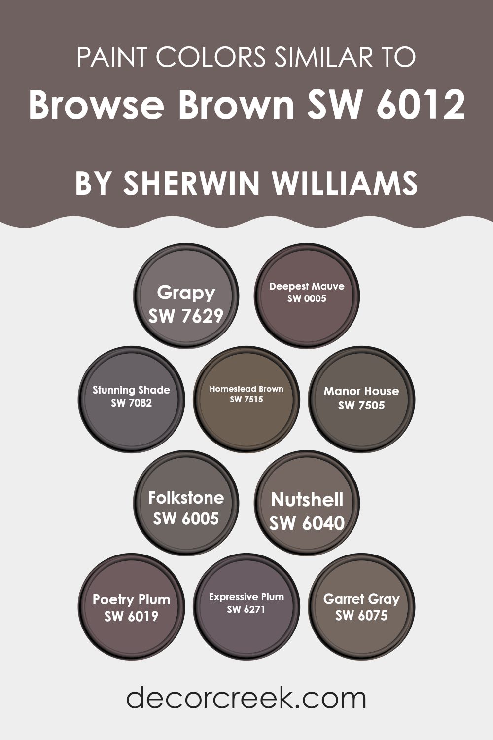
Colors Similar to Browse Brown SW 6012 by Sherwin Williams
Choosing similar colors when designing a space creates a harmonious and cohesive look that feels naturally balanced. This approach can subtly enhance the design without creating a stark contrast, allowing the colors to blend smoothly.
Colors similar to SW 6012 Browse Brown by Sherwin Williams, such as SW 7629 Grapy and SW 0005 Deepest Mauve, offer variations that work well together because they share a similar depth of saturation. Grapy presents as a deep, muted purple, reminiscent of an overripe grape, while Deepest Mauve adds a dusty rose undertone, providing a warm, welcoming feel.
Further enhancing this palette, SW 7082 Stunning Shade and SW 7515 Homestead Brown bring richness and depth. Stunning Shade is a darker gray with a touch of purple, making it ideal for creating a subdued but impactful aesthetic.
Homestead Brown leans towards a traditional earthy tone that looks robust and grounded. Shades like SW 7505 Manor House and SW 6005 Folkstone add versatility; Manor House is a classic dark taupe that offers an understated elegance, and Folkstone is a cool gray that serves as a neutral backdrop against bolder colors.
Additionally, SW 6040 Nutshell and SW 6019 Poetry Plum introduce subtle variations: Nutshell reveals a touch of beige mixed with gray for softness, while Poetry Plum provides a poetic blend of plum with muted undertones.
Completing this spectrum are SW 6271 Expressive Plum and SW 6075 Garret Gray, both of which enrich the palette – Expressive Plum bursts with a vibrant plum tone, and Garret Gray serves as a soft, medium gray that elegantly ties the other shades together. These related hues support each other to create settings with depth and character, making any design project look cohesive and thoughtfully composed.
You can see recommended paint colors below:
- SW 7629 Grapy
- SW 0005 Deepest Mauve
- SW 7082 Stunning Shade
- SW 7515 Homestead Brown
- SW 7505 Manor House
- SW 6005 Folkstone
- SW 6040 Nutshell
- SW 6019 Poetry Plum
- SW 6271 Expressive Plum
- SW 6075 Garret Gray
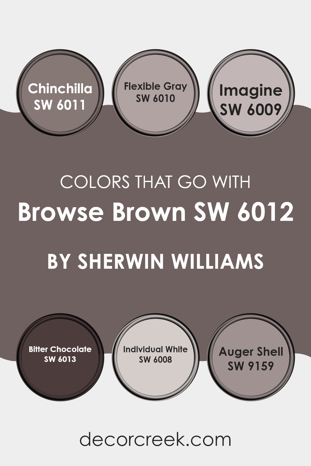
Colors that Go With Browse Brown SW 6012 by Sherwin Williams
When selecting colors that pair well with Browse Brown SW 6012 by Sherwin Williams, it’s essential to consider how these hues create harmony and balance within a space. Complementary colors like Chinchilla, Flexible Gray, Imagine, Bitter Chocolate, Individual White, and Auger Shell work with Browse Brown to fashion a cohesive decor scheme. These colors ensure design elements flow smoothly from one room to the next, establishing a unified look that is pleasing to the eye.
Chinchilla is a soft gray that adds a gentle contrast to the deeper tones of Browse Brown, making it ideal for creating a subtle backdrop. Flexible Gray, slightly darker than Chinchilla, offers a hint of versatility, working well in spaces that serve multiple purposes.
Imagine is a lighter, soothing gray that provides a refreshing break from darker shades, perfect for enhancing areas like bathrooms or kitchens. Bitter Chocolate is rich and deep, almost echoing Browse Brown itself, perfect for accent walls or furniture pieces to add depth.
Individual White is a clean, crisp white that brings light and a sense of openness to spaces dominated by darker hues. Lastly, Auger Shell features a unique blend of taupe and gray, imparting a warm, welcoming feel when paired with the earthy tones of Browse Brown. These colors collectively help in creating visually appealing and coherent spaces.
You can see recommended paint colors below:
- SW 6011 Chinchilla
- SW 6010 Flexible Gray
- SW 6009 Imagine
- SW 6013 Bitter Chocolate
- SW 6008 Individual White
- SW 9159 Auger Shell
How to Use Browse Brown SW 6012 by Sherwin Williams In Your Home?
Browse Brown SW 6012 by Sherwin Williams is a warm, deep brown paint color that can add a cozy and inviting feel to any room in your home. This rich shade works particularly well in living rooms and bedrooms where you want to create a comfortable, relaxing atmosphere. You can use it as a main wall color to give the space a grounded, sturdy feel or as an accent wall to add depth and focus to the room.
In addition to walls, Browse Brown is great for painting furniture or cabinets. It pairs beautifully with soft creams and rich neutral shades, bringing a homey vibe to your interiors. If you have a large, bright room, using Browse Brown can help make it feel more intimate and welcoming.
For those looking to add a touch of nature-inspired aesthetics, this color coordinates nicely with greens and blues. Whether you are repainting an entire room or just looking for an accent hue, Browse Brown offers versatile possibilities for enhancing your home’s decor.
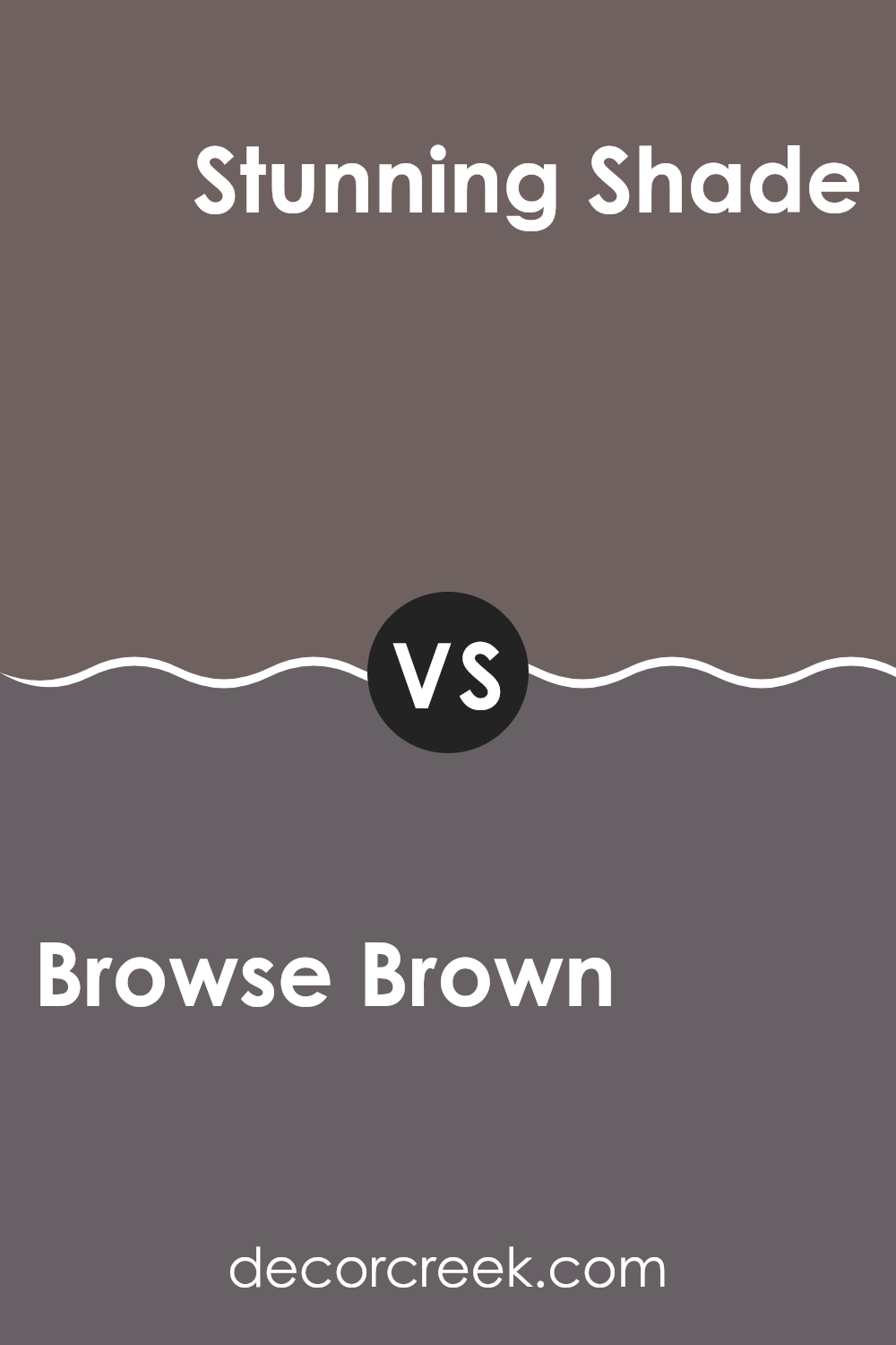
Browse Brown SW 6012 by Sherwin Williams vs Stunning Shade SW 7082 by Sherwin Williams
Browse Brown by Sherwin Williams is a warm, deep brown color that gives a cozy and inviting feel to any room. It’s like the color of rich soil or dark chocolate, perfect for creating a comfortable, homely space.
On the other hand, Stunning Shade by Sherwin Williams is a darker, more intense gray. This color has a modern and sleek look, great for spaces that aim for a more refined and clean appearance. While both colors add depth and character to a space, Browse Brown offers a traditional warmth, whereas Stunning Shade provides a cooler, more contemporary vibe.
The choice between these two would depend on the atmosphere you want to create: warm and welcoming with Browse Brown or cool and chic with Stunning Shade.
You can see recommended paint color below:
- SW 7082 Stunning Shade
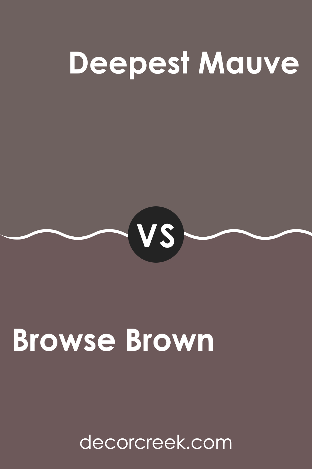
Browse Brown SW 6012 by Sherwin Williams vs Deepest Mauve SW 0005 by Sherwin Williams
Browse Brown is a rich, deep brown with a warm, earthy feel. It has a robust presence that works well in spaces that aim for a cozy and inviting atmosphere. This color pairs nicely with natural materials like wood and leather, enhancing their natural textures.
Deepest Mauve, on the other hand, is a subtle, dark purple with hints of gray. It provides a more understated elegance, making it a perfect choice for creating a quiet, refined look in a room. It blends well with soft whites and muted grays for a gentle contrast.
While both colors bring their distinct qualities to a design, Browse Brown offers a more traditional warmth, and Deepest Mauve lends a gentle, refined touch to interiors. Whether you’re looking to add depth or create a soft background, each color has its unique way of setting the mood in a space.
You can see recommended paint color below:
- SW 0005 Deepest Mauve
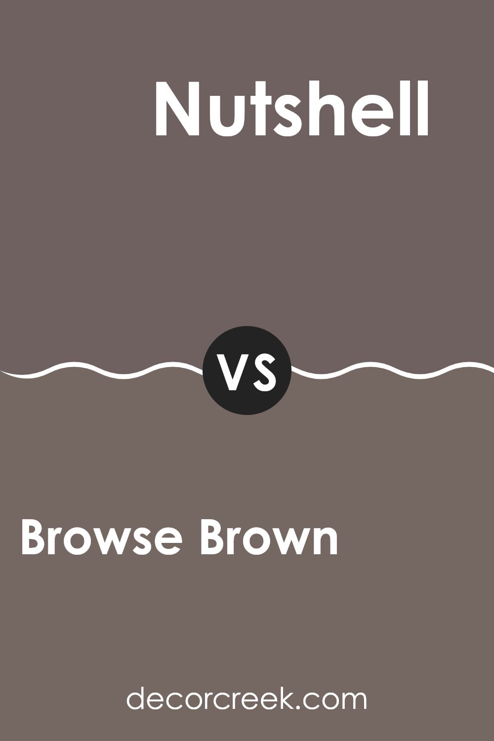
Browse Brown SW 6012 by Sherwin Williams vs Nutshell SW 6040 by Sherwin Williams
Browse Brown SW 6012 by Sherwin Williams is a deep and rich brown shade that gives a cozy, grounding feel to any space. It’s great for creating a warm, inviting atmosphere in rooms like the living room or bedroom.
On the other hand, Nutshell SW 6040, also by Sherwin Williams, is a lighter brown with more neutral undertones. This color works well in spaces that need a subtle touch of warmth without being too dominating.
It’s ideal for areas where you want to maintain a light and airy feel but still add some warmth. Overall, Browse Brown is a darker, more pronounced brown, perfect for making a statement and adding depth, while Nutshell is softer and more versatile for blending with different color schemes and decorating styles.
You can see recommended paint color below:
- SW 6040 Nutshell
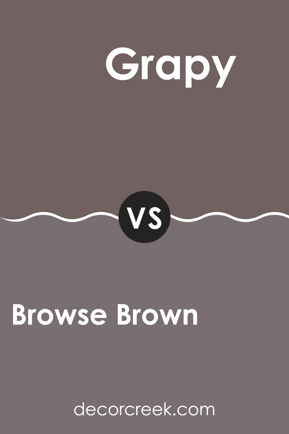
Browse Brown SW 6012 by Sherwin Williams vs Grapy SW 7629 by Sherwin Williams
Browse Brown and Grapy from Sherwin Williams have distinct tones that set quite different moods in interior spaces. Browse Brown is a warm, welcoming deep brown shade that adds coziness to any room.
It’s perfect for creating a comforting, homey feel, ideal for living rooms and dens where you want to relax. On the other hand, Grapy is a bold, dark gray with a hint of purple. This unique color brings a strong, contemporary vibe to spaces, making it a great choice for modern living areas or bedrooms looking for a stylish edge.
While Browse Brown imparts a sense of snugness and traditional warmth, Grapy offers a trendier and sharper atmosphere. Both colors are versatile in their own ways and can be used effectively to make a room feel more grounded or give it a more striking look, depending on your design goals.
You can see recommended paint color below:
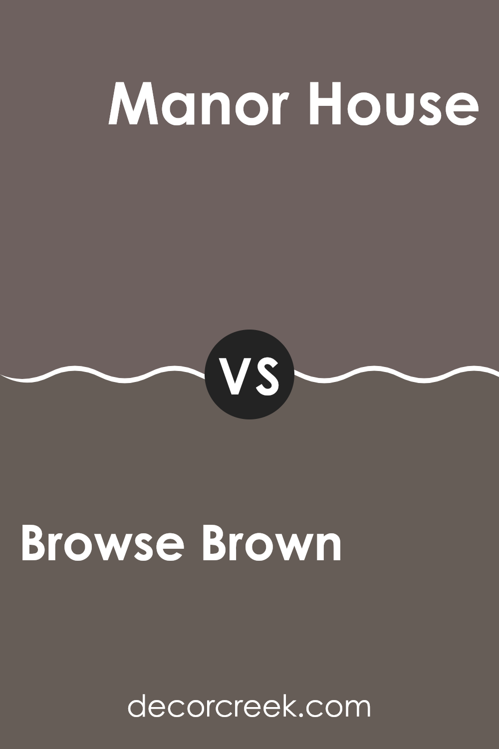
Browse Brown SW 6012 by Sherwin Williams vs Manor House SW 7505 by Sherwin Williams
Browse Brown SW 6012 by Sherwin Williams and Manor House SW 7505 are both warm and cozy shades of brown, but they each bring a unique feel to a space. Browse Brown leans towards a medium-dark brown with a comforting and earthy vibe, making it perfect for creating a cozy and inviting atmosphere in spaces like living rooms or bedrooms. It’s darker and can help make a large room feel more intimate.
On the other hand, Manor House is a lighter brown, offering a softer look that’s very versatile. This shade can work well in any room, enhancing the space without overpowering it. It pairs beautifully with brighter colors and natural materials like wood or stone.
Overall, if you’re looking for a deeper, more traditional brown, Browse Brown is the go-to. For something a bit lighter that still provides warmth but with a more subtle approach, Manor House is an excellent choice. Both colors provide a comforting presence and can easily fit into various decor styles.
You can see recommended paint color below:
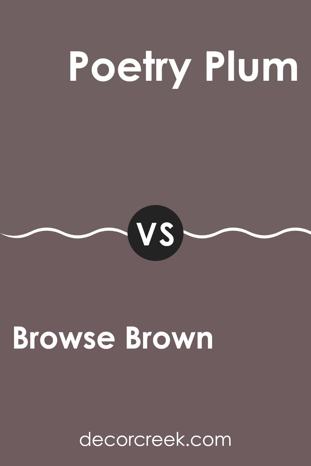
Browse Brown SW 6012 by Sherwin Williams vs Poetry Plum SW 6019 by Sherwin Williams
Browse Brown and Poetry Plum, both from Sherwin Williams, are distinct in terms of shade and mood. Browse Brown is a deep, rich chocolate color, offering a warm, cozy feel to any room. It’s a versatile shade that can work well in spaces where you want a sense of comfort, such as living rooms or studies.
On the other hand, Poetry Plum is a darker, more subdued plum shade that adds a touch of elegance without being too bold. It works great in intimate spaces or as an accent wall color, providing a more reserved but still interesting backdrop.
While Browse Brown brings a traditional warmth, Poetry Plum offers a cooler, understated charm. Each color has its own unique vibe, making them suitable for different decor styles and personal tastes. Deciding between the two would largely depend on the atmosphere you’re aiming to create in your space.
You can see recommended paint color below:
- SW 6019 Poetry Plum
Browse Brown SW 6012 by Sherwin Williams vs Garret Gray SW 6075 by Sherwin Williams
Browse Brown and Garret Gray are both warm, inviting colors from Sherwin Williams, but they offer different vibes for your space. Browse Brown has a deep, rich chocolate hue that gives a cozy and comfortable feeling. It’s perfect for creating a snug and inviting atmosphere in places like living rooms or studies.
On the other hand, Garret Gray is a lighter, softer gray with warm undertones. It’s more understated than Browse Brown and works well in areas where you want a neutral backdrop that still offers warmth. Garret Gray is versatile, suitable for bedrooms, bathrooms, or kitchens, where it pairs well with both bold and muted accents.
While both colors create a welcoming feel, Browse Brown packs a stronger visual punch with its darker, earthier tones. It tends to make a room feel smaller and more intimate. Garret Gray, meanwhile, can help open up a space and reflects more light, making it feel larger and more airy. These colors can work beautifully together or stand alone, depending on the mood you want to set.
You can see recommended paint color below:

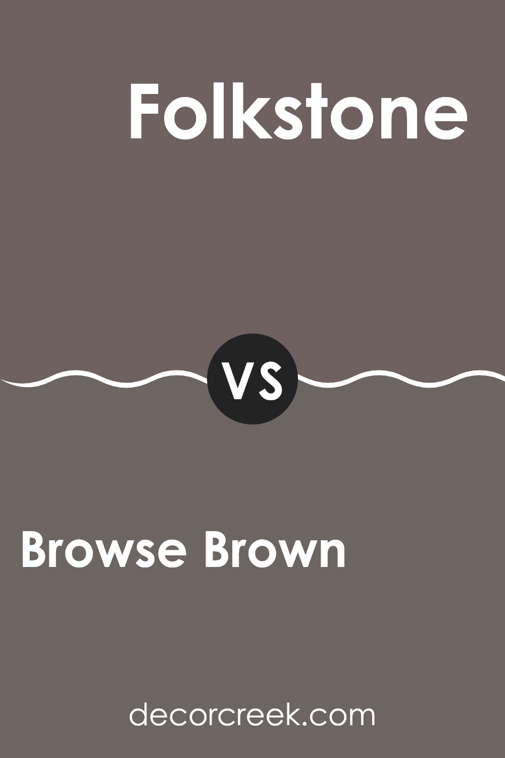
Browse Brown SW 6012 by Sherwin Williams vs Folkstone SW 6005 by Sherwin Williams
Browse Brown SW 6012 and Folkstone SW 6005, both from Sherwin Williams, offer distinct vibes for room decoration. Browse Brown has a deep, warm brown tone that gives a cozy and inviting feel, perfect for spaces where comfort is key, like living rooms or bedrooms. It resembles rich soil and can make large spaces feel more intimate.
On the other hand, Folkstone is a cool gray shade that provides a sleek, modern look. It’s a versatile color that works well in various settings, from kitchens to offices, bringing a clean and updated feel. Its neutral tone makes it easy to pair with a wide range of decor styles and colors.
In comparison, Browse Brown feels warmer and cozier, while Folkstone gives off a cleaner, more contemporary aura. Both colors are quite adaptable and can enhance the aesthetic of a home when used thoughtfully.
You can see recommended paint color below:
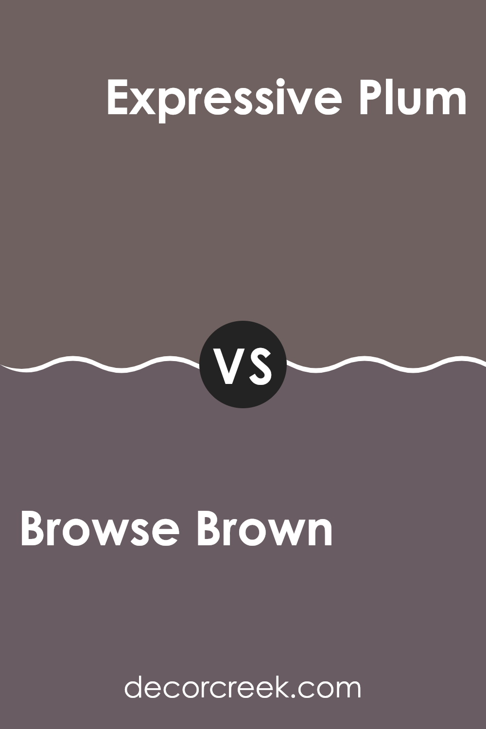
Browse Brown SW 6012 by Sherwin Williams vs Expressive Plum SW 6271 by Sherwin Williams
Browse Brown and Expressive Plum are two distinctive colors from Sherwin Williams. Browse Brown is a warm, inviting shade of brown that gives a cozy and grounded feel to spaces. It can work well in living areas or bedrooms where you want a calm, steady atmosphere. Its earthy tones make it adaptable to different decor styles, from rustic to modern.
On the other hand, Expressive Plum is a much deeper, more intense color. This shade of purple adds a bold, dramatic flair to any room. It’s perfect for creating a focal point, whether on an accent wall or in accessories. Because of its richness, it pairs well with lighter hues or metallic accents which bring out its depth even further.
Both colors have their places in home design, with Browse Brown offering a more relaxed and versatile background, and Expressive Plum providing a striking option for those looking to make a more vivid statement.
You can see recommended paint color below:
- SW 6271 Expressive Plum
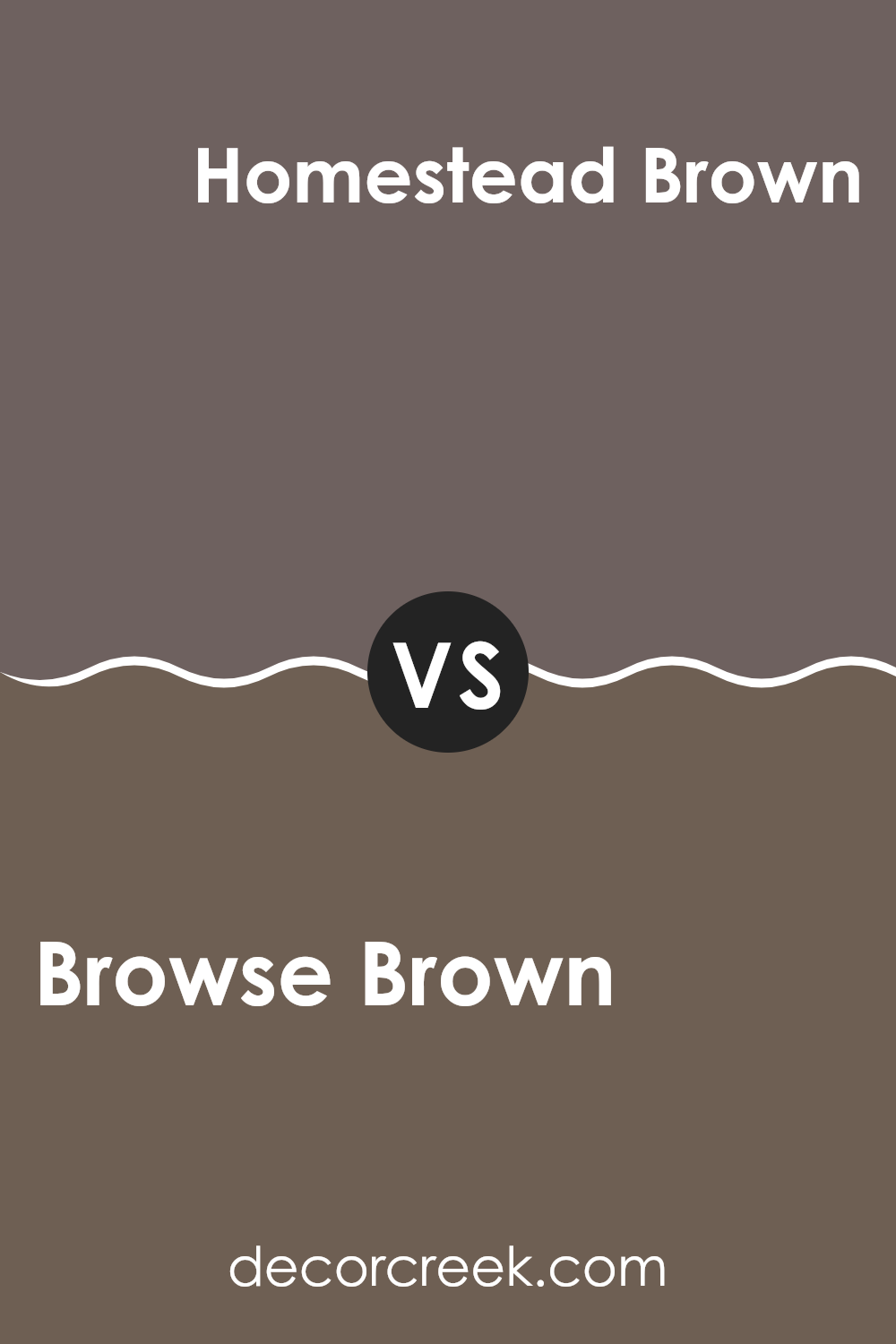
Browse Brown SW 6012 by Sherwin Williams vs Homestead Brown SW 7515 by Sherwin Williams
Browse Brown and Homestead Brown are two popular shades from Sherwin Williams, each adding its unique flair to interior spaces. Browse Brown has a lighter, softer quality that subtly warms up a room without overwhelming it. This makes it an excellent choice for living areas and bedrooms where a gentle and welcoming atmosphere is desired.
On the other hand, Homestead Brown is noticeably darker and richer. This color provides a strong presence in a room, offering a bold statement that is both cozy and grounding. It works well in larger spaces or on accent walls to draw attention and add depth to the décor.
While both colors share a brown base, Browse Brown leans towards a more muted, sandy tone, whereas Homestead Brown skews closer to a deep, earthy brown. The choice between them would depend on the desired impact and the size and use of the space.
You can see recommended paint color below:
Conclusion
Sherwin Williams did a great job making this shade. It’s strong but not too dark, perfect for mixing with lighter colors like creams or even other shades of brown. Many folks like to use it because it creates a homey vibe, making spaces perfect for relaxing or having friends over.
In my journey, I learned that Browse Brown works well in many different types of rooms, from modern to traditional. It’s like a friendly color that gets along with everyone and fits in almost anywhere. So, if you ever think of changing a room in your home and want something that feels warm and inviting, Browse Brown is a fantastic choice to consider. It’s definitely a color that brings a calm, cozy feeling every time you walk into the room.
Ever wished paint sampling was as easy as sticking a sticker? Guess what? Now it is! Discover Samplize's unique Peel & Stick samples.
Get paint samples

