Choosing the right paint color for your home can feel overwhelming with all the options available. However, if you’re looking for a shade that blends neutrality with a sense of modern flair, SW 6005 Folkstone by Sherwin Williams might just be the perfect pick. In my experience, Folkstone offers a unique blend of gray that is versatile enough to use in various spaces, whether you’re painting a cozy bedroom or giving a fresh look to your kitchen.
This shade of gray stands out because it manages to balance a cool undertone with enough warmth to make any room feel inviting. I’ve noticed how it complements different lighting conditions, appearing more dynamic as natural light shifts throughout the day.
Its subtle elegance provides an ideal backdrop for both minimalist and vibrant decorating styles, supporting a wide range of color palettes.
You’ll find that Folkstone is not just another gray; it holds its own charm and character that can elevate the overall feel of your space while offering a soothing presence.
Whether you are looking to update a single room or planning a larger renovation, this color maintains a seamless flow throughout your home, ensuring that each room transitions beautifully into the next.
What Color Is Folkstone SW 6005 by Sherwin Williams?
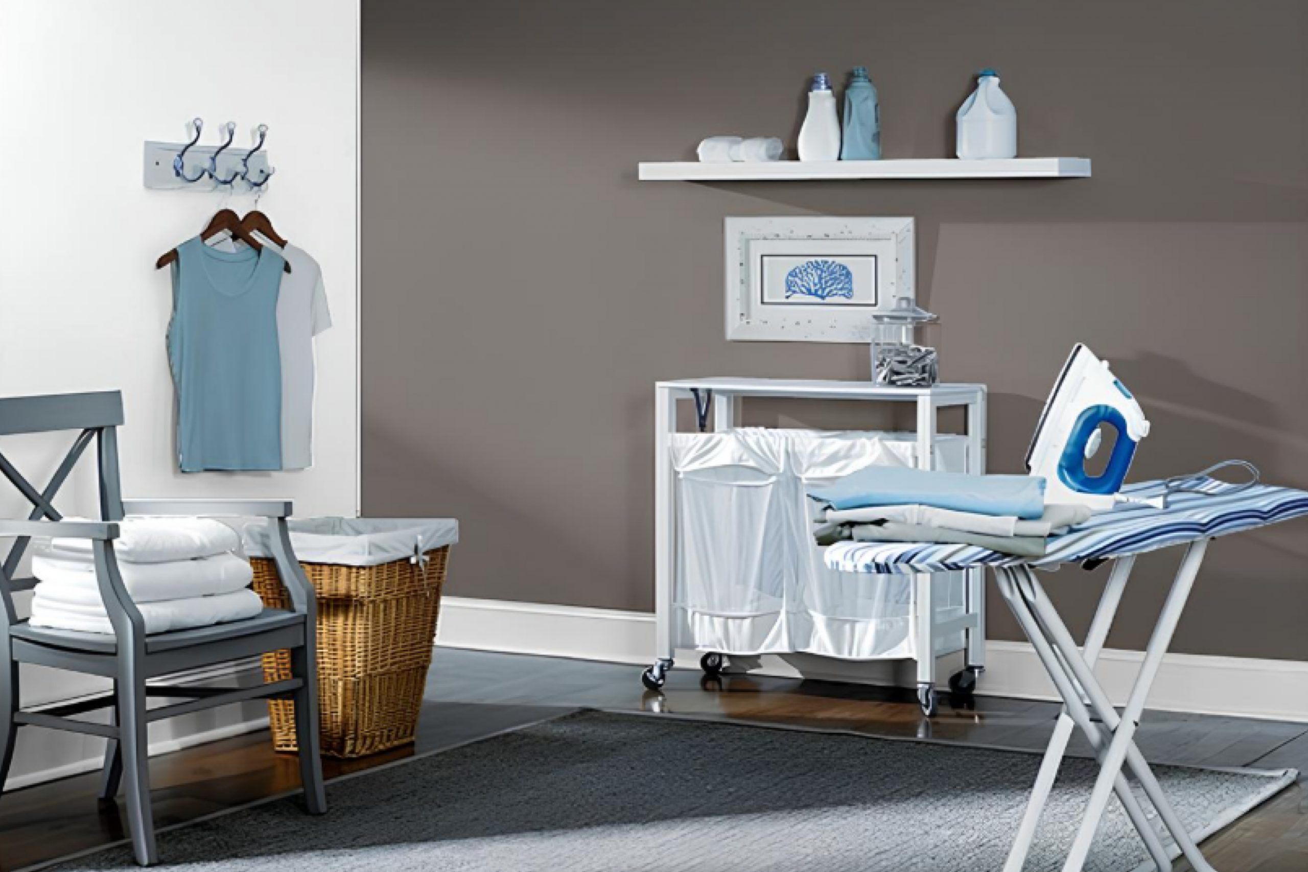
The color Folkstone by Sherwin Williams is a versatile and robust gray that provides an excellent backdrop for many interior designs. This medium-to-dark gray shade carries a warmth that makes it inviting, yet it is neutral enough to be paired with a wide range of colors and decor styles. Folkstone is particularly effective in creating a grounding and balanced feel in any room, making spaces look more put-together without overwhelming the senses.
Folkstone works exceptionally well in contemporary and modern interior styles due to its clean and clear appearance. It also fits beautifully in industrial themes, where its gray undertones echo the utilitarian feel of metal and exposed brick.
For those looking to create a cozy yet refined setting, Folkstone pairs wonderfully with rustic elements such as reclaimed wood and textured fabrics like linen or wool.
In terms of color pairings, Folkstone complements both vibrant and soft hues.
You can pair it with crisp whites for a fresh and airy look, or with bold colors like mustard or teal for a more dynamic vibe. In terms of textures, Folkstone goes well with polished metals, glass accents, and smooth leather, creating a subtle contrast that enhances its underlying warmth without making the space feel cluttered.
Overall, it’s a practical and appealing choice for anyone looking to add a touch of understated elegance to their home.
Is Folkstone SW 6005 by Sherwin Williams Warm or Cool color?
FolkstoneSW 6005 by Sherwin Williams is a versatile gray paint color that fits well in many areas of the home. Its neutral tone makes it easy to pair with various decor styles, whether you want a modern look or something more traditional.
In living rooms, Folkstone can create a calm backdrop that allows furniture and art to stand out. It’s also light enough to use in small spaces, like bathrooms, without making them feel cramped. In bedrooms, this shade of gray provides a soothing atmosphere, which is ideal for resting. For kitchens, it works beautifully on cabinets or walls and pairs well with both dark and light countertops.
What’s great about Folkstone is that it doesn’t shift much under different lighting conditions, maintaining its true color whether in natural light or under lamps. Overall, its adaptability and clean look make it a popular choice for those looking to update their home without bold colors.
Undertones of Folkstone SW 6005 by Sherwin Williams
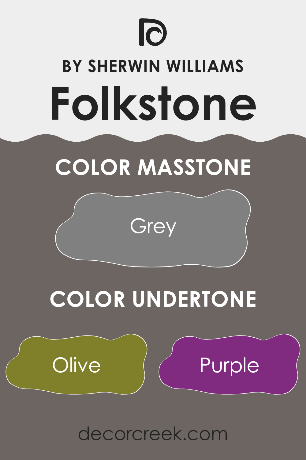
Folkstone is a unique paint color that includes a complex blend of undertones. An undertone in paint refers to the subtle color that lies beneath the primary surface color. When light hits the paint or as lighting changes, these undertones can become more apparent, influencing the overall hue and feel of the color.
The range of undertones in Folkstone, such as olive, dark turquoise, purple, and navy, contributes to its versatility and depth. When used on interior walls, these undertones interact with both natural and artificial lighting, impacting the color’s appearance throughout the day.
For example, in a room with ample sunlight, the yellow undertones might brighten the space, making the room feel warm and welcoming. In contrast, during the evening under artificial lighting, darker undertones like navy or dark green might become more dominant, giving the room a cozier and more grounded atmosphere.
Additionally, the context of the room—such as furniture and decor—can also affect how these undertones play out. Light-colored furnishings might bring out the lighter undertones like pale yellow or mint, whereas darker furniture could highlight the stronger undertones like brown or dark grey.
In summary, the range of undertones in Folkstone makes it a dynamic choice for interior walls, as it adapts subtly to different lighting conditions and settings, affecting the mood and character of any room.
What is the Masstone of the Folkstone SW 6005 by Sherwin Williams?
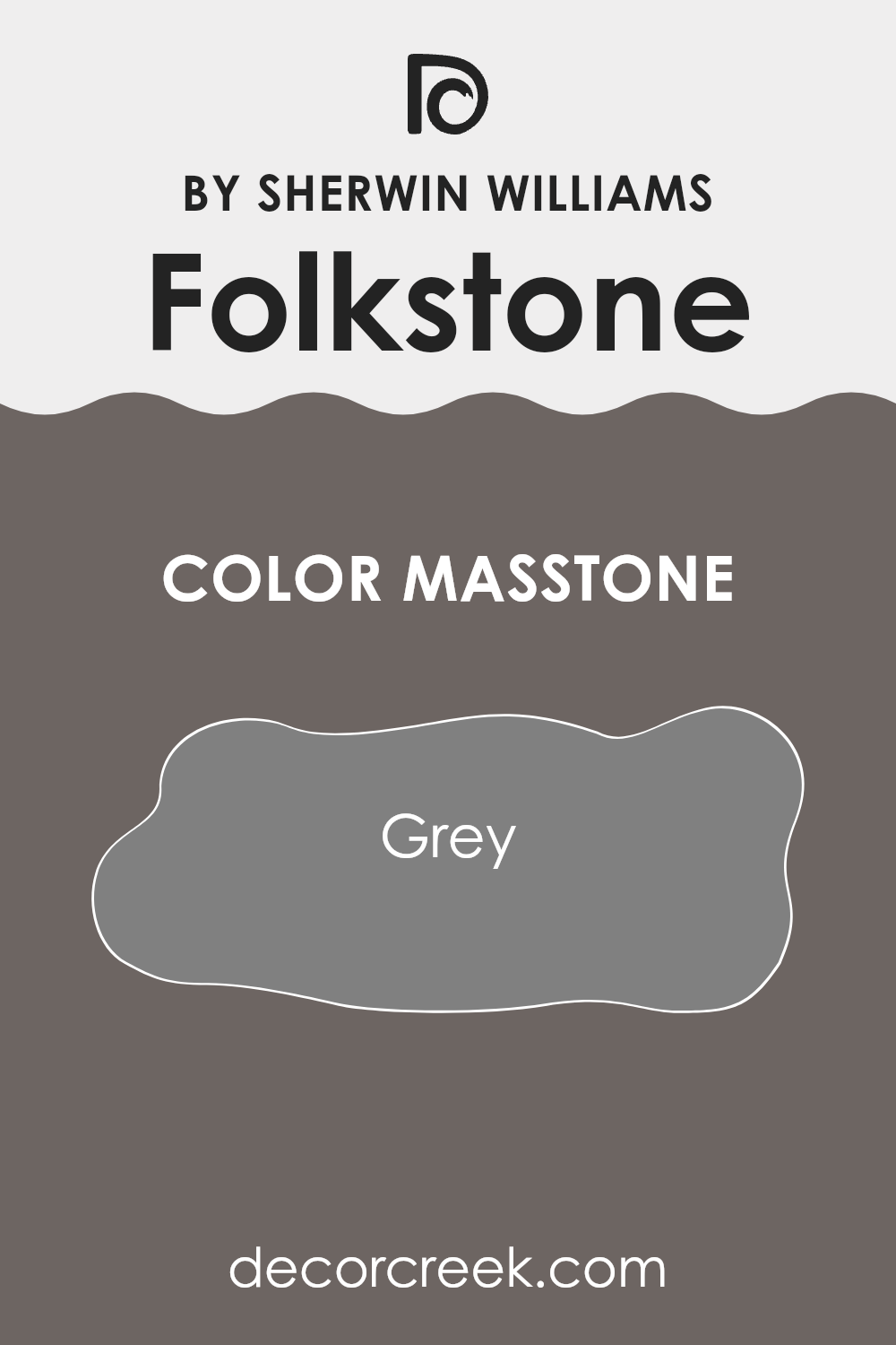
Folkstone by Sherwin Williams is a classic grey shade, which has a balanced and neutral masstone. This specific shade of grey, known as Folkstone SW 6005, can have a calming effect in a home setting, making spaces feel more stable and grounded. It serves as an excellent backdrop for various decor styles and colors, meaning it can work well in almost any room.
Because it is a true grey, Folkstone doesn’t lean towards either warm or cool; this makes it incredibly versatile. It harmonizes easily with vibrant colors by allowing them to pop, yet can also complement softer hues for a more muted overall look. This neutrality allows homeowners a lot of flexibility in decorating, able to support a broad range of color schemes and interior styles from modern to rustic.
Moreover, its simplicity helps in creating an illusion of more space, making smaller rooms appear larger. This quality is particularly useful in apartments and smaller homes where maximizing the perception of space is important.
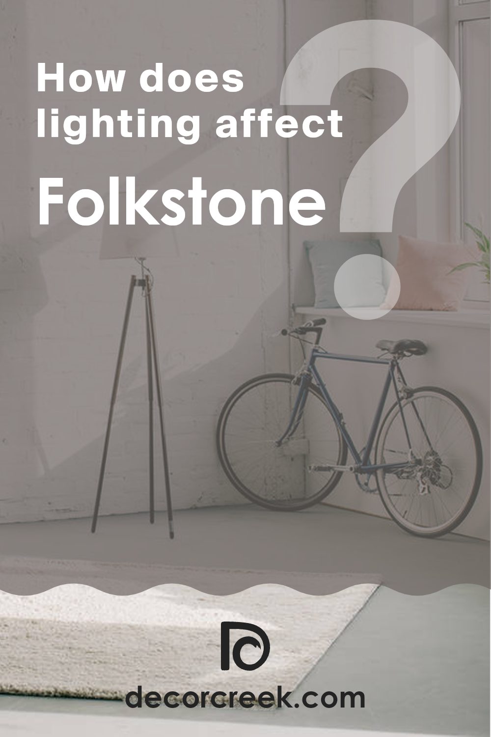
How Does Lighting Affect Folkstone SW 6005 by Sherwin Williams?
Lighting plays a crucial role in how we perceive colors in our environments. The same color can look quite different depending on the type of light it’s exposed to, such as natural sunlight or artificial lighting from bulbs. The way a color appears can change its mood and effect within a space.
Taking the color Folkstone by Sherwin Williams as an example, its appearance varies under different lighting conditions.
In artificial light, particularly under warm bulbs, this color tends to look softer and slightly richer. The warm tones of the light enhance the gray, giving it a cozy, inviting feel.
However, under cooler, fluorescent lights, Folkstone may appear sharper and slightly bluish, which can make it feel more brisk and less warm.
In natural light, the appearance of Folkstone also shifts during the day and depending on the orientation of the room.
In north-facing rooms, the color is exposed to cooler, indirect light, making it look more consistent and true to its neutral gray shade. Such rooms might have a consistently subtle and muted quality of light, which doesn’t alter the color dramatically throughout the day.
South-facing rooms receive a lot of direct sunlight, making Folkstone look brighter and warmer for the most part of the day. This can add a sense of airiness and space to the room, making the gray feel lighter than it actually is.
East-facing rooms get bright light in the morning, which makes Folkstone look warm and vibrant early in the day. As the day progresses, the intensity of the light decreases, leading the color to revert to its true, neutral tone by the evening.
West-facing rooms are the opposite, as the color will appear more muted during the morning but gain warmth and depth in the evening as the sun sets.
In summary, Folkstone’s appearance changes significantly with various types of light. Understanding these differences can help in making informed decisions for painting and decorating to optimize the ambiance of any given space.
What is the LRV of Folkstone SW 6005 by Sherwin Williams?
LRV stands for Light Reflectance Value, a measure that indicates how much light a paint color reflects back into a room as opposed to absorbing it. The scale for LRV runs up the highest percentage being very reflective, which makes a room appear brighter and potentially bigger, to the lowest percentage where the color absorbs more light, making a room look smaller and darker.
This measure helps in choosing the right paint color based on how light or dark you want the space to feel. The LRV for the color Folkstone by Sherwin Williams is 13.519, which is on the lower side of the scale. This means it’s a darker color, absorbing more light than it reflects. This can make small rooms feel cozy and intimate but may make them appear smaller.
In large and well-lit rooms, using this color can add depth and warmth, enhancing the aesthetic without making the space feel closed in. If used in areas with less natural light, it may make the room feel quite dark, so additional lighting might be necessary to balance the ambiance.

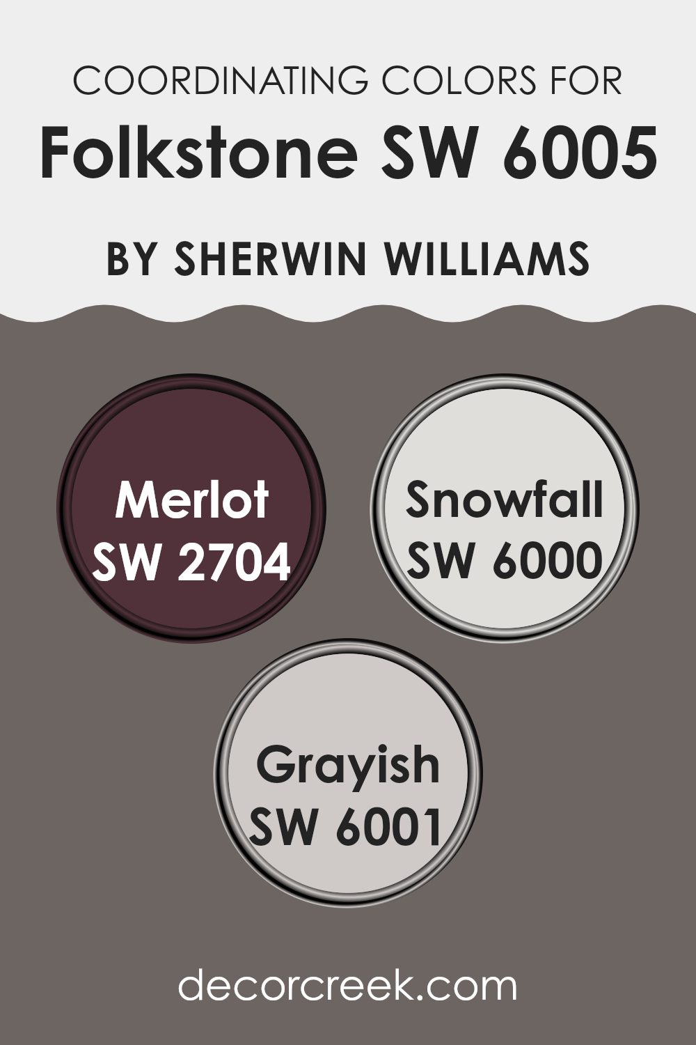
Coordinating Colors of Folkstone SW 6005 by Sherwin Williams
Coordinating colors are those that complement and enhance each other when used together in décor, creating a cohesive and visually appealing look. For instance, colors that coordinate well with a base color like a grey can add depth and interest to a room.
When decorating with a versatile neutral like gray, choosing the right coordinating colors can make a significant impact on the overall aesthetic. One great coordinating color is SW 2704 – Merlot, which offers a rich, deep wine red hue that pairs beautifully with cooler tones, providing a warm contrast that draws the eye and adds a dash of elegance.
Another coordinating color, SW 6000 – Snowfall, presents a fresh, clean white that contrasts sharply with deeper shades, brightening the space and adding a sense of freshness. Finally, SW 6001 – Grayish is a subtle blend of gray and beige, often referred to as “greige,” which harmonizes naturally with other neutrals to create a seamless look throughout the space. These colors together can create an engaging and comfortable atmosphere that feels cohesive and thoughtfully designed.
You can see recommended paint colors below:
- SW 2704 Merlot
- SW 6000 Snowfall
- SW 6001 Grayish
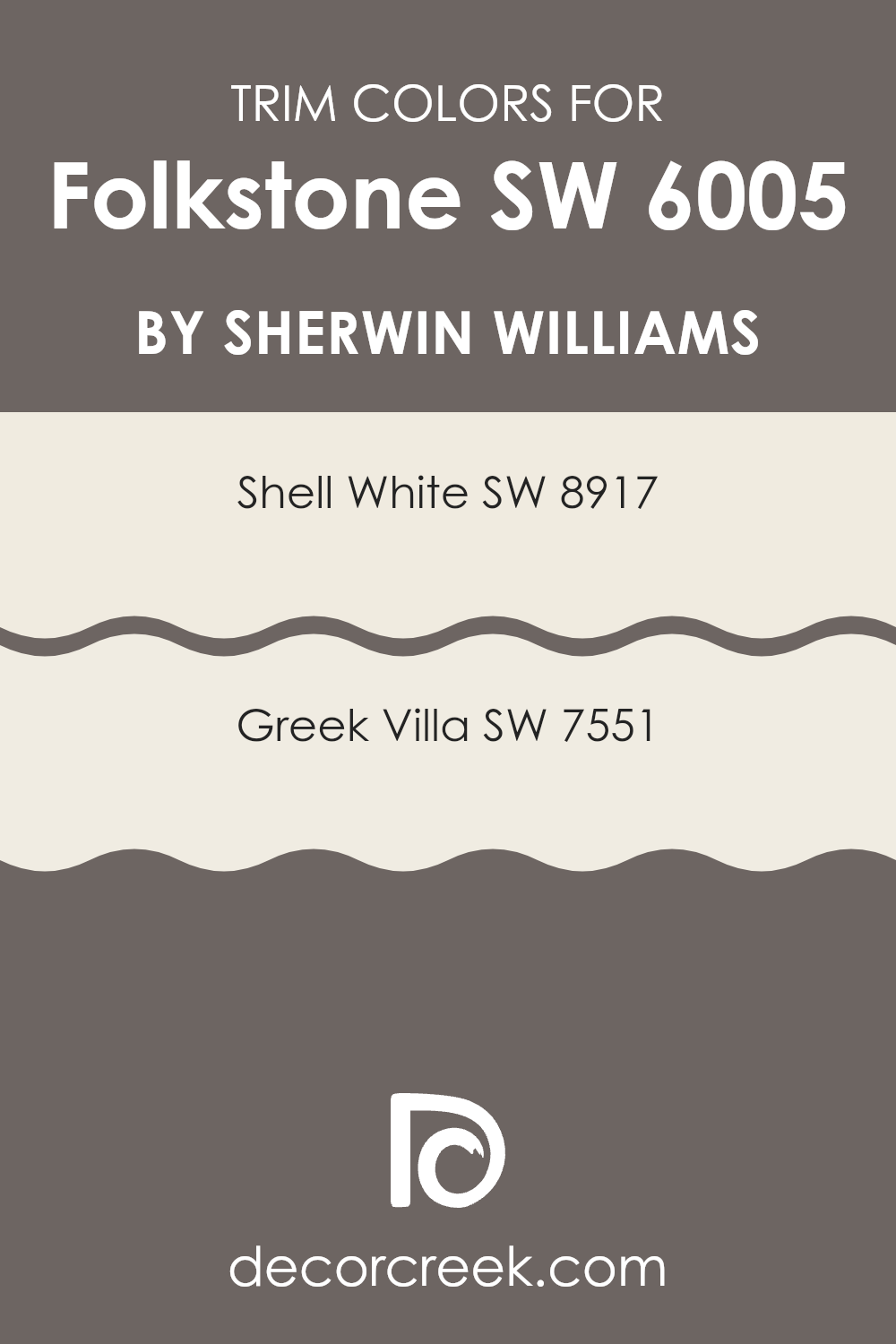
What are the Trim colors of Folkstone SW 6005 by Sherwin Williams?
Trim colors, like SW 8917 – Shell White and SW 7551 – Greek Villa, play a crucial role in defining and highlighting the architectural details of a space. When paired with a wall color such as Folkstone by Sherwin Williams, these trim colors help to create a crisp, clean look that enhances the overall aesthetic appeal.
The contrast between the darker tone of Folkstone and the lighter trim colors can make features like crown moldings, door frames, and baseboards pop, enhancing their visual impact and contributing to a well-rounded and polished look.
SW 8917 – Shell White is a soft, warm white with a subtle touch of creaminess that adds a gentle warmth to the edges of a room, making it a great choice for softening the strong presence of a darker shade like Folkstone.
Meanwhile, SW 7551 – Greek Villa is a slightly off-white with a hint of beige, providing a hint of depth and warmth that complements more neutral or cooler wall colors. Both colors are versatile and provide a pleasing contrast that help in making a room feel more inviting and artfully arranged.
You can see recommended paint colors below:
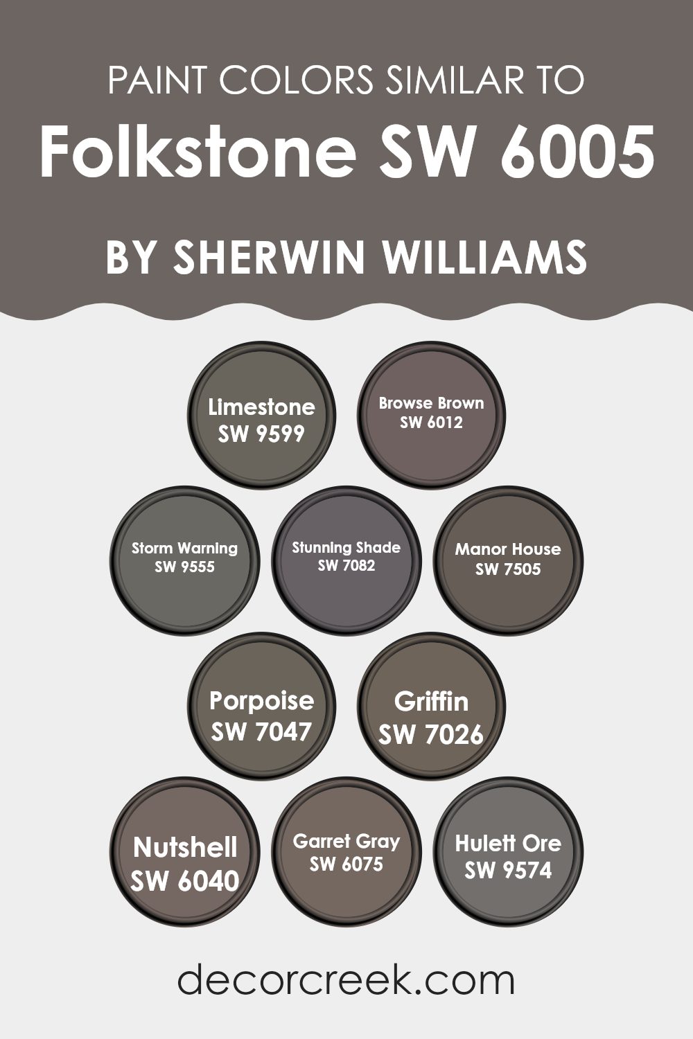
Colors Similar to Folkstone SW 6005 by Sherwin Williams
Similar colors play a vital role in creating a cohesive and harmonious look in any space. When shades are closely related, such as those similar to Folkstone by Sherwin Williams, they bring a sense of unity and flow to the décor.
This grouping can also make small spaces appear larger and give a sleek, streamlined look to interiors. Deciding to use variations of a single hue can subtly highlight architectural features or draw attention to specific areas without overwhelming the overall aesthetic of a room.
For instance, Limestone is a muted gray that can beautifully offset darker furnishings, while Browse Brown offers a warm, welcoming vibe that pairs well with natural materials like wood. Storm Warning, a deeper gray, adds drama and can serve as a sophisticated backdrop for art or bright accessories.
Meanwhile, Stunning Shade is a dramatic charcoalesque color that lends a touch of elegance to any nook. For those who prefer something less intense, Manor House veers into the lighter side of gray, providing a soft, neutral canvas. Porpoise, another gray but with hints of brown, bridges the gap between cool and warm tones nicely.
Griffin and Nutshell offer a robust palette that works well in areas that demand some visual weight.
Garrett Gray is a balanced medium gray that has the flexibility to blend with both modern and traditional décor. Lastly, Hulett Ore brings a subtle earthy touch, making it perfect for creating a cozy and inviting atmosphere. Each of these colors complements Folkstone, enhancing the space without dominating it, ensuring that every element within the room works in concert.
You can see recommended paint colors below:
- SW 9599 Limestone
- SW 6012 Browse Brown
- SW 9555 Storm Warning
- SW 7082 Stunning Shade
- SW 7505 Manor House
- SW 7047 Porpoise
- SW 7026 Griffin
- SW 6040 Nutshell
- SW 6075 Garret Gray
- SW 9574 Hulett Ore
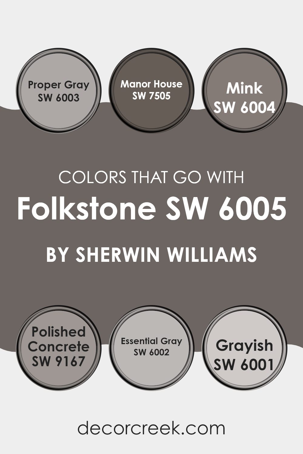
Colors that Go With Folkstone SW 6005 by Sherwin Williams
The choice of colors that complement Folkstone SW 6005 by Sherwin Williams is crucial because it enables creating a cohesive and pleasant decor scheme. Colors like Proper Gray, Manor House, Mink, Polished Concrete, Essential Gray, and Grayish each bring their own unique shade and mood into the mix, which can greatly enhance the overall aesthetic of a space.
When these colors are thoughtfully applied together, they can produce a harmonious and inviting atmosphere, making any room feel more like a coherent part of the home. Proper Gray SW 6003 is a balanced gray that neither too dark nor too light, ideal for spaces needing a neutral backdrop.
Manor House SW 7505, on the other hand, is a deeper, richer shade that adds a touch of drama and depth, perfect for accent walls. Mink SW 6004 offers a hint of warmth with its dusky undertone, making it great for areas that require a cozy atmosphere. Polished Concrete SW 9167 is a cool, minimalistic gray that gives a modern and industrial feel, suited for contemporary designs
. Essential Gray SW 6002 is another light gray that provides a clean and fresh look, excellent for brightening dim spaces. Lastly, Grayish SW 6001 leans slightly towards the lavender spectrum, giving a subtle splash of color that works well in bedrooms and other peaceful retreats.
Together, these colors coordinate very well with Folkstone SW 6005, allowing flexible styling options that can suit varied interior preferences.
You can see recommended paint colors below:
- SW 6003 Proper Gray
- SW 7505 Manor House
- SW 6004 Mink
- SW 9167 Polished Concrete
- SW 6002 Essential Gray
- SW 6001 Grayish
How to Use Folkstone SW 6005 by Sherwin Williams In Your Home?
Folkstone SW 6005 by Sherwin Williams is a versatile gray paint color that suits almost any room in your home. This neutral shade works well in living areas, kitchens, and even bedrooms, providing a clean, simple backdrop that pairs easily with various decor styles and colors. Whether your furniture is modern or traditional, Folkstone creates a seamless look that ties different elements together.
For those looking to freshen up their kitchen, this color can help make the space look newer and cleaner without overwhelming the senses. In the living room, Folkstone complements both bright accents and softer tones, allowing you to mix and match your decorations without clashing.
Additionally, its calming quality makes it an excellent choice for bedrooms, where it can help set a relaxing mood. Overall, using Folkstone SW 6005 is a straightforward way to refresh your home’s look while keeping things stylish and coordinated.
Folkstone SW 6005 by Sherwin Williams vs Manor House SW 7505 by Sherwin Williams
Folkstone and Manor House are two different shades of gray from Sherwin Williams. Folkstone is a lighter gray that gives a fresh and clean look to spaces. It’s great when you want to brighten up a room without making it feel cold or stark. This color works well in smaller areas or rooms without much natural light as it helps make the space feel bigger.
On the other hand, Manor House is a darker gray. It offers a more grounded and cozy vibe, ideal for creating a feeling of comfort. It suits larger spaces or rooms with plenty of natural light to prevent it from feeling too dark. Manor House works remarkably well in areas where you want a bit more warmth and depth.
Choosing between them depends on the atmosphere you want in your room and how much natural light the space receives. Lighter Folkstone can lift a room, while the deeper Manor House can give it a cozy wrap-around feel.
You can see recommended paint color below:
Folkstone SW 6005 by Sherwin Williams vs Stunning Shade SW 7082 by Sherwin Williams
When comparing Folkstone and Stunning Shade, both colors by Sherwin Williams, we can notice a distinct difference in their tones. Folkstone is a gray shade that leans towards a soft, neutral look. It’s a versatile color that fits well in many areas of a home or office, providing a calm, understated backdrop.
On the other hand, Stunning Shade is a darker, more pronounced gray. This color has a more assertive presence, making it ideal for accent walls or areas where a bolder statement is desired. It can add dramatic flair to a space, standing out more than its lighter counterpart, Folkstone.
Both colors offer unique possibilities and can change the atmosphere of a room depending on how they are used in decor and lighting.
You can see recommended paint color below:
- SW 7082 Stunning Shade
Folkstone SW 6005 by Sherwin Williams vs Nutshell SW 6040 by Sherwin Williams
Folkstone and Nutshell are two paint colors offered by Sherwin Williams that provide distinct aesthetics for room decoration. Folkstone is a deep gray that gives a strong, solid look and can make a room feel warm and inviting. This color is versatile and works well in various spaces, including living rooms and bedrooms, where a touch of formality is desired.
On the other hand, Nutshell is a lighter, soft brown shade that offers a very cozy and welcoming vibe. It’s excellent for creating a comfortable environment, ideal for spaces where you want to relax and feel at ease, like dens or reading nooks.
While both colors lend a warm atmosphere to a room, Folkstone tends to make a more bold statement with its darker tone whereas Nutshell, with its understated elegance, keeps things light and airy. Pairing them together could balance each other nicely in a home, providing warm accents without overpowering a space.
You can see recommended paint color below:
- SW 6040 Nutshell
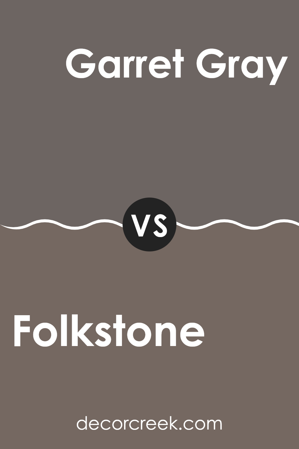
Folkstone SW 6005 by Sherwin Williams vs Garret Gray SW 6075 by Sherwin Williams
The main color, Folkstone, and the second color, Garret Gray, both by Sherwin Williams, share a subtlety and depth that make them popular choices. Folkstone is a solid, mid-tone gray that offers a neutral backdrop suitable for various spaces. It’s neither too dark nor too light, making it incredibly versatile for rooms needing a balanced gray that can pair well with both bright and subdued accents.
Garret Gray, on the other hand, is a deeper shade. This color adds a bit more drama and intensity to a space compared to Folkstone. It’s ideal for creating a cozier atmosphere, possibly in a bedroom or living area where a slightly darker color enhances the feeling of warmth and comfort.
Overall, while both shades are gray, Folkstone feels lighter and more adaptable to different lighting conditions and decor styles. Garret Gray, being a bit richer, tends to make a stronger statement and works well in areas where a touch of sophistication is desired without using overwhelming dark tones.
You can see recommended paint color below:
- SW 6075 Garret Gray
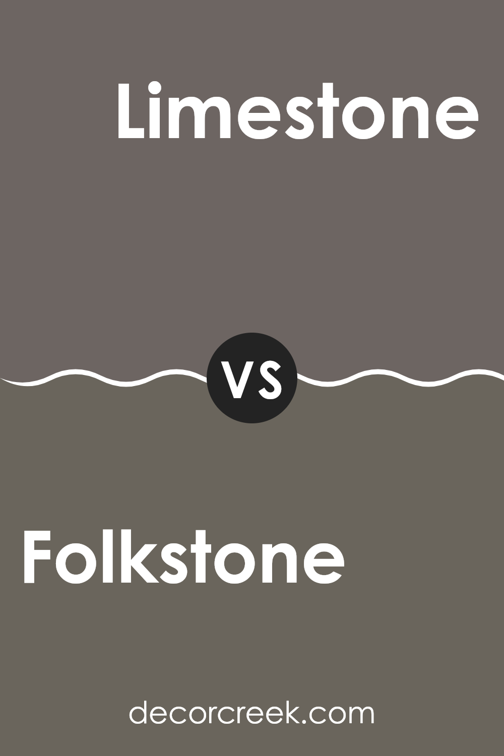
Folkstone SW 6005 by Sherwin Williams vs Limestone SW 9599 by Sherwin Williams
Folkstone and Limestone are two interesting shades from Sherwin Williams. Folkstone is a deep gray with a strong presence that gives a room a more grounded, secure feel. It’s a versatile color that can fit well in many areas of a home, such as living rooms or bedrooms, adding a sense of stability and calm.
On the other hand, Limestone is much lighter, almost like a soft, pale gray with hints of beige. This color can make spaces feel more open and airy, perfect for smaller rooms or areas that don’t get a lot of natural light. It’s an excellent choice for creating a relaxed, light atmosphere.
Both colors can work beautifully together, with Folkstone providing a solid anchor and Limestone offering a gentle contrast, lightening up the environment. This pairing can be effective for creating a balanced, visually appealing space.
You can see recommended paint color below:
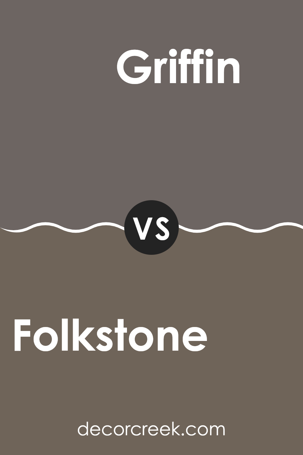
Folkstone SW 6005 by Sherwin Williams vs Griffin SW 7026 by Sherwin Williams
The main color, Folkstone, and the second color, Griffin, by Sherwin Williams, are both shades of gray but have distinct differences. Folkstone is a lighter gray with a very soft, almost misty quality. This lighter shade makes it versatile for various spaces, enhancing brightness in rooms with less natural light.
On the other hand, Griffin is a deeper, more robust gray. It holds a stronger presence due to its darker tone, offering a feeling of stability and grounding. Suitable for accent walls or spaces where you want to add a bit of drama without overwhelming with darker colors like black.
Both colors work exceptionally well in modern decor schemes, and when used thoughtfully, can complement a range of other colors and materials. Whether you choose Folkstone for a gentle backdrop or Griffin for a more pronounced effect, both bring their unique flavor to interiors.
You can see recommended paint color below:
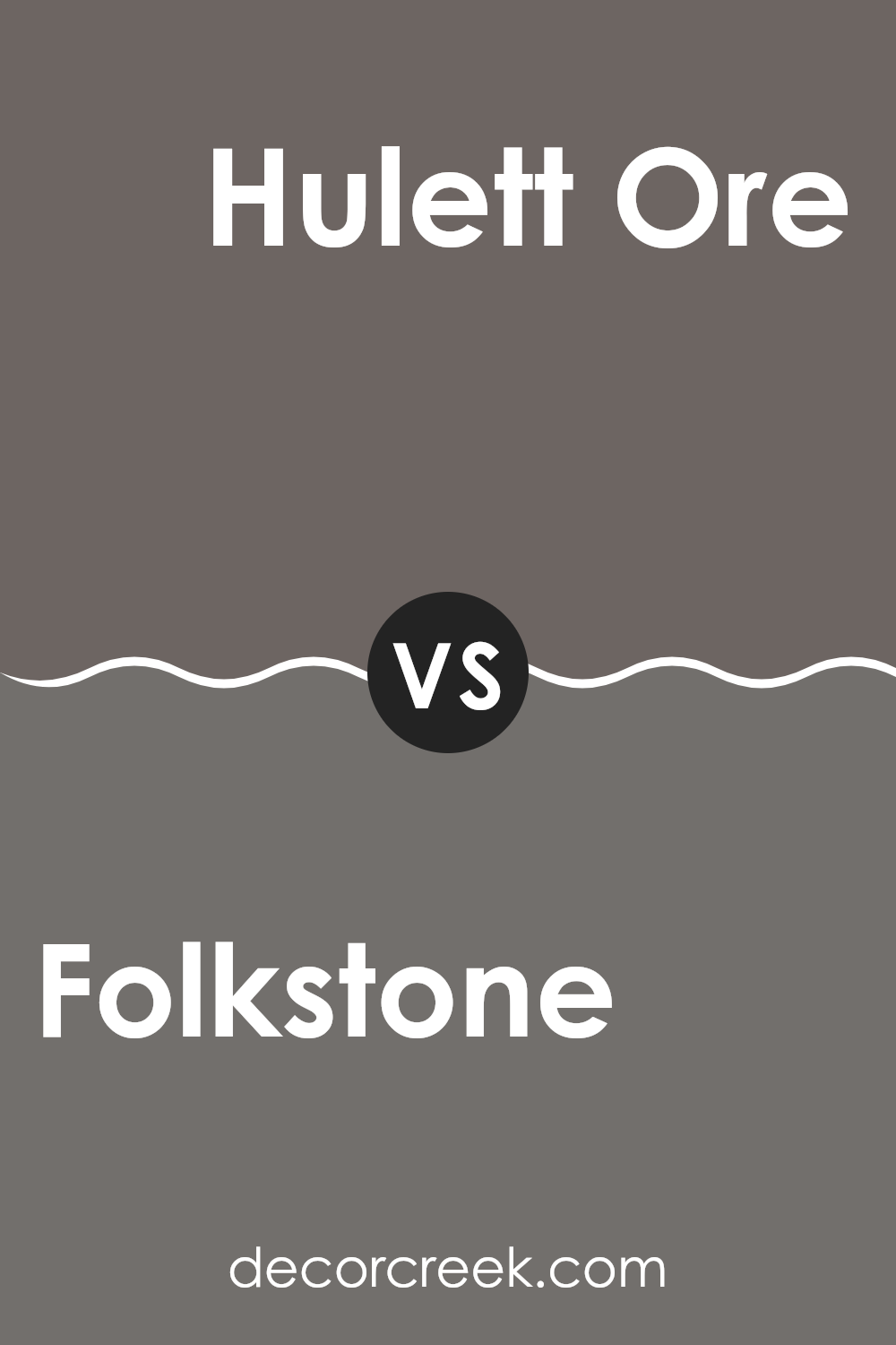
Folkstone SW 6005 by Sherwin Williams vs Hulett Ore SW 9574 by Sherwin Williams
Folkstone and Hulett Ore from Sherwin Williams are both neutral tones, but they have distinct differences that affect their use in decorating. Folkstone is a grey with a subtle warm undertone, making it versatile for use in various spaces, from kitchens to bedrooms. It’s light enough to make small rooms feel larger while still adding a touch of color.
On the other hand, Hulett Ore is a darker, more earthy grey with richer brown undertones. This color is ideal for creating a cozy and inviting atmosphere. It works well in areas that benefit from a more grounded, soothing feel, like dens or reading nooks.
When deciding between these two, consider the amount of natural light in your space and the mood you want to achieve. Folkstone might be better for a bright, open feel, while Hulett Ore could be the choice for a more enclosed, warm setting.
You can see recommended paint color below:
- SW 9574 Hulett Ore
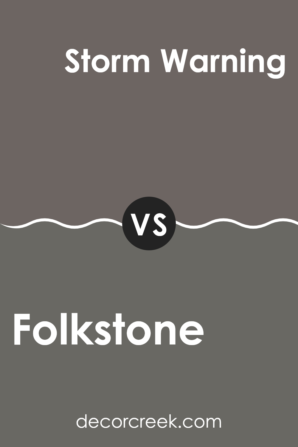
Folkstone SW 6005 by Sherwin Williams vs Storm Warning SW 9555 by Sherwin Williams
Folkstone and Storm Warning are both paints from Sherwin Williams, yet they bring different vibes to a room. Folkstone is a soft gray that offers a subtle and neutral base, making rooms look sleek without being too bold. It works well in places where you might want a quiet, clean look such as bedrooms or offices.
On the other hand, Storm Warning is a significantly darker shade. This gray has deeper blue undertones, giving it a more noticeable presence. It’s ideal for making a strong statement in a space or when you wish to add some drama and depth, perfect for accent walls or cabinets.
While both colors are versatile, Folkstone tends to be easier to match with a wide range of decor, maintaining a gentle backdrop. Storm Warning, with its bolder tone, demands a bit more thought in coordinating colors but can provide a richer, more striking effect. Each brings its own unique style to interiors, depending on what atmosphere you want to achieve.
You can see recommended paint color below:
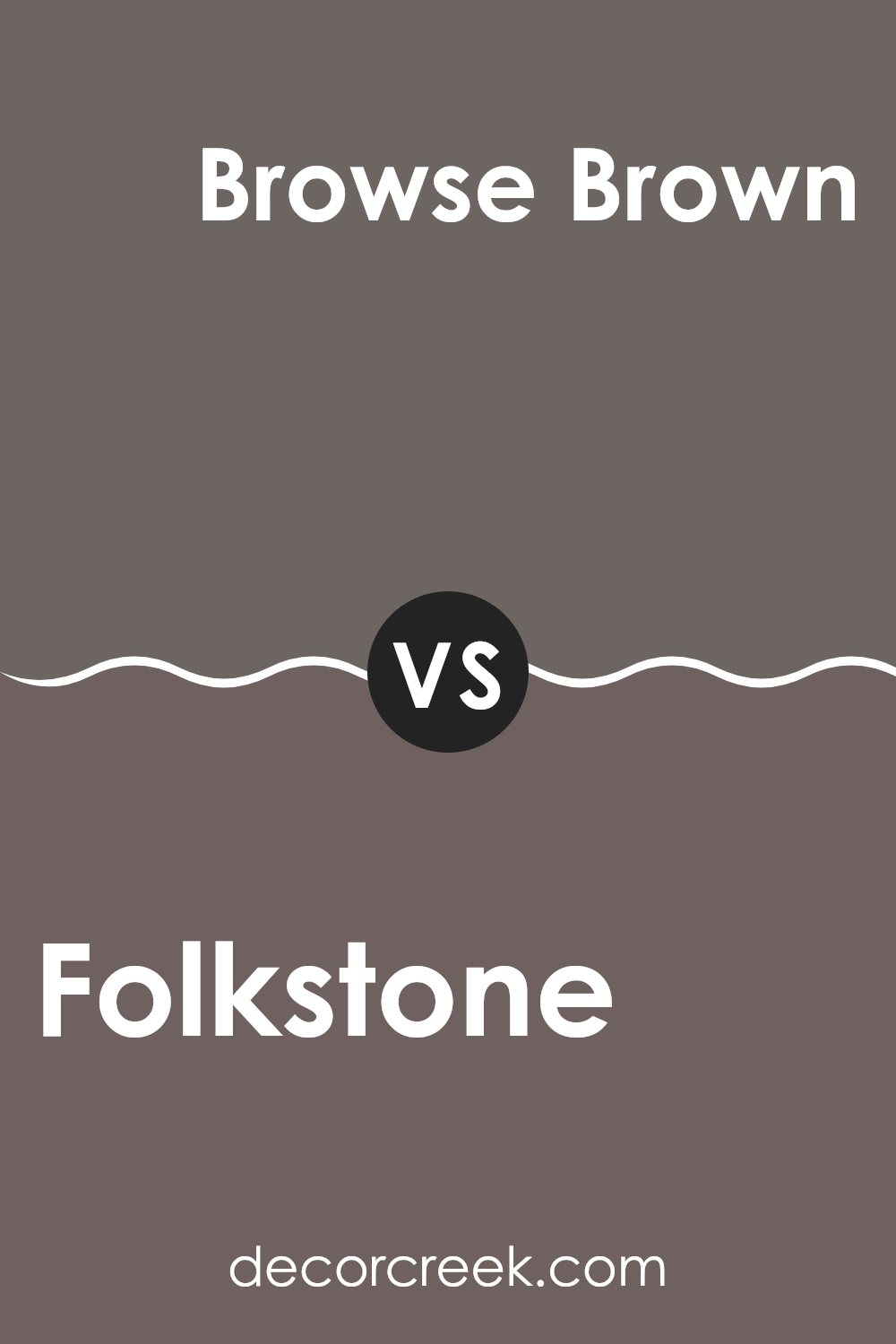
Folkstone SW 6005 by Sherwin Williams vs Browse Brown SW 6012 by Sherwin Williams
Folkstone is a medium gray color that provides a calm, neutral backdrop for any room. It is versatile, pairing well with both bright and subdued colors in furniture and decor. This makes it a popular choice for its flexibility in various design styles.
Browse Brown, on the other hand, is a deeper, warm taupe color. It adds a cozy and inviting feel to spaces, making it ideal for rooms where you want to relax, like living rooms or bedrooms. It works especially well with natural materials, such as wood and leather, enhancing their rich textures.
Both colors share a soothing quality but serve different purposes in interior design. Folkstone is better for creating a subtle, understated look, while Browse Brown creates a strong, warm presence that can make a space feel more enclosed and snug. They can also be used together to build a layered, harmonious color scheme.
You can see recommended paint color below:
- SW 6012 Browse Brown
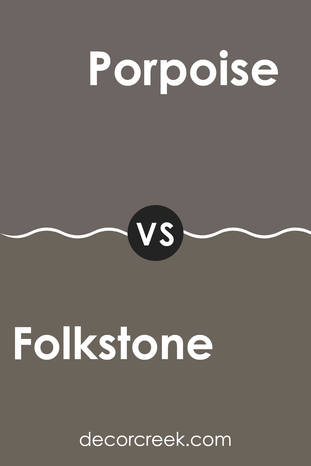
Folkstone SW 6005 by Sherwin Williams vs Porpoise SW 7047 by Sherwin Williams
Folkstone and Porpoise by Sherwin Williams are two neutral colors, yet they bring distinct tones to the table. Folkstone is a mid-tone gray with a steady, balanced feel, perfect for a calm and straightforward ambiance in any room. It neither leans too cool nor too warm, making it a versatile choice for various decorating styles.
On the other hand, Porpoise is a darker shade of gray compared to Folkstone. This color has a deeper and more pronounced presence, providing a strong visual statement. Due to its intensity, Porpoise might be best suited for an area where you want to create more impact or depth, such as an accent wall or a cozy nook.
Both colors are excellent for those aiming for a modern yet timeless look. Folkstone might be preferable in smaller spaces or rooms that get less natural light, as its lighter tone will help brighten the space. Porpoise, being darker, is ideal for larger areas or where a dramatic effect is desired.
You can see recommended paint color below:
In conclusion, SW 6005 Folkstone by Sherwin Williams is a really cool paint color that lots of people like because it looks great in almost any room. This color is a mix of gray and a tiny bit of blue, which makes it feel calm and welcoming.
When you put it on your walls, it can help make the room feel happy and cozy. It works well whether you have a big room or a small room. Also, the cool thing about Folkstone is that it goes with many different colors for the furniture and decorations, so you don’t have to worry about things not matching.
Many people use this color because it’s easy to live with and stays looking good over time. So if you’re thinking about giving your room a new look, Folkstone might be a perfect choice. It’s simple, pretty, and makes everything else look even better!
Ever wished paint sampling was as easy as sticking a sticker? Guess what? Now it is! Discover Samplize's unique Peel & Stick samples.
Get paint samples

