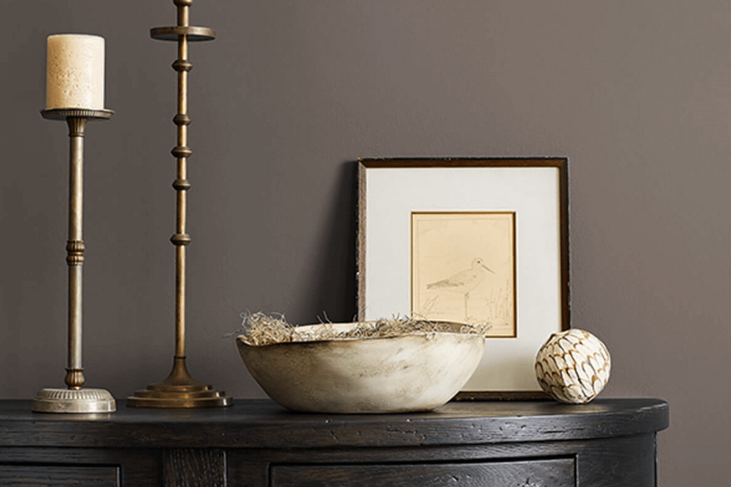
I recently got familiar with SW 7505 Manor House by Sherwin Williams, and I have to share my thoughts on this shade. Imagine a color that brings a sense of sophistication and depth to any room it graces. Manor House does just that without being too overpowering.
It’s a deep, rich gray that somehow balances warmth with modernity, making it incredibly versatile. Whether you’re looking to repaint your living room or add some character to your bedroom, this hue has the potential to create a striking impact.
What stands out about Manor House is its ability to complement various decors and lighting conditions. In daylight, it’s vibrant and lively, yet under evening lighting, it turns into a cozy and inviting backdrop. It pairs beautifully with both vibrant colors and muted tones, giving you flexibility in your decorating choices
. If you’re thinking about giving your space a new paint job, Manor House could be the perfect choice for adding that special touch of elegance and warmth.
What Color Is Manor House SW 7505 by Sherwin Williams?
Manor House by Sherwin Williams is a warm, deep gray shade that brings a sense of richness and coziness to any room. This versatile color has a timeless quality, making it a fantastic choice for various interior styles, particularly modern farmhouse, traditional, and contemporary settings.
The beauty of Manor House lies in its ability to act as a neutral backdrop or as a bold statement, depending on how it’s used. In a room with ample natural light, this shade softens, creating a welcoming and cozy atmosphere. In spaces with less light, it provides a strong and grounding effect, perfect for creating a sense of intimacy.
This color pairs exceptionally well with natural materials such as wood, leather, and linen, enhancing its organic feel. Wooden elements, from oak to walnut, complement its depth and bring out its warm undertones. When paired with leather, Manor House achieves an elegant but comfortable look, ideal for a study or a living room.
For textures, think of adding soft throw blankets or plush velvet cushions. These elements not only add a layer of comfort but also contrast beautifully against the depth of Manor House, making any interior feel more inviting. This shade also works well with metallic accents like brass or copper, adding a touch of glamour to the otherwise earthy color.
Overall, Manor House is a versatile color choice that can help create a variety of moods and styles in a home, depending on how it’s styled with different materials and textures.
Is Manor House SW 7505 by Sherwin Williams Warm or Cool color?
Manor House by Sherwin Williams is a rich, deep gray paint color that can make any room in a home feel warm and welcoming. It is a versatile shade that works well in many spaces, whether you’re looking to paint a cozy living room or a stylish bedroom.
The deep tone of this gray offers a solid base that pairs beautifully with brighter colors or softer, muted tones, making it a good choice for those who like to mix and match decor. This color also does a great job at hiding imperfections on walls and can help make a small space seem larger and more open when used properly.
Because it’s such a neutral color, Manor House can fit into many design styles, from modern to traditional. It’s particularly effective in spaces that get a lot of natural light, as the color can shift and appear differently as the day progresses, adding a dynamic element to the room.
Undertones of Manor House SW 7505 by Sherwin Williams
The color Manor House by Sherwin Williams has a rich spectrum of undertones that subtly influence both its appearance and the atmosphere it creates in a room. Undertones are the colors that lurk beneath the primary shade, affecting how it looks under different lighting conditions and when juxtaposed with other colors.
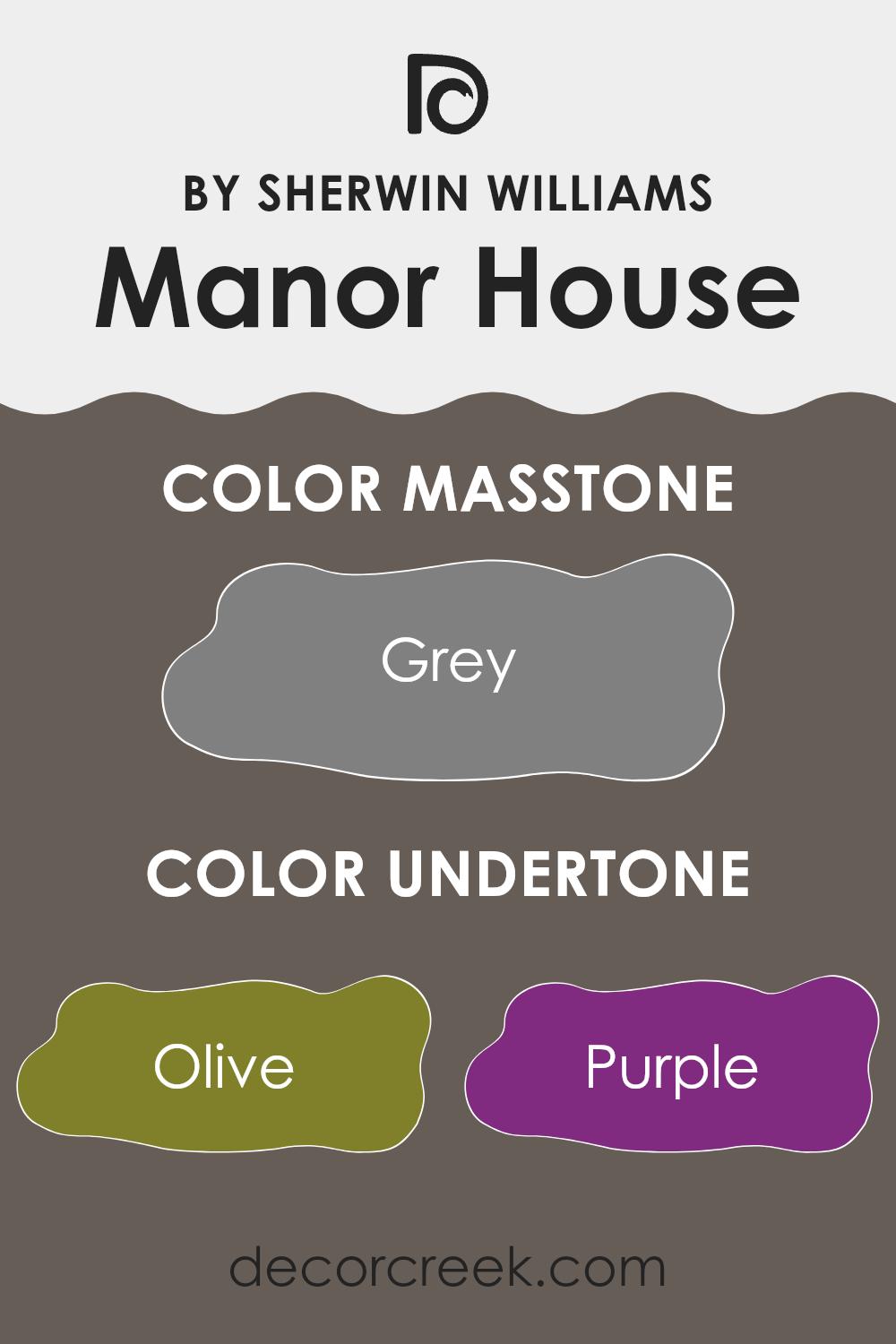
Manor House contains undertones across a broad range, including greens, blues, browns, and even delicate pinks. These undertones play a significant role in how the paint adapts to various environments. For instance, olive and dark green undertones bring a hint of nature’s calmness, while the darker tones like brown and dark grey add depth and grounding.
Lighter tones, such as pale pink and mint, introduce a soft, almost soothing vibrancy to the space.
When applied to interior walls, these undertones blend subtly, making the room feel cozy and welcoming while still maintaining a sense of grounding. In natural light, some of the greener and lighter undertones might become more prominent, promoting a fresh and airy feel. In contrast, during the evening under artificial lighting, the darker tones such as navy and dark brown might stand out more, creating a richer, more intense atmosphere.
The wide range of undertones in Manor House make it a versatile color choice. It can harmonize with a variety of decor styles and preferences, adjusting its appearance according to the surrounding colors and lighting. This flexibility makes it an excellent choice for living rooms, bedrooms, or any space that benefits from a dynamic and adaptable color that responds to its environment.
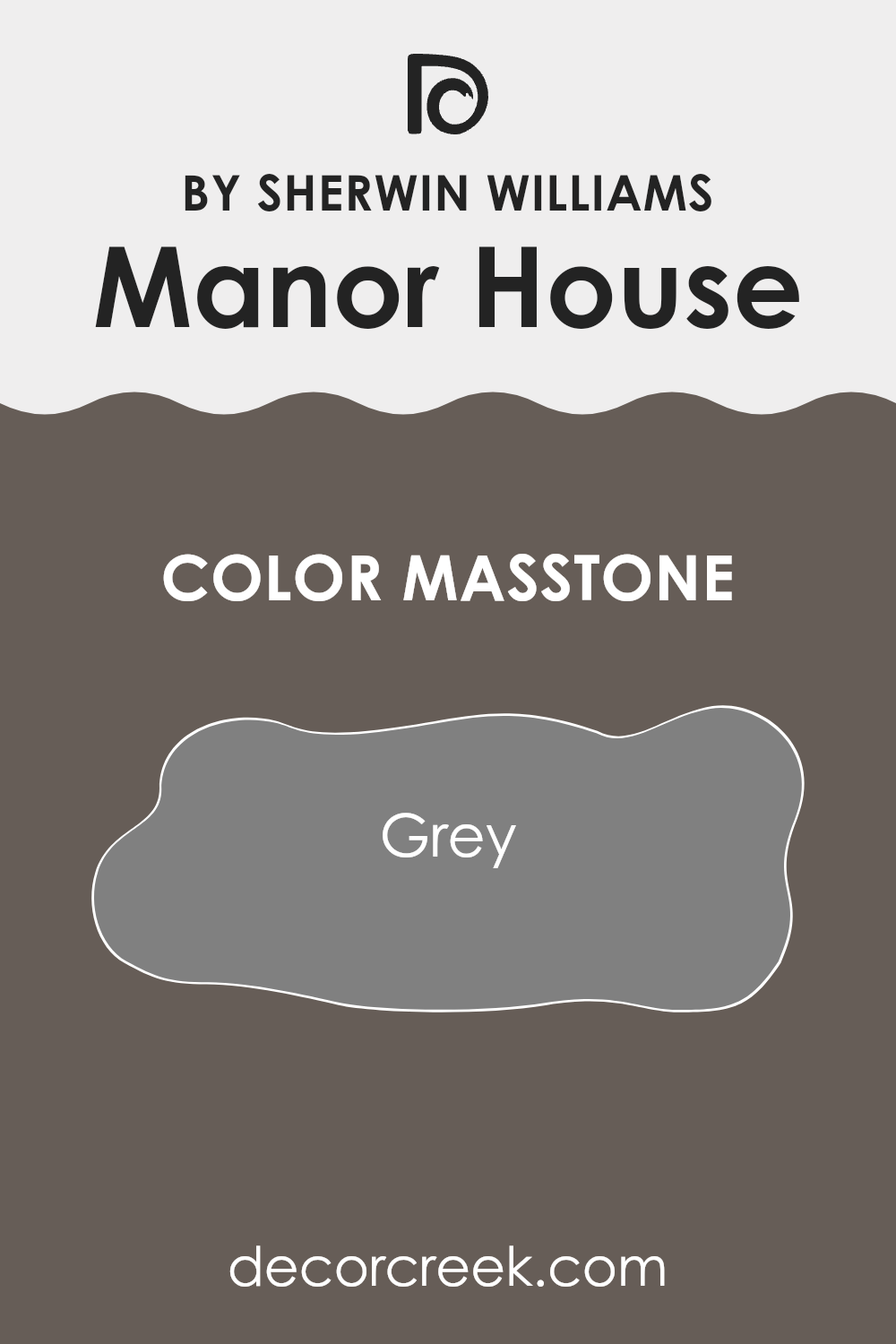
What is the Masstone of the Manor House SW 7505 by Sherwin Williams?
The color Grey (#808080), known as Manor HouseSW 7505, has a balanced masstone that can have a positive impact on interior spaces. Grey is versatile enough to work in various rooms, adapting well to different styles and decor choices.
This shade can make small spaces appear larger and brighter, especially when paired with proper lighting. It also serves as a neutral background, allowing furniture and artwork to really stand out. Moreover, Grey (#808080) has a calming effect, providing a subtle backdrop that doesn’t overwhelm the senses.
This makes it a great choice for bedrooms and living areas where a peaceful atmosphere is desired. Overall, this color is practical for anyone looking to create a clean, streamlined look in their home while maintaining a warm and inviting environment.
How Does Lighting Affect Manor House SW 7505 by Sherwin Williams?
Lighting has a crucial impact on how colors appear in a room. It can change the way a color like Manor House by Sherwin Williams is perceived, whether under natural or artificial light.
In general, artificial light can shift the way colors are seen, depending on the type of bulb used. LED or fluorescent lights can alter color appearances, making them seem cooler or warmer than they do in daylight.
In natural light, the appearance of the color Manor House can significantly vary depending on the direction the room faces
1. North-Facing Rooms: These rooms typically get less direct sunlight, which can make colors look slightly more muted or cooler. As a result, Manor House might appear as a deeper, more shadowy gray, giving a calm and gentle feel to the room.
2. South-Facing Rooms: These rooms benefit from abundant light for most of the day, which can brighten and warm up colors. Manor House in a south-facing room could look lighter than expected and can even lean towards a warmer tone during the daytime.
3. East-Facing Rooms: Rooms that face east get plenty of light in the morning, which can make colors feel bright and warm early in the day. Manor House in an east-facing room would look vibrant and fresh in the morning, slowly transitioning to a truer shade of gray as the sun moves.
4. West-Facing Rooms: West-facing rooms receive the evening light, which can cast a golden glow. In these rooms, Manor House might take on slightly warmer hues in the late afternoon, offering a cozy and inviting vibe as the sun sets.
Understanding how different light exposures affect the color can help in deciding use based on the mood you hope to achieve and the natural characteristics of the room. Whether under artificial or natural lighting, knowing how colors like Manor House interact with light sources will guide you in making informed choices about your space.
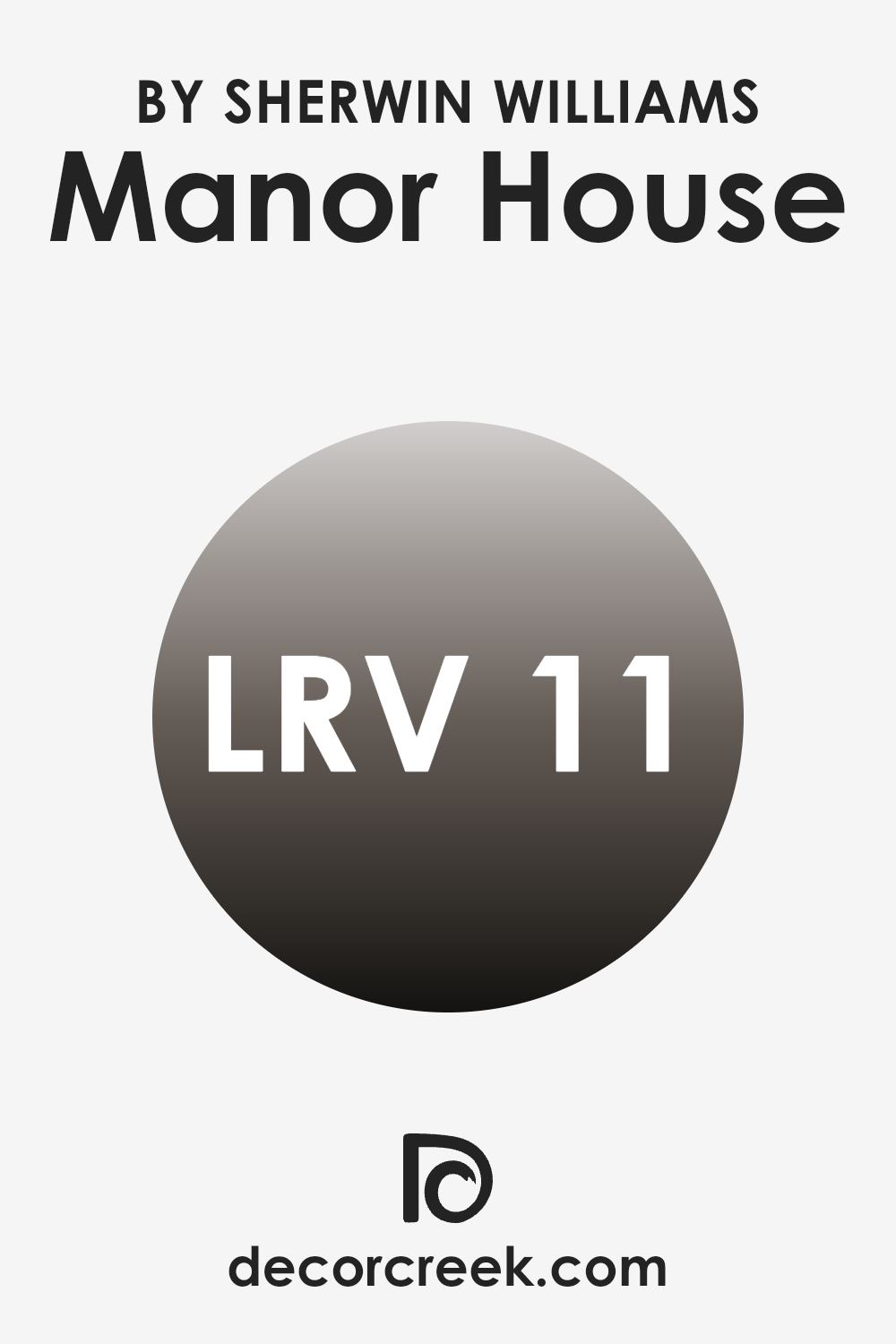
What is the LRV of Manor House SW 7505 by Sherwin Williams?
LRV stands for Light Reflectance Value, a measure used to indicate how much light a paint color will reflect when it’s applied to a surface. This value can range from 1 to 99, with lower numbers indicating that the color absorbs more light and higher numbers indicating that the color reflects more light.
Colors with a higher LRV make a room feel brighter since they reflect more lighting back into the room. Conversely, colors with a lower LRV can make a room feel cozier and more enclosed because they absorb more light. Given that the LRV of Manor House is 11.337, it falls on the lower end of the scale, which means it’s a relatively dark color.
When used on walls, this dark shade will absorb more light and won’t reflect much light back into the room. This characteristic can make a space feel smaller or more intimate, which might be perfect for creating a cozy atmosphere in areas like bedrooms or theaters.
However, if the room is already lacking in natural light, using a color with such a low LRV might make it appear even darker, so additional lighting might be necessary to balance out the effect.
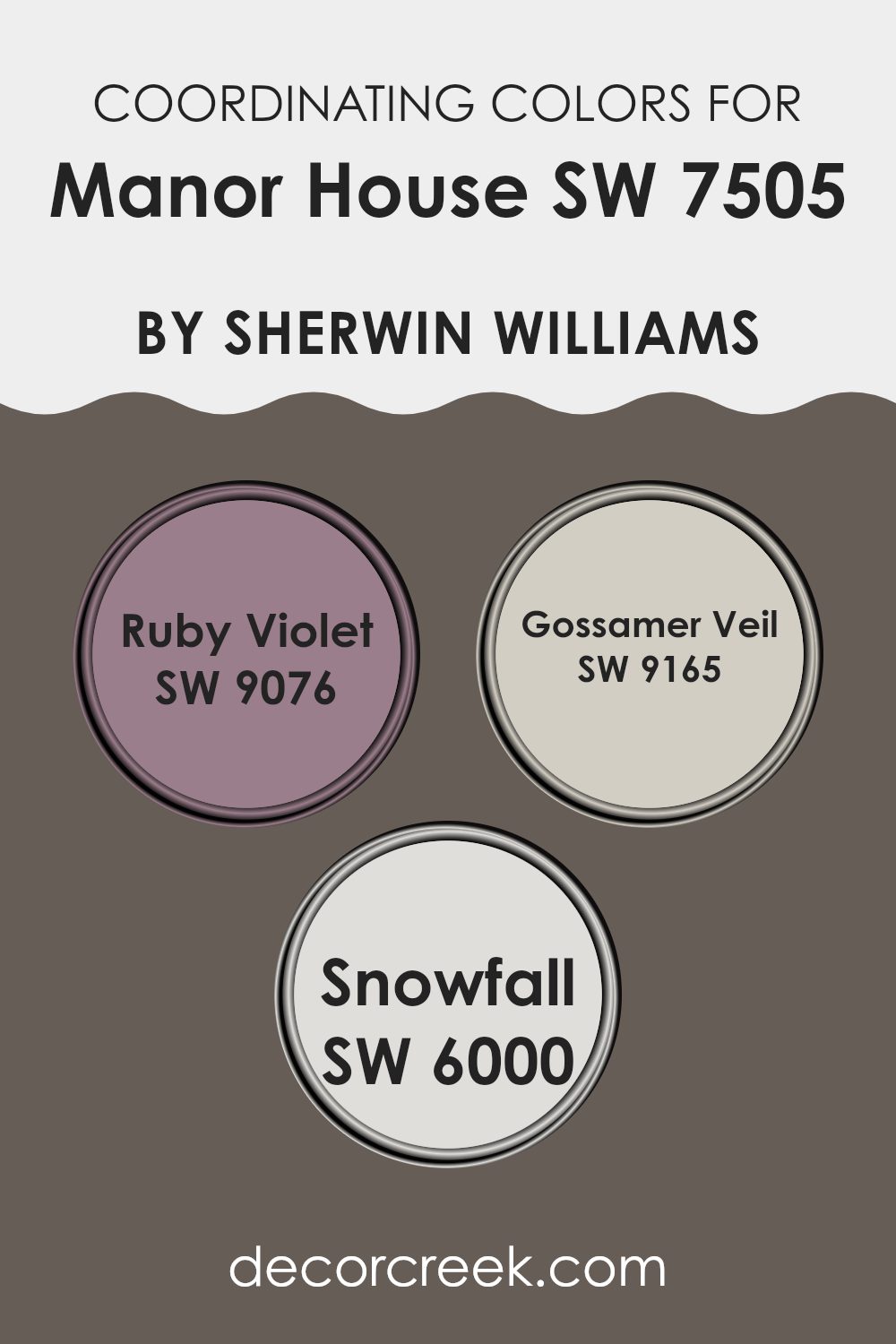
Coordinating Colors of Manor House SW 7505 by Sherwin Williams
Coordinating colors are selected shades that harmonize well with a primary color to create a visually appealing palette. These additional colors complement or balance the main color’s intensity and can enhance the overall aesthetic of a space. By incorporating coordinating colors, designers can enrich the environment, subtly connecting different hues for an effective and pleasant atmosphere.
Manor House’s coordinating colors include Ruby Violet, Gossamer Veil, and Snowfall. Ruby Violet is a deep, vibrant shade that adds a bold splash of energy to any room, providing a striking contrast to Manor House’s more subdued tone.
Gossamer Veil, on the other hand, is a light, almost ethereal gray that offers a soothing neutral, perfect for creating a balanced backdrop that allows other colors to shine. Lastly, Snowfall is a fresh and clean white that brings a sense of brightness and clarity, helping to lift and illuminate the entire color scheme. Together, these coordinating colors work harmoniously to create a dynamic and inviting space.
You can see recommended paint colors below:
- SW 9076 Ruby Violet
- SW 9165 Gossamer Veil
- SW 6000 Snowfall
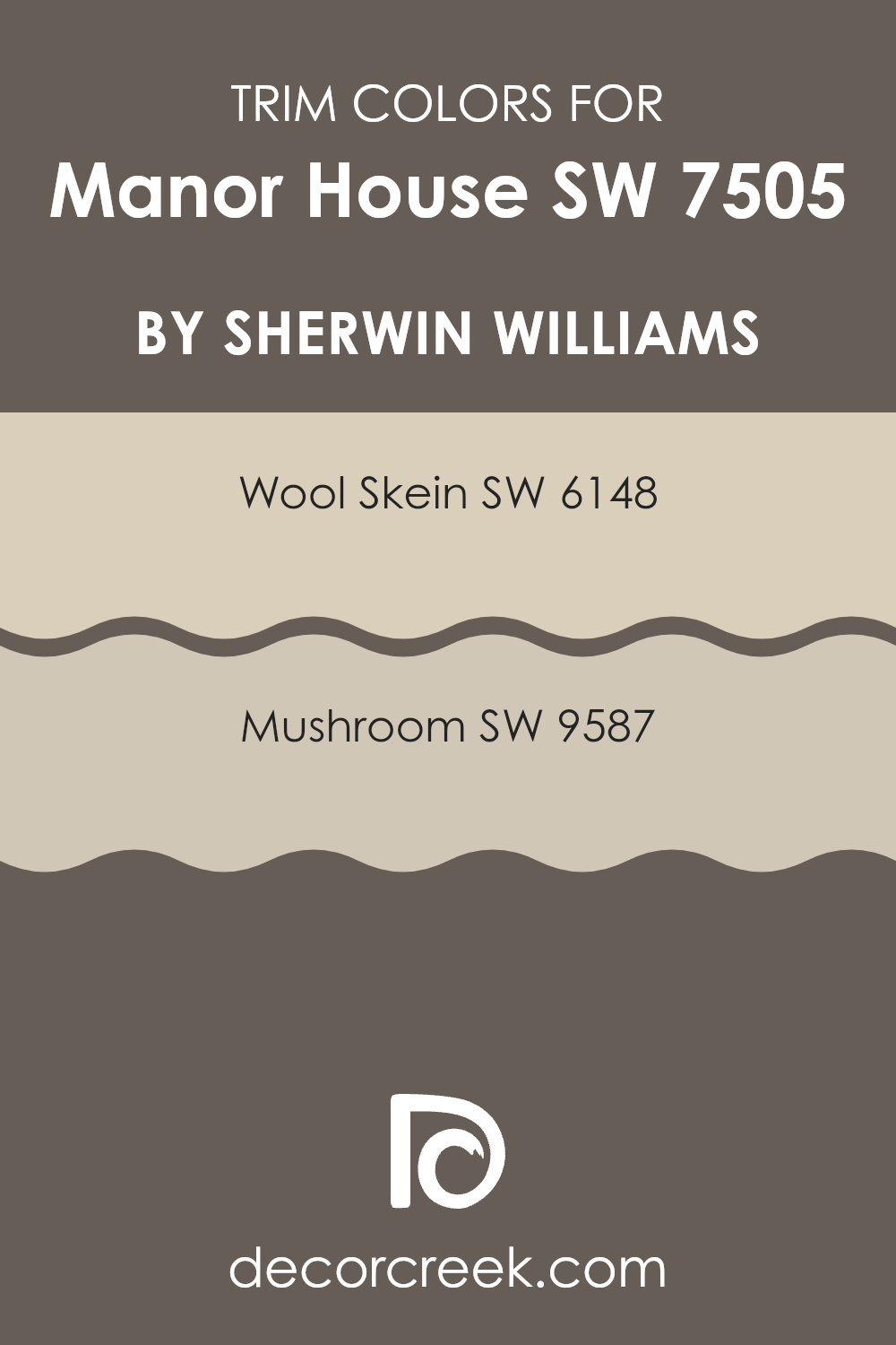
What are the Trim colors of Manor House SW 7505 by Sherwin Williams?
Trim colors are specific shades used to accentuate architectural details and edges such as door frames, window frames, skirtings, and moldings. Choosing the right trim color can enhance the overall look of a room or exterior, creating a clean and finished appearance.
In the case of using a dark, rich tone like Manor House by Sherwin Williams, selecting the right trim color becomes crucial in providing a striking contrast that highlights the architectural features without overwhelming the primary color. Wool Skein SW 6148 from Sherwin Williams is a gentle, muted beige with a warm undertone, making it a perfect complement to darker hues.
It adds a subtle brightness without competing for attention, allowing the deeper tones to stand out while providing a soft, seamless transition between colors. On the other hand, Mushroom SW 9587 is a deeper, earthy beige that offers a stronger contrast while still maintaining harmony with richer wall colors. It brings a sense of grounding and warmth, enriching the overall palette and enhancing the mature vibe of the main color.
You can see recommended paint colors below:
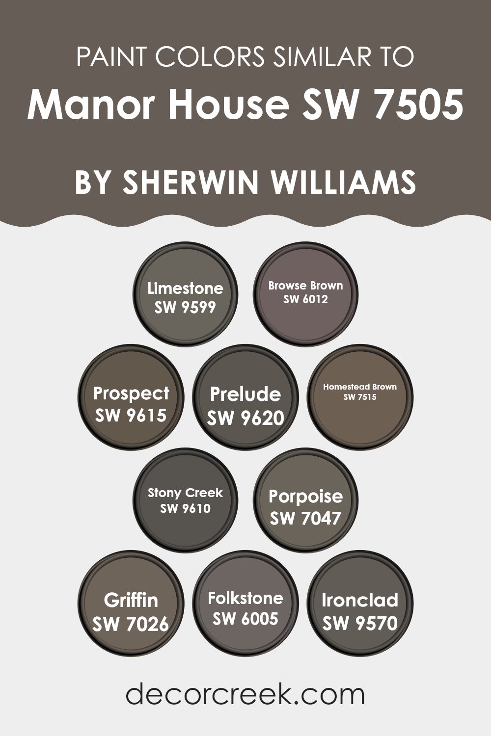
Colors Similar to Manor House SW 7505 by Sherwin Williams
Using similar colors, especially in interior design, can help achieve a cohesive and harmonious look that is pleasing to the eye. Colors like SW 9599 Limestone, a soft gray with a subtle warmth, and SW 6012 Browse Brown, a deep, earthy brown, effectively create a soothing feel with their understated elegance. These tones complement each other without overpowering the space. Similarly, SW 9615 Prospect is a lighter gray that adds a sense of calm, while SW 9620 Prelude, with its slightly greenish-gray hue, introduces a natural element into rooms.
Further enriching the palette, SW 7515 Homestead Brown offers a richer, more saturated brown that coordinates well with the lighter grays like SW 9610 Stony Creek, a cool, medium gray. SW 7047 Porpoise and SW 7026 Griffin are diverse yet compatible— Porpoise is a darker gray that provides contrast, and Griffin strikes a balance with its muted gray-brown tone.
SW 6005 Folkstone offers versatility as a mid-tone gray that works well with bolder colors like SW 9570 Ironclad, a strong, dark gray that can stand as a feature color in the design. Harmonizing these similar shades aids in creating a fluid visual flow from room to room, ensuring that the design feels interconnected and thoughtfully planned.
You can see recommended paint colors below:
- SW 9599 Limestone
- SW 6012 Browse Brown
- SW 9615 Prospect
- SW 9620 Prelude
- SW 7515 Homestead Brown
- SW 9610 Stony Creek
- SW 7047 Porpoise
- SW 7026 Griffin
- SW 6005 Folkstone
- SW 9570 Ironclad
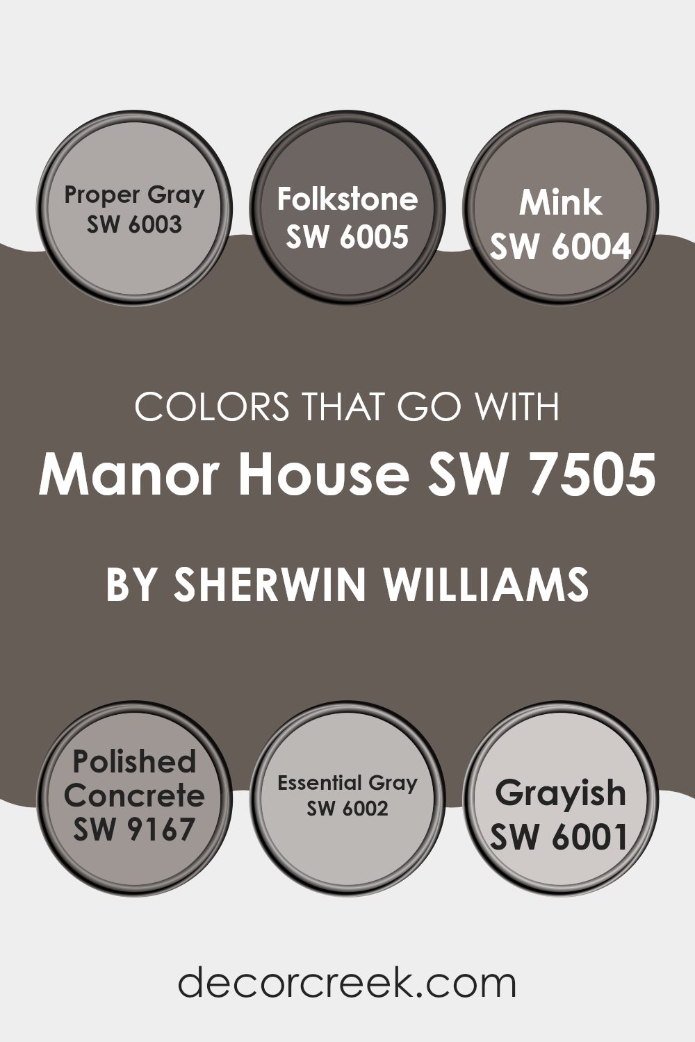
Colors that Go With Manor House SW 7505 by Sherwin Williams
Choosing the right colors that complement Manor House SW 7505 can significantly enhance the aesthetics of any space by creating a harmonious and appealing atmosphere. The selected color palette works well to accentuate Manor House’s unique dark gray hues, making it versatile and ideal for creating a chic and cohesive environment.
For example, using colors like SW 6003 – Proper Gray, which is a lighter shade, provides a subtle contrast that can make smaller rooms feel more spacious. Similarly, SW 6004 – Mink, with its deep, rich tone, can add depth and drama, perfect for accent walls or large furniture pieces.
Furthermore, shades like SW 6005 – Folkstone bring a balanced tone that ties in with Manor House for a smooth visual transition across rooms. Neutral tones like SW 9167 – Polished Concrete introduce a more industrial feel which can modernize a traditional setup or enhance a contemporary space, ensuring the overall look remains stylish but grounded.
Additionally, SW 6002 – Essential Gray and SW 6001 – Grayish offer gentle variations in gray, allowing for layering of shades that can highlight architectural features or fine decorations within the room. Utilizing these colors together enables not only aesthetic pleasure but also creates an inviting atmosphere, ensuring any interior design is both beautiful and functional.
You can see recommended paint colors below:
- SW 6003 Proper Gray
- SW 6005 Folkstone
- SW 6004 Mink
- SW 9167 Polished Concrete
- SW 6002 Essential Gray
- SW 6001 Grayish
How to Use Manor House SW 7505 by Sherwin Williams In Your Home?
Manor House SW 7505 by Sherwin Williams is a rich, deep gray paint color that brings a classic and timeless look to any room. It’s a versatile shade that can work beautifully in a variety of settings.
For those looking to refresh their living space, Manor House can be an excellent choice for living room walls, creating a cozy and inviting atmosphere. It pairs well with white trim, which can help to brighten the space and add a crisp, clean contrast. In the bedroom, applying Manor House on the walls can set a calm and restful mood, perfect for relaxing at the end of the day.
It also looks elegant in a dining room, providing a stylish backdrop for meals and gatherings. Additionally, Manor House can be used on kitchen cabinets for a modern update. This color works well with both natural wood and metal accents, allowing you to mix and match decor items to customize the look of your home.
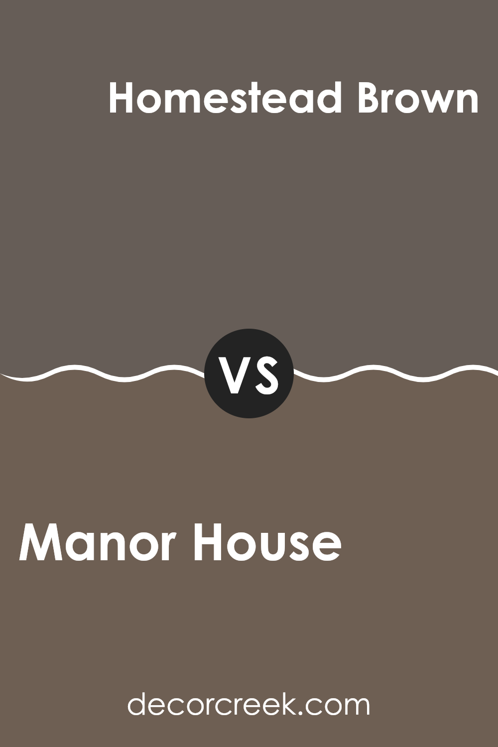
Manor House SW 7505 by Sherwin Williams vs Homestead Brown SW 7515 by Sherwin Williams
Manor House and Homestead Brown are two distinct colors by Sherwin Williams that offer unique differences in their tones and feels. Manor House is a rich, deep gray with a subtle warm undertone, making it perfect for giving spaces a strong yet inviting atmosphere. It works well in various areas, adding a certain depth without overpowering the surroundings.
In contrast, Homestead Brown leans more towards a darker, chocolate brown. This color offers a cozy and comforting vibe, ideal for creating a welcoming and homey feel in any room. It is particularly suitable for areas where a sense of warmth and security is desired, like living rooms or bedrooms.
While both colors are dark, Manor House swings towards a cooler palette, and Homestead Brown moves towards a warmer one. Choosing between them would depend on the mood you want to set. Manor House could be suited for more formal, sleek areas, while Homestead Brown fits beautifully in casual, comfortable settings.
You can see recommended paint color below:
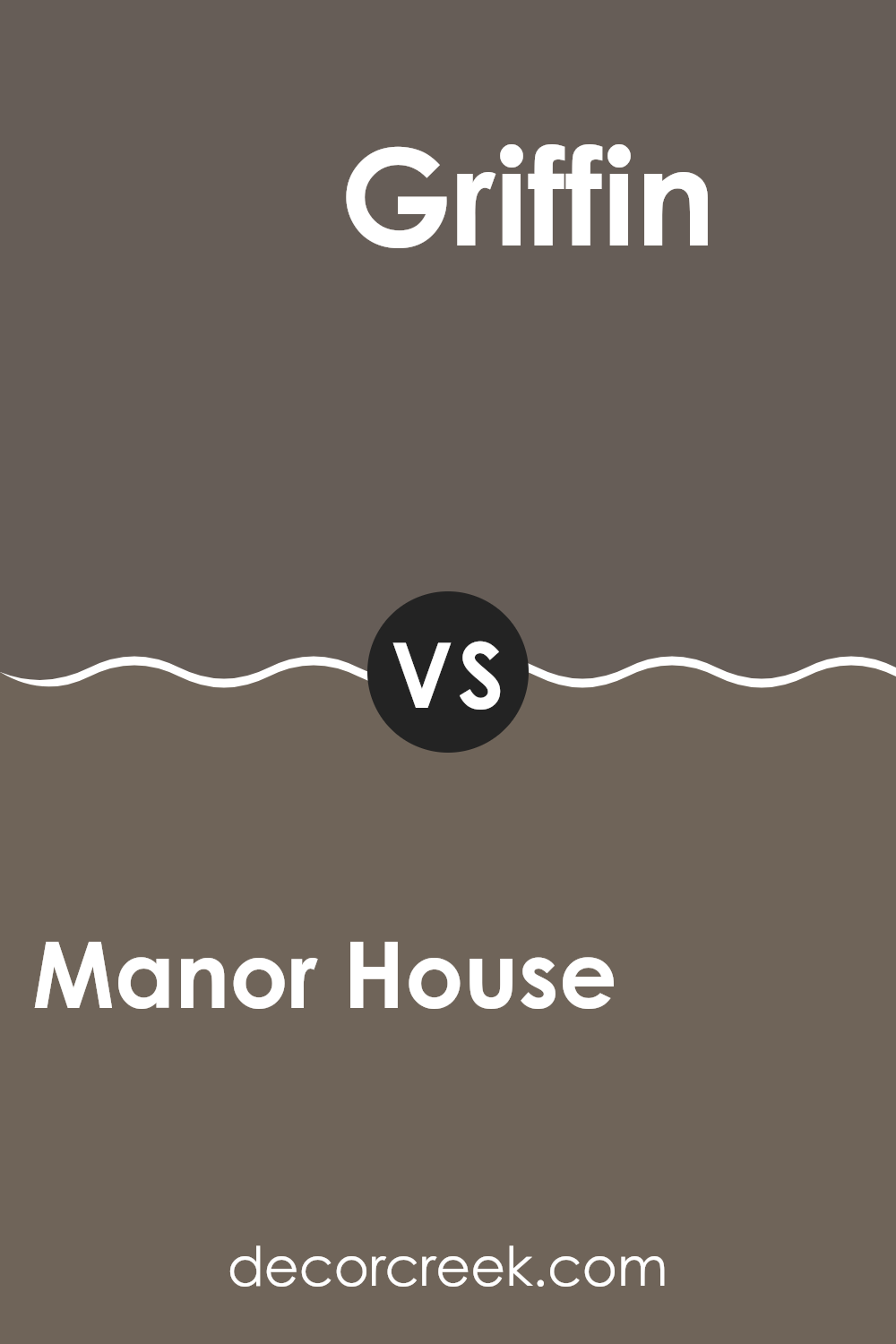
Manor House SW 7505 by Sherwin Williams vs Griffin SW 7026 by Sherwin Williams
Manor House and Griffin, both by Sherwin Williams, are two neutral tones that offer distinct vibes for any space. Manor House is a deeper beige, giving a warm and welcoming feel. It often works well in areas where you want a cozy, inviting atmosphere such as living rooms or bedrooms.
On the other hand, Griffin is a mid-tone gray that provides a modern and slightly more formal appearance. It’s a great choice for spaces that aim for a clean, contemporary look like kitchens or offices.
Both colors are versatile and can pair well with various decor styles, but Manor House leans towards a friendly, homely vibe, while Griffin offers a cooler, crisper ambiance that might suit more functional or minimalistic spaces. Whether you choose the warm depths of Manor House or the cooler tones of Griffin, each brings its unique feel to interiors.
You can see recommended paint color below:
- SW 7026 Griffin
Manor House SW 7505 by Sherwin Williams vs Folkstone SW 6005 by Sherwin Williams
Manor House and Folkstone by Sherwin Williams are both appealing shades of gray, but they each bring a different vibe to a space. Manor House is a warm, welcoming gray that adds a cozy and comforting atmosphere to any room. Its richness works well in a variety of settings, making it a versatile choice for living rooms or bedrooms.
On the other hand, Folkstone is a cooler gray that has a more modern and clean feel. It’s excellent for creating a sleek, contemporary look, often used in kitchens and bathrooms for that crisp and fresh appearance.
Both colors go well with various decor styles and can act as a neutral backdrop for brighter colors or as standalone hues for a muted palette. Your choice between these two would likely depend on the mood you’re trying to set in your space and the existing colors and materials in your home.
You can see recommended paint color below:
- SW 6005 Folkstone
Manor House SW 7505 by Sherwin Williams vs Stony Creek SW 9610 by Sherwin Williams
Manor House is a warm, inviting gray with a hint of brown, making it feel cozy and welcoming in many different spaces. It contrasts with Stony Creek, which leans more towards a dusty blue-gray, offering a cooler tone.
Manor House offers a neutral base, often used to create a homey, comforting atmosphere, suitable for living rooms or bedrooms. In contrast, Stony Creek, with its cooler blue undertones, is great for spaces where you want a fresh, clean look, like bathrooms or modern kitchens.
Both colors work well in various lighting, though Manor House tends to maintain its warmth, whereas Stony Creek can shift from a subtle blue to a more pronounced gray depending on the light. In decorating, Manor House pairs well with rich woods and warm colors, while Stony Creek is ideal with white trim and contemporary decor.
You can see recommended paint color below:
Manor House SW 7505 by Sherwin Williams vs Ironclad SW 9570 by Sherwin Williams
Manor House is a warm gray tone that’s gentle and easy on the eyes. It has a soft and welcoming vibe which makes it perfect for creating a cozy atmosphere in any room, particularly spaces like living rooms or bedrooms where a touch of comfort is appreciated.
On the other hand, Ironclad is a much deeper, almost charcoal gray. This color is strong and pronounced, making it ideal for accent walls or furniture pieces. It adds a bold statement to a space without overwhelming it, standing out well against lighter tones in a room.
When comparing the two, Manor House brings a lighter and airier feel, which can help small spaces appear larger. Ironclad, being darker, can make a dramatic impact and works best when used sparingly or in larger, well-lit areas to avoid making the space feel too closed in. Both colors work well in modern decor schemes and can be beautifully paired with a variety of other shades.
You can see recommended paint color below:
- SW 9570 Ironclad
Manor House SW 7505 by Sherwin Williams vs Limestone SW 9599 by Sherwin Williams
Manor House and Limestone by Sherwin Williams are two distinct hues that can change the mood of a space. Manor House is a rich, deep gray that adds a strong presence to a room. It’s perfect for creating a feeling of stability and grounding. In contrast, Limestone is a much lighter gray that has a soft and subtle vibe. It’s great for making a space feel open and airy.
While Manor House works well in areas where you want a sense of coziness and comfort, like living rooms or studies, Limestone is ideal for spaces that aim to feel more relaxed and refreshing, such as bathrooms or small kitchens.
The choice between the two depends on the kind of atmosphere you’re looking to create. Whether you go for the boldness of Manor House or the lightness of Limestone, both colors offer a fresh and modern twist to any decor.
You can see recommended paint color below:
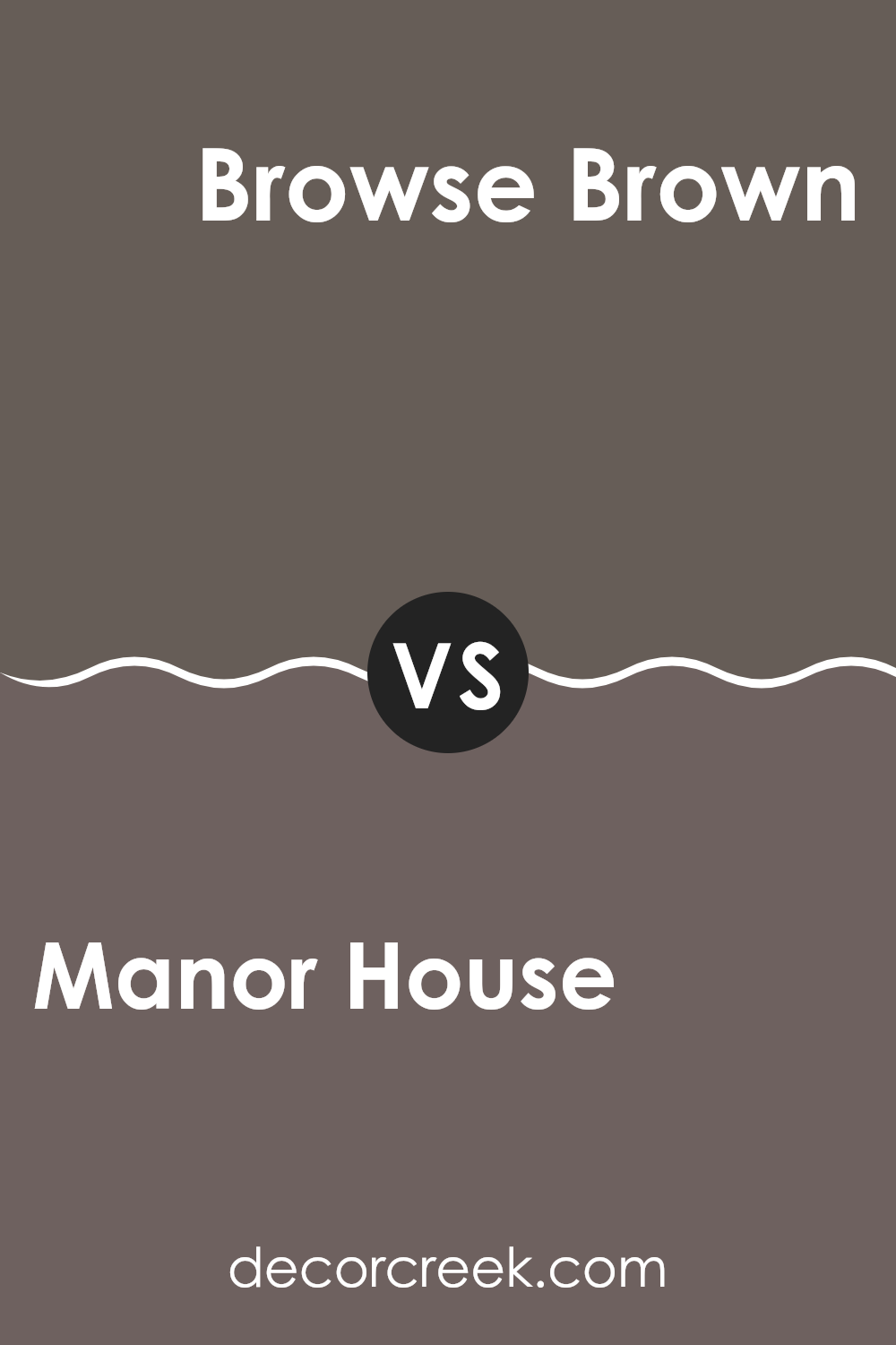
Manor House SW 7505 by Sherwin Williams vs Browse Brown SW 6012 by Sherwin Williams
Manor House is a warm, deep gray with subtle brown undertones. This color is versatile, offering a cozy yet polished look that works well in both modern and traditional spaces. It leans more towards a neutral palette, making it easy to pair with a wide range of decor styles and colors.
Browse Brown, on the other hand, is a richer, more robust brown. It has a distinctively darker and more pronounced presence compared to Manor House. Browse Brown mimics the look of dark chocolate, providing a strong but inviting atmosphere. This color is ideal for areas where a more dramatic, cozy feel is desired.
While both colors share a warmth that can make a space feel welcoming, Manor House is lighter, making it better suited for smaller or less brightly lit spaces to prevent them from feeling cramped. Browse Brown, being darker, is perfect for larger spaces or as an accent wall, where it won’t overwhelm the room.
You can see recommended paint color below:
- SW 6012 Browse Brown
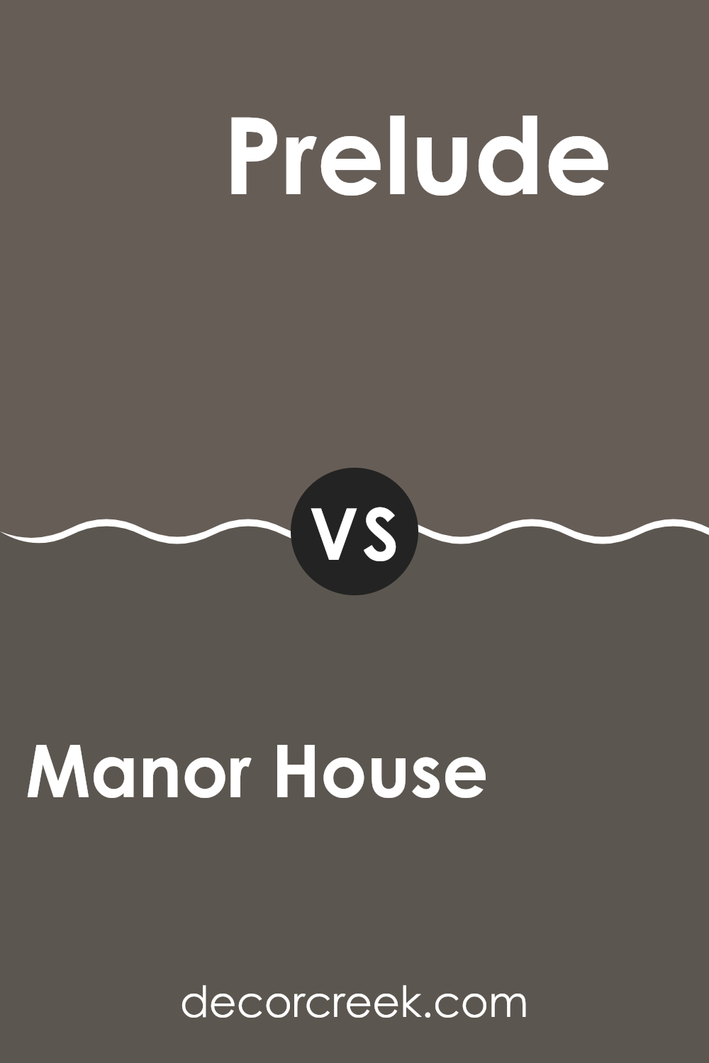
Manor House SW 7505 by Sherwin Williams vs Prelude SW 9620 by Sherwin Williams
Manor House and Prelude are both colors by Sherwin Williams that offer unique tones for different atmospheres. Manor House is a rich, warm gray that conveys a sense of sturdiness and traditional elegance. This color works well in spaces where a grounded, comforting feel is desired, like living rooms or bedrooms. Its depth makes it a great choice for creating a cozy environment.
On the other hand, Prelude is a lighter and cooler violet-gray hue. It brings a fresher, more airy feel to a space, making it ideal for areas that you want to feel open and light, such as bathrooms or small kitchens. Prelude’s subtle violet undertones provide a gentle hint of color without overwhelming the space.
When used together, these two colors can balance each other beautifully. Manor House serves as a solid, warm base, while Prelude adds a touch of lightness and modern flair, creating a pleasant contrast that can enhance the whole look of a home.
You can see recommended paint color below:
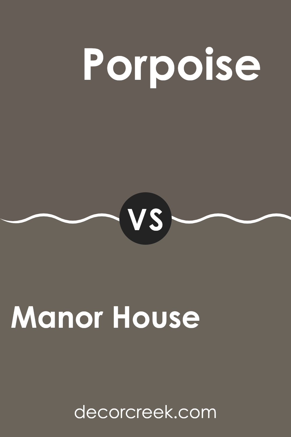
Manor House SW 7505 by Sherwin Williams vs Porpoise SW 7047 by Sherwin Williams
Manor House and Porpoise are two distinct shades from Sherwin Williams. Manor House is a warm, welcoming grey that leans towards a beige undertone, making it a perfect neutral choice for any living space. This color is ideal for someone looking to create a cozy and inviting atmosphere. It pairs well with both bright and deep hues, allowing for versatility in decor styles.
On the other hand, Porpoise is a cooler shade, offering a darker, more intense grey that has notes of blue. This makes it excellent for adding a bit of drama and depth to a room. Porpoise works well in spaces that benefit from a stronger, more striking color presence, like accent walls or cabinetry.
Overall, the biggest difference lies in the temperature and depth of the colors—Manor House brings warmth and softness, while Porpoise offers a more robust and cool tone. Both colors are flexible in their own right, making them great candidates for various design schemes.
You can see recommended paint color below:
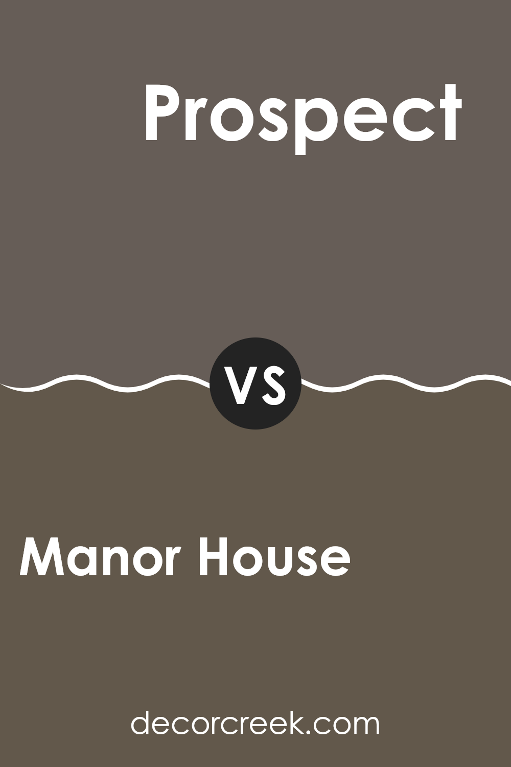
Manor House SW 7505 by Sherwin Williams vs Prospect SW 9615 by Sherwin Williams
The primary color, Manor House, and the secondary color, Prospect, both offered by Sherwin Williams, have distinct tones that serve different design needs. Manor House is a warm, creamy beige that gives off a cozy and inviting feel, perfect for living areas or bedrooms where comfort is key. It’s a versatile color that pairs well with many different decor styles and colors, offering a neutral background that allows furniture and artwork to really stand out.
On the other hand, Prospect is a darker, more assertive gray with hints of blue undertones. This color is excellent for creating a striking impression in a space, suitable for modern and minimalist themes. It works well in a study or dining room, where its bolder character can complement metallic fixtures or white trim for a crisp, contrasting look.
The choice between these two depends largely on the mood one wishes to set in a room—Manor House for a soft, warm ambiance, and Prospect for a more dramatic and strong presence.
You can see recommended paint color below:
Conclusion
After spending some time talking about SW 7505 Manor House by Sherwin Williams, I’ve come to appreciate how special this paint color really is. The color, Manor House, is like a shade of gray with a hint of something warm, making it feel welcoming, not too dark or too light. It’s a perfect color if you want to make a room look good and cozy, like a friendly hug when you enter. This color seems to work well in just about any room, from kitchens to bedrooms, because it matches so well with different decorations and other colors.
I found out that Manor House isn’t just nice to look at; it also helps make a space feel put-together. It’s great for families because it’s good at hiding small marks or dirt, which means the walls look good longer. When people visit, they always say how nice it looks, which makes me feel proud of my home.
In the end, I think SW 7505 Manor House by Sherwin Williams is a fantastic choice if you’re thinking about a new color for your home. It’s not just a paint color; it’s a way to make your home look and feel nicer.
So, if you’re getting bored with your old colors, Manor House might be just what you need to freshen things up!

Ever wished paint sampling was as easy as sticking a sticker? Guess what? Now it is! Discover Samplize's unique Peel & Stick samples.
Get paint samples

