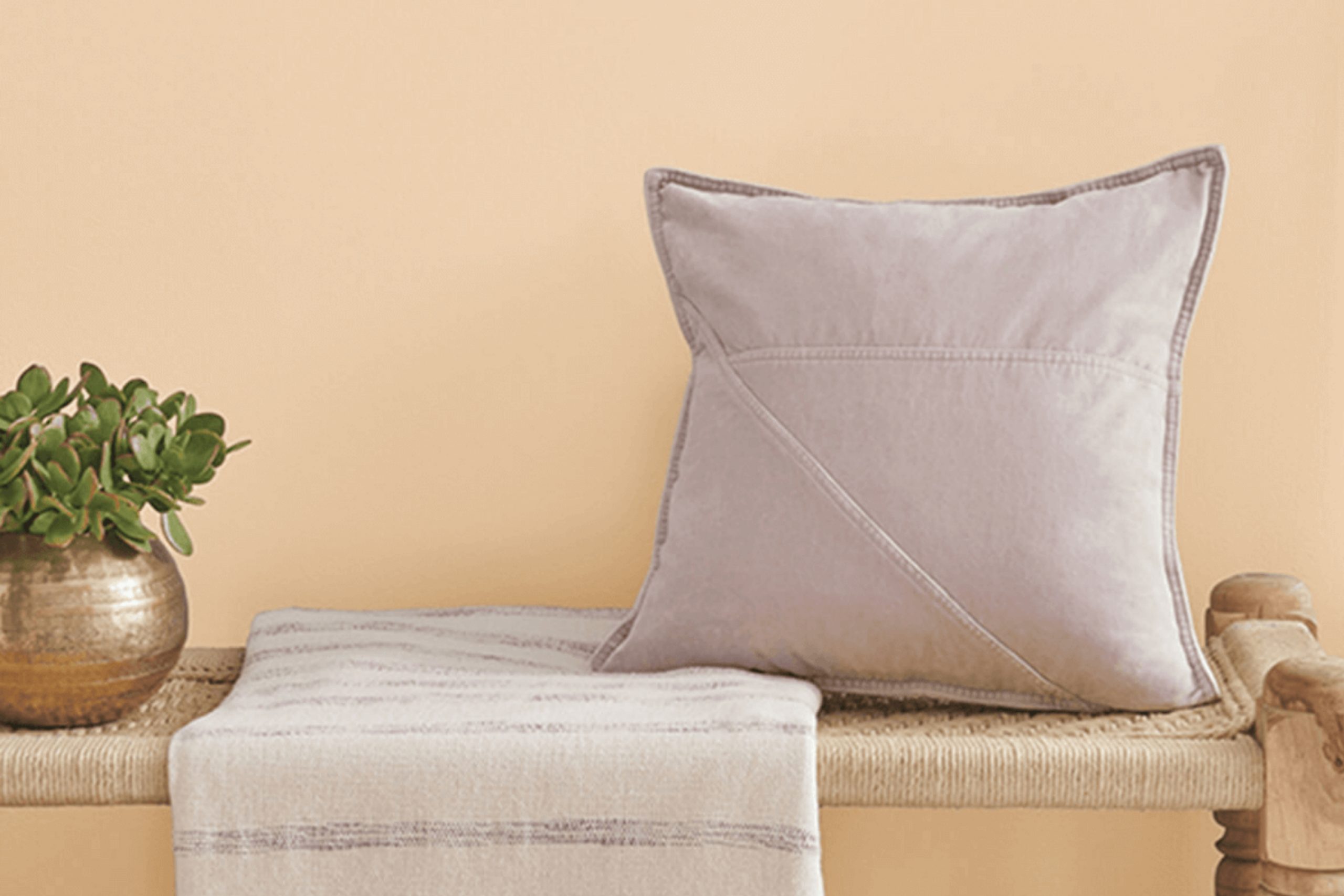
When looking for a new color to freshen up your space, you might want to consider SW 0028 Caen Stone by Sherwin Williams. Living with walls painted in Caen Stone affects the way your room holds light, giving it a warm and inviting glow that subtly enhances my mood throughout the day.
In trying out this shade, you’ll find it has a natural versatility, pairing well with various decor styles, from rustic to modern. Its unique tone, a blend of beige and gray, makes it a perfect neutral backdrop while still adding character and warmth. Whether you’re updating your living room, bedroom, or even your kitchen, Caen Stone offers a fresh look without overpowering your existing furnishings and accents.
Through painting with Caen Stone, I noticed how it complements wood tones and textiles, enriching the space rather than clashing or fading into the background.
If you’re considering a change and seeking a color that balances warmth with neutrality, give Caen Stone a chance to transform your home with its subtle but impactful charm.
What Color Is Caen Stone SW 0028 by Sherwin Williams?
Caen Stone by Sherwin Williams is a warm, creamy beige that provides a cozy and inviting atmosphere to any room. This color has soft yellow undertones that bring a subtle brightness, making it ideal for spaces that need a touch of warmth without overwhelming brightness. It is versatile enough to work in various interior styles, from traditional to modern and even rustic farmhouse.
This neutral shade pairs excellently with natural materials like wood, helping to accentuate its rich grains and textures. Whether with polished dark walnut furniture or lighter oak floors, Caen Stone serves as a harmonious backdrop. It also complements stone elements, such as marble countertops or a stacked stone fireplace, adding to the room’s overall warmth.
When it comes to fabrics, Caen Stone goes well with textured linens, soft cotton, or even wool, contributing to a cozy and comfortable living environment. This color supports an atmosphere perfect for relaxation and casual living.
For those looking to create a balanced and welcoming space, Caen Stone is a reliable pick. It works beautifully in living rooms, kitchens, and bedrooms, providing a soft but substantial foundation that welcomes various decor styles and personal accents, making any space feel like home.
Is Caen Stone SW 0028 by Sherwin Williams Warm or Cool color?
Caen Stone SW 0028 by Sherwin Williams is a warm beige hue that brings a cozy feel to any room. This color is light enough to make small spaces appear larger but has enough richness not to feel cold or sterile.
It’s excellent for living areas or bedrooms where you want a comforting atmosphere. It teams well with both light and dark furniture, allowing for versatile design choices. This shade also works great as a base, letting brighter colors like blues or greens stand out without overwhelming the space.
Because of its neutral nature, it adapts well to various lighting conditions, maintaining its warmth under artificial light or reflecting a soft glow by daylight. It’s perfect for those looking for a color that makes their home feel welcoming and cozy without being too bold or dramatic.
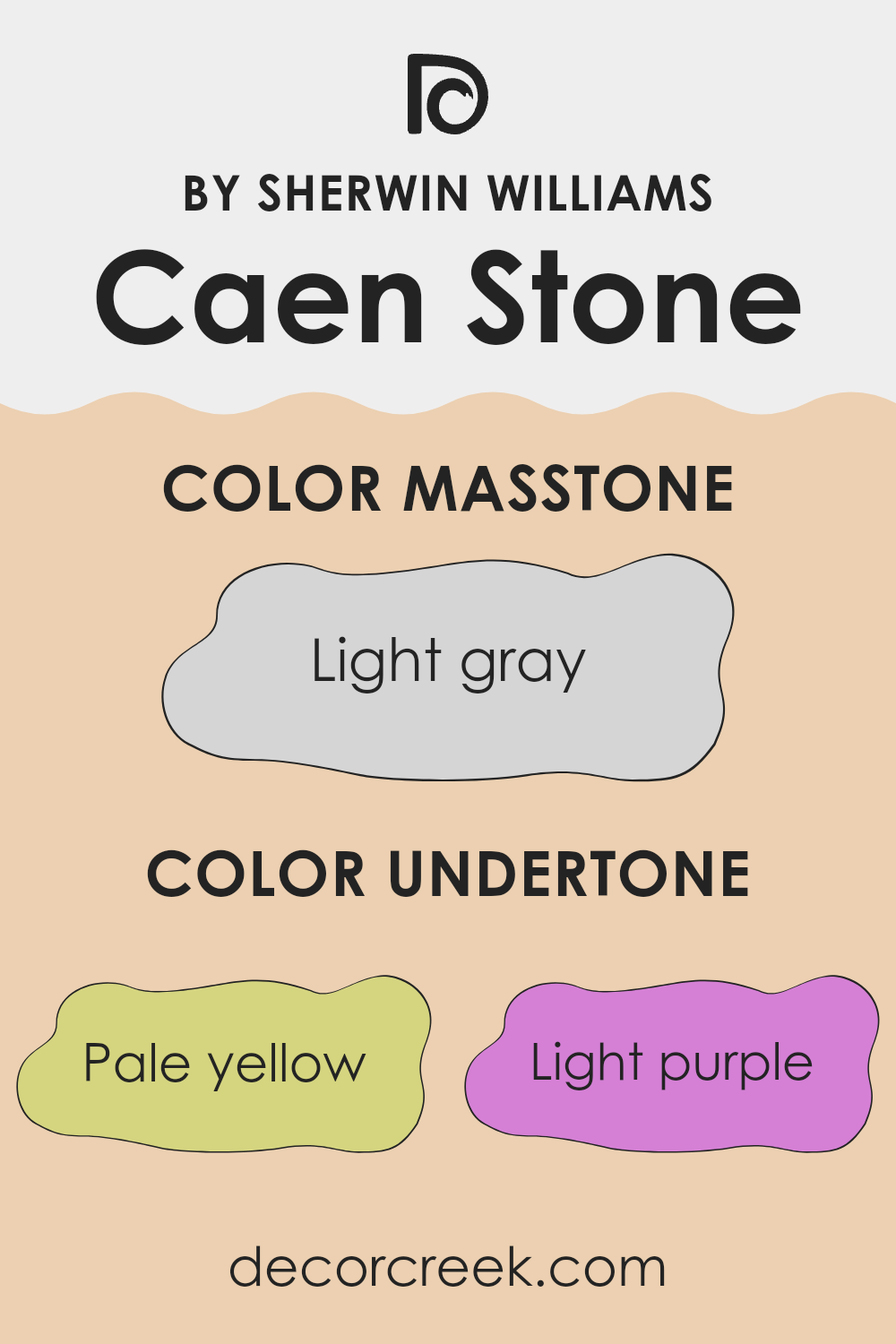
Undertones of Caen Stone SW 0028 by Sherwin Williams
Caen Stone is a nuanced paint color that displays a spectrum of subtle undertones, making it a versatile choice for interior walls. Undertones are the muted colors that lurk beneath the primary surface color and play a crucial role in shaping our perception of the color. They can influence how a paint color looks in different lighting conditions and can either warm up or cool down the room depending on their hue.
The undertones in Caen Stone include pale yellow, light purple, pale pink, light blue, mint, lilac, and grey. These hues contribute to the complexity of the color, allowing it to adapt to a variety of decors and themes. For example, pale yellow and mint undertones add a hint of freshness and brighten the space, making the room feel more inviting.
On the other hand, the presence of lilac and light blue can provide a subtle coolness that soothes the eye, which is ideal for creating a calm environment. Grey undertones help in grounding the color, ensuring that it doesn’t feel too vibrant and remains muted, making it suitable for large areas like living room walls.
The interplay of these undertones in Caen Stone means that it can appear differently when paired with various furnishings or when viewed in natural versus artificial light. This chameleon-like trait allows it to blend harmoniously with an array of interior styles, from modern minimalist to cozy farmhouse.
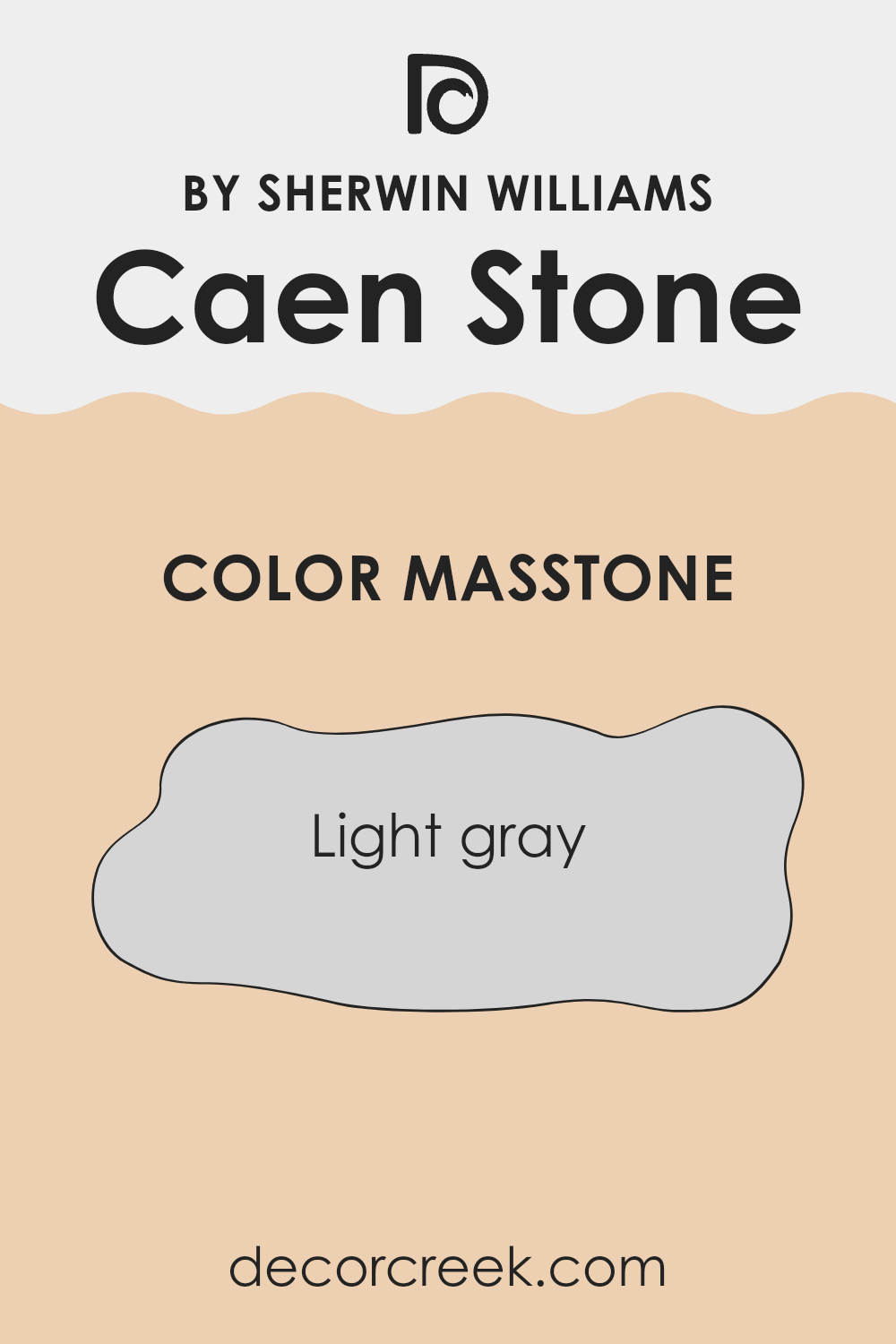
What is the Masstone of the Caen Stone SW 0028 by Sherwin Williams?
Caen Stone SW 0028 by Sherwin Williams is a welcoming light gray color that brings a clean and straightforward look to any room. With its masstone being a soft shade of light gray (#D5D5D5), it provides a neutral backdrop that is highly versatile.
This color is particularly good in homes because it blends well with different types of decor, from modern to traditional. Light gray like Caen Stone works well in spaces that have limited natural light or are smaller in size, as it can help make these areas appear brighter and more open.
It’s also an excellent choice for rooms where relaxation is key—like bedrooms and living rooms—since the light gray hue has a calm and gentle effect. Additionally, this neutral shade is easy to match with vibrant accents like cushions, artwork, or rugs, which allows for personal touches in the decoration without overwhelming the space.
How Does Lighting Affect Caen Stone SW 0028 by Sherwin Williams?
Lighting plays a crucial role in how we perceive colors. Different types of light bring out different tones in a paint color, affecting mood and ambiance in a space. One example of how lighting can affect paint is Sherwin Williams’ shade “Caen Stone.”
In natural light, colors can appear truer to their intended hue, but this varies depending on the time of day. “Caen Stone” tends to look warm and more vibrant under natural sunlight.
In artificial light, however, the type of bulb can change how a color is seen.
Incandescent bulbs, which produce a warm glow, enhance the golden and yellow tones in “Caen Stone,” making it appear cozier. Fluorescent lighting, on the other hand, might bring out cooler tones in the same color, thereby making it look slightly duller or more grey.
The orientation of a room also affects the appearance of colors. North-facing rooms tend to get less direct sunlight, which can make a color like “Caen Stone” appear more muted and softer, enhancing its earthy qualities. South-facing rooms receive a high amount of natural light most of the day, which can make “Caen Stone” warm and vibrant, truly popping against the backdrop of sunlight.
In east-facing rooms, the morning light can make “Caen Stone” appear very bright and cheerful but might feel slightly cooler in the evening as natural light fades. West-facing rooms enjoy evening light, where “Caen Stone” will look warmer and more welcoming towards the end of the day when bathed in the soft, orange hues of the setting sun.
Understanding these nuances helps in making informed decisions about paint color based on room orientation and lighting conditions to achieve the desired effect in a space.
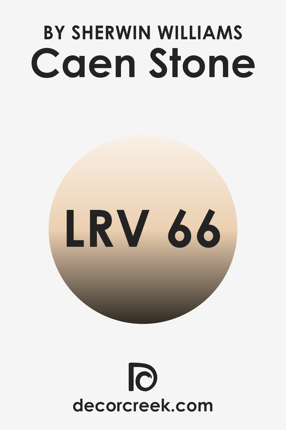
What is the LRV of Caen Stone SW 0028 by Sherwin Williams?
LRV stands for Light Reflectance Value, which is a measure of how much light a paint color reflects or absorbs when it’s applied to a wall. This value is given as a percentage, and the higher the number, the more light that color reflects.
Essentially, light colors have high LRVs and make rooms feel brighter because they reflect more light back into the space. Dark colors have low LRVs and can make rooms feel cozier or smaller because they absorb more light.
With an LRV of 66.382, Caen Stone by Sherwin Williams is a fairly light color that would be good for spaces where you want to create a bright and open feel. It reflects a good amount of light, which can help make a small room look larger or a dark room appear brighter. The light reflectance of this particular shade makes it versatile for use in various areas of a home or office, adapting well to different levels of natural and artificial lighting.
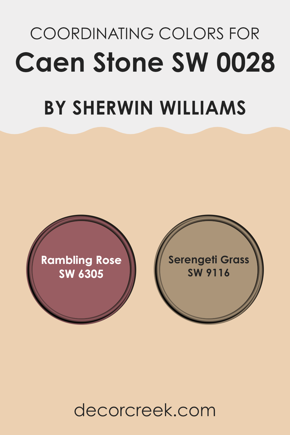
Coordinating Colors of Caen Stone SW 0028 by Sherwin Williams
Coordinating colors are shades that complement a primary color, enhancing its visual appeal and setting a specific mood or tone in a space. For instance, if you’re working with a base color like Caen Stone by Sherwin Williams, selecting the right coordinating colors can create a harmonious and pleasing color scheme for any room. Two excellent coordinating colors for Caen Stone are Rambling Rose and Serengeti Grass by Sherwin Williams.
Rambling Rose is a soft, muted shade of pink with warm undertones that adds a gentle, welcoming feel to a room. It pairs beautifully with the earthy tones of Caen Stone, offering a natural and subtle contrast that warms up the space without overwhelming it. On the other hand, Serengeti Grass is a soothing green that suggests the lushness of natural landscapes.
This color works well with Caen Stone to provide a refreshing and calming effect, ideal for creating a relaxed atmosphere in your home. Both Rambling Rose and Serengeti Grass not only complement Caen Stone but also help in achieving a cohesive look that ties together the elements of a room beautifully.
You can see recommended paint colors below:
- SW 6305 Rambling Rose
- SW 9116 Serengeti Grass
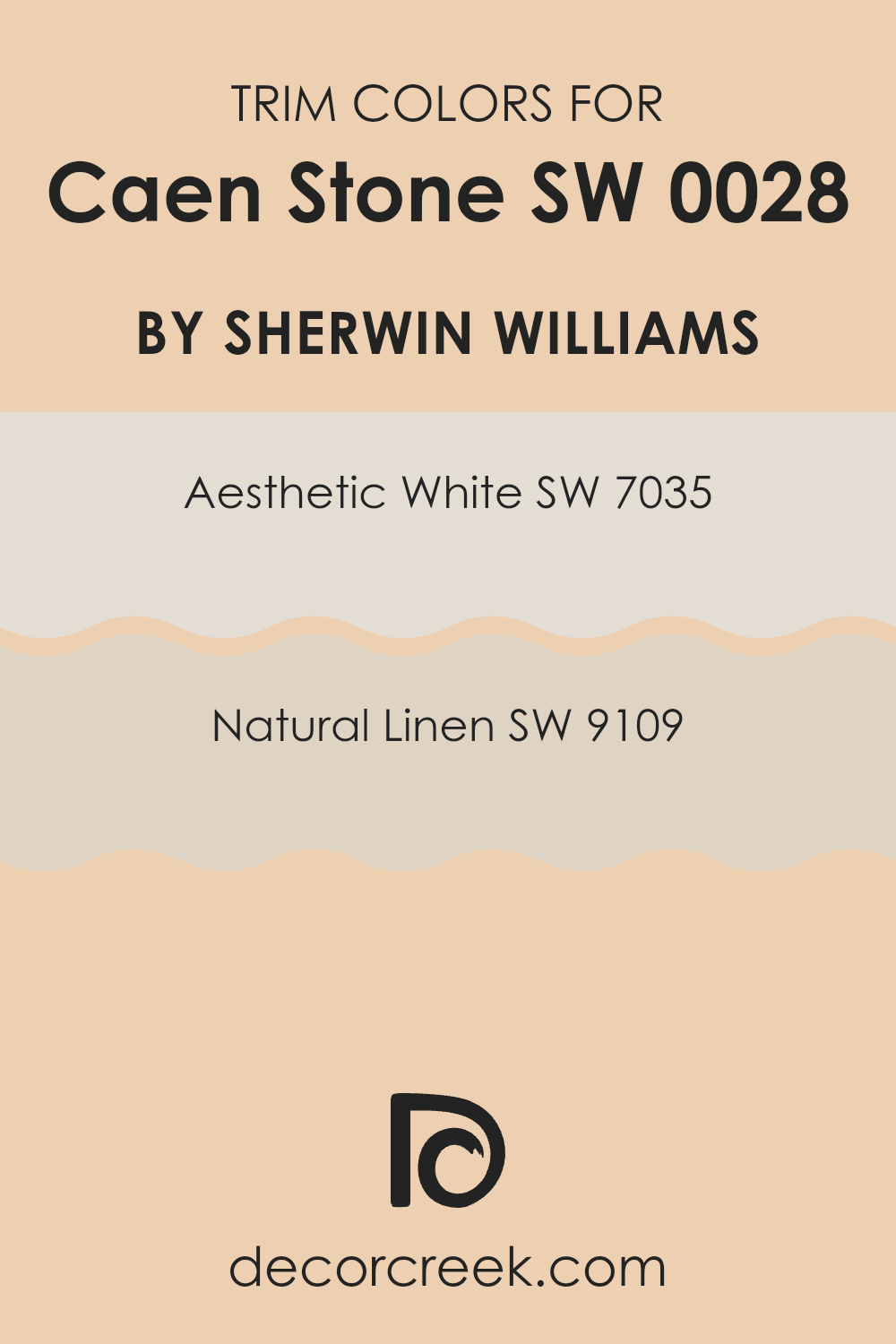
What are the Trim colors of Caen Stone SW 0028 by Sherwin Williams?
Trim colors are vital in interior design as they help define the borders between different areas, creating a clean, finished look that enhances the overall aesthetic of a room. By choosing contrasting trim colors, you can accentuate architectural features and outline spaces effectively.
Using colors like Aesthetic White and Natural Linen as trim paints, specifically with a base such as Caen Stone by Sherwin Williams, establishes a subtle yet impactful visual contrast which can make the main color stand out more clearly, giving the room a more defined look.
Aesthetic White SW 7035 is a soft white shade that offers a hint of warmth, making it a versatile option for trim that works well with the neutral, warm tones of Caen Stone. It adds a gentle contrast without overwhelming the primary color.
On the other hand, Natural Linen SW 9109 has a more pronounced beige tone, providing a slightly stronger contrast to Caen Stone, yet still maintaining a harmonious color palette. This color is perfect for creating a cozy, inviting feel while still keeping the look clean and organized.
You can see recommended paint colors below:
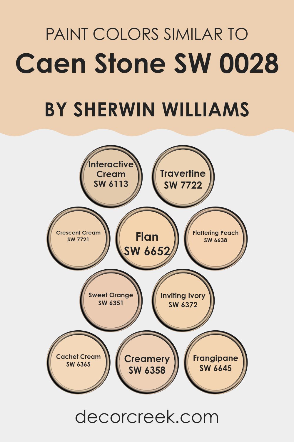
Colors Similar to Caen Stone SW 0028 by Sherwin Williams
Similar colors play a crucial role in interior design by creating a harmonious environment and ensuring visual coherence in a space. When colors share a similar hue or tone, they naturally complement each other, resulting in a cohesive look. This can make a room feel more put together and aesthetically pleasing.
Colors like Interactive Cream and Travertine are great examples, with Interactive Cream offering a light, warm beige that effortlessly pairs with Travertine’s slightly deeper, muted yellow. This kind of pairing helps in achieving a gentle transition between colors in a room, reducing stark contrasts and promoting a more unified appearance.
Furthermore, shades such as Crescent Cream and Flan add subtle variations without clashing, thanks to their creamy, soft backgrounds. Crescent Cream brings a delicate buttery warmth, while Flan goes a tad richer, almost mimicking a soft caramel, enriching spaces without overwhelming them.
Similarly, Flattering Peach and Sweet Orange introduce a soft glow with their peachy and light citrus notes, respectively, ideal for adding a touch of freshness. Inviting Ivory, Cachet Cream, and Creamery continue this trend, providing variations from soft ivory to a richer, more pronounced cream.
These tones are particularly useful for creating a layered look that retains a unified theme throughout various elements like walls and furnishings. Finally, Frangipane finishes off with its cheerful and light, yet rich tone, offering an almost floral-like warmth to any room it adorns. By employing these similar colors, one can achieve a refined and inviting atmosphere that feels coordinated and thoughtfully designed.
You can see recommended paint colors below:
- SW 6113 Interactive Cream
- SW 7722 Travertine
- SW 7721 Crescent Cream
- SW 6652 Flan
- SW 6638 Flattering Peach
- SW 6351 Sweet Orange
- SW 6372 Inviting Ivory
- SW 6365 Cachet Cream
- SW 6358 Creamery
- SW 6645 Frangipane
How to Use Caen Stone SW 0028 by Sherwin Williams In Your Home?
Caen Stone SW 0028 from Sherwin Williams is a warm, inviting paint color that brings a cozy feel to any space. With its neutral undertones, it works well in a variety of settings, like living rooms, bedrooms, or kitchens.
This color pairs beautifully with both bright and dark furniture, allowing you to mix and match as you like. For a balanced look, combine it with soft whites or bold accent colors such as navy or emerald green. This paint is also great for smaller spaces like bathrooms or hallways, as it can make them seem brighter and more open.
If you’re looking to freshen up your home without making drastic changes, adding this shade to your walls might be the simple solution you need. It’s easy to apply and can quickly update the look of any room. Whether you’re painting a whole room or just an accent wall, Caen Stone offers a fresh, pleasing backdrop that makes your home feel welcoming.
Caen Stone SW 0028 by Sherwin Williams vs Inviting Ivory SW 6372 by Sherwin Williams
Caen Stone and Inviting Ivory by Sherwin Williams are both warm and welcoming colors, but they have distinct tones that set them apart. Caen Stone has a deep, earthy beige tone that gives a room a solid, grounded feel.
It pairs well with a variety of decor styles, adding a touch of warmth without overwhelming the space. On the other hand, Inviting Ivory has a much lighter, creamy shade. This color brightens up a space more visibly and creates a soft, cozy atmosphere. It’s perfect for making small rooms appear larger and more open.
While both colors can work beautifully in many settings, Caen Stone offers a more muted, subtle backdrop, whereas Inviting Ivory serves as a gentle highlight, bringing a lighter, airy feel to the environment. Together, they can create a layered aesthetic that is both warm and inviting.
You can see recommended paint color below:
- SW 6372 Inviting Ivory
Caen Stone SW 0028 by Sherwin Williams vs Sweet Orange SW 6351 by Sherwin Williams
Caen Stone is a subtle and soft shade of beige with a hint of yellow. It’s a neutral color that offers a lot of versatility when decorating. It can work well in almost any space as it provides a calming backdrop that pairs easily with different furniture styles and other colors.
On the other hand, Sweet Orange is a vibrant and cheerful orange color. It brings a lot of energy and brightness to a room, making it perfect for spaces where you want to add some liveliness, like a kitchen or a playroom.
While both colors come from the same manufacturer, they serve very different purposes in interior design. Caen Stone is more understated and can help other elements in the room stand out, whereas Sweet Orange is likely to become the focal point in a space because of its boldness. These colors could be used together for a balanced look with Caen Stone toning down the intensity of Sweet Orange.
You can see recommended paint color below:
- SW 6351 Sweet Orange
Caen Stone SW 0028 by Sherwin Williams vs Creamery SW 6358 by Sherwin Williams
Caen Stone and Creamery by Sherwin Williams are two distinct yet complementary paint colors that you might consider for home interiors or exteriors. Caen Stone has more of a warm beige tone, giving it a classic and inviting appearance.
It’s perfect if you’re going for a neutral look that feels cozy. On the other hand, Creamery is paler, leaning towards a soft, creamy yellow. This color is brighter compared to Caen Stone and can make spaces appear more open and airy. If you’re aiming to add a little more light and a subtle hint of color to a room without overwhelming it, Creamery might be the way to go.
Both colors work beautifully together, with Caen Stone offering a grounding, earthy base and Creamery bringing in a touch of lightness. This pairing could work well in a living space where balance and warmth are desired.
You can see recommended paint color below:
- SW 6358 Creamery
Caen Stone SW 0028 by Sherwin Williams vs Frangipane SW 6645 by Sherwin Williams
Caen Stone is a subtle, warm beige shade that gives a soft, inviting feel to a room. This color is versatile and pairs well with a variety of decor styles, making it a solid choice for nearly any space. It’s particularly effective in areas where you want a neutral backdrop that still offers a hint of warmth.
On the other hand, Frangipane is a brighter, more vivid yellow. It adds cheer and brightness to a space, making it perfect for kitchens, bathrooms, or any area that benefits from a sunny lift. This color stands out more than Caen Stone and is great for creating a focal point or adding a pop of color.
Both colors work well together, with Frangipane offering a lively contrast to the more muted Caen Stone. Whether you’re looking to create a subtle foundation with occasional bursts of brightness or a generally cheerful atmosphere, these colors can be combined effectively.
You can see recommended paint color below:
- SW 6645 Frangipane
Caen Stone SW 0028 by Sherwin Williams vs Flattering Peach SW 6638 by Sherwin Williams
Caen Stone and Flattering Peach, both by Sherwin Williams, offer distinct visual experiences. Caen Stone is a warm, light tan that brings a cozy, earthy feel to any space. This subtle hue is versatile and pairs well with many decor styles, working beautifully in areas where you want a neutral backdrop that still offers some warmth.
In contrast, Flattering Peach is a vibrant, cheerful peach tone that immediately brightens up a room. It’s much bolder than Caen Stone, adding a splash of color that is playful and inviting. Ideal for spaces where you want to inject personality and energy, it works well in kitchens, dining areas, or any space that benefits from a touch of warmth.
Together, these colors can create a balanced look if used thoughtfully. Caen Stone can serve as a calming foundation, while accents in Flattering Peach can add focal points and interest to the design.
You can see recommended paint color below:
- SW 6638 Flattering Peach
Caen Stone SW 0028 by Sherwin Williams vs Travertine SW 7722 by Sherwin Williams
Caen Stone and Travertine by Sherwin Williams are two distinct yet visually warm hues, each offering a different vibe for interior spaces. Caen Stone is a gentle tan with subtle yellow undertones, giving a light, airy feeling to rooms.
It’s perfect for creating a cozy, welcoming atmosphere without overpowering the space. On the other hand, Travertine leans towards a deeper, richer greenish-gray, providing a more grounded and earthy feel. This color is excellent for those looking to add a touch of nature-inspired calm to their environment.
Both colors work wonderfully in spaces that aim for a natural aesthetic, but while Caen Stone reflects more light and creates an illusion of a more spacious area, Travertine offers a sense of depth and solidity. When choosing between the two, consider the mood and functional aspects of the room.
You can see recommended paint color below:
Caen Stone SW 0028 by Sherwin Williams vs Crescent Cream SW 7721 by Sherwin Williams
Caen Stone and Crescent Cream, both by Sherwin Williams, are two subtle yet distinct hues that can create different moods in a space. Caen Stone is a deep, warm beige that almost approaches the richness of a light brown. This color exudes a cozy and inviting feel, making it an excellent choice for living rooms or study areas where warmth is key.
Crescent Cream, on the other hand, is a lighter, softer cream color. It is much paler compared to Caen Stone and offers a fresh and clean look. This makes Crescent Cream a great option for spaces that aim to feel airy and bright, such as kitchens and bathrooms.
While both colors promote a warm atmosphere, Caen Stone’s deeper tone provides a sturdy, grounded sensation, whereas Crescent Cream has a more uplifting and light effect. Choosing between them would depend on the kind of warmth and brightness one aims to achieve in the space.
You can see recommended paint color below:
- SW 7721 Crescent Cream
Caen Stone SW 0028 by Sherwin Williams vs Cachet Cream SW 6365 by Sherwin Williams
Caen Stone and Cachet Cream by Sherwin Williams offer subtle yet distinct tones for interior spaces. Caen Stone is a pale tan that resembles the natural hue of limestone, giving a soft, warm feel to any room.
It’s versatile and plays well with various decor styles, serving as a calm background that allows other elements to stand out. In contrast, Cachet Cream is a much lighter, creamy shade with a hint of yellow. It can brighten up spaces while providing a cozy, welcoming atmosphere.
Both colors provide excellent coverage and can be used in various settings, like living rooms, kitchens, or bedrooms. However, while Caen Stone brings a touch of earthiness, Cachet Cream leans towards creating a cheerful and airy environment. Choosing between them depends on the desired mood and the specific lighting of the room where they will be applied.
You can see recommended paint color below:
- SW 6365 Cachet Cream
Caen Stone SW 0028 by Sherwin Williams vs Flan SW 6652 by Sherwin Williams
Caen Stone and Flan, both from Sherwin Williams, are unique colors that offer different aesthetics for interior spaces. Caen Stone is a soft, muted yellow with a hint of beige, giving it a warm and subtle appearance. This color works well in spaces where a light, airy feel is desired, complementing natural light beautifully. It’s an excellent choice for living rooms or bedrooms where a calm, welcoming atmosphere is important.
On the other hand, Flan is a brighter and more vibrant shade. It leans towards a cheerful, sunlit yellow, bringing a lively and energetic vibe to any room. This color is perfect for kitchens, dining areas, or any space that benefits from a boost of brightness and positivity.
Overall, while Caen Stone offers a gentle and understated appeal, Flan stands out with its bright and energizing tone. Whether used together or separately, each color has its charm and creates its own unique environment.
You can see recommended paint color below:
- SW 6652 Flan
Caen Stone SW 0028 by Sherwin Williams vs Interactive Cream SW 6113 by Sherwin Williams
Caen Stone and Interactive Cream are two paint colors from Sherwin Williams that both offer a warm and welcoming feel but in different ways. Caen Stone is a gentle beige with subtle gray undertones, giving it a soft and versatile appearance. This color is great for spaces where you want a calm, cozy vibe without going too dark or too light.
On the other hand, Interactive Cream has a richer, more golden tone that brings a bit more warmth and brightness to a room. It’s a wonderful choice if you’re looking to create a cheerful and inviting atmosphere, as it casts a sunny glow that can make spaces feel more vibrant.
When comparing the two, Caen Stone leans more towards a neutral base, which may be easier to match with various decor styles and colors. Interactive Cream, with its creamier, more pronounced hue, might be better for those who prefer a bit more color and warmth on their walls. Both are great options depending on the mood and style you want to achieve in your space.
You can see recommended paint color below:
- SW 6113 Interactive Cream
Conclusion
Writing about SW 0028 Caen Stone by Sherwin Williams has been really interesting. This paint color is very special, it looks like the sandy beaches which makes any room feel warm and welcoming. When I tested it out, I noticed that it has a perfect balance, not too bright and not too dark, just right to make your room feel cozy.
I tried Caen Stone in different rooms to see how it looks with various lights. In bright sunlight, it made the room look lively, like a sunny day outside. With indoor lights, it kept its warm feel, making the evening feel snug and comfortable. This color goes well with lots of other colors too. You can pair it with dark blues, greens, or even grays and it still looks nice.
After talking about it with friends and seeing it in many rooms, I’d say Caen Stone is a great choice if you want to change any room in your home. It’s like picking the perfect background for all sorts of pictures, where everything else looks even better because of it. Whether you’re thinking about painting a new house or changing the look of your current one, this color could be just what you’re looking for.
Overall, SW 0028 Caen Stone by Sherwin Williams offers a warm, gentle color that makes any room feel happy and relaxing. It’s easy to see why it’s a favorite for many!
Ever wished paint sampling was as easy as sticking a sticker? Guess what? Now it is! Discover Samplize's unique Peel & Stick samples.
Get paint samples

