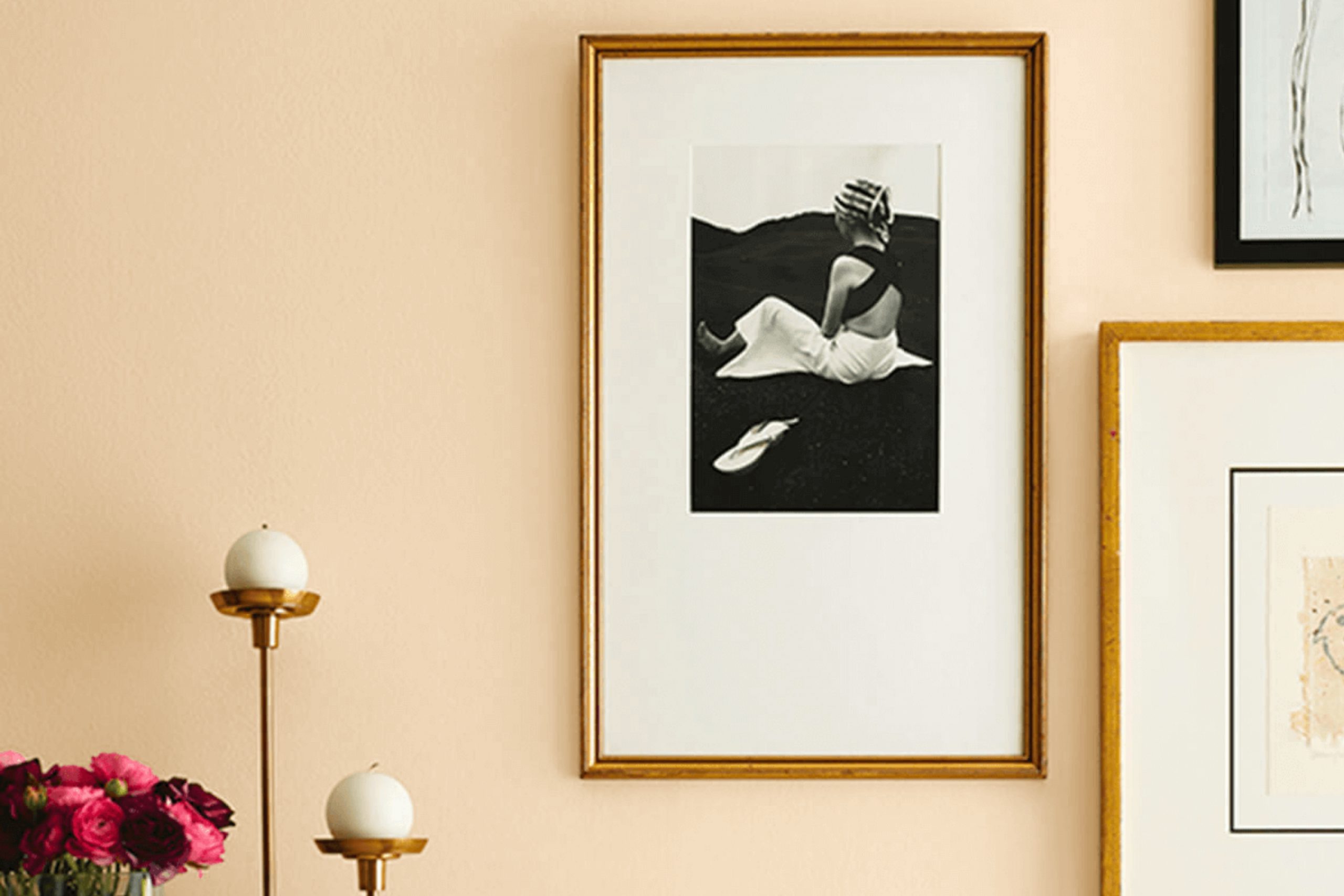
If you are considering giving your space a fresh, soothing update, SW 7722 Travertine by Sherwin Williams might be the perfect choice for you. This paint color offers a warm, neutral palette that mimics the soft tones of natural travertine stone, making it incredibly versatile for any room in your home.
Whether you’re aiming to refresh your living room, bedroom, or even your kitchen, Travertine provides a solid foundation for various decor styles, from modern minimalist to cozy country. I enjoy how this shade works beautifully with both natural light and artificial lighting, adapting subtly to different settings and enhancing your existing furnishings without overwhelming them.
Plus, it pairs effortlessly with a host of contrasting colors, allowing you to personalize your space with unique accent pieces.
If you’re looking for a color that provides a calm, inviting atmosphere with an organic touch, consider SW 7722 Travertine for your next project.
What Color Is Travertine SW 7722 by Sherwin Williams?
The color Travertine by Sherwin Williams is a muted, earthy beige that brings a warm and inviting ambiance to any space. With its understated elegance, this shade is a versatile choice for anyone looking to add a cozy yet stylish touch to their interiors. The neutral tone of Travertine makes it easy to blend with a variety of styles, particularly rustic, modern farmhouse, and traditional designs.
In terms of interior styles, this color works well in spaces that aim to feel warm and homey. It’s perfect for living rooms and bedrooms, where the goal is to create a comforting atmosphere. The shade is particularly effective in rooms that receive plenty of natural light, as it can enhance the sense of openness and warmth.
When it comes to pairing with materials and textures, Travertine is quite accommodating. It looks especially captivating when combined with natural wood, which can either be lightly varnished to maintain its raw appeal or stained to bring out darker hues that contrast subtly with the paint. Linen fabrics in soft creams and whites can also complement this color beautifully, adding to the overall softness and warmth of the room.
Furthermore, using stone elements like marble or granite offers a sleek contrast, adding a touch of natural texture that pairs well with the earthy tone of Travertine.
Is Travertine SW 7722 by Sherwin Williams Warm or Cool color?
Travertine by Sherwin Williams is a warm, gentle paint color that brings a cozy and inviting feel to any room. Its subtle beige tone works perfectly as a neutral backdrop, allowing other colors and decor elements to stand out. In living spaces, it pairs beautifully with rich woods, giving a rustic yet modern vibe. In bedrooms, its softness promotes a relaxing atmosphere, making it easy to unwind at the end of the day.
The lightness of Travertine makes small rooms appear larger and more open, which is especially useful in apartments or houses with limited space. It reflects light well, brightening up dark areas without being too stark or cold.
This color is versatile enough to work in various styles, from traditional to contemporary, and looks particularly good with blue, green, or gray accents. Overall, Travertine is a go-to choice for those looking to create a warm, welcoming home environment.
Undertones of Travertine SW 7722 by Sherwin Williams
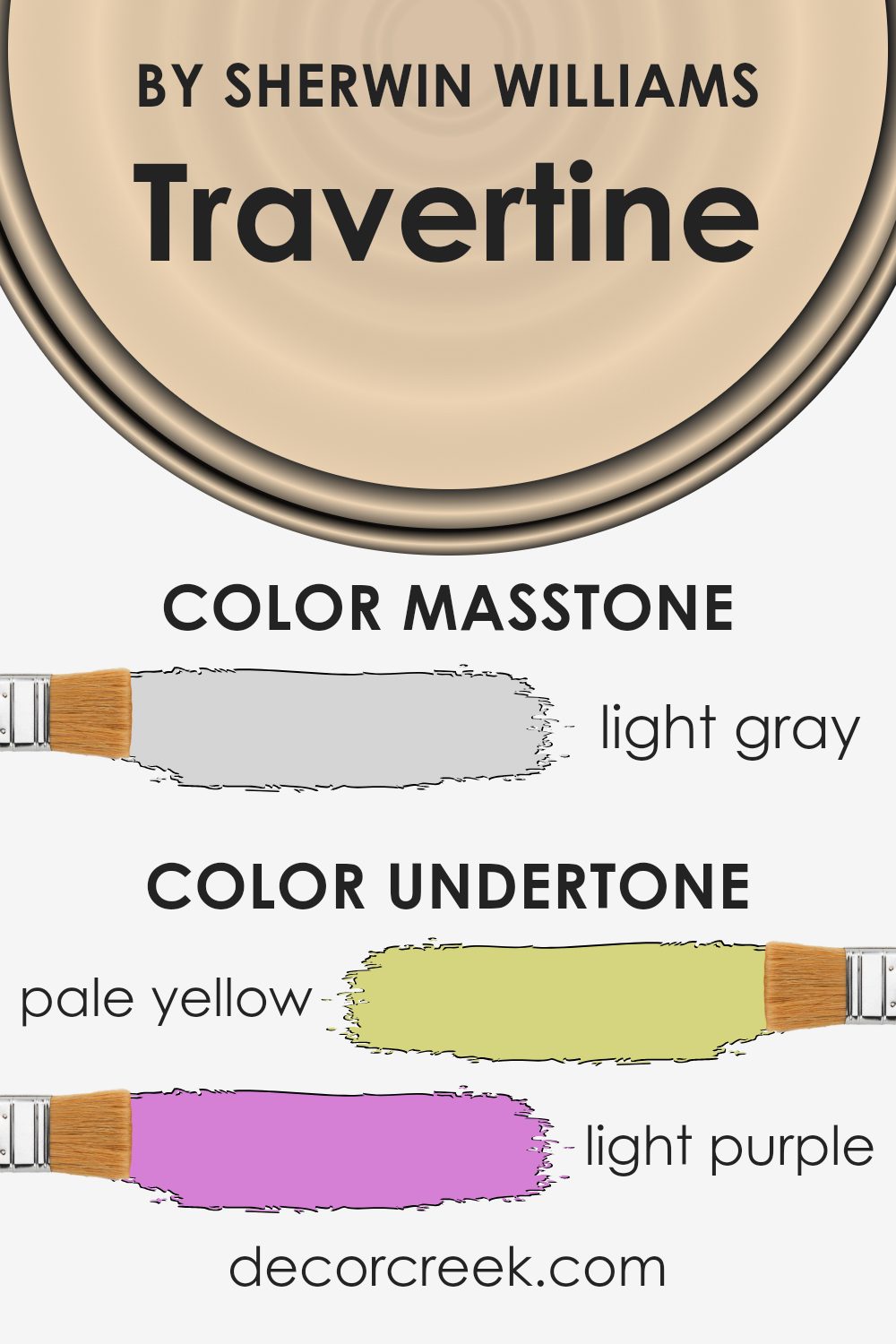
Travertine is a unique paint color, versatile due to its complex undertones. Undertones are subtle colors that influence the main hue. They can make a color appear cooler or warmer, depending on their shade, and affect how colors look under different lighting conditions. The undertones of a color like Travertine can significantly impact its appearance and mood.
Travertine has undertones of pale yellow, light purple, pale pink, light blue, mint, lilac, and grey. These undertones contribute to a muted yet varied palette, making it adaptable to many interior spaces. For example, the pale yellow undertone adds a touch of warmth, making a room feel cozy and welcoming. Light purple and lilac bring a hint of softness, which can help soften the feel of a space. Pale pink enhances this effect, adding a gentle, soothing touch.
The light blue and mint undertones in Travertine introduce a subtle freshness, which can make a small room feel more open and airy. The grey undertone helps ground the color, preventing it from feeling too bright, and adds a modern touch.
When used on interior walls, Travertine creates a dynamic yet balanced ambiance. Each undertone plays a part in how the color behaves in different lighting conditions. In natural light, the warmer undertones might stand out, making the room feel sunnier. In artificial lighting, cooler undertones like light blue and lilac might become more prominent, providing a calm, relaxed vibe.
Thus, understanding undertones is key to selecting paint colors that will achieve the desired effect in a space, matching both the environmental conditions and the aesthetic aims of the décor.
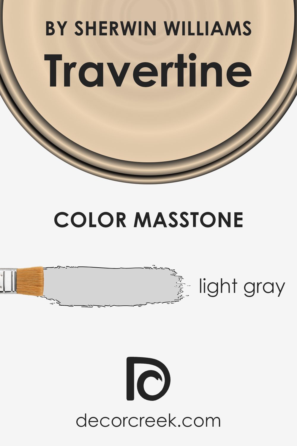
What is the Masstone of the Travertine SW 7722 by Sherwin Williams?
TravertineSW 7722 by Sherwin Williams, with its light gray masstone coded as #D5D5D5, shines in its subtlety and adaptability when used in homes. This specific shade of gray brings a slight warmth that helps create a cozy and inviting atmosphere in various spaces, from busy kitchens to relaxing living rooms. The versatility of the color means it pairs effectively with both vibrant and muted hues, allowing homeowners to easily match it with different decor styles and personal tastes.
Light gray serves as a practical backdrop, not clashing with bolder colors or drawing attention away from statement furniture or art pieces. In smaller rooms, this color helps make the space feel larger and more open by reflecting light instead of absorbing it.
Furthermore, in well-lit areas, this hue can maintain its integrity without looking washed out, ensuring a pleasant visual consistency throughout the day. This characteristic makes light gray a smart choice for anyone looking to create a flexible and appealing home environment.
How Does Lighting Affect Travertine SW 7722 by Sherwin Williams?
Lighting plays a crucial role in how we perceive colors. Different light sources can change the way a color looks, sometimes making it appear brighter, duller, warmer, or cooler. This is especially true for paint colors on walls, such as the shade Travertine SW 7722, a neutral color from Sherwin Williams.
Natural light, which is sunlight, has a full spectrum of colors, making colors appear more vibrant. In artificial light, the type of bulb used (such as LED or fluorescent) influences the color’s appearance. LEDs, for example, can range from warm yellowish hues to cooler bluish tones.
In Natural Light:
Travertine SW 7722, being a light, warm, earthy tone, responds well to natural light. In rooms facing south, which receive ample sunlight throughout the day, this color will look vibrant and airy, enhancing the room’s natural brightness. In north-facing rooms, where the light can be cooler and more diffused, Travertine will appear slightly more muted and cooler, yet it still holds its warm undertone.
In Artificial Light:
Under warm artificial lighting, such as incandescent bulbs, the color tends to look similar to its appearance in south-facing rooms during the day—warm and welcoming. In cooler artificial light, like some LEDs, it can look a bit more subdued, similar to its appearance in a north-facing room with natural light.
Throughout the Day:
In rooms that face east, Travertine SW 7722 will be bathed in warm morning light, making the color look bright and fresh. It’s perfect for spaces like breakfast nooks. As for west-facing rooms, the late afternoon and evening light can make the color appear very warm and cozy, ideal for living rooms or dining areas where you want a welcoming atmosphere.
Overall, how Travertine SW 7722 looks can vary greatly depending on the direction the room faces and the type of light it receives. This understanding can help you decide where to use this particular shade to optimize its beauty in your home.
What is the LRV of Travertine SW 7722 by Sherwin Williams?
LRV stands for Light Reflectance Value, which is a measurement used to describe the amount of visible and usable light that gets reflected from a surface when illuminated by a light source. Essentially, it’s a gauge of how light or dark a paint color will look on a wall.
The scale on which LRV is measured runs from a low reflectivity of virtually none, which appears almost black, to a high reflectivity of total reflectance, which would be seen as pure white. The higher the LRV number, the more light the color will reflect, making the space feel brighter and larger.
The LRV for the paint color mentioned is 67.687, indicating it is on the lighter side of the scale and will, therefore, reflect a good amount of light without being overpowering. It’s a balanced choice for those wanting to maintain a room that feels airy and open without the starkness that can come with extremely light colors.
This particular shade will help in making the room feel illuminated and spacious, which is especially useful in smaller or darker spaces. The light but not too stark appearance of the wall color can also help in enhancing the aesthetic appeal and the sense of calm in a room.

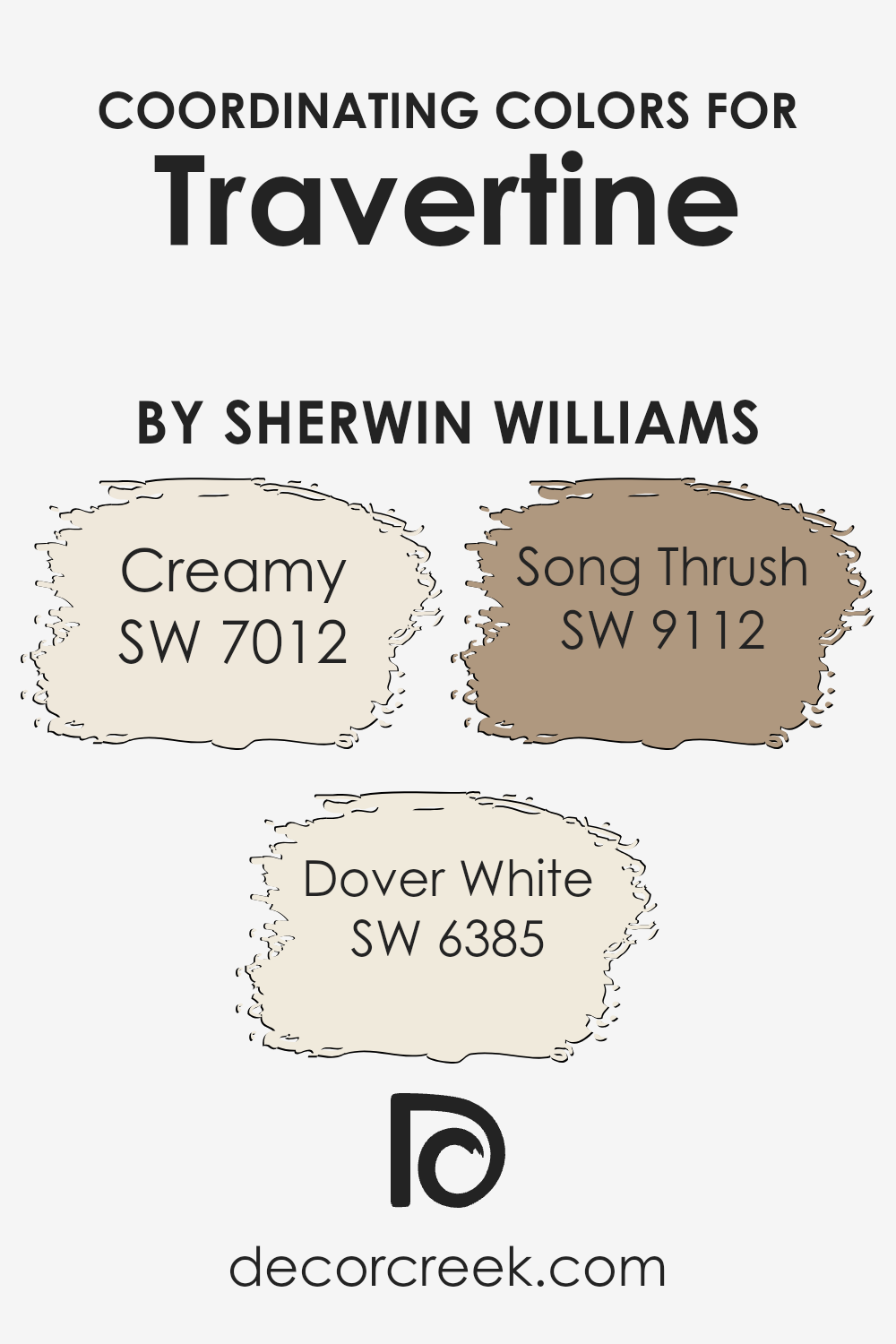
Coordinating Colors of Travertine SW 7722 by Sherwin Williams
Coordinating colors are shades that work well together to create a harmonious look in any space. When it comes to choosing colors that coordinate with Travertine by Sherwin Williams, options like Creamy, Dover White, and Song Thrush can be excellent choices to complement and enhance the main hue. These coordinating colors can either balance out or enhance the features of the primary color, depending on their undertones and intensities.
Creamy (SW 7012) is a warm, soft white that can bring a gentle brightness to a room, especially when paired with a neutral like Travertine. It’s great for creating a relaxed and inviting atmosphere without being stark or too vibrant. Dover White (SW 6385) is another warm shade, but with a hint of yellow, providing a cozy, sunlit effect that makes it perfect for living spaces or kitchens where a welcoming feel is desired.
Song Thrush (SW 9112) is a deeper, muted brown that complements the earthy qualities of Travertine, adding depth and warmth to the overall scheme. This shade works well in areas where a richer contrast is needed, elevating the aesthetic without overwhelming the senses. Together, these colors offer a balanced and cohesive palette that can enhance any living space.
You can see recommended paint colors below:
- SW 7012 Creamy
- SW 6385 Dover White
- SW 9112 Song Thrush
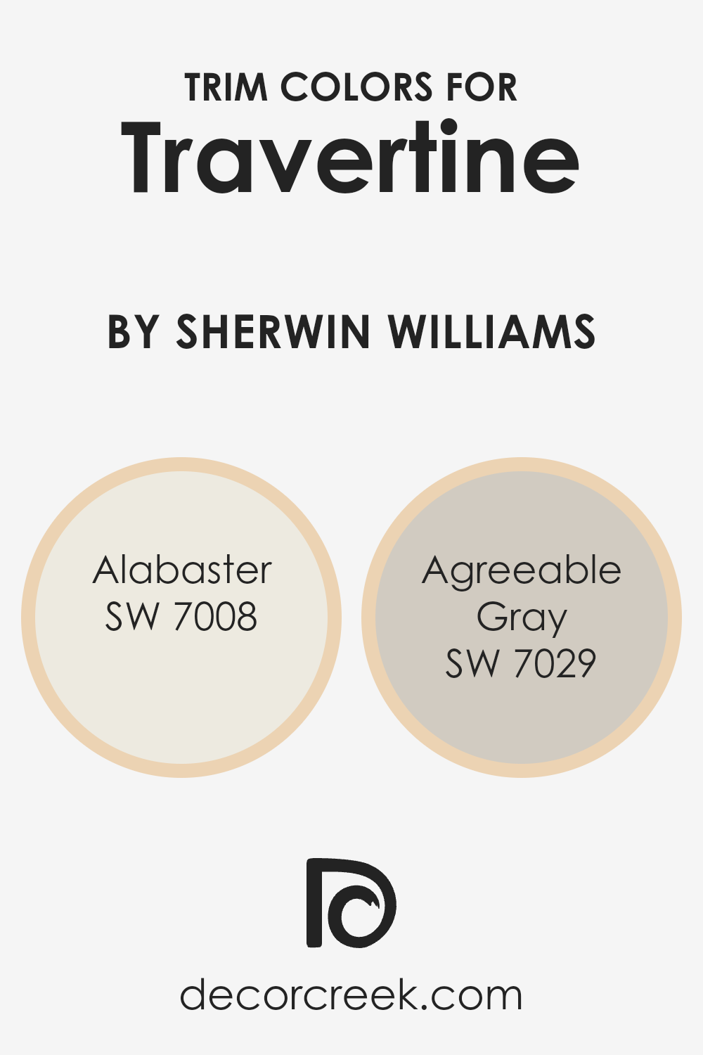
What are the Trim colors of Travertine SW 7722 by Sherwin Williams?
Trim colors, such as SW 7008 – Alabaster and SW 7029 – Agreeable Gray from Sherwin-Williams, play a critical role in enhancing the visual appeal and contrast of a primary wall color. When paired with a base color like SW 7722 – Travertine, trim colors help to outline and define the architectural features of a room, such as door frames, window trims, and skirting boards, giving a clean and finished look to the space.
This careful selection can make the walls stand out, creating a more distinct and appealing visual space.
SW 7008 – Alabaster is a soft, creamy white that offers a gentle contrast to richer, deeper hues, providing a subtle highlight to the trim areas without overwhelming the main color. SW 7029 – Agreeable Gray is a mild, warm gray that works harmoniously alongside varied color palettes, adding a touch of neutrality and balance where it’s applied. Both colors ensure that the room achieves a cohesive look while ensuring that the decorative elements, like trim and molding, pop against a softer or richer main wall color.
You can see recommended paint colors below:
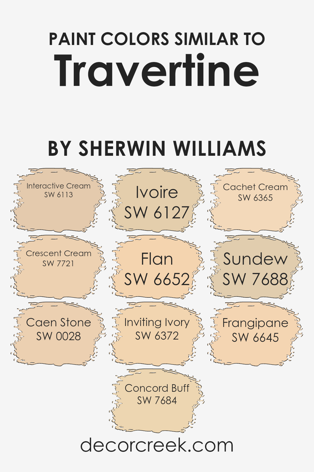
Colors Similar to Travertine SW 7722 by Sherwin Williams
In interior design, using similar colors can create a harmonious and cohesive look. When we look at colors that complement each other, like shades similar to Travertine by Sherwin Williams, we see how they can effectively work together to set a particular mood or tone in a room. For instance, Interactive Cream offers a warm, welcoming vibe with its soft, creamy hue. Crescent Cream, slightly more subdued, provides a comforting, delicate touch that enhances spaces that require a gentle ambiance.
Moving to hues like Caen Stone, its deeper, earthy tones bring out a natural elegance, ideal for spaces that aim to connect with nature-inspired themes. Concord Buff, on the other hand, offers a richer warmth, making it great for creating inviting and cozy areas.
Ivoire adds a splash of mild yellow, uplifting the space with its light-hearted and playful personality. Flan is similar but with a bit more depth, complementing wood finishes and natural textiles beautifully. Inviting Ivory and Cachet Cream, both suggestive by their names, exude a clean and soft presence, rounding off sharper designs and adding softness to modern decors. Finally, Sundew and Frangipane showcase a slight variation in undertones, with Sundew leaning more towards understated elegance and Frangipane offering a hint of cheerful zest.
You can see recommended paint colors below:
- SW 6113 Interactive Cream
- SW 7721 Crescent Cream
- SW 0028 Caen Stone
- SW 7684 Concord Buff
- SW 6127 Ivoire
- SW 6652 Flan
- SW 6372 Inviting Ivory
- SW 6365 Cachet Cream
- SW 7688 Sundew
- SW 6645 Frangipane
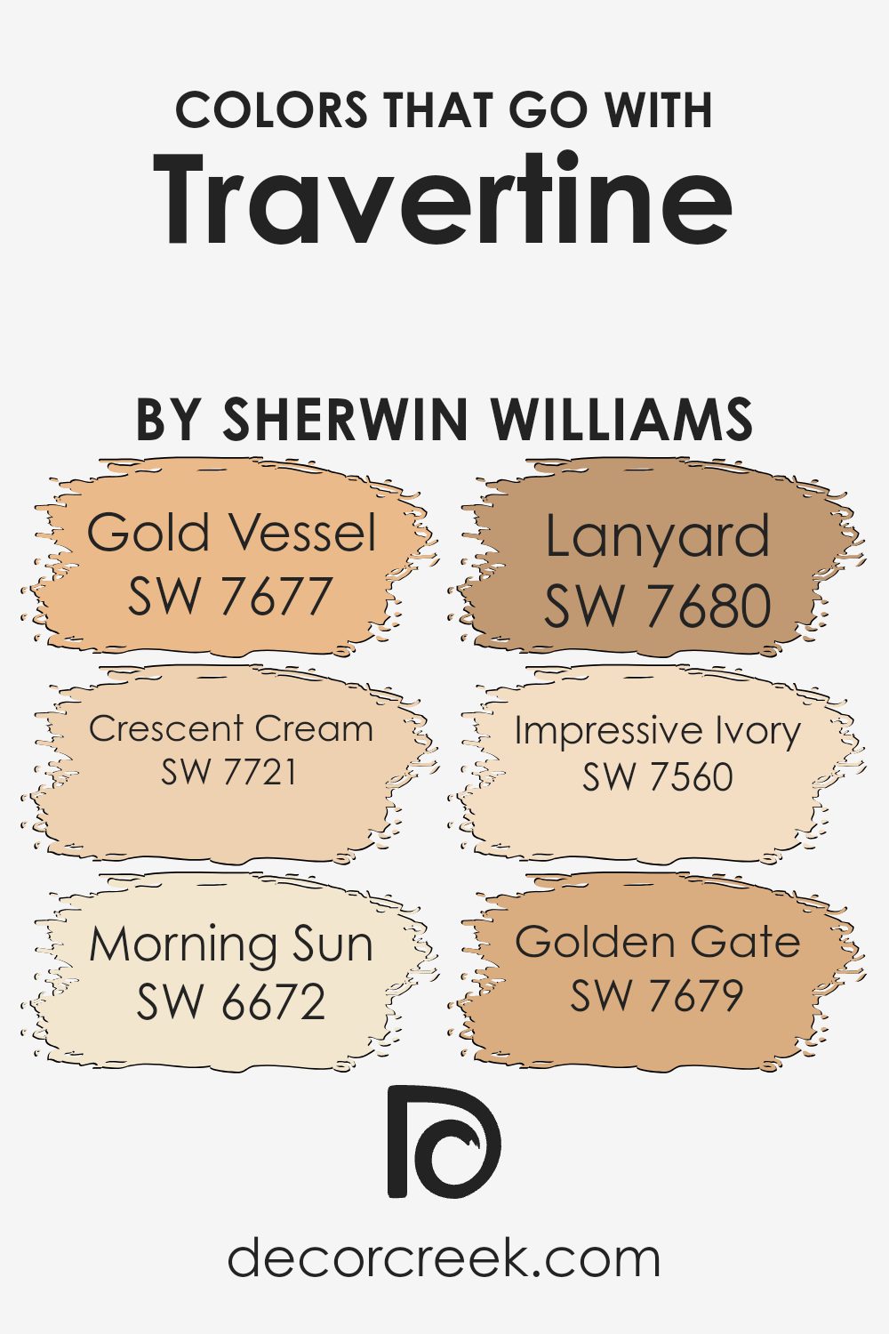
Colors that Go With Travertine SW 7722 by Sherwin Williams
Choosing the right colors to pair with Travertine SW 7722 by Sherwin Williams is critical in creating a harmonious and visually pleasing atmosphere in any space. Travertine is a warm neutral, offering a solid base for incorporating other colors. When paired properly, these colors enhance the aesthetic value and ambiance of a room by complementing or offering a striking contrast to the base color.
For instance, Gold Vessel SW 7677 brings a rich and deep mustard shade that pairs beautifully with Travertine, providing a burst of color that is both warm and inviting. Crescent Cream SW 7721 is a soft, very light yellowish hue, offering a subtle brightening effect that can make spaces feel more open and airy.
Morning Sun SW 6672, a vibrant yellow, offers a cheerful splash of brightness, uplifting the mood of any room. Lanyard SW 7680 is a robust navy blue, introducing a dramatic and bold contrast that can highlight specific features or furnish a more grounded feel to a room. Impressive Ivory SW 7560, as a gentle off-white, seamlessly integrates with Travertine for a clean and coherent look, perfect for creating a calm and welcoming atmosphere.
, Golden Gate SW 7679, which embodies a muted terracotta, intricately mixes warmth into the palette, fostering a cozy and comfortable setting. Combining these colors with Travertine SW 7722 ensures a refined palette that enhances the visual appeal and character of your home or office.
You can see recommended paint colors below:
- SW 7677 Gold Vessel
- SW 7721 Crescent Cream
- SW 6672 Morning Sun
- SW 7680 Lanyard
- SW 7560 Impressive Ivory
- SW 7679 Golden Gate
How to Use Travertine SW 7722 by Sherwin Williams In Your Home?
**Exploring the Suitable Uses of Travertine SW 7722**
Travertine SW 7722 by Sherwin Williams is a versatile paint color fitting various home spaces. Its warm, neutral tone pairs nicely with numerous decor styles, from rustic to modern.
For those looking to give their living room a fresh, inviting feel, Travertine can do wonders by harmonizing with furniture in earth tones or softening brighter accents. In bedrooms, using this color can create a cozy, calm atmosphere, making it easy to relax at the end of the day.
Additionally, for those interested in updating their kitchen or bathroom, Travertine offers a clean, timeless backdrop. It can complement wood cabinets excellently and works well with both dark and light countertops.
By applying this color, homeowners can simply refresh various rooms without overpowering them with bold colors, maintaining a warm and inviting ambiance throughout their space.
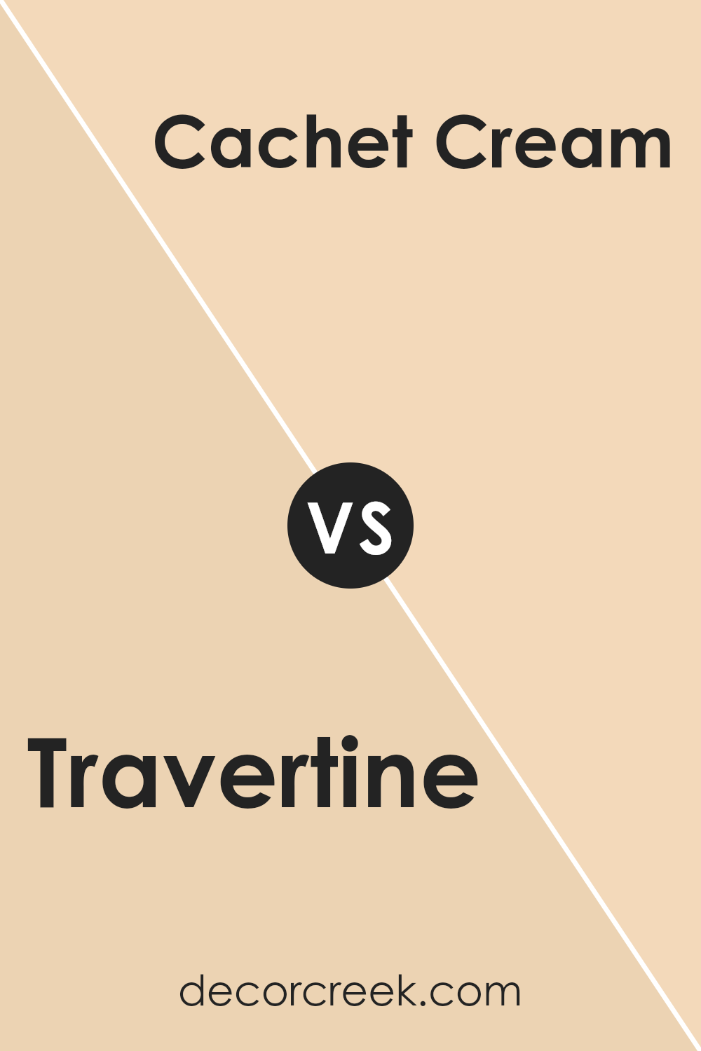
Travertine SW 7722 by Sherwin Williams vs Cachet Cream SW 6365 by Sherwin Williams
Travertine by Sherwin Williams is a muted, soothing green with a slight gray undertone, making it a versatile choice for spaces where a calm and restful ambiance is desired. This color pairs well with natural elements and light woods, giving a room an organic, earthy feel. On the other hand, Cachet Cream is a warm, pale yellow that offers a subtle, creamy brightness to interiors.
It’s an excellent option for creating a cozy and welcoming atmosphere, especially in well-lit areas or spaces that need a touch of warmth.
While Travertine leans towards a more neutral, subdued palette, Cachet Cream brings a gentle cheerfulness to a room. Both colors are quite adaptable and can work beautifully in various settings, from modern to traditional. However, Travertine might be better suited for those looking for a more understated, nature-inspired look, whereas Cachet Cream is ideal for anyone wanting to inject a soft, inviting glow into their space.
You can see recommended paint color below:
- SW 6365 Cachet Cream
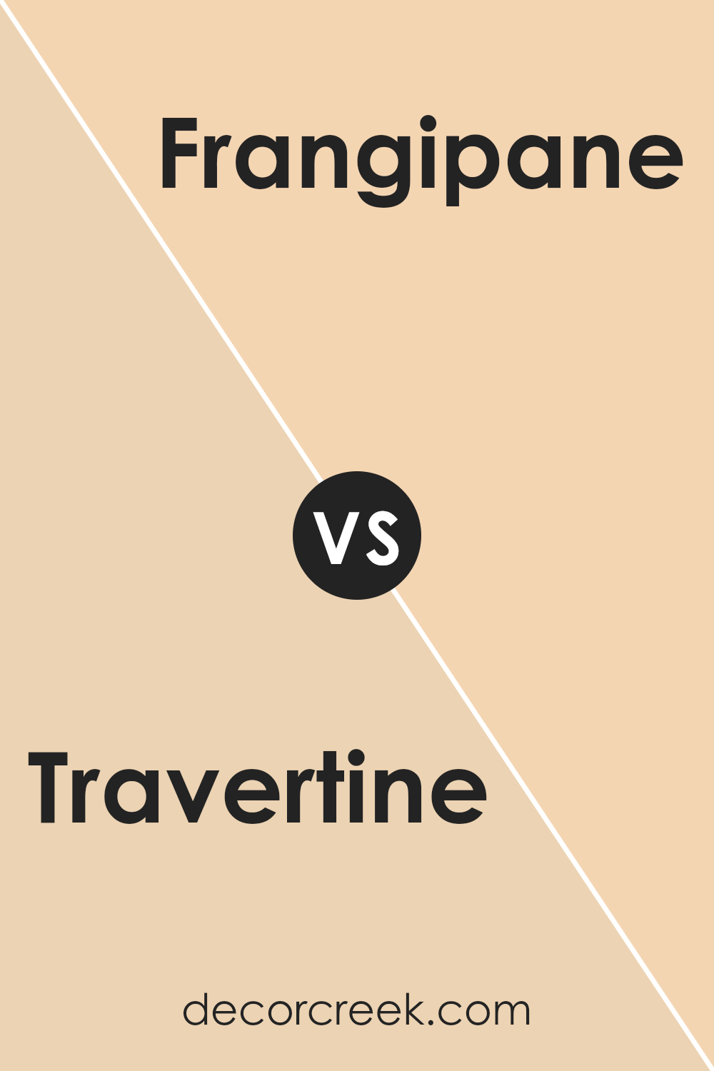
Travertine SW 7722 by Sherwin Williams vs Frangipane SW 6645 by Sherwin Williams
Travertine SW 7722 and Frangipane SW 6645 by Sherwin Williams are two distinct colors with unique characteristics. Travertine is a neutral, muted green that evokes a sense of calm and simplicity. It’s a versatile shade that blends well with natural elements and materials, making it ideal for spaces that aim for a subtle and understated look.
On the other hand, Frangipane is a bright and cheerful yellow. It’s a warm color that brings a pop of energy and brightness to any room, perfect for creating a sunny and inviting atmosphere. Travertine works well in spaces where you want a laid-back, grounded feel, while Frangipane is great for adding vibrancy and a touch of cheerfulness.
Together, these colors could complement each other, with Frangipane adding life to the soothing backdrop of Travertine.
You can see recommended paint color below:
- SW 6645 Frangipane
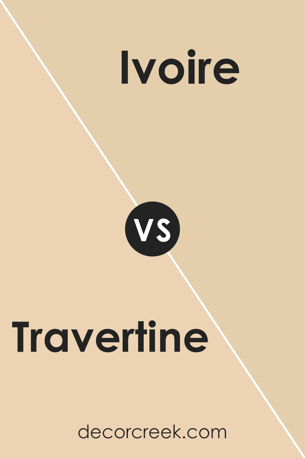
Travertine SW 7722 by Sherwin Williams vs Ivoire SW 6127 by Sherwin Williams
Travertine and Ivoire are both warm, welcoming hues from Sherwin Williams, though they present subtle differences in mood and setting. Travertine is a deeper, olive-toned beige that offers a cozy and grounding atmosphere, making it perfect for spaces where you want a touch of nature-inspired comfort. Its richness works well in living areas or bedrooms where a calm, soothing backdrop is desired.
On the other hand, Ivoire is a lighter, creamy beige with a soft yellow undertone. This color is brighter and creates a feeling of lightness and airiness in a room. It’s an excellent choice for smaller spaces or rooms with less natural light, as it helps to make the space feel more open and cheerful.
Both colors pair well with a variety of decor styles and other hues, offering flexibility in design choices. Whether you’re looking for a solid, earthy base or a gentle, uplifting shade, Travertine and Ivoire provide lovely options.
You can see recommended paint color below:
- SW 6127 Ivoire
Travertine SW 7722 by Sherwin Williams vs Concord Buff SW 7684 by Sherwin Williams
Travertine by Sherwin Williams is a creamy beige that has a warm and welcoming tone. It’s excellent for creating a cozy atmosphere in a home, making rooms feel inviting and comfortable. This color is subtle and not too bold, which makes it versatile for use in various spaces such as living rooms, kitchens, or hallways.
On the other hand, Concord Buff is a richer, golden yellow color that offers a brighter and slightly more vibrant feel. It’s a shade that will add a dose of cheerfulness and brightness to any area. Concord Buff can instantly warm up a space and is well suited for dining areas or places where you want to add a sunny disposition.
Both colors have their distinct qualities; Travertine is more subdued and neutral, making it easier to pair with different decor styles, while Concord Buff is perfect for adding a lively splash of color in a room that could use a boost of energy. They complement each other well in spaces that benefit from both neutral and vibrant tones.
You can see recommended paint color below:
- SW 7684 Concord Buff
Travertine SW 7722 by Sherwin Williams vs Caen Stone SW 0028 by Sherwin Williams
Travertine and Caen Stone are both colors offered by Sherwin Williams, but they bring different vibes to a space. Travertine is a warm neutral that leans towards a creamy, beige tone. It’s a versatile color that can brighten rooms without being too stark, giving a cozy and inviting feel.
On the other hand, Caen Stone carries a deeper, grayish beige hue. This color is great for adding a bit more drama and depth to a space, while still maintaining a neutral palette. It’s a wonderful choice for those who prefer something slightly bolder than a typical beige, without straying too far from earthy, natural colors.
In summary, while both colors share a neutral foundation, Travertine offers a lighter, creamier touch suitable for creating a soft, warm environment. Caen Stone, with its richer, gray-infused beige, provides a stronger statement while still keeping things calm and grounded.
You can see recommended paint color below:
- SW 0028 Caen Stone
Travertine SW 7722 by Sherwin Williams vs Flan SW 6652 by Sherwin Williams
Travertine is a soft and warm neutral beige that offers a cozy and comforting feeling to any space. It pairs well with various decor styles and is versatile enough for many rooms, such as living areas and bedrooms. This color is excellent for those who want a timeless look that feels inviting.
On the other hand, Flan is a much brighter and more vivid color, resembling a cheerful yellow. It instantly adds a sunny and energetic vibe to a room, perfect for spaces like kitchens and dining areas where you want a lively atmosphere. This shade can bring a sense of happiness and positivity to your home environment.
When comparing these two, Travertine is more subtle and understated, making it easier to match with different colors and furniture. Flan, being bolder and brighter, works best as an accent or in rooms where you want to make a strong visual impact. Both colors have their unique appeals depending on what mood or style you’re aiming for in your decorating project.
You can see recommended paint color below:
- SW 6652 Flan
Travertine SW 7722 by Sherwin Williams vs Inviting Ivory SW 6372 by Sherwin Williams
Travertine SW 7722 and Inviting Ivory SW 6372 are both colors offered by Sherwin Williams, and they bring their unique tones to home decor. Travertine leans toward a dusty sage hue, a muted green with a gray base, perfect for creating a calm and grounded atmosphere without being too bold. It’s a good choice if you want a hint of color while keeping things understated.
On the other hand, Inviting Ivory is a warmer tone, closer to a soft, creamy beige. It lives up to its name by offering a welcoming and cozy feel to any space. This color is versatile and can brighten up rooms without overpowering them, making it great for areas where you want to introduce light and warmth.
Together, these colors can work well if you’re looking to combine cool and warm tones. Travertine provides a subtle, refreshing backdrop, while Inviting Ivory can highlight key areas with its gentle warmth, offering a balanced palette.
You can see recommended paint color below:
- SW 6372 Inviting Ivory
Travertine SW 7722 by Sherwin Williams vs Sundew SW 7688 by Sherwin Williams
Travertine and Sundew, both created by Sherwin Williams, are unique in their own ways. Travertine is a soft, neutral beige with a hint of yellow warmth. It creates a cozy and welcoming feel, suitable for any room that aims for a relaxed atmosphere.
On the other hand, Sundew is a gentle hue caught between beige and light gray with a subtle green undertone, giving it a refreshing and soothing quality without feeling cold. While Travertine brings in warmth and a sense of calm, Sundew offers a more muted and understated vibe that can make small spaces appear more open and airy.
While both colors are versatile, Travertine might be preferable for those who want a classic, warm look, whereas Sundew works well in spaces aiming for a modern, minimalist aesthetic.
You can see recommended paint color below:
- SW 7688 Sundew
Travertine SW 7722 by Sherwin Williams vs Crescent Cream SW 7721 by Sherwin Williams
Travertine by Sherwin Williams and Crescent Cream also by Sherwin Williams are two subtly distinct shades that cater well to spaces seeking a warm and welcoming atmosphere. Travertine is a slightly deeper and earthier tone compared to Crescent Cream. It offers a robust presence, feeling more anchored and resembling the natural stone after which it is named. It’s an excellent choice for areas where a stronger, yet still soft, color is desired.
Crescent Cream, on the other hand, is lighter and leans towards a more traditional cream color. It has a freshness to it that brightens spaces more evidently than Travertine. This makes it ideal for smaller or darker rooms where the aim is to make the area appear more open and airy.
Both colors work beautifully in living spaces due to their warm undertones, but Crescent Cream might be more suited for those looking for a subtle lift, while Travertine offers a hint of earthy depth.
You can see recommended paint color below:
- SW 7721 Crescent Cream
Travertine SW 7722 by Sherwin Williams vs Interactive Cream SW 6113 by Sherwin Williams
Travertine SW 7722 and Interactive Cream SW 6113 are both warm neutral colors from Sherwin-Williams, yet they present distinct tones that cater to different design preferences. Travertine leans towards a greenish tint, giving it an earthy, natural feel that pairs well with natural materials like wood and stone. This subtle green undertone makes it ideal for spaces where you want to introduce a touch of nature.
On the other hand, Interactive Cream has a yellowish undertone, enhancing spaces with a cozy, inviting aura. It emits more brightness, making it a great choice for rooms that aim for a cheerful and welcoming atmosphere. This color can make dim spaces seem sunnier and more vibrant.
Both colors work beautifully in various settings, from casual to formal, depending on how they are matched with other colors and decor. However, their different undertones will influence the mood and spatial perception of the room, so choosing between them depends a lot on the effect you want to achieve in your space.
You can see recommended paint color below:
- SW 6113 Interactive Cream
Conclusion
Writing about SW 7722 Travertine by Sherwin Williams has been a fun journey for me. This paint color is like a gentle hug for any room. It’s not too bright and not too dark, just the right shade to make a room feel warm and welcoming. I found that it works really well in rooms where you relax, like a living room or a bedroom.
I tested this color in different lights and was happy to see that it looks good both in sunlight and under lamps. It kind of reminds me of a soft blanket or a smooth stone, which is probably why they named it Travertine, after a kind of rock.
Using this color could be a smart choice if you want to give your room a fresh look without going too wild with color. It’s calm but still has a happy vibe. It would look nice with white furniture or even with some darker woods, giving you some good options for decorating.
So, in conclusion, I think SW 7722 Travertine by Sherwin Williams is a great choice if you’re thinking about repainting. It’s friendly, warm, and works well in many rooms. If you’re thinking about trying a new paint color, this one could really make your room feel new and comfy.
Ever wished paint sampling was as easy as sticking a sticker? Guess what? Now it is! Discover Samplize's unique Peel & Stick samples.
Get paint samples

