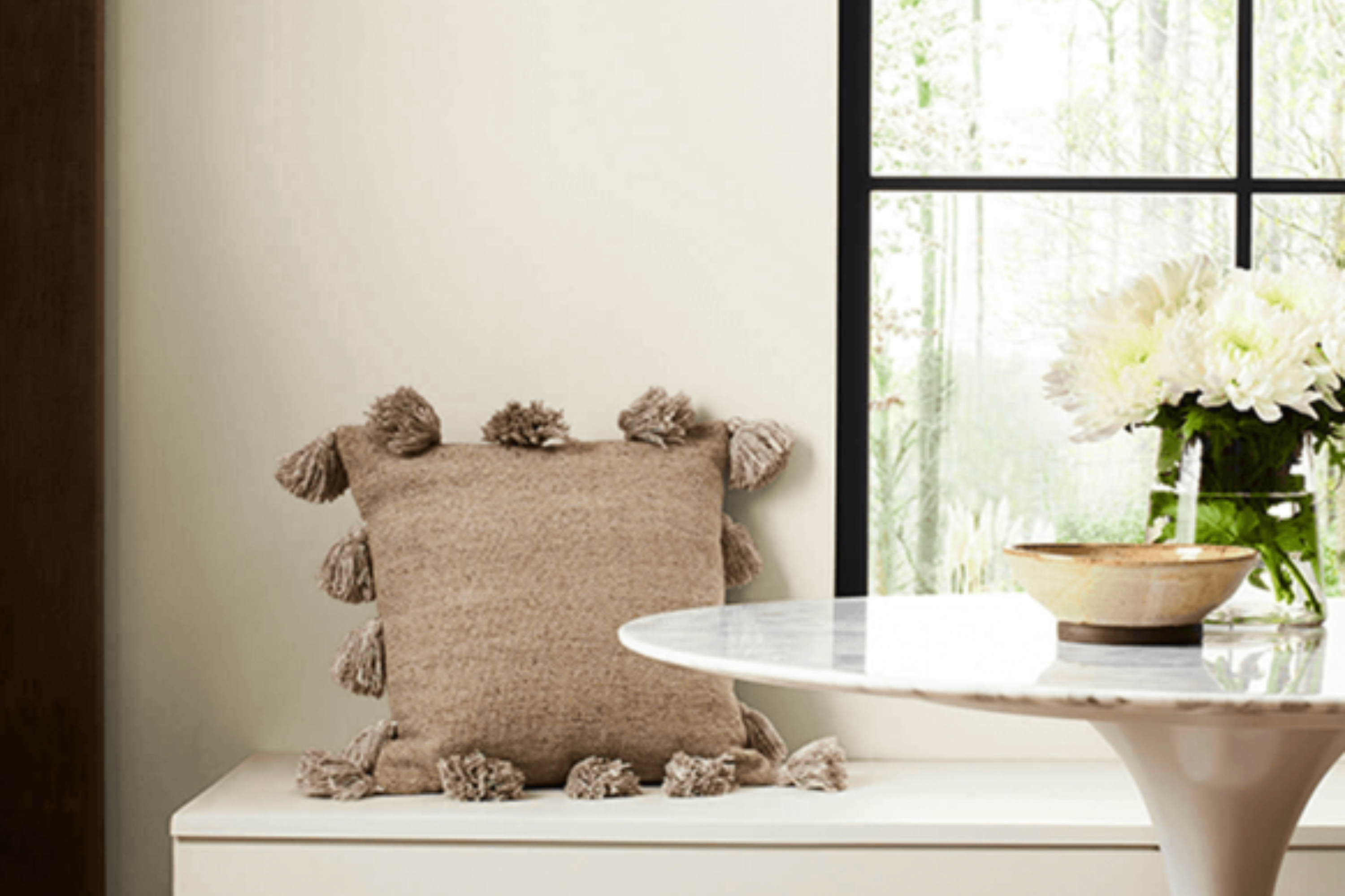
Choosing the right paint color for your space can feel overwhelming with so many options out there. That’s where Sherwin Williams’ SW 7035 Aesthetic White comes into the picture, offering a versatile and welcoming hue that elevates any room’s atmosphere.
This particular shade of white stands out for its warm undertones, making it a perfect match for anyone wishing to create a cozy, inviting space. Unlike stark whites, Aesthetic White brings a softness to walls, balancing brightness without feeling too cold or impersonal.
This color is a favorite among homeowners and interior designers alike for its flexibility. It pairs beautifully with a range of decor styles, from modern to rustic, and works well in various settings, including living rooms, bedrooms, and kitchens. Whether you’re looking to refresh a single room or planning a total home makeover, Aesthetic White offers a clean slate with its subtle warmth, setting the stage for your design elements to shine.
In this article, we’ll explore the ins and outs of SW 7035 Aesthetic White by Sherwin Williams, including tips on how best to utilize it in your home, and what to consider when coordinating with other colors and materials. Let’s take a look at how this serene and soft hue can transform your space into a comforting oasis.
What Color Is Aesthetic White SW 7035 by Sherwin Williams?
Aesthetic White by Sherwin Williams is a subtle, welcoming shade that strikes a perfect balance between warm and cool tones. This versatile color is neither too stark nor too creamy, making it an ideal choice for various interior styles. It softly reflects light, bringing a gentle brightness to a room without overwhelming it. This shade has a unique ability to adapt to its surroundings, making it a great partner for both bold and muted color palettes.
Aesthetic White works wonderfully in modern, minimalist, traditional, and even rustic interior designs. Its neutral base acts as a canvas, allowing furniture and decor to stand out.
In minimalist settings, it complements sleek lines and simple forms, adding warmth without clutter. In more traditional or rustic spaces, it highlights natural wood textures, enhancing the cozy and inviting feel.
When it comes to materials, Aesthetic White pairs brilliantly with natural elements like wood, leather, and stone, emphasizing their textures and colors. It also goes well with metal finishes, from warm brass and gold to cool silver and chrome, adding sophistication. Fabrics in linen, cotton, or even wool textures in both light and dark colors complement this shade by adding depth and interest to the environment.
Its adaptability makes Aesthetic White a go-to color for those looking to create a space that feels both stylish and inviting, bridging the gap between different materials and styles with ease.

Ever wished paint sampling was as easy as sticking a sticker? Guess what? Now it is! Discover Samplize's unique Peel & Stick samples.
Get paint samples

Is Aesthetic White SW 7035 by Sherwin Williams Warm or Cool color?
Aesthetic White by Sherwin Williams is a popular paint color choice for many homeowners. This particular shade is a soft, soothing white with a subtle hint of beige, making it an excellent option for those wanting a white that isn’t too stark or cold. Its warm undertones bring a cozy and inviting feel to rooms, making spaces feel more open and airy, yet without the clinical feel that some pure whites can create.
The beauty of Aesthetic White lies in its versatility. It can effortlessly complement a wide range of decor styles, from modern to rustic, and works beautifully in all types of lighting conditions.
Whether in a room with abundant natural light or a space that relies on artificial lighting, this color maintains its warmth, enhancing the overall ambiance of the home.
Using Aesthetic White on walls can also serve as a neutral backdrop, allowing furniture and art to stand out. It’s especially useful in smaller spaces, where it can help make the area appear larger and more inviting. Additionally, this color pairs well with a wide spectrum of other colors, making it easy for homeowners to add their own personal touch to their decor without fearing a clash.
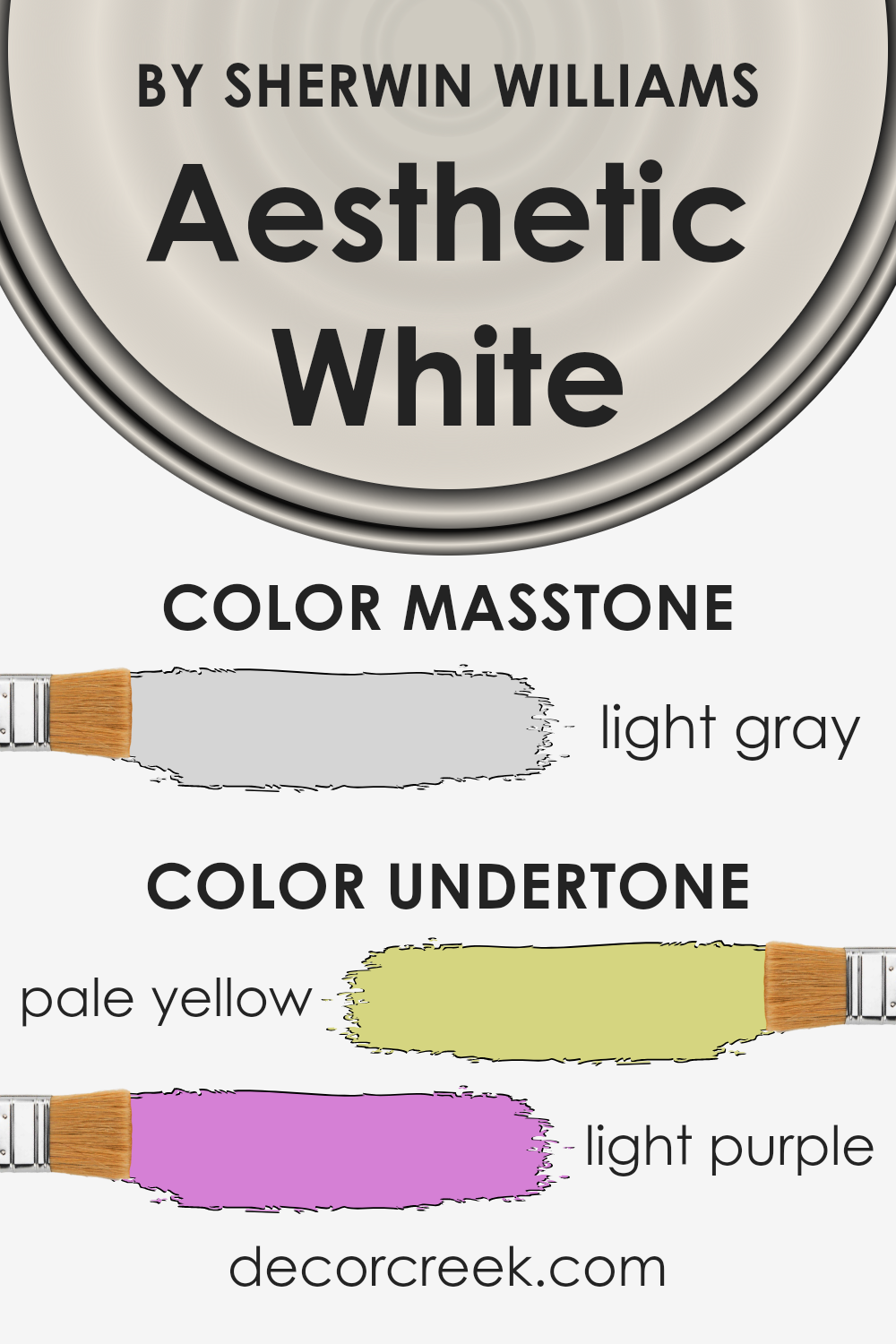
Undertones of Aesthetic White SW 7035 by Sherwin Williams
Aesthetic White by Sherwin Williams is a unique paint color with subtle and intriguing undertones that can really influence the mood and look of a room. When talking about this color, it’s interesting to note that it carries hints of pale yellow and light purple. These undertones play a significant role in how the color appears under different lighting conditions and when paired with various decor elements.
Pale yellow undertones add a touch of warmth to the paint. This makes the space feel cozy and inviting, which is perfect for living rooms or bedrooms where comfort is key. On a sunny day, the yellow hues can be more noticeable, bringing a bright and cheery vibe to the room.
The light purple undertones introduce a gentle hint of sophistication and depth. This subtle complexity ensures the color doesn’t just feel flat or dull. Instead, it adds a layer of interest, making walls more dynamic and visually appealing. In areas with less natural light or during the evening, these purple hues might become more apparent, contributing to a calm and serene atmosphere.
Understanding these undertones is crucial because they significantly influence the overall look and feel of the paint once applied to interior walls. Depending on the lighting, furnishings, and surrounding colors, Aesthetic White can shift from warm and inviting to subtly sophisticated. This versatility makes it an excellent choice for anyone looking to create a space that feels both comfortable and stylish.
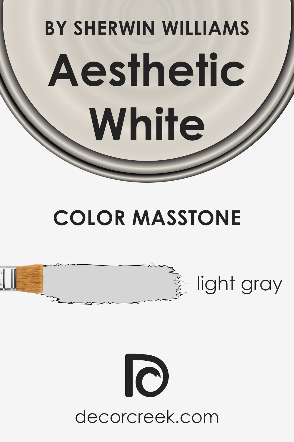
What is the Masstone of the Aesthetic White SW 7035 by Sherwin Williams?
Aesthetic White SW 7035 by Sherwin Williams has a masstone of light gray, marked with the color code #D5D5D5. This subtle and soothing shade brings a serene and airy feel to any room it graces.
Its light gray tone makes it incredibly versatile, allowing it to easily pair with different decor styles and color schemes. Whether you’re aiming for a modern, minimalistic look or a warm, cozy ambiance, this color can do it all. It reflects natural light beautifully, making spaces appear larger and more welcoming.
In homes, it acts as a perfect backdrop for art, furniture, and accent pieces, highlighting them without overwhelming the space.
Its neutrality avoids the starkness sometimes associated with pure white, offering a soft, gentle hue that promotes calmness and relaxation. The masstone of light gray ensures that the color adapites well in various lighting conditions, ensuring your home feels bright and inviting throughout the day.
How Does Lighting Affect Aesthetic White SW 7035 by Sherwin Williams?
Lighting plays a crucial role in how we perceive colors. It can completely transform the appearance of any color, influencing mood and ambience. Different types of light, whether artificial or natural, can make colors look more vibrant, softer, or sometimes entirely different from how they look on a color chip.
- Taking the color Aesthetic White as an example, this versatile shade by Sherwin Williams reacts uniquely under various lighting conditions. Under artificial light, such as LED or incandescent bulbs, this color can take on a warmer or cooler tone depending on the type of bulb. Warm lights tend to enhance the cozy aspects of Aesthetic White, making spaces feel inviting. Conversely, cooler lights can bring out its crispness, giving it a more modern feel.
- In natural light, the direction of the room plays a significant role in how Aesthetic White is perceived. In north-faced rooms, which receive cooler, indirect light, this color might appear slightly more muted and cooler, giving rooms a calm and serene vibe. South-faced rooms, basked in warm sunlight for most of the day, can make Aesthetic White look brighter and warmer, enhancing its welcoming nature.
- East-faced rooms get the morning light, which is softer and warmer. Here, Aesthetic White can help create a gentle, uplifting environment perfect for starting the day. As the light shifts away, the color remains softly lit, maintaining a serene atmosphere. In west-faced rooms, which capture the intense afternoon and evening light, Aesthetic White can glow with warmth, creating a cozy and pleasant space as the light emphasizes its warmer tones.
In summary, Aesthetic White’s interaction with different lighting conditions underscores the importance of considering light exposure when choosing paint colors. Its ability to adapt to its surroundings makes it an ideal choice for various settings, proving how versatile and dynamic paint colors can be under the influence of light.

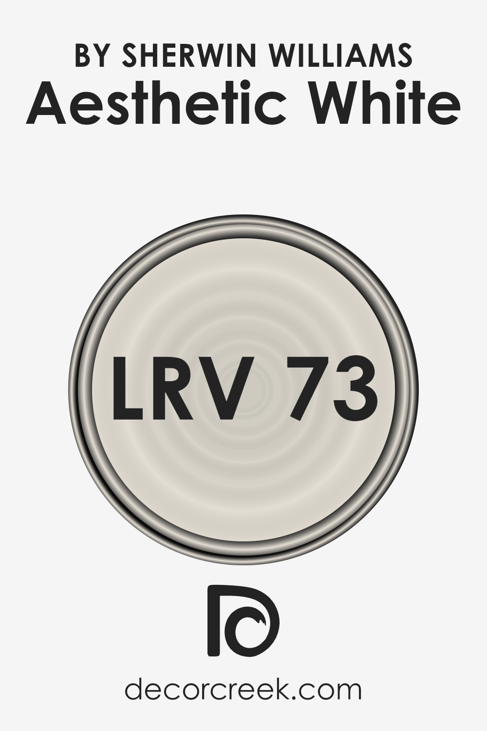
What is the LRV of Aesthetic White SW 7035 by Sherwin Williams?
LRV stands for Light Reflectance Value, which is a measure of the amount of light that a paint color reflects compared to the amount it absorbs. This value is provided on a scale of 0 to 100, where 0 means the color absorbs all light (appearing totally black), and 100 means it reflects all light (appearing completely white). Understanding LRV is crucial when choosing paint colors because it can significantly affect how bright or dark a space feels.
A high LRV can make a room feel more open and airy as it reflects more light around the space, while a low LRV can make a room feel cozier or smaller due to the absorption of light.
With an LRV of 73.097, Aesthetic White falls into the lighter end of the spectrum, meaning it has a high capability to reflect light. This property makes it an excellent choice for spaces where you want to enhance brightness and give an impression of more space without going for pure white. In well-lit areas, this particular shade will appear vibrant and can help in making the room feel more welcoming and open.
In rooms with less natural light, it can still help to brighten the space significantly compared to darker colors. Its light-reflecting qualities can subtly influence the mood and visual temperature of the room, making it a versatile choice that can adapt to various lighting conditions while maintaining its warm and serene appearance.
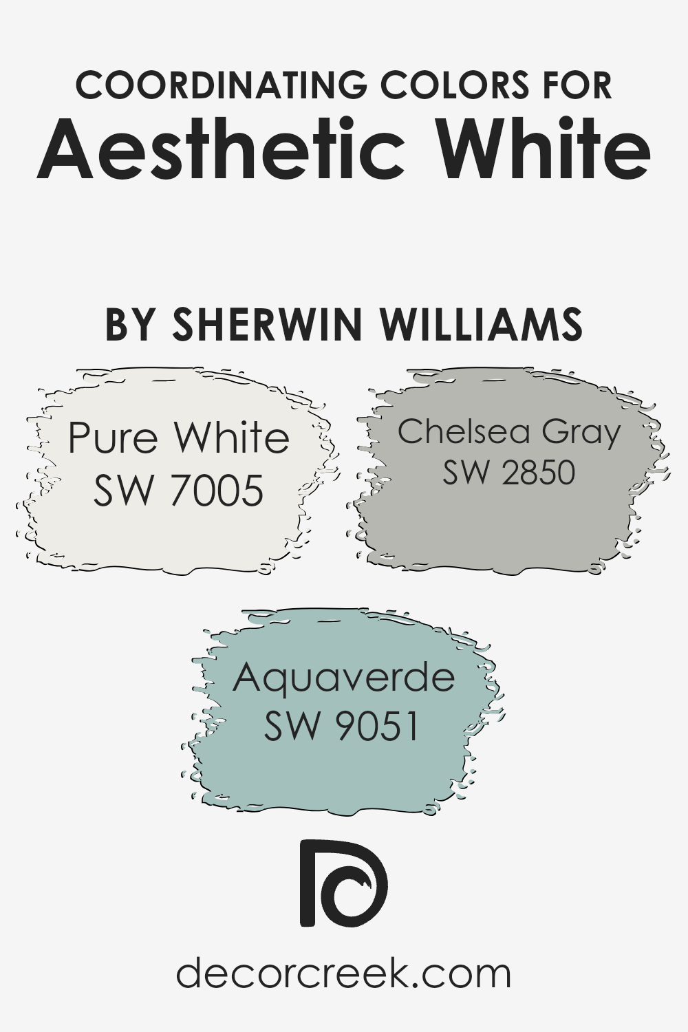
Coordinating Colors of Aesthetic White SW 7035 by Sherwin Williams
Coordinating colors are shades that complement each other beautifully when used together in decor or design, enhancing the overall aesthetic appeal of a space. These colors are chosen based on their ability to harmonize with a main color, creating a balanced and pleasing palette. When it comes to Aesthetic White by Sherwin Williams, a sophisticated and versatile hue, there are specific coordinating colors that work exceptionally well to either soften or enrich its neutral base.
- Pure White (SW 7005) is a fresh and clean shade that brings out the subtlety of Aesthetic White, adding brightness and clarity to spaces without overwhelming them. It’s perfect for trim, ceilings, or as a contrasting color for a modern, crisp look.
- Aquaverde (SW 9051) is a gentle whisper of green that infuses rooms with a sense of calm and serenity. It offers a soft, natural complement to Aesthetic White, ideal for creating a tranquil and refreshing ambiance.
- Chelsea Gray (SW 2850) provides a deeper contrast, grounding Aesthetic White with its solid, reassuring presence.
This rich, sophisticated shade adds depth and definition, perfect for accent walls or furniture, making the neutral warmth of Aesthetic White stand out even more. Together, these coordinating colors create harmonious combinations, offering endless possibilities for beautiful and cohesive interior designs.
You can see recommended paint colors below:
- SW 7005 Pure White
- SW 9051 Aquaverde
- SW 2850 Chelsea Gray
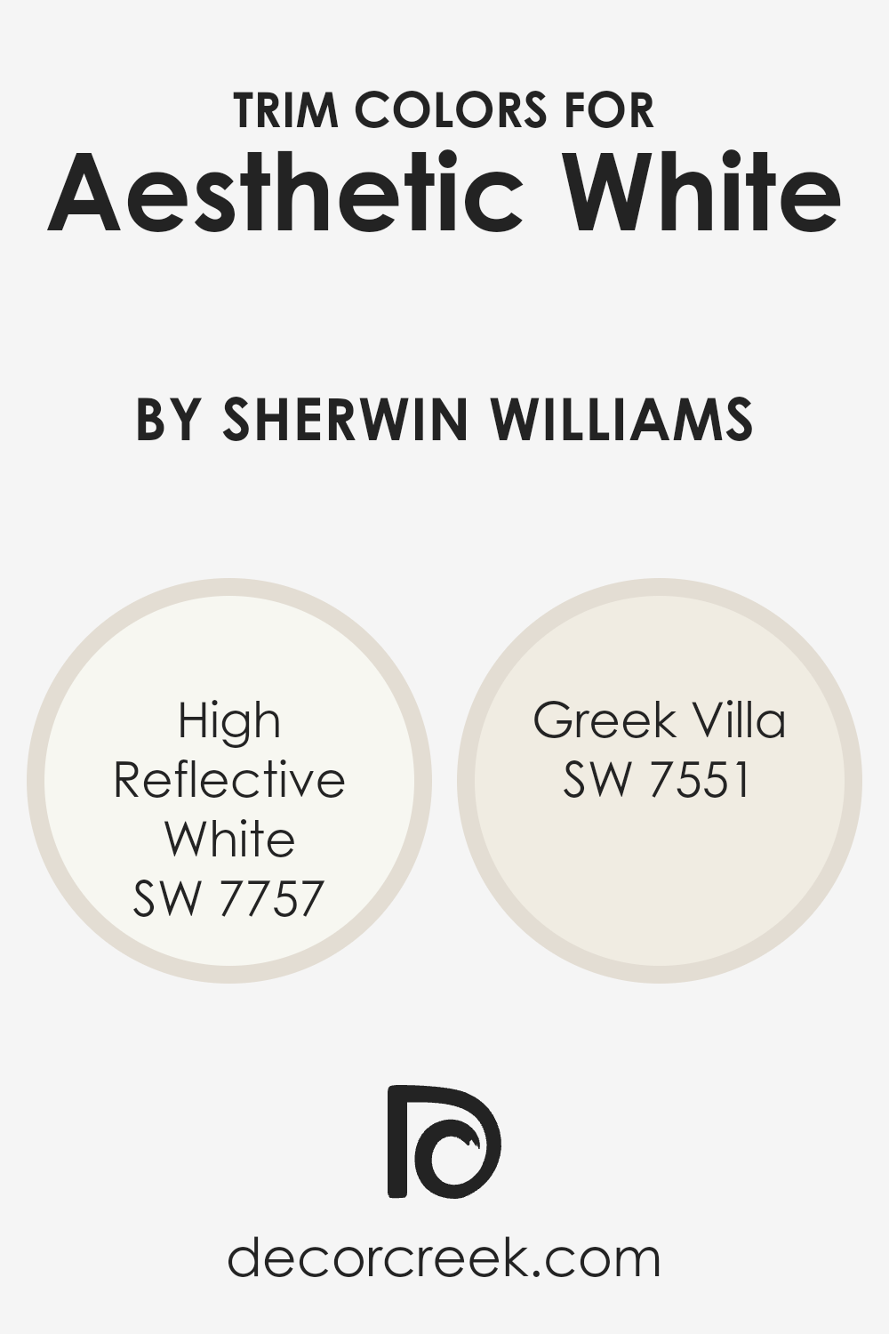
What are the Trim colors of Aesthetic White SW 7035 by Sherwin Williams?
Trim colors are essentially the hues selected for the architectural details of a room or exterior, such as baseboards, moldings, window frames, and doors. When it comes to pairing trim colors with a neutral yet warm wall color like Aesthetic White by Sherwin Williams, choosing the right trim color can significantly impact the overall look and feel of the space.
A well-chosen trim color can accentuate the architectural features of a room, creating a cohesive and polished look that adds depth and character. The trim acts as a frame for the wall color, highlighting its warmth and texture, and can either subtly complement the main color or offer a striking contrast for more visual impact.
For Aesthetic White, a color that carries a soft and inviting warmth, high-quality trim options include High Reflective White (SW 7757) and Greek Villa (SW 7551). High Reflective White is a brilliant, almost pure white that brings a crisp and clean contrast to the softness of Aesthetic White, making the walls stand out and giving the space a fresh and airy feel.
On the other hand, Greek Villa offers a slightly warmer, creamy tone that harmonizes beautifully with Aesthetic White, ensuring the space feels unified and soothing. The blend of Greek Villa as a trim color enriches the cozy and welcoming ambiance of a room, perfect for those looking to maintain a gentle, harmonious aesthetic throughout their space.
You can see recommended paint colors below:
- SW 7757 High Reflective White
- SW 7551 Greek Villa
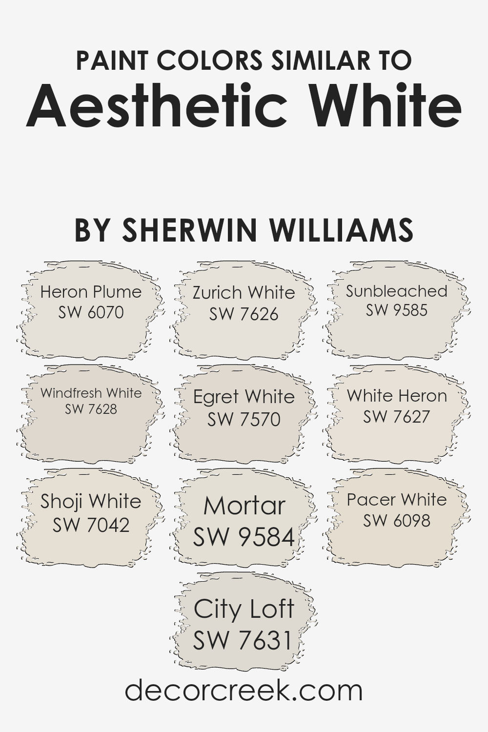
Colors Similar to Aesthetic White SW 7035 by Sherwin Williams
Similar colors are crucial in design because they create harmony and a seamless transition between spaces, offering a palette that is pleasing to the eye. When decorating a space, achieving a balanced and cohesive look involves carefully selecting colors that complement each other.
For instance, when considering shades similar to Aesthetic White, there are several options that work beautifully together to create a subtle yet sophisticated vibe.
- Heron Plume is a soft, airy hue that adds a touch of warmth to any space, making it feel welcoming and cozy.
- Windfresh White, on the other hand, brings a crisp, clean feel, perfect for creating a bright and uplifting environment.
- Shoji White offers a slightly muted, neutral base that pairs well with a variety of decor, emphasizing simplicity and elegance.
- City Loft has a gentle gray undertone that exudes calmness, making it ideal for a serene and tranquil setting.
- Zurich White blends warmth with a hint of gray, providing a versatile backdrop for both contemporary and traditional styles.
- Egret White introduces a delicate, creamy tone, infusing spaces with a sense of sophistication and softness.
- Mortar and Sunbleached stand out as deeper, more grounded shades which enrich the palette with their earthy, natural tones, perfect for adding depth and character.
- White Heron and Pacer White, with their light and airy qualities, round out the selection, offering a refreshing and clean canvas that enhances the overall aesthetic.
Together, these colors represent a harmonious balance, allowing for a fluid and cohesive look throughout any home.
You can see recommended paint colors below:
- SW 6070 Heron Plume
- SW 7628 Windfresh White
- SW 7042 Shoji White
- SW 7631 City Loft
- SW 7626 Zurich White
- SW 7570 Egret White
- SW 9584 Mortar
- SW 9585 Sunbleached
- SW 7627 White Heron
- SW 6098 Pacer White
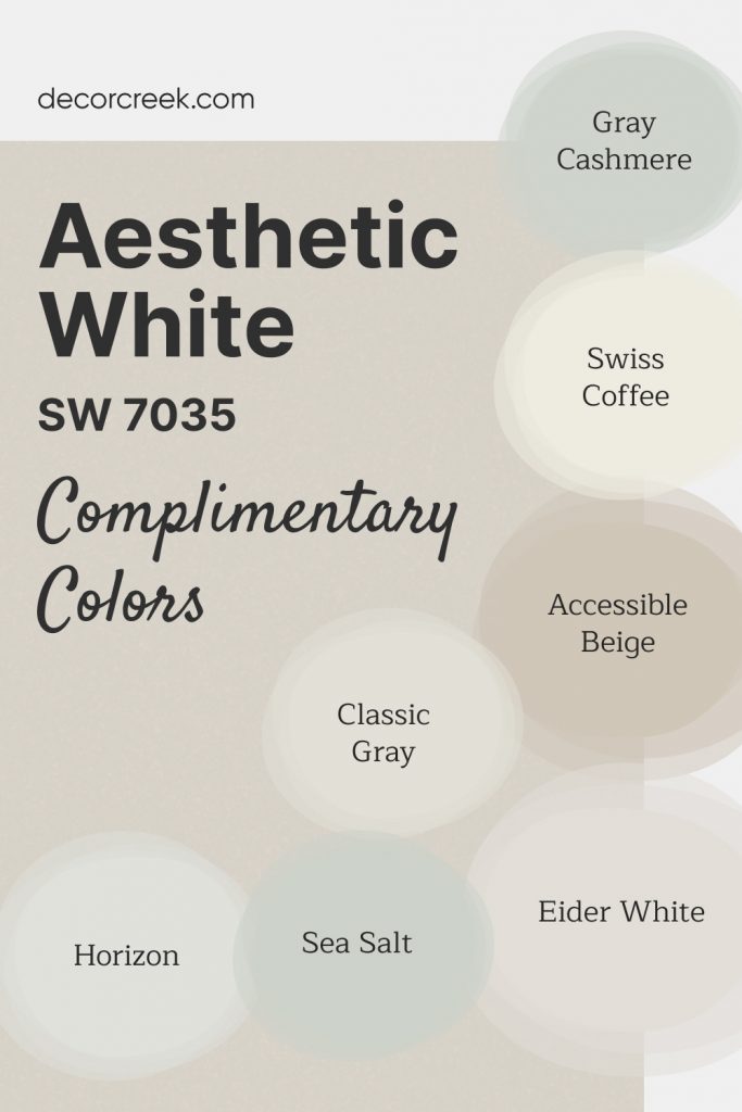
Complimentary Colors for Aesthetic White SW 7035 Paint Color by Sherwin Williams
Aesthetic White SW 7035 by Sherwin-Williams is a versatile warm off-white with a soft beige undertone. It works beautifully in spaces where you want a light, neutral backdrop without feeling too stark.
This color provides a cozy, inviting atmosphere while maintaining a sense of openness and brightness.
For a harmonious palette, Accessible Beige SW 7036 and Classic Gray OC-23 bring warmth and depth. To enhance brightness, pair it with Swiss Coffee OC-45 or Eider White SW 7014.
Sea Salt SW 6204 and Gray Cashmere 2138-60 offer soft, muted color options, while Horizon OC-53 introduces a subtle coolness for balance.
Together, these shades create a timeless and sophisticated look.
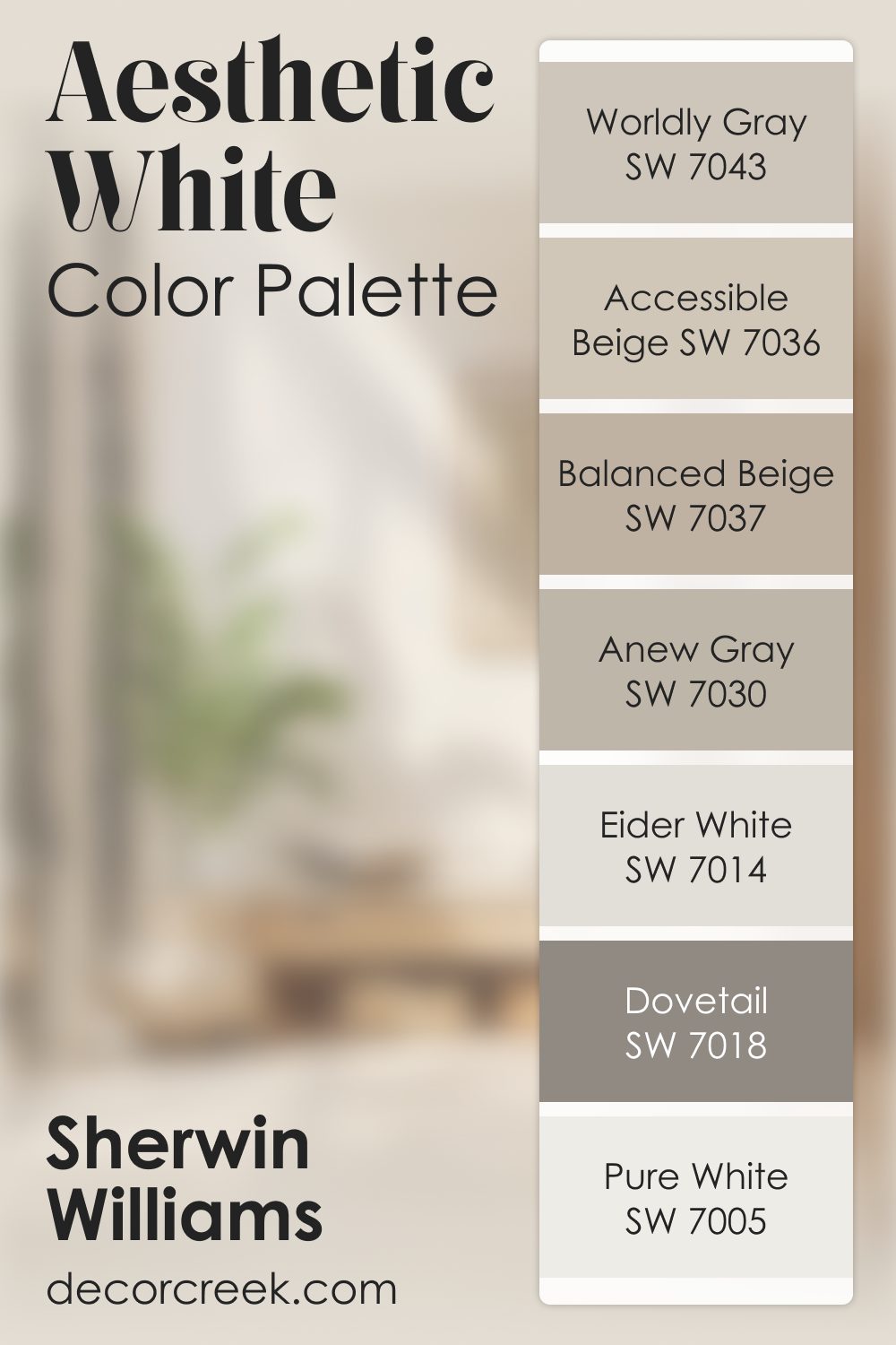
Aesthetic White SW 7035 by Sherwin Williams Color Palette
Aesthetic White brings a light, soothing presence that instantly creates a calm setting. It’s soft, airy, and beautifully adaptable, making it easy to pair with many warm neutrals. Accessible Beige and Balanced Beige bring warmth and comfort, creating depth without overwhelming the palette. Pure White brightens the combination with a clean, gentle lift.
Worldly Gray and Anew Gray help structure the palette by adding natural, smooth transitions.
Dovetail brings deeper contrast that enriches the palette with a grounded feel. And Eider White ties everything together with its clean, airy brightness.
Together, these shades create a balanced, gentle palette that feels welcoming, soft, and beautifully layered.
How to Use Aesthetic White SW 7035 by Sherwin Williams In Your Home?
Aesthetic White by Sherwin Williams is a lovely, subtle shade of white that brings a warm, inviting atmosphere into any room. This color is incredibly versatile, making it an excellent choice for various spaces in your home. Whether you’re sprucing up your living room, bedroom, or even your kitchen, Aesthetic White can add a gentle touch of sophistication and coziness.
One of the best things about Aesthetic White is how it complements other colors. It works beautifully with both bright and muted tones, allowing you to mix and match your decor freely.
You can pair it with bold colors to make them stand out or with softer hues for a calming effect. It’s also great for highlighting artwork or unique furniture, as its neutral backdrop can make colors pop without overwhelming the space.
Applying Aesthetic White on walls can make small rooms appear larger and brighter, while in well-lit areas, it adds a soft, glowing effect. It’s perfect for creating a peaceful, serene environment that’s inviting and relaxing. Whether you prefer modern, traditional, or any style in between, Aesthetic White can help you create a beautiful and personalized space in your home.
Aesthetic White SW 7035 by Sherwin Williams vs Mortar SW 9584 by Sherwin Williams
Aesthetic White and Mortar are two distinct colors by Sherwin Williams that have their unique characteristics. Aesthetic White is a soft, warm white with a slight hint of beige, making it a perfect option for those who want a white that’s not too stark or cold. It’s versatile and can be used in any room, offering a cozy and inviting atmosphere.
On the other hand, Mortar is a much darker shade, a grey with deep undertones that give it a rich, sophisticated look. It’s an excellent choice for adding drama or accentuating spaces without overwhelming them with pure black.
While Aesthetic White brings a light, airy feel to spaces, Mortar adds depth and intensity. Together, they could complement each other well in a design, with Aesthetic White brightening spaces and Mortar providing striking contrast or focal points.
You can see recommended paint color below:
- SW 9584 Mortar
Aesthetic White SW 7035 by Sherwin Williams vs White Heron SW 7627 by Sherwin Williams
Aesthetic White and White Heron, both by Sherwin Williams, offer stylish twists on classic white. Aesthetic White leans towards a warm, welcoming tone. It’s not stark; instead, it adds a cozy, inviting feel, perfect for any space craving a touch of warmth.
Think of it as a gentle hug for your walls, making rooms feel more like home. On the other hand, White Heron stands out with its crisp, clean vibe. It’s brighter and feels more refreshing, making it great for spaces that need to feel open and airy.
Where Aesthetic White brings a subtle warmth, White Heron offers a clear, sharp background, excellent for modern aesthetics or enhancing natural light in a space. Together, these colors provide versatile options for different moods and settings — Aesthetic White infusing warmth and coziness, and White Heron delivering a fresh, clean backdrop.
You can see recommended paint color below:
- SW 7627 White Heron
Aesthetic White SW 7035 by Sherwin Williams vs Egret White SW 7570 by Sherwin Williams
Aesthetic White and Egret White by Sherwin Williams are two popular paint colors, often used for their soft and gentle appeal. Aesthetic White is a warm shade with a subtle beige undertone, giving a cozy and welcoming vibe to any space.
It’s versatile, making it a great choice for various rooms, from living areas to bedrooms. Egret White, on the other hand, leans more towards a light gray with a hint of warmth. This color is perfect for those who prefer a slightly cooler palette but still appreciate a touch of warmth to ensure the space feels inviting. Both colors are excellent for creating a serene and peaceful environment.
However, your choice between them might depend on the specific mood you want to create or the existing decor elements in your room. Aesthetic White is best if you’re aiming for a classic, warm look, while Egret White works well for a more modern, subtle elegance.
You can see recommended paint color below:
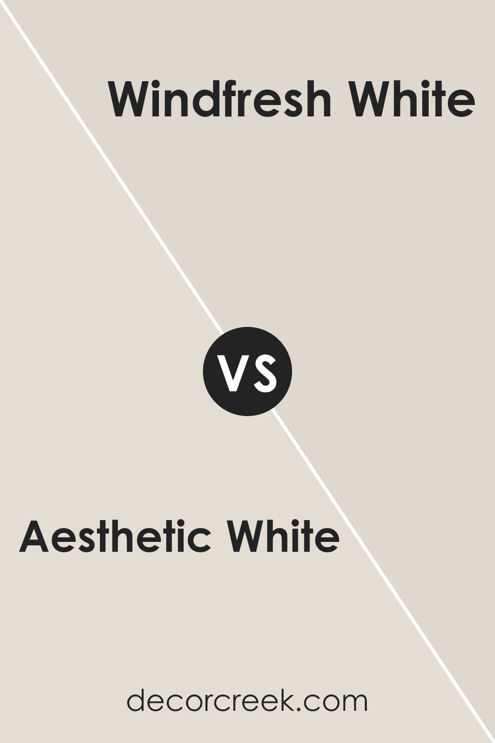
Aesthetic White SW 7035 by Sherwin Williams vs Windfresh White SW 7628 by Sherwin Williams
Aesthetic White and Windfresh White, both from Sherwin Williams, offer subtle variations in white tones that can significantly affect the mood of a room. Aesthetic White leans towards a warm palette, carrying creamy undertones. It’s ideal for creating a cozy, welcoming space without overwhelming it with color. This shade suits almost any room and pairs well with soft or rich hues, allowing flexibility in design.
On the other hand, Windfresh White offers a crisper feel, closely aligning with pure white but with just a hint of cool undertones. It’s perfect for spaces that aim for a fresh, clean look, like bathrooms or kitchens, or for enhancing natural light in a less sunny room. This color provides a more modern touch and works well with bold or pastel accents.
While both colors are versatile, the choice between Aesthetic White and Windfresh White depends on the desired warmth and overall atmosphere of the space.
You can see recommended paint color below:
- SW 7628 Windfresh White
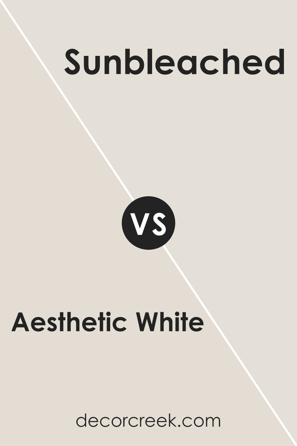
Aesthetic White SW 7035 by Sherwin Williams vs Sunbleached SW 9585 by Sherwin Williams
Aesthetic White and Sunbleached are two paint colors from Sherwin Williams that each bring their own unique vibe to a space. Aesthetic White is kind of like a warm hug for your walls. It’s not a stark white but has this creamy, soft touch that makes any room feel more cozy and inviting. Think of it as the kind of color that plays well with others, making it super easy to match with different decor styles and colors.
On the other hand, Sunbleached is like the last golden hour of a sunny day. It has this light, almost faded look that reminds you of wood that’s been gently worn by the sun. It’s a bit more specific in its appeal compared to Aesthetic White, giving rooms a laid-back, beachy vibe that’s really soothing.
Choosing between them depends on what feeling you want to bring to your space. All room feel both relaxing and homey, go for Sunbleached when you’re aiming for that airy, sun-kissed atmosphere.
You can see recommended paint color below:
- SW 9585 Sunbleached
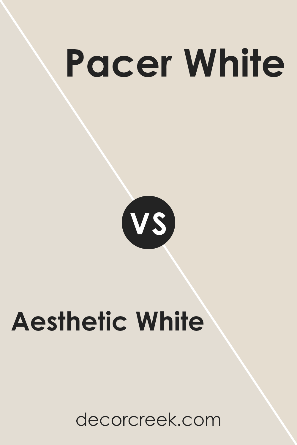
Aesthetic White SW 7035 by Sherwin Williams vs Pacer White SW 6098 by Sherwin Williams
Aesthetic White and Pacer White are two paint colors that offer subtle differences to any space they’re used in. When you look at Aesthetic White, you’re greeted by a color that carries a hint of warmth, making it versatile for rooms where you want a cozy yet bright feel. Its creamy undertone ensures it’s not stark, providing a soft backdrop that’s inviting and gentle.
On the other hand, Pacer White leans a bit more towards the neutral side, offering a clean and clear look without the warmth that Aesthetic White brings. It’s excellent for those wanting a more straightforward, classic white that ad applies broadly without warmth making spaces feel refreshed and open.
Both colors serve well in a range of lighting conditions, but the choice between them really boils down to the vibe you’re aiming for. Aesthetic White wraps you in a subtle, warm hug, perfect for living rooms or bedrooms. Pacer White keeps things crisp and clean, ideal for kitchens, bathrooms, or modern living spaces looking for a minimalist touch.
You can see recommended paint color below:
- SW 6098 Pacer White
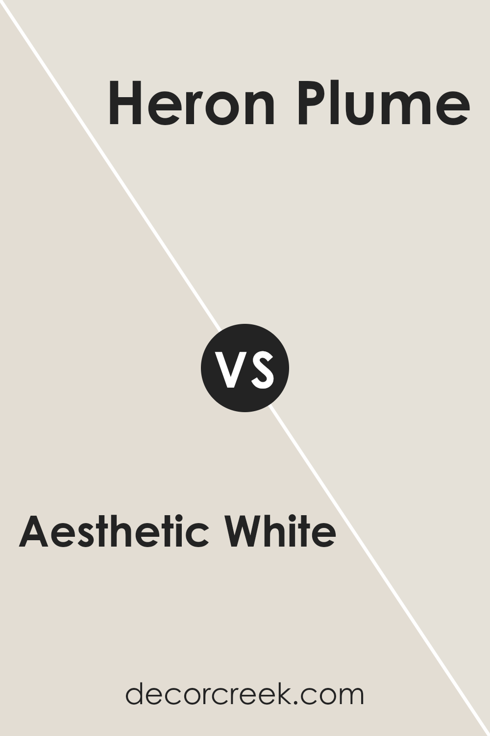
Aesthetic White SW 7035 by Sherwin Williams vs Heron Plume SW 6070 by Sherwin Williams
Aesthetic White and Heron Pluma are two subtle and soft colors by Sherwin Williams, offering their unique takes on neutral shades. Aesthetic White leans more towards a warm and inviting tone, with a creamy touch that makes it perfect for creating a cozy atmosphere. It’s the kind of color that can brighten up spaces without overwhelming them, offering a nice backdrop for various decor styles.
On the other hand, Heron Plume has a cooler undertone, giving off a serene and calm vibe. It’s a bit lighter compared to Aesthetic White, and its subtle gray hints make it a great choice for those who prefer a more neutral or modern look. Heron Plume works well in spaces that get a lot of natural light, as it can enhance the room’s brightness and airiness.
Both colors are versatile and can be used in different settings, from living rooms to bedrooms, depending on the ambiance you’re aiming for. Aesthetic White brings warmth and softness, while Heron Plume adds a touch of elegance and tranquility.
You can see recommended paint color below:
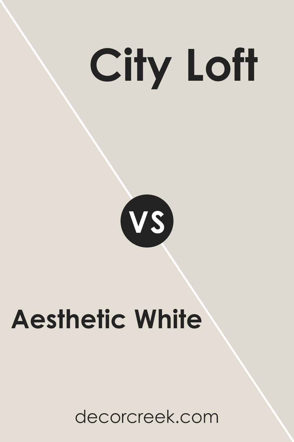
Aesthetic White SW 7035 by Sherwin Williams vs City Loft SW 7631 by Sherwin Williams
Aesthetic White and City Loft, both by Sherwin Williams, offer subtle yet distinctive shades for walls. Aesthetic White leans towards a soft, creamy hue, making spaces feel warm and inviting without overwhelming brightness. It’s like the gentle light of early morning, providing a calm, comforting backdrop. On the other hand, City Loft offers a lighter, more neutral tone.
It’s akin to a soft, overcast sky, creating a serene and open atmosphere. This color is perfect for those who prefer a hint of coolness, bringing a fresh and airy feel to rooms.
Together, these colors can complement each other well in different spaces or serve as standalone options based on the mood you’re aiming for. Aesthetic White adds warmth and coziness, ideal for living rooms or bedrooms, while City Loft can make small spaces appear larger, perfect for kitchens or bathrooms. In essence, choosing between them depends on the desired ambiance: cozy and warm versus bright and airy.
You can see recommended paint color below:
- SW 7631 City Loft
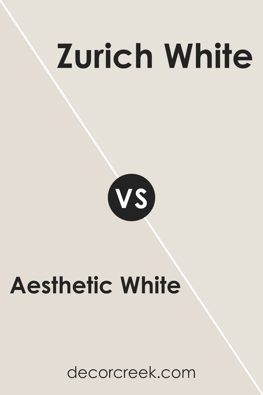
Aesthetic White SW 7035 by Sherwin Williams vs Zurich White SW 7626 by Sherwin Williams
Aesthetic White and Zurich White are two Sherwin Williams colors that seem similar at first glance but have their own unique tones. Aesthetic White is a warm white with a hint of beige, giving it a cozy and welcoming vibe. It’s not stark or cold; instead, it offers a soft, creamy appearance. This makes it great for rooms where you want a comfortable, inviting atmosphere.
On the other hand, Zurich White leans towards a slightly cooler palette, having a subtle gray undertone. This doesn’t make it icy but rather provides a clean, crisp look. It’s excellent for spaces where you seek a modern and fresh feel without the harshness of pure white.
While Aesthetic White envelops a room in warmth, making it feel like a snug embrace, Zurich White refreshes a space, making it appear bright and airy. D
epending on the mood you want to set or the direction of the light in the room, you might prefer the warmth of Aesthetic White or the crispness of Zurich White. Both are versatile but cater to different aesthetic preferences and designs.
You can see recommended paint color below:
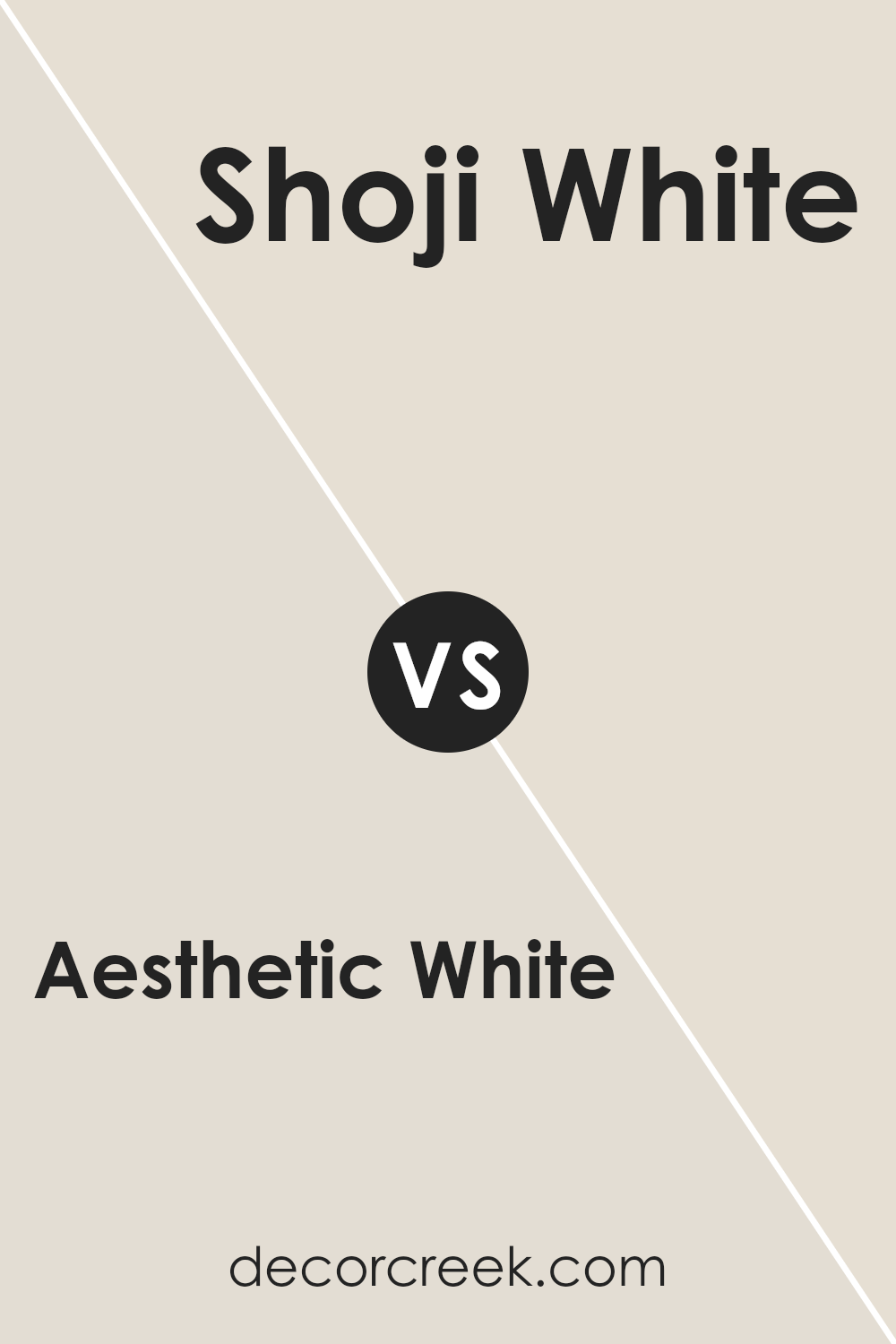
Aesthetic White SW 7035 by Sherwin Williams vs Shoji White SW 7042 by Sherwin Williams
Aesthetic White and Shoji White by Sherwin Williams are both popular choices for people looking to add a sophisticated touch of color to their walls without overshadowing their decor. Aesthetic White has a slightly warm hue, making it ideal for spaces where you want a cozy and welcoming atmosphere. It’s not too stark or creamy, striking a perfect balance for a clean look that still feels homey.
On the other hand, Shoji White stands out for its neutral base, leaning just a tad cooler than Aesthetic White. It’s incredibly versatile, fitting seamlessly into almost any space without creating a cold feel.
This color can brighten up rooms without the harshness that some brighter whites bring, providing a soft backdrop that complements various decorating styles.
While both colors share a base of white, their undertones set them apart, offering subtle but significant differences. Aesthetic White brings warmth to spaces that crave a touch of coziness, whereas Shoji White offers a cleaner, more neutral canvas, adapting flexibly to different lighting and decor. Choosing between them depends on the mood you’re aiming to achieve in your room.
You can see recommended paint color below:
Conclusion
Aesthetic White by Sherwin Williams is a versatile paint color that is gaining popularity for its ability to bring a warm and inviting atmosphere to any space. Its unique shade can serve as both a cozy background and a subtle statement, making it an excellent choice for those looking to refresh their interiors without overwhelming the senses.
This color harmonizes well with various decor styles and materials, making it a go-to for homeowners and designers alike who are aiming for a chic yet understated look.
In conclusion, Aesthetic White proves to be a sophisticated and flexible option for anyone looking to update their home or office. Its ability to blend seamlessly with different settings and enhance the overall aesthetic appeal without dominating the space is what sets it apart.
Whether it’s used in a busy family kitchen, a serene bedroom, or a lively living area, it offers a timeless elegance that appeals to a wide range of tastes.

Ever wished paint sampling was as easy as sticking a sticker? Guess what? Now it is! Discover Samplize's unique Peel & Stick samples.
Get paint samples
