Introducing the vibrant and stunning shade known as AF-290 Caliente from Benjamin Moore. This paint color is all about bringing warmth and energy into any space. Caliente is a bold red that manages to be both striking and elegant, making it a perfect choice for anyone looking to add a pop of color to their home.
As part of Benjamin Moore’s highly regarded color collection, Caliente stands out for its ability to complement a wide range of decor styles, from modern and contemporary to classic and cozy.
When you choose Caliente for your walls, you’re not just picking a paint color. You’re making a statement. This shade has the power to transform a room, giving it a feeling of dynamism and passion. Whether you’re painting an accent wall, a full room, or even a piece of furniture, Caliente guarantees to bring life and character to your space.
It’s more than just its looks; Benjamin Moore’s paint is known for its quality and durability, ensuring that the beautiful color you apply stays vibrant for years to come. Caliente is not just a choice; it’s an investment in making your home feel more welcoming and lively.
If you’re looking to add some warmth and a touch of boldness to your living environment, AF-290 Caliente by Benjamin Moore is an option worth considering.
What Color Is Caliente AF-290 by Benjamin Moore?
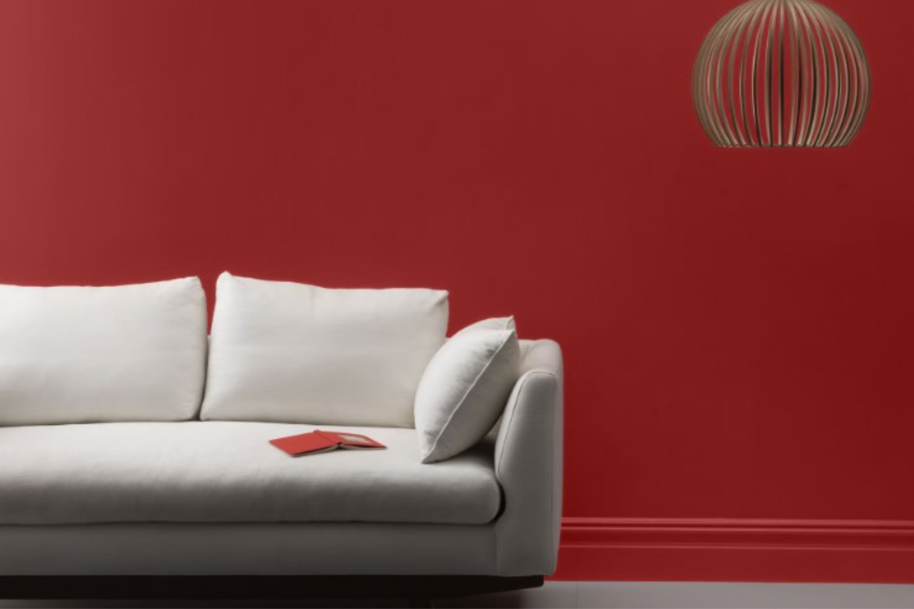
Caliente is a strikingly bold hue by Benjamin Moore that appears as a rich, deep red, displaying an undeniable warmth and sophistication. This color has a vivid quality that can effortlessly make any space feel more inviting and vibrant.
Its depth allows it to stand out as an accent or command attention as the main color theme in a room. Caliente works exceptionally well in interior styles that celebrate boldness and energy, such as modern, contemporary, and even eclectic designs. It has the remarkable ability to add depth and warmth, making spaces feel cozy yet elegant.
When considering materials and textures to pair with Caliente, consider natural elements that complement its warmth. Wood, in its various tones, from light oak to dark walnut, enhances the richness of Caliente, creating a cozy, grounded atmosphere. Metallic accents, particularly in gold or brass, can add a touch of luxury and sophistication, bringing out the vividness of the red.
For textiles, think about velvet for an added layer of sumptuousness or linen for a softer, more relaxed feel. Together, these combinations can create a dynamic and inviting space that feels both modern and timeless.
Opting for Caliente in your home is a way to introduce a sense of boldness and warmth, perfect for creating spaces that are both eye-catching and comfortably sophisticated.
Ever wished paint sampling was as easy as sticking a sticker? Guess what? Now it is! Discover Samplize's unique Peel & Stick samples.
Get paint samples

Is Caliente AF-290 by Benjamin Moore Warm or Cool color?
Caliente AF-290 by Benjamin Moore is a bold, vibrant shade of red that brings a lot of warmth and energy into any home. When used in interior decorating, this color can truly transform a space, making it feel more inviting and full of life.
It’s perfect for adding a pop of color to a room, whether you paint a single accent wall or use it for decor items like cushions or artwork. Because of its strong presence, it works well in spaces where you want to stimulate conversation and interaction, such as the living room or dining area.
However, because it’s such a powerful color, it’s important to balance it out with neutral tones like white, beige, or soft grays. This ensures that the space doesn’t feel overwhelming. Natural light helps soften the intensity of Caliente AF-290, making the room look vibrant without overdoing it. In dimmer spaces, it can create a cozy, snug atmosphere. Using this color thoughtfully can therefore help you achieve just the right mood and aesthetic in your home, making it feel both warm and dynamic.
Undertones of Caliente AF-290 by Benjamin Moore
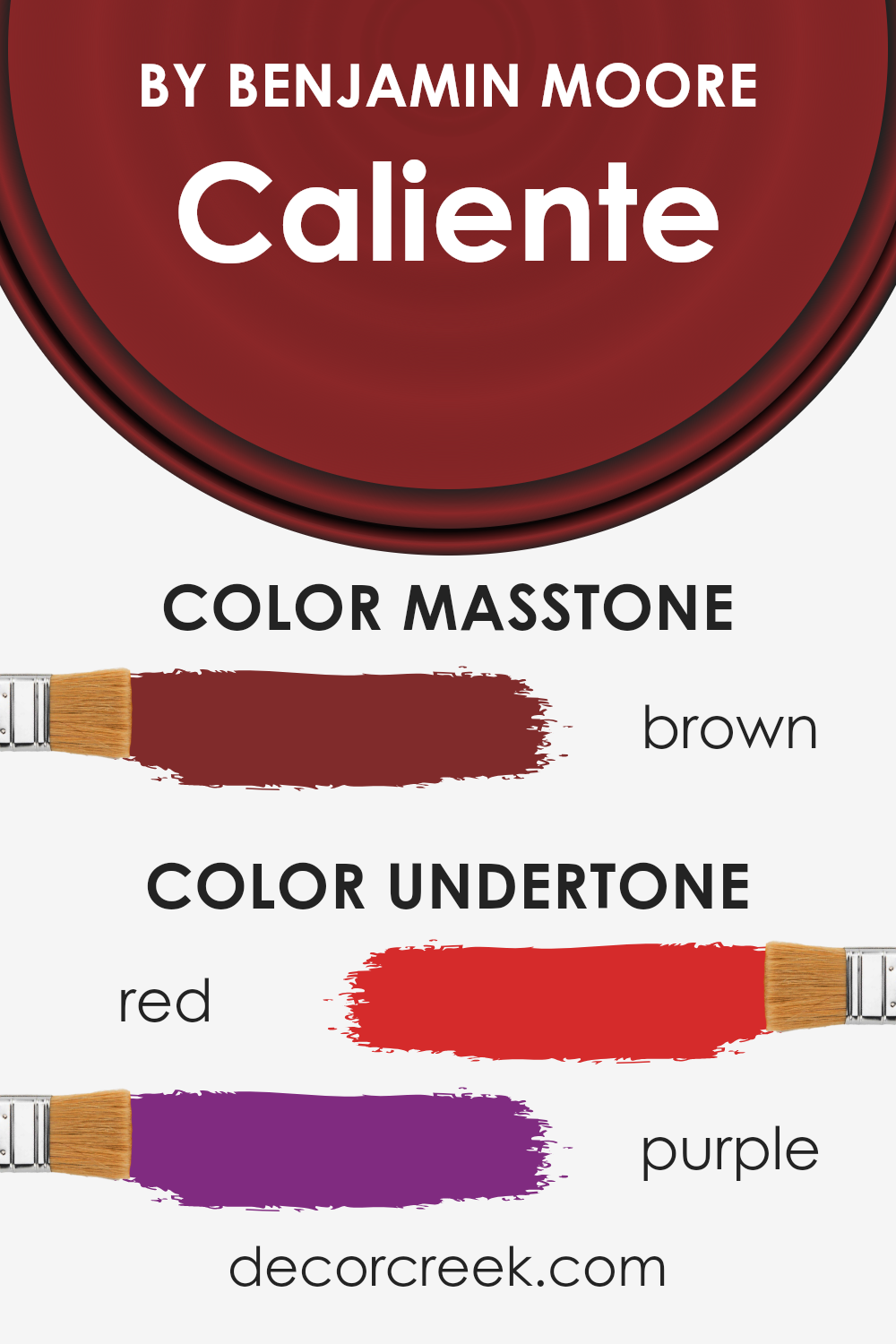
Caliente is a vibrant, bold color that carries a mix of warm undertones. The red (#D52B2B) brings a fiery, energetic vibe to the color, infusing spaces with warmth and vitality. It’s like adding a little bit of spice that wakes up the senses. This type of red can make rooms feel cozy and inviting, perfect for places where you want to spark conversations or add a dramatic flair.
On the other hand, the purple undertone (#802B80) adds a touch of sophistication and depth. Purple, often associated with luxury and creativity, brings an element of surprise to Caliente, softening the red’s intensity and making the color more nuanced and complex.
When it comes to how undertones affect the way we see color, they can significantly influence our perception. Depending on the lighting and surrounding colors, undertones can either enhance or subdue the main hue.
For instance, in natural light, Caliente’s red undertone may appear more vibrant, making a room feel lively and energetic. In artificial light, the purple undertone might become more pronounced, lending a richer, more luxurious feel.
On interior walls, these undertones play a crucial role in contributing to the atmosphere of a room. Caliente can transform a space, making it feel bold yet sophisticated, warm yet inviting. It’s ideal for creating a statement wall or adding depth to an otherwise neutral palette. Its unique blend of undertones can also complement various decor styles, from modern to traditional, by adjusting the room’s mood to match.
What is the Masstone of the Caliente AF-290 by Benjamin Moore?
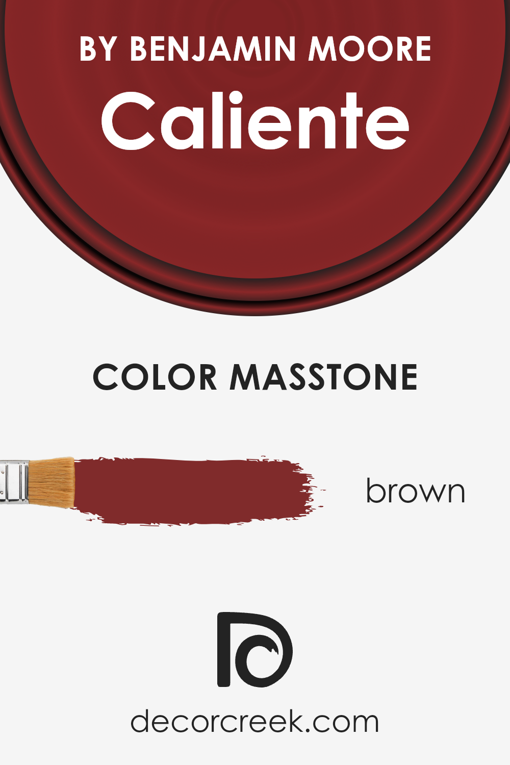
Caliente AF-290, a paint color by Benjamin Moore, has a unique charm thanks to its masstone, which is brown (#802B2B). This specific shade brings a warm and inviting atmosphere into any room of a home.
When you choose this color for your walls, you get a cozy, welcoming feeling that makes spaces feel more intimate and personal. Because of its deep, rich tone, it’s quite versatile, complementing a wide range of decor styles, from traditional to modern.
This color has the ability to make large, open spaces feel more grounded and comfortable, while also adding depth and character to smaller rooms.
Whether it’s used on a feature wall to create a focal point or as a backdrop to highlight art and furniture, its brown undertone ensures it pairs beautifully with both bold and neutral colors. This flexibility allows homeowners to experiment with different looks without changing the wall color. By adding this distinct shade to your home, you can effortlessly achieve a stylish and cohesive look that stands out.
How Does Lighting Affect Caliente AF-290 by Benjamin Moore?
Lighting plays a crucial role in how we perceive colors. The same paint on a wall can look different throughout the day or under various lighting conditions. This is because light affects the way color wavelengths are absorbed and reflected back to our eyes.
Consider a color like Benjamin Moore’s Caliente. It’s a vibrant, bold hue that can transform a space depending on the lighting. In natural light, Caliente appears bright and lively, making rooms feel energetic and warm. However, artificial light can change its appearance. Under warm lighting, Caliente might look richer and more inviting, while cool lighting could make it appear slightly muted.
- Rooms facing different directions also witness shifts in how Caliente presents itself due to the quality of natural light they receive. North-faced rooms get less direct sunlight, causing colors to appear more consistent but somewhat cooler throughout the day. In such rooms, Caliente might seem a bit more subdued, maintaining its depth but with a cooler undertone.
- South-faced rooms bask in ample sunlight, making colors like Caliente look vibrant and dynamic. Here, the color can truly shine, appearing warmer and more radiant as the sun moves.
- East-faced rooms enjoy the morning sunlight, which is cooler and bluer. This kind of light can make Caliente look very vibrant in the morning, gradually shifting to a softer tone as the day progresses.
- West-faced rooms get the evening light, which is warmer and golden. In these rooms, Caliente will glow warmly in the afternoons and evenings, capturing the richness of the sunset hours.
Ultimately, the interaction between light and color is a dance of wavelengths and perceptions. A color like Caliente is a perfect example of how light can influence mood and atmosphere in a room, showcasing the dynamic relationship between the two.
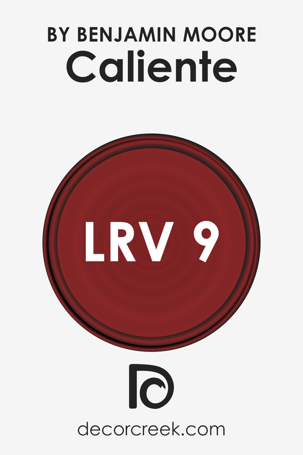
What is the LRV of Caliente AF-290 by Benjamin Moore?
LRV stands for Light Reflectance Value, which is a measure used to describe the percentage of light a paint color reflects when it’s applied to a surface. Think of it this way: On a scale from 0 to 100, 0 means it’s a true black, absorbing all light, and 100 means it’s a pure white, reflecting all light back.
This measurement helps in understanding how light or dark a color will look on your walls and can greatly influence the mood and appearance of a room. For instance, colors with a higher LRV make a room feel more spacious and brighter since they reflect more light. Conversely, colors with a lower LRV absorb more light, making a space feel cozier but potentially smaller and darker.
With an LRV of 8.82, Benjamin Moore’s color falls on the darker side of the scale.
This means it won’t reflect much light, absorbing more instead, which can significantly impact the atmosphere of a room. In spaces with ample natural light, the color can add a rich, deep ambiance without making the room feel too closed in. However, in a room with limited light, it might make the space feel even smaller or dimmer.
This low LRV suggests that the color is bold and can make a strong statement in interior designs. It’s a color that’s likely to draw attention and can be used to create dramatic and intimate spaces, making it an excellent choice for accent walls or rooms where you want to foster a sense of coziness and warmth.
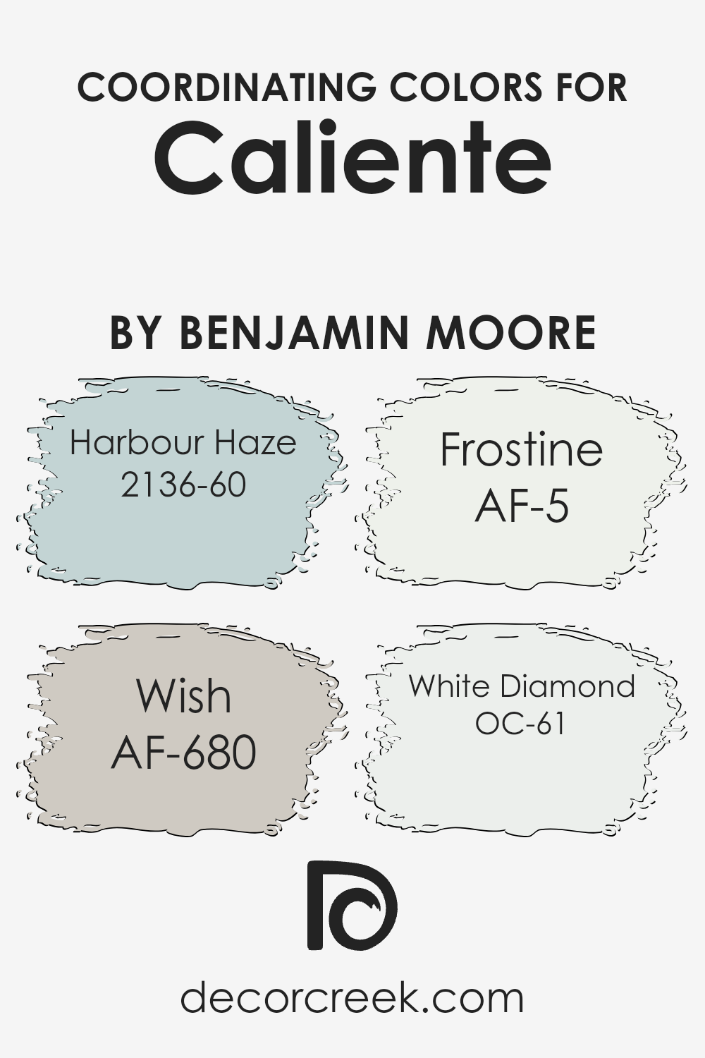
Coordinating Colors of Caliente AF-290 by Benjamin Moore
Coordinating colors are hues that work harmoniously together to complement or enhance each other, bringing balance and a sense of cohesion to a color scheme. In the case of a vibrant hue like Caliente AF-290 by Benjamin Moore, a carefully selected palette of coordinating colors can help to create a visually appealing and balanced space.
By integrating shades such as Harbour Haze, Wish, Frostine, and White Diamond, one can craft a color scheme that not only highlights the richness of Caliente but also adds depth and variety to the design.
Harbour Haze is a light, airy blue with a serene quality that pairs beautifully with the boldness of Caliente, offering a refreshing counterbalance. Wish, on the other hand, is a subtle, neutral taupe that brings a soft, grounding element to the palette, ensuring that the overall look remains sophisticated and not overwhelming.
Frostine is a delicate, almost ethereal white with a slight cool undertone, providing a crisp, clean contrast that can enhance the vibrancy of Caliente. Finally, White Diamond is a bright, sparkling white that offers a pure, invigorating freshness, working wonders in illuminating and enlarging any space it graces. Together, these coordinating colors create a harmonious and engaging palette that can breathe life and elegance into a room.
You can see recommended paint colors below:
- 2136-60 Harbour Haze
- AF-680 Wish
- AF-5 Frostine
- OC-61 White Diamond
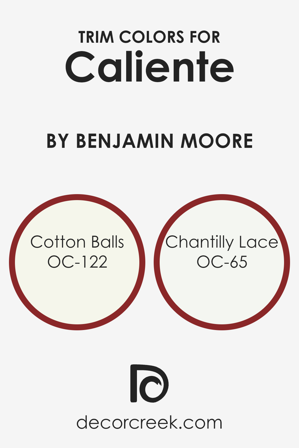
What are the Trim colors of Caliente AF-290 by Benjamin Moore?
Trim colors are specific shades used on the finishing touches of a room, like baseboards, moldings, door frames, and window frames, contrasting or complementing the main wall color to enhance the room’s overall appearance.
For a dynamic and bold color like Caliente by Benjamin Moore, selecting the right trim color is crucial because it can either highlight the vibrant quality of the wall or bring a sense of balance and refinement to the space. Trim colors act as a frame for the wall, emphasizing its hue and contributing to the room’s ambiance and cohesiveness. They can transform the feel of the room, making it feel more polished or adding a layer of sophistication.
Cotton Balls (OC-122) is a soft, warm white with a hint of creaminess, making it an excellent choice for trim with Caliente walls, as it offers a gentle transition from the bold wall color to the trim, providing a soothing touch to the eyes.
It can soften the impact of the vibrant red, adding a touch of light and airiness to the room. On the other hand, Chantilly Lace (OC-65) is a brighter, crisp white with a clean look that can make the edges of a room pop against Caliente walls, adding a fresh and striking contrast. This color has the power to define space clearly and bring a modern and sharp feel to the area, highlighting architectural details with its pure and radiant hue.
You can see recommended paint colors below:
- OC-122 Cotton Balls
- OC-65 Chantilly Lace
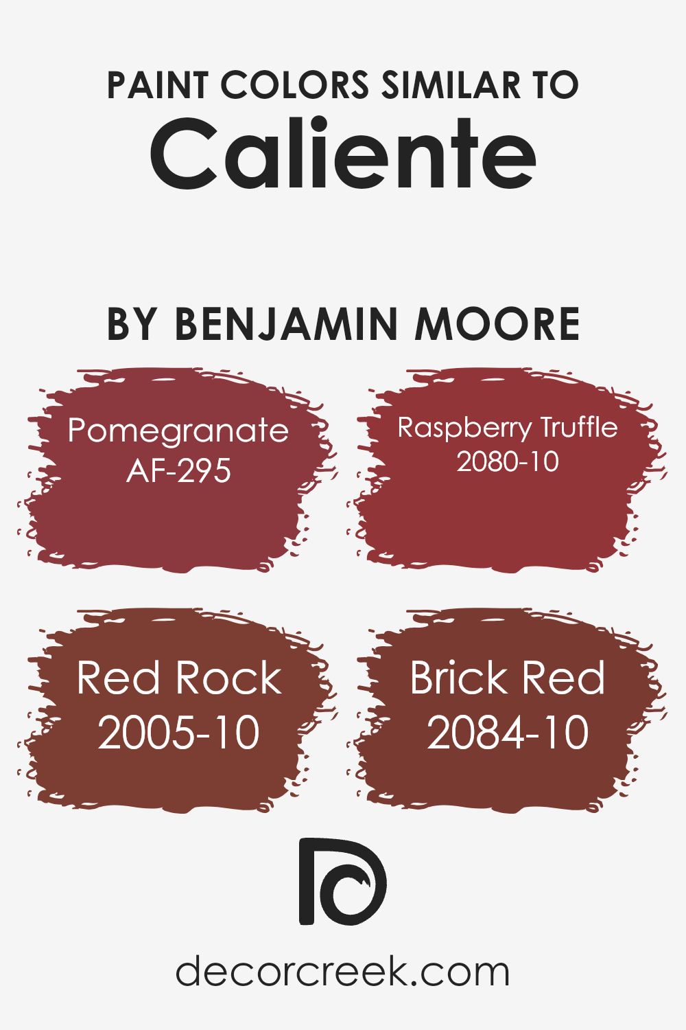
Colors Similar to Caliente AF-290 by Benjamin Moore
In interior design and decoration, using similar colors to create harmony and coherence in a space is crucial. Colors that are close in hue, such as AF-295 – Pomegranate, 2005-10 – Red Rock, 2080-10 – Raspberry Truffle, and 2084-10 – Brick Red, provide a seamless visual experience, making the environment feel more connected and pleasant.
When colors like these are used together, they offer a subtle variation that adds depth and complexity to a room without causing a visual clash. This is especially important in creating a themed or mood-centric space, where the aim is to evoke a particular feeling or atmosphere.
Pomegranate is a rich, deep red that adds a bold and robust energy to spaces, ideal for accent walls or statement furniture pieces. Red Rock has an earthy, warm tone that brings a cozy and welcoming feel, perfect for living rooms or intimate dining areas. Raspberry Truffle offers a darker, more indulgent shade of red, creating an elegant and sophisticated ambiance, suitable for bedrooms or formal sitting areas.
Lastly, Brick Red, with its traditional and timeless appeal, works well in exterior spaces or rooms that aim for a classic look. Together, these colors can transform any space into a harmoniously rich and warm environment, making it feel coordinated and thoughtfully designed.
You can see recommended paint colors below:
- AF-295 Pomegranate
- 2005-10 Red Rock
- 2080-10 Raspberry Truffle
- 2084-10 Brick Red
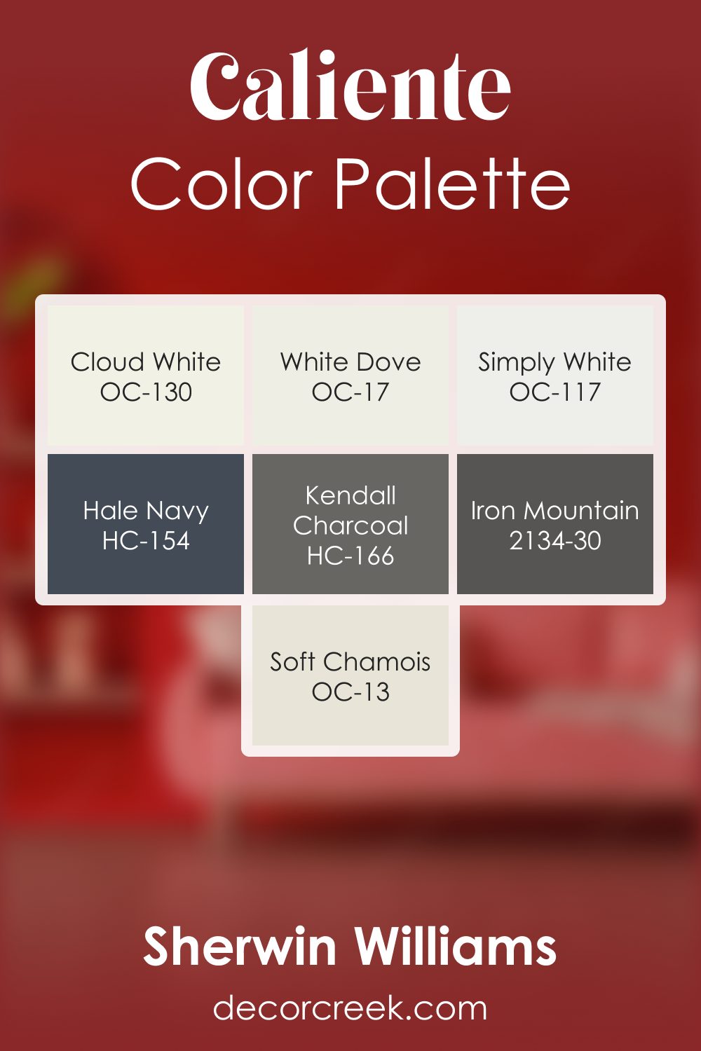
Caliente AF-290 by Benjamin Moore Color Palette
Caliente is bold, warm, and full of spirited energy, and this palette builds around that vibrant personality with a thoughtful mix of whites, deep accents, and grounding neutrals. Cloud White, White Dove, and Simply White brighten the palette and help Caliente feel warm and glowing rather than overwhelming.
Hale Navy introduces cool depth that balances the heat of the red and gives the palette strong, steady grounding.
Kendall Charcoal adds confident structure that enhances the palette’s depth and clarity. Iron Mountain deepens the contrast further, creating a rich foundation that elevates Caliente’s warmth and makes it feel refined and balanced.
Soft Chamois brings gentle warmth that softens the transitions and blends the palette together with a calm, friendly touch.
Together, these shades form a palette that feels expressive, warm, and full of personality. It works beautifully in dining spaces, entryways, creative rooms, and cozy corners where color can shine with confidence and warmth.
How to Use Caliente AF-290 by Benjamin Moore In Your Home?
Caliente AF-290 by Benjamin Moore is a vibrant, powerful red paint color that can make a statement in any home. This bold hue is perfect for those wanting to add a touch of drama and excitement to their living spaces.
You can use Caliente AF-290 in various ways to create different effects. For instance, painting an accent wall in a room with this color can add a lively focal point without overwhelming the space. This approach works great in living rooms or dining areas, making the space feel warm and inviting.
If you’re feeling adventurous, consider painting your front door with Caliente AF-290. This creates a welcoming entrance and boosts your home’s curb appeal. For a more subtle usage, incorporating accessories like cushions, vases, or artwork featuring this rich red can add a pop of color to a neutral room.
Because of its bold nature, pairing Caliente AF-290 with neutral tones or soft colors allows it to stand out, making your decor choices look intentional and chic.
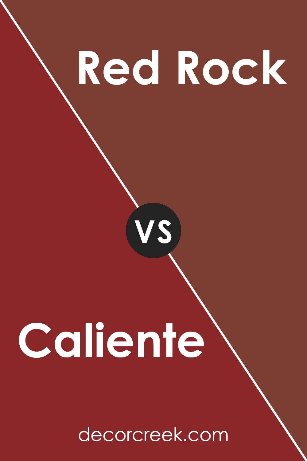
Caliente AF-290 by Benjamin Moore vs Red Rock 2005-10 by Benjamin Moore
Caliente AF-290 and Red Rock 2005-10 are both vibrant paint colors from Benjamin Moore, but they bring different feels to a space. Caliente AF-290 is a bold, strong red. It’s the kind of color that makes a statement in any room, creating a lively and energetic atmosphere. It’s perfect for someone looking to add a splash of confidence to their decor.
On the other hand, Red Rock 2005-10 leans towards a warmer, earthier tone. It’s not just any red; it’s like the warm hues you’d see in natural clay or a desert landscape at sunset. This color brings a cozy and inviting vibe, making it ideal for spaces where comfort and warmth are key.
Although both colors are red, Caliente is more about boldness and energy, while Red Rock offers a sense of warmth and natural comfort. Choosing between them depends on the mood you’re aiming to create in your space.
You can see recommended paint color below:
- 2005-10 Red Rock
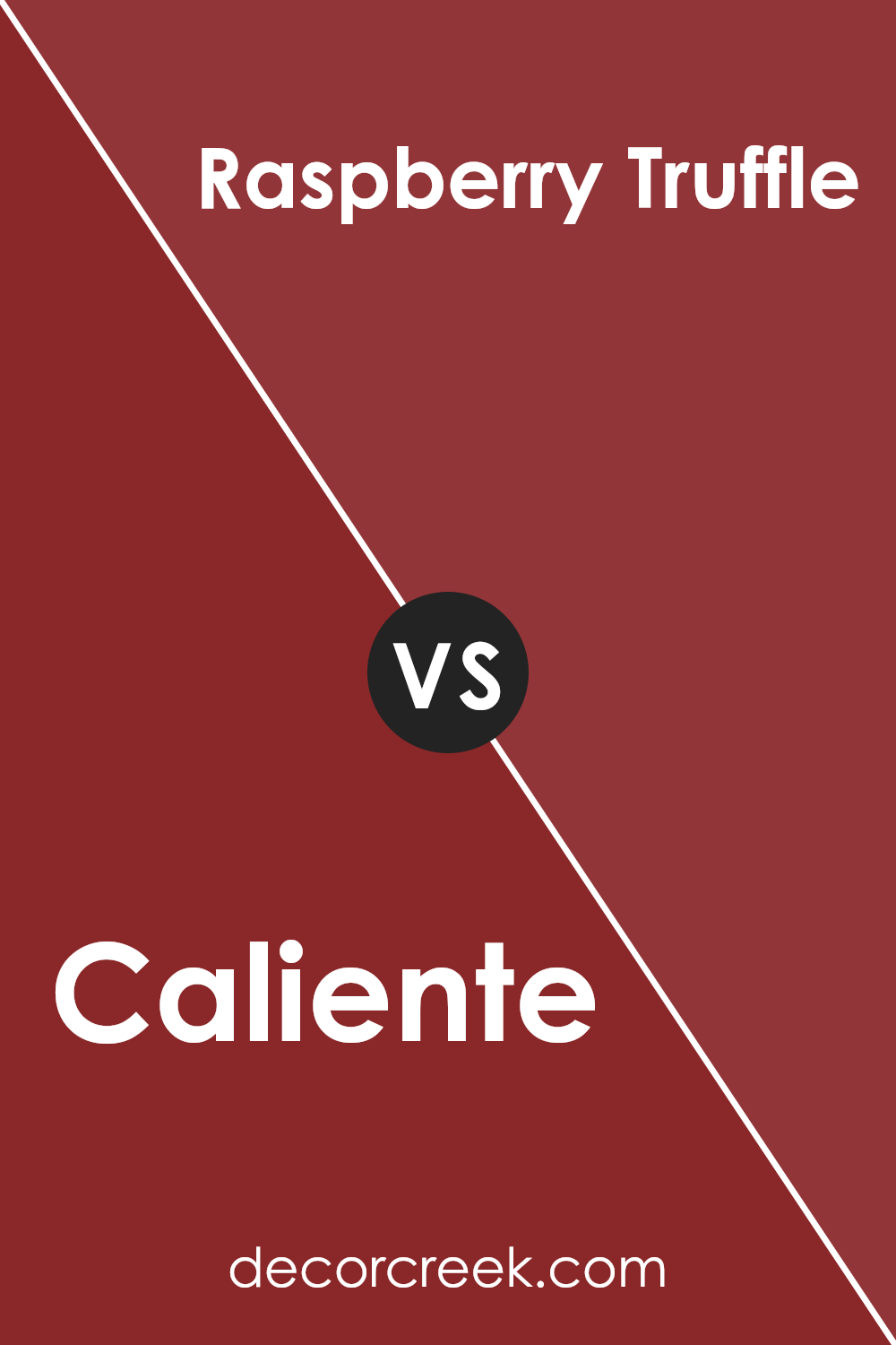
Caliente AF-290 by Benjamin Moore vs Raspberry Truffle 2080-10 by Benjamin Moore
Caliente is a bold and lively red that jumps out at you. It’s like the red you see on a fire truck: vibrant and full of energy. It doesn’t just sit back; it stands out and grabs your attention. On the other hand, Raspberry Truffle has a softer, more comforting feel. Imagine the rich, deep color of a raspberry dessert – that’s what this color brings to mind.
It’s still in the red family but leans towards a darker, more chocolatey shade that feels cozy and warm. While Caliente is all about making a statement and livening up a space, Raspberry Truffle offers a more subdued, inviting atmosphere.
They both have their own charm: Caliente energizes a room, while Raspberry Truffle makes it feel like a cozy retreat.
You can see recommended paint color below:
- 2080-10 Raspberry Truffle
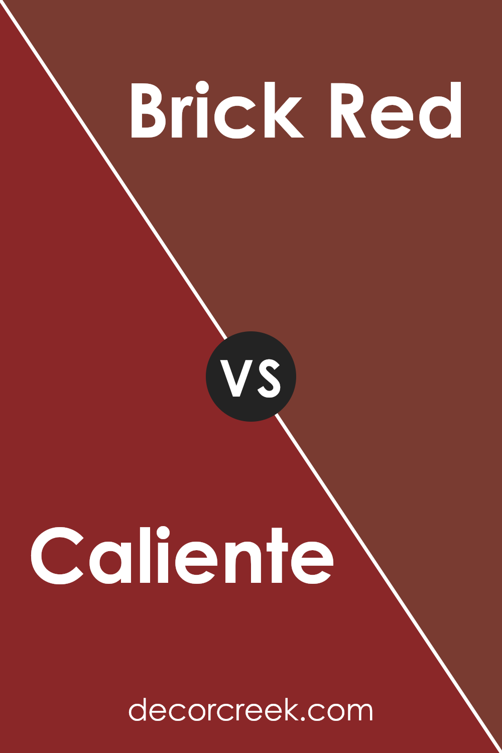
Caliente AF-290 by Benjamin Moore vs Brick Red 2084-10 by Benjamin Moore
Caliente and Brick Red are two vibrant colors by Benjamin Moore that each bring their own unique vibe into a space. Caliente is a bold, fiery red that’s full of energy and warmth. It’s the kind of color that makes a statement wherever you use it, turning any space into a dynamic and lively area. It’s perfect for creating a focal point or adding a pop of intensity to an otherwise neutral palette.
On the other hand, Brick Red has a more grounded and traditional feel. It’s a deeper, more muted shade than Caliente, reminiscent of classic brick walls often seen in historic buildings.
This color is ideal for those who want to add richness and depth to their space without overwhelming it with too much brightness. It works well in cozy, intimate settings, where its earthy tones can contribute to a welcoming atmosphere.
Both colors are great choices, but their effects differ greatly due to their varying intensities and tones. While Caliente adds a touch of drama and passion, Brick Red brings in warmth and a sense of timelessness.
You can see recommended paint color below:
- 2084-10 Brick Red
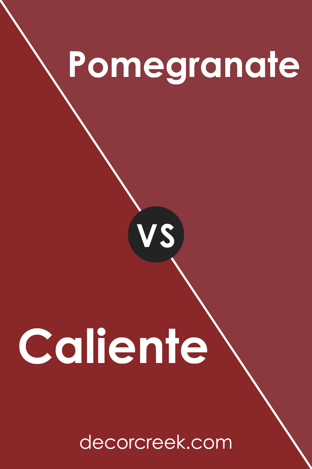
Caliente AF-290 by Benjamin Moore vs Pomegranate AF-295 by Benjamin Moore
Main color – Caliente AF-290 by Benjamin Moore is a bold, vibrant red with a slight hint of warmth. It brings a strong, energetic feel to any space, making it perfect for areas where you want to make a statement or add a burst of energy. This color works well in living rooms, dining areas, or even on a front door to welcome guests with its lively personality.
Second color – Pomegranate AF-295 by Benjamin Moore, on the other hand, is a deeper, more sophisticated shade of red. It has a rich, luxurious feel that adds depth and elegance to interiors. Unlike the bright and punchy vibe of Caliente, Pomegranate offers a more subdued and refined atmosphere, making it ideal for bedrooms, libraries, or any space where a touch of class and serenity is desired.
While both colors share a red base, Caliente is all about vibrancy and energy, whereas Pomegranate brings in a sense of richness and luxury. Each has its unique appeal, depending on the mood you want to create in your space.
You can see recommended paint color below:
- AF-295 Pomegranate
Conclusion
In conclusion, Caliente AF-290 by Benjamin Moore is a vivid and bold color that adds warmth and energy to any space it graces. Its rich, deep red tone is perfect for creating statements in homes, whether applied to a single accent wall or used throughout a room for a more immersive experience.
The color’s versatility enables it to work well in various settings, from modern to traditional, enhancing the decor with its dynamic presence.
Homeowners and designers alike appreciate the sophistication and vibrancy that Caliente AF-290 brings to interiors. Its ability to evoke feelings of passion and comfort makes it a popular choice for those looking to infuse their spaces with personality and flair.
Whether aiming to create a cozy and inviting atmosphere or seeking to inject a dash of drama, Caliente AF-290 proves to be an excellent selection, demonstrating its enduring appeal and transformative potential in interior design.
Ever wished paint sampling was as easy as sticking a sticker? Guess what? Now it is! Discover Samplize's unique Peel & Stick samples.
Get paint samples
