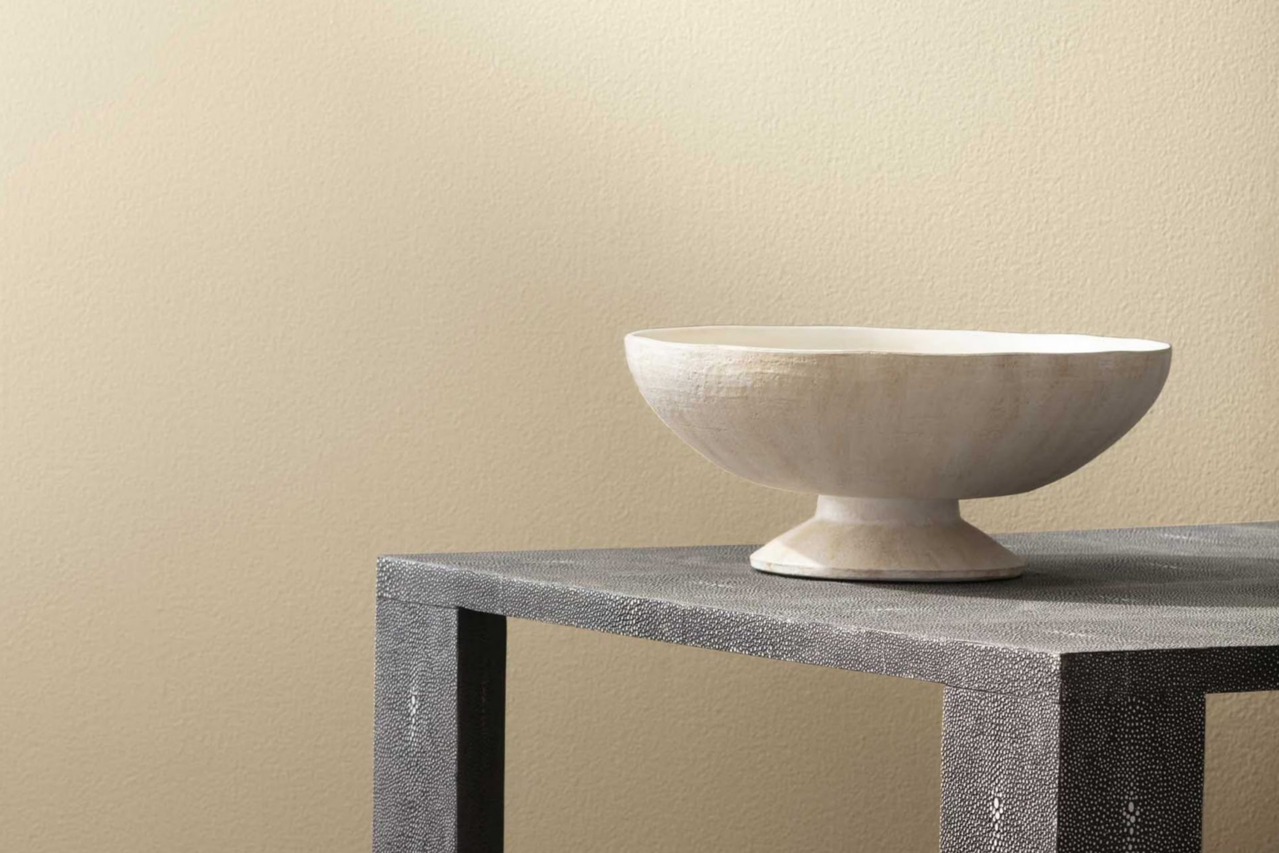
Let me tell you about Benjamin Moore’s 267 Canvas. When you see it, it’s almost like looking at a clear sky on a perfect spring day. This shade of paint has a subtle way of brightening up a room, providing a soft backdrop that complements nearly any decor style.
Using it in my own home, I noticed how it plays with natural light, shifting gently from dawn to dusk, adapting to the changing ambiance effortlessly. The color is flexible too.
Whether you’re painting a bedroom to create a calm, soothing atmosphere or giving your living room a fresh look, Canvas has a classic appeal that makes everything around it shine.
What’s really impressive is how this particular color manages to stay understated yet impactful, making it a fantastic choice for anyone looking to refresh their room without overpowering it.
What Color Is Canvas 267 by Benjamin Moore?
Canvas 267 by Benjamin Moore is a flexible beige shade that offers a warm, subtle backdrop for various interior styles. Its gentle neutrality makes it especially suitable for minimalist designs, where the focus is on simplicity and openness. It also works well in rustic settings, complementing natural wood textures and organic materials like linen, wool, and clay.
This color pairs beautifully with natural elements. In rooms featuring hardwood floors or wooden furniture, Canvas 267 creates a cohesive look that feels grounded and inviting. Its compatibility with soft, plush textures like velvet or faux fur makes it a great choice for creating cozy, comfortable rooms, ideal for living rooms or bedrooms.
For those looking to add a touch of modernity, Canvas 267 serves as an excellent base color that pairs well with metallic accents like brass or copper, bringing a touch of warmth without overpowering the room. It’s also perfect for areas with lots of natural light, as the color can appear lighter or deeper depending on the illumination, giving it a dynamic quality that adjusts throughout the day.
Ideal for anyone looking to create a calm, welcoming environment, Canvas 267 supports a variety of decorative styles and textures, making it a reliable choice for any home.
Is Canvas 267 by Benjamin Moore Warm or Cool color?
Canvas267 by Benjamin Moore is a warm, welcoming paint color that can instantly make any room feel cozy and inviting. This shade has a subtle, creamy tone that pairs well with almost any furniture or decor style. Whether you’re painting your living room, bedroom, or even the kitchen, Canvas267 creates a soft background that isn’t overpowering.
Homeowners love this color because it offers a fresh look while still being neutral, making it easy to match with other colors. It can brighten up a small room or make a large room feel more intimate and cozy. Additionally, Canvas267 works wonderfully in homes with both natural and artificial light, reflecting the light beautifully to keep rooms looking bright and airy throughout the day.
Overall, Canvas 267 is a great choice if you’re looking for a color that’s flexible and easy to live with, adding warmth to any room without being too bold or distracting.
Undertones of Canvas 267 by Benjamin Moore
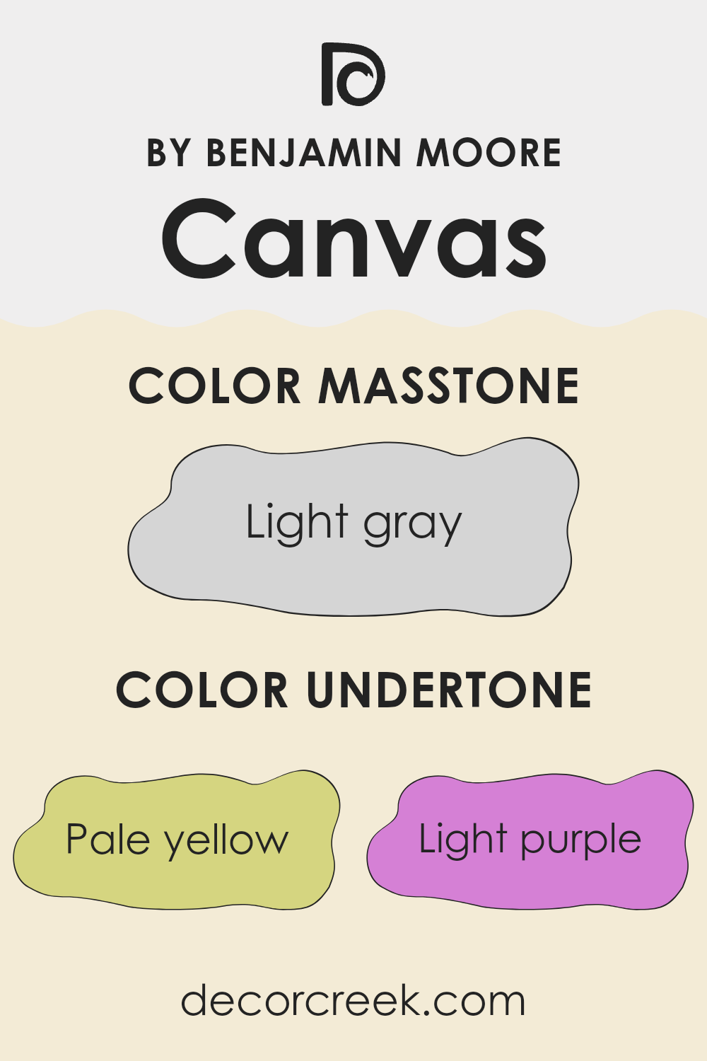
Canvas 267 by Benjamin Moore is a flexible paint color that carries a complex blend of undertones, making it an interesting choice for interior walls. The undertones in this color include pale yellow, light purple, light blue, pale pink, mint, lilac, and gray. Each of these undertones adds a subtle dimension to the paint that can influence the perceived color depending on lighting and surrounding elements.
Undertones are the underlying colors that, though not always immediately noticeable, can significantly impact how a main color looks in different situations. They can make a color appear warmer or cooler and can either complement or clash with other colors in a room.
For instance, the pale yellow undertone in Canvas267 adds a hint of warmth, making areas feel more welcoming. The light purple and lilac bring a soft, almost imperceptible depth that enriches the color complexity. Light blue and mint undertones offer a fresh, airy feel, enhancing rooms with a subtle touch of coolness.
The pale pink softens the overall appearance, contributing to a gentle ambiance. Lastly, the gray undertone in Canvas267 grounds the color, providing a neutral base that helps stabilize the potential vibrancy of the other undertones. When used on interior walls, Canvas267’s diverse undertones will interact with the room’s lighting and furnishings.
In natural light, the cooler undertones like blue and mint might become more pronounced, while in artificial lighting, the warmer tones might become more dominant. This interplay of undertones allows Canvas267 to adapt uniquely to different rooms and decors, ensuring the color never looks flat or one-dimensional. This adaptability makes it a practical choice for various room settings and styles.
What is the Masstone of the Canvas 267 by Benjamin Moore?
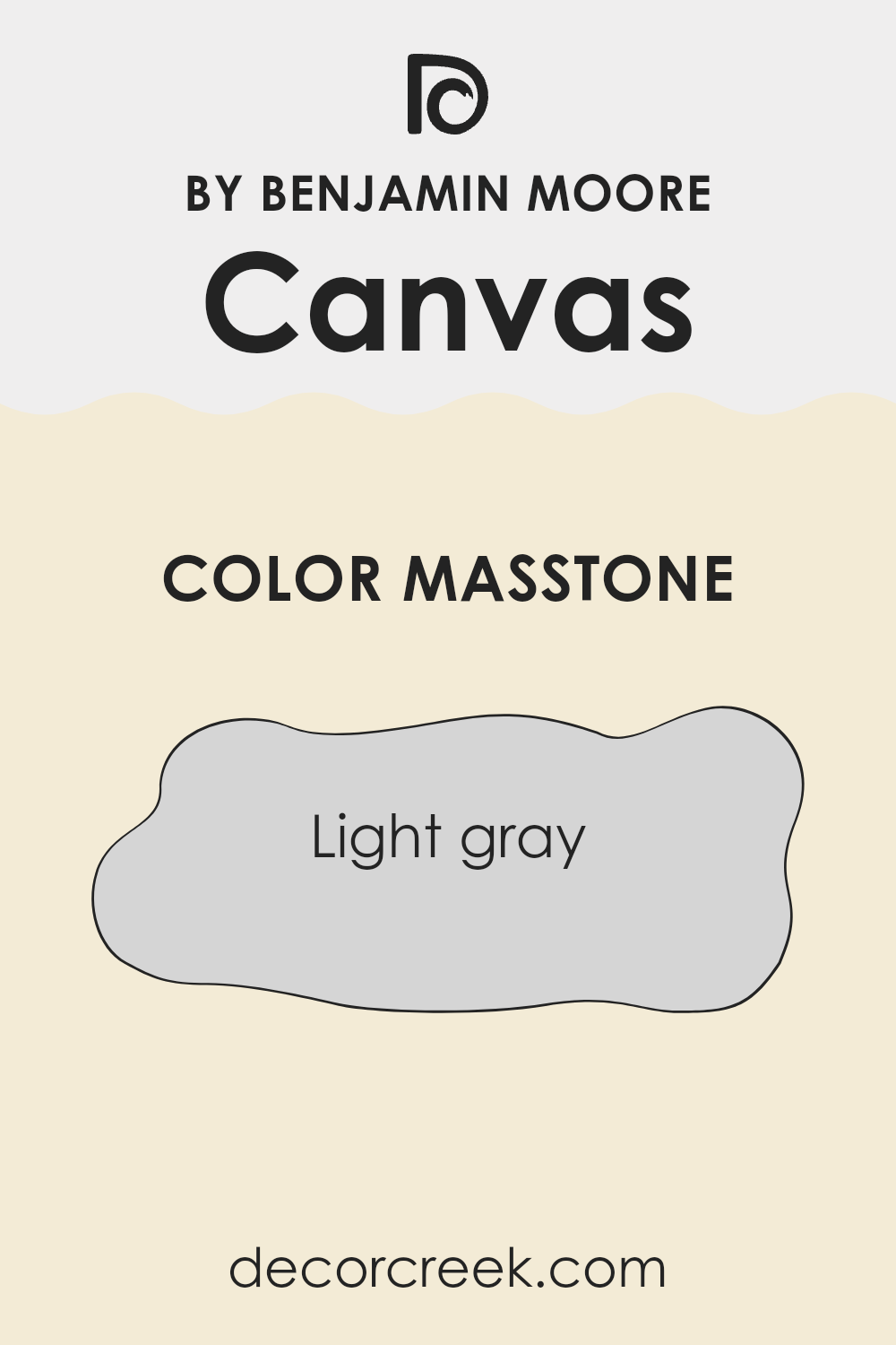
Canvas 267 by Benjamin Moore has a masstone of light gray, which presents as a soft and neutral shade. This color has a remarkable ability to blend seamlessly with various home décors, whether modern or traditional. Its light gray tone, #D5D5D5, serves as a flexible backdrop that can support both bold and subtle decorating choices.
In homes, this light gray ensures that areas feel open and airy. It’s particularly effective in smaller rooms where it can help to make the area feel more expansive than it actually is. Due to its neutral hue, it pairs well with a wide range of colors, from vibrant tones that pop against its calm background to more muted shades that complement its understated elegance.
Moreover, its adaptability extends to different light conditions, maintaining its true color whether bathed in natural sunlight or under artificial lighting. This makes it an excellent choice for main living areas, bedrooms, and even offices, ensuring consistency throughout the day.
How Does Lighting Affect Canvas 267 by Benjamin Moore?
Lighting significantly influences how colors appear in various environments, an essential factor to consider when selecting a paint color like Canvas 267 by Benjamin Moore.
The type of light—whether natural or artificial—can change how we perceive colors due to differences in light quality and intensity.
Natural Light Effects:
In rooms with natural light exposure, the orientation of the windows affects the color perception:
– North-Faced Rooms: These rooms often receive less direct sunlight, making light cooler and somewhat bluish. Canvas 267 may look more muted and slightly darker in these rooms, emphasizing its subtle tones.
– South-Faced Rooms: These areas get plentiful sunlight, which is warm and bright for most of the day. Here, Canvas 267 will appear lighter and more vibrant, showing off its warmth and potentially bringing a cheerful vibe to the room.
– East-Faced Rooms: Morning light in these rooms is warmer and becomes cooler as the day progresses. Canvas 267 will look brighter and warmer in the morning but could appear softer and cooler by the afternoon.
– West-Faced Rooms: Light in these rooms is cooler in the morning and warm in the evenings. Canvas 267 will seem more subdued in the morning but warmer and more welcoming towards sunset.
Artificial Light Effects:
Different types of artificial lighting can also affect how Canvas 267 looks:
– Incandescent Lights: These lights give off a warmer, yellowish glow, making Canvas 267 look more inviting and slightly warmer than it is.
– Fluorescent Lights: Generally casting a cooler, blue-toned light, fluorescent bulbs can make Canvas 267 appear cooler and sharper, which might reduce its warmth.
– LED Lights: Depending on the type of LED used, the effect can vary. Warm LEDs enhance warmth like incandescent lights, while cool LEDs mimic the effect of fluorescent lighting.
In summary, the appearance of Canvas 267 by Benjamin Moore can vary under different lighting conditions, both natural and artificial. It might appear more vibrant in well-lit, south-facing rooms and more subdued in north-facing rooms with less light. Adjustments in room lighting can help bring out the desired aspects of this color in your home.
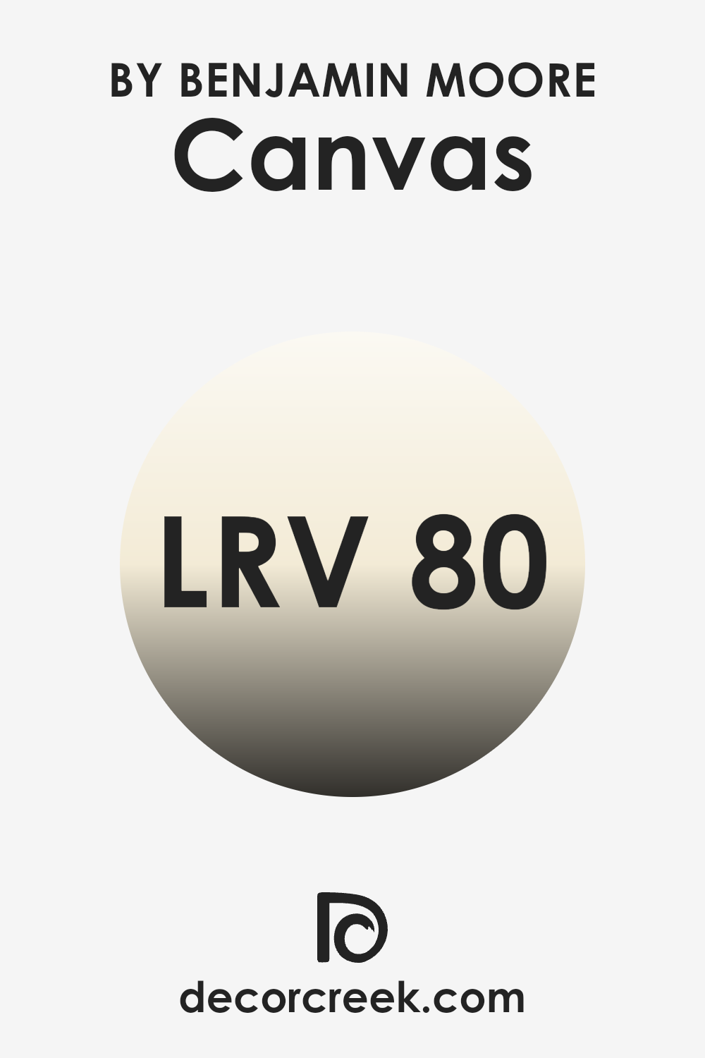
What is the LRV of Canvas 267 by Benjamin Moore?
LRV stands for Light Reflectance Value, which is a measurement used to determine how much light a color will reflect when it’s applied to a surface. LRV values range from a low number for darker shades, which absorb more light, to a high number for lighter shades, which reflect more light.
This value is critical when choosing paint colors because it helps to understand how bright or dark a room will feel once it’s painted. Lighter colors can make small areas appear larger and are also effective in rooms that don’t receive much natural light, as they make the most of the available light by reflecting it back into the room.
In the case of Canvas 267 by Benjamin Moore, which has an LRV of around 80.42, this is a relatively high value indicating that it is a light color which will reflect much of the light that hits it. This means it can help to make a room feel airy and more open, which is ideal for smaller rooms or areas with limited natural light.
This color will not only lighten up a room but also provide a subtle warmth to the walls, contributing to a pleasant and welcoming atmosphere. The high LRV rating allows for flexibility in lighting options, enhancing brightness during the day and maintaining a light and relaxed feel in the evening.
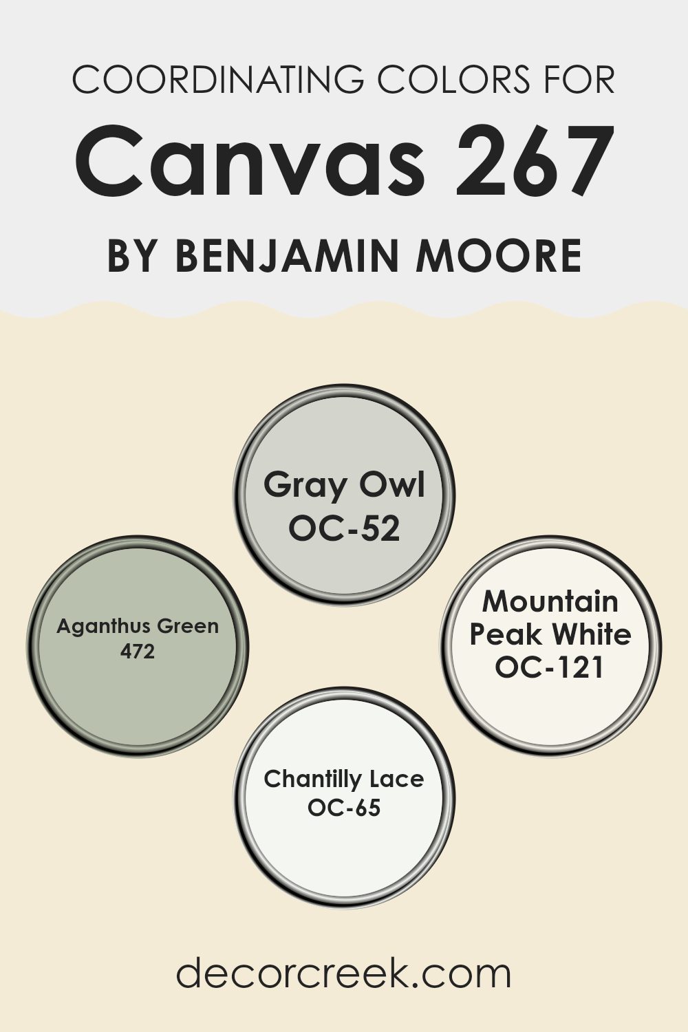
Coordinating Colors of Canvas 267 by Benjamin Moore
Coordinating colors are selected to complement each other and create a harmonious color scheme in a room. These colors are intended to be used together for walls, trim, accents, and furniture to create a cohesive and visually appealing look. The idea is to balance the colors so that they enhance the overall aesthetic without overpowering the senses. It is crucial to choose coordinating colors carefully, as they play a significant role in setting the mood and style of the room.
For example, OC-52 – Gray Owl is a soft, neutral gray with subtle green undertones that creates a calm, refined atmosphere. It is flexible enough to work in various rooms, serving as a gentle backdrop that lets other colors shine. Another coordinating color, 472 – Aganthus Green, offers a richer hue, providing a natural and inviting vibe that can breathe life into a neutral palette.
OC-121 – Mountain Peak White is a crisp, clean white that can brighten rooms and provide a sharp contrast to darker hues, making it perfect for trim or ceilings. Lastly, OC-65 – Chantilly Lace is a pure, bright white with no undertones, which makes it a go-to for a fresh and clear look, particularly in modern designs where a stark, clean appearance is desired. Together, these colors can be used to create a pleasant and stylish environment.
You can see recommended paint colors below:
- OC-52 Gray Owl
- 472 Aganthus Green
- OC-121 Mountain Peak White
- OC-65 Chantilly Lace
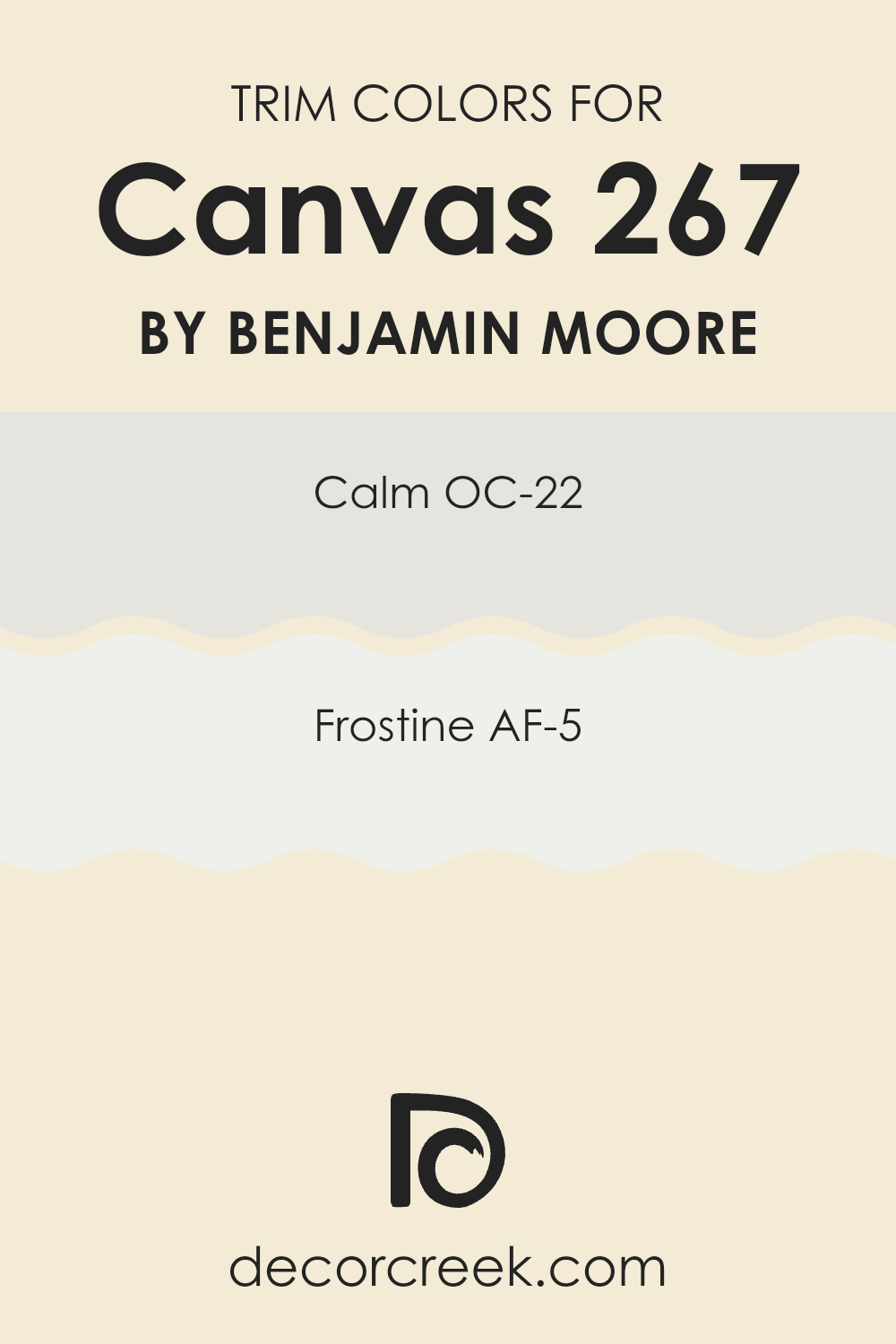
What are the Trim colors of Canvas 267 by Benjamin Moore?
Trim colors are specific shades used on the details of a room or a building, such as door frames, moldings, baseboards, and window trims. These colors play a critical role in defining the architectural details and highlighting the overall aesthetics of a room.
By selecting the right trim colors, you can enhance contrast, create a sense of coherence or add a subtle distinction that complements the primary colors of your walls. It’s similar to adding an outline or a border in art, where the goal is to bring out the best features in a painting.
OC-22 Calm is a soft, muted gray that provides a subtle and gentle contrast, working beautifully with a variety of wall colors to create a soothing backdrop without overpowering the senses.
AF-5 Frostine is another excellent choice for trim, offering a slightly crisper and cooler tone of white that provides a clean and fresh look, capable of brightening up areas while maintaining a harmonious blend with both neutral and bold wall colors.
Both of these shades from Benjamin Moore are flexible and can effectively highlight the craftsmanship and architectural details of any room, providing an aesthetically pleasing and polished finish.
You can see recommended paint colors below:
- OC-22 Calm
- AF-5 Frostine
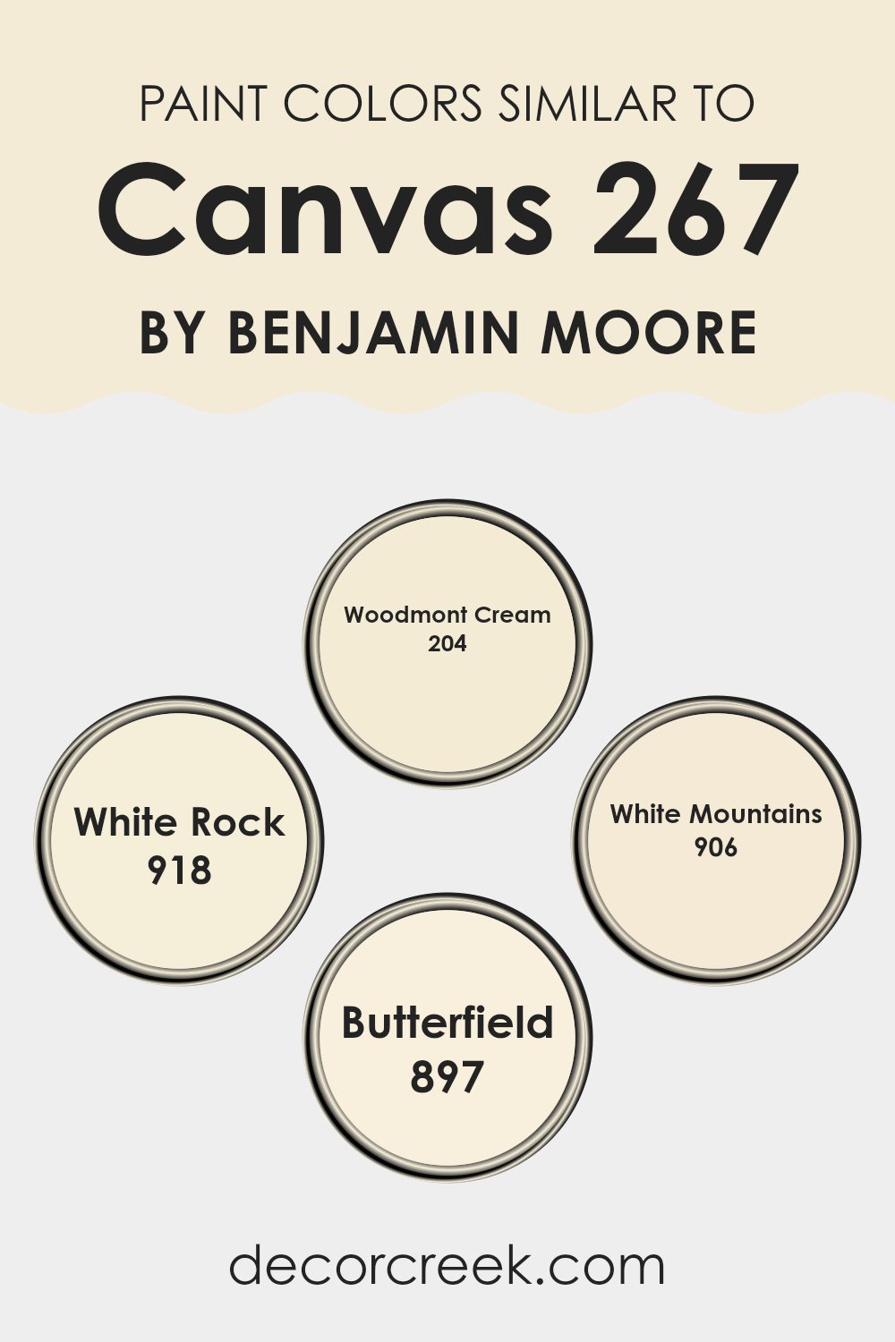
Colors Similar to Canvas 267 by Benjamin Moore
In interior design, using similar colors can create a harmonious and soothing environment. Colors that are alike in tone and shade allow for a fluid and cohesive appearance, making a room feel well put together. Similar colors can subtly blend with each other, providing a gentle transition from one area to another, which can enhance the overall aesthetic without creating a jarring effect.
For instance, when colors like Woodmont Cream, White Rock, White Mountains, and Butterfield are used together, they foster a soft and unified look because they share subtle undertones that complement each other.
Woodmont Cream has a warm, creamy hue that can make any room feel cozy and inviting. It’s an excellent choice for living areas or bedrooms where a soft, welcoming atmosphere is desired. White Rock, on the other hand, is a lighter, almost ethereal shade of white with warm undertones that catch the natural light beautifully, making it ideal for smaller areas or rooms with less natural light.
White Mountains offers a crisp, clean look that can help in making a room appear larger and more open. Lastly, Butterfield brings a gentle yellow undertone that adds a hint of cheerfulness to any setting. These colors work well together to create a room that feels seamlessly connected and thoughtfully designed.
You can see recommended paint colors below:
- 204 Woodmont Cream
- 918 White Rock
- 906 White Mountains
- 897 Butterfield
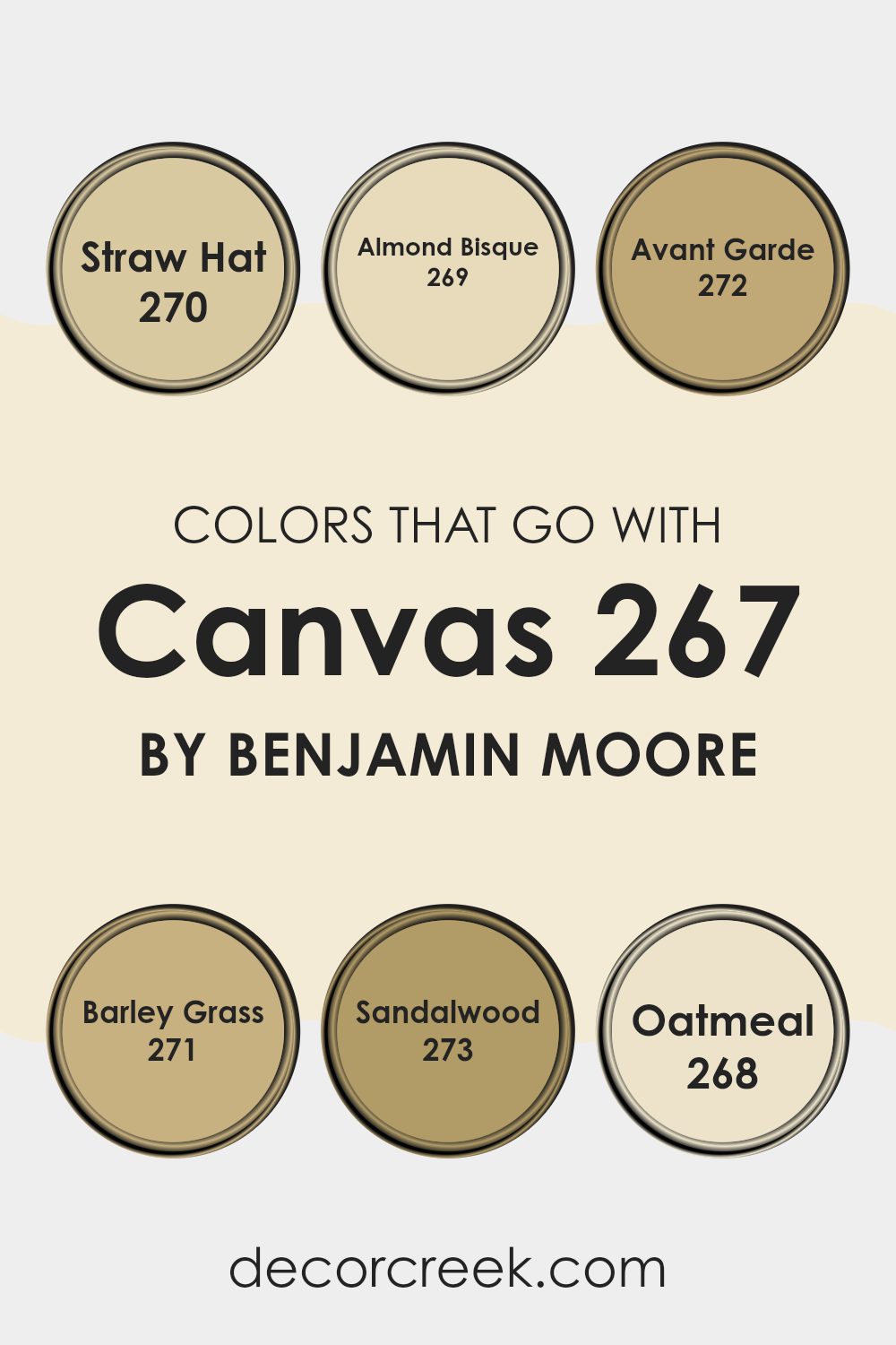
Colors that Go With Canvas 267 by Benjamin Moore
Colors that complement Canvas267 by Benjamin Moore play a crucial role in creating a harmonious and visually pleasant room. These colors, carefully selected to blend well with Canvas267, ensure that the overall aesthetic of a room remains balanced and appealing.
When colors like Straw Hat, Almond Bisque, Avant Garde, Barley Grass, Sandalwood, and Oatmeal are used together, they contribute to a cohesive look that enhances the ambiance without overpowering the subtlety of Canvas267. Such coordination helps in achieving a professional and polished look in any interior room.
Straw Hat is a gentle, warm hue similar to the soft tones of a sunhat made from natural fibers, adding a touch of warmth that’s ideal for creating a cozy atmosphere. Almond Bisque, a softer tone reminiscent of creamy almond milk, provides a subtle backdrop that pairs beautifully with more assertive colors.
Avant Garde is slightly bolder, a vibrant yet muted shade that blends well with earthy or neutral decors. Barley Grass offers a fresh, gentle green that brings in a touch of nature’s calm. Sandalwood is a rich, deep color that draws in warmth, perfect for accentuating features without overpowering the senses.
Lastly, Oatmeal is a flexible, hearty color that sets a solid foundation for various styles and tastes, working seamlessly to support both vibrant and muted color schemes. Together, these colors create diverse options for designing a room that feels both coordinated and stylish.
You can see recommended paint colors below:
- 270 Straw Hat
- 269 Almond Bisque
- 272 Avant Garde
- 271 Barley Grass
- 273 Sandalwood
- 268 Oatmeal
How to Use Canvas 267 by Benjamin Moore In Your Home?
Canvas 267 by Benjamin Moore is a soft and neutral paint color that can add warmth and a welcoming feel to any room in your home. It is a flexible shade that blends well with many decor styles, making it a popular choice for both homeowners and interior designers.
For a cozy and peaceful vibe, you can paint your living room or bedroom walls with Canvas 267. It works wonderfully as a base color, providing a subtle backdrop that allows your furniture and decor items to stand out.
Additionally, Canvas 267 is perfect for smaller areas like bathrooms or hallways due to its light and airy quality, which helps to make areas appear larger and brighter. If you’re looking to refresh your kitchen, consider using Canvas 267 on cabinets for a clean and fresh look. Combine it with contrasting colors like deep blues or greens for accent walls or decor items to add interest and character to your room. This paint is a great tool for anyone looking to give their home a gentle yet noticeable update.
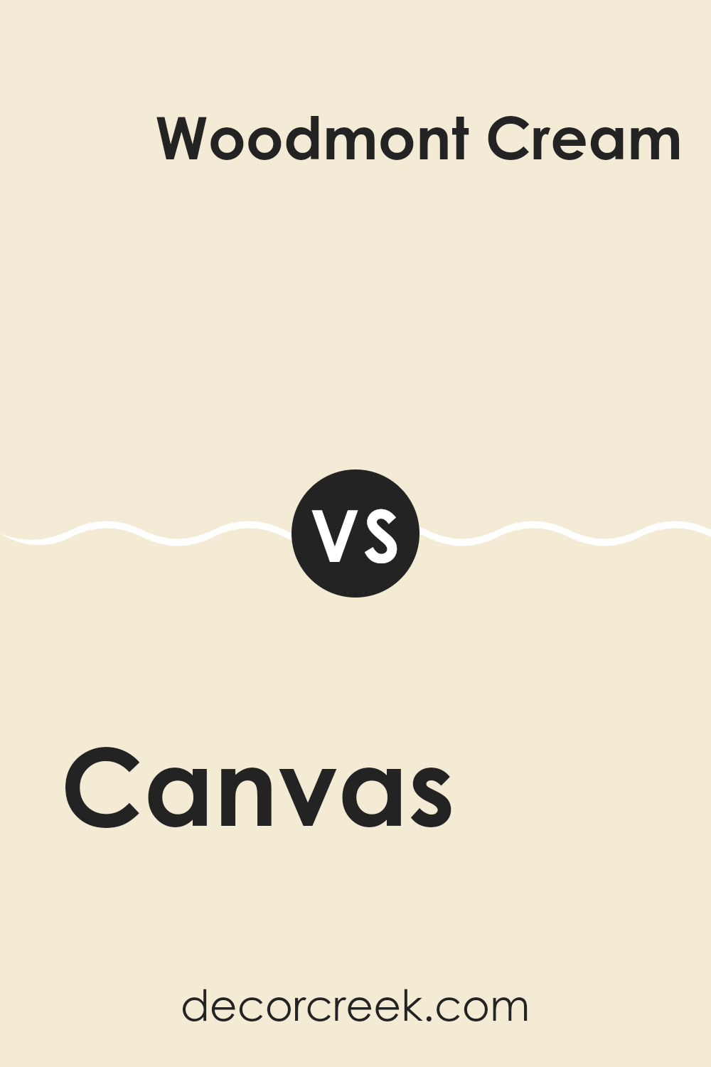
Canvas 267 by Benjamin Moore vs Woodmont Cream 204 by Benjamin Moore
Canvas 267 by Benjamin Moore is a crisp, flexible shade. It’s a neutral that is almost an off-white, making it adaptable for various rooms. This light hue keeps rooms looking bright and open, ideal for creating a fresh, airy feel. In contrast, Woodmont Cream HC-204 from the same brand leans towards a warmer, slightly deeper tone.
It’s a soft beige that adds warmth to a room without overpowering with color. This creamier shade is excellent for areas where a cozy, inviting atmosphere is desired. When comparing the two, Canvas is purer and brighter, thus it may seem more modern and minimalistic.
Woodmont Cream, with its richer depth, is perfect for traditional settings or any place where a touch of warmth is desired. Both colors offer flexibility in decor, but their differences in tone influence the mood and style of the room.
You can see recommended paint color below:
- 204 Woodmont Cream
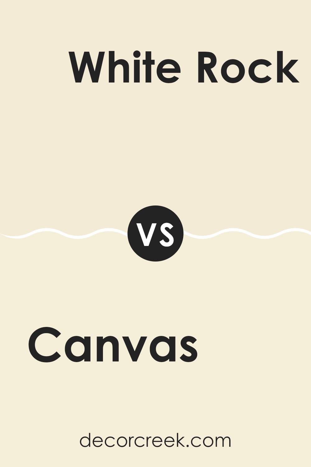
Canvas 267 by Benjamin Moore vs White Rock 918 by Benjamin Moore
Canvas 267 and White Rock 918 are both colors from Benjamin Moore, each offering a unique feel for interior rooms. Canvas 267 is a warm beige that brings a cozy and inviting vibe to any room. This tone is perfect for those looking for a neutral backdrop that isn’t too stark, adding a subtle touch of warmth.On the other hand, White Rock 918 is a soft white tone with a hint of gray.
It’s lighter than Canvas 267, providing a clean and airy feel that can help make small areas appear larger and brighter. While Canvas 267 adds warmth, White Rock 918 offers a fresh look that can make a room feel crisp and clean.
Both colors pair well with a variety of decor styles and are flexible for different settings, whether you’re painting a living room or a bedroom. The choice between them depends on the mood you want to create – warm and cozy with Canvas 267 or light and fresh with White Rock 918.
You can see recommended paint color below:
- 918 White Rock
Canvas 267 by Benjamin Moore vs Butterfield 897 by Benjamin Moore
Canvas 267 and Butterfield 897 are two distinct colors by Benjamin Moore. Canvas 267 is a soft, neutral beige that provides a calm, and gentle background. It’s the type of color that can fit into most areas easily, making rooms seem more open and airy.
On the other hand, Butterfield 897 is a richer, creamier yellow. It offers a hint of warmth and coziness, creating a welcoming ambiance. This color can make areas feel more enclosed yet cheerful. When comparing the two, Canvas 267 is more flexible and subdued, making it easier to match with various decor styles and colors.
Meanwhile, Butterfield 897, with its warmer undertones, is great for adding a touch of comfort and is well-suited for areas where you want to add vibrancy and warmth. Both are great choices, but your selection might depend on the mood and functional use of the room you’re painting.
You can see recommended paint color below:
- 897 Butterfield
Canvas 267 by Benjamin Moore vs White Mountains 906 by Benjamin Moore
When comparing Canvas 267 and White Mountains 906, both colors by Benjamin Moore, we see two distinct shades of white. Canvas 267 is a warmer white that gives off a cozy, inviting vibe. It has a subtle creamy undertone that makes it a great choice for living rooms or bedrooms where you want a hint of warmth without overpowering the room.
On the other hand, White Mountains 906 is a cooler white. This color has a slightly bluish tint, which can make a room feel more open and fresh. It’s an excellent option for bathrooms or kitchens, where a clean, crisp look is often desired.
In essence, both colors can brighten up a room but in different ways. Canvas 267 brings warmth and a soft glow, whereas White Mountains 906 offers a more refreshing and clear feel. Depending on the room and the mood you’re aiming for, either could be a suitable choice.
You can see recommended paint color below:
- 906 White Mountains

After reading about the 267 Canvas color from Benjamin Moore, I feel quite excited about it! 267 Canvas is not just any ordinary paint color. It’s a soft, warm white that can light up any room beautifully without being too bright or too dull. Imagine having a big, blank canvas; this color gives you the chance to decorate your room any way you want. It doesn’t clash with other colors, so you can use it with any other colors you like for your pillows, curtains, or even your furniture.
When I think about using 267 Canvas in my own home, I see it as a perfect backdrop that lets my favorite decorations stand out. It’s like when you wear a simple white t-shirt; you can pair it with jeans, shorts, or any colorful accessories.
Benjamin Moore’s 267 Canvas offers this kind of simplicity and flexibility, making it a fantastic choice for anyone looking to freshen up their home. It’s the kind of color that makes every room feel warm and welcoming, just like a cozy blanket on a chilly day.
In summary, if you’re thinking about giving your room a new look, I’d say 267 Canvas is a great color to consider. It’s kind of like the vanilla ice cream of paint colors — it goes well with everything! Whether you want your home to have a calm vibe or just a clean and simple look, this color could be your go-to choice.
Ever wished paint sampling was as easy as sticking a sticker? Guess what? Now it is! Discover Samplize's unique Peel & Stick samples.
Get paint samples

