If you’re searching for the perfect neutral paint color for your home, OC-52 Gray Owl by Benjamin Moore might just be what you need. This shade has gained quite a bit of popularity, and with good reason. It’s a soft, light gray that can effortlessly blend into any space, providing a serene and airy feel that’s both modern and timeless.
Choosing a paint color can often feel overwhelming with so many options out there. However, Gray Owl stands out for its versatility. Whether you’re looking to brighten up a small room, give a sleek look to your kitchen cabinets, or create a soothing atmosphere in your bedroom, this color can do it all.
Its ability to adapt to different lighting conditions and complement various decor styles makes it a go-to choice for homeowners and professional designers alike.
Beyond its aesthetic appeal, OC-52 Gray Owl is also practical. It pairs beautifully with a wide range of colors, from soft pastels to bold hues, making it incredibly easy to integrate into your existing home decor. Plus, being from Benjamin Moore, a brand known for its high-quality paints, you can expect excellent coverage and durability.
So, if you’re in the market for a paint color that’s both beautiful and functional, Gray Owl might be the perfect pick for you. It’s sure to give any room in your home a fresh, updated look without the hassle.
What Color Is Gray Owl OC-52 by Benjamin Moore?
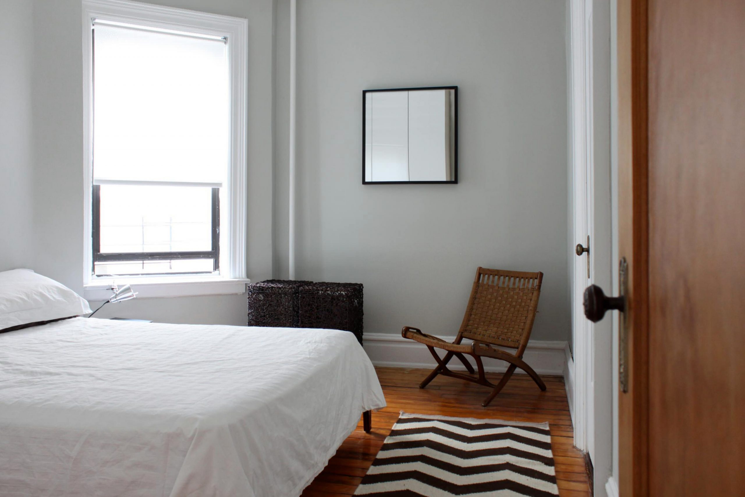
Gray Owl OC-52 by Benjamin Moore is a versatile and balanced gray paint color with subtle green and blue undertones. This makes it a unique choice that can slightly shift in appearance under different lighting conditions, sometimes appearing as a true gray while at other times showing a hint of color. Its adaptability makes it perfect for various interior styles, including modern minimalist, traditional, and even coastal themes, thanks to its calming and neutral base.
This color can create a serene and inviting space without making the room feel cold or impersonal. In terms of materials, Gray Owl pairs wonderfully with natural elements like wooden furniture and stone finishes, adding warmth and texture to the environment. It also complements metallic finishes such as brushed nickel or polished chrome, giving a sleek and contemporary look.
For textiles, consider soft linens or plush velvets to introduce contrast and depth, enhancing the coziness of the space.
Gray Owl works exceptionally well in spaces that aim for a light and airy feel, such as living rooms, bedrooms, and bathrooms. Its understated elegance provides a perfect backdrop for both bright accents and subdued tones, allowing for great flexibility in interior design. Whether you’re aiming for a sophisticated look or a comfortable retreat, Gray Owl can help you achieve the ambiance you’re dreaming of.
Is Gray Owl OC-52 by Benjamin Moore Warm or Cool color?
Gray Owl OC-52 by Benjamin Moore is a versatile color that can have a stunning impact on any home’s interior. This shade of gray strikes a perfect balance between warm and cool tones, making it adaptable to a wide variety of decorating styles and spaces. Its ability to reflect light beautifully can brighten up a room, giving the illusion of more space, which is especially beneficial in smaller or darker rooms.
One of the biggest advantages of Gray Owl is its flexibility. It can serve as a subtle, neutral backdrop for bold and vibrant accents or work cohesively with softer, muted tones for a more serene and calming environment. This color also transitions smoothly between different types of lighting throughout the day, maintaining its inviting quality without losing character.
Whether you’re aiming for a modern, sleek look, a cozy cottage vibe, or a minimalist aesthetic, Gray Owl can effortlessly fit your vision.
It’s particularly effective for creating a peaceful and grounding atmosphere in bedrooms and living areas, where comfort is key. Plus, its timeless nature means your space will remain stylish and sophisticated for years to come.
What is the Masstone of the Gray Owl OC-52 by Benjamin Moore?
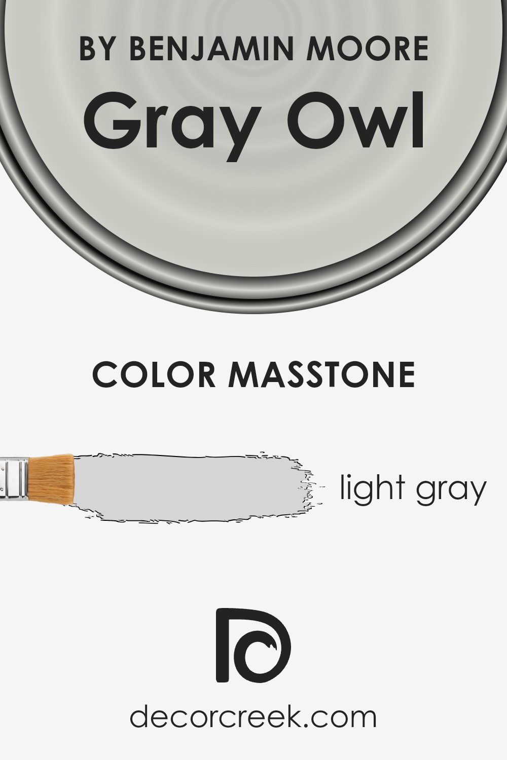
Gray Owl OC-52 by Benjamin Moore has a masstone of light gray, symbolized by the #D5D5D5 hex code. This subtle, soothing color provides a fresh, airy look in any room, making spaces feel more open and serene. The beauty of this light gray lies in its versatility. It effortlessly complements various decor styles, from modern minimalist to cozy farmhouse, acting as a neutral backdrop that allows furniture and artwork to stand out.
This particular shade of gray works well in homes because it brings a sense of calmness and sophistication. It’s light enough to make small rooms appear larger and brighter, yet has enough depth to add character to the space without overwhelming it. Whether applied in living rooms, bedrooms, or kitchens, Gray Owl OC-52 creates a soft, inviting atmosphere that’s both stylish and relaxing.
Moreover, this color pairs beautifully with a wide range of other hues, from bold and vibrant to soft and subtle, giving homeowners the flexibility to update decor without needing to repaint. This adaptability makes Gray Owl OC-52 a smart choice for those looking to create a timeless interior that can evolve with changing tastes and trends.
How Does Lighting Affect Gray Owl OC-52 by Benjamin Moore?
Lighting plays a crucial role in how we perceive colors, impacting their brightness, shade, and even their hue. Color, in essence, is seen by the way it reflects light; therefore, different light sources can change how a color looks. A perfect example to explore these effects is the color Gray Owl by Benjamin Moore.
In artificial light, colors can vary dramatically depending on the type of bulb used. Cool, fluorescent lighting can make Gray Owl appear more bluish, highlighting its cooler undertones. Meanwhile, warm incandescent bulbs can soften this color, making it feel warmer and more inviting. The key with artificial lighting is understanding the color temperature of your light source, as it influences the color perception in your space.
Natural light, on the other hand, brings its dynamics into play, affecting how Gray Owl looks throughout the day and depending on the room’s orientation. In north-facing rooms, light tends to be cooler and more consistent throughout the day. Here, Gray Owl may lean towards its cooler, more shadowy aspects, enhancing the subtle nuances in its gray undertones. It might feel more crisp and serene, perfect for creating a calm and focused space.
South-facing rooms are bathed in warm, golden light for most of the day. This type of light can make Gray Owl look softer and slightly warmer, potentially pulling out any hidden warm undertones in the paint. It creates a cozy and welcoming atmosphere, ideal for living spaces and kitchens.
In east-facing rooms, morning light can make this color look very soft and gentle, providing a bright and airy feel. As the day progresses, the light shifts, and the color may appear more muted. Conversely, in west-facing rooms, Gray Owl may look more uniform during the morning and then warm up significantly in the afternoon and evening as the sunlight intensifies.
This changing light can offer a dynamic feel to the space, with the color adapting from a neutral base in the morning to a more nuanced hue by sunset.
Understanding how lighting affects colors, especially a versatile shade like Gray Owl, can help in choosing the right paint for your space and how to light it effectively for the mood you want to achieve.
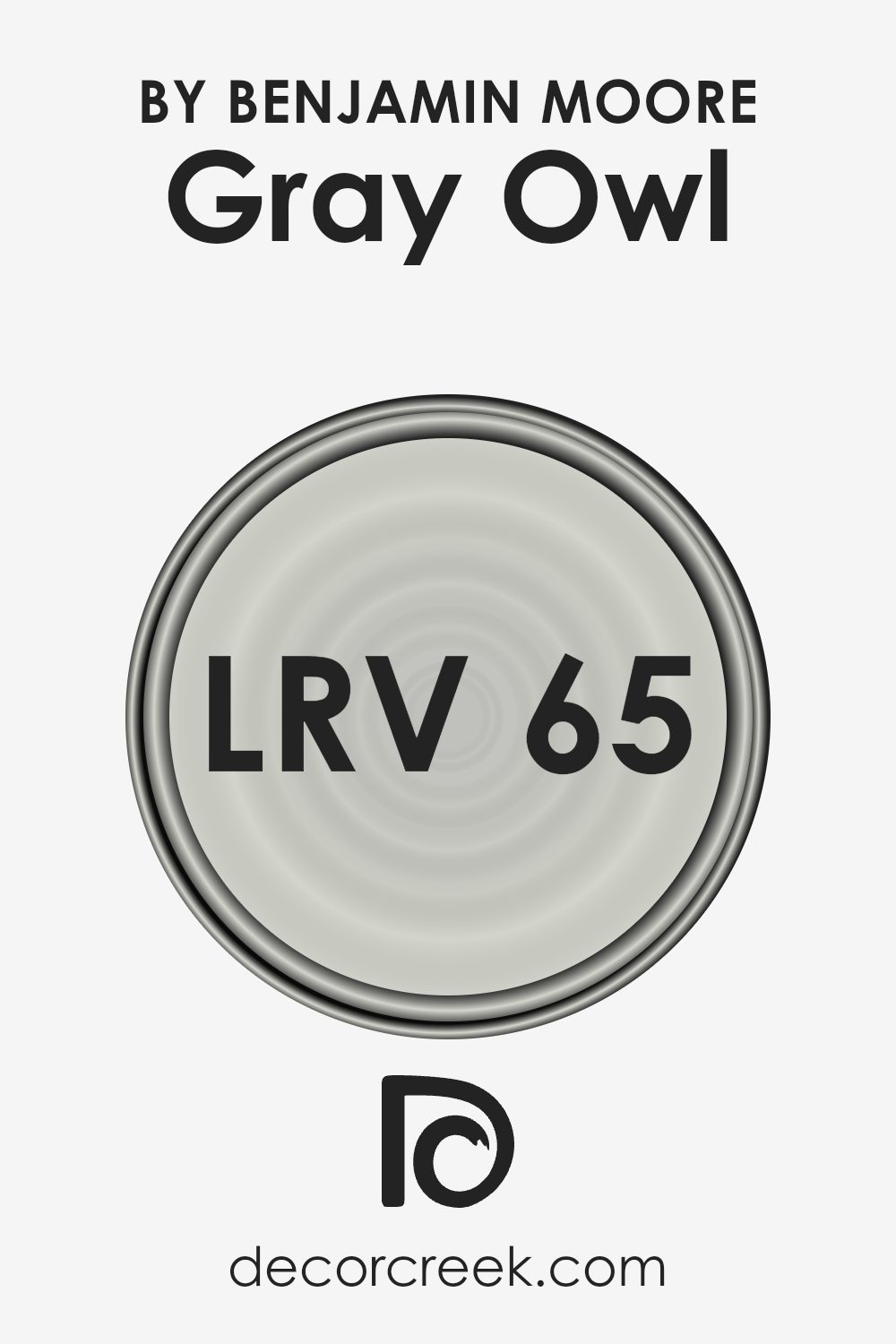
What is the LRV of Gray Owl OC-52 by Benjamin Moore?
For the specific color Gray Owl (LRV of 64.51), it sits on the lighter side of the scale, indicating it is a relatively light shade that will reflect a fair amount of light. In practical terms, this means that Gray Owl can help make a space feel airy and more open, especially in well-lit areas.
The specific LRV value of 64.51 suggests that it’s a versatile color, capable of being light enough to add brightness to a room, yet it has enough depth to still provide some warmth and character. This can affect how the color appears on the walls throughout the day, lighter under bright lighting conditions, and slightly deeper during the evening or in spaces with less natural light.
Coordinating Colors of Gray Owl OC-52 by Benjamin Moore
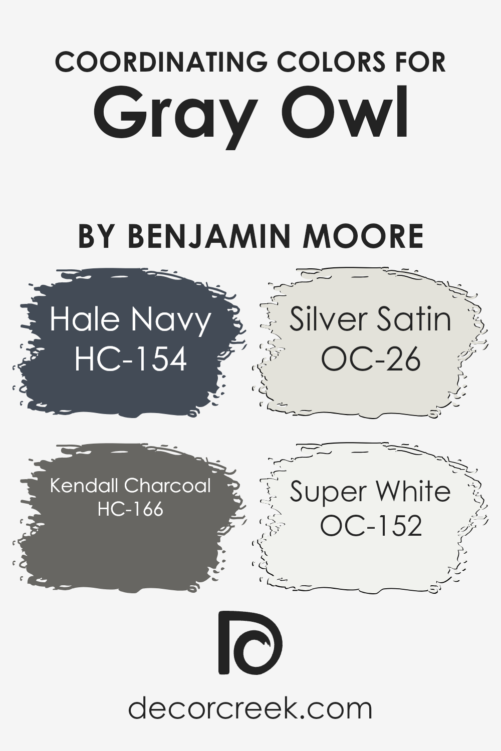
Coordinating colors are hues that work well together to create a harmonious look in any space, complementing each other without clashing. They can be used across various elements of a room, including walls, furniture, and decor, to bring out the best in the primary color they’re paired with. When you choose coordinating colors, it’s all about achieving a balanced and visually appealing environment, enhancing the overall design without overwhelming the senses.
For example, HC-154, known as Hale Navy, is a deep, sophisticated blue that brings a sense of tranquility and depth to spaces, making it a perfect complement to more neutral tones. HC-166 – Kendall Charcoal, offers a rich, dark gray that adds an elegant, moody vibe, ideal for creating striking contrasts.
OC-26 Silver Satin is a soft, airy gray with subtle undertones that can brighten and open up a space, offering a light contrast that’s both refreshing and serene. OC-152 Super White is a clean, crisp white that acts as a versatile backdrop, capable of making other colors pop while contributing to a sense of freshness and purity.
Together, these colors work in harmony to enhance the ambiance of a room, offering a range of possibilities to highlight the beauty of the primary color they accompany.
You can see recommended paint colors below:
- HC-154 Hale Navy (CHECK A SAMPLE)
- HC-166 Kendall Charcoal (CHECK A SAMPLE)
- OC-26 Silver Satin
- OC-152 Super White (CHECK A SAMPLE)
What are the Trim colors of Gray Owl OC-52 by Benjamin Moore?
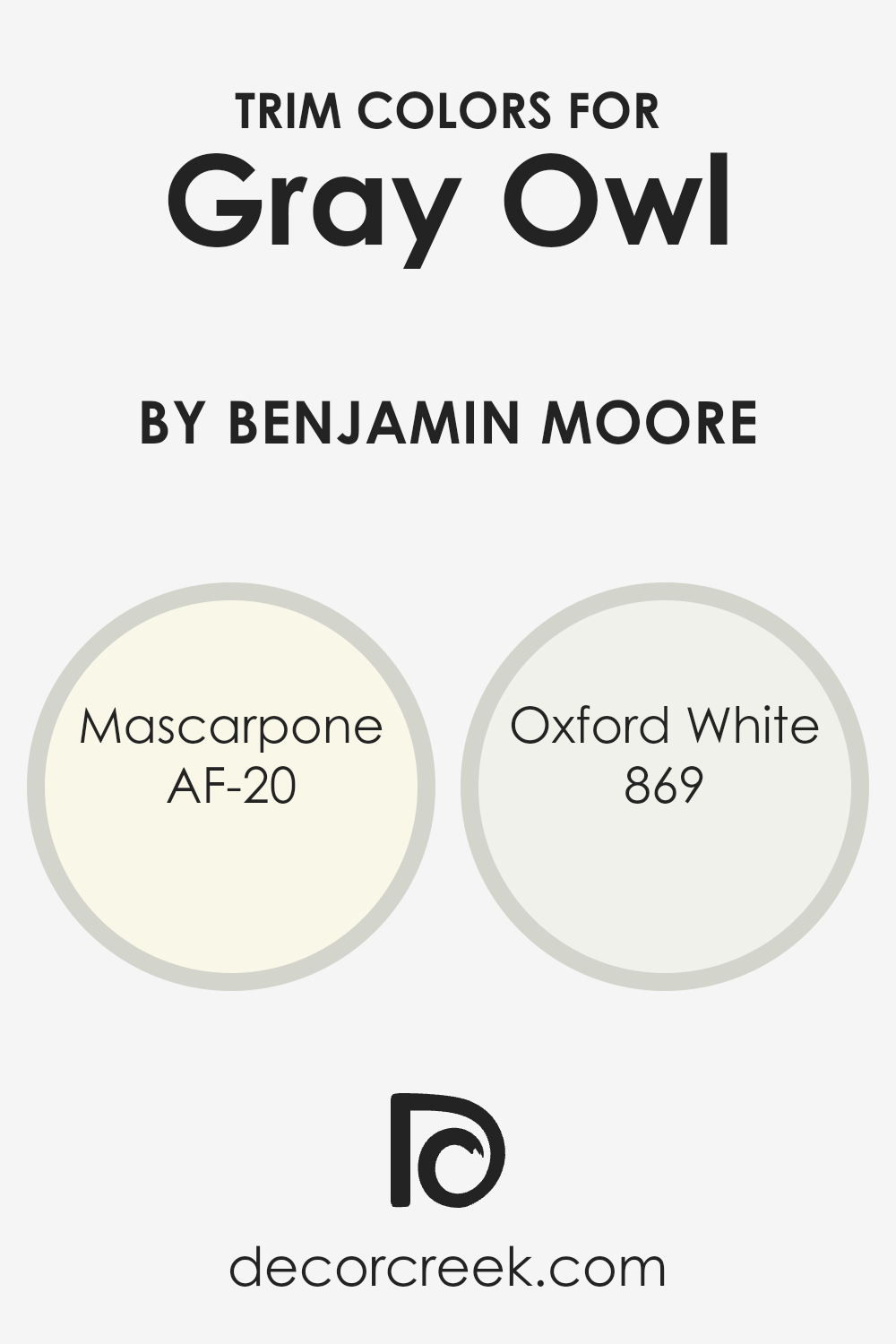
Trim colors are specifically chosen shades that are used to accent and outline features in a room such as door frames, window sills, and skirting boards, bringing contrast and depth to the wall colors. When considering a neutral yet sophisticated wall color like Gray Owl by Benjamin Moore, selecting the right trim color becomes crucial in enhancing the overall ambiance of the space.
Trim colors work to define the boundaries in a room more clearly, adding a layer of crispness and refinement to the design. They also play a significant role in highlighting the architectural features of a room, making them stand out against the broader canvas of the walls.
AF-20 Mascarpone and 869 Oxford White are two trim colors that pair beautifully with Gray Owl. Mascarpone is a warm, creamy white with a softness to it that can add a gentle, inviting contrast to the cooler tones of Gray Owl, providing a subtle yet enriched boundary that feels both cozy and elegant.
On the other hand, Oxford White is a clean, bright white with a slightly more pronounced contrast against Gray Owl, offering a sharper edge and a more defined framing to spaces. This makes Oxford White a great option for those looking to infuse their rooms with a crisper, more vibrant delineation.
Together, these trim colors complement Gray Owl beautifully, ensuring the walls not only stand out but also contribute to a harmonious and balanced interior palette.
You can see recommended paint colors below:
- AF-20 Mascarpone (CHECK A SAMPLE)
- 869 Oxford White (CHECK A SAMPLE)
Colors Similar to Gray Owl OC-52 by Benjamin Moore
Similar colors play a crucial role in design and decoration because they create a cohesive and harmonious look, ensuring that different elements in a room feel connected. When dealing with a specific color like Gray Owl, finding colors that closely resemble it, such as Vapour Trails, becomes essential for achieving a balanced and subtle aesthetic.
These similar shades can work together to add depth and complexity to a space without overwhelming it with contrast. They facilitate a gentle transition between different surfaces and elements, making the environment feel more unified and inviting. By carefully selecting colors that share a common hue, designers can craft spaces that feel thoughtfully composed and aesthetically pleasing.
Vapour Trails is a nuanced color that shares the same gray base as Gray Owl but introduces a slightly different undertone, making it ideal for layering and adding dimension to a room without straying too far from the core palette. This quality makes it perfect for creating a serene and muted backdrop that is easy on the eyes, yet sophisticated.
On the other hand, the color in mention, while closely related to Gray Owl, adjusts the lightness just a tad, presenting an opportunity to introduce subtle variations in a space that relies on a monochromatic scheme. It offers a way to keep the design interesting and dynamic, even when sticking closely to a single color family.
The selection of such similar colors ensures that every element in the room contributes to a cohesive whole, enhancing the overall look and feel of the space.
You can see recommended paint color below:
- 1556 Vapour Trails (CHECK A SAMPLE)

Complimentary Colors for Gray Owl OC-52 Paint Color by Benjamin Moore
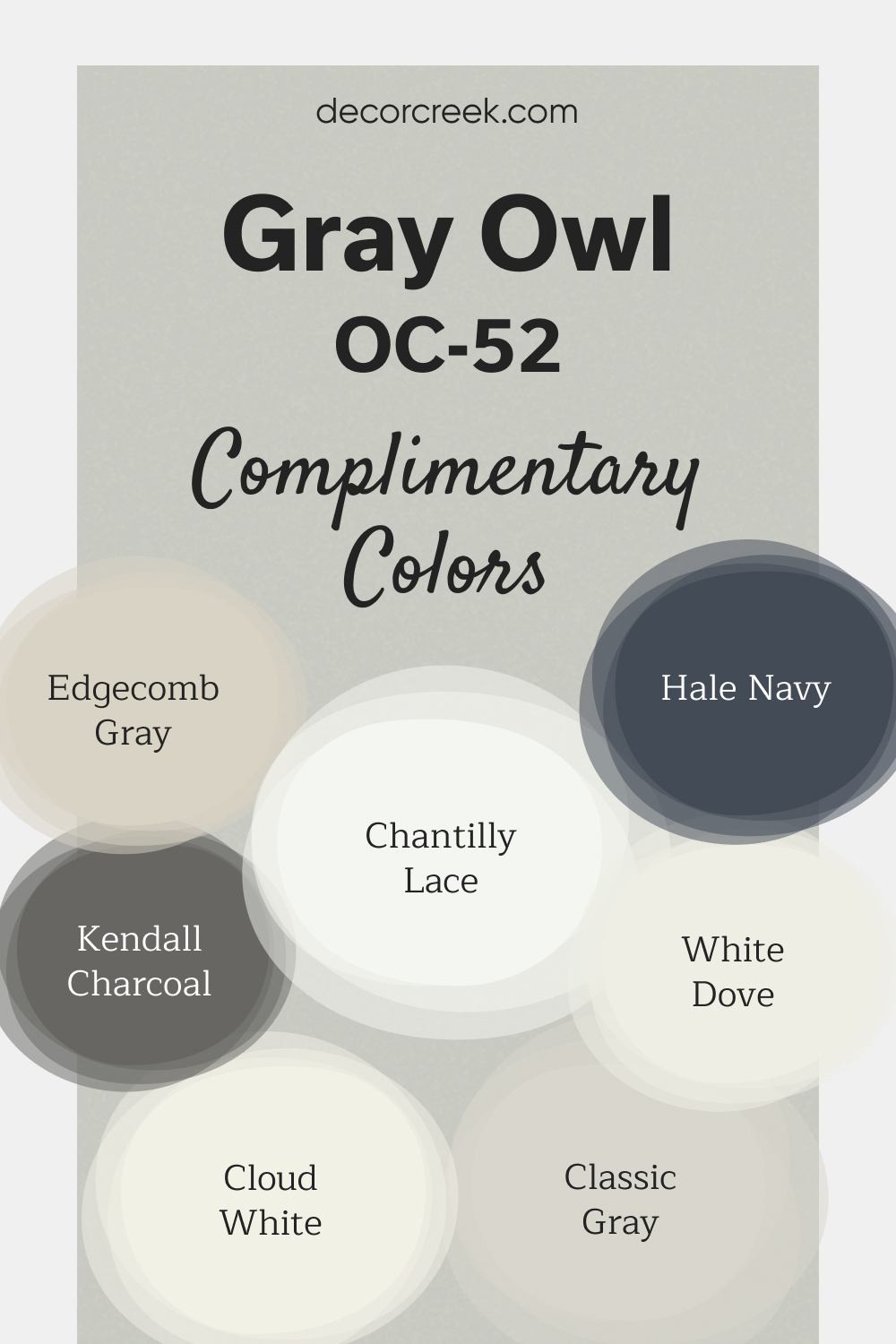
Gray Owl by Benjamin Moore is a versatile light gray with cool undertones, making it a favorite for brightening up spaces while maintaining a modern, clean look. Its subtle hue works wonderfully as a main color in living rooms, bedrooms, or even kitchens, providing a calming backdrop.
Gray Owl’s adaptability makes it easy to pair with both light and dark accents. To create contrast, pair Gray Owl with Hale Navy or Kendall Charcoal for a bolder, more defined look.
For a softer feel, use Chantilly Lace, White Dove, or Cloud White for trim and ceilings to keep the space bright and fresh. Edgecomb Gray and Classic Gray are excellent options to add depth to a neutral palette without overwhelming the room.
How to Use Gray Owl OC-52 by Benjamin Moore In Your Home?
Gray Owl OC-52 by Benjamin Moore is a versatile paint color that has gained popularity for its ability to bring a sense of calm and sophistication to any room. This neutral shade is a perfect balance between warm and cool tones, making it a superb choice for those who can’t decide between a stark cool gray and a warm beige. It’s like a chameleon; it adapts to its surroundings, making it incredibly easy to work with.
You can use Gray Owl in various ways at home. It’s excellent for living rooms, creating a serene and inviting atmosphere, or in bedrooms, where it promotes rest and relaxation. This color also shines in bathrooms and kitchens, offering a clean and airy look that pairs well with both modern and traditional décor.
Because of its neutral nature, it serves as a fantastic backdrop for artwork, furniture, and colorful accents, allowing them to stand out without overwhelming the space. Whether you’re updating a single room or repainting your entire home, Gray Owl OC-52 offers a timeless elegance that can effortlessly rejuvenate your space.
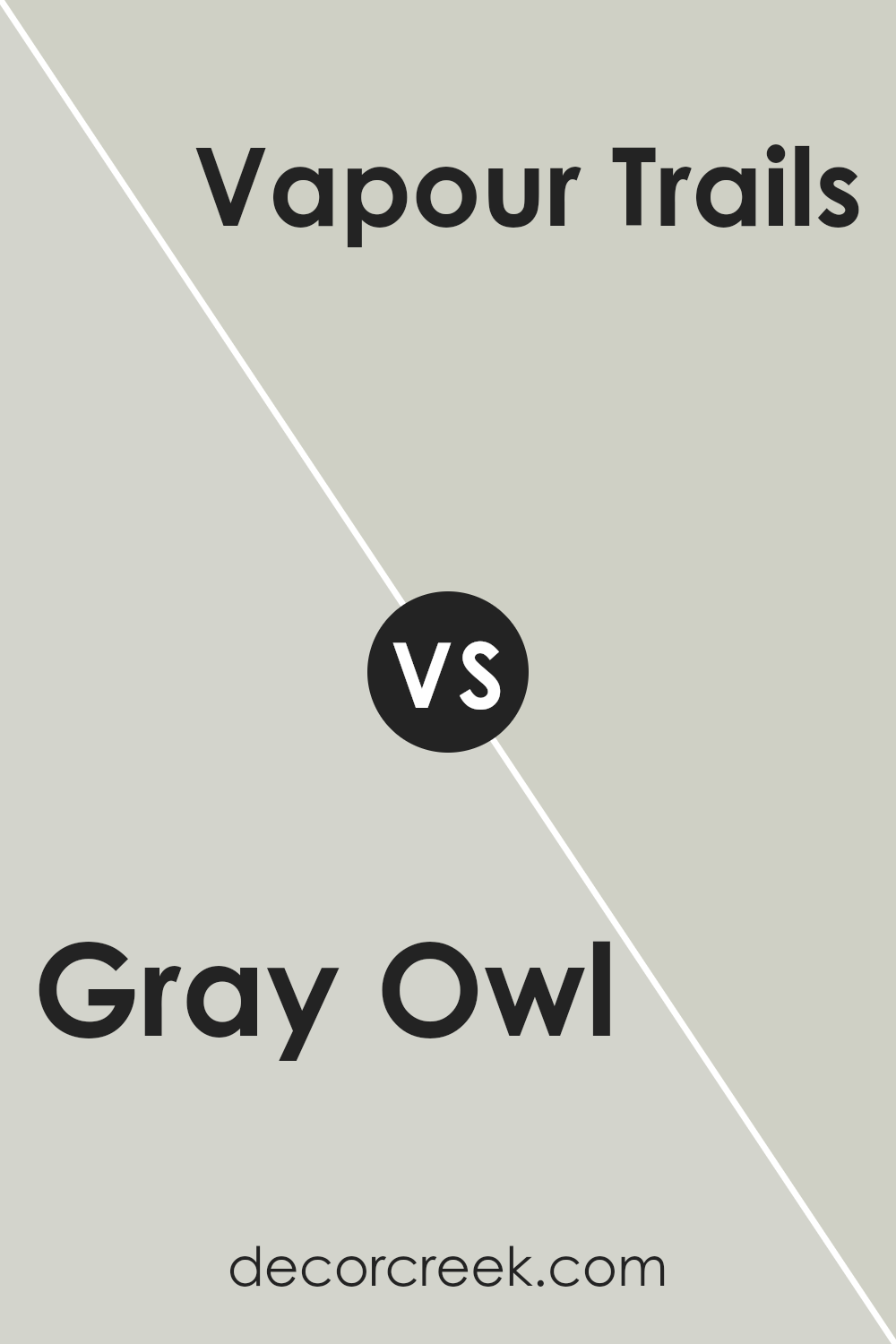
Gray Owl OC-52 by Benjamin Moore vs Vapour Trails 1556 by Benjamin Moore
Gray Owl OC-52 and Vapor Trails 1556 are two colors from Benjamin Moore that share a subtle, calm vibe, yet they hold distinct tones that set them apart. Gray Owl has a soft, gentle gray tone that brings a light, airy feel to any room. It’s almost like looking out on a cloudy day, offering a sense of serenity and neutrality. It fits well in spaces where you want a touch of modernity without overwhelming the senses.
Vapor Trails, on the other hand, leans more towards a muted blend of gray and beige, often referred to as “greige.” This color has a warmth to it that Gray Owl lacks, making it ideal for creating a cozy and inviting atmosphere. It’s like the warm, comforting color of stones on a sunny path, giving a room a more grounded and welcoming feel.
In summary, while both colors are wonderfully versatile and can suit a variety of decor styles, Gray Owl offers a cooler, more detached ambiance, whereas Vapor Trails brings warmth and coziness into a space.
You can see recommended paint color below:
- 1556 Vapour Trails (CHECK A SAMPLE)
Conclusion
In conclusion, Gray Owl by Benjamin Moore has emerged as a remarkably versatile and appealing color choice for interior design. Its balanced blend offers a neutral backdrop that is both soothing and sophisticated, making it a popular pick among homeowners and designers alike. This color manages to strike a perfect harmony between warm and cool tones, enabling it to fit seamlessly into a wide array of decor styles and spaces.
Moreover, its adaptability extends to various lighting conditions, where Gray Owl demonstrates an impressive capacity to shift in hue and intensity, thus contributing to a dynamic and inviting atmosphere in any room.
Whether aiming for a light and airy ambiance or a cozy and inviting space, Gray Owl proves to be an exceptional choice that brings a sense of tranquility and elegance into homes.
Ever wished paint sampling was as easy as sticking a sticker? Guess what? Now it is! Discover Samplize's unique Peel & Stick samples.
Get paint samples


