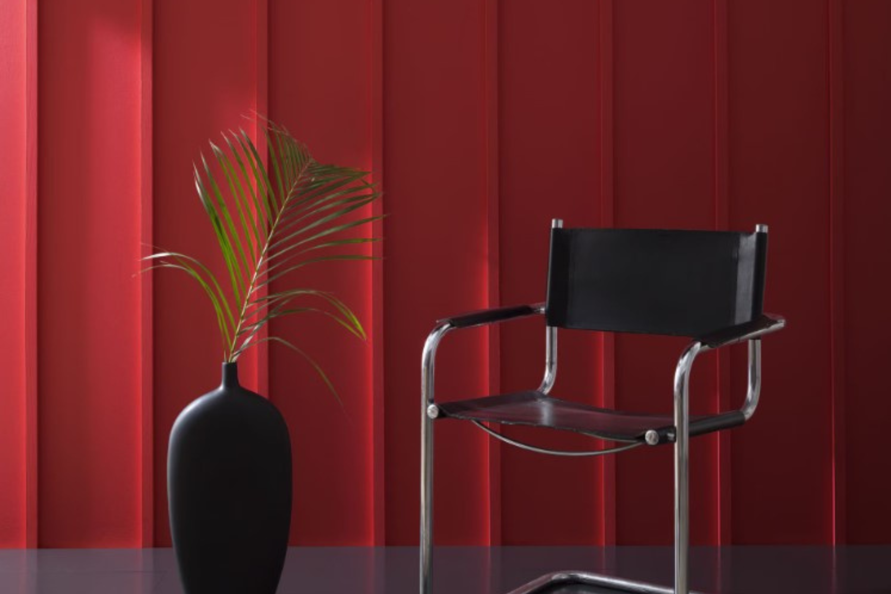
Are you looking for a paint color that adds a rich and warm feeling to any room? If yes, then HC-182 Classic Burgundy by Benjamin Moore might just be the perfect choice for you. This deep, red wine color brings an elegant and sophisticated vibe to spaces, making it ideal for areas where you want to create a cozy and inviting atmosphere.
Classic Burgundy is versatile enough to be used in a variety of rooms, from living rooms and dining areas to bedrooms, adding a touch of class and depth wherever it is applied. Its richness makes it a great option for feature walls, providing a stunning backdrop for art and furniture.
Additionally, it pairs beautifully with a wide range of other hues, from soft neutrals to more vibrant tones, allowing for various design styles.
Whether you’re aiming to update a single room or planning a more significant home renovation, HC-182 Classic Burgundy can help you achieve a look that feels both timeless and modern.
Its unique shade enables homeowners and designers alike to create spaces that are not only beautiful but also full of character. So, if you’re ready to transform your space with color, Benjamin Moore’s Classic Burgundy might just be the choice for you.
What Color Is Classic Burgundy HC-182 by Benjamin Moore?
Classic Burgundy by Benjamin Moore is a rich and deep shade that brings warmth and sophistication to any room. This particular burgundy hue has a luxurious quality, blending red and purple undertones to create a color that feels both regal and cozy. It’s a versatile paint that can transform a space into a snug retreat or an elegant entertaining area, depending on how it’s used.
This color works exceptionally well in interior styles that emphasize comfort and elegance, such as traditional, Victorian, or even modern settings that aim for a dramatic flair. It’s perfect for creating a focal point in a room, whether that’s an accent wall, a cozy reading nook, or a striking piece of furniture.
When it comes to pairing with materials and textures, Classic Burgundy shines alongside rich woods, like mahogany or walnut, adding to the feeling of warmth and depth. It also pairs beautifully with soft textures, such as velvet or silk, enhancing the luxurious feel of the space.
Metallic accents, especially in gold or brass, can add a touch of glamour against this deep burgundy backdrop, creating a refined and inviting atmosphere.
Overall, Classic Burgundy can bring a sense of sophistication and comfort to interior designs, making it a great choice for those looking to add a dash of elegance to their home.
Ever wished paint sampling was as easy as sticking a sticker? Guess what? Now it is! Discover Samplize's unique Peel & Stick samples.
Get paint samples

Is Classic Burgundy HC-182 by Benjamin Moore Warm or Cool color?
Classic Burgundy by Benjamin Moore is a deep, rich color that brings warmth and sophistication to any space. This particular shade is perfect for creating a statement wall or adding depth to a room without overwhelming it with darkness.
Its luxurious tone works well in both traditional and modern settings, making it a versatile choice for homeowners.
When used in homes, Classic Burgundy adds an element of elegance and comfort, making spaces more inviting. This color pairs beautifully with neutral shades like beige, gray, and white, which helps to balance its intensity. Additionally, it can also complement warmer tones like gold or mustard, adding to the cozy atmosphere of a room. Ideal for living areas, dining rooms, and even bedrooms, this color enhances the aesthetics of a space by adding a touch of sophistication.
Lighting plays a significant role in how this color is perceived; natural light can soften its appearance, while artificial light can enrich its depth, showcasing the flexibility and beauty of Classic Burgundy in home environments.
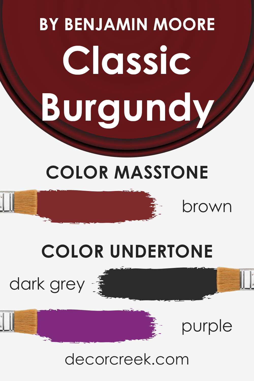
Undertones of Classic Burgundy HC-182 by Benjamin Moore
Classic Burgundy by Benjamin Moore is a unique paint color with rich undertones that can significantly impact how it appears in different settings. Specifically, this color features dark grey and purple undertones, which add depth and complexity to its overall appearance.
The dark grey undertone provides a solid, grounding effect, making the color appear more muted and subtle in some lighting conditions. This can create a cozy and comforting ambiance in a room, perfect for creating a tranquil bedroom or a welcoming living room.
On the other hand, the purple undertones add a hint of vibrancy and warmth, giving the color a more dynamic character. This blend can shift the perception of the space, bringing a sense of sophistication and elegance.
When applied to interior walls, these undertones influence the color’s behavior in response to different types of lighting. In natural daylight, the purple undertones might become more pronounced, infusing the room with a soft, warm glow. Meanwhile, in artificial light, the dark grey undertones could dominate, making the walls appear more subdued and intimate.
Understanding these undertones is crucial in deciding where and how to use this paint color effectively. Their interplay enables Classic Burgundy to offer a versatile palette that can adapt to various interior styles, from modern and sleek to traditional and cozy. Whether aiming for an impactful statement wall or a refined backdrop for your space, this color’s complexity allows for creative expression and personalization.
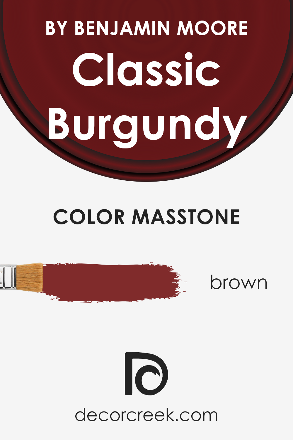
What is the Masstone of the Classic Burgundy HC-182 by Benjamin Moore?
Classic Burgundy HC-182 by Benjamin Moore has a masstone that appears as a deep, rich brown (#802B2B). This unique shade offers a warm and inviting feel, making it perfect for creating cozy spaces within homes.
When used on walls, it can add depth and sophistication, easily anchoring a room with its strong presence. This color is versatile, working well with both traditional and modern decor. It pairs beautifully with soft neutrals, such as creams and light grays, to balance its intensity. Additionally, when matched with bold colors like teal or mustard yellow, it can create a lively and dynamic interior.
The brown undertone makes it more forgiving than a pure red, ensuring it complements various wood finishes and textiles, enhancing the overall aesthetic of a space. Suitable for living rooms, dining areas, or even bedrooms, this color brings a sense of warmth and comfort, making any room more inviting.
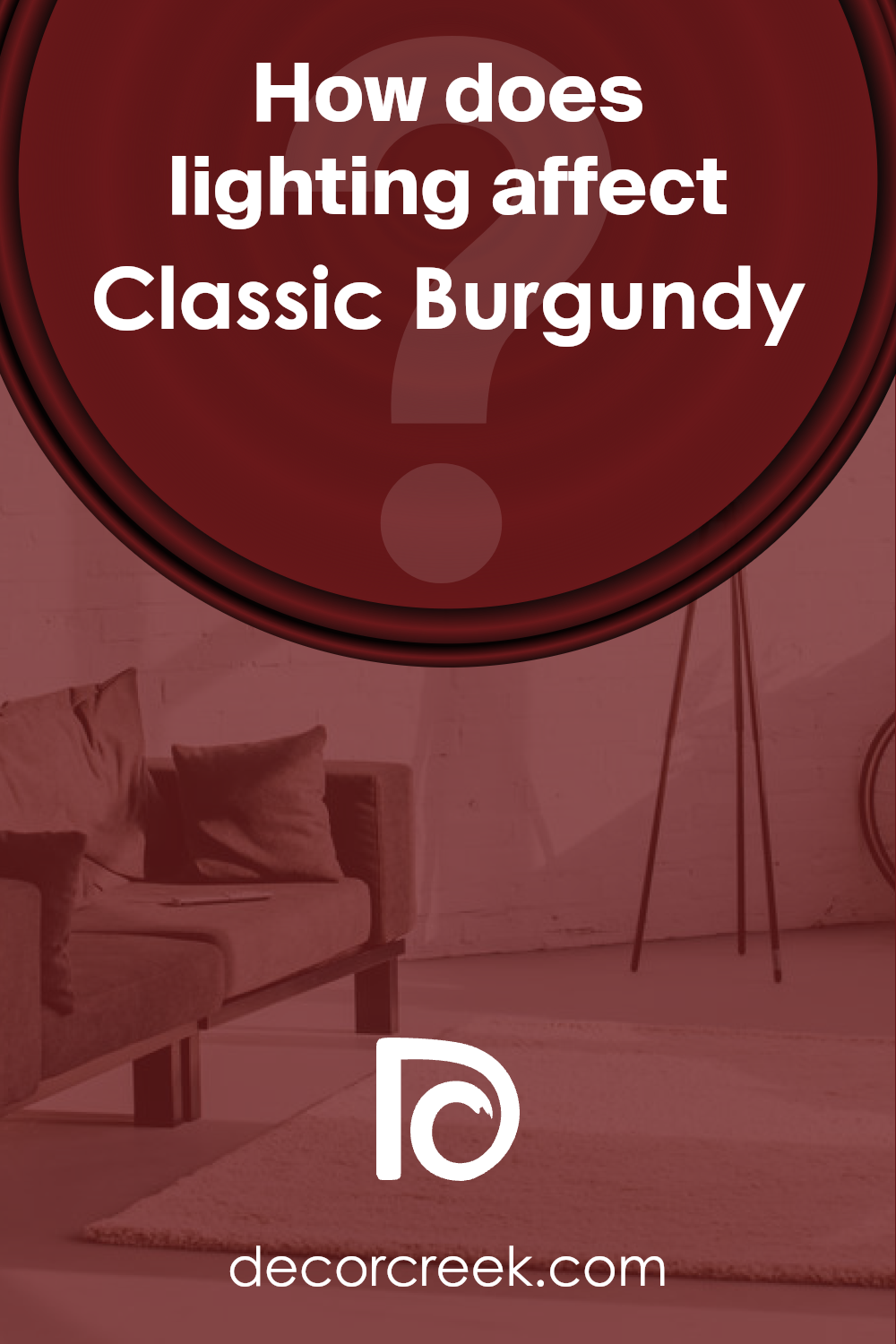
How Does Lighting Affect Classic Burgundy HC-182 by Benjamin Moore?
Lighting plays a crucial role in how we perceive colors, transforming them dramatically under different conditions. When it comes to understanding how a color like Classic Burgundy behaves in various lighting scenarios, it’s essential to grasp how artificial light and natural light can change its appearance.
- In artificial light, Classic Burgundy might look deeper and more intense. This is because most artificial lights, particularly incandescent bulbs, tend to give off a warmer glow, enriching warm colors like burgundy. Under cooler artificial lights, such as fluorescent lights, this color may appear slightly muted, losing some of its richness.
- Natural light, on the other hand, can significantly alter the appearance of Classic Burgundy throughout the day. Sunlight can reveal the true depth and undertones of this color, making it appear more vibrant during midday when the light is brightest and slightly softer during the morning and evening.
The orientation of a room also affects how Classic Burgundy is perceived:
- North-Faced Rooms: These rooms get less direct sunlight, resulting in cooler, more even light throughout the day. Here, Classic Burgundy can look more somber and subdued, emphasizing its cooler undertones.
- South-Faced Rooms: Receiving ample sunlight, south-faced rooms highlight the warmth and depth of Classic Burgundy, making it appear more lively and dynamic.
- East-Faced Rooms: Morning light is cooler and can make Classic Burgundy seem fresh and bright in the morning, gradually turning into a richer hue as the day progresses and the light becomes warmer.
- West-Faced Rooms: Evening light brings warmth, deepening the color into a more intense, vibrant burgundy by the end of the day, after being more muted during the morning when the light is cooler.
Understanding how lighting affects Classic Burgundy can help in choosing the right paint for your space, ensuring that the color behaves as you desire throughout the day.
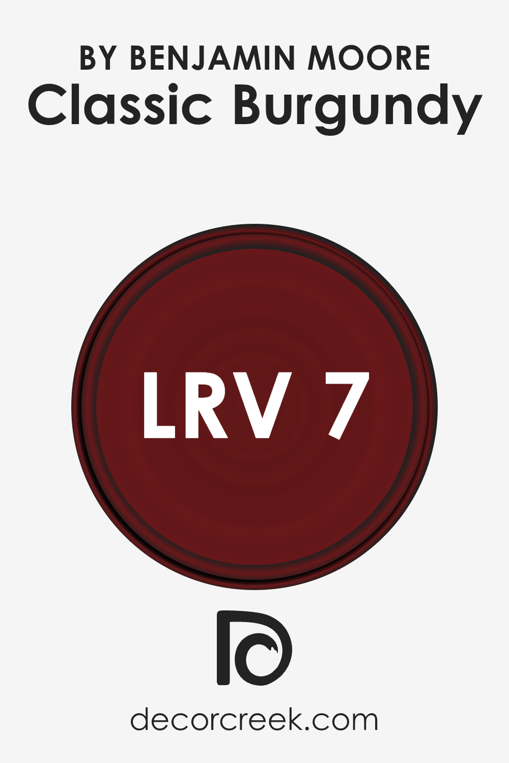
What is the LRV of Classic Burgundy HC-182 by Benjamin Moore?
LRV stands for Light Reflectance Value. It’s a measurement used to describe the amount of visible and usable light that a paint color reflects from or absorbs into a painted surface. This value is given on a scale from 0 to 100, where 0 means it’s a pure black that absorbs all light, and 100 means it’s a bright white that reflects all light back into the room.
The LRV of a paint color can greatly impact how the color looks in your space. Higher LRVs make rooms feel larger and brighter since they reflect more light. On the other hand, colors with lower LRVs absorb more light, which can make spaces feel smaller and the colors appear more intense.
With an LRV of 7.23, the specific color in question falls on the lower end of the scale. This means it’s a deep, rich color that won’t reflect much light back into the room. In practical terms, when used on walls, this color will absorb most of the light, rather than bouncing it around the space. As a result, it might make the room feel more enclosed and cozy, which could be exactly what you’re looking for in certain areas like a bedroom or den.
However, due to its low LRV, if the room is already lacking in natural light, this color could make it feel even darker. It’s essential to consider both the size of your space and its lighting conditions when choosing colors with low LRVs.
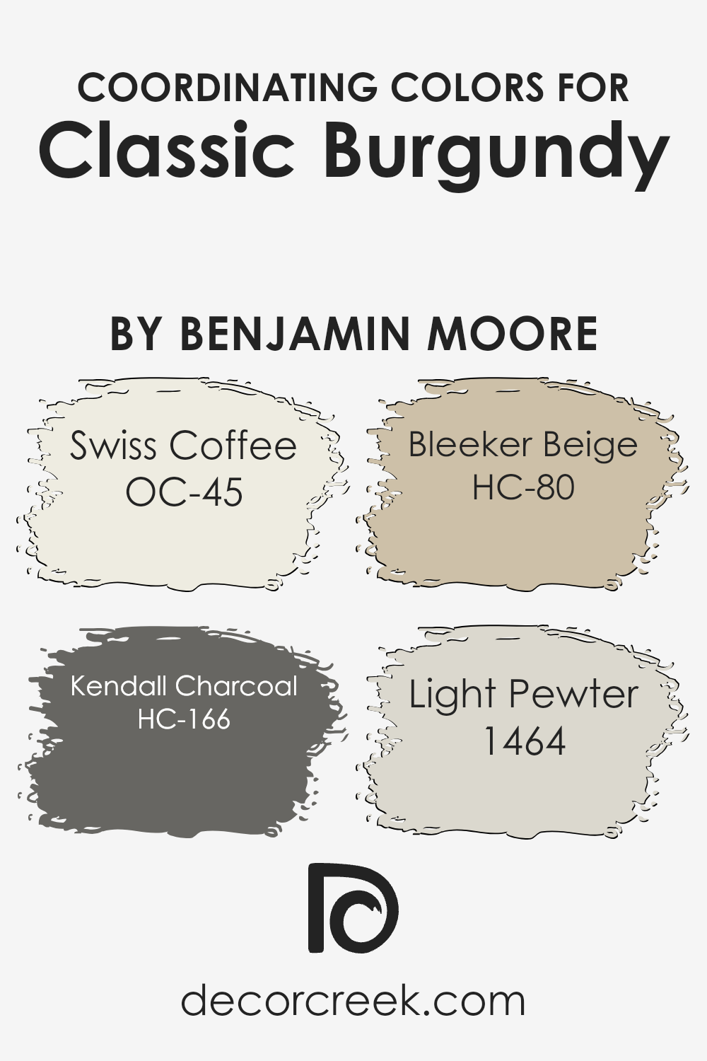
Coordinating Colors of Classic Burgundy HC-182 by Benjamin Moore
Coordinating colors are shades that harmonize well with a main color, enhancing the overall aesthetic and creating balance within a design. When used thoughtfully, these complementary hues can add depth and character to a space. For Classic Burgundy, a sophisticated and rich color, selecting the right coordinating colors is crucial to achieve a harmonious look.
These colors should complement the burgundy’s boldness while bringing warmth and versatility to the design.
OC-45 Swiss Coffee is a soothing off-white that brings a soft and airy feel to the room, lightening the atmosphere when paired with the depth of burgundy. It’s perfect for creating a crisp and clean backdrop that allows the burgundy to stand out without overwhelming the space. HC-166 Kendall Charcoal offers a stark contrast to Classic Burgundy, introducing a deep, brooding gray that adds a contemporary edge and sophistication.
This combination is ideal for those looking to make a bold statement. HC-80 Bleeker Beige is a warm and inviting hue, providing a neutral base that enhances the cozy aspects of burgundy, making spaces feel more intimate and inviting.
Meanwhile, 1464 Light Pewter is a versatile, light gray that bridges the gap between contemporary and traditional styles. Its ability to complement both the burgundy and the other coordinating colors creates a seamless and cohesive look that is both stylish and understated. Together, these shades work alongside Classic Burgundy to create a rich, layered design that feels both welcoming and refined.
You can see recommended paint colors below:
- OC-45 Swiss Coffee
- HC-166 Kendall Charcoal
- HC-80 Bleeker Beige
- 1464 Light Pewter
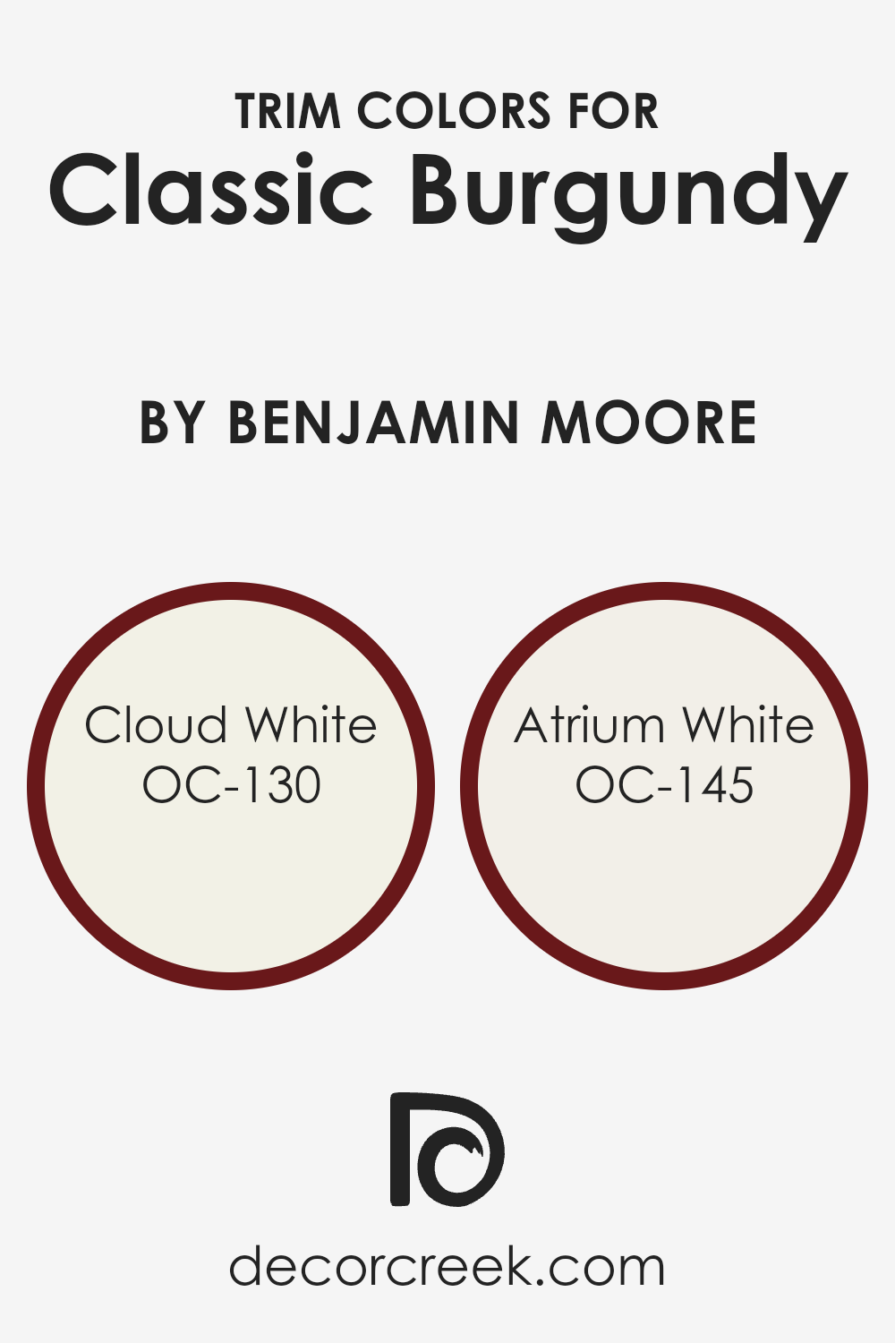
What are the Trim colors of Classic Burgundy HC-182 by Benjamin Moore?
Trim colors are the hues used for painting the architectural details of a home, such as door frames, window frames, and moldings. These colors play a crucial role in defining and enhancing the overall aesthetic of a space.
When paired with a rich and sophisticated shade like Classic Burgundy, a deep, warm tone, the right trim color can create a stunning contrast that highlights the beauty of the walls, making the color pop and adding a layer of visual interest to the room. Trim colors, by complementing or contrasting with the main wall color, can also influence the perception of space and light within a room, making it feel more cohesive, spacious, or intimate, depending on the chosen palette.
OC-130 Cloud White is a soft, clean white with a hint of warmth, making it an excellent choice for trim when you’re working with a bold color like Classic Burgundy. Its subtle warmth softens the intensity of darker hues, ensuring that the space feels inviting and balanced rather than overwhelming.
On the other hand, OC-145 Atrium White leans towards a crisp, pure white with a slight touch of red undertone, which can subtly echo the deeper reds of Classic Burgundy. Using Atrium White as a trim color provides a sharp, fresh contrast that can make the rich burgundy walls stand out, enhancing their elegance and creating a dynamic yet harmonious look in the space.
You can see recommended paint colors below:
- OC-130 Cloud White
- OC-145 Atrium White
How to Use Classic Burgundy HC-182 by Benjamin Moore In Your Home?
Classic Burgundy HC-182 by Benjamin Moore is a rich, deep wine color that instantly brings warmth and sophistication to any space. Imagine using this bold hue in your living room or dining area; it can create a cozy yet elegant atmosphere, perfect for both relaxing and hosting gatherings.
This shade can also add depth and character to smaller spaces like powder rooms or accent walls, offering a striking contrast when paired with lighter or neutral colors. If you’re thinking of refreshing your bedroom, using Classic Burgundy for one wall behind your bed can set a luxurious and calming scene, enhancing the room’s overall feel without overwhelming it.
For those who enjoy DIY projects, painting furniture pieces in Classic Burgundy can breathe new life into old items, adding a touch of modern refinement. Whether you’re updating a single room or adding special touches throughout your home, Classic Burgundy offers a timeless elegance that can make your space feel more inviting and stylish.
Conclusion
Classic Burgundy by Benjamin Moore is a rich and deep hue that brings an undeniable warmth and sophistication to any space. This color, known for its versatility, can be used in a variety of settings, from creating a cozy atmosphere in living rooms to adding a touch of elegance to dining areas.
It pairs beautifully with a wide range of decor styles, making it a go-to choice for those looking to add a sense of luxury and depth to their interiors. Whether applied as an accent wall or used across an entire room, Classic Burgundy adds dramatic flair and a sense of comfort to homes.
The adaptability of Classic Burgundy allows it to complement both contemporary and traditional designs, making it a timeless addition to any color palette. Its ability to blend seamlessly with other colors and materials also means it can be easily integrated into existing designs, offering a practical yet stylish makeover option.
For homeowners and designers seeking to create a space that feels both inviting and stylish, Classic Burgundy stands out as a top choice. It strikes the perfect balance between boldness and warmth, ensuring spaces feel welcoming and beautifully put together.
Ever wished paint sampling was as easy as sticking a sticker? Guess what? Now it is! Discover Samplize's unique Peel & Stick samples.
Get paint samples
