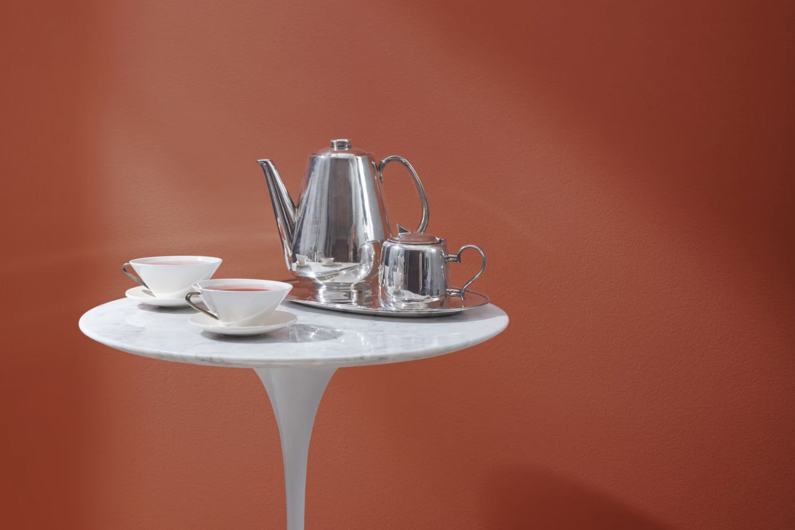
As you consider refreshing your room, Benjamin Moore’s 2172-10 Copper Clay might just be the perfect choice for you. This unique shade offers a blend of warmth and elegance that could enhance the aesthetics of your home. Copper Clay is not just any ordinary color; it’s a rich, deep tone that alludes to natural elements, bringing an earthy, grounded feel to any area.
Imagine your living room or bedroom adorned with this hue; it adds a sense of coziness, yet retains an air of refined charm. Perfect for those of you looking to create a welcoming and polished atmosphere, Copper Clay works wonders in rooms that crave a touch of understated beauty.
Whether you are looking to revamp a single room or your entire house, consider how this color might align with your existing decor and lighting. The reflective quality of Copper Clay enables it to adapt to various lighting conditions, showcasing different nuances throughout the day.
So, if you’re planning a makeover, think about how Copper Clay could be the right fit for bringing a fresh and appealing look to your home.
What Color Is Copper Clay 2172-10 by Benjamin Moore?
Copper Clay by Benjamin Moore is a rich, warm hue with a deep, earthy essence that brings a cozy and welcoming feel to any room. This color is a mix of burnt sienna and rusty brown, creating a comforting atmosphere that is perfect for rooms where relaxation is key. It’s a flexible shade that works beautifully in a variety of interior styles, particularly rustic, bohemian, and modern areas.
The warmth of Copper Clay makes it a great match for natural materials like wood, leather, and linen, enhancing their organic qualities. When paired with wood, whether light oak or dark walnut, it highlights the natural grains and adds depth to the room. Leather furniture, especially in darker tones, when combined with this hue, can create a luxurious, yet grounded feeling.
Textured fabrics like linen or chunky woven blankets also complement the earthiness of Copper Clay, adding layers of interest to your décor. In terms of metals, brushed gold or copper accents can highlight the warmth of the paint, providing a subtle shimmer that contrasts nicely with its matte finish.
Ideal for living rooms, bedrooms, or any room where you want a touch of warmth, Copper Clay is a color that can create a comforting retreat in your home. It especially shines in well-lit rooms where the natural light can enhance its rich tones. This color is a great choice for anyone looking to create a cozy, inviting interior.

Is Copper Clay 2172-10 by Benjamin Moore Warm or Cool color?
Copper Clay by Benjamin Moore is a warm, rich terracotta shade that adds a cozy and inviting feel to any room. This color is perfect for those looking to create a homey atmosphere in their living areas. Its earthy tone works well in living rooms or bedrooms, where it brings a sense of warmth and comfort.
Because of its depth, Copper Clay pairs nicely with natural materials like wood or leather, enhancing their natural beauty. It’s also a great choice for accent walls, providing a striking backdrop that makes furniture and decor stand out.
In well-lit areas, this color glows with a vibrant energy, while in dimmer rooms, it offers a snug and secure feeling. This flexibility makes it suitable for various home styles, from rustic to more modern designs. Overall, Copper Clay is a flexible color that can make a room feel more welcoming and cozy.
Undertones of Copper Clay 2172-10 by Benjamin Moore
Copper Clay by Benjamin Moore is a unique color with a blend of various undertones that can significantly influence how it appears on your walls. Understanding undertones can be quite helpful when choosing paint colors for your home.
Undertones are subtle hues that, while not always immediately noticeable, can alter the primary color’s appearance depending on the lighting and surroundings. For instance, Copper Clay has undertones like olive, red, purple, orange, grey, dark grey, pink, dark green, pale pink, navy, and dark turquoise. These hues mix together to give the paint a complex and rich appearance.
In an interior setting, the way Copper Clay looks can shift throughout the day and in different types of lighting. The olive and dark green undertones might make the color appear more grounded and connected to nature, especially in rooms with lots of natural light or greenery outside. In artificial or dimmer lighting, the dark grey or navy undertones could make the area feel more enclosed and cozy.
Similarly, the warmer undertones like red, orange, and pink add warmth, making a room feel welcoming and comfortable. Pairing this paint with contrasting or complementary colors in decor can either accentuate or balance these undertones.
Overall, the rich mix of undertones in Copper Clay makes it flexible for various applications, allowing it to fit well in many different design schemes, from more traditional to contemporary styles. This makes the paint not just a color choice but a design tool that alters perceptions of the room and mood.
decorcreek.com
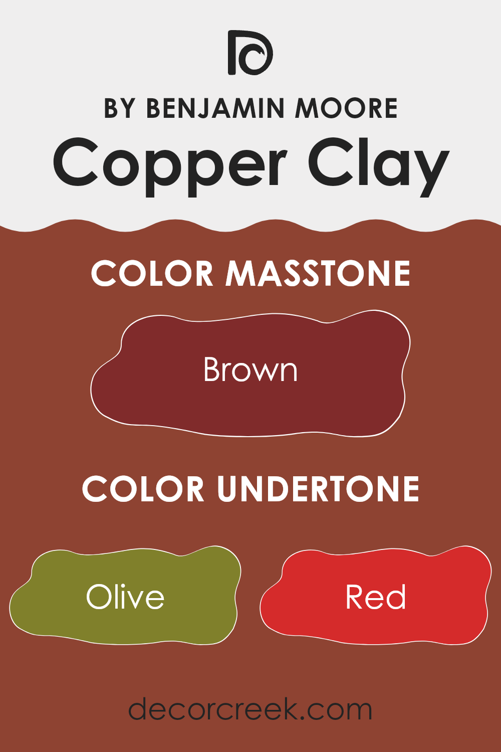
What is the Masstone of the Copper Clay 2172-10 by Benjamin Moore?
Copper Clay 2172-10 by Benjamin Moore is a unique shade of brown, featuring deep red undertones. This color creates a warm and welcoming atmosphere in any home. The rich tone has a cozy feel that works well in living rooms or dens, offering a comforting backdrop for relaxation and family gatherings.
Because Copper Clay is a darker shade, it pairs excellently with lighter colors like creams or soft yellows, bringing balance and contrast to a room. This makes it a great choice for walls, especially if the goal is to highlight artwork or furniture pieces with lighter hues.
Additionally, its earthy quality enables it to blend seamlessly with natural materials such as wood or leather, enhancing the organic feel of a room. This makes it a flexible color for homes aiming to achieve a grounded, homey ambiance. Copper Clay excels in rooms that benefit from a touch of nature-inspired richness, adding both depth and warmth to interiors.
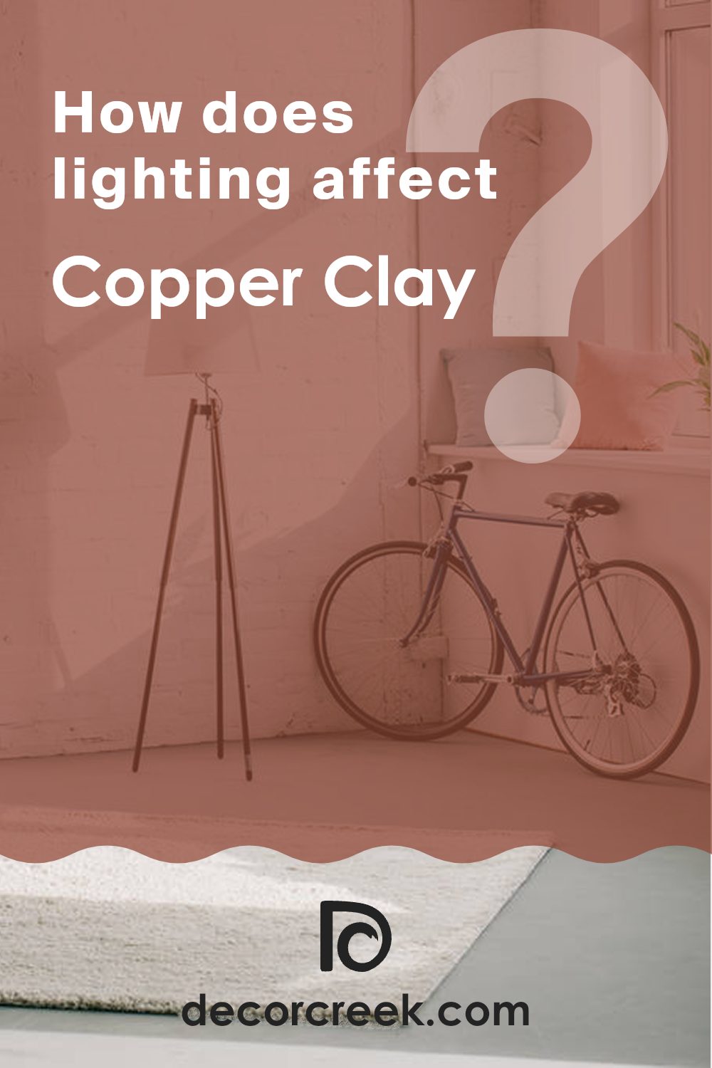
How Does Lighting Affect Copper Clay 2172-10 by Benjamin Moore?
Lighting plays a crucial role in how we perceive colors. The way light reflects and absorbs can make a huge difference in the appearance of a color in various environments. This is particularly true for paint colors, such as the warm, earthy hue Copper Clay by Benjamin Moore.
In artificial light, Copper Clay can look very different depending on the type of bulb used. Typically, LED or fluorescent lights can either enhance or soften its warm, rich tones. Under warm white bulbs, Copper Clay tends to feel cozier and more inviting, making it ideal for living areas or spots where you want a warm, comforting aura. Under cooler bulbs, the color might lose some of its warmth, appearing slightly muted and less vibrant.
In natural light, the appearance of Copper Clay changes throughout the day. The color glows warmly in the morning light, looks true to its natural tone around noon, and deepens towards the evening, offering a rich, welcoming vibe. The amount of daylight and the angle of the sun greatly influence how this paint color presents itself.
Regarding room orientation:
- North-facing rooms: These rooms get less direct sunlight, which can make Copper Clay appear more muted and cooler. In these areas, the color may look slightly darker and less vibrant.
- South-facing rooms: Here, the abundance of sunlight can bring out the brightness and warmth of Copper Clay, making the area feel open and lively.
- East-facing rooms: In these rooms, morning light can make Copper Clay look very warm and welcoming. As the day progresses, the intensity of the color may decrease as less direct light hits the area.
- West-facing rooms: These rooms receive strong evening sunlight, which can really highlight the warm tones of Copper Clay, making it glow beautifully towards the end of the day.
Choosing the right lighting and considering room orientation can help you maximize the beauty of Copper Clay in your room, ensuring it provides the atmosphere you desire.
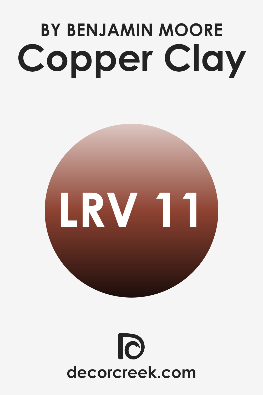
What is the LRV of Copper Clay 2172-10 by Benjamin Moore?
LRV stands for Light Reflectance Value, which is a measure used to describe how much light a paint color reflects back into a room. This value is represented by a number ranging from 1 to 100, with higher numbers indicating that the color reflects more light. Paints with a higher LRV can make a room feel brighter and larger because they reflect more light around the area.
On the other hand, colors with a lower LRV absorb more light, which can make a room feel cozier but also smaller and darker. With an LRV of 10.6, the color in question is on the darker end of the scale. This means it will absorb more light than it reflects, creating a denser feel in any area it’s used.
When applied on walls, this particular shade will not brighten the room but will add depth and warmth. It’s well-suited for larger rooms or areas with plenty of natural light to prevent it from making the room feel too confined.
This choice of color can be especially effective if the goal is to create an intimate atmosphere where the walls visually recede, enhancing furnishings and other elements in the area.
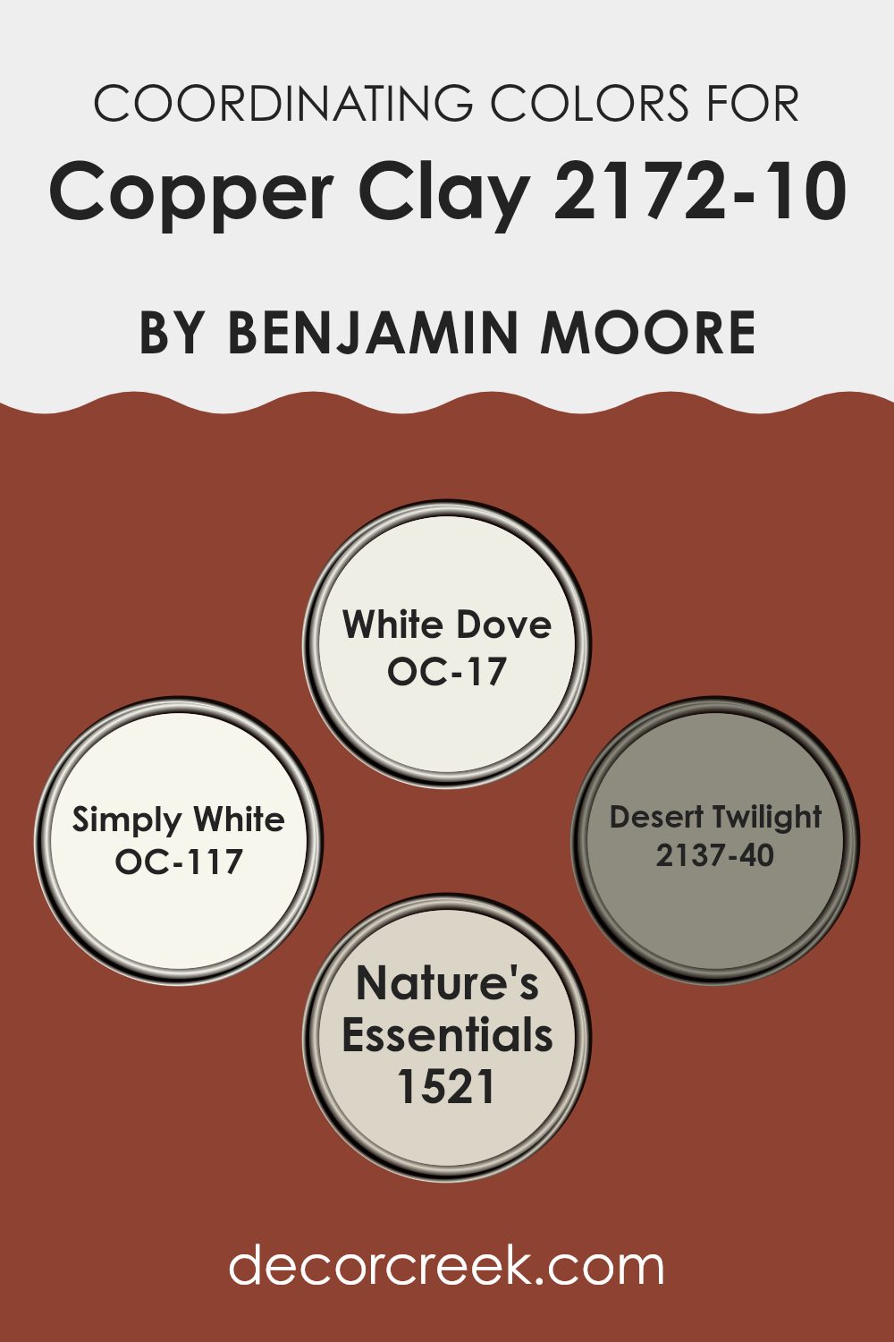
Coordinating Colors of Copper Clay 2172-10 by Benjamin Moore
Coordinating colors are chosen to complement a main color by enhancing its visual appeal and creating a balanced look. In the case of a bold color like Copper Clay by Benjamin Moore, coordinating colors like OC-17 – White Dove, OC-117 – Simply White, 2137-40 – Desert Twilight, and 1521 – Nature’s Essentials are selected to harmonize with the deep, earthy tone of the primary color.
White Dove, described as a soft and warm white, acts as a gentle contrast that helps to brighten rooms while maintaining a cozy feel next to richer hues like Copper Clay. Similarly, Simply White offers a clean and fresh look, providing a crisp backdrop that allows darker colors to stand out.
On the other hand, Desert Twilight is a subdued, grayish shade that complements the depth of Copper Clay, adding a layer of complexity and quiet refinement to the overall palette. Lastly, Nature’s Essentials is a muted earth tone that works seamlessly with Copper Clay, enhancing its natural vibe without competing for attention. Each of these colors supports the main shade in its own way, contributing to a cohesive and harmonious color scheme.
You can see recommended paint colors below:
- OC-17 White Dove
- OC-117 Simply White
- 2137-40 Desert Twilight
- 1521 Nature’s Essentials
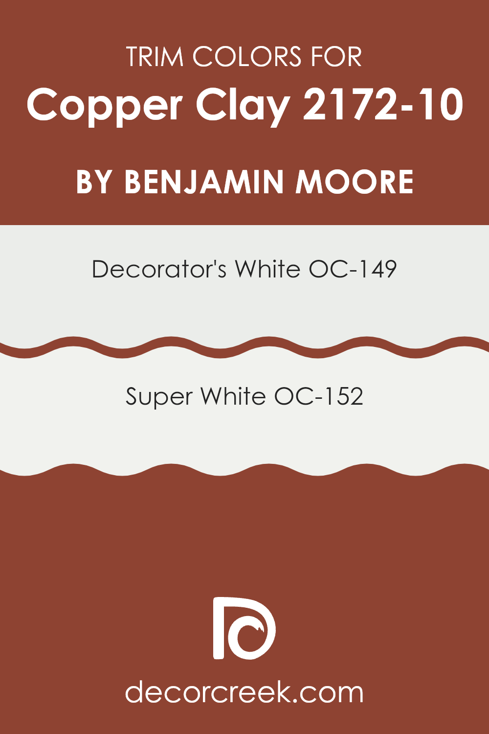
What are the Trim colors of Copper Clay 2172-10 by Benjamin Moore?
Trim colors are specific shades used primarily for painting the moldings, baseboards, window and door frames, and other structural accents of a room. Choosing the right trim color can significantly enhance the visual appeal of an area and create a distinct, polished look, especially when contrasted against wall colors.
For example, using crisp and clean trim colors like white or off-white with walls painted in Copper Clay by Benjamin Moore can bring out the richness of the wall color while providing a neat, finished appearance to the room. Decorator’s White OC-149 is a fresh off-white color that leans toward a subtle hint of gray.
This hue is very useful in making darker colors stand out while keeping the overall atmosphere light and open. On the other hand, Super White OC-152 is a brighter, purer white, offering a more striking contrast and clarity when used next to deeper or vibrant wall colors. Both colors can beautifully highlight the architectural details of a room, ensuring that every edge and line is properly emphasized.
You can see recommended paint colors below:
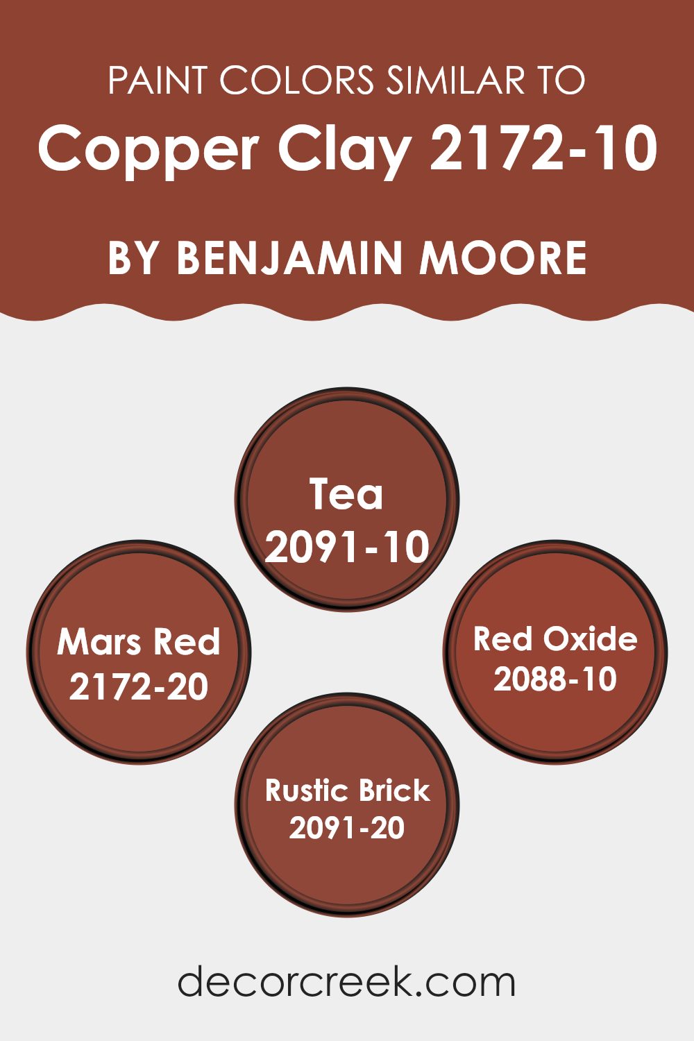
Colors Similar to Copper Clay 2172-10 by Benjamin Moore
Choosing related colors for a design project ensures a harmonious and pleasing visual experience. When colors like 2091-10 – Tea, 2172-20 – Mars Red, 2088-10 – Red Oxide, and 2091-20 – Rustic Brick are used alongside Copper Clay from Benjamin Moore, the result is a coherent color scheme that seamlessly blends together.
These hues share warm undertones that complement each other, promoting a unified look without abrupt transitions. Using such connected colors helps create a sense of flow and balance in rooms, making them feel more inviting. Each of these shades adds its unique hue while maintaining overall harmony with Copper Clay. The color Tea, for example, is a deep chocolate brown that brings a grounding and earthy feel to interiors.
Mars Red, on the other hand, offers a vivid, deep rust tone that fills rooms with warmth and energy. Red Oxide, a robust reddish-brown, has an organic richness that pairs well with natural materials like wood and leather. Lastly, Rustic Brick, which introduces a more muted brick red shade, gives rooms a classic vibe without overpowering the setting. Together, these colors create a collection of options that work beautifully in various combinations, enhancing the aesthetic and atmosphere of any area.
You can see recommended paint colors below:
- 2091-10 Tea
- 2172-20 Mars Red
- 2088-10 Red Oxide
- 2091-20 Rustic Brick
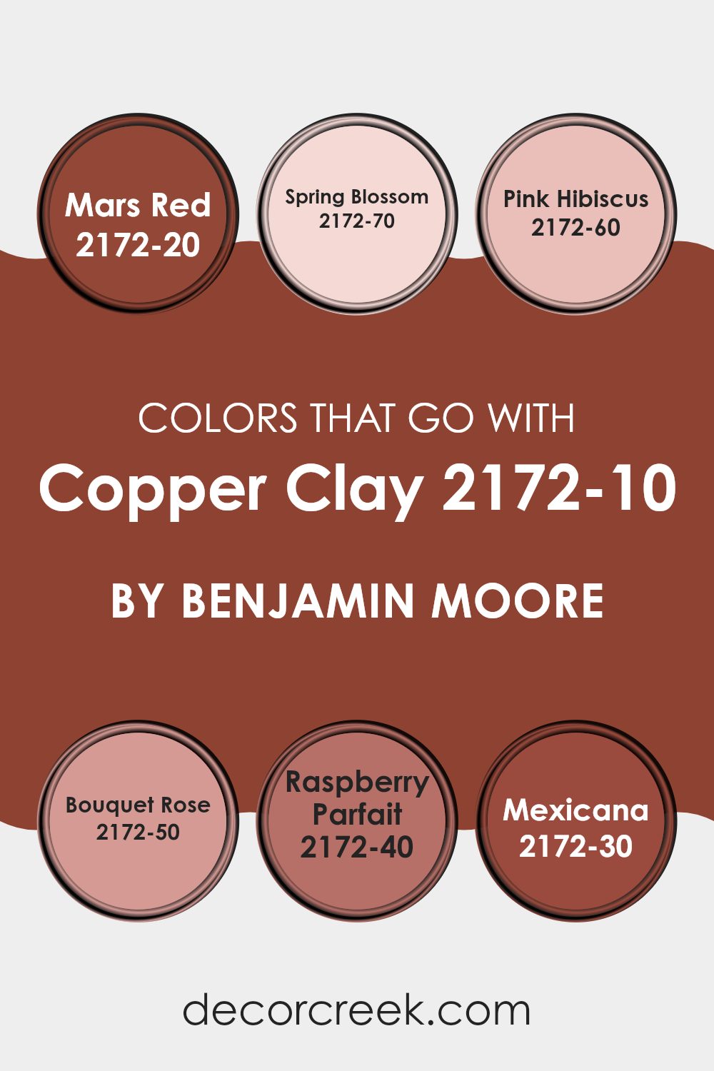
Colors that Go With Copper Clay 2172-10 by Benjamin Moore
Choosing complementary colors to go with Benjamin Moore’s Copper Clay 2172-10 is an important aspect of interior design because it can either enhance or soften its warm, inviting nature. When selecting shades like Mars Red, Spring Blossom, and others from the same palette, you create a balance that either cools down or warms up the room depending on the choice.
These hues help ensure that Copper Clay, a rich, earthy tone, isn’t too intense but instead becomes part of a cohesive and pleasant color scheme. Mars Red is a deep, vibrant shade that brings a bold and energetic feel to areas, perfect for emphasizing focal points.
Spring Blossom, on the other hand, is a very light, almost airy pink that adds subtle freshness and brightness, contrasting nicely with deeper tones like Copper Clay. Pink Hibiscus offers a softer approach, less intense than Mars Red but still noticeable, ideal for a gentle accent of color.
Bouquet Rose has an understated refinement, providing a mid-tone option that bridges lighter and darker hues effectively. Raspberry Parfait introduces a playful, slightly whimsical touch with its bright, berry-like personality, great for energizing a room.
Lastly, Mexicana surrounds the area with a sense of warmth, its red-orange hues reminiscent of clay and sunset, perfect for creating cozy, welcoming environments. Together, these colors work harmoniously to shape diverse moods that suit Copper Clay’s flexible character.
You can see recommended paint colors below:
- 2172-20 Mars Red
- 2172-70 Spring Blossom
- 2172-60 Pink Hibiscus
- 2172-50 Bouquet Rose
- 2172-40 Raspberry Parfait
- 2172-30 Mexicana
How to Use Copper Clay 2172-10 by Benjamin Moore In Your Home?
Copper Clay 2172-10 by Benjamin Moore is a warm and inviting paint color that can add a cozy touch to any room in your home. This rich, earthy shade feels inspired by natural clay and provides a welcoming atmosphere when applied to the walls. It’s especially effective in living rooms and bedrooms where you want a comforting and friendly vibe.
Using Copper Clay in a small room like a bathroom or an alcove can make the area feel more enclosed and snug, perfect for creating a cozy retreat. In larger rooms, using it on one accent wall can bring balance without making the room feel heavy.
This color pairs beautifully with natural wood, stone, and soft neutral tones like creams and beiges. Its flexibility means you can use it in various decorative styles, from rustic to more modern designs. Try combining it with soft fabrics and simple decorative accents to make it the perfect backdrop for a warm and inviting home.
Copper Clay 2172-10 by Benjamin Moore vs Rustic Brick 2091-20 by Benjamin Moore
Copper Clay and Rustic Brick are two colors by Benjamin Moore that offer unique yet harmonious natural tones. Copper Clay is more like a subdued burnt orange. This color has an earthy character, giving a cozy and warm vibe to any room. It draws its essence from natural elements and creates a soothing, gentle mood. It pairs well with soft neutrals or lively shades for a balanced appearance.
Rustic Brick, on the other hand, is a deeper, more robust tone resembling traditional red brick. It’s a bold choice that makes a clear statement wherever it’s used. This hue naturally conveys a sense of warmth and comfort but with a stronger presence compared to Copper Clay. It’s excellent for creating a focal point in a room or adding a rustic accent.
Both colors provide warmth in different degrees and can beautifully complement each other in interior design, maintaining a grounded, natural aesthetic throughout.
You can see recommended paint color below:
- 2091-20 Rustic Brick
Copper Clay 2172-10 by Benjamin Moore vs Mars Red 2172-20 by Benjamin Moore
Copper Clay and Mars Red, both by Benjamin Moore, are two distinct shades that bring their own unique character to a room. Copper Clay is a subtle, muted orange that gives off a cozy and warm feeling without being too bright or intense.
It’s an excellent choice if you’re aiming for a soft yet inviting atmosphere. Mars Red, in contrast, is a deeper and more powerful hue. This shade mirrors the rich tones of red clay soil and carries a strong, expressive presence. It can add a bold and energetic touch to an area, making it truly stand out.
While both colors share an earthy foundation, their effect differs. Copper Clay feels more understated and can blend naturally with other neutrals. Mars Red draws more attention and pairs beautifully with heavy, dark furniture or as an accent wall to create visual impact. Whether you go for the calmer Copper Clay or the vibrant Mars Red depends on the mood and design personality you want to express.
You can see recommended paint color below:
- 2172-20 Mars Red
Copper Clay 2172-10 by Benjamin Moore vs Red Oxide 2088-10 by Benjamin Moore
Copper Clay and Red Oxide are both warm, rich shades from Benjamin Moore that create inviting atmospheres, yet each brings its own distinct tone to a room. Copper Clay has an earthy, muted character with touches of orange and brown, resembling the natural look of clay fired in a kiln.
It’s a grounded, cozy hue that works beautifully in areas meant for relaxation, such as living rooms or bedrooms. Red Oxide, on the other hand, presents a deeper, more powerful red tone, similar to rust or the color of aged, oxidized metal.
This hue is bolder and makes a clear statement, ideal for accent walls or design elements meant to draw attention. While both shades share warmth, Copper Clay offers a softer, more relaxed presence, whereas Red Oxide delivers a striking and dramatic effect.
You can see recommended paint color below:
- 2088-10 Red Oxide
Copper Clay 2172-10 by Benjamin Moore vs Tea 2091-10 by Benjamin Moore
Copper Clay and Tea are two distinct paint colors by Benjamin Moore, each bringing its own charm. Copper Clay is a deep, warm terracotta shade that mirrors the reddish-brown hue of natural clay pots. This color adds a cozy, inviting feeling to rooms, making it ideal for living or dining areas where a comforting atmosphere is desired.
In contrast, Tea is a rich, dark brown tone that reflects the color of black tea leaves. It’s a more subtle and neutral option compared to Copper Clay, offering a grounded character that fits beautifully in both traditional and modern interiors. Tea works especially well in bedrooms, offices, or any room where a touch of formality and calm is preferred.
Together, Copper Clay and Tea offer choices for those who want to create a warm setting with earthy tones. While Copper Clay captivates with its vibrant, warm undertones, Tea provides a quiet, steady presence suited to a variety of design styles.
You can see recommended paint color below:
- 2091-10 Tea
After reading about 2172-10 Copper Clay by Benjamin Moore, I think it’s a really lovely paint color! It feels like a warm, cozy brown with touches of orange that remind me of autumn leaves or sweet caramel. Imagine painting a room with this shade — it would make the area feel warm and welcoming, like wearing your favorite brown sweater.
Copper Clay seems perfect for spots in your home where you relax, such as the bedroom or living room. It has a gentle strength in its tone, which helps a room feel snug and secure. I also think it would pair beautifully with many furniture styles, whether classic or modern.
In short, 2172-10 Copper Clay by Benjamin Moore is a wonderful option for anyone wanting to make their room feel warm and inviting. It’s like wrapping your room in a soft, comforting blanket — perfect for creating your own cozy retreat.
Ever wished paint sampling was as easy as sticking a sticker? Guess what? Now it is! Discover Samplize's unique Peel & Stick samples.
Get paint samples

