When you’re looking to refresh a room or start a new project, choosing the right paint color is key. I recently came across SW 6356 Copper Mountain by Sherwin Williams, and it’s a shade that could really warm up a space. This color is like a cozy blanket; it has a rich, deep tone that seems to fill the room with warmth.
It’s not just any brown – there’s a subtle vibrancy to it that reminds me of autumn leaves or the glow of a sunset.
Choosing a paint like Copper Mountain could be a fantastic way to add some personality and warmth to your living area, bedroom, or even an office. It pairs well with a variety of decor styles and brings a welcoming feel to any space. If you’re thinking about rejuvenating your home’s look, consider how a warm, earthy color like this could make your room feel more inviting.
Whether you’re painting an accent wall or planning to redo the whole room, SW 6356 Copper Mountain could be the perfect choice to create a cozy, inviting atmosphere.
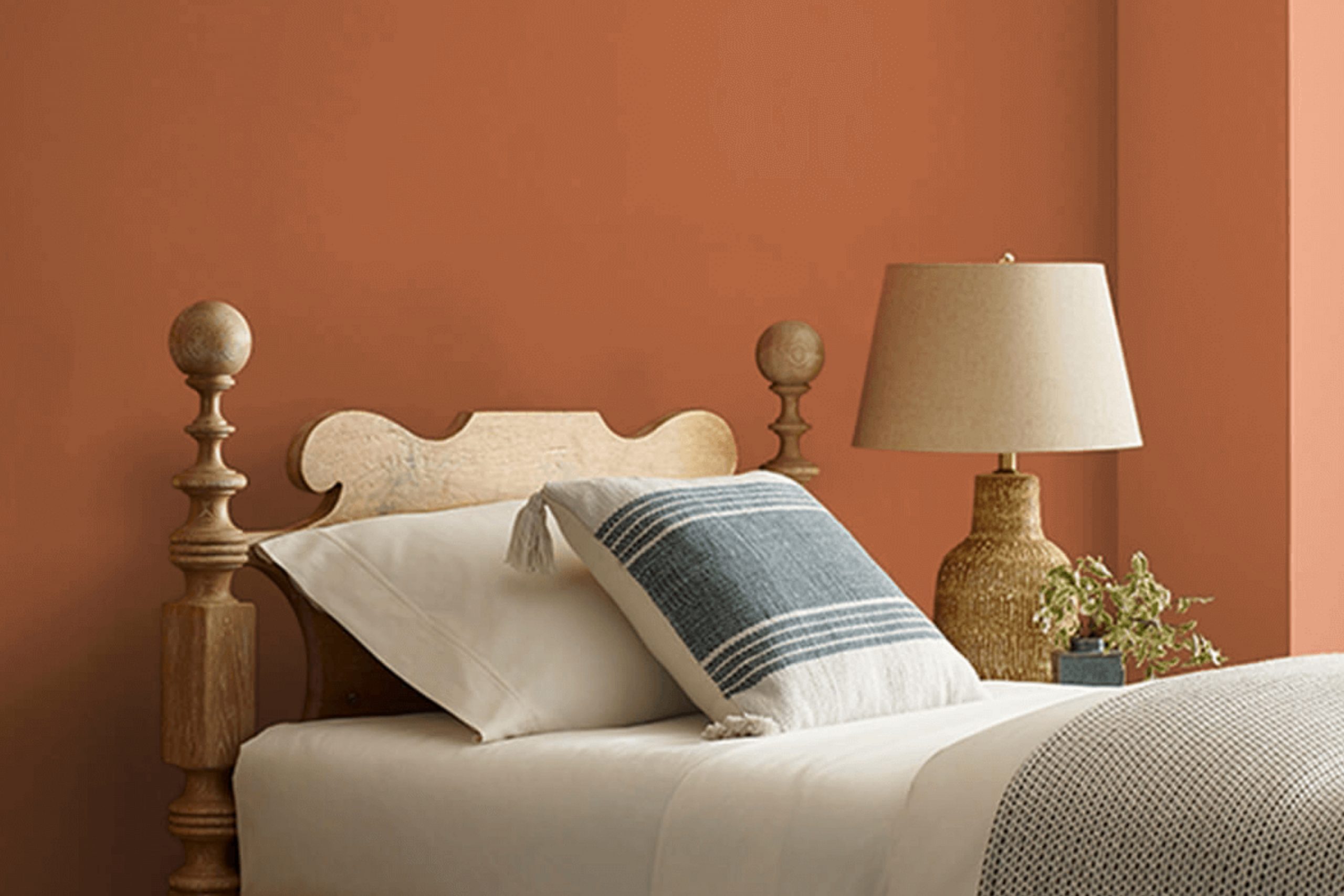
What Color Is Copper Mountain SW 6356 by Sherwin Williams?
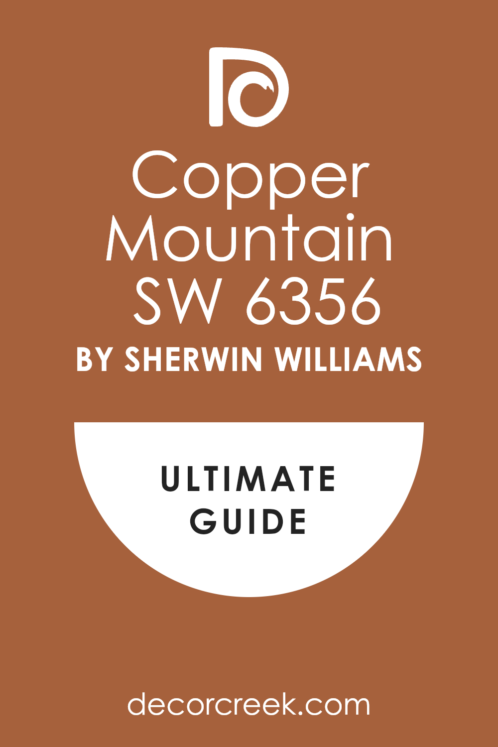
Copper Mountain by Sherwin Williams is a warm, inviting hue that resembles the natural tones of weathered copper. This paint color has an earthy quality, with a base that leans towards a rich, medium brown and subtle hints of burnt orange. This color is particularly versatile and rich, lending itself well to creating cozy and welcoming spaces.
Copper Mountain is a fantastic choice for those who are looking to warm up their living spaces without overpowering them with too much darkness. It works excellently in interior styles that emphasize comfort and warmth like rustic, traditional, and modern farmhouse designs.
This color creates a lovely, homey atmosphere when used on living room or kitchen walls.
When it comes to pairing with materials and textures, Copper Mountain coordinates beautifully with natural wood, from lighter pines to darker walnuts. The warmth of the wood and the paint complement each other, enhancing the cozy factor of any room.
It also looks stunning with textured fabrics like tweed or plush velvets in neutral tones, which add depth and interest to the space. For a more contemporary feel, incorporating matte black or brushed metal accents can create a striking contrast that’s both modern and timeless.
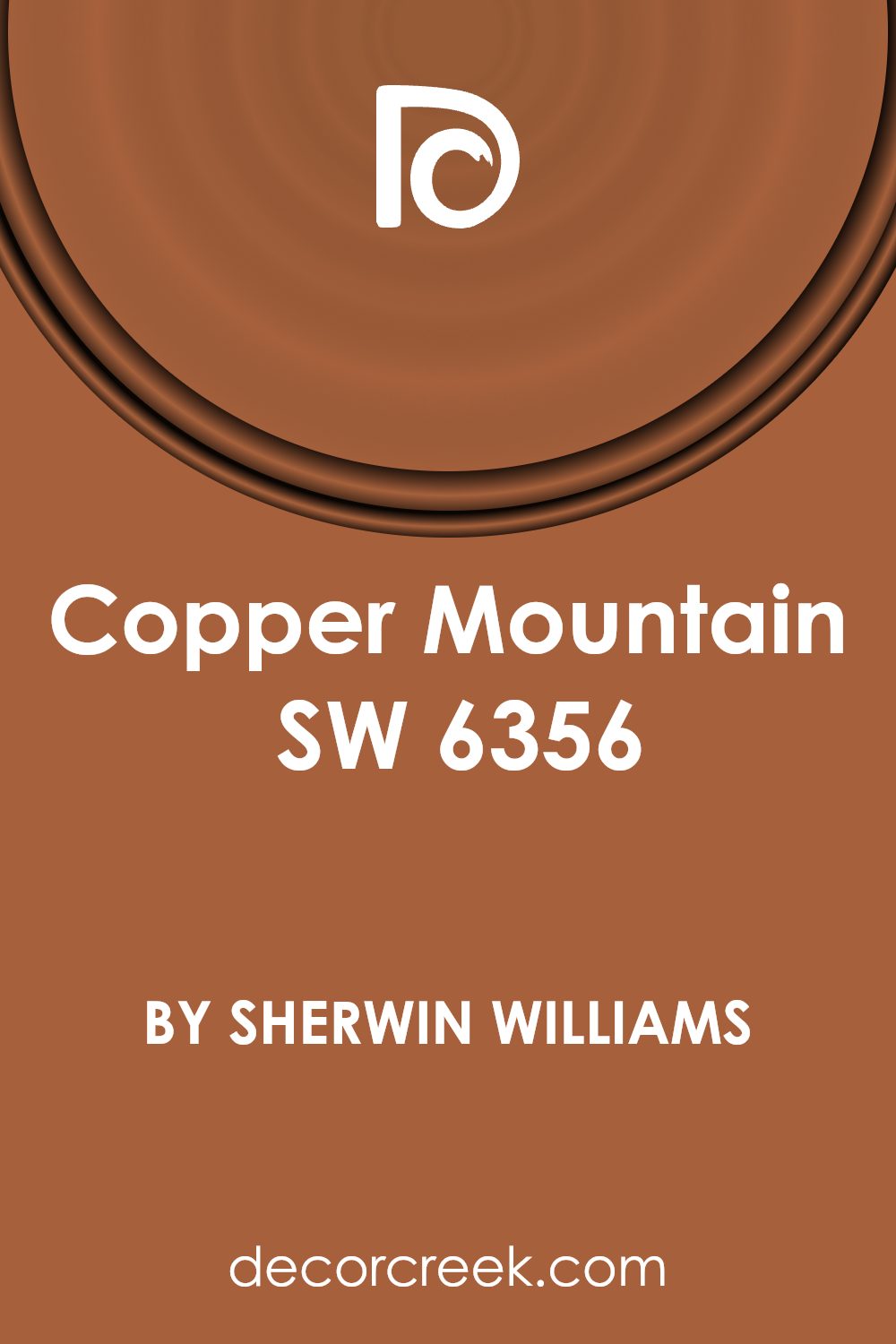
Is Copper Mountain SW 6356 by Sherwin Williams Warm or Cool color?
Copper Mountain by Sherwin Williams is a warm, cozy shade of terracotta that adds a welcoming vibe to any room. This color works great in spaces where you want to add a touch of warmth without overwhelming the area with too bright colors. It pairs beautifully with natural elements like wood or stone, enhancing the homey feel of a space.
This shade is particularly effective in living rooms and kitchens, where it creates a friendly and inviting atmosphere. In a well-lit room, Copper Mountain reflects light beautifully, giving off a soft, subtle glow that makes the space feel more relaxed and comfortable.
On the other hand, in rooms with less natural light, it brings depth and richness, helping to make the space feel more intimate.
Additionally, this versatile color coordinates well with neutral tones such as whites, beiges, and greys, offering a wide range of design options. It’s an excellent choice for those looking to add a touch of warmth and personality to their home without going too bold.
Undertones of Copper Mountain SW 6356 by Sherwin Williams
Copper Mountain is a rich, warm color that brings a cozy and inviting atmosphere to any room it’s used in. The undertones in a paint color play a crucial role in how the color appears once applied to the walls and how it behaves under different lighting conditions. Each undertone can bring out a different aspect of the main color, impacting the overall mood and effect of the room.
Copper Mountain has hints of orange, brown, and red, which contribute to its warmth. In natural light, these undertones can make a room feel more welcoming and energetic. Under artificial lighting, the orange might become more pronounced, adding a vibrant touch to the space.
Other undertones like grey and brown help in softening the intensity, making the color versatile for various spaces and complementing a wide range of home furnishings. Lighter undertones such as pale pink and pale yellow give Copper Mountain a subtle brightness, preventing it from overwhelming the space.
Using this paint on interior walls can make the room feel warm and cozy, especially in settings with ample natural light. In dimmer conditions, the darker undertones, such as dark grey and brown, could make the room feel smaller, but the right interior lighting can counteract this, highlighting the color’s warmth and depth.
Overall, the success of using Copper Mountain in interior décor depends on considering the balance and interaction of its undertones with the room’s lighting and furnishings to create the desired atmosphere.
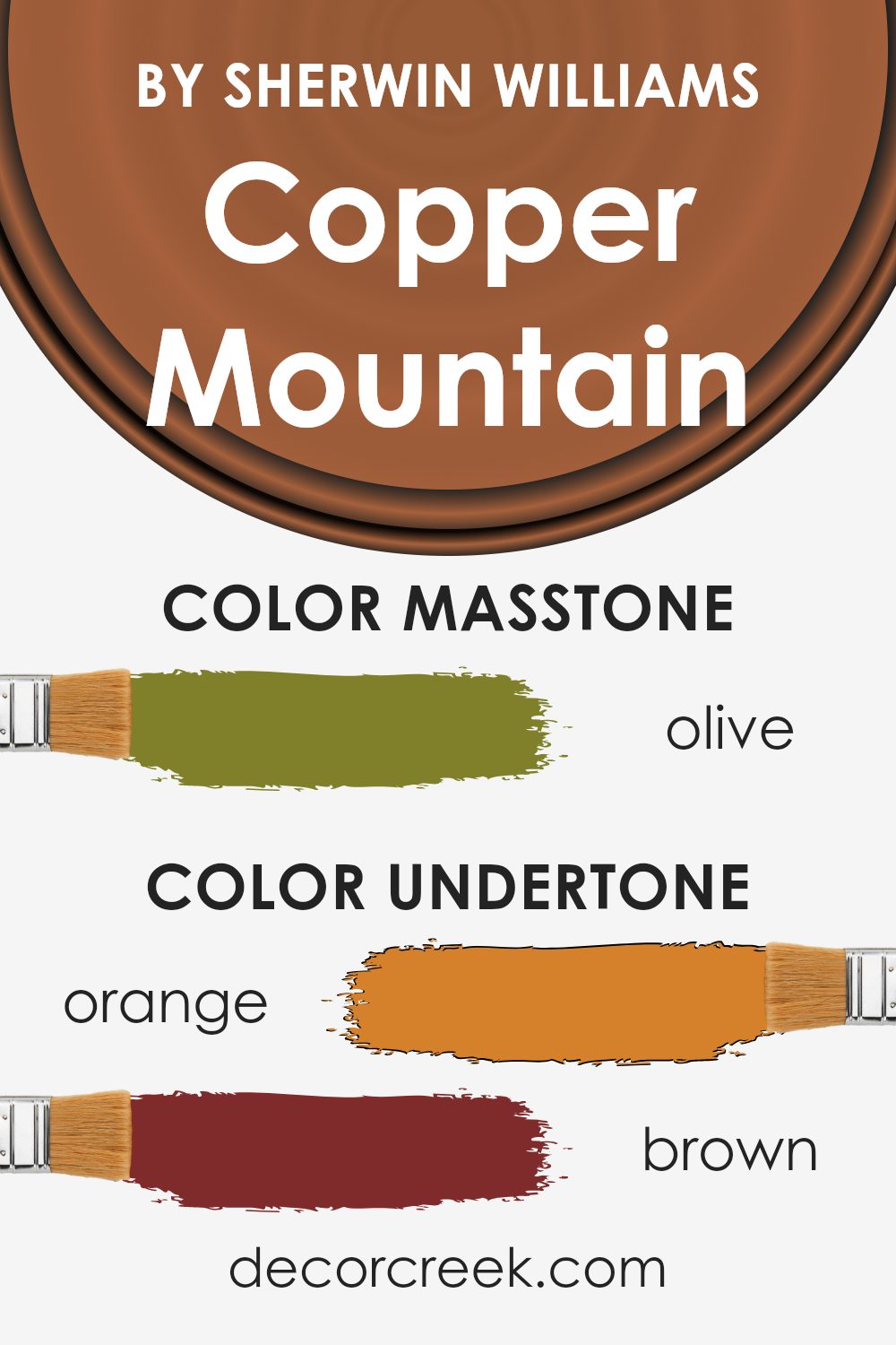
What is the Masstone of the Copper Mountain SW 6356 by Sherwin Williams?
Copper MountainSW 6356, colored Olive (#80802B), is a rich, deep shade that brings a warm and cozy feeling into any room. Its distinct color impacts home interiors by creating a welcoming environment that feels both comfortable and inviting.
Depending on the lighting, this hue can look darker or lighter, adding a dynamic element to the decor. It pairs well with natural materials like wood and leather, enhancing their earthy qualities.
In rooms like the living room or study, it helps to establish a relaxed atmosphere, perfect for spending time with family or enjoying a good book. In addition, this color complements a variety of other shades such as creamy whites or soft grays, allowing for versatile color schemes. When used in a home, Copper Mountain brings a sense of warmth and natural beauty, making it a popular choice for those looking to create a cozy and appealing space.
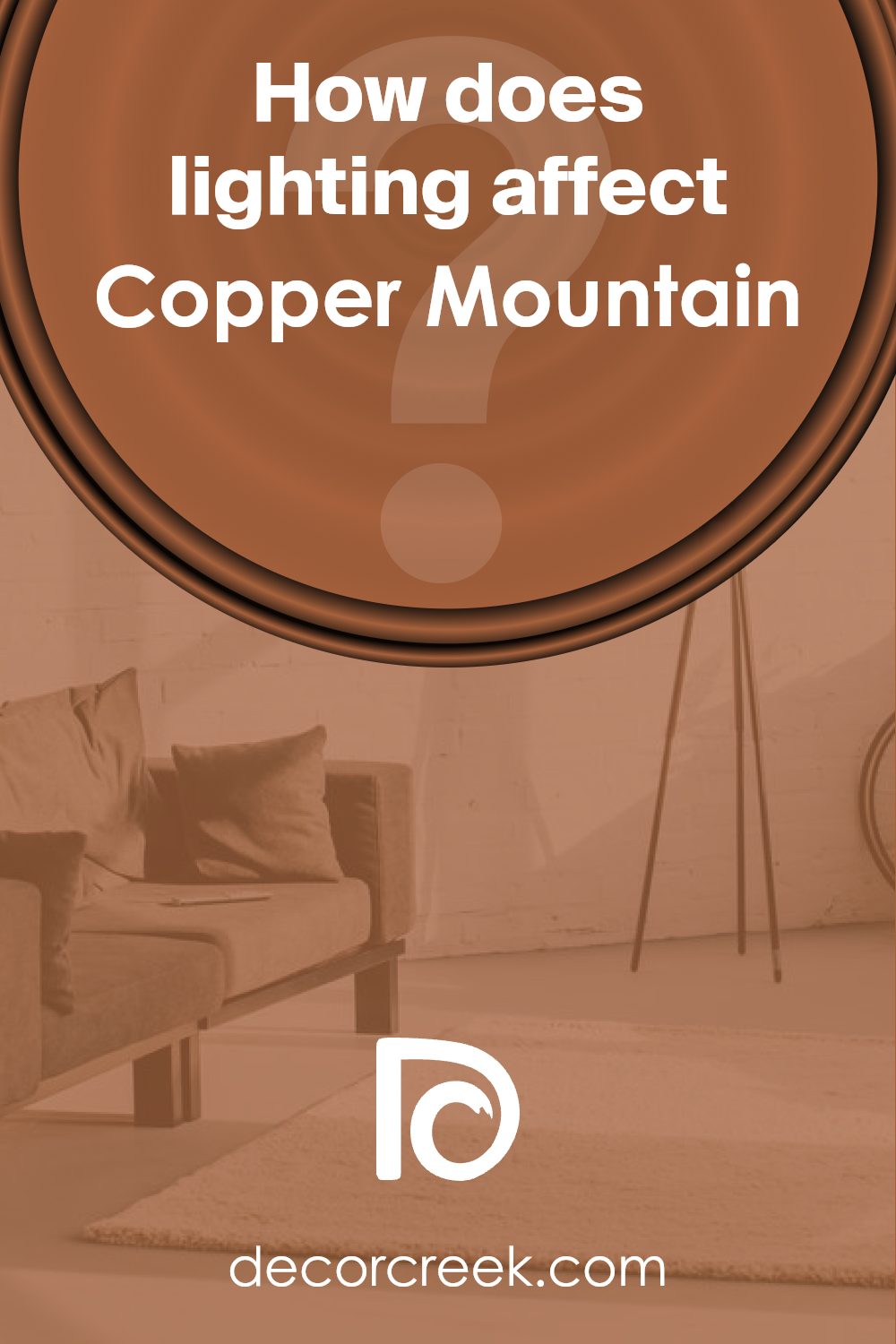
How Does Lighting Affect Copper Mountain SW 6356 by Sherwin Williams?
Lighting has a significant impact on how we perceive colors. A color can appear different depending on the kind of light it’s under. This is because light sources vary in color temperatures; natural daylight is typically cooler, casting a bluish tint, while indoor lighting can be warmer, giving off a yellowish hue.
Considering a specific shade like Copper Mountain SW 6356 by Sherwin-Williams, its appearance can change dramatically based on the lighting. Copper Mountain is a rich, warm terra cotta color that can create a cozy and inviting atmosphere in a space.
In natural light, this color bursts with vibrancy and can look quite lively. The natural sunshine brings out the bright, warm undertones, making the room feel cheerful and welcoming. It works well in rooms with a lot of windows and natural sunlight, particularly south-facing rooms that get the strongest light throughout the day. Here, the color will appear lighter and more vivid.
Artificial light, depending on whether it’s warm or cool, can enhance or mute this color. Warm artificial light complements the warm tones in Copper Mountain, making the color appear even richer and deeper. This is ideal for creating a snug, cozy feeling in the evenings.
In north-facing rooms, Copper Mountain may lose some of its brightness as these rooms get less direct sunlight and the light is often cooler. Thus, the color might look slightly muted and darker, but still quite warm.
For east-facing rooms, the color will look particularly vibrant in the morning when they catch the warm sunrise light, but it will transition as the day goes on, becoming cooler. Conversely, in west-facing rooms, the color will feel softer in the morning light and grow intensely warm and dynamic by the evening as the sun sets.
Understanding these effects can help in choosing the right paint color for a specific room based on the directional light exposure and deciding on artificial lighting to complement the natural tones of the paint.
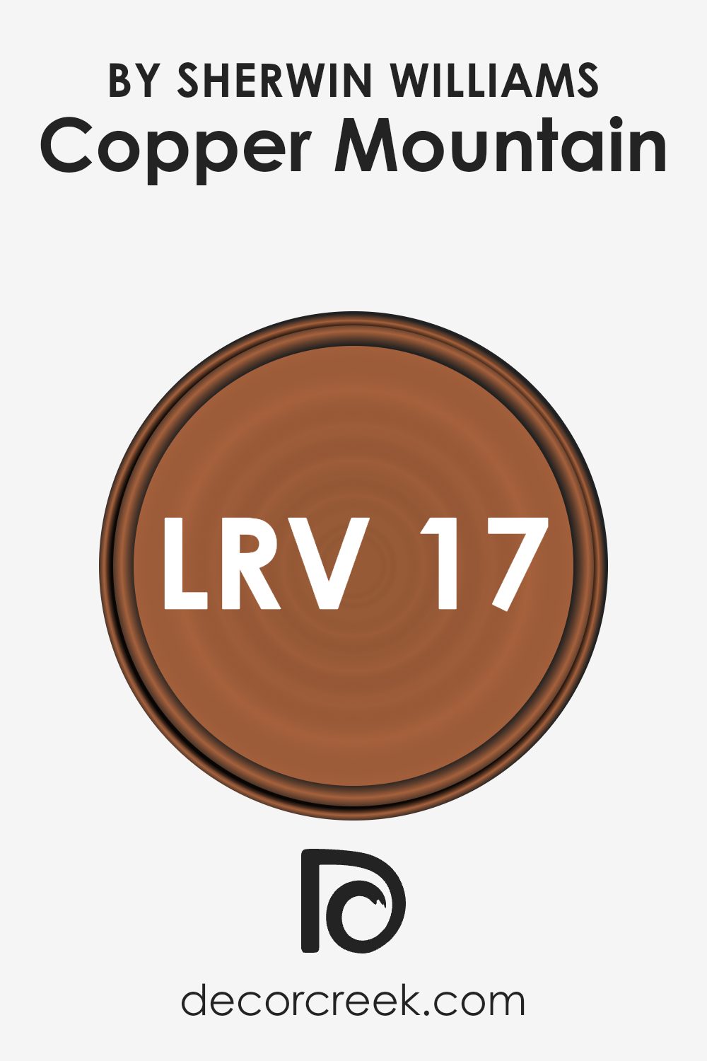
What is the LRV of Copper Mountain SW 6356 by Sherwin Williams?
LRV stands for Light Reflectance Value, which is a measure of how much light a paint color reflects back into a room. It’s expressed on a scale where a lower number means less light reflection and a darker shade, while a higher number means more reflection and a lighter shade.
This value helps in deciding how a color will look in a specific environment, especially under different lighting conditions. Lighter colors can make small spaces appear bigger and are generally easier to match with decor.
Darker colors, on the other hand, are more dramatic and can make large spaces feel cozier but may make a small room feel cramped or smaller.
With an LRV of 17.034, Copper Mountain by Sherwin Williams is quite a deep shade that absorbs more light than it reflects. This means it could make a strong statement in a room, providing a bold backdrop that can contrast nicely with lighter colors and furnishings.
However, it’s important to consider the room’s lighting, as this paint color may make the space appear darker especially if it doesn’t receive ample natural sunlight or adequate artificial lighting. It’s ideal for larger areas or rooms where a sense of warmth and depth is desired. Proper lighting will significantly influence how this color manifests in the space.
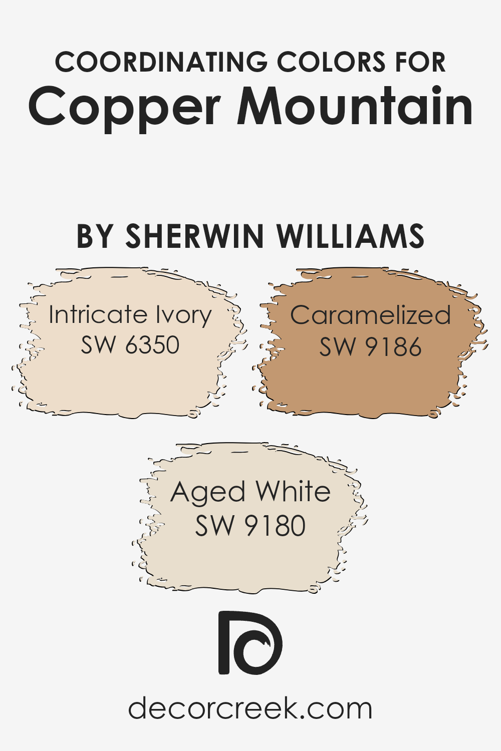
Coordinating Colors of Copper Mountain SW 6356 by Sherwin Williams
Coordinating colors are selected to harmonize and complement a primary color, in this case, Copper Mountain, a warm, earthy hue. These coordinating shades work together to create a cohesive mood and enhance the overall aesthetic of your space. By pairing colors that share similar undertones or levels of saturation, the resulting look is visually pleasing and flows smoothly from one area of a room to another.
Intricate Ivory, a soft, gentle white, brings a light and airy feel to the mix, perfect for making small rooms appear larger and brighter. Aged White, which is a richer, creamier white, adds a touch of warmth, making any area it’s used in feel welcoming and cozy.
Caramelized, with its golden amber tones, offers a subtle hint of sweetness that beautifully complements Copper Mountain by adding depth and warmth, ensuring the space feels cozy and inviting while maintaining a harmonious color palette. Together, these colors create a balanced and appealing atmosphere in any home.
You can see recommended paint colors below:
- SW 6350 Intricate Ivory (CHECK A SAMPLE)
- SW 9180 Aged White (CHECK A SAMPLE)
- SW 9186 Caramelized (CHECK A SAMPLE)
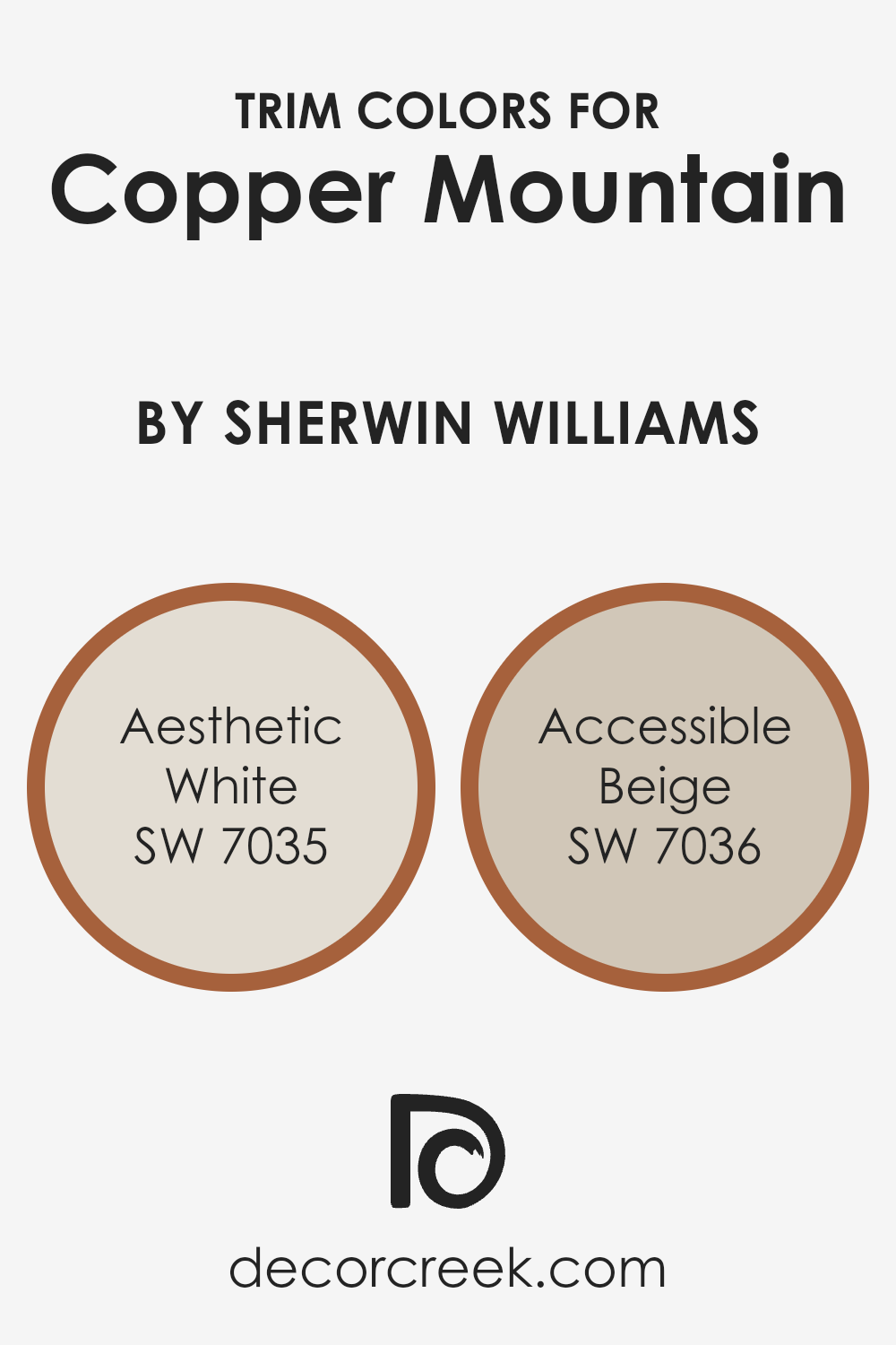
What are the Trim colors of Copper Mountain SW 6356 by Sherwin Williams?
Trim colors are chosen to complement the main color on a surface, creating a refined detail that enhances the overall look of a space. For something like Copper Mountain by Sherwin Williams, which is a warm, rich tone, selecting the right trim color is crucial for achieving a balanced appearance.
Aesthetic White SW 7035 and Accessible Beige SW 7036 are both excellent choices as trim colors because they have a subtle neutrality that can offset a stronger main color without overpowering it. This is essential in maintaining the aesthetic coherence of the room.
Aesthetic White SW 7035 is a soft, gentle white that subtly contrasts with more vivid colors, providing a clean line that defines spaces beautifully. On the other hand, Accessible Beige SW 7036 is a light beige that offers a warm, inviting appearance.
It works well to softly blend the edges of a room while still providing some contrast with darker or more saturated colors like Copper Mountain. Both choices lend themselves to creating a well-rounded, visually pleasant environment.
You can see recommended paint colors below:
Colors Similar to Copper Mountain SW 6356 by Sherwin Williams
Using similar colors in a design can create a harmonious and cohesive look, enhancing the aesthetic appeal of any space. These colors often share the same base hue but differ slightly in tone and saturation, making it easy to mix and match them for a subtle yet effective color scheme.
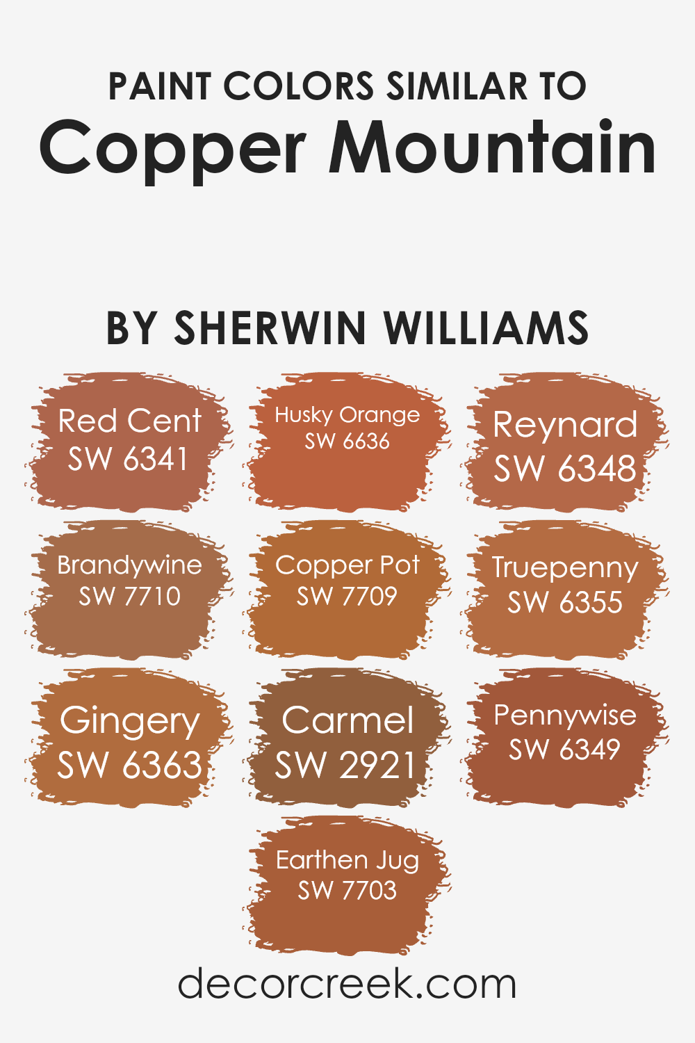
For instance, the warm, earthy tones of SW 6341 – Red Cent feature a reddish-brown hue that brings to mind the rich color of oxidized copper, perfect for adding depth to a room. Similarly, SW 7710 – Brandywine is a deeper, more intense shade that suggests the color of vintage wine, ideal for creating a cozy and inviting atmosphere.
SW 6363 – Gingery, as its name suggests, offers a spicy, vibrant orange that adds life and energy to interiors. In contrast, SW 7703 – Earthen Jug is a muted terra cotta, excellent for grounding spaces with a touch of warmth.
The lively SW 6636 – Husky Orange is a bright, cheerful color reminiscent of autumn leaves, while SW 7709 – Copper Pot leans towards a rich, burnished orange that resembles aged copper, great for adding a rustic touch.
SW 2921 – Carmel’s soft, caramel-like hue provides a smooth transition between more intense colors, and SW 6348 – Reynard offers a bold, fox-like orange that’s sure to catch the eye.
Lastly, SW 6355 – Truepenny and SW 6349 – Pennywise share a similar vibration with tones of vibrant copper and muted gold respectively, offering numerous options for layering and accentuating designs with style and simplicity.
You can see recommended paint colors below:
- SW 6341 Red Cent (CHECK A SAMPLE)
- SW 7710 Brandywine (CHECK A SAMPLE)
- SW 6363 Gingery (CHECK A SAMPLE)
- SW 7703 Earthen Jug (CHECK A SAMPLE)
- SW 6636 Husky Orange (CHECK A SAMPLE)
- SW 7709 Copper Pot (CHECK A SAMPLE)
- SW 2921 Carmel
- SW 6348 Reynard (CHECK A SAMPLE)
- SW 6355 Truepenny (CHECK A SAMPLE)
- SW 6349 Pennywise (CHECK A SAMPLE)
Colors that Go With Copper Mountain SW 6356 by Sherwin Williams
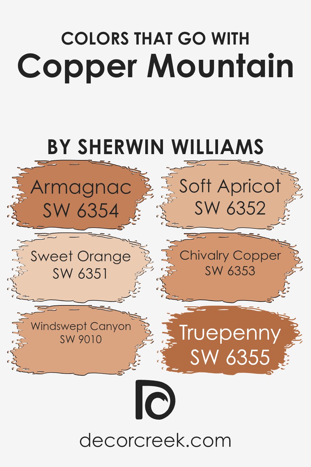
Choosing the right colors to complement Copper Mountain SW 6356 by Sherwin Williams is crucial for creating a harmonious and appealing space. Copper Mountain is a warm, deep hue that works beautifully with other colors that enhance its rich, earthy tones.
For instance, Armagnac SW 6354 is a dark, reddish-brown color that mirrors the natural hues of aged brandy, providing a robust counterpart to the copper tones. Sweet Orange SW 6351 offers a lively, citrusy pop that brings a bright, cheerful contrast to the deeper, more subdued shades of Copper Mountain.
Additionally, Windswept Canyon SW 9010, with its dusky, reddened earth tone, echoes the natural elements, pairing perfectly with Copper Mountain to create a cozy, grounded atmosphere. Soft Apricot SW 6352 provides a lighter, creamy hue that softens the overall palette, offering a gentle balance to the more intense shades.
Chivalry Copper SW 6353, as the name suggests, is a valiant medium copper that blends seamlessly with Copper Mountain, enhancing the cohesion of the colors. Lastly, Truepenny SW 6355 adds a unique twist with its clear, bright penny-like color, injecting a vibrant touch that highlights the dynamic nature of the overall scheme.
Together, these colors work in concert to provide a balanced, warm, and inviting environment.
You can see recommended paint colors below:
- SW 6354 Armagnac (CHECK A SAMPLE)
- SW 6351 Sweet Orange (CHECK A SAMPLE)
- SW 9010 Windswept Canyon (CHECK A SAMPLE)
- SW 6352 Soft Apricot (CHECK A SAMPLE)
- SW 6353 Chivalry Copper (CHECK A SAMPLE)
- SW 6355 Truepenny (CHECK A SAMPLE)
How to Use Copper Mountain SW 6356 by Sherwin Williams In Your Home?
Copper Mountain SW 6356 by Sherwin Williams is a warm, rich shade of terracotta orange that adds a cozy feel to any room. This paint color is perfect for those looking to add a splash of earthy tone to their living space. You can use Copper Mountain in various ways within your home.
For example, painting an accent wall in the living room with Copper Mountain can create a cozy focal point. This color also works well in a kitchen or dining area, giving it a welcoming and warm atmosphere.
In bedrooms, using this color on one wall or as a backdrop behind a headboard can make the space feel more comfortable and inviting. Additionally, pairing it with neutral colors like creams, grays, or soft whites can help balance the warmth of Copper Mountain, making the space feel balanced and aesthetically pleasing. Accessories in gold or green can also complement this shade, enhancing the overall look of your rooms.
Copper Mountain SW 6356 by Sherwin Williams vs Truepenny SW 6355 by Sherwin Williams
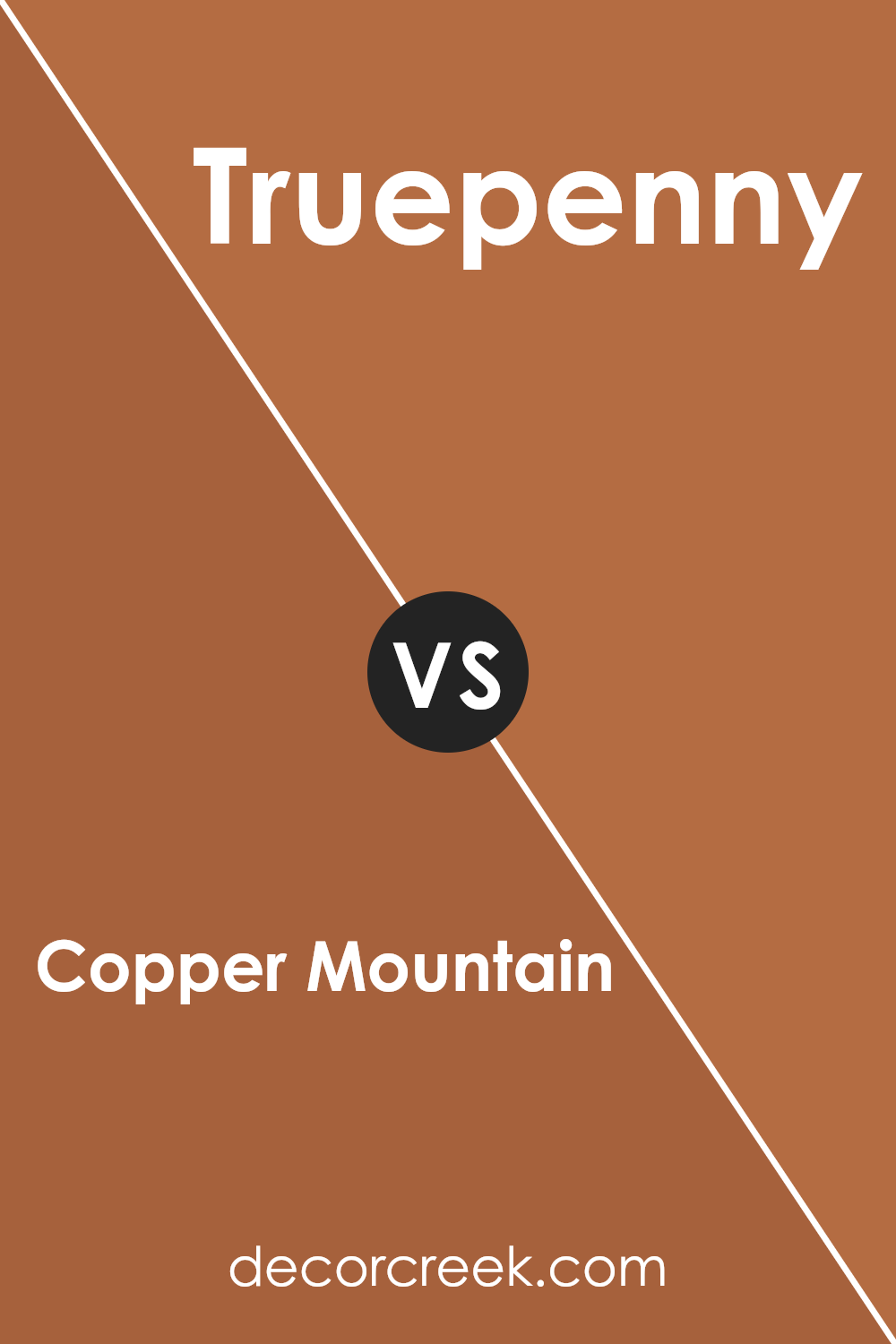
Copper Mountain and Truepenny, both by Sherwin Williams, are warm and inviting colors, yet they have distinct tones that set them apart. Copper Mountain is a deep, rich terra cotta shade. It leans more towards an earthy, red-brown that creates a cozy and welcoming atmosphere. It’s a bold choice and works well in spaces where you want to add warmth and character.
On the other hand, Truepenny has a lighter and softer approach. While still warm, it’s closer to a caramel brown. This color is versatile and tends to open up spaces while maintaining a warm ambiance. It’s perfect for someone looking for the warmth of a brown without the intensity of a darker shade.
Both colors can beautifully warm up a room but serve different aesthetic needs depending on the vibrancy and lightness you want in your space. Choosing between them depends on how dramatic or subtle you want your color impact to be.
You can see recommended paint color below:
- SW 6355 Truepenny (CHECK A SAMPLE)
Copper Mountain SW 6356 by Sherwin Williams vs Pennywise SW 6349 by Sherwin Williams
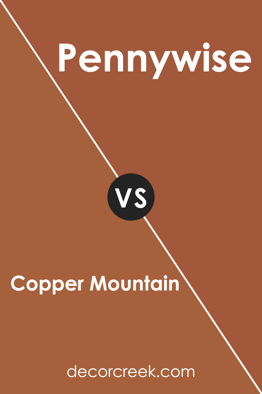
Copper Mountain and Pennywise are both warm, welcoming colors from Sherwin Williams, but they have distinct tones that set them apart. Copper Mountain is a deeper, more muted shade of orange with a rustic feel, reminiscent of an aged penny or autumn leaves.
It can provide a cozy vibe to a room without overpowering other design elements. On the other hand, Pennywise is a brighter, more vivid color. It’s closer to the classic orange but with a hint of softness, making it perfect for spaces where you want to add a cheerful and lively splash of color without going too bold.
Both colors would work well in living spaces where you want a sense of warmth, but the choice between them depends on whether you prefer a more understated or vibrant look.
You can see recommended paint color below:
- SW 6349 Pennywise (CHECK A SAMPLE)
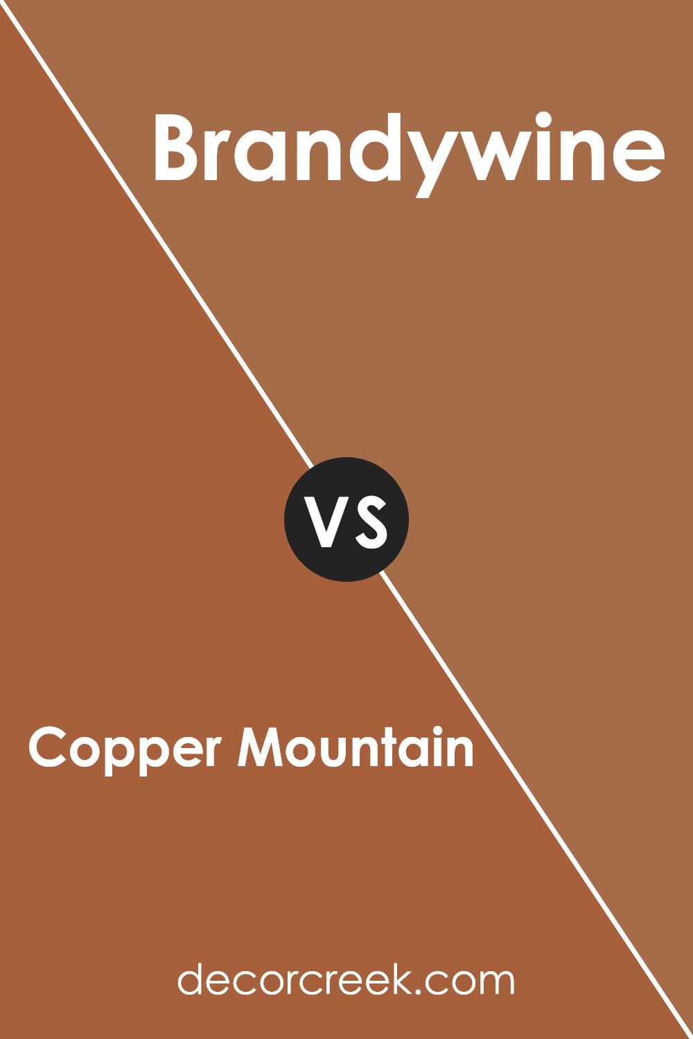
Copper Mountain SW 6356 by Sherwin Williams vs Brandywine SW 7710 by Sherwin Williams
Copper Mountain is a rich, warm shade of brown with a hint of burnt orange that gives it a cozy and inviting feel. It’s perfect for spaces where you want to create a comfortable and welcoming atmosphere. On the other hand, Brandywine is a deeper, reddish-brown color that resembles the dark hues of red wine.
It offers a more traditional and formal look, making it ideal for elegant dining rooms or sophisticated office settings. While both colors share a warm base, Copper Mountain’s lighter and orange-tinged undertones make it more suited for casual, light-filled rooms, whereas Brandywine, with its deeper and more intense red tones, is better for areas that benefit from a dash of drama and luxury.
You can see recommended paint color below:
- SW 7710 Brandywine (CHECK A SAMPLE)
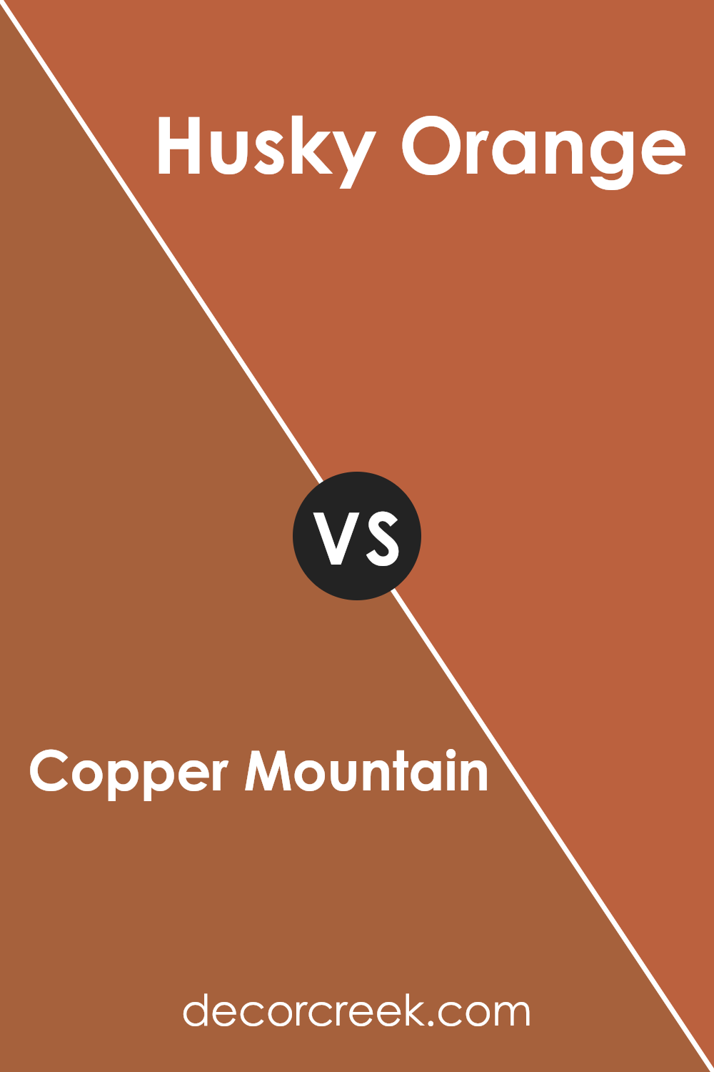
Copper Mountain SW 6356 by Sherwin Williams vs Husky Orange SW 6636 by Sherwin Williams
Copper Mountain and Husky Orange are both vibrant shades from Sherwin Williams but have distinct tones that set them apart. Copper Mountain is a rich, warm terracotta color that resembles the natural hue of clay pots. It’s deep and cozy, making it perfect for spaces where you want to add a sense of warmth and comfort.
On the other hand, Husky Orange is a brighter and more energetic color. It has a vivid, playful vibe with its bold, almost neon, orange tone. This makes it an excellent choice for areas where you want to inject liveliness and fun, like a children’s play area or a creative workspace.
While Copper Mountain creates a more muted and grounding effect, Husky Orange stands out and grabs attention with its intensity.
You can see recommended paint color below:
- SW 6636 Husky Orange (CHECK A SAMPLE)
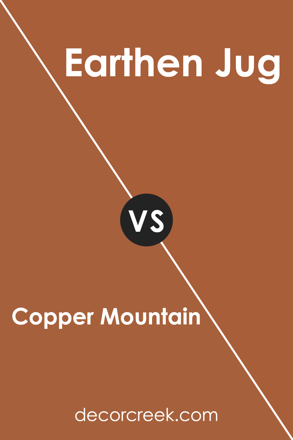
Copper Mountain SW 6356 by Sherwin Williams vs Earthen Jug SW 7703 by Sherwin Williams
Copper Mountain is a rich, warm shade that leans towards a terracotta with orange and red undertones. It evokes the feeling of a cozy autumn day and adds a welcoming touch to any room. This color is versatile enough to work well in a living room, dining area, or kitchen to create a warm, inviting atmosphere.
On the other hand, Earthen Jug has a deeper, more subdued tone compared to Copper Mountain. It is a robust color, resembling traditional red clay. Earthen Jug provides a strong presence and can make a bold statement when used in home decor. It’s particularly striking in spaces that benefit from a deeper color to enhance features like trim or accent walls.
Both colors provide warmth but in distinct ways: Copper Mountain with its brighter, lighter feel, and Earthen Jug with its deeper, grounding essence. They could complement each other well in a space that utilizes both for different features or accents.
You can see recommended paint color below:
- SW 7703 Earthen Jug (CHECK A SAMPLE)
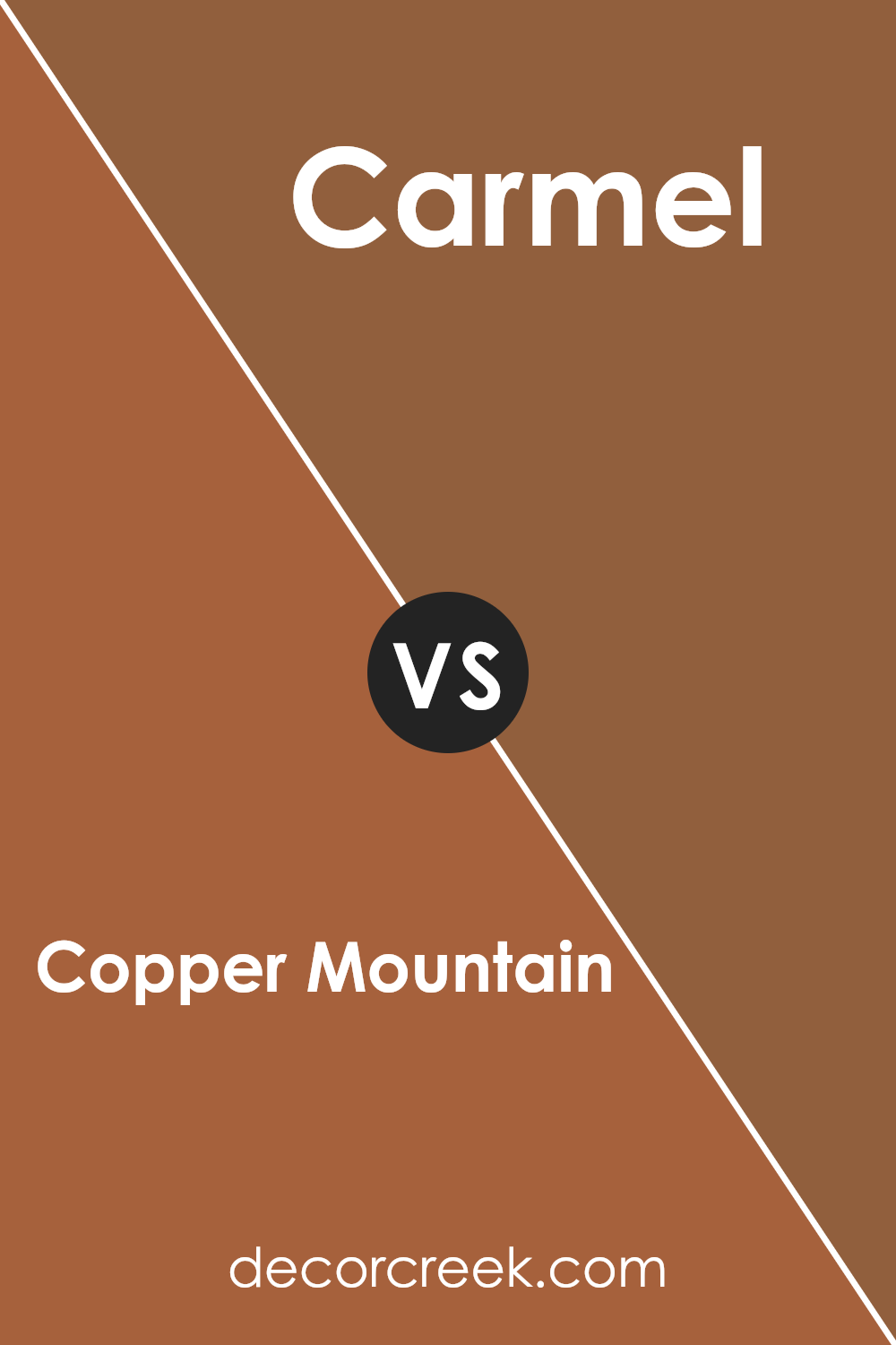
Copper Mountain SW 6356 by Sherwin Williams vs Carmel SW 2921 by Sherwin Williams
Copper Mountain and Carmel are two distinctive paint colors that bring warm tones to any space. Copper Mountain has a deeper, richer presence, leaning towards a rusty brown that could remind you of an autumn sunset. This color can create a cozy and homey atmosphere, perfect for living spaces or bedrooms where warmth is desirable.
On the other hand, Carmel is lighter and more subtle, offering a softer feel. Its hue is closer to a sandy brown, evoking a gentle, welcoming vibe. This color is excellent for areas that you want to keep light and airy, such as kitchens or bathrooms.
Both colors lend a sense of warmth but in different intensities and undertones. Copper Mountain adds a punch of boldness with its deeper, earthy shades, while Carmel gives a room an open and gentle feel with its lighter touch. The choice between these two would depend on the mood and style you wish to achieve in your space.
You can see recommended paint color below:
- SW 2921 Carmel
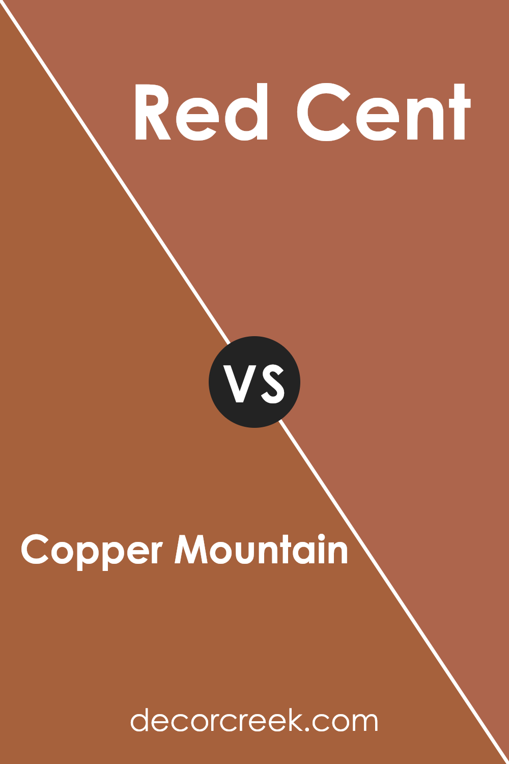
Copper Mountain SW 6356 by Sherwin Williams vs Red Cent SW 6341 by Sherwin Williams
Copper Mountain and Red Cent are both warm, welcoming colors by Sherwin Williams, but they have distinct differences in hue and mood. Copper Mountain is a warm, earthy orange with a hint of brown, making it cozy and inviting, perfect for spaces where you want a hint of nature and softness. It has a rustic charm that works well in living rooms or dining areas.
On the other hand, Red Cent leans more towards a deep, rich red with a touch of earthiness. This color is bolder and more vibrant, creating a strong presence in any space. It’s a great choice for accent walls or areas where you want to add a lively splash of color.
While both colors are warm and can complement each other, Copper Mountain provides a more subtle and toned-down atmosphere, whereas Red Cent offers a more striking and vivid aesthetic. Choosing between them would depend on the kind of feel you want for your room.
You can see recommended paint color below:
- SW 6341 Red Cent (CHECK A SAMPLE)
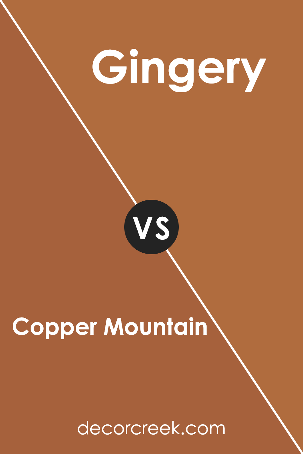
Copper Mountain SW 6356 by Sherwin Williams vs Gingery SW 6363 by Sherwin Williams
Copper Mountain and Gingery by Sherwin Williams are both warm and inviting colors, but they bring different tones to a space. Copper Mountain has a deeper, richer hue reminiscent of a smooth, aged copper penny. It adds a cozy and somewhat rustic charm, perfect for creating a welcoming atmosphere.
On the other hand, Gingery carries a lighter, more vibrant feel. This color resembles a fresh slice of ginger root with its spicy yet earthy tone. Gingery is great for spaces where you want to add warmth without the heaviness that Copper Mountain might bring.
Both colors work well in living areas or spaces where you want to add a touch of warmth, but the choice between them would depend on how bold or subtle you want the room’s atmosphere to be.
You can see recommended paint color below:
- SW 6363 Gingery (CHECK A SAMPLE)
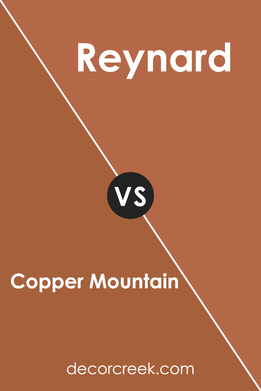
Copper Mountain SW 6356 by Sherwin Williams vs Reynard SW 6348 by Sherwin Williams
Copper Mountain is a warm, inviting shade that has a rich, earthy base with hints of orange and red. This color tends to add a cozy, comfortable feel to any space, making it a popular choice for living rooms and dining areas. Its deep and rich hue provides a strong backdrop, excellent for rooms that could use a bit of warmth.
Reynard, on the other hand, is a darker color that leans more towards a brownish-red. It has a subtle intensity which makes it suitable for creating an intimate atmosphere in spaces like studies or home libraries. Unlike Copper Mountain, Reynard does not have prominent orange tones, which gives it a more reserved and muted appearance.
Both colors offer distinct vibes: Copper Mountain is more vibrant and can energize a space, while Reynard is more reserved, providing a grounding effect. This contrast makes them suitable for different uses depending on the atmosphere you’re aiming to create.
You can see recommended paint color below:
- SW 6348 Reynard (CHECK A SAMPLE)
Copper Mountain SW 6356 by Sherwin Williams vs Copper Pot SW 7709 by Sherwin Williams
Copper Mountain and Copper Pot, both by Sherwin Williams, are warm, inviting shades but have distinctive characteristics. Copper Mountain presents a softer, more muted tone. This color has a dusty element, making it ideal for creating a cozy, welcoming ambiance in spaces like living rooms or bedrooms. It pairs well with natural materials and textures, such as wood and linen, enhancing its earthy feel.
On the other hand, Copper Pot boasts a deeper, more vibrant hue. It has a bolder, more pronounced orange undertone, which makes it stand out more dramatically. This color is perfect for areas where you want to make a statement or add a splash of vitality, like in dining areas or as an accent wall. Its rich depth works well with dark woods and metals, providing a striking contrast.
Both colors offer warmth but differ in intensity and mood, with Copper Mountain being more subdued and Copper Pot offering a punchier impact.
You can see recommended paint color below:
- SW 7709 Copper Pot (CHECK A SAMPLE)

Conclusion
In wrapping up, SW 6356 Copper Mountain by Sherwin Williams is a paint color that really stands out because of its rich, warm tone. It’s like a mix of orange and brown, similar to the color of autumn leaves or a beautiful sunset. This means it can make any room feel cozy and welcoming, perfect for spaces where you want to relax or have friends over.
Using Copper Mountain can add a special touch to places like the living room or your bedroom. It goes really well with other earthy colors like greens and browns, so it’s easy to find things that match.
Whether you’re thinking about painting a whole room or just one wall for a fun accent, this color is a solid choice.
Overall, SW 6356 Copper Mountain is more than just paint; it’s a way to make your home feel warmer and more inviting. So if you’re thinking of giving your space a new look, this color could be the perfect starting point. It’s definitely a color that brings warmth and a friendly vibe to any space.
Ever wished paint sampling was as easy as sticking a sticker? Guess what? Now it is! Discover Samplize's unique Peel & Stick samples.
Get paint samples


