Imagine wandering through a peaceful coral garden under the sea, surrounded by vibrant marine life. That peaceful, calm feeling is what the color 012 Coral Reef by Benjamin Moore brings into your room. It’s soft yet lively, a shade that beautifully bridges the gap between orange and pink, adding a gentle pop of color to any room without feeling too strong.
When you see 012 Coral Reef, you instantly feel more cheerful and relaxed. The color has a unique ability to brighten up rooms while keeping a soothing atmosphere. Whether you’re looking to refresh your living room, bedroom, or even your kitchen, this color might just be the perfect pick.
Sure, there are countless shades out there, but Coral Reef has a special charm. It pairs wonderfully with a wide range of décor styles, from modern minimalist to rustic chic. Plus, it’s adaptable enough to work in different lighting conditions, holding onto its beauty and warmth throughout the day.
It’s not just a color; it’s a mood booster that changes your environment into a delightful haven. Ready to give your walls a breath of fresh coral air?
What Color Is Coral Reef 012 by Benjamin Moore?
Coral Reef by Benjamin Moore is a vibrant and cheerful shade that instantly brightens up any room. This color has a playful blend of pink and orange tones which brings a warm, inviting vibe to rooms. Perfect for adding a splash of energy, this hue works exceptionally well in living areas, kitchens, and even bathrooms.
In terms of interior styles, Coral Reef is adaptable. It fits beautifully in modern and contemporary settings due to its boldness. However, it’s also ideal for eclectic and Bohemian decors because of its fun and lively nature. When used in a coastal-style room, it mirrors the stunning shades found in tropical reefs, creating a beachy feel that’s casual yet stylish.
To really make this color shine, pair it with neutral tones like soft whites or light grays which help balance its intensity. Materials like light woods or bamboo also complement its warmth and can create a softer, more natural look. For textures, consider combining Coral Reef with soft fabrics like cotton or linen to keep the room feeling cozy and welcoming.
Additionally, elements like glass or metallic finishes can add a touch of modernity and fresh contrast to this energetic color.

Is Coral Reef 012 by Benjamin Moore Warm or Cool color?
Coral Reef (012) by Benjamin Moore is a vibrant and cheerful paint color that can add a lot of personality to a home. This particular shade has a bright and warm feel to it, which makes it perfect for creating a welcoming atmosphere in living areas. When used in rooms like the living room or kitchen, it can make the rooms seem more inviting and lively.
This color works well when used as an accent wall, paired with neutral tones such as whites, greys, or beiges, which helps balance its brightness. It’s also great for smaller elements like doors or furniture, adding color without feeling too heavy.
Coral Reef is also a smart choice for bathrooms or bedrooms where you might want something a little different that still feels cozy. Light plays beautifully with this shade, and during the day, natural sunlight can highlight its warm tones, making the room feel fresh and lively. Overall, this color can really bring a cheerful and homey feel to any interior design.
Undertones of Coral Reef 012 by Benjamin Moore
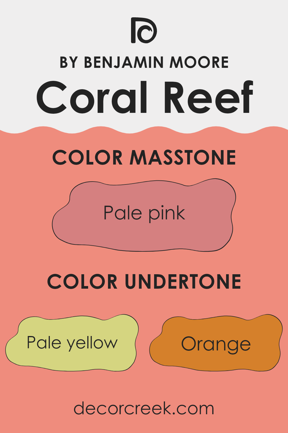
Coral Reef by Benjamin Moore is a dynamic color that draws its richness from a diverse palette of undertones. These underlying hues, including pale yellow, orange, light purple, pink, grey, and others, play a crucial role in how the color is perceived and how it interacts with light and surrounding colors in any interior room.
Undertones affect the way we see color by adding depth and complexity. For instance, a coral with a pink undertone might appear softer and more inviting, while one with an orange undertone could seem more vibrant and energetic. The presence of grey or light grey can soften the intensity, making the color more subdued and easier to blend into a variety of decor styles.
When Coral Reef is used on interior walls, these undertones come into play by subtly shifting under different lighting conditions, which means the color can look slightly different at various times of the day. For example, in natural daylight, the yellow undertones might make the color appear brighter and more cheerful, while in artificial light, the grey or light purple undertones could bring out a more muted, cozy feel. This flexibility makes Coral Reef a great choice for living rooms, bedrooms, or any area where the mood can shift from energetic to relaxed.
Its adaptability also means it pairs well with various furnishings and can complement a range of other colors, adding warmth and personality to any interior.
What is the Masstone of the Coral Reef 012 by Benjamin Moore?
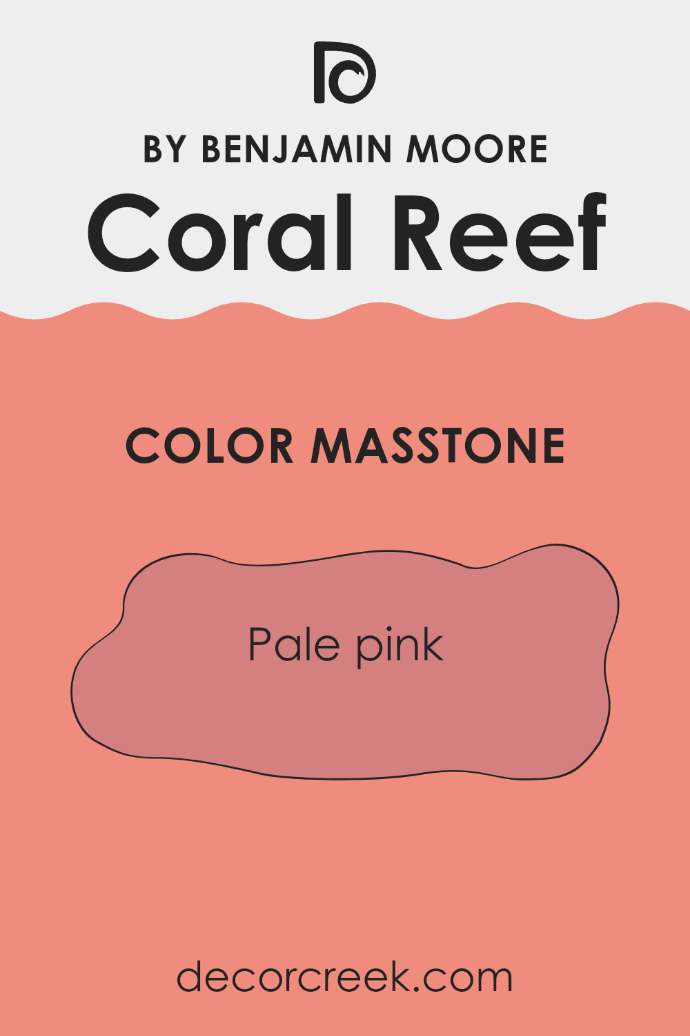
The Coral Reef color by Benjamin Moore, with a masstone of pale pink (#D58080), offers a gentle and inviting vibe for any room in your home. This shade of pink is light and soothing, making it perfect for areas where you want to create a relaxed atmosphere.
It works especially well in bedrooms and living rooms, helping these rooms feel warm and welcoming. Since it’s not too bold, this pale pink can be paired with a variety of other colors and decor styles, from modern to vintage.
It’s also a good choice for small rooms as it helps to reflect light, making rooms appear larger and brighter. In addition, this color can be used in bathrooms or dining areas to add a soft, subtle touch of warmth. Overall, its gentle hue helps create a cozy and comforting environment in the home.
How Does Lighting Affect Coral Reef 012 by Benjamin Moore?
Lighting plays a crucial role in how we perceive colors. Depending on the type of light—whether it’s natural daylight or artificial lighting—colors can appear differently. For example, Coral Reef, a vibrant color by Benjamin Moore, will look different under varied lighting conditions and in different room orientations.
In natural light, Coral Reef will show its true color. Sunlight is the most balanced source of white light, available during the day, and it can bring out the vivid and warm undertones of Coral Reef. This makes rooms painted in this color feel lively and cheerful under natural lighting.
With artificial lighting, the type of light bulb used affects how this color is perceived. Warm light bulbs highlight the red and orange tones, making Coral Reef appear cozier and richer. Cool light bulbs, on the other hand, might make it look slightly more muted, bringing forward any subtle cool undertones.
Room orientation also influences how Coral Reef looks throughout the day:
- North-Faced Rooms: These rooms get limited direct sunlight, which can make colors appear slightly duller and cooler. Coral Reef might look more subdued and less vibrant in north-facing rooms, especially during the day.
- South-Faced Rooms: These rooms receive abundant sunlight for most of the day, which can make Coral Reef look exceptionally bright and inviting. The color appears warmer and more intense in south-facing rooms.
- East-Faced Rooms: In these rooms, the morning light can make Coral Reef look soft and bright in the early hours, providing a gentle, warm glow. As the day progresses and the direct sunlight moves away, the color may lose some of its brightness.
- West-Faced Rooms: West-facing rooms benefit from the evening light, which can cast a golden glow, enhancing the warm tones of Coral Reef. In the afternoon and evening, the color can appear very dynamic and warm in these rooms.
Overall, Coral Reef is an adaptable color that can work beautifully in many settings, depending on the lighting and room orientation. Adjusting your lighting can help you get the most out of this vibrant color.

What is the LRV of Coral Reef 012 by Benjamin Moore?
LRV stands for Light Reflectance Value, which is a measure of the amount of visible and usable light that a color reflects or absorbs when it is applied to a wall. This value can range from one to ninety-nine and is expressed as a percentage. A higher LRV means the color reflects more light, making it appear lighter on the walls. Conversely, a lower LRV means the color absorbs more light, making it look darker. This measurement is crucial when choosing paint colors, as it helps predict how light or dark a color will look in a given room and affect the mood and visual size of the room.
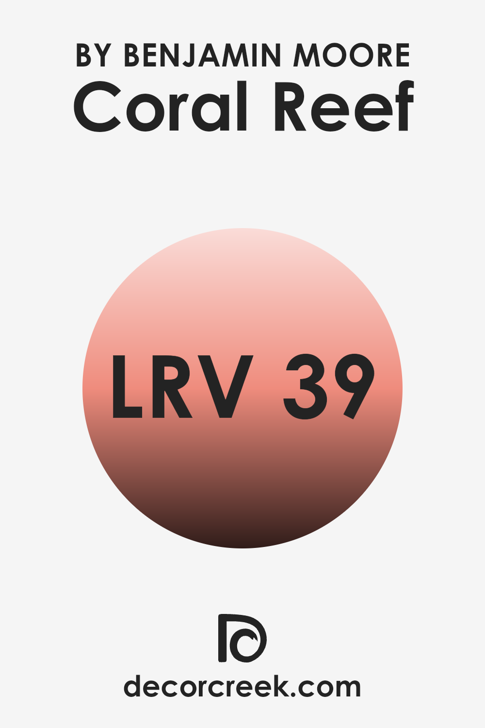
The LRV of Coral Reef (38.87) by Benjamin Moore indicates that it reflects a moderate amount of light. This value suggests that Coral Reef is neither too dark nor too light, making it an adaptable choice for various rooms.
In well-lit rooms, such as ones with plenty of natural sunlight or strong artificial lighting, this color will appear more vibrant and lively. In dimly lit areas, however, it may seem slightly more subdued and provide a cozy, warm feel to the room. Choosing this particular LRV can help balance out a room that doesn’t want to swing too dramatically to either the dark or light end of the spectrum, offering a good middle ground.
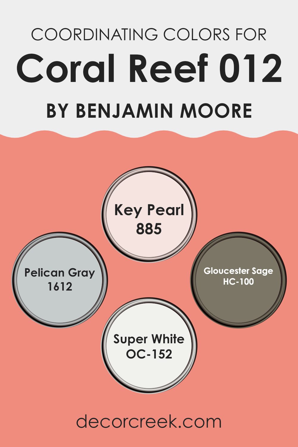
Coordinating Colors of Coral Reef 012 by Benjamin Moore
Coordinating colors are selected shades that harmonize well with a main color to create a visually appealing palette. For instance, with a warm, lively shade like Coral Reef by Benjamin Moore, its coordinating colors are chosen to complement and enhance its unique tone, providing balance and variety in interior design. These coordinating shades can bring out different aspects of the main color, making it more flexible across different rooms and styles.
Key Pearl 885 is a subtle off-white with a hint of warmth, making it a gentle complement that softens the vibrance of Coral Reef, lending a light and airy feel to the room. Pelican Gray 1612 offers a medium gray tone, providing a neutral backdrop that allows the coral hue to stand out, perfect for achieving a balanced, modern look.
Gloucester Sage HC-100 introduces a soft sage green, adding a touch of earthy naturalness that pairs beautifully with the organic vibe of Coral Reef, ideal for rooms looking for a touch of nature. Finally, Super White OC-152 acts as a crisp, clean white that works brilliantly to enhance natural light in a room, making Coral Reef pop even more while keeping the decor fresh and bright. These coordinating colors together create a cohesive and inviting atmosphere, allowing for flexibility in decor while maintaining a harmonious look.
You can see recommended paint colors below:
- 885 Key Pearl
- 1612 Pelican Gray
- HC-100 Gloucester Sage
- OC-152 Super White
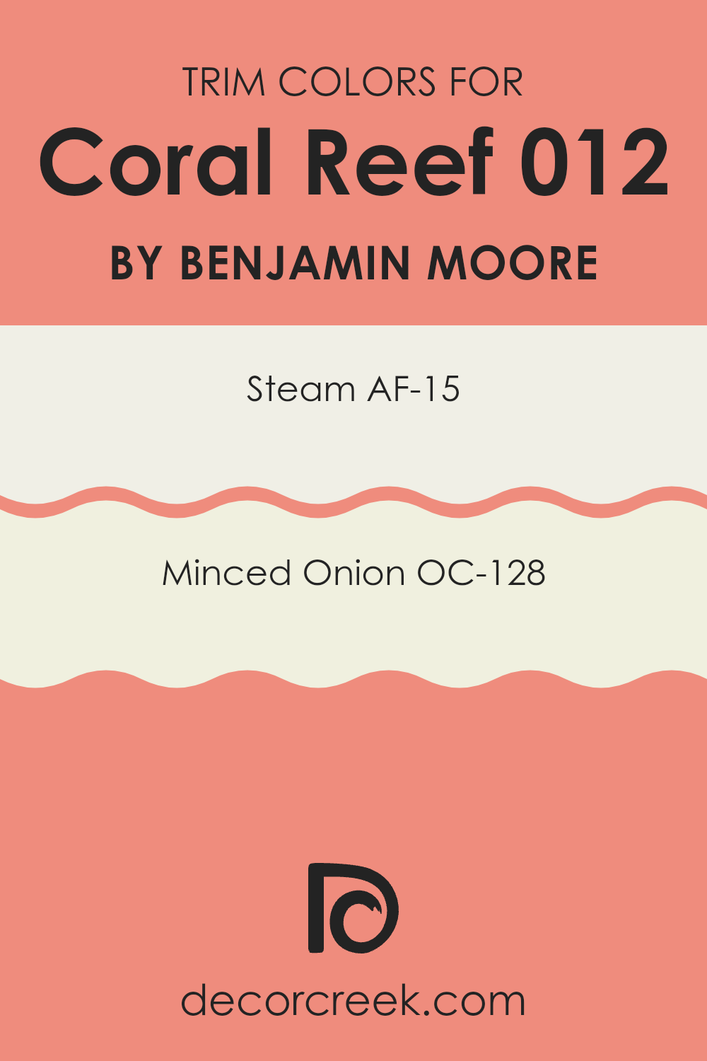
What are the Trim colors of Coral Reef 012 by Benjamin Moore?
Trim colors are essentially the accent colors used for the architectural elements like door frames, window frames, and baseboards in a room. These colors are crucial because they outline and define the room, providing contrasting lines that make main wall colors pop or harmoniously blend into the overall design scheme.
For example, using trim colors effectively can enhance the visual appeal of a room, creating a more polished or finished look. When using a vivid shade like Coral Reef by Benjamin Moore, pairing it with the right trim colors helps balance the vibrancy and can make the walls stand out in a pleasing way.
For the color AF-15, known as Steam, it’s a very light, almost white shade that offers a clean and fresh look. It works well as a trim color because it doesn’t compete with more dominant colors and provides a subtle frame to the room without harsh contrasts. On the other hand, OC-128 or Minced Onion is a soft, muted beige that gives off a warm and welcoming vibe. This color is particularly useful for areas that need a hint of warmth to complement cooler tones, working beautifully with Coral Reef to ensure the room feels cohesive and thoughtfully designed.
You can see recommended paint colors below:
- AF-15 Steam
- OC-128 Minced Onion
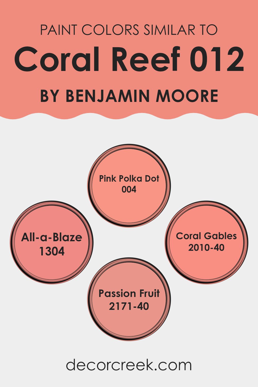
Colors Similar to Coral Reef 012 by Benjamin Moore
Choosing similar colors for a design project can be very important as it helps in creating a cohesive and harmonious look. Similar shades, like the ones close to Coral Reef by Benjamin Moore, work well together because they share common undertones that offer gentle variation without clashing. This selection of colors enhances visual harmony and offers a unified look. When colors are related, they naturally complement each other, making the room feel well planned and pleasing to the eye.
For instance, Pink Polka Dot is a soft, cheerful pink that adds a touch of lightness and fun to a room, ideal for creating a playful yet polished atmosphere. All-a-Blaze, on the other hand, is a bolder, more striking shade that still holds on to that underlying warmth, making it perfect for accent walls or to draw attention to specific areas within a room.
Coral Gables is another excellent choice, with a richer, more saturated hue that brings depth and elegance to interiors. Lastly, Passion Fruit offers a more muted but equally warm tone, ideal for those looking to add a bit of energy to their decor without feeling too intense. All these colors work beautifully together or on their own, thanks to their shared warmth and vibrancy.
You can see recommended paint colors below:
- 004 Pink Polka Dot
- 1304 All-a-Blaze
- 2010-40 Coral Gables
- 2171-40 Passion Fruit
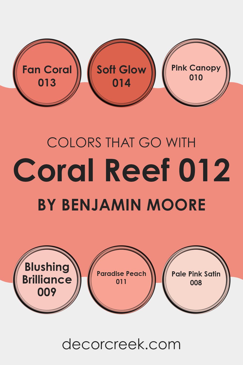
Colors that Go With Coral Reef 012 by Benjamin Moore
Choosing the right colors to pair with Coral Reef 012 by Benjamin Moore is crucial for achieving a cohesive and harmonious look in your decorating scheme. Colors like Fan Coral 013 and Soft Glow 014 work well with Coral Reef because they share similar tones that blend seamlessly, creating a warm and inviting ambiance.
Fan Coral 013 is a slightly lighter version of Coral Reef, offering a soft harmony that’s ideal for creating a gentle contrast. Soft Glow 014, on the other hand, introduces a mellow, creamy hue that complements the vibrant Coral Reef without feeling too strong, perfect for rooms where you want a hint of warmth.
The interaction of colors like Pink Canopy 010 and Blushing Brilliance 009 with Coral Reef enhances its richness and adds depth to the overall aesthetic. Pink Canopy 010 is a deep, expressive pink that adds a bold touch, contrasting beautifully with the lighter Coral Reef. Blushing Brilliance 009 is a vivid pink that injects energy and liveliness, working well in areas that benefit from a pop of color.
Additionally, Paradise Peach 011 and Pale Pink Satin 008 offer more subtle ways to enrich Coral Reef. Paradise Peach 011 is a soft peach that complements the coral tones, ideal for a soothing effect in more relaxed settings. Pale Pink Satin 008 provides a very light pink tint, lending an airy feel to the ensemble, great for achieving a delicate balance in your color palette.
You can see recommended paint colors below:
- 013 Fan Coral
- 014 Soft Glow
- 010 Pink Canopy
- 009 Blushing Brilliance
- 011 Paradise Peach
- 008 Pale Pink Satin
How to Use Coral Reef 012 by Benjamin Moore In Your Home?
Coral Reef 012 by Benjamin Moore is a vibrant and cheerful paint color that can brighten up any room in your home. This shade of coral has a warm and welcoming tone that works exceptionally well in living areas, kitchens, or even bedrooms, providing a fresh and lively atmosphere. It pairs beautifully with neutral colors like whites, grays, and beige, which help balance its brightness.
Decorating with Coral Reef 012 is a great way to add a splash of color without feeling too intense in your room. It can be used on a feature wall to create a focal point in the room or as an accent on smaller elements like doors or cabinets. This color also goes nicely with natural materials such as wood or linen, adding a touch of coziness to the environment.
Additionally, Coral Reef 012 can work well in bathrooms or kids’ rooms, offering a fun and energetic vibe that stimulates positivity and creativity. Opting for this color can make your home feel more inviting and cheerful.
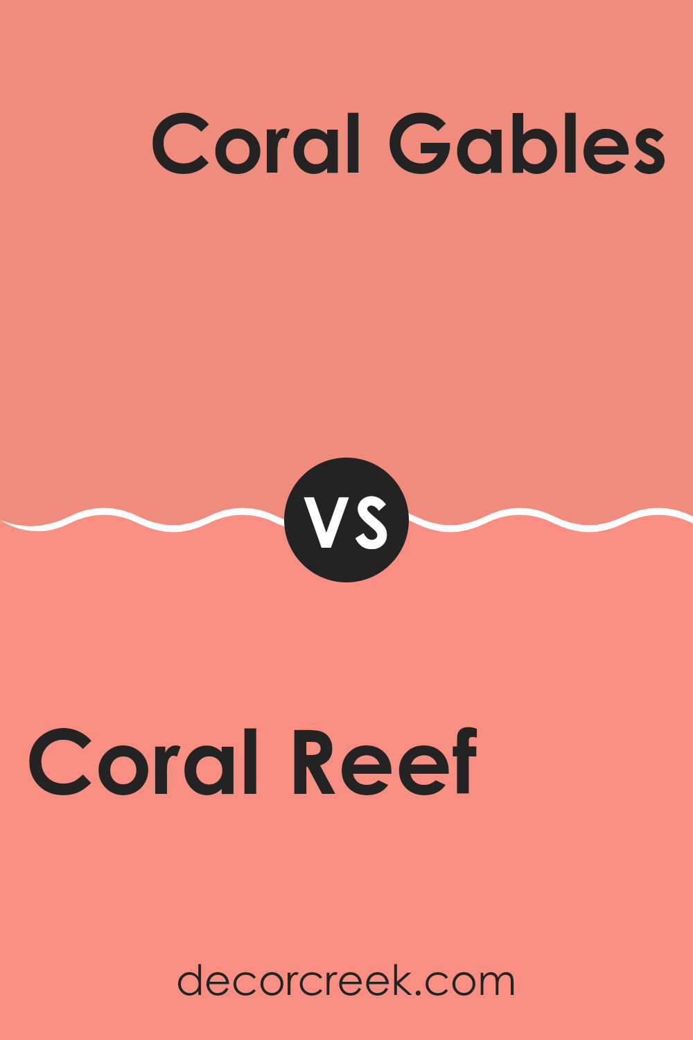
Coral Reef 012 by Benjamin Moore vs Coral Gables 2010-40 by Benjamin Moore
The two colors from Benjamin Moore, Coral Reef and Coral Gables, both have a lively, energetic feel, but they differ in their specific tones and vibes. Coral Reef is lighter and has a soft, warm undertone that feels sunny and cheerful, making it perfect for brightening up any room.
On the other hand, Coral Gables is deeper with a richer, more pronounced coral hue that adds a bold touch to its surroundings. It’s excellent for creating a strong statement in a room.
Both colors bring a sense of warmth, but Coral Reef has a gentleness to it, while Coral Gables offers a bit more punch. Each color would work well in different settings depending on the mood you’re aiming to achieve, whether it’s light and airy or bold and lively.
You can see recommended paint color below:
- 2010-40 Coral Gables
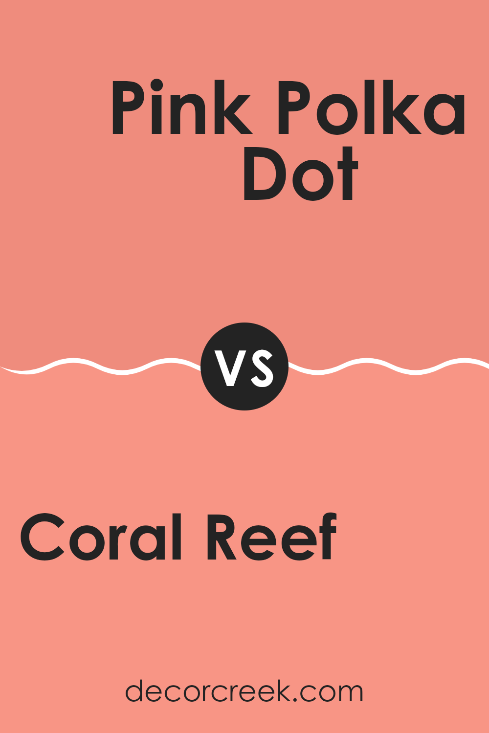
Coral Reef 012 by Benjamin Moore vs Pink Polka Dot 004 by Benjamin Moore
Coral Reef is a bright and vibrant color that adds a lively feel to any room. It has a mix of pink and orange tones, creating a warm and inviting atmosphere. This shade is great for energizing a room without feeling too intense.
On the other hand, Pink Polka Dot is a softer, more subdued shade. It leans more toward a classic pink, providing a gentle and soothing presence. This color is perfect for areas where you want a touch of sweetness and calm, like bedrooms or bathrooms.
Both colors have their unique charm and can be used effectively depending on the mood and style you want to create in your room. Coral Reef is bold and cheerful, while Pink Polka Dot is gentle and relaxing. They could even complement each other in the right decor scheme, adding depth and interest to an interior.
You can see recommended paint color below:
- 004 Pink Polka Dot
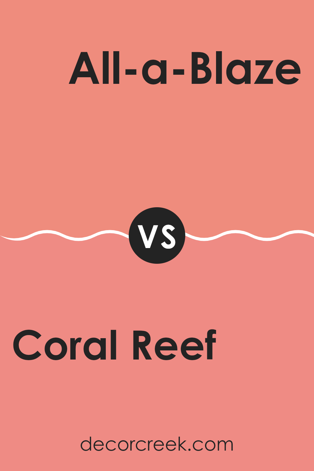
Coral Reef 012 by Benjamin Moore vs All-a-Blaze 1304 by Benjamin Moore
Coral Reef, a color by Benjamin Moore, has a gentle, soft peachy-pink tone that gives a warm, welcoming feel to any room. It’s a light and friendly shade that works beautifully in areas like living rooms or bedrooms, where a touch of subtlety and warmth is appreciated.
In contrast, All-a-Blaze is a bolder choice. This Benjamin Moore color is a deep, vibrant coral with a stronger presence. It commands more attention and is perfect for making a statement, whether on an accent wall or for an entire room that needs a lively boost.
While Coral Reef has a calming effect due to its lighter, less saturated hue, All-a-Blaze offers an energetic vibe with its richer, more intense color. Depending on your room’s purpose and the atmosphere you want to create, each color offers a unique feel; Coral Reef brings a soft, gentle warmth, and All-a-Blaze adds a dash of drama and excitement.
You can see recommended paint color below:
- 1304 All-a-Blaze
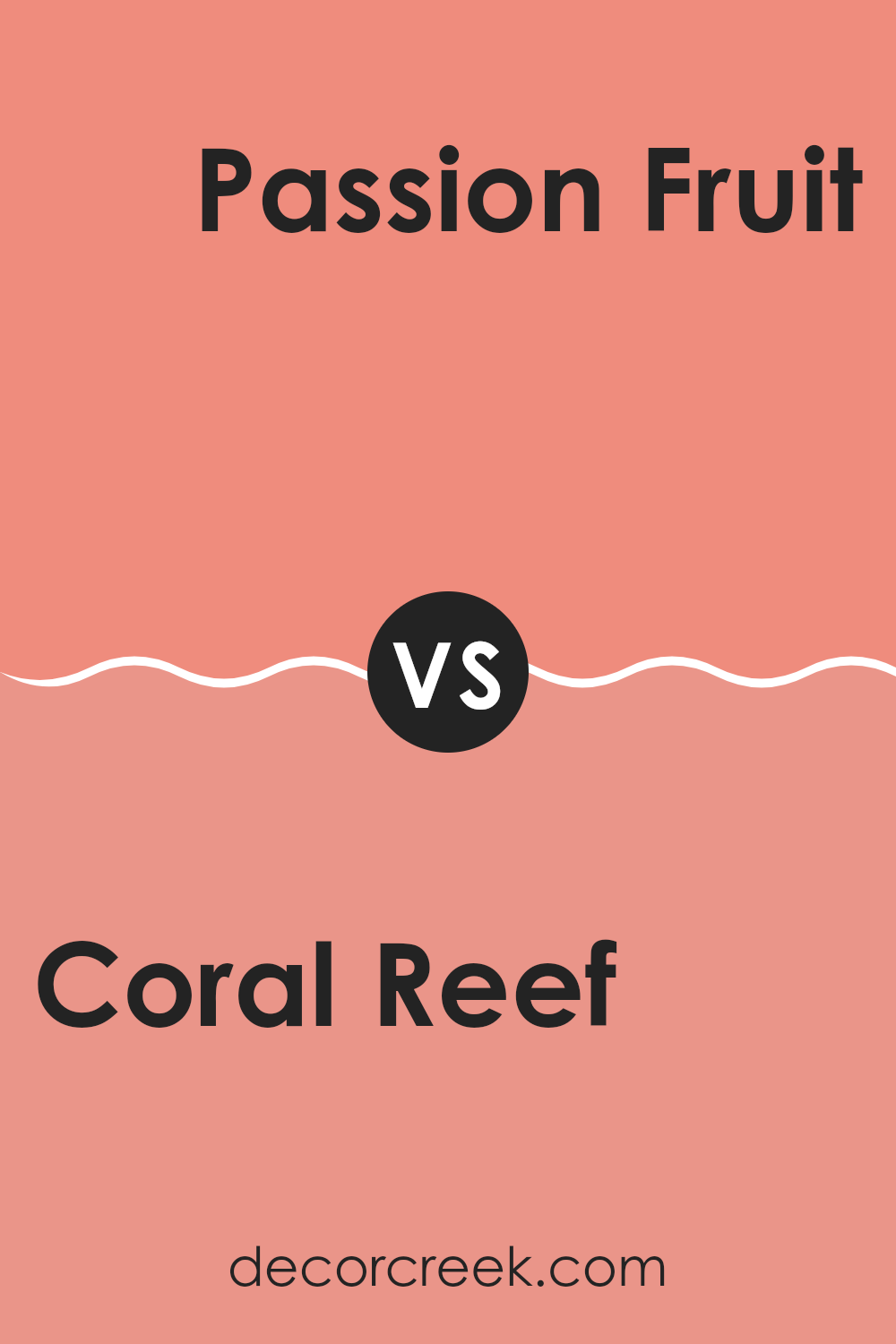
Coral Reef 012 by Benjamin Moore vs Passion Fruit 2171-40 by Benjamin Moore
The color Coral Reef by Benjamin Moore is a soft and cheerful pink with a slight hint of orange, giving it a warm and inviting feel. It’s a light color that can brighten up rooms and make them appear more open. Passion Fruit, on the other hand, is a bolder shade.
This color is a rich, deep pink with a touch of purple, making it more striking and vibrant compared to Coral Reef. While Coral Reef has a calming effect suitable for creating a relaxed atmosphere, Passion Fruit is more likely to make a statement and draw attention due to its intensity.
You might choose Coral Reef for a relaxed and light room like a living room or bedroom, while Passion Fruit could be perfect for an area that you want to energize, like a creative workspace or an accent wall. Both colors offer unique ways to refresh a room, but their impacts and uses can be quite different based on their intensities and tones.
You can see recommended paint color below:
- 2171-40 Passion Fruit
In finishing my reading and writing about the paint color 012 Coral Reef by Benjamin Moore, I’ve learned a lot about this cool paint color! First off, Coral Reef is a really vibrant and cheerful color that can brighten up any room. It’s perfect for places like a living room or a kitchen where you spend a lot of time and want to feel happy.
This color isn’t quiet or plain; it’s pretty lively! Imagine the color you’d see on a beautiful coral in the ocean. It’s not just one plain orange; it’s got hints of pink that make it really pretty to look at. A neat thing about Coral Reef is that it goes well with lots of other colors. You can pair it with light colors for a soft and friendly look or with darker colors to make it stand out more and give a room a cheerful pop.
If you want to change up a room in your house or if you’re just tired of the same old colors, think about trying Coral Reef. It’s a wonderful color that makes rooms look fresh without being too shocking.
All in all, Coral Reef by Benjamin Moore is an exciting choice for anyone who wants to make their home a little more fun and welcoming.
Ever wished paint sampling was as easy as sticking a sticker? Guess what? Now it is! Discover Samplize's unique Peel & Stick samples.
Get paint samples

