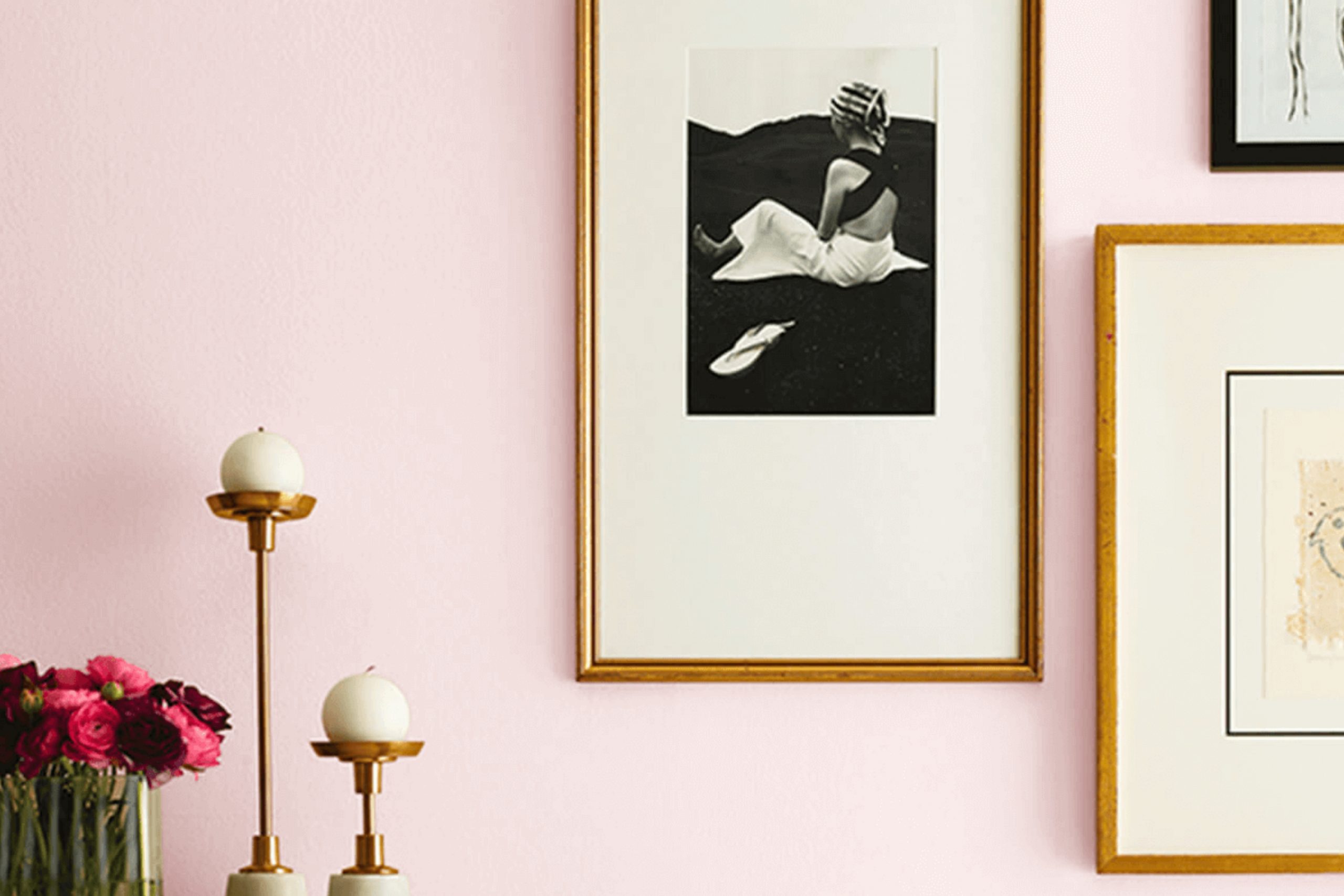
When you first lay your eyes on SW 9692 Cotton Candy by Sherwin Williams, it’s like stepping into a sweet, dreamy landscape. This particular shade of pink is soft yet inviting, perfect for adding a touch of whimsy to any space. I used it to brighten up a small reading nook, and it instantly made the area feel more personalized and cheerful.
If you’re thinking about refreshing a room without going too bold,, Cotton Candy offers a lovely balance. It pairs beautifully with neutral tones like whites and greys, or can be coordinated with bolder colors for a more playful palette. Whether you’re aiming to revitalize your living room, a child’s bedroom, or just a cozy corner, this color brings a warm, gentle vibe that uplifts the spirit.
Adding furnishings or decor in contrasting colors like deep blues or greens can make the pink really pop, creating a dynamic yet harmonious look. Also, experimenting with textures can enhance the effect—think plush cushions or soft, airy curtains.
SW 9692 Cotton Candy gives you a soft, playful base that leaves room for creativity — just like the simple joy of real cotton candy.
What Color Is Cotton Candy SW 9692 by Sherwin Williams?
The color Cotton Candy by Sherwin Williams is a gentle pink hue that echoes the light and fluffy nature of its namesake. This soft pink is not too overpowering and has a soothing quality, making it an ideal choice for creating a cozy and welcoming atmosphere in any room. Its lightness provides a sense of open space and calm, perfect for places where you want to relax and feel at ease.
Cotton Candy works beautifully in a variety of interior design styles. It is particularly effective in shabby chic décor, where its vintage charm can be paired with distressed furniture and a mix of antique finds. It also fits well in Scandinavian interiors, known for their clean lines and light colors, contributing to a minimalist yet warm environment.
Furthermore, this color is a great choice for a nursery or child’s room, offering a soft backdrop that is comfortable and appealing. When it comes to materials and textures, Cotton Candy pairs well with natural wood, from pale beech to weathered oak, enhancing the warmth of the pink. It also looks stunning with creamy whites and soft grays, which help to maintain a light and airy feel.
Textiles like linen or soft cotton in simple patterns complement the subtle charm of Cotton Candy, making any space feel more inviting.
Is Cotton Candy SW 9692 by Sherwin Williams Warm or Cool color?
Cotton Candy by Sherwin Williams is a soft, playful pink paint color that brings a gentle, cheerful atmosphere to any room. This particular shade works wonderfully in interiors meant for relaxation or creativity, such as bedrooms, nurseries, or even creative studio rooms.
Its light and airy feel can make small rooms seem a bit more open and inviting, while adding a gentle splash of color that doesn’t take over. When used in homes, Cotton Candy can add a touch of warmth and a friendly vibe, making interiors feel more intimate and personalized.
It pairs well with neutral tones like whites or soft grays, which helps balance its sweetness and prevents it from overpowering the space. Accents like soft greens or blues can also complement this pink to create a refreshing and pleasant color scheme. Overall, Cotton Candy is a great choice for adding a little fun and light-heartedness to your home without going over the top.
Undertones of Cotton Candy SW 9692 by Sherwin Williams
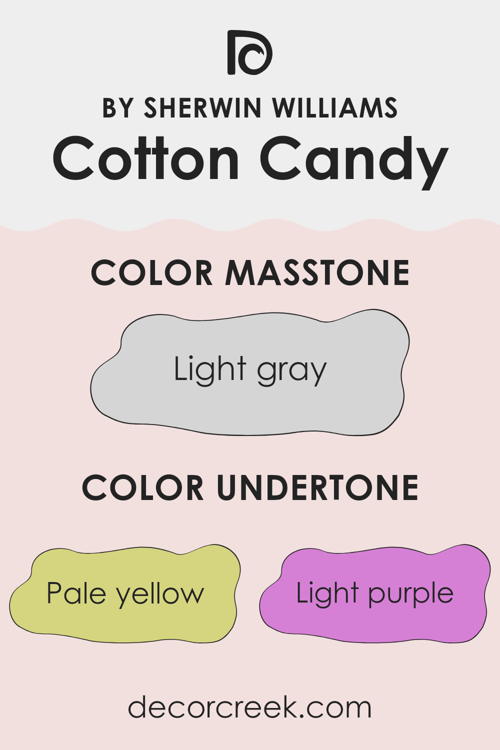
Cotton Candy from Sherwin Williams is a unique paint color because it contains a mix of subtle undertones that can change how it looks on your walls. Undertones are the hint of color that you see mixed in with the main color, and they can greatly influence the final appearance. For Cotton Candy, these undertones include pale yellow, light purple, light blue, pale pink, mint, lilac, and grey.
When you put this color on interior walls, the lighting and surrounding colors can bring out different undertones. For example, in a sunny room, you might notice the pale yellow or light blue undertones making the walls seem brighter and more refreshing. In a room with less natural light, the gray or lilac undertones might become more noticeable, giving the walls a more muted appearance.
Understanding these undertones can help you decide where to use the paint and what decorations and furniture will look best with it. Cotton Candy can make a room feel playful and cheerful if the lighter undertones come through or it can be more subdued and neutral if the darker undertones prevail. This flexibility makes it easy to use in different rooms and styles throughout your home.
What is the Masstone of the Cotton Candy SW 9692 by Sherwin Williams?
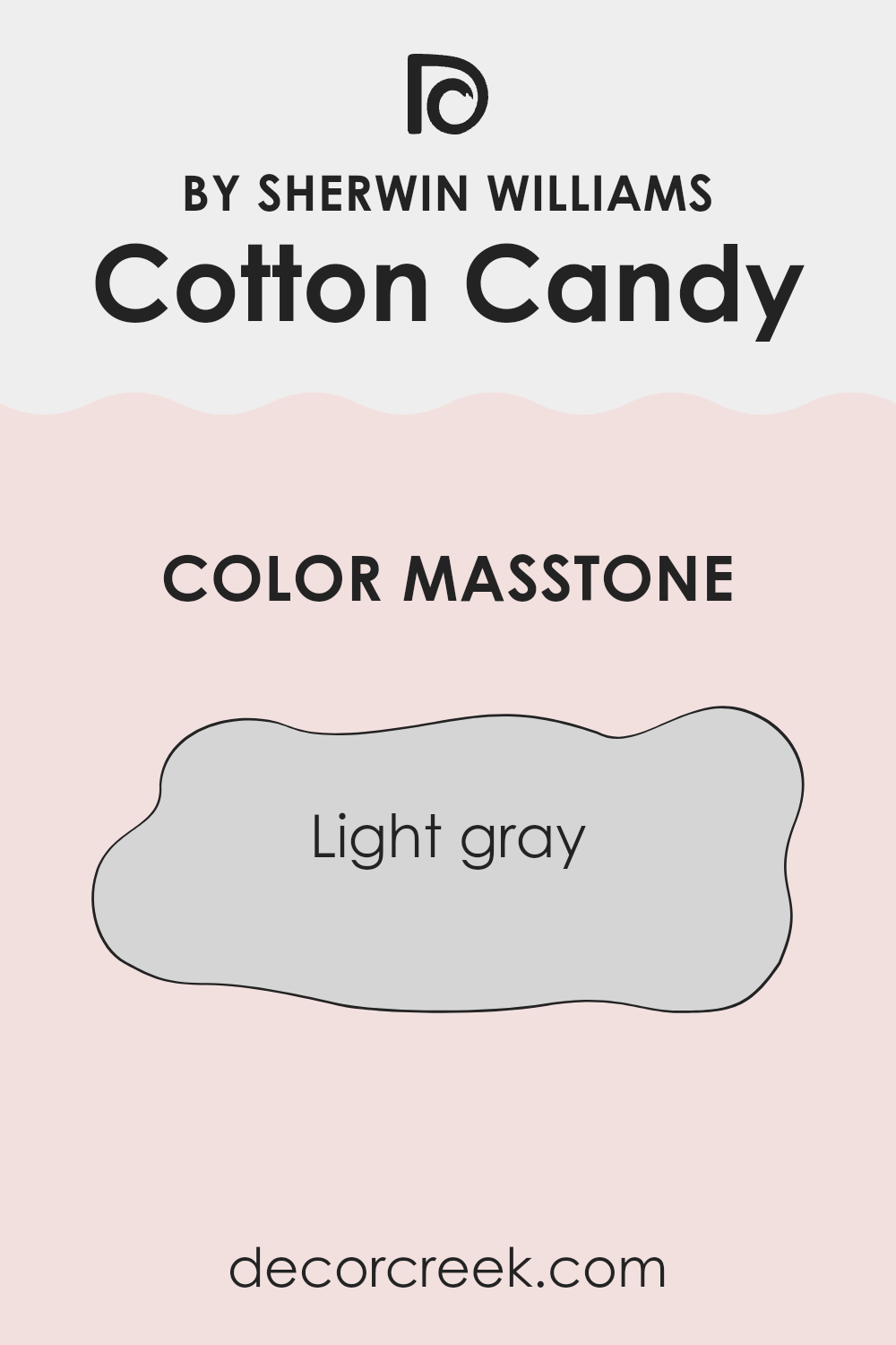
Cotton CandySW 9692 by Sherwin Williams, with its masstone of Light Gray (#D5D5D5), offers a gentle and neutral palette that’s easy to fit into various home decor styles. This light gray hue brings a clean and undemanding presence to rooms, making it a great choice for creating a calm and straightforward backdrop.
Since it’s not overpowering, it pairs effortlessly with other colors, whether you want to match it with soft pastels for a cozy vibe or bold shades for contrast. Its adaptability means it works well in any room, from kitchens to bedrooms, providing a light-enhancing effect in interiors that don’t get a lot of natural sunlight.
Additionally, its subtle tone can help smaller interiors appear larger, making it a practical choice for apartments or tight areas. Overall, the Cotton CandySW 9692 creates a flexible and inviting environment in homes without any fuss.
How Does Lighting Affect Cotton Candy SW 9692 by Sherwin Williams?
Lighting plays a crucial role in how we perceive colors. Different light sources can significantly alter the appearance of a color, including how bright or muted it looks. Each type of light, whether natural or artificial, casts its distinct hue, impacting the vibe of a room based on its color scheme.
Taking the color Cotton Candy by Sherwin Williams as an example, this soft, delicate pink can vary in appearance depending on the lighting conditions. In artificial light, such as that from incandescent bulbs, this color tends to look warmer, bringing out a cozier and more inviting pink tone. It’s ideal for spots meant to have a welcoming and soft ambiance.
In natural light, the impact on this pink shade depends on the direction of the room and the quality and amount of light it receives. In north-facing rooms, which do not receive direct sunlight and tend to have cooler light, Cotton Candy might appear slightly more muted and less vibrant. This could make the color feel more subtle and gentle, fitting for a restful area like a bedroom.
In south-facing rooms, the situation is quite different. These rooms get plenty of direct sunlight, which can intensify colors. Here, Cotton Candy would likely appear brighter and more vivid, possibly enhancing its playful and cheerful qualities—perfect for living spots or playrooms where a lively atmosphere is desirable.
East-facing rooms receive bright light in the morning, which can make Cotton Candy look very soft and pleasant at the start of the day, gradually shifting as the light changes. Conversely, in west-facing rooms, the color gets softer morning light but can appear dramatically warmer and brighter in the afternoons due to the intense, warm sunlight typical of these hours. This shifting light makes west-facing rooms a fun place to use a color like this — it keeps things lively and full of character
Overall, the light direction and type not only affect how Cotton Candy is perceived but also how it can be best utilized in different rooms to enhance the mood and atmosphere desired.
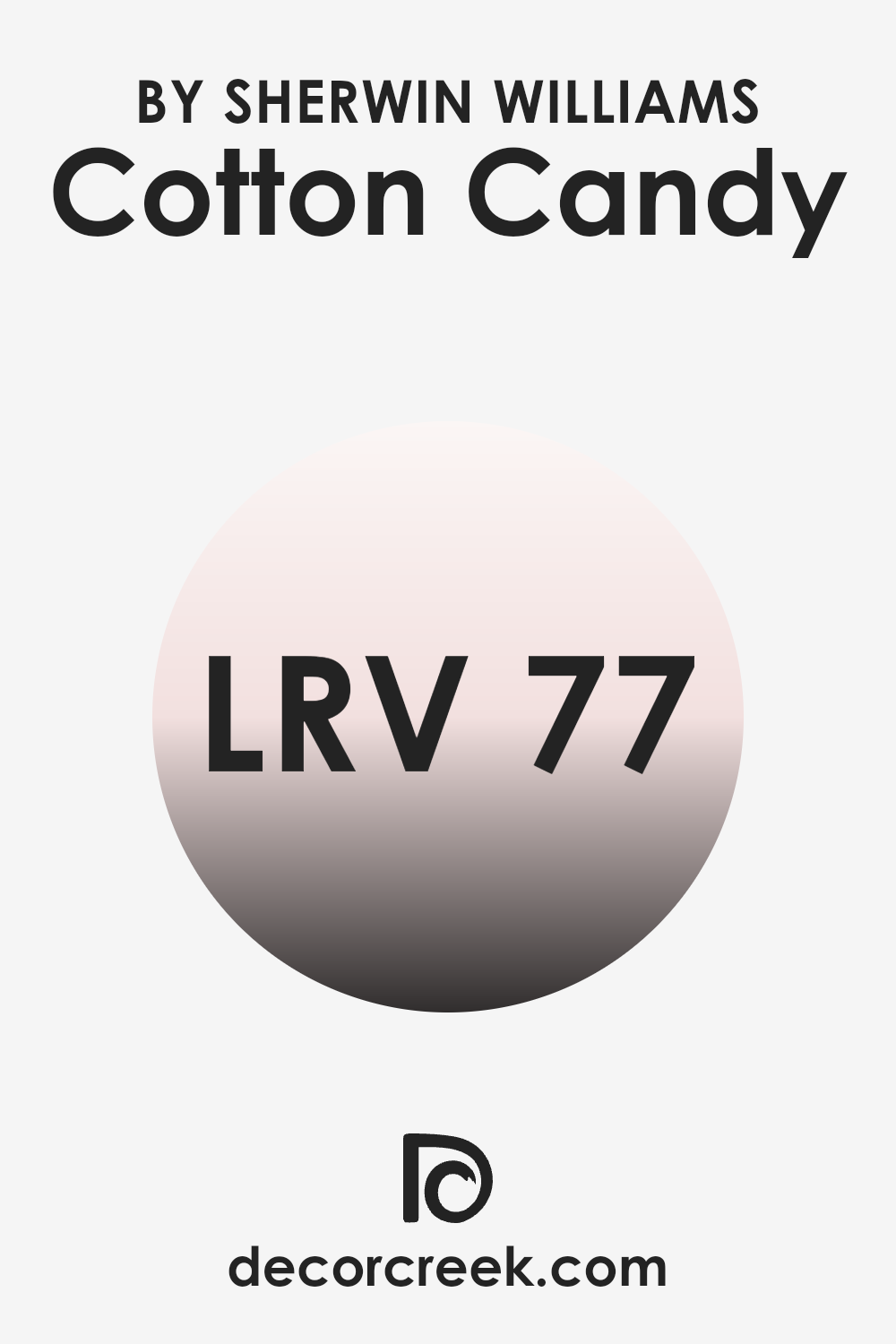
What is the LRV of Cotton Candy SW 9692 by Sherwin Williams?
LRV stands for Light Reflectance Value, a measure used to describe the percentage of light a paint color reflects back into the room as opposed to absorbing it. Higher LRV values mean the color reflects more light, making rooms appear brighter, while lower LRV values mean the color absorbs more light, often creating a cozier or smaller feel in a room.
This is an important factor to consider when choosing paint colors, as it can significantly affect the atmosphere and visual size of your space. The right LRV can make a room feel airy and open or more intimate and grounded depending on your preference.
For the color Cotton Candy SW 9692, which has an LRV of around 77, it’s a light shade that will reflect a good amount of light back into the room. This makes it ideal for use in smaller or darker rooms where you might want to enhance the sense of space and brightness. Its high LRV means it is likely to keep rooms feeling light and airy, and can help compensate for limited natural light. This is particularly useful in rooms that are naturally less bright, allowing for a visually more spacious environment.
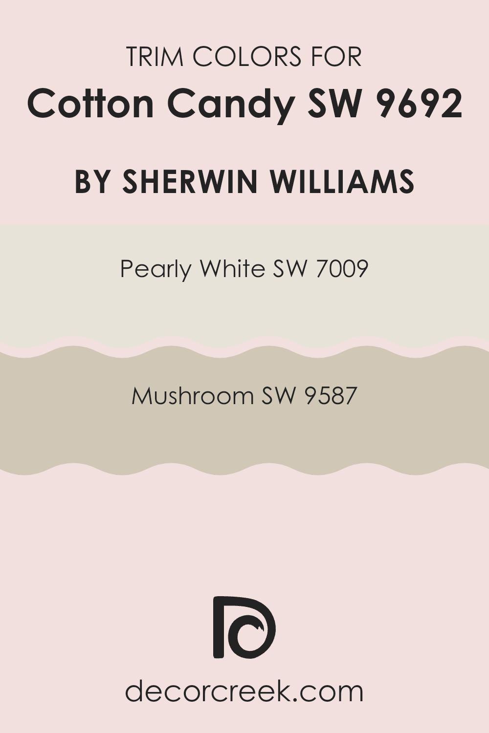
What are the Trim colors of Cotton Candy SW 9692 by Sherwin Williams?
Trim colors are the shades used for painting architectural details such as door frames, moldings, and baseboards, contrasting with the wall color for added aesthetic appeal and definition. For Cotton CandySW 9692, a vibrant and playful shade, choosing the right trim colors can enhance its appearance and create a harmonious look.
SW 7009 Pearly White and SW 9587 Mushroom are great picks — they offer a soft but noticeable contrast that helps Cotton Candy SW 9692 stand out, while still keeping the look calm and balanced.
Pearly White is a soft, creamy white that brings a clean and refreshing touch to the lively tone of Cotton CandySW 9692. It helps in making the brighter hues pop while maintaining a gentle and welcoming ambiance. On the other hand, Mushroom is a warm, earthy taupe that adds a sense of warmth and grounding. It works beautifully with Cotton CandySW 9692, providing a natural, understated balance to its spirited vibe, making the space feel cozy and well-coordinated.
You can see recommended paint colors below:
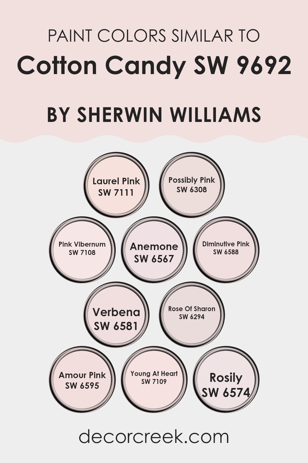
Colors Similar to Cotton Candy SW 9692 by Sherwin Williams
Similar colors are crucial in design because they help create a cohesive and visually appealing space by maintaining a uniform tone and vibe. When colors are similar, they naturally complement each other, leading to a harmonious look that is pleasing to the eye. This continuity can make a room feel more put together and intentional.
Colors like Laurel Pink (SW 7111) and Possibly Pink (SW 6308) bring soft variations that add depth to a design while keeping the look calm and easy. Laurel Pink brings a soft, dusty rose hue that feels gentle and welcoming, while Possibly Pink is slightly brighter, adding a cheerful warmth.
Pink Viburnum (SW 7108) has a deeper, more saturated tone that can provide a stunning contrast against lighter pinks like Diminutive Pink (SW 6588), which boasts a pale, delicate shade. Anemone (SW 6567) and Verbena (SW 6581) introduce a more vivid palette, with Anemone presenting a bold pink statement and Verbena showing off a lighter, airy feel.
Rose of Sharon (SW 6294) offers a rich, robust color that draws attention, while Amour Pink (SW 6595) hints at a playful, spirited vibe. Young At Heart (SW 7109) reconnects with the youthful, exuberant aspect of color, and Rosily.
(SW 6574) rounds out the options with a soft, muted blush tone — a nice reminder that even within similar shades, you can still build depth and keep things interesting. These various shades provide numerous options for designers looking to achieve a specific mood or style in a space, making it easy to coordinate furniture, decorations, and other elements seamlessly.
You can see recommended paint colors below:
- SW 7111 Laurel Pink
- SW 6308 Possibly Pink
- SW 7108 Pink Vibernum
- SW 6567 Anemone
- SW 6588 Diminutive Pink
- SW 6581 Verbena
- SW 6294 Rose Of Sharon
- SW 6595 Amour Pink
- SW 7109 Young At Heart
- SW 6574 Rosily
How to Use Cotton Candy SW 9692 by Sherwin Williams In Your Home?
Cotton Candy SW 9692 by Sherwin Williams is a soft and cheerful pink color that can bring a light, happy vibe to any room in your home. It’s perfect for creating a playful nursery or making a cozy reading nook feel more welcoming.
If you want to add a touch of sweetness to your living space without going overboard, consider using this color for an accent wall or in decorative touches like throw pillows or curtains. This shade is also great for a bathroom or a vanity space where you might want a bit of gentle charm.
Pairing Cotton Candy with whites or light grays can keep the atmosphere airy and open, while matching it with darker or more vivid colors can create a striking contrast. Whether you choose to paint an entire room or just sprinkle in some colorful accents, Cotton Candy has a youthful spirit that can brighten up your home.
Cotton Candy SW 9692 by Sherwin Williams vs Amour Pink SW 6595 by Sherwin Williams
Both Cotton Candy and Amour Pink by Sherwin Williams brighten any space with their charming shades, but they offer distinctly different vibes. Cotton Candy is a muted, soft pink that brings a gentle and light feel to a room, making it perfect for creating a soothing environment.
It’s less about intensity and more about creating a subtle, pleasant ambience. On the other hand, Amour Pink packs a bit more punch with its bolder, brighter pink tone. This color is more vivid and expressive, ideal for rooms that aim to make a cheerful statement or energize the setting.
While Cotton Candy might be suited for a nursery or a calming corner, Amour Pink could work well in more dynamic areas like a creative space or a lively living room. Both colors, though, share the ability to add a touch of cheerful warmth to any interior.
You can see recommended paint color below:
- SW 6595 Amour Pink
Cotton Candy SW 9692 by Sherwin Williams vs Diminutive Pink SW 6588 by Sherwin Williams
Cotton Candy and Diminutive Pink are both pink shades from Sherwin Williams, but they have distinct vibes. Cotton Candy is a soft, playful pink that resembles the fluffy, light aspect of its namesake. It’s quite pale, giving a gentle and soothing feel to a space, perfect for creating a relaxing environment.
On the other hand, Diminutive Pink is deeper and slightly more saturated. This color still maintains a softness but leans towards a slightly richer, warmer hue. It’s a good option if you want to add some color without making the room feel too bright or loud.
Both colors work well for parts of the home meant to feel welcoming and light, but Cotton Candy brings a lighter air, ideal for smaller or less light-filled rooms. Diminutive Pink, with its slightly fuller color, could be a better choice for areas where a bit more warmth and presence are needed. They are lovely options for anyone preferring subtle pink tones in their decorating palette.
You can see recommended paint color below:
- SW 6588 Diminutive Pink
Cotton Candy SW 9692 by Sherwin Williams vs Verbena SW 6581 by Sherwin Williams
Cotton Candy is a soft, gentle pink that has a very light and airy feel to it. This color is perfect for creating a cozy and welcoming atmosphere in parts of the home like bedrooms or nurseries. It reflects a lot of light, making it an excellent choice for smaller rooms or areas that don’t get a lot of natural sunlight.
On the other hand, Verbena is a vibrant lavender shade that adds a pop of color and energy to any space. It’s bolder than Cotton Candy and stands out more, making it suitable for places where you want to make a statement, like an accent wall or a guest bathroom.
Both colors offer unique vibes—Cotton Candy is subtle and soothing, while Verbena is lively and cheerful. They can work beautifully together for someone looking to combine softness with a touch of vibrancy in their color scheme.
You can see recommended paint color below:
- SW 6581 Verbena
Cotton Candy SW 9692 by Sherwin Williams vs Possibly Pink SW 6308 by Sherwin Williams
“Cotton Candy” and “Possibly Pink” are both charming pinks offered by Sherwin-Williams, but they have distinct vibes. “Cotton Candy” is a bright and playful shade, evoking the joy and lightness of its namesake.
It’s a perfect choice for adding a cheerful pop of color to a space, making it feel youthful and lively. In contrast, “Possibly Pink” is a softer, more subdued pink. This color has a gentle feel, well-suited for creating a relaxing and cozy atmosphere in a room.
It’s less intense than “Cotton Candy,” which makes it easier to pair with a wide range of decor styles. If you’re aiming for a more understated or mature look, “Possibly Pink” would be the way to go. Both colors have their unique appeal and can beautifully enhance a space depending on the mood you want to set.
You can see recommended paint color below:
- SW 6308 Possibly Pink
Cotton Candy SW 9692 by Sherwin Williams vs Anemone SW 6567 by Sherwin Williams
Comparing Cotton Candy and Anemone by Sherwin Williams, you’ll notice some vivid differences. Cotton Candy is a soft, gentle pink that brings to mind the light and fluffy sweetness of its namesake. It’s a very subtle and pleasant color, easy on the eyes, and great for parts of the home where you want a touch of softness and cheer.
On the other hand, Anemone stands out with its bold and lively teal shade. This color is much deeper and vibrant than Cotton Candy, offering a striking pop of color that can really liven up a room. It’s the kind of color that stands out and can be a focal point in decor.
In summary, if you want a space that feels gentle and soothing, Cotton Candy is the way to go. But if you’re after a more dynamic and energetic vibe, Anemone would be the ideal choice. Both colors have their unique charm and can make any space interesting in their own right.
You can see recommended paint color below:
- SW 6567 Anemone
Cotton Candy SW 9692 by Sherwin Williams vs Young At Heart SW 7109 by Sherwin Williams
Cotton Candy and Young At Heart are two charming colors by Sherwin Williams that offer subtle yet distinct differences. Cotton Candy is a soft, light pink that evokes the sweetness and airy nature of its namesake. It’s perfect for creating a gentle, playful vibe in a room.
On the other hand, Young At Heart is a deeper, more saturated pink. This hue has a richer, fuller feel, making it great for adding a cheerful pop of color to the home without feeling too strong.
Both colors are great for adding a touch of whimsy and a cheerful pop to any decor, but the choice between them depends on how subtle or bold you want to go. Cotton Candy works well for a softer, lighter feel, while Young At Heart stands out more with its vibrant tone.
You can see recommended paint color below:
- SW 7109 Young At Heart
Cotton Candy SW 9692 by Sherwin Williams vs Laurel Pink SW 7111 by Sherwin Williams
Cotton Candy and Laurel Pink, both by Sherwin Williams, are lovely colors, but they have different vibes. Cotton Candy is a playful, light pink that really pops. It’s the kind of color that brings a cheerful brightness to a room, reminiscent of the fun and sweetness of its namesake. It works great in sections meant to feel open and happy, like a child’s room or a creative space.
Laurel Pink, in contrast, leans toward a soft, muted pink. It adds a gentle touch of color and brings warmth without making the room feel too bold.. This makes it ideal for creating a cozy and inviting atmosphere, perhaps in areas like living rooms or bedrooms where you seek comfort and calmness.
It’s a more understated shade compared to the more lively Cotton Candy. Together, these colors can complement each other well in sections where balance between vibrancy and softness is desired.
You can see recommended paint color below:
- SW 7111 Laurel Pink
Cotton Candy SW 9692 by Sherwin Williams vs Pink Vibernum SW 7108 by Sherwin Williams
Cotton Candy and Pink Viburnum, both by Sherwin Williams, offer distinct shades of pink, perfect for different settings and moods. Cotton Candy has a soft, light pink hue, comparable to the airy, sugary treat it’s named after. This color is gentle and understated, adding a subtle touch of sweetness to sections. It’s ideal for creating a cozy, inviting atmosphere in rooms meant for relaxation, like bedrooms or nurseries.
On the other hand, Pink Viburnum is a bolder, more vibrant pink. It stands out more than Cotton Candy, making it a great choice for areas where you want to inject a bit more personality and energy. This could be perfect for a playroom, a craft room, or even an accent wall that catches the eye.
Overall, while both colors share a pink base, Cotton Candy offers a lighter, calmer vibe, whereas Pink Viburnum is punchier and more lively. Choose based on the mood you wish to create and the space you are decorating.
You can see recommended paint color below:
- SW 7108 Pink Vibernum
Cotton Candy SW 9692 by Sherwin Williams vs Rosily SW 6574 by Sherwin Williams
The main color, Cotton Candy, is a gentle and soft pink that gives off a playful and light-hearted feel. It’s a color that could remind you of the airy and sweet nature of its namesake treat, perfect for creating a cheerful space.
On the other hand, Rosily, is a deeper, dustier pink that has a more mature tone compared to Cotton Candy. Although it’s still in the pink family, Rosily offers a sense of calm and might be more suitable for sectionsthat aim for a restful yet cheerful ambiance.
While both colors share a base hue, Cotton Candy’s brightness makes it ideal for lively, vibrant decor, whereas Rosily’s subdued quality lends itself well to more subdued, cozy settings. The choice between them would depend on whether you prefer a lighter, more vibrant pink or a more muted, gentle approach.
You can see recommended paint color below:
- SW 6574 Rosily
Cotton Candy SW 9692 by Sherwin Williams vs Rose Of Sharon SW 6294 by Sherwin Williams
Cotton Candy by Sherwin Williams is a soft, light pink with a playful and gentle feel. It’s reminiscent of the fluffy, sweet treat often enjoyed at fairs. This color can brighten a room with its airy touch, making it ideal for creating a cheerful and welcoming atmosphere.
On the other hand, Rose of Sharon by Sherwin Williams is a more intense and vivid pink. It conveys a bolder and more energetic vibe, suitable for rooms where you want to make a lively statement.
While Cotton Candy offers a subtle hint of color, Rose of Sharon packs a punch with its richness, making it a standout choice for those looking to add some dynamism to their surroundings. Both colors promote a sense of warmth and friendliness, but Rose of Sharon does so with greater intensity compared to the more subdued and delicate Cotton Candy.
You can see recommended paint color below:
- SW 6294 Rose Of Sharon
As I wrap up talking about SW 9692 Cotton Candy by Sherwin Williams, I think it’s a great paint color to make any room look sweet and cheerful, just like actual cotton candy. This color isn’t just pink; it’s a soft pink that makes you feel happy and calm when you look at it. It’s perfect for any kid’s room or even a play area because it’s light and has a playful touch.
Using SW 9692 Cotton Candy can really make a simple room look bright and fun without doing a lot. It’s like adding a little sprinkle of joy on the walls. Plus, if you’re thinking about mixing it with other colors, it goes really well with soft whites or even light greys, and that can make your room feel even more cozy and welcoming.
So, if you or your child loves pink, Cotton Candy by Sherwin Williams is a paint color worth thinking about. It gives any room a gentle touch of color that’s both friendly and pretty, perfect for creating a space that feels good to be in.
Whether you want to paint a whole room or just an accent wall, Cotton Candy is a fun choice that brings a lot of light and charm to a home.
Ever wished paint sampling was as easy as sticking a sticker? Guess what? Now it is! Discover Samplize's unique Peel & Stick samples.
Get paint samples

