When it comes to choosing paint for your space, picking the right shade can truly transform the ambiance of any room.
SW 7009 Pearly White by Sherwin Williams is a fantastic choice if you’re searching for a color that brings a sense of freshness and elegance.
This shade isn’t just a simple white; it’s a nuanced hue that offers a subtle hint of warmth, making spaces feel inviting and cozy.
Ideal for those looking to brighten up their interiors without the starkness often associated with pure white, Pearly White manages to strike the perfect balance.
t works wonderfully in a variety of settings, from living rooms and kitchens to bedrooms and bathrooms, adapting seamlessly to different lighting conditions. This versatility makes it an excellent choice for both contemporary and traditional decor styles.
In addition, this color pairs beautifully with a wide range of accent colors and materials, offering endless possibilities for personalizing your space.
Whether you are updating a single room or planning a whole-house makeover, Pearly White provides a sophisticated backdrop that enhances your existing furnishings and decor.
Let’s explore more about how this shade can enrich your home environment and why it stands out as a go-to choice for many homeowners and decorators.
What Color Is Pearly White SW 7009 by Sherwin Williams?
Pearly White by Sherwin Williams is a soft, elegant color that brings a touch of sophistication and warmth to any space. It’s a versatile shade that falls somewhere between pure white and a very light cream.
This subtlety makes it an excellent choice for creating a welcoming, airy ambiance without the starkness sometimes associated with pure white.
Its ability to reflect light beautifully enhances the sense of space in a room, making it feel larger and more open.
This color works fantastically in various interior styles, particularly in modern, minimalist, and Scandinavian designs, where its lightness complements the clean lines and simple aesthetics of these spaces.
It also fits beautifully in more traditional settings, adding a fresh, updated look without detracting from the classic elements of the design.
Pearly White pairs wonderfully with a range of materials and textures. It looks stunning against natural wood, whether it’s a pale, bleached wood in a more modern space or a rich, dark oak in a traditional setting.
Metals such as brass, gold, and chrome can add a touch of glamour to a room painted in this hue, while soft textiles in muted tones or vibrant patterns can add depth and interest.
Fabrics like linen, cotton, and wool in both furniture and decorative accents work well with this color, contributing to a layered, sophisticated space that feels cohesive and thoughtfully designed.
Ever wished paint sampling was as easy as sticking a sticker? Guess what? Now it is! Discover Samplize's unique Peel & Stick samples.
Get paint samples

Is Pearly White SW 7009 by Sherwin Williams Warm or Cool color?
Pearly White by Sherwin Williams is a beautiful, soft off-white paint color that offers a warm and inviting atmosphere to any room. This versatile shade has a subtle creamy undertone which makes it perfect for creating a cozy and comfortable space.
Unlike stark whites, Pearly White adds depth and character to walls without overpowering the room with brightness.
This color is excellent for individuals wanting to freshen up their living space without the cold feel that some pure whites can bring.
Whether it’s used in a living room, bedroom or kitchen, Pearly White adapts wonderfully to both natural and artificial light, changing subtly throughout the day to provide a lively yet peaceful ambiance.
For homeowners looking for a neutral backdrop, Pearly White serves as an ideal canvas. It pairs beautifully with a wide range of colors, materials, and home styles, from modern to traditional.
This flexibility allows for easy updates to decor over time without needing to repaint.
Because of its understated elegance, Pearly White helps highlight architectural features or cherished furniture pieces, making it a popular choice for those aiming to enhance the beauty of their homes with a timeless look.
Undertones of Pearly White SW 7009 by Sherwin Williams
Pearly White by Sherwin Williams is a popular paint color choice for those looking to add a soft, inviting feel to their spaces. At first glance, it may just seem like a simple off-white.
But what makes it truly special are its undertones – pale yellow and light purple.
These undertones are subtle hues mixed into the paint that can have a big impact on how the color looks once it’s on your walls, affecting the paint’s overall appearance in different lighting conditions.
Imagine painting your interior walls with Pearly White. During the day, when sunlight floods the room, the pale yellow undertone can make the space feel warmer and more welcoming.
It’s like the color softly glows, bringing a cozy ambiance to the room. On the other hand, in the evenings or in rooms with less natural light, the light purple undertone might become more noticeable, giving the walls a cooler, more serene vibe.
This duality makes Pearly White versatile, capable of creating different atmospheres at different times of the day.
The presence of these undertones means that the color isn’t just a static, one-note white. Instead, it reacts dynamically to its surroundings, changing subtly with the lighting, and blending with furniture and decor in unique ways.
This interaction is crucial to consider when choosing Pearly White for your interior, as it can significantly influence the mood and style of your space.
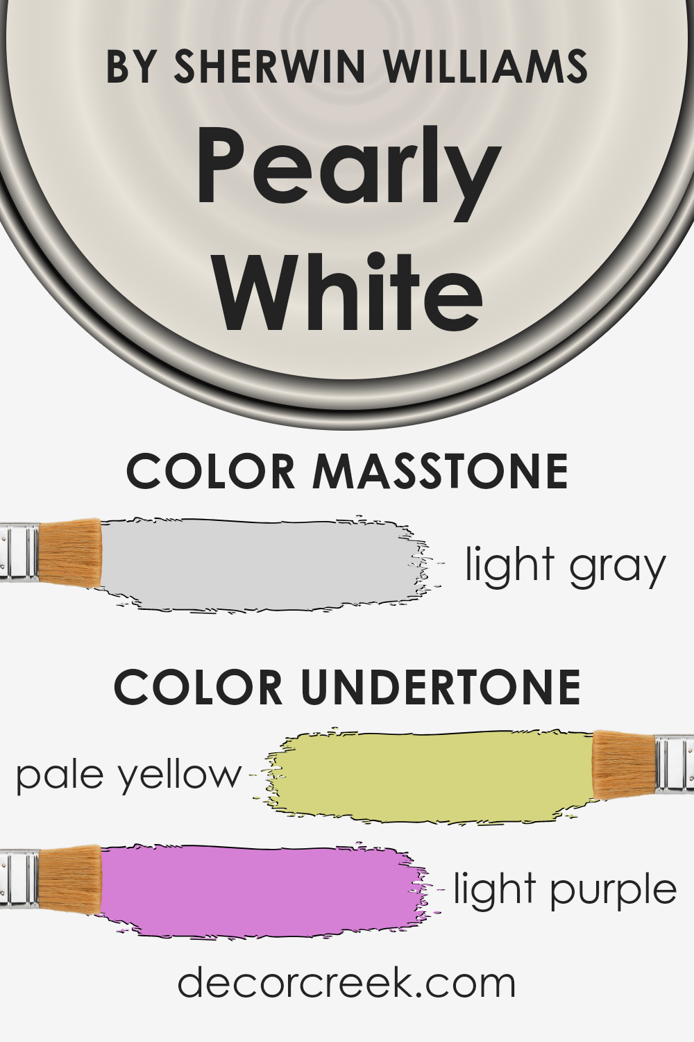
What is the Masstone of the Pearly White SW 7009 by Sherwin Williams?
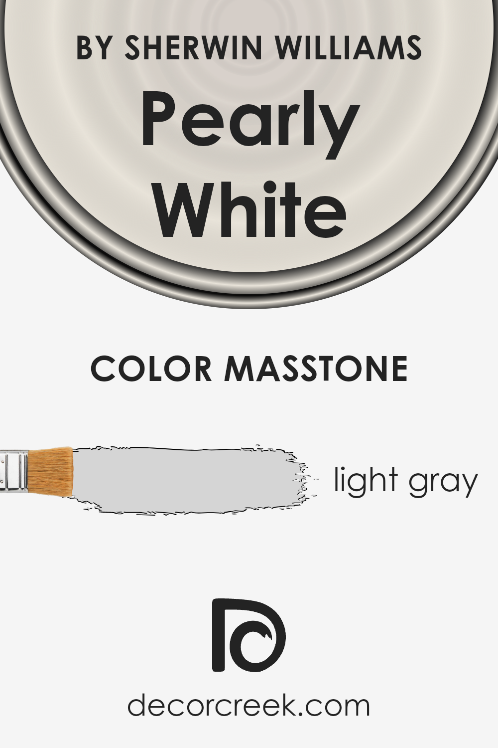
Pearly White by Sherwin Williams has a masstone, or the pure color before it’s lightened or darkened, similar to light gray with a hex code of #D5D5D5.
This subtle and delicate shade has a versatile quality, making it a perfect choice for various rooms in a home. Because of its light gray nature, it brings a sense of calm and cleanliness to any space.
This color works well in areas that receive a lot of natural light, as it can enhance the brightness and make the room appear larger and more inviting.
In low-light areas, it introduces a soothing, cozy atmosphere without overpowering the room with darkness. It’s a fantastic option for giving walls a gentle, neutral backdrop, allowing for flexibility in decorating with different colors and textures.
Whether in a modern or traditional setting, this shade will complement your home beautifully, adding a touch of understated elegance.
How Does Lighting Affect Pearly White SW 7009 by Sherwin Williams?
Lighting plays a crucial role in how we perceive colors. Essentially, the type of light and its intensity can make a color look completely different.
This is because different light sources have different color temperatures, affecting how we see colors. Let’s take the color Pearly White as an example to understand this phenomenon.
In artificial light, Pearly White can display a range of tones depending on the type of bulb used. With warmer bulbs, like those found in many homes, this color might look creamier, adding a cozy vibe to a room.
In cooler, more modern LED lighting, the same color could appear brighter and more neutral, lending a more contemporary look.
Under natural light, Pearly White transforms yet again. Natural sunlight brings out the truest version of this color due to its full spectrum of light.
On a sunny day, Pearly White will appear bright and lively, reflecting a significant amount of light and making spaces feel larger and more open.
The direction of room exposure also affects how Pearly White is seen. In north-faced rooms, which receive less direct sunlight, this color might look a bit cooler and more subdued, creating a calm and serene atmosphere.
South-faced rooms bask in more intense light for the majority of the day, making Pearly White look warmer and more vibrant, enhancing the feeling of warmth and brightness.
East-faced rooms get bright morning light, making this color appear fresh and airy in the mornings but cooler as the day goes on.
Conversely, west-faced rooms will see a softer version of Pearly White in the morning, with the color looking warmer and more glowing in the evening as the sun sets.
In conclusion, the appearance of Pearly White, like any color, is significantly influenced by the type and direction of lighting.
This fascinating interplay between light and color can help you decide the best use of Pearly White in your decorating projects, depending on the ambiance you wish to achieve.
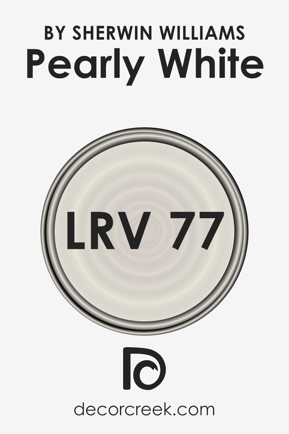
What is the LRV of Pearly White SW 7009 by Sherwin Williams?
LRV stands for Light Reflectance Value, a measurement that tells you how much light a color reflects and how much it absorbs.
Think of it like this: the scale goes from 0 to 100, where 0 means it’s pitch black and absorbs all light, while 100 means it’s super bright, reflecting all light back at you.
LRV is super helpful when picking paint colors for your room. It’s all about how bright or dark the color will feel once it’s up on your walls.
High LRV colors can make a space feel more open and airy because they reflect more light around the room. On the other hand, low LRV colors can make a room feel cozier and more intimate because they absorb more light.
Now, with an LRV of 77.327, Pearly White has a high light reflectance value. This means it’s on the brighter side, capable of making rooms feel more spacious and brighter.
This color is great for spaces that you want to feel open and welcoming, bouncing a good amount of light around and enhancing the room’s natural or artificial lighting.
Because of its high LRV, it doesn’t absorb much light, making it a fantastic choice for rooms that might not get a ton of sunlight, helping to brighten them up without relying solely on lamps or overhead lights.
Remember, the final look can also depend on other factors in your room, like lighting conditions and decorations, but overall, this color can help achieve a fresh and airy vibe in your space.
LRV – what does it mean? Read This Before Finding Your Perfect Paint Color
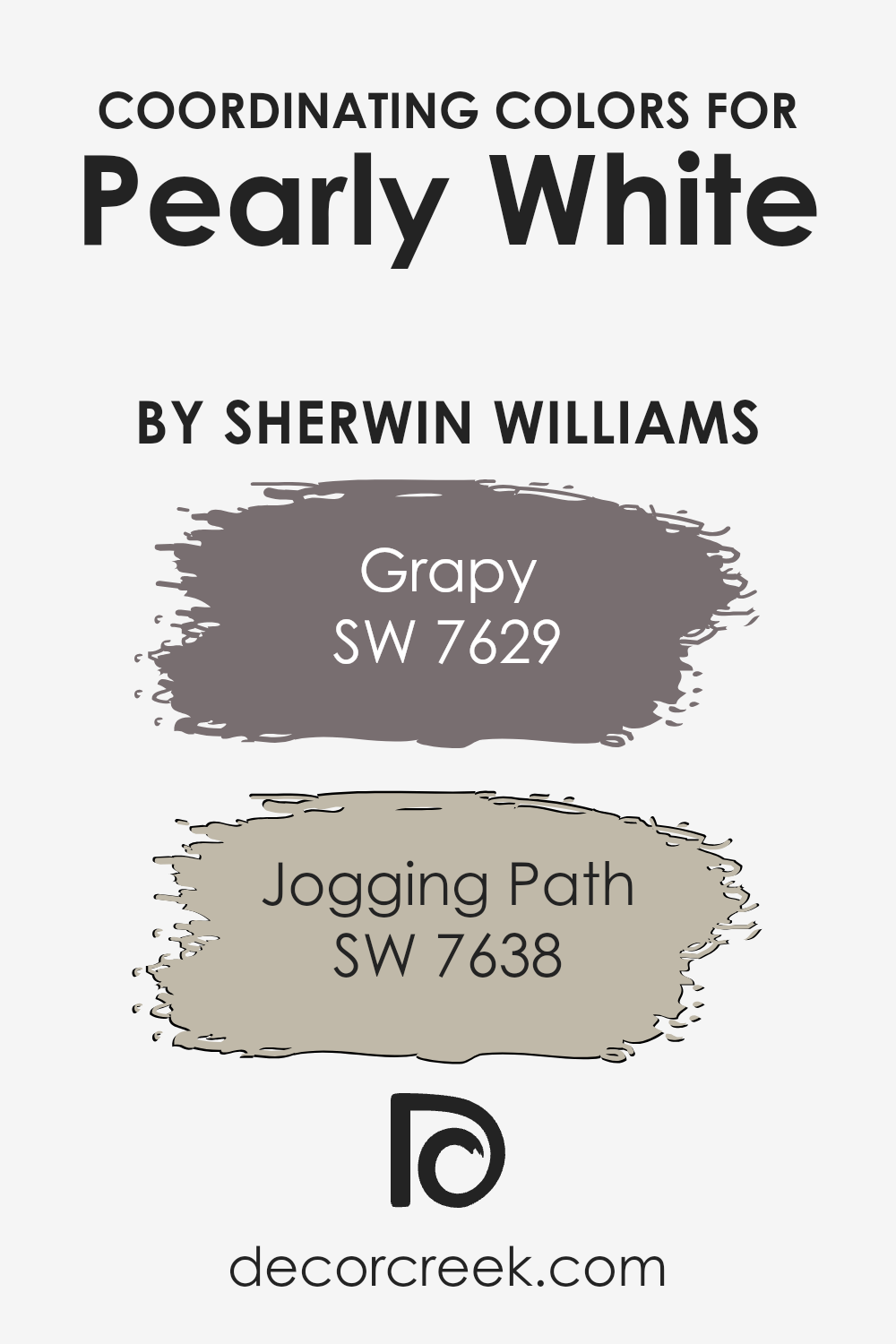
Coordinating Colors of Pearly White SW 7009 by Sherwin Williams
Coordinating colors are hues that harmonize with each other when used together in a design or space, creating a cohesive and visually appealing look.
When you have a base color like the soft and subtle Pearly White, choosing the right coordinating colors can enhance the atmosphere you want to achieve.
Two excellent examples of coordinating colors for Pearly White are Grapy and Jogging Path by Sherwin Williams.
These colors work together because they share a complementary balance, ensuring that no single color overwhelms the others, instead fostering a sense of unity in the space.
Grapy is a unique shade that adds a hint of sophistication and depth to a room when paired with a lighter, neutral base such as Pearly White. Its rich tone can bring warmth and charm, making spaces feel more inviting and personal.
On the other hand, Jogging Path presents a different appeal. It’s a versatile grayish-green that embodies a sense of calm and serenity, perfect for creating a relaxing ambiance.
When these shades accompany Pearly White, they offer a beautiful palette that can transform any room into a harmonious blend of colors, where each one supports and enhances the others, making the overall aesthetic cohesive and balanced.
You can see recommended paint colors below:
- SW 7629 Grapy
- SW 7638 Jogging Path
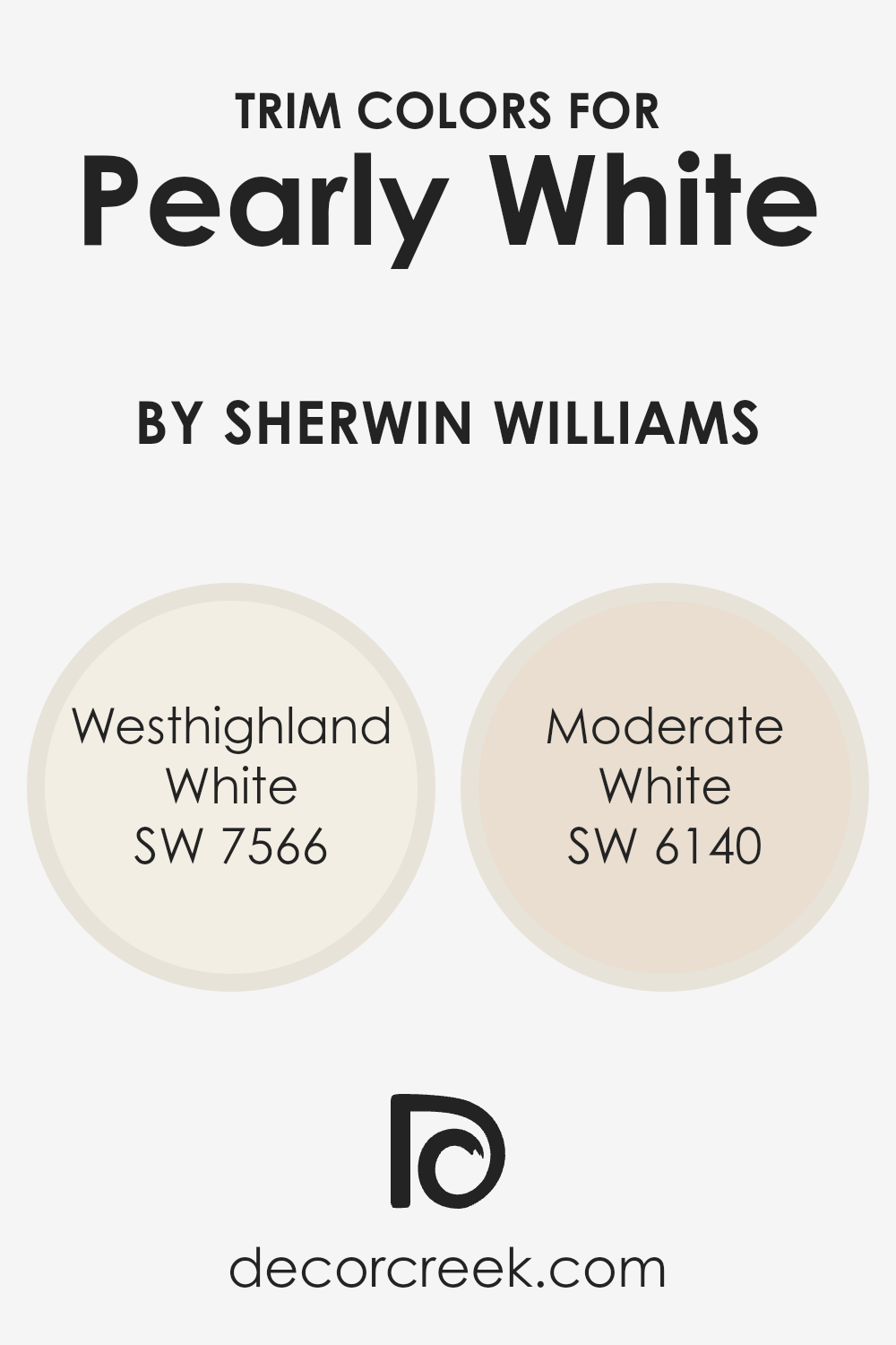
What are the Trim colors of Pearly White SW 7009 by Sherwin Williams?
Trim colors are those chosen specifically to complement or contrast with the main color on walls to add definition and character to a room.
When we talk about Pearly White by Sherwin Williams, selecting the right trim color is essential because it can either elevate the soft, serene feel of Pearly White or provide a subtle delineation that highlights architectural details.
Trim colors serve not only to frame the walls but also to bring out the best in your primary color choice, making the space feel thoughtfully designed and cohesive.
For Pearly White, SW 7566 – Westhighland White is an excellent trim option.
This color is a warm, inviting white that adds a gentle brightening effect to the edges of a room when used as a trim, putting forth a welcoming atmosphere without overpowering the main hue.
On the other hand, SW 6140 – Moderate White, offers a slightly deeper tone, providing a soft contrast that enhances the architectural elements of a space without creating a stark divide.
This color is ideal for those looking to add depth and interest to their rooms subtly, allowing Pearly White’s tranquil vibe to take center stage while ensuring the space’s design elements are pronounced and appreciated.
You can see recommended paint colors below:
- SW 7566 Westhighland White
- SW 6140 Moderate White
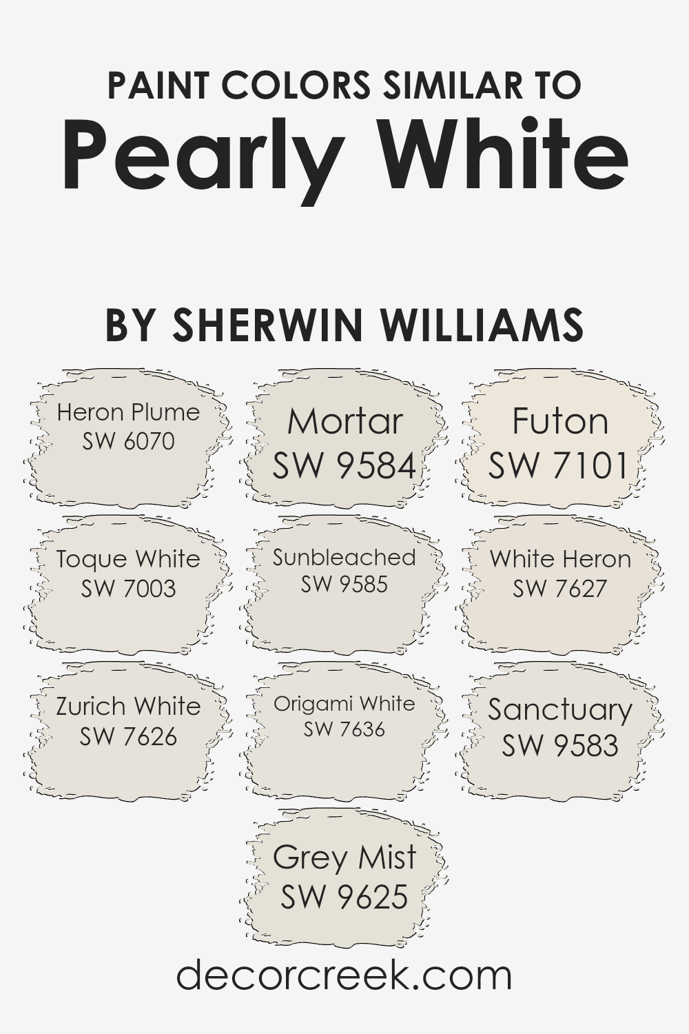
Colors Similar to Pearly White SW 7009 by Sherwin Williams
Similar colors play a vital role in creating a harmonious and balanced visual experience, especially in interior design.
When colors like Heron Plume, Toque White, Zurich White, Grey Mist, Mortar, Sunbleached, Origami White, Futon, White Heron, and Sanctuary are used together, they offer a subtle variety while maintaining a cohesive look.
This is because these colors share a common hue foundation, making them effortlessly blend with each other.
They possess a unique ability to complement without overwhelming, allowing for a design that is both soothing and sophisticated.
Heron Plume is a soft, airy color that adds a hint of warmth to spaces, making rooms feel welcoming. Toque White, on the other hand, is slightly cooler, providing a clean backdrop that enhances natural light.
Zurich White brings a touch of sophistication with its understated elegance, perfect for creating a serene atmosphere. Grey Mist introduces a gentle, muted quality, reminiscent of early morning fog.
Mortar offers a stronger, more defined presence with its deeper tones, grounding the lighter shades in the palette.
Sunbleached brings warmth and a sense of nostalgia, perfect for adding character. Origami White is crisp and minimalistic, offering a modern twist. Futon, with its versatility, bridges the gap between warm and cool tones.
White Heron is pure and classic, providing a fresh, open feel. Finally, Sanctuary is a soft, inviting color that draws you in, making spaces feel safe and restful.
Together, these colors support a range of design aesthetics, from contemporary to traditional, allowing for personalization while maintaining visual continuity.
You can see recommended paint colors below:
- SW 6070 Heron Plume
- SW 7003 Toque White
- SW 7626 Zurich White
- SW 9625 Grey Mist
- SW 9584 Mortar
- SW 9585 Sunbleached
- SW 7636 Origami White
- SW 7101 Futon
- SW 7627 White Heron
- SW 9583 Sanctuary
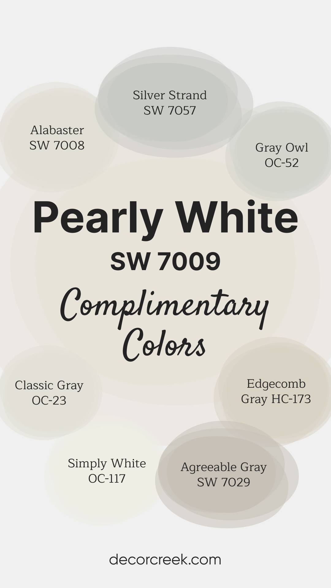
Complimentary Colors for Pearly White SW 7009 Paint Color by Sherwin Williams
Pearly White SW 7009 by Sherwin-Williams is soft glow to any space. Perfect for walls, trim, or cabinetry, this shade brings a subtle warmth that works beautifully in both modern and classic settings.
It pairs effortlessly with a range of neutrals, allowing for a cohesive and balanced color palette.
For a fresh, bright look, pair Pearly White with Alabaster SW 7008 or Simply White OC-117. Agreeable Gray SW 7029 and Edgecomb Gray HC-173 offer gentle contrast and warmth, while Classic Gray OC-23 and Gray Owl OC-52 add a touch of depth.
To introduce a cool, serene element, Silver Strand SW 7057 rounds out the palette with its soft, refreshing hue.
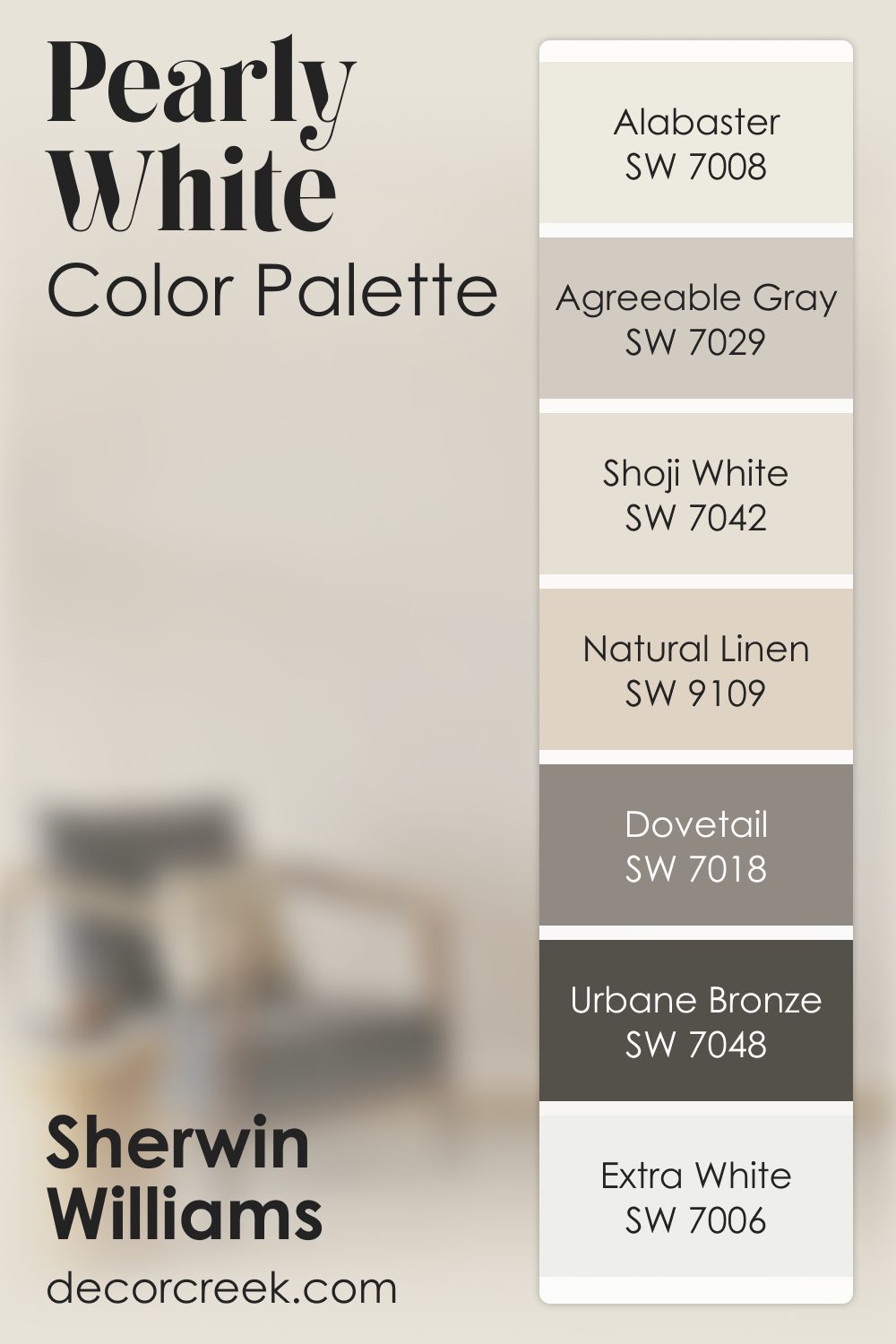
Pearly White SW 7009 by Sherwin Williams Color Palette
Pearly White brings a delicate glow that makes any room feel peaceful and soft. It has a gentle lightness that pairs beautifully with warm neutrals. Alabaster and Shoji White enhance its soft glow, creating a warm and creamy look. Agreeable Gray and Dovetail bring subtle contrast that adds structure without harshness.
Natural Linen adds warmth and texture, giving the palette a cozy touch. Urbane Bronze adds deeper contrast, grounding the design with calm strength.
Extra White keeps the palette clean and balanced. Together, these shades create a soft, glowing, elegant palette that feels calm and inviting.
How to Use Pearly White SW 7009 by Sherwin Williams In Your Home?
Pearly White SW 7009 by Sherwin Williams is a versatile paint color that can brighten up any room in your house.
Think of it as a soft, creamy hue that brings a subtle warmth wherever it’s used.
It’s like the perfect middle ground between white and a very light beige, making it a fantastic choice for those who love neutral tones but want something with a bit of depth.
You can use Pearly White in various ways throughout your home. For instance, it’s a great option for living rooms or bedrooms looking to achieve a cozy, inviting atmosphere without going too dark or too stark.
The color works beautifully as a main wall color but can also serve as an elegant background for showcasing artwork or family photos.
In kitchens, Pearly White can help create a clean and airy feel, especially when paired with natural wood cabinets or metallic accents.
It can also make small spaces appear larger and more open, making it an excellent choice for bathrooms and hallways.
Overall, Pearly White is a flexible color that can complement a wide range of decor styles, from modern to rustic, and everything in between.
Whether you’re painting an entire room, creating an accent wall, or refreshing your trim and doors, Pearly White can breathe new life into your space with its gentle warmth and sophistication.
Pearly White SW 7009 by Sherwin Williams vs Zurich White SW 7626 by Sherwin Williams
Pearly White and Zurich White are two different shades from Sherwin Williams, both offering their unique appeal. Pearly White sits on the spectrum as a soft, warm tone with a hint of creaminess.
It’s the sort of white that brings a cozy, inviting feel to a space, making it ideal for living rooms or bedrooms where you want a touch of warmth.
On the other hand, Zurich White swings towards a cooler palette. It’s a cleaner, more neutral white with a subtle gray undertone. This color is excellent for those seeking a modern, crisp look in their spaces like kitchens or bathrooms.
While Pearly White adds a dash of warmth, making a room feel homier, Zurich White offers a sleek, contemporary vibe, perfect for highlighting clean lines and minimalist decor.
Choosing between them depends on the atmosphere you want to create—cozy and warm with Pearly White, or cool and modern with Zurich White.
You can see recommended paint color below:
Pearly White SW 7009 by Sherwin Williams vs White Heron SW 7627 by Sherwin Williams
Pearly White and White Heron, both from Sherwin Williams, offer unique shades that can transform a space in different ways. Pearly White has a soft, warm undertone that makes it feel cozy and inviting.
It’s like the gentle glow of morning light, making rooms feel welcoming and lived-in. This color works well in spaces where you want to add a touch of warmth without overwhelming the area with too much color.
On the other hand, White Heron presents a cleaner, brighter look. It’s like a fresh canvas, offering a crisp backdrop that makes other colors pop.
This shade leans towards a cooler tone, which brings a sense of freshness and modernity to any room. It’s perfect for spaces that aim for a minimalist aesthetic or where you want to create a sharp contrast with bold furnishings or artwork.
Though both colors are white, Pearly White’s warmth contrasts with White Heron’s crispness, offering different vibes for room atmospheres.
You can see recommended paint color below:
- SW 7627 White Heron
Pearly White SW 7009 by Sherwin Williams vs Sanctuary SW 9583 by Sherwin Williams
Pearly White and Sanctuary by Sherwin Williams are two distinct colors that offer their unique touch to any space. Pearly White is a soft, muted white with a gentle warmth that makes spaces feel inviting and cozy.
It’s perfect for creating a serene and spacious atmosphere, as it reflects light beautifully, making rooms appear larger and more open.
On the other hand, Sanctuary is a soothing, earthy green with a hint of gray, giving it a tranquil and grounding feel. This color can transform a room into a peaceful retreat, where you can relax and feel closer to nature.
It pairs well with natural materials and can add a touch of elegance to any space.
While Pearly White is excellent for those looking to brighten up a room and give it a clean, classic look, Sanctuary offers a more enveloping feel, ideal for creating a cozy, restful corner in your home.
Both colors have their charm and can work well alone or together, depending on the vibe you’re aiming for.
You can see recommended paint color below:
- SW 9583 Sanctuary
Pearly White SW 7009 by Sherwin Williams vs Origami White SW 7636 by Sherwin Williams
Pearly White and Origami White by Sherwin Williams are two shades that at first glance might seem quite similar but have their distinct characteristics when you look closely. Pearly White is a soft, warm white with a cozy vibe.
It gives a room a gentle, welcoming feel, making spaces feel light and airy without being too stark. Imagine it like a soft morning light that fills a room gently.
On the other hand, Origami White leans a bit more towards a neutral direction. It’s still a warm white but has a hint of grey in it that makes it appear slightly cooler than Pearly White.
This color can add a sleek and modern touch to spaces, providing a clean backdrop without the warmth that Pearly White offers.
Choosing between these two depends on what feel you’re aiming for in a room.
If you want something cozier, Pearly White is the way to go. For a more modern, subtle elegance, Origami White might be the better pick. Both colors offer their unique take on white, allowing for beautiful, tailored interior spaces.
You can see recommended paint color below:
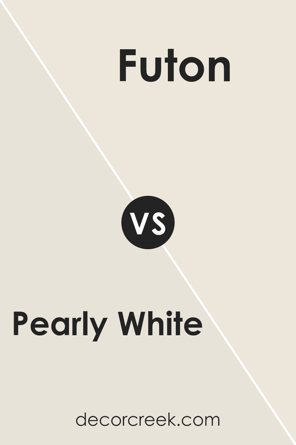
Pearly White SW 7009 by Sherwin Williams vs Futon SW 7101 by Sherwin Williams
Pearly White is a soft, warm shade that offers a hint of coziness to spaces. It’s like a gentle hug from a fluffy cloud, bright but not blinding, making rooms feel inviting and airy.
This color shines best in places where you want serenity and a touch of brightness, easily pairing with different decor styles without stealing the show.
On the other hand, Futon presents a neutral base with a slightly deeper tone, standing as a versatile backdrop for any room.
It walks a fine line between warm and cool, adapting to various lighting conditions with ease.
Futon is that reliable friend who gets along with everyone, making it a smart choice for spaces that need a subtle depth without overwhelming the senses.
When you compare Pearly White and Futon, you see a dance between airy lightness and grounded neutrality.
While Pearly White lifts a room’s energy, bringing in a breathable, open vibe, Futon anchors spaces, offering a calm, steadfast presence.
Together, they can create a harmonious balance, each playing off the other’s strengths, from creating contrast to achieving a sophisticated, layered look.
You can see recommended paint color below:
- SW 7101 Futon
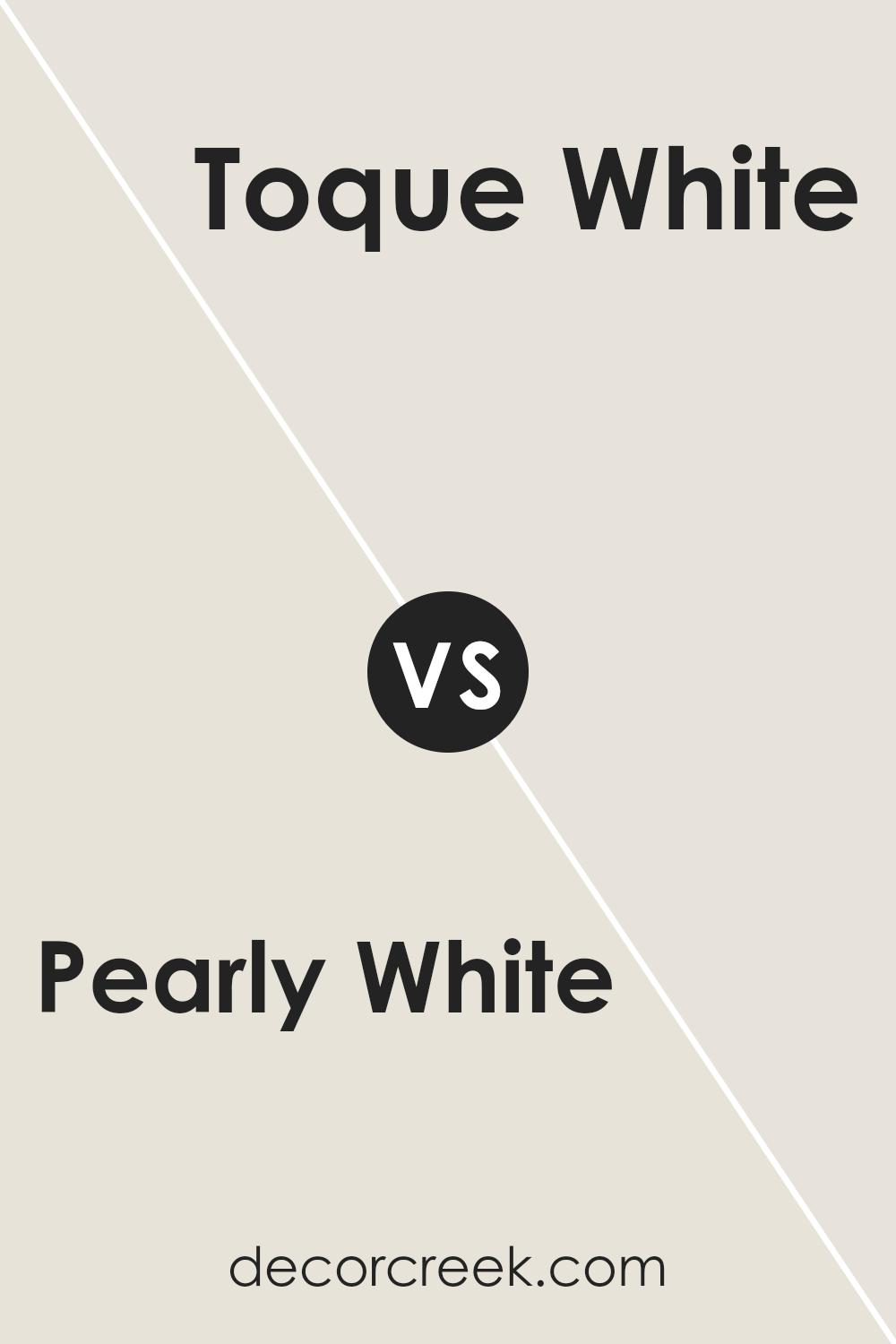
Pearly White SW 7009 by Sherwin Williams vs Toque White SW 7003 by Sherwin Williams
When you look at Pearly White and Toque White by Sherwin Williams, both offer a subtle, clean palette but have distinct vibes. Pearly White, as its name suggests, has a soft, creamy appearance that feels warm and welcoming.
Its slight undertone adds a cozy richness, making it perfect for spaces where you want a hint of warmth without overwhelming brightness.
On the other hand, Toque White leans more towards a neutral, muted shade. It’s like the quiet background that allows other colors in the room to stand out.
While still warm, Toque White is more understated, offering a minimalist elegance that suits modern and traditional settings alike.
Choosing between them depends on the mood you’re aiming for. If you’re after a slightly richer, warmer feeling, Pearly White is the way to go.
For those preferring a clean, subtle backdrop that pairs easily with any decor, Toque White is ideal. Both colors provide a beautiful, clean canvas, but it’s their subtle differences that tailor them to specific tastes and spaces.
You can see recommended paint color below:
- SW 7003 Toque White
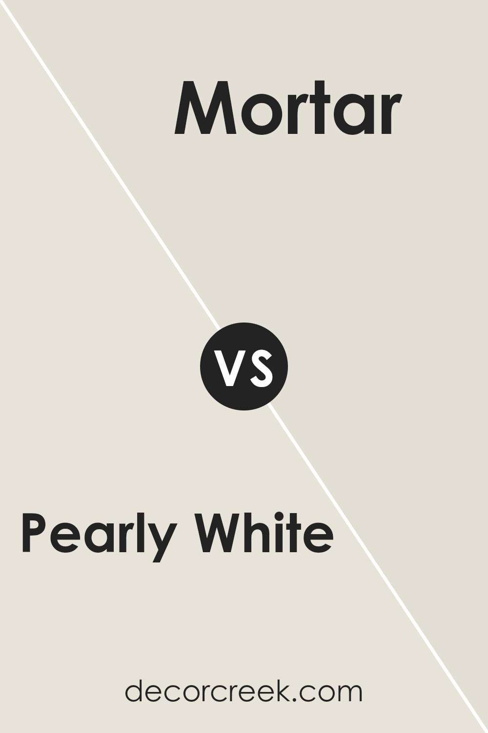
Pearly White SW 7009 by Sherwin Williams vs Mortar SW 9584 by Sherwin Williams
Pearly White and Mortar, both by Sherwin Williams, are quite different when it comes to setting the mood of a room. Pearly White is light and airy, offering a refreshing and clean look that can make spaces feel more open and bright.
It’s a versatile hue that pairs well with almost any decor, adding a subtle sophistication without overwhelming the senses.
On the other hand, Mortar sits on the other end of the spectrum. It’s a much darker shade, giving off a strong, solid vibe that can add depth and character to a space.
Mortar is perfect for those looking to make a bold statement or add a layer of richness to their interiors.
It works exceptionally well in creating an anchor for rooms that might otherwise feel too floaty or insubstantial with lighter colors.
Together, these two colors can create a dynamic contrast, balancing light and dark elements in a room.
While Pearly White brightens, Mortar grounds, offering a unique opportunity to play with light and shadow in your decorating scheme.
You can see recommended paint color below:
- SW 9584 Mortar
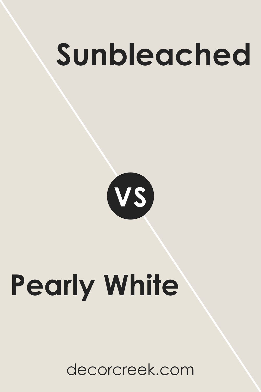
Pearly White SW 7009 by Sherwin Williams vs Sunbleached SW 9585 by Sherwin Williams
Pearly White and Sunbleached by Sherwin Williams are two unique colors with their own special qualities. Pearly White is a soft, creamy white that gives a gentle and soothing feel.
It’s perfect for creating a calm and peaceful space. It reflects light beautifully, making rooms feel bigger and brighter.
On the other hand, Sunbleached is a warm, light tan color that reminds you of sandy beaches and sun-kissed wood.
It adds a cozy, welcoming vibe to any room, making it feel more relaxed and homey. While Pearly White leans towards a classic, clean look, Sunbleached offers a more natural, earthy aesthetic.
Both colors work well in various settings, but Pearly White might be better for a modern, minimalist style, whereas Sunbleached suits a rustic or coastal theme better. Choosing between them depends on the mood you want to set in your space.
You can see recommended paint color below:
- SW 9585 Sunbleached
Pearly White SW 7009 by Sherwin Williams vs Grey Mist SW 9625 by Sherwin Williams
Pearly White and Grey Mist are two shades from Sherwin Williams that offer subtle but distinct vibes for any room.
Pearly White, as its name suggests, has a soft, almost creamy quality that reflects light beautifully, giving spaces a warm and inviting glow. It’s perfect for creating a cozy, yet elegant atmosphere.
Think of Pearly White as a gentle hug for your walls, providing a calm and serene backdrop that’s versatile for any decorating style.
On the other hand, Grey Mist steps in with a cooler, more neutral presence. This color brings a sense of calm and sophistication, offering a whisper of color that’s neither too bold nor too faint.
It’s like a quiet morning mist, subtle and soothing, making it ideal for a more modern, chic look or when you want to add a touch of refinement without overwhelming a space.
While both colors provide a fresh, clean look, Pearly White leans towards warmth and softness, making spaces feel more intimate.
Grey Mist, with its cooler tone, brings a sleek and contemporary edge, perfect for those seeking a minimalist or more modern feel.
You can see recommended paint color below:
- SW 9625 Grey Mist
Pearly White SW 7009 by Sherwin Williams vs Heron Plume SW 6070 by Sherwin Williams
Pearly White and Heron Plume, both by Sherwin Williams, offer unique but subtly distinct vibes for any room.
Pearly White, as its name suggests, has a soft, almost shimmering quality that brings light and a spacious feel to spaces.
It’s the kind of white that adds a touch of elegance without being too stark or cold, making it perfect for creating a calming atmosphere.
On the other hand, Heron Plume steps away from the brightness of Pearly White with its slightly warmer, beige undertones. This color brings a cozy warmth to rooms, promoting a welcoming and comfortable environment.
It’s a bit more grounded than Pearly White, providing a neutral backdrop that’s versatile yet inviting.
While both colors are fantastic for those looking to keep their spaces light and airy, the choice between them comes down to the desired mood.
Pearly White leans towards a fresher, crisper feel, whereas Heron Plume offers a hint of warmth and depth.
The decision between the two ultimately depends on whether you prefer the cool luminosity of Pearly White or the soft, nurturing vibe of Heron Plume.
You can see recommended paint color below:
- SW 6070 Heron Plume
Conclusion
Pearly White by Sherwin Williams stands out as a versatile and timeless color option for those looking to add a touch of elegance and brightness to their space.
Its soft, warm undertones make it an excellent choice for creating a cozy yet sophisticated atmosphere in any room.
Whether applied in living areas, bedrooms, or kitchens, this shade offers a perfect backdrop for various decor styles, from modern to traditional, making it a go-to paint color for homeowners and designers alike.
The beauty of Pearly White lies in its ability to harmonize with a wide range of accent colors and materials, enhancing textures and bringing a sense of calmness and light to interiors.
It’s particularly effective in spaces that aim for a chic, serene vibe without going stark or cold, proving its adaptability and charm.
As a result, Pearly White has gained popularity for its potential to uplift and refine living environments, demonstrating why it continues to be a favored choice within the Sherwin Williams palette.

Ever wished paint sampling was as easy as sticking a sticker? Guess what? Now it is! Discover Samplize's unique Peel & Stick samples.
Get paint samples