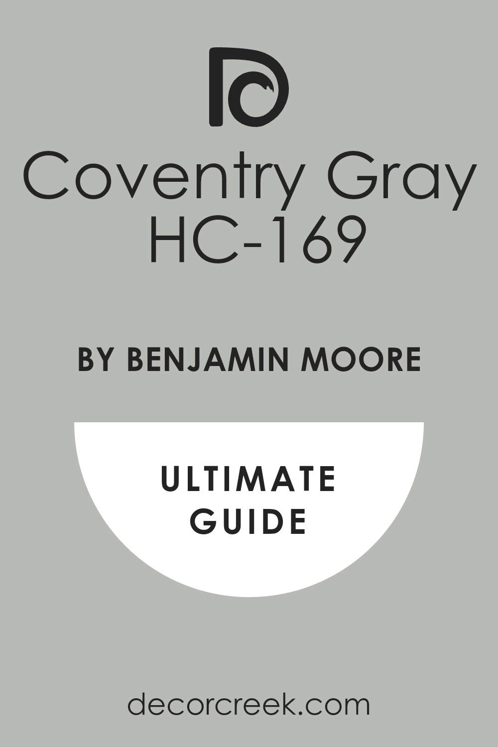
If you’re on the hunt for a versatile and timeless paint color, you might want to consider HC-169 Coventry Gray by Benjamin Moore. I’m here to share why this particular shade could be a great choice for your space. Coventry Gray is part of Benjamin Moore’s Historic Color collection, designed to offer hues that have proven their enduring appeal and can beautifully adapt to different styles and lighting conditions.
This gray isn’t too dark or too light, hitting just the right note of neutral gray that works beautifully in a variety of settings. Whether you’re looking to paint your living room, bedroom, or even your kitchen cabinets, Coventry Gray offers flexibility.
It pairs well with both warm and cool tones, allowing you to mix and match decor effortlessly.
Moreover, its historical significance adds a layer of sophistication and depth that newer colors might lack. This gray can be a calming presence in a room, providing a backdrop that highlights your furniture and art without overwhelming them. So, if you want a color that’s both practical and aesthetically pleasing, Coventry Gray is worth considering. It’s a choice that you’ll likely be happy with for years to come.
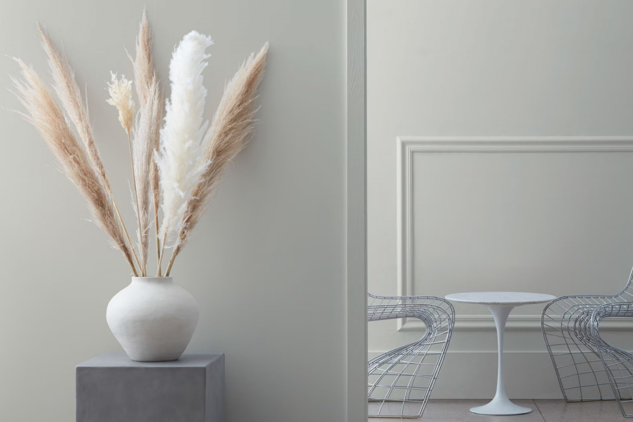
What Color Is Coventry Gray HC-169 by Benjamin Moore?
Coventry Gray by Benjamin Moore is a versatile and elegant gray shade that strikes a perfect balance between warm and cool tones. This neutral color is subtle enough to serve as a background yet has enough depth to stand alone. It’s an ideal choice for those looking to create a modern and understated look in their home.
This color works exceptionally well in a variety of interior styles, particularly in contemporary, minimalist, and transitional spaces. Its neutral character allows it to blend seamlessly with most color schemes, providing a calm and collected atmosphere. Coventry Gray is also an excellent option for Scandinavian-inspired interiors where light, clean lines and simplicity are key.
When it comes to pairing with materials, Coventry Gray goes hand in hand with natural elements. It looks stunning with light to medium wood tones, adding a touch of warmth to spaces furnished with oak, walnut, or pine. For a more industrial vibe, combining this color with metals like brushed nickel or stainless steel can create a crisp, clean look. Additionally, incorporating textures such as linen, cotton, and jute can enhance the coziness of the space, making it more inviting.
Overall, Coventry Gray is an adaptable color that helps achieve a fresh and modern look in any home, pairing well with a wide array of materials and textures to suit various design preferences.
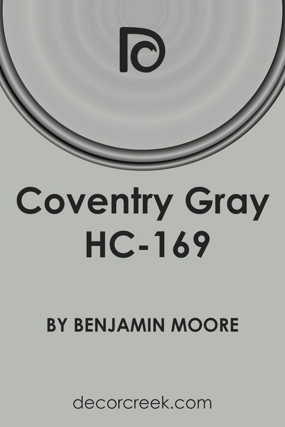
Is Coventry Gray HC-169 by Benjamin Moore Warm or Cool color?
Coventry Gray by Benjamin Moore is a versatile and modern gray paint color that can help freshen up any room in your home. Its balanced shade is neither too dark nor too light, making it a perfect choice for those looking to create a clean and inviting atmosphere. This shade of gray can make small spaces appear larger and more open, while giving larger rooms a cozy, cohesive look.
Coventry Gray works well in various lighting situations, looking subtly different in natural light compared to artificial light, which adds a dynamic charm. It pairs beautifully with white trims, adding a crisp contrast that enhances architectural features.
Additionally, it complements a wide range of colors and decors, making it an excellent choice for living rooms, kitchens, and bedrooms. Overall, Coventry Gray offers a straightforward and effective way to refresh your space with a chic, modern feel.
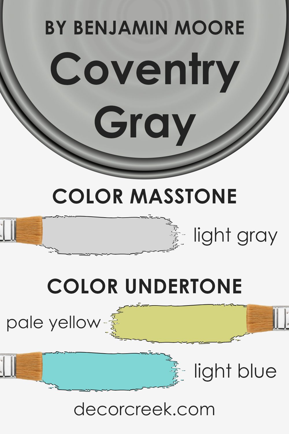
Undertones of Coventry Gray HC-169 by Benjamin Moore
Coventry Gray is a versatile shade with a blend of subtle undertones that influence its appearance in different lighting conditions. When choosing paint colors, it’s crucial to understand how undertones interact with light, as this can dramatically change the color you see on the walls.
The undertones of Coventry Gray include pale yellow, light blue, light purple, mint, pale pink, lilac, and gray. Each undertone adds a distinct flavor to the main gray color. For example, pale yellow and mint bring a slight warmth and freshness, making the space feel more welcoming. Light blue and lilac, on the other hand, inject a hint of coolness, which can help to create a more calming atmosphere.
Pale pink and light purple add a soft, almost imperceptible touch of sweetness and sophistication, while the gray undertone helps to anchor the color, ensuring it remains neutral and flexible for various decor styles.
On interior walls, these undertones play with the light, subtly shifting the color’s appearance throughout the day. In natural sunlight, you might notice the cooler tones like the blues and lilacs more prominently, giving the room a crisp and airy feel. In artificial lighting, the warmer tones such as yellow and pink might stand out, creating a cozy and inviting atmosphere.
Choosing a neutral color like Coventry Gray allows for flexibility in decorating and can help in pairing with different fabrics and furniture styles without clashing. It’s a practical choice that adapts to various settings and styles, reflecting different moods depending on its surrounding elements and lighting conditions.
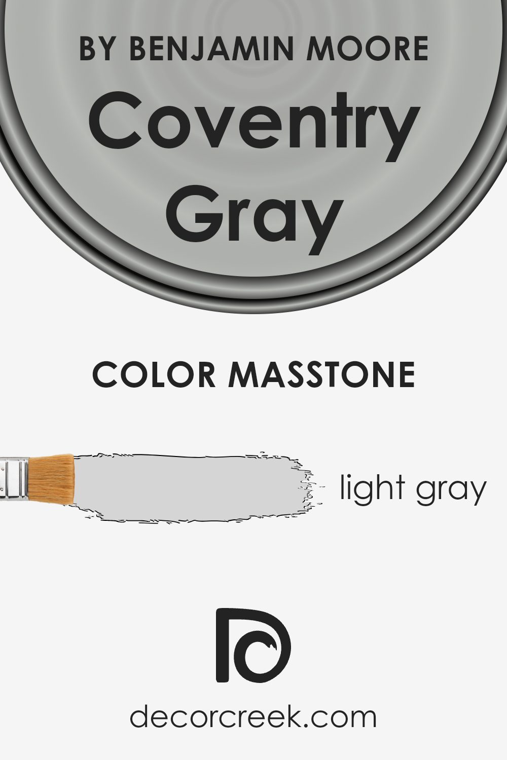
What is the Masstone of the Coventry Gray HC-169 by Benjamin Moore?
Coventry Gray HC-169 is a gentle shade of light gray that creates a clean and adaptable foundation for any room. This color’s masstone, which registers with the hex code #D5D5D5, is light enough to make spaces feel more open and airy. When used on walls, it provides a subtle backdrop that can complement a wide range of decor styles and colors. The neutrality of Coventry Gray means that it doesn’t command attention but rather works quietly to support the overall aesthetic of a space.
Because it doesn’t shift much under different lighting conditions, this color is particularly useful in rooms that have varying light throughout the day. It remains consistent, offering a steady and pleasant visual experience. In homes, its versatility allows it to be a popular choice for common areas like living rooms and kitchens as well as private spaces such as bedrooms.
This light gray can help achieve a clean, tidy look that feels inviting and comfortable.
How Does Lighting Affect Coventry Gray HC-169 by Benjamin Moore?
Lighting plays a crucial role in influencing how colors appear in a space, affecting everything from mood to the perception of size and cleanliness. Different light sources can change the way a paint color like Coventry Gray looks on your walls.
- Natural Light: In natural lighting, colors can show their truest form. Coventry Gray, under the natural light of the sun, depending on the time of day, can appear as a true gray or slightly shift towards blue tones.
- Artificial Light: In artificial lighting, the type of bulb matters. Fluorescent lighting can give Coventry Gray a cooler tone, making it lean more towards a steely gray. In contrast, incandescent lighting can warm up the color, softening it to a more muted gray with potential beige undertones.
Room Orientation and Coventry Gray:
– North-Facing Rooms: These rooms get less sunlight, which can make spaces feel cooler. Coventry Gray in a north-facing room might look a bit more shadowy and cool, emphasizing its blue undertones.
– South-Facing Rooms: These rooms are flooded with warm sunlight all day, which can warm up the color. Coventry Gray will appear lighter and softer in south-facing rooms, showing more of its gray base.
– East-Facing Rooms: East-facing rooms enjoy bright light in the morning, which can make Coventry Gray look very lively and vibrant in the morning, but it might appear cooler and darker in the afternoon and evening as the natural light fades.
– West-Facing Rooms: With evening sunlight, west-facing rooms can make Coventry Gray appear warmer and more welcoming in the afternoon when it’s bathed in a golden hue.
It’s always a wise move to test paint colors in different corners of the room at different times of day to see how light changes their appearance. This ensures you pick a shade that suits the room’s light, adapting beautifully from sunrise to sunset.
What is the LRV of Coventry Gray HC-169 by Benjamin Moore?
LRV, or Light Reflectance Value, is a measure of how much light a paint color reflects back into a room, as opposed to absorbing it. Measured on a scale, where lower values mean the color absorbs more light and appears darker, and higher values mean the color reflects more light and appears lighter. This measurement is particularly useful when choosing paint colors for your home as it helps predict how light or dark a color will look on your walls depending on the available lighting.
The LRV of Coventry Gray, which is 48.18, positions it in the middle range of the scale. This means it neither reflects light strongly nor absorbs it deeply.
In practical terms, this makes Coventry Gray a versatile choice for rooms, working well in a variety of lighting conditions. In a well-lit room, this color will look vibrant and lively, whereas in a room with less natural light, it will appear a bit more subdued without making the room feel too dark.
This neutrality in light reflectance makes it a reliable choice for diverse spaces in your home.
Coordinating Colors of Coventry Gray HC-169 by Benjamin Moore
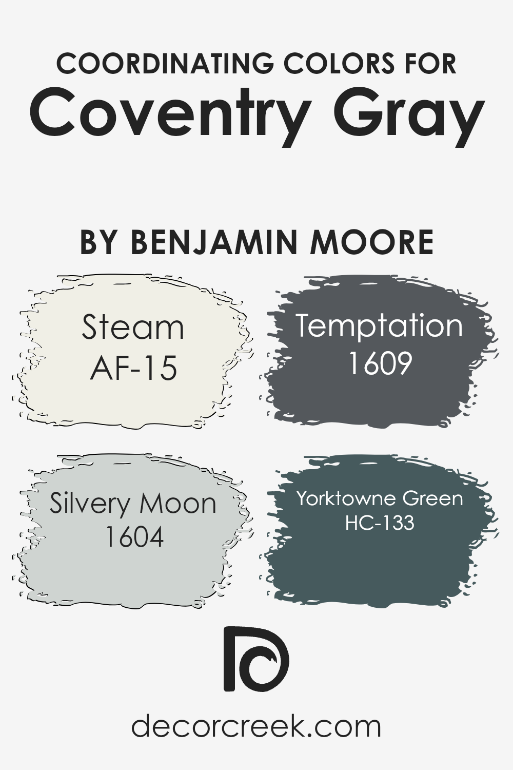
Coordinating colors work by complementing a base color, enhancing the overall aesthetic appeal of a space without overwhelming it. Coventry Gray by Benjamin Moore serves as a versatile base thanks to its balanced gray hue, making it an excellent canvas for a range of coordinating colors. These coordinating colors harmonize with Coventry Gray, providing a cohesive look that ties different design elements together.
AF-15, known as Steam, is a clean, almost pure white, providing a crisp contrast that highlights darker colors like Coventry Gray, making spaces feel more open and airy. Silvery Moon, with its number 1604, offers a subtle hint of blue, giving rooms a gentle, luminous glow that works beautifully in well-lit areas.
The third color, Temptation (1604), adds depth with its slightly more intense gray tone that can be used to create a more dramatic look or to add sophistication to a design scheme. Lastly, HC-133, or Yorktowne Green, adds a splash of earthy green that grounds the color palette and brings a natural, refreshing touch to environments that pair well with Coventry Gray’s neutrality.
This combination of white, light blue, deeper gray, and green creates a delightful balance, ensuring that spaces are both inviting and visually interesting.
You can see recommended paint colors below:
- AF-15 Steam (CHECK A SAMPLE)
- 1604 Silvery Moon (CHECK A SAMPLE)
- 1609 Temptation (CHECK A SAMPLE)
- HC-133 Yorktowne Green (CHECK A SAMPLE)
What are the Trim colors of Coventry Gray HC-169 by Benjamin Moore?
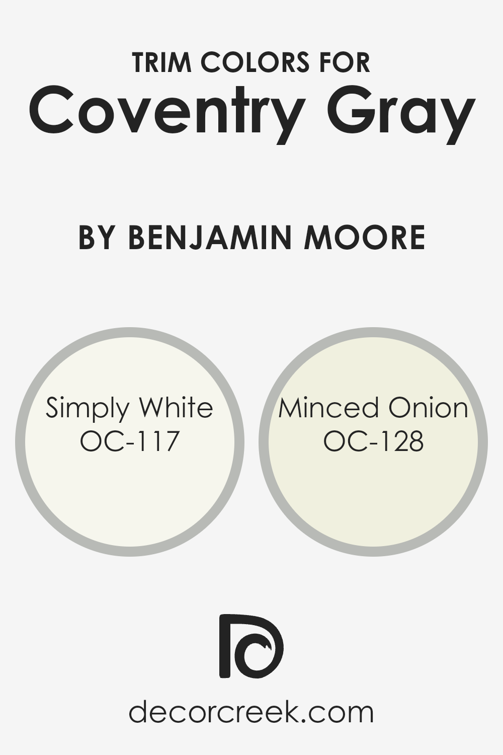
Trim colors play a critical role in enhancing the overall aesthetic of a room, particularly when paired with a main wall color like Coventry Gray by Benjamin Moore. Choosing the right trim color can highlight the elegant simplicity of Coventry Gray, drawing attention to architectural details and creating a cohesive look. Simply White OC-117 and Minced Onion OC-128 are two trim colors that complement Coventry Gray beautifully.
Simply White OC-117 is a clean and crisp white that brings a fresh and bright contrast to the cooler tones of Coventry Gray, making the space feel more open and airy. On the other hand, Minced Onion OC-128 offers a subtle, creamy backdrop that softly blends with Coventry Gray, lending a gentle warmth to rooms without overpowering the primary color.
Both choices help in achieving a harmonious balance that enhances the visual appeal and feel of spaces painted in Coventry Gray.
You can see recommended paint colors below:
- OC-117 Simply White
- OC-128 Minced Onion
Colors Similar to Coventry Gray HC-169 by Benjamin Moore
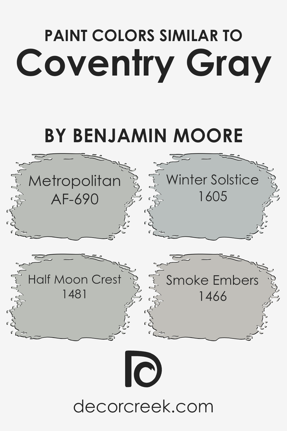
Selecting similar colors is key in design because it allows for a harmonious and pleasing aesthetic. When colors like Coventry Gray HC-169 from Benjamin Moore are used in a space, choosing shades that blend well creates a cohesive look. Metropolitan AF-690, a gentle gray, sets a calm and understated tone that complements the stronger hues of Coventry Gray.
Half Moon Crest 1481, slightly lighter, brings a soft, more reflective quality to spaces, enhancing areas that might not get as much natural sunlight.
Winter Solstice 1605 provides a deeper, almost ethereal feel to an environment, which works well in creating a sophisticated backdrop without overpowering the room’s decor. Smoke Embers 1466 offers a mid-tone gray that is versatile, working well with both warmer and cooler palettes, making it a great option for tying various design elements together.
Using shades like these ensures a smooth visual transition in spaces, particularly where you want to maintain a consistent theme without abrupt color changes.
You can see recommended paint colors below:
- AF-690 Metropolitan (CHECK A SAMPLE)
- 1481 Half Moon Crest (CHECK A SAMPLE)
- 1605 Winter Solstice (CHECK A SAMPLE)
- 1466 Smoke Embers (CHECK A SAMPLE)
Colors that Go With Coventry Gray HC-169 by Benjamin Moore
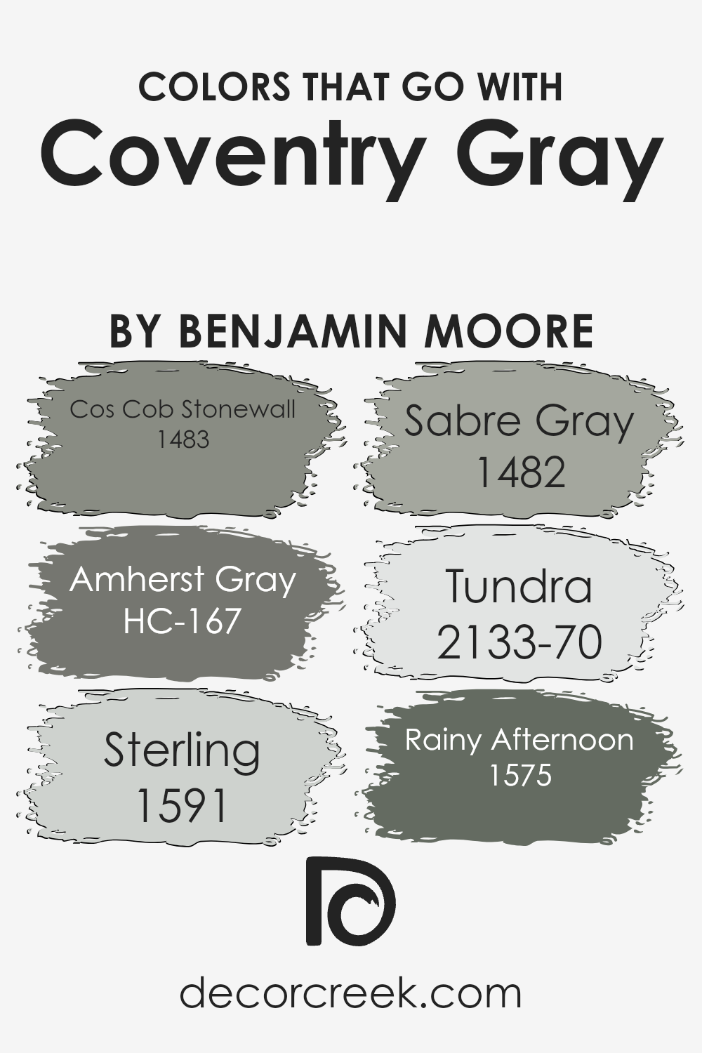
Choosing colors that harmonize with Coventry Gray HC-169 by Benjamin Moore is crucial because it helps create a cohesive and pleasant aesthetic in any space. When colors complement each other well, they create a visual flow that can make rooms appear more inviting and comfortable.
For example, pairing Coventry Gray with colors like Cos Cob Stonewall, a deep, earthy hue, and Amherst Gray, a darker shade that adds depth, provides a balanced backdrop that makes spaces feel more put-together and cozy. These pairings are essential in achieving a design that feels intentionally styled and complete.
When considering other colors like Sterling, a light and airy gray, it can help bring a sense of softness to the space when used alongside Coventry Gray. Similarly, Sabre Gray offers a mid-tone option that bridges the gap between darker and lighter shades, adding variety without overpowering. Tundra, with its slightly bluish cast, introduces a subtle hint of color which can enliven a predominantly gray scheme.
Lastly, Rainy Afternoon, a deeper shade, works well to create a grounded, calming atmosphere. Using these colors together ensures that the aesthetic remains cohesive, yet differentiated enough to keep the visual interest alive in your home environment.
You can see recommended paint colors below:
- 1483 Cos Cob Stonewall (CHECK A SAMPLE)
- HC-167 Amherst Gray (CHECK A SAMPLE)
- 1591 Sterling (CHECK A SAMPLE)
- 1482 Sabre Gray (CHECK A SAMPLE)
- 2133-70 Tundra (CHECK A SAMPLE)
- 1575 Rainy Afternoon (CHECK A SAMPLE)
How to Use Coventry Gray HC-169 by Benjamin Moore In Your Home?
Coventry Gray by Benjamin Moore is a versatile gray paint that can bring a fresh look to any room in your home. It’s a balanced shade, not too dark or too light, making it perfect for both small and large spaces. You can use it in your living room to create a cozy, welcoming atmosphere that’s still modern and stylish. In the bedroom, Coventry Gray works well as a soothing backdrop for relaxation and sleep.
If you’re thinking about refreshing your kitchen or bathroom, this color pairs beautifully with white cabinets or tiles, providing a clean and airy feel. For those who like a bit of contrast, it also looks great with darker elements like navy blue accessories or furniture. Plus, it’s subtle enough to be a base for a gallery wall, allowing your favorite art pieces to really stand out.
Overall, Coventry Gray is a smart choice for anyone looking to update their home with a fresh, new look that remains timeless.
Coventry Gray HC-169 by Benjamin Moore vs Winter Solstice 1605 by Benjamin Moore
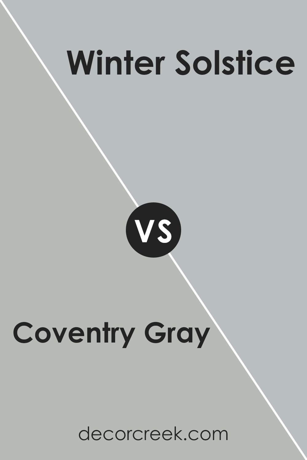
Coventry Gray and Winter Solstice, both by Benjamin Moore, offer unique shades for various spaces. Coventry Gray is a balanced gray that carries a slight blue undertone. This makes it vibrant yet still very adaptable, fitting well in many areas like kitchens or home offices. It works great for a modern look and pairs nicely with whites or even bold colors.
On the other hand, Winter Solstice is a darker, softer gray that leans more towards a charcoal color. This color is perfect for creating a cozy and inviting atmosphere in spaces like living rooms or bedrooms. It’s particularly effective in areas with good natural lighting, as the deeper tone offers a warm backdrop.
Both colors are versatile and can be used in multiple home styles, from contemporary to traditional. Your choice between them might just depend on the mood you want to set and the natural lighting in your rooms.
You can see recommended paint color below:
- 1605 Winter Solstice (CHECK A SAMPLE)
Coventry Gray HC-169 by Benjamin Moore vs Half Moon Crest 1481 by Benjamin Moore
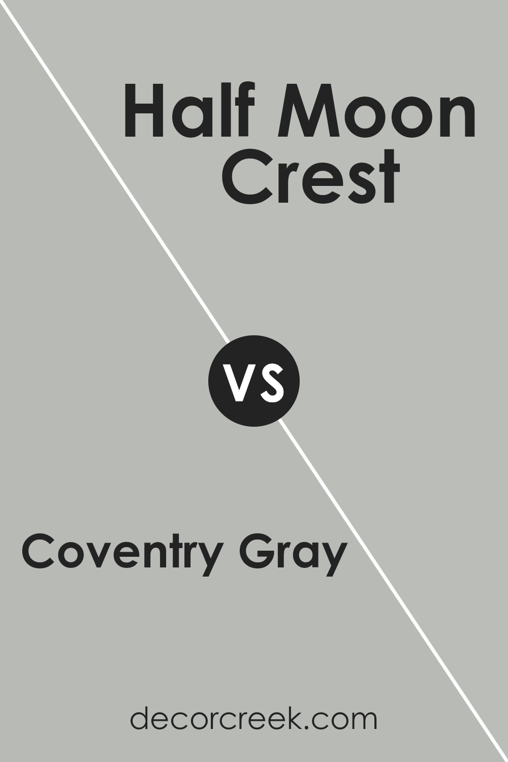
Coventry Gray and Half Moon Crest are two colors by Benjamin Moore that offer subtle differences for interior spaces. Coventry Gray is a true gray that gives a balanced, neutral backdrop to any room. It’s neither too dark nor too light, making it a versatile choice that can work well in various lighting conditions.
On the other hand, Half Moon Crest has a slightly lighter and warmer tone. It can create a softer look, making spaces feel more open and airy. This color works especially well in smaller rooms or areas with limited natural light.
Although both colors are from the gray family, Half Moon Crest leans towards a greige (gray-beige) that can add a hint of warmth, whereas Coventry Gray maintains a cooler, more classic gray appearance.
Together, these colors can be used to complement each other well in different rooms or as accent and base colors in the same space.
You can see recommended paint color below:
- 1481 Half Moon Crest (CHECK A SAMPLE)
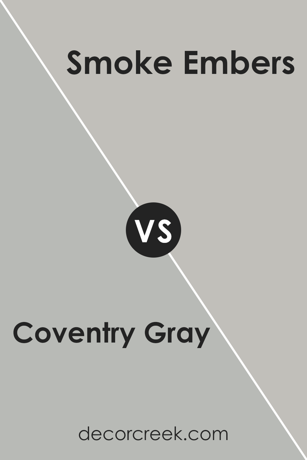
Coventry Gray HC-169 by Benjamin Moore vs Smoke Embers 1466 by Benjamin Moore
Coventry Gray by Benjamin Moore is a balanced, medium-depth gray that pairs well with both bright and muted color schemes. It offers a classic and versatile look, making it suitable for various spaces, from kitchens to bedrooms. On the other hand, Smoke Embers is a lighter, softer gray that leans slightly towards taupe.
This color tends to provide a more subtle and calm feel, making it ideal for creating a cozy, relaxed environment in areas like living rooms or home offices. While both colors share a gray base, Coventry Gray is distinctly deeper and cooler, meaning it can make more of a statement in a space.
In contrast, Smoke Embers offers a gentler approach and blends more seamlessly with a range of decor styles. Both colors can effectively set the mood in a room but cater to different aesthetic preferences and functionalities.
You can see recommended paint color below:
- 1466 Smoke Embers (CHECK A SAMPLE)
Coventry Gray HC-169 by Benjamin Moore vs Metropolitan AF-690 by Benjamin Moore
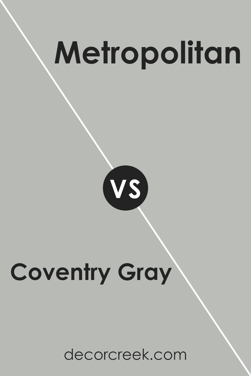
Coventry Gray and Metropolitan are two popular hues by Benjamin Moore, each offering a unique vibe for wall colors or accent features in homes. Coventry Gray is a classic, mid-toned gray with a balanced, cool undertone. This gives it the flexibility to fit well in various room settings, adding a touch of calmness without feeling too cold. It’s perfect for rooms that seek a subtle yet distinct gray backdrop.
On the other hand, Metropolitan is a softer, more understated color that leans towards a neutral gray with warm undertones. This makes it incredibly versatile and ideal for creating a cozy, inviting atmosphere in any space. It’s especially good in areas where you want a gentle touch of color that doesn’t overwhelm the senses.
Both colors offer a modern feel and can work beautifully in contemporary settings. Whether you choose Coventry Gray for a touch more character or Metropolitan for a soothing ambience, both paint colors provide excellent coverage and depth to enhance your home’s aesthetics.
You can see recommended paint color below:
- AF-690 Metropolitan (CHECK A SAMPLE)
Conclusion
In wrapping up, HC-169 Coventry Gray by Benjamin Moore is a paint color that stands out because of its unique gray shade. This color can be described as soothing and versatile, making it a great choice for any room in the house, whether it’s the living room, bedroom, or even the kitchen. What’s really nice about Coventry Gray is how it manages to balance a cool tone with just enough warmth to make a space feel inviting, not cold.
This shade pairs beautifully with many other colors, from bright whites to deep blues, giving you a lot of flexibility when decorating. It’s particularly good for creating a calm and serene environment, which can be very comforting after a busy day. Plus, it looks professional and clean, making it a good option for offices too.
By choosing Coventry Gray, I’ve noticed that it can make spaces look more modern and chic without trying too hard. So, if you’re looking to give a fresh touch to your space without going too bold, this might be the perfect shade for you!
Overall, Coventry Gray by Benjamin Moore is a reliable and attractive choice for anyone wanting to give their home a new look.
Ever wished paint sampling was as easy as sticking a sticker? Guess what? Now it is! Discover Samplize's unique Peel & Stick samples.
Get paint samples


