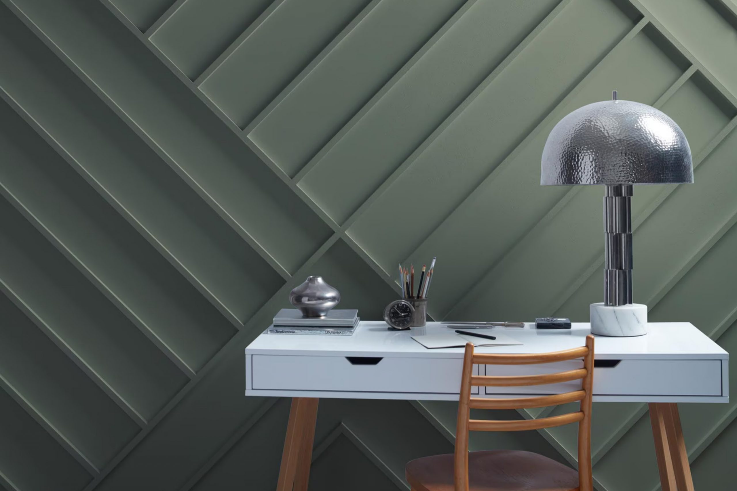
When you think of a cozy afternoon, with gentle rain tapping on your window, this color brings that exact mood into any room. Benjamin Moore’s 1575 Rainy Afternoon is the perfect choice if you’re after a fresh yet tranquil vibe for your home.
This shade is a soft, subtle green that mimics the peaceful feeling of a lush garden bathed in a light drizzle. Ideal for anyone looking to add a touch of calmness to their living area, bedroom, or even a home office, this paint color pairs well with a variety of decor styles and colors, offering versatility and elegance.
Whether you’re updating a single room or planning a larger renovation, Rainy Afternoon provides a timeless backdrop. It’s exactly what you need if you’re aiming for a space that feels both refreshing and relaxing at the same time. So, if you’re ready to give your home a gentle, soothing atmosphere, 1575 Rainy Afternoon by Benjamin Moore could be your perfect match.
What Color Is Rainy Afternoon 1575 by Benjamin Moore?
Rainy Afternoon by Benjamin Moore is a unique paint color that beautifully captures the serene and calming essence of a drizzly day. With its cool undertones, this shade sits perfectly between grey and green, offering a hint of nature’s tranquility indoors. It’s a versatile color that can add depth and sophistication to any space without overwhelming it.
This color works wonders in various interior styles. It’s a natural fit for modern and minimalist designs, where its understated elegance can create a chic and tranquil atmosphere. It also complements Scandinavian decor, enhancing the clean lines and natural light with its soft, muted tones. For those who love a touch of vintage charm, Rainy Afternoon pairs well with rustic elements, adding a cozy, lived-in feel to the room.
When it comes to materials and textures, this color pairs beautifully with natural wood, from light oak to darker walnut, accentuating the warmth of the wood. Metals like brass and copper can add a touch of glamour against its subtle backdrop, while soft textiles in white or light neutral tones create a comfortable and inviting space.
The versatility of Rainy Afternoon also allows it to work well with stone textures, like marble or slate, bringing an element of nature indoors and completing the soothing, peaceful vibe of your space.
Is Rainy Afternoon 1575 by Benjamin Moore Warm or Cool color?
Rainy Afternoon 1575 by Benjamin Moore is a unique paint color that brings a touch of sophistication and calmness into any home setting. This color mirrors the serene and tranquil feeling of a rainy afternoon, adding depth and character to walls without overwhelming the space. It’s a versatile shade that works well in various rooms, whether you’re looking to create a cozy living room, a peaceful bedroom, or even a refreshing bathroom atmosphere.
One of the key benefits of Rainy Afternoon 1575 is its ability to blend seamlessly with different decors and styles. Whether your home features modern, minimalist furniture or more traditional pieces, this color complements them beautifully, creating a cohesive look that feels both inviting and elegant. Additionally, it pairs wonderfully with natural light, softly reflecting it to brighten up the room while maintaining its soothing vibe.
Overall, Rainy Afternoon 1575 offers a perfect balance between creating a statement and providing a backdrop that allows other elements in the room to shine. It introduces a sense of calm and relaxation, making any home feel more welcoming and lived-in.
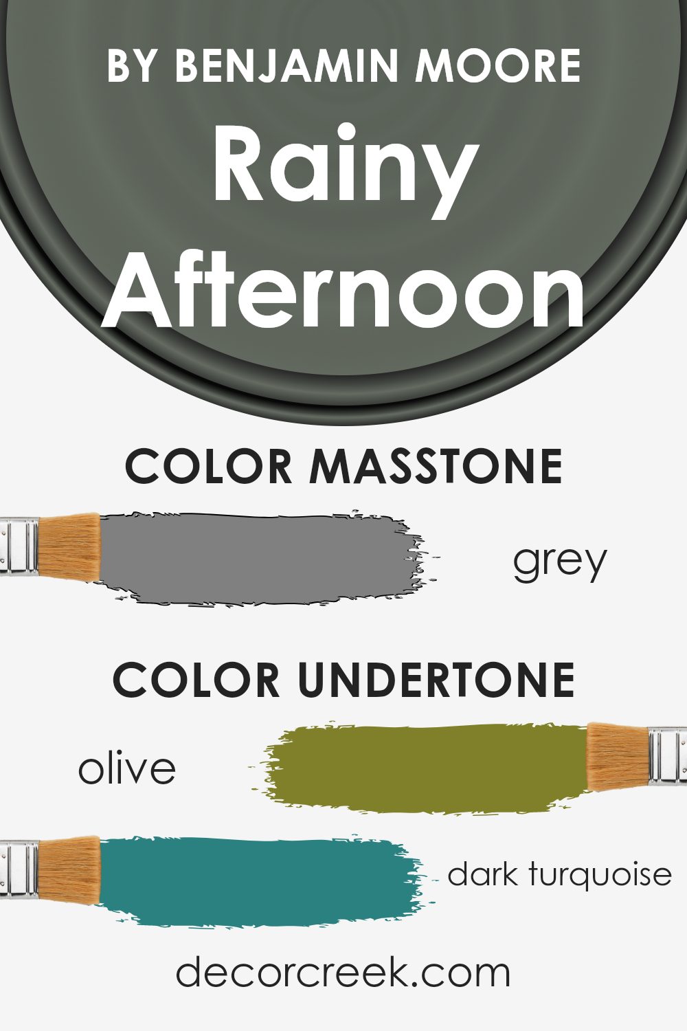
Undertones of Rainy Afternoon 1575 by Benjamin Moore
Rainy Afternoon by Benjamin Moore is a fascinating color that carries a wide range of undertones, creating a complex and versatile hue perfect for interior walls. The undertones of a color are like hidden colors within the main color. They can subtly affect how the main color looks, depending on the light and surrounding colors. For Rainy Afternoon, these undertones, from olive to lilac, and from light turquoise to fuchsia, play a crucial role in how this paint color feels in a room.
When you use Rainy Afternoon on your walls, the room’s lighting and the colors of your furniture and decorations can bring out different shades from the paint. For example, in a room with a lot of natural light, you might notice the lighter undertones, like pale pink or light green, making the room feel soft and inviting. In contrast, in a room with less natural light, darker undertones, such as dark green or navy, could become more dominant, giving the space a cozier and more intimate vibe.
Understanding the undertones in Rainy Afternoon can help you decide on the best room to use it in and what decorations to pair it with. The versatility of this color, thanks to its rich blend of undertones, makes it a fantastic choice for any room, allowing you to create a variety of atmospheres.
Whether you’re going for a calm and tranquil space or a lively and dynamic area, paying attention to these undertones and how they interact with your room’s elements can achieve the desired effect.
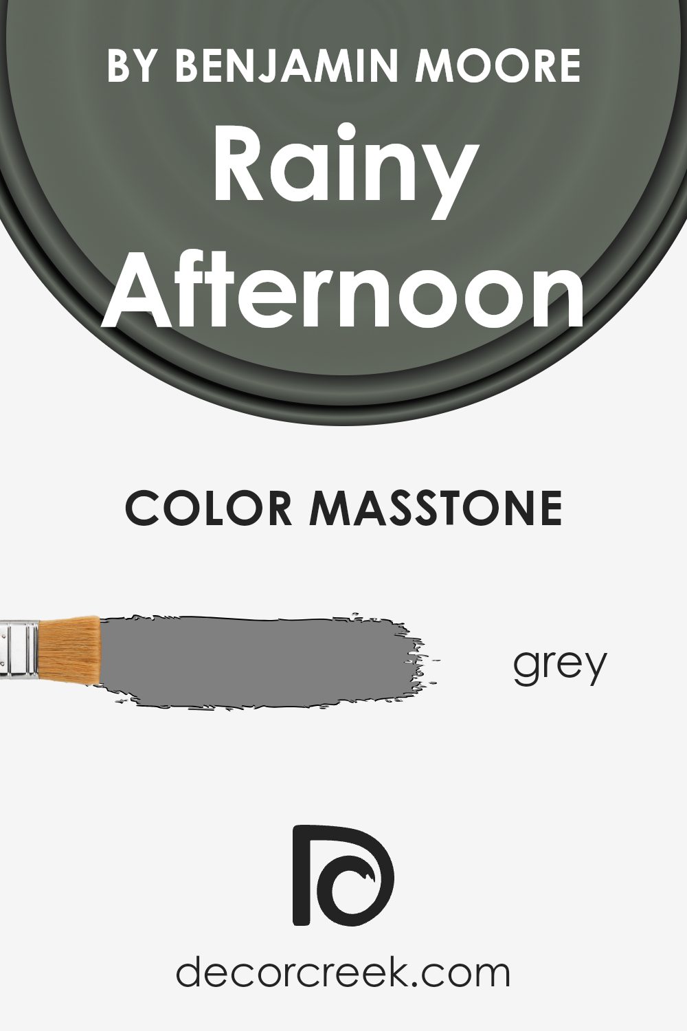
What is the Masstone of the Rainy Afternoon 1575 by Benjamin Moore?
Rainy Afternoon 1575 by Benjamin Moore is a beautiful grey color with the masstone of classic grey (#808080). This specific shade of grey is fantastic for homes because it serves as a versatile backdrop for any room. Grey is a color that can easily blend with other colors, making it a solid choice for walls since it won’t clash with your furniture or decor.
What’s more, Rainy Afternoon 1575 has a calming effect, reminiscent of a gentle, peaceful rainy day. This quality makes it perfect for creating a cozy and inviting atmosphere in living spaces. It’s particularly suited for bedrooms and living rooms where a softer, more tranquil environment is often desired.
Since grey is neutral, it can also help highlight other elements in the room, such as artwork, furniture, or colorful accents, making them stand out more. This shade of grey from Benjamin Moore can indeed make your home feel more comfortable, stylish, and timeless.
How Does Lighting Affect Rainy Afternoon 1575 by Benjamin Moore?
Lighting plays a crucial role in how we see colors. Imagine painting a room with the shade “Rainy Afternoon” by Benjamin Moore. This color can appear differently depending on the light source – under natural daylight, it might look one way, but under the glow of a lamp, it may seem quite another.
Under artificial light, such as LED or incandescent bulbs, “Rainy Afternoon” can take on a warmer or more inviting tone. This is because artificial lights often add a yellowish tint to colors, making them appear cozier. So in the evening, your room could look more snug and welcoming due to this effect.
In contrast, under natural light, “Rainy Afternoon” can show its true color more accurately. But, the direction of the room also affects how this color appears throughout the day. North-facing rooms might not get a lot of direct sunlight, making “Rainy Afternoon” appear slightly cooler or more muted, giving the room a calm and serene vibe.
South-facing rooms bathe in plenty of sunlight, meaning “Rainy Afternoon” could look brighter and more vibrant here. The natural light can bring out the depth of the color, making the space feel lively and energetic.
East-facing rooms enjoy the morning sun, so “Rainy Afternoon” might look exceptionally warm and cheerful in the morning, fading to a softer tone by the afternoon as the direct sunlight moves away. This change can make the room feel dynamic and bright in the morning, while still maintaining a sense of calm as the day progresses.
West-facing rooms get the afternoon and evening sun, which can make “Rainy Afternoon” glow warmly during these times. The color might appear richer and more intense, creating a cozy atmosphere perfect for unwinding in the evening.
In conclusion, the appearance of the color “Rainy Afternoon” is greatly influenced by the lighting, changing in character from warm and inviting under artificial light to vibrant or muted under natural light, depending on the room’s orientation.

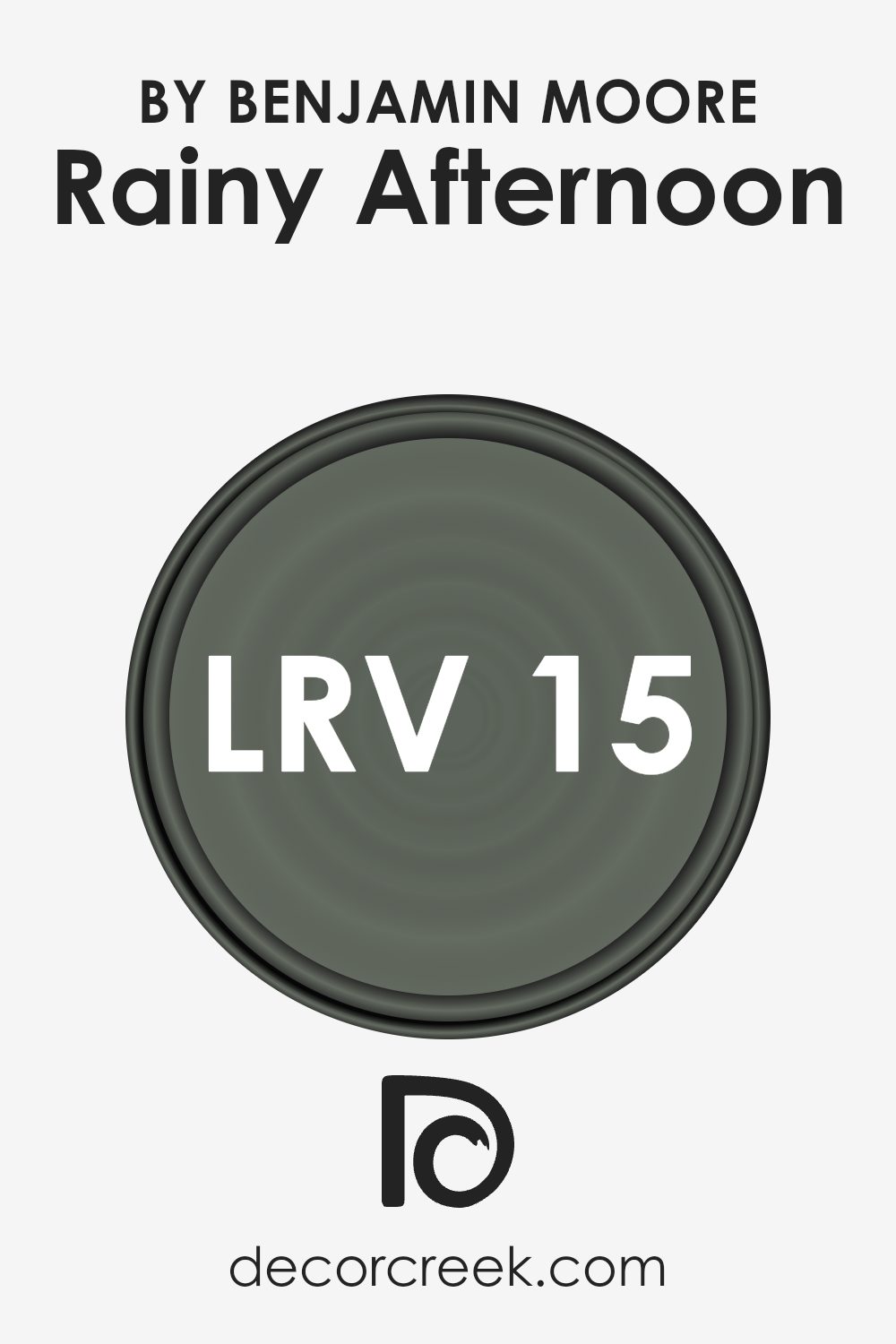
What is the LRV of Rainy Afternoon 1575 by Benjamin Moore?
LRV stands for Light Reflectance Value, which is a measure used to describe the amount of light a paint color reflects or absorbs once applied to a wall. This value is given on a scale where a lower number means the color reflects less light and appears darker, and a higher number means the color reflects more light, appearing lighter.
The LRV helps in deciding how a paint color will look in various lighting conditions and how it can influence the feel of a space. It is particularly important when choosing paint for spaces with specific lighting needs or when aiming to create a certain ambiance in a room.
For the color in question, with an LRV of 15.2, it is on the darker side, meaning it will absorb more light than it reflects. This characteristic can make rooms painted with this shade feel cozy and more intimate, yet it might also make them appear smaller or dimmer, especially if natural lighting is limited. In spaces with ample lighting, however, this deep, rich color can add depth and sophistication.
Choosing this color for your walls would be ideal for creating a snug and enveloping atmosphere, but it’s also wise to balance it with good lighting or lighter accents to prevent the space from feeling too closed in.
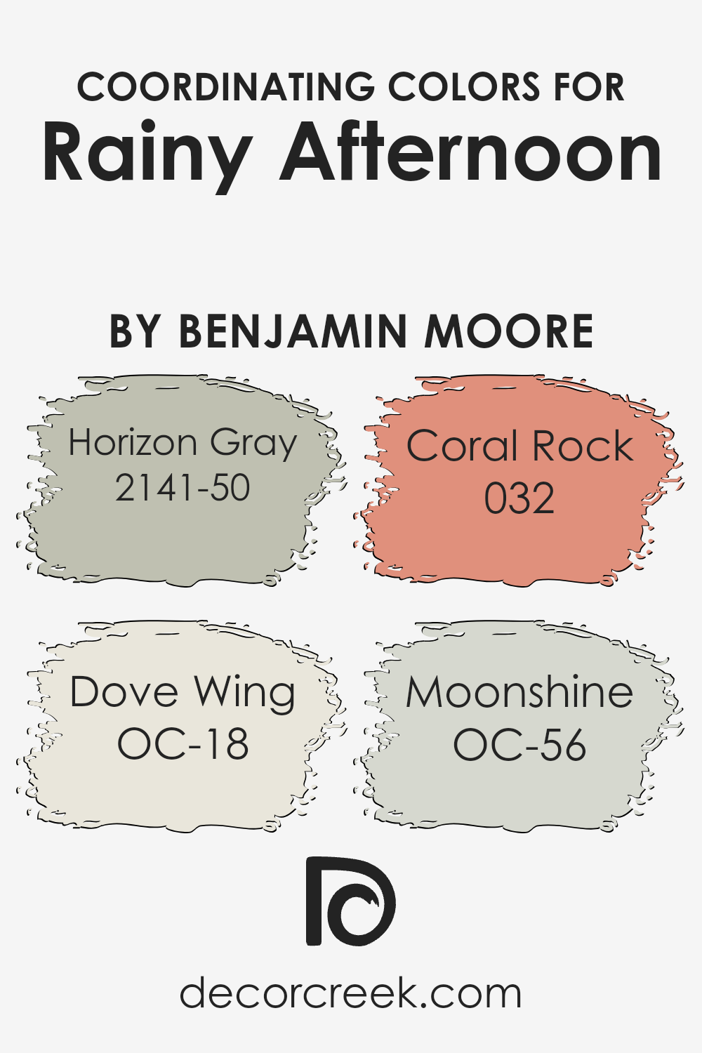
Coordinating Colors of Rainy Afternoon 1575 by Benjamin Moore
Coordinating colors are hues that complement each other beautifully when used together in interior design. They have a harmonious relationship that balances the overall appearance of a space, enhancing its aesthetic appeal without overwhelming the senses.
These colors are selected based on their ability to support and enhance the primary color choice, in this case, Rainy Afternoon by Benjamin Moore, without competing for attention. The beauty of coordinating colors lies in their versatility; they can either stand out individually or blend seamlessly, depending on how they are applied within the decor.
One of the coordinating colors, Horizon Gray 2141-50, is a soft, soothing gray that brings a sense of calm and elegance to any room. It’s versatile enough to serve as a gentle contrast to the deeper tones of Rainy Afternoon, offering a serene backdrop that invites relaxation. Dove Wing OC-18, another coordinating hue, is a light, nearly off-white color with a hint of warmth, making it perfect for creating a subtle, airy feel in a space, thus providing a soft lift to the atmosphere.
Coral Rock 032 introduces a playful, yet sophisticated splash of color, with its soft, peachy-pink hue that adds a delicate vibrancy without overpowering the space. Lastly, Moonshine OC-56 is a light gray with a tinge of blue, offering a fresh and modern feel, acting as a cool counterpart to the other colors, ensuring the space feels open and bright. Together, these colors form a cohesive palette that complements Rainy Afternoon, providing a range of options for creating a harmonious and inviting interior.
You can see recommended paint colors below:
- 2141-50 Horizon Gray
- OC-18 Dove Wing
- 032 Coral Rock
- OC-56 Moonshine
What are the Trim colors of Rainy Afternoon 1575 by Benjamin Moore?
Trim colors are chosen to contrast or complement the main color of a wall, enhancing the overall appearance of a room. For “Rainy Afternoon” by Benjamin Moore, a sophisticated gray shade, selecting the right trim color is essential to bring out its unique tones.
Trim colors highlight architectural features, frame the color of the walls, and create a cohesive look throughout the space. They act as a visual guide, drawing the eye to the design details that make a room special. Using the right trim color can also affect how the size and brightness of a room are perceived, making it an important choice in decorating.
OC-17 “White Dove” is a soft, warm white with a hint of cream. It offers a subtle contrast to “Rainy Afternoon,” providing a soothing transition between the wall color and the trim that enhances the cozy ambiance of a room. Meanwhile, OC-145 “Atrium White” is a brighter, crisp white with a fresh, clean look.
It provides a sharper contrast to “Rainy Afternoon,” which can make the edges and details of a room’s architecture pop, giving the space a more defined and structured appearance. Both colors are versatile choices that complement the gray hues of “Rainy Afternoon” without overwhelming its sophisticated charm.
You can see recommended paint colors below:
- OC-17 White Dove
- OC-145 Atrium White

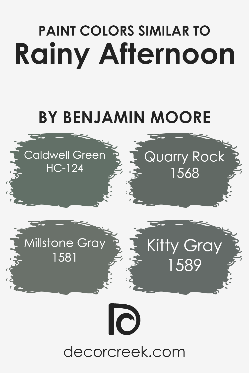
Colors Similar to Rainy Afternoon 1575 by Benjamin Moore
Choosing colors that share a similar tone or feel is vital in creating a harmonious and visually cohesive space. Especially when inspired by the serene and subtle atmospheres such as a Rainy Afternoon, ensuring the colors you select blend well together enhances the overall ambiance of a room.
Similar colors work by providing a smooth visual transition between differing elements within a space, allowing the eye to move seamlessly without abrupt stops that can be caused by contrasting colors. This method of selection brings a sense of calm and continuity, important for areas where relaxation and focus are key.
Among the colors that align with the quiet mood of a Rainy Afternoon, HC-124 – Caldwell Green stands out with its deep, earthy essence, offering a touch of nature’s serenity. It’s like bringing a piece of a lush, rainy landscape indoors, creating a backdrop that’s both grounding and refreshing.
Next, 1581 – Millstone Gray invokes the solid, dependable feel of stone on a damp day, providing a neutral but sophisticated foundation that complements wood and metal accents perfectly. The shade 1568 – Quarry Rock further echoes the tranquility of a secluded rocky retreat, with its mid-tone gray offering a sense of stability and understated elegance.
Lastly, 1589 – Kitty Gray adds a softer, more playful dimension. Its lighter, more whimsical approach makes it ideal for infusing a gentle, airy quality into the ambiance, reminiscent of the sky clearing after a gentle rain. Each of these colors, in their own way, supports a theme of rest and relaxation much like the comforting pause of a Rainy Afternoon, working together to create a soothing sanctuary.
You can see recommended paint colors below:
- HC-124 Caldwell Green
- 1581 Millstone Gray
- 1568 Quarry Rock
- 1589 Kitty Gray
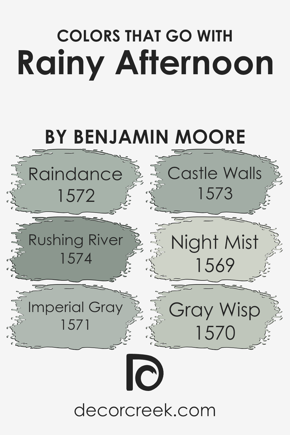
Colors that Go With Rainy Afternoon 1575 by Benjamin Moore
Selecting colors that harmonize with Rainy Afternoon 1575 by Benjamin Moore is essential for creating a cohesive and visually appealing space. When you choose colors like Raindance 1572, Rushing River 1574, Imperial Gray 1571, Castle Walls 1573, Night Mist 1569, and Gray Wisp 1570, you ensure a balanced and relaxing environment.
These colors work together because they share similar undertones, making it easier to create a room that feels unified and thoughtfully designed. Whether you’re painting walls, choosing furniture, or selecting decorations, using colors that go well with Rainy Afternoon 1575 helps in achieving a harmonious design.
Raindance 1572 is a serene blue with a hint of gray, giving off a calm and refreshing atmosphere, much like a gentle rainfall. Rushing River 1574, meanwhile, is a deeper blue-gray that suggests the fluidity and depth of moving water, adding a dynamic yet peaceful element to the space. Imperial Gray 1571 is a sophisticated, muted gray that provides a strong foundation for any room, offering stability and elegance.
Castle Walls 1573 has a light, airy feel, reminiscent of ancient stone, bringing a touch of history and solidity. Night Mist 1569 is a subtle, shadowy gray with a hint of blue, perfect for creating a cozy and enclosed feeling, like a safe harbor. Lastly, Gray Wisp 1570 is a soft, ethereal blend of blue and green, invoking the misty mornings of a lush landscape, ideal for adding a breath of fresh air to any environment. Together, these colors can transform a space into a peaceful retreat that reflects the beauty of a rainy afternoon.
You can see recommended paint colors below:
- 1572 Raindance
- 1574 Rushing River
- 1571 Imperial Gray
- 1573 Castle Walls
- 1569 Night Mist
- 1570 Gray Wisp
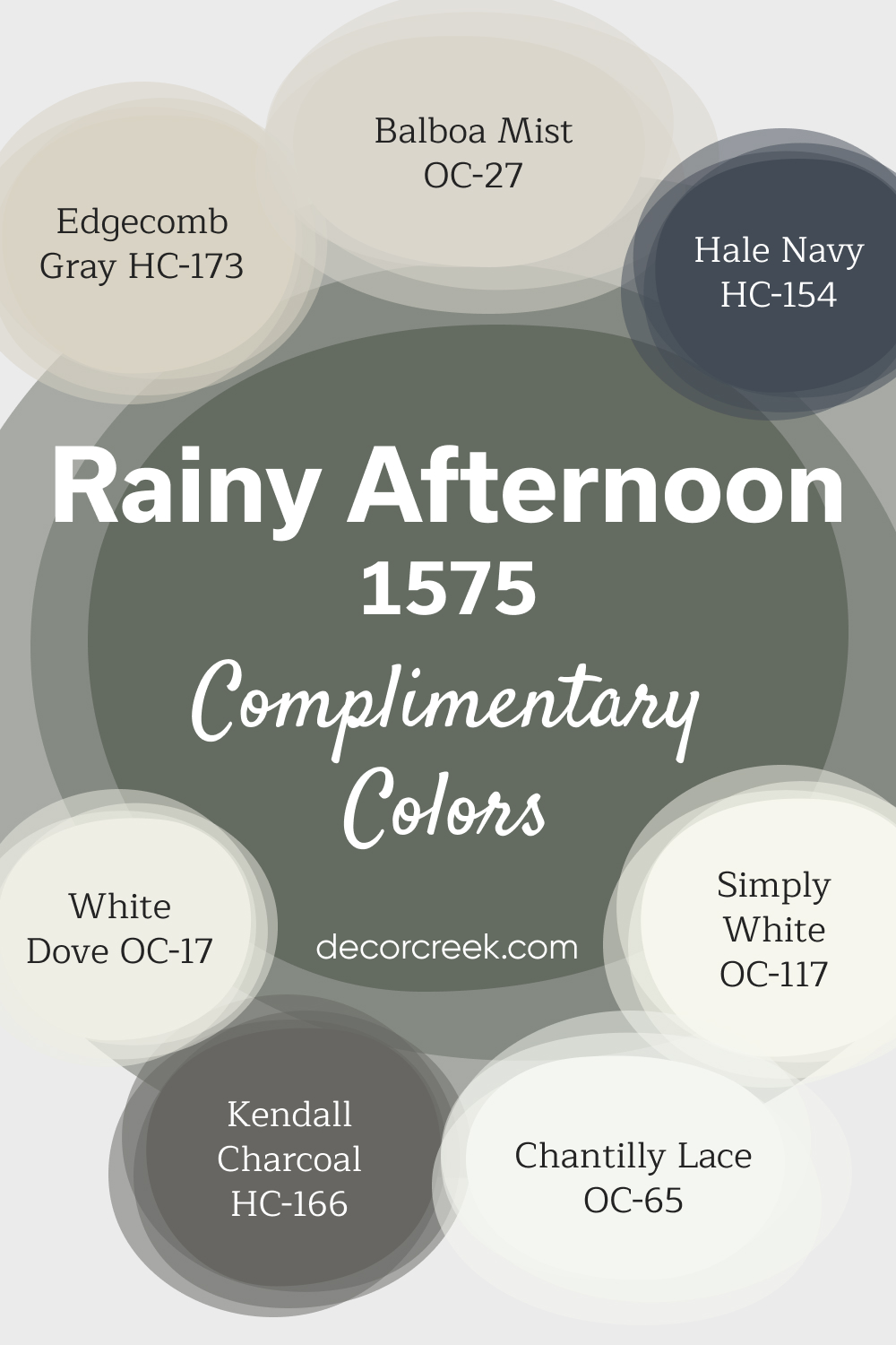
Complimentary Colors for Rainy Afternoon 1575 Paint Color by Benjamin Moore
Rainy Afternoon by Benjamin Moore is a calming green that brings a sense of serenity to any room. Its versatility makes it easy to pair with both neutral tones and deeper shades. For a crisp and clean look, Chantilly Lace, White Dove, or Simply White are perfect companions.
If you’re after a softer, more subdued atmosphere, Edgecomb Gray and Balboa Mist offer a warm, neutral contrast. For a bolder touch, consider using Hale Navy or Kendall Charcoal.
These darker shades add dimension and create a striking balance against Rainy Afternoon’s rich green tone. Whether you’re designing a cozy living space or a stylish office, this palette provides endless possibilities.
How to Use Rainy Afternoon 1575 by Benjamin Moore In Your Home?
Rainy Afternoon 1575 by Benjamin Moore is a unique shade of green that quietly adds a touch of serenity and reflection to any room. Think about a gentle, soothing rain shower that refreshes everything it touches; this paint color has the same calming effect on spaces, making it perfect for creating a tranquil atmosphere at home. Whether you’re looking to paint a bedroom, a bathroom, or even a home office, this color can help bring a sense of peace and quiet.
For those who want to add a bit of nature’s calm into their living areas without overwhelming them with dark or bold colors, Rainy Afternoon provides a soft, muted option that works beautifully on walls. It pairs nicely with light woods, white trims, and a variety of textiles, allowing for versatile decor options.
If you’re keen on creating a cozy nook, a calming study space, or even a relaxing living room, this color can help you achieve it. Plus, its understated elegance means it suits both modern and traditional styles, making it a go-to choice for anyone looking to refresh their home with a touch of understated beauty.
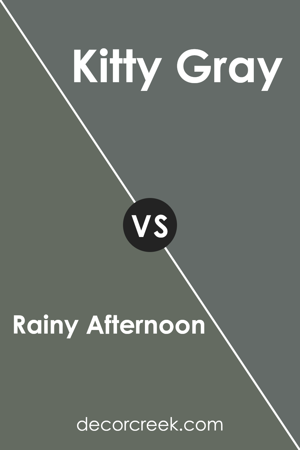
Rainy Afternoon 1575 by Benjamin Moore vs Kitty Gray 1589 by Benjamin Moore
Rainy Afternoon and Kitty Gray by Benjamin Moore are two unique colors. Rainy Afternoon is like looking out the window on a stormy day, feeling cozy and calm. It’s a medium shade that mixes green and gray, giving a peaceful touch to any room. It’s perfect for creating a tranquil space where you can relax.
On the other hand, Kitty Gray is lighter and brings a soft, gentle vibe. It’s like the fur of a fluffy kitten – subtle and soothing. This color leans more towards a classic gray with a hint of warmth, making it versatile for different spaces. It can brighten up a room while still keeping things calm and comfy.
Both colors are great choices for giving your home a fresh look. Rainy Afternoon adds depth and creates a serene backdrop, while Kitty Gray offers a lighter, airier feel. Depending on what mood you’re going for in your space, either color could be the perfect fit.
You can see recommended paint color below:
- 1589 Kitty Gray
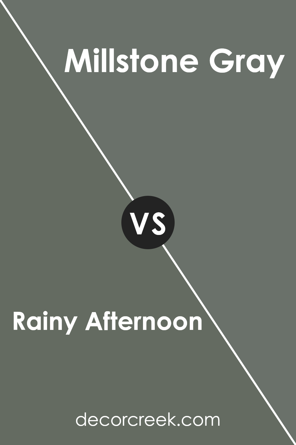
Rainy Afternoon 1575 by Benjamin Moore vs Millstone Gray 1581 by Benjamin Moore
Rainy Afternoon and Millstone Gray, both from Benjamin Moore, are two distinct colors that bring unique vibes to any space. Rainy Afternoon is a soft, cozy grey with subtle green undertones, offering a sense of tranquility and peace. It’s like looking out at a gentle drizzle, where the world seems quiet and calm. Imagine being in a snug room, feeling the calmness envelop you.
On the other hand, Millstone Gray is a deeper, more pronounced grey. It carries a stronger, more straightforward gray tone, leaning slightly towards the cooler side. This color has the power to give spaces a more defined, strong presence, making rooms look sophisticated and grounded.
While Rainy Afternoon might whisper serenity and subtle natural vibes, Millstone Gray speaks in a clear, steady tone, offering solidity and a touch of elegance. Both colors work beautifully in their own right, setting different moods and atmospheres depending on what you’re aiming for in a space.
You can see recommended paint color below:
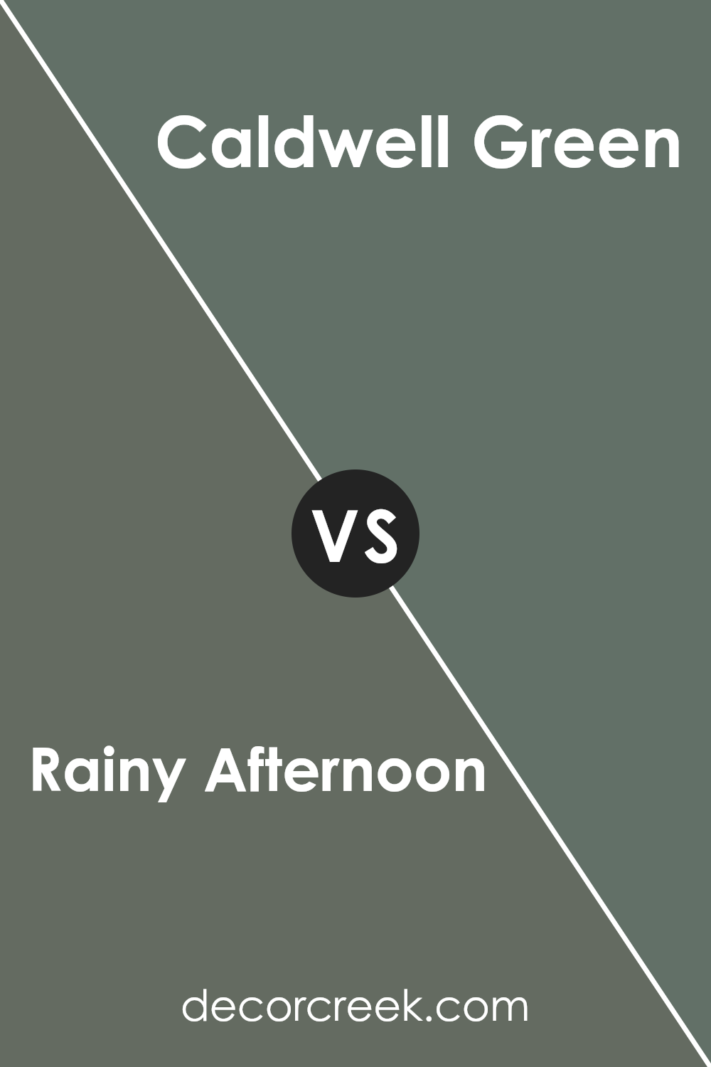
Rainy Afternoon 1575 by Benjamin Moore vs Caldwell Green HC-124 by Benjamin Moore
Rainy Afternoon and Caldwell Green are two distinct colors from Benjamin Moore that can transform the mood of any space. Rainy Afternoon is a subtle, soothing gray with hints of green, evoking the peaceful and refreshing feeling of a gentle rain. Its cool undertone makes it versatile, fitting well in rooms that aim for a calm and serene atmosphere.
On the other hand, Caldwell Green leans more towards a deep, rich green with a touch of earthiness. It brings a sense of nature and depth into a room, encouraging a feeling of comfort and grounding. Caldwell Green is bolder compared to the softer Rainy Afternoon, making it a standout choice for spaces that desire a statement with an elegant touch.
While both colors belong to the cool spectrum, Rainy Afternoon offers a lighter, more muted experience, perfect for creating a tranquil setting. Caldwell Green, however, brings a stronger character with its deeper tones, ideal for adding warmth and sophistication. Combining them can provide a balanced and dynamic ambiance, where the coolness of Rainy Afternoon perfectly complements the earthy robustness of Caldwell Green.
You can see recommended paint color below:
- HC-124 Caldwell Green
Rainy Afternoon 1575 by Benjamin Moore vs Quarry Rock 1568 by Benjamin Moore
Rainy Afternoon and Quarry Rock, both by Benjamin Moore, are quite distinct yet subtly similar shades. Rainy Afternoon has a comforting, soft gray tone with hints of green, evoking the serene mood of a gentle drizzle in the afternoon. It’s a color that brings a calm, refreshing touch to any space, making it feel like a cozy retreat on a rainy day.
On the other hand, Quarry Rock leans more towards a deeper, stony gray with subtle blue undertones. This color is reminiscent of the rugged beauty of rocky landscapes, offering a sense of strength and stability. Its depth adds a sophisticated edge to rooms, making them feel grounded yet open.
Both colors are versatile and can be used across various settings, from peaceful bedrooms to modern living rooms. However, while Rainy Afternoon tends to lighten and soften spaces with its subtle green hues, Quarry Rock provides a stronger, more pronounced presence, anchoring rooms with its earthy, rock-inspired tones. Together, they could complement each other, with Rainy Afternoon adding breathability and Quarry Rock giving depth and contrast.
You can see recommended paint color below:
- 1568 Quarry Rock
Conclusion
Rainy Afternoon 1575 by Benjamin Moore is a unique shade of green that carries a sense of calmness and serenity, making it perfect for those looking to add a touch of tranquility to their spaces. This color draws inspiration from the peaceful moments of a rainy day, offering a soothing backdrop that is both comforting and stylish. Its versatility allows it to fit into various rooms, whether you’re aiming for a cozy living area or a calm bedroom retreat, demonstrating its ability to blend seamlessly with different decor styles and preferences.
Choosing Rainy Afternoon 1575 can elevate the aesthetic of your home by introducing a subtle hint of nature indoors. Its muted tones provide a natural elegance that enriches the environment without overpowering it, creating spaces that feel open, airy, and inviting.
This paint color is particularly suited for those seeking to create a peaceful haven in their home, highlighting Benjamin Moore’s commitment to offering shades that not only look beautiful but also enhance the overall ambiance of a space.
Ever wished paint sampling was as easy as sticking a sticker? Guess what? Now it is! Discover Samplize's unique Peel & Stick samples.
Get paint samples

